#and calm the fuck down
Explore tagged Tumblr posts
Text
Dana’s last ‘fuck you’ to Disney
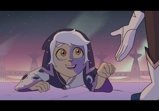
He/they collector
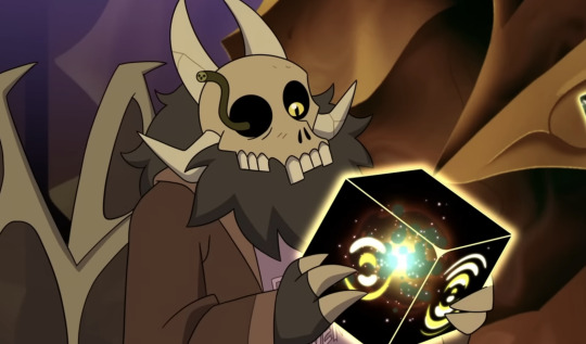
Genderqueer/bi-gender papa king
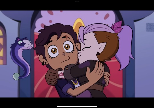
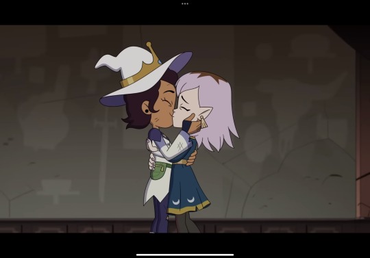
TWO girlfriend kisses
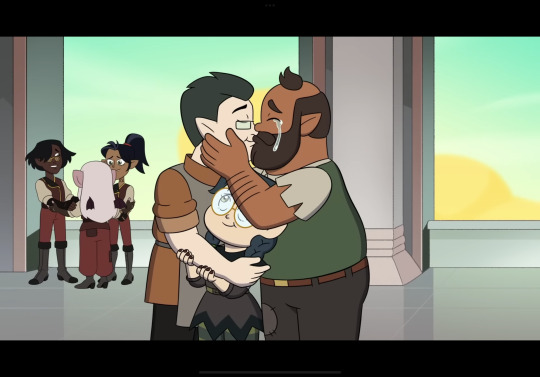
Onscreen mlm kiss
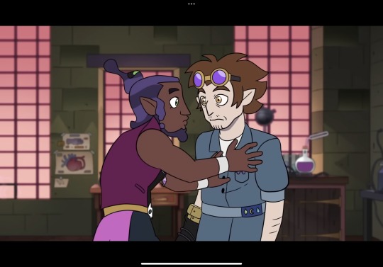
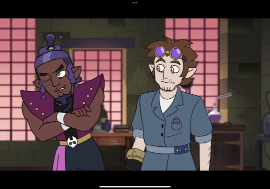
Implied aladarius
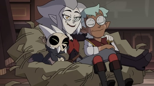
a happy ending to the bi/enby couple
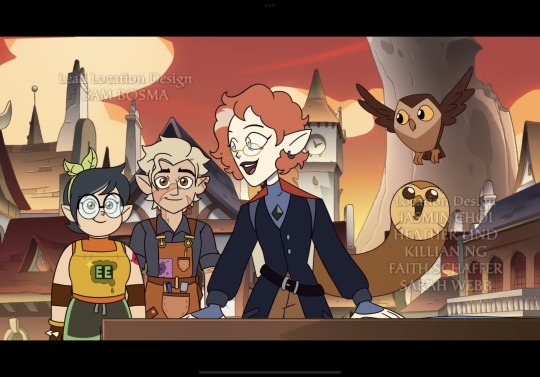
A happy ending to the aro/ace character
And
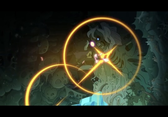
Death to the white Christian puritain
#Toh spoilers#the owl house spoilers#the owl house#watching and dreaming#Lumity#plus the sideline str8 relationship in favor of the gay ones!#i love huntlow but that was so great to see#raeda#clawthorne family#Willow park#Lilith clawthorne#Aladarius#papa king#10k#1k#5k#50k#edit: GUYS I KNOW HUNTLOW ISNT STRAIGHT THIS WAS BEFORE THAT INFORMATION WAS RELEASED#guys this post is fucking reblog bait it’s not that big of a deal calm tf down
77K notes
·
View notes
Text
what is with men being mad any time a woman raises her voice where did that even come from. someone posted a video of a small electrical explosion, and the top comment was of course the woman screams. the second comment is women try not to scream challenge, level impossible. i had to go back and watch the video again. there is, somewhat fainty, a little gasp emitted off-camera, more of a yelp than a scream. it is mostly lost in the crack of the explosion. afterwards, you hear her voice, shaken, say, are you okay?
i am helping one of my friends train her voice pitch lower, because she wants to be taken seriously at work. she and i do each other's nails and talk about gender roles; and how - due to our appearance - neither of us have ever been able to be "hysterical" in public. we both appear young and sweet and feminine. she is cisgender, and cannot use her natural voice in her profession because people keep saying she appears to be "vapid". we both try to figure out if our purposeful voice lowering is technically sexist. is it promoting something when you are a victim to it?
a storm almost sends a pole through a car window. in the dashcam, you can hear the woman passenger say her partner's name twice, crying out in alarm. she sounds terrified. in the comments, she is lambasted for her lack of calm. how is that even fucking helping?
in high school, i taught myself to have a lower voice. i had been recorded when i was genuinely (and righteously) upset; and i hated how my voice sounded on the phone speakers when it was played back. i was defending my mom, and my voice cracked with emotion. it meant i was no longer winning the argument: i was just shrieking about it.
girls meet each other after a long summer and let out a little joyful scream. this usually stops around 12-14, because people will not tolerate this display of affection (as it has the effect of being passingly annoying). something about the fact that little girls can't ever even be annoying. we are trained to examine each part of our lives (even joy) for anything that could make us upsetting and disgusting. they act like teenage girls are breaking into houses and shrieking you awake at 3 in the morning. speaking as a public school educator: trust me, it's not that bad, you can just roll your eyes and move on. it does not compare to the ways boys end up being annoying: slurs in graffiti, purposefully mocking your body, following you after you said no. you know, just boy things.
there's another video of a man who is not allowed to yell in the house, so he snaps his fingers when he's excited about soccer. the comments are full of angry men, talking about how their brother is unfairly caged. let him express himself and this is terrible to do to someone. eventually the couple has to address it in a second video: they are married with a newborn baby. he was trying not to wake the infant up. there is no comment on the fact women are not allowed to yell indoors. or the fact that it could have been really alarming or triggering for his wife. sometimes i wonder if straight men even like women, if they even enjoy being in relationships with them.
for the longest time, i hated roller coasters because it always felt inappropriate and uncomfortable for me to scream. one of my friends called me on it, said it was unusual i'm so unwilling. i had to go to my therapist about it. i don't like to scream because i was not raised in a safe situation, and raising my voice would have brought unsafe attention towards me. even when i am supposed to scream, it feels shameful, guilty. i was not treated kindly, so i lack a basic form of self-protection. this is not a natural response. it is not good that in a situation of high adrenaline - i shut up about it.
something very bad is happening, i think. in between all the beauty standards and the stuff i've already discussed - this one feels new and cruel in a way i can't quite express. yes, it's scary and silencing. but there's something about how direct it is - that so many men agree with the sentiment that women should never yell, even in an emergency - it feels different.
is the word shriek gendered automatically? how about shrill or screech? in self defense class, one of the first things they tell you is to yell, as loud and as shrilly as you can. they say it will feel rude. most women will not do this. you need to practice overcoming the social pressure and just scream.
most women do not cry out, even when it's bad. we do not report it. we walk faster. we do not make a scene. what would be the point of doing anything else? no matter what we do, we don't get taken seriously. it is a joke to them. an instagram caption punchline. we have to present ourselves as silent, beautiful, captivating - "valuable."
a woman is outside watching her kids when someone throws a firecracker at them. she screams and runs towards her children. in the comments, grown men flock together in the thousands: god. women are so annoying.
#warm up#writeblr#this one has bothered me for a bit#any time a woman does something even passingly annoying we treat it like a fucking crime#hey man. women are allowed to be annoying. everyone forever is allowed to be passingly annoying#as long as they aren't hurting anyone/thing#like u wanna know something? i find it super annoying that men don't wear seatbelts#why arent there thousands of comments on driving videos thats just like : men try not to die in a car crash challenge#''this briefly annoyed me''. okay??????? AND????????????????? go get ur self a cookie and calm down about it#ur not entitled to control other ppl's experiences and emotions just so u can maintain ur own peace#if being briefly annoyed ruins ur whole day! you! need! therapy!!!!#men try not to become immediately angry about nothing challenge: level impossible#ps author is nonbinary. we didn't even get into the gender presentation thing#the fact men think it's SEXY that my voice is on the lower end....
21K notes
·
View notes
Text
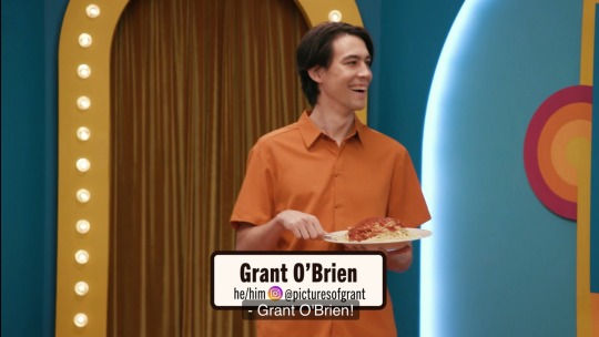
his ass is NOT grant o’brien!!!!
#dropout#game changer#zac oyama#aloe.etc#yes i know its because grant has covid but its still its funny they kept the bit going#100#200#hey why did this blow up so fast#300#400#GUYS CALM DOWN ITS NOT THAT FUNNY#500#you guys are on fire#600#700#what the fuck chat#800#900#1k#MY FIRST POST TO HIT 1K!! TYSM DROPOUT FANS!!!#2k#3k#4k#5k
6K notes
·
View notes
Text
i think its so funny when people take the way donnie acts at face value even though its a horrible lie because he's a horrible liar, while understanding leo is bullshitting very well despite him actually being GOOD at bullshitting. many such cases
#personal#rottmnt#although tbf its probably because with leo its unpacked more thoroughly in the movie#donnie is not a morally ambiguous emotionally unavailable bad boy. he is very sensitive actually#he's a little crybaby /aff#and like this isnt hidden. he isnt SECRETLY sensitive or secretly caring its very out in the open actually#he's not hiding it well AT ALL AND THEY ALL KNOW IT LMAOOOOOOOO#i think donnie's perception of himself is somewhat earnest and somewhat. not? he DEFINITELY thinks he's more evil than he actually is#BGHFHDHGJFHG#i think what causes him to lash out and struggle to communicate is his inability to articulate his feelings#they are just too big for him. like its the exact opposite of robotic#he cant force himself to give a fuck but when he DOES its too much#so he yells and lashes out or he shuts down completely#honestly i think the perception of him being too sensitive being a problem makes way more sense than the perception of him being 'robotic'#when it comes to struggles in how his family sees him at least#even in little ways you can see him take it pretty personally when he's insulted#he struggles to blow things off#and i think it would also explain his tendency to like. visibly calm himself down when he gets upset? its a thing he does a lot in the show#he desperately wants to destroy that perception of him because he's trying so hard to close himself off#he doesn't want to be the sensitive one that cant take anything. it especially works in line with his shell#it was a big inspiration for canary continuity tbh. donnie should struggle with being the sensitive one in fic more#mikey is more empathetic and he's more emotional but donnie's quicker to feel offended or take things personally#BACKED UP HEAVILY BY CANON#that 'you can be honest with me! no hard feelings' - 'he's lyinggggggg'#like he's not upset with them babying him as much as he is with them genuinely finding it frustrating that he can fall behind like that#and just cannot take shit like that. so he tries to pull back and not seem as affected as he is#theyre a very cuddly family but mind you they can be actually mean to each other like that!!
2K notes
·
View notes
Text
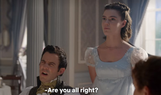
colin, post his sexy dream: i had no dream, not one, just complete and utter darkness and penelope is a friend, no an acquaintance, of our families
benedict speaking for all of us:
4K notes
·
View notes
Text
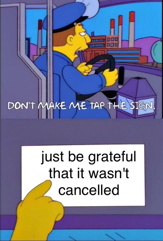
in regards to the LMK S5 trailer
4K notes
·
View notes
Text
So y'all have seen the Williams F1 Logo before, yeah?
well get ready, becaues I am about to ruin your day!
where does one even begin with this. i am sorry in advance. -just a poor learning graphic design student, who simply tried to enjoy their saturday evening
The Logo
For anyone that doesn't know, here's the Williams F1 Logo. Entirely unedited, copied straight from Wikipedia:

Now like many fans, I actually quite enjoy this logo. I like the modern, sharp edges of it and it's simple yet intriguiging design. It's memorable, while also easily recognizable as a W. I also really enjoy the colour choice (this, however, is entirely a personal preference.)
(entire rant under the cut. please keep reading this took years off my life span.)
How did we even get here?
Let's start at the beginning. How did we even get here? Well I, a poor poor learning graphic designer, was watching this lovely video from Mr. V's Garage about bad F1 Logo's over the past 35 or so seasons. Very interesting, I can only recommend it (but you don't need to watch the video to understand this post)!
Now, to cleanse the palette at the end of the video, Mr. V included a top 10 GOOD logos from this time span, it was very kind of him.
On P4 of this "Good List," Mr. V placed the current Williams F1 Logo, as pictured above. At first I vaguely agreed with this, believing that he probably simply hadn't noticed one of the things that's been bothering me about that Logo since the first time I saw it up close.
The first sign of Trouble
So, what is this mystery issue, you might ask?
It's simple really. You don't necessarily notice it at a first glance, but something about that logo seems off. Taking a second longer, you may notice it yourself.
No, I mean it, take a minute and go look at the logo. It looks wonky as hell, doesn't it?
Well I can tell you the first thing that I personally noticed. The arms of the W aren't in line with the bottom half, see:

(Graphic by @girlrussell who was so kind to let me use it, as it is way prettier than the one I made)
It's a crooked W. There is no good explanation for this. The rest of the font is perfectly fine, geometrical shapes.

Anyway, the good person that I am I went to point this out to my partner ( @leftneb ) who proceeded to inform me that he, infact, was not aware about this and was, quote, "never going to unsee that."
Now, the good FRIEND that I am, I, of course, proceeded to rush into our broader F1 friendgroup to make them suffer for eternity.
What's the logical next step to take? Of course, fix the logo in Adobe Photoshop, you know, as a joke.
(Disclaimer at this point, I am not necessarily the biggest fan of Williams Management Team. I enjoy ALL their drivers this season. I do NOT enjoy James Vowels. Be warned.)(Also I am aware that he probably did not have an influence on the logo)
Trying to fix it. Oh god, I was so innocent back then
Trying to fix the logo in Photoshop is the worst mistake I could've made. THE worst path to take. I could've just giggled about making my friends suffer (which I succeeded in, by the way) and moved on. Instead I ruined a perfectly good Saturday evening, and for what? I don't know anymore.
Anyway, how was I gonna go about fixing the logo in the simplest way possible? Simplest way I could come up with: slap the thing in Photoshop and put two, mirrored boxes at each side to make the sides line up. Small issue, how do I make the thing actually even? Fix: line them up at the intersecting point with the bottom tips of the W.
Here's the result:

Hey, anyone care to explain to me why in THE LORDS NAME the arms are different sized? I mean, surely they weren't before. Surely, certainly, I must've messed up.
I double, I tripple checked. I made sure everything was lined up and made sense. But no.
It just couldn't be. Something was uneven in this logo, something even deeper. Something I could not have predicted when first taking a closer look. It was at this point I realized I had messed up. What rabbit hole had I stumbled across? Certainly, it couldn't get much worse.
And that's when I noticed.

(pictured above; my genuine reaction)
There's MORE? (oh god, the top isn't lined up)

I couldn't believe my eyes. This is the PINNACLE of the sport, and THIS was the logo of one of the competing teams? I mean, yeah, we have a Visa Cash App RB or a Kick Sauber or even a MoneyGram Haas which are all terrible logos, but at least they're CLEAN. (this has not been checked. If anyone wishes to ruin a nice Saturday evening, feel free to check them and tell me how wrong I was in the previous statement!)
But you can see that there is no end in sight for this post. I'm sure you're as scared as I was at this point. By now we were sitting in VC, discussing the horribleness of this logo. I had long informed my irl's about this, who take said design classes with me. And it was one of them who pointed out the next thing that had been bothering me, but I had not been able to put a finger on up to this point.
thE DISTANCE, HOW DID THEY FUCK IT?

I'm afraid I have to confirm your fears.
Yes, those lines are the same length. According to Photoshop, they're on the same level as well, so no flunking with angles.
The gaps of the arms to the main W are not the same. They're differently sized gaps.
It was clear to us, this logo is inherintely flawed. They're subtle issues, but once you pay attention you start to notice things. It all looks slightly wonky and off centre. And eventually, you get paranoid, and start comparing other angles and sizes. And you will keep finding things. This has ruined my life.
HOOOOOW

Honestly, I don't even know what to say. Yes, yes sadly those lines, too, are the same length. Just copied over from one side to the other and layed over on the same height. I admit, they're not layed over perfectly. I was honestly holding back tears at this point. But the point still stands, you can clearly see a difference in width.
Honestly, the only way I can explain it is that at some point there was a mess up of distance or proportions and whoever was designing the logo couldn't pin it down and tried to restore the visual balance by making manual adjustments. And in all honesty? They kinda did a good job, if that's what's happened. I mean, you notice the crookedness of the arms, and then maybe the difference in height, but the rest you probably will not notice if you don't spend too much time staring at it. (like some of us) And even those issues clearly aren't noticeable to the vast majority, considering I had to go point it out to a group chat for my friends at least to notice.
what the fuck is THAT?
Now, the thing about doing this investigative work of prooving a team you dislike is worse in more aspects than you previously thought, is that you do a lot of zooming in. And zooming in means you might notice bits that yours eyes simply overlooked before, because they were too small.

Here you can witness the top of the middle point, that, for whatever reason, really wants to touch the top border of the Logo. I'm relatively certain that's the highest few pixel in the entire graphic, considering earlier chapter "There's MORE?" I have no idea why it looks like that or why they thought it was necessary for it to not end in a clean point.

I just actually have no idea how to even describe what is going on on the top of the left arm. That left hand side, again, touches the side and is therefore the most-left-pixel in the graphic. I, once again, have no idea the purpose of this. However the RIGHT hand side also makes no sense, as it is the most prominent corner in the whole logo. There's pointed corners, and rounded OF corners, but nothing that is trying to form it's own colony in a distant land that hopefully isn't this god awful logo. I hope that blob gets away. I really do. You go king.
i'm loosing my mind
Anyway, the only reason I could come UP with those weird "reachy-outy-bits" was to establish the dimensions of the logo? But if that was the case, I don't understand why they managed to keep all the other potentially border touching corners clean?


Like, look. Those are clean, sharp corners with some clearance off the borders. I have no clue why they managed it here but not with the others.
guys. please.
Backtrackig a little bit, going back to the positioning of the arms.

Do I need to mention that those lines are both the same length and the same (mirrored) angle? I really hope I don't, because I don't think I could be making this shit up. Like, once you roughly know what you need to look for it just kinda becomes easy to find.
As said before, I genuinely do think that most of these issues happened in a chain-reaction. For example, the distances between the main part and the W wouldn't be as noticeable (and they do get noticeable once you start looking at it) if the angle wasn't fucked. And guess what, there's more fucked angles here! Which ALSO influence this specific area of the logo!
this is just embarrasing for you.

something something same line copied over and mirrored etc etc
It's not as visible but the angles defintely don't line up here as well. As mentioned before, these issues for the most part all influence each other. It doesn't really excuse the issues, in my opinion as a designer, because a big company like this shouldn't have these sort of issues in their logo.
So let's review;
to sum it up,

i cannot even BEGIN to explain to you how big of a fucking JOKE this FUCKING logo is. because, i thought to myself, to round the post out, hey, why not show ALL the issues i pointed out in one picture? that would round it out quite nicely, wouldn't it?
Yeah well, this logo sent STRAIGHT FROM HELL just could NOT let me rest. I had only done the lines visualizing the crooked arms in PAINT up until this point, i.e. I had only pulled both up individually. To make a nice "rounding out" picture I still had to add them into PHOTOSHOP. so i did. i pulled up the line. i mirrored the line.
THE ANGLE IS FUCKING DIFFERENT
none. and i mean NONE of my friends had noticed this before. i need you to understand that we looked at this thing with FIVE pair of eyes, and NONE of us noticed that until i thought to myself "Oh I still need to add these specific lines to have ALL the issues I pointed out in my SILLY TUMBLR POST in ONE image" and i get THAT FUCKING SURPRISE
I was PLANNING to round the post out with a statement on how obviously this isn't a serious post. Here, I even had it all written out already because I accidentally started writing it in the last paragraph:
Of course, this is nitpicking, and it's not that serious. I'm aware of that. AS MENTIONED most of these would not be noticeable if we hadn't gone specifically looking for them.
yeah, well, fuck that. i just spent two hours seething about this logo. i'm ending the post on this instead.

#i am ENRAGED#i managed to actually calm down about it#yk. just typing away#and then i just try to ROUND OUT THE POST#for fucks sake#anyway i know i'm posting this at an hourrendous hour#if you read all the way. reblog? maybe#pretty please#williams f1#williams formula 1#williams racing#formula 1#f1#also apologies for any spelling mistakes i do NOT have the nerve to go back and proofread this
939 notes
·
View notes
Text

#tsom#whistlecone#the sound of music#captain von trapp#georg von trapp#maria von trapp#georg x maria#captain and the governess#pinecone/whistle#my art#please don't repost#chewing on them like squeaky toys#listen. i have a problem#and my problem is christopher plummer and julie andrews#spinning them like rotisserie chickens in my brain#i am going mental#what am i gonna do oh my god#they need to fucking stop#“you don't look like a captain” “you don't look like a nun” hmmmm okay can we calm down#what if i drew them kissing what then
2K notes
·
View notes
Text


I'M SICK RIGHT NOW???? MALLEUS YOURE DOING A DOUBLE KILL THE CLOSER WE GET TO 2025 LORD YOU LOOK LIKE THE KING OF BRIAR VALLEY RN I CAN'T SCREAM BECAUSE I'M GONNA BUST OUT MY ESOPHAGUS BUT AHHHH FUCK MY VIL FUNDS 👹👹👹👹👹👹👹👹 WHAT IF I WRANGLE YOUR HORNS RIGHT NOW GONNA PULL A GASTON AND EAT 5 DOZEN EGGS JUST TO DRAG YOU BY YOUR OVERGROWN KERATIN
#twisted wonderland#twst#diasomnia#savanaclaw#malleus draconia#jack howl#merry christmas indeed twst building up a crisis as per usual#second diasomnia ssr for the new years???? lilia. CALM THE FUCK DOWN
898 notes
·
View notes
Text
Eddie posts a Tiktok of an old home video taken almost right after he bought a camcorder. The band has just come off the stage and they’re walking down a hallway, amped up and loud. Just boys being boys.
Gareth is filming and Eddie is talking to the camera like, “Everybody always ask me. They say, ‘Eddie, what’s it like having your boyfriend at one of your shows.’ Or they would ask me that if they won’t skin me alive for having a boyfriend.”
Gareth, who is always worried Eddie’s going to accidentally out himself: Dude
Eddie: Relax. Skin all here. We’re good. I would respond to this question that no one would ask me because no one knows I have a boyfriend by looking them deep in the eyes.
Eddie: And I’d say, ‘It’s amazing having my boyfriend here because-
Eddie: *slams the door open to their small cramped dressing room so hard it nearly dents the wall*
The walls: *literally shaking from the band current on the stage*
Steve: *Asleep, dead to the world*
Eddie: -he’s the only motherfucker who can sleep through the show.’
Eddie, crouching down next to Steve so they’re both in shot, says because they’re making this tape for his uncle, “Wayne, what are we going to do with our boy?”
#It’s not Steve’s fault#he drove like six hours right after work to come to this show#and then the guy who works the lights wouldn’t calm the fuck down with the strobe lights so Steve couldn’t even watch#but don’t worry#once Steve wakes up. he’s ready to party#eddie munson tiktok saga#steve harrington#eddie munson
3K notes
·
View notes
Text
I saw some people pissed by Agatha not getting a redemption arc at the end of the series, but the real reason is: she shouldn't get one.
She killed so many witches and did terrible things and nothing is going to change that at the end of the day.
I think what they gave us is so much stronger, you see how she’s filled with trauma and can't make herself trust anyone besides herself and her son.
She doesn’t kill witches, because she feels like. She’s a succumbs, she needs the energy in order to survive and that’s something her mother could never understand.
After she figured out how to control her powers I’m sure she could have joined a coven and she’d receive help from them.
But who would trust a kind of witch who has a defense as an attack? And how could Agatha trust anyone after her own coven and mother tried to kill her?
Redemption arcs are more times than not extremely forced, people’s actions shouldn’t be forgiven by a single action. They made us understand Agatha as a whole character, with flaws, traumas and depth and know that, ultimately, her life lead her into doing terrible things, that have no excuse.
#redemption arcs are overrated#agatha I love you with all my heart and I accept you as a whole person#I can’t fix her but I can fuck her enough to calm her down a little#agatha all along#agatha harkness#kathryn hahn#rio vidal#aubrey plaza#lilia calderu#teen agatha all along#billy maximoff#jennifer kale#alice wu gulliver#agatha x rio#agathario
554 notes
·
View notes
Text

they are so in love and disgusting and also sarcastic bitches. follow for more / prev comic / next comic
#i have BEEN the grossly affectionate couple in the friend group btw. maybe one more reason i love them#right off the bat after meeting they are holding hands and hugging and touching each others shoulders#xie lian even rubs hua cheng’s back to calm him down during the lang qianqiu/ qi rong scene#also#the fandom knows that xl is an essentially kind person but i’ve been paying attention to his dynamic w/ fxmq#they give each other so much shit lmao 😭#when xl is with people he knows well and trusts he is truly so judgemental and sarcastic.#it is so funny.#can you imagine being confronted by the most powerful people in the three realms and they destroy your self esteem with dry fucking wit#feeling so insane about them currently#tgcf#art#hualian#heaven official's blessing#tian guan ci fu#hua cheng#xie lian#feng xin#digital art#my art#mxtx#comic
7K notes
·
View notes
Text
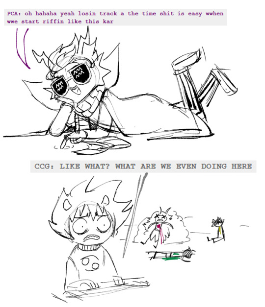
#homestuck#eridan ampora#karkat vantas#death //////// // /#just straight up one of the funniest moments from the comic#erikar#tagging that because this conversation fascinates me#karkat is LITERALLY IN THE MIDDLE OF YELLING AT ERIDAN FOR WAND MURDER#and SCARED FOR HIS FUCKING LIFE because of gamzee#and he CALMS DOWN because he's talking to fucking eridan and fucking eridan is a fucking idiot#moirails you guys theyre so moirails for each other
2K notes
·
View notes
Text

Thinking about this quote a lot
#I haven’t even seen the fucking movie yet can you guys calm down#ok ive seen it now. other than the unresolved gayness it kinda sucked#deadpool#wolverine#poolverine#deadpool and wolverine
840 notes
·
View notes
Text
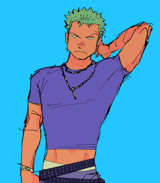
i refuse to draw him in a normal length shirt. you cant make me
#sighhh fuckkk hes just my barbie doll now i only draw him in outfits i want to wear#but alas. i dress like a homeless person because my teeth chatter in 65 degree weather. im like a californian were-stickbug#trying to unlearn shame with my scribbles#(said like trying to calm down a horse) youre good YOURE GOOD. YOURE GOOD YOURE GOOD. ITS FINE. YOURE FINE#messy AND its that one fucking anime guy this is like a shame-combo for me#buts its FINE were UNLEARNING SHAME. WERE NOT CRINGE. CRINGE IS DEAD.#wtf... art#roronoa zoro#zoro#one piece fanart#one piece zoro
1K notes
·
View notes

