#and I want to do another gifset with only the gifs that have the same angle because it's sth my autistic brain won't shut up abt
Explore tagged Tumblr posts
Text
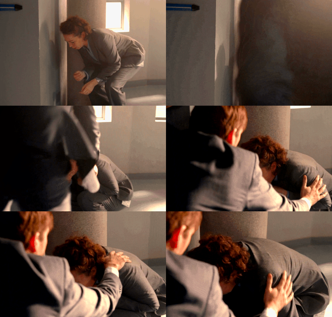
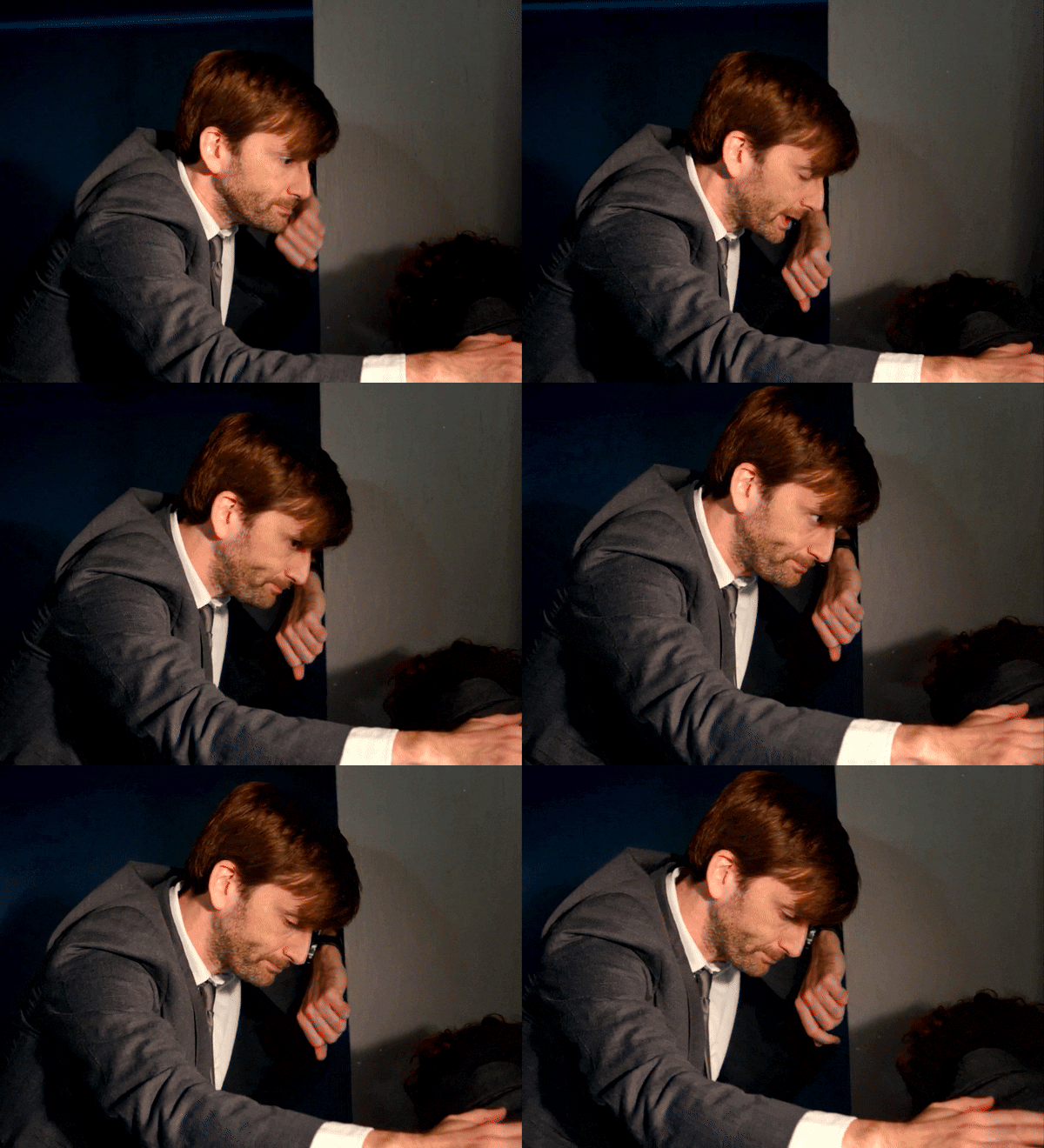
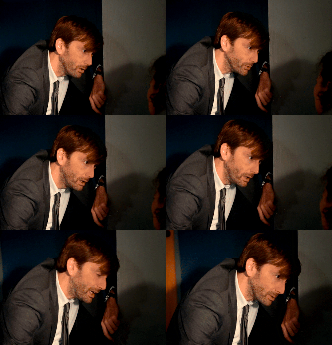
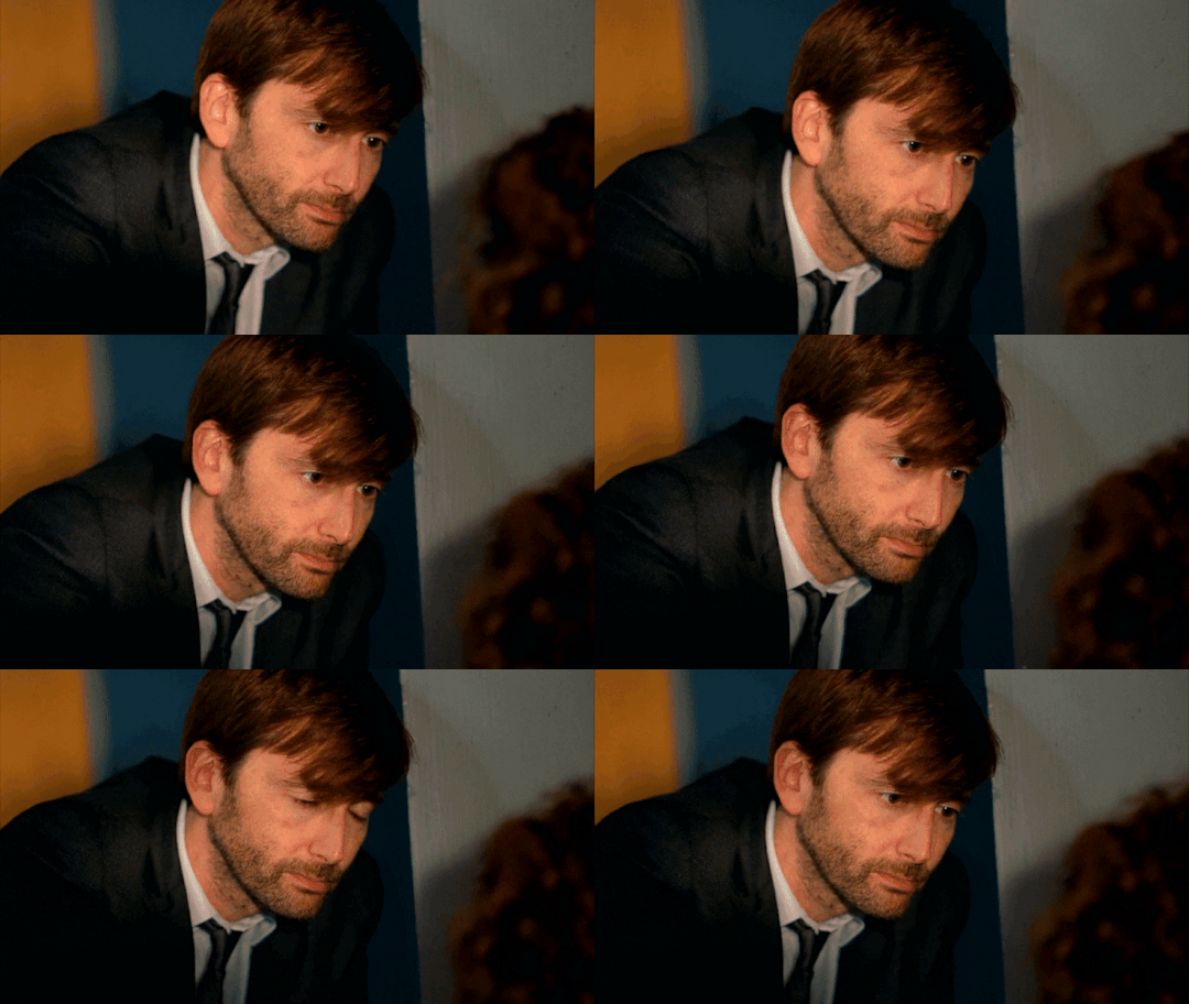
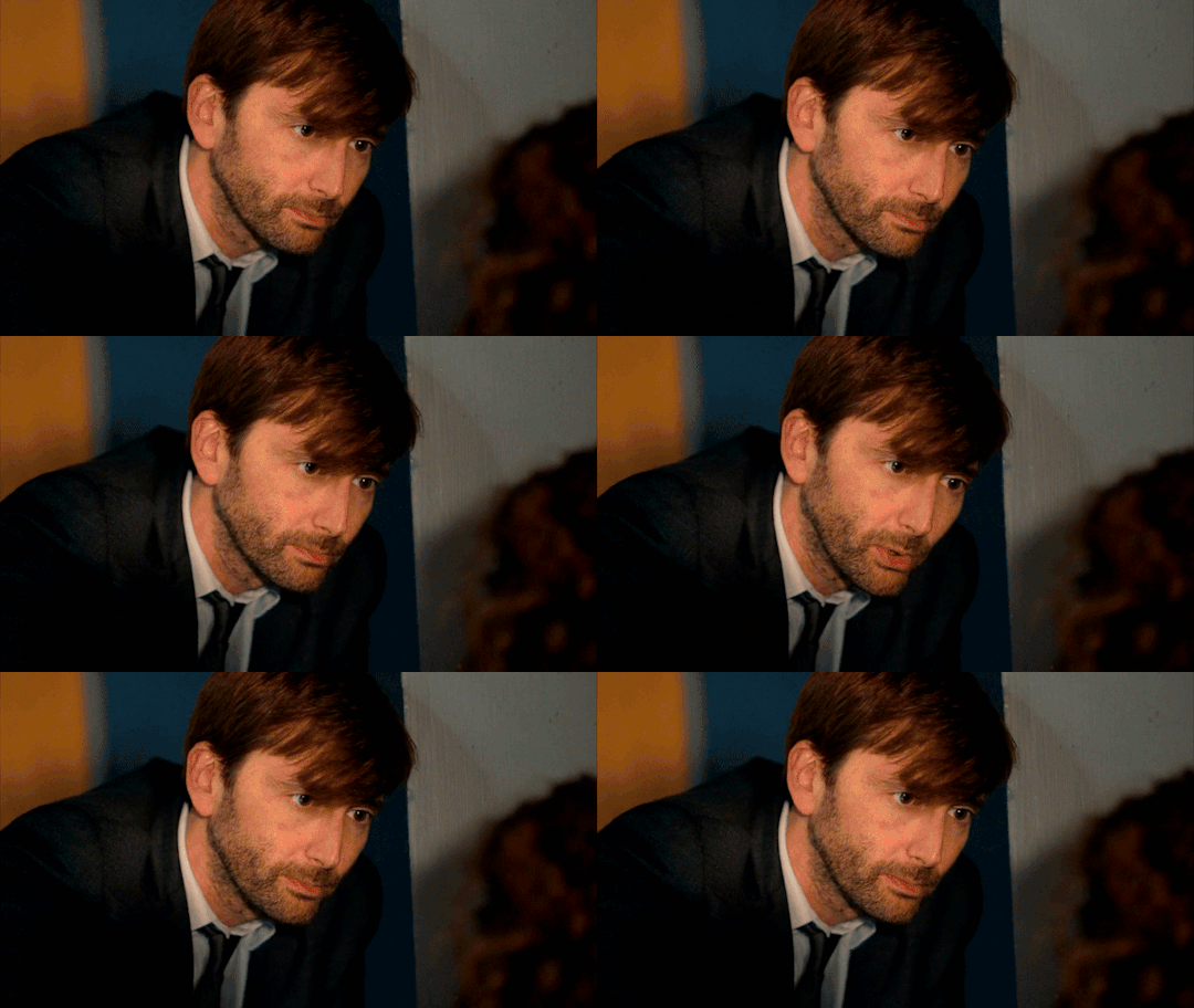
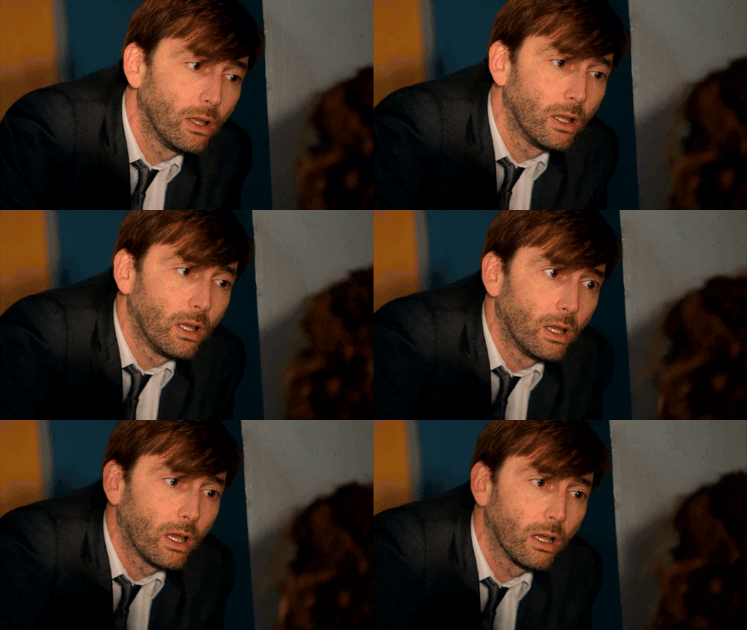

#David Tennant#DI Alec Hardy#Broadchurch#my gifs#Damn the tenderness! The kindness!#The way he tries to soften the irreversible blow by easing her into it#Asking her first what she was doing#in order to then ask if she saw Joe come to bed#and then coming to her side of the table#Alec Hardy is the kindest man Broadchurch will ever have the privilege of knowing#the way he scrambles up and rushes over to be there for her as she falls apart#the way he keeps a steadying comforting hand on her#the way he has his hand out ready to steady her even when he's not touching her!#the way he keeps his voice as non-threatening and non-challenging as possible every time she pleads & he has to shatter her hopes#oh also! also! the way he considers for a long time when she asks to see Joe#He KNOWS it's against procedure. He KNOWS she's unstable now. But he can't not give her the only thing she asked for that he can give.#I'm going to gif this scene over and over so if using the Broadchurch tag is abusing the tag pls someone let me know#and I'll make up my own tag for Broadchurch#I need to do a gifset that includes Ellie but it will have to be side by side#and I want to do another gifset with only the gifs that have the same angle because it's sth my autistic brain won't shut up abt#oh my heart those two! <3 <3 <3#These are seven gifs. Is that a long post? I don't know if I should tag this as long post#I'm very sorry to anyone who felt this was a long post and I didn't tag it. I hate that color of the sky post. it's unrelentingly long#I'm sincerely sorry if this is the same situation
156 notes
·
View notes
Text
@theinfinitedivides #tv: my dearest #second gif knife to the f*cking gut it's the way Jang Hyun puts his hand over Ryang Eum's mouth mid-sentence and he jerks back #a little. probably caught off guard but then you look over at the next column and you see that same surprise but smaller. subtler #it is the incline of his brow then is the only indication look back at the first column and you see it there too but with everything else #going on on Ryang Eum's f*cking face it is easy to miss #he is always saving him. he is always saving him and Ryang Eum will always return to him bc of it God!!!!!!! #something something this is why Jang Hyun storming off to Shimyang (Gil Chae-less in the end of part one i must add) #hurt so f*cking much bc look at them. they know each other like they know their own selves what do you expect me to do with that #kind of information. what #telling you rn i'm paying for my son's therapy and then i'm writing a modern AU where he GETS the therapy amen #edit: not this being in the drafts right under another MD gifset where the caption is 'i have always wanted to hold this hand'...... #not me throwing up about how Jang Hyun (Gil Chae? haven't gotten there yet) can just say that without repercussions #meanwhile Ryang Eum pines and wastes away bc he cannot even bring himself to touch him under normal circumstances. he allows #himself the liberty only when it is absolutely necessary shut the f*ck up and get out of my house

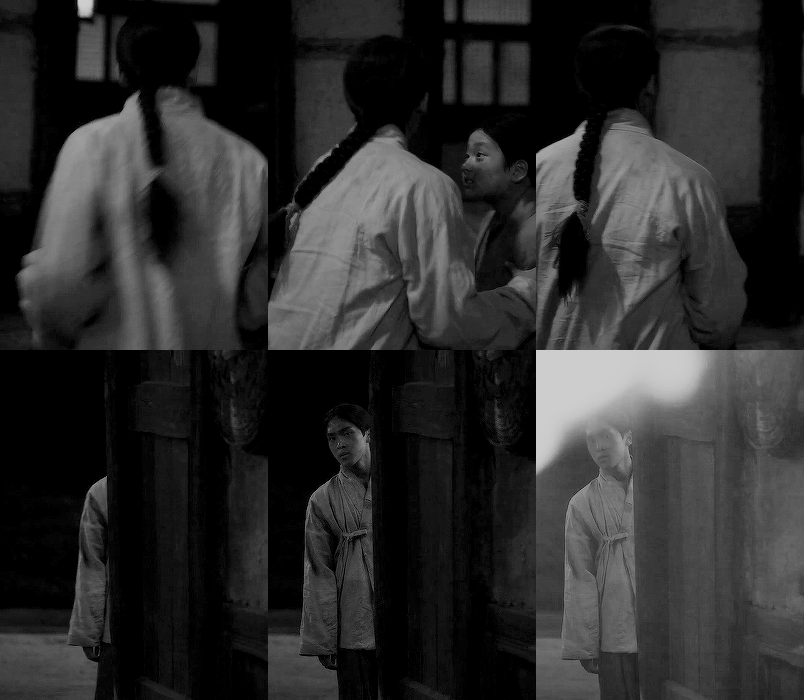


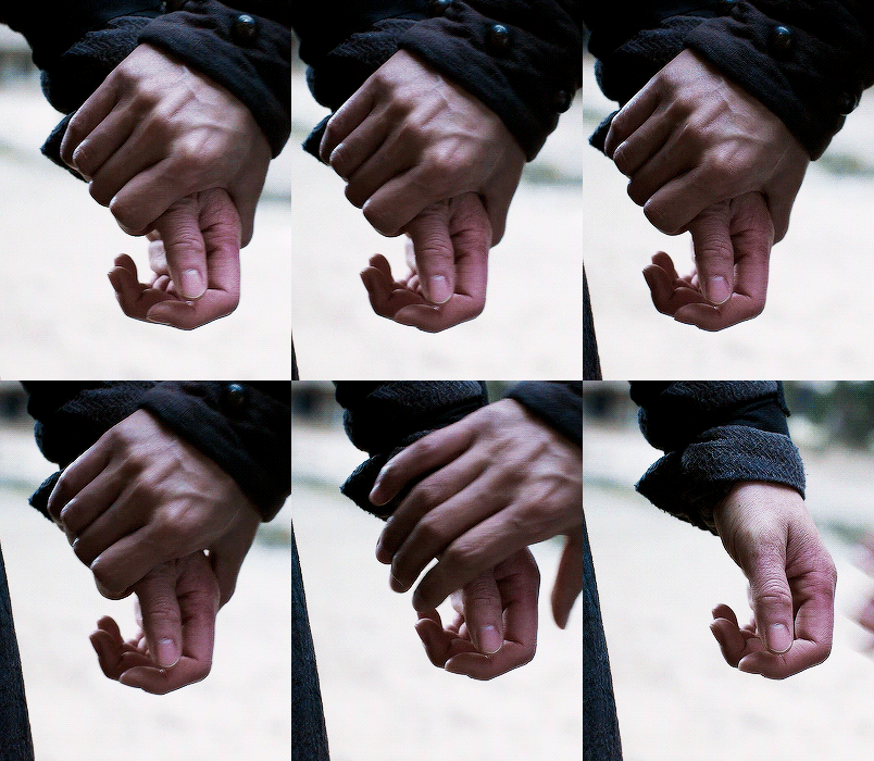

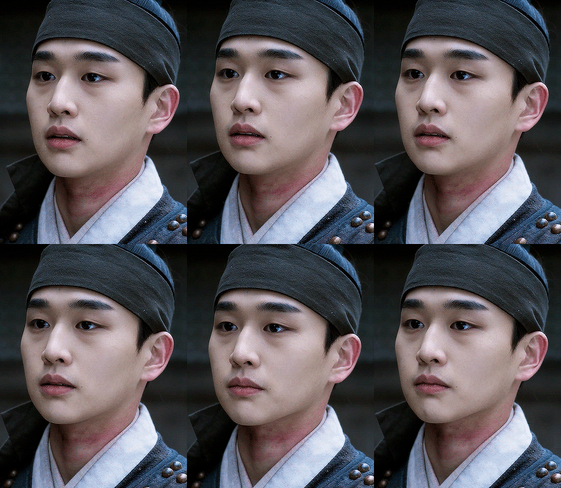

Once again, he saved me.
RYANG EUM & LEE JANG HYUN MY DEAREST 연인 (2023) EP. 04 // EP. 15
#tv: my dearest#second gif knife to the f*cking gut it's the way Jang Hyun puts his hand over Ryang Eum's mouth mid-sentence and he jerks back#a little. probably caught off guard but then you look over at the next column and you see that same surprise but smaller. subtler#it is the incline of his brow then is the only indication look back at the first column and you see it there too but with everything else#going on on Ryang Eum's f*cking face it is easy to miss#he is always saving him. he is always saving him and Ryang Eum will always return to him bc of it God!!!!!!!#something something this is why Jang Hyun storming off to Shimyang (Gil Chae-less in the end of part one i must add)#hurt so f*cking much bc look at them. they know each other like they know their own selves what do you expect me to do with that#kind of information. what#telling you rn i'm paying for my son's therapy and then i'm writing a modern AU where he GETS the therapy amen#edit: not this being in the drafts right under another MD gifset where the caption is 'i have always wanted to hold this hand'......#not me throwing up about how Jang Hyun (Gil Chae? haven't gotten there yet) can just say that without repercussions#meanwhile Ryang Eum pines and wastes away bc he cannot even bring himself to touch him under normal circumstances. he allows#himself the liberty only when it is absolutely necessary shut the f*ck up and get out of my house
160 notes
·
View notes
Text
My GIF Making process: Screen capturing using MPV player, Organizing files, 3 Sharpening settings, Basic Coloring PSD + Actions set

This is a very long post so heads up.
I’ll try to be as thorough and true as much as possible to the way I make my gifs (I already use Photoshop Actions which I’ve long since set up but now for this tutorial I’m reviewing them to show you the exact steps I’ve learned to create my gifs 😃) and present them to you in a semi-coherent way. Also, please bear with me since English is my second language.
First things first. Below are the things and tools we need to do this:
Downloaded 4K or 1080p quality videos (let’s all assume we know where to get these—especially for high definition movies and tv series—so this post doesn’t get removed, okay? 😛)
Adobe Photoshop CC or the CS versions can work as well, but full disclosure I haven’t created gifs using the CS versions since 2020. I’m currently using Adobe Photoshop 2024.
mpv player. Use mpv player to get those frames/screenshots or any other video player that has a screen grabber feature. I’ve used adapter for the longest time but I’ve switched to mpv because the press to screenshot feature while the video is playing has been a game changer not to mention ultimate time saver for me. For adapter you need to play it in another video player (like VLC player), to get the start and end timestamps of the scene you want to gif which takes me ages before I can even open Photoshop.
Anyway! Please stop reading this post for a moment and head over to this amazing tutorial by kylos. She perfectly tells you how to install and use mpv player, both for Mac and Windows users.
One thing I have to share though, I had a tough time when I updated my MacOS to Sonoma since MPV is suddenly either duplicating frames or when I delete the duplicates the player seems to be skipping frames :/ I searched and found a solution here, though it didn’t work for me lol. My workaround for this in the meantime is decreasing the speed down to 0.70 then start screenshotting—it’s not the same pre Sonoma update but it works so I’ll have to accept it rather than have jumpy looking gifs.
Now, after this part of kylos’ tutorial:

you can continue reading the following sections of my gif tutorial below.
I want to share this little tip (sorry, this will only cater to Mac users) that I hope will be helpful for organizing the screenshots that MPV saved to the folder you have selected. Because believe me you don’t want to go through 1k+ of screenshots to select just 42-50 frames for your gif.
The Control + Command + N shortcut
This shortcut allows you to create a new folder from files you have pre-selected. As you can see below I have already created a couple of folders, and inside each folder I have selected screenshots that I want to include in one single gif. It's up to you how you want to divide yours, assuming you intend to create and post a Tumblr gifset rather than just one gif.

Another tip is making use of tags. Most of, if not all the time, I make supercorp gifs so I tag blue for Kara and red (or green) for Lena—just being ridiculously on brand and all that.
Before we finally open Photoshop, there's one more thing I want to say—I know, please bear with me for the third? fourth? time 😅
It's helpful to organize everything into their respective folders so you know the total number of items/frames you have. This way, you can add or delete excess or unnecessary shots before uploading them in Photoshop.
For example below there are 80 screenshots of Kara inside this folder and for a 1:1 (540 x 540 px) Tumblr gif, Photoshop can just work around with 42-50 max number of frames with color adjustments applied before it exceeds the 10 MB file size limit of Tumblr.

Sometimes I skip this step because it can be exhausting (haha) and include everything so I can decide visually which frames to keep later on. You'll understand what I mean later on. But it's important to keep the Tumblr 10 MB file size limit in mind. Fewer frames, or just the right amount of frames, is better.
So, with the screenshot organization out of the way, let's finally head over to Photoshop.
Giffing in Photoshop, yay!
Let’s begin by navigating to File > Scripts > Load Files into Stack…

The Load Layers window will appear. Click the Browse button next.
Find your chosen screenshots folder, press Command + A to select all files from that folder then click Open. Then click OK.
After importing and stacking your files, Photoshop should display the following view:

By the way, I'll be providing the clip I've used in this tutorial so if want to use them to follow along be my guest :)
If you haven't already opened your Timeline panel, navigate to Windows > Timeline.
Now, let's focus on the Timeline panel for the next couple of steps.
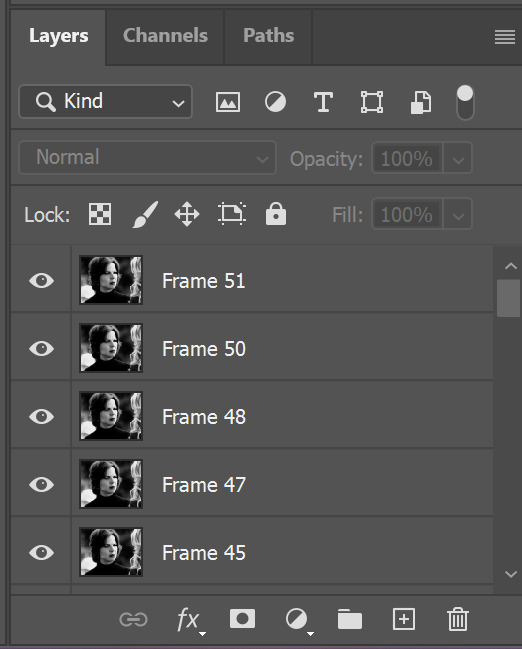
Click Create Video Timeline, then you’ll have this:

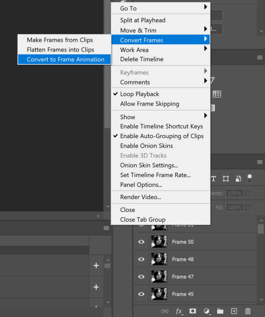
Now click the menu icon on the top right corner then go to Convert Frames > Make Frames from Clips

Still working on the Timeline panel, click the bottom left icon this time—the icon with the three tiny boxes—to Convert to Frame Animation
Select Make Frames From Layers from the top right corner menu button.
So now you have this:

Go and click the top right menu icon again to Select All Frames
Then click the small dropdown icon to set another value for Frame Delay. Select Other…

The best for me and for most is 0.05 but you can always play around and see what you think works for you.
Click the top right menu icon again to Reverse Frames.
I think Photoshop has long since fixed this issue but usually the first animation frame is empty so I just delete it but now going through all these steps there seems to be none of that but anyways, the delete icon is the last one among the line of feature buttons at the bottom part of the Timeline panel.
Yay, now we can have our first proper GIF preview of a thirsty Lena 😜

Press spacebar to watch your gif play for the very first time! After an hour and half of selecting and cutting off screenshots! 😛 Play it some more. No really, I’m serious. I do this so even as early (lol) as this part in the gif making process, I can see which frames I can/should delete to be within the 10 MB file size limit. You can also do it at the end of course 🙂
Now, let’s go to the next important steps of this tutorial post which I’ve numbered below.
Crop and resize to meet Tumblr's required dimensions. The width value should be either 540px, 268px, or 177px.
Convert the gif to a Smart Object for sharpening.
Apply lighting and basic color adjustments before the heavy coloring. I will be sharing the base adjustments layers I use for my gifs 😃.
1. Crop and Resize
Click on the Crop tool (shortcut: the C key)

I like my GIFs big so I always set this to 1:1 ratio if the scene allows it. Press the Enter key after selecting the area of the frame that you want to keep.
Side note: If you find that after cropping, you want to adjust the image to the left or another direction, simply unselect the Delete Cropped Pixels option. This way, you will still have the whole frame area available to crop again as needed and as you prefer.
Now we need to resize our gif and the shortcut for that is Command + Opt + I. Type in 540 as the width measurement, then the height will automatically change to follow the ratio you’ve set while cropping.
540 x 540 px for 1:1
540 x 405 px for 4:3
540 x 304 px for 16:9
For the Resample value I prefer Bilinear—but you can always select the other options to see what you like best.
Click OK. Then Command + 0 and Command + - to properly view the those 540 pixels.

Now we get to the exciting part :) the sharpen settings!
2. Sharpen
First we need to have all these layers “compressed” intro a single smart object from which we can apply filters to.
Select this little button on the the bottom left corner of the Timeline panel.


Select > All Layers
Then go to Filter > Convert for Smart Filters
Just click OK when a pop-up shows up.
Now you should have this view on the Layers panel:

Now I have 3 sharpen settings to share but I’ll have download links to the Action packs at the end of this long ass tutorial so if you want to skip ahead, feel free to do so.
Sharpen v1
Go to Filter > Sharpen > Smart Sharpen…
Below are my settings. I don’t adjust anything under Shadows/Highlights.
Amount: 500
Radius: 0.4
Click OK then do another Smart Sharpen but this time with the below adjustments.
Amount: 12
Radius: 10.0

As you can see Lena’s beautiful eyes are “popping out” now with these filters applied. Click OK.
Now we need to Convert to Frame Animation. Follow the steps below.
Click on the menu icon at the top right corner of the Timeline panel, then click Convert Frames > Flatten Frames into Clips
Then Convert Frames > Convert to Frame Animation
One more click to Make Frames From Layers
Delete the first frame then Select All then Set Frame Delay to 0.05

and there you have it! Play your GIF and make sure it’s just around 42-50 frames. This is the time to select and delete.
To preview and save your GIF go to File > Export > Save for Web (Legacy)…
Below are my Export settings. Make sure to have the file size around 9.2 MB to 9.4 MB max and not exactly 10 MB.

This time I got away with 55 frames but this is because I haven’t applied lighting and color adjustments yet and not to mention the smart sharpen settings aren't to heavy so let’s take that into consideration.
Sharpen v1 preview:

Sharpen v2
Go back to this part of the tutorial and apply the v2 settings.

Smart Sharpen 1:
Amount: 500
Radius: 0.3
Smart Sharpen 2:
Amount: 20
Radius: 0.5
We’re adding a new type of Filter which is Reduce Noise (Filter > Noise > Reduce Noise...) with the below settings.

Then one last Smart Sharpen:
Amount: 500
Radius: 0.3
Your Layers panel should look like this:

Then do the Convert to Frames Animation section again and see below preview.
Sharpen v2 preview:

Sharpen v3:
Smart Sharpen 1:
Amount: 500
Radius: 0.4
Smart Sharpen 2:
Amount: 12
Radius: 10.0
Reduce Noise:
Strength: 5
Preserve Details: 50%
Reduce Color Noise: 0%
Sharpen Details: 50%
Sharpen v3 preview:

And here they are next to each other with coloring applied:
v1

v2

v3

Congratulations, you've made it to the end of the post 😂
As promised, here is the download link to all the files I used in this tutorial which include:
supercorp 2.05 Crossfire clip
3 PSD files with sharpen settings and basic coloring PSD
Actions set
As always, if you're feeling generous here's my Ko-fi link :) Thank you guys and I hope this tutorial will help you and make you love gif making.
P.S. In the next post I'll be sharing more references I found helpful especially with coloring. I just have to search and gather them all.
-Jill
#tutorial#gif tutorial#photoshop tutorial#gif making#sharpening#sharpening tutorial#photoshop#photoshop resources#psd#psd coloring#gif coloring#supercorp#supercorpedit#lena luthor#supergirl#my tutorial#this has been a long time coming#guys. i'm BEGGING you. use the actions set - it was a pain doing all this manually again ngl LMAO#i've been so used to just playing the actions#so this has been a wild refresher course for me too 😆
477 notes
·
View notes
Text
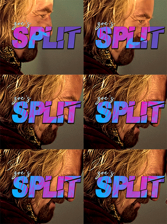
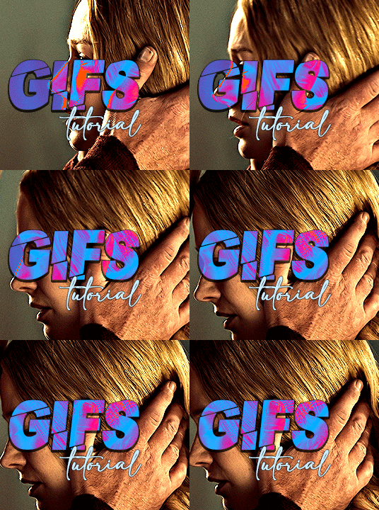
i always get questions when i do a split gifset, and it's a deceptively simple process so i thought i'd try to show how i do it! i don't know if these types of gifsets have a more universally recognized name, but that's what i call them so that's what i'm going with.
i'm going to write this assuming you have a solid familiarity with photoshop and making gifs, but please feel free to send me an ask if anything is unclear. i use video timeline/smart objects so will be showing that (here's a great general tutorial on giffing with timeline). i will also be talking A LOT about gif dimensions, so first let's briefly go over the limits and theory a little bit.
a 1 column gifset can accommodate gifs 540 pixels wide
2 columns = 268 pixels each with a 4 pixel gutter between
3 columns = 177, 178, 177 pixels with 4 pixel gutters
i'm mostly going to talk about 2 column split gifs here (what i will refer to as 2x1 from now on - 2 across and 1 high), but the process is the same for 3 column (3x1) and so on (1x2, 2x2, etc).
so, why would you even want to make a gifset like this? i mean, let’s face it, generally, bigger is better for gifs on tumblr, and there are obvious incentives to 540 width gifs over 268 or 177/8 width, especially since the upload limit went to 10MB. but even 10MB isn’t much when you’re talking about high quality footage. gif making is a constant balance between quality (whatever that means to you: frame dimensions, sharpening, coloring, etc) and file size. split gifs are a cheat to that limitation >:)
i personally believe an untapped frontier of tumblr gifmaking is playing with dimensions and time. that sentence makes me sound like an old-timey sci-fi villain, but you get the idea: gifmaking is an art and there are many fun and interesting ways of exploring the medium. you can do a lot with 268 pixels! longer frame loops to gif longer scenes unbroken, bolder coloring on a wide shot you don’t want to pare down. and, a shorter x axis means the y axis’s bang goes a lot further on a buck. also just if you have a 2 column set but only 5 gifs so you need to make one take up 2 slots. there's a lot of reasons but the most important one is it's fun :) here are some examples of other split gifs i've made: x, x, x
this isn't so much a limitation, more of a shift in how you think about gifs, but it's important to remember that each gif should ideally be doing something still. when making split gifs, it’s easy to pick a wide scene without thinking about how it’ll be split down the middle, and then you’re left with a lot of something on one side and a lot of incongruous nothing on the other - or you're left with a person cut in half awkwardly in the middle. so while a split gif can still be a whole scene, you shouldn’t ignore the break and what it means to the bigger picture. now this is personal preference, but i like to play with the break and make it a part of the gifset. mirrored movement, subjects trapped on either side but still talking to each other, a bird flying from one side to the other. fun with frames! it can be another way of drawing attention to specific images/moments/feelings happening within the same shot.
SIMPLE SPLIT GIFS
to more narrowly define what i’m calling “simple split gifs,” it’s one set of frames split down the middle into two separate gifs that are meant to play concurrently, side by side.
first thing's first, crop your gif and uncheck delete cropped pixels if it is not already (very important). i'm cropping it to the 1x1 size, in this case 268x350. if you need to see how the full size will look, you can try it out with 536 first. but this one is pretty easy, this is the exact center of the frame (the left boundary of this crop is the center line) and both their heads fit within their respective 1x1 crop.
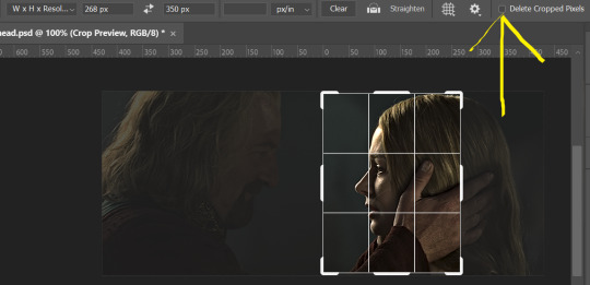
then color as you normally would. if your scene is very different one side to the other, it might be easier for you to color on a wider crop and then either crop again or copy paste your coloring to the smaller crop version. i do that with the 2x6s, but it's usually not that big a deal to color the 2x1s with just the small crop on your canvas at the time. this scene is very symmetrical, both in movement and colors, so i'm good.
now the fun part! once you've got one side how you want it, save/export as you normally would. at this point i also like to make a mental note of how many frames there are.

so i have 49 frames and it's still only ~3MB! this is just an example that i picked from my rotk fancy set, otherwise i probably would have made this gif longer.
then onto the other side, so i ctrl + z my way back to my smart object video timeline. to get to theoden i just drag and drop the smart object 268 pixels over. since this one is in the exact center of the image, it even helpfully guides me (this can get annoying if you are NOT giffing the center of the image fyi, but you can always manually go pixel by pixel too if you need to with your <- -> keyboard buttons. just always remember where you started and count accurately). i can never move around my smart object without hiding the adjustment layers on top of it, so you'll see me do that in this screen recording.
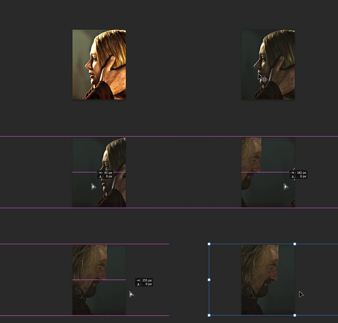
see how it corrected me when i dragged it a few pixels down by accident, and with all those pink guidelines? sometimes photoshop is good 😌
then make sure you still like the coloring, adjust whatever needs to be adjusted, but watch out! don't make any major changes because it still has to match the other side. and export again.

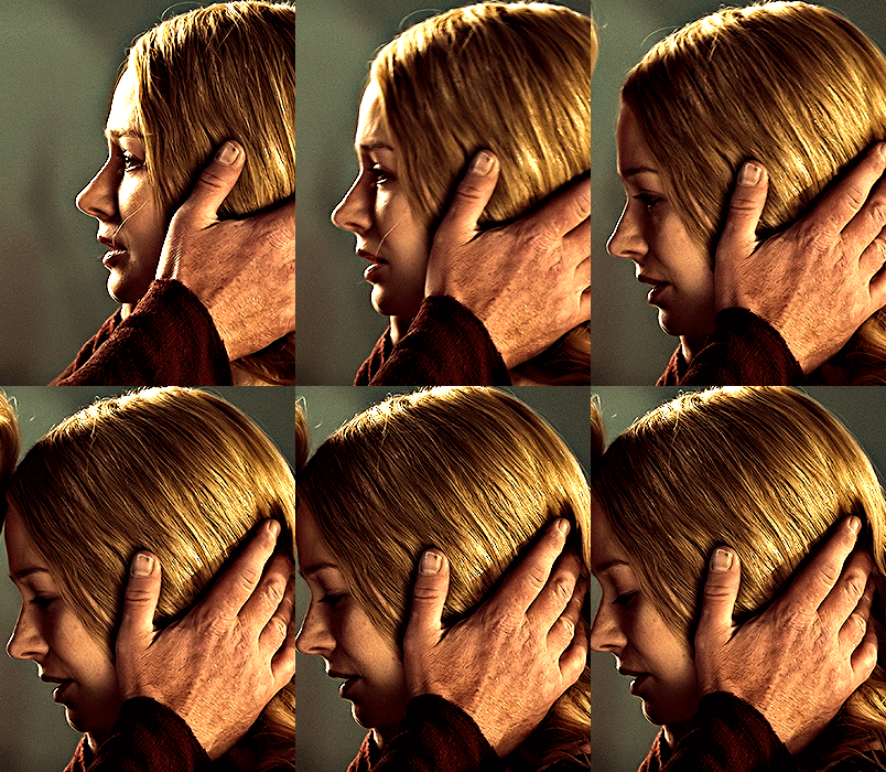
what we perceive as 1 series of frames chopped down the middle is just 2 separate gifs with the same frame rate. when tumblr loads the images, it will run concurrently in the post (even though it never does in the draft post 🙄). and that's it!
COMPLEX SPLIT GIFS
again i'm making up terms, but i call anything with more than 2 components a complex split gifset. i've tweaked some things in the process as i went along, but this is generally how i did the lotr series. these sets are basically just many split gifs with transitions. and here's where endurance becomes a factor :) there's a lot of prep done blind. but if set up well, it will be fairly easy to pull together by the end.
first i decide on my dimensions, using my upper bounds to determine how big i'm going to go. since lotr has very nice large file sizes, i can go pretty big without sacrificing much in quality. i decided on 3 rows of 350 pixel height gifs and it's worked well for me. that means my biggest gif will have a total height of 1050 pixels - fun! you could also do 8 rows, with two 2x2s or just a series of 2x1s that transition to 1x1s. there really is no limit to this except your imagination and source material.
i cap everything i'm going to use before i even open photoshop, then do all of them at once. uncheck delete cropped pixels, then i make my gifs! this is where i spend 90% of the time on this set. every gif should be the size of the smallest 1x1 gif (268x350 for me). i make all 10 into a fully colored, separate psd. (and then i usually go back through all of them a few times to get the colors to match better 😅) for the bigger ones (2x1: 536x350 and 2x6: 536x1050), i just crop them as if they were 1x1 but always thinking about how they will look when big. this gets tricky when i do the big one :) my lazy workaround for that is to basically make it twice: one cropped as it will be and one full size for me to color. then i copy and paste all the coloring layers onto the small one and voila, i know that the coloring in the upper right slice will also look good on the bottom left slice 1050 pixels away because i saw it on the full size version.
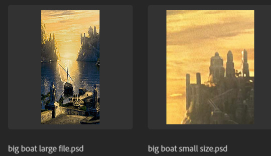
coloring is probably the biggest thing i'm thinking about with this kind of set. the whole idea is that these gifs are using the same colors, more or less, throughout each phase. even with the 1x1s, they're still part of a larger color concept, and they should (🤞) work with each other.

in a pinch, i like to eyedrop a color from one gif and add it as an accent to another. one of my 1x1s had a much more muted color palette originally, but i wanted it to have deeper blues and yellows to complement the 1x1 that would go next to it, so i added some gradients on lower opacity over it, color picked from other gifs i already colored.

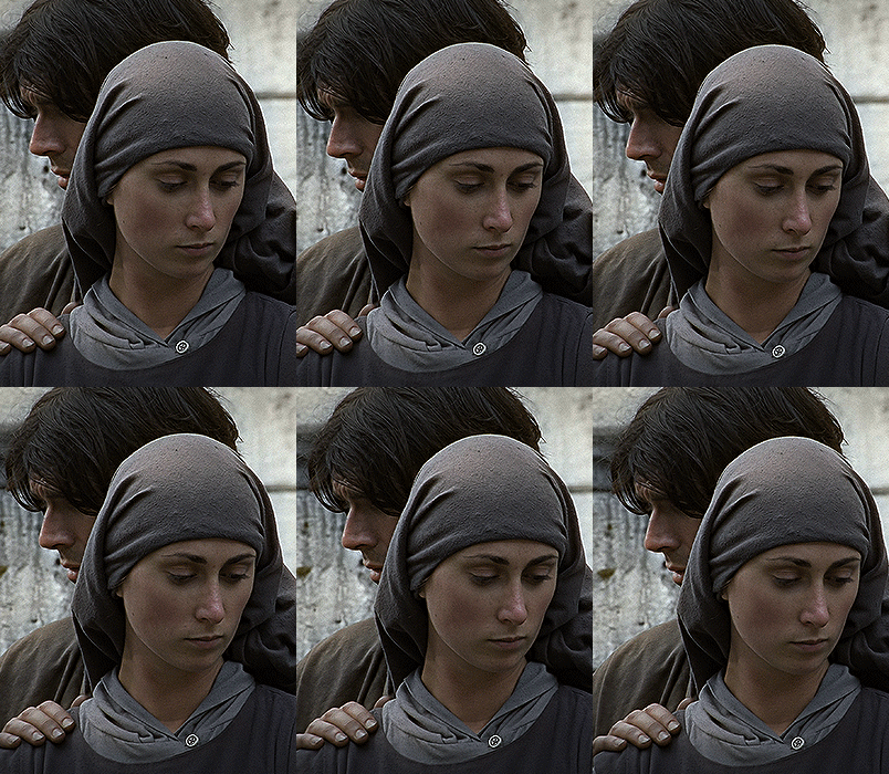
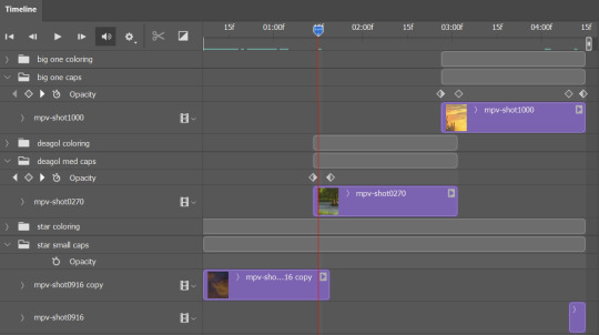
i keep my coloring and the smart object in separate folders to help me in the final step of combining everything, and then i trim everything down to my lowest common denominator of frames. you might think you need to keep frames pretty minimal if you're doing 3 phases with transitions like this, but there's more room to work with on a small gif, in terms of file size. i usually do 30-50 frames for each phase, with the assumption that i'll be adding a transition on each side of each gif that will eat up some frames (i usually do 4-6 frame fade transitions). for the rotk set my final frame count was 129 and i never went over 8MB on a gif, so there's plenty of space play around with things :)
and then, combine! whatever order you start with, you are stuck with (unless you're getting even more complicated, but we won't go into that lol). for these sets i go small 1x1 -> medium 2x1 -> big 2x6. i like to think of it in phases from this point on. small is the first phase, then medium, then big. then i put in the fade transitions, chopping up the first phase gif so the last one will fade into it, restarting the whole cycle seamlessly. i'm just doing a quick and dirty fade here, but here's a tutorial if you want more explanation on transitions.
at this point i save this psd as its position, "top left" or whatever (usually it's a psb by this point too 🥲), just in case i need to go back to it. then i export this first gif and move on to the rest.
it's the same concept as a simple split gif: drag and drop the smart object to the new position, but now there are multiple phases to keep track of. folder organization has been key for me to keep everything straight. i move through the gifs in a backwards S, starting with the top left. but you could go any direction, just gotta stick with it and remember your counts. in my case, i'm always thinking of 268 pixels over and, for the 2x6, 350 up/down. it's a tedious process, but it goes quick (apart from waiting for photoshop to load each time you export).
i did this series as a color concept aesthetic kind of thing, so my theory was by using the same-ish colors throughout, that would save me in the end when it came time to export. there's only 256 colors max to work with on a gif, and that's usually what gets me over the 10MB limit. but as i said, i have never even gotten close to the size limit on this series. it's pretty hard to reach the limit on 268 pixels, but not impossible. (i did run into that on the emma set i did, and that was hell. but also not an impossible fix in the end.)
and that's it! if you try any of this and have trouble, i'm happy to help if i can but mostly this is a "click around and see what works for you" kind of process. and feel free to tag me on your split gifsets :) i love seeing them <3
#*lotrsplit#*#split gifs#gif tutorial#photoshop tutorial#usergif#allresources#chaoticresources#completeresources#photoshop tag
293 notes
·
View notes
Text
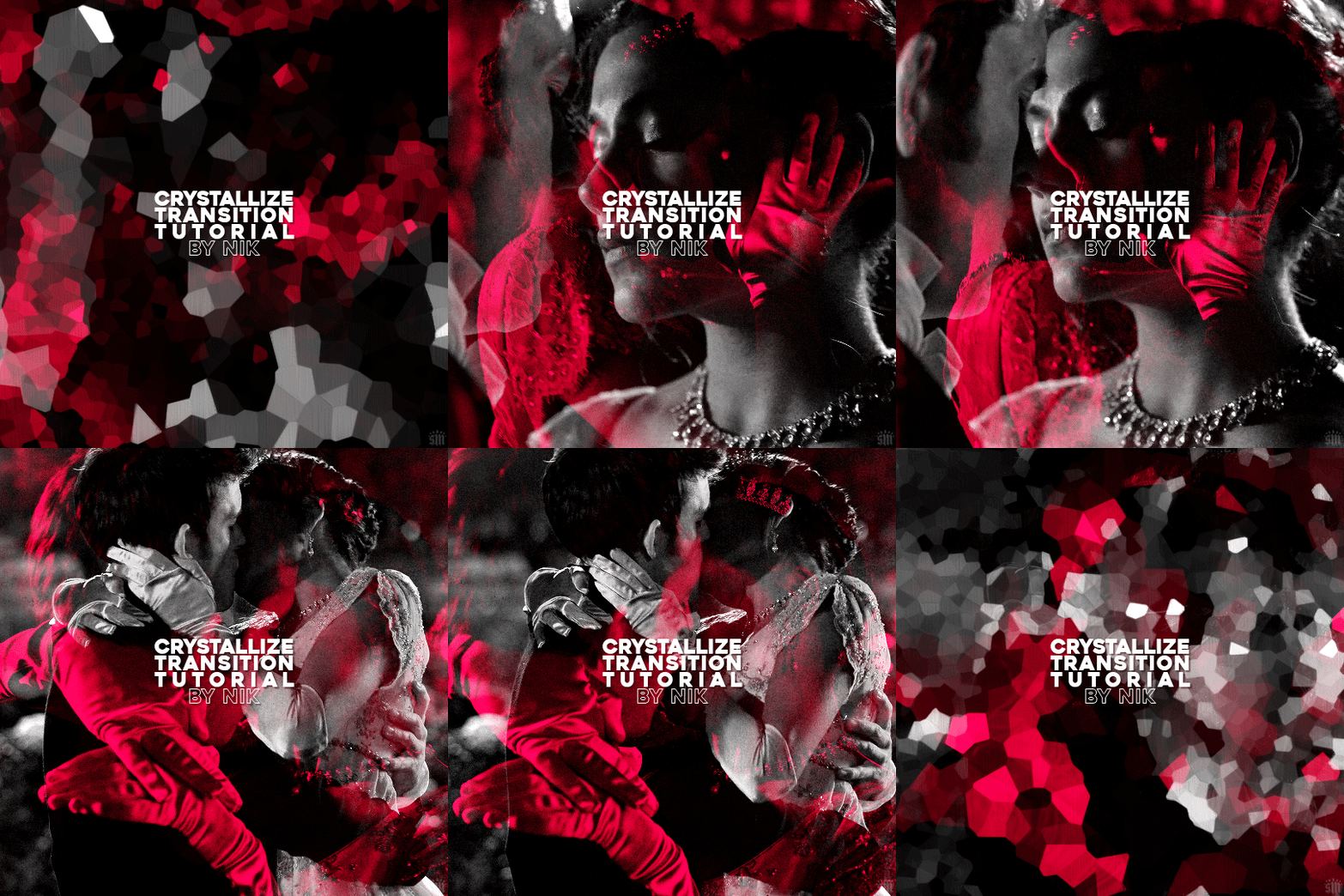
HOW TO: Do A Crystallize Gif Transition
Hi! I was asked to explain how I did the transition effect in this gifset, so here's a quick tutorial! Disclaimer: This tutorial assumes you have an intermediate understanding of gif-making in Photoshop using Video Timeline and requires the use of keyframes.

PHASE 1: THE GIFS
1.1 – Determine how many frames you need. Since you need at least 2 scenes for a transition, consider limiting the amount of frames you'll use per scene. For a transition between 2 scenes that's 540x540px, I would recommend no more than 30 frames per scene (for a final gif that's 60 frames). Even that may be pushing it depending on your coloring. Just be sure to consider the dimensions and colors of your gifs in relation to the amount of frames to keep your final gif under Tumblr's 10MB limit.
1.2 – Import frames, crop, resize, convert to smart object for Video Timeline, color, blend, etc. Do this as you normally would! If you need a tutorial for the basics, here's my tutorial. :) Please note, the methods in this tutorial only work with gifs that are converted into smart objects in the Video Timeline workspace.
Tip A: I recommend using scenes where there's a lot of one color (or scenes where you can manipulate it to look like that). The crystallize filter on a gif creates A LOT of movement that can feel a bit chaotic. Having your gif be primarily one color reduces the eye strain a bit imo.
Tip B: I like how this effect looks with blended scenes because it allows me to use different "crystal" sizes (more on this in Step 2.2). Check out the USERGIF Resource Directory for plenty of blending tutorials!
1.3 – Move all your gifs into one document, group into folders, and arrange. Once everything's in one doc, keep everything organized in a group folder! I have just two scenes, so that's Folder 1 & 2. Within those folders are the gifs I blended, which I labeled by gif color. Then, simply drag Folder 2 so it continues right after Folder 1. (Make sure none of your adjustment layers from Folder 2 accidentally affect Folder 1! You can do this by clipping your adjustment layers to match the length of the gif as I did, or using clipping masks.)
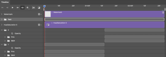
(Ignore that lone Hue/Saturation layer lol. I decided last-minute that I wanted my gif to lean more pink than red.)
PHASE 2: THE FILTERS
2.1 – Duplicate each scene. We're going to use opacity keyframe animations on these duplicated scenes that allow it to go from "normal" to "effect" and vice versa. The filters will only be applied to the duplicates. In the screenshot below, all of my duplicates are highlighted:

2.2 – Apply the Crystallize Filter. Above your sharpening settings, apply this filter by going to Filter → Pixelate → Crystallize. On the pink gifs, I made the crystals bigger (cell size: 45), and on the black and white gifs, I did a cell size of 25.
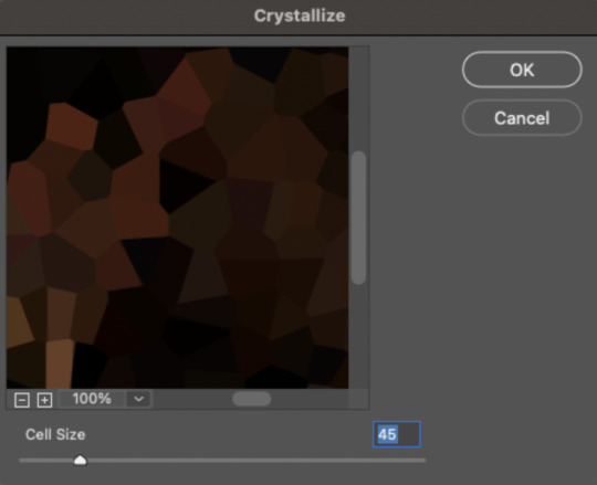
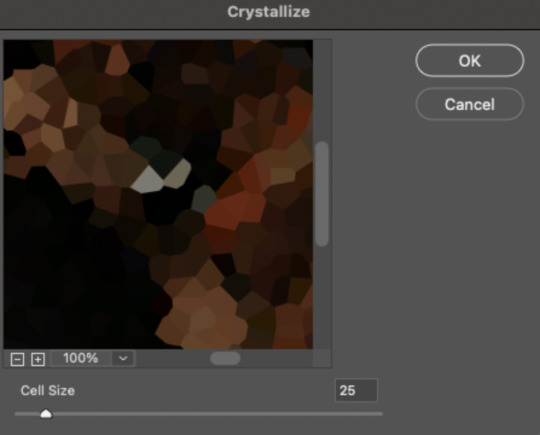
The different sizes help break up the uniformity of the crystals imo, creating more of a mosaic-like look, which is what I wanted to match my gifset concept.
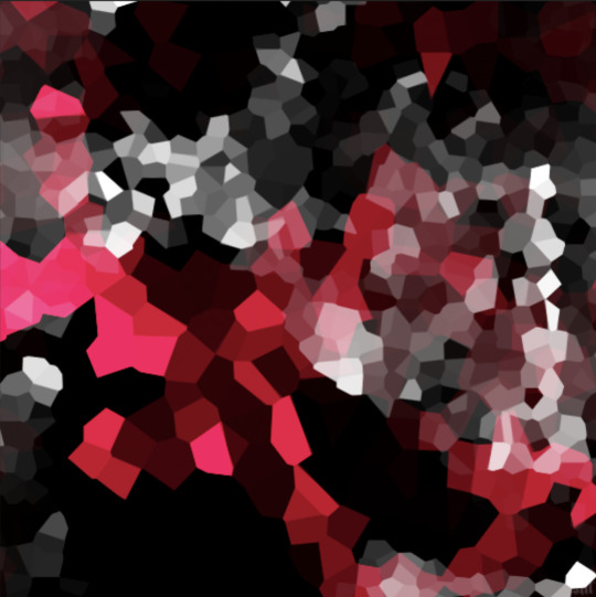
2.3 – Apply the Oil Paint Filter (Optional). Filter > Stylize > Oil Paint. Here are my settings (they're the same for both crystal cell sizes):
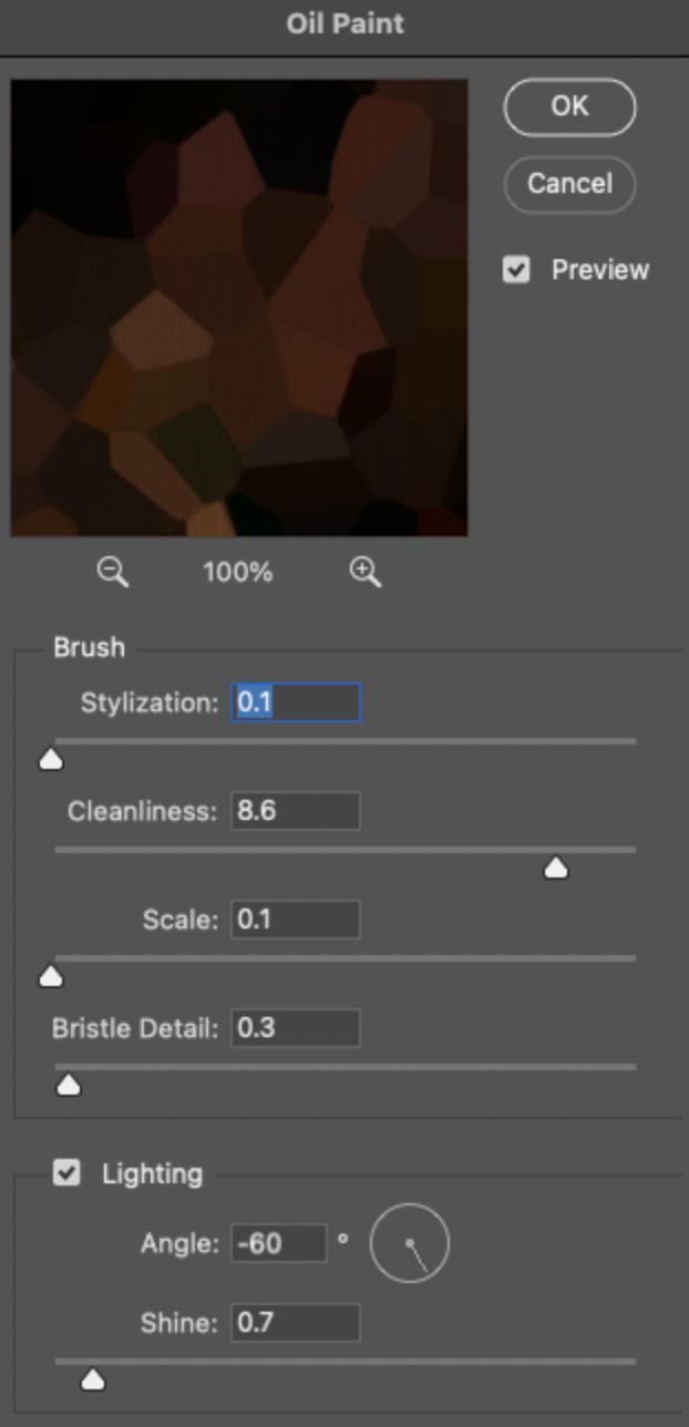
Brush – Stylization: 0.1, Cleanliness: 8.6, Scale: 0.1, Bristle Detail: 0.3 Lighting – Angle: -60, Shine: 0.7
This filter helps soften the cells a bit while adding some texture (left: no oil paint; right: with oil paint):


2.4 – Repeat steps 2.2 & 2.3 on all duplicated scenes.
PHASE 3: THE KEYFRAMES
3.1 – Add opacity keyframes. The very start and end of each scene needs an opacity keyframe set to 100% opacity. Move 0.09 seconds from each of those points, and place another opacity keyframe, this time set to 0% opacity. We're basically making the crystals fade in and out. Please reference the screenshot below for keyframe placement:

If you need more info on opacity keyframes, check out Phase 2 from this fade transition tutorial I did on usergif.
3.2 – Repeat step 3.1 on all duplicated scenes. All the keyframes in Folder 1 should line up exactly and all the keyframes in Folder 2 should line up exactly!
PHASE 4: THE DUPLICATES
4.1 – Convert back to Frame Animation. If you're not sure how to do this, I've written out the steps here. I rec the action linked in my general gif tutorial which I shared earlier!
4.2 – Delete duplicate frames. Whenever you use keyframe animations, you'll get duplicate frames. That's just how it works, unfortunately. If you follow my steps exactly (specifically the 0.09-second spacing, which follows my tried-and-true 0.03-second rule), you'll have a total of 12 duplicate frames exactly — 3 duplicates per keyframe section. Just manually delete them! You can spot the duplicates by eye, but with this spacing, it's usually the 2nd, 5th, and 8th frame for each transition section. The selected frames below were my duplicates:

If you want to learn more about why there are duplicates and the math behind it all, I explained it in more detail in this ask.
4.3 – Export and you're done!

I hope this tutorial helps! Let me know if you have any questions :)
#gif tutorial#completeresources#usershreyu#usernanda#useryoshi#userzaynab#userrobin#usersalty#userhella#alielook#uservivaldi#tuserabbie#useraish#userabs#tuserlucie#mialook#resource*#gfx*
363 notes
·
View notes
Note
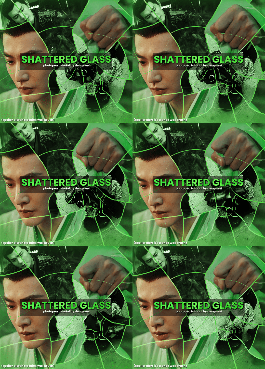
your gifsets are perfect, I'm always in awe of what you can do and you're creativity!!! Could you please explain how you made the broken glass gif with different gif in it on photopea? https://www.tumblr.com/dengswei/754916132337729536/userdramas-creator-bingo-green-asiandramanet?source=share and would it be possible to do something similar with other shapes? Thank you for your lovely creations <33
heyy thanks so much!! and of course! i have to admit the way i do it might be a little bit tedious compared to like everyone else (though i don't know how photoshop users or other photopea users might do it 🤣) okay this is gonna end up being so long because of the way i do it so i'm sorry about that and i hope it makes sense 😭
okay i have to admit i couldn't find the texture i've seen people use for the shattered glass effect so i actually used a photopea default brush from this pack
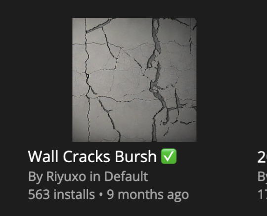
to download the brush set go to window -> plugins -> brush and then search for wall cracks brush (it's literally the only wall related brush set in photopea so it'll show up the moment you download it)
so for the gif i did above i did my giffing the usual way of creating & colouring for different gifs seperatly and then adding them all to one project (it doesn't have to be 4 gifs i just chose 4 because that's what i wanted to show in this gif)
i've done this twice once for this set and another time for this the blood of youth set and i have to say the most important part of this is keep multiple versions of the brush in the position you want as you can so once you've used it to test it out and you like that version keep it because unless you can manage to position the brush in the exact same place every time you're gonna need to reference those (or even use the magic wand tool for it later) and also you need to keep at least a white on black background version for the outline
in the brush pack the one i used was this one: (3564, crack b 9)
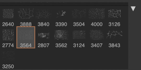
for this part i just say play around with both positioning and sizing of the brush, it automatically opens with the size 3000+ which is fine i think with the tushan jing one (the green gif above) i stuck with that size and just kept clicking around until i got the positioning i wanted (this is another reason why i said what i said in the paragraph above because if the brush size is bigger than 1000 it's doesn't come out in the exact positioning as you expect it too
i decide the positioning of the gifs on the way i like the brick brush looking rather than the other way around, this is the positioning i went with if you're curious & would like to use it if that's easier 🤣
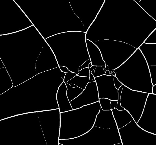
you'll need to keep this as a seperate layer at the top, i had it set to screen and then added a colour fill layer clipped on later so that i had the outline for when i was masking
so to start off i have the base gif which i do nothing to, that stays as it is, with the brush layer above set to screen
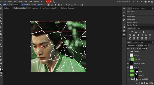
next is where you want to position your other gifs it may benefit to figure this out all at first before doing any of the masking so you know which parts you want to erase and which parts you want to keep
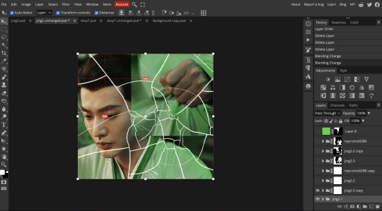
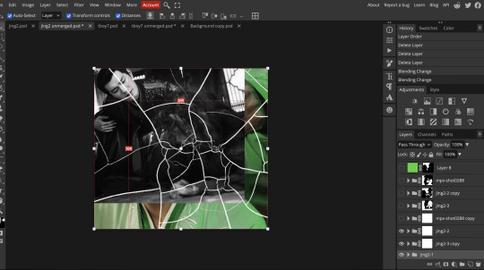
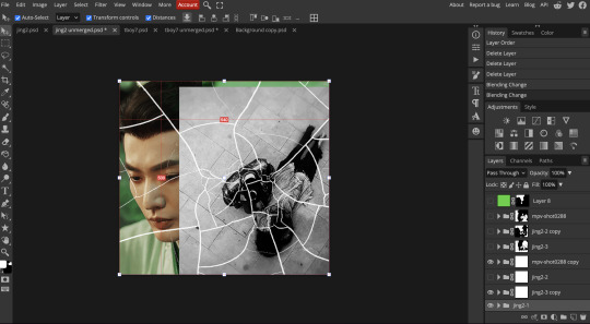
so this is what i decided with my positioning looking at where each of the cracks are
now comes the tedious part, in some ways the way i do this is a lot similar to how i do grid but it's not as easy (for grid photopea automatically locks onto the squares making it easier to mask, here you have to do it all manually)
first put a raster mask on all of the other gifs except for the base gif & use the magic wand tool on the brush layer so you get the outline of the brush and you mask that away from your gif (so if you turned off the brush layer it should look a little something like this: (it's not perfect but it won't matter that much because you should have the original turned on at the end anyway) (you don't have to do this step tbh i just did it because i thought it looked better)
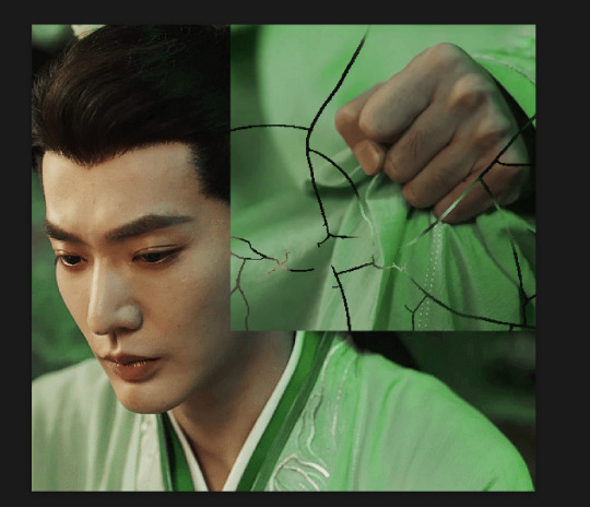
so with the brush layer turned on you can use that as a template to which parts of the cracks you want to erase, you can either use the magic wand or the paint brush tool it really depends on how much of a perfectionist you are and whether or not the sharp edges bother you (plus some of the cracks have small openings so it might erase another part you don't want if you use the magic wand tool so it really is another instance of playing around and seeing what you like, and it might also change once you add the other gifs too)
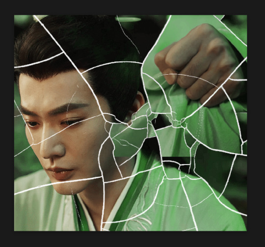
so this is how it looks after i've done that (notice in the middle you can still see the edge of the gif? that won't matter because one of the other 2 gifs i still have yet to mask will cover that) & just repeat the same thing for the other gifs you want to add
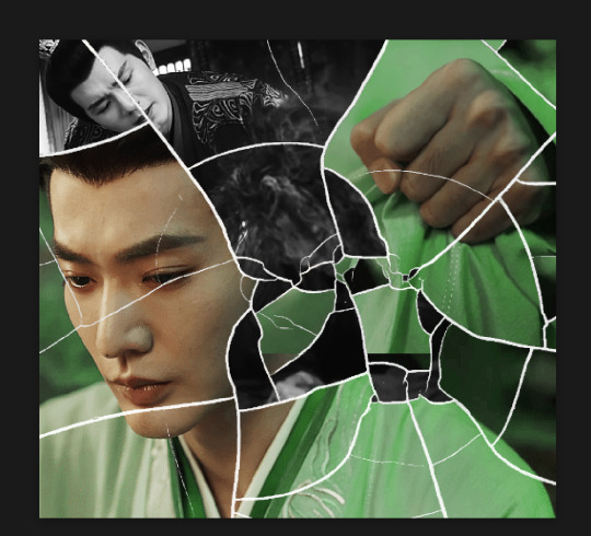
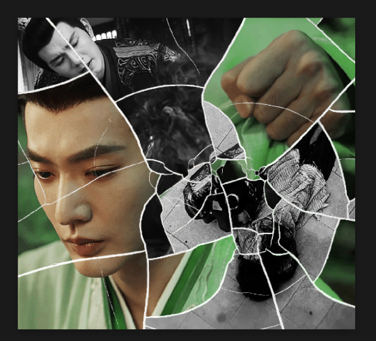
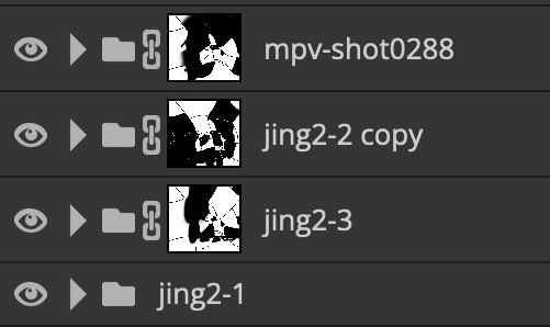
this is how my masking folders look if you're curious
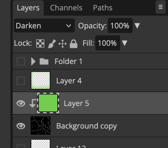
& last but not least i added a green colour fill layer clipped to the brush layer and set that to darken to get the green effect (make sure that the brush layer is still set to screen)
& once you've merged all of the gifs together you should get your desired outcome like the gif above (make sure that all the gifs have the same amount of frames too)
when it comes to other shapes i'm sure you can! like i did a tutorial with the grid version here, i guess it'll just be a lot of trial and error & finding a texture or brush with different shapes to try it out with kinda like how i did with both versions of this (i definitely did it a lot better this time around compared to the first version i did of this)
hopefully this wasn't too long or too confusing, if anything is please feel free to ask me again and i'll try and explain it a little better 🤣
#replies#Anonymous#photopeablr#usergif#tutorials#photopea tutorials#completeresources#mine | tutorials#gif tutorial#photopea#resources#gif resources#gifmakerresource#photopea tutorial#tutorial#gif tutorials
94 notes
·
View notes
Note
are you making those gifs just from the yt shorts/ig reels of I AM STILL that they are posting? it doesn't even look like it bc the quality of the gifs is so good D:
If you want to talk about quality you've come to the right person! LAKSKSALKS everyone loves high quality files but sometimes I do crazy things for files that not even my friends can do. such as my paid weverse files. I always want the original quality and with screen record we don't have that, so I literally gave my email and password to someone on a forum so they can download my files from my weverse account in the original quality. this person just said "hi, I know how to download paid files from weverse using codes, do you want me to do it for you?" and I, who don't know this person, said "omg please, thank you so much for doing this for me". 😅😭 also download torrent files from suspicious websites. the list is long LKASKLAKSAS but I can give you some tips on how to always find good quality files, at least files that are free or easier to find.
try to join in exclusive forums like kpop24hrs or a harder like jpopsuki and avistaz. I had an account on jpopsuki, but maintaining an account there is very hard for me, I am someone who doesn't keep files saved on my laptop. there is a forum called "torrent invites" where some people go there and offer invitations or even exclusive forum accounts. I got a jpopsuki invitation account for a friend there. check torrent invites forum if you want an invitation to another forum! now youtube videos. to download youtube videos I use 4k video downloader. but before downloading the videos you can also try to change the format of the video to see if the quality changes too. sometimes videos in mkv format have better quality, so it's always good to check if the quality changes.
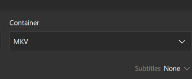
I always do that on bangtantv like bangtanbomb or the episodes videos which most of the time are always only uploaded on youtube. BUT we have some videos that are not only uploaded on yt but also on instagram and tiktok~~~~ and this is where we win heheheh~~ if a video is uploaded on these three platforms ALWAYS download it from tiktok. 99% of the time, videos on tiktok have a thousand times better quality than those on youtube and instagram. or you can also download the video on these three platforms so you can compare and see which quality is better, but I'm sure that tiktok's quality will always be the best. here's an amazing example, jin video that I giffed earlier.
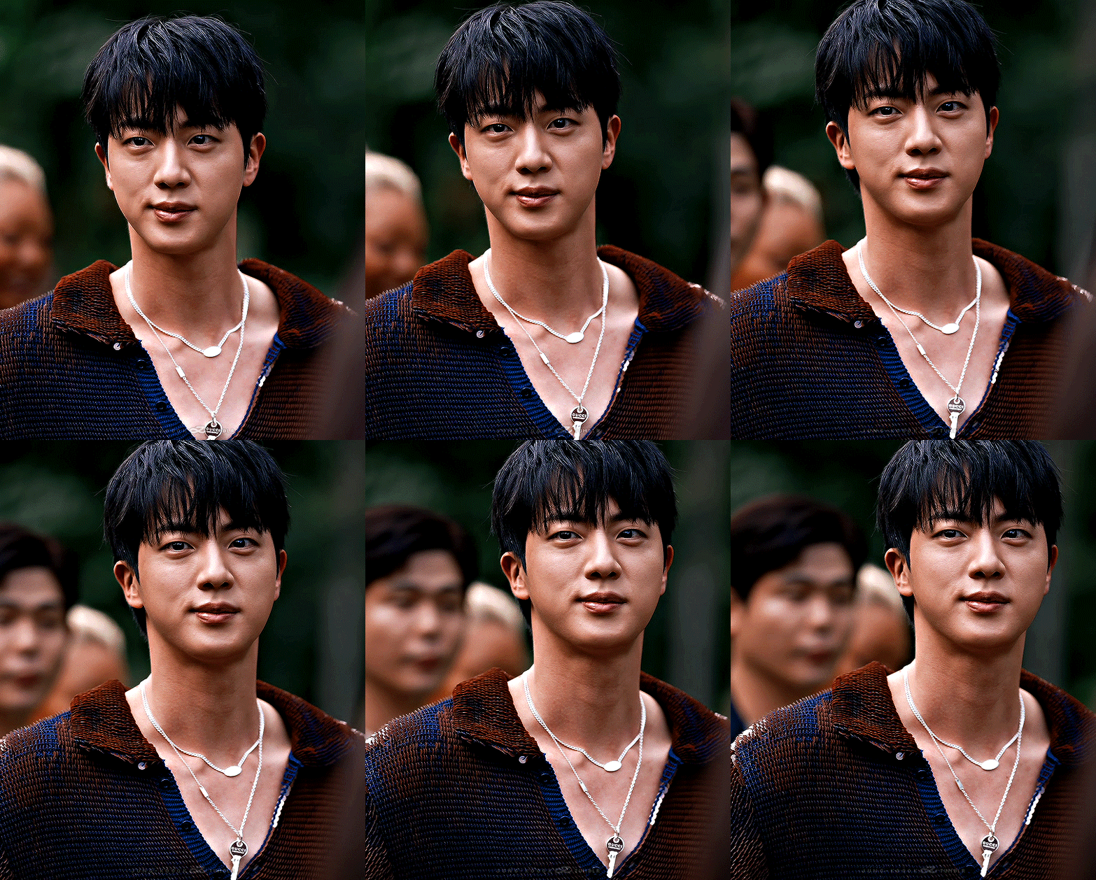
first i only saw people sharing the instagram link but i went and searched if the instagram account also had a tiktok account and BAM they did 🥹 I downloaded the video from instagram and the quality was poor:

but when i download the tiktok video the quality was:

damn... this is sexy🫦
when instagram doesn't always make videos available in 1080p, most videos on tiktok are 1080p. just go and search "where to download instagram videos online" "where to download tiktok videos online" and open a website that does that and that's it.
another example, my tae and jeongguk recent gifset that you talk about here in this ask.
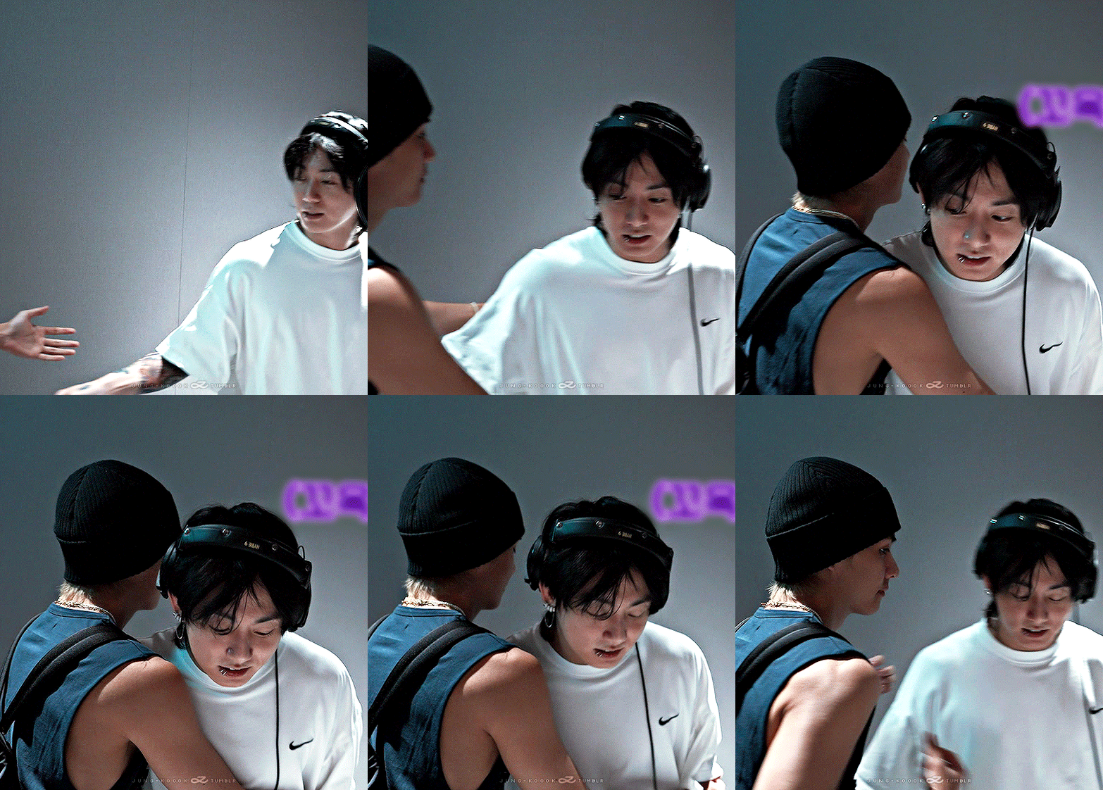
the quality of the video uploaded on youtube and instagram is very similar.
yt:

instagram:

but look how the quality is a thousand times better on tiktok:

🥹🥹🥹🥹🥹 so beautiful that I almost got emotional LAKSKASKASKA
my advice is to always look for other platforms they may have uploaded the files to! like for example jeongguk vogue photoshoot. many people thought that the videos were only uploaded on twitter and instagram but no, they were also uploaded on facebook! always look for accounts on facebook as well. but facebook is weird… from what I understand they won't upload all the quality at the same time so sometimes it takes a while for a video to be in 1080p there. another thing, sometimes they will also change the quality lol. for example, when I downloaded jeongguk photoshoot there the highest quality available was 2k but now it only has 1080p.


now:
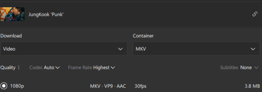
😭😭😭😭😭😭
now torrent files~ I don't recommend the websites I download my files from because I'm not sure they are trustworthy but as I have a good program to protect my laptop so I feel safer lakskas. for torrent files I use eztvx, kpkuang, 1lou. "are you sure" files I had to search for jung kook or jimin to find the files on some of these websites.
and now free websites where we can download high quality bangtan files are namuspromised, sharemania, soowoozoooo and ouranxingg.
there are others but I feel like these are the ones who always share high quality files.
this was me trying to explain to you guys how to always find high quality files with my bad english LAKSKSKASK I just love helping people find good quality files ♡
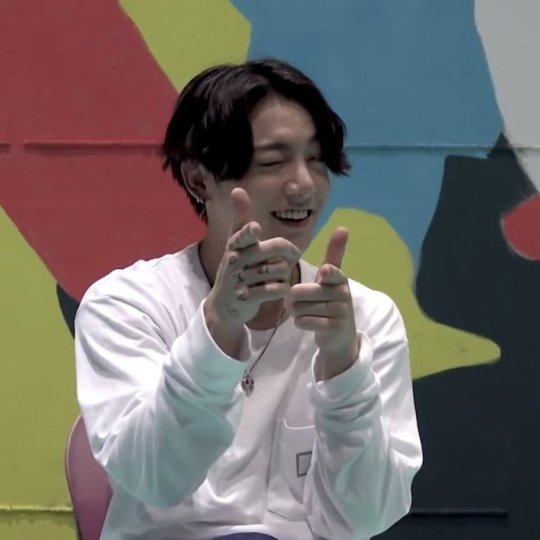
EDIT: I forgot to talk about vimeo but @galatariel reminded me of them too ♡ many photoshoot are uploaded there with high quality so also check vimeo when a photoshoot comes out! I downloaded most of my recent tae photoshoot there~
86 notes
·
View notes
Text
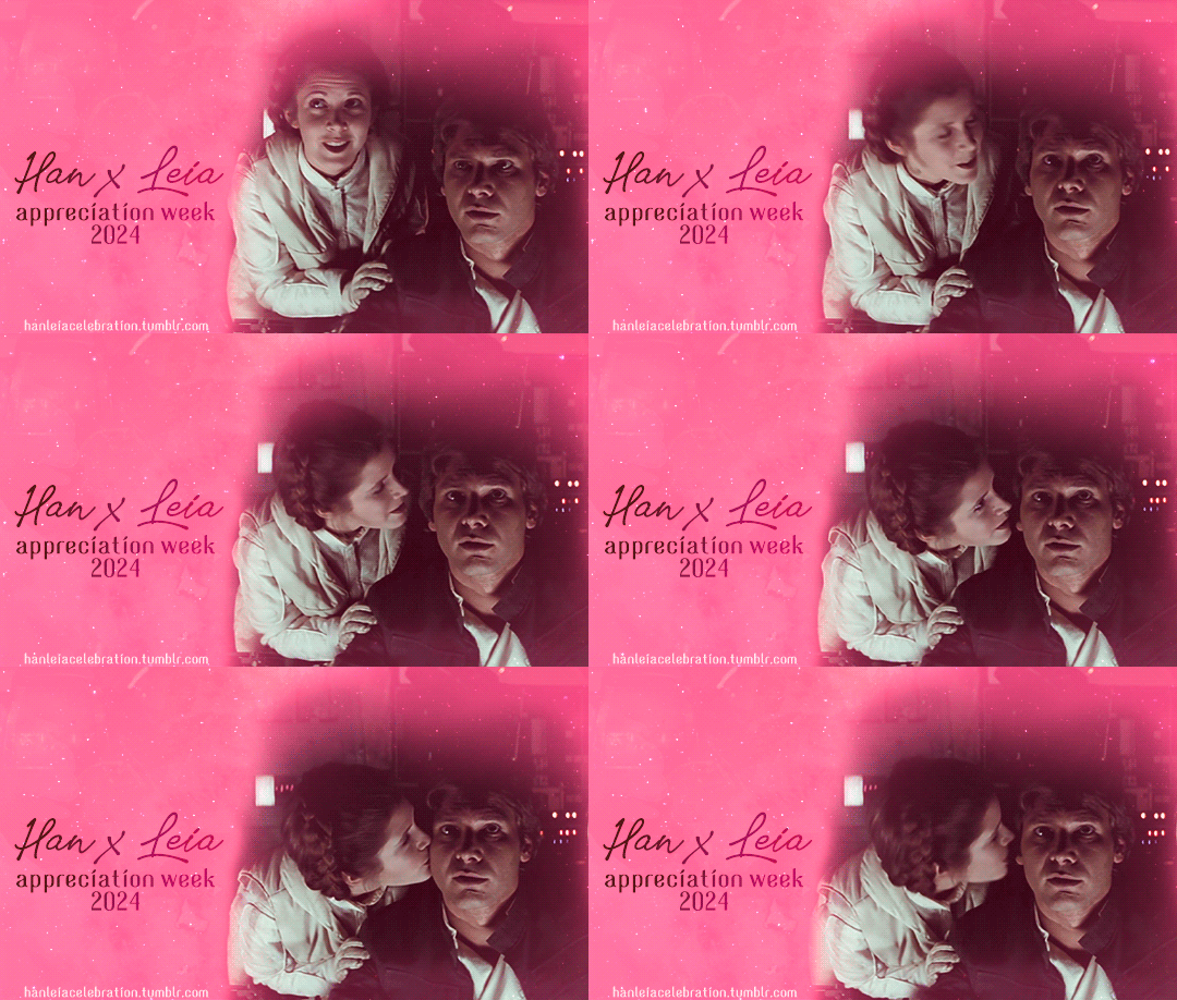
Han/Leia Appreciation Week 2024
WE'RE BACK, BABY! "Wait, what's happening, wasn't this in August??" you might wonder. Based on your feedback, we decided to host this and (probably) future editions of Han/Leia Appreciation Week earlier in the year. July seemed like the better choice, given that it's a vacation period in both hemispheres!
This year we're also giving you the prompts over a month in advance, so you have plenty of time to plan and create!
Han/Leia Appreciation Week was an event originally hosted at @han-leia-solo between 2016-2019, but for the past three years, we've taken up the mantle here at @hanleiacelebration 😊
💖 How does Han/Leia Appreciation Week work?
The event will run from July 14th to July 20th, and there will be two different prompts each day that creators can fulfill with: fanfic, fanart, gifsets, graphics, fanvids, headcanons, crafts, playlists, rec lists. You’re encouraged to tag your posts with #hanleiaweek2024 so we can reblog them! After the week is over, we’ll share a masterlist with links to the works.
You can show your appreciation in many ways; however, please keep in mind that it has to be a creation of yours of some sort, e.g. don’t repost other people’s fanart, gifs, or unedited pictures. Rec lists should include a link to the original source both for fanfic and fanart (more on this after the cut).
🎆 The prompts
Sunday 7/14: Tradition / Ceremony
Monday 7/15: Braids & Bloodstripes (hair or clothing) / Home planet
Tuesday 7/16: AU / Canon divergence
Wednesday 7/17: Force / Belief
Thursday 7/18: Favorite scene / Favorite quote
Friday 7/19: Meeting / Escape
Saturday 7/20: Free day!
You can use only one of the daily prompts, combine both, reinterpret them, or skip the day if you can’t think of anything. If you’re not able to post on the same day for a prompt, you’re still encouraged to share it through the week—just don’t post works for a certain prompt before the day corresponding to that prompt.
💠 💠 💠
FAQs and Rules under the cut - please read!
💕 Can I post my work to another site and share the link on Tumblr?
Yes! This is a good option for people who might want to create explicit art that could be taken down on Tumblr, write a long fic or multichapter, or make videos or playlists.
💕 Does it have to be a new creation? Can I finish and post a WIP?
It has to be something that has never been posted anywhere else before, so finishing and sharing a WIP is okay! If it doesn’t fit any of the prompts, you can share it on Free Day.
💕 Is this event open to all ratings?
Yes! Just remember to use a “Read more” cut if you’re posting the whole work on Tumblr, and to add a note at the top if your work is rated Mature or Explicit, as well as if it has any major trigger warnings, so all folks can safely browse through the entries.
💕 Are there any length or quality requirements?
There’s no min. or max. length for fanfic or quality level for art, but please note that AI-generated works won’t be accepted. For gifsets, there’s a minimum of two gifs (that must be made by you!). For playlists, there’s a minimum of five songs. For rec lists of fic or fanart, there’s also a minimum of five recs. Some more questions you might have about rec lists:
- How do I share someone else’s art without posting a picture? You might post a thumbnail that crops a preview of the piece; if the piece has a title, you might use that; you might describe it; or you might say something like “this piece by [artist]”, and link to the source.
- What if I found a fanart on Google? Try to find the original source using reverse search image.
- What if I can’t still find it, can I just say “credit to the artist”? In that case, please just don’t share the piece.
- What if I know the artist but don’t have a link to the original source? Naming the artist and linking back to where you found it is okay, in that case.
💕 Can I write for canon/Legends and include other pairings?
All canons, time periods, headcanons and AUs are welcome, and you’re allowed to include side pairings, except for R*eylo. However, keep in mind that this is a Han/Leia appreciation week - at the risk of sounding repetitive, works should focus on appreciating Han and Leia’s relationship!
💕 What’s the time zone for the event?
Please don’t worry too much about time zones: when we say “day”, we always mean “whenever that day is for you in your part of the world”. IE: if it’s Monday for you, you can post your work for the Monday prompt.
💠 💠 💠
Do you have any other questions? Don’t hesitate to send us an ask or to message one of the mods: @lajulie24 @hanorganaas and @otterandterrier
We can’t wait to see what you all create!
#hanleia#hanleiaweek2024#han x leia#han solo#leia organa#star wars events#swfandomevents#swedit#swcreators#mod post
113 notes
·
View notes
Note
Hey!! I just wanted to say that your recent speak now gif set is sooo stunning. I was wondering how you managed to create that cassette tape effect if it isn’t any trouble? It’s really so pretty.
Have a great day! ✨
ahhh thank you so so much! first of all, i cannot take any credit for this effect, as it was greatly inspired by this amazing yellowjacket gifset by @thewintersoldier!!
but here's how i recreated the effect, from a cassette png (found on pngwing here), to this animated cassette effect (as seen in my speak now set):
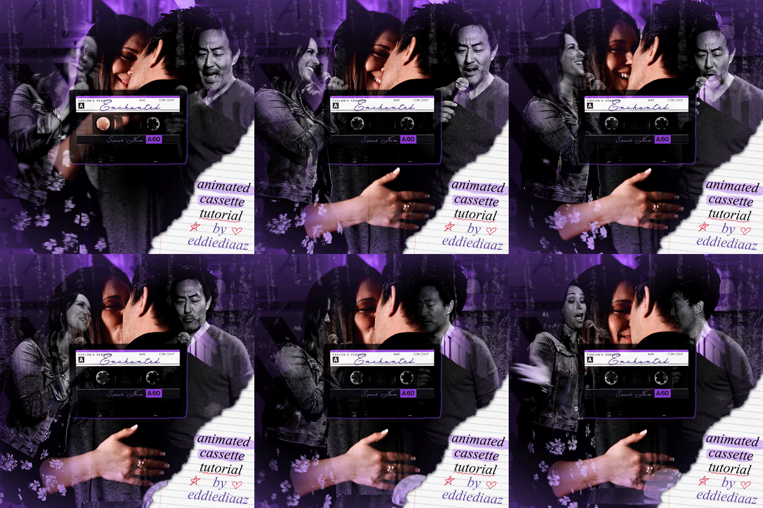
psst: i usually always create in photoshop cs5, but for this effect you need a recent version of photoshop because it's using transform keyframes (i think cs5 doesn't let you do that, or i just don't know how to lol). i used cc 2019 for this.
sorry if this is lengthy or has too much or too little details haha, but i hope it's comprehensible! english is not my first language so i also apologize in advance for any mistakes!
I. PREPARING THE CASSETTE
so, starting with the png here:
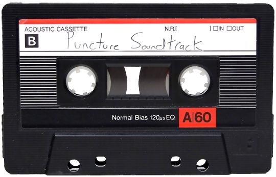
i removing everything i didn't want on the cassette png with the brush tool by just drawing the right color over the unwanted text. for the color, i then went to image > adjustments > hue/saturation and in the red tab, i played with the hue slider to get that purple color. finally, i added some text to my liking, and this is what i ended up with:
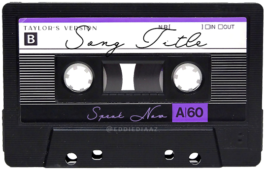
(not necessary but: i also selected the white lines on each side with the magic wand tool because i wanted these lines to be transparent. once your selection is done, go right click > layer via cut. it will create a new layer of the cutout you just made. you just need to disable or delete the layer to make the selection (lines) transparent.)
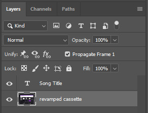
at this point you want to have only 2 layers: the revamped cassette and the text layer. you can remove the text layer actually, and just add the title back at the end, as it is not necessary for this effect. i just like to have the visual.
if you have multiple layers, you need to select all of them (except the song title layer), right click on the png layer and click on merge layers. this will create one layer with all the editing you made on the cassette. if you think you will need to edit this later though, i would save the file as a psd before merging the layers.
II. THE EFFECT
okay, so now that you have your cassette, make sure your video timeline is activated, not frame animation, and you are ready to go.
first, you want to create a perfect circle shape around one of the reel with the elliptical marquee tool (hold shift while dragging the circle). make sure it covers the entire area that will later be rotated. make sure this circle is perfectly centered around the reel or otherwise the animation will be a bit lopsided.
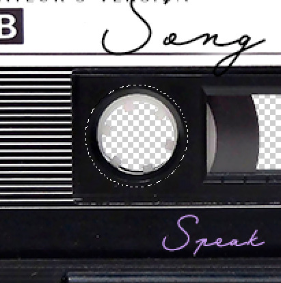
then right click on this selection and go "layer via copy". this will create a layer of only that circle selection. important step: right click on that new layer and go "convert to smart object". the layer should look like that, i've renamed mine:
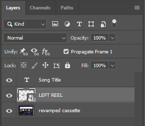
now if you go to your timeline and open that new smart object layer, you will see that you have 3 keyframe options. we only need the transform one.

go to the start of the timeline and activate the transform animation by clicking on the stopwatch button. a keyframe will be created automatically.
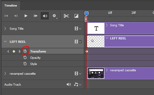
to create the actual animation, move the position of the cursor on the timeline further, i put mine at the 01:00f mark so it's easier to create the right timing.
then what you want to do is select the reel smart object layer and hit ctrl + T. a box will appear and this is how you will make the reel rotate.
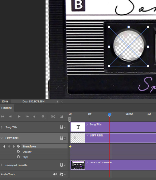
to rotate the reel shape, move your cursor near the blue box on your canvas and drag it until you have rotated the shape halfway through and hit enter. another keyframe will be created and if you play your animation, the reel should rotate on itself for half a turn

move your position on the timeline to 02:00f and do the same thing: select the left reel smart object, hit ctrl + T, rotate for another half turn, and hit enter. this third keyframe should be the last one needed for the animation and you should have a full animated rotation of the reel.
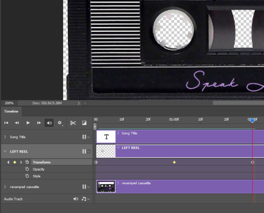
play your animation, and adjust the speed to your liking by dragging the keyframes on the timeline (but make sure they stay within the same distance from each other). the closer the keyframes are, the faster the animation are, and the further they are, the slower it'll be.
then you can just trim the smart object to your animation's length, and duplicate (right click the smart object > duplicate layer) this layer the amount of times needed (i find this less finicky than duplicating keyframes), and placing them one after the other. three full turns should be enough. this is what my timeline looks like right now:
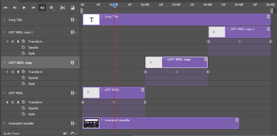
and my animation for the left side looks like this:
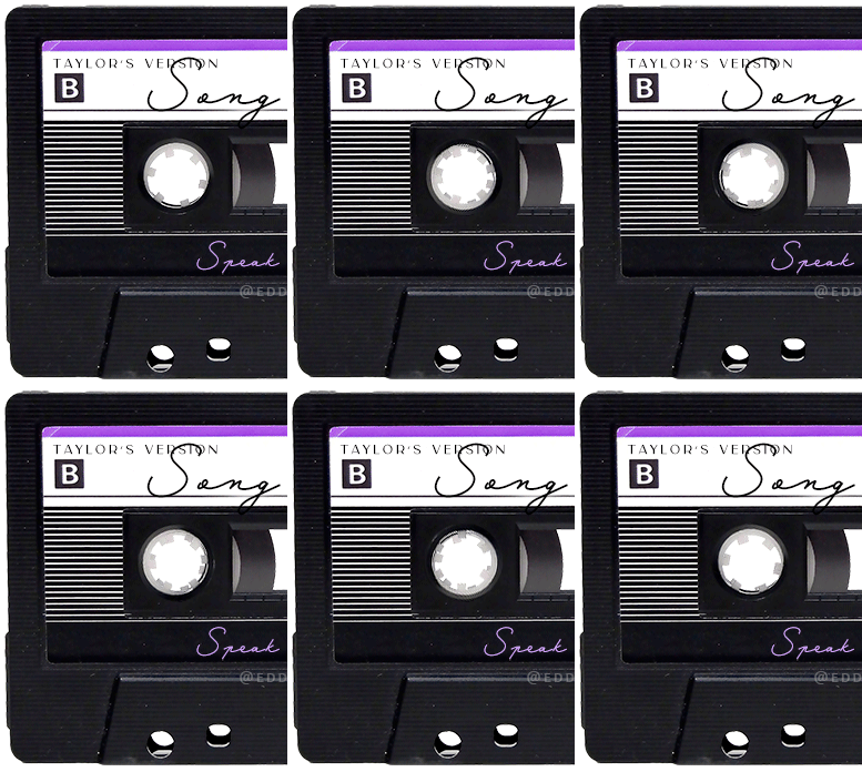
as you can see, we can see the little "dents" peeking through behind the animation. we don't want that! to remove it, select the revamped cassette layer (that should be under the reel smart object), and create another perfect circle around it with the marquee tool. this time make sure it's smaller than the previous one, it just needs to cover these dents.
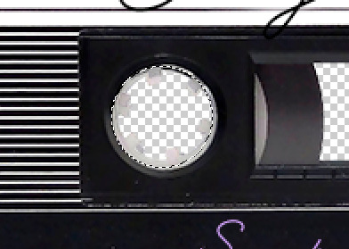
then right click on this selection on your canvas and go "layer via cut". this will create a new layer with that selection, and all you need to do is to disable it. this is removing the information in that circle.
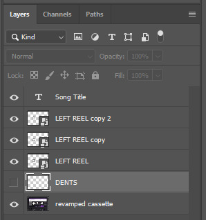
once you are happy and the animation works, you can just delete that cut layer. now the animation is done and looks like this:

III. SECOND ANIMATION
one you have done it on the left side, you just gotta do the same thing on the right side. you can also try duplicating it, but i found it finicky for some reason (or maybe i'm just not used to the controls of this 2019 photoshop version?).
this is what i have once i've done the same thing on the right reel:
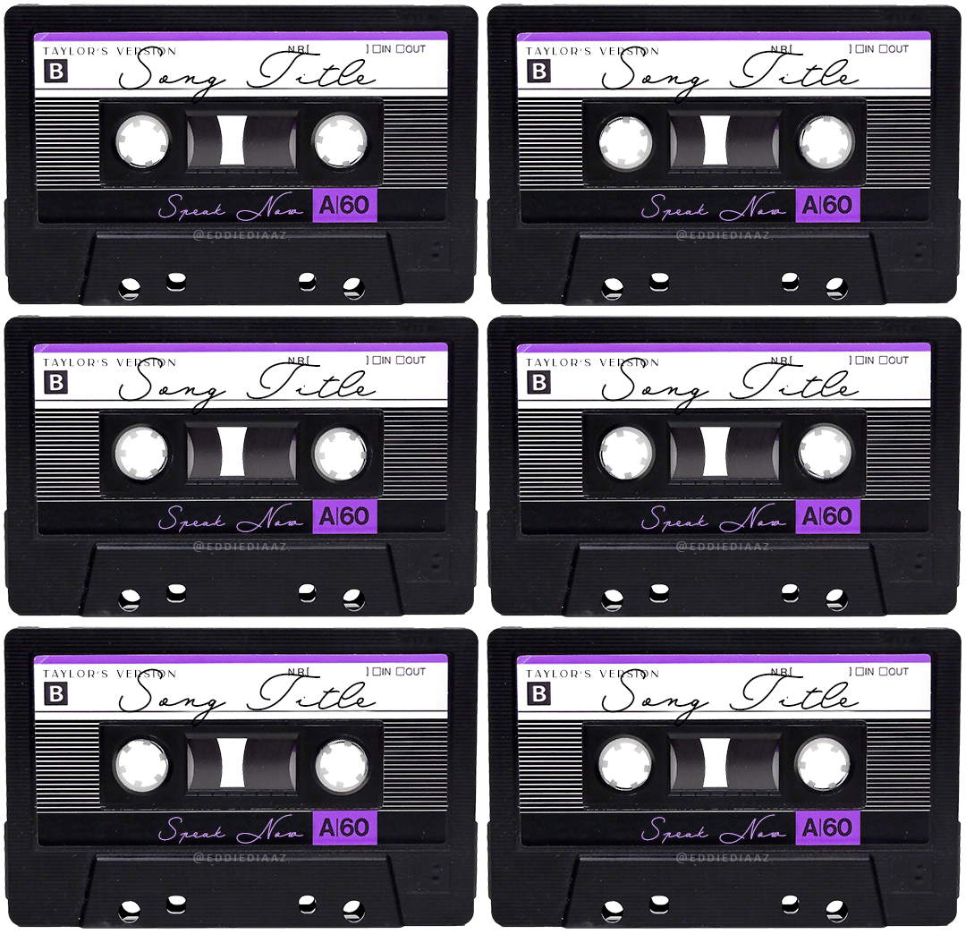
once i am happy with the speed and everything, i want to have only one layer so it's easier to use on gifs. first, i will save this animation as a psd file, in case i want to reuse it. then i am removing the song title layer and will be flattening everything and creating frames from this animation. to do so i am using the "save" action from here.
i'm not sure why it does that, but it's creating a couple of frames where the reels are a bit offset from their position everytime there's a full circle done, so i just delete these 5-6 frames. you can also change the speed here, but by default it should be 0.05.
once you are happy with it, just turn these frames into a smart object with the video timeline again (convert frame animation to video timeline and select all the frame layers > right click > convert to smart object)
now you have a smart object that is ready to be used anywhere!
IV. FINAL TOUCHES
for my particular speak now gifset, i have multiple layers of the animated cassette on each gif:
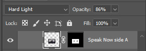
1, bottom one - cassette layer set to the blending mode "hard light" and set to opacity 86%:
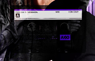
2, middle - this same cassette layer set to hard light, but with the opacity at 100%, AND with a layer mask so it's only applied to the animated reels (i wanted them to show up more):

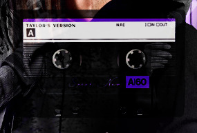
3, top one - and finally a third layer with another layer mask because i wanted the white label and speak now area to be less see through. it's set to the normal blending mode and the opacity is at 75%


and then i just added the song title on top at 100% opacity and normal blending mode, and added some drop shadows, and tada!
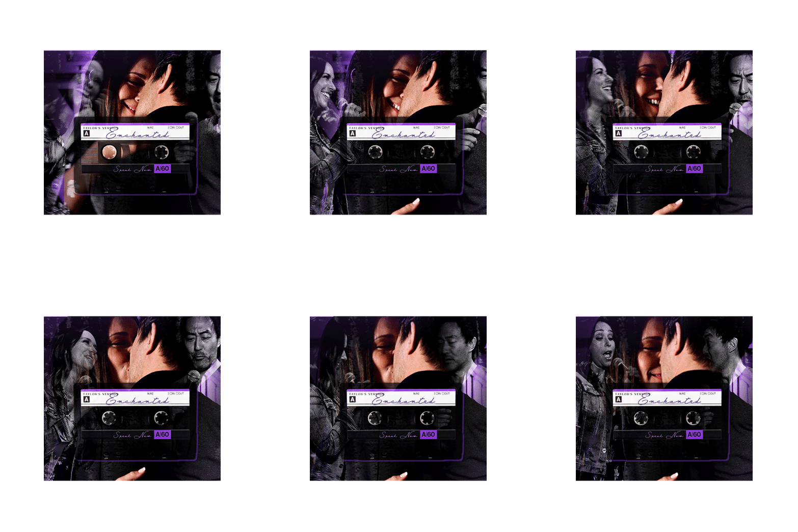
there we have it, i hope this was helpful <3
#alie replies#Anonymous#photoshop#tutorial#*ps help#completeresources#allresources#resourcemarket#userrobin#userraffa#userpjo#usertreena#tuservaleria#tuserheidi#userdean#userrainbow#usersalty#userzaynab#usernik#swearphil
404 notes
·
View notes
Text
This man is so normal about Varadha (Deva and his possessive madness.)
Thinking about Deva's lines that's mostly "DON'T TOUCH VARADHA" how could anyone watch Salaar and think they are just friends when Deva showed this level of possessiveness. No straight man would this offended over another man getting touched by anyone ever.


(Please anyone even if you haven't seen this movie and see this gifset, do you think this is hetero lines? I need to know.)
He did warned Naarang like 4 times not to touch Varadha,


Which is in itself kinda an insane line to repeat that many times, with all kind of begging gesture. I mean he could have said other kind of variation like "don't hurt him," "don't kill him," "don't hit him," or just anything like the usual lines I often heard when someone pleading for the safety of others, but nope, Deva was clear with what he wanted, he didn't want anyone touching Varadha, not even a touch, more over to harm him.


When people didn't want to hear his kind request, what did he do? He lashed out, he became someone who was uncontrollable n only unreasonable rage left in his veins when prople crossed that simple condition, I mean just look at the way he just broke that chain and his eyes basically bulked out from anger like he could literally torch the entire court room just with the fury flame in his eyes.


What's interesting to me is the way Varadha also got the end of his anger about this (even though later he said sorry for lashing out toward Varadha) but almost like "Varadha, don't let anyone ever touch you" . The literal madness of possessive display, even Varadha himself, he forbid him from letting anyone to touch him.
It's crazy gosh the way he raised his voice that echoed to the entire prison even Bilal, rinda, and basically everyone else also could hear it, almost like it's also a warning to them "NO ONE SHOULD TOUCH Varadha di you hear me?!", everyone else should understand this line that Deva had drawn, Varadha is not to be touched by anyone else and they all should make sure of it if they didn't also want to get the taste of his wrath the way Naarang had suffered.
If I was Varadha, I would have shivered to my core lmao either you run so far away from this kind of man that hold a big sign of redflag possessiveness, but perhaps because Varadha is just like Deva, he, himself, is crazy, he perhaps even loves this part of Deva the most who is so obsessed with him and basked in this level of madness display gladly.


Even when Deva was just a little boy, that idea of no one should touch Varadha had gnawed it's way to his brain, he perhaps didn't know how it happened, but it's almost like part of him, the reason that he lives is to protect Varadha, even from himself.
So I counted it like a total of 11 times that Deva said don't touch Varadha lines
It's really too many right? I don't think even other heroes got to show their possessiveness this strong, this many times on screen, with this really undeniable lines to show how much you care about this person.
It feels like in The Princess Bride movie somehow when Deva says "No one should touch you" the way Westley said "As you wish" but unlike Buttercup, Varadha still doesn’t perhaps have a clear clue that it means "I love you" just the same, the fact that Deva keeps saying it over and over again like he was trying to get the message across, because often times the word love is too heavy on the tongue to say it blatantly, men really do try to find any other way to avoid saying love lol either through action or say it differently but they literally mean the same thing.
Sometime I wonder if Varadha ever try to let anyone other than Deva to touch him intimately but literally couldn't continue any further because Deva's possessiveness ringing in his ears like a warning "no one should touch you.", Varadha who subconsciously thinks that all of him belongs to Deva and he should have asked his permission first even if he wanted to let other people touch him, which Varadha himself knew that the answer is No, Deva is not going to allow it, so he stop and think of Deva and just want him to be near him and hold him and possessed him the way he wanted to, body and soul.
#salaar#varadeva#this is all legit line in the movie#ghayyyy#desi lgbt#desi lgbtq movie#legit#prabhas#prithviraj sukumaran#my special thanks to Malayalam subtitles for the MY Varadha part lmao#videsh anand#happy birthday little deva
92 notes
·
View notes
Note
do you have a coloring tutorial? your gifs are so nice and vibrant, how do you do it? :)
hi, here's a simple basic coloring tutorial that I use pretty much for all of my gifsets:

I won't get into the basics of making a gif as this is just a coloring tutorial, but here is my gif after I just crop and resize it:
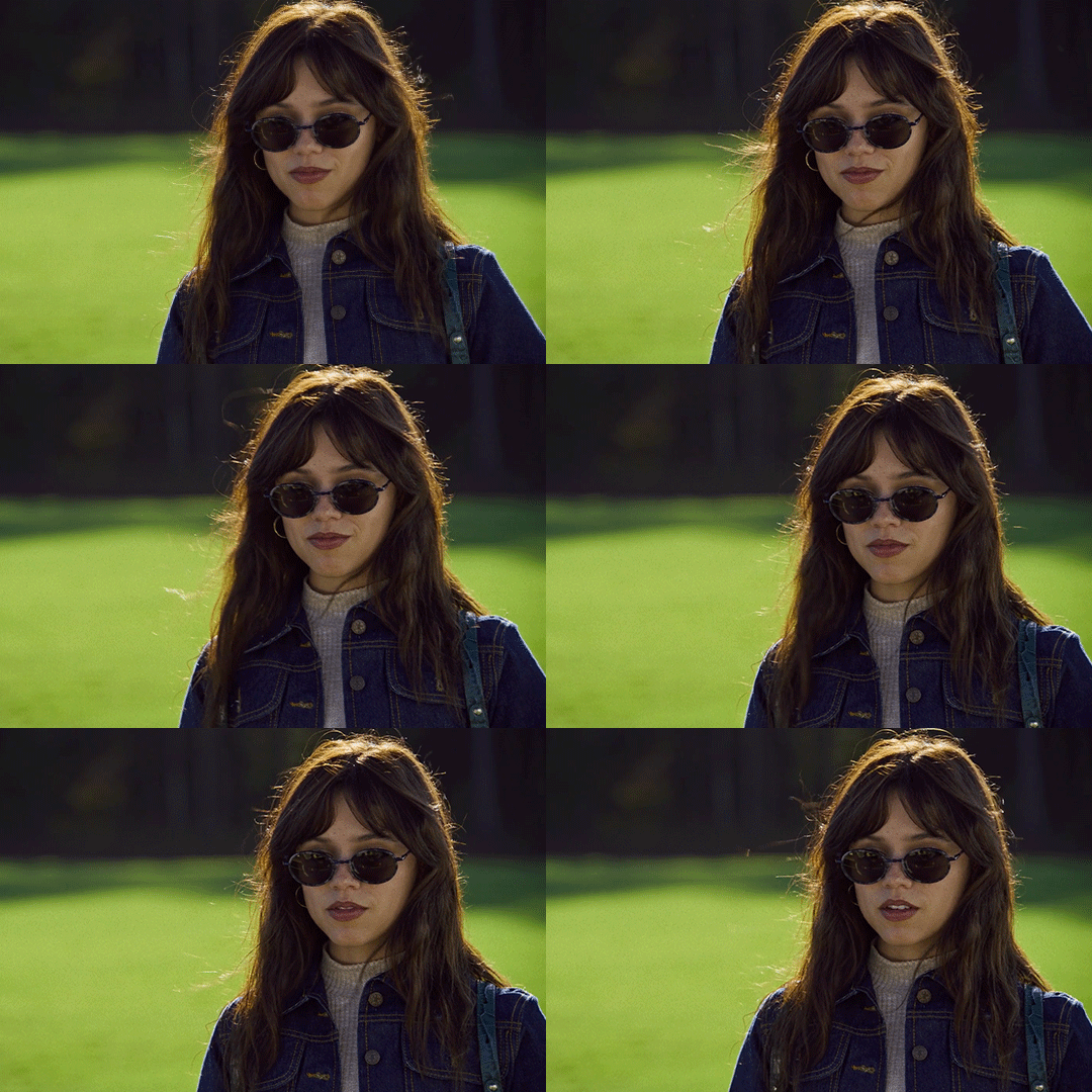
and here it is after I sharpen it:
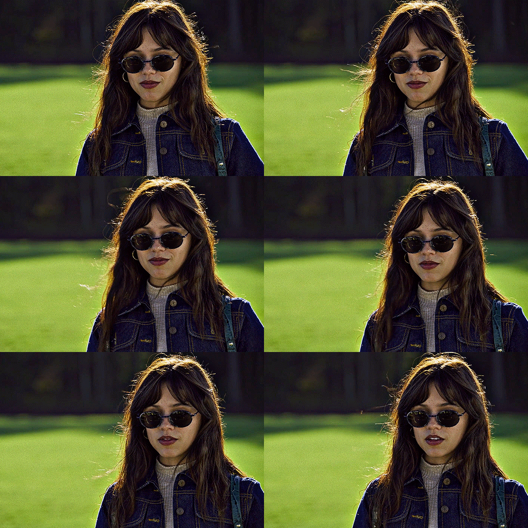
sharpen can affect the depth of shadows in a gif, so I do this before I add any coloring, but I know some people color first and only then sharpen, so both ways work!
alright, ready for some fun coloring? let's go!
before adding any adjustment layers, I suggest creating a new group, so all of your coloring changes can neatly sit in one place.
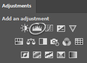
I always start with levels and curves, they often help to make the overall gif more natural if the lighting is too yellow, too dark, etc., it's a very useful guide, especially if you're new to gifmaking. so, let's start by clicking on the levels icon, a new adjustment layer should appear over your gif layers:
the next step is to click on each of these little icons (I usually only use the top and bottom ones) and to select the lightest and the darkest parts of your gif. pick the top one, select the darkest part and then pick bottom one and pick the lightest part, you should see some changes on your gif, sometimes they're subtle, sometimes they're very obvious:
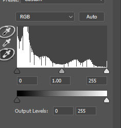
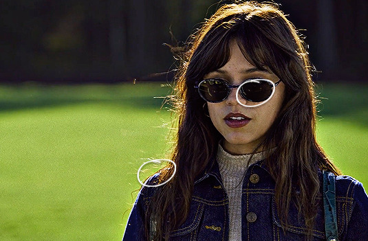
in my gif the lightest part is somewhere near her shoulder where the light hits, the darkest part is her sunglasses (if there are a lot of dark/light parts, I just click around and see whichever looks more subtle. for example, I tried the part on top of her head where the light hit, but it made the gifset too blue because the lighting is yellowish, but since the whole scene is not very yellow, it looked weird so I'm sticking with her shoulder, it just simply looks better overall):
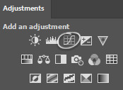
and then I do the same thing with the curve adjustment layer, selecting the darkest and lightest part of my gif just like I did with the levels layer:
while this is a good guide for beginners, it doesn't always fix all the problems. it can be quite harsh, so I recommend setting the opacity to a lower percentage and if it looks a little weird, sliding the arrows to one side and another with each color until it looks better to you:
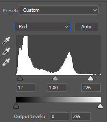
like I said, it's a good guide but manual work is often needed, don't be afraid to mess around with the settings. for this gif I set levels layer opacity to 60% and curves to 37%.
moving on, I'm adding a selective color adjustment layer to fix how the skintone looks with red and yellow colors. it differs with each scene, sometimes the skin is too yellow and orange, so I add more cyan and less yellow but in this case I chose these settings and I set the opacity of this layer to 35%:
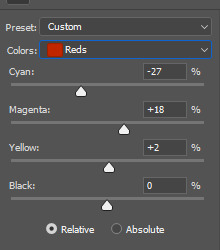
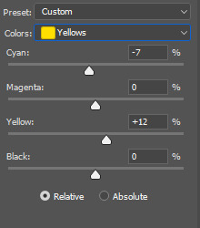
I want to mention that with poc it's very important not to mess around too much with their skin tone and not to white-wash and orange-wash them, there are quite a lot of tutorials on how to avoid doing that.
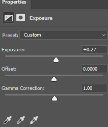
the next layer I add is exposure, I want to brighten my gif a little bit. you can do that by selecting either brightness or exposure layer like I did:
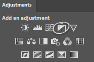
the scene I'm working with is pretty bright, so I'm not adding too much of exposure, here are my settings:
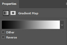
next up, I want to deepen the shadows a little bit, so I use a gradient map for that:
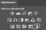
I use black and white gradient and set the opacity to 10%:
moving on, color balance is another great trick to make the gif look more smooth with one consistent color overall:
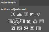
if I'm working with scenes that have a lot of green/yellow in them and I want to get rid of that, this is a quick way to slide the arrow to the opposite color and soften it a little bit by adding another color. I usually like to add more magenta to midtones and make the gif have a little bit of a pink look. here are my settings for this specific gif and the opacity of this layer is set to 30%:
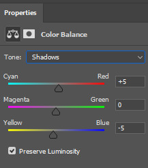
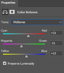
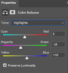
and here's what difference it made to the gif:
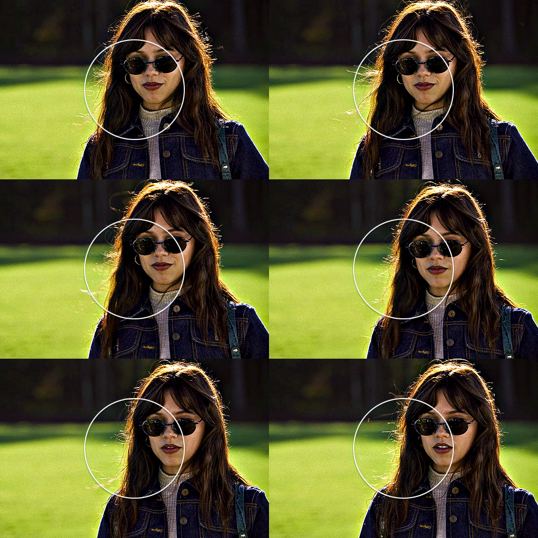
as you can see, the colors outside the circle are less green on her skin and hair. it's all coming together nicely!
let's move on to the background colors. I add another selective color layer and I'm gonna play with the colors I want to enhance the most. in this case it's green grass and her blue clothes. here are my settings for these colors:
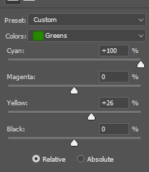
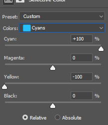
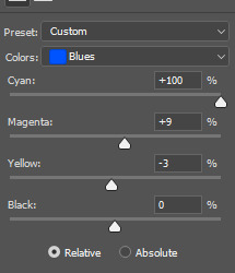
and finally, to enhance the vibrant coloring even more, I like to add one final hue/saturation layer:
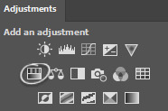
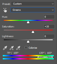
here I like to add more saturation to the colors we're focusing on in the background and add around +20 of saturation. I did this to green, cyan and blue colors:
and that's it! here is the finished gif compared to the completely raw one:
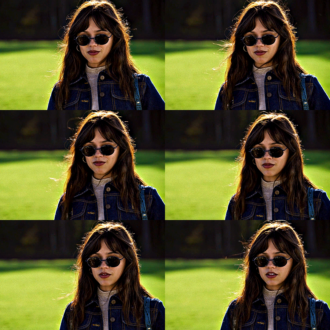

this coloring tutorial is very basic, but it works for most scenes I work with, I just sometimes focus on other colors, add more or less layers but the overall process is very similar.
I encourage to mess around with all the settings and see which ones look the most pleasing to your eye. let me know if you have any questions :)
111 notes
·
View notes
Text
joongdunk vampire bl when??
maybe you've already seen my post "reasons why i need a sexy joongdunk bl". and if you have, then maybe you remember the bonus vampire section at the end
well, i've decided to start collecting vampire mentions here in this own separate post. here i will collect instances where either joong or dunk actually utters the word "vampire" but i will also include things somewhat adjacent to vampires (looking at you, lol fanfast 2023 dum dum neck biting action 👀)
i'll keep updating this post with every future vampire mention that i happen to come across. if you happen to find a vampire mention that is not yet in this post but you think it should be on the list, then do feel free to send me a link to it and i might just add it!! some of them, esp the vampire-adjacent things will be added based on vibes (my vibes, that is. it's my post so i get to put in it whatever the fuck i want)
like this one for example:
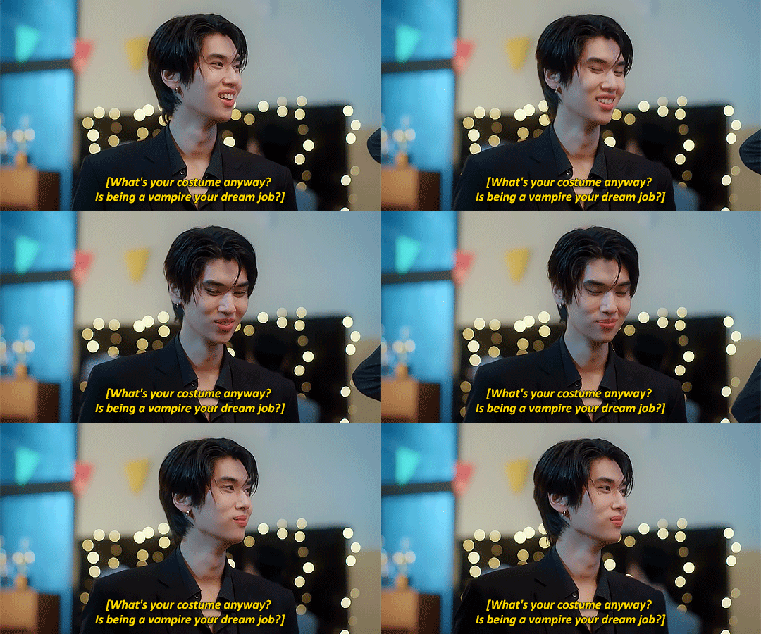
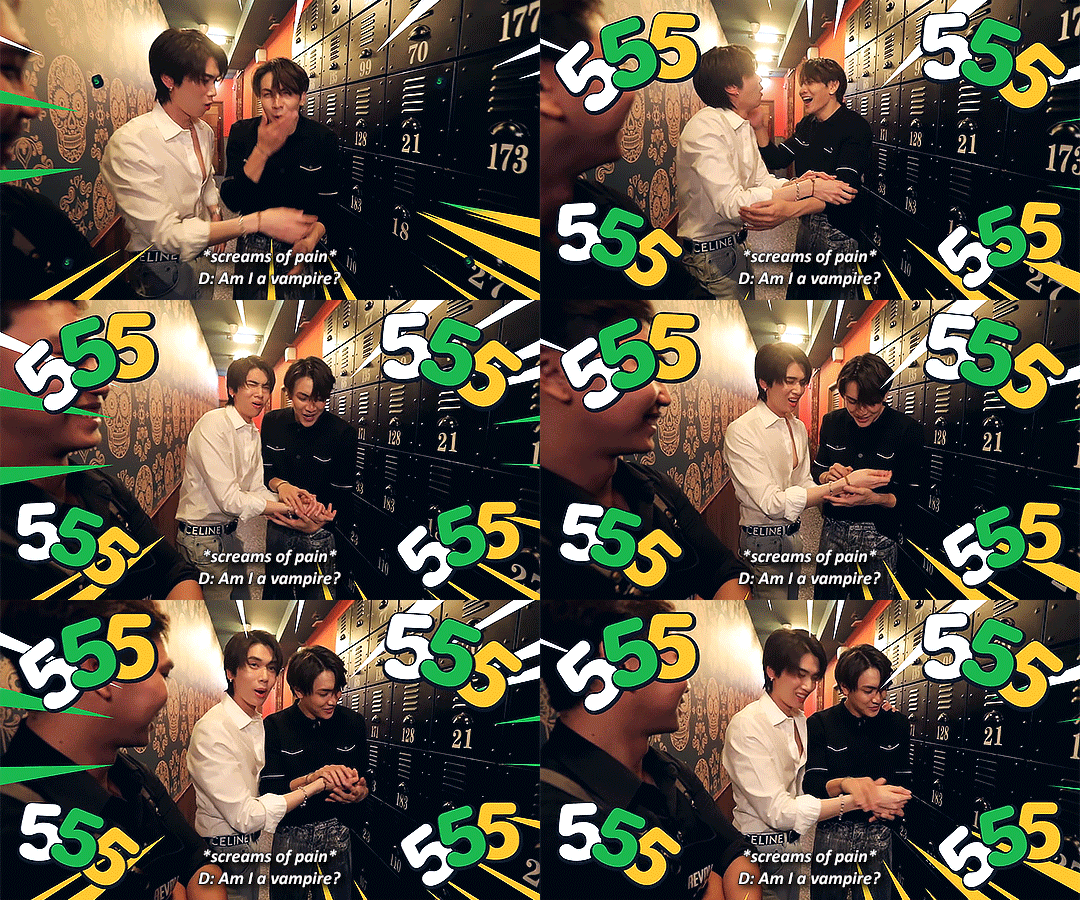
[hidden agenda ep12 pt4 (3:25); (24.09.2023)]
like yeah i know this one doesn't really count bc those are just some lines in a series from one fictional character to another fictional character that just happens to be played by dunk but like!! is it not true!! being a vampire (on tv) is dunk's dream job, is it not!!!
1. they WANNA play vampires
no but seriously tho, dunk wants to play a vampire, he explicitly said so:
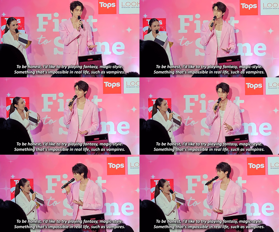
[dunk x tops; (30.09.2023)]
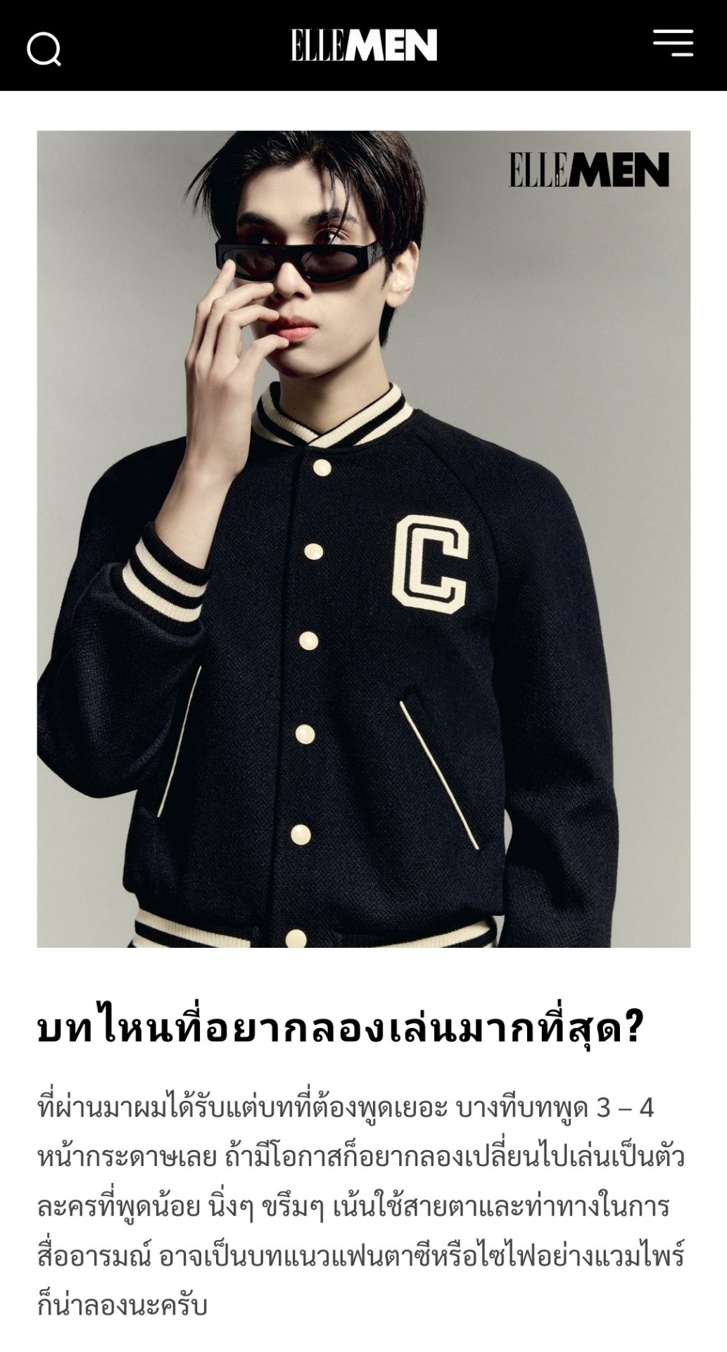
Which role do you want to try playing the most? Up until now I've only gotten roles that speak a lot. Sometimes the lines are 3-4 pages long. If I get the opportunity, I want to try switching to a role that speaks little, that is calm and serious and where the emphasis is on using eyes and gestures to convey emotions. A fantasy or sci-fi role like a vampire might be worth a try.
[dunk for elle men; (13.11.2024)]
and so did joong, for that matter:
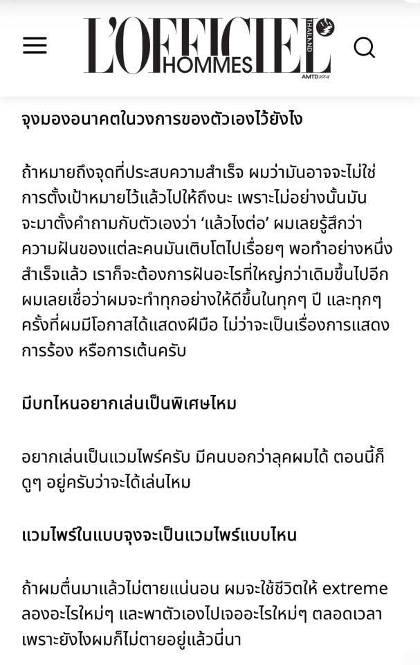
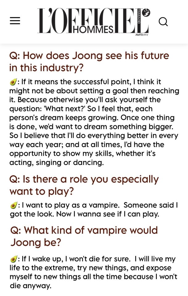
[l'officiel hommes thailand: "the act of being myself" | translation; (08.12.23)]


[joong's 23rd birthday event; (17.03.2024)] (extended gifset here)
2. dum dum
now, the dum dum performance deserves it's own little section lbr. bc seriously wtf was all that:
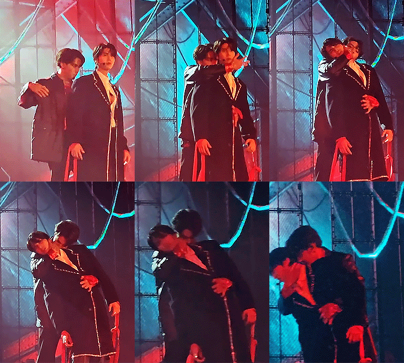

[LOL fanfest D1; (24.06.2023) | LOL fanfest D2; (25.06.2023)]
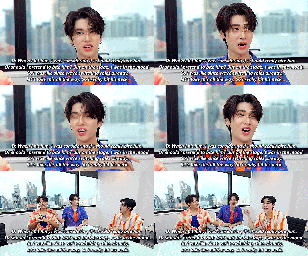
[arm share ep131; (02.08.2023)]
oh and make no mistake, it's not me who's making the dum dum performance about vampires, no, dunk is:
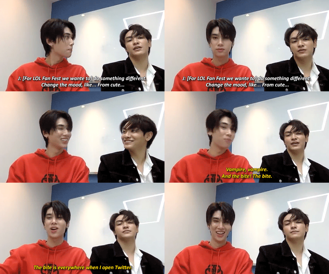
[let's talk bl s4 ep07; (16.08.2023)]
no seriously, let 👏 them 👏 play 👏 vampires!! they've already got experience in biting each other's necks!!!!
3. collection
ok from here on out i think i'll stop with the babbling and just have a collection of gifs with random vampire mentions that i'll just continue to add to this post whenever i come across more bc why the fuck not
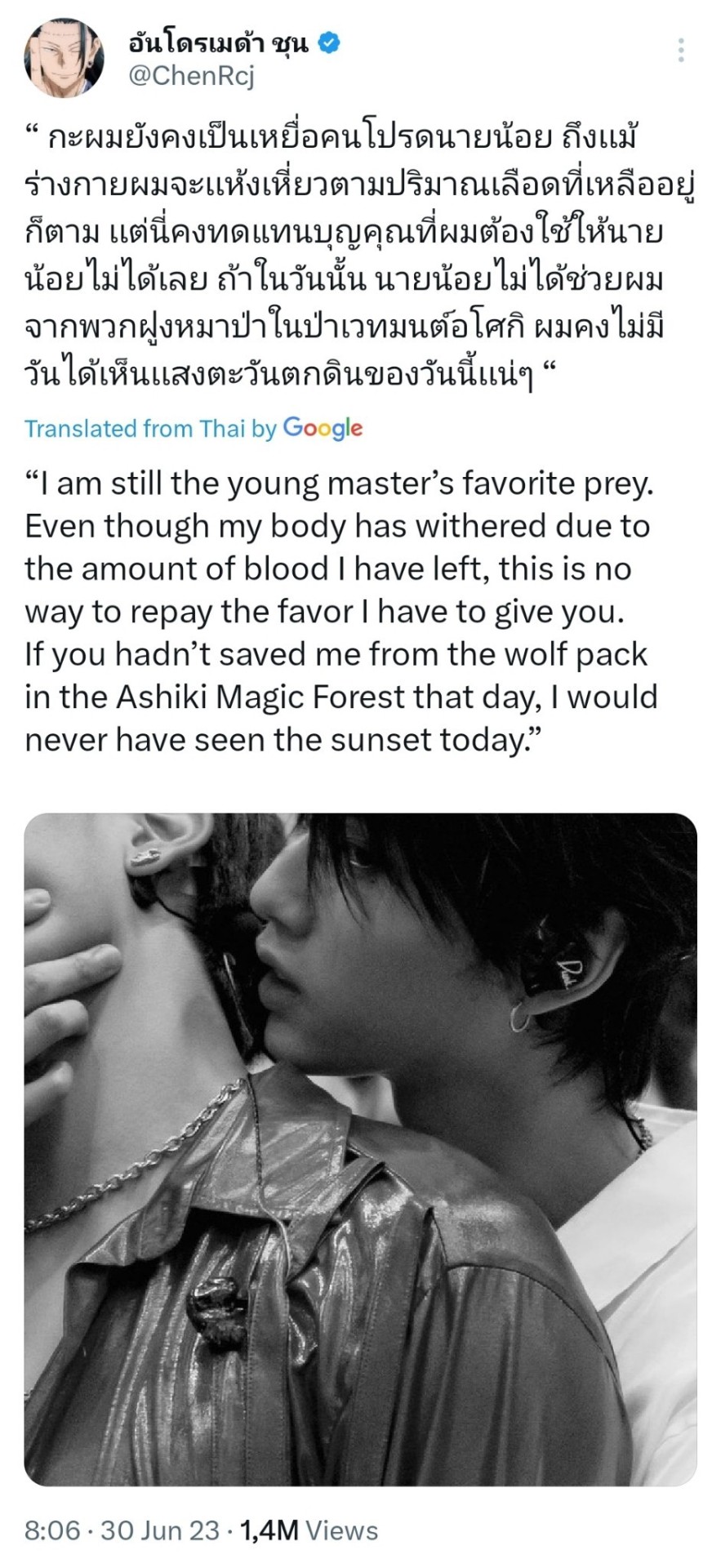
[joong's tweet; (30.06.2023)]
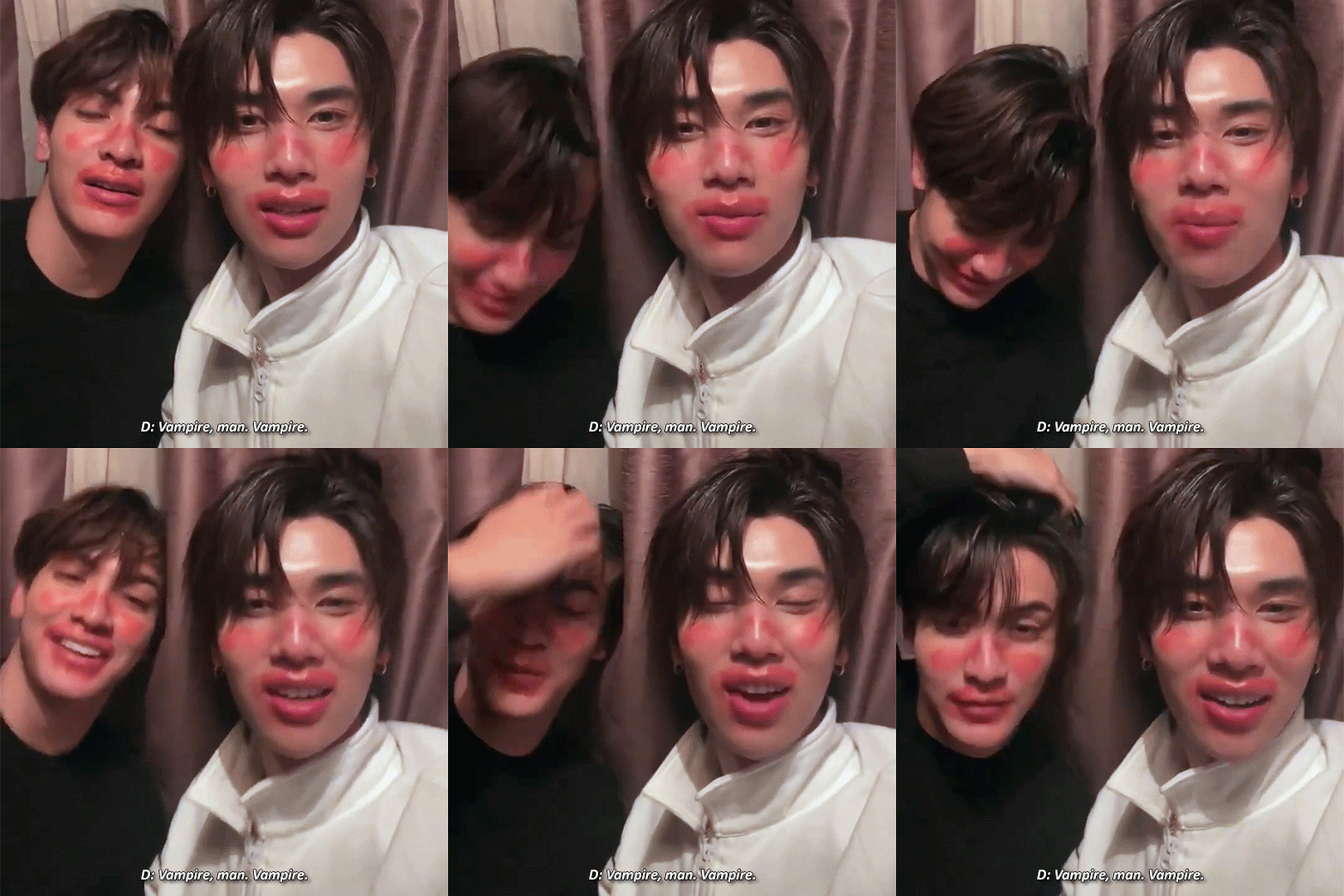
[instagram live; (09.10.2023)]
[hidden hangout ep2; (14.11.2023)]
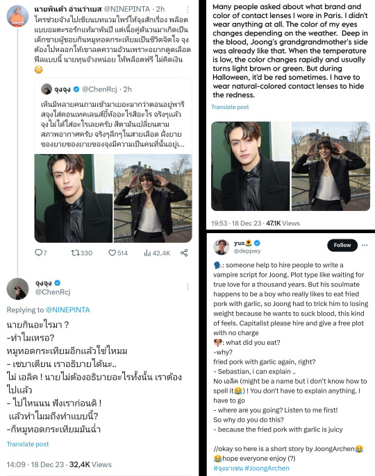
[original twitter thread | translation 1 | translation 2; (18.12.2023)]
context: joong asked what kind of plots fans would like to see him and dunk play
Translation/Summary:
Fan🗣️: In their past lives, Joong and Dunk were enemies who hated each other deeply. One day, a situation arose where one of them had to kill the other. However, the one who was killed (Joong) didn’t die permanently—it was more like his soul was temporarily sealed. He's been there ever since, even up to the present time. Joong☀️: Oh~ Is he still resentful? Fan🗣️: Yes, he is. He’s been sealed in the same spot for a very long time. Joong☀️: So, it’s like the vibe of an old Thai drama, right? starts singing an old Thai series opening theme Fan🗣️: Right, that kind of vibe. But this one is a fantasy genre. His soul is sealed, and we can say he became a vampire. He’s still alive but trapped—he can’t go anywhere, so he keeps living until he can earn a wealthy life. Joong☀️: How does a vampire live his life in Thailand? Fan🗣️: He has to stay in the same place. He can’t leave the restricted zone, and he can’t be exposed to sunlight. Joong☀️: If he lives in Thailand, where would he stay? Thonglor? (a road in Bangkok known for nightlife) Fan🗣️: More like Sukhumvit. (known for luxury malls) Joong☀️: Sukhumvit Vampire? Fan🗣️: Yes~ Joong☀️: Alright, we’ve got the name of the story, everyone. Sukhumvit Vampire 😆 Fan🗣️: So, one day in the present, Dunk comes into the zone controlled by Joong, the same place where Joong’s soul has been sealed. Joong☀️: You mean Sukhumvit? Fan🗣️: Yes. And when Joong sees Dunk, he thinks, "Isn’t this the person who killed me?" Joong☀️: Oh~ So Dunk has been reborn, and Joong’s like, "The person who killed me gets to be reborn, but I’m stuck here." Fan🗣️: Exactly! It’s like, "I’ve been stuck here for so long, while the country has advanced so much, and I’m still trapped." Joong☀️: So I’m the vampire, right? Fan🗣️: Yes, and Dunk killed you. But you can switch roles if you want, I’m not strict about it. I just want this kind of plot. Joong☀️: So, the story is that when they meet, Joong wants to kill Dunk for revenge. But then suddenly, he realizes, after Dunk's rebirth, that Dunk is actually pretty handsome! HAHAHAHA 🤣🤣 Fan🗣️: He believes that killing the person who killed him will break the curse and free him from the place where he’s sealed. Joong☀️: Will monks come at the end and tell us not to seek revenge anymore? 😆 Fan🗣️: No, at the end, they just stab each other to death. Joong☀️: Huh? Really? Do they actually kill each other, or do they hesitate because they’ve fallen in love? Fan🗣️: Actually, I was planning for them to kill each other, but then they realize there was a reason why they have to kill each other in the first place (since their past life). So, the reason is… Joong☀️: Fighting over bubble tea. Fan🗣️: Okay, Joong. Delicious 😂
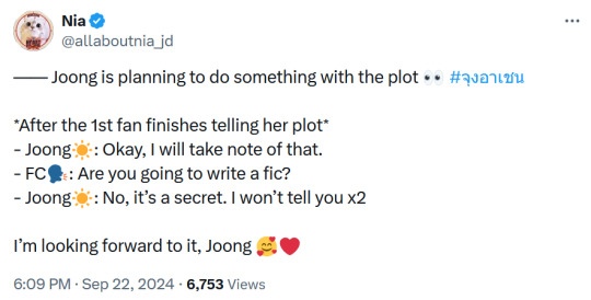
[joong twitter space (back-up link); (22.09.2024) | translation 1 | translation 2]
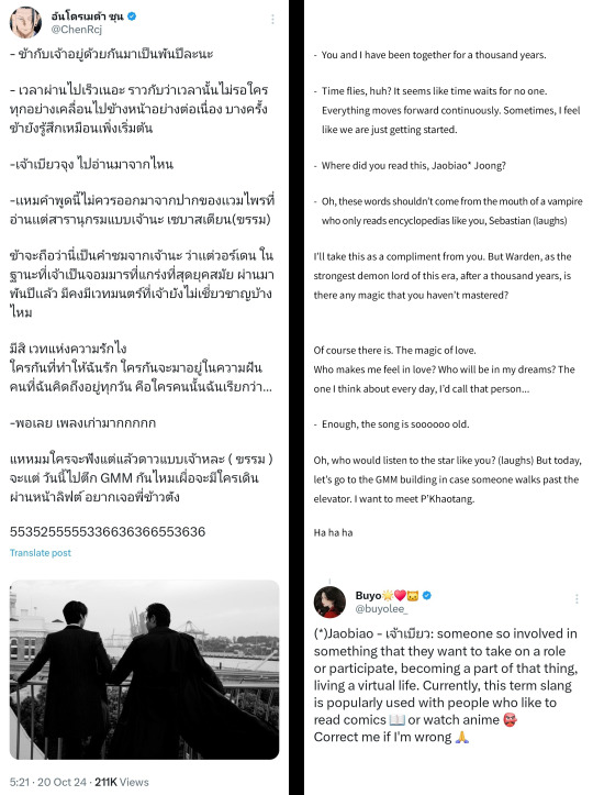
[joong's tweet; (20.10.2024) | translation pt1 | translation pt2]
[joong's broadcast channel on instagram; (20.10.2024)]
#hoping against all odds that joong and/or dunk will at least get to play guest vampires on mgb if they already didn't get the leads#airenyah plappert#adrm#joongdunk#nothing to see here i'm just#joongdunk vampire bl truthing my way through life#sexy joongdunk vampire bl#jd vampire mentions masterpost#vampire mention masterpost
112 notes
·
View notes
Note
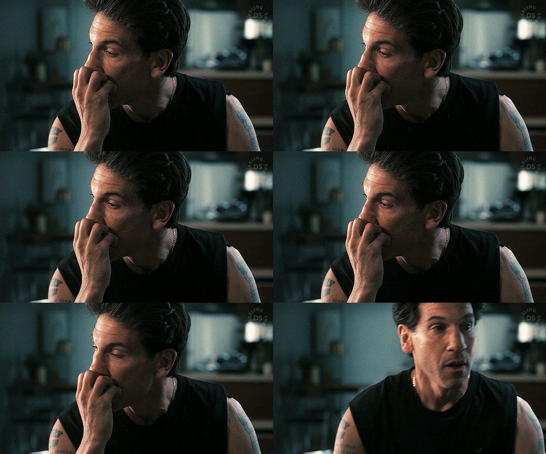
Okay, I didn't think of Shane when I was making that Julian gifset, but you're right, that nose scrunch is something Shane used to do. (I've definitely seen it in other characters too, but it was Shane that did that twisted twitch of his brow more often.) That's how good Jon is that I never look at a new character and see Shane or any of his other roles. We’ve already talked about this a million times, but I love how much work he puts into each of his characters, how he comes up with all their mannerisms, the way they talk, sit and walk... Even when he’s basically playing similar roles, I could never look at any of them and say that looks like Shane, or that’s Frank, or that’s whatever. Obviously that’s what actors do, but not all of them do. I’d love to see him in more roles like Julian, he did an amazing work despite the show being kind of a flop. He always stands out. That first scene alone when he’s being interrogated is just one of his best scenes in his entire career imo.
You said you wanted a statement so there it is, have a good day 💜
Hahaha, you can send those kinda statements any time you want, cause I can only agree with you 1000%. Going from playing Shane who slowly goes crazy, to someone as soft and kind as Julian takes talent. We've said it before, but Jon has sooo much potential. He can play anything and he will always give his absolute best for even the smallest role. That's something I really love about him, how dedicated and passionate he is about what he does. That scene you're talking about just broke my heart. It was fantastic, and I don't remember him ever playing someone as helpless and desperate as Julian. He's been desperate as Frank when he dreams again and again about his family dying, but it wasn't the same kind of intensity. The nuances he uses to adapt to each new character is incredible. But at the same time, as much as I'll never be able to mistake one role for another thanks to his acting, I also love getting little glimpses of other characters in his different roles. You can tell that some are his own mannerisms peeking through and that's fun. The habit he has to push up his nose with his knuckles like in that GIF. That's such a Jon thing to do, but then you have the nose scrunch and there's Shane showing up for a nano second. One thing's for sure, I'm looking forward to seeing him moving around as Frank again 😍
38 notes
·
View notes
Note
Hi, Regina is my absolute favourite in ouat and you made her stunning in this gifset ✨
I was wondering how did you make glitch effect from green to b&w, Would you please post a tutorial?
Hi! Thank you so much! the start of the tutorial is below the cut but because it's multiple gifs and I could only add so many photos to a post to explain, I have had to split it onto another post but I have put a link at the end when it's time to move onto the next one. :) if anything doesn't make sense or if anyone follows this and it helps, i would love to know either way!
Glitch effect tutorial used on this set below the cut

note: credit to this tutorial which was very helpful when i was making the set but i didn't feel it explained how to do the b&w gif and that's what took me a while to figure out, so if anything on this tutorial isn't clear, that one should also help. this will be slightly different because in my set i made it so the glitch faded into each other and i've added my own flare to it but the basic technique is the same.
create 2 gifs the same size, you can add whatever colouring, sharpening etc you like, one in colour, one in b&w (you can do 2 in colour but for the purpose of this i'm doing one b&w to show how to do both versions).
i'm going to do the b&w gif fading into the colour gif on this tutorial (bc that's just what i started editing first) but obviously if you're making a full set decide which gif you want to fade into which because the first part of the gif will have the glitch effect on the end and the second will have it at the beginning so it will matter for the final outcome of your set
PART 1 - B&W GIF
if you edit in frame animation, you must convert your b&w gif to the video animation timeline otherwise the colours will not show up on the glitch effect. you can do this by clicking the lines menu above the frames
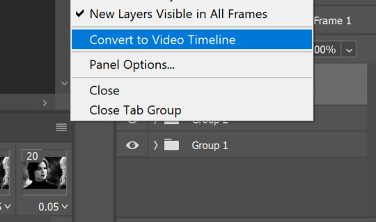
i usually colour in frame animation because it plays quicker to preview how it will look and then convert to video to add my sharpening at the end but it's personal preference how you create your gifs.
hold control + select all of your frames > right click > convert to smart object
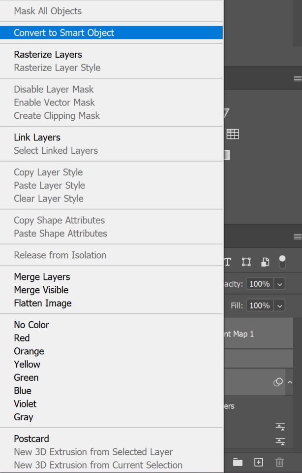
all of your frames, colouring etc should all be in one frame now, select it > click the lines menu above the animation timeline again > convert frames > flatten frames into clips
you should now have a longer list of layers that make up each frame of your gif
this is because we need to convert back to frame animation to edit the glitch effect onto individual frames. if you don't flatten the frames to clips the gif will not play when it's converted because 1 layer will equal only 1 frame. it may seem long winded to go back and forth but it makes sure all your colouring is already included in the frames when you make it glitch. if you add the colouring afterwards it will change the colour of the glitch effect or turn it black and white and it won't be very visible (if anyone has an easier way i'm very happy for suggestions, i was just figuring this out as i went and found the glitch didn't work on the b&w gif any other way for me!!)

now we go back to the 3 lines menu > convert frames > convert to frame animation
if you get this pop up, press continue. it's fine because we have each of our frames in their own layers now

your frame animation timeline will initially load with just one frame

go to the lines menu again > make frames from layers
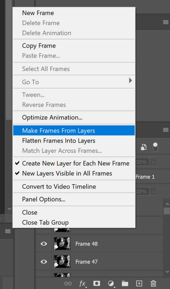
now all of the frames will load, but they will be at 0 seconds (except the first frame) and we need to make them all run at a playable speed, so go back to that same lines menu above the timeline > select all frames > select under any frame where it says 0 sec. > other > i usually put in 0.05 but do whatever works for you

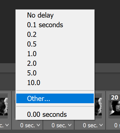
PART 2 - ADDING THE GLITCH EFFECT
pick a frame about 5 from the end, select it and select the corresponding layer with the eye icon next to it to show it's the one visible

right click > duplicate layer (or just press control + J)
then on the copy of the layer right click > blending options (or double click)
in the advanced blending section, untick R > ok
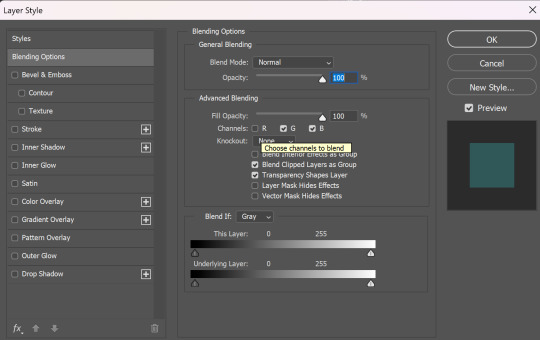
make sure the move tool is selected

now using the arrow keys on your keyboard move that layer either left or right as many notches as you like (i've started out with 10 here)
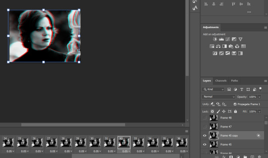
hold control > select both the visible layers

right click > merge layers
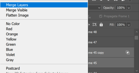
now move onto the next frame and corresponding layer and repeat the same process (i have no idea why my ps decided frame 46 doesn't exist so ignore that dkjddj)
if the frame(s) below is still visible, just click the eye to hide it so only the one you're working on and it's copy layer are showing
this time i've moved the layer 6 notches to the right as below
keep going until you get to the end of the animation. you can move each layer as much as you like either side just play around with your gif and do whatever you think looks good! if you want to do more than the last 5 frames or less than them, do that too! just remember that we are also going to put a glitch on the coloured gif then combine them, so the final glitch effect will be longer

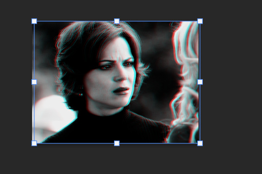
when you're done, you might have to go back to the first frame on your animation and hide all of the layers you've just edited because on mine they all visible so the gif won't play
then go back to the end of the gif and make the right layer visible on the right frame again (hopefully this makes sense)


so far, the gif should play something like this

to make it smoother i picked a few frames earlier in the gif, before the start of the glitch at the end to add the same effect to the first frame i edited was number 32 (layer 'frame 45'), so i'm going to add it to frames 25 and 26 as well
then i selected the last frame and layer > filter (at the top of the screen) > blur > motion blur


then pick another frame and corresponding layer > filter > noise > add noise
do this to a couple of frames of your choice with the glitch effect on too, it makes it a little more grunge-y which i think fits with the concept that it's supposed to be glitching/broken
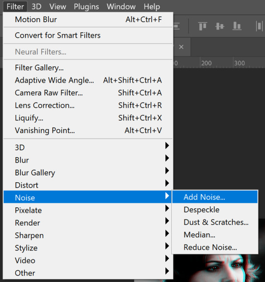

now it looks like this, subtle but in my opinion notably smoother

go to the left side of the screen under the frame timeline and click the convert to video timeline button
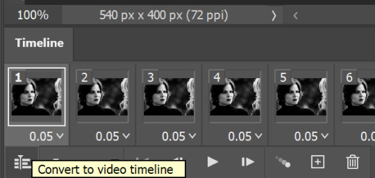
once i've converted it back to the video timeline, i like to select all of my layers again > right click > group from layers (or select all and control + g). i'm going to rename this b&w so it doesn't get confusing later
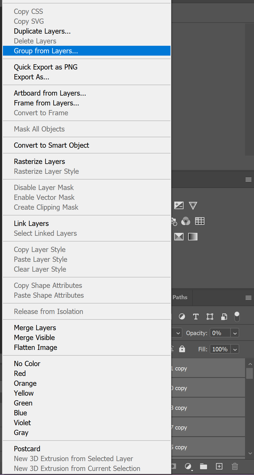
I can only add 30 images per post so this tutorial is CONTINUED HERE!
#resource#gifmaking#tutorial#gif tutorial#glitch tutorial#glitch effect tutorial#photoshop tutorial#userssam: tutorial#answered#anonymous
22 notes
·
View notes
Text
Full giffing process - tutorial (*≧ω≦*)

Due to little demand, i will be going thru my complete process for making gifs. so this will cover all the basics i hope! keep in mind this is just the way I personally do things! please feel free to send me asks or dms if you have any doubts or questions!
☆☆☆☆☆☆☆☆ DISCLAIMER: Everything I know about giffing, I've learned from other tutorials, including the VapourSynth Resources I'll be using in this tutorial so I'll leave links to those tutorials I've used here as well!
In Depth Giffing Tutorial (link here) How to use VapourSynth (link here) ☆☆☆☆☆☆☆☆
(o´▽`o) I'm a windows user so idk if this works exactly the same on mac!
First things first, you will need:
☆ 4k video downloader (download it here!) ☆ Vapoursynth (32bit download / 64bit download) ☆ Photoshop (download it here! -64bit version only)
Okay! The first thing you need to do is make sure you're working with the highest quality material possible to ensure a decent looking gif!
I'd say the minimum quality needed for decent gifs is 1080px. But if you really want to gif that low quality 2 frame milisecond of your fave, i respect that
☆ lives / streams and tiktoks are typically not very high quality ☆ for stage performances such as music shows, ts/tp files are preferred but those can be really hard to get a hold of (this is a whole deeper level of giffing hell and more of an advanced class topic so nevermind this for now!) ☆ those occasional 4k facecams on youtube work fine tho! ☆ for mvs, variety shows etc, you can download the video with good quality from youtube using 4k video downloader
_(:3 」∠)_
Now let's talk about tumblr and it's pre-requisites for a good looking gif post :D
Tumblr can be sooooo annoying about gifs okay.... I find it's best to plan my whole set before I actually start doing anything but hey that's just me. Some things to keep in mind are: dimensions, file size, number of frames and post layout!
☆ Dimensions
You have 3 main options here and it's all about the width!
☆ 1 collumn: single gifs! these should be 540px wide ☆ 2 collumns: split that in half! 268px wide so there's a lil breathing space between the gifs! ☆ 3 collumns: 3's a party! 177px for each gif please
You can go crazy on the height but the width should mostly stick to one of those 3 unless you want tumblr to pull and squeeze your gif around like a piece of gum.
☆ File Size
This is really important because tumblr has a single image size limit of 10mb. Which means that every single gif you make has to be under that size or you won't be able to post it. The other thing about this is that the dimensions, number of frames and ammount of varying colors throughtout your gif will greatly impact on the final file size. Basically, the larger the dimensions and the more frames it has, the bigger the final file will be. Later on I will show you how to check your gif's final size before exporting it!
☆ Number of frames
This has more to do with the length of your gif, the longer it is, the bigger the final file will be. Typically gifs should be under 3 seconds long. So if you are making a set, try to break the moments you want to include in your set by increments of up to 2 - 3 seconds each, otherwise it might not fit all into one single gif. The number of frames is also extremely important when making combined gifs but that's for another tutorial.
☆ Post layout
If you want to make a cool looking gifset (where some gifs are larger in dimension than others, or when you want to have a single gif followed by a line of 2 gifs next to each other), then it might be worth it to plan out the layout before you start making the gifs. This way you ensure you won't have to remake gifs down the line because they don't fit together the way you wanted to.
☆ミ(o*・ω・)ノ
Timestamping
For this step, you will go through the video you want to gif from and you will just write down all the sections you want to use, down to the exact seconds. Example: 02:30 - 02:32.
(^◕ᴥ◕^)
VapourSynth (VS) - Clipping the video
I know VS can look pretty intimidating with it's bare coding and all but I promise it can be your friend. You just have to set it up correctly and pay close attention whenever you're using it. This software is a must for giffing, it will do all your cropping, resizing, sharpening and denoising for you, making sure your gifs look good. It is also indispensable when giffing ts/tp files because it deinterlaces those files so you can clip them.
First, let's set it up. This is the most annoying and difficult part of this tutorial so make sure you pay full attention to every single step!
☆ step 1) download a version of VS here (link).
☆ step 2) unzip the file on your desktop area.
☆ step 3) open the folder and find the file named "vapourscript (drop video file on me)" - make a shortcut of that file and move it to the desktop.
☆ step 4) find the folder named "gifs" - make a shortcut of that file and move it to the desktop.
☆ step 5) drag your video file you want to gif from and drop it on top of the "vapourscript (drop video file on me)" shortcut on your desktop.
☆ step 6) enter the timestamp input, in the first line it will be the starting of your timestamp, in hours format, then hit enter. in the second line enter how long your timestamps lasts, in seconds, also in hours format. then hit enter and let the code run.
☆ step 7) the resizer tab should now load on a web browser, then you will set the dimensions of your gif on the top left corner. you can also adjust the position of your gif within the video screen and zoom in if wanted.
☆ step 8) choose the preprocessor, denoise and sharpening options on the left and tick the boxes on. I usually just stick to the settings i'm using in my video down below.
☆ step 9) now in the VS box, go to file > load, choose the script saved in the gifs folder.
☆ step 10) copy the code from the resizer into the code in the vs screen, under the designated line.
☆ step 11) alter the code exactly like I did in my video down below. save it. this is now your default vs script for clipping your gifs. what you are doing by adding the hastag and the quotation marks is you're disabling those sections of the code. the reason you do that is in case you want to run the preview before exporting. this is because those lines involve some heavy graphic processing which can make the computer slow. I will talk about the script in more detail later on.
☆ step 12) i don't usually use this option but you can also preview your gif and set specific frames to start and end your gif. This is around the 4:30 mark in the video.
☆ step 13) time to export your clip! now you will temporarily remove the marks you added to disable the code and then go to script > encode video. in the popup box, you will select the option "export to MOV", then start so that you can use that video file in photoshop later.
☆ step 14) after you are done exporting, close the encoding box and then close vapoursynth, never agree to save the script when closing it, or that will override your default script.
☆ step 15) now you need to rename the encoded file for your gif. go to the gifs shortcut folder you created on your desktop, then go to output. this is the folder where VS will save all your encoded files. but everytime it saves the file with the same name so you need to come to this folder and change the name for every gif file you encode before you clip a new one, otherwise VS will just replace the previous clip with the new one you just finished.
Here's a detailed walk through of each step in this video tutorial:
youtube
IMPORTANT
After you are done processing your first clipped file, now you have your default script already built in VS, so whenever you run it to clip more videos, this script will already be in your VS screen. So now all you need to do whenever you want to clip more files (to make more gifs) is to adjust the dimensions, positioning and zoom of the video in the resizer screen and then change a few numbers in your script! then run encode to save the clipped file.
☆ To make new clips: go thru steps 5- 7, also do 8 if you want to mess with the denoise and sharpening filters again, but I don't really know much about how those work so I can't help you with this.
Now what you need to alter in the code, each time you are making a new gif: after you run VS and change the settings in the resizer to what you want, you need to change the zoom numbers and the video positioning in the code.
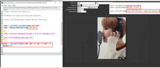
you need to replace the numbers in the VS script on the left so they match the numbers in the resizer on the right.
Do step 12 if you want to set specific frames to clip. Then steps 13 - 15 and you are done! You need to do all this every single time you want to make a new gif.
Now let me talk a bit more about some of the lines in this script:
☆ line 14: #video = core.std.Trim(video, a, b) this line is to set specific frames to trim your video section, your final encoded file will be only the frames inbetween the numbers you input here. a = first frame, b = last frame. you will need to run the preview option in VS in order to see every single frame of your clip and select your first and last frame. I usually do this in photoshop later instead so I don't bother with it on VS unless i'm making combined gifs, in which you need all the clips to have the exact same number of frames. the hashtag at the beginning of this line means that the script won't follow this command when executed. so if you want to include it, you need to remove the hashtag before encoding your file.
☆ line 18: #video = haf.QTGMC(video, Preset="Slower", TFF=True) this line is for the preprocessor option in VS, that tool is mainly only used when giffing ts/tp files because you need to deinterlace them before you can use them on photoshop. so you will only need to remove the hashtag and enable it when giffing those types of files. when im giffing those files, i usually always keep it with this setting:

I don't really understand much about this so I never mess with it. If you want to know more, I believe there's more info about it in the tutuorials I linked at the beginning of my post.
☆ line 22: video = descale.Debilinear(video, 786,442) this line is for the zoom of the video screen. you just need to match what you have in your VS script to what you end up with in your resizer.
☆ line 25: video = core.knlm.KNLMeansCL(video, 1, 2, 4, 2.5, channels="YUV") this line is for the denoising filters, in my case I always use KNLM and this is what it's line looks like. I know you can change those numbers to change the filtering settings but I never messed with it so I'd usually just have it like that.
☆ line 27: video = fun.FineSharp(video, sstr=2.5) this line is for the sharpening, in my case I always use FineSharp and this is what it's line looks like. I know you can change the number to change it's settings but I never messed with it so I'd usually just have it like that.
note: lines 25 and 27 (which have to do with denoise and sharpening) are the ones within quotation marks in your default script. I believe the quotations work in a similar way as the hashtag, in which the script only executes the lines when the quotations are removed. Which is what you do everytime you are about to encode your clip, otherwise they stay on. I think you should also remove them if you want to test how they affect your gif in the preview screen but i think these filters also require heavier graphic processing which my computer can't handle well so I never do that.
☆ line 30: video = core.std.CropRel(video, left=303, top=16, right=215, bottom=26) this line is for the positioning of your video screen within the gif dimensions. you just need to match what you have in your VS script to what you end up with in your resizer.
ʕ •̀ o •́ ʔ
Photoshop (PS) - let's make a gif!
Now that we have clipped and preprocessed our video file, it's ready to go to photoshop!
☆ step 1) after you have opened PS, go to File > Import > Video Frames to Layers. Then choose the clipped file you created through VS.
PS should open a box like this:
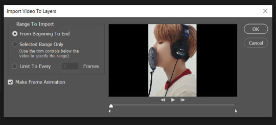
Keep those options ticked and hit OK
☆ step 2) now you need to go to Window > Timeline to bring up the timeline tool box. This window will always be necessary when making gifs. Let's take a look at it, I've marked down all the important buttons you will need:
timeline menu: there are several commands in here, you will need to use some of them later on.
convert to video / frame timeline
play controls to watch your gif
trash can to delete selected frames. (when deleting frames, first delete them here and then delete it's matching layers which are still there after deleting the frames)
frame delay time: this is where you set the time for how long that frame will be visible in your gif

☆ step 3) remember how I mentioned the preview option in VS and how i don't usually use it to trim the frames of my clip? That's because I usually do that at this step of the process, in PS. Notice how each frame is also a layer, and when a frame is selected, the matching layer has the eye symbol next to it turned on. So now you should play your gif and see if there are any frames you don't want to keep, then delete the frames and it's matching layers.
Since we applied sharpening filters back when we were clipping the video on VS, your clip should probably already look pretty decent even before the next steps, so steps 4 - 9 are optional. The coloring part of my video has been sped up.
☆ step 4) click on the timeline menu and select "Select all frames", then go to the select menu at the top of the PS screen and select "All layers". Now click on button 2 of the timeline at the bottom left, switching from the frame timeline to the video timeline.
☆ step 5) before you do anything else, make sure the blue holder is at the beginning of the track before you do anything else. Then go to Filter (at the top of PS) and select "Convert for smart filters". This will convert all the layers into one single layer.

☆ step 6) now make sure the layer is selected, then go to Filter > Sharpen > Smart Sharpen. A box will open with several options:
I usually keep the amount to around 30, I don't touch on radius and you can also mess with reduce noise if you think your gif is looking too sharp. Hit OK when you're done.
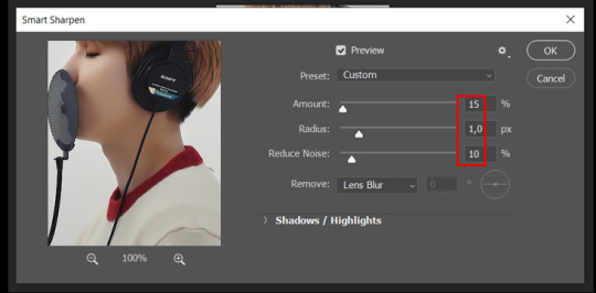
Since this is a filter applied to a smart object (the converted layer that contains all our layer - frames), this means you can turn this filter on or off as long as the layers are in the form of a smart object. You can also go back to it and alter it's settings (like I've done in my video down below)
☆ step 7) now while making sure the blue holder is still at the beginning of the track and the layer is selected, click on the timeline menu that i mentioned above. Then go to Convert Frames, then select Flatten frames into clips.
☆ step 8) again go to the timeline menu, Convert Frames, but now select Make Frames from Clips. Now click on the button at the bottom left of the timeline box, to convert the video timeline back into a frame animation. Then hit continue in the pop up box.
☆ step 9) now you are back to the frame timeline screen from before, but now the first frame is empty. You need to delete that first frame and then check the final frame because sometimes PS also creates another empty frame at the end at this point.
☆ step 10) PS also created a new layer under the layer 0, where the filter is still applied, you can delete this new layer as well. Now for organizational purposes, select all remaining layers (that contain your frames) and group them (you can see how in the video).
☆ step 11) This step is also optional, now I like to add the coloring to the gif. I have a separate tutorial exclusively on this topic. You can check it here:
☆ step 12) This is the time when I also add my signature. This is optional. You need to have the signature layer(s) on top of all the other layers. I usually have it in all black or all white, with lowered opacity of around 40%.
NOTE:
When adding elements (such as a signature) to a gif, it's important to always make sure you have the first frame selected, otherwise PS can move your newly added elements around the canvas on different and random frames. This also applies to anything in the layers pannel that has specific opacities. It's best to already add the elements with the final wanted opacity with the first frame selected.
Exporting + Delay time
☆ step 13) To export: go to File > Export > Save for web (Legacy). PS will open this box:
First I just use the exporting screen to test the delay time of my gif, and to check the gif's final size.
About the size: The final size is displayed at the bottom left. Remember it needs to be under 10mb. If it's above that, then you will have to go back and delete frames and test again until the size is within the limit.
About the delay time: To test the delay time, hit that play button and the gif will play at it's default delay time. If it's too fast or too slow, you will hit cancel and change the delay time (at the next step).
For actual exporting: The highlighted box at the top right of the screen is very relevant now. Make sure the first box has the GIF option selected. At the next box, you can select either perceptual, selective or adaptive. I usually like to use adaptive. At the next box you need to choose either diffusion or pattern. I like to use pattern. Tick the transparency box and then select either pattern or diffusion transparency dither.
Once you are satisfied with all aspects of your gif, hit save to export your final gif.
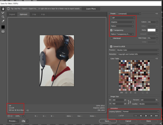
To fix the delay time: After you have exited the export box, go back to your timeline, click on the menu button at the top right and select "Select all frames". Then, on any random frame, click at the small arrow next to the numbers under the frame. Select the option "Other". That will open a pop up box to alter the delay time. To test it again, use the export box explained above. Once you are satisfied, save your gif! I've also altered the delay time in my video to show you the process.
☆ step 14) After your gif is done and saved, I'd suggest to save your psd file if you added any coloring to it. This is so you can reuse the coloring later in other gifs without having to redo it all. This is useful if mking a set of gifs from the same moment / video.
Here's a detailed walk through of each PS step in this video tutorial:
youtube
I hope this tutorial is helpful! Feel free to send me any asks if you have doubts or need extra help! (つ≧▽≦)つ
187 notes
·
View notes
Text

HOW TO: Make an iPhone Layout + Downloadable Template
Hi! I've gotten a few messages asking for a tutorial on my iPhone gifsets — but instead of only doing a tutorial (that would probably be triple the length this one already is), I decided to turn my layout into a template with all the bits and bobs! In the "tutorial" under the cut, I'll share everything you'll need, a free template download, and quickly go over how to use this template. :)
Disclaimer: This template uses Video Timeline and this tutorial assumes you have a basic to intermediate understanding of Photoshop.

PHASE 1: THE ASSETS
1.1 – Download fonts. These are the fonts used for all assets I've included in my template: – SF Pro or SF Pro Display (Regular, Medium, Bold): Either version works, they look nearly identical. You can download directly from https://developer.apple.com/fonts/ or easily find it via Google – Bebas Neue: Free on Google Fonts, Adobe Fonts, and dafont – Times New Roman (Bold): Should be a default font in Photoshop

Make sure to download and install any of the fonts you don't already have before opening my template. That way, once you open the template file, all the settings (font size, weight, spacing, color, opacity, etc.) are as intended.
1.2 – Download my template. Before you use my template, all I ask is that you don't claim or redistribute it as your own and that you give me proper credit in the caption of your post. Making these iPhone gifsets takes me a longgg time and turning this layout into a template took several hours too.
DOWNLOAD TEMPLATE VIA KO-FI ← This template is completely free to download (just enter $0), but if you feel inclined to tip me, I appreciate you! 💖

BTW this template also includes some of my frequently used icons!
NOTE: If, for some reason, you open the template and see the pop-up shown below, click "NO" — otherwise, the fonts will be all messed up:
And if you see this triangle with an exclamation point by a text layer, don't double-click it — it'll mess up the font as well:

PHASE 2: THE GIFS
I'm just going to briefly go over gif sizes and my recommendations. Also, keep in mind when grabbing your scenes, you'll want all of these gifs to be the same amount of frames.
2.1 – Background Gif: 540 x 540 px. I recommend this size so you have a good amount of visibility for the gif behind the iPhone wallpaper. I also recommend making this black and white (or in my case, black and white with a slight blue tint — idk I just like the way it looks) so the wallpaper coloring can stand out.
2.2 – Wallpaper Gif: 230 (w) x 500 (h) px. Keep in mind the very narrow dimensions of the wallpaper! And also keep in mind that you'll have a bunch of apps and widgets covering the image. I try to use wide shots (or layer my clips into looking like wide shots). Also, keep in mind your color scheme for your set and your character's aesthetic! I tend to focus on one or two colors for the wallpaper.
I usually position the wallpaper to the side with 20px bumpers, so there's lots of space to see the background:
2.3 – Large Photo Widget Gif: 201 (w) x 96 (h) px.
2.4 – Small Photo Widget Gif: 94 x 94 px.
PHASE 3: THE TEMPLATE – "IPHONE" FOLDER
In this section, I'll try to quickly walk you through how to use this template and some bits that may require extra instructions. I'll be going through each folder from top to bottom.
3.1 – Status Bar. Time, Service, and WiFi are pretty self-explanatory. In the Battery folder, you can use the shape tool to adjust the shape layers labeled "Fill (Adjustable Shape!)" to customize the battery level.
3.2 – Message Notification. Again, these are pretty self-explanatory. I've already masked the circle for the contact photo, so you can simply import any photo and use the transform tool to shrink it down. The circle is 24x24 px. If you don't want to use a photo, there's another folder called Default Initials.
If your message text can't fit the text box, the message should end with ellipses which is how iOS caps off long texts.
3.3 – Blurred Banner (IMPORTANT) This folder is easy to miss because there's only one placeholder layer in there. On iPhones, the area behind a banner notification and the dock get blurred (including the wallpaper and any apps).
What to do: Make a duplicate of the apps in Row 1 and/or widgets that intersect the message banner, convert them all into one smart object, apply a Gaussian Blur filter (Radius: 3.0 pixels) on the smart object, and move the smart object into this masked folder!
(There's another masked folder in the Wallpaper folder for the dock which I'll go over in that section.)
3.4 – Apps Turn off the yellow guide if you don't need it to keep things aligned and turn off layers you don't need by clicking the eye icon. Replace the "App" placeholder text with your app name, change the color or gradient of the square to compliment your color scheme, and add your custom app icon overlay!
If you can't find an app icon you need from the ones I provided, flaticon.com is a great resource. Also, if you can only find the filled version of an icon, check out this tutorial for how to make any text or shape into an outline.
Also, each app folder has 4 notification bubble options (1-4 digits). Again, you can toggle these on and off as you need!
3.5 – Big Widgets I like using these when my wallpaper has A LOT of negative space to fill. I included the Photos and Books widgets in my template, but there are lots of widgets available on iPhones. You can check some of the other ones I've done here, or if you have an iPhone, simply try adding some widgets to your phone!
There are also widgets bigger than these, but they would take up half of the phone screen which is why I don't use them for these edits.
3.6 – Small Widgets The only thing I'll say about these — because they're pretty straight forward — is there are a lot more weather themes than I included in my template. Also, if you set your character's phone to evening, the weather widget will show a dark background (sometimes with stars), so keep that in mind.
Speaking of, I've included Light Modes and Dark Modes for, I think, every applicable widget.
3.7 – Page Dots These barely perceptible dots indicate that your character has more pages of apps than shown in your gifset (so if an anon tries to come at you, you can just say "it's on the next page of apps" /j /lh)
3.8 – Dock Again, the dock has notification bubble options and I've included the default app designs, custom filled designs, and custom outlined designs for iMessage, Phone, Email, and Safari (there's also a FaceTime alternative if that's how your character rolls). These are usually the apps people keep in their Dock, but this is fully customizable too. So, if your character is, like, super obsessed with Candy Crush or something and needs it in thumb's reach — you can put it in the dock.
3.9 – Wallpaper This whole folder is masked already to a 230x500 px rounded rectangle.
Inside, you'll find another "Blurred Portion" folder for the area behind the message banner notification and the dock.
What to do: Duplicate your gif layer and place it in this folder, remove any sharpening filters, and apply a Gaussian Blur filter (Radius: 3.0 px). Be sure to add any coloring/adjustment layers ABOVE this folder and your original sharpened gif layer.
PHASE 4: EXPORT
We made it!
I hope this template makes it super easy for you to recreate this layout! If you decide to try it out, feel free to tag me with #usernik.
If you notice anything wonky about the template, kindly let me know so I can fix it! And if you have any questions about how to use this template, please don't hesitate to send me a message! I just ask that you try to be specific in your question so I'm able to answer you the best I can!
#gif tutorial#completeresources#userpickles#usersmia#userabs#usertreena#alielook#userkosmos#usershreyu#userzaynab#tuserabbie#useryoshi#usersalty#tuserlucie#usernanda#userelio#userhella#usercats#gfx*#resource*
928 notes
·
View notes