#also that one tumblr water effect tutorial works very well
Explore tagged Tumblr posts
Visit Tumblr Blog
Explore Tumblr blogs with no restrictions, modern design and the best experience.
Last Seen Tumblr Blogs


Fun Fact
In 2020, 44% of users from Denmark used Tumblr daily.
Text
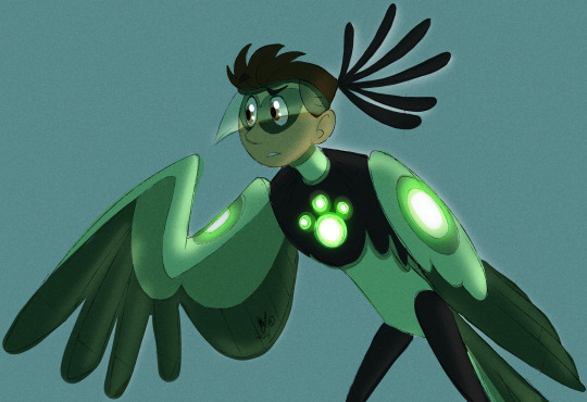
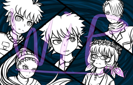
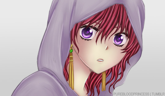
First have a Chris as a glowy confused secretary bird. I just think he's neat. X3
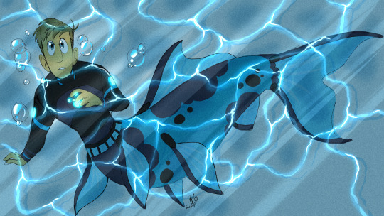
Next, have a MerMartin. I dreamed a villain wanted to use the creature power suits to show off at their freakshow with other "weird" animals, so they went to Zach for his disruptors and Martin got turned into half a goldfish by accident and became an instant hit being a cryptid and all. Too late for mermay I suppose. Might play around with this one.....
water tutorial
#wild kratts#chris kratt#martin kratt#freakshow au? mer au? goldfish au???#i just don't know yet lol#can't help but think about goldfish having bad memories and projecting my bad memory onto martin.......#also that one tumblr water effect tutorial works very well#my art
628 notes
·
View notes
Note
long post, this is my own pov but its really worth reading up here's my pov, from the understanding of fair use. the copyright system in the USA is not perfect but it is a) what is currently legally enforceable b) its a decent starting point. There is also a a US copyright claim to a Midjourney created comic (the writing & panelling were human made but the specific per panel images were machine generated & edited/layouted by its human writer) thats written in pretty layman terms that might help.
Copyright is also! not just about what is/isnt stealing but it does deal a lot with whats legal and what you can profit from and that's pretty deeply tied into this issue. And the copyright office decision also cuts well into the non human factor of this
So here are the 4 general guidelines for copyright: 1. the purpose and character of the use, including whether such use is of a commercial nature or is for nonprofit educational purposes;
2. the nature of the copyrighted work;
3.the amount and substantiality of the portion used in relation to the copyrighted work as a whole;
4. and the effect of the use upon the potential market for or value of the copyrighted work.
the worst and most flagrant copyright issues are because you can, in fact, explicitly instruct the AI to copy specific artists. Yes it trains mindlessly on large datasets, but it also learns like, "expressionism" are these traits and art style like "Monet" are these other traits. And manyyy of these artists are contemporary and living artists, especially those who's work is popular on social media. For human artists, you learn techniques sure, but in practice, its almost always an amalgamation of different techniques and your own techniques AND human input to create unique images. Aka, when I copy a Kevin Wada painting tutorial, the way I draw and what I like wouldn't make it look like Wada's. In general and in practice with experienced artist's- yeah copying techniques rarely actually replicates the work. But in many cases- the training on general techniques to create unique art is just not true as these programs outright attempt to emulate original works. This is why a lot of articles against AI point out that you can fully reproduce Sony's Dualshock 3 controllers and near perfect frame recreations of Avenger's Endgame. Its not about technique, its that you are recreating end products. This would violate a lot of 3 (because now your end work is suddenly a lot like the original. In addition, they can often be rarely transformative. They do not add new ideas or perceptions to the thing they copy, theyre just... adding it) and 4 (if you copy comic artist John McJohn's exact art style, the way AI does, you are actively impacting the market and value for John McJohn to sell his art. If you are selling a product with all the main characteristics as John McJohn buyers, it's a good sign number 4 is a problem)
2. Okay well tumblr user jirnkirks, what about all the art that isnt identifiably from a specific IP or artist? I would say this is where some of the legal stuff is beyond me slash the US Copyright system isn't perfect and golden. But first of all, and most notably, an individual human copying an existing painting or following a tutorial is very different from a for profit corporation data scraping millions of images in bulk. Shitbag vibes aside, data scraping like this is a commercial use of the product. It's a bit like the difference between going to a govt protected/taxpayer funded river and taking a sip or a dip vs going to a river, setting up a pump and packaging machine to bottle up the water to sell. Many of these companies are taking images at a scale, collecting them, and using them at a profit with a new technology that artists did not consent to.
As an artist... in little ways, there are some similarities. But from a long pov? Its one thing to accept your art will get human copycats and people inspired by you. Its a whole other kettle of fish to see your art being used to power an industry commercializing artist's work as a whole without consent whilst actively working to remove the value and industry for your work in an already exploitative industry.
3. How do humans use techniques? All humans have their own individual thoughts and artistic viewpoints. To say artists steal or copy each other techniques is a bit of a flattening of what goes on- of course copying techniques occurs and copycat artists, but generally like...artists just inspire each other and a single artist is their own sauce + a mix of different things that makes something identifiably theres. Their inspiration is transformed by the human. This might change one day but.... AI aren't people. I can't stress this enough. they are not intelligent, they are not cognizant or conscious. They are essentially complicated formulas that learn to use billions of variables to approximate a balance the end user likes. There is nothing inherently human or transformative in their works because they are programs. They can't do any of that. This was, in fact, part of the Copyright Office's decision. Humans can choose the result they want but the actual process generating the image? It is the same level of intelligence behind shaking a dice and printing the result.
And I think its fair that artists come from a community of inspiration and generally, most understand that as they become more prolific artists, they give back to the same community of artists. Computer programs are not and have never been part of this community, and worse yet, its greatest proponents have been actively anti artist, both philosophically and financially.
isn’t art about taking/copying little elements from the art of others? if ai is trained on such a large data set how is fhat ethically wrong, artists don’t consent to people taking their techniques either
/gen question please don’t attack me
-
17 notes
·
View notes
Text
How to Write Indigenous Characters Without Looking like a Jackass:
Update as of December 26th, 2020: I have added a couple new sections about naming and legal terms, as well as a bit of reading on the Cherokee Princess phenomenon.
Boozhoo (hello) Fallout fandom! I'm a card-carrying Anishinaabe delivering this rough guide about writing Indigenous characters because wow, do I see a lot of shit.
Let's get something out of the way first: Fallout's portrayal of Indigenous people is racist. From a vague definition of "tribal" to the claims of them being "savage" and "uncivilized" mirror real-world stereotypes used to dehumanize us. Fallout New Vegas' narrated intro has Ron Perlman saying Mr. House "rehabilitated" tribals to create New Vegas' Three Families. You know. Rehabilitate. As if we are animals. Top it off with an erasure of Indigenous people in the American Southwest and no real tribe names, and you've got some pretty shitty representation. The absence of Native American as a race option in the GECK isn't too great, given that two Native characters are marked "Caucasian" despite being brown. Butch Deloria is a pretty well-known example of this effect. (Addendum: Indigenous people can have any mix of dominant and recessive traits, as well as present different phenotypes. What bothers me is it doesn't accommodate us or mixed people, which is another post entirely.)
As a precautionary warning: this post and the sources linked will discuss racism and genocide. There will also be discussion of multiple kinds of abuse.
Now, your best approach will be to pick a nation or tribe and research them. However, what follows will be general references.
Terms that may come up in your research include Aboriginal/Native Canadian, American Indian/Native American, Inuit, Métis, and Mestizo. The latter two refer to cultural groups created after the discovery of the so-called New World. (Addendum made September 5th, 2020: Mestizo has negative connotations and originally meant "half breed" so stick with referring to your mixed Latine and Indigenous characters as mixed Indigenous or simply by the name of their people [Maya, Nahua].)
As a note, not every mixed person is Métis or Mestizo. If you are, say, Serbian and Anishinaabe, you would be mixed, but not Métis (the big M is important here, as it refers to a specific culture). Even the most liberal definition caps off at French and British ancestry alongside Indigenous (some say Scottish and English). Mestizo works the same, since it refers to descendants of Spanish conquistadors/settlers and Indigenous people.
Trouble figuring out whose land is where? No problem, check out this map.
Drawing
Don't draw us with red skin. It's offensive and stereotypical.
Tutorial for Native Skintones
Tutorial for Mixed Native Skintones
Why Many Natives Have Long Hair (this would technically fit better under another category, but give your Native men long hair!)
If You're Including Traditional Wear, Research! It's Out There
Languages
Remember, there are a variety of languages spoken by Indigenous people today. No two tribes will speak the same language, though there are some that are close and may have loan words from each other (Cree and Anishinaabemowin come to mind). Make sure your Diné (you may know them as Navajo) character doesn't start dropping Cree words.
Here's a Site With a Map and Voice Clips
Here's an Extensive List of Amerindian Languages
Keep in mind there are some sounds that have no direct English equivalents. But while we're at it, remember a lot of us speak English, French, Spanish, or Portuguese. The languages of the countries that colonized us.
Words in Amerindian languages tend to be longer than English ones and are in the format of prefix + verb + suffix to get concepts across. Gaawiin miskwaasinoon is a complete sentence in Anishinaabemowin, for example (it is not red).
Names
Surprisingly, we don't have names like Passing Dawn or Two-Bears-High-Fiving in real life. A lot of us have, for lack of better phrasing, white people names. We may have family traditions of passing a name down from generation to generation (I am the fourth person in my maternal line to have my middle name), but not everyone is going to do that. If you do opt for a name from a specific tribe, make sure you haven't chosen a last name from another tribe.
Baby name sites aren't reliable, because most of the names on there will be made up by people who aren't Indigenous. That site does list some notable exceptions and debunks misconceptions.
Here's a list of last names from the American census.
Indian Names
You may also hear "spirit names" because that's what they are for. You know the sort of mystical nature-related name getting slapped on an Indigenous character? Let's dive into that for a moment.
The concept of a spirit name seems to have gotten mistranslated at some point in time. It is the name Creator calls you throughout all your time both here and in the spirit world. These names are given (note the word usage) to you in a ceremony performed by an elder. This is not done lightly.
A lot of imitations of this end up sounding strange because they don't follow traditional guidelines. (I realize this has spread out of the original circle, but Fallout fans may recall other characters in Honest Hearts and mods that do this. They have really weird and racist results.)
If you're not Indigenous: don't try this. You will be wrong.
Legal Terms
Now, sometimes the legal term (or terms) for a tribe may not be what they refer to themselves as. A really great example of this would be the Oceti Sakowin and "Sioux". How did that happen, you might be wondering. Smoky Mountain News has an article about this word and others, including the history of these terms.
For the most accurate information, you are best off having your character refer to themselves by the name their nation uses outside of legislation. A band name would be pretty good for this (Oglala Lakota, for example). I personally refer to myself by my band.
Cowboys
And something the Fallout New Vegas fans might be interested in, cowboys! Here's a link to a post with several books about Black and Indigenous cowboys in the Wild West.
Representation: Stereotypes and Critical Thought
Now, you'll need to think critically about why you want to write your Indigenous character a certain way. Here is a comprehensive post about stereotypes versus nuance.
Familiarize yourself with tropes. The Magical Indian is a pretty prominent one, with lots of shaman-type characters in movies and television shows. This post touches on its sister tropes (The Magical Asian and The Magical Negro), but is primarily about the latter.
Say you want to write an Indigenous woman. Awesome! Characters I love to see. Just make sure you're aware of the stereotypes surrounding her and other Women of Color.
Word to the wise: do not make your Indigenous character an alcoholic. "What, so they can't even drink?" You might be asking. That is not what I'm saying. There is a pervasive stereotype about Drunk Indians, painting a reaction to trauma as an inherent genetic failing, as stated in this piece about Indigenous social worker Jessica Elm's research. The same goes for drugs. Ellen Deloria is an example of this stereotype.
Familiarize yourself with and avoid the Noble Savage trope. This was used to dehumanize us and paint us as "childlike" for the sake of a plot device. It unfortunately persists today.
Casinos are one of the few ways for tribes to make money so they can build homes and maintain roads. However, some are planning on diversifying into other business ventures.
There's a stereotype where we all live off government handouts. Buddy, some of these long-term boil water advisories have been in place for over twenty years. The funding allocated to us as a percentage is 0.39%: less than half a percent to fight the coronavirus. They don't give us money.
"But what about people claiming to be descended from a Cherokee princess?" Cherokee don't and never had anything resembling princesses. White southerners made that up prior to the Civil War. As the article mentions, they fancied themselves "defending their lands as the Indians did".
Also, don't make your Indigenous character a cannibal. Cannibalism is a serious taboo in a lot of our cultures, particularly northern ones.
Our lands are not cursed. We don't have a litany of curses to cast on white people in found footage films. Seriously. We have better things to be doing. Why on earth would our ancestors be haunting you when they could be with their families? Very egotistical assumption.
Indigenous Ties and Blood Quantum
Blood quantum is a colonial system that was initially designed to "breed out the Indian" in people. To dilute our bloodlines until we assimilated properly into white society. NPR has an article on it here.
However, this isn't how a vast majority of us define our identities. What makes us Indigenous is our connections (or reconnection) to our families, tribes, bands, clans, and communities.
Blood quantum has also historically been used to exclude Black Natives from tribal enrollment, given that it was first based on appearance. So, if you looked Black and not the image of "Indian" the white census taker had in his brain, you were excluded and so were your descendants.
Here are two tumblrs that talk about Black Indigenous issues and their perspectives. They also talk about Aboriginal and Torres Strait Islander people of Australia.
However, if you aren't Indigenous, don't bring up blood quantum. Don't. This is an issue you should not be speaking about.
Cherokee Princess Myth
"Princess" was not a real position in any tribe. The European idea of monarchy did not suddenly manifest somewhere else. The closest probable approximation may have been the daughter of a chief or other politically prominent person. But princess? No.
Here is an article talking about possible origins of this myth. Several things are of note here: women from other tribes may have bee shoved under this label and the idea of a "Cherokee Princess" had been brought up to explain the sudden appearance of a brown-skinned (read: half Black) family member.
For a somewhat more in depth discussion of why, specifically, this myth gets touted around so often, Timeline has this piece.
Religion
Our religions are closed. We are not going to tell you how we worship. Mostly because every little bit we choose to share gets appropriated. Smudging is the most recent example. If you aren't Indigenous, that's smoke cleansing. Smudging is done in a specific way with ceremonies and prayers.
Now, a lot of us were forcibly converted. Every residential school was run by Christians. So plenty of us are Catholic, Baptist, Anglican, Lutheran, etc. Catholicism in Latin America also has influence from the Indigenous religions in that region.
Having your Indigenous character pray or carry rosaries wouldn't be a bad thing, if that religion was important to them. Even if they are atheist, if they lived outside of a reserve or other Indigenous communities, they might have Christian influences due to its domination of the Western world.
Settler Colonialism and the White Savior Trope
Now we've come to our most painful section yet. Fallout unintentionally has an excellent agent of settler-colonialism, in particular the Western Christian European variety, in Caesar's Legion and Joshua Graham.
(Addendum: Honest Hearts is extremely offensive in its portrayal of Indigenous people, and egregiously shows a white man needing to "civilize" tribals and having to teach them basic skills. These skills include cooking, finding safe water, and defending themselves from other tribes.)
Before we dive in, here is a post explaining the concept of cultural Christianity, if you are unfamiliar with it.
We also need to familiarize ourselves with The White Man's Burden. While the poem was written regarding the American-Philippine war, it still captures the attitudes toward Indigenous folks all over the world at the time.
As this article in Teen Vogue points out, white people like to believe they need to save People of Color. You don't need to. People of Color can save themselves.
Now, cultural Christianity isn't alone on this side of the pond. Writer Teju Cole authored a piece on the White Savior Industrial Complex to describe mission trips undertaken by white missionaries to Africa to feed their egos.
Colonialism has always been about the acquisition of wealth. To share a quote from this paper about the ongoing genocide of Indigenous peoples: "Negatively, [settler colonialism] strives for the dissolution of native societies. Positively, it erects a new colonial society on the expropriated land base—as I put it, settler colonizers come to stay: invasion is a structure not an event. In its positive aspect, elimination is an organizing principal of settler-colonial society rather than a one-off (and superseded) occurrence. The positive outcomes of the logic of elimination can include officially encouraged miscegenation, the breaking-down of native title into alienable individual freeholds, native citizenship, child abduction, religious conversion, resocialization in total institutions such as missions or boarding schools, and a whole range of cognate biocultural assimilations. All these strategies, including frontier homicide, are characteristic of settler colonialism. Some of them are more controversial in genocide studies than others." (Positive, here, is referring to "benefits" for the colonizers. Indigenous people don't consider colonization beneficial.)
An example of a non-benefit, the Church Rock disaster had Diné children playing in radioactive water so the company involved could avoid bad publicity.
Moving on, don't sterilize your Indigenous people. Sterilization, particularly when it is done without consent, has long been used as a tool by the white system to prevent "undesirables" (read, People of Color and disabled people) from having children. Somehow, as of 2018, it wasn't officially considered a crime.
The goal of colonization was to eliminate us entirely. Millions died because of exposure to European diseases. Settlers used to and still do separate our children from us for reasons so small as having a dirty dish in the sink. You read that right, a single dirty dish in your kitchen sink was enough to get your children taken and adopted out to white families. This information was told to me by an Indigenous social work student whose name I will keep anonymous.
It wasn't until recently they made amendments to the Indian Act that wouldn't automatically render Indigenous women non-status if they married someone not Indigenous. It also took much too long for Indigenous families to take priority in child placement over white ones. Canada used to adopt Indigenous out to white American families. The source for that statement is further down, but adoption has been used as a tool to destroy cultures.
I am also begging you to cast aside whatever colonialist systems have told you about us. We are alive. People with a past, not people of the past, which was wonderfully said here by Frank Waln.
Topics to Avoid if You Aren't Indigenous
Child Separation. Just don't. We deserve to remain with our families and our communities. Let us stay together and be happy that way.
Assimilation schools. Do not bring up a tool for cultural genocide that has left lasting trauma in our communities.
W/ndigos. I don't care that they're in Fallout 76. They shouldn't be. Besides, you never get them right anyway.
Sk/nwalkers. Absolutely do not. Diné stories are not your playthings either.
I've already talked about drugs and alcohol. Do your research with compassion and empathy in mind. Indigenous people have a lot of pain and generational trauma. You will need to be extremely careful having your Indigenous characters use drugs and alcohol. If your character can be reduced to their (possible) substance abuse issues, you need to step back and rework it. As mentioned in Jessica Elm's research, remember that it isn't inherent to us.
For our final note: remember that we're complex, autonomous human beings. Don't use our deaths to further the stories of your white characters. Don't reduce us to some childlike thing that needs to be raised and civilized by white characters. We interact with society a little differently than you do, but we interact nonetheless.
Meegwetch (thank you) for reading! Remember to do your research and portray us well, but also back off when you are told by an Indigenous person.
This may be updated in the future, it depends on what information I come across or, if other Indigenous people are so inclined, what is added to this post.
#fallout 3#fallout 4#fallout 76#fallout new vegas#fallout 1#fallout 2#fallout: new vegas#ozhibii'ige
13K notes
·
View notes
Text
Tips for Working with ADHD During Online School (or Work)!
This is really late and I don’t really know why I didn't do this earlier, but here we are! I thought I’d publish a list of tips and tricks that have helped me while doing school online - mostly long homework sessions - (and might help with online working). Even though it is the summer, some people are still working or doing summer school, so I hope this helps someone who needs it!
Get everything you’ll need or even the stuff you might need. It saves you from having to get up if you’re on a roll and breaking your streak (or maybe you find you can’t get up to get it bc ~executive dysfunction~)
If you find you don’t have something you need and it’s not pressing, wait until a pause or you’re getting up anyways, ie you’re getting up to fill your water bottle and you’re gonna need your phone charger. Take that time to go to the bathroom, get a snack, etc. I find this the best way to get around executive dysfunction because I didn’t want to get up for that one small thing earlier, but now I’m up for something else and I can kinda justify my other tasks, in a way? It’s like, I get up, and I'm like “well I'm already getting water, might as well just grab a snack and my phone charger too”
I’m terrible at prioritizing, so I try to prioritize the most obvious assignments first. You have one assignment due at 3 and another at 6? Do the 3 pm deadline first. You have a certain class that you have more missing assignments in than another? Do that homework first. If you can’t prioritize, try to think of the most logical order.
I usually do all my assignments for one class in a block because I get on a roll. Like, my brain is thinking in chemistry or whatever, so I knock out all my chem assignments at one time (this has to do with ADHD brains not being very good at jumping from task to task).
I started planning heavy hw days on google calendar. For example, I just list all the assignments I have to do and what time to do them and calendar will give me a little notification 10 and 5 minutes before a new task starts (this also helps me keep track of how time is passing because adhd brains aren’t too great at that either). Tip: give yourself much more time than you think you need—I usually give an hour unless it’s a super short assignment. Even if you’re 100% sure that you’ll finish it in under an hour, give yourself an hour and you feel a sense of accomplishment (and get a lil dopamine boost—we tend to be short on that too) because you finished something earlier than expected and you get ahead of schedule (which, if you finish before you plan on, will also give you a dopamine boost at the end).
Keep a bottle of water near you and a snack or two if you want. I need my meds to stay focused on my assignments for longer than an hour or so and it drastically improves my executive function (this is specifically for me, I don't know how meds work for everyone else). But the side effects of all three different types of meds I’ve taken have all come up/been worse when I don’t drink enough water. Also it’s just good for you. My meds kill my appetite, so I don’t need snacks, but if you get hungry, go for it.
Most of the time, I like having someone or a list giving me explicit instructions, kind of like a checklist I can check off. So even if you don’t use a calendar, I suggest putting your assignments in a numbered or bulleted list and then you can just check them off as you move down the list. It also tells me what to do next, because I’ll just do whatever I feel like doing most of the time and a list gives me direction. (Also, having one central list helps me keep everything in one place so I don’t have to go hunting through each of my class schedules for all my class assignments)
I have a little calendar chart for the week I created on google docs and there I list what assignments are due on which days of the week that I fill out on Monday. Once I fill it out, I spread out the assignments over the week (because a good 75% of them are due on Friday) so I have around 4 assignments due each day (which generally takes me from 9 or 10 to anywhere from 3 to 5. Even then I’ll usually not have enough work to spread over 5 days (because most of my teachers aren’t pure evil) so I’ll sprinkle in some of my many missing assignments in there on the lighter days. Also, it prevents me from only doing one or two assignments for a few days and then realizing that to not have any late work, I’ll have to complete 5 in one day (that’s happened before. It was extremely stressful and I didn't finish all my assignments. 0/10 do not recommend).
Take plenty of little breaks. We’ll get mentally tired from hours straight of just doing schoolwork (I’m not 100% sure if this is an adhd thing so don’t quote me on it but I’m pretty sure) so take a 15-30 minute break every few hours or assignments, maybe 20 minutes every 1.5 hours or after you finish two assignments or whatever works for you. Read a few chapters of your book, watch an episode of your favorite show, or make some food and scroll mindlessly through tumblr, whatever makes you happy. Just plan them ahead so you don’t get sucked in to doing 3, 4, 5 hours of work nonstop by setting an alarm for a specific time or putting it on your calendar.
Have a special place to do your work. I can't speak for everyone, but a lot of my motivation comes from habits, so I’ll do work (and only work) at my desk and not in my chair or bed or whatever (even though it’s way more comfortable) so when I sit down my brains like “ok it’s time to work I gotchu”
Not necessarily for working, but for zoom calls: get your favorite stim to use during those. A lot of teachers will ramble on and on and I’ve gotten so fidgety during these calls its really noticeable (aka, you can literally see me trying to crack my neck/back/fingers every five seconds) so I’ve taken to having some scissors and one of my many balls of yarn on my desk so I can start braiding or fingerknitting some yarn while my teachers ramble.
Sidenote: fingerknitting is a really great stim (for me, at least) because it requires basic, repetitive motions that don’t require me to look at my fingers. I once read like 14 (?) scenes of Shakespeare almost all in a row and I swear, I was only able to do that because of the fingerknitting. It’s super simple and you could probably find dozens of short tutorials on youtube.
I'm pretty sure this is only a mac thing, but on my computer, I have it set to announce the time on the hour, every hour and I find it helps with my complete time blindness and helps me not get sucked into doing a 1 hour project for 2 hours. Also if i'm working on a project that’s taking longer than expected and I have a zoom call at, say, 11, then the computer will break me out of my homework trance and I’ll realize what time it is (if that makes sense) and it’s prevented me from being late to a zoom many times. To get your macbook to do this, you go to the desktop —> settings —> date and time —> and then click “announce the time”, and you can choose whether you want it to announce it every hour, half an hour, or fifteen minutes.
Feel free to add your own! Happy studying/working!
64 notes
·
View notes
Text
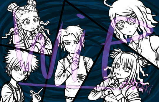
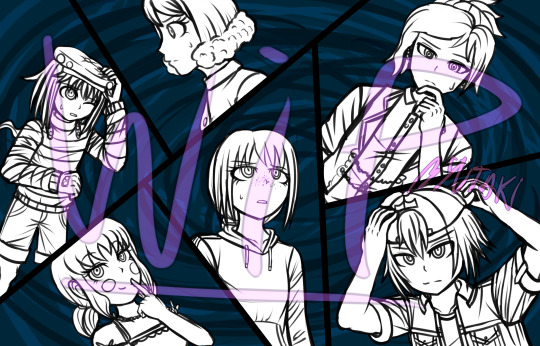
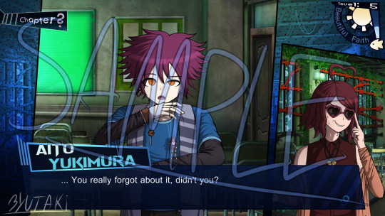
DDR:LF Progress Log
Hi everyone! Welcome to the first progress log.
It’s a post where I put all the things I’ve done for the fanganronpa so far that I haven’t posted anywhere; most of them are WIPs or Betas. It also works for me as a way to keep track of how far I’ve come.
Today’s post contains the following:
Character Bios (previously only available in the DR amino) and FAQ
4 WIPs of important CGs (well... more like 2)
3 Different types of Animation Tests
WIP/Beta of the GUI Design
Next objectives
If you’re interested in checking this post, keep reading it down below!

By the way, feel free to join the fangan’s discord server by going to this link https://discordapp.com/invite/aSd6PN4 ^^ with that being said, let’s begin the post~!
-------------------
Character Bios and FAQ
To start this blog AND this post on a right note, I’m finally posting on tumblr the character bios, which means you can now access to the information from each member of the cast of DDR:LF, which was previously only available in amino. You can find them in this post.
As for the other part, I wrote a FAQ with the main sort of questions there could be about the fangan. Feel free to give it a read here if you want to know about some basic stuff about the project, and if you still have doubts, please do send an ask! I’ll gladly answer it ^^
WIPs of CGs
You didn’t think that the only drawing I was working on were sprites, right?
In today’s post, here are some CGs WIPs that I didn’t get around to finish yet (since their priority is below the character sprites, but it’s a nice change instead of doing sprites 24/7).
First, the pre-trial CGs!
There are some expressions/positions that I might be willing to change, although that’ll come in later when I gotta sit down to finish these. But yeah, later. (Also, just to be clear, I drew these waaay back, so the designs might not match the current ones).
In a trial, depending the type of chapter, the 1st CG and 3rd one will switch places. The one that appears last will be the one that contains the protagonist whose POV we are witnessing.
Second, one of every prologue’s main CGs. “The killing game has begun!”
Looks of doubt and deceith are flying across the room! Who will make it through the end of the day? And who’ll be left behind~?
It might seem pretty basic without them being colored, but hopefully it’ll look better in the future!
Animation Tests
Man, this was a lot of fun to work on, and it was all worth it! I hope you all enjoy these as much as I did while trying to materialize these concepts!
#1 - Prologue Title Card
Every chapter of this story has a title card, just like the original danganronpa games. In the case of DDR:LF, this is more or less what each card will look like.
youtube
It’s kinda basic; elements being added to the screen here and there, as well as some silhouettes appearing.
What are these silhouettes, you might ask? It’s none other than the cast of the fangan, but it’s not just anybody who’s randomly picked. The silhouettes belong to the victims and the murderers of the current chapter, so for example, chapter 1 will have the silhouette of the 1st victim and the 1st murderer, but it’ll be modified enough for the silhouette to not be easily recognizable; nobody wants to get spoiled the deaths right at the start of the chapter, right?
Of course, the prologue is an exception... maybe.
A bit of the BGM was done by me, while some other elements of it were taken off from royalty free sound effects/melodies websites.
---------------
#2 - Pixel Execution
As you all know, there’s always a pixel animation that starts off an execution. I have that too, of course! and in order to avoid spoilers + show you what I was able to do, I put myself in the place of the culprit. (I swear I didn’t kill off anyone yet... only after the fangan has started I’ll be considered guilty).
youtube
The background music was also composed entirely by me, although in the future it might change- but I don’t really know for certain, so get used to this for now :)
---------------
#3 - Execution style test
I’ve recently downloaded the program Live2D, and what for? For executions, no less! After trying it for a while, I’ve concluded that it’d simplify my job a lot more than if I used sony vegas for animating the executions (not to mention it looks smoother with this new one).
youtube
For this test, I’ve used Seiji as my puppet. It might be simple, but it was to test out the limits of the program. It turned out really good imo! So I’ve decided to use Live2D to animate the executions (or at least, do most parts of them with it). I learnt some stuff while experimenting around with the program, so next time I’ll finish these sort of things even faster probably.
Also I put it on loop because a 2 second video is rather sad.
GUI Design
Now, I'll admit that I'm not the best at GUI design, but I tried my best to come up with my own design for the fanganronpa's interface, which I made based on a water-ish looking theme. The (not final) result of that is the picture below.
In case that you’re wondering, no, this isn’t any sort of canon conversation. It’s just the phrase I could come up with.
And yes, the background is from V3; I don't have any backgrounds at all for the project yet lol.
The sun and the fish on the top right corner will change depending on the time of day; but that's something that I'll keep to myself until the moment I start posting the story.
I have conflicted feelings with this GUI though, I don't know if I like it or not. It looks somewhat good but still off at the same time? Although it might just be me. If anyone has any feedback or suggestion for the GUI's design, the inbox is always open to receive such help!
So what's next?
Currently, I have loads of assignments at college, so it's kinda hard to make a balance between the project, social life and college work. However, the project is something that won’t stop.
The fangan has only one member, which is me of course; that means it’s going at a slow pace. I'm willing to make a recruitment for help, but that’ll be later once I have the basics to let someone else help me. If you’re willing to volunteer for this project, keep heads eyes up for the day I call out for help.
In the past, I tried to learn how to program with unity, but it’s hard to follow it up when the free tutorials are scattered here and there. When I have free time and everything art-related has been set up, I might try to pick it up again. I say might because I’m gonna start a tiny course for unreal engine at college. Maybe with the basics that they teach there, I’ll be able to do a better/quicker job than if I did it with unity (which I have 0 experience with). But the future is uncertain, so I’ll be the judge of that once I’m done with that course!
With that being said... as of now, the next objectives for the project (not ordered by priority) are the following:
Finishing Default Sprites.
I only have 7 default sprites done out of the 16 students, and I’m already working on the 8th. Half-way there?
Concept Art for each Room/Place.
While I have written down all the places in each dome, there are some that I need to draw the concept of the place, since the idea in my mind keeps changing them, I should settle them down.
Finishing Writing the Prologue and the Basics of Chapter 1.
I mean I already have like a half of these two things or more, but since I keep changing it, they never get any actual progress. Maybe I should learn to let it be as it is lol.
Creating 3D Assets.
Of course, I’ll make the 3D models for the rooms and props... well, I might do them; that is if I can’t find anyone that can make them. Pros of this is that I can do things exactly how I want them; cons are that it takes time and I’m not an expert in 3D modeling.
Trial GUI.
Class trials in danganronpa have a different GUI than the one used outside of them. We have a beta for the general GUI up there, now we need one for the class trial’s as well!
Concept Art for... a Trial Thing.
It’s no surprise that there are special things in fanganronpas, such as making changes to certain game mechanics, or creating completely new ones. The one I’m refering to in this case is a change to an already existing mechanic in the DR games. Can you guess which one it is~?
Splash Art.
During the first year of birthdays, I drew some sketches for the characters; those are the base for their future splash art.
---------------------
And last (and currently least important)
Recruiting Volunteers for the Project.
Obviously, I can’t do everything in this project by myself. In the future, once I have made a base for every ground of the project, I’ll recruit people that can work from there. Artists (GUI,CG and Sprite), Compositors, and 3D modelers are the ones that I’ll be looking for in this recruitment. In an even-later recruitment, I’ll make a casting call for voice actors as well. Please be patient though!
---------------------------------------------
I suppose that’s it for this very long post. It took more days than expected to put everything together, but at last I can release it now!
Now, June and July are pretty busy months at college, so unfortunatelly the progress will slow down a lot more than usual for the next few weeks. Thanks for sticking around this project despite the long road it has ahead! ^^
See you all in the next post! And if you read this entire thing, thank you for your interest in the fangan! <3
8 notes
·
View notes
Text
Manga Colouring Tutorial
youtube
Dedicated to @aphrodytevalentine, @eternalpassions and @vk-crzy! I hope you will find this useful girls!
Hello everyone~! <3
I put together a manga colouring tutorial. It’s more like a recording of the process of what I usually do, but I hope it can still be useful for some people. I’m not saying my way of doing things is the only way to colour manga. There are numerous methods you can use, I think most of it depends on personal preference. This is just simply what works best for me.
Rest of the explanation is under the cut.
Programs used:
- Adobe Photoshop CC 2015 - Paint Tool Sai - Wacom Intuos Draw (graphic tablet)
It’s perfectly possible to colour without a graphic tablet, but I’m not gonna lie, having one certainly makes life easier. Same can be said about Sai. Doing everyting in Photoshop is possible, but some of Sai’s tools are so good that once you try them you never wanna go back.
I’m not going to go into super detail with my explanation, I don’t think this is the place to teach how to use Photoshop (and Sai). So please ensure you have a basic knowledge of things before you attempt this.
You can download the finished PSD here.
Steps:
I always start with Photoshop. I fix the scan and put on the base colours, but I don’t use a tablet for this. Then I open up Sai and shade with the tablet. Once that’s done I use Photoshop again to change the background and add any effects/filters that I want or find suitable for the image.
Basically, Sai and the tablet is for shading only, everything else is done in Photoshop.
1. Use good quality scan.
I’m not kidding, having good scans means you have to work less on trying to improve the quality before colouring. It’s super helpful.
2. Fix your scan.
If you want to get rid of the background or speech bubbles, start with that. Do some redrawing if needed. Remove any excess dust and make sure the scan is clean. I usually remove the shading on the skin area as well. Level the image properly and if needed, use Topaz Clean and Topaz Denoise. Basically, fix the scan as if you were attempting a black and white edit.
3. Set your layers up.
Make sure you always group and name them, it’s super helpful when you have to work with 100 or more layers. Also make sure that you make a new layer for everything. Easier to backtrack and correct mistakes.
This is how it looks like at the end:

With one group open:

Lineart layer is always at the top, set to multiply. I always put a layer mask on it and fill that with a mid-toned grey, this is going to make the lines less harsh and overall more pleasing to look at. After that I have the lineart layer locked so that I don’t accidentally paint on top.
Background layer is always at the bottom. While I colour I usually have it filled with a random colour, it’s to make it easier to look at, pure white is very blinding after staring at it for a long time. Then, just like the lineart layer, I lock it to avoid accidents. After the colouring is done, I change the background to whatever I find fitting for the current image.
The colour layers are in between the lineart and the background. As you can see I always have them grouped. I made a screenshot of the “hair group” open so you can see how it looks. Others look the same. At the bottom I have the base colour, above that those are the shading layers. I always use Clipping Mask so that the shading doesn’t flow outside of the base colour.
4. Put on all your base colours.
I usually use the Pen Tool to select the area I want selected, and then I simply fill it in. You can save yourself some time if you remember the general rule that a layer that is on top of another one, is going to hide the one under. So basically you don’t always have to follow the outline if you know that a layer you will make on top will hide the excess anyways. Please watch the video to better understand, it’s hard to explain lol.
5. Do the shading in Sai.
After the base colours are on, open up Sai and shade. Try to place the light source in one corner. What I mean by that is try to decide and keep in mind where the light is coming from, the shades depend on that. For shading I usually use the Marker Tool, the Brush Tool, the Blur Tool, the Eraser Tool and sometimes the Water Colour Tool. In Sai you have loads of settings and options for the brushes and the graphic tablet makes all of it pressure sensitive so you can have very delicate strokes. For highlights I usually set the layer to Luminosity. Another good function of Sai is that you can use Hue/Saturation for the entire layer group and not just one layer. That way it’s easy to fix the colours after you finished shading.
6. Add the remaining extra touches in Photoshop.
After I’m done shading, I fix the background and add effects/textures/etc in Photoshop. Make sure you resize the finished image to Tumblr dimensions and you are done. :)
#there is no music under the video so far but i might add something later#manga coloring#tutorial#manga coloring tutorial#digital colouring
38 notes
·
View notes
Text
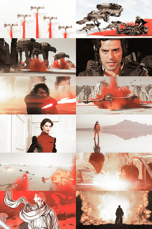
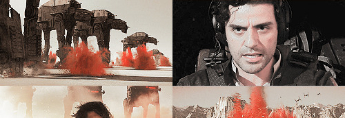
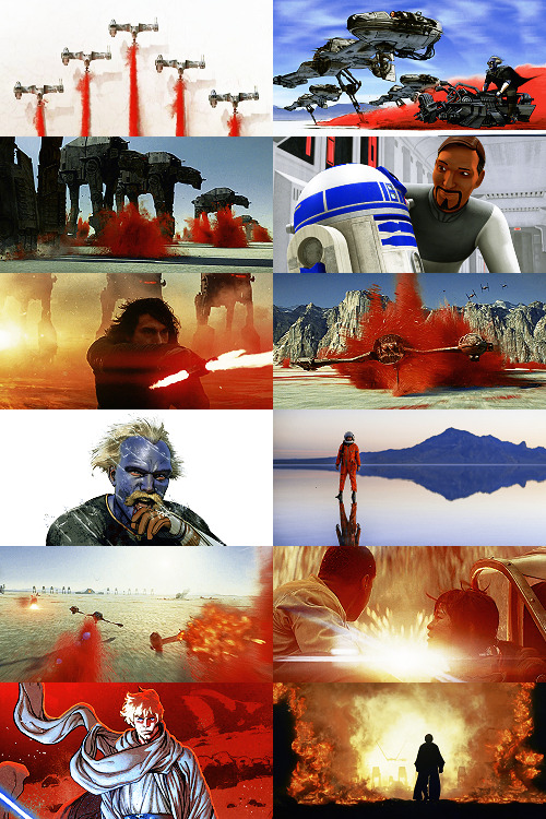
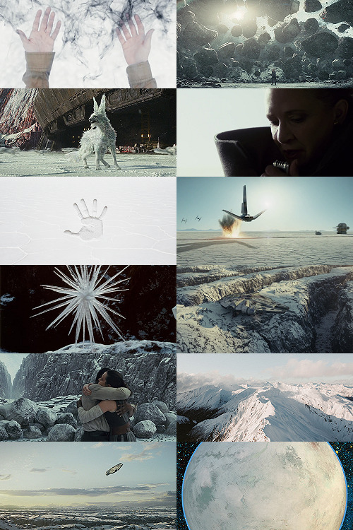
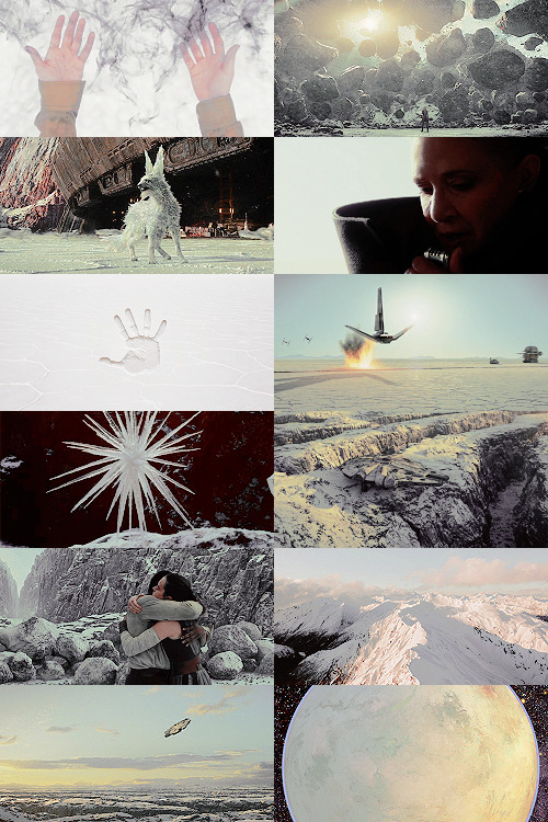
Making A Galaxy Far Far Away: An Aesthetic Photoset Tutorial
Requested by @geleixi (and varying amounts of time ago by @rockett-to-the-purple-moon, @thenameisgreed, @pizzaplanethq, and probably others who sent nice messages that I went “Oh, what a nice message this means so much I LOVE IT SO MUCH I’M TOO ANXIOUS TO ANSWER IT WRONG I’ll just do it later” and then promptly NEVER answered it.)
Brainstorming & Photo Collection
Picking a Color Palette
Choosing Images from Collection
Coloring
Textures & Effects
First off: I am not even going to remotely pretend like graphic design is a Thing I Am Better At Than Anyone Else, because that would be patently false and ridiculous, but I also get a fair number of Asks about making photosets/aesthetic posts, so here we are. I’m planning to do a separate one, maybe, for how I do the Cartoon Girls All Grown Up and Nancy Drew Dream Games series, because the “brainstorming and photo collection” part is so different that it inherently affects the rest of the process.
BUT I also feel like I don’t see a ton of tutorials that go through the brainstorming/finding images part of making aesthetics, and I tend to think of my Graphics Style(TM) as “DEEPLY Uninterested in washed-out faux sepiatone grimdark Tumblr Coloring?? + Not Good Enough At Masks To Do Negative Space Well,” which might be some people’s level of ~graphics design passion(TM)~ too, so. That’s the ride for which this ticket has been bought.

Brainstorming & Photo Collection
Obviously, the specifics of this are totally different for every aesthetic, but all of the GFFA/swworlds start from the same seed: Star Wars Aesthetic.
Star Wars itself has a very particular Lookque, imo: it’s not quite retrofuture, it’s not quite dirtpunk, it’s not quite scifi, even. There are the insanely sumptuous (and hella culturally appropriative) queens of Naboo and the ramshackle toppled AT-AT where Rey lives on Jakku and the not-even-subtle-at-all-jfc Nazi inspiration of the Empire and First Order and the straight-up millennial Tumblr witch Goffik look of the Dathomir Witches and Zabrak siths and the blue, blue water of Scarif. There “isn’t” a unifying aesthetic through Star Wars, and yet, as Gareth Edwards said, there’s a LOOK and FEEL to Star Wars: if you go a little too far to the left or right, it isn’t Star Wars anymore.*
*That said, this tutorial talks about Crait, which was invented by Rilo Jon, who went both too far left and too far right but mostly... too far-right. BA DUM BUM! Anyway.
So part of what makes Star Wars Look Like Star Wars, to me, is that it ISN’T ever Too Scifi. There’s a realism in all of Star Wars’ disparate planets -- their looks, anyway; like, talking about how Crait, in this case, makes NO ecological sense as a planet AT ALL is another post entirely. (IT MAKES NO SENSE.) It’s different from, like, Doctor Who, which I think revels in its “we can make these aliens and planets look like WHATEVER” more? Star Wars tends to be very like... “we want to use practical sets and effects.” Even for planets that only appear thus far in Clone Wars and Rebels? So it’s definitely part of the intention of SW’s Aesthetic.
ALL OF THAT TO SAY, my first step with each planet is to figure out the best way to represent it using as much real-world photography as I can and how best to channel the ~spirit of Star Wars~ in the graphic. Sometimes I fail miserably. CURSE YOU, NAR SHADAA. But most of the time it helps provide a Framework for the rest of the brainstorming and photo collection.
SO. FOR CRAIT. (For another example/totally different look and process, I wrote up a little about Haruun Kal on its post here.)
Crait has the definite benefit of appearing in one of the movies, so the first part of photo collection was to screencap TLJ. I took the caps using the 1080p digital release at a 20-frame frequency, so even once I deleted the aps that weren’t of Crait (moving the Canto Bight frames into a folder for Cantonica, of course!), I had like... 1500 images just from TLJ to start the brainstorming and collection with.
First, I trimmed down those ~1500 screencaps to 168 caps that were distinct enough from one another to give me a sense of “what happens” in the scene and, more than that, “What Crait Looks Like.” Then, because there’s additional canon material of Crait besides TLJ, I saved the unlettered images of “Star Wars: The Storms of Crait” from comic penciller Mike Mayhew’s blog @mikemayhew -- if those hadn’t been available, which they’re usually not for planets that appear in the comics (THANX MIKE MAYHEW!!!), I would have taken and cropped panels from the comic at both 100% and screen-fit/60% sizing that had utility for a graphic about planet scenery and not character.
THEN, I looked at Wookieepedia and MSW. Crait was based on the Salar de Uyuni salt flats in Bolivia, so I Google image-searched that. There weren’t actually very many images of the Salar de Uyuni salt flats that I super loved, so I ended up saving images of other salt flats as well, particularly the Bonneville Salt Flats in Utah.
THEN there was the issue of the red minerals, which were entirely fictional and not part of any real-world salt flat. BUT, there IS real red sand... so I saved some images of red-sand dunes (mostly Mui Ne in Vietnam). I also went through my Star Wars Stock Folder to find images of crystal caves and mines that I’d either saved for other planets in the past, but didn’t end up using, OR just saved because there are so fucking many crystal-based planets in SW.
Each of my big graphics series has its own Stock Folder for unorganized images that just strike the right Vibe~ and might be useful someday, in addition to every planet (or cartoon girl, or US state for the Nancy Drews, etc) having its own folder for specific/organized image collection.
My Star Wars Stock Folder:
So there were already a lot of crystals, star destroyers, blasters, and bunkers that were actually in snow but whatever it was white and crystalline, to work with. I added some workable Crait-like images from the stock folder to Crait’s collection, too.
AND THEN, finally, I LOVE the vulptices, so I searched for (and found!) some of the concept art and 3D modeling images from ILM, and I put those in the folder, as well.
I also saved this, hoping I’d be able to make it work because it’s SO CUTE, but I couldn’t, but here LOOK HOW CUTE:
And then, lest I stay in the image-collection rabbithole forever, I said, “OK, that’s enough.” I ended up starting to actually MAKE the Crait graphic from a collection of 272 images:
Picking a Color Palette
Obviously, the dominant colors of Crait are red and white, so the aesthetic had to be based in red and white. My first instinct was to make a duotone aesthetic using only red, white, and black/grayscale. Something like this:
Which... I don’t hate, or even dislike. It’s definitely more in line with popular Tumblr aesthetic, uh, aesthetics. But I usually don’t like landing on that kind of coloring because it ALWAYS, ALWAYS whitewashes people of color (and jeez, it even whitewashes white people -- look at the model in the fourth frame down on the left, or Luke in the bottom-left.) The “vibrance -100 + Selective Color Red>Red + 100″ always ends up doing the above example to, in this case, Poe: turning him into a licorice man.
So then trying to correct THAT either whitewashes the FUCK out of him/people in general:
(Toning down the red)
Or introducing other colors back into the graphic as a whole:

(Upped yellow and cyan.)
So I nixed that coloring before I even started. (These examples were made after the fact purely to serve as examples.)
I went back to the drawing board, AKA the Crait image folder.
But looking at the collected images -- especially the screencaps and the panels from the Storms of Crait comic -- I was struck by how much Crait also incorporates yellow and blue. (Note that I really, really wanted to try to include Trusk Berinato and Bail Organa... but we’ll talk through why that didn’t work out.) I LOVE @droo216‘s bright, almost jewel-tone edits which I 100% know I don’t have either the patience or skill to make, but I liked the idea of trying to make Crait’s aesthetics in a primary colors + black/white scheme.
Which I actually really like! (Again, made post-facto as an example.) But again, red vibrance DiD tHe tHiNG!!! to Poe and ESPECIALLY to Finn and Bail.
So a high-vibrance look emphasizing bright colors was a no-go. Besides, going back to the source material: high-vibrance and high-energy are the opposite of what the planet of Crait is about. It’s a dying husk of a planet, being killed slowly by its own ecology as the salt in its crust dries out everything beneath it, sucking up water until everything either evolves into living crystal-dogs or goes extinct (thank u Rilo for not including dune-worms, this is the one thing you did right). Crait wouldn’t be vibrant.
But... aha! It’s also distinctly layered. I’ve done three-panel swworlds aesthetics before, so I decided to do that for Crait, too: first a mostly-white graphic like the salt crust, then white+red+yellows in the middle, and finally a dark layer of almost entirely red like the mineral mines.
Choosing Images from Collection
With the color palette and “feel” decided (dying at the surface, then growing richer and redder and angrier as the photoset moved downwards), I was able to choose images.
NEKKID PHOTOSETS SANS ANY EDITING! XXX! But for reference to see both cropping and for reference on choosing.
TOP IMAGE, MOSTLY WHITE:
L-R, TOP-BOTTOM:
I saved this image from my dash at some point and have been tossing it into planets’ folders every time there’s a white-based color scheme. It almost got used for Ilum, but at the last second wasn’t. I felt like it fit the coalescence of Rey’s Force strength here, and also the kind of “last wisps” of Luke Skywalker, well.
“Lifting rocks.”
I’m actually still not 100% whether I should have landed on a vulptex here, but dammit they were one of the only good parts of TLJ. This vulpie baby is on the salt surface, looking out at the blinding sun, so she seemed like a good fit compared to the other caps of vulptices -- the ones loping on the canyon surface at the end were all very motion-blurry.
Carrie in that gorgeous coat in homage to Harrison in Blade Runner makes me weepy, and those were some of the most beautiful shots in the movie. This one had a good balance of white and black, so it could be placed around any level “busyness” in the surrounding photos. Especially since I suckkkk at negative space.
I saved this image to the Crait folder like the day it was announced as a planet in the upcoming Episode VIII and given its first peek. I love it!
Hi, salt flats, and also Star Wars spaceships. I actually had a lot of trouble with the level of green in this image, but the ~essence of Star Wars is PEW PEW SPACE BATTLE, so.
This is an ice sculpture in real life! It reminds me of the vulptices and is cool as hell.
The Millennium Falcon! I toyed with different caps that showed it in actual battle, but the blue would have been hardest to work with in this photoset compared to the others below. Plus, now I can save a bunch of Falcon-in-flight pictures for use on planets that only appear in the novels or comics.
NECESSARY, ICONIC, PERFECT, THE MOST IMPORTANT THING THAT HAPPENED ON CRAIT.
Fine, this is a snowy mountain and not a salt flat, but I liked the striations in color and gentle variations in grayscale.
This was the palest/least Bright Blue sky of all of the Falcon screencaps from Crait.
I tried a few screencaps of Crait from TLJ, but I landed on using the full-panel image of Crait from Storms of Crait. It has the cleanest definition of the “planet from space” options we have of Crait.
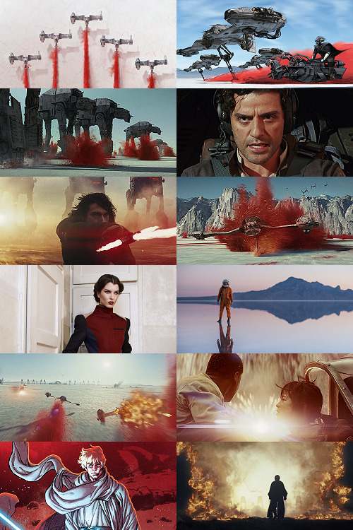
This is a promo image, not a screencap. It’s a much crisper view of the ski-speeders. I love the vivid color difference.
The blue-and-yellow additions to the color scheme didn’t work out, but I did still want to include Storms of Crait. This shot had a little more blue in it than I would have liked, but it has Leia in a ski-speeder back before the salt caused them to rust out, too!
Remember when it seemed like the Crait battle’s new AT-ATs would be super cool and like, do more than stand there menacingly behind Kyle? Me, too.
POE! DAMERON! HAS! NEVER! DONE! ANYTHING! WRONG! IN! HIS! LIFE!
KYLE! HAS! ONLY! EVER! DONE! WRONG! IN! HIS! LIFE!
I tried out like five different tiny-frame-difference screencaps of the ski-speeders kicking up red minerals, and I decided that this one, with a clearly defined spray of red surrounded by white and bluish sky, suited the placement here best: there’s red in the panel to its left as the main color, but minimal red in the above- and below panels.
I wanted to include actual Connix, but she’s wearing yellow and only ever shows up surrounded in brownish-black darkness, so here, have one of my standard Fashion Rebel Officer Stand-Ins instead -- the red and white obviously played a part in picking this shot over the rest of the options from the photoshoot.
I LOVE this slightly mystical shot of a Rebel pilot slash astronaut on a rain-slicked salt flat. How perfect?!
As we get down to the bottom of this middle panel, I wanted to include more destruction and more presence of yellow and orange. This image has a good balance of “negative space” in the sky and salt flat, and then the explosion of Nodin Chavri’s ski-speeder (I think?) ties in well to...
Finn and Rose, post-collision. I wanted to include Rose, and the almost JJ Abrams-esque white starburst in the center of this cap is a good balance to the spray of red around a ski-speeder two panels above.
Luke on Crait in the Rebel Alliance...
And Luke on Crait in the Resistance.
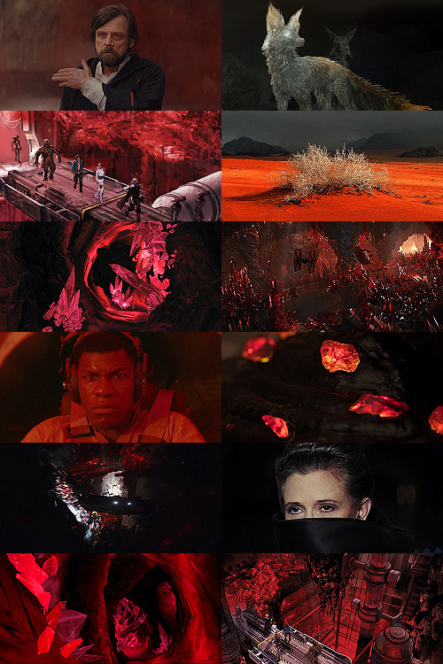
This was a kind of “????” moment of characterization -- and general direction -- in TLJ, but Luke surrounded by red as an old man would fall right below Luke as a young man, on his first mission after the Battle of Yavin, when the three graphics were aligned.
I wanted to use the straight-up concept art of the vulptex, but the black around it was TOO black, if that makes sense? So I layered it over a darkened cap of the vulptex who leads Poe to Rey and freedom. This is one of the very rare shots that I use an edited base image.
Han and Chewie! I had to include Han and Chewie. The unlettered panels from Storms of Crait that show the mineral mines are stunning; I highly recommend heading over to Mike Mayhew’s page and taking a look. The detailing of the crystals is something I wish I could have captured better at this scale.
This is one of the red-sand dunes I saved! Crait doesn’t have any living vegetation, but the drama of the black, stormy sky and the red sand drew me in here.
Some CGI crystal caves... I saved these ages ago for use on Ilum or Dantooine, I think? (Same with what will be #11 below.) I don’t love using CGI, but I think the crags on these crystal growths suited the images from canon!Crait.
A screencap of the TIEs chasing the Falcon through the mines. This was honestly one of the most visually stunning parts of TLJ, and it’s so split-second that most people missed it AND most of the screencaps have a lot of motion-blur. I’m really pleased that this one came out so crisp, and I knew I had to use it as an “anchor image.”
Finn, full-on, in red. I’m realizing belatedly as I write up this tutorial that I showed Poe face-on and Finn face-on, but I stupidly chose to show Rey only from a distance. I AM A FOOL! A FOOL!
Aren’t these resin crystals amazing? The full-size image actually shows them surrounded by snow, by the tree-stump they’re on wouldn’t fit Crait, so I cropped in closer on this image than I did for most of the Crait set.
Another shot of the Falcon in the mines. I like the way the framing of white sunlight here echoes...
Leia’s face, a bright spot in the dark, watching out over the salt flat. :(
(See #5 above!)
And again, the homage of Carrie’s coat looking like Harrison in Blade Runner made me sad, so I THREW IN ANOTHER HAN AND CHEWIE. The mining equipment here shows more detail than in the screencaps above, too.
Coloring
Like I mentioned waaaay above, in the intro: I never use set colorings for photosets. (Except Halloween Spookstravaganza, because jeez so many of those screencaps are like 240p VHS rips and it’s just not worth putting in Effort(TM).)
That said, I think one thing that I do differently than I see in most tutorials is this first step:
I ALWAYS start Aesthetic photosets by arranging the images and then *BRINGING THE CONTRAST ALL THE WAY DOWN.* This is especially helpful on photosets that include a mix of real photography, CGI screencaps or art, and/or comics panels, but it’s also just useful in general for photosets that use images from a wide variety of places.
The reason I do this is because it helps to “smooth out” the differences in light source, color balance, etc., that are part of the raw base images. For this set, it also helps to define the variations in color between very similar shades: the craters on Crait, the wisps of clouds, etc.
In some cases, I’ll do two layers of Contrast -50. For Crait, I did a later of Contrast -50 and then a layer of Contrast -15.
Then, I Select All > Copy Merged > [Turn Off Contrast Layer View] > Paste As New Layer.
Now, the “smoothed” version is placed as a layer above the raw layer. From there, it depends on the look of the photoset what I do -- sometimes, I leave it as-is, but I almost always lower the opacity on the “smoothed” layer until the level of contrast and balance looks consistent across the whole photoset. For Crait, I ended up with the “smoothed” layer set to Lighten 100%.
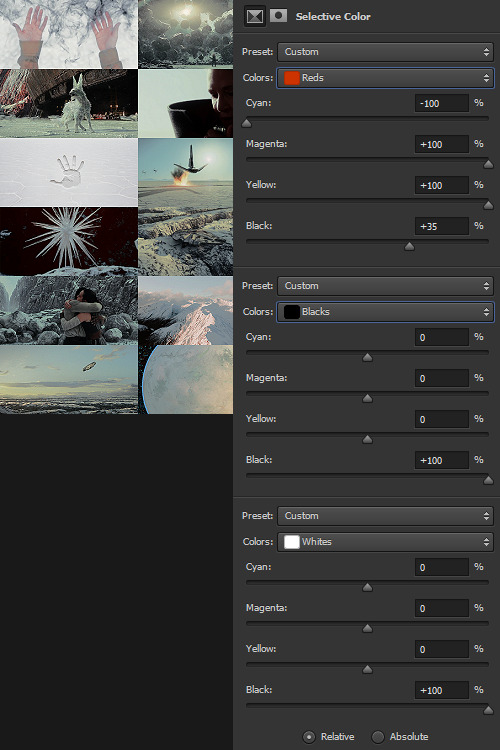
Selective Color time. There are two ways I usually start this: either one color at a time -- especially for Aesthetics like Pheryon that will essentially be monochromatic -- or, in this case, I looked at the balance of the three main colors that would carry through the entire Aesthetic.
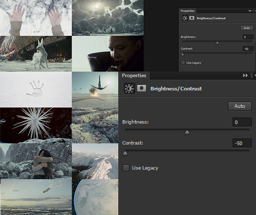
REDS
Cyan -100 (This brightens the vivacity of the red.) Magenta +100 Yellow +100 Black +35
BLACKS
Cyan 0 Magenta 0 Yellow 0 Black +100
WHITES
Cyan 0 Magenta 0 Yellow 0 Black +100 -- This is NOT my usual setting for adjusting white, and since white is one of the main colors in the Crait Aesthetic, it might seem counterintuitive to make the white darker instead of brighter. However, this will help to make next step of color adjustments “take” on the white/whitish surfaces a lot more easily, and it will also help to balance out the bluish sky areas with the white background areas. (I’m not sure this explanation makes sense? But it’s what I did.)
Then, I Select All > Copy Merged > [Turn Off Selective Color Layer View] > Paste As New Layer > Either COLOR or HUE 100%.
“Hue” is more effective for smaller, more incremental color adjustments -- for BIG SWEEPING COLOR CHANGES, “Color” tends to work better. But it totally depends on the photoset! Try both, and see which you like better.
I feel like this is kind of the step where my process of making aesthetics stops being any different from most tutorials -- but this has been HUGELY helpful for me, a non-graphic designer-person, to be able to create a kind of “base image” that has very similar color values, brightness/contrast, and vibrance.
Sometimes this step helps to create really extreme color differences, such as in the Raydonia Aesthetic, and other times, I use it to just adjust one or two color-values so that there’s more consistency in, say, shades of yellow or shades of green, as in the Takodana Aesthetic, for which I just wanted to create a more cohesive palette of green in particular... it started out with a zillion greens, and I wanted to bring it all together into one “aesthetic.”
I think this step, and the reasoning behind it, are why SO MANY PSDs for aesthetics rely on a layer of either gray or sepiatone-ish set to Darken or Multiply as one of their key layers. But I’m just not about the grimdark life, and if I’m making an AESTHETIC OF A THING, I want the aesthetic POST to actually HAVE THAT THING’S AESTHETICS, you know?! I want to use the colors of the thing that I’m saying is meant to evoke the visuals of the thing!
Anyway. Now you have your BASE IMAGE. Often I’ll Merge All here, just for my own sanity.
Then I go in and make any other other adjustments on a “coloring” level that I think will help with the “vibe” I’m going for! For this Crait set, I definitely needed to bring the brightness up so that the white and red popped. However, bringing up the brightness also swallowed a lot of the detail in the white surfaces -- especially the planetary surface of Crait in that bottom-right space -- so I decreased the contrast again.
Brightness +70 Contrast -50
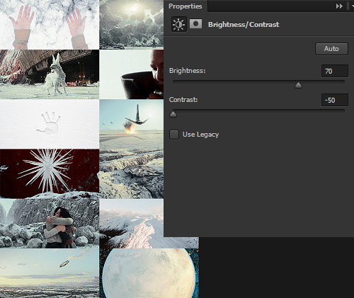
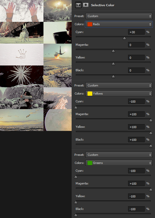
And then I go in for the macro-level adjustments of color using any mix of Selective Color, Hue/Saturation, and Color Balance that works. For Crait, that was more Selective Color, because since I had decided on my color palette, and it sadly did not include blue, I needed to start by taking out as much of the blue, cyan, and green that I could.
And I’m ngl, I told myself the WHOLE FREAKING TIME I was making this photoset that I needed NOT TO DELETE THE PSD RIGHT AWAY LIKE I USUALLY DO so that I could write up all the settings for this step.
But it was a reflex. And I deleted the PSD right away like I always do.

So suffice to say, I just futzed with the levels one at a time until the RED was brought up a little, the YELLOW was brought up a lot, and everything else was brought down and/or hue-adjusted to sliiiide into being yellow, red, or black/white.
Another Select All > Copy Merged > [Turn Off Selective Color Layer View] > Paste As New Layer > Either COLOR or HUE 100%. I think I also DUPLICATED this layer and set it to SOFT LIGHT 50% and then duplicated it again to SCREEN 50%.

I could have left it like this, but I am me and I am nothing if not Extra All The Time, so I opened up my folder of light textures (and other textures) and decided to Go To Town.
Textures & Effects
For your Aesthetic-Making Purposes, here are the three I used on the Crait set:

The first two were set to Screen 100%, and the bottom one was set to Burn 15%. I layered them in this order.
It still looked incomplete, so I decided to use this POWDR Element from Creative Market, which is actually like 5400x5400 pixels and which I’m not going to share here because I paid for it and don’t want CM to revoke my access or whatever, but it looks like this, only HUGE:

I also set this element to Burn 15% and moved it around the image until it looked the way I wanted it.
Textures and effects aren’t In on Tumblr anymore, but I really like using them -- they add, not to be cheesier than usual, texture to an aesthetic post, and I think that they can also help less-skilled graphic-makers like me to hide any myriad of imperfections in coloring, sharpening, whatever. I’m an especially big fan of this noise element (set as a pattern on Screen), so I’m going to share it here even though I didn’t use it on the Crait set:

Most of my textures have been saved over the last literally twenty years since I started making fannish graphics and photosets, largely from defunct old LiveJournals, but there also used to some great sources for them on Tumblr and still are live sources for them on DeviantArt. Just search around and you’ll find what you want! :)

In conclusion, I think it’s infinitely more fun NOT to rely on premade PSDs or standardized Settings, but I also recognize and fully respect that if I made graphics differently, I would probably get easily 5-10x more notes on each post than I do. But I make graphics the way that’s fun for me, and I just try to learn a little something from every set I make. The GFFA Planets/swworlds in particular have been something that I started, originally, because I wanted to catch up and learn about Star Wars planets that I felt like I was missing because I don’t have any fannish history with the Old EU, and I wanted to learn about them in a way that helped me feel like I was engaging with the SW source material AND making the enormity of the canon more accessible to other newish or casualish fans, like I was two years ago when I started this aesthetic series. I like making aesthetics that are genuinely inspired by the aesthetic of the thing that I’m calling it an aesthetic of, so even when it ends up just looking like rainbow barf (CURSE YOU, NAR SHADDAA!!!) I’m having fun.
THAT SAID, here’s how the time breakdown for the Crait set works out:
TOTAL TIME INCLUDING IMAGE COLLECTION AND SCREENCAPPING: Est. 20 hours.
COLORING AND ACTUAL GRAPHIC-MAKING PART: 7 hours.
WRITING UP THIS TUTORIAL: 5 hours.
So, um, if you are so inclined, here is my Ko-Fi link. I post at least two graphic sets every week, sometimes up to 25 (usually during October).
I hope this was helpful at all! I had a good time thinking about my process in-depth like this, and I would love to get tagged in any aesthetics you might try making using a similar method! :)
59 notes
·
View notes
Text
Sigil Tutorial Part 2
Hey, hows everyone doing? Last time we covered what a sigil is, and how to design one. You can find that tutorial here.
Now we’re going to be talking about what to do with our completed sigils and how to get it to do what we want it to do. This means drawing it on something, charging it with energy, and activating it. This is going to be another long one, so continue reading below the break.
Like making the sigil, there are a million ways to do this and dramatically different schools of thought on how it can and should be done.
And like making sigils, I don’t get too hung up on the “should”s of casting a sigil. Magic is a very flexible art and often one method is just as good as another, and sometimes one method is the right tool for the job, but other tools have their place too. As an eclectic witch, I like to have a lot of tools, and gain the experience to know what tool works where.
So what are we going to need to do now that we have a sigil? Well, simply put, we’re going to have to put it somewhere, charge it with energy, and then activate it so it starts working. Let’s go over each of those steps in more detail, then I’ll give you examples I’ve done so you can jump off from there and start doing your own sigils.
Inscribing - The simple act of drawing the sigil in it’s final design where it needs to go. This can vary depending on what you want the sigil to do, and the next steps you’ll be taking might help decide this, so it’s good to think through all the steps first. But generally speaking, it can be written on paper, carved in fruit, even typed in a blog post, really anywhere can work.
Charging - The act of giving a sigil power. This can also be done in countless ways. Meditating on the sigil and it’s meaning, leaving it in the moon or sun light, placed in a crystal array, anything that would give any other kind of spell energy can be used and more.
Activating - This is the most important step. This triggers the effect of the sigil to start working. And the way that is decided is totally up to you. You could burn the paper it’s on, or plant the fruit you carved it into. You can design it to trigger at a specific time simply they commanding it to do so (This sigil will activate when I need to do well!). All you have to do is let the sigil know when to activate. You can do this by literally telling it the rules for activating, saying them out loud or in your mind. You can write it into the creation of the sigil, or think it while creating the sigil, for example in part one we said “I WILL DO WELL”. If your intent was to do well on an exam, it would activate on that exam. If you want to generally do well, it should know to activate whenever you need a little extra luck to do well at something.
Before we get to the examples, we’re going to take a real quick glance at the method we won’t be using, just to get a grasp of the other school commonly used.
This school comes from chaos magic. A method popularized by Austin Osman Spare, it generally involves taking a concept, turning it into a sigil, charging it, and then destroying it to activate it. In this method it’s important to forget about the sigil, and by doing so you let it passively work it’s magic on the universe around you. I’ve read up on this to an extent, but I’m not super experienced in this art. I much prefer the other method because it resonates more with my other practices. Either way, it’s an interesting school to look into.
Some Examples of Sigils I’ve Created and Cast
So the most basic of sigils I’ve cast is to have a thought with the activation built in. My starting thought was something like “I will do well on this exam”, and then I simplified it into a sigil, like the example in part one. Then I charged it through meditation, imagining my energy flowing from my mind into the paper I drew it on, taking my knowledge and keeping it safe in the sigil until I needed it on the test. Then I folded it up, stuck it in my pocket, and went to school the next day. The test started, the sigil went to work and gave me those thoughts back and I passed the test. This is the simplest and easiest to do. You don’t even have to think about how to activate it, because the conditions are built in.
I’ve also used a method where I draw the sigil into a seed shell and plant it. This is great for long term spells. The sigil gains it’s energy from the soil and the plant it grows into. The plant it’s self becomes the representation of the sigil, and as it grows and thrives it carries out your spell passively. Activation can vary on this one, but it works well for something you want to start as soon as the plant sprouts and keep lasting as long as the plant does. If you can’t draw directly on the seed, try drawing the sigil on a bit of paper, and wrapping it around the seed, and burying them together.
I helped a person design a sigil to stop gossip in her own home. The design of the sigil was made to look like lips, ears, and eyes. I told her to draw it with water on the places where she thought people were talking about her. It was charged by the people coming and going into the rooms she drew it and activated by them talking. If they started gossiping it would give them the feeling of being watched and they’d shut up.
I’ve painted good health sigils in the bottom of my tea cup with honey, charged it with hot tea and stirring, and activated it by drinking. Awesome idea I’ve seen here on tumblr that’s great for a little wellness potion.
As some of you may know I do a lot of enchanting and amulet making. Often times I’ll take a concept I want to imbue onto an amulet I’m making, turn it into a sigil of sorts, and turn that sigil into a piece of jewelry. Here’s a simple and literal sigil turned amulet. The sigil ended up being a circle above a square with a black circle inside it. It’s charged by wearing, and activated by needed to complete a task (the sigil was “I will complete my task).
And there’s a ton of other ways you can make sigils work. Generally anything you can think of should work. Hopefully this helped you learn by my examples. Like I said, there’s a ton of resources out there of other methods.
If you found this interesting or want to know more, I might revisit this in a more structured way. I might also make an advanced tips for sigil making where I’ll dive into premade symbols to represent ideas, maybe more on digital and code based sigils, and some other out of the box things. So let me know if that’s something you’d want to see!
15 notes
·
View notes
Note
You have any tips on loc maintenance? Also any directories I can look into?(YouTube, Tumblr page, etc) long time follower btw. Plan to show MUCH more support.
Maintaining dreadlocks is very different from maintaining other natural hair styles.Your maintenance routine will vary depending on the age of your dreads and the method you used to start them.The two most popular methods for starting and maintaining dreadlocks in natural black hair are twisting/palmrolling and latching.=> here there is a great article about the two methods https://www.knattydread.com/pages/maintain-dreadlocksFEW TIPS FOR HEALTHY DREADLOCKS 1- FIND A GOOD LOCKTICIANA locktician that can give you great advice and recommend healthy products. Make sure you feel comfortable with her or him and have a real conversation about your hair objectives and your desired look.2- KEEP YOUR LOCS CLEANLocs thrive in a clean environment. When you are first starting locs, water actually helps to loc your hair faster. Once you are fully locked continue to wash your hair on a regular basis. Cleansing is a part of any healthy hair care routine.3- MASSAGE YOUR SCALPIt stimulates hair growth. You’d be surprised how the simple act of gently massaging your hair at night for about 5 minutes, will really help you achieve the beautiful locs you desire.4- MOISTURE YOUR LOCKSGive your locs the moisture it craves, starting from the scalp, down to the tip of the loc. Be careful to avoid products, such as creams and heavy waxes, that can cause build up in the loc. Use oils such as Olive oil to start with as you gain more knowledge about locs.5- DON'T RETWIST YOUR HAIR TOO MUCHIf done too often it can start to create breakage and thinning at the root. Your edges are especially sensitive and prone to breaking off, so just be careful, you don’t want your hairline to lean back.4- SLEEP WITH A SCARF Locs tend to shed a lot, and protecting your edges and your scalp is crucial. A silk night cap helps keep the moisture in your hair and scalp, as well as protect your hair from pillow friction. 5- EXPERIMENT !Try different ways of cleaning, oiling and styling your hair. Everyone’s hair has different textures and no ONE technique will work for everyone6- USE NATURAL PRODUCTSThere are a lot of products out there that are made with just chemicals, and/or “natural” ingredients mixed with chemical ingredients that will strip your hair of its natural oils that is needed to hydrate, moisturize and grow. Natural ingredients, still give you the same benefit as any of the chemical based products but with no side effects7- BE PATIENT Locking your hair is a journey and it’s a little different for each person. Some people's hair locs faster than others. Thicker hair tends to lock faster. But ifyou take good care of your hair then the growth will come. So don't get discouraged. 8- ENJOY YOUR JOURNEYDon’t compare yourself with others that are in the in their loc journey. Locs is a process. Take your time and enjoy your hair.VLOGGERS TO FOLLOW ON YOUTUBE :1- Chescalocs : Franchesca has become one of the best known faces for locs on the internet. She gorgeous locs that she’s been growing for 9 years. 2- GrizzleRocsLocs : Tameika has been documenting her journey on YouTube for just a year but she already has a wealth of video tutorials on how to style your locs3- Jungle Barbie : This trendy diva shows us how to achieve more edgier hairstyles with locs dispelling the myth that “Locs Can’t be Chic4- Gypsy Emprez : This beauty from Trinidad and Tobago has great hair and make up tutorials.5- Jasmine Rose : she is a gorgeous 20 something Haitian-American who shares her hair, beauty, and naturalness with her lovely subscribers. She’s funny, funky, and creates great tutorials on hair, makeup, and fashion.6- Damian Walter : he does not have locs himself, but he's an amazing loctician full of expert advice. He’s a master natural hair stylist that can create a loc quicker than you can blink. 7- BronzeGoddess01 : She’s a motivational speakers, life coach, makeup enthusiast, full-time mommy, and part-time diva! She has a video series called “Strawberry Letter” where people solicit advice for their life problems and she shares with her viewers, which is highly popular and quite interesting. 8- Ibyl : Love, Life, and Locs channel is about documenting her sisterloc journey, which starts from the very beginning. She shares her tips, updates, experiences, and concerns. 9- Locs Mermaidia : She discusses how to maintain and properly care for your locs. If you are all about needing loc inspiration, she’s the vlogger to follow.10- Tbey82 : a channel full of locs, family, and healthy natural hair love. She loves vlogging and shows tutorials that are easy to follow and have clear directions.SOME INTERESTING BLOG ABOUT LOCKS :- holisticlocs.com- perfectlocks.com- locslashes.netHope it will help you !
136 notes
·
View notes
Text
Midweek Update: A Half-Ton of Halftoning
Hey everyone,
I had a change in plans this past week -- originally, I was going to focus on the level design, and then implement the new shaders if feedback was good. However, I received enough positive feedback that I decided it would be a good idea to just go straight to the shaders and slightly delay the level design a little longer, and good news: they look even better than I thought they would! Let’s go on a little tour of the Fightyplace to show them off, and see some familiar old faces while we do! I’d also advise looking at the full-size images, as Tumblr’s downscaled views hide a lot of the detail.

(full size here)
This image, taken from the very first area of the Fightyplace, showcases the main gist of the new shaders! You can see the same toony shading I discussed last week, as well as the improved outlining that TCP2 uses -- on that note, it’s an involved process to implement the improved outlines for the objects, and something that interferes with development if implemented early, so some outlines will still look bad; the bravery test in this screenshot and the wall in the next shot both use the improved outlines, but most other stuff is currently using default outlines. However, on top of this, there’s one major change: all the objects in the game are now shaded with a halftone shader!

(full size here)
For those who don’t know what exactly this means, look closely at the picture above: all the dark sections of the screen are shaded with a dot pattern inspired by the shading in comic books. I chose to do this style in order to gel nicely between the gameplay and the comic book cutscenes -- which was previously a weird contrasting artstyle that caused the sudden 2D cutscenes to feel even more jarring than 2D cutscenes in a 3D game can be.

(full size here)
The Effigy Chamber still hasn’t had all the shaders ironed out and applied properly, but even in it’s WIP state you can see the massive improvement provided by the shaders. The cel-lighting helps emphasize the features of the Stat-ues while still maintaining the imposing sense of mystery. You can also see the new specular effect on a number of objects in this scene -- as opposed to Unity’s traditional faded glossiness, this shader system lets me apply specular to objects as a highly stylized and sharp highlight, a method very similar to my own drawing style used for the cutscenes.

(animated)
In the above shot you can see one of the coolest new features of the new shaders: a better water system! Both the waterfall and the water now have foam at the edges, and a foam-esque effect now applies to Capboy when he’s in the water:

(full size here)
This is great for a number of reasons. Number one is that it just straight-up looks good! The water before looked horribly flat and static, and the new shaders remedy that. Furthermore, a very jank half-assed ripple effect I had implemented can now be removed, as the shader does the job of giving Capboy a “presence” in the water all on its own. In terms of performance impacts, this shifts the load from the CPU to the GPU, and is likely overall less performance heavy. However, just as I said when I implemented the 3D grass, TFG is a VERY graphically unintensive game, so there’s plenty of room to stretch when it comes to loading stuff on the GPU.

(full size here)
Several other graphical changes have occurred as well. Cutout-transparent textures, like the dirt road, aren’t really compatible with outlines, so I’ve added black outlines to the textures themselves. I’ve also swapped out the blob shadows in favor for Unity’s realtime shadows -- once again, a shift from CPU to GPU workloads. I’ll likely implement some sort of partial blob shadow for Capboy, to help the player know where exactly he’s going to land.
Lastly, I’ve switched the rendering path from Deferred to Forward -- way back when I first tried to implement toony shaders, around a year ago, I needed to switch it from Forward to Deferred, but humorously enough the new shaders require me to do the exact opposite. For those who don’t really know what this means, Forward and Deferred are two different ways to handle lighting in games -- the short of it is that the game is going to be a bit more GPU intensive due to light counts, but in turn is going to look prettier; you may notice that all the screenshots now have very nice antialiasing that simply can’t be done in Deferred rendering.
I’ll finish this post with a collection of images that don’t really need commentary, just to showcase the new shaders, but before I do that I’d like to discuss the non-shader-related work that’s been done. There hasn’t been a whole hell of a lot, but observant viewers may have noticed the mountain looks a little different:

(full size here)
The plan for the mountain is to give the player two routes to reach the top and kill the vines infesting the Fightyplace: a combat route and a platforming route. The player can choose to either break in the bottom and fight their way up, or climb up the outside and slip directly in from above. The combat route, of course, begins at the Dogjail -- but now I can officially say work on the platforming route has begun!

(full size here)
The idea is that Capboy will need to grab ledges along this wall to bypass cannons, constantly firing on the ground below to prevent the Spherefriends from reclaiming their lost fort. When your cannonballs are conjured out of thin air, it’s no big deal to waste a lot of them, right?

(full size here)
I’ve also spent a large amount of time trying to properly nail down Capboy’s slope sliding mechanics. I’m very close to finally getting them to be seamless, having him slide down the hills without any jank or stuttering at all, but I’m still not quite there yet. Further, I’ve fixed some bugs with his ledgehanging which would prevent him from jumping off of edges occasionally, and I’ve greatly increased his friction. This is in preparation for a number of changes I have planned:
Capboy’s base jump height will be reduced a decent amount. This is because I’m going to be adding several new platforming moves.
A triple jump mechanic, similar to that in Mario games, will be added, as well as a backflip jump. Just like in Mario, Capboy will be able to jump twice in place, gaining extra height on the second jump, but will need to have a head of steam in order to do the third jump. The second jump will be approximately what Capboy’s jump height is now, likely a little more.
The Lanky Lunge and Lofty Leap are going to be made into unlockable abilities from Happy Crag. Additionally, the Lofty Leap will be buffed a bit to help justify its status as an unlockable ability, and to give it an advantage over the triple jump which will likely reach its current height
To make up for the loss of basegame mobility from Lanky Lunging, Capboy will get either a sprint ability or a sprint mode ala Talon Trot in Banjo-Kazooie. This ability will either be baseline or unlocked very early into the Fightyplace, I’m not entirely sure which yet. Either way, this ability will result in a long skid when Capboy stops while using it, on-par with his current skid.
This, of course, means the platforming tutorial will need to be reworked a bit (and possibly scrapped entirely in favor for a more natural tutorial throughout both the Fightyplace and the small portion of Cragwell that Capboy will explore in the demo -- we’ll see!).
Finally, I’m afraid I have some news that may disappoint some people: I’m planning on removing first-person mode entirely. As development on the game progresses, the playability of a full-on first person mode gets lessened and lessened, and it’s officially at the point where getting it to work well will be a massive headache and will add a ton of time to TFG’s already very-behind-schedule development. It’s possible that this may change in the future, but for the demo, I’m going to be entirely removing first person mode in favor of a more zoomed-in camera stage.
With all that planning stuff out of the way, I’d like to showcase more of the new shaders! Like I said, no commentary on these, as the visual quality should speak for itself:

(full size here)

(full size here)

(full size here)

(full size here)

(full size here)

(full size here)
As for the future, I officially have a tentative schedule for the next 2 months that, if I stick to it, would encompass everything that needs to be done for the demo -- and yes, I mean everything. Due to the ongoing personal issues, I don’t know if I’ll be able to stick to this schedule, but we’re starting to reach the home stretch here for real...and only a year late!
In terms of specific plans, I only have two goals for this upcoming week: fixing sliding once and for all, and getting the entire level architecture DONE FOR REAL -- this means I intend to complete the structure of both the interior and exterior of the Fightyplace. With any extra time I may find myself with, I’ll begin work on placing collectibles and enemies throughout the level. Thanks for reading, everyone, and I’ll see you all next time!
Last Week: Stylish Shamrocks
Next Week: Living on the Edge
35 notes
·
View notes
Text
Dog Tracking Training | Get More Info Here
New Post has been published on https://dogtraining.dknol.com/english/dog-tracking-training-get-more-info-here/?utm_source=Tumblr&utm_medium=Tumblr+%230+Freda+K+Pless&utm_campaign=SNAP%2Bfrom%2BBest+Dog+Training
Dog Tracking Training | Get More Info Here

We can pickup your dog for dog training and/or boarding and then return the dog to anywhere in the world. For Puppy Preschool: Minimum C3 vaccination 10 days prior to class. Your industry experts First Name Mutts with Manners: Basic Dog Training Course Animal Care Services Waiting to be released Site Design by Comfusion Last night was the first night that Bear hasn’t demanded us to play and wrestle and was happy to lay quietly on his bed while we were relaxing. Australian Association of Professional Dog Trainers Inc Email : [email protected] Dental care – your pet’s teeth and gums Hydraulics short course for agriculture, mining, earth moving or civil construction workers. By utilising all methods of technology available today, individuals around the country will have the opportunity to train directly with Steve and Vicki Austin, world renowned dog trainer. · 15 March 2018 Affiliation’s Become a puppy class instructor. To check the availability of Urban Puppy School (Available in Carindale only) click here. To Enrol in Urban Puppy School click here URBAN… read more Home | Sitemap | Shop – Dog Accessories | Dog DVD or Video | Contact Us Companies and V.E.T. Overview Cert III in Engineering – Mechanical – Kieran Grice Office Opening Hours: Greenslopes Pet Café Please note: Upcoming Seminars Working At Heights Send us your contact details and we will keep you up to date with all courses release dates. Cancel Tools[edit] Jump up ^ Slabbert, J. M.; O. A. E. Rasa (1997). “Observational learning of an acquired maternal behaviour pattern by working dog pup: an alternative training method?”. Applied Animal Behaviour Science. 53 (4): 309–316. doi:10.1016/S0168-1591(96)01163-X. Logan : Upcoming Seminars and it’s full of wiggly tails and puppy rolls! This is a 6 week course that will run for 45 minutes on Thursday nights. Jump up ^ Arhant, Christine (March 2010). “Behaviour of smaller and larger dogs: Effects of training methods, inconsistency of owner behaviour and level of engagement in activities with the dog”. Applied Animal Behaviour Science. Int’l Society for Applied Ethology. 123 (3–4): 131–142. doi:10.1016/j.applanim.2010.01.003. Media library Your White Card in 3 Easy Steps Dog Boarding Sydney Purina One Frozen Food Discourage him from biting or nipping. Instead of scolding him, a great way to put off your mouthy canine is to pretend that you’re in great pain when he’s biting or nipping you. He’ll be so surprised he’s likely to stop immediately. If this doesn’t work, try trading a chew toy for your hand or pant leg. The swap trick also works when he’s into your favorite shoes. He’ll prefer a toy or bone anyway. If all else fails, break up the biting behavior, and then just ignore him. Total Care Lost + Found Have you lost your pet? The AWL Lost + Found is here to help! Read more Polite in Public Decorations Patient stories Need dog training? Book a class Specialist Trainers Doberman Sale Victorian Fisheries Authority Register here Contact Name * E-mail *Telephone * Advice + Education Length: 5wks Jumps racing Customer Service Policy Hearne, Vicki (1987). Adam’s Task: Calling Animals by Name, New York: Alfred A. Knopf ISBN 0-394-75530-8 · 25 February 2018 Become a dog trainer Price List Recommended Links move at your own pace image slider Taylored Obedience Training Smart Paws FAQ हिन्दी Sound Proof Puppy Training App Hays Paddock, Lister St, East Kew, Melbourne, Victoria Breeds 4.1 Koehler method Gurnoor : Waltham Centre Bearings & Angles Campaign & Promotions This is one of the easiest dog obedience commands to teach, so it’s a good one to start with. Dogs SA Nat Bradford Fixtures and ladders Measurement, Transformations, Time – FREE Small Group Classes By regularly taking the dog outdoors, through the same door, to the same site, and providing rewards for proper elimination, the puppy should soon learn to head for the door each time he/she has to eliminate. If you recognise the signs of impending elimination and praise the puppy whenever he/she heads for the doorway, the behaviour can be further encouraged. Puppies that have been interrupted or reprimanded on one or more occasions as they begin to eliminate indoors, may begin to try to sneak away, whine or show some form of anxiety, when they feel the urge to eliminate, but cannot escape from the owner’s sight. If you can pick up on these cues, and take the puppy directly to the outdoors for elimination and reward, the puppy may consistently begin to show these signals when he or she needs to eliminate, and may even begin to take you to the exit door. 1300 4 777 22 No bullying or harassment of fellow commenters. Keep it civil!
dog training
puppy training
dog obedience training
fbq('track', 'ViewContent', content_ids: 'dogtraining.dknol', ); Daily Routines for Your Puppy Lots of work to do still but an overwhelming and uncertain future for our fur babies has turned in an afternoon of learning, to an exciting adventure we feel capable of tackling and coming out on top. 07 Sep 2017 9:49:31am 2. The course was informative and easy to follow: Working in Communities To check availability of Urban Puppy School (only available in Carina) click here. To enrol in Urban Puppy School click here. URBAN OLDER PUPPY… read more The online tutorial was easy to follow and very informative. The admin throughout and during follow up has been thoroughly enjoyable to deal with. Thanks! – Ricky Murdoch Post: P.O. Box 2173 Milton BC QLD 4064 Instructors Course 2018 We are looking for club members who have trained a dog to Class 3 or Class 4 standard and who are interested… Dr Chris Brown Events amp Corporate Contact us today to find out how our unique approach can change the way you live with your dog. Your dog’s welfare needs Collars Very Difficult. It took me too long to find it. Fundraising Read More… Spain Expert Veterinary Services Hold your hand up to your dog’s snout. When he sniffs it, move your hand to the floor, so he follows. Contact Us Subscribe to our newsletter and keep up-to-date with the latest information on pets and the AWL. Accessibility Prerequisite: Level 1 Junior or Level 1 Senior paste it into your webpage 10 Best Training Tips CART: 0 items At any time that the puppy cannot be supervised, such as throughout the night or when you need to go out, house them in a secure area. An escape-proof crate, a dog run, or collapsible pen are simple, highly effective, and most important, safe. The puppy could also be confined to a room that has been carefully dog-proofed. When selecting your dog’s confinement area it is useful to consider a number of factors. The dog will adapt fastest to the new area if they are associated with rewards. Have the puppy enter the area for all their treats, toys, and perhaps food and water. The area should have some warm, dry, comfortable bedding, and should never be used for punishment (although it can, and should, be used to prevent problems). Housing the puppy in isolated areas where there is minimal human contact, such as in a laundry room or basement, should be avoided. In fact, often the best area is a kitchen (so that this can also be the dog’s feeding area) or a bedroom (so that it becomes the dog’s sleeping area). Each time the puppy needs to be confined, it should first be well exercised and given an opportunity to eliminate. Ask the Expert – Question of the Week Klever Kanine Dog Obedience School Inc. Click here to find out Motivating Miracles End of life care Welfare inspectors Puppy Raising near Vaccinations Charities we’re proud to donate to When do we graduate to the next Level? Basic Dog Training Tips | Click For more Basic Dog Training Tips | Click Here Basic Dog Training Tips | Check This Out Legal | Sitemap
0 notes
Text
Watercolors for Beginners (on a budget)
All these watercolor artists on YouTube have their favorite “expensive” brushes, meanwhile Jay Lee, who is an incredible artist, uses $4-5 dollar brushes. I’m not a fan of the cheapest ones still, like the $7 packs, because it’s hard for them to retain shape. The best brush for you- like writing software- is a brush you know well over a brush some artist in a fancy studio says Will Get Results. I think this is something that should have been obvious to me after learning photography equipment is more about skill than dollars once you get a DSLR or mirrorless, but enough about that. If you want to get into watercolor, here’s my advice a year in.
Materials
A standard round brush really is the most important brush- unless it isn’t. You can exclusively use flats, and it can add an interesting stylistic aspect to you work. But a round can do pretty much anything you ask from it. Generally, this brush is a size #8, #10, or a #12. If you splurge on anything at all, it should be your base brush, who will be with you for a very long time. Paint and paper are “consumables” so eventually they get used up, but a brush, even a ratty old one, is basically forever. Treat it well.
Some kind of large wash brush, like an oval brush, dagger brush, quill brush, or large flat brush. Or even thick, four inch wide, and slightly terrifying ones for wall sized large surfaces. Whichever one you pick, a large brush really does help give the smoothest washes and gradients for large areas.
Either a rigger brush, small round brush, small/medium flat brush, or even a fan brush. Riggers are good for detail and natural lines, fans for cool effects and lines, and flats for thick or thin lines. That said, these brushes do help certain styles. Riggers are excellent for naturalistic painters who like trees, and they’re also good for painting, well … rigging on ships. The fan is good for abstract, and the flat for geometric shapes specifically, but both of them have many more uses than just those. Rounds are the most multipurpose due to their influence on watercolor in the United States is, and a smaller size can be useful for detail work. All these different brushes fit into one category because they can do each other’s most important job, which is to make super thin lines.
Pans or tubes Don’t worry about cost because they’re about the same. Student grade is okay. I swear. If you’re not displaying your physical paper copies yet, relax. Lightfastness doesn’t exist on the internet. (Tip: learn Photoshop so that your watercolors will look good online, it will make a world of a difference.) If it helps to use the cheapest 7 pan set made by a crayon company so you actually paint, so be it. You’ll have to overcome your fear of using expensive materials eventually though, so student grade is a good medium between the two. Try and pick a brand that has both artist and student quality if you can afford it, so you can reuse pans if you pick that option.
Fluid, Canson, Arches, etc are some good name brands but explore your local art store or online options available cheaply (if you like goulash you can even use regular cardboard). Cold press is good for naturalistic subjects, absorbency, and texture. Hot press is smooth, less absorbent, and allows for re-wetting. Most people use coldpress, it has that classic watercolor look. There are also two main weights for paper, 140 lb which is often cheaper, and 300 lb which comes in higher qualities, often in large sheets. 140lb is best held down or in blocks, 300lb can be painted on its own, which is good for painting outdoors. You can also use the backside of both weights, 140 lb and 300 lb. Remember, this is LB as in pound. Some will say “300 series” or whatever. What’s really important is the weight, not the arbitrary classification by a company.
Fun stuff. Brushes that look weird. Metallic paints. Salt, water brush pens, saran wrap, natural sponges, and masking fluid. Water based ink. Complex mixing pallettes and jar systems to avoid having to get up mid-painting. Paint is supposed to be fun, or intellectually stimulating, or expressive, or whatever reasons you have for doing it in the first place. If making glorious paintings with three primaries in the woods using creek water in a cup sounds like a good time: ignore this next bit, and I respect you. If you’re trying to force yourself to do boring things because of online advice telling you to hammer the basics into your very soul before having fun, here’s the contradicting advice: have fun. It makes for better art, if nothing else.
TL;DR: moderately cheap paper is okay, to a point, which is the 140 lb minimum. Student grade paints are good for work you won’t display. You need three brushes, including a basic brush (#8 round is what I use), a detail brush (#4 rigger for me), and a wash brush (I have lots, even though I paint postcards, so definitely try to plan ahead for your standard paper size).
Extra information: having lots of brushes is really very fun- especially when you have some that you can mistreat. I don’t regret buying the other brushes at all. Go the cheap pack route if you haven’t figured out what “snappy” means, or shedding, or other qualities that makes good brushes good. Going cheap helps you appreciate the nuance of a better brush and gives you a good base, like downloading a basic texture pack for digital art, and something to scrub paint off pans with when they wear out.
I haven’t recommended any brands for a reason, which is there is a lot of brand loyalty among watercolor artists. Plus, I think you should do your own technical (lightfastness, qualities) and experiential (how does it Feel) judging. This is true of brushes, paper, and paint. If you’re totally lost on brushes, watch this video by witty gritty paper co, and this video by Liron, and this other video by Liron. For more research, there’s lots of science behind the quality of brushes, especially water uptake. ProArte is the only brand I know of using prolene synthetic material, which has better water uptake than standard synthetic, and you can find some packs online. I recommend the set with the rigger brush, because large wash brushes naturally hold a lot anyway. Oh, and synthetic is far cheaper than natural hair brushes. With paint and paper, sticking to name brands is a good guideline.
Again, one more time for emphasis. Take care of your brushes. Wet them a little while (Brush Experts™ recommend 30 minutes, I just do it at the same time I wet my pans) before you begin. Clean them thoroughly. Shape them to a point after use. Masking fluid can gunk up your brush, so be careful. Most importantly, don’t press too hard! Watercolor brushes are soft so that they can use the specific properties of water to carry pigment, and bending the bristles can disrupt that. Don’t drag them on the bottom of your water cups, don’t dig them down to the ferrules (the shiny metal or plastic bit) into your paper, and don’t scrape them along the paper unintentionally without enough water. Doing even a couple of these will drastically increase the lifespan of your brush.
Cost breakdown
About $15-20 on brushes, $35ish on paints, and as little as $7 on reasonably sized paper. It’s usually about .50¢ to $1 a sheet, and a pan set or set of tubes will last you a very, very long time. Many artists start using artist grade paints before they run out of student grade. This is about $62, which is a lot of money! So don’t be afraid of the absolute cheapest watercolors, but it’s important to fund your passions, too. You can absolutely start with one quality brush ($5 vs $20), tiny paper ($5), and decent student grade ($35) for $45 and still have everything you really need. Karia on YouTube should be coming out with more reviews, in addition to the ones already posted, on different cheaper materials that could help you save costs, too. Going to a store to avoid shipping helps on top of that, and gives you a chance to compare brush size vs your paper, and to see the different paint options next to each other.
A lot of this post was just me synthesizing information, so definitely check out the people below. These are free excellent watercolor tutorials, material reviews, advanced techniques, and more. I’m just starting in watercolor, but I remember being disappointed there wasn’t any guide on Tumblr on where to spend money and where you can save and still learn something. I hope this guide helps, in some way, to fill that gap, and it wouldn’t exist if I hadn’t had access to videos like these online.
Channel Recommendations
Jay Lee has fantastic tutorials at many levels of skill, mostly works with flowers and brighter colors. This channel is a good option for visual learners, and combines basic exercises with complex brushwork well. Also, this artist freehands, which means no outlining beforehand.
Liron Yanconsky doesn’t traditionally work in watercolor so there are fewer videos than than other content. Still, there are a lot of material and technical discussion, which was incredibly helpful when I was just starting. Liron mostly works with a natural pallette with landscapes. A special aspect of Liron’s paintings are the use of perspective. On top of that, there are multiple speedpaints to help with figuring out how light to dark works. This channel in particular is good for auditory learners, because he talks about everything from technique to mental blocks common to artists. Very interesting stuff, definitely subscribe.
Karia has a similar background to Liron, and the channel is much more low key. I especially like the cat visitors during the videos. The channel doesn’t really discuss much art wise, but still offers good content. Also, you can donate directly to Karia from the links in the description! Definitely consider it, based off all the hard to find comparison videos of paints.
TheWittyGrittyPaperCo is actually a company channel, run by Meredith, who is a self taught (through YouTube) watercolor artist. The channel has a fantastic overview of the basics, including materials, exercises, and other tips. A few specialized aspects are portraits and lettering. It’s also the kind of channel that talks about things that even google has a hard time answering- how much water, how to use new watercolor materials, legal things like reference photos, etc. I have used these videos the most I think, especially small tips buried in the longer videos, to improve my work. Like Jay Lee’s channel, there are tutorials for visual learners. I almost don’t need to subscribe because I revisit the videos so often.
Susan Harrison-Tustain is a watercolor artist from New Zealand who has some incredible instructional videos. Many of them discuss techniques that just aren’t that common on youtube. Susan even has her own brush series. Considering the information is usually found on DVDs, it’s worth at least one watch to learn terms and see specific effects.
Ekaterina Smirnova is another incredible artist. This channel includes tutorials, techniques, materials, and more. Many of these tutorials are freehand, and include both auditory information and visual information. There’s also videos in Russian. The channel updates regularly, but not often, so it would beneficial to subscribe if you like he videos.
That’s it! My inbox is open for anyone that needs help, there’s so much info I just couldn’t include because it was getting long enough already.
EDIT: I waaay over estimated the money for the paints. Cotman watercolors (a half decent beginner 12 color set) is only $13, making the basics cost only $23! I also forgot to mention a hand towel and ceramic plate to sacrifice to the pigments. The hand towel is for drying your brush to control water flow, and the plate is for mixing and diluting. Bought new, it would only be around $5 at most, but I'm assuming you might already have them.
2 notes
·
View notes
Text
Job Application: Community and Professionalism
Contributing to the course environment
In tutorial participation:
I attended and participated in every tutorial through the case study where I took down my group's notes and blogged about it. In these case studies I contributed to the open discussion about the various topics in the tutorial.
Case study week 1.
Case study week 2.
Case study week 3.
Case study week 4.
Case study week 5.
Case study week 6.
Case study week 7.
These should also demonstrate my positive attitude in attempting to come up with solutions to some very bad situations (e.g. Deep Water Horizon).
Documenting Security Everywhere:
The following posts should demonstrate my effectiveness and time management skills (something that you are looking for as part of your community and professionalism section). The act of blogging to my 9 followers also contributes to the community.
Some of my best posts would be: Security Everywhere week 3. This was reblogged twice and commented on by others! What a community I contributed to. Exquisite.
This is another post where I contribute to the community by blogging about security procedures that have not been mentioned in the course.
Security Everywhere week 4. It was also reblogged
I also contributed to others learning through my write up about the some of the CTF's I completed as well as my weekly lecture blogs. Here is some of my tumblr history:


Teamwork:
Working together with in at team of six to present a Social Engineering presentation in two weeks is a great example of professionalism and community. We were not originally told when we would be presenting so we just meet up every weekend and worked for about four hours on researching and compiling our information.

Here is a screenshot of us communicating and professionally dividing up tasks.
This is another example of me working together with my good friend Nanway for some notes!

James also helped me on a few levels of Bandit.

Communication and Feedback
I gave constructive feed back and positive reinforcement throughout the term, however most of it was verbally. I'm sure those conversation were recorded by the NSA via any microphone that was near by but I don’t have access to those. There are a few screenshots of me communicating and giving feed back.

This was on Nanway's week 3 case study post
Here is a three way discussion on Nanway's Security everywhere post.

This is an example of one of the MANY positive comments I made.

Further, I contributed to the breaking into a house activity which was liked my many of my classmates !!

As well as the hiding the crown jewels activity!


Responsible Data Handling
I did the phishing activity in week 6 but I did not post it because it did it on my friend and I don’t want to expose his details (James Hull). I actually had a lot of potentially sensitive data that I came across and wrote notes about but did NOT blog about. You'll just have to trust me on this. An example of data I did not share was Jazz's phone number, but if you have a look at his _censored_because_i_want_marks_.
0 notes
Text
Final piece based on pitch
Developing my favourite idea
The idea that I have chosen to follow through with is the third idea as I think it’s not that similar to other projects I have done, unlike the other two ideas where I have used most of the techniques before and wouldn’t be learning a lot of new things.
To start, I created a mood board of different 3D environments that people have created to get a better idea on multiple things such as which surrounding climate I would prefer the piece to take place in, the appearance of the sky and the size of the mountains.
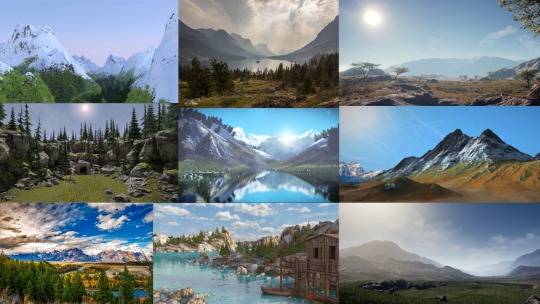
Creating a mood board for the potential main object which would be a spaceship. I decided a spaceship as I thought it would be interesting to animate as well as it’s more adventurous than the standard plane which could potentially look good but wouldn’t be as imaginative.
Sketching out different ship designs which could then suit as a good foundation for development.
After choosing the ship design I liked the most out of my ideas I began to develop it.
After coming up with a final design for the ship I sketched out the different perspectives as it would be created in a 3D environment.
I then began to create the ship using Unreal Engine.
To start, geometry shapes were added and then edited using the geometry editor where each point of the 3D shape would have to be adjusted.
After the shape was completed I would select all of the faces.
Then change the alignment settings to “Align Surface Planar” which would even out the surface so that when the material was added it wouldn’t appear stretched like the shape was.
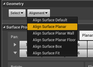
After some of the shapes were created the materials were then changed to give me an idea as of to how the final ship would look like.
These materials were experimented with more until I found a style that I thought I could work with.
The rest of the ship was created using the same techniques with some added features that I thought would add interest.
The ship shapes were then compiled into one static mesh for it to be exported as an OBJ and opened in Photoshop. This was done to experiment and create an even more realistic personalised material.
As I liked the ship how it was and time was running out I decided to begin working on my landscape. To start I had to create a basic flat landscape using the manage landscape settings.
The sculpt and material tools were then used to build a simple mountain range.

Whilst I was creating the landscape the ship colour didn’t fit in with the rest of the scene so I decided to create a mood board of different ships to change the colour to make it more believable.
I noticed similar ships tended to include white and grey colours along with some elements of a more interesting colour such as red or blue.
I also looked up what the exterior of a standard spaceship is made out of so the material would look more realistic.
Comparing my digital ship to my drawings from different perspectives.
Overall the digital version looks more like an older idea which resembles too much of a jet fighter and less of a spaceship due to it’s pointed edges. However, since additional elements such as the objects coming out of the sides and from under the ship were added it still resembles something from the future to some degree which is what I was going for.
I thought about my idea more and thought that the scene would look better with more ships with one main ship standing out as this would look more interesting.
I changed the three other colours to red, white and blue as I think these three colours have really good contrast together.

Creating metallic shine texture in Photoshop for my final ships.
By first finding an image, splitting it into four and rotating it, this was done by going to “Filter”, “Other” then “Offset” where I entered half the amount of the aspect ratios.

It was then blended using the spot healing brush to make the to be material seem seamless and wouldn’t be obvious that it was just the same image repeated.


For my main ship, I decided to have half the ship be a gold material to emphasize that it’s more important than the other three.
Changing other ship colours to all chrome to make the main ship stand out even more.
After I was satisfied with the final versions of the ships I continued working on my environment.

Adding streams created by sculpting out the landscape under a liquid materialised layer.
Was going to use a preset sky…
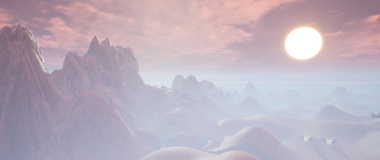
But decided against it as I didn’t see it as an asset which could be given to me if I were to do this in the VFX industry.
Instead, I tried to create a sky that I thought looked similar using the colour and cloud opacity settings.
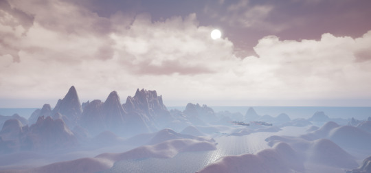

Following multiple tutorials then experimenting with creating materials to paint the landscape with.
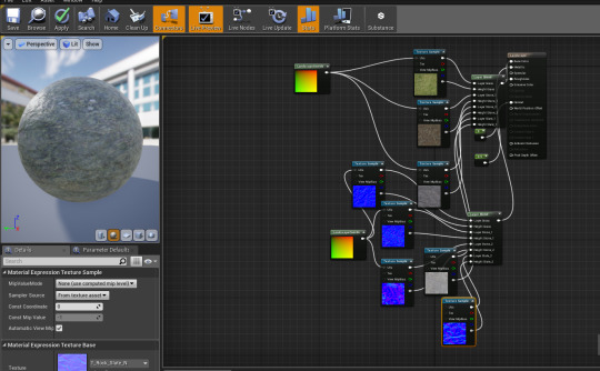
I then added rocks along the main stream using the foliage tool.
Although I didn’t create the rocks, the way they would be distributed wasn’t pre-set, unlike the sky plugin.
I also did this to add trees and grass.
Creating a cabin asset in its own environment.
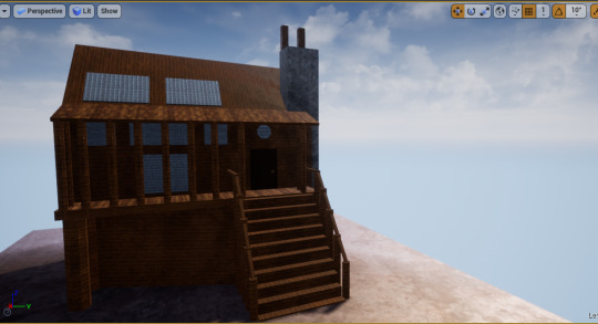
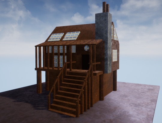
Then converting into a static mesh and importing into the mountainous environment.
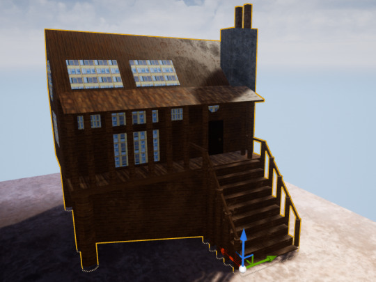
I decided to duplicate then recolour my imported cabin.
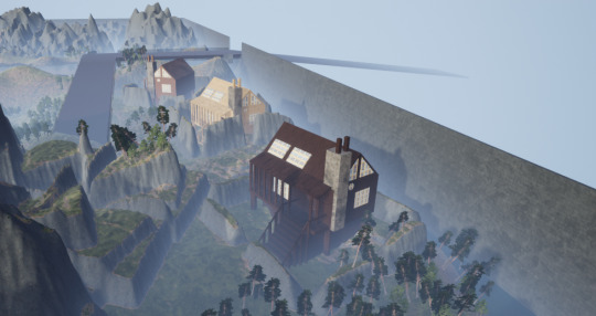
I noticed that the size was just too inaccurate after comparing them to the spaceship and the trees so I shrunk and duplicated them even more.
I thought that one side of the environment didn’t look effective as it was just mountainous like the other half and didn’t help add character to it. So, to fix this I thought I would stick with the surreal theme and try to create a castle design to be implemented.
Creating a storyboard of different castles from 3D models and real life to influence and help design my own castle design.
Sketching out some ideas of the castle which could work.
I decided to keep the design simple as I was still low on time.
Apart from the bridge, the castle was created using the same techniques as the cabin and the ship. The bridge was created by first creating a cuboid then adding cylinder shapes with the number of sides turned up and the brush type set to “Subtractive” which removed parts of the cuboid where the cylinder was placed.
I didn’t like how uneven the castle looked or the colours which didn’t work together very well, so I experimented with the design until it looked somewhat decent.
Before -
After -
Converting to static mesh.
Importing into the environment -
Images of areas from the final environment -
Since I planned to record my environment I looked at how different 3D environments were recorded to give me an idea of how to record my own. I liked this map reveal showing different heights through the perspective of multiple cameras.
youtube
Recording the journey sequence throughout the environment in Unreal Engine using the matinee settings.
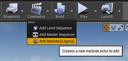

I also decided to record different sequences of areas which I thought needed to be highlighted as they wouldn’t get much film time if the environment was just recorded in one continuous journey. I would add these different short recordings between the journey so it remains interesting.
Unfortunately, during the main journey recording in, the camera kept rotating itself between two keyframes which I couldn’t fix even after replacing the keyframes multiple times. To get over this issue I thought to just replace the moment when the camera did this with other recorded sequences.
The video below is just the journey recording so the error is still visible at 1:02.
youtube
The rest of the recording sequences in the form of just one video since Tumblr doesn’t allow more than 5 videos to be embedded into one post -
youtube
After Effects -
I used After Effects to trim down the footage and make the files smaller by exporting them as a Quick Time H.264 format which changed the total size from 7.28 GB to 2.21 GB.
Premiere Pro -
Premiere Pro was used to put the separate recordings together, change the pace and change other visual aspects such as the colour grading, the tint and the contrast to make it look more professional.
Putting the clips together -

The clips were put together by placing them next to each other on a timeline and adding blend effects so that the transitions would be smooth.
Changing the pace -
The pace was changed by right-clicking on the timeline, going to “Show Clip Keyframes”, then “Time Remapping” and selecting “Speed”.

I then used the pen tool to select certain times of the footage I wanted to change.

And either lowered or heightened the cutout area to change the time.
Changing the visual aspects -
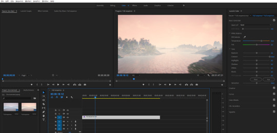
I changed the visual appearance by going to the colour options

And changing the settings on the right.
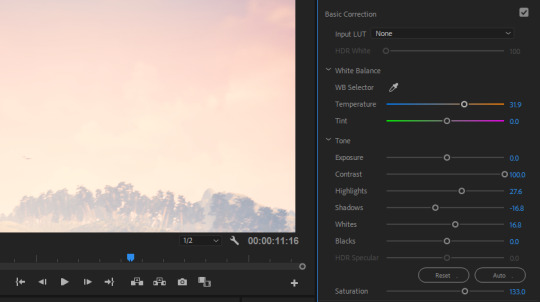
Video so far -
youtube
More After Effects to add audio -

I first imported the music I wanted to use then placed it on the timeline, I then added rainforest sounds and used keyframes to fade in and out the sounds depending on where the camera was in the scene.
Final video -
youtube
Final video on Behance - https://www.behance.net/gallery/81319421/3D-Unreal-Environment
Evaluation -
Successful?
I would say that this project was carried out successfully as I think the animation looks interesting throughout the whole duration in terms of motion and colour. The cameras showing the ships going over the water (from 1:21 to 1:27) in my opinion looks especially impactful as the combination of the two shots made it look more professional and thought out.
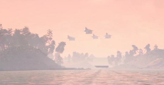
However, I think I could have done a better job when using the foliage tool as some of the trees are at unrealistic angles.

The mountains could also have been sculpted out more using the hydration tool to make them appear less rounded and natural.
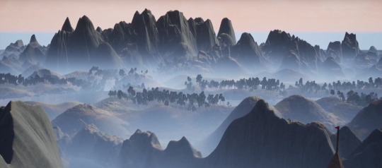
What skills have I learned?
During this project, I have become a lot more comfortable with using Unreal Engine in general. Including how to distort and manipulate geometries, how to align panels of objects, how to experiment with material appearances, and how to record and render without external software such as OBS.

Regarding areas outside Unreal Engine, I have learned other things such as how to create my own raw materials and textures in Photoshop, and how to blend and edit videos to a much better degree than what I could before in Premiere-Pro.


What went well?
During this project manipulating the shapes in Unreal went well since this was easy to pick up and allowed me to create objects and looks which I couldn’t create before.
Another thing that went well was the recording stage in Unreal as it was, in my opinion, entertaining to carry out due to how I could control the motion and the perspective of the camera allowing me to be more specific with what I could show and how it would be presented.


What didn’t go so well?
One thing that didn’t go so well was that making the size of the environment so large caused vast amounts of foliage to be added and therefore created lag which strained the computer and showed in the final rendering of the video.
Although the texturing and materialising for the mountains looks decent, I think it could have looked a lot more realistic with overlapping the textures and having less consistency.
After reviewing the final animation even more, I noticed that the camera seems to appear sharp and jittery in areas where too many keyframes were added, this causes the flow of the animation to be halted for a brief moment causing the viewer to be taken out of the journey through the environment.
What I would do differently next time
Following on from the point made about the jittery camera movements I think next time I would have to try and use less individual keyframes within short durations.
In addition, when looking at my environment from a higher perspective like shown at the end of the video, the horizon line is flat causing the piece to look smaller than what it actually is as well as it looking unfinished and obvious that the landscape is computer generated. So, to fix this for next time, I could make the landscape larger and sculpt the horizon line or I could create or find a landscape image which blends into my environment background like a matte painting.

0 notes
Text
Irritable Bowel Syndrome (IBS) & Coronavirus (Covid-19)
Like you, we are closely following the Corona Virus (Covid-19) situation as it continues to develop. The great majority of us are conscious that this is a serious threat and every precaution taken will not be in vain. Most of us are also ready to make possible changes to prevent this virus from circulating, so that we, all around the globe, can soon go back to our normal life.
But what if some of us are also dealing with one of America's most common digestive disorders, like Irritable Bowel Syndrome (IBS)? Suffering from Irritable Bowel Syndrome (IBS) is no easy task. Living with it every day can be extremely difficult for many of us already.
One of the key things for us to remember is to be prepared and not get stressed. Preparation will curtail the impact of the Coronavirus (Covid-19) on your community, your loved ones and you. And if you suffer from Irritable Bowel Syndrome (IBS), you are probably very good at being prepared by now. Trying to be calm and stress free is also very important, because it will help to avoid triggering your symptoms or making them worse.
Here are 5 important tips for you to be safe:
1. Hand washing is crucial to prevent fecal/oral transmission. Scrub your hands for at least 20 seconds. Don't forget to always wash your hands when you get home or arrive to work. Use hand sanitizer gel if soap and water are not available.
2. Cover your mouth and nose with a tissue or your sleeve (not your hands) when you sneeze or cough. Throw away used tissues immediately and wash your hands right after.
3. Remember; do not touch your eyes, mouth or nose if your hands are not properly clean.
4. Practice “Social distancing”, which is what epidemiologists are using to refer to a conscious effort to reduce close contact between people and hopefully stymie community transmission of the virus. Some of us still have to work and meet with others, so follow the steps above to keep healthy.
5. Amazon prime has partnered with Whole foods so that you can buy groceries online and they'll be shipped to your door. There are also many other services like this available with many other grocery stores.
For those who are feeling panic, stress, and depression:
• Even though, we have suggested practicing social distancing, there are other ways that you can connect with old friends and family. These include doing a video call through apps like "WhatsApp" (free), where you actually get to see your friend of favorite cousin on the phone face to face! You can also go old school with a simple phone call to someone you trust and always makes you feel good when chatting. Avoid emails, FB messaging and texts, as what you need right now, is a friendly voice to talk to and vent out.
• Stop watching the news 24/7. Maybe have a relative check in the news for you and tell you a recap of what's going on every other day or so.
• Spoil yourself a little and take relaxing baths. Add fragrance oils if you have any or light up a candle. You can also add some relaxation music or just your favorite tunes, but be mindful of where you place your candles and music devices, so they are in safe areas.
• This is the time to relax and unwind, so watch movies that make you laugh and smile. Also listen to your favorite music and even dance a little by yourself or with your loved ones. You'll feel so much better!
• If you are not working from home, get busy. The busier you are, the less time you'll have to worry.
• Start a new hobby or activity. There are tons of free tutorials online that will get you excited to learn something new. Learn a new language or a new dish, start a new collection, etc... The point is for you to be entertained in a fun way.
Our thoughts and well wishes are with you. Please take your own precautions to stay vigilant, healthy and safe. And remember, We Will Overcome This.
Digestinol
Digestinol is an all-natural supplement that helps support and promote digestive health as well as support your immune system. Its biggest benefit is the ability to target and reduce inflammation within your digestive system. Inflammation along your digestive system is one of the main reasons for pain/discomfort associated with digestive disorders. It can help with both constipation as well as diarrhea, because it gets your body back to normal so the amount of fluid in your colon is regulated the way it should be.
What is Digestinol?
Our product contains AMP (Aloe Mucilaginous Polysaccharides) which is an all-natural molecule found in the aloe vera plant. It is known to enhance the body’s immune system due to its anti-inflammatory, antioxidant, anti-bacterial and anti-viral properties. We have a 97-98% success rate reported from people who take Digestinol as directed for 90 days or longer.
If you are not interested in prescription medications to treat your condition and prefer a more natural approach, Digestinol makes all-natural capsules that contain a very specific form of Aloe Polysaccharides to target the inflammation along your digestive tract.
These capsules also provide your body with the nutrients that it is lacking in order to take back control of itself. Digestinol isn't just Aloe Vera powder, Aloe Vera (contains Aloein) which irritates your digestive system and can cause diarrhea. Digestinol undertakes very specific additional steps in order to remove the Aloein during their extraction process to focus on only the beneficial portions of the Aloe Leaf, the long chain Aloe Mucilaginous Polysaccharide molecules.
Since Digestinol is 100% all-natural it doesn't bring along the side effects that other chemically based prescription medications have. We tell our customers to think of Digestinol as an all-natural digestive system specific vitamin that reduces inflammation and provides your body with specific nutrients that allow it to take back control of itself.
Our Digestinol capsules will also help to balance the good and bad bacteria levels in your body allowing it to regain control of its normal operations.
For more information, visit us at www.Digestinol.com or:
Facebook – https://www.facebook.com/Digestinol
LinkedIn – https://www.linkedin.com/in/digestinol-research-ba1651116
Tumblr – http://digestinol.tumblr.com
Digestinol Blog – http://digestinol-blog-digestinol.com
Instagram - @Digestinol
Twitter - @Digestinol1
0 notes
Text
EC - Feedback
1. The format of the class was interesting because I have never had a class formatted like this before but it was a welcome change. It was easy to follow and I knew what the schedule was for the class for the most part which I really enjoyed and was super helpful for managing my time with my other classes.
2. Making an art gallery and presenting it was actually very fun for me because over this past year I have really gotten into photography and my group's gallery was based in photography. In addition, through being fairly well versed in presentations, the actual presentation was not too nerve-wracking for me.
3. To be completely honest I overall did not like the SOA Art Galleries. I enjoyed some of the art and talking to the artists however doing it more or less every week got really old really quickly for me. I got less interested as the weeks went on and although I still went it felt like work more than an art experience to learn from and explore.
4. I surprisingly enjoyed the weekly art activities. I discovered new things that I liked and it was fun that every week it was different. I was really into the activities since they all had a purpose. Whether it was exploring how to voice a political opinion or new ways to express creativity there was a purpose and did not seem like senseless work with no point.
5. The 7 ideas about art are actually my favorite part of the class. I felt like I was actually learning things and discovering new ways to think about how we express ourselves in the 21st century. I would have never considered mashups art unless convinced otherwise in this class and that new perspective is going to stick with me for a while.
6. I did not like the Tumblr aspect of this class purely because of how foreign it was to me. It got easier as the class went on but there are still things now that I do not understand how to do. It was really easy to forget to post things since I am always on beachboard or WebAssign but I rarely thought about Tumblr since I am subconsciously thinking about it as social media and not the tool my class uses for my grade.
7. Using Wix without any prior knowledge of web design was really difficult. For a lot of my time on it, my group was kind of fumbling around on how to make our website and looking it up on the internet was somewhat hard since the directions are very general when there are so many options thrown at you. There were so many buttons I did not know what did what unless I tried out every single one which got tedious and discouraged me to work on the website at times.
8. I really liked the website instead of beachboard despite what I said about Tumblr. All the info was available to me in a new, fresh, asthetically-pleasing manner. It did not feel like work to open it up. I opened it up and actually wanted to see what was posted rather than not wanting to go all through beachboard and end up having to ask a classmate or emailing the professor.
9. Having no tests made me appreciate the class more. I wanted to go more for the learning and fun aspect rather than because I had to or I would be left behind. The class is set up so participation is not completely mandatory but since the explanation for all the homework is during class and the index cards are for participation you sort of are encouraged to which I know 99% of students at CSULB would take over exams that only stress people out on what they can remember and forget soon after.
10. I do not believe it was the dialogue you had or the length of the lecture. I believe the problem lied with the students. The students in the class do not really care about the subject matter and therefore did not feel intrigued to participate. If it is not for that reason I know it had to be because a lot of us were tired since the class was later on in the day when people start to get lazy. Some of the points of discussion that were brought up were thought-provoking but because of the combination I mentioned, participation was rare. Another factor was that it was a lecture hall. I know there are people too scared or shy to voice their opinions in that environment. Perhaps if it were a smaller class and people got to know each other more there would be more participation. This exact thought-process was used in my public speaking class and there was always participation and no fear to talk in front of each other despite it being a class people struggle with and being at night.
11. My suggestions for the class are to space out the galleries to every other week so you can try to prolong interest and participation. In addition instead of Tumblr, use a beachboard but only to collect assignments. This way students can see their grades explicitly while also using a system they are familiar with and even get alerts as to when dropboxes are closing which would be deadlines and make it even more convenient for students to do assignments because as time progressed I saw that people got tired of navigating Tumblr and quality of work sometimes dipped. The website was fantastic and I would not change anything about that. I always knew what was going and I could plan my days around it which helped a lot on top of the fact that the website itself is really nice to engage with. You were always available for your office hours and it was in a pretty cool place relatively speaking. I liked that the option to email you was also very available because I know sometimes it is daunting for students to directly talk to their professors. Class time was used effectively but since the timing was later in the day I could tell people were tired so perhaps if it was earlier the experience would be improved. I would also suggest you do a tutorial of some sorts or linking tips or help videos for Wix if you continue to use it in the future for the art gallery assignment instead of throwing students into the water and seeing if they can swim which it seemed like. Secondly throwing what seemed to be like four assignments at people towards the end of the class threw a lot of people off and a lot of students panicked and got stressed out since finals is just around the corner. I would suggest introducing the EC earlier in their semester by at least two weeks especially the Museum exploration one and if not, extend the deadline of it. Overall this was a great class and I would recommend it to everyone that needs it. It is engaging, interesting, and fun with a great professor that actually cares about students and the learning experience.
0 notes