#also sorry for any screenshot with my mouse in the image
Explore tagged Tumblr posts
Note
Hi! I love your cc!! I've been trying to find a tutorial for how to make something take on the texture of a sims body, like your tails do, and vice versa how to make a piece of cc that does that have different swatches instead. Haven't been able to find anything and I was wondering if you might know of one? No worries if not, thank you!
Hi! Thank you so much! So sorry for the delay with this, my internet died last week and I’ve been busy since then. I honestly can’t remember when I learnt how to make it take the texture from the skin but iirc it was me just asking someone else how to rather than an actual tutorial. The process is super simple so I’ll do a lil tutorial here for it

Depending on how you have your blender set up you might not have the extra window like I do, so go up to where the red circle is, click and drag those 3 diagonal lines and it’ll open a new viewpoint.
Click on the icon at the bottom of the viewpoint.
Select UV/Image Editor, the window will then look like the one on the left with the pixel grid.

4. Click this box and change the mode from Object Mode to Edit Mode. 5. Press A on the keyboard to select the entire mesh. 6. Press U on the keyboard and select Unwrap. (There are different ways to unwrap an object, but considering how tiny the UV will end up and it not needing a "proper" texture, there’s not really any point in doing any fancy unwrapping here)
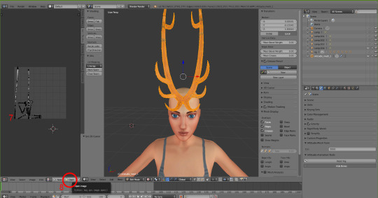
7. After unwrapping you will see the UV map of your mesh in the UV editor 8. Click Open and find the UV image (Linked Here)

9. Click in the UV Editor window so it is active, press A to select the object's UV and then press S and scale it down (Move the mouse to scale it). Then press G and move it to where you want the object to take the skin colour from. For horns I tend to go for mid forehead, for my tails I go near the ear because the back skin is slightly darker/shaded so it blends better.

10. Now, the texture won’t immediately take note of the skin colour, so to fix that click the Material icon and then click New.

11. Click the icon next to Material and choose BaseTexture. This will apply the texture to the horns.

12. (Edited two screenshots together to show the uv placement, it won’t show it when you’re in object mode) Now back in object mode on the mesh viewpoint you can see that the mesh is now taking the colour or skin from the sim's forehead! You can move it around if you want to see if there's any other area you prefer, but be mindful of where other objects and textures will interact. With my tails and horns any hairs that have shadows or cover the ears will have issues with darkening the horns' colour. It's kinda inevitable honestly.
13. Now it’s just a case of importing it into Sims 4 Studio like other cc, for my horns I used earrings, but for the children and younger I used the blank body mesh (Because there's literally no base game accessories for any of them which don't have additional issues? I tried a bracelet but with long sleeve the horns would disappear, and I didn't have the patience to figure out exactly how to stop that lol). I replace the existing texture in Sims 4 Studio with a completely blank image (That’s the same size as the UV map)
The process for regular texturing is very similar, but I used a regular blender tutorial for that. There is also This Tutorial which goes over how to properly divide up your mesh for a cleaner UV map.

To get a image you can use to apply an actual texture, whilst in edit mode, click A to select the UV map, then click UV at the bottom and then Export UV Layout. This will save an image that just shows where your UV is, you can then use this as a guide when painting/applying a texture.
This is how my UV map looks after exporting and after painting it the texture I want. You can then reimport your textured image back into blender to see how it looks. Also if you've already imported your file into S4S you can simply just import the texture and it should apply.


I hope this all makes sense! Any questions I'll try to answer!
#sims 4#simblr#ts4#sims tutorial#cc tutorial#sims 4 tutorial#most of this is muscle memory at this point I almost forgot you had to apply the material for it to actually show lol#my regular methods of doing things is fucking around and finding out honestly lol
11 notes
·
View notes
Text
Who should know their secret identities: A Huggy and WordGirl Relationship Analysis
Let’s take a moment to discuss WordGirl/Becky and Huggy/Bob’s relationship. To label it, it seems to be an interesting mix of friendship, mentor/mentee, and parent/child. Today I want to specifically talk about the parent/child aspect of their relationship. I want to talk about a rule of Huggy’s that may not be best for Becky.
Like any decent parent, Bob obviously just wants what’s best for Becky. But sometimes what a parent or guardian thinks is best for the child, is not what is really best for them. For our favorite heroine and her sidekick/mentor, I think this is the case with their secret identities. Bob seems to be very strict on this subject, while Becky has shown a desire to share her secret with a select few people. Of course, Becky is protective of her identity too, but on more than one, on-screen, occasion she has wanted to share this secret with her best friends and family, while Bob continues to object to the idea. And there’s reason to believe this conversation comes up a lot more off-screen than we may have realized, which further brings into the question whether or not Bob’s perspective on the matter is the right one.
Let's take a look at some secret identity sharing (or almost sharing) moments, shall we?
The first incident was in WordGirl Makes a Mistake. Whilst feeling self-conscious about her mistake, Becky decides to confide in her dad and brother. Notice Bob’s reactions to this.


He abandons pizza. Bob. Abandons. Food. He never does that, even during the most crucial moments. At best he takes the food with him or scarfs it down before leaving. But he feels so strongly about this that he completely abandons his food.


Then he tries to discredit her in a panic. When she shares her secret with her family, he can’t look and once it’s all said and done, he looks very annoyed and disapproving. He doesn’t let up on this until he realizes neither Tim or Tj believe her.


Now let’s turn to Becky to see her perspective on the subject. Aside from the fact she was willing to tell her family, she states that she’s been “Holding this back for a long time…” clearly showing that she truly does want to tell them she’s WordGirl.


Next, we’ll examine The Good, the Bad and the Chucky, when Becky seriously considered telling Violet, and almost went through with it.


When the idea is brought up, Huggy immediately protests and is grumpy the rest of the episode. When Becky starts to tell Violet, Bob makes one last attempt to convince her not to. Becky doesn’t pay any attention to him and keeps talking, and Bob goes into full-blown panic. He even faints.


Again, compare this to Becky, who truly wanted—yearned — to tell Violet. Remember this episode defined yearn as being something stronger and deeper than a want. Not to mention her reasoning says a lot about how much she wants this. “She’s my best friend, I tell her everything, and it would be such a relief to totally be myself around her.”


This episode also gives us some insight into how often this conversation comes up and how it usually plays out. When WordGirl first brings up the idea of telling Violet and Huggy objects to the idea, she frowns and rolls her eyes. She does this as though she’s heard this a thousand times and is tired of hearing it.

An even better episode to help us realize how this conversation goes is The Invasion of the Bunny Lovers. This is the episode where Scoops finds out Becky is WordGirl. Bob is under mind control the entire episode, and doesn’t find out about the incident until the end when Scoops calls Bob “Huggy.” The screen immediately shows WordGirl who looks extremely nervous and signals Scoops not to bring it up.

Scoops doesn’t get the message and WordGirl then gives Bob a very nervous smile. This is similar to how a child acts when they are in huge trouble and want to either get on their parents’ good side or not even tell them to stay out of trouble.


The next thing she does is fly away from Bob, again much like a child trying to avoid trouble.


After Huggy finds her, her expression quickly changes to a look of dread, like she’s about to get the lecture of a lifetime. Meanwhile, if we examine Huggy’s body language, he’s clearly mad and she certainly is getting the lecture of a lifetime.


Going back to my point about this being like a child in trouble with her parent, and how this shows us how the secret identity topic usually plays out, I see this whole interaction as being similar to family’s putting an emphasis on grades. Of course, the child wants good grades, but perhaps the parents are very strict about them, and when the child gets a less than satisfactory grade, she might try to hide it or wait for the right time to tell her parents, because she dreads the reaction they will inevitably have. The secret identity rule is such a strict one with little to no room for debate that Becky acted like a child with a bad grade when the secret got out.
And of course, this makes perfect sense. Becky was so young when she discovered her powers, she was at an age when most children want to show their parents every cool thing they can do. And at age 9-11, Becky has been shown to be very open with her parents, so of course she too would have wanted to share her abilities with her parents. But she clearly didn’t because…ya know, they don’t know about them. What would have stopped a censor-less toddler with not yet the brain capacity to think “maybe I shouldn’t tell mommy and daddy what I can do”? It was Bob.
Bob told her not to tell anyone from a very young age, and Becky listened to him because he was someone who loved her, took care of her and someone she trusted. But now she’s getting older and starting to think for herself and questioning whether Bob is right when he says “you can’t tell anybody you’re WordGirl.”
And maybe she’s right to question it. There’s no doubt in my mind he’s just telling her she can’t tell because he believes it’s what’s best for her, but is it really what’s best for her? Granted, Bob probably has this rule so strict because the more people who know, the greater the odds a slip up could happen that lets the secret out to the world, which would undoubtedly be terrible. That and anyone who knows her secret would be worried about her in battles.
But is telling a few people worth the risk of all this happening? First, let’s look at how bad Becky wants this. “I’ve been holding this back for a long time” “I yearn to tell Violet I’m WordGirl.” Second, let’s remember why she wanted to tell the people she did. With Violet, it was because she was feeling guilty for not having told her and craved the ease for not having to hide herself from her best friend. And she told her family because she was having a hard time as WordGirl and her family started to notice.
Which leads me to my next point my most important point because this isn’t about what Becky wants. It’s about what she needs. In the case of her family, she needs to be able to go to the people who care about her and want to help her most. As much as Bob loves her and will do whatever he can to help her, he can’t solve every problem she has. Not to mention sometimes it’s not even that she needs their help and advice all the time, sometimes she might just need an ear to vent to that’s not Bob’s. And her family deserves to know what’s going on with their daughter. They deserve to know she’s worked up because she made a word mistake in battle, or that she’s acting rude because she’s been spending one on one time with Ms. Power. Her parents want to help her, but they obviously can’t if they’re not aware of that part of her life. And wouldn’t Becky’s life and crime fighting be easier if she didn’t have to lie to her parents to go do her job? Wouldn’t it be easier for her to say “I missed family dinner because I was fighting Two-Brains and the Energy Monster,” then to get punished for doing her job? I won’t even get into the fact that keeping secrets—that dictate a huge portion of your life—from your loving family is probably emotionally unhealthy.
As for her friendship with Violet: that had many problems that were because of the WordGirl secret. I won’t get too much into this here because one day I want to do a whole analysis on it, but in many episodes leading up to Rhyme and Reason, Becky and Violet were starting to have a rift wedged between them. And it always was because Becky had to leave to fight crime when Violet needed her. I’m not sure when these issues started, but if Becky had told Violet when she wanted to in The Good, the Bad and the Chucky, it likely would have gone differently than in Rhyme and Reason. This not only would have fixed a lot of problems in their friendship either before they started or before the problems had gotten bad, but also would have resulted in less drama. Most of Violet’s betrayed feelings were from the fact that Becky never told her, and she found out by accidentally photographing it. This would have saved Becky a lot of unnecessary heartbreak. Maybe not all of it, but a lot of it.
These are all fine reasons to tell the closest people in Becky’s life, but Bob’s perspective on this subject is still important too. More people knowing means the secret could get out easier, everyone who knows will be worried about her in battles and probably other things I’m not thinking of. The question is: Is it worth risking all that for the benefits of Becky’s friends and family knowing? There is not a definite, crystal clear right answer, it all depends on Becky and what’s right for her and her life, and I think as she gets older, she’ll start to question what the right answer for her is. Bob, however, is stubborn and I can’t see him changing his views on this subject very easily. I don’t want him to suddenly change is mind and let her tell whoever she wants, but I do think it’s important that he considers his perspective on the topic, might just be the wrong one. But I don’t know what it would take for him to consider that idea. I feel like it would have to be something extreme, like Becky having a mental breakdown from not being able to tell her parents things.
None the less I do think this conversation has been coming up more and more lately and will continue to be brought up more and more as Becky gets older and starts thinking more for herself.
#wordgirl#becky botsford#bob botsford#captain huggyface#captain huggy face#wordgirl makes a mistake#the good the bad and the chucky#rhyme and reason#analysis#sorry for not cropping pictures but i was lazy and in a rush#also sorry for any screenshot with my mouse in the image#oh btw if someone notices any private information in the screen shots please let know so i can replace the pictures#i used a player with an account under my real name so if anyone notices my name or anything else (idk what) let me know#and then pretend you never saw it!!! ;)#I'm so happy to have this done#i hope you all enjoy it!!!!!!
42 notes
·
View notes
Note
How do you go about making your DND word boards? Do you have any resources that you recommend? I'd love to try and make them for my player characters and NPCS.
omg i'm so flattered you're asking, they're so much fun to make!
usually mine consist of 10-12 lines from songs/poetry/books in addition to 2 or 3 art pieces interspersed throughout (arranged like 4 texts - 1 image - 4 texts - 1 image - 4 texts)
the song lyrics are probably the easiest part because i make playlists for all my characters and all of the other players in my campaigns do as well. i just peruse the appropriate character playlist and pick a bunch of lyrics that i think are apt to the vibe of the character. a minor tip I've learned, when you take screenshots of the lyrics make sure they aren't all from the same lyric website, that way it won't look too uniform (usually i alternate between Genius and AZLyrics, and occasionally highlight the text with the mouse)
the poetry/book excerpts could potentially be a little bit harder if you aren't already into poetry; if you were to look closely at my wordboards you would notice that Mary Oliver and Richard Siken make frequent appearances because they are my favorite poets, so I'm already familiar with their work lol. it's usually harder to find lines from a novel or other book that work, but I've done it before (it's usually just luck, or I'm already reading a book for fun and then think 'oh this reminds me of xyz character' and make note of it for later). i've been using this website to download my text sources for a while (it's free). off the top of my head, i've had a lot of luck with Mary Oliver, Richard Siken, Louise Glück, Nikita Gill, and have drawn a surprising number of quotes from the Stormlight Archive series by Brandon Sanderson. If you encounter a book that you suspect might have some good quotes, but you don't want to scour it yourself, you can look it up on Goodreads and they have a whole section in every book's little entry about popular quotes from the book.
the art is easier than the poetry. a lot of the time i literally just google it like 'sky painting' or 'sky art' and see what i find (that's exactly what i did for both of the paintings for this post and several others). some characters are harder to find an art theme for than others, so the difficulty of this part is heavily dependent on how strong or specific the aesthetic of the character is.
one of the most helpful things for me has been to have character tags on my tumblr for all of my characters. that way, every time i see something that reminds me of them, i can tag it and reference it later if I'm making a wordboard. some of the other people in my campaigns do the same thing, so i can reference theirs if i need to.
also, make note of fun quotes that the character says in-game in case you want to include them in the body text of the post! this part is optional to me, because sometimes i forget to be looking out for one, and then i have to post the wordboard and add the quote later when something interesting comes up lol.
i hope this was helpful, and good luck! sorry that was so long-winded, and feel free to dm me if you have any more specific questions :)
5 notes
·
View notes
Note
hii i'm sorry to be a bother but i was curious if you have any transparent versions of those p4a aigis icons you made? thanks so much even if you don't <3
i’ve been thinking for a bit about how i want to answer this, and the short answer is, no i don’t have them.
if you want a longer answer -- as a content creator, i’ve been compiling all my resources for at least 2 years now at this point just for persona alone. a lot of this was me making the resources myself from official art, including the the various mangas and anthologies.
since you’re specifying p4a aigis icons, i’m gonna guess you mean these two sets, as they’re the only things in my catalogue specified as p4a aigis that isn’t just her official sprites and renders. in total, there’s about 61 different images there -- 61 images that took me about 4 months to cut out by hand with a mouse, not counting it took me about a week to compile the images themselves to be able to be cut out and cropped.
in an ideal world, i would hand them over and ask for credit on being the one who did all that work and i’d get credit for it, but it’s kind of a given in this day and age the work content creators such as myself put into making things like this is considered lesser. to people who don’t do graphics work, they only see the final result made from official art and not the countless hours it takes to comb through a piece of media for acceptable screenshots to then format, and then to spend more hours painstakingly cutting them out so they look nice.
from my position in this, i’d rather just keep them for my own use, as i do still have them. which, i get it sucks, because i also understand this from the point of view of someone who just wants the already done resources for free use. but the content creator side of me kind of won out while i was debating how to answer this, so i do apologize on that front.
#ask tag#since ive been doing more icon dumps recently from manga i felt this kind of finally deserved an answer
7 notes
·
View notes
Text
Social Distancing (NSFW)
*Not my gif*
Pairing: Kevin Atwater x Reader
Prompt: “Another Kevin story” reader is having a hard time social distancing
Warnings: smut (18+), swearing, daddy kink, sexting
A/N: Your texts are italicized, Kevin’s are bolded. Be careful and stay healthy out there guys. Wash your hands and practice social distancing. I don’t want to see any of you sick! Also this somehow turned into a slight daddy kink thing oops.
“Seriously Kev what am I supposed to do all day.” You whined from your bed as Kevin got dressed for work.
“I don’t know...enjoy your time off?” He smirked, amusement on his face looking at you in the mirror as he pulled his shirt on.
“I would enjoy it much more if you took that shirt off and climbed back into this bed.” You wiggled your eyebrows at him as he turned to face you.
“As much as I would love to and believe me I would,” he looked at you slight lust in his features before shaking it off, “some of us are still essential. Criminals don’t stop cause of a virus.” He sighed sitting on the bed to pull his shoes on. Groaning you shoved your face into a pillow making him chuckle.
“Oh! I forgot. I got you some hand sanitizer and vitamins they’re on the kitchen counter. Make sure you put them in your desk.” You informed. Coming around to your side of the bed he leaned down to place a soft kiss on your lips.
“Thank you babe. I will.” He picked up his bag to head out.
“Kevin.” You scolded him, making him sigh.
“I will baby. I promise. Have a good day. Just relax!” He scolded back heading out the door. Huffing you relaxed back into your bed turning the TV on to occupy your attention. You had been sucked into an episode of How I Met Your Mother when your phone vibrated beside you. Rolling over you opened it to see a text from Kevin.
“The hand sanitizer has somehow become a shared bottle.” He sent with a picture of the bottle sitting on Mouse’s desk at the front of the room, a few people gathered around it before another text came through, “also, Ruzek wants to know why you didn’t get him any vitamins.” Chuckling you typed back a reply,
“I’ll get him some on my next grocery run promise. Also remind your colleagues of the six feet apart rule. If you get anything you're quarantining in the guest room.” You teased.
“Totally understandable.” He answered. Shaking your head with a small smile you abandoned your phone back to your night stand focusing your attention back on the tv.
A few hours had passed before you started going a little stir crazy. You had no more rooms to clean in your house; they were already spotless from last week. Not that you weren’t enjoying your time off but you needed to think of something to do. Remembering that you needed to clean your phone up a little you started doing some maintenance. Deleting some games and old apps you hadn’t used in a while, clearing out your notes folder before moving onto your pictures. You had a habit of screenshotting things to send to people and forgetting to delete them. You were about five minutes in before you had reached your “Kevin” album. Also known as the hidden album. You had honestly forgotten you even had them on your phone since they weren’t in your regular pictures and since you moved in with him three months ago you two hadn’t had any reason to send pictures anymore. But looking back at them you were damn glad you had saved them. Immediately feeling heat spread through your body at the pictures and videos you had saved over the years. Squirming in your bed you pulled Kevin’s messages back up.
“Hey..you guys busy?” You asked and he answered almost immediately.
“No, we’ve been inside all day. They don’t want us out unless it’s a big case.” He explained.
“Soooo.. are you like around people?” You continued.
“I’m...at my desk? So I guess so?” You could practically hear the confusion over his texts.
“Oh good cause I need your help.” You stated.
“With what?” He asked. You pushed the blanket down that covered you to your thighs leaving you laying openly in your bra and panties as you snapped a picture sending it off to your boyfriend without an explanation. “Babe.” He stated simply.
“Kev, please. I miss you and I found pictures of you on my phone and I’m so horny now.” You explained wishing the whine of your words would come out in text. Knowing he’d give in if he could hear you beg.
However, apparently he could imagine the whine in his head cause not long after he replied,
“This has got to be quick.” Smiling you trailed your hand down to tease yourself outside of your panties. Fingers lightly tracing over your slit. Adjusting yourself so you could still text with the other hand.
“Already started, just need you to get me there baby.” You replied.
“You’re so needy, interrupting me at work like this. So bad. You know that?” He began.
“Yes. I’m sorry. Just need you.” You typed.
“You’re my girl. Only I should get to see you. Anyone could’ve seen that picture. Being risky aren’t you baby? You’re gonna get so punished for this when I get home.” Sighing at his words you began to rub harder feeling the dampness already starting to accumulate.
“How?” You urged.
“Gonna tease you so bad. Make you so wet without even touching your pussy. Gonna kiss all over your body except your pussy. Then I’m gonna make you suck this dick. Since your so good at it and you’re gonna let me fuck that pretty mouth of yours. Maybe I’ll cum all over your pretty face or maybe I’ll bend you over the counter and fuck you so hard you won’t be able to walk tomorrow. Would that be a good punishment or would you like that too much?” Whimpering as you read the words you snuck your hand into your panties starting to rub soft circles around your clit, spreading the wetness from between your legs.
“Oh god Kev. Want you to fuck my mouth so bad. Love tasting your dick.” You said.
“I know you do. And you’re so good at it too princess. Love hearing you moan when my cock is shoved down your throat too. Makes me wanna cum right then and there. Take those panities off. Put those fingers to work gorgeous.” Swallowing hard you followed his instructions using your free hand to push your panties down your legs kicking them to the side and spreading your legs wider. Slowly pushing a single finger into your pussy, increasing the speed with each thrust before adding a second. The amount of wetness making it easy.
“Wish these were your fingers filling me up.” You texted.
“Me too baby. Love taking care of that pretty pussy of yours. Love tasting it and filling it up.. You always take me so well princess. Always know how to please daddy. How to keep daddy begging for more don’t you?” Moaning at his words the speed of your fingers increased curling up to find your sweet spot, hips jolting up once you did. Your mind filled with images of Kevin. How his mouth feels when it’s all over you, fingers thrusting hard and purposefully into your pussy driving you towards the edge so well, how his cum feels when it fills you up, these thoughts kept running through your mind as you began to to ride your hand and rub your clit with your thumb willing yourself to believe Kevin’s fingers were the ones bringing you to your peak.
“Love feeling your dick deep in me daddy. Fuck, I’m close Kev.” You warned.
“Love knowing I can make you cum with just a few words. Love knowing I can make that pussy wet so easily baby. Come on babygirl. Cum for daddy. Just like you would all over my fingers. Don’t be quiet on me either.” He encouraged. Between his words and the old video of him cumming you had playing on your phone your muscles tensed hard before the pleasure unraveled throughout your body. Dropping your phone to your side your eyes shut tightly, Free hand now gripping your sheets as your hips bucked up riding out your high, thighs shaking while you moaned out Kevin’s name loudly even though he was nowhere to be seen or heard. Only realizing how fucked and in love he actually had you as you laid, panting trying to get your sense of the world back. Picking your phone back up you laughed to yourself,
“Thanks, baby.” You sent with a kissy face emoji.
“Anything for my girl. You better be damn ready for me when I get home though. I wasn’t kidding.” He sent with a winky face.
”Always ready for that dick of yours..” You replied truly meaning it and already wishing the hours away.
#kevinatwaterxreader#kevin atwater x reader#kevin atwater imagine#kevin atwater#kevin atwater smut#chicago pd imagine#chicago pd x reader#chicago pd smut#chicago pd
401 notes
·
View notes
Note
I'm following your recolor tutorial with gimp, but I'm having some problems. I use the free select tool and invert the image I want to use, but it keeps the white background around the part I select even after I click delete. It won't let me erase it either. Is there any way to avoid this?
oh no, i’m sorry! i think i know a few reasons it might be happening. if this doesn't help, feel free to message me and/or send screenshots so i can see exactly what’s going on.
1. try an alternative route
keyboard shortcuts! if you're on a mac it might be different keys, but you'd have to check the gimp website or your gimp settings for what those are.
once you've selected your graphic, you'll press ctrl+i (inverts the selection), then delete, then press ctrl+shift+a (deselects it).
i do it this way 99% of the time since it's faster, but shortcuts can confuse things when you're learning so i left it out of the other post.
2. ensure you're on the right layer
if you are selecting on the layer below the image you want to use, you can still see the selection but it will not let you do anything to the other layers that are not selected. it’s real easy to mix up and after some thinking it sounds like this very well could be your problem.
make sure the layer with the image you want is selected; in the layers menu, the background of your image’s layer should look darker, like this:

the rest is below keep reading cuz it's a little lengthy.
3. selecting the correct area
you might actually be selecting the area around the graphic and then inverting. it's really easy to do by accident. in that case, it would then select the graphic and it will delete the graphic instead of the excess, and it also wouldn't let you erase the white background. it doesn’t sound like the problem you’re having since you didn’t mention the graphic disappearing, but i’ll mention it just in case.
when you're selecting, make sure you draw around the graphic, so that the selection looks something like this:
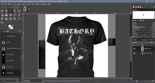
and you aren't drawing around the whole image and including the background, in which case your selection would look more like this:
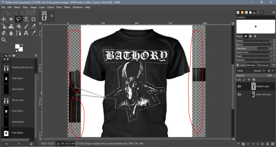
see how the selection lines go off the image (circled)? that’ll getchya!
4. more layer stuff
make sure your image is on a separate layer than the sims 4 texture. if you paste your image into gimp, make sure you click on the little green "add as new layer" button circled below:
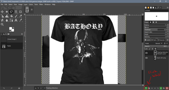
if you add it as a layer from the edit menu, it will automatically be a separate layer, so you don’t have to worry about this problem.
but if it isn't a new layer, that can mess it up and cause the transparent background to turn a solid color.
5. close the selection
if any of that isn't the issue, you might not be closing your selection all the way. if you're clicking and dragging your mouse around the graphic to select it, it can be a little tricky to tell if it's closed.
i suggest clicking around the graphic; you will see little circles pop up where you click like these (1st image) and you can close the selection by clicking back the circle you started with (2nd image):
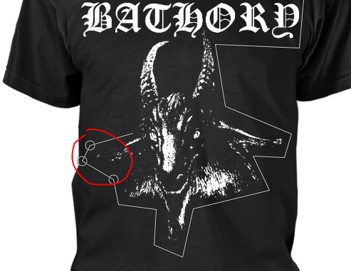

after that you should be able to do the rest of the process just fine.
and if none of that works...
again, feel free to message me and/or share some screenshots of the problem. these are my best guesses, but maybe i know what’s going on and i'm just not thinking of what it is without seeing it, you know?
hopefully though, one of these solutions worked.
1 note
·
View note
Text
Illustrator Tutorial
So for quite a while I’ve been mulling over the idea of making a tutorial of how I create art in Adobe Illustrator. I’m not the best at explaining things but I just thought I’d share how I make my art! Warning—this is a super long post. And it’s not exceptionally interesting. Sorry about that….
I draw traditionally, so when I’m satisfied with my drawing, I open up Illustrator, make a new file, and place the artwork in it.
This is how I set up my file and work space. My layers are at the right of the screen (the top layer is my drawing layer, the bottom layer is my “sketch” layer, locked and usually set on 65-72% opacity). If I wanted to change the size of my Artboard (the file, basically) I would go to the Artboard window (located above my layers) and make my changes there. To the left is the Toolbar. It contains a ton of useful tools, such as the Selection tool (basically the “mouse”), Direct Selection tool (helpful for editing line work), the Pen tool (what I use to trace over my drawings), Type tool (for typing), Rectangle tool (for making quick shapes like squares, stars, circles, etc), Shape Builder tool (for merging shapes), the Hand tool (for moving the screen around—if that makes sense…) and the Zoom tool (lol pretty self-explanatory). There’s many more tools of course, but these are the ones I utilize the most. (Uh unfortunately the tools I am using aren’t showing up in my screenshots while I work…so I’ll just point them out as I use them)
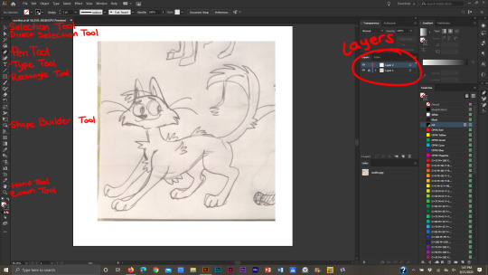
Now that I’ve got my file set up and drawing in place, I trace over it with the Pen tool. There is also another way to make line work. If you’ve got nice line work that you’re satisfied with you can simply select your drawing, then click “Image Trace.” Illustrator will make a vector image of the drawing. Personally I don’t like making line work that way because, well, I’m sorta odd when it comes to line work and I prefer to use the pen tool.
When I make a shape and connect two anchor points together, they make a single shape, like this head. You don’t necessarily have to make shapes in Illustrator, but it does make things easier imo.
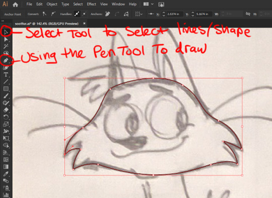
To edit my line work, I select the line work itself using the Selection tool, then go to Object>Transform>Reflect.

Another window will pop up, and from there, I can choose if I want the image to be flipped horizontal or vertical. Then I click “Ok.”
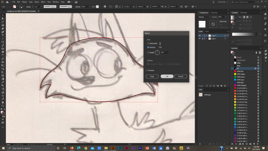
I make edits using the Direct Selection tool. Then I flip the line work back to how it was. I can do this by right clicking the line work and going to Transform>Reflect. The same window will pop up again, and I click Ok.
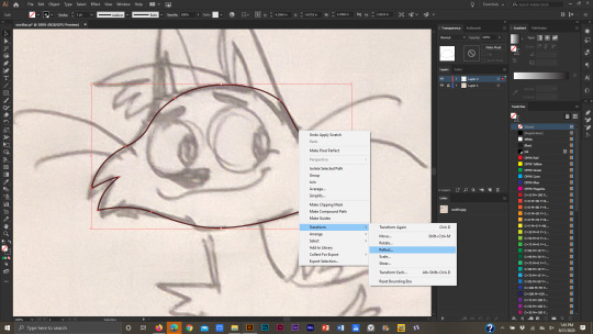
But how do I make lines in Illustrator? I use the mouse when I work in Illustrator (I used to just use my laptop’s track pad, but uh…I highly suggest that you don’t do that! Using the mouse is a lot easier on the hand, and the track pad is pretty bad for carpal tunnel). You can also use a Wacom tablet or whatever, but I prefer using a mouse. Anyway, to draw in Illustrator using the Pen tool, simply click anywhere on the canvas to make an anchor point and drag the mouse away from where you clicked. As the mouse moves around, a line will follow it. If you click again, a straight line will appear.
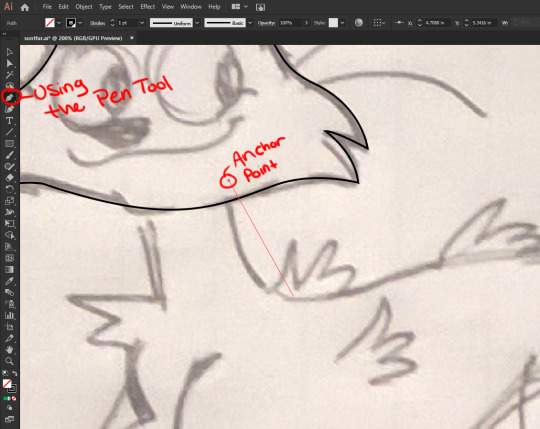
To make curved lines though, after you click on the canvas, drag the mouse around to make a curved line.

To merge shapes, select each shape with the Selection tool (click on a shape, and while holding down the Shift key, click on another shape. Two shapes are selected at once now…or just drag the Selection tool over multiple shapes at the same time).
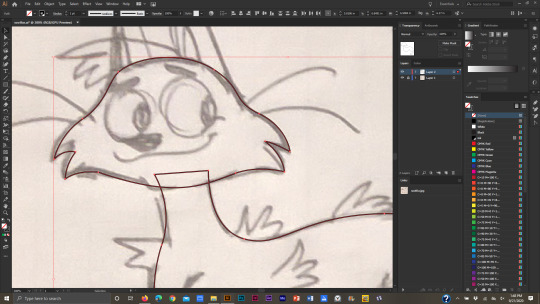
Drag over the selected shapes with the Shape Builder tool…
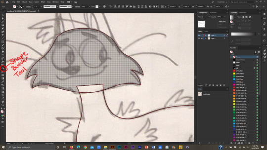
…and one shape will be formed.
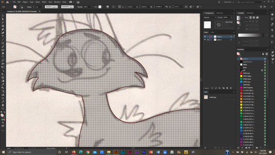
So that’s how I make line work and shapes in Illustrator. If I want to rearrange which shape is “in front” or “behind” another shape, I select the shape, right-click on it, go to Arrange>then Send to Back or Bring to Front.

If I want to make a duplicate of a shape, I select it with the Selection tool, click “alt” (on Windows) then drag the new shape away. Then I de-select it.
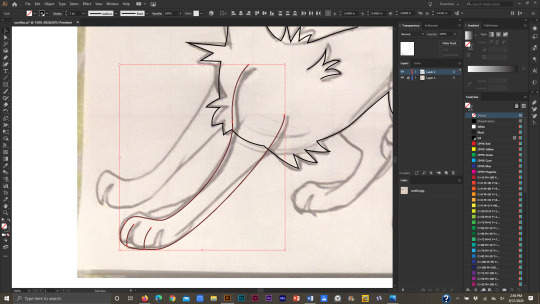
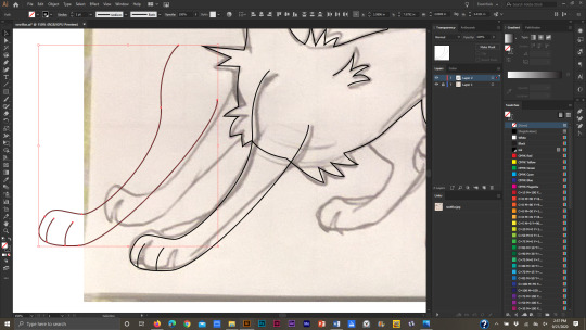
When building shapes, sometimes I have to “delete” part of a shape so that it doesn’t show up in the final illustration. For example, when I make pupils. To do this, I select the shapes that have to be edited: the iris, pupil, and the eye itself. The eye won’t change, but in order to make the iris and pupil fit inside the eye, I’ll have to select it. If I don’t then all I’ll manage to do is merge the iris and pupil together.

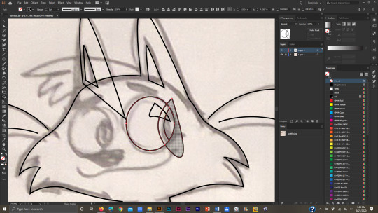
So after they’re all selected I use the Shape Builder tool and drag it over the part of the iris and pupil that I don’t want anymore. While doing this I hold the “alt” key down, so that when I’m done editing the eye, the extra shape will be deleted.
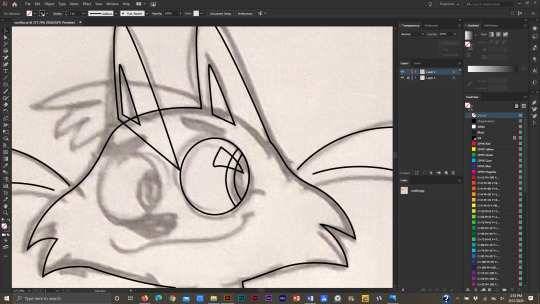
And finally the line work is DONE!

Now to add color. To change the color of a shape, I select it with the Selection tool then change the color from the Swatch window.
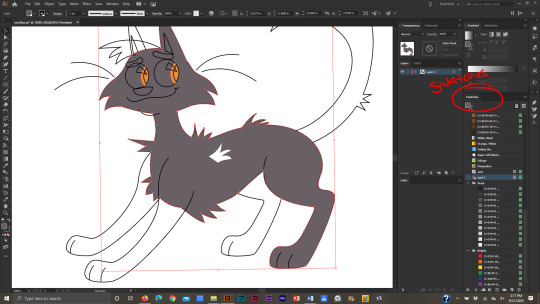
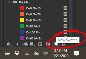

When the artwork is colored, I get into the intricacies of line work! I like bold line work, and I like to create tapering lines for legs, mouths, and other little details. To make a bold outer line, I select all the major shapes that form the “outside” of the image, make a copy of them, and send them to the back (Arrange>Send to Back)
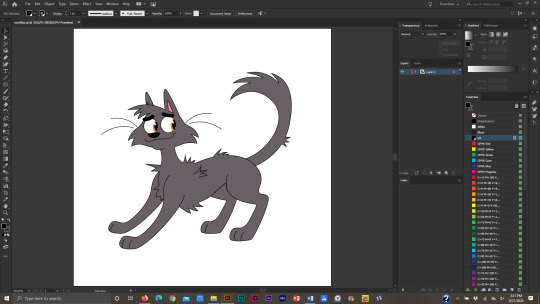

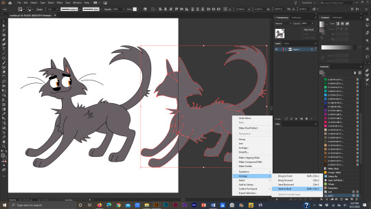
To make the lines bold I change the stroke to a 5 pt. Oval (the upper left section is where the lines, or “strokes,” can be edited) then increase the stroke weight to 4 points.
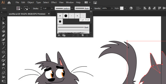
I slide all the shapes back behind the “front” shapes like so.

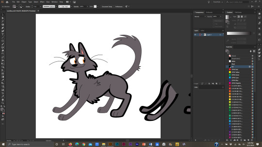
For the front leg, I don’t want to keep the line work near the shoulder odd-looking like this.
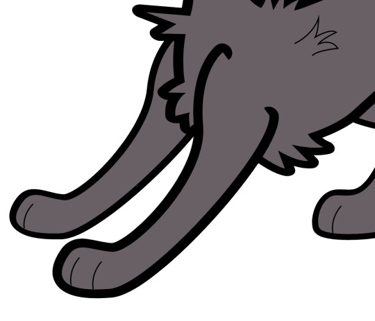
So I use the Direct Selection tool, select the anchors at the shoulders, and move them around till I’m happy with how they look.
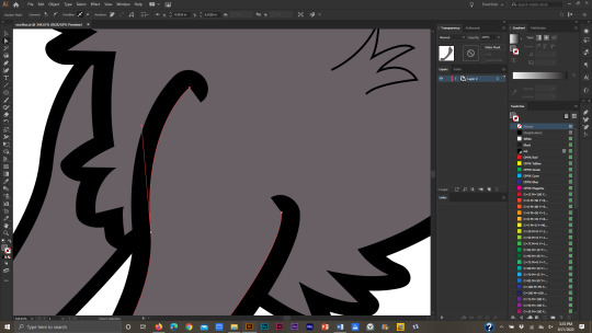

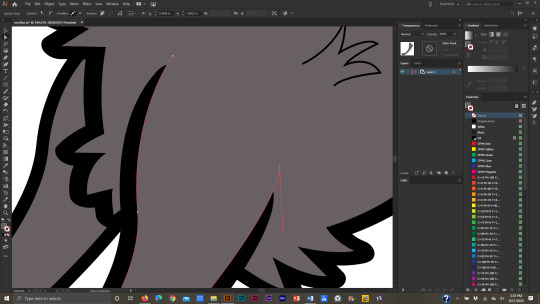
To further edit my lines I can select individual lines and change their shape from the “Uniform” line to any design I want. I like using this triangle-shaped line for whiskers and toes. Then I can edit the stroke width to be bigger or smaller.

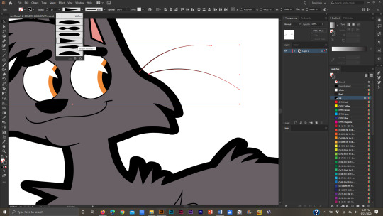
And finally, a cat is born!
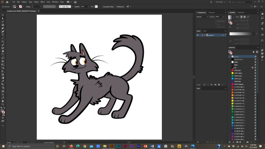
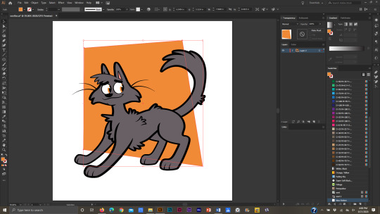
I’ll go over how I make backgrounds too. It’s not all that interesting though XD When I make backgrounds for my Warrior Cat drawings, I like to include patterns and gradients in them. First though, I make a simple shape.
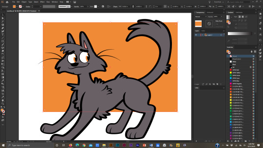
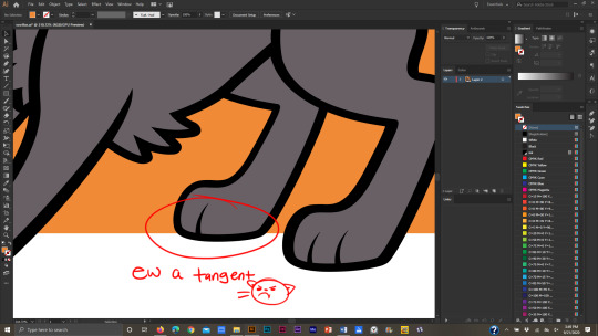
I try to avoid tangents at all costs so I use the Direct Selection tool to move the anchor points and lines around the main drawing. (BTW a “tangent” is when two lines touch each other without intersecting. It isn’t the most desirable thing to have in a piece of art). For example, the edge of the background square touching the bottom of the cat’s foot forms a tangent.
When I’ve settled on a final design for the background shape, I make a pattern to fill it.

I like to keep my patterns simple, so for this one, I made a circle pattern. To make the pattern, select the shapes you want for the pattern…

…go to Object>Pattern>Make. A window will pop up saying that a new pattern has been added to the Swatches panel; click ok.
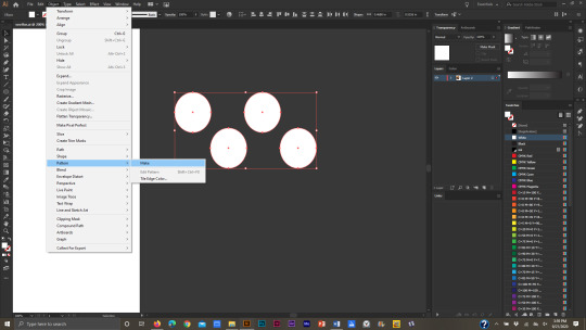
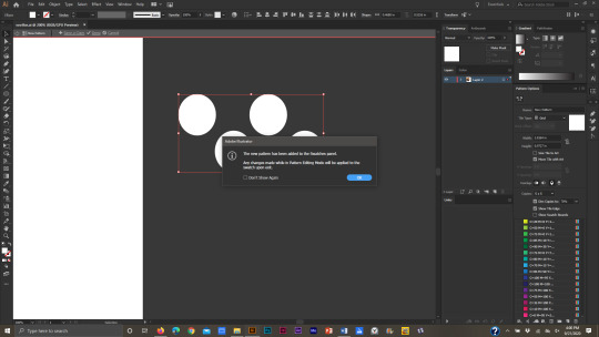
In the dialogue box to the far right, the pattern can be edited even further. When I’m done editing it I click “Done” in the upper left corner of the screen.

And a new pattern has been added to the Swatches! I make a duplicate of the background shape and change the Fill color to be the new pattern.

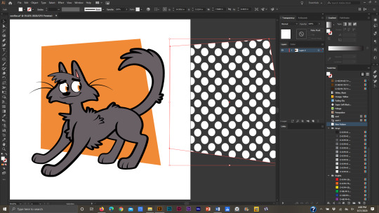
Then I slide the patterned box in front of the orange one, but behind the cat, then I adjust the opacity.
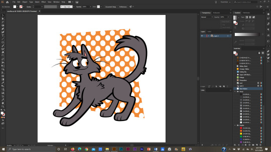

I make a third copy of the background shape, move it in front of the last two shapes, then click on the gradient box in the gradient window. It automatically makes a white and black gradient in the shape.
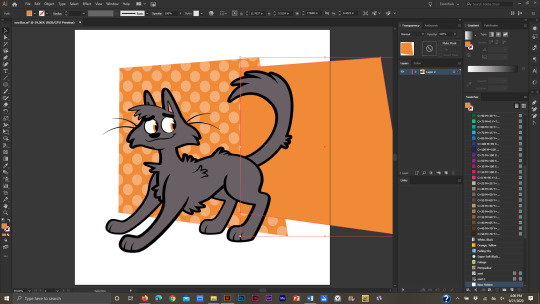
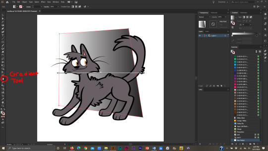
To edit the gradient I click on the Gradient tool in the Toolbar. Then I can adjust the direction of the gradient.


In the gradient window I can change the colors. I also change the opacity of the shape and switch it to “Overlay.”
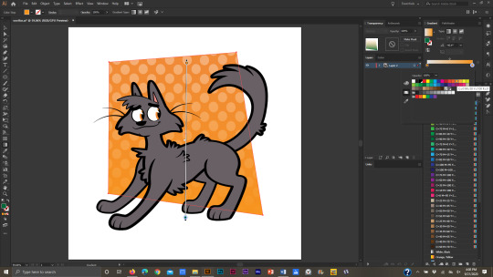

I add a bold white line behind the illustration, add my watermark, and I’m done!
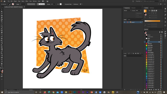
If I want to add shadows, I draw them over the illustration and adjust the opacity of the “shadow-shapes” till it looks decent. I change the shadow-shapes to “Multiply” as well. (I uh was just too lazy to add them to this pic but I have examples of cell-shading in a lot of my other pics).
Like I said, I’m not the best at explaining things, so here’s one of my speed drawings that show me using all the tools mentioned to make my drawings: https://www.youtube.com/watch?v=hD3wA_pwn4k
To finish this long (and probably boring) post, Adobe Illustrator is a vector based program. It doesn’t utilize pixels—I am NOT eloquent enough to discuss the differences so here’s a few sites that do:
https://stinajones.co.uk/the-difference-between-vector-and-pixel-graphics/
https://www.printcnx.com/resources-and-support/addiational-resources/raster-images-vs-vector-graphics/
https://www.ionos.com/digitalguide/websites/web-design/pixel-graphics-vs-vector-graphics-a-comparison/
Anyway I hope this was useful, even if in a small way! If any other Illustrator artists have tips, tricks, or tutorials they’ve made or have found useful, please share!!
2 notes
·
View notes
Text
hello! so this is a mostly-nessian fic, ah, au, set in modern times, told via text and group chats. available here on ao3 as well. enjoy:)
Feyre Archeron to The She Musketeers: So you’re both coming to dinner this Saturday night?
Elain Archeron: Yes! Can’t wait!
Nesta Archeron: Yes
Feyre: Great So I’ll send you the address but you still have to call me when you get there because getting into Rhys’ apartment is kind of a hassle
Elain: What should we wear?
Feyre: Oh I know it sounds fancy but we’re totally casual
Nesta: Elain, when did you choose this God-awful group name?
Elain: ?? what’s wrong with it?
Feyre: I like the new group name
Nesta: Did you even read The Three Musketeers?
Elain: I saw the mickey mouse one
Feyre: I saw the barbie one
Nesta: Why does it have to say she instead of three?
Nesta: There was a Barbie one?
Elain: so that we know we’re girls
Feyre: Yeah barbie and the three musketeers
Elain: or any she/her individuals
Nesta: If Barbie doesn’t need to specify she then why do you?
Elain changed the group name to Three/3/III/...--
Feyre: Since when do you know morse?
Nesta: Elain, for God’s sake
Nesta Archeron to Little Feyre: So is Barbie a part of the three? Because it’s not exactly clear from the title.
***
Rhysand Setareh to Cass and the Machine: which one of you stole my good jacket?
Cassian Razmande: u have no good jackets
Azriel Sayeh: Cassian did.
Cassian: all ur jackets are lame
Cassian: wow, traitor much??
Azriel: I think he left it at Mor’s.
Rhys: cool, thanks
Rhys: thanks @Az I mean
Rhys: if it wasn’t clear I was not thanking you for stealing my best jacket
Cassian: so i think this is a betrayal on two accounts, one thinking i would steal a lame jacket and two ratting me out
Rhys: why’d you even take it? you only ever wear your leather one anyway
Cassian: i d i d n o t t a k e y o u r s t u p i d j a c k e t
Azriel: He had a date with a woman named Charlotte Reddon. She’s a senior actuary for Helion at Day’s Savings.
Rhys: wow, really?
Cassian: honestly the idea that i would ever date anyone who works in insurance counts as betrayal number 3
Cassian: no!!!
Cassian Razmande to Razzmatazz: how did you find out??? she literally just made senior actuary this week??
Azriel to Cass and the Machine: [Screenshot image]
Cassian: WOW
Rhys: well congrats to Charlotte!!!!!
Cassian changed the group name to Cass and Rhys and Traitor Joes
Azriel changed the group name to Cass and Rhys and Traitor Joe
Azriel: It’s only Joe’s if you mean to assign ownership to the establishment.
Cassian has removed Azriel from the group chat.
Rhys: so, how did it go??
Cassian: Not Well Thanks For Asking
Rhys: ah, well. you just need to get out more.
Cassian: i go out all the time?
Rhys: i mean like... go out and talk to someone who is not me or az or mor or amren or Feyre
Cassian: whyd you only capitalize her name?
Rhys: she deserves it :)
Cassian has removed Rhys from the group chat.
***
Feyre Archeron to Rhys <3: Seating arrangements are too much comma right question mark
Feyre: Not like that exclamation point
Feyre: Oh my God I hate this text to talk
Feyre: I give up!!!!
Rhysand Setareh to Darling Feyre My Love and Life<3<3<3: bit early for a break down, i think.
Feyre: It’s never too early for a break down
Feyre: Seating arrangements question mark
Feyre: I mean seating arrangements punctuation question mark
Feyre: J E S U S
Rhys: don’t hurt yourself
Feyre: Too late already walked into a pole
Rhys: what??? are you okay???
Feyre: Fine just tell me what you think about seating arrangements
Rhys: unnecessary
Rhys: we’ll just tell everyone where to sit ahead of time and your sisters won’t have to decide where to sit
Feyre: But I don’t know where they should sit!
Feyre: Oh that’s how you do it!
Feyre: Reece I got it to work!
Feyre: Oh it’s got your name wrong
Rhys: i really think you’re overreacting
Feyre: Can I like register your name?
Rhys: i’ll do it when you get home
Rhys: also don’t worry about it. you’re sitting next to me and your sisters will be across from us and the other will fill in the spots
Rhys: oh we should keep cass and amren away from elain
Feyre: Yeah, but we need to keep Cassian away from Nesta, too.
Rhys: i think nesta can handle herself
Feyre: Cassian can’t.
***
Nesta Archeron to Little Feyre: Okay we’re outside
Feyre Archeron to Nesta, PhD: Okay, the doorlady’s name is Nuala, tell her you’re coming to see us
Nesta: There’s no one here named Nuala?
Feyre: Maybe her twin Cerridwen?
Nesta: You have twin doorladies?
Feyre: It’s really not as weird as you think it is
***
Morrigan Liolle to Fey: Survived the night?
Feyre Archeron to Mor: no
Feyre: Nesta’s never speaking to me again, I think.
Mor: She’ll come around. How’s Elain?
Feyre: Pretending like nothing happened which is good I guess?
Mor: How is that good?
Feyre: Well, she and I are still on for Saturday night.
Mor: Huh. Well, that is good.
Morrigan Lilolle to Idiot: You owe Nesta Archeron a new shirt
Mor: And skirt
Mor: And shoes
Cassian Razmande to Mor: i’ll thank you not to tell me how to dress nesta, thanks very much
Mor: You didn’t say anything in that vein to her, did you??????
Mor: Cassian answer me
Mor: Cassian
Mor: C a s s i a n
Mor: I guess I never did sit you down and teach you how to talk to women.
Morrigan Liolle to Rhys: We may be in need of some damage control.
Rhysand Setareh to Mor: but Feyre and elain are still on for saturday?
Rhys: and i don’t think she’s mad at Feyre?
Rhys: oh
Rhysand Setareh to Cass: What Did You Do Now.
Cassian Razmande to Rhys’s Pieces: nothing????
Rhys: to NESTA
Cassian: oh
Cassian: what do you care?
Rhys: if you have fucked this up for Feyre even more is2g
Cassian: i haven’t!!!!!!!!!
Azriel Sayeh to Cassian: Did you try and come on to Nesta after ruining dinner last night?
Cassian Razmande to Mor: what are you OBSESSED with getting me in trouble??????????????
Amren to No Drunk Strip Karaoke Allowed At The Penthouse: @Cassian Razmande, why don’t you clear up exactly what you said to Nesta Archeron?
Feyre Archeron: Yes I’d be thrilled to hear
Rhysand Setareh: i think we all would be
Cassian Razmande: jesus
Cassian: well since her clothes got all messed up at dinner
Cassian: as i was gallantly walking her out
Morrigan Liolle: you messed up all her clothes at dinner
Azriel Sayeh: You locked her out.
Cassian: i offered to buy her some new clothes and wash the ones she had on
Azriel: Jesus, Cassian.
Mor: g o d feyre i’m sorry
Cassian: what is so bad about that??????
Amren: Cassian. Do you think we’re all convinced you offered to reimburse Nesta for her troubles and drop off her outfit at the dry cleaner’s?
Feyre: she said it was the worst way she’s ever been asked out on a date
Cassian Razmande to Feyr Bear: she said it was a date?
Cassian: because she sorta said yes.
***
Cassian Razmande to Nesta;)PhD;): so i hear you’re spreading rumors about us? ;)
Nesta Archeron to Cassian Feyre’s New Idiot Friend: Who is this?
Cassian: aww don’t be like that;)
Cassian: come on nes;)
Nesta: Don’t call me Nes, you ass.
Cassian: so you do have my number;)
Nesta: What the hell is up with all the winking emoticons?
Cassian: i heard you got a little worked up after yesterday
Nesta: Oh, you mean when you poured dinner all over me?
Nesta: Or before that, when you insulted my career?
Nesta: Or after that, when you locked me outside?
Cassian: no after that
Cassian: when we made plans for our date
Nesta Archeron to Little Feyre: I don’t know where you find your strays, Feyre, but you keep them out of my life.
[One call from Feyre Archeron to Nesta, PhD]
[One call from Feyre Archeron to Rhys<3]
[One call from Rhysand Setareh to Cass]
Cassian Razmande to Nesta;)PhD;): so i’ve just been informed that you did not actually agree to come along with me on a clothes-shopping date.
Nesta Archeron to Cassian Feyre’s New Idiot Friend: Oh do you think?
Cassian: in my defense your sarcasm is too subtle
Nesta: Sarcasm is only worth it if it’s subtle
Cassian: we can debate the merits of too-subtle and overtness over breakfast after tonight
Cassian: DON’T call feyre to tell on me to rhys again that was a joke
Cassian: but dinner?
Nesta Archeron to Ellie: I don’t like Feyre’s new friends. Do you?
Elain Archeron to Nesta My Big Sister<3: i think i liked them
Nesta: You think you liked them? What does that mean?
Elain: well i got the feeling they were performing
Nesta: Oh, you think that was them trying more than usual?
Elain: come on it wasn’t so bad
Nesta: You left dry
Elain: did cassian ask you out for real?
Elain Archeron to Feyre My Little Sister<3: :)
Feyre Archeron to Ellie<3: ....yes???
Elain: nesta’s got a crush:)
Feyre: Oh?
Elain: she can’t stop thinking about him:)
Feyre: In fairness that could be her spitting rage
Elain: no one in this family understands love.
Cassian Razmande to Feyr Bear: look, am i taking your sister on a date or not?
Feyre Archeron to Cass: ???????? Idk?????????
Feyre: Are you????????
Cassian: like. i don’t know. that’s why i’m asking you
Cassian: i have asked repeatedly and i believe she has said yes but someone is planting seeds of doubt in my mind
Feyre: Is someone Nesta or Rhys?
Feyre: Because if it’s Nesta I think it’s safe to say you’re not actually going out
Amren to Nesta Archeron: Just put the boy out of his misery.
Nesta Archeron: Sorry, who is this?
Amren: Amren. We met at dinner the other night.
Nesta: Oh, Feyre’s friend.
Amren: From dinner. Anyway, he’s an idiot, sure, but torturing lesser beings is still generally frowned upon.
Nesta: How am I torturing him, exactly?
Amren: Just let him know if you’re going out or not.
Nesta Archeron to Little Feyre: [Message deleted]
Nesta Archeron to Ellie: [Message deleted]
Nesta Archeron to Amren: What do you think I should do?
Amren to Nesta Archeron: Regarding?
Nesta: You know
Nesta: Him
Nesta: Cassian
Amren: Trust your instincts, girl.
Nesta Archeron to Cassian Feyre’s New Idiot Friend: It really was the worst date-proposal I’ve ever received
Cassian Razmande to Nesta;)PhD;): was it really???
Cassian: at least i offered to pay
Nesta: It is 100% the initiating party’s responsibility to pay for the date
Cassian: is that your professional legal opinion?
Nesta: It is
Nesta: So hypothetically, Tuesday lunch would be on me
Nesta: If you were free
Nesta: And I were asking you out
Cassian: hypothetically i would be free for that
Cassian: well, dr. archeron?
Cassian: are you asking me out?
Nesta: Yes.
Cassian: then i’ll see you tuesday
Cassian: ;)
Cassian: see? the winking emoticons are necessary. look how un-into our date i look without it
Cassian: v v much into our date btw
Nesta: Quit while you’re ahead
Cassian: if those are the doctor’s orders:)
Cassian: what’s your stance on regular smilies?
#lizo writes#nessian fic#acotar fic#acotar modern au#nesta archeron#cassian#nessian#so I made Feyre dyslexic#and there is a lot that went on in my head that I didn't write here!!#perhaps I will expand on this one day#anyway I'd love to hear your thoughts#I am always up for talking about Nesta Archeron my lovely wife also
105 notes
·
View notes
Note
I think you've already talked about this before but I couldn't find the post on your Tumblr, so I was just wondering what your process was for making animated gifs. Like what methods you use to make them, what software you use, etc? Also, what parts do you find most fun or difficult or challenging? I've started making some animated gis, and while I don't know if I'll ever be nearly as prolific as you are, I was interested in learning more about them.
Oh hey! Thank you!! I don’t think I’ve ever gone through the process of how I make gifs in detail before, mainly because I don’t use Photoshop so I just assume my advice won’t be helpful to anybody. I don’t know how helpful this will be to you, but I’ve done a little step by step walkthrough of how I make a gif with a few general pointers thrown in. I was gonna try and keep it brief but it turned out much longer…..sorry.
I’ve put what I find most difficult and fun at the end, so you can just skip to that if you want.
As for the rest, here goes….
So, background: I taught myself how to make gifs using Serif Photoplus X2 because we used their products in highschool. Then a few years later, I updated to Photoplus X7 (made hardly any difference though). Serif doesn’t even make the Photoplus range anymore (they still sell X8 but it’s rubbish and crashes a lot, and their new product Affinity doesn’t even let you make gifs!). I’ve tried to use Photoshop in the past and everyone says it’s better, but I’m stuck in my ways like the stubborn old woman I am.
Anyways, when I want to make a gif I start off by capturing screenshots for the frames. I’ve always used GOM Player and their “Burst Capture” option to do this. GOM Player lets you choose the format your images are saved as and where you want the frames saved to. I have a special “captures” folder for temporarily storing the files in. So for example, these are my frames:
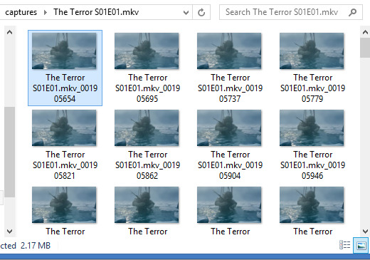
A good general tip for making gifs with any software is to use the best quality video you can find. Most of the stuff I make is with 1080p or 720p quality. I find it helps when it comes to colouring and making the gif look clearer.
Once I have my captures, I copy them into my animation “canvas” (or SPP file) which has a base colouring I’ve already made on it. It’s kind of like a PSD on Photoshop. I select my captures and drag them onto the canvas which looks like this:
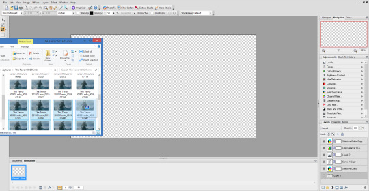
The canvas is 1080p, the same as the captures but everything will be resized later. I originally captured 100 screenshots here, but I’ve decided to use only 40 in the end because I want to make a 540px width gif. If I used all 100 frames for a 540px gif it would end up being way over the 3mb limit and it wouldn’t work on Tumblr.
Now this is where the time consuming work comes in for me. Once my captures have been copied into the SPP file, they actually become layers which I have to turn into gif frames (if that makes sense). So at the moment they look like this
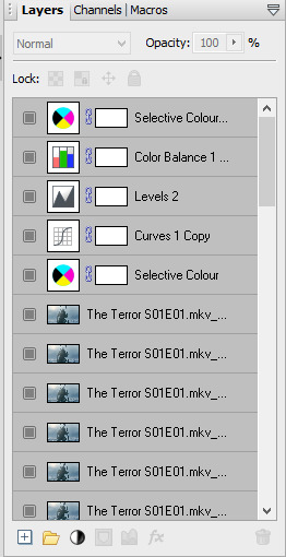
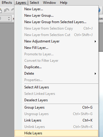
But I don’t have any actual frames yet at the bottom of the screen. So what I do next is go to the layers tab at the top of the screen and click “hide layers”, making them all invisible
Then basically what I do next is create a frame at the bottom and assign an individual capture to it by clicking the little grey square (making it visible again). So as you can see, my first frame is for my first capture/layer. The next frame will be the capture/layer on top of that.

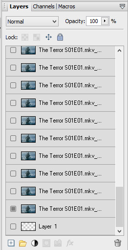
So yeah, that means I create each frame individually. It’s veeery time consuming but you get quicker at it the more you do it (it’s also faster to do on a laptop touch pad rather than a mouse.).
Once I’ve created all my frames, I reselect the colouring layers at the top so they’re visible on every frame. It should look like this

Next, you need to crop your gif and resize it. I want my gif to be 540px by 270px so I put 54.00 and 27.00 into the crop feature to get it accurate. This allows me to crop the canvas into the right dimensions.
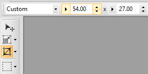
Once I’ve cropped the canvas, I then go to the Image tab at the top and click “Image Size…” and set the image size to 540px by 270px. I usually ignore the Print Size bit.

540px is the best size for a full width Tumblr gif, anything bigger or smaller will make your gif look blurry. This gifset is a good guide for making sure Tumblr doesn’t blur or crop your gifs.
My gif is almost ready to be exported. But I want it to look clearer, so I sharpen all the layer/captures (yes, individually again). I have no settings for sharpening, but I find using the standard “Sharpen” effect under the “Effects” tab is enough.
Once I’ve sharpened everything, I get to the colouring and exporting which is the biggest challenge for me. Photoplus’ options for exporting gifs are limited, so the only decent export options are these
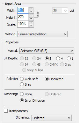
“Web-safe” and “Ordered” makes the gif look like this

“Optimized” and “None” makes it look like this. Okay, but the background looks low quality and patchy

“Optimized” and “Error Diffusion” is the only one that to me, looks the best quality. That’s probably why it produces the bigger file size too (the gif below is 2.78mb)

But there’s other downsides to Error Diffusion which I’m still trying to figure out to this day. Like how it makes parts of the gif “glitch” (that’s the only way I can describe it) or look extra fuzzy. The only way you can fix it is by playing around with the colouring. And by “playing” I mean adjusting and previewing until you want gouge ur eyes out :)
I think that’s why I like giffing The Terror so much, because the film they used has a grainy texture to it, making it easier to hide all my Error Diffusion sins. Though there’s been many times I’ve posted something and hoped no one’s noticed all the mistakes.
Some general tips for colouring
Unless you’re going for a certain effect, emphasise on the colours that are already in the shot. In my gif above for example, I turned up the blues and cyans.
Use Levels or Curves instead of Brightness and Contrast.
Zoom in on your gif to spot any Error Diffusion glitches.
Be mindful about whitewashing POC, especially if you’re following the pastel gif trend.
Look at how other people colour their gifs and use PSDs for reference but don’t rely on them too much.
Colouring can increase or decrease the gif file size. If you need to get below 3mb, try toning down super vibrant colours. If the shot you’re giffing is dark, make it a bit darker. If it’s light, make it a bit lighter.
If all else fails, just make the gif black and white.
Reading all this back makes how I make gifs look like a nightmare lmao. But I’ve been doing it this way since like, 2012 and i love it. I started out making very bad Star Wars and Lady Gaga gifs but as time has gone on and I’ve gotten better, I’ve found I enjoy making things for smaller fandoms much more. I like that if I want a certain set or edit on my blog, I can just go and make it (with varying degrees of success) instead of waiting for someone else to do it.
You appreciate the work that goes into making a movie or show when you make gifs too. Like, you notice subtle little things in the actors performances or something the cinematography is trying to convey. You get to revisit a scene in detail and then share it with everybody else and if you’re lucky, watch them scream in the tags get some nice comments.
There’s lots of other stuff I like about making gifs but I’ve rambled on far too much so I’m just gonna shut up for now. But I think I’ve covered all the important stuff. I don’t know how much of a help I’ve been (there’s still stuff I don’t understand myself) but if there’s anything else you want to know just drop me a message. Good luck with your own gifs!! I’m sure you can do a much better job than me!
#Ask#unspeakablehorror#phew! this is a full on essay i'm sorry#gif making#Serif Photoplus#photoplus#long post
22 notes
·
View notes
Text
color icon tutorial
ok i’m not super great at making icons but an anon requested a tutorial for my icons so i will post my process! it’s good for beginners i think (even tho i have been making these icons this way since 2016 lol)
you’ll need:
Photoshop CS5 or higher (I have CS5 which is quite old, I know, but I pirated it many years ago oops)
relatively hq pics to make icons out of
a psd (if you need some, tumblr.com/tagged/psd is what i periodically check for some).
an action (preferably sharpening action, since that is what i use)
a texture if you want
you, yourself, and you, and i guess this tutorial
i’m going to be making this as a beginner’s tutorial so it’s gonna go about as in-depth as one can be! it’s gonna include a lot so feel free to skip a lot of it if you are already pretty well-versed in photoshop or icon-making.
ITS SO LONG IM SO SORRY IT IS SO VERY IN-DEPTH I’VE EXPLAINED EVERY POSSIBLE THING I COULD’VE
but also if you have any questions at all, please let me know. i love teaching people stuff.
example of the icons that i make:

Hi hello welcome
Ok, so first open up Photoshop. I am using CS5.
You will need hq pics of whatever you plan to icon. I do 99% Taylor Swift, so I use taylorpictures.net for all my icon needs. Make sure they are of semi-decent quality, they don’t have to be amazing since we will be shrinking them down to a very small size so much of the quality is gonna disappear anyway but like, make sure you can at least tell the subject from the background distinctly (you’ll see why later).
This is the picture I am using for this tutorial (and will post icons separately):
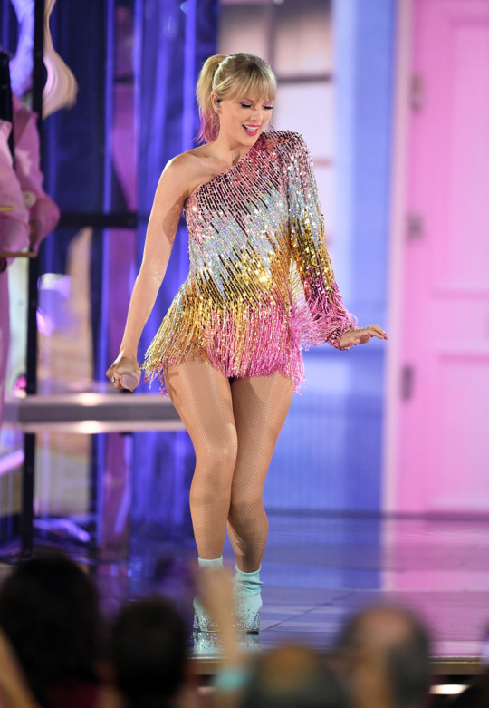
Open this in ps (File > Open > the picture)
Ok so now it’s the actual tutorial lol
1. Crop the image
We are not going to crop it to 100x100! Select the Crop tool and set the dimensions to 300 px x 300 px--MAKE SURE THAT YOU TYPE IN PX AFTER YOU TYPE IN 300, OR ELSE IT WILL CONVERT TO CM AND THAT WILL NOT WORK FOR THIS!
Next, crop the picture you want as much as you want--as long as you get what you want in the icon. For these kinds of icons, you just want to focus on one item--like Taylor, for example--instead of multiple (not Taylor and her backup dancers since this isn’t what my icons look like and you won’t be able to do that very well on a beginner level). Crop that to a 300x300 px size and click the check mark on the top bar to finalize it.

If your pic is hq enough--meaning a larger picture--it will probably look super small. That’s ok, it’s just proportional to the old picture. Go to the right side bar and select the Navigation tool.
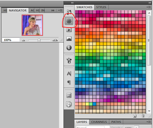
If that tool isn’t there, you will just have to go to Window and select Navigator, and it will bring that up for you.
See where it says 100% in the picture right there? It will likely say something like 25% or whatever if you just cropped it, so change it to 100% which will bring it to full size.
Cool! now it should look like this:
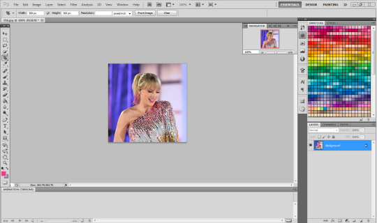
2. Use the Quick Selection Tool

Go to the left sidebar on Photoshop. Depending on which PS you have, it might look different. This is what mine looks like. Regardless, the icon should look relatively the same I believe across all Photoshop versions. If it’s not there, you might want to left click and hold down on some of the icons and see if it is an alternative option (it should be there already--but it is grouped with the Magic Wand Tool just in case).
This tool has three options in the top bar: free select, add, and subtract. Start with the middle option: add.

This will allow you to choose which parts of the picture you want to select to cut out for your icon. You can change the selection brush size, but I always keep it at 3px because it keeps it really precise.
Drag your mouse over the area of the image that you want included in your icon. This tool will automatically choose parts of the image that are similar--for example, Taylor’s blonde hair will like all be selected around the same time, but the pink/blue background will not be, since it can tell that those are starkly different colors and thus two different objects in the picture. It should have a crawling ants moving line around the areas of the picture you want to select. If you go outside of what you want included in your icon, that’s ok! That’s why the subtract option is there. Just select that--to the right of the Add option--and go over what you do NOT want in your icon to get rid of it using the Subtract tool. You might have to go back and forth between those tools in order to get exactly what you want in the final product.
I can’t show you my final outline for Quick Selection since it goes away when I screenshot, but after you’re sure you got what you want in your moving ants line, it’s time to finalize it.
Remember, this tool effectively cuts out the selected portion of the picture from its background.
3. Refine Edge
On the top bar, click the big rectangle button that says Refine Edge. It will bring up a window that looks sort of like this, but I have settings adjusted the way I like:
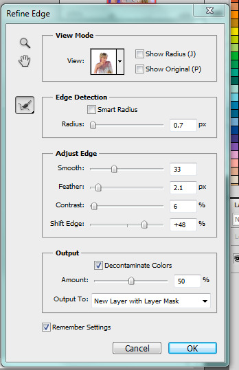
You can change these settings any way you’d like, but I generally stick with this. It’s also okay to mess around with them and see how you feel. If you don’t want to do that, you can just use my settings and edit anything you don’t like later.
Click OK to cut.

This has pretty much removed the background from the picture and only left what we cut out and a transparent background (hence the checkered background--that is space that doesn’t actually exist). You can also see some shadow from the background around her arms and hair, which we can delete out later very easily. That is a result of the settings from Refine Edge, which is why some people choose to lower the Feather bar so that it doesn’t include as much shadow--which is good for many pictures since a lot of these are straight cuts, but this can occasionally cut out part of the icon you want to keep or make it look weird since you want just a little space to mess up when it comes to the Quick Selection Tool.
Bonus step if you want a selective colored icon:
Some people like really vibrant icons that include re-coloring. I’m not very good at it, but what I do (and it sometimes turns out well--this is typically the way people do it, though they are less sloppy than I am) is select a color from the Swatches at the right that is similar to the one that they want to paint over. For example, if I wanted to make Taylor’s hair more yellow/gold and vibrant, I will choose a yellow. Select the Paintbrush tool. On the top bar, the Opacity will likely be set to 100%, which will basically color right over the picture and look weird. Set the opacity to something very light--mine is 20%--and paint over the part that you want to color. Make sure you do this in one stroke--if you paint over her hair with 20% opacity once, let go of the mouse, then go over it again, it’s gonna start building up and becoming more opaque!
You can also completely recolor a picture this way, like if you wanted Taylor to have entirely pink hair, you can use this same method but choose the pink you want instead of a similar yellow. This can be very difficult and tedious, so I don’t typically selective color my icons, though occasionally I do because I love those icons with obnoxiously vibrant colors.
4. Open texture/create new background.
Ok, so I do both of these things depending on the background I want. I have some textures saved such as this that I use for icons:

I didn’t make it--it’s pre-made by another artist on tumblr from whom I downloaded their texture pack. You can make backgrounds like these too, but I’m not very good at them.
SO you can either File > Open one of these pre-made backgrounds/textures, or you can make your own.
In order to do that, you can do File > New and change the settings to width: 100 pixels and height: 100 pixels. Under Background Contents, choose White. That’s very important! You don’t want transparent, it doesn’t help us. That brings up a new window on Photoshop next to the picture we’ve just cut out, just a small white square. You can paint that whatever color you’d like. Use the Paint Bucket tool and choose a color from the Swatches section on the right. This will make the background completely one color. However, if you want a gradient, you can do this several ways, but I do it like this:

Click that, go to Gradient, and mess around with the Gradient options and see how you like the background. Here’s one I made, for example:

Boom! Background for icon. I will use this since I made it for this tutorial so yeah it might not look amazing but here we are.
IF YOU USED THE TEXTURE I JUST POSTED OR YOU KNOW THE TEXTURE YOU ARE USING IS NOT 100x100--THE ONE I POSTED BUT DID NOT MAKE IS 200x200--THEN YOU NEED TO RESIZE IT TO 100x100.
You can do this by going to Image > Image Size and changing the 200 pixels x 200 pixels (or whatever is there) to 100 x 100.
5. Duplicate layer
Now it is time to combine these two images we’ve created. Go back to the original picture we worked on--mine is Taylor at the BBMAs--and go to the right sidebar. You should have two copies of this image now: Background and Background Copy. Background Copy is the cut out picture we are using for the icon. Right click on Background Copy and select Duplicate Layer...
This will bring up a window that asks what you wanna do with this layer.

Select the dropdown under Destination. Currently, the Document selected is the image we are already on (my Taylor pic was saved under 056.jpg) but we want to click the dropdown and select the pic that we are using for the background. In my case, it’s titled Untitled-1 since I didn’t change the name. Yours probably is too. Select whatever your background image is saved as and click OK.
Now go to the background image or texture that you just selected--your cutout should be there, but you can probably juuuust barely see it! That’s because your picture is about 3 times bigger than your background.
6. Resize layer
Use the Select tool--the very top icon on the left sidebar--and make sure Show Transform Controls is selected on the top bar. If it’s not, you’ll know--because you won’t be able to resize the image.

The square you are seeing (that isn’t the picture) is the layer we just duplicated onto the background, aka the icon. You’ll want to hold Shift and select the bottom right part of the image to resize to whatever you would like visible in the icon--it could be the entirety of the picture we cut out, or just part of it, if you realize you like how only part of it looks. Either way, you need to hold Shift while you do this, or else the image will NOT stay proportional, and it’ll look all wonky. Hold Shift the entire time you are resizing. This is what mine looks like:
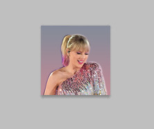
You can see I both resized it and moved it a little to the right--you can use the Select tool to move it, but that might move it way too much since it does it incrementally, you can just use the arrows on your keyboard and move it by pixels which takes longer but is way more precise.
You can still see the shadows from the background on the icon, so select the Eraser tool (if the shadows bother you or you don’t like how it looks) and zoom waaay in. You want to be careful with the Eraser tool! (Also make sure Background Copy is still selected so you don’t accidentally erase the background. If you just have Background Copy selected while you erase, it will only erase whatever is part of that layer, it won’t bother the background).
While zoomed in, erase the pixels that are obviously discolored from the rest of the image. You can zoom in and out to check how you like it as it progresses.
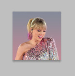
Here is mine after I used the eraser tool on any parts of the image I thought were bad! It should lay on the background naturally.
Now that we’ve figured that out...
7. Sharpen/action
Now is the time to apply an action! Please sharpen your icons. You want them to look good on your blog or others blogs, and in order to do that, you need to sharpen them.
If you already have actions uploaded, cool! If you don’t know how, well, I sure am going very in-depth here so you’re in luck.
Download an action from any photoshop resource (or tumblr.com/tagged/photoshop-action is where I look occasionally). You will have to load them onto your Photoshop now. Click the button that looks like a movie Play icon on the right sidebar. This will bring up the Action list. Photoshop likely has pre-made actions for you, but we don’t use those because I never taught myself how to use those so maybe you can use them, I don’t know. I just use ones I download from Tumblr.
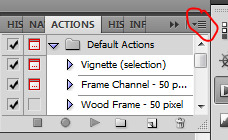
Click that little dropdown menu and click Load Actions...
This should bring up a file opener and you can select the action that you downloaded for this icon. It will download it into Photoshop and will now always be there--you don’t have to load actions every single time you want to use them. If you load them once, they should be there for the rest of forever.
Scroll down to find that action and select it. Now, make sure you still have Background Copy selected. I don’t care about applying an action to the background, just the copy, which is still our image that we cut out. Click the Play button on the Action list--pictured above on the very bottom of the screenshot, next to the Circle and the Folder icon. This will apply the action to the background copy. (Hint: if the Play button isn’t available, it’s probably because your action is in a folder. Click the dropdown of the folder and click the first thing under it--that should be the action and it will apply it).

There it is with the action applied! It’s muuuuch sharper--perhaps a little too sharp, but that’s ok, it won’t look bad on people’s blogs.
8. Add a PSD
To apply a PSD, File > Open and choose the PSD you want to use. I listed above where I find most of my PSDs, just download one you like. You can choose 100 different ones and try it out if you want. I use the same one for everything, by @toxicpsds (I believe it’s #6). This should open a third window with the PSD over a sample image (thanks to the artist!). You just have to select the PSD layer--not the image with it--and Duplicate Layer and put it on the image that we have produced thus far. It is the same process as when we took our cutout and put it on the background. (The PSD is probably under a group--mine says Group 1--so just select the group in its entirety--shift-click it if you need to).

You can tell the background is also lighter. If you don’t want the color of the background affected by the PSD, select Background Copy and the PSD together, right click on one of them, and select Merge Layers. This will put the cutout and the PSD in the same layer, which should take the PSD off of the background and revert it back to the color we had before. However, I really like what the PSD did to the background, so I will keep it this way.
I am finished now with my icon!
9. Save it for Web
To save the icon to be able to post on Tumblr, go to File > Save for Web & Devices, which will bring up a window like this. It might look a little different since I have my settings a certain way, but whatever.
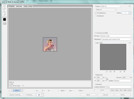
(Sorry this looks weird here, it’s just what happens when I screenshot. I’m not a tech wizard).
Your pre-saved things might look different, but make sure you are saving a a PNG-24 for the best quality. Just make your settings look like this, basically, then click Save.

There she is! All done!
If you have any questions, let me know! I tried to be really specific, but I’m not sure what level people are on Photoshop (probably better than I am) so just ask if I need to clarify anything!
60 notes
·
View notes
Text
Tips for Screenshots!
hey everyone! i thought i would share some tips on taking screenshots and a little bit on editing. i’m not the best of the best but i am a photographer irl so that helps a lot! also, you don’t HAVE to do any of these. by no means am i saying i’m perfect or i always take the perfect screenshot, (sometimes i’m lazy) these are just the tips that i utilize!
psa i used unedited screenshots for my examples so if you want to see the finished product go look at my gameplay
basics
always make sure your headline effects are turned off! turning off the headline effects removes your sim’s plumbob and thought bubbles. you can have these turned off at all times by using mccc (mc command center) but you can also use the cheat: headlineeffects[on/off] i also like to turn the hover effects off, (the glow that occurs when you move the cursor over your sim) but i use mccc for that. i don’t know the cheat, sorry.
make sure your walls are all up and set the building level to the highest level. this way, there aren’t chunks of your building missing in the background of your screenshots. also when taking shots inside of a building, there will be a ceiling instead of the building being open to the sky.
andrew’s pose player and teleport any sim is the mod to use to get your sims to pose a certain way and in a certain place. this is especially helpful if you are a storyteller. you can find these here. (you have to download poses separately)
i’m sure most of us know about tab mode, but if not, here are the keys:
[tab] key = “Free Camera Mode”
[w, a, s, d, q, e] = Moves your camera (hold down [shift] to move faster)
[z & x] = Zoom
[c] = captures and saves a screenshot
[0] = pause and unpause
[1,2,3} = change speed
click and move mouse to change the tilt of the camera
[page up] = floor up
[page down] = floor down
rule of thirds or centering
use the rule of thirds as a basis so that the eye immediately is drawn towards your subject, or you can center your subject! this is just a guideline- not a rule that has to be followed!!!! for example:


b is following the rule of thirds and a is not
(PSA i did the lines super quick so they are all fucked up)
be level with your sims
when i take screenshots of my sims, i always get down to their level. especially when you are trying to tell a story, you want it to appear like you exist in the story, rather than taking screenshots of a game you are playing (if that makes sense) for example:


unlike the bottom photo, the top photo is not level with the sims
do not overexpose
lighting is everything! i always change all the lights in the house to “neutral white” or just “warm white” to get rid of the icky yellow color (warmest white) i also sometimes will dim the lights or turn off lights for screenshots. (make sure headline effects are back on if you want to change the color and dimness of lights)

this is overexposed and blown out to where you can’t really see the details of the screenshot. (also warmer lighting)
use this mod by @luumia for eliminating blue indoor shadows!
utilize your background
play with your background! a scenic background is more appealing to the eye than a toilet. (this doesn’t always have to be the case, as some screenshots have to be taken in the bathroom for story purposes) also, a nicely decorated building is always great! there are some great builds here on tumblr!
play with your angles
this is where you can be creative and have fun! when i am creating a gameplay post, i like to take different angles of the same pose. it is more interesting to look at different angles then the same screenshot repeatedly. i will take wide angle shots, shots where i am peaking behind a wall or a plant, close up shots, shots of their feet, etc.
editing your screenshots/using reshade
i use photoshop for my edits. you can also use gimp but i have no idea how to use that.
i’m going to admit that my edits aren’t always the best out there. reshade is beautiful, but it isn’t my cup of tea. downloading different reshade presets can cut back on your editing process. if you want an intense dof (depth of field aka the blurry background) you may want to try reshade. i personally did not like the way it looked in my game.
check to see if you need to crop the image to omit any unwanted/ugly objects out of the outer frame.
you can use a psd or action for sharpening your image. i know people use topaz clean. i personally use smart sharpen for all of my images.
edit the screenshot to your aesthetic. you can use a psd or action for this as well, or you can edit it how you want. making your shots brighter and more saturated will help them pop.
resize your image. i resize my width to 1000. whatever you prefer.
save your edited screenshot as PNG!
i hope i helped some of you out! let me know if you have any questions! i’m going to reiterate that this is not a set of rules that you have to follow! these are just tips that have helped me when creating my gameplay. you can use this as a base and then when you feel comfortable enough to start getting creative, you can start to experiment!
as far as figuring out what aesthetic you like, you just gotta try things out and learn what you like and what you dislike!
have a wonderful day! <3
#ts4#s4#thesims4#ts4 screenshots#s4 screenshot#sims4#maxis match#ts4 screenshot#s4 screenshots#ts4 tips#s4 tips
64 notes
·
View notes
Note
Hi..!!! ♥ I have a little issue. so i will love to install all the reshade that you made. but sadly my deskop cant handle. so I edit photos no problem with that. but I will love if you can teach me how can a make the focus camera with reshade. like fucus in somehing and all the backgroud make it blurred? you got it? sorry if my english is not good. i dont speak it. Have a lovely, lovely day xx
Hi there!
I’m not sure if you’re asking how to only use the blur effect in ReShade without everything else, or how to edit pictures in Photoshop to make the background blurred, so I’ll cover both!
ReShade:
Download the latest version of ReShade and install it. When it asks if you want to download the shaders, you only need to tick DOF and SMAA.
DOF (depth of field) is the shader responsible for the blur, and SMAA (subpixel morphological antialiasing) is ReShade’s version of what TS4 calls Edge Smoothing–you’ll want this because you need to turn off Edge Smoothing in the game options, and use SMAA to smooth edges instead. DOF will not work with Edge Smoothing turned on, but it does work with SMAA turned on.
With only those two shaders downloaded your game will load much faster than if you had all the shaders installed.
When you’re in-game, open the ReShade gui using shift+f2. Follow this tutorial to make sure the depth buffer is set up properly for TS4.
Back in the Home tab of the gui, in the top half of the screen you’ll see a line for SMAA, and a few different lines for different types of DOF. Tick the box next to SMAA and you probably won’t need to make any adjustments to it from there.
Next, you’ll want to try ticking different DOF boxes and playing around with their settings until you find one you like. They are all different types, each has their strengths and weaknesses. Marty McFly’s ADOF is probably the best in terms of quality but it’s also the one that is the most performance-heavy, so you might want to avoid that one. My pick would be gp65cj042 DOF–it gives a natural look, can give circular bokeh or polygonal depending on your preference, and isn’t too heavy to run.
Take the time now to set up a hotkey for it. On the right you’ll see an empty box: click it once and you’ll be able to press any key you want and from that point onwards whenever you press that key again it will toggle DOF on and off. It’s easier than opening the gui every time you want to turn it on and off, and it means you don’t have to play with it on, and can just turn it on for screenshots.
In the bottom half of the screen are the controls for the shaders. This is where you change how you want them to look when they’re enabled. Under the DOF settings you’ll see a long list of things to change. At the top of the list are a few things that are global–they apply no matter which version of DOF you chose earlier. The easiest thing to do here is to pick auto-focus and to make it mouse-driven auto-focus. This means that the camera will automatically bring into focus whatever your mouse cursor is hovering over, and anything behind that point will be blurred.
If you don’t want the foreground to ever be blurred (the part of the screen closer to you than the thing you want to be in focus) I recommend setting the Near Blur Curve value to a very high number. I set it to 9000, which is overkill. You’ll need to double-click in the box next to it to type in that number, because the slider doesn’t go that high.
Far Blur Curve determines how quickly the blur becomes its strongest behind your focus point. You’ll probably want to keep this relatively low, but I often change it on a shot-by-shot basis depending on what I want to do.
Blur Radius controls the strength of the blur. This is the value you’ll be changing most often. For wide shots you’ll likely want a lower number, and for tight shots like portraits you’ll probably want a higher number. Play around with it though until you find something you like.
As you go down the list you’ll see you start getting controls for the different types of DOF. If you chose gp65cj042‘s DOF you’ll want to scroll down until you find the lines that have GPDOF in the name. Here you can change things like the quality of the DOF, how bright blurred items should be, the shape of the DOF (the bokeh, the little points of light), and so on. Play around with these settings until you find something you think looks nice.
Now you’ll have a basic setup for using DOF whenever you want, by pressing the hotkey you set up at the beginning. To have the most control you’ll want to fiddle with the controls regularly to make sure each picture looks right. It can be confusing at first, but over time you’ll become more confident and understand which controls do what.
Blur in Photoshop (or other editor):
I used to do this when I played TS3. For example, this picture was edited entirely in Photoshop.
I used a plugin called Exposure by Alien Skin. It’s not a free plugin, I bought it. It has bokeh control, where you can mask or select parts of an image to keep in focus, and it blurs the rest of the image. You can choose different lens types to simulate (Exposure is built to simulate particular film and camera combinations for professional photographers). It’s an incredibly easy and very professional-looking way of getting realistic blurred backgrounds. But of course, not everyone can or wants to buy a plugin just for one thing.
As for how to do it without a plugin, the basic thing to understand is to mask off the areas you want in focus and use one of the blur filters to blur everything else. There are a few good tutorials written by other simmers on this. This is very easy to follow by @smubuh. This tutorial by @evangelisims is really exceptionally good, and explains the basics of focal planes as well as how to achieve different levels of blur in a background.
I hope that’s useful for you, anon.
84 notes
·
View notes
Text
Using Neko Project II fmgen with PC-98 Touhou Games
There’s a guide to this over on Maidens of the Kaleidoscope, but I’d like to make a different guide for two reasons:
One, to go into more detail, provide images, and make the ideal configuration settings more accessible, since you really shouldn’t experience much lag with NPII on an average modern computer, and...
Two, because Neko Project II is really considered the most accurate PC-98 emulator out there at this time, yet many people are still using Anex86, which has very poor sound and graphics, likely because it’s the one included with the Touhou 1-5 HDI files download, or else because of performance issues with Neko Project which can generally be sorted out by modifying the configuration. I highly recommend at least trying NPII, if only for the lack of the screen flashing issues that Anex86 has.
This is quite long and contains several images, so the guide is under the cut.
1. Download
It’s usually recommended for playing almost any PC-98 game that you use the fmgen version of Neko Project for its additional features and sound options. You can download the latest build here. Simply scroll down to the section labeled PC-98 and click the first link. You also need the YM2608 rhythm module samples, which can be downloaded from here original link died, I’ve reuploaded them to dropbox here. Just extract these into the same folder as Neko Project. Without these, the music will lack percussion.
If you want to use the MIDI soundtrack in Story of Eastern Wonderland, rather than using the fmgen version, you may wish to try this build instead (password: 9821), as at this point it seems the MIDI option is broken in fmgen NPII, though I’m working on trying to find a way around this. If you download the kai build in order to use the MIDI option, run np21.exe, as np21cu.exe’s MIDI option is also broken, and the others will not work. Further down I’ll describe how to configure the MIDI settings; pretty much all other configuration details should still apply regardless of the version of NPII you’re using.
To open a game, go to Harddisk > IDE #0 > Open, select the HDI file, then hit Emulate > Reset.
2. Emulator Configuration
For fmgen NPII, run np21nt.exe to start the emulator; the other exe files in there are unnecessary for this purpose (np21.exe will work, but is designed for Windows 9x, and the others won’t work).
Now, go to Emulate > Configure. Here are the majority of the changes you need to make to run Touhou at the highest quality possible. I’ll cover each section individually.
CPU
I recommend keeping the first option at 2.4576 MHz. Then, for the multiplier, choose at least x32. If you want to play the Mystic Square extra stage, you may want to switch to at least x40 (you can type in any value you want, rather than using the dropdown menu), but otherwise you can run all games smoothly at x32, which is the most common setting for PC-98 Touhou, putting you just above the recommended CPU speed for the games.
Keeping this value relatively low will reduce the strain on your system if your own CPU is on the slower side; setting it to x24 should probably work, but I wouldn’t recommend going any lower. On the other hand, if you have a more powerful computer, go ahead and set the CPU multiplier higher if you’d like.

Architecture
This determines the type of CPU emulated. The PC-9801VM uses the NEC V30 processor, the PC-9801VX uses the i286, and the PC-286 is actually a clone manufactured by Epson (this is actually the model emulated by Anex86) that also uses the i286 processor. For Touhou you can technically use any of these options, but in my own testing I found that the PC-286 setting may cause some sound problems, and sticking with either PC-9801VM or PC-9801VX should give the best compatibility with many other games.
(Tip: if using a large amount of expanded memory (explained more below), PC-9801VM will give you the shortest startup time. It’s not a huge difference, just a few seconds, but it exists nonetheless.)

Sound
Set the sampling rate to at least 44K. Higher is better, but not necessary for good sound. If you experience performance issues at the higher settings, reduce it to 44K.
For the buffer, reduce it to a maximum of 100 ms. You can go lower for better performance, but 100 ms should be fine in general. If you notice any sound drops, increase the buffer above 100 ms. In contrast, if you notice sound lag, lower it to at least 70 ms.
Lastly, check QFM.

All other options under the config menu are unnecessary and up to you.
GDC Setting (Under System Setup Menu)
For this, enter the system setup menu by holding down the end key on your keyboard while clicking Emulate > Reset. Go to the second option and press enter.
This will bring up the following menu. Go down to the GDC option and change it to 2.5MHz. This is required for PoDD to run correctly; you can leave everything else alone.
Hit esc twice to leave the system setup menu.
3. Other Options
Font
Unlike Anex86, Neko Project has a working font by default. (Note that the incorrect W and V are hardcoded into the common SoEW English patches that are around. Sorry.) However, if you want to change it to a rather more accurate font, you can choose Font under the Emulate menu and select either of the font files from Anex86 (font.bmp) or T98-Next (font.rom). Alternately, just place one of those files into the folder Neko Project is in. You can download the Anex86 font here and the T98-Next font here (if just clicking that doesn’t work, choose right click > save link as).
Save States
If you’re using fmgen NPII and want save states available, add the line STATSAVE=true into the [NekoProject21] section of the np21nt.ini file. This will add a save state menu under Stat, which goes from 0 to 9.
Emulation Speed
If you want to run the games faster or slower for any reason, and wish to use a speed other than the provided ones (for example, 150%, the equivalent of playing a Windows Touhou game at 90FPS) add this line to np21nt.ini under [NekoProject21]: CPUSMENU=50,75,80,90,100,150,200,400. Change these numbers to whatever you want, but the maximum is 8 options. These are just the ones I use, often for slowing the game down considerably in order to take precise screenshots.
Screen
The window options can be found here, and you can switch to fullscreen via this menu. When not in fullscreen, I like to keep it at Windowed (Hard), but the window mode is really up to you. Everything else on the menu here can be left alone.

Screen option
There generally isn’t much need to change anything under here, except for the FullScreen tab; if you want the game to appear at a larger size in fullscreen, you can check “No change screen resolution”.
Then, under Zoom, you can choose an option for the fullscreen display to be larger. Fixed aspect is my preference when using this, as adjust aspect will stretch the display to a 16:10 aspect ratio, but you can try them all and see which you like best (none will make the display quite small, however).
Using no change screen resolution and a zoom option is generally preferable for standard gameplay, as it will typically give you the best display.
If you leave “No change screen resolution” unchecked, the game’s display will have a greater amount of black space around it, but this option is actually preferable if you want to take accurate screenshots in fullscreen at the proper original size; just crop out the extra space. Below is how it’ll look with this option. No change screen resolution + fixed aspect will be similar, but larger and with less black space around it.
Sound
Found under Device > Sound, here you can change the sound board. For Touhou, you want PC-9801-86; this is based on the YM2608 sound card.
Beep refers to the PC-98′s onboard PC beeper speaker; these options control its volume. You don’t really need to change them, though you can lower the volume or disable it if you dislike the beep sound made on startup.
(Additionally, for an amusing or at least somewhat interesting experience, try changing the SFX option to beep in a game with this option, like Mystic Square. Some of the sounds are pretty silly.)
The built-in fmgen cannot be disabled unless you add an alternate FM core, which can be downloaded from the same page as fmgen NPII (select fmdllset). To use these, extract them into the same folder as NPII. Then, add the line FMGenDll = XXX.dll to the np21nt.ini file, under [NekoProject21]. Change XXX.dll to the desired FM core; the readme file included with the alternate cores describes each one (use google translate if needed). If you don’t know what any of this is about, you’re fine just using built-in fmgen.
Lastly, Seek sound recreates the sound of a floppy drive if you load a floppy disk image, for authenticity. If you’re only playing Touhou, you have no need to worry about this.
Memory
You may wish to add expanded memory here. In theory, this shouldn’t be necessary for running Touhou; however, if you want to play Lotus Land Story, you NEED to set this above the default. Without expanded memory, the game will freeze at stage 5 at the very start of of the boss battle if playing as Reimu. I’ll explain more on performance in LLS further down, so please read that. If you still have some performance issues in LLS after following those instructions, perhaps try a low-mid setting. Otherwise, you should be able to safely set it to the maximum 13.6 MB.
Mouse
Hides the mouse pointer. If you click this, you won’t be able to unselect it, or click any other menus at all.
If you’ve accidentally hidden the mouse pointer, go to np21nt.ini, scroll down to nousemmx=false, and change it to true. (No, ‘nouse’ is not a typo, that is the actual line within the file.)
MIDI option
If you are not using the fmgen build so that you can use SoEW’s MIDI soundtrack as detailed above, this applies to you. If you’re using the fmgen build, you can ignore this completely.
Set MIDI-OUT to a MIDI device on your computer; typically you’ll only have something like Microsoft GS Wavetable Synth unless you’ve installed your own, better one (I highly recommend VirtualMidiSynth, which will allow you to load your own soundfonts for MIDI playback). MIDI-IN can be left alone. Under Module, select SC-88.
Sound option
It’s unlikely you’ll need to change anything here. However, if you want to remap joypad buttons, that can be found here.
“Lotus Land Story is too slow!” - LLS Performance Fixes
As mentioned above under Memory, LLS requires expanded memory for the stage 5 boss battle if playing as Reimu. The game will freeze without it; set the memory to a higher value than the default 640KB. However, performance issues will likely still remain. So!
Download this archive and place all three files within the NP2EMS folder into the root of your Lotus Land Story HDI file using DiskExplorer. If you need DiskExplorer, it can be downloaded here. Open it up, select the HDI file, leave the profile set to Anex86 HDD, and then either drag the files over to the window or click File > Import. The changes will be saved automatically, just close DiskExplorer and you’re ready to go.
If you’re still having problems, check to make sure you have turbo mode selected in the options for LLS. Otherwise, go to Other > Clock disp and watch the number (at the top of the window). If it’s running considerably below where it should be, it’s likely your computer; try making changes as detailed in the above sections to reduce the amount of system resources NPII requires.
If the speed is not running below where it should be, try going and setting the CPU speed higher under Emulate > Configure. This applies to troubleshooting for other games as well.
That’s all I can think of for now, so if you have any questions, please feel free to message me and I’ll try my best to answer.
#neko project II#touhou project#touhou#pc-98#guides#txt#i've been working on this post for WEEKS now but i think i've got everything finally#please rb if you'd like#long post
140 notes
·
View notes
Text
Alc269 For Mac Os X

Alc269 For Mac Os X 10.8
Alc269 For Mac Os X 10 11 Download Free
Alc269 For Mac Os X 10 12 Download
Alc269 For Mac Os X 10.10
Great apps for your Mac. Right there on your Mac.
The Mac App Store makes it easy to find and download Mac apps as well as widgets and extensions — like editing extensions for the new Photos app. You can browse Mac apps by category, such as games, productivity, music and more. Or do a quick search for something specific. Read descriptions and customer reviews. Flip through screenshots. When you find an app you like, click to buy it. The Mac App Store has apps for just about everything and everyone. Here are a few of our favourites.
Pages
Create beautiful documents, letters, flyers, invitations and more. View in Mac App Store
Numbers
The same principle applies to macOS® and Mac OS X®. We call them “Kext” files or “Extension” files. By default, Apple provides all the required kext files with the operating system to run on a legitimate Apple computer. Hi, sorry about my english:) i have a OS X 10.8 on my Lenovo Y580 ( ALC269 ) and also i have a Samson Go Mic USB. My problem is - when i connect a Samson to USB, OS X detected it in USB Device, but not as Microphone. I have a VoodooHDA Kext. But on AppleHDA is the same efect. Dec 16, 2015 -I have OS X 10.11.2 running on it's own HDD-I am using legacy boot mode in the BIOS and have the Clover boot loader on the Mac OS drive.-Everything seems to be working great except for audio output/device. I have a Realtek ALC269 as my soundcard driver and I have tried several scripts and kext combinations but nothing seems to work.
https://lasopabuffalo413.weebly.com/gin-rummy-download-for-mac.html. Make eye-catching spreadsheets and charts in just a few clicks. View in Mac App Store
Keynote
Put together a presentation with captivating graphics and transitions. View in Mac App Store
iBooks Author
Create stunning Multi-Touch books for iPad and Mac. View in Mac App Store
Final Cut Pro X
Bring your film to life using revolutionary video editing software. View in Mac App Store
Logic Pro X
Turn your Mac into a complete professional recording studio. View in Mac App Store
Wunderlist
Manage and share your to‑do lists across all your devices. View in Mac App Store
Evernote
Take notes, save web pages, create lists, attach images and PDFs, and more. View in Mac App Store
Cobook Contacts
Find, organise and keep your contacts up to date in even easier ways. View in Mac App Store
Things
Keep track of to-dos, deadlines and projects with this task manager app. View in Mac App Store
Notability
Can you download fortnite on a macbook air. Annotate documents, record lectures and take notes with this all-in-one app. View in Mac App Store
Autodesk SketchBook
Take your ideas further with a complete set of digital drawing tools.View in Mac App Store
Day One
Keep a journal that sends reminders and looks great in day or month view. View in Mac App Store
Pocket
See something you like? Save interesting articles, videos and web pages for later. View in Mac App Store
The Photo Cookbook
Follow over 240 easy‑to‑prepare recipes picture by picture. View in Mac App Store
Kuvva Wallpapers
Download autocad for macbook pro. Choose specially curated wallpapers from a new artist each week. View in Mac App Store
Tonality
Create inspiring black-and-white images on your Mac.View in Mac App Store
swackett
Get visual weather reports that turn complex data into fun infographics. View in Mac App Store
Sky Gamblers Cold War
Rule the action-packed skies in over a dozen different aeroplanes. View in Mac App Store
Sparkle 2
This easy-to-play but enthralling game makes the most of the Retina display. View in Mac App Store

Bike Baron
Beat hundreds of challenges as you master over 100 different bike tracks. View in Mac App Store
Civilization V: Campaign Edition
Build and defend the most powerful empire the world has ever known. View in Mac App Store
Galaxy On Fire 2™ Full HD
Battle your way through a 3D war-torn galaxy against an alien armada. Apple mac os x 10.6 free download. View in Mac App Store
SimCity 4 Deluxe Edition
Build a city from the ground up and manage your metropolis in every way. View in Mac App Store
Money
Set a budget, schedule payments and track investments — all in one app. View in Mac App Store
MoneyWiz – Personal Finance
Alc269 For Mac Os X 10.8
View all your accounts, transactions, budgets and bills in one secure place. View in Mac App Store
iBank
Manage your money with this fully featured, intuitive personal finance app. View in Mac App Store
Next - Track your expenses and finances
See your expenses by year, month or day, and take control of your finances. View in Mac App Store
Investoscope
Monitor your portfolio of stocks, bonds, mutual funds and more. View in Mac App Store
StockTouch
Keep track of the market in a whole new way. View in Mac App Store
djay
Mix songs from your iTunes library and spin live on a digital turntable. View in Mac App Store
Sound Studio
Record, edit and produce digital audio. Create your own mixes and add effects. View in Mac App Store
Shazam
Like what you hear? Identify a song at a moment’s notice. Then share it or buy it. View in Mac App Store
Tabular
Read and write tablature notation for guitar, bass, drums and more. View in Mac App Store
AmpKit
Turn your Mac into a powerful guitar amp and effects studio. View in Mac App Store
Sound Forge 2
Record, edit, process and render high-resolution audio files. View in Mac App Store
Install any app with ease.
The Mac App Store revolutionises the way apps are installed on a computer — it happens in one step. Enter the same iTunes password you use to buy apps and music on your iPhone, iPad, Mac or iPod touch. Within seconds, your new app flies to Launchpad, ready to go. So you can spend more time enjoying new apps and less time installing them.
Keep your apps up to date.
Since developers are constantly improving their apps, the Mac App Store keeps track of your apps and tells you when an update is available — including OS X software updates. Update one app at a time or all of them at once, for free. You can even have your apps and OS X update automatically, so you’ll always have the latest version of every app you own.
The app you need. When you need it.
Can’t open a file you’ve downloaded or received in an email? OS X can search the Mac App Store to find the app that can open the file. Buy what you need instantly and get back to business.
Buy, download and even re-download.
You can install apps on every Mac authorised for your personal use, and even download them again. This is especially convenient when you buy a new Mac and want to load it with apps you already own.
From the Mac App Store
Top Paid Apps
Top Free Apps
Alc269 For Mac Os X 10 11 Download Free
If you try to start up your Mac from a hard disk, network volume, or Time Machine backup that contains an incompatible version or build of macOS, you might experience one or more of these symptoms:
Your Mac doesn't finish starting up, or displays a prohibitory symbol at startup.
You see a message that you're using an unsupported or incorrect version of the Mac operating system.
Your Mac doesn't respond to your trackpad, mouse, or keyboard.
Apps unexpectedly quit.
Your Mac doesn't sleep or wake.
You don't hear any sound from your Mac.
The fans in your Mac are louder, because they're spinning faster.
The image on your display appears to shrink, has black bars around it, or appears tinted.
You can't use Bluetooth or Wi-Fi.
Which Mac operating systems are compatible?
The version of macOS that came with your Mac is the earliest version compatible with that Mac. To find out whether your Mac is compatible with a later version of macOS, check the system requirements:
Alc269 For Mac Os X 10 12 Download
If your Mac won't start up from a compatible version of macOS, it might require a specific build of that version. To get the correct build, reinstall macOS or upgrade to a later version of macOS.
Learn more
Alc269 For Mac Os X 10.10
To restore a Time Machine backup that was created on a different Mac, use Migration Assistant.

0 notes
Photo

Cipher Memorial Wall
Inside the Agent’s Lounge, there’s the comforting drone of conversation, the clink of glasses and the scrape of chairs on the durasteel floor, a little music, and an air of almost normalcy. Here, agents can mingle and relax; they can be themselves beyond the weight and responsibility of titles and designations and roles. It’s not crowded all the time like it is now - sometimes, it’s the one place in Headquarters that’s completely deserted - but between the hours of 1500 and 2300, it’s a bustling and cheerful, if generally well-mannered, establishment.
Inside the Agent’s Lounge, there is a staircase. It climbs the back wall, but no one really talks about it, because it wraps over the memorial and everyone already knows where it goes.
As a brand new Cipher, you know too, but you haven’t drummed up the courage to visit the Cipher’s Lounge yet.
It’s the exclusive part of this little section of Headquarters - Ciphers or invitation-only. That’s an understood rule; no one will throw you out if you’re graceless enough to ascend as a regular agent, but everyone observes it out of respect.
Ciphers aren’t like other agents. No one can understand an agent like another agent ... but no one understands Ciphers except their own.
It’s said that a Cipher’s lifespan is five years. It’s a literal statement, and you know this, but the prestige, respect, the prospect of independence, and the secrecy and excitement wouldn’t let you say no - even if you could. You feel you can beat the odds. You’re good, and you’re resilient, in a way a lot of other people aren’t.
But the memorial on the back wall and the slight, but discernable, hush whenever someone does climb the staircase tell you that other agents notice the darker aspects of the Cipher’s life.
Or maybe it’s just the fame, you tell yourself. There are a few Cipher agents you’re still nervous about meeting in person.
The memorial is subdued, yet elegant. Crafted from rare starstone, it’s polished to a surface so smooth and frictionless your fingers seem to bead and slide off like water. It resembles an expanse of the galaxy itself - deep, rich black and glinting matter-of-factly with twinkling stars and the blue-purple iridescence of nebulae and stardust. No one piece of the stone is like any other, and it seems to change in the reflection of the lounge’s lighting as you walk around the room.
Set deeply into the stone wall and contrasting sharply with the darkness are glittering white crystals carved into faceted eight-pointed stars. They’re large, for a crystal, each about the size of your palm, and they refract the light into tiny sparks and flickers of rainbow. Rumor has it that each one is a rare Durindfire gem from Tatooine, but Intelligence has never issued an official statement regarding what they are or where they’re mined from. It’s one of the many closely-held secrets you’ve yet to learn, and there are whisperings that they may have some kind of faint Force signature. Regardless, there’s no way for you to tell, and Intelligence has shown no indication of confessing to anything. This is one secret to which they cling tightly, and the Sith either aren’t fully aware or don’t care.
But it is clear that Intelligence takes their memorial seriously.
Remember
it says.
Live fully. Love deeply. Serve completely.
The Cipher motto.
A Cipher never dies.
You know it’s not true, but it almost feels like it, when you press your palm to the hard coolness of one of the starcrystals and a hologram of a Cipher appears.
You don’t know this one, and there are no names. But as you’re still getting used to the loss of your own name, you find it’s oddly appropriate - removed from the cold, impersonal Cipher designation, the image is probably the closest you can get to the real person behind the number. Someone remembers them. You have friends who know by heart which stars belong to their Ciphers. Both MIA and KIA have made it here, and the occasional regular granted honorary-Cipher status in recognition of some monumental, final act.
At the bottom of the wall, you find the traditional Cipher non-farewell:
Until we meet again ... On the other side of tomorrow.
Perhaps a bit of superstition. Ciphers never say goodbye. But they know. You’ve yet to really know like they do. Still, you’ve heard this before, and some regular agents have adopted the phrase, or variations thereof. Everybody wants to come back, someday.
Walking away from the wall, you still feel optimistic. But it’s a sobering, melancholic reminder and there is still plenty of space on the wall.
You just hope that, perhaps one day - a long time from now - you will have made enough of an impact to be granted an immortal star of your own.
>>>>> Cipher Memorial Wall <<<<<
(cLICK THE LIIIINK and mouse-over the stars!)
So this was kind of an experiment, but I’ve been mulling over this concept for a while and decided I finally had to do something about it.
To get a place for your Cipher on the wall, send me a high-res screenshot and their name!!
Must be an MIA/KIA Cipher.
The MIA/KIA can occur at any point in your Cipher’s story, even if it hasn’t “officially” happened yet.
As long as they are MIA/KIA from Imperial Intelligence’s official perspective, it’s fine! In other words, if your Cipher faked their death or appears dead or missing in Intel records, I’ll still make a star for you. :)
No regular, non-Cipher agents, unless they went MIA/KIA during some great, above-and-beyond service to Intelligence or the Empire. In that case, they are granted honorary Cipher status.
Please send me your Ciphers so I can recognize them, and reblog to spread the woooord.
I feel weird not including the Cipher names in the memorial, but given the forbidden real name thing (and possible still-living relatives), it seems most appropriate to go without. I’m mulling over ideas to include them in a non-obvious way so people can learn who your Cipher is/was, but I haven’t gotten there yet.
This is totally my own Cipher headcanon, but please feel free to adopt/adapt the concept to use for yourself. :)
(If this doesn’t work so well on mobile, I’m sorry in advance, but I got nothin’ I frakenstein all my code. XD Also it’s pretty dark, so I don’t know how it’ll turn out on other monitors.)
#Star Wars#swtor#Imperial Agent#Imperial Intelligence#Cipher Agents#I DID A THING 8D#Cipher Wall#Cipher Memorial
129 notes
·
View notes
Text
how i gif and sharpen
HOW TO MAKE GIFS - tutorial by maxsmeyers
so okay. anon asked me how i make my gifs. i guess that everyone makes gifs the same way but anyway if you find this tutorial useful please like or reblog
what you’ll need: 1) kmplayer 2) adobe photoshop cs6 extended (it’s important because extended version contains a timeline and you’ll need it for the gifs) 3) some videos from which you’ll make your gifs
what you’ll learn: how to go from this:

to this:

and finally to this:

also important: english isn’t my mother tongue so there will be mistakes, sorry
let’s begin!
1) choose the video you want to make gifs from and open it using kmplayer
2) press ctrl + g and frame extraction window will pop up. these are mine settings for the screencaps (from them you’ll make your gif)

make sure your settings look exactly as mine. i find these ones the best for gifs note: the folder where screencaps will be may be different because it depends on the folder where your program is installed (mine is on the disk d and people usually install all the programs on disk c) 3) when you have chosen the moment of the vid you want to gif press start on this window and play the video. when the moment ends press stop
4) now you have some screencaps. so go to the folder with your screencaps and you’ll see sth like this:

i have 94 screencaps. it’s a pretty big amount but i don’t want to delete any extra right now, i’ll do it later in photoshop. if you see that you really captured sth unnecessary you can delete it in the folder
4) open photoshop and go to file -> scripts -> load multiple dicom files. small window will pop up and all you need to do is to find the folder with your screencaps (one more time again: mine is on the disk d in the program files. yours may be somewhere else. just find it). my way to the folder looks this way: computer -> disk d -> program files (x86) -> kmplayer -> capture. after this press ok and the screencaps will begin to load
5) this is how your photoshop window might look right now:

you have to press on that “create frame animation” button. note: make sure it’s not switched to “create video timeline”
6) many frames begin to appear and these are the frames your gif is made of. press the little arrow in the right upper corner of the timeline and go to “select all frames”. then press a little arrow near “0 sec”, go to “other” and switch to “0,05 sec”. here’s the screenshot of your steps:

7) now let’s crop our future gif using new tumblr dimensions (170px, 268 px, 540 px). i’ll make my gif square using 268 px. press “c” on the keyboard and write the size in two little windows

after this press enter and go to image -> image size and change the size of your gif to the sizes you’ve just written

and press ok
note: width and height both should be in pixels
8) now find a magnifying glass and double click on it

or you can also click on the magnifying glass once and then click on the “actual pixels”. it doesn’t matter
9) the basis gif is ready and if you don’t want to sharpen or color it you can save it. go to file -> save for web and switch all your setting to these ones:

note 1: make sure to switch looping options to forever or your gif will stop after 1 round of moving note 2: make sure your gif is less that 3 mb overwise it won’t move because it’s the limit of tumblr
so here’s your final product without action and psd

but actually i don’t post my gifs without action and psd so insted of saving it i apply my base psd and then sharpen the gif
note: you can find good psds here
10) this step is about sharpening gifs. it’s really optional but with this your gifs look better, believe me. i used to sharpen them with action i downloaded from here. but now i make the other way. you should select all your frames again using the same step as in the 6) using that small arrow. and then press that strange button in the left bottom corner

same with the frames on the right. select them all by clicking on the first one and then on the last on + pressing shift. after that right click on the mouse and select “conver to smart object”
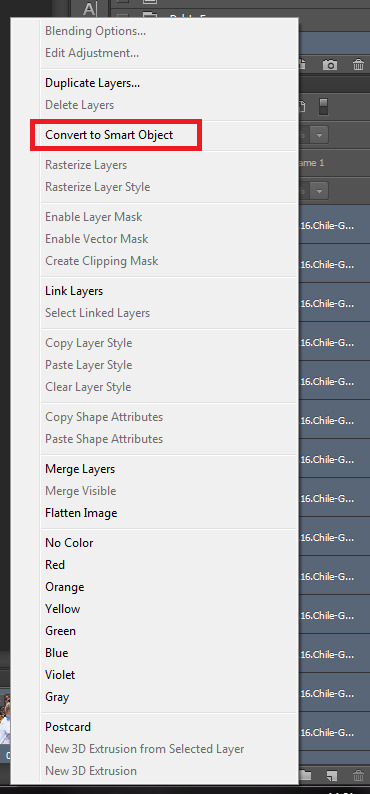
this is how your photoshop window should look like:

now go to filter -> sharpen -> smart sharpen and put the same settings as on the screenshot

press ok. then right click on the mouse on your just sharpened group of the layers on the right side and choose “duplicate layer”

one more time hit ok. go again to filter -> blur -> gaussian blur and switch your settings to these ones:

hit ok and you’re almost done. all you have to do is to switch the opacity of the layer to 50% instead of 100%

and now go to file -> save for web and save your gif
note: sometimes after this step with sharpening gif can start moving faster or slower. all you need to do is re-open your saved gif and change the speed of the gif to normal again (0,05 or 0,04) like in the step 6)
after applying my psd and sharpen this is how my gif looks like:

note: this and this are the great examples of how to color gifs for the beginners!
that’s all. there’re many mistakes and i guess sth looks kinda complicated, so if you have any questions feel free to ask me :)
151 notes
·
View notes