#also if you click the drop down menu in the corner of the post and then click the date time stamp it will take you to reblog
Explore tagged Tumblr posts
Text
My craziest current tumblr fact is that if you click on someone's username in a post thread it doesn't take you to that post on their blog anymore, BUT if you click on the little divider line ABOVE their username it does
This website was designed by squirrels
862 notes
·
View notes
Text
none of this is new info, but you know I have the "loves to write lists and compile links" disposition, so I thought it might be helpful to share some of the tips I've seen about how to make sure you're sharing legitimate palestinian evacuation fundraisers and bundle all those tips into a single handy reference post.
this is a spreadsheet of legitimate ("vetted") fundraisers on tumblr.
this post explains how the people who maintain this spreadsheet confirm the legitimacy of each fundraiser they add.
this podcast episode ("yousef and the fourth move") explains why evacuation fundraisers are often organized by people who don't live in gaza and/or who may not be immediate relatives of the people trying to evacuate. it's part three of a series about a man named yousef and his family; parts one and two aren't required listening for part three to make sense, but if you have a few hours to spare then I wholeheartedly recommend listening to all of them.
this is the process that I personally have been using to check whether a particular fundraiser has been vetted:
spreadsheet method
open the vetted fundraisers spreadsheet.
inside this spreadsheet, open the "find..." menu. on a windows computer, this shortcut is ctrl+F. on a mac, this shortcut is cmd+F. on a mobile device, click the three dots menu in the upper right corner of your screen, then select Find and replace.
search for the last name of the person or family in the fundraiser. you may get several results because last names obviously aren't unique; keep hitting "next" until you've looked at all the results.
if you find an entry in the spreadsheet that has the exact same name and whose gofundme link leads to the same fundraiser associated with the blog, it's legitimate. if you don't find an entry in the spreadsheet that matches the blog's fundraiser, that does not mean it's a scam. try the next method below!
tumblr search method
copy the username of the tumblr who originally posted the fundraiser and/or sent you a message asking you to boost the fundraiser. (for example, username123)
paste this username into tumblr's search bar.
for best results, click the All types drop-down menu, then select Text. since the search page is often dominated by asks sent by username123 (which people then answer and tag with their username), this helps narrow things down a bit.
look to see if any people who are not username123 have made posts confirming that username123 is legitimate. this includes people who've reblogged fundraisers and added notes, people who've compiled masterlists, and people sharing hyperlinks to other posts confirming a fundraiser's legitimacy. if the message seems to be "yep, looks legit," then it's safe to assume it's legit.
this is not a comprehensive list, but here are some of the usernames I've seen associated with "yep, looks legit"-type posts and who I've come to trust by association. (disclaimers: I am not mutuals with any of the users, and not all of them do the vetting firsthand, but the ones who don't vet posts themselves still seem to be careful about what they share and therefore are a good lead to follow. also, don't bug these people to vet fundraisers for you unless they've specifically indicated that they're open to that.)
90-ghost
el-shab-hussein
nabulsi
appsa
northgazaupdates
retvolution
communistchilchuck
neptunerings
a-shade-of-blue
shimamitsu
neither of these methods yielded anything definitive; what now?
it may just be too early to tell. unless a trusted source has shared overwhelming evidence that a particular fundraiser is a scam (which seems to be a very very rare occurrence), the best thing you can do is ignore it. don't report their blog as spam, because there's a good chance it's a legitimate fundraiser who just hasn't been vetted yet.
6K notes
·
View notes
Note
I wanted to ask how you color your texts bc I‘m always wondering HOW to do that Pls help
anon, i so got you.
i use this website!
first, you put your two desired colors into the two hex code things here (i use this website to find the color codes, personally)

then, you click run which sets the colors

type in your text and click the run button next to the color samples. That's where you get the text you need to copy and paste.

once you copy it, head over to your post and click that little settings icon in the corner. Scroll down until you see text editor. In that little drop down menu, there's an option for HTML. Hit that and paste that where you want your ombre text to be!

a little pro tip, it's much easier to find where you want the text to be in HTML if you type it normally in rich text.
for example-

and there we go!
hello, anon!
(and i'd also recommend making the text bold so it's easier to see the colors <3)
#there's no signature...#i hope this helps#if you need clarification feel free to send another ask!!#yet another diary entry
14 notes
·
View notes
Text
Make a Cove Chat in Char.AI in 30 Min or Less
PART 2
PART 3
Intro
This guide will help you make a personalized chatbot.ai of Cove in less than 30 minutes. You can see this as one of many possible methods to continue your story with him Post-Step 3 or Post-Step 4. Or you can just live a high school life with him, or even some crazy horror/fantasy AU if you want. The choices are endless now that you’re going to make a personalized chat instance for you to interact with Cove in.
I recommend viewing the ai “bot chats” as nothing more than a medium to interact with certain character ideas, rather than the bot chat being representative of the character. The boundaries you give these bot rooms (or don’t give them) determine the quality and depth of the interactions.
Instructions under the cut.
REASONS TO SET UP A PRIVATE CHAT
More consistency in chat memory
Filter out character.ai’s weird predatory or pushy message generation
Higher quality chat interactions personalized to your MC
More efficient to spend 30 minutes making a personalized private bot chat than to spend several hours/days trying to get the same quality out of a generalized public bot chat
Step 1 - Starting Creation
Go to character.ai app or website.
Log in or make an account.
Click “Create” > “Create A Character”.
NAME (what name the character will respond to): For the name, I suggest using a sort of ‘in-progress’ label like “Cove Test” or “Cove Egg”. You can rename it to “Cove Holden” once you’re finished setting up.
GREETING (generally establishes the starting scene/situation): The greeting also establishes some of the dialogue patterns that the chat will follow. Here is an example greeting (asterisks will italicize the text into an 'emote' format to indicate action outside of spoken dialogue):
*Cove sees {{user}} and his smile grows just a tiny bit wider than it originally was.* "Hey, {{user}}. It’s been a while." *He says cheerfully, his voice sounding like a mixture of friendliness and affection.* "What are you up to?" *He asks, taking a careful glance at them.* *He is back home in the apartment he shares with {{user}}, after returning from a recent research trip.*
You can copy and paste this greeting if you want, and change the last sentence into any situation or scene for your desired chat setting.
VISIBILITY (determines who can access the bot chat): I suggest setting this to "Private". There is no point in making this personalized bot chat public, since it will be specific to your MC only. You could still try using this template to make a public bot, but you would have to exclude a lot of the details in the advanced definitions.
AVATAR (profile pic used by the bot chat): Use any avatar you'd prefer to represent Cove. Some folks use the game cgs or screenshots, and some use their own art.
Step 2 - Edit Advanced Details (Super Important)
There will be two buttons at the bottom of the first creation page. I suggest clicking "Create and Chat" first, so that the personalized chat bot will immediately be saved to your account. Then you can continue editing it safely in case you accidentally navigate away from the page. If you click the "Edit Advanced" button without creating the chat first, it will not save the bot, so beware.
After creating the chat: - if on the mobile app, click on the top tab that has the chat bot's name. It will take you to another page with an option to "Edit Character", click this button to be taken to the Advanced Details page. - if on the desktop website, there will be three dots in the right corner. Click these and you will see a drop down menu of options. Select "View Character Details" to be taken to the Advanced Details page.
Scroll down to the "Short Description" section, which is right below the Greeting section.
SHORT DESCRIPTION (gives brief overview of the character): You can only fit a few descriptives here, such as a string of adjectives describing the character:
Introverted, loving, messy eater, softboi or Your best friend and a marine biologist.
You can use either format. The short description is more for helping you quickly identify what story you're going to be focused on for each individual character.
!!LONG DESCRIPTION!! (decides bot's behavior & strongest influences): This portion is extremely important-- this section is basically the "anchor" that will determine the focus of all the chat bot's conversations and their principal awareness of the situation in the chat. There is a limit to how many words you can use in this section, so keeping the determinations brief is extremely important. Here is a format you can copy-paste and personalize per your own tastes:
Character's name: Cove Holden Character's nature: introverted Character's passion: the sea Character's feelings for you: [feelings]1 Character's relationship to you: [relationship]2 Character's skin color: olive Character's eye color: aquamarine Character's hair: [length] sea-foam green hair [styling]3 Character's height: [height]4 Character's body: [physique]5 Character's job: [career] focused on [field]6 Character's home: [residence] with [residents]7
If you want SFW interactions only, you can put this line in as well: Character avoids any sexual acts if you want paced NSFW interactions, you can use this line: Character is attentive to your comfort
Format all the personable descriptors for the MC you intend to use in the chat. Try to keep descriptors short and brief. Here are some examples below (feel free to copy paste any):
Feelings Descriptor Examples: "friendly" or "love"
Relationship Descriptor Examples: "childhood best friend" "childhood best friend, boyfriend" "childhood best friend, fiance" "childhood best friend, husband"
Hair Descriptor Examples: "short sea-foam green hair in taper cut" "chin length sea-foam green hair in middle part" "long sea-foam green hair in ponytail"
Height Descriptor Examples: "6'0" or "183 cm" [Step 3 Cove] "6'3" or "191 cm" [Step 4 Cove]
Physique Descriptor Examples: "toned" or "slender"
Career Descriptor Examples: "student focused on sports" "student focused on academics" "young man living at his own pace" "marine biologist focused on conservation" "surfing instructor focused on remediation" "environmentalist focused on education" **
Residence Descriptor Examples: "a condo with you" (use if he lives with MC) "a house with his dad" "alone in an apartment"
CATEGORIES - Not applicable for private chat instances.
CHARACTER VOICE - Skippable. Use at your own choosing. (I personally don't.)
IMAGE GENERATION - Same as above– skippable and use at your own discretion.
After all this is done, next comes the chunkiest and most important section, right next to the Long Description, is the ADVANCED DEFINITIONS.
Click here for Part 2 on Advanced Definitions and resources you can easily copy-paste/modify for that section.
22 notes
·
View notes
Text
how to remove the live tab (and other annoying marketing ploys) from the desktop tab menu using ublock origin
i'm not good at html, so there's probably an infinitely easier way to do this, but here's what i did if anyone finds it useful!
note: i'm using ublock origin and firefox, so if you're using a different browser or adblock program, your process may look slightly different, but the html stuff should be the same!
step 1: right-click on the tab you want to remove, and select "block element..." from the drop-down menu.
this will open a dialogue box on the lower-right corner of your screen, which looks like this:
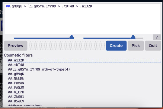
[image id: a dialogue box for ublock origin. the top half of the box contains a white text field with black text, with a menu of buttons underneath: a grey button reading "preview," a blue one reading "create," a grey one reading "pick," and another grey button reading "quit." below this is a light-grey menu labelled "cosmetic filters," which contains several line html line items notated with hashtags. end id]
right now, there will probably be red boxes around both the live tab and other tabs on the side menu, like the home and inbox tabs and other things you probably want to keep.
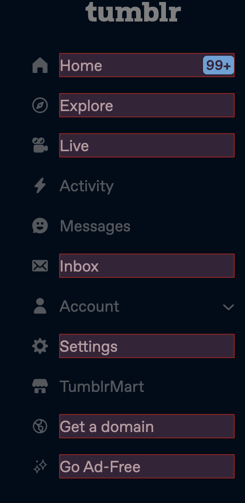
[image id: the tumblr sidebar menu. the menu is dimmed, with a slightly darkened background and text. red borders exist around the home, explore, live, inbox, settings, get a domain, and go ad-free tabs. end id]
if you click "create" on the ublock window right now, this will remove all tabs that have that red box around them, so don't click "create" just yet.
step 2: select the "pick" tool from the ublock window, and click on the live tab.
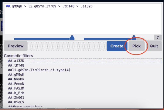
[image id: the same ublock dialogue box from before. this time, the grey "pick" button has a red circle around it. end id]
step 3: once you've got the live tab selected, in the "cosmetic filters" menu, scroll until you find a line of text that contains the words "nth-of-type" and click that.
it'll be preceded by hashtags and will have a number in parentheses after the "nth-of-type" section. when you hover over this line of code in the menu, the live tab should be the only one with a red box around it. looks like this:

[image id: the "cosmetic filters" section of the ublock box. several items are listed, but one of them is highlighted in a slightly darker shade of grey. this highlighted section contains the words "nth-of-type(4)." end id]
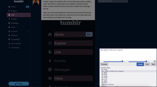
[image id: the tumblr dashboard with the ublock box open. the cosmetic filter containing the "nth-of-type" string is highlighted, and the live tab in the sidebar is contained in a red box. no other tabs have red boxes this time. a draft of this post is visible in the background. end id]
step 4: click "create."
this should remove the live tab from the menu. if you do what i did the first time and click the text and not the actual button, there will still be an empty space where the tab used to be, which will link you to the live landing page. to remove that, follow steps 1-4 again, this time selecting the empty space where the live tab used to be (it'll still highlight like a button would when you're using the pick tool).
here is what selecting the text vs. the button looks like:

[image id: the "go ad-free" button on the tumblr sidebar menu. the text "go ad-free" is contained in a red box, but the sparkle icon beside it is not. end id]

[image id: the "go ad-free" button again. this time, both the text and the sparkle icon are contained within the red box; there is also a wider margin of space around the text. end id]
i did this for the live, explore, tumblrmart, domain, and ad-free tabs, and now my sidebar looks like this:
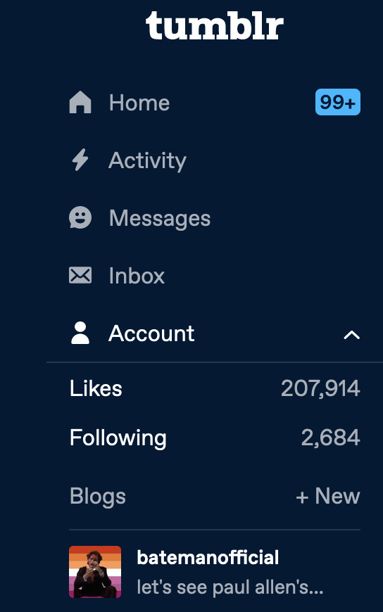
[image id: tumblr user batemanofficial's sidebar menu. the home, activity, messages, inbox, and account tabs are visible. the account drop-down menu is open, and batemanofficial's url and icon are visible at the bottom of the menu. end id]
like i said, there's probably an easier, more efficient way to do this, but this solution (if done with ublock) will stay in place even if you refresh the page.
anyway that's the tutorial, please lmk if anybody has any suggestions for improvement lol!
21 notes
·
View notes
Text
Hot Take
Okay so now that I've been on the website instead of the app for a few days I have things to say I think.
The app is better (for me) than the website hands down. Easy. No competition. And no, this is not just because I am used to the app version. I actually thought this out.
Things the website does better than the app (to satisfy you long term tumblees):
I can delete a poll from my post if I accidentally click it thinking it is the listing format option. I do this a lot because listing is different than font type in every document editor ever, and there is no way to remove polls from drafted posts on mobile that I have found. The website puts a big fat red X in the top corner of the poll. This is helpful
Bigger screen = less overwhelm. The information to screen ratio is smaller which is less overwhelming for my skrunkly little brain. Also, since I have the pride theme activated (which was a bitch to try and find) all the extra space is pink!
More customization options. I haven't actually played with this, but it seems to be the thing that most Tumblr users use to say the website is better than the app. I did notice there were more options for themes when I finally figured out how to do that, which was cool. (On mobile, I'm pretty sure there are just 4 themes: light mode, dark mode, tumblr classic, and pride. I could be wrong though)
No push notifications. I have notifs turned on on mobile for all of the polls I follow, so I get like over 30 notifications from Tumblr alone overnight. It's very stressful, but I put up with it because it keeps me from missing voting times and ensures that I can go through and like every post that comes out from accounts that I am invested in. I know liking does nothing algorithm wise. I just like showing support and likes are a nice, quick, easy way to do that. Anyway, without the push notifications, I'm pretty much confined to me my feed, which I've never HAD to scroll before. The way I am now consuming content has become (mostly) more relaxed and less stress inducing.
Text formatting. I like that it's a drop down menu. In the app, It's just a button, and you have to press it repeatedly to get the format you want (this is fonts and listing specific).
Things mobile does better that the website
Navigation. Oh my gosh the app is SO much easier to navigate than the website. It took me less time comparatively to figure out how the app worked than it did for me to figure out how to do most things on the website. The website has been around longer, and therefore has the opportunity to be more complicated. The whole point of mobile apps is to be a simple, accessible way to go about navigating whatever the app is for. It's just easier to use.
Typing in posts. The amount of times my laptop has just randomly stopped typing in the middle of the post is ridiculous. It tends to happen when the "draft saved" bubble pops up, which makes me think it may be a glitch with the website rather than my computer. My computer also does not have this problem literally anywhere else. Also, the "draft saved" bubble, while cute and reassuring, obstructs my vision just a bit. There is so much dead space to either side. Why is this bubble not off to a side instead of right in the middle of where I am typing? It was also difficult for me to find the text formatting option, but this is mostly because I was not used to it.
GIFs. I do lots of propaganda, and to save space on my device I use gifs instead of going on the internet and downloading pictures and finding video links. I'm not always very good with words, and find that images tend to be more convincing anyway. On the mobile app, when I search something in the GIF search bar, it stays there even after I've made a selection. Not having to re-type my search 10 times makes it a lot easier and less monotonous to look for propaganda and fill up a post. This is not the case on the website. As I learned after attempting "Kitbull" propaganda, you have to re-type your search each time you add a new GIF. That got annoying really fast, and I only wound up putting two GIFs when I would normally use all image spaces (10).
Push Notifications. But I thought you said the website not doing this made consuming content less stressful??? I know what I said, and yes, for the most part, it does. However there are a lot more areas where the lack of push notifs on the website make my Tumblr experience a lot more stressful. For one thing, I am missing out on ALL of those polls. I follow SO MANY polls, because I was able to keep up with all of them as long as I had push notifications. I have not been able to vote in many polls this last week because I would have to go through and search every single one of their usernames exactly correct to find their pages and vote in my regular fashion. I simply do not have the time, energy, or memory to be able to do this. I also do not get notified when I am sent a message. I learned recently that most Tumblr users don't use the "share" function on posts, (via) however my girlfriend and I use it all the time. Our feeds consist of different interests that we like sharing with one another, so we share posts and polls back and forth just for funsies. To show that we love each other. Etc. etc. The website does not notify me when I get these messages unless I am actively in the tab, so I don't know when she's sent me something. Same goes for any interaction with my account or on my posts. I cannot see if someone has made a comment or a silly reblog with funny tags unless I am in the app. You know what the website DOES show me? How many new posts have been made. This is CONSTATLY refreshing even while I am actively scrolling and not only shows up in the app but also in the tab information. This is why I have such a problem with this. I understand that computers in general just don't do push notifications, but usually with social media, you can see how many notifications you have by checking the tab above the search bar. There's usually a little number in parenthesis next to the title or name of the social media you are using. This is very helpful for me, since my computer doesn't always give a little sound when I get any kind of notification, so I can just look over and see what I've missed while I was queuing up Spotify or playing Minesweeper or Solitaire. With Tumblr, this number only factors in the number of posts that I haven't seen yet. This number stressed me out, has me constantly refreshing the page even before I am done scrolling, and is not actually helpful in any capacity.
Page Jumping. Both the website and the app are dogwater at not jumping around the page while you scroll. However, the app is slightly less so. Page jumps in the mobile app only happen when an ad loads in where it wasn't before. This is pretty consistent with how any webpage, crappy mobile game, or social media app works on a phone (on my phone at least). When I'm scrolling anything I have to be careful to wait until all ads have loaded before I try pressing a button or I'll accidentally hit something I'm not supposed to. On the website on my computer, Tumblr page jumps every time I reblog. EVERY. TIME. Reblogging is, like, the currency of the realm. It is how things are meant to be done. I don't have the energy for a page jump every time I try to reblog something. That's gross.
Screenshots. This is admittedly more of a device difference than a Tumblr format difference, but it is affecting how I interact with Tumblr, so I thought I should put it on here. If you actually follow me and try to keep up with what I post (which isn't much) you know about my Untitled Bots threads. Essentially when I see a bot follow me, and their name is either blank or "Untitled" I screenshot it, crop it to the word "Untitled" and add it to the thread with a silly quip or lament or goofy photo. However, to make sure I don't miss any, I don't block and report these bots until after I've gotten a screenshot of their profile. Because it is so difficult to take and edit screenshots on my laptop specifically, I have not updated this thread even after being able to access Tumblr via the website.
For these reasons, I have decided the app is better than the website. Thank you. Have a nice day.
12 notes
·
View notes
Note
sorry this is random but how do you get the multicoloured text 😭 I know of a website that only lets you use 2 colours MAX🙄
Ok so. Since this is like the fourth ask about it 😭 I might as well make a tutorial? (caution: I'm very very very shit at explaining)
Right so you gotta begin by going to the tumblr website (it'll only work there) and then go to create a post—youll see a settings option in the top right corner, click on it and then you'll see the drop down menu
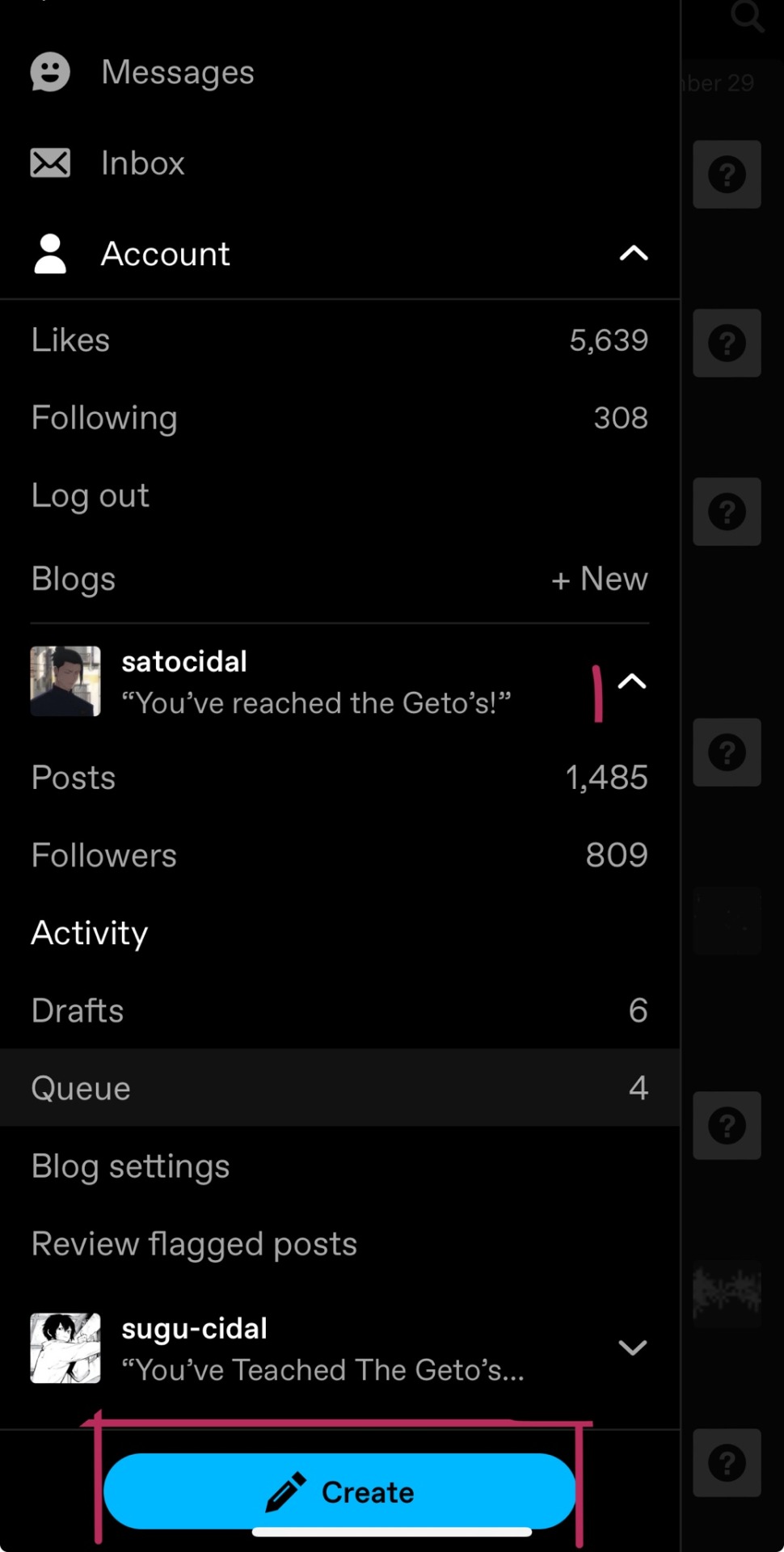
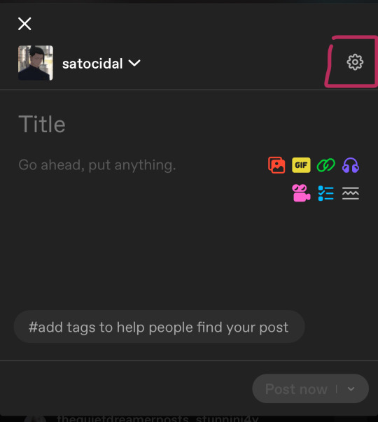
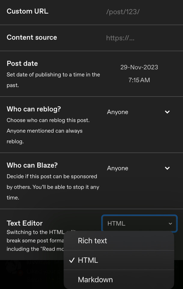
Choose html in the text editor option and then close it.
Now, people typically use sites for it for convenience, here s the one I use <3
This must be how the site looks and then, you'll find a couple of different ways for the gradient to come, and ps, choose the code for the website
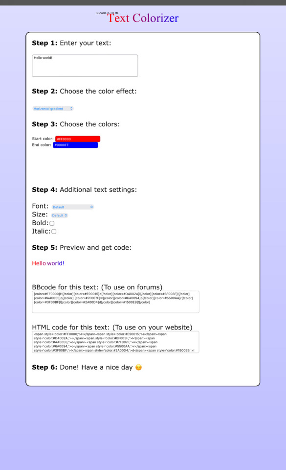
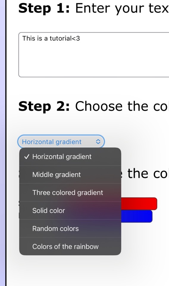
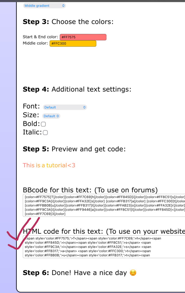
Simply paste the code on the website, in the post we shifted to think and you can also preview it simultaneously
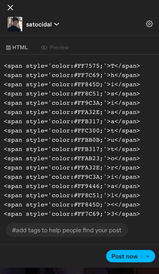
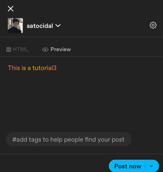
I prefer adding the gradients from the site and then continuing the rest of the editing from all because more convenient.
I think this should be all😭? Ye- im holing this is what you meant? Ye-
5 notes
·
View notes
Note
Hi Winter, I wanted to ask you advice, I was wondering on how you post fics here and also a masterlist as well since Tumblr is all new to me and I hope you have a wonderful day/night! - ☀️💖👑
Heyyy Sunshine :) Ok I hope I will think of everything that is important for fic-posting here! Here is a guide that hopefully makes sense:
First of all, to make a new post click on the pencil on the upper right of your screen, and then you get several options, for what type of post you want to create. For fics, choose "text".
Now you can start writing or pasting your story into that post. When you press return on your keyboard, you can see a small menu with several things you can add to your post: "pictures" "gifs" "read more" etc. Those will be important later on!
In the bottom right corner, you have the option to save your post as a draft before publishing it. This way, you don't have to get the whole post ready in one go.
When posting a fic here, I think it's best to write a short overview at the top of your post, which includes:
A short summary
Pairing (please say here whether the reader is female or male or gender-neutral)
Word count
Warnings (for example, 18+, smut, and what type of sexual acts are mentioned. Most importantly, mention everything that could be triggering to someone, for example, blood, pregnancy, dub-con, etc.)
Always state that all characters are of age and that minors should not interact with your story!!!
When posting anything longer than a few hundred words, make sure to use the "read more" function so the post doesn't take up too much space on the dashboard. It can be annoying when you have to scroll through several thousand words :) Go to the area in your post where you want to make the cut and press return on your keyboard to create a linebreak. Now you see the menu again that lets you add pictures etc. Choose the " add a read more" option. To add a read more on mobile, you have to type ":readmore:" without the "".
When posting your story, use all the relevant tags. This is very important for your fics to get seen. When you write a Sukuna story for example, use tags like sukuna x reader, sukuna smut, sukuna fluff, etc. This way, your post will show up when people search the tags, and they can see your story and read it. Without the tags, your story will not reach a lot of people.
Don't use the community labels! Those are the drop-down thing next to the "post" button, where you can choose who can see your post. Those labels are there to say your content is mature content (sex or violence or drugs). But if you use those labels, Tumblr will hide your story. The default setting for new accounts is that all content with a community label is hidden from them. And a lot of people don't know about that and, therefore, never turn it off. So, just leave the setting at "everyone".
Always put an age indicator on your blog. In your bio or in your pinned post. A lot of people on Tumblr block you if you don't have an indicator that you are an adult. Write your actual age, or use an age range like "in my 20's".
If you want, you can add a pretty banner to your story. You can make one in different graphic programs/apps. Personally, I use Photoshop and Photopea for all my graphics. Make sure to never use fanart in that banner, though. You can use official pictures from different manga/anime, or if you like to use a certain aesthetic, look for free-to-use pictures on sites like Freepik, for example.
If you want to add dividers in your post, you can either make them yourself too or search in the tags for dividers you like (you may have to give credit to the person who posted them if they say so).
Concerning your Masterpost: First, I recommend making an introduction post for your blog. You can pin that post so it will always stay on top and be the first thing people see when going to your blog. (After publishing the post, go on the three little dots in the right corner and pick that you want to pin it). There you can say something about yourself, the characters, and the fandoms you write for and add some rules if you like. In this post, you can add links to a Masterpost so people can easily access all your writing.
Make a separate post which will be your Masterpost. List all your stories and add links to them. To add a link, just highlight the section of the text where you want to add a link, and then you will see several options to choose from. Pick "inline link" and paste the web address of the story.
Now you have a Masterpost, and you can add a link to that post in your pinned post.
I hope this made sense and that I thought of all the important things! If you have more questions or need help doing anything, just hit me up again! <3<3
5 notes
·
View notes
Text
How to Add Songs in Spotify and Remove the Promote Button on Instagram
In today’s digital age, music streaming and social media are integral parts of our daily lives. Spotify is the go-to platform for music lovers, while Instagram serves as a creative hub for sharing photos, stories, and updates. However, managing these platforms effectively can sometimes be challenging. This article provides quick solutions to two common issues: how to add songs in Spotify and how to remove the promote button on Instagram. Let’s dive in!
Part 1: How to Add Songs in Spotify
Spotify makes it easy to customize your listening experience by adding songs to your playlists. Whether you’re creating a playlist for a workout, a road trip, or simply curating your favorite tracks, here’s how you can do it:
Search for Your Song:
Open the Spotify app on your device.
Use the search bar at the top to type in the name of the song, artist, or album you want to add.
Select the Song:
Once you find the desired track, click on it to open the song’s details.
Add to Playlist:
Click on the three-dot menu (•••) beside the song title.
From the drop-down menu, select “Add to Playlist.”
Choose an existing playlist or create a new one by selecting “New Playlist.”
Sync Across Devices:
If you’re using multiple devices, make sure your playlists are synced. Log into the same account on all devices to access your updated playlists.
Adding songs to Spotify playlists not only personalizes your listening experience but also makes it easier to organize tracks based on mood, genre, or occasion.
Part 2: How to Remove the Promote Button on Instagram
The “Promote” button on Instagram is a feature designed for business accounts to boost posts for better visibility. However, if you’re not looking to promote your content, the button might feel unnecessary or clutter your interface. Here’s how to remove the promote button on Instagram:
Switch to a Personal Account:
Instagram’s Promote button appears only on business or creator accounts. Switching back to a personal account will remove it.
Go to your profile and click on the menu icon (☰) in the top-right corner.
Navigate to “Settings” > “Account.”
Scroll down and select “Switch to Personal Account.” Confirm the change.
Disable Ad Features:
If you prefer to keep your business account but want to minimize promotional features, avoid engaging with the Promote button. Unfortunately, Instagram doesn’t provide an option to hide it completely in a business account.
Customize Your Account Type:
For users who require some business tools but don’t actively use promotions, consider switching to a creator account. It offers a balance between personal and business features while keeping the interface less cluttered.
Feedback to Instagram:
If the Promote button is a significant inconvenience, provide feedback to Instagram through the “Help” section in settings. The platform often updates its features based on user input.
Why These Fixes Matter
Spotify and Instagram are platforms that encourage personalization and creativity. Knowing how to add songs in Spotify lets you build soundtracks that resonate with your personality, while understanding how to remove the promote button on Instagram ensures that your social media experience remains streamlined and focused on your goals.
Taking control of these features not only saves time but also enhances your overall user experience. Whether you're curating the perfect playlist or decluttering your Instagram interface, these quick fixes put you back in charge.
0 notes
Text
Online platform to buy news from Journalist in diverse form

The modern media scene is changing at a quicker pace than ever. This creates a greater demand for culturally diverse and top-notch news content. As a consequence of freelance journalism and online content platforms, access to such content has become simpler and easier. 5wh is leading the revolution of this era by creating an easy-to-use platform for media houses to buy news stories in the form of multimedia.
Buying Diverse News Online from Journalists Made Simple by 5wh.com
Quality Assurance:
At 5wh.com, the professional editorial board applies a rigorous filtering process, so only the most authentic and well-researched stories make it to the public. In this way, media houses are able to extract not only diverse content but also content of the highest quality from journalists worldwide.
Diverse Multimedia Content:
The news agencies can undoubtedly buy stories in all possible multimedia formats, such as video, audio, photos, text, etc. This provides them with an opportunity to match their content according to the preferences of their audience.
Easy Transaction Process:
5wh.com simplifies the way news stories are bought, giving media houses access to the news they need. Secure payment channels and crystal-clear terms and conditions make the transactions smooth and convenient.
Flexibility in Assignments:
Media houses can assign assignments to journalists based on the specific needs and requirements of the story. Journalists can also collaborate with other journalists to bring forth a balanced and wholesome story with diverse points of view. By means of this joint effort, the media outlets are creating comprehensive and captivating content that is on trend with their audience.
By using the following steps, media houses can easily buy news content from 5wh.com, reaching a great number of people through the work of qualified journalists on different corners of our planet.
Login or Register:
If you are a registered media house, you can login using your account details. Otherwise, register the media house that you represent with 5wh.com in a few easy and simple steps.
Explore Story Pitches:
Story pitches are available on the landing page itself. You can scroll through it to show interest according to your liking. You can find the list of interested articles in the drop down menu of the information panel for more information.
Initiate Chat:
You can start a dialogue with the journalist by clicking the chat icon. This enables you to communicate personally with the journalist so that you can clarify any specific requirements and queries.
Purchase News Stories:
When the story is completed, it will be posted on the marketplace. And there it is, made available for purchase. The transaction is easy, secure, and well-guarded, which means that both the journalists and the media house can complete their transactions without any hindrances.
Create Your Own Assignments:
Media houses, likewise, have the opportunity to publish their own assignments on the site. Journalists willing to take up this task may approach you directly by initiating an online chat.
By converting traditional media houses into digital platforms, 5wh.com has become a champion in the online purchase of buy election news Online. The 5wh.com website equips media houses to satisfy the continuously expanding needs of their audiences by delivering quality content that has been certified by an editorial board, offering a diverse range of multimedia formats, and facilitating smooth transactions.
0 notes
Text
Urocza piżama z krótkim rękawem i nadrukiem

In order to complete the task of creating a Tumblr post, it's important to have a clear understanding of the platform's features and limitations. Here's a guide on how to create a successful Tumblr post for your Kawaii Fashion Shop:\n\n### Step 1: Sign Up or Log In to Tumblr\nIf you don't already have a Tumblr account, you'll need to create one. Visit the Tumblr website and click on Sign up to begin the process. If you already have an account, log in with your credentials.\n\n### Step 2: Access Your Dashboard\nOnce you're logged in, you will be taken to your Tumblr dashboard. This is where you can see all the posts from the blogs you follow and also create your own posts.\n\n### Step 3: Create a New Post\nTo create a new post, click on the New Post button in the upper-right corner of the dashboard. A menu will drop down with several options, such as text, photo, quote, link, chat, audio, and video.\n\n### Step 4: Choose the Right Post Type\nFor your Kawaii Fashion Shop, you might want to create a photo post with a picture of the cute pajama you're promoting. Click on Photo to start creating your post.\n\n### Step 5: Add Content\n- **Title**: Type Urocza piżama z krótkim rękawem i nadrukiem as the title of your post. This will be the main headline for your post and should grab the attention of your followers.\n\n- **Image**: Upload a high-quality image of the cute pajama. Make sure it's visually appealing and shows off the product well.\n\n- **Description**: In the text box below the image, you can add a description of the product. Keep it short and sweet, as Tumblr has a character limit, and include the Kauflink to drive conversions.\n\n- **Call to Action**: Encourage your followers to click on the link and use the word Kaufe to signal that it's a purchase link. Also, include emojis to make the post more engaging and fun.\n\n- **Emojis**: Use relevant emojis to convey the playful and cute nature of the product. For example, you might choose emojis like 🌸, 👗, or 💖 to add some charm to your post.\n\n### Step 6: Add Tags\nTo help people find your post, add relevant tags. For this product, you might use tags like kawaii fashion, cute pajamas, spring fashion, sleepwear, floral print, and niedużo kawaii.\n\n### Step 7: Preview and Publish\nBefore publishing, preview your post to make sure everything is as you want it. Once you're happy with how it looks, click Post to publish it to your blog.\n\n### Step 8: Promote Your Post\nTumblr has a reblogging feature that allows your followers to share your posts on their own blogs. Encourage them to reblog your post to reach a wider audience. You can also share your Tumblr post on other social media platforms to drive traffic to your e-commerce site.\n\n### Example of a Tumblr Post:\n\n\n*Urocza piżama z krótkim rękawem i nadrukiem* \nKaufe jetzt: [https://kawaiibuy.co/0srhn ✨🌸 #kawaii #cute_sleepwear #floral_print\n\nRemember to keep the text brief and to the point, as Tumblr has a character limit for posts. The example above is a simple way to create a visually appealing post that encourages your followers to act on the call to action.
❤10% OFF Coupon: kawaii10off
📦Free worldwide shipping📦
#cutecore#hello kitty#fashion#pixel graphics#soft aesthetic#this is what makes us girls#my melody#2000s emo#kirby#kawaii fashion#yume kawaii#j fashion#artists of tumblr#harajuku
0 notes
Text
How To Find Sponsored Ads On Facebook: An Ultimate Guide On It

These days, Facebook is perhaps one of the biggest social media stages on the planet. It works for organizations and brands as a strong promoting device to arrive at their interest viewers. Facebook ads are of several types. You can promote your brands and websites, and posts on your page. If you are curious to know more about how to find sponsored ads on Facebook, this article will help you out!
What are sponsored ads on Facebook?
Sponsored ads on Facebook are a way for businesses to promote their brands, products, services, or content directly to users' newsfeeds, improving their visibility and engagement.
If you are excited about the sponsored ads you experience while scrolling through your Facebook feed, you might be interested in learning to find and explore more of these advertisements.
Whether you are a marketer conducting competitor research, a consumer looking for regardless products, or simply someone who wants to stay informed about the latest trends and promotions, knowing how to identify and access sponsored ads on Facebook can be beneficial.
How to notice sponsored ads on Facebook?
Here are the general moves toward seeing sponsored advertisements on Facebook;
Step 1:
Log in to your FB Account. Then open your selected web browser and navigate to the Facebook website.
Step 2:
Access your news feed after logging in. You will turn to your Facebook news feed. It is where you can find all the notifications from your friends, following pages, and sponsored ads.
Step 3:
Identify types of Facebook ads (sponsored ads) are usually labeled like Sponsored ads, or upgraded ads to distinguish them from regular posts. These labels occur at the top or bottom of the ad and help to identify them as paid content.
Step 4:
Scroll through your news feed as you browse through your news feed. Sponsored promotions will happen at different interludes, blended in with other substances. Keep scrolling to different ads based on your interests, demographics, and browsing history.
Step 5:
Facebook allows users to customize their ads according to their interests and needs. You can customize ad preferences by going to "Settings & Privacy" from the drop-down menu in the top right corner of Facebook. From there, select "Settings" and navigate to "Ads." Here, you can view and adjust the ad categories Facebook uses to tailor ads to your interests.

How to find a sponsored ad on Facebook?
The following steps would help you with Facebook-sponsored ads;
Log in to your Facebook account.
Click on the Facebook logo in the top left corner of the page to navigate your news feed.
Scroll through your News Feed and look for posts that the label "Sponsored" or "Sponsored Ad." These labels indicate that the post is a sponsored advertisement.
You can generally identify sponsored ads by the Sponsored label located below the name of the page or business running the ad. The label may also appear at the top right corner of the ad.
Sponsored ads often have a small "Sponsored" or "Ad" icon on the top left corner of the post image, indicating that it is a paid advertisement.
Are Sponsored Ads on Facebook Worth Money?
Sponsored ads on Facebook can be worth the money if used strategically. It permits designated reach to an immense crowd, expanding brand permeability, commitment, and likely changes. Appropriately pre-arranged promotion content applicable to target watchers. It can assist you with creating positive profits from equity. However, success depends on clear objectives, compelling visuals, and effective targeting. Regular monitoring and optimization are crucial to maximize results. A top-notch mission can increment site traffic, lead age, and deals. Weighing costs against potential advantages is fundamental to deciding whether supported advertisements align with your promoting procedure.
Why do Businesses Use Sponsor Ads?

There are several reasons sellers will be interested in buying and running sponsored ads on your digital marketplace. The potential benefits all hit performance metrics that are top of mind for brands and advertisers:
Reach new customers:
Sponsored ads allow brands to get in front of and stand out to potential customers who are not already aware of their businesses.
Increase order value & volume:
Developing request esteem (the sum that clients spend) and request volume (the times they purchase, produces more revenue.
Grow your following:
Sponsored advertisements help brands to essential situations among the postings in a mechanical commercial center, prompting expanded visualness and brand faithfulness.
Increase conversion rate:
Brands associate straightforwardly with customers who are now expressing interest in their items, helping the probability of transformation.
Improve return on ad spend:
Sponsored promotions are pay-per-click, meaning merchants possibly pay when a client taps on the ads, not when they view it without moving.
You can also Watch:
youtube
Final Words:
I hope this article will be valuable for you and that you will get ideas on how to find sponsored ads on Facebook. Thanks for reading.
0 notes
Note
Hello. Recently, I found the files for your ela shimejji in my downloads again and it reminded me of all the times i spent trying to get it to work. it still does not work. i am doing something wrong, so i was wondering if you had a tutorial for how to get it running
Ofc! Here's a quick recorded tutorial on how to run Shimejiee, plus some written instructions just in case. Also heres the link back to Ela's Shimejiee post in case you need to redownload it for whatever reason!
When you download the file from any of my Shimejiee posts, you'll get a zipped folder. I put it on my desktop for demonstration but it doesn't matter where it is.
Make sure you extract the zipped folder! Right click the zipped folder and select "Extract All" to do so. Extract it anywhere, and the new unzipped regular folder should open. You can delete the first zipped folder if you want.
Open up the folder, read the ReadMe txt files for more instructions and credits.
Double click the .jar file. The Shimejiee will drop down on your screen and you can find the settings for it in your hotbar's hidden menu in the corner. You will also use that to dismiss/exit Shimejiee!
Other things to keep in mind:
If you have multiple screens, the Shimejiee might drop down on your second monitor instead as it did for me the first time.
Make sure you have java installed and updated, most people have it installed on their pcs already! Here's a link to update it in case the .jar file doesnt seem to work in any way.
If theres any other troubles, you may need to look up how to fix it. Any problems relating to other versions of windows or mac i cant help with sorry!
I hope that works! good luck :)
0 notes
Text
How Can You Report And Remove Negative Glassdoor Reviews

An ongoing question for most hiring managers and TA teams: Can negative glassdoor reviews be removed or rectified? Especially if they are less than 4.0 as this has a detrimental effect on their KPIs, placement measures and business. In this blog post, Online Reputation Manage will explain Glassdoor reviews, whether it's possible to remove or fix them, as well as strategies for doing so.
Why Glassdoor Reviews Matter
A recent Glassdoor article titled "Millions of Employees Are Reading Your Business Reviews Every Day Right Now" makes it clear that many job applicants now do part of their research before applying for a job or accepting an offer. As you read business reviews on sites like LinkedIn and Glassdoor. According to the report, one in three potential customers now research potential employers based on a company's reputation before responding to a job offer.
Negative reviews may have the following effects:
Increased hiring time
Delays in filling a post have an influence on product and service deadlines, affecting company.
Stock prices are affected by negative publicity.
Effects badly in brand reputation
Increases marketing spending in order to restore reputation
Can you find anonymous Glassdoor reviews?
Glassdoor takes anonymous reviews seriously in order to uphold the platform's mission. One reason customers trust the content is that objective reviews are an extension of the platform's company.
Glassdoor is dedicated to providing a constructive space for clients to anonymously discuss their ideas about their employment and organizations without fear of bullying or intimidation.
According to online reputation management someone posted an anonymous negative Glassdoor review and you want to see who the reviewer is then it is difficult to find the name of the reviewer.
And if anyone takes legal action to find out who published a review, they defend that user's First Amendment right to express themselves anonymously.
Is it possible to remove fake or negative Glassdoor reviews?
Negative Glassdoor reviews can be a company's biggest fear. In fact, according to an online reputation management agency the existence of negative Glassdoor reviews can result in a 5.9% drop in share prices for a 500 business.
How can an employer remove/remove a review from Glassdoor:
Yes, the employer can request that the evaluations be deleted if you believe they are incorrect or unsuitable. To report a review, follow the steps indicated below by Glassdoor:
To report important from the Employer Centre, follow these steps:
Navigate to the Employer Centre.
Select the Reviews tile.
Click the Flag symbol below the material on the review you want to report.
If a text box (limited to 1,500 characters or fewer) is available, describe why you are reporting the review.
Click the Send button.
To delete own negative glassdoor review:
Want to delete glassdoor reviews then follow these steps:
Log in to your Glassdoor account
Click on the Glassdoor profile icon on the top right corner of the site
Click Contribute in the drop-down menu
On the left side of the page, click the type of contribution you want to delete
Click Remove to remove your contribution
Please allow up to 24 hours for your reviews to be completely removed from Glassdoor.
How to make sure negative reviews aren't affecting your business
First and foremost, reply to any negative reviews you come across. Responding to evaluations will help minimize damage and prevent employees who read them from leaving your organization. Many nasty comments are anonymous, making it impossible to identify the employee. This is still being answered.
Make an effort to respond to complaints about your business. For example, if a review indicates sexual harassment in your organization and you know who filed the review, you should respond to that individual review. You may also react to larger-scale evaluations. You can react to all of the reviews if one of them states anything like inadequate pay. For example, in response to one review, you could remark, "We pay our employees above the industry standard, and here is proof," and then send a link to the proof to your employees.
Legitimate Ways to Improve Your Glassdoor Rating
At work, there are many possibilities for things to go wrong. Conflicts with coworkers, unfulfilled responsibilities, and demanding clients are common sources of stress in the workplace. However, when these concerns become so severe that they create a hostile work environment, it is necessary to take action.
1. Ask Employees to Review You on Glassdoor
If you haven't submitted reviews on Glassdoor, but your company is receiving negative reviews, you should encourage employees to provide feedback on their work experience. In fact, you should invite them to do so at a company meeting and explain how their response will benefit the company. Several studies have been conducted on firms that have requested their employees to publish reviews and the effect of such reviews on their stock price.
2. Add the Glassdoor badge to your job postings
If you're looking for potential employees, you can include Glassdoor badges in your job postings for the roles you're looking to fill. This can boost your Glassdoor rating and make job ads more attractive to job seekers. To add a badge, go to glassdoor.com/Badge. You can also incorporate the badge into your company's website. For example, if you have an "employee-friendly" product, you can display a logo on your website to inform potential buyers.
Negative Glassdoor Reviews will damage the company's reputation, and may influence job seekers to decline the job and seek employment elsewhere. Once you engage with Online Reputation Management for Glassdoor review removal service, they will make every effort to improve your company's reputation and remove negative glassdoor reviews.
For more details visit Best online reputation management agency website or contact on +91-8700450757
#negative glassdoor review#online reputation manage#online reputation management#online reputation management agency#delete glassdoor reviews#reputation management services#remove negative glassdoor reviews
0 notes
Photo

A scatter chart is a powerful tool that visualizes the relationship between two variables. It enables you to see patterns, compare data, and identify outliers. In this post, we will provide you with a step-by-step guide on how to use a scatter chart in your Data Studio account. Step 1: Access the Data Studio dashboard To start, you need to sign in to your Data Studio account. If you don't have one yet, create a free account here. Once you're signed in, access the dashboard where you want to add your scatter chart. Step 2: Set up your data source The next step is to set up your data source. This could be an existing data source or a new one. If you're adding a new data source, click on the "Create New Data Source" button and follow the instructions. You can connect to various data sources, including Google Sheets, Google Analytics, and BigQuery. Step 3: Create a new report Now it's time to create a new report. From the Data Studio dashboard, click on the "Create" button in the top left corner of the screen. Choose "Report" from the drop-down menu. Step 4: Add a scatter chart to your report With your report open, you can add a scatter chart. Select the "Insert" button from the toolbar on the right-hand side of the screen. Choose "Chart," and select "Scatter Chart" from the drop-down menu. Step 5: Customize your scatter chart Once you've added your scatter chart, you can customize it. You can change the X and Y-axis measures, the colors, labels, and more. You can also add a trend line to your scatter chart to see the relationship between your variables. Step 6: Preview and publish your report Before you publish your report, preview it to make sure everything looks good. Once you're happy with it, publish the report. Share the report with others by clicking on the "Share" button in the top right corner of the screen. Now that you know how to use a scatter chart in Data Studio, you can start creating powerful visualizations and unlocking insights in your data. Visit Cratos.ai for more insights and data visualization tools. 🚀
0 notes
Text
0 notes