#also i used gouache on a glass dip pen and it worked so well for eyelashes etc
Explore tagged Tumblr posts
Text
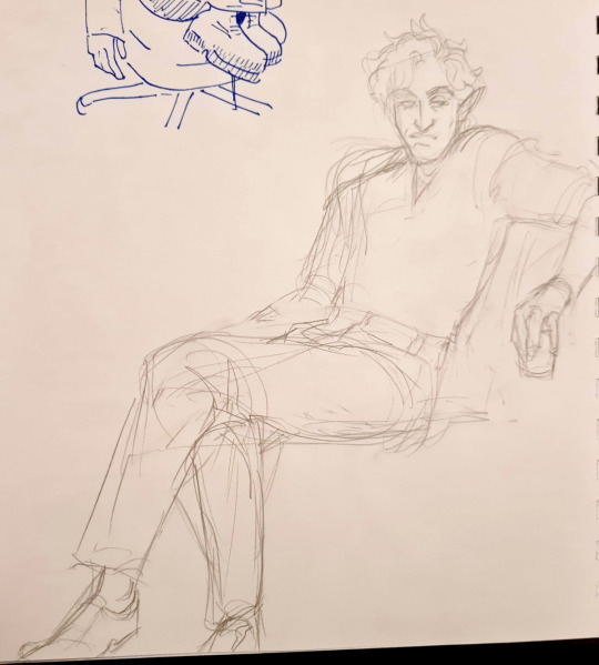
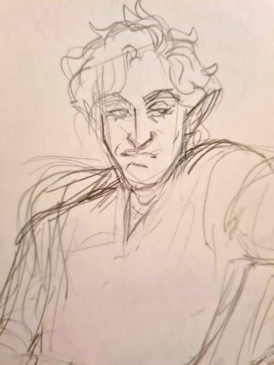


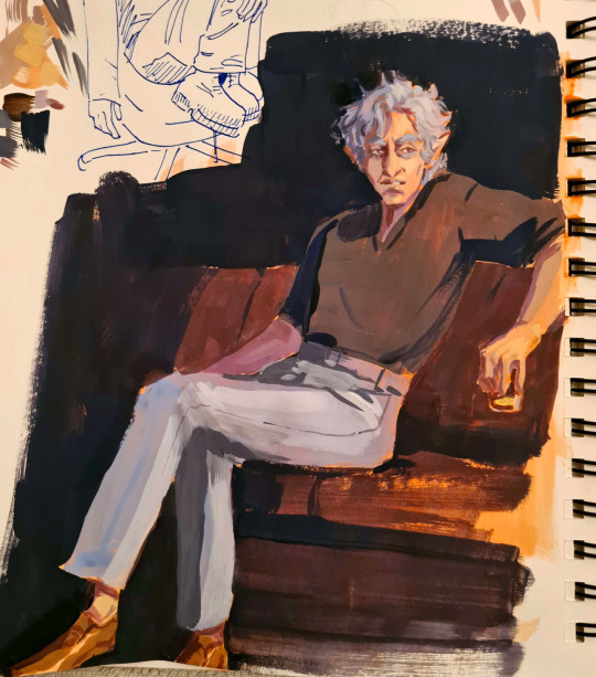
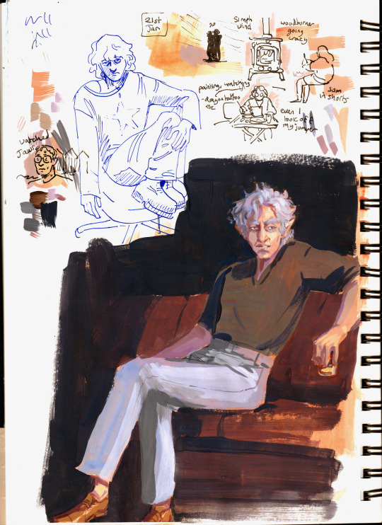
got over my 'waah painting is hard and scary and takes too much thinking' and just set up in the living room and painted Something, I'm honestly surprised it came out nice!
#astarion#gouache#with a tiny bit of colour pencil#also i used gouache on a glass dip pen and it worked so well for eyelashes etc#my art
371 notes
·
View notes
Text
Traditional art materials I like!
❤️🧡💛💚💙💜🤎🖤
Pens:
1. Tombow brush pens will never let you down. These suckers are good for EVERYTHING. You know I keep that mf thang on me. You can get a pack of 3 on amazon for about 6 bucks I think! Worth every penny. I own like,,,, 10. The black ink is nice and dark. The blue case has a slightly firmer tip, while the black one is ever so slightly softer. If you prefer tighter line control, I’d go with the blue.
2. Pentel duopoint flex. Just discovered this bad boy when shopping for pens at Michael’s. It’s 2 sided like the name suggests, with a wide brush and thin brush. The wide brush is a little looser and can make some pretty broad lines, while the thin side is firmer and is easier to control. The line variety you can get outta this thing is Insane. It’s a little on the pricier side at $10 at Michael’s, but the website literally always at least has a 20% off coupon, and it’s completely worth it. Not sure how long it lasts yet, but as soon as I saw how well that badboy performs, I bought 2 more. I’ll report back if they wear out quickly.
3. You can never go wrong with a good ol’ ballpoint pen. Bic is usually the way to go. Penmate smears like Hell, especially the blue ones.
4. Micron PN. This one is a firm brush point, and the lines are pretty fine, but you can still press a little harder to get that variation in there. I’ve been using it to illustrate my book a lot lately. Microns also tend to be a little pricey, but if you stock up a little at a time when you can, it’s worth it.
5. Pentel sign pen. These are similar to tombow, but have a slightly wider base of the nib. They work great, but if you prefer darker black ink, go with the tombow.
6. Speedball dip pen. If you’re looking to get started with dip pens, you can get a set at michael’s with a single black pen and several different nibs, from thin to flat calligraphy, for around $11. They’re pretty reliable and last a while! Just remember to clean around the base of the pen where the nib goes in so that the ink won’t clog the entry port and get stuck in there, and you’re golden! You can clean off india ink with ammonia, or glass cleaner like windex. Speedball india ink is also pretty nice, with a lovely dark black.
Paints:
Watercolors:
1. Kuretake gansai watercolors. These guys are the most bright, pigmented, beautiful watercolors I’ve ever used. If you’re looking for a bolder watercolor, this one is for you. Look for the long green box. Japanese watercolors in general tend to vary from so opaque that it almost acts like gouache, to transparent, and have the most bold colors I’ve seen from the medium.
2. Watercolor confections. These guys have wonderful little portable tin cases, and come in a wide variety of color themes. I own the tropical set, and wow is it beautiful. The colors are easily activated, beautifully granulated, and lightfast. They also have a lovely skin tone set I haven’t personally tried yet but that I’ve had my eyes on for quite a bit!
3. HIMI jelly gouache. Yes, this is the super trendy one that everyone uses, but it’s trendy for a reason! I don’t reach for it as often as I do my gansai palette, but if you like the opacity of gouache but don’t wanna fiddle with tubes, this is for you. I know it’s not exactly watercolor, but it’s in the same neighborhood!
Acrylic:
1. Crayloa. Yes, you read that right. Crayola acrylics have downright beautiful mixing colors, and are just really good affordable acrylics. Crayola isn’t always the best choice for professionals, but they’re reliable, and these acrylics never miss. Most of the time if you see me post an acrylic painting, it was made with those paints!
2. Windsor and newton. W&N is generally a pretty reliable company, and their supplies are pretty high quality, and often worth the slightly higher price tag. Their acrylics in particular are around $5 each, which is more affordable than say, golden or liquitex. Funnily enough, they perform similarly to crayola acrylics, but they feel more… luxurious, somehow. Wish I had a better way to describe it, but I just got myself a pretty good sized set and am looking forward to wearing it out. Oh, and they also dry nicer than crayola, in which different colored paints tend to have slightly different finishes. W&N doesn’t do that, and from what I’ve seen so far they all dry a nice smooth matte.
(I don’t know enough about oil to recc paints for that lol but I hope to in the future!!)
Canvas: I tend to just get whatever cheap canvas I can find, but I must say, if you’re lacking in space to store your art, I recommend getting a roll of unprepared canvas. If you want to start out white like a lot of pre-made canvases are, just pick up some gesso and prepare the surface yourself. You can cut out any size piece to your liking! When you’re done with the painting, you can roll it up for safekeeping! I’ve got canvases stockpiled, but I’m going to start the habit of working with the plain fabric much more often, since I still unfortunately live at home and my bedroom also essentially doubles as my studio.
Pencils:
1. Prismacolor ebony. These babies are much more affordable than their colored pencils, and you can get a 12 pack for around 10 bucks on amazon. These guys, like their name suggests, are super soft and dark, so you can get wonderful line variation and contrast. They tend to smudge easily though, so if you have trouble with that, be careful!
2. General’s layout pencils. These guys are also super dark, and lay down almost black. They’re also very soft graphite, so you can get some good line variation and contrast just like ebony, but they have a much less shiny finish, which can be nice!
3. Palomino blackwing. Yes, THOSE pencils. I cannot recommend them enough. They will make you feel so fancy. They lay down soft, dark, and come with this cool little rectangular eraser you can adjust. They’re famous for a reason! They were Chuck Jones’ weapon of choice!! If you feel like paying slightly more, then these are absolutely worth the tag. Depending on where and when you get them, they can set you back around $25-30 for a pack of 12, and they are absolutely worth every penny. The only thing I’d suggest is to be careful when sharpening, since they can wear down more quickly than regular pencils. It helps to carefully sharpen with an x-acto blade, and to only sharpen the lead itself when possible, and not the wood right away. It’ll make them last much, much longer, and make the price tag even more worthwhile.
Woodburning/pyrography tool:
I’ve only ever used one woodburning tool thus far (that’s about to change!) and that’s the walnut hollow creative versa-tool. It’s a wonderful tool to start out with, and you can get one at michael’s for around $30, and even less if you use a coupon. (Can u tell I work at michael’s lmao. Hmu for michael’s tips, you can save a lot of money really easily there!) The tool gives you a nice variety of tips to choose from. The universal chisel nib is probably the easiest to start with. You can shade with the flat end, and get thin to thick lines depending on how hard you press with the edge. It’s a little hard to get curves on it, but with practice and patience it comes easier! If you draw pretty fast, like me, it can take some getting used to, since pyrography tends to be a slow and steady kind of a process. The slower you go, the deeper it will burn, the thicker/darker lines you’ll get, and the quicker you go the more likely it’ll be that you’ll just scar the wood and not get very far.
As for the thinner tips in the walnut hollow kit, don’t be fooled! If you’re looking to get thinner lines, these won’t always work the way they seem they will. It’s kinda confusing if you go in blind like I did, but I learned that the thinner the metal, the less heat that you get coming out of it, and the longer it takes for a line to appear. You can still use them for tiny details, but it takes a bit. You’re better off getting a good handle on the universal chisel nib and making thinner lines that way, since it tends to go much quicker, and with the higher heat you’re able to get from that, you’re less likely to scar or stab the wood.
The shader tip is also a pretty good tool to learn. I’ve seen artists who only use the shader tip and create photo realistic stuff! As soon as you get used to the odd shape, you learn to kind of work with it like a paint brush. Angling it to the side can also get you some nice thin painterly lines. And of course, like the name suggests, holding it flat and moving it gently over the wood (longer for darker burn, shorter for lighter) can get you a lovely range of values.
Choosing your wood; make sure to choose soft, light wood. Darker wood is generally fine as long as it’s soft, but it’s harder to get the image in there since you can’t add highlights with just the burner or leave any blank spaces for the highlights. It’s best to choose a lighter wood, like pine, which I believe is what the plaques at michael’s are made of. In the wood section there you can get pre-made plaques for $1-5 each, and they’re basically perfect for the task. I know less about getting wood slices, but the ones in that same section are also pretty nice, have nice light wood in the center, and it’s got a built in frame around it by way of the bark. They tend to be a lot more expensive though, so make sure you wait for a sale or use a coupon unless you wanna shell out $10 or more for a single piece of wood, even if it is a little nicer. Or just befriend a lumberjack!!
You can also color your woodburnings with watercolor. I unfortunately don’t have much experience with this, since I’ve pretty much only painted on mine with acrylic, which can be fun just as long as you don’t paint over all the lines you made by accident, but I just wanted to throw that out there for all my homies that like color.
💗 That’s all I’ve got for now! I hope anyone who likes my art and wants to try something similar is able to try the supplies I use, and get just as much joy out of these supplies as I do! My inbox is always open if you have any questions about a piece or how I did it. I adore answering any inquiries, so it’s no bother! I’m no professional, but I have been making art for most of my life, so if I’m ever able to provide any help or advice for another artist then I’m happy💗
20 notes
·
View notes
Photo
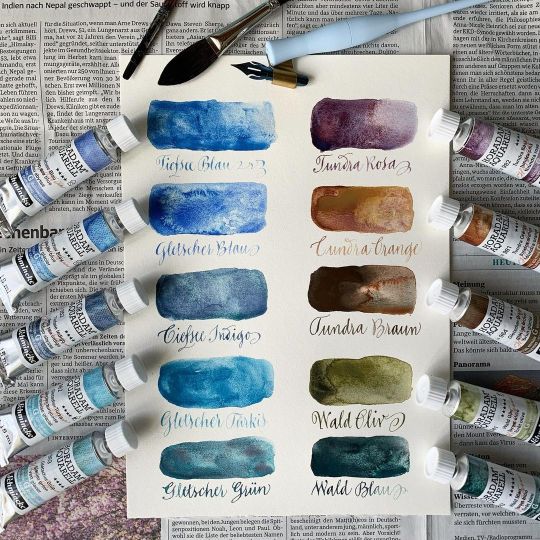
Something a bit different today – I used to do A LOT of watercolor painting in my youth (I learned most of the basics from my father, he was quite good at it and today I treasure his color sets and brushes). I also like watercolor for writing and I’m not sure why I don’t use them more often – the subtle variations in color hues can look so charming. Probably because I’m not the biggest fan of loading nibs with a brush, which is a must if I use watercolor pans (which are what I’ve been using, again, since my teens). :: When I recently saw the granulating watercolors by @schmincke_official, I was pretty hooked – so many interesting blues! They are only available in tubes – and I thought, so I can easily convert them in “dippable” inks like I do with gouache (simply mix an amount of your tube color with water in a small container and just dip away!). I chose a set of blues plus some warm shades to complement them and for mixing neutrals. Here are the first quick color swatches – and for reference, the »Tundra Braun« is actually the »Gletscher Braun« (Glacier Brown, sorry)! :: Regarding how the behave with a pointed pen: in this very quick first test I noticed that some colors worked much better regarding ink control, hair lines etc. – as I’ve seen this happen with gouache too, I guess it depends on the actual pigments how well a color is suited for writing. Pigments that are heavier or less fine are more difficult to work with in my (totally personal and unscientific) experience – the tones that worked better were generally the blues, while the brown was the one that gave the thickest hairlines and was more difficult to control blot-wise … more experimenting to come, I must try this also with other tools – I guess glass pens could do nicely here, or quills. :: And no, it’s not a sponsored post – just a review ☺️! #calligraphy #kalligraphie #kalligrafie #caligrafia #supergranulation #supergranulationwatercolors #colorswatches #watercolorswatches #aquarellfarbe #aquarellfarben #aquarellfarbentest #calligraphywithwatercolors #schmincke #horadam #horadamaquarell #calligraphypractice #letterlove #handwriting #handschrift #flourishforum #federflugcalligraphy https://www.instagram.com/p/CPwUoKRgOUX/?utm_medium=tumblr
#calligraphy#kalligraphie#kalligrafie#caligrafia#supergranulation#supergranulationwatercolors#colorswatches#watercolorswatches#aquarellfarbe#aquarellfarben#aquarellfarbentest#calligraphywithwatercolors#schmincke#horadam#horadamaquarell#calligraphypractice#letterlove#handwriting#handschrift#flourishforum#federflugcalligraphy
3 notes
·
View notes
Text
Mary Lawton.
Bio: I was born on Long Island, New York in 1958, and loved drawing and making art since I was pretty young. I remember really loving Rat Fink, the anti-hero of Mickey Mouse, and tracing pictures of him. I even had a plastic Rat Fink ring when I was eight. I am the youngest of a very loud and raucous group of six siblings who always encouraged me to make art. My parents were my biggest fans, they would parade their friends through my bedroom to show them the murals I drew on my walls. I read MAD and National Lampoon with a fervor, and I still remember some of the insanely hilarious cartoons I saw in those magazines, although Alfred E. Newman's face gave me nightmares. After backpacking in Europe for a while after high school, I moved to Boston in 1979, and became friends with a bunch of artists, some of them cartoonists and animators. We were all enamored of Lynda Barry and Matt Groening, who were bursting on to the alternative comics scene at the time. I devoured their comics, and also loved Roz Chast, B Kliban, William Steig, Mary Fleener, Gahan Wilson, and many others. I knew that I wanted to do what they were doing.
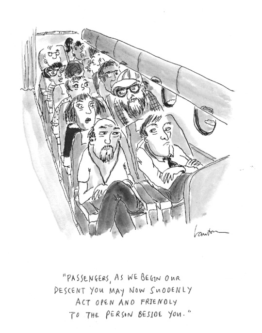
Find this print, here!
I was drawing very primitive, autobiographical strips about my childhood at that time. I sent them out to magazines and newspapers and they began to get published. It was a nice time to be an 'alt' cartoonist as there were so many markets and the pay was great. I also loved cooking, so I worked in restaurants during the day to make a living, and drew in my little bedroom/studio at night. After ten years cooking and cartooning, I left Boston in 1989, moved to Manhattan, and worked at Chelsea Animation, an ink-and-paint studio on 23rd Street. Working there with a great group of like-minded artists was like going to a party every day. Non-stop hilarity. We all sat over our light tables wearing white cotton gloves, painting cels of all sorts of commercial animated films. At that time I took a few classes at the School of Visual Arts at night.
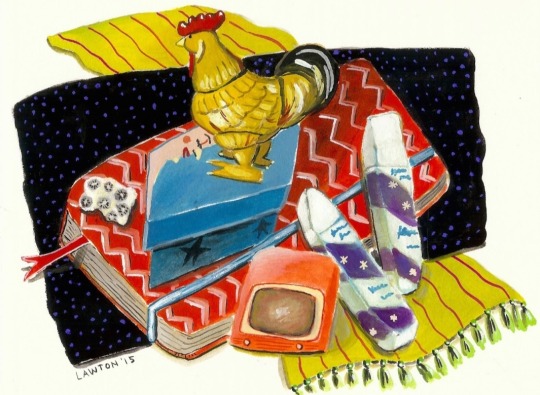
Since then, my art has been in many magazines and newspapers, books, greeting cards, museums and galleries, and I've done a gazillion commissions. In the 1980's I sent samples of my cartoons to William Steig for his advice, because I just loved his drawings and books. He became my friend and mentor, and always encouraged me to send to The New Yorker. I did this for nearly thirty years and finally got one accepted in 2017. I have sold several to The New Yorker online, and a few more in their hard copy magazine. Around the same time, I was invited to join Six Chix, a comic strip by six women, a different one each day of the week, syndicated with King Features. It was created in 2000 by Jay Kennedy, the masterful editor at King, who died tragically in 2007. Mine is the Thursday comic, and every six weeks I draw a Sunday. I love being part of this group of women cartoonists!
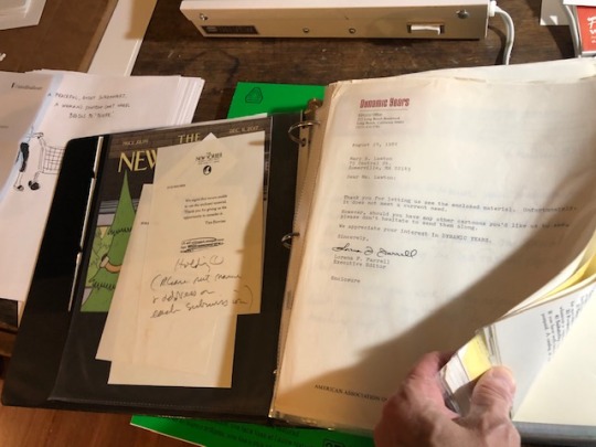
I have saved all of the rejection slips I got since I started sending out my cartoons in the early 1980's. They are in an album that now weighs 4.5 lbs. It's my reminder to never give up, to just keep returning to my work table. Persistence pays.
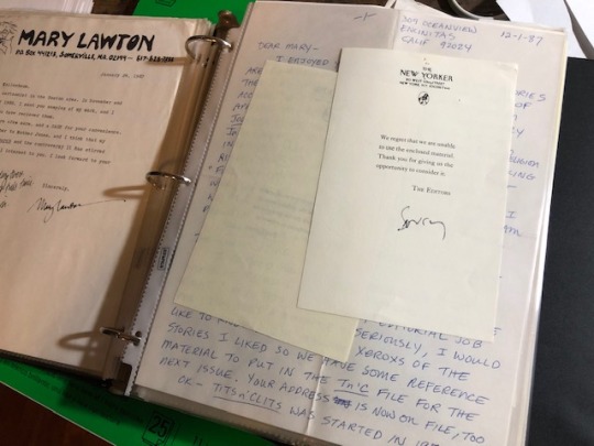
Favorite cartoon: I think my favorite cartoon that I have had published in the New Yorker magazine is my very first [editor’s note: the cartoon at the beginning of the interview], because it was so dang thrilling to finally be in that magazine. I happened to be in New York the week it appeared in print. On my way back home to Texas, as my plane flew over Manhattan at night I looked down at those lights below and I felt like I had really made it. It was a dream come true! Also, since it was an airplane cartoon, I shared it with the flight attendants, who all got a good laugh, and they brought me a glass of champagne. Later that year I was part of the Funny Ladies exhibit at the Society of Illustrators in New York. Liza Donnelly was so kind to invite me to be in the show. To be there on opening night and to meet Emma Allen and the cartoonists that I have admired for so long, felt like being at The Academy Awards. Only better.
I really love to draw political cartoons, so I'm also proud of the ones that have made it into The New Yorker Daily Cartoon.
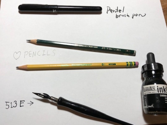
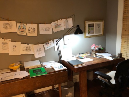
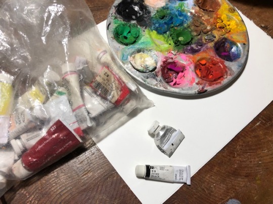
Tools: I drew with Rapidograph pens for many years. I switched to dip pens, which I enjoy depending on the paper. Lumpy or textured paper, ugh. Smooth paper, and it's perfect. I practiced using the dip pen by doing calligraphy for a long time, with lots of different nib sizes and shapes. At the moment I use Pigma Graphic in all sizes, but they are disposable, so I'm on the hunt for a new reusable pen so I don't add to the land fill. I sketch out cartoons in pencil most of the time, then ink in. I love Arches papers, and use them for finishes and gouache paintings. Or Bristol paper. I buy big sheets and cut them up. But every day, I use a lot of printer paper for roughs. The pencils I mostly use are the Faber Castell 9000, in a 3 or 4 B. I also love Ticonderoga pencils, not only for their beautiful name but they feel perfect on Boise all-purpose printer paper. I love paint brushes of all kinds. I use gouache every day. It took me many years to learn about gouache, to finally get how it works. It's complicated because of its soluble nature. I looked at instructional videos on Youtube, and got the hang of it. I use black gouache for my washes, and Titanium White right out of the tube for covering up mistakes, or all sorts of highlights. My old work lamp has a long arm so I can move the light all over my table, which is really handy.
Tools I wish I used better: Sketchbooks! That seems odd, but it's true. My sketchbooks are very messy, and not something I'm proud of, or want to save and look back on. I have seen beautiful sketchbooks which are themselves art pieces, but it's not my style! I mostly want to toss them into the recycle bin once they are full. Also, I wish I could use computer drawing tools.
Tool I wish existed: Can't think of one.
Tricks: I don't look at social media much, and I think that helps my creativity, and certainly gives me more time to do stuff.
Misc: I have three big-time men in my life, my husband and my two sons. Four, if you count my dog Buddy. All bring me a ton of joy. I've lived in Texas for 25 years, and I encourage visitors! We always like to show folks the Texas we know and love.
Website, etc:
Instagram
newyorker.com
sixchixcomics.com
funnytimes.com
narrativemagazine.com
thenib.com
Editor’s Note: If you enjoy this blog, and would like to contribute to labor and maintenance costs, there is a Patreon, and if you’d like to buy me a cup of coffee, there is a Ko-Fi account as well! I do this blog for free, and your support helps a lot! You can also find more posts about art supplies on Case’s Instagram and Twitter! Thank you!
#mary lawton#how to be a cartoonist#mary lawton cartoonist#artists on tumblr#art supplies#drawing process#art process#cartoons#cartooning
17 notes
·
View notes
Photo
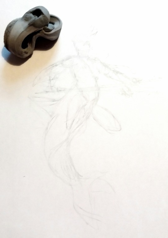
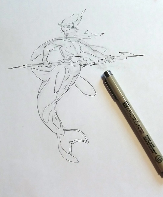
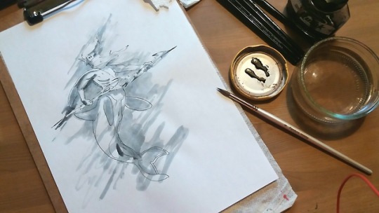
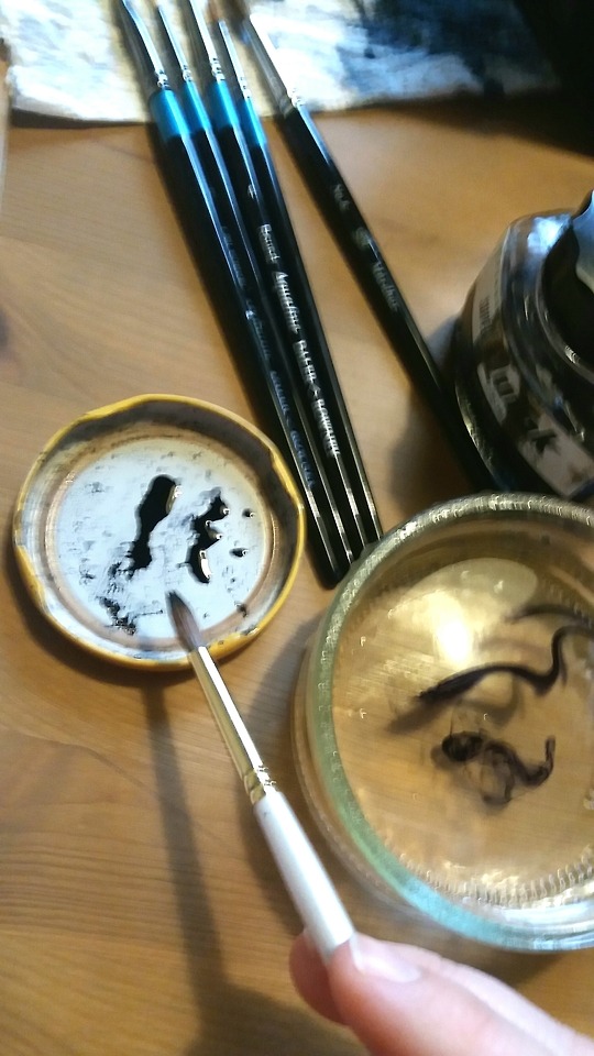
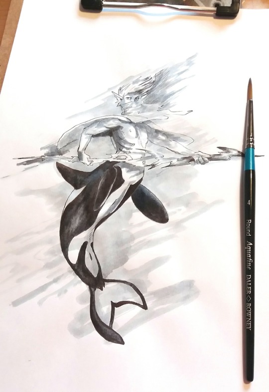
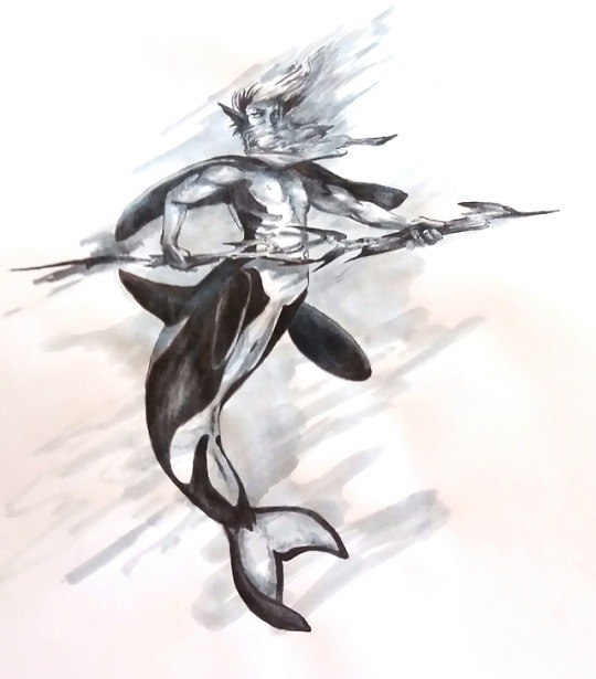
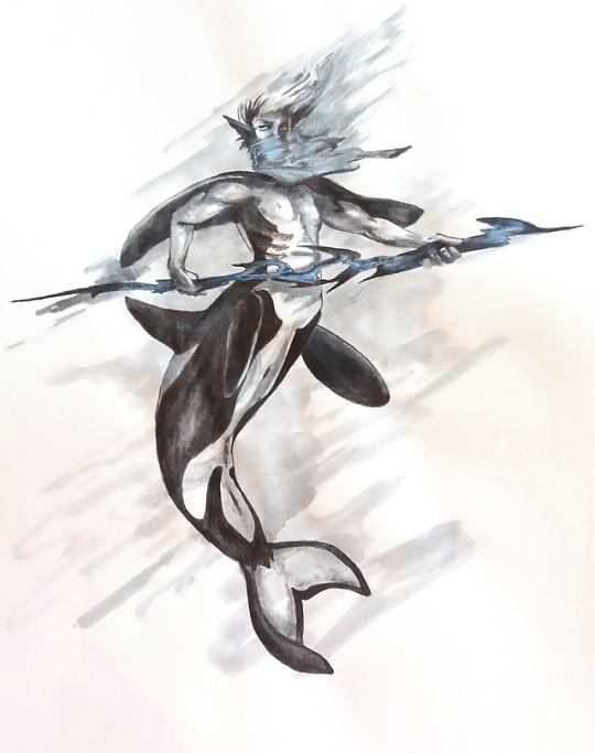
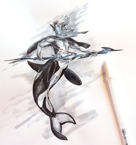
@alaricathecat sent an ask
You’re such an amazing artist! I’m sorry if you got this question 100x times already, but what media do you use to paint your pictures? I’ve been looking for a new media type, and it looks absolutely fun (and perhaps really difficult?) to use, but I’m nothing but stubborn if I do say so myself. Lmfao. Anyway, your art is stunning, I wish I could have art class with you, because I believe I could learn a lot from you
First of all: Thank you
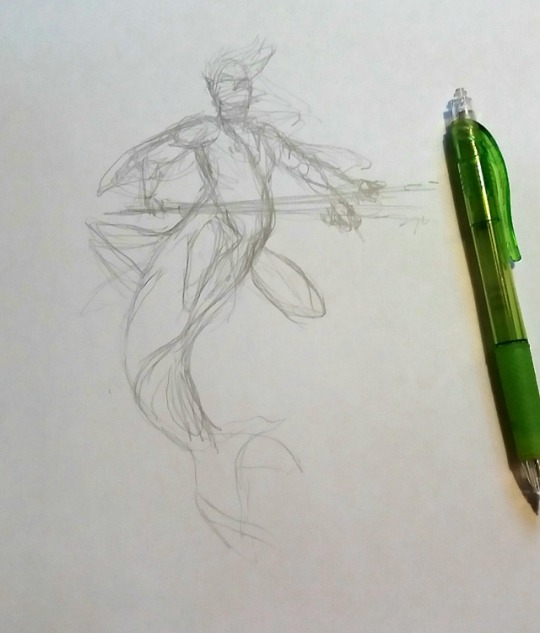
I’m guessing you are talking about the most common style I’m using right now?Easiest way is to show, I guess, so I documented the process of my last drawing ^^ I’ll go into detail under the cut! (there should alsobe miscellanious things under the tag #how I art)
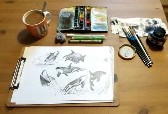
Basically, it’s bottled ink with a few touch ups. Everything but the glass of water is in the first image (coffee, very important, and KEEP IT ON THE OPPOSITE SIDE OF YOUR WATER to minimise risks of inking up your coffee!!), including the sketches I did of orcas in preparation for this piece. Always find ways to nag yourself into some sketch studies whenever you manage! I hadn’t drawn orcas before, so I just set a timer to 40 minutes and drew a few of the first images that came up when googling.
I use mechanical pencil for the sketch, a 2B 0.7 lead, which I get excess lead off of with a kneaded eraser. This help not to clog the tips of pens or brushes with all that excess, and the ink go on the paper not on top of the graphite. I rough line it with a thin waterproof ink pen (today that ended up being a 02 micron) and then use the kneaded eraser to remove the rest of the sketch. The kneaded eraser is worth gold! Get a good brand one, though, because there are some really crappy out there, and the brand ones I find don’t generally cost more in any case. They are supposed to be really soft and possible to drag out loooong very easily and quite fast. You might get stuck stretching it over and over and over and over- yeah.
Then I move on to the ink, and watercolours or gouache depending on what’s closest when I’m about to sit down. The brushes are the only thing I’ve bothered to get hold of high quality ones. I splurged with birthday money, and I’m weak they were so good! A single decent one that hold liquid well and don’t let go of it in great blobs was fine for quite a while, though.
Here come the trouble with my technique though, because what I use for paper is printer paper x’D Not the cheapest one, but step above, xerox big pack for colour print. The surface hold up surprisingly well, and I have also used it for markers as it doesn’t bleed through very fast. If can’t handle liquids well at all, though x’D Bubbling, people! The trick is, as little water as possible and let layers dry inbetween. A bit fiddly, but lower the cost a lot for these not high class artwork pieces. (also a lot of the low cost, but still far more expensive, watercolour papers actually handle water worse than these printer papers, sooo
The ink is thinned out with water, a can lid work excellently as colour cups! A dip into the ink, put it in the lid and add a some droplets of water. I use a clean moist brush, but let excess water bleed out from the brush onto toilet paper, then bring in the amount of watered down ink I want and apply. My different brushes need different ratios of water and ink in them to let go of the same amount of liquid and colour, so learn your brushes! The more expensive brushes are able to let go of practically all ink and practically none is wasted in the water glass, while the cheap brushes always have quite a bit of ink left in them despite not really letting go of more to the paper.
Then it’s layering time. But not too heavy layering, as the ink I use reactivate again. Making sure not to work the surface much, as it too easily crumbles. Oh. And getting distracted by how pretty ink in water is. Maybe dip the brush an extra time just to see the pretty swirls~
First few layers are all over, not that much confined to inside the lines. Help to create more depth and movement in the end. I try to shade the lighter areas first, as the darker colours will bleed when layering over them. The very darkest clear edges last, on perfectly dry paper, to ensure clean contrast lines.
The shading from dark to light, I make sure to have a dipping of water sucked up high up in the brush, then relatively dark ink. When you then go from dark to light, you’ll get less and less colour. The smoother a shade you want, the more important it is to work wet and not risk the paper suck up colour and end up with sharp edges where you don’t want them. Usually with liquids, you apply water first, then add in the colour in the wet area, but you can only do that with good (expeeeeensive) watercolour paper. So, here you have to work fast and confidently.
Or. You know. Get shades in ways you hadn’t planned, and either just make it all lots darker, or pretend it’s all fine. That’s a skill to learn, too! Very important one x’D
I use maybe… 2-5 dips into the ink in total for these pieces, so a bottle of ink really isn’t very expensive compared to what I get out of it.
When I’m happy with the ink, I add in touches of colour. Still with little water, and it will mix in with the ink. Gouache you can layer on top better, but I’m just accenting a bit, so solstice blue it was x3
Then we have the white el tip pen. That I have to stop myself from overusing completely x’D Outlining things like the weapon and dividing line between body and furthest fin to stand out more, added in on the eyes that was a tad bit too dark and adding shinies to body and such.
Lastly I go over with a ink pen again, or possible my smallest brush if I can be bothered, to just touch everything up.
And that’s it. With disturbances and cats and kiddo and all, it took about 1.5 h, preparations and digital after work (adjusting what the scanner killed, and tiny adjustments here and there, made his right pupil smaller as it was too big, for example) excluded.
I really like working the ink and the brushes. It got such life and soul, the medium give it’s own twist on what you try to make. I did get a grip on the ink thanks to inktober, where I at least 2/3 worked with the bottled ink to prompts, so that the point became making something with ink rather than forgetting your medium in favour for motif. Sketching and exercises and time limits, those are what have made me take the biggest steps in art. Making truly elaborate pieces have been about having a bit fun with the skills you have, but the journey of growing as an artist isn’t about those anymore for me. It’s surprisingly freeing, and the day you discover hard work on sketch exercises make you suddenly able to sketch a wide variety of things just like that? It’s complete awe ^^
46 notes
·
View notes
Text
Watercolor Brush Pen Set
The Beginners Watercolors
Watercolor work are far different from oil work. They every have their very own element that provide very different results. As an artist I have enjoyed working in many kinds of medium for creating art, nonetheless, I would like to focus my attention here on my two favorites, watercolors and oils.
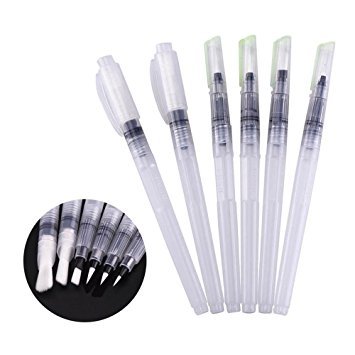
The very first thing that an artist has to think about when she or he begins a brand new piece is what impact do I would like have on the work, for there are issues that you can do with one medium that you simply cannot do with the other. Let us compare the two mediums and see the distinction.
Oil portray can be rather more forgiving than watercolors for watercolors are very not able to be erased or alter much after you start. When working a watercolor you must be fast and know exactly what impact you want. The second that you simply put the brush to the paper the pigment units in. You possibly can choose to place water on the paper before you set the brush on the paper or you'll be able to just lay the strokes right on. Also, watercolors are translucent which implies that you could see by way of it so know what you're looking at for errors will soar out at you.
One other characteristic of watercolors is which you could delineate with much better exactitude than you are able to do with oils. You possibly can put a pen and ink line right to the paper and carry that line anywhere on the paper. What lines of ink that you simply put on a watercolor are clear Vivid Watercolors and everlasting. An ideal weakness in watercolors is that you simply cannot rework it. For example, if you do not like the tone of a colour you utilized, you can take your brush dip it into water and apply that to the tone. The tone will carry out to a point however go away the residue.
Now you apply a brand new tone and see that it's not as clear and contemporary. Additional, in the event you attempt to rub the pigment into the paper it would get muddy wanting and free all it beauty. The key to success with watercolors is to be quick and lightweight. Do not try to edit, attempt to do every thing through on the first time.
Oil painting on the other hand might be very forgiving for you will get a rag and thinner and simply rub off the oils that you just didn't like and rework it. Additionally, oils are much stronger in tone and stand-out even at great distance. Oils have a rich luster that watercolor can not method. Nonetheless, the greatest weak spot with oils is that you can't delineate very will.
In contrast to watercolor where you can introduce a pen and do a number of cross hatching in desired sections of the work, oils don't permit the use of a pen or another drawing instruments, the paint brush is the ruler of the oil canvas.
In a pen and wash painting, the attributes of watercolors are like personality traits of an individual, what makes an individual, or paint, different and distinctive. Every artist creates a mode of their very own understanding their watercolors. Understanding three attributes of your watercolors will make selecting and mixing easier--and enjoyable.
Luminosity refers to how a lot mild penetrate a colour. A transparent color has a high luminosity. How does it work? Rays of light passes through the watercolor onto the paper and reflects back to the viewer's eyes by means of the clear paint. The extra layers of wash you set, the darker the colour, and the less gentle is reflected back.
One of the qualities of clear watercolors is the layering of washes, of the same colour or totally different colors, to provide a desired shade or a distinct shade; layering means to apply one coat of paint on high of one other coat of paint. There are no true clear watercolors, however any watercolor may be made more clear by diluting it with water.
An opaque coloration is the opposite of transparent coloration and has a low luminosity. The rays of light reflect back to the viewer's eyes from the floor of the paint itself, some or all, and not a lot the paper.
Identical to clear colours, there aren't any true opaque watercolors, except for gouache, also known as bodycolor. Watercolors which are opaque in nature might be diluted on the expense of coloration depth.
Lightfastness refers to how delicate a colour is to mild.
Some watercolors are permanent, which means they do not readily fade when uncovered to light over time. No paint is one hundred% permanent so do not have your pen and wash in any direct daylight for too lengthy. Some colors are fugitive, which means the opposite of everlasting. They may fade simply when uncovered to light over time.
Shield your paintings from daylight if they're to keep their depth of colour. Framing your work beneath UV glass is one answer.
Watch out if you have your artwork work near massive spacious windows. Be certain you recognize where the daylight cast its rays, from dawn to sunset, to maintain it out of direct sunlight. Some people do not realize this until it's too late.
Staining refers to how some paint take to the paper.
Some watercolors are high staining, which stains the paper rapidly and completely. These colours are unimaginable to remove regardless of how a lot you wet and blotch them, particularly after the color or colors have dried.
Some watercolors are low-staining and non-staining and can be removed from the paper leaving little or no stain; just moist the realm again and blotch it with a wet brush or paper towel. This strategy can also work after the paint dries.
Paint producers have a ranking scale of lightfastness and other attributes on watercolors and could be discovered on their labels and packaging. If you cannot discover it, name the producer for information. You need to use paints that have a lightfastness rating of I or II by the testing requirements of the American Society of Testing and Supplies, often known as ASTM International.
Watercolors are extremely widespread paints. It is very easy easy to pull out that lengthy box of paints and grab a paintbrush. Then you pour a jar of water and let the pleasure begin. While they're great fun you will do well if you happen to additionally take a little time to get to know some watercolor methods. There are several basic ones to learn but there are also some enjoyable ones, too. This text incorporates a good proportion of each. So, learn on to search out out some suggestions and tricks to make watercolor portray completely great for everyone.
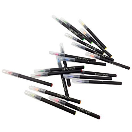
Attempt portray on wet paper. Take a large sheet of paper and make it completely wet by dipping all of it the way into water within the sink. Take cookie sheet or use a plastic tabletop and easy it out. Take a paint brush and put thick, moist watercolors on top. They are going to blur on the wet paper and mix together to make unusual shapes. You possibly can draw on high with a black marker pen after your fuzzy image dries. Great fun! Read on for some more watercolor strategies.
Stick a watermelon or some other form of seed onto a sheet of white paper.
Paint an imaginary plant, perhaps, one with the roots growing from the seed underground, with the leaves and flowers and fruit of the plant relating to the seed that you simply select. This can be academic for teenagers in addition to a terrific recreational pastime. Keep reading for extra great watercolor methods
A "wash" is created when watercolors are brushed on very light utilizing plenty of water. Attempt to paint a scene or the outside utilizing light washes of watercolor. Do not worry if you happen to can not see the element. Go back to the portray when it's dry and use a dark marker or ink pen to add back the element. Creates an attention grabbing impact that will likely be very talked-about with viewers of your work. Are you enjoying these watercolor strategies? Well, there are extra to come back. Preserve reading.
Plastic wrap is magic. First, create an image with moist and colourful areas. Crumple a sheet of plastic while the paint is still wet and in puddles. Easy it down onto the wet paint however don't transfer the plastic round. Instead, simply press it flat onto the paint. After getting accomplished that, set the portray to one facet to dry and while you return and pull off the plastic you can find beautiful patterns within the dry paint underneath.
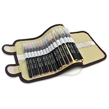
Use bubble wrap to create the identical impact as in quantity four. By bubble wrap I imply the sheets of packing plastic which might be coated with little air bubbles. This makes an excellent different pattern as the paint dries and can also be nice enjoyable, too.
Hopefully, you're getting the idea. You do not want to limit your self to conventional, time honored watercolor techniques. There are tons and many unbelievable ways of making the most of this highly pleasurable passion. Attempt doing a little extra research on this matter and you might be certain to search out more methods that you'll discover useful.
People with younger children typically have to find actions to occupy and stimulate them and portray is a well-liked one. They also like to do issues which can be inexpensive and highly satisfying so they're nice folks to ask for concepts in this space. Go on, strive a few of these ideas in the present day. You may be glad that you simply did.
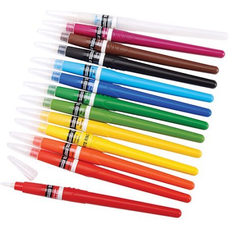
Watercolor portray is a sort of portray artwork, which generates artistic representations, usually on piece of paper with the help of pigments which can be usually water-soluble. Other forms of portray make use of oil soluble paints or dry pigment in sticks similar to pastels. This kind of painting is effectively-recognized to many people in manner of kid's activity performed with colour boxed set and waxed pens. Such coloured blocks are actually swiped with the help of moist brush and the colour transfers itself to the watered brush and there from to the wadding.
Grownup watercolorists use various paints, although. On the other hand, youngsters's variations would not have the amount of shade required to get the results accessible with 'artist rank' watercolor paints.
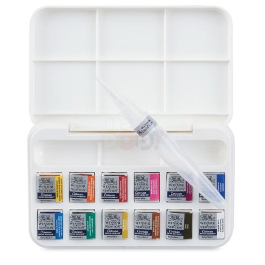
Watercolor painting also make use of different kinds of palette explicit to the shape - naturally a giant flat piece of plastic with depressions surrounded by colours. Yow will discover watercolor paints bought in tubes as well and they are squeezed into these depressions and then let to dry. This is really the same of the children's set of dried out coloured cubes. Some painters/artists further use 'brand new' watercolor paint straight from the tube and do not let it dry. This is because they claim the colors are more energizing if the paint just isn't permitted to dry up earlier than it contacts the paper.
Watercolor portray has a unique techniques meant to different medium. The most quality is possibly the tactic well-often known as wet-in-wet, in that vast portions of the paper are solely moist, either with coloured water or plain coloration. The comb is crammed with shade from the palette and both dived or caressed onto the paper, allowing the colour to run wherever it will, flowering into engaging and stunning patterns, integration with last instruments of different colours and shaping recent shades. Moist-in-moist watercolor portray is in actual fact onerous to manage, however may yield among the most surprising and pleasing results.
If you are fascinated in exploring watercolor craft for yourself, deal with yourself to genuinely 'artist elevation' tubes of paint blusher. Most coat producers render a 'alumna mark' stemma that's considerably cheaper, however these paints instrument not fruit the self outcomes, which could be disheartening to the trio.
Relatively than buying a solon comprehensive ambit of cheaper paints, buy a smaller restrict of the upper caliber paints, since most any apparition can be created from mixing collectively two or extra further colors. As an example, you may mix a really saturnine dim rest a cylinder of inglorious painting blusher of their coat box.
0 notes