#also i tried a little something new with the lineart & coloring
Explore tagged Tumblr posts
Text
Woke up this morning
And my brain said
"Draw the blorbos as royalty x knight au......"
And I physically could not do anything else until I did, so

Zakumint/Pomegranate Tea in the royalty x knight AU be upon ye
It took me way too long to decide which one should be the knight, the pushing factor was the translation of Mint saying "One-Sama" to "My Queen" in New Mew akdnskd
#art#digital art#tokyo mew mew#tokyo mew mew new#tmm#tmmn#tmm new#tokyo mew mew zakuro#zakuro tokyo mew mew#zakuro fujiwara#mint tokyo mew mew#minto tokyo mew mew#minto aizawa#tokyo mew mew mint#mint aizawa#zakumint#pomegranate tea#oh#also i tried a little something new with the lineart & coloring#hope you guys like it
58 notes
·
View notes
Text
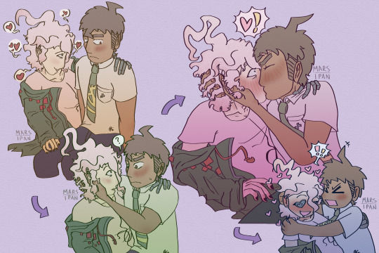
they're so GROSSSSSS (<- desperately wants what they have)
alt color under the cut:
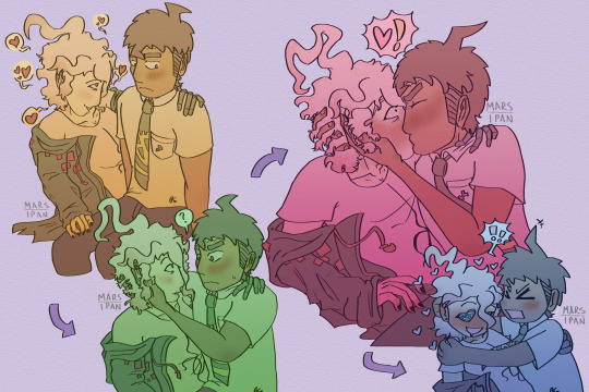
#martzipan#komahina#hajime hinata#nagito komaeda#2 final colors bc my brain is allergic to desaturation. i needed to have One Bright One for my sanity#anyways i think they have this thing when they finally get together#where komaeda will just say. Anything basically. in an attempt to fluster hinata#and it does fluster him! but also sometimes he decides to do something about it#which flusters KOMAEDA even harder bc the dumbass forgets that like. affection can happen to him#which makes HINATA flustered again because 'you can say all that but one kiss is overwhelming?!?'#and they do this. all the time. especially early on before they're really used to each other#and they're gross about it. they do this in public. everyone else has to watch them do this like. thrice daily#they're awful. and also i envy them#tried some new things this time. more character interaction practice which is fun#i think this is likee... the third???? kiss i've ever drawn??? good for them#but i care more about the lineart. i tried to think about line weight at least a little bit :] it is Difficult lmao#this one made me realize i need to do a hips study lmao. also a neck study#in other words a girl needs to practice her joints more#there's still smth bugging me abt hinata's face in the 3rd one. but. i don't care it's done i'm not touching it
49 notes
·
View notes
Text
I've said for the better part of two years, well before it was even announced, that a Misfits and Magic season 2 might kill me, and in fact it tried (in only the best ways)! And not only did it give me the gift of a new all-time favorite D20 episode (sorry, Neverafter's "Once Upon A Time," there's a new dealing-with-PC-death-in-the-most-perfect way episode, and it's "A Place of Knowing"), it also gave me something I've been waiting years for: little lineart symbols that perfectly match my usual tattoo aesthetic, so I can finally get the D20 tattoo I've been dreaming of, for my favorite campaign, no less.
Just one problem: I'm not much for social media, and having consumed all the MisMag season 2 content I can find, I still can't find anything that confirms what all six of the little creature symbols should be. So I figured I'd farm the question out to the internet, and see if anyone saw/heard something I missed. So: the index cards.
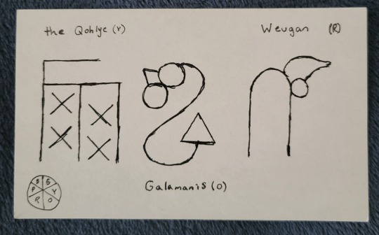
The warm half of our color wheel, as depicted by the Gowcentric Orrery, is straightforward. The symbols appear on Tabby in direct coordination with their names when the Pilot Program visits Galamanis, the Qohlye, and Weugan in episodes 2, 3, and 6. They also all look reasonably recognizable as their animals (I'd say the Qohlye the least, and Weugan the most, but there's still a winged goat, a lizard, and a dog in the shapes). So that was easy. The problem is, unless I missed something, we're not shown the other three island/creatures in as straightforward a way.
Across different episodes, we do see symbols that clearly represent Tabby, the knotted symbol for magic's rules, and, of course, Tabby's enemies to lovers best friends relationship with Jammer, but because they're recognizable, I discounted them from my research. But, in episode 4 (on Seegenpelater) we do see three other symbols, which are never formally explained on the show, appearing when the Pilot Program are conversing with text-Tabby. Without finding anything to confirm or deny it, I've assumed that these three other symbols are in fact the cool side of our color wheel, breaking Tabby's pictogram language into the six basic magic principals he was made to coordinate. Which leaves the problem of working out which symbol is which of our favorite little magic guys.
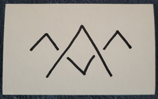
With limited understanding, the only clues I really could think to go off of were the general shape of the symbol, and the word they appear before on Tabby's tablet when he's doing his magic-eight-ball routine. I'm almost 100% certain the above symbol is Seegenpelater's. I'd say this looks about as close to a two-headed camel as the warm side of the wheel looks to their animals. It also was accompanied by the word "doubtful" on Tabby's screen, which I do think corresponds reasonably to Seegenpelater being the basis of illusory/enchantment magic (ie, magic that casts reality in doubt). That would make it the blue wedge, opposite Galamanis, and leaves us with purple (Miskoro) and green (Tadershecourt).
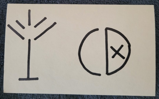
This is where I hit the snag. I don't think either of these especially resembles our boy Tad. I could honestly see an argument for either depicting an antlered creature. My best guess is that the one on the left is Miskoro and the one on the right is Tad: I'd say the left looks to me like a winged guy with a tail, and the right does have a vague skull shape to it. We also see both of these symbols used twice. The left symbol accompanies the phrase "likely," while the right is joined with "ask later." I don't find that particularly helpful, since both phrases to me could be associated with Miskoro's transformation magic, but given that Tad's is a magic of curtailing/lessening, I'd be more inclined to give him the latter (also, I think it looks like a power button, and it's fun to think about Tad's symbol literally being a kind of off switch).
Assuming I'm correct, and that these symbols do all correspond to the orrery (as opposed to us just not seeing some symbols because it didn't come up during gameplay), that would make our full, official Gowcentric Orrery look something like this (apologies for the quick, shitty sketch):
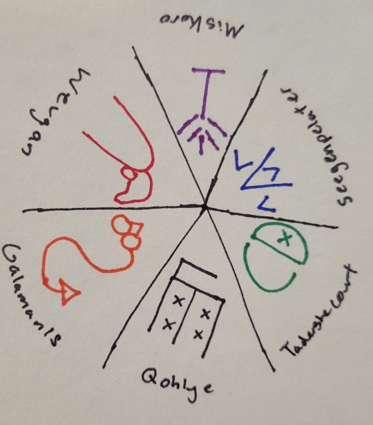
Does anyone know a confirmation one way or the other if this is right? If @quiddie or the Dimension 20 art team has released an official version? I've literally been thinking about this for the past two months, so if anyone else has an answer, or even just a theory, I'd really love to hear it!
#my thoughts#dimension 20#d20#d20 mismag#d20 spoilers#misfits and magic#evan kelmp#k tanaka#sam britain#whitney jammer#aabria iyengar#hopefully thats enough tags that at least somebody with an answer will see this!#I've definitely gotten symbol tattoos from shows without confirmation before#cough cough circular galifreyan#but this one i really want to get right#also d20 merch team release pins for this season#or literally any new mismag merch#im begging you#misfits and magic 2#d20 meta#mismag meta
70 notes
·
View notes
Note
since your art style has changed (and i love how expressive and mischievous? it feels now, idk if that makes sense but i admire the heck out of your growth) what does your process look like now? do you use the same brushes as before? do you want to talk about what you love about your work now? i saw your tag about tlt redraws now that you like your art and it made me curious. anyway love your art so much, nori!
hi!! thank you so much for this very cool question!! i guess before i just drew without much putting any thought to like... anything at all haha, only when i started doing comics was when i actively tried to make myself enjoy the process more.
i just thought about what I hated and tried to change it and just do a lot more art studies in my own time and try to really think about everything... like composition ! and like with colors, i didn't like how i only used to use desaturated tones, when i enjoyed more colors in other art i see.
or with poses, i didn't like how everything i drew felt very static to me, it still does but i'm getting better!! so i've studied dynamic-ness and whatnot.
i didn't like how "realistic" i would naturally go with proportions while drawing when my personal taste enjoyed more cartoon-ish and whimsical proportions, so i tried to be a little bit more loose with that but i'm not all there yet. for example, when i do some reference studies in my own time i find myself copying it 1:1 as it is, so now i try to incorporate it into a specific style without just copying it, it doesn't feel like i benefited otherwise!
i'm also trying to currently improve my lineart, i'm finding it much more enjoyable to draw with a thin brush! my lines were often thick and bulky and not super clean.
and yes!! i used to be loyal to like one or two brushes but i'm just trying new things constantly and it definitely affects the general vibe of the drawing, i've been obsessed with pencil brushes but i'm retiring it for a bit for a more jagged brush that i'm obsessed with now lol (still haven't posted anything with that, (working on it) but it totally changed the vibe.)
i feel like i often know when something looks right but i struggle on how to get there at times, but lately i've been seeing more right than wrong and just generally enjoying drawing.... drawing is my favorite thing.... i clocked in 9 hours yesterday on procreate.
#sorry for making this an essay#i just really appreciate the question#very passionate!#thank you for the nice words too!!
88 notes
·
View notes
Text
Ohhh a wip tag game! :D Thank you so much for the tag @physics-of-one-piece, @darklordofcutlets, @tavsianus ❤❤❤!
Rules: make a new post with the names of all the files in your wip folder, regardless of how non-descriptive or ridiculous. Tag as many people as you have wips. People send you an ask with the title that most intrigues them, then post a little snippet or tell them something about it!
Okay, let's gooooo Since Physics also extended the game to artists (thank you ❤!) let's start from the art stuff! And…. yeah, I have either something coherent or some nonsense titles here 😂 I'll focus on these more or less in progress or the ones I want to finish - almost all of them are about the Donquixote brothers though.
Art:
asasdadadad (believe it or not, this is the Time travel swapped AU comic xdd I’m working on color ver now and/or possible continuation)
comic (another Time travel swapped AU, also a comic, a different one tho)
Cora_ponyo_habu_2 (a rough sketch for Corazón x ‘Ponyo’ crossover)
doffy3 (a color version of King of Dressrosa drawing)
doodles (a drawing of Corazón)
kluska (drawings of Corazón)
otohime (a drawing of Queen Otohime, a present for a friend, a sketch for now)
Cora_enamel_pins (a small merch project, currently working on color ver, though I’ll probably switch from enamel pin to acrylic charm, it’s cheaper)
corazon_2_sdhjsdhad (Cora, Law and Doffy drawing, color ver in progress + some DQ brothers doodle. I like to work on many projects in one file, so I group them or just cover up/hide the works I’m not working on at the moment)
1 (a bunch of sketches/concepts for Doffytober2024 prompt ‘hatred’)
devil fruit_1 (a sketch for Doffytober2024 prompt ‘devil fruit’, working on color ver now)
Brothers - Deities2 (DQ Brothers as deities, one stylized drawing (lineart done, working on colors) + a sketch of another one. An old thing but I still want to finish this)
corazon3 (a stylized drawing/poster of Doffy xd I didn’t finish coloring the thing, maybe I’ll post it in black&white)
the world 3 (a DQ Brothers comic set on Minion Island TvT )
vash rosi_comic (would you look at that, another DQ Brothers comic! Cora's musings about Doflamingo's motives)
shirahoshi 1 (an almost finished drawing of Princess Shirahoshi)
As I also write a little, here are some wips I'm working on (all of them gen and DQ brothers-centered).
Writing:
Time travel swapped AU What the title says. Time travelling Law & Heart Pirates meet little Doffy & Cora. He adopts them takes them in in a heartbeat, though warming up to Doflamingo is a very very slow process. Snippets.
DR st A folder with a bunch of wips for the I've seen you fic. Doflamingo finds slave Rosinante in the Human Auctioning House on Sabaody. He takes care of him and basically decides to wage war on the whole slave market. Cora & Doffy & Donquixote Family, rated T for the topic it circles around, multi-chap + series.
DR - Ghibli - Sen to Chihiro Doffy & Cora x Spirited Away crossover. The brothers are tossed into the Spirit Realm and meet Yubaba sisters. Oneshot.
KSxDR - prologue Not a prologue anymore xd A wip document for the Through the End fic. Doffy & Cora x Blood Blockade Battlefront crossover, multi-chap.
A Battle of Will Corazón-centered, CoraFest wip, multi-chap. Corazón, for some reason, tries to quit smoking, this time for good. The Family has a lot of fun with this.
Pralnia Tsuru - spinoff (translation: Tsuru's Laundry Room - spinoff) Tsuru & Cora & Doffy fic, centered around and exploring Tsuru’s powers, how they can affect people and possibly change DQ brothers’ story. Two chapters, the first one focused on Tsuru and Corazón, the second one on Tsuru’s powers and Doflamingo.
That's all I think! Though still more than I thought xd That was fun! :D I’m fine with posting snippets for both art and writing, so feel free to ask if something caught your eye.
Tagging time! (no pressure tho ❤) @flamboyant-vampire, @mercyannmay, @sugarpsalms
I don't know who else to tag, but feel free to join if you want to!
#one piece#vewu art#donquixote rosinante#donquixote doflamingo#donquixote corazon#donquixote brothers#tag game#art#writing#that was fun! :D#now I just need to finish these#:)
10 notes
·
View notes
Text
I am looking thru files rn and take a lot of pictures of my own art for progress, bc I think like many creatives, it's hard to explain or describe how i get from point A to B in art. im a horrible teacher but this piece for example: (explained under cut)

i tried drawing their little cafe outfits really fast but i just didnt vibe with it. idk what made me want to redo the whole thing. i like the attempt at cooler colors for asougi though. so then we move onto these and:

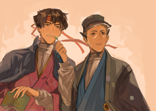
the first pic looks like an absolute MESS, but what i generally do is get a sketch down, and COLOR out of the way first? I assume it's to set the general tone/ vibe for the piece, which is why you notice a lot of plain color blocks in the bg. then i go back and do lineart and merge all the layers to paint! :D
tbh it's a very back and forth process, and the best way someone described it to me is "you put down blobs of color and then go crazy" which is very, very true.
I think i like the aspect of "carving" in traditional art, where you kinda play around with paint so you go over it again and try something new. so i try to apply that to digital. i think in a lot of my pieces you can see i teeter on the line of messy lineart with color to full blown painting.
anyways there was no point of this, but this is why i always wanna keep track of old art and why i go and revamp old concepts. like i can always try again! also why thumbnailing is very. very. important. but my main goal in art is to have fun when u can, so that's why i play alot.
#mine#no one asked for this but im thinking about my art a lot#and how much it's changed#we've come so far sniffle. like im so serious when people who have followed me for a while are the strongest troopers bc. e#AS LONG AS I IMPROVE THATS WHATS IMPORTANT <3#sometimes u need a yaoi ship to push u to the brink of insanity and suddenly you appreciate art and learn. life is beautiful
44 notes
·
View notes
Note
Hello! first off I just want to say that I love love love your art!!! its so amazing! 💖 So, I’ve been asking this question around online, so I hope you don’t mind! (Please feel free to ignore this ask if you don’t feel like answering!) Anyway, I’ve been drawing for a good while now. It’s always been something that interests me, but, in all the time that I’ve done it, I’ve never once found a style that is unique to me and that I’m good at. So, I was just wondering if you have any tips or advice on how to find your own style? I’ve tried so many though I can’t ever seem to like any of them or actually stick to it. One thing I really have trouble with is proportion. I want my style to be more chibi-esqe, but not completely if you knows what I mean lol. If you have any advice for a fellow artist I’d really like to hear it!! Please share your wisdom :D
Hello and thank you !! I don’t mind at all ! Let’s see…
For finding your art style:
► Define what you want to tell with your art. Not mandatory, but i think it helps. What do you want people to feel when they see your art? Do you want them to feel the emotions of the characters you draw? Or be impressed by the technique? the colors? All of the above?- I think your answer will lean you to something more specific in terms of style. For example, I tend to focus on characters expressions and feelings. So i have a relatively simple artstyle that allows me to focus on facial traits a bit more. (Also... i'm lazy- So i like to tell more with less)
► Observe drawings from artists you love ! Try to analyze what you like so much about it. Is it the lineart? the specific way they draw eyes or any specific part of the body? Is it the colors or the rendering style? And try to reproduce it yourself. Not in a plagiarism kind of way, but more as a study !
► Try, fail and retry again. Once you have analyzed the things you like, try to incorporate it into your own art. It might come off badly sometimes, but you also might create happy accidents ! Both outcomes are good learning. And while I don't think it’s possible to have a style 100% original, it doesn’t mean you can’t create an artstyle that you own and feels as uniquely yours !
► Be patient (trust the process and don’t be too hard on yourself). Defining your artstyle might take years to refine itself. Decades even… With practice and dedication it will come naturally to you ! But as with any discipline you have to be patient, there will be ups and downs and very frustrating moments but you never cease to learn.
For proportions:
► Don’t be shy about using references. There is no such thing as cheating in art (if used properly). It builds your visual library, so help yourself as much as you can ! Professionals use them all the time too.
► I don’t want to be the bearer of bad news, but…. We can’t really cut anatomy practice- I avoided it for so long myself and I regret it bitterly. So don’t be like me and practice your anatomy ! Even if you aim for a simple or semi-chibi style. The trap is it seems easy to draw , when in reality a lot of chibi artists already master anatomy to a certain degree. It’s much easier to simplify shapes when you know a little more about the structure behind them.
There are a lot of websites to help you, here’s a few ! http://reference.sketchdaily.net/ https://line-of-action.com/ https://www.posemaniacs.com/
My advice is to start slow. Most of those websites have a timer by default, but don’t set a time limit for now and take your time on each pose. Try to breakdown body parts into simple geometrical shapes. It helps grow your visual library and it’ll get easier to draw with better proportions !
___
Here you go ! I realize it's very generic sorry - TLDR: don't give up ! If you want anything more specific don't hesitate to ask again, I'll do my best ! Good luck on your art journey ! ♥
15 notes
·
View notes
Note
if you have the time/energy to elaborate, what's your process like for coloring stuff you ink traditionally? i've figured out a few different methods over the years, but i generally stick to fully digital or traditional for a piece, so i'm curious to see how you do it! :0
This is such a fun question for me because I get to both ramble about my art process and have an excuse to throw some colors on this Breloom I drew ages ago.
I use Clip Studio Paint and an Ipad for my digital stuff so I'll be referring to the processes on that but I'm sure there is a work around for other programs as well :^)
I scan my traditional art at 400dpi because it's always easier to work bigger with digital stuff and resize it smaller then the other way around :^)

So here's our raw scan, which already looks very decent but when I want to color something I like for everything to be much cleaner/sharper/more contrast-y and to get rid of the noise from the paper texture lmao. A well lit photo will also do the job because that's what I did for many years before getting my scanner but tbh if you're a traditional -> digital artist like myself a scanner is like a best friend you can buy HAHA
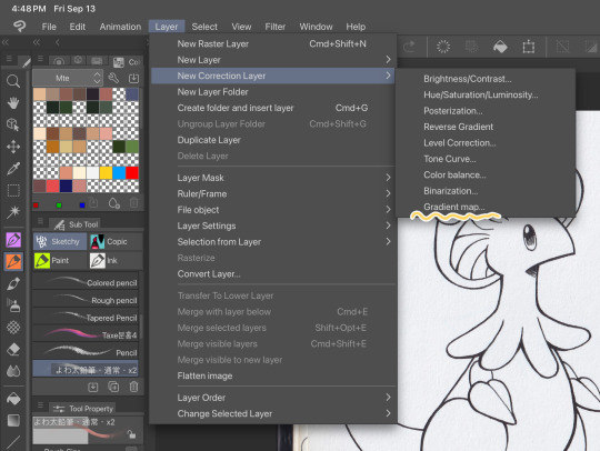
First things first, I apply a Gradient Map Layer > New Correction Layer > Gradient Map
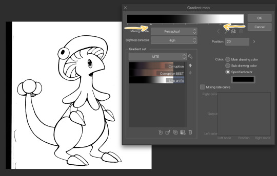
Clip has a really nice black and white map preinstalled but I made myself a custom map just by pushing the black and white a little closer, it completely clears up all the noise and makes everything really crisp! Make sure you check on your lines when adjusting things because super fine feather lines can sometimes be lost if you make the contrast too high. Extra tip! If you want to make Graphite Pencil or Ball Point Pen really nice looking as well, just add a dark grey point in the gradient map closer to the black then middle...works perfectly :^)!!
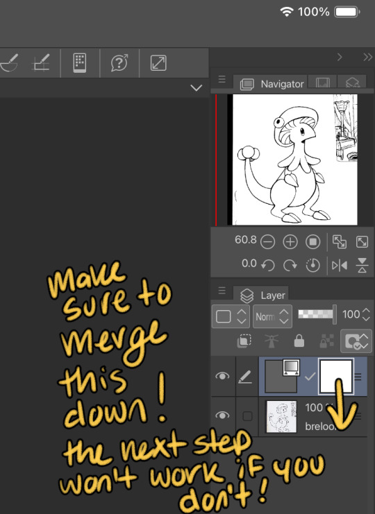
This is the point I look for stray pixels, cat hairs, ect and make sure to erase any surrounding doodles or sketches I don't want included.

GOD DAMN Those lines are CRISP-Y!!!
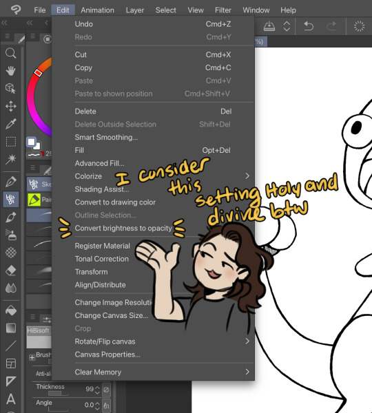
Next up we're going to want to go Edit > Convert brightness to opacity
Tbh If I didn't have this method idk what I would do with myself.... I've tried the whole "Lineart on top layer set to multiply" Method and ...ehh....
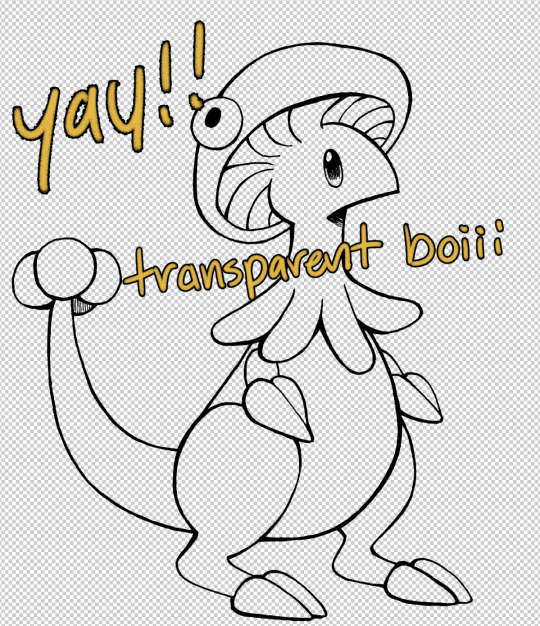
Now that I have a nice transparent line art I'll stick a new white layer down below it because the checker pattern hurts my eyes LOL
I'm going to add a read more here since this post is getting lengthy haha
I'm going to quickly go over the style I use for MTE! It has been refined to be quicker and easier to do since you know...I have a week time limit per page ... 😭 I have a completely different way I do colors for other things I want to spend more time on but I might explain that one in the future...I'm running out of steam tonight LOL

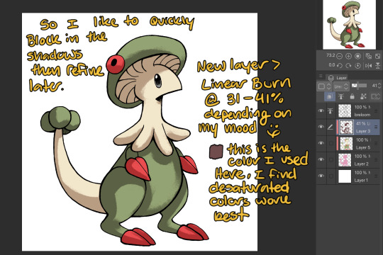
I use this really awesome brush pack that has a pencil like texture and I love it to bits...here's a link to it if your interested!
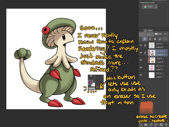
At this point I might add some overlay layers or play around with an airbrush but I think this guys done for now :^) I tend to stay away from highlights with my shading for MTE..My biggest goal is to make sure everything is clear and readable! That being said I break my own rules all the time for special panels that need the extra 'oomf!'

Slap a lazy square background and yay!! He's done!
Hope this was interesting aaaa Thank you again for the ask!!
#art#traditional art#digital art#digital colors#breloom#pokemon#ask#tutorial#art process#coloring tutorial
9 notes
·
View notes
Note
‘Twas both 👁👁, but yeah honestly I’m very interested cause damn- (sorry if I seem awkward I’m not good with online interaction 😭😭 LMAO)
NAH no worries you're doing fine!!
It's a pretty wide array of topics but touching the surface of it, I'll go into my art process.
Here's a short thread where I went into this similarly!
I pretty much follow the steps of what I mentioned there, but it varies a little bit based on the style I go for too: painting whole illustrations or design or more simple fun things.
I could describe what I did in each frame of my process gifs which I've posted before but I would need some time. With big pieces, the steps I go by (read slowly, it's a pretty dense text):
thumbnailing -> sketching with bigger shapes to get the line of action/feel (that is, I'm just blocking out the composition) -> refine that a bit -> hide BG, draw the characters (lineart) and add the base colors of them. (then merge & rasterize a copy of it for later) -> put them back in the environment (unhide BG), make them grey -> add shading in greyscale style (multiply layers, glow dodge layers, you name it) -> get that previous rasterized layer back and put it on color mode -> those characteristic shiny parts get a new layer with overly saturated + high brightness colors -> color BG with a new color layer -> then rendering/refining for concerning amounts of time -> add effects and change color/brightness/contrast curves + gradient map -> profit???
For software, I generally use Paint Tool SAI (I adore blending/painting here), I use Clip Studio Paint for the 3D posing library/sketching/lineart, and Photoshop for final effects. (Update: I mostly do all things in CSP now)
(if you have CSP, try out this brush... it saved my life)
As for improvement:
I experiment, watch a lot of youtube videos (I personally like the ones which analyse an artist). I suggest thoroughly understanding how something moves and works (for anatomy I can recommend the book 'Anatomy for Sculptors'), I also study and jot down important pieces of advice or insights to a collective document, rather than saving them to my device where it is highly likely to be forgotten.
I believe if you put great importance on colors and composition, that can cause the most noticeable, 'fastest' improvement, at least if you view it from the lens of social media. (While online environments provide significant reassurance, it must be engaged with in moderation, as it is easy to fall into a lot of negative mindsets, taking the enjoyment out by perfectionism, comparison, or seeking validation, etc.)
Another improvement technique you can try is to slow down a speedpaint video of your choice and follow along with the artist. Extremely useful, I recommend, put your artist under a microscope.
Of course I don't do all of these things every single waking hour, it's just a side hobby to my unrelated studies in real life. Even if you don't actively draw your visual library and knowledge can improve passively, I find that so fascinating. I don't touch a paper for months and there's a sudden jump, like damn what. (Not saying you should do this, active learning is still better ofc) Either way my point with that is, that improving does and did take a lot of time for me as well.
Apologies if this goes all over the place, I tried to touch upon every subject that came to mind at the moment, in not too much in detail, overall I hope it makes sense
If you have any specific questions related, feel free to ask! Or if there's any specific problem you'd like to tackle but find yourself lost, same applies!
#i wrote this before sleeping so it might all be chaotic/nonsensical#thank you for the ask!#asks#art tutorial#art tips
13 notes
·
View notes
Note
Hay :D
Can you tell us what do you use to color your drawings on traditional? I need some tips •́ ‿ ,•̀
why hello!! Sorry for such a late answer!!
so, I’m a fun little something we call ✨inconsistent✨(sigh) so while I may not be the best person to ask…but here’s things I commonly use color wise (favored art supply dump)
Alchohol ink markers
I use these most, they are a beautiful thing, my favorite are Ohuhu as they are high quality and a much lower price then brands such as Copic. (Can you taste the salt.)
They have less blend ability in comparison to Copic but are overall a much better investment if you ask me! They are great for a more smooth look! Another one I have around that I use for less saturated colors is touch youch youch
I very much prefer brush pens over the chiseled ones, for a paint like experience, and more dynamic application! Again these are just personal preference!
(I have a bad habit of opening ink capsules and painting with ink. I would not necessarily recommend this.)
Watercolor
There’s lots of pretty nice watercolor you can get for a pretty cheap price! The ones I prefer currently are MeiLiang, I got them online for a good price and they are very nice!
That said I do mix around different brands and such, whatever is on hand.
Gel pens
I love gel pens, even if you just have like one or two it’s such a difference!! I love just having white ones for adding little details and such to drawings! You can also get colors if you like! I use the Jellyrollers!
Colored pencils
a lot of people hate colored pencils which I get, but I find them very helpful for detailing (when I have motivation to do so lol) I often use them on top of drawings I’ve layed down a base of alcohol ink with! That way it has a clean base and can add the fun texture and stuff afterwards!! Those smooth looks can be achieved with pencils alone, I often just don’t have time for that :) it’s very fun though, layering is key with pencils
I do very much enjoy prismicolor colored pencils!!! It’s an investment I don’t regret lol, although I’m sure any soft core colored pencils would have the same effect!!
Posca
occasionally I use posca markers for large poster sized drawings, esp for the ink capsules. I like the paint coverage!! That said they can be a pain to work with.
it’s probably not good to be like me and use all of this on sketch paper. (I know. I’m aware that that is psychotic.) but I do normally use sketch paper, getting some multi medium paper might be good if you are interested in paints inks and pencils though, that way you can use it for all of the above :))
Color wise that’s what I commonly mix and match with, when it comes to pens my FAVORITE pens to sketch or do lineart with are Tombow calligraphy pens. Simple brush pens, it makes detailing harder but I enjoy the dynamics. There’s lots of micro pens you can find for small details as well!! I also prefer to use mechanical pencils for sketching, simply because the mechanical lead stays thin and sharp instead of getting dull. That said, I use very cheap mechanical pencils, and sometimes you need a full pencil depending on the project.
There’s a little mini rant on the art supplies I use color wise, again these are just my preferences from what I’ve tried!! I’m by no means a professional haha, i very much experiment and make a mess of things!
Traditional art can become…quite the investment. Especially when it comes to buying all of the art supplies as your resources dwindle. I have to buy new art supplies much more often than I’d like to admit.
All that said, I am a firm believer of art being able to be formed from any medium!! >:D
be it a simple 2b pencil, a ballpoint pen, or crayons products, I think anything can be used to make something really pretty :))
Only real advice I have is don’t be scared to mix and match, get messy, and experiment!! Do whatever’s most fun, and don’t think you can’t make something great from something simple!! There’s no real rules. Only techniques and suggestions. It can be daunting because there’s no undo button in traditional art, but I think that’s a really good way to expand your abilities :0 it teaches you to roll with mess ups and learn how to work with them!!
Most importantly, let yourself learn from others, but NEVER let people force how you use your supplies, don’t be scared to beat them up if that’s what you need (the art supplies not the people.), and don’t think you need the fanciest things to make nice things >:D
if you want more specific tips and such feel free to ask, I’ll do my best to answer :,)
#karineverse#art#traditional art#art rant oops#I’m probably bad to ask as I use a mix of whatever I can find#But these are some things I like to use!#hope this helps :.)
13 notes
·
View notes
Text

mercedonius
typical rambling below
felt like i should get some art in this weekend so here’s some little doodles of most of the high calamities. naturally, i’m still struggling to nail down azathoth’s design but i’ll get there at some point im sure. I’d like to say 6, 8 and 9 are ever so slowly coalescing into character ideas… but not really. these are big positions that rightfully need to be filled by the proper ocs. every high calamity might be graded as mercedonius, but not everyone graded as mercedonius is a high calamity, after all. does anyone know what that means. i don’t know if i’ve posted enough rambles yet.
everyone bar trinajm and demi have had their palettes tweaked a bit. i’m happy with where nam nams and demi are at design wise and thank god for that because it feels like it took me a million iterations to get here.
ging
ging’s design is one i can say i’m not that happy with. i like his current design conceptually, but honestly, i feel like i could do a lot better as a whole. i sort of want to play around with what kind of kind of animal he resembles. and also give him a consistent outfit while i’m at it too. someone remind me to draw his shamisen again sometime. speaking of which, it’s one of the imperial regalia grade relics! isn’t that neat?
ptah
i love ptah. so glad i invented him. his new colors are fine for now? maybe i’ll make him more orange? maybe i’ll make him more grey? maybe just his overalls? not sure. i do like him being composed from a single group of samey washed out tones. this is fine for now! he looks so cute! which he shouldn’t!
father
it’s been years since I tried to color father, and it’s let me remember that i’m not really sure what his skin tone is. with viné and asmodeus having demonic skin tones since their descent into hell i’m not all too sure what camp to throw him in. his all black outfits look better in my head so for now i’ve given him his classic lavenderish black look. he looks okay! maybe i’ll have to make him look more like blackjack from blackjack
nayra
i made her purple instead of blue. I’m fucking with it. Gave her an orange top for fun. Go nayra!
qiyama
i really don’t know what i’m doing with colors for qiyama’s design as yama materia. like seriously. i definitely like this red variant compared to the previous blue, but like… I dunno… i’m not sure what to do. he looks good as uncolored lineart for sure but i gotta figure out SOMETHING. This is okay for now. Whatever.
i’m planning on turning these doodles into stickers to print once i get them cleaned up a little. Or get someone else to redraw them. I’m gonna throw em on my phone case!!! And theyll live there forever!!!! Muahahahaha!!!!!
thanks bye
#oc#ocs#oc design#original character#relicverse#mostspecialgirldoodletag#peerless immortal ging#trinajm veloc#ptah kghtfnagh kailash#father#nayra medulosk#qiyama dreadnaught nihilo#demiurge#planeswalker association#hundred nights guild#insiders#alejandro#starshot#flg#kailash clan
0 notes
Photo
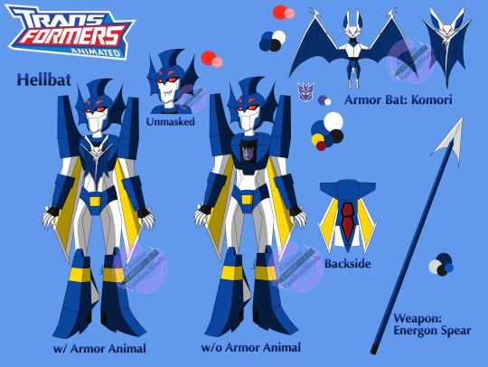

Let me tell you that this is my best work so far and I'm really proud of this reference I made for Hellbat in the TFA style. But it took a while, from sketching, linearting to coloring, however it was helpful to learn a different artstyle and practice it out with one of my favorite transformer. I got into Transformers Animated when I was rewatching some videos of the show and people talking about it, so I decided to watch the whole show and I forgot how good the show was. That and it was all 2D animated, so yeah, it got me hooked. X3 I never thought this was the push to try another artstyle and I'm glad that I encouraged myself to do it. I'm so glad to get into another TF franchise and create a new AU story for TFA. I'm so excited to practice more on the artstyle and write a new story about this AU. ( Hehe, I plan to write a new story but it'll be awhile, though it's going fast with a few chapters being written) So without further adieu, here's Transformers Animated Hellbat! ----------------------- Not going to lie it was a little tricky with designing him. I had seen a few artists draw him in the style with their own interpretation. So I gave it a try with the inspiration and the refs of other TFA characters. Sketches were drawn and practice was done for Hellbat, I tried to make him with his Victory look with the wings, chest plates and armor. He got his boxy arms and legs. His helm stayed the same but his fins are a little big. he has like the thrusters on his peds, like rockets. He got claws now and a tricky part and the change in the design was the tail fin. (The part of the plane at the end of it.) This was something I took from his Hades figure that I have. The tail fin is on his right leg than the left leg like his figure. Thought it would make him a little different from other seekers. He has this odd feature making him like the black sheep in the seekers. And yes he has a chin, kind of, it's more sharp and this design is him being younger in TFA. --------------------- Which I will talk about in his personality in my AU: *Hellbat is a young seeker who works under the great general Deathsaurus. *He lives in the fortress on an organic planet after the Cons lose the Great War and were exiled. *Lives with other cons that are his 'teammates' 'classmates', though, he's not good socializing with them. Avoids them sometimes... *He's a cheeky, sneaky and a good liar that is training to be a warrior. Though his teachers don't think he'll be a good warrior... *He's a yandere, kind of, but gets protective with someone he really likes. Due to not having friends. *He's also a good listener though bots think he isn't paying attention to things, when really, he is. *Is good a doodling pictures on a datapad. :) *His loyalty is to the Cons and to Deathsaurus. Though, that may be challenged later on in the future... *Wanted more than living in the fortress, wanted to go out to space and help out the Cons in the name of Deathsaurus. *He uses his tricks to get what he wants in info to getting bots to feel he isn't threatening, when he is with his words and empty promises. *He crashed landed on Earth years ago after what happened to the ship he sneaked on where Megatron was and was in stasis for 50 years. He woke up dizzy and confused on what happened till he remembered. He was left on Earth all alone at the time as he tried to contact Deathsaurus to get someone to come and help him off the planet. Little did he know, he would meet someone, someone he would have a new idea of to fool to siding with him and the Cons... He would become a spy on Earth for Megatron. ------------------- There's a lot I would want to talk about TFA Hellbat but it would be too long, so I'll may draw or write, showing his personality more. I hope to get the AU story going soon. Till then I hope you guys like the design and the little writing about him. Also this is a big post for me on this site! So hope it’s not too much for you guys! XD I also have another design of him with a different chin, it makes him a little older but it's personally looks cool on him. It’s a favorite of mine. :) Anyways, I hope to finish up some art I have and post soon. Till then, Enjoy! And Happy Friday! Have a great day! Art, Design@Mine Hellbat, Transformers Victory@Masumi Kaneda, Ban Magami Transformers Animated@Hasbro, Sam Register, Matt Youngberg and Derrick J. Wyatt (Rest in Peace)
#tf animated#transformers animated#transformers#transformers victory#hellbat#character design#referencesheet#design#drawing
24 notes
·
View notes
Text
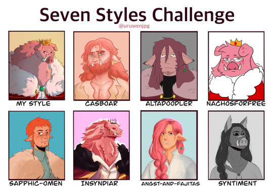
I challenged myself to try and mimic the style and designs of seven different artists. And what better subject to draw than technoblade who has some of the most varied designs.
Each artist's style proved to have its own challenges and I've learned a lot of new techniques while I studied them, some which I might even start incorporating into my own art moving forward.
This was very fun to do, thank you to the artists who volunteered (and to those who got selected out of the blue). Please go check out everyone here, they are all extremely skilled and cool people.
Artists featured:
@casboar
@altadoodler
@nachosforfree
@sapphic-omen
@insyndiar
@angst-and-fajitas
@syntiment
↓ Close ups of each and added commentary below the cut ↓

Casboar was the first one I tackled and I may or may not have had a mild breakdown having to remember how to digitally paint people. But being able to keep in some of my construction lines helped in figuring stuff out. Their Techno design is very fun to draw, big fan of the dad bod.
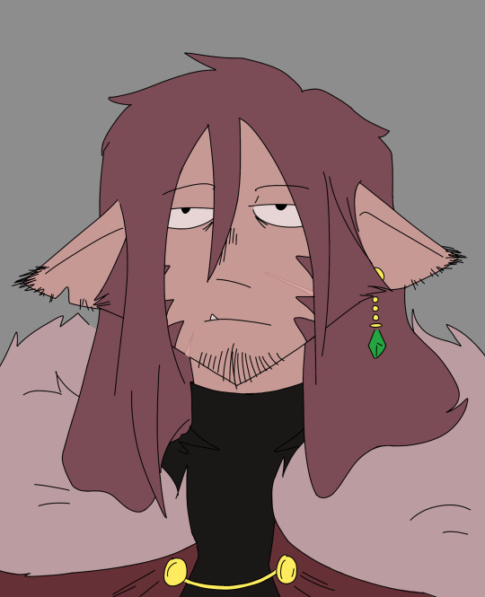
Alta's style intimated me a lot going in due to the more stylized 'cartoonish' feel and the fact that I had to use a brush I'm not as familiar with. But after I finished the sketch I knocked out the lineart in a few minutes and it was easy sailing from there. His stye was actually really fun to draw in once I got comfortable, good shapes there.

Going into this I was the most anxious to draw in this style, I was extremely worried I'd butcher the lineart. But similar to Alta, after I doodled for a bit I was able to get into a good flow and knock this one out pretty quickly. I also had to improvise on the brush since I don't actually have any pixely brushes.

This was the first style to be really challenging. I couldn't find a brush that fit right and all of my sketches were too similar to how I normally draw. So I ended up sitting on their blog and staring at their art for a few hours until I finally pushed myself to start. I probably stayed a little too close to the original sketch since there's definitely some messy parts.
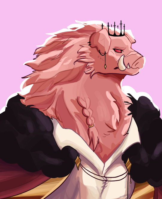
This is the one I procrastinated on. Syn's way of shading/lighting is so cool looking but also terrifying when I remembered I had to do it. I had to alter the sketch several times and marked out where the highlights and shades were going to go. I definitely could have pushed the colors more for better contrast but I got to the point where I was too scared to keep working on it in fear of messing something up.
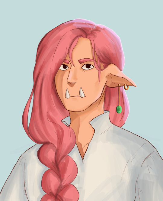
Realism has never been my strong suit and this is the one I'm the least happy with. Emma's art style kind of reminds me of d&d art and I tried to channel that when drawing but the sketch was too close to how I normally draw and the lineart got messy as a result of that. I should have pushed the value in the shading too but same with Syn's it just got to a point where I was too scared to keep messing with it.

I decided to go monochrome for Syntiment. It looked better that the colored version I did and also I think it just makes stand out more there were also a lot more references to work with. Unfortunately long hair is my enemy, I struggle a lot in drawing it and I had like three layers of sketches just for the hair. I also drew this and Emma's back to back so if they look similar no they don't
409 notes
·
View notes
Note
please talk about the doing the dishes comic pleaseplease i am begging you i am on myknees please your brain is so massive plea
THANK YOU HAHA that's very sweet of you to say <3
i tried to make a symmetry with the color palettes used throughout the pages! the borders go around the color wheel: starting in orange and culminating in black, and then going backwards to orange again (roughly, as i did change the hues a bit the second time around to keep them visually distinct and appropriate to the tone i was trying to convey). then the last three pages are yellow, green, and red specifically because those are the colors i associate most with them (i love playing with the fact that green + red = yellow in additive color!). which also means i picked all new colors for Everything in Every page lol but the use of color (and the lack of it) has always been very important to the way i convey things in my art so i enjoyed being precise about it. there are certain constants throughout, though; like the color i used for "black" (lineart, vanitas's speech bubbles) usually sits around dark blue, and the color i used for "white" (their shirts, ven's speech bubbles) mostly sticks around pale warm colors.
and the seventh page being the only one to use pure black and white was very intentional of course. also the poses there are inspired by christian iconography of saint michael stomping on satan.
this comic ended up being a lot about hands for some reason. maybe something about how touch is the first frontier for connection (see further below for notes on corporeality and hugs) and also a little bit of me bringing back ven's original left-handed design and my headcanon that xehanort forced vanitas to become right-handed.
ven's "i'm with you" is a reference to sora saying the same in kh3 about roxas. and the backstory for ven's nickname and the "pure light and pure darkness don't exist" line are from the bbs novel.
vanitas is washing and ven drying because of the water = darkness symbolism in canon and ventus = wind.
but also fuck canon. in this house we ignore ux’s retcon of vanitas’s origins.
similarly when i mentioned in the other essay that i saw vanitas calling ven "brother" as an approximation of their complex relationship: in canon it seems he only calls ven that because he wants to claim total distance from ven’s identity, as re:mind hints and ux reveals that he technically is a separate being from ven/didn't originate from within him. but once again fuck canon <3 i'm repurposing vanitas calling ven his brother, as well as ven saying "we’re not brothers we’re the same," for my own lore which is "we don’t know wtf is going on and we’re trying to figure it out over time." in my lore they’re comparable to alters in a system; "we’re brothers" + "we’re the same" are Both equally true and untrue statements.
anddd i didn't address ven's "we're the same" line in that essay because i forgot it was added in re:mind, so when i tried to search up that cutscene for reference and saw the original version without that line, i was like "well i guess i made that up in my brain" aksjdkddf. so really, my more detailed thought on it is that vanitas calls ven his brother as his own sorta-metaphorical-sorta-not approximation of their relationship -> ven is resistant to that label at first because he doesn't understand it or their relationship yet -> he accepts/uses it for the first time in my previous comic, trying to affirm vanitas’s existence using vanitas’s choice of words (while having his own internal nuances and interpretation of their brotherhood as informed by his brotherhood with terra) -> vanitas is like holy shit we’re brothers (discomfort) (relief) (???).
calling back to my first fanart of these two, in my lore vanitas ALSO does, on some level, want to be protected and wants that loving brotherhood rather than an adversarial one. it's not solely ven who wants that. but it's just one of the many many conflicting feelings he has about ven so it's difficult for him to parse and admit. he is working on it tho i'm proud of him :)
wait this also reminds me of how re:mind added "HEY GUYS. FEELING A LITTLE LEFT OUT HERE!!" KASJDKFDL best vanitas characterization decision kh3 ever made
vanitas finds hugs very nice and comforting but only with ven (at least until he chills out a little and feels comfy hugging other people, maybe) which is inspired by a really good fic i read in the summer and still think about frequently. the “supernatural dysphoria” it’s tagged with is written SO well imo, it includes the idea that vanitas feels calmer when in physical contact with ven because that’s his original body which he was forcibly removed from and desperately wants back. i LOVE that. and i think ven would like hugs too because of course vanitas is the other half of his heart who he’s missed dearly. a hug between them is like coming home after a really long time away and someone moved all the furniture around but it’s still home and it feels good to be there again at last :)
canonically vanitas was always able to vicariously feel ven’s emotions to an extent; i headcanon that an aftereffect of their fusion is ven starting to feel vanitas's emotions as well, now that the connection between them has been forged anew. he has less practice with it though, so it's easier when he's in direct contact with vanitas or one of the unversed, which he showcases with the hareraiser.
the specific choices for unversed are intentional too :) i went with red hot chili = anger, blue sea salt = bitterness, hareraiser = panic, and thornbite... is like the emotional reaction to physical pain. i think it would be very easy for vanitas to conflate physical with emotional pain, especially considering he doesn't technically have a physical body and is Made Up Of emotions.
alsooo i think i phrased it a little ambiguously but vanitas doesn't think that the unversed are "the bad things" that ven is talking about!! he's saying that the unversed are like him in that they "hadn't been given a chance to see all the good things in life." i think about nomura's reasoning for their name ("those that are not [well]-versed in life/their own existences") Every Day. it's about the fact that they were all made to believe that suffering is all there is and that they are fundamentally monstrous but that is not true and there is hope and a future for them... i need to lay down now.
only ven is allowed to call him nita for now but it's still nonbinary transmasc nita nmonday. end post <3
11 notes
·
View notes
Note
10 & 18? I love hearing people talk about their art / their process, plz tell us what you are proud of! <3
YOU! YOU...
a bit of rambling below again, haha:
10. Are you confidant about your art?
To be honest, after drawing so much due to my hyperfixation on Hollow Knight, I've definitely gotten more confident in my art than I did a year ago. In 2020 and before I wouldn't have imagined that I'd actually be proud of what I make, so I’ve come to appreciate the hard work I put into a lot of my fanart over the course of 2021 because I think it helped me take necessary baby steps.
A lot of that is largely due to a newfound passion for drawing cloaks and drapery! I cannot believe that of all things to fall in love with it would be things like capes and cloaks and fabrics, haha. It's likely because I worked really hard to actually study references and tried to incorporate what I learned into my drawings. A lot of my "learning" from when I was younger was largely intuitive, so thinking of the more technical side of improvement was challenging and new. (Other things like figure drawing books, Youtube guides and tutorials, and tips on linework also provided guidance that I felt I needed. I feel better about figure drawing and lineart than I did a year before. Oh man I actually think I had a major jump in improvement in the lineart department thanks to the tutorial of another fantastic artist, so I’m super thankful for their advice.)
I’ve definitely gotten more confident in some of my skills, and much more proud of how I draw big, flowy cloaks to the point where it’s become one of my most favorite things to draw, hehehe.
18. What are you currently trying to improve on?
Haha oh man, there are several things on the back burner that I think about improving on but haven't gotten around to doing any studies because I push them to the back of my mind all the time, especially if it's difficult. Here's a small list:
perspective
backgrounds
human faces and expressions (especially with diverse features based off of different ethnicities! that’s important)
clothing aside from cloaks (PANTS)
more figure drawing because I still have a long way to go (i still can’t draw an ass)
colors...
PAINTING
RENDERING
cloaks and capes and dresses <3
I have not even breached the territory of colors yet because colors are the devil, but I did look into videos talking about perspective to at least make a little groundwork into something that gives me such a hard time, so I hope that I will keep at it and get somewhere in that regard. It’s difficult, but I’ll work hard!!
(btw...i feel i should talk to you at one point but alas, i have no spine)
16 notes
·
View notes
Note
Hey Sylenth! I've been following you for a long time and practically look up to you as an artist role model🤗 the way you draw traditionally and enhance it practically shows to me that its possible to create art as visually appealing as yours. Anyways I came here to ask a question that I cant really figure out on my own. I saw you show the different ink washes and I know you use them in your pieces, it's been something I've always wanted to try and just dont know how to do it. If it's not to much to ask, could you share how you do it and what supplies you use? Itd be greatly appreciated but I understand if you dont want to. Thanks in advance!🥰
Aah, thank you, I'm so flattered! 😳💙✨
I prefer to work with ink in a "slow, but safe" way: I start coloring from the lightest shade, gradually building up the tone with layering. I think this video with Shin pretty much covers it. I'm just more careful when it comes to bigger pieces, but overall process is the same. The only exception is when I want to use wet on wet technique for some cool chromatography effects like these:
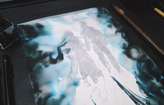
In that case I fill in those places first, so that these water pools don't disturb already shaded areas AND so I can throw away redraw the piece right away if something goes wrong.
💠 As for art materials - I prefer using inks that are safe for fountain pens, so I mostly use Diamine inks for drawing. They're affordable, mix really well and have a lot of gorgeous colors available. I also have several bottles of Sailor inks and recently I've discovered some really cool chinese manufacturers like Carpink and Penbbs (the ink on the photo above is Carpink's Foggy City, for example). The thing I like the most about inks is the chromatography some of them have - I'm in love with how all those dyes separate and become visible when applied to wet surfaces. If you never tried it before, I think I can recommend to start with Diamine Earl Grey - it's a purplish grey color which dissolves beautifully into pink and blue. This ink is pretty easy to buy and fun to play around with.
💠 I've written about the paper I use in detail here, so you can check this post, if you're interested. Basically if the paper is good for watercolor, it'll be good for inks too (if we're talking about ink washes specifically ofc). Oh, and since then I've also started to draw on a transparent tracing paper sometimes! I drew Ada and half of (N)O14 on it. I like how it makes ink transitions look very soft and a little blurry; it's kinda hard to work on compared to a normal paper though.
💠 My favorite brushes to use are Art Secret sable travel brushes, I use them all the time for everything. You can see it in the video with Shin and pretty much on every Inktober 2019 photo since I bought them. I try some other brushes from time to time, but these are still the best for me.
💠 And finally, for lineart I mostly use gel pens, dip pen and a small brush. If I'm doing lineart with inks, I either use the waterproof ones (like Higgins Black Magic or Sailor Kiwaguro) or do the lineart after finishing the ink wash.
💠 Oh and one more thing! I highly recommend to get a ceramic or a porcelain palette, or even to use a plain white dinner plate (yeah, I'm serious, I bought all my smaller "palettes" in a houseware store). It's SO much easier to work with than a plastic one! The paint doesn't shrink into tiny drops, you can always see what color you're using, it stays moist longer and the surface doesn't stain at all, you can wipe it with a tissue and it's as good as new.
Hope it was useful for you! 💙
46 notes
·
View notes