#also i literally dont know what am doing with the colors but they look nice i guess owo
Explore tagged Tumblr posts
Text
28 asks! Thanks yall! :)) 🦶


My last doctors appointment came up with nothing. Onto the next one in a few weeks...

Oh good idea-- :00

Dink already has a friend! His name is Doink! :)

@stupid-thatsme
I usually watch YouTube or listen to music while I draw. I feel like it helps me draw faster and keeps me focused somehow.. XDD And no one wants to be alone with their thoughts lets be real-

@coolguyinternet
<XD I'll have to think about that one-

1: I knew what was coming for me in Tales from Ba Sing Se. But it still hurt. :(((
1: At first I don't think I liked Mei very much <XDD But after seeing her turn around at the end of the show?? I really like her :))
There's a lot of moments that were sweet and sad. But Zuko's apology to Iroh, and Toph and Sokka's talk about Katara's motherly nature were amongst the sweetest. And Aang going avatar mode when loosing Appa and being comforted by Katara has to be the saddest I can remember.. 🥺🥺🥺
The ending overall just felt like it came too soon, I wish the show was longer..

@mrplants-world
You're gonna have to be a liiiitle more specific- 😅

(Aang holding Appa art in question)
Do people really ask that?? Man.. smh.. smh.. 😔😔

That sounds like something they'd do! :DD

:DDD Thank you! I'm glad you like my artwork!! :))))

@the-woomyverse
XDDD Oh man that's some fantastic angst potential

(Evil Grim and V post in question)
An asker in this post described what I imagine they'd be like really well! :00
And yes! The evil versions are all shiny but evil Anastasia (Kricketot) is normal colors XD

I didn't intend to have Miraidon around, no.. 😅
And I don't have the DLC, so I am unfamiliar with Ogerpon.. <:0


@necromicon42
The boo mushroom isn't intended to be in my AU.. but the boomerang and cloud flower could be included :00 I imagine they'd be/look a lot different though..
The boomerang flower might not be a full on powerup.. I might make it this big flower that once it grows its oddly shaped petals fall off and harden like wood. Leaving behind these perfect flat boomerangs. I can imagine Mario and Luigi just learning how to throw the boomerangs instead of absorbing a powerup. This would also explain how boomerang bros got their boomerangs. They throw the same dried up petals that the bros throw-
The cloud flower might just be changed into some king of... wispy thing and the bros can collect. Instead of a flower. Maybe a literal cloud? I'm not sure.. but I can see it existing :00

@spinelfan11
I believe so! XD Thank you! :)

(Refencing this post and this post)
<XD No one is safe from the bootleg curse!

<XD No no, my AU was made before the movie came out. Nothing from the movie applies to my AU- including the Vanessa daughter thing <XDD

Well lets see,
1: I think Gravity Falls and Pixars cars was very inspirational to me! :0
2: My favorite song changes from day to day,, but currently I really like Lights by Ellie Goulding! :))
3: When I understood it, I think I liked math! :))
4: And sorry! But drawing suggestions are now closed 😅

@anikakitty11
Shroomie!! :DDD

@untitled-7613
I wouldn't trust them personally- 😅😅

@khoiazo
XDD The only appropriate response to evil Grim and V honestly-

@xxanxious-anxietyxx
:000 WAIT REALLY??? THANKO YOU!! :DDD

@hope0koi
They doin good! I've been meaning to draw them more often <XDD

@minophlia
Ah man.. this is very bitter sweet. I'm glad you found me here and that you like what I make. But its also horrible to hear that you found me through stolen artwork that I worked so hard on..

@katpotato55 (In response to this post)
:DD THANK YOU SO MUCH!! :)))

@im-nice-but-i-dont-like-you
XDD Well hey it made me laugh too! Also thank you! :))

@ink-machine-kidd
I'm afraid I wouldn't know what to do for that..😅I'm not familiar with Digimon.. 🥺 Thank you for the suggestion though! :00

@agent-cakeshroom
XDD Thank you!! And yes! I DO love sky! :DD Been playing ever since season of dreams back in 2021 💪💪💪
#my response#avatar the last airbender#pokemon scarlet and violet#fnaf security breach#super mario bros
96 notes
·
View notes
Text
Simon's Month - (Cat)Fish
day 19!! @youngroyals-events
Simon tries to convince a man on a dating app that, yes, that is his actual face in those pictures.
read below or on ao3 (T, 500)
You got a match!
Wille liked your photo!
Wille sent a message!
_____________________
Wille: If you’re gonna use fake pictures you might as well make them believable…
Simon: im sorry what?
W: I’m just saying, it’s pretty obvious you’re a catfish. Those pictures are not real.
S: um yes they are? that's literally my face
W: Nice try! No one actually looks like that. Way too perfect.
S: is this some kind of weird pickup line because im not sure you’re executing it properly
W: No? What do you mean? Clearly those are photoshopped or something. Who has skin that smooth looking? Or eyes that beautiful shade of brown?
S: literally i do
W: Seriously, where did you find these? Did you edit them yourself?
S: did you get dropped on your head as a child or something
W: … I mean, probably. But that doesn’t matter here. I know an edit when I see one.
S: clearly you dont because that is my face thank you for the compliment, i guess???
W: You’re welcome for complimenting your editing skills. But I still don’t believe you.
S: ok now im convinced this is some weird plot toget me to send like nudes or something
W: Oh my gosh, no! I’m not even on here for that! I’m too much of a romantic for hook-ups. We’d have to go on at least a few dates first. And I would only ever ask if I knew you wanted to. To send pictures. Naked ones. And only you felt safe doing so. But I think in person is better anyway.
S: okay…
W: Sorry if that was weird. I keep staring at the pictures and they’re making it hard for my brain to work.
S: hard huh?
W: Ha. Ha.
S: i guess that’s kinda sweet i’m not much into hook-ups either
W: Oh. That's cool. But, seriously, where did you find these pictures?
S: i remind you. that is me im starting to question your sanity Wille
W: Sure, Simon. You just walk around like that all day and somehow you’re still single and on a dating app. Sure, very believable, *catfish*!
S: omfg i do have pet fish but im not a catfish you're one to talk no ones hair is that color also there is no way u have a perfect little freckle on ur top lip or do you put that there with makeup
W: What?? Me?? No, it’s not makeup! I am just Swedish! I get freckles in the sun!
S: suuuure
W: Don’t turn this around on me, Simon. Except, wait, do you really have pet fish?
S: yes, i do
W: Can I see them?
S: [Image attached]
W: Beautiful! What are their names?
S: idk if i can trust you with their names you think i’m a liar
W: :( Simon
S: :( Wille
W:
You can trust me. It’s justified, I think, that I don’t believe you.
S: [Image attached] literally me [Image attached] me with fish for proof i cant believe your awful rizz is working on me … Wille? here i’ll write out a little note for you so you know its actually me [Image attached]
W: ‘.,;-=p./ ?um I-m her e SOrry I was.. You are real?
S: lol i am real
W: When are you free?
S: huh?
W: I would like to take you on a date, Simon To apologize for calling you a catfish But also because you are funny and pretty, and I need to see you in person just to be totally sure that you’re actually real.
S: hm i guess i’d be okay with that i wanna know what that freckle on your lip tastes like
W: asdnasfwaogjfan
S: their names are oski, olle, and felle, btw are you free tonight?
#does this count as an smau#is that what the kids are calling it these days#this was very fun to write#not so fun to format#simonmonth2024#yr fic#wilmon#simon eriksson#intothelight#yr fanfic#all our words were worth it
86 notes
·
View notes
Note

hii again! im the anon from here and here!! and the lengthy answer requires an as lengthy follow up so here i am (also if such large asks are inconviniencing in any way pls let me know i dont want to make you uncomfortable)
first of all, it was very interesting to read about this language, im not that into fictional languages stuff but it looks very fun and original to me, thank you for sharing, it's very cool!
second of all, i took some time to translate the glyphs in the names that you've already given and that's what i've got. feel free to correct me!


most of them are pretty self-explanatory (some are a bit less obvious, like the "walk" in loki's name prob means that he's a missionary, and "death" in meralon's that he's an undertaker), but i have a couple of questions.
how would you translate qlaunek's glyphs? im coming up with only something like "the one who reads out the enligthment" which is clanky and awkward. is long+eye in litsy's name mean that he has very good eyesight or on the contrary, that he's farsighted (or something else entirely)? also why is the colour glyph in his name an inverted yellow? is it a mistake or another colour? do colours describe a general family of colour like hues and such (like i don't think that gerard is the same bright green as leshy but maybe im wrong)?
i see some personality glyphs in some names (fear in nimve f.e., which im guessing means that they're cowardly). does that mean that the names can change with time? like if nimve becomes less scared or gerard somehow becomes lucky? did salky's name change when he started wearing camelias?
and since you said it was an inside circle thing between lamb and deciples, doesn't pixie kinda get's pissed off that her name literally contains "angry cat" in it? :D
aaand as the very least some things i think are Neat in this language: i love how combined symbols look and function (like in claunek's name, or how "use" and "make" become "exchange"), the fact that verbs starve, attack, infect etc. are all named after the crowns is awesome and genuinely a nice smart touch, just the visuals of the language are pleasant and fun to look at
again thank you for sharing!! and i look forward to new words in future comics, now that im somewhat familiar with the language
=OOOO absolutely fabulous reveal! B) With another banger ask! (Long ask do not bother me at all! It's kind of very fucking cool to receive a lengthy response about something I thought would not get much reaction/attention- I was happy to receive this, and see I got you and a few people on board with the language!)
Lets now respond to all this in order: -For Claunek, I forgot to put into the lexicon the glyph I gave him- I also did a pretty shit job at drawing it, ngl- But you got a good guess from my shit job! This glyph is the one of "Fate", with a big F. Claunek is the one who can read Fate! I got the symbol from the motif at the back of his tarot cards, and thought it was a perfect fit =D (I just didn't had the patience to make it right on what is supposed to be a sketch-) (I also used this symbol in the comic, and it might come back to haunt the narrative >=D) -Litsy's weird glyphs are mistakes- I used the previous ask to put things down, and so, some rules have been revisited, some glyphs changed. The particle at Litsy's eyes is upside down, as this particle did not had it's mirror version originally. The correct version of his name would be "the yellow cat with big eyes" For the upside-down yellow, I just forgot in which way the triangle of Heket's crown pointed at, since I used the crowns again as inspirations X') (would also say that the placement of the number in Nari's name is wrong- The subject always come first, and since the number is attached to a glyph, the glyph comes first, the number after.) -Colors describe the overall hue yup! An orange that goes more into red hues will be designated as red, and it'll be designated as yellow if yellow is more predominant. Cyan will be blue, pink is red, brown is all over the place, ect. (and yeah, no, Gérard is not the same green as Leshy- I'll show it some day, but the bunny got more of a lighter sickly green) -I didn't really thought of that before, but the names being able to change overtime is a very logical concept for this language! So yeah, you now made name-changing a very normal and regular process in the cult's life! Congrats =D (And yeah, Pixie definitely got pissed at her Cartouche, and made it official in the eyes of everyone X') She fell into the self-fulfilling-prophecy trope and got mad about it X'D) Really quick round, for the few translation """mistakes""" (not really mistakes, since some info are missing or just impossible to know): -Purna is a cook, so the final glyph is more on the food side. -Meralon is a raccoon, wich is not easy to catch when you don't have the mask-looking motif on the face. -Nysus is a Wolpertinger, but good luck to guess that from a simple glyph X')
To conclude, I am glad you were able to read through the whole rant, and try the language out! Your translations are accurate, and it makes me so, so happy you took the time to write them down and ask questions about the language ='3 Overall, I'm very happy you, and other people, saw my stuff, and reacted to it. Seeing y'all enjoying everything gives me wings <3 Thank you very much, and I'll try to put this language everywhere I can from now on ;3 (it was already planned, but now, I'll put more >=3)
13 notes
·
View notes
Note
KIKI KIKI i have a questionnnnn what is ur favorite thing about chika??
NYX MY LOVE , sorry for the delay but here we go !!! this is going to be like a selfship post but anyway enjoy :3
one of my favourite things about him is his eyes — the color and the form. i can stare at them all day and observe the way he expresses his emotions with only just a look: they widen when he is excited, narrow when he is sceptical, when he looks away showing disinterest.

especially love it when his eyes go big and he just stands there with no thoughts in his brain, looking like a cute small kitten.
of course, you would have guessed it ... his arms !!! i don't even have to talk about it, just know that once i get him to hold me, i am not leaving his embrace and he doesn't have a choice letting me go either. i'm also kinda tall, slightly above the average, 168cm (5'6") and chika is 183cm (6'0") so it's gonna be so much easier when we hug or kiss. wrapping my arms around his waist, while he hugs my shoulders. hugs !! from !! behind !! where he wraps his toned arms around my chest and i can feel his heartbeat, resting his head on top of my head or me hugging him from behind, my arms wrapping arous his waist while my head rests on his back. he doesn't have to bend much just to lean slightly forward while i tilt my head up and then steal a kiss.
next is his jaw ! i just found it so attractive for some reason, it's not too sharp just perfect. it's actually a little embarrassing talking about things i found attractive in fictional men because i do find them appealing in real men. neck/collarbone/jaw kisses are a must ! just appreciating every part of him and showing it in kisses, so many kisses!

i have a little bit of a long nails so it's really calming for me when i trace all over his arms, squeezing the soft flesh, scratching it, feeling his muscles tightening... i think he will love receiving massages, and good for him because i have magical hands, gonna make him relax because for someone who looks calm, he is very tense! don't worry baby, i got ya ♡
next his lips, those soft lips, that i can kiss every day and night ♡ tiptoeing to reach his beautiful and soft face, cupping his cheeks with my hands and leaving a loving kiss. kissing his neck if standing close together, as the height difference is literally perfect. surprising him with a quick peck on the lips or cheek by pulling him down by his collar or reaching up. when he smiles, oh my that smile im melting, blushing and giggling because he is just so cute i could nom nom him. i will always nom nom chika !
i'm not done with his arms. play !! fights !! one of my love languages is physical affection and i also tend to show my love by hitting and biting. so i launch at him with all my might, fists flying, slaps landing with sharp snaps. he barely flinches, effortlessly twists out of my grips. i go harder, twisting his arm back, and he responds with just enough force to match me, never more. i know he could easily overpower me, but he’s learned where the line is—never crossing it. i taught him well. play fighting with chika is my favorite time ♡

okay but his fashion sense, im stealing his wardrobe, all of it !!! he dresses so nice i would like to wear his clothes all the time, oh my god his shirt would probably be slightly oversized and i will use them as pajamas. mmm, yes we are the dress to impress couple, hitting pose 28 !!!
LAST BUT NOT LEAST his amazing and pretty long hair. i don't like men with long hair, but there are exceptions like chika, my pretty princess. i bet its so soft and fluffy, running my hands through it will be like me playing with clouds. playing with hid hair would calm me down in seconds, even making me fall asleep on the spot. occasionally dying the yellow tips again almost turning myself into a minion with those yellow painted hands. i love his hair and the style he has it (please bae don't cut it, i will love you no matter what but please dont)
OVERALL I JUST LOVE CHIKA, ALL OF HIM. he climbed the ranks to be one of my favorite characters faster than anyone, so he set a new record !!
(please someone get me a boyfriend because im so lonely and the way i cope is by liking and obsessing over fictional characters, thank you!)
#✧* ꜝ chat with nyx#✧* ꜝ takiishi chika#we are made fo eachother#its not me being delusional about a pixel#okay maybe i am#its fun#i just hold him very close to my heart#he gives me the comfort a real person can't do#i hope everytime yall see chika you think of me#im just going to add more song to my takiishi playlist now#again i love him#endo im sorry bae but im taking your man with me
10 notes
·
View notes
Note
if ur still doin the ask game: blue, gray n black !
gray: talk about the colors you tend to use in edits! do you like making bright or dark edits? are there colors you dislike editing?
i dont know if there are any colors i tend to lean towards in editing, really, but i generally prefer bright edits ^_^ i dont like editing orange... sighs... despite that one of my faaave layers to use is an orange photo filter it always makes things look so nice
black: what kind of programs do you use to edit? have you always used these or have you branched out before?
i use photopea currently! i find its a lot nicer to use for coloring and such. i moved over faiirly recently from ibis, i find both have their respective pros and cons :3
blue: do you have favorite editors? is there any specific reasoning for your choosing?
i have loooads of editors that i admire but here are a notable few! yapping under the cut sorry.
@ideallyadored - i looove vees editing style so much.... his use of colors is sooo lovely to look at (our psd collab was SO FUN it was real cool to see our coloring styles merge) + THEIR STIMBOARDS R SO COOL.... loving all the alnst stuff recently <- not biased.
@lavendergalactic - THE WAY THEY DO GRAPHICS?? insane. absolutely insane. HOW IS EVERY SINGLE ONE A HIT. how do you do everything on ibispaint too... even though ive moved to photopea editing now, back when i followed you and i learnt you used ibis i was so relieved because i was like "damn if they can make banger stuff with ibis so can i...."
@plecakism - lumis editing style is sooo tasty. she made my current layout and when i got it i was in a state of SHOCK it was sooo fucking cute 😭😭 also. object show edit blog. IMMEDIATE win for being a hfjone fan
@necroangelz - another person whos graphics i ADORE. i am so in awe of people who consistently make graphics. how do you do it. most impressive thing in the world to me. your itafushi graphics havent left my mind since you made them TBH + THE KEL GRAPHICS YOU MADE FOR MY BUNDLRSS R SO CUTE
@p1nk-sugar - YOUR PIXELS ARE SOOO CUTE ORIEL i love them sm. people who make (ADORABLE) pixels are the backbone of the rentry/sntry/bundlrs/website building in general community. xoxo
@otoripink - FEENIEEE YOUR LAYOUTS AND GRAPHICS ARE SOOO COOL i love them sm.... your pyroscout graphics are SOO CUTE as are your harunene layouts. ceo of harunene ❤️
@ghostflora-s - LITERALLY LIKE MY FIRST EDITBLR MUTUAL. your edits have got to be some of my favorite on this website i love the way you do replycons and icons and headers and wallpapers and like literalyl EVERYTHIGN oh my god. your coloring is top notch everything you do is just absolutely fire
18 notes
·
View notes
Note
as a fellow alopecia haver would you mind if i asked a few questions about how you cope with it? like, do you wear hats or wigs or do clever hairstyles to hide it or do you just let it show? ive tried pills and scalp shots and nothing is reversing mine. im only 26 and i feel like this is the worst thing to ever happen to me and i dont know what to do about it. nobody even thinks balding women exist. nobody considers how it is to actually be one. im so scared no one will ever like me or find me cute again. i used to think i was so cute. this sucks so bad.
For me the back of my head around the nape and up to nearly the top of my scalp has never grown hair, not even when I was born. My father also has alopecia areata and he has a few golfball-to-coin sized patches he loses and regrows at a random basis. So I've had my entire life to contend with hair loss and family that was familiar with it, so I sympathize so incredibly hard to women who develop it later in life. It is probably mortifying.
So yeah, shots and pills and balms and oils and etc have never worked for me. I also lose hair at random basis around the rest of my scalp, mainly around the margins of my crown (losing my bangs) and the sides of the back where I already do not grow hair. I also lose half my left eyebrow on a regular basis. If you go far back enough in my #me tag I've posted what it looks like. I also preface some of my advice might not be helpful if you have afro-textured hair, but I will recommend someone who will be extremely helpful in that respect.
Also I hope you don't mind me doing a shotgun blast of advice but maybe my experience will help someone
Things that worked for me:
I've always been flipping my part as my hair cycles in a growth/loss state for my bangs. Low pony tails tend to hold better than high ones in what is essentially a clever combover. Uhhh and always keep a hair tie around in case there is wind lol I always get self conscious when there's a breeze.
This is kind of vague and probably shitty advice but I've noticed over the years I lose hair when I am stressed, so I've had to make the call (in addition to other factors) to quit jobs that really strain me and I've noticed improvement in hair growth. So depending on your circumstances I say make some effort to reduce your other stress factors while you go through figuring it out. This shit is literally traumatizing.
This thing here is basically a pepper shaker for keratin bits that can color-fill in patches of missing (or really tiny short baby) hair. I can only speak as a brunette but it works pretty damn good as some camouflage for your skin poking out where you can't cover it. Do note it kind of has an ashy texture so it's something to wash out at night like makeup. Scalp makeup lol.
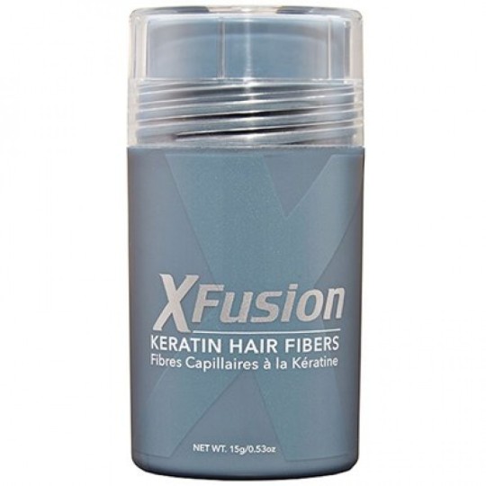
Hats are good. I wore trucker hats for most of my teen years, but I don't wear them much anymore, especially being out of the stress of school. However - a piece of advice from a mentor of mine, Jamie Elmore, is to call hats, bands, scarves, wigs, anything under an umbrella term "accessory." It's kind of corny but sometimes conceptualizing these things that way helps coping with the impulse of a world that demands you hide your hair loss and another where you can freely express yourself without fear of judgement. Anyway, I recommend looking her up, she has a magazine and works hard for the alopecia community, particularly for black alopecians.
Oh yeah if you can find those hippy chick silk hair bands that have the elastic around the back, I love those. Regular bandanas are also good.
Uhhh shorter hair also tends to weigh and pull less, which I think everyone has varying sensitivity to, but to anyone considering a bob, why not might help lol. I also lose my hair in the largest amounts in the shower, so like, if you develop a weird complex about showering I know allllllll about it.
I have tried partial wigs, which are custom cut out and adhered to your head, and it's nice if you want to do hairstyles you otherwise could not, but it's high maintenance, very itchy, and gets gummy after about a week.
But yeah it's been a very slow and steady process to get used to going out in public without putting effort in camouflaging my alopecia, and that mostly has to do with tuning people out. The existential stuff gets personal so I save those conversations for a 1-to-1. *Holds you by the shoulder* we are all coping out here.
I look at that sword of Damocles hanging over my head and if my scalp gets wiped out beyond all sidepart repair, I'll go full wig-wearing. I once had a hair stylist who was giddy at the idea of shaving my head when I explained it to her, which was comforting in a silly way.
Anyway, it's been years since I've dipped my toes into the greater Alopecia Community, the ones with all the acronyms, but there are NAAF chapter groups that you can meet and hopefully find people to connect with. I think you need to join an email group though. Anyway. For the longest time the only people I knew with it was just my dad and a cousin who had it for 1 year and never again and seeing a group of people with patchy/full baldness in person for the first time made me cry.
To end on a good note, there have been trials for JAK inhibitors (a treatment for many autoimmune disorders) having really breakthrough success rates at hair regrowth, but I haven't looked into it lately. Seems very promising. A lot better than cortisone shots in the scalp I figure, maybe worth the pain lmao
EDIT: i misremembered it being lupus medication, but it was actually Janus kinase inhibitor trials with success.
20 notes
·
View notes
Note
Any advice on how to draw backgrounds? Gotten to the point in my art where im semi confident in drawing poses and expressions but backgrounds?? girl help i can only somewhat draw a tree
oh hell yeah i love backgrounds, ive been working on more interiors lately (when not overburdened by sbc work lol) but im assuming you're asking about nature so that's how im going to answer it as okay so: -first of all find yourself a good TEXTURED blending/smudging brush because it will save your life. i use these rock texture brushes from This Studio Ghibli pack, it's $6 and i HIGHLY recommend the whole pack because it's the main one i use for most of my bg foliage/grass ect and i love it dearly

-find references either in irl photos or other artist's work. if using another artist's work watch their speedpaints or look at what you like about their art style and techniques and steal it. im serious. obviously don't trace it and pass it off as something of your own but look at how they do the aspects you struggle with, and try to incorporate that
for me, that struggle is forest foliage because i have a hard time filling out the spaces without everything looking like same colored blobs, so i looked at how my buddy hannah mudshadow does bgs because she's really good at filling out a scene and making it look natural, and i noticed she uses a lot of abstract shapes instead of trying to render every leaf, so rather than doing my base work for bushes/trees with a leaf brush, i use a chunky scatter brush now and it looks really good, and then i can go and add some leaf brushes on top of that for more definition in areas that might catch light ect so that will give it the thick, bushy .. bush look without looking crowded or too shaped
-nature is messy as hell and things are never going to be perfectly shaped and toned unless you're drawing perfectly managed hedges or something. got some dirt brown on your green bush? those are dead leaves now. accidental weird texture on your tree? the bark is gone there, something ate it. bushes and trees have dead branches that just hang out there in them, grass grows long and sometimes a deer or whatever doesn't eat the whole patch so there's long uneven sprigs sticking up. petals fall off flowers. trees have huge webs of branches
-don't try to detail everything. make things further away more abstract and messy to give the illusion of detail. throw a gradient over it for some slight tone variation or something so it;s not completely flat but ppl are going to look at your subject and see the rest of it with the corner of their eyes, so you don;t need to fully render every flower in the field. here's some examples of that
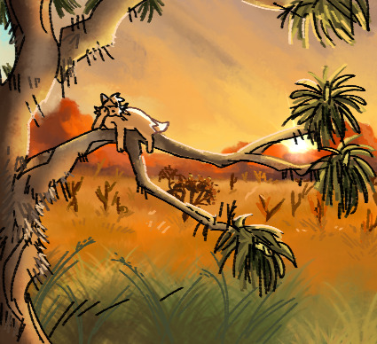
the cactuses in the far BG are just V and Y shapes, the joshua tree in the middle distance is dark with some light blobs right on the edge where the needles would catch light.
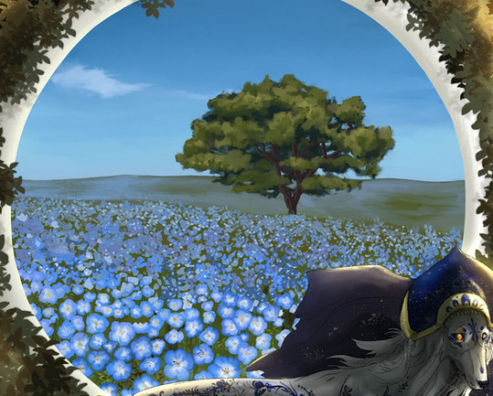
this is from 2021 so be nice to me but as the flowers go back in the distance, i stop rendering their petals and start doing blue dots with white dots, and then even further away i just sorta blend blue and green together to give the illusion of a field of flowers.
-i dont know what your style is, but i personally hate using a ton of layers and tend to merge them as i go, but for the most part i draw every panel of SBC bg on the same 1 layer, going back to front (start with sky, mountain, bg grass, foreground grass and cactus, then go back and scatter foliage as necessary) and it keeps my stuff loser and i tend to get less precious about making things look perfect. i also work very fast because i am unironically really lazy at art and am desperate for shortcuts.
-oh yeah one more thing. assuming you draw cats, cats are SOOOOOO small in comparison to literally everything. as warrior artists i think our perspective gets a but confused sometimes (i am certainly guilty of this too!) and there is absolutely nothing wrong with this because sometimes that's just how you have to build your scenes, but it really makes me laugh when i see scenes of like, rusty jumping off his fence to go into the woods, but the fence is only a bit taller than him. so try to remember things are huge and cats are small as hell
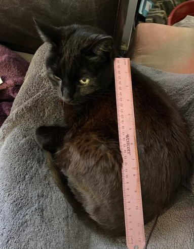
na'ni's a huge cat, all things considered but look at her compared to my small aloe plant

or the cedar tree in my front yard.

absolutely microscopic. don't look at my slippers.
so yeah. i hope this helps, it's not so much a tutorial because i don't think i'm the best person for tutorials because honestly i dont know much and this is all stuff i've picked up on, like i dont know shit about composition or values or color theory but this is important stuff to keep in mind about the environments themselves. don't worry too hard about colors at first because you can always change it by adjusting your curves n stuff. or slap a filter on that bad boy. or dont. also pay attention to your horizon line because it helps angle the rest of your piece. but look up tutorials for that because i only started learning about it like a week ago
55 notes
·
View notes
Text
Darling the world is gonna hate you suck it up
Not before you guys jump me just hear me out!! Something I've noticed time and time again even within myself is that majority of the things we want, the things we hate about ourselves, the things we love about ourselves, etc literally come from just what the world viewed us as.
For example, black girls are the biggest target when it comes to my statement. We have been brainwashed to believe time and time again that our ethnic features, our lingo, our presence, our aura, our skin, etc have all been deemed as "unattractive" or "ugly". Girls and even guys who have a certain tone or accent to there voice (I'm specifically talking about my southern brothers n sisters here) is seen as "aggressive", women with deeper more stronger voices are seen as "manly" that quite literally takes away women pure sense of femininity!! Our bodies, if your skinny your unattractive your called things like sticks n whatnot (yall know), if your fat you're unattractive, if your body is curvy the internet may try to deem u as attractive but then we go out in the real world you're now not only oversexualized but now your body is what defines who u are as a character they dont even care to know if you're nice or not they will judge based off your physique entirely saying names such as "slut" or "whore" or even going as far as assuming your ran through or something when alot of times that's not true at all. A more softer approach such as acne, having a big nose, if your hair is short or even if it's long but looks a certain eay(yall know what I'm talking about), you even liking a certain color now since it isn't trendy all of a sudden it's an "ugly color" be so fucking fr😭. Pink and purple were the top 2 prime colors that fit this description perfectly.
My point is this, I want you to take a realllllll good look at yourself in the mirror, think of everything you absolutely hate about yourself write it out if u need to absolutely every little thing. Now look at all those things you hate about yourself and ask yourself "Do I genuinely hate all these things about me? Or were these things I was TOLD to hate about me?" Soon enough you will eventually began to realize that a lot of those things you THOUGHT u hated about yourself, were actually opinions coming from someone else NOT YOU!! You don't like the way you smile? Why? Did someone tell u they didn't like your smile? Or is it your teeth? What's wrong with them? What's wrong with smiling your heart out regardless if u show teeth or not? Absolutely nothing!! Oh someone told you that dressing up in more classy attire rather than fast fashion makes u seem lame?? Oh so now u don't wanna be the guy that dresses like he's a rich and wealthy billionaire but rather something you know every other guy is wearing also?? What was wrong with dressing in a fresh suit or being color coordinated and dress to impress with your layers and your nice button down with the pressed slacks? ABSOLUTELY NOTHING!!
"Darling, for as long as I am here with you. I want you to learn and understand that this world, this world will hate you, this world will turn its back on you and they won't even have a real reason why but they will. I do not know why the world is this way and why it is so dark and cruel sometimes. But, you are the light the shines above all thos darkness. You are the angel that brings heaven to the hellish parts of the world. The world hates because they can't stand to be next to someone who loves themselves so much and are so secure and accepting of who they really are. Do not limit yourself because of the things the world loves about you that is for normies and you, my child, are not that at all. You are a Queen/King, hand chosen by the most high the God of all God's, to be in this world and bring love, light and beauty to its atmosphere, crafted by love, beauty, intelligence, compassion, empathy, patience, security, fulfillment, kindness, loyalty, discipline, strength, courage and all things divine. Don't you ever lower yourself for anyone in this world except God himself. Fall in love with your creation, be in love with the divine creation that you are just as I, and surely enough, in its own strange and peculiar way the world will also fall in love with you as well. Why? Because what is a world, without you in it? "
-Ms. Allurèa
20 notes
·
View notes
Note
For the yugioh character meme: Number 96!
Why I like them/why I don’t
Dark Mist is one of the characters who I am so sad didn’t get more screen time. He had an awesome debut and established himself as a threat immediately by taking Yuma hostage but then he’s just stuck in the key a while. He appears a bit but really doesn’t do much important stuff until his team up with Vector in season 3. BUT HES STILL SO COOL!!!!!!!!!!!!!!!! He’s a number and he’s completely intelligent which literally no other number has shown the capacity to be I’d argue that it’s not cause he’s fused with Astral, he still planned a way to get into Yuma’s deck. The intelligence could come from the fact that he’s part Don Thousand and speaking of which wow do I wish that was expanded on more. Imagine being a fusion of two completely opposite people one of which is meant to destroy the other, thats an identity crisis just waiting to happen.
To conclude I guess I just like him cause he has so much potential for cool stuff
What I like about their appearance
*deep breath* ok this guys got a lot of appearances and I have varying opinions on them so this is gonna be my unofficial 96 forms ranking post in order of appearence
Beast 96
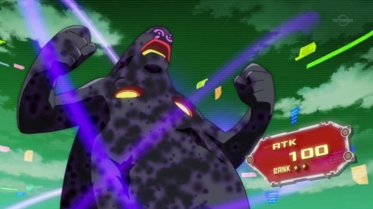
We get this form for a grand total of one scene and it only exists so that Yuma will underestimate him further and let Dark Mist posses him. Pretty funny guy, I like the layering of the warm colors, it makes it look like he has a molten core
5/10 a bit to boring but its meant to be
Astral 2 evil edition
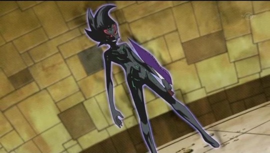
Very solid design, likely cause it’s basically Astrals design and that one’s good too. The red face detailing makes him feel more distinct and is also a nice nod too his monster form
8/10 I think it’s funny that he doesn’t get censored in every scene like Astral does
Monster 96
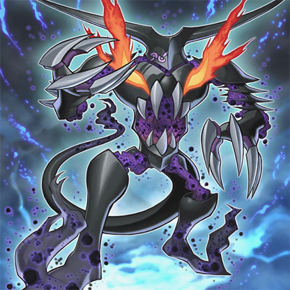
Mmmmmmmmmmmmm good. Zexal’s monster designs are always a treat and 96 is no exception. The sharp edges with the misty (haha) bits connecting them gives it a very cool haunted armor look and the flaming eyes are a nice pop of color.
10/10 absolutely sick
Barian powerup form
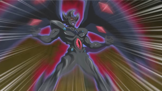
Oh god oh no oh fuck oh god. All good things must come to an end and 96’s design streak comes to a screeching grotesque ugly as all sin halt. This design is a crime for many reasons but I’ll go one at a time. First off, WHY IS HE FLESHY??? I know its a thing for yugioh villians to have theyre veins poke out when they get extra evil but 96 is a combination of Astral and Don Thousand, arguably two of the more ethereal looking designs. It feels like they tried to mash Don Thousand, Vector, and Monster 96 all into one design and then failed horribly. The flesh boots and shoulder pads are meant to look like his monster design but it lacks the sharpness that made the original work. Theres also a bunch of ripple things? Why. I dont like them. He also just copied Vectors wings but they just look out of place. And lastly the purple lipstick that would be a cool element but with everything combined and Dr Fakers haircut makes him look like a clown. Rant over. Sorry.
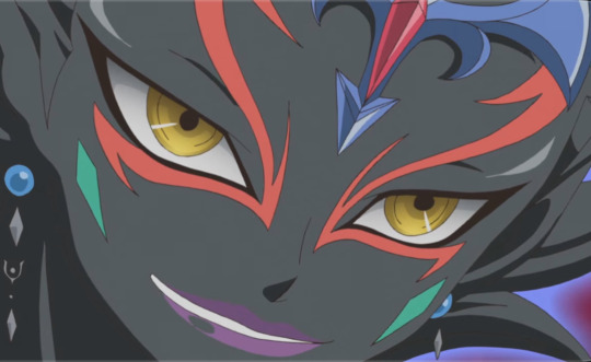
0/10 I’m glad he exploded
Corpse puppet
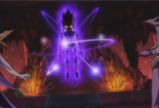
Ok this one shreds actually. I actually think this is one of 96’s coolest designs and criminally underrated (then again when is he not) it’s a pretty fucked up parallel seeing as they both died, Astral got brought back by Yuma and meanwhile Dark Mist is having his corpse tossed around and repeatedly destroyed by Vector.
10/10 rad as all hell best creepy puppet in the show just too bad he’s a personality less husk
Do I prefer their dub names or original names?
Dark Mist vs Black Mist, they mean almost the same thing but I prefer Dark Mist cause it’s what I’m used too
OTP/NOTP/OT3
I honestly don’t think he should be dating anyone at all. He should be embezzling government funds and standing ominously in dark alleyways a romance with him involved would make everyone in it worse
Favourite card they use
I feel like basically all his cards are bangers. Giant germs the guy who originally had him used? Iconic, weird, stuck in my head ever since I first saw the episode. His weird utensil themed monsters who literally came out of nowhere? Hilarious, cute, why do even have those my man aren’t you the devil? 96 himself? Fucking awesome looking in monster form
Favourite moment they were in
Both his duels were very good but his debut/the Yuma hostage situation holds a special place in my heart as the most violent tv show episode I could get my hands on as a kid <3
Least favourite moment
……….. barian powerup transformation *shudders*
3 notes
·
View notes
Text
sw visions s2 review! i overall enjoyed this season more than the first, the variety in animation mediums was amazing and a lot of these were just fucking stunning to look at. thoughts and ranking under the cut:
9. sith
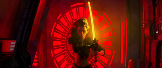
i have beef with this one. i think this by default takes the spot as my overall least favorite star wars visions episode across both seasons just because of how it does the dumb "you can use both the light side AND the dark side :) dont worry about it" trope. the animation is cool in some places but (likely due to disney+ deep frying the video quality?) it felt weirdly hard to look at in others. i do love the painting aesthetic but it feels the least true to the star wars spirit. i think the duel from season 1 executed the "darksider vs former sith" idea much better
8. i am your mother

this one being so low on the ranking is just a testament to how much i enjoyed all of the other episodes. i think this short succeeded fully with what it set out to do, it's just a fun story about a mother-daughter pilot duo which is great! simple and enjoyable.
7. aau's song

this one was just really adorable. i loved the aesthetic and the animation, the characters felt so.. fuzzy. huggable. really nice breather to end off a volume of really good stories. loved the visuals for the crystals and the character design for the jedi in this episode especially
6. the pit

bruh i was so fucking sad when THAT happened . i get why they did it but it felt so unfairrrrr aaaaaaaaaaaaaa. i liked the animation and character designs and this one also has some really creative visuals for the settings. but i thought the resolution to the conflict felt a little too .. easy isnt the right word for it. but i think some of the writing falls a little short in an otherwise really good story.
5. the bandits of golak

and i KNOW the people that made this were fans of tcw/rebels. (was that sabine's phoenix symbol i saw on the side of the train????). loved the dynamic between charuk and rani, i get why they had to part ways but i got sad when they did nevertheless. the texturing on the models feels very reminiscent of tcw's style and it tickled my brain <3 except i think the character designs blow tcw out of the water <333
4. journey to the dark head

FUCKING SUE ME. i loved this one. studio mir put everything and i mean EVERYTHING into the animation on this one. toul and ara are great characters and i love how they played off of each other. bichan's character design went HARD AS HELL i literally don't care if some of the story didn't make sense to me because ouhghhhhh this was just a whole MEAL for my eyes . if that makes sense. studio mir i love you
3. 2. the spy dancer
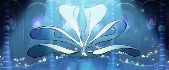
i CANNOT in good faith put this at any spot below a 2 so i guess we'll have a tie here. the animation was absolutely fucking STUNNING and the fight scenes were also, like journey into the dark head, complete and utter bangers. loi'e is probably my favorite protagonist out of all the episodes this season, just the concept for her being a performer and also a spy for the rebels is [chefs kiss]. i also do love a good ironic twist and this one Has it <3
2. screecher's reach

perhaps this one is ranked so high because it was placed right after my disappointment from episode 1 and perhaps it's because it struck such a chord within me that i truly cannot explain. daal and her friends were so cute and the colors and backgrounds were truly beautiful to look at and god. the story on this one. fully fucked me up. crazy how a story this dark and upsetting made me feel better than episode 1 but it gave me Such a level of tragic catharsis. (is that the right word for it? it's unsatisfying but on purpose and i love it) this one probably isn't going to be as high on other people's rankings but i don't care. i love it. it's dear to me.
in the stars

this one just straight up made me cry. i don't why it hit me that hard but it definitely has to count for something. this one is also really fucking beautiful to look at like the rest of my top 4 but this one has an aesthetic that lends itself really really well to the storytelling. the scene of the painting telling their mother's backstory is just.. ugh my heart. i love koten and tichina so much it's unreal. the final scene where they stared down the walker mirroring the painting made me fucking lose my mind. perhaps i was not feeling very hopeful for their fates after what happened in episode 2 but i was so happy when it did end on a happy note. also them finally seeing their mom's star in the sky.. i just.. ugh. lay me into the ground!!!!!
#star wars visions#star wars visions season 2#star wars visions volume 2#stars war#star wars visions spoilers#hopefully somewhere out there understands why i ranked episode 2 so high i feel like it's gonna be like#an akakiri deal where it puts people off from it despite being a really compelling story w beautiful art#hopefully not though. maybe people will see those stunning star backgrounds and perfect horror vibe and Understand#i can see episode 6 being the fan favorite like the village bride was for last season and for very very good reason#anyway happy may 4th everybody <3 sometimes the starwar is good <333
31 notes
·
View notes
Note
Haiii how are you and your boyfie!?!
hi hes amazing like always oh my god like i love him, i dont even know what to say to make you understand how in love with him i am because hes soooooooo
i cant think of him for too long because i stop breathing but i also cant stop thinking about him. (im in love with him). he gives me everything failure.
he’s like actually perfect, as a person but also like, i dont think you could get a better boyfriend like he’s so nice and caring and he makes me so fucking sappy its embarrassing.
i mean he’s soooooooooo. like. ugh. i dont know enough words.
he’s so kind and sweet and he’s so nice and he’s funny and its so fun to be with him and talk to him, and i wish i could spend every second of my life with him because he makes me so happy, and you know that feeling when you’re looking at the sunset? he’s like putting stars into a box and snorting them. and i’m 100% sure that he would write something really poetic and romantic and touching and beautiful instead of the sentence i just said.
it’s like bumping into god on the street. i’m terrified of him. he’s so cool and smart and i don’t get how he likes me back because jesus christ. what a mess. he’s so good at everything he does, i haven’t seen him do anything badly ever. and he’s actually so nice. he doesn’t know how good he is. he’s the most best person i know. that’s a very bad sentence but it’s true.
i wish i could shrink him and carry him in my pocket so that i could make sure he’s safe and that i never lose him. i want to get rich so i can give him everything ever.
and oh my god. he’s the color red. and i love that because red is the color for love and i love him so much and it’s perfect just like him. and the song brooklyn red. and ohhh my god. every song is him. and i totally don’t deserve him because he’s soooooooooo. i love him so mush. haha.
you know those questions that are like “whats something you could give a presentation about with no preparation” or “what could you talk about for hours without running out of stuff to say” and all those, it’s literally him. how much i love him.
i could probably spend the rest of my life writing about how i feel about him and god knows how much i actually have written about it. (it’s a Lot.) like im actually obsessed with him. it’s regularly affecting my life because i can’t stop making everything about him. and im so sorry to everyone that’s tried to talk to me and i keep making the topic about him. i cant help it.
there’s so much stuff i want to do.
im not even exaggerating with all this, he’s Just That Good. and i guess you could say no one is That Good but yes. he is, you just don’t know him. i feel bad for everyone that doesn’t know him. he makes everything better because he’s him, he’s perfect. he makes me feel so much better about everything.
i miss him so much, i miss talking to him. i have to stop writing this i’m getting overwhelmed. my nose is so stuffed and it’s hard enough to breathe already. he gives me so many feelings. and it drives me crazy that he doesn’t realize how perfect he is.
what was the question? we’re doing good, i’d say.
#mush ask#sorry im insane about him#im amitten im cahrmed im bewitched#sometimes i wonder if he ever did one of those love spells because holy shit#sorry my brain is melted#he’s. him#applesauce#hes awesome saucesome#hes all that and a bag of chips bro#‘i try to be the chill girl but honestly im not’ was written about me actually#he turns my brain into mush#hah#im his biggest fan#he’s beautiful
3 notes
·
View notes
Note
I like several things about your art & lore so a simple note doesn't do it justice i feel, i just hope tumblr formates it somewhat okay via ask lol. 1. How absolute soft and round you draw, you hardly see any edges or hard corners and i am at this point fully convinced you do this on purpose, even when it comes to Vyrm's sidespikes or any claws.
2. Being able to make all characters easy to recognize yet give each your spin, even if one were to fully color any character in your art black, you can still say whats going on and who is who. 3. Expand on "blank slates", while we got all these Lore tablets by PK, we hardly know him as official, public text written as the King do not tell how he was in Person, and I for myself have adopted a few things as my HC on how your Vyrm acts in that regard, even more with his relationship with WL. Same goes for Grimm, the aspect of an eternal, ageless god seeking a quiet life after tasting all the world had to offer is very, very nice.
4. Not restricting yourself to what the game shows us, that might be just Take 2. but i feel like this should be mentioned as well, you dont just say "everyone is a bug" you go with reptiles, mammals, bugs, birds, literally everything imagineable to fit your vision of characters, especially your design of Lurien shows that being both bug & bird inspired. 5. Also Dinosaurs. Your Baryonix picture is still one of my faves, not just because Baryonix have become one of my fave dinos thanks to ARK: Survival Evolved but in general, still close to one of the more accurate renders we have while also adding your own charm, love the light blue "crest" (not sure how to call it) you added on the head especially, not just stylish but a possible feature to attract mates. You make dinosaurs look soft but not forget they were dangerous beasts.
Oh gosh this is a long one, I really appreciate this! I'll try responding to each one.
1. It is on purpose, yes! Funnily enough, it's a complete contrast to my old artstyle from over a year ago. Using Vyrm's side spikes as an example, they used to be almost perfect sharp triangles. These days I try to make the shapes in my art very round and soft, so I'm really glad this is something you like!
2. Thank you, I'm glad you think so! It's something I've been a little conflicted about sometimes. On one hand, I worry that I changed them so much they might not register as the characters they're based on. On the other, I want to draw them like this, that personal touch helps me connect to them on a much closer level, and considering Grimm and Vyrm in particular are my comfort characters, I'm trying to get rid of that doubt so I can fully embrace it. Hearing that they're still recognizable really does help!
3. Ahh I'm so happy to hear you adapted some of my interpretations into your own headcanons! It's really flattering to know that my silly rambles might have impacted how others view the original counterparts/their own interpretations.
4. Thank you! I'd just be repeating what I said in the second one, but again, it's very reassuring that people are open to my interpretations!
5. Ooooh I didn't expect this one hahaha. I'm glad you liked it! Redesigning the Jurassic World Baryonyx used to be one of my favorite things, I'm not the biggest fan of the movie design and I always found it fun to tweak it in subtle (and less subtle) ways to make it work better as the animal it's supposed to represent. And yes, I believe crest is the correct term here, it's something the movie design didn't include but I think it gives Baryonyx a lot of personality.
Again, thank you so much for your kind words!
4 notes
·
View notes
Text

(minus a few who were too hard to find arrival pics of) no one asked for this and yet!!!! here we are!!!
*obligatory disclaimer* these are just my opinions. this is not criticism about how the drivers look or their physical appearance. this is not to rank the drivers on anything other than their choices/outfits. plz do not take this seriously, i am just a random weird woman posting online. i have no credibility, only passion and rage.
CATEGORY #1 - SERVING (THE POSITIVES)

P1: LEWIS HAMILTON
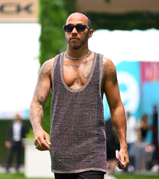
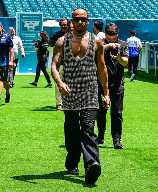
I MEAN....LIKE WE SAY IT EVERY TIME...
do i wish it wasn't an old navy tank top tunic dress? yes. but his supple breasts are out...... i cant focus on anything else.....my heart beats in my ears... dont ask me what color the anything is. I DONT KNOW I CANT SEE IT
P2: LANDO NORRIS
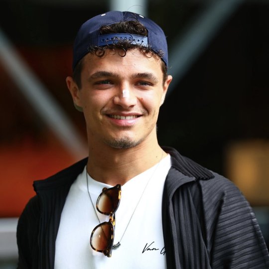
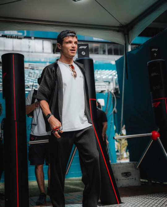
Perhaps the MOST surprising pick for me. Is Lando hot??????????? I've been asking myself this for months......he also seems to be entering his fashion girl era. (FINALLY!!!) He was pictured in an Aimé sweatshirt (A JUMPA for ur english and former english colony folk) so i have high hopes. Maybe I'm just seduced by his Dutch battle scars but he really came thru today. at first i thought he was in miyake and i was literally going to go BALD. but its not :( the brand is basically an even more expensive Zara lmao but...baby steps lol
P3: FERNANDO ALONSO
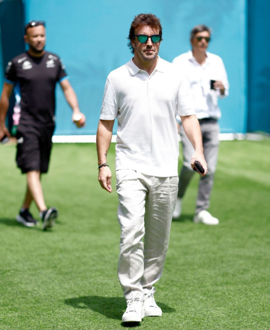
When Kevin Jz Prodigy chants 'eating the old way! serving the old way! serving the old way!', they meant that about grandpa stunting in head to toe WAG white. he's got the youthful shoes, casual polo with the dad fit, linen trousers for the swap weather. its classic. reminding all the wags who the real bad bitch is.
P4: ZHOU GUANYU
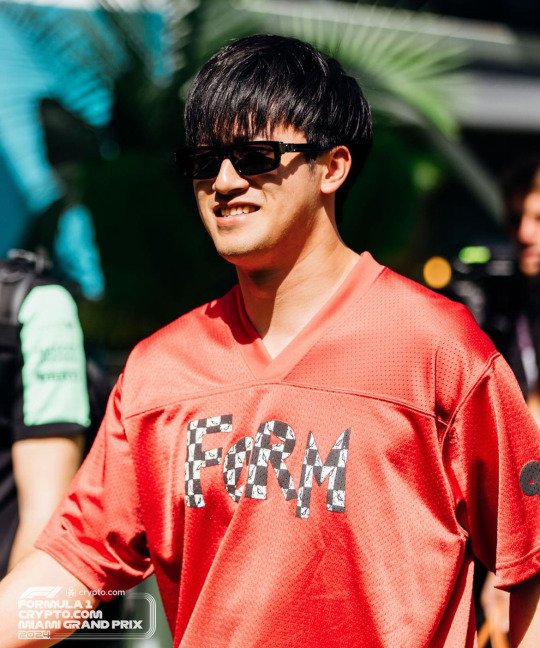
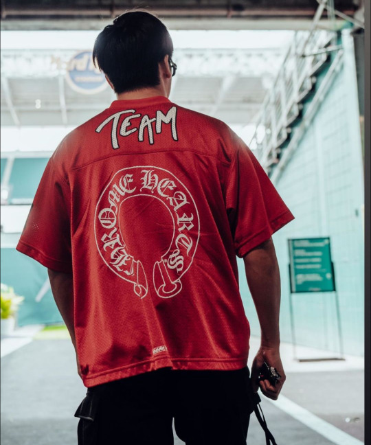
The media is doing him sooo dirty by not showing the back of his jersey!! its not my favorite look he's ever done but it's only media day. i think he looks great in red and i love the blackletter font on the back. I do wish the front was a little cuter but his pants are really cool (sorry theyre cropped out lol) and he's still giving personality and taste!
P6: OSCAR PIASTRI
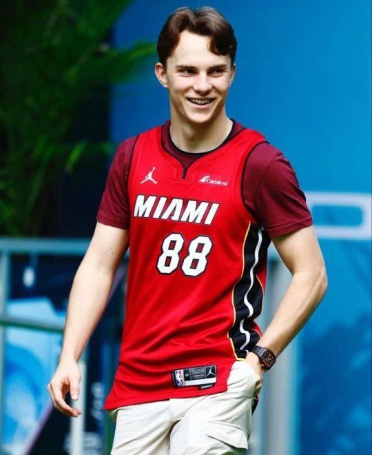
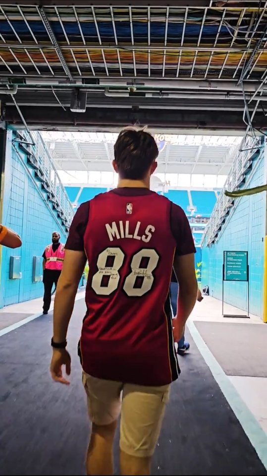
ok yes he does have the 6th grade boy who's still close with his mother fit on under the jersey but he's always stayed true to who he is. i like that he's worn jerseys to races/race locations he seems excited about like he wore one in Melbourne for his home race. AND this one is signed?! he came with a goal in mind and it was to GAG the fellow jocks at the paddock. jock4jock if you will. gotta respect it.
P7: YUKI TSUNODA
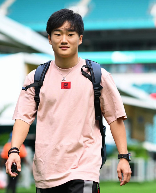
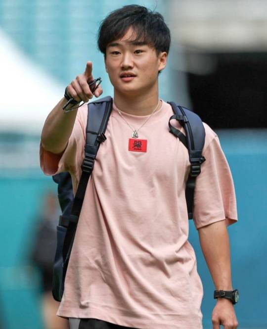
it's a basic serve but a serve nonetheless. he's comfy, he's casual and looks good. i like this color on him a lot and the contrast between the pink and red is fun. hair is looking super good too!!! this is gonna be a good weekend for him, i'm demanding it from the universe!!
P8: VALTERRI BOTTAS & LANCE STROLL
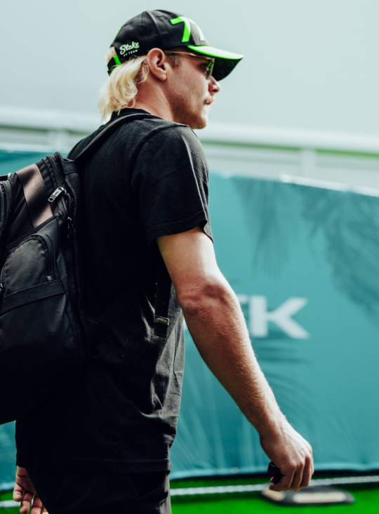
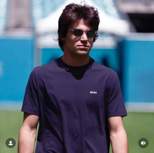
A tie because they're both just on the diva in a tee vibe. You can't blame a comfort queen for being one! The color is nice on Lance and Val is sporting that farm's tan well.
CATEGORY #2 - CHOP!!!!!!!!!!!!!!!!!!!!!! (THE BAD AND THE MEH)

P8: LOGAN SARGENT & ALEX ALBON
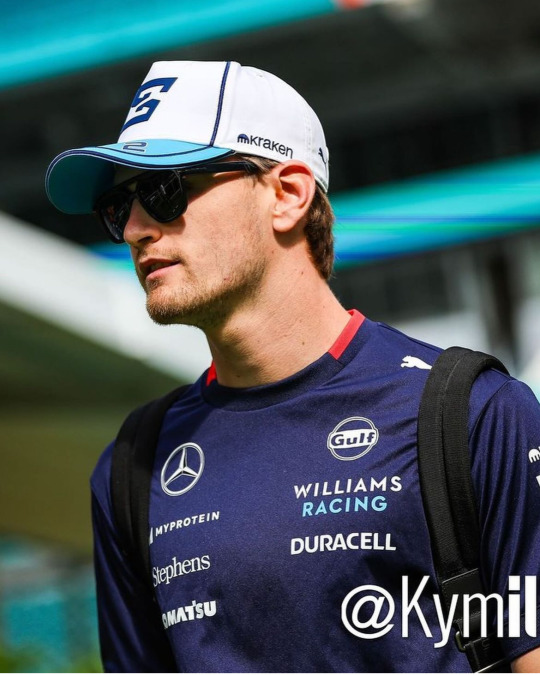
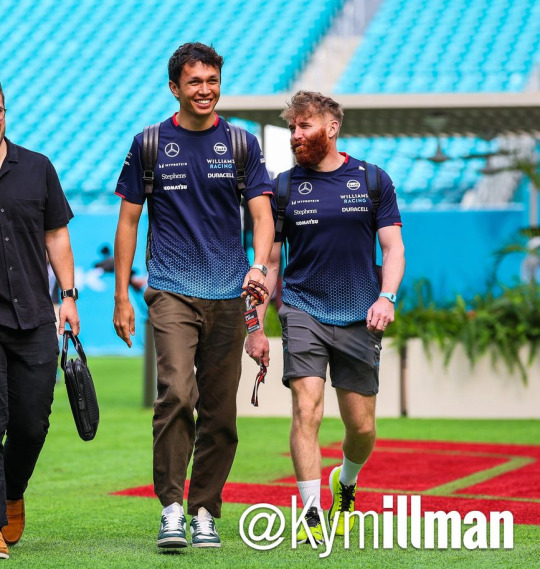
Another tie because they both just came in team livery. that's literally the only reason they were included in this category. though it pains me to rate alex anything other than handsome, wifed and successful. he does look great in them trousers and who can resist him in blue! hoping for a little creativity (arriving with lily) tomorrow!! as for logan...this is ur home race.....i better see something real special and/or Floridian tomorrow or ELSE.........CHOP!!!
P9: DANIEL RICCIARDO
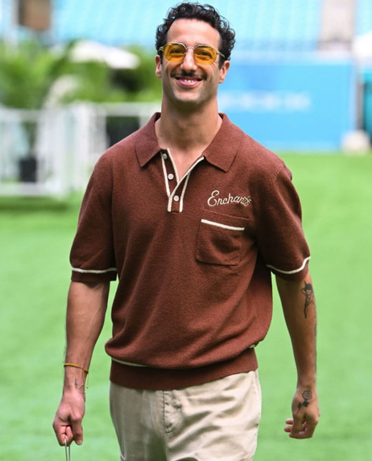
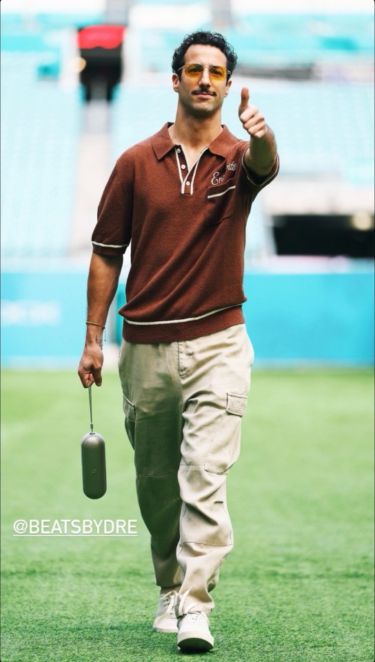
I know the girls are not gonna like this one. But i must speak my truth.....even if you won't hear it....
I don't think anyone is surprised he's wearing his own merch. It would be better for me if it was a little more interesting than his last few releases of just his brand's logo but I like the color and detailing. He's, of course, wearing the wrong size. Personally, if i were trying to promote my own brand, I would perfect tailor the shirt to fit my body so it looked like the best shirt i've ever worn. The Purse by Dre is probably the best part if only because its so stupid and useless. The cargo pants....look, as a former fan, I know that he prefers to dress in baggier clothes. I'm not knocking him for that--who doesn't love a billowing tee to hide the body tea but when you're a 35 year old millionaire...why do your pants not fit you. This is saggy crotch and diaper butt territory. From a styling perspective, sometimes wearing oversized clothes only makes you look smaller. Like you're drowning in your own clothes. That's what it always looks like to me with DR. I know he's interested in fashion and yeah maybe he is still on my shit list but for someone of his status and with the level of resources he has at his disposal...like this man went to the MET GALA with an actually good nEW YORK BASED DESIGNER. what is this...CHOPPPPP
LAST PLACE (THERES NOT THAT MANY SORRY): FUCKASS FERRARI CARLOSER SAINZ AND CHARLES LECHOP!!!!!!!!!
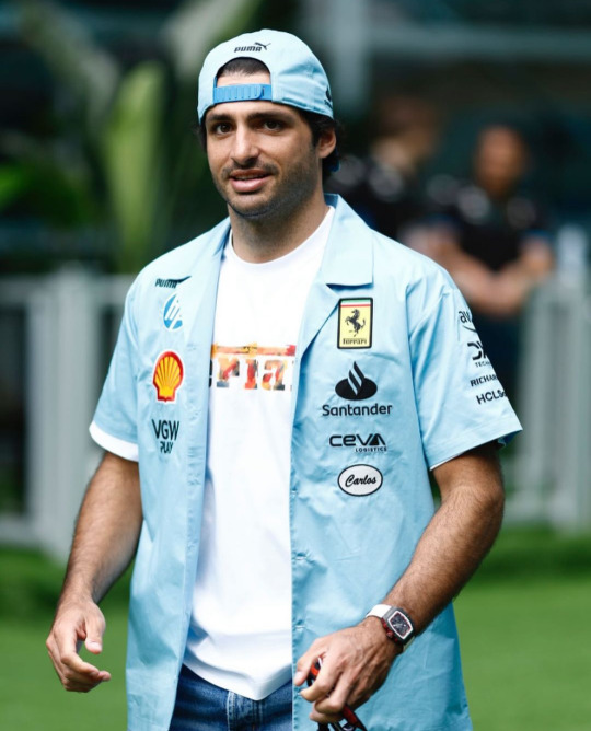
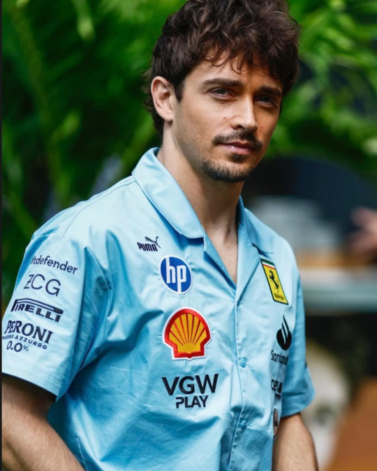
Ugh. heavy on my mind AND my spirit. Never has powdered blue made me so viscerally annoyed. Normally I love this color but not like this. If the design was actually good, I would still hate it but lucky for a hater like me, the design is SOOOOOOOOO hideous. I guess one of the top ten corporations ruining our planets wasn't enough of a steal for them, they had to add a double whammy for genocide blood money too! Puma AND Hp? It's like they thought the BDS chart was a bingo card. The mechanic style name tags are a nice touch too. Very down to earth for millionaires who's private plane usage might be able to rival THAT woman. Blue collar cosplay is kinda fun when you don't actually have to live paycheck to paycheck! Its nice that their name tages are so low too, so you remember that they've sold their souls out to corporations. It's really only a matter of time before a thirst photoshoot with laptops come out or Charles shoves his puppy into a printer. But hey! At least Charles is investing in the local community! Always nice to see million dollar homes sell when the cost of living for a normal person is 30% over the national average in a city where it's illegal to sleep on the streets🥰 CHOP!!!!!!!!!!!!!!!!!!!!!!!!!!!!!!!!!!!!!!!!!!!!!!!!!!!!!!!!!!!!!!!!!!!!!!!!!!!!!!!!!!!!!!!!!
(ok yes, i am aware these men are all millionaires and only one of them have so much as acknowledged the mass murder of Palestinians. but i'll talk my shit forever if it means there's just one person talking about the real world in the f1 space. FREE PALESTINE. BELIEVE WOMEN. FUCK COMFORTABILITY AND THESE MEN WHO PROTECT EACH OTHER. THEY NEVER WANTED US IN THIS SPORT TO BEGIN WITH, ALL THE MORE REASON TO REMIND THEM I'M HERE!!!!!!!!!)
sorry for the rant. this was originally going to be about fashion. and it still is. sorta. BYE
2 notes
·
View notes
Text
thanks @polar-bears-making-pancakes for tagging me <3
Are you named after anyone: i think a distant aunt of my dad's died the week i was born and my dad was like "oh thats a nice name". i was originally gonna be catherine but i think allison suits better
When was the last time you cried: a week ago. got my period and i was hungry you know how it is
Do you have kids: no
Do you use sarcasm a lot: some might say i use it too much
What sports do you play/have played: i used to play netball. which i dont think is a common sport outside of the commonwealth.
What's the first thing you notice about people: what their nails look like. i love nail polish so i literally always check peoples hands to see if they have anything fun going on.
What's your eye color: brown
Scary movies or happy endings: i cannot watch horror i am simply a baby
Any special talents: i dont think so
Where were you born: sydney
What are your hobbies: reading, switch games, fucking around online, painting my nails
Do you have pets: three kittys <3
How tall are you: 174cm (5'8)
Favorite subject in school: maths <3 did a whole uni degree of it too. have not used it since but i still really love the elegance of maths
Dream job: i used to think it was any job that paid well but i have since realised i love working max 4 days a week so guess my dream job what i currently do - meaningful work that is both rewarding and relatively easy, and also is flexible. currently a disability support provider consultant (i tell disability providers when they arent following the law)
tagging @heartstopperdnp @rachosaurusrex @thinking-emoji and anyone else who wants to join in <3
#im nosy so if you wanna do it please do i will be reading like 👁👁#also no obligation to do it. fuck knows how many tag games i have liked and then forgotten to do 😭#tag games
12 notes
·
View notes
Note
two things. one, your art is absolutely wonderful. i love the warm tones and style. two. got any like. weird art tips. like just weird things you do that work really well. or just art tips in general lol. there's something bout your style that makes me go ':D' lmao
aaaaaa tysm !!!! very glad u like my style <33 means a lot
and yeah id say i have quite a few with the way im very experimental n passionate abt art !
>> i think my weirdest one is rly just the main way i render tbh ? like, as u can pretty easily see with my main art style is that its all very crunchy n pixelated, n thats all cause i have anti-aliasing off for my brush . i render in a pretty unorthodox way but it makes things so so so much easier and more fun for me, even if its more time consuming for several reasons
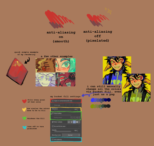
heres a little bit of an infographic ive whipped up that hopefully u can get smth out of lmao . its 6am ive been up all night drawing as usual so im having a lot of trouble doing things properly sorry sorry
and the funny thing is this is aaaaaaaaall just cause i hate blending and am scared of committing to things (esp colors) so i just decided "okay whatever im gonna be goofy and just make it all pixelated idc anymore" and it worked !! (thanks homestuck) art is sm more enjoyable since i started doing this as it fits perfectly with the way my brain works and its helped me sm with getting better at colors bc of the way i have to do every single color manually (for several reasons like how i have to keep track of every color ((which makes me recycle them a lot more making things look more united)), gradients r the most fun to do but i have to make sure all the colors "blend" together nicely, i get to change them super easily, etc etc)
however these days i HAVE been trying to get back into working with anti-aliased brushes just to get out of my comfort zone n such, but tbh the only thing its helped me with is remind me how much more fun drawing aliased is and how absolutely dogshit i am at blending FDJHJKDF
also it makes me better at minecraft skins since im so used to working with pixels !
>> another little weird thing i have that honestly just goes against basic art rules is experiment by having ur values be as close together as possible without losing contrast . this is horrible as a tip, but fun as an experiment, and for me its just fun since i already know pretty well how values work and have enough experience to break the "rules" - because lot of times good shading colors r actually lighter than the original when put under b&w
so if ur like me i would recommend trying it out ! if u dont even know what values are then this ISNT good for u, do values properly as they really help
>> if u struggle a lot with side profiles, just learn from the gorillaz demon days album art . like literally im not joking that is THE thing that made me learn to draw side profiles and id say im pretty good at them now (however the effectiveness of this probably depends on the style)
and by learn from it i mean u can just trace it with any other characters, or study it, or reference it, yadaydayada . just do wahtever with it, damon albarn dgaf
obviously this isnt gonna magically make u great at side profiles but if u want a fun art challenge or ur a big gorillaz fan like me, it could get u kickstarted !!!! especially if ur doing it with ocs or characters u like that are in a band or something
ok thats all the tips ill be giving out tonight im a little sickly victorian child rn
hope it helped . uhm . bye
13 notes
·
View notes
Text
quantum break appreciation month: a quick retrospective
so, first of all, wow, it was WAY more effort than i thought to just POST SOMETHING EVERY DAY. i put a lot of pressure on myself to only post The Good Stuff to this blog, and boy golly is my standard of "good stuff" higher than it ought to be! so this has been great practice for me in "finished is better than perfect."
second of all, i wanna put together a quick rundown of everything i did this month!
Announcement post
April 1st: My Bleeding Clock (My Immortal AU) fanfic for April Fool's Day
April 2nd: Playlist to go with My Bleeding Clock
April 3rd: Sketch of 2010!Beth
April 4th: Sketch of Jack and Beth
April 5th: Reblogged my old post about last year's anniversary zine, as well as a new little sketch to celebrate the 7th anniversary of the game's release
April 6th: Doodle of Beth in a skirt (with pockets!)
April 7th: I literally just posted a passage I like from the QB:ZS novel
April 8th: Started posting old art... completed set of the halo series here!
April 9th: More old art (Jack/Paul this time)
April 10th: More old art, LNEHH edition
April 11th: More old art, Will Joyce edition
April 12th: Some Jack/Paul art to celebrate me and my husband's anniversary :3c
April 13th: QUANTUM BREAK HOMESTUCK AU!!!
April 14th: Surprise! it's even more old Jack/Paul art!
April 15th: Wow! I can't believe it's more Jack/Paul art!
April 16th: Apparently I was busy this day because I just reblogged LNEHH, lol
April 17th: Quantum Break characters, but as Skyrim characters
April 18th: Some blinkie gifs I made using blinkies.cafe
April 19th: A sweater I made using the linocut stamps from last year's anniversary zine
April 20th: Another blinkie gif, hehe
April 21st: Meta post about color palettes and color usage in Quantum Break
April 22nd: A little QB divider I made for my fansite (WIP)
April 23rd: Some terrible glitter gifs, also for the WIP fansite
April 24th: Minecraft skins of a bunch of QB characters!
April 25th: I was also apparently busy this day, cuz all I did was make a stupid phone background for myself XD
April 26th: Took a swing at pixel art
April 27th: A promo for the Quantum Break Discord Server I run!
April 28th: Wrote another chapter of My Bleeding Clock...
April 29th: Art of Jack and Paul :3
April 30th: Started a new longfic: The Symmetry of Fear!
holy shit. that's a lot. i am retroactively impressed with my past self for doing all this, lmao. nice.
third of all! i wanna note that i started several projects this month that i have yet to finish. of course i'm not confining my quantum break posting to one month of the year (impossible) but i will take my time finishing the... uh... three fics and two meta essays i have unfinished, as well as the fansite i am working on. i want these to be GOOD, so i'm not going to rush them. i'm glad this month gave me to juice to finally get these projects started, though!
and lastly... why did i even do this project/event in the first place?
well... good question. i imagine i'm not the only one who has been Going Through It for a while now, and i just... really needed a big project to focus on for a while. and quantum break is like, one of the only things that i never get tired of thinking about, so... are you seeing my logic here?
all that said, i do genuinely want to work on putting more love out into the world. and i love quantum break! i want other people to love it too! (or at least, i want other people to look at my passion for it and be like "i dont go here but you keep doing your funky little thing my man," you know what i mean?)
so, big thanks to everyone who has encouraged me this month, whether it be in reblog tags, in the quantum break discord server, or elsewhere. also, big thanks to my husband, who i would not have married if not for our mutual obsession with quantum break, and who is always down to listen to me talk about my various theories and fic ideas. and finally, a big thanks to remedy, for making this dumb game that i love so so so much.
#quantum break#quantum break appreciation month#thanks yall for putting up with my qb posting seriously#i know thats not what most of yall are here for#but thanks for humoring me anyway!#i WILL make more people love this game so help me god
10 notes
·
View notes