#also i hand drew everything including the panels because i like that hand-drawn look
Explore tagged Tumblr posts
Text


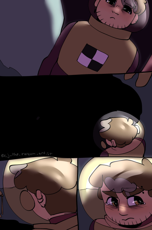
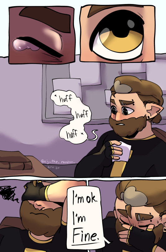


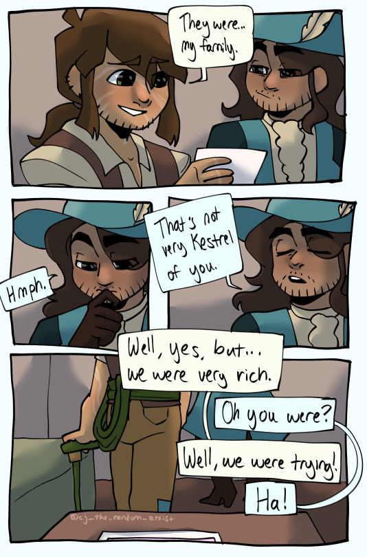

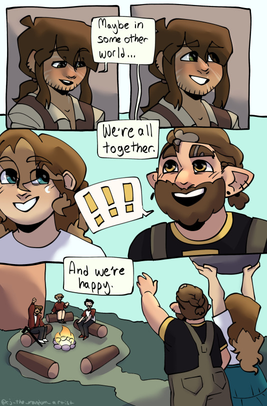
Is this comic completely silly, a little overly dramatized, and not my best work?? Yes. Did I cut a few corners and put a little less effort into making everything highly detailed than I would in a full illustration due to time restrictions and wrist pain?? Also yes. Was it worth making so I can practice making comics and drop some random thoughts onto a piece of digital paper?? Absolutely yes.
This was kind of based on a loose idea that I have that Pirates SMP and Hermitcraft Season 9 (as it's going right now) are different universes?? Like, that in the Pirates SMP universe the Hermits all got scattered so far from each other after Season 8 and Moon Big that they just... didn't start a Season 9??? And kind of just went on whatever adventures life took them on in whatever universes they ended up in???? Idk it's a kind of silly headcanon and probably completely wrong but I don't care and it doesn't have to be right or anything cuz I enjoyed making this and that's the point of this. So, silly headcanons aside, this was fun to make.
That said. Hope y'all like this little comic and my theory bit I put in here, and have a good day :D
#boatem#boatem crew#boatem crew fanart#impulsesv#impulsesv fanart#pearlescentmoon#pearlescentmoon fanart#goodtimeswithscar#goodtimeswithscar fanart#mumbo jumbo#grian#mythical sausage#hermitcraft#pirates smp#extra long post for y'alls viewing pleasure since i used actual comic page dimensions for this for practice#also i hand drew everything including the panels because i like that hand-drawn look#this was so fun. so fun to make. so silly and fun and i truly enjoyed making it and i hope y'all like it you lovely people :D
3K notes
·
View notes
Text
Madness draws: Behind the Scenes of the Bela/Farin: “Widumihei” comic.
A few months ago I posted here this comic:
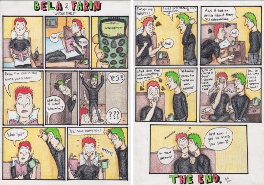
CLICK HERE for the original post about that comic where you can see it in better and bigger size, and also reblog it ;)
And this post is just a deep dive into how I plan, do and draw my comics.
Let’s start with sketchbook things...
So every comic needs a story, right? My comics usually are born from either some dialogue I imagine in my head or by an impulsive inspiration that happens when I see something or talk with people and a random idea is triggered. I’m very good at coming up with new ideas solely based on just one word or so which is why I often ask people if they have anything they would want to see/read because I suck at coming up ideas on my own. Or I do get ideas, but not as often as I’d want to.
This particular idea was very old and I have tried but I cannot find the piece that was my inspiration but it was in some of my old German books because I remember laughing at it with either my brother or even with the German teacher in 2011 or 2012. I was only able to find my first “sketch” of the story:
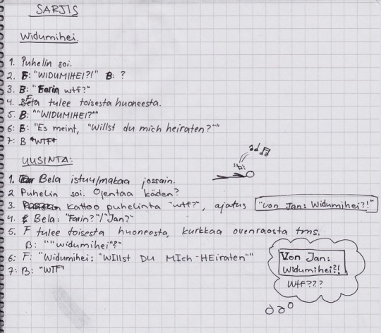
This is in the notebook I used for writing down some comic ideas and even had one comic in it, plus it’s also my fanfiction writing notebook. It has no date but I know for sure it was either 2011 or 2012 because that’s when I did my last Bela/Farin comic and pretty much started my (unintentional) 6 year pause from drawing altogether.
I have always been trilingual when I do these plans for my comics, often writing the “narration” in Finnish and the dialog either in English or German because I just cannot imagine them to speaking Finnish. The translation of that text goes as:
COMIC (sarjis = sarjakuva = comic book in Finnish)
1. The phone is ringing. 2. F: “Widumihei?!” B: ? 3. B: “Farin wtf?” 4. Farin walks from another room. 5. B: “Widumihei?” 6. F: “It means, “will you marry me?”“ 7. B: *wtf* REPLAY:
1. Bela is sitting/laying somewhere. 2. The phone is ringing. Reached with his hand? 3. Looks at the phone, “wtf?”, a thought: “von Jan: Widumihei?!” 4. Bela: “Farin?” / “Jan?” 5. F comes from another room, looks in from behind the door frame or something. B: “Widumihei?” 6. F: “Widumihei: “WIllst DU MIch HEiraten”“ 7. B: “WTF”
So when I then started to draw these comics again in 2018, I kept thinking about this one too and still wanted to draw it one day. If you have read the finished comic, you may notice something different in the old plot versus new: I switched Bela’s and Farin’s roles. Back then I didn’t know too much yet but over the years I have learnt much much more about them and I just figured that asking to marry him even as a joke would be too much for Farin and that it would fit Bela’s persona much much better.
***
I had a bit of problems with getting started with this one, mainly because the last times I drew a dä comic was in June 2020, in April 2020 and before those in October 2019. Because of so long time between the comics, I just always forgot about my methods and in which order I do things and what works for me the best. So every time I started to work on a comic, I had to start completely over because all I had was blank paper and I somehow needed to get my thoughts in order and out of my head, into a physical form aka as text and images on the paper, and it’s easier said than done.
So pardon me but from this on the text is going to get a little bit confusing for a little while from now on - but it’s also a very good look over how the life with my suspected ADHD be like sometimes...
I started working on the plot once again to my sketchbook... I think it was somewhere in the beginning of 2020. Because the next idea there is from the summer. This is what the plot looked like at that point - here I had already switched their roles:
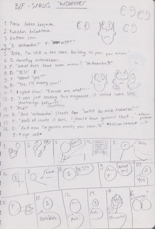
Shortly, the texts go: 1. Farin is reading a book. 2. A phone makes a noise. 3. (Farin) looks at it/read the message. / 6. B appears into the doorway. / 11. F spits out the tea.
And underneath it you can see one of the stick figure storyboards I often do in order to kinda see the text in pictures better, and I will write down or draw important aspects like expressions (Farin’s eyebrows) or things like *facepalm’* or *eyeroll* so that I remember to add them.
Next I was struggling with the era. It needed to be an era with the old mobile phones with SMS options but still not too early because I feel that Farin would have not been the first in line to buy a brand new technology object, especially not when it’s a phone. I was even googling when did Germany get their first mobile phone - I remember I got my first phone aka Nokia 5510 in 2000 or 2001 after my mom got a new one and gave her old one to me, so the story shouldn’t happen too many years before the Millenium.
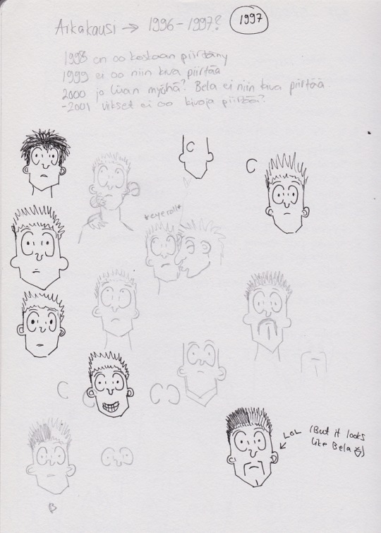
Originally I planned 1997 for that - I needed to think about that based on their styles because shorter hair is harder to draw. Here’s me trying out some hairs and how they’re to draw and which era would suit my needs the best. I actually find the text hilarious altho it’s mine but this is what it’s in English:
Time period -> 1996-1997? 1998 I’ve never drawn 1999 is not that much fun to draw 2000 is already a bit too late? Bela not that much fun to draw. -2001 moustaches are not fun to draw?
I think I was struggling with my thoughts because the next thing in that sketchbook is yet another storyboard:
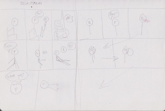
Or actually I think this was just to see how many sheets I’d need and how many panels I could fit on one sheet.
Anyhow, I then did other things for some time before I got back to this project this year. Including finishing with the sketchbook I had been using since 2010 (and the half of it since 2018!) and I had to get myself a new one. So when I started to think about this comic again, one night I was just thinking about some Bela/Farin scenarios as usual and suddenly I just felt that I NEED to do the comic in the 1998 style!!! So suddenly we jump from the original 1997 idea to the new era, only because of the colors.
So asap I grabbed my sketchbook and started to look for the proper colors for the hairs:
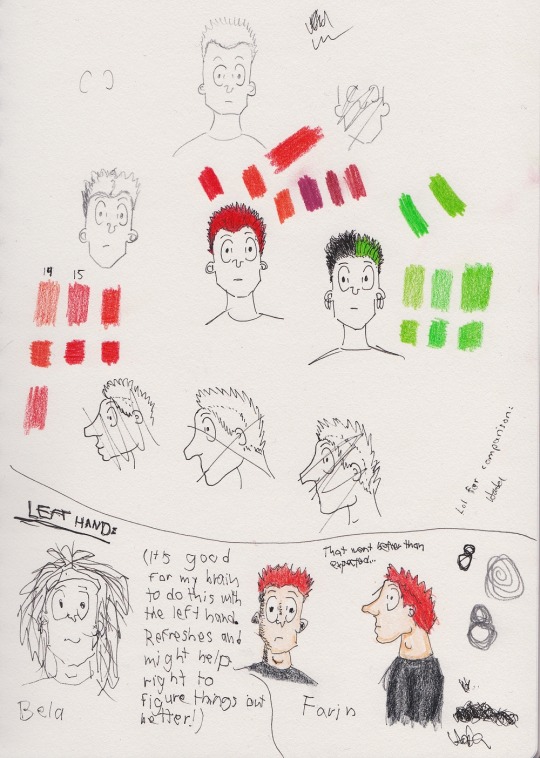
This one I posted here before too as I was struggling a lot and just felt that I didn’t know how to draw, again. Sometimes when I feel like that, I start drawing with my non-dominant aka left hand because it doesn’t have all that in muscle memory so drawing and writing with it feels more free and it feels almost like pressing a refresh button in my brain. Suddenly the right one know again how to draw because left isn’t too well in control. The below part of the image is done completely with the left hand, including the coloring.
And because I had now a new sketchbook, I somehow couldn’t... deal with the plot and plans being in a different sketchbook than everything else so I had write the plot/dialog AGAIN, into this new sketchbook, along with the storyboards and everything:
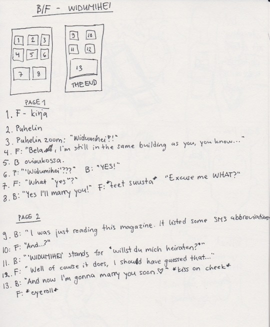
Translations: kirja = book, puhelin = phone, oviaukossa = in the doorway, teet suusta = tea(s) out of a/the mouth. “Puhelin zoom” just means “close up to the phone screen” in Madness.
You can also see that I found out that I don’t need to do the stick figure storyboards to imitate a sheet when I can just draw this rectangle and smaller rectangles inside of it and write there numbers to match the things in the dialog to make it much easier for me to plan the pages. And here’s also a small easter egg: there’s 13 panels overall in this comic :D I almost did 12 but then felt that no, I really need to do 13 because, you know, the hairs, the era, the album title. And also because I like the number so much lmao.
So from there we get to the second storyboard which is not just stick figures anymore but just me planning how I want the panels to look like. To get the imagery of the rooms and facial expressions etc. out onto the paper so that I can see them in real life instead of my shady imagination that sometimes isn’t as vivid as what I could be.
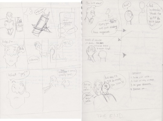
Also have you ever tried to draw a beach chair? It’s more difficult than you’d think:
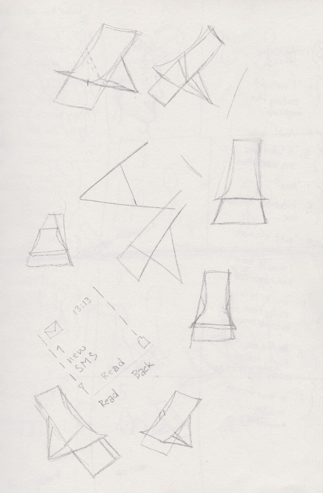
I tried to draw the same thing from the same reference photos so many times and still I always felt like I was trying to draw that impossible triangle or some other illusion image. And it just went on and on here:
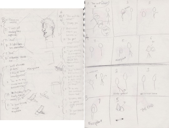
Originally I also had planned the second panel to be a close up of the phone so that Farin’s face would be left at the background from the frog perspective. That’s what I was trying to with that weird-ass face on the left but turned out that I have never drawn these characters from such angle and I just... couldn’t see it in my head clearly enough to be able to draw it. So I dismissed that idea and that’s why the angle changed from a phone close-up to a side view to the room and at Farin.
As I was in the middle of planning the second page, I suddenly wasn’t happy with my original plot anymore. I wasn’t sure if it would work and needed to think about it one more time. So I wrote two other dialogs here, along with a storyboards for them both. I ended up choosing B from those two options eventually.
I don’t remember anymore if I had already done the first sketch of the comics or not but at some point I just felt that I no longer knew how to draw in my style. Sometimes you just draw and learn wrong things and wrong methods that you get used to and then you have to take a break and actually do a little bit of studying over your own style to find again the way how you want to draw, and get rid of the bad habits and find the good ones again. In my case it was to draw the eyes way way too big when they originally never were THAT big, so I had to learn how to draw them small and normal again. That’s why I did these, as I really needed to pay attention to the faces and remember how to draw them again:
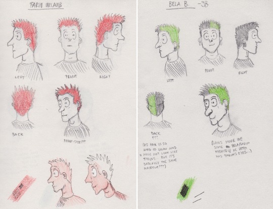
The front-side views were another big readong for this “study” because I have drawn that perspective only once or twice before and I needed to figure out how I want to draw that. Also, I don’t know if it’s just me but for some reason the front-side Farin reminds me of one of the parent characters from this cartoon called The Rugrats which I watched as a kid. It was totally unintentional, but you can google The Rugrats if you don’t know how the charatcers looked like in the cartoon.
The things below are just me testing something. The red Farins were just to test how the colored pencils work on each other and how the fineliners work with the colored pencils, and which way is the better way to do the shading. And the red colored pencil was the only one available at the time so that had to do.
A little bit about the heads btw: You might notice some difference between the left and right faces. It’s because I have always, always struggled with drawing anything that is looking at right. Most of the animal portraits and all I have drawn so that they look at left because I just find it so much easier to draw. I think with comics it’s because I always start with the eye (and the eyebrows if I don’t forget it) and then do the forehead, nose, mouth and chin, and after that I either continue from the hair (from the front) or do the ear first. But when I am drawing them to look at right, I have to basically draw the mirror image and starting from the hair is not the key because it can easily mess up with the perspectives. I still usually draw everything in the same order but it really is difficult because I’m doing a mirror image and my own hand is on the way, too. Basically I’m drawing from right to left instead of left to right! (I think I should try drawing those with my left hand, then...)
And from here we get to the first sketch of the comic. From here on the images are from my phone’s camera so they are sometimes illegally bad but no can do, I again didn’t think I’d post these to anywhere:
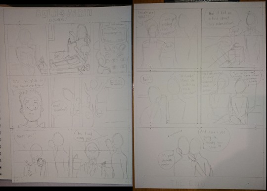
Here you can see I was mainly just focusing on the shapes and the space inside those panels. Just trying to see the perspective and how everything is. The only thing that I drew more precisely was the third panel, with the hand and phone. I had quite a nice memory of old phones in my head but I still googled for some reference photos of Nokia 5110 phones as that was my first phone (as I mentioned earlier), and I also happened to have some of my other old phones on the table nearby so I took my own hand reference photos too:
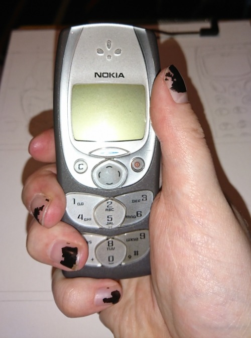
They always say there’s a little bit of the artist in their art and this one literally has that - “Farin’s” hand is actually my hand! :D And I think the size is kinda on point too because this phone was like 2-3 times smaller than Nokia 5110 and I have small hands, and I believe Farin must have much bigger hands, so the 5110 probably would have looked about the same size in his hand.
After the first sketch, the next step was then - the second sketch:
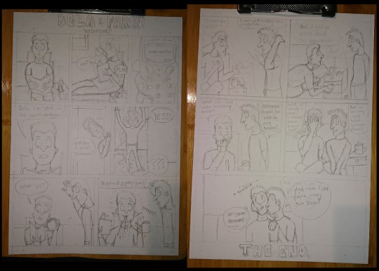
I also wanted to add more action to the panels so that it’s interesting to look at and not just basically the same panel over and over again with just different speech bubbles, so I came up with the idea of Farin spitting out his tea not being as cartoony as it could be and that he would have to actually clean it up instead of just leaving it there just because in cartoons/comics everything is possible. That way I got more depth into the panels and it was also interesting for me to draw because I drew lots of new postures I have never drawn before, and I’m surprised how well it went despite me not even looking for any kind of reference photos! The only things I used reference photos for were the beach chair, and the phone in a hand. (I have actually always been quite good at drawing 3D objects and spaces, especially if they are rectangular.)
So yeah, this is the phase where everything is then finished with pencil and what follows next is drawing the lines with fineliners - I use Sakura Pigma Micron fineliners for everything else, and black Promarker for doing the lines for the panels (and also if I need bigger pitch black areas done).
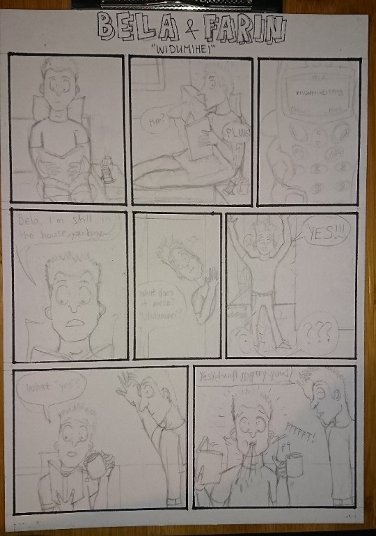
Here are the panel lines done but I only had a photo of this first sheet.
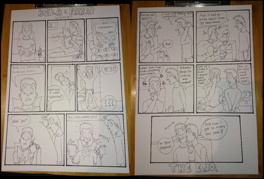
And here are both sheets with the finelining done and all pencil marks etc. erased. I really like this part because it looks so clean when all those sketch marks are gone. It’s also crazy to think I literally spend hours drawing something in pencil only to erase it all away later :D
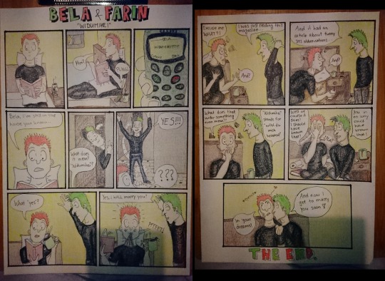
And here’s one photo of the coloring process, the first one has only the base colors done but none of the shadows yet (apart from the shirts), and the second one has some of the shadows done but not everything yet.
Usually after coloring, I will then go through everything with the fineliners one more time to make sure all the lines are dark enough as it just gives everything the finished yet a bit “sketchy” look that what I really like with my comics. The actual last detail is always adding my signature along with the date or year.
And here’s the finished comic one more time for comparison:

Don’t forget to check and reblog the actual post about this comic if you read this post all the way here. I’d appreaciate that a lot since art and artist on Tumblr are not really that much appreciated.
9 notes
·
View notes
Text
i have greatly enjoyed looking at those 2019 art memes, and even though my art skills are still very underdeveloped i collected my best doodles from every month this year. i also gathered all the doodles for specific characters... for scientific reasons. i’m putting this under a cut because my art is a little cringey and i will probably delete this later. there is minor cartoon gore included, so be aware of that.

art is hard! i think the main thing i learned this year was how to draw relatively clean lines despite worsening hand arthritis. i also learned how to use my drawing tablet.
you can tell in the earlier stuff that everything was tilted because i couldn’t figure out how to hold the tablet. eventually i figured out a solution for that (my setup is absolutely fucked for drawing) and learned how to use tools in sai to mitigate that shit.
breaking it down in terms of characters is very interesting. i have kind of a caricatured style that i’m trying to learn how to display every character uniquely in and some characters were way worse than others this year.

i didn’t draw makenna very much, but i did finally figure out that her hair is blonde and not red. that’s something, at least.

i drew lavender a lot. he’s basically the only character with any real consistency for some reason. like, he’s purple and that’s really easy to remember. wavy hair, angry, covered in blood. all easy to remember. i also included drawings of his human form too.
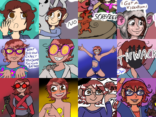
bowen has no consistency and the only thing i figured out this year is that his skin isn’t ghost white.

i should draw eve more but i don’t. there’s some characters that work better in my style and eve isn’t really one of them, the poses i tend to imagine her in are currently beyond my skills. one day.
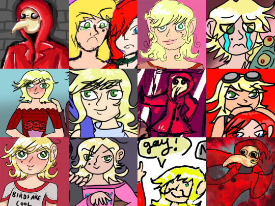
speaking of characters that don’t work in my style. erick isn’t one of those, but i can’t figure out what his face looks like. or which side his mole is on. the third one on the bottom is basically a scribble but damn it, it’s important, it has to be included.

ravenna is the oldest and most powerful of the seven liches, but i rarely draw her, because then i also have to draw melchior and that’s a lot of work. i also never draw the liches in their undead form because my art is bad and i’m bad and idk how skeletons work.

melchior definitely has a face that i can replicate in drawing. the first one is a concept from when i was trying to learn more realistic drawing before i realized i just want to cartoon.

mordecai is a terrible villain and i don’t understand his hair. i like experimenting with the curse of oldness being reversed but i’m still not sure if that happens canonically. if it doesn’t then mordecai is literally a character whose only motivation is turning themself back into a twink after getting cursed.

vincent was specifically helpful for figuring out how to position glasses on a drawing’s face, which i’ve always had problems with and is the main reason bowen’s earlier drawings don’t have glasses. also? tentacles. or tendrils. or whatever those pieces of the fluid demon he uses to slap mordecai are called.

it took me forever to figure out what lucien’s face looked like. and then it also took me fivever to remember that he is supposed to have scars on his face. the earliest drawing here is from january of this year and i had a ts3 sim of him seven years ago that had the scars, so that’s not an excuse. i just can’t remember shit.

iirc the first drawing here is actually from before 2015 and was drawn with a pen and touch tablet, so it looks very 2006 deviantarty because those tablets hurt my brain to use. it’s included so that i have an increment of 4. viola is a goofy character and i like drawing her. i just wish i could figure out what exactly she looked like. the last panel is definitely better as far as line quality, but the third or sixth hair design would be more accurate, i think.

some ocs are easier to imagine caricatured and some are easier to imagine as real people. i have a better idea of what cassandra would look like if she was a real person than what she should look like in this style. her hair being frizzy and blonde is pretty much her defining visual trait.

other random drawings of mia, molly (erick’s ex), rosalie (lavender’s half-sister), and thoreaux.
basically, art is STILL hard, and i still have a lot of days where drawings will not turn out no matter what i do. but i have definitely improved since january of 2019, even if accidentally, and i hope my art eventually gets to a point where it suits my storytelling purposes.
#non sims#fq art#delete later#mobile has been messing up my cuts#so if you're on mobile i apologize for way too much shit in this post
11 notes
·
View notes
Text
The Goon #5

The Goon #5 Albatross Funnybooks 2019 Written by Eric Powell & Thomas Sniegoski Illustrated by Brett Parson Lettered by Richard Starkings & Comicraft's Jimmy Betancourt The gangs that have sprung up on Lonely Street in his absence continue to give The Goon fits, and now the drunken reprobates have started drinking something called Beezlebooze with monstrous effects! And who is the mysterious crime figure called Dapper calling the shots from the shadows? I have no idea why I haven't been reading The Goon since the beginning? I love Avatar Press but the series debuted at a time when I was moving and before getting started back up regularly with comics. Plus it was the early days of the internet and I hadn't even joined any social media sites or groups through Yahoo or AOL. It's amazing how far we've come and how social media has played such a role in discovering and telling others just how good a series can and ones that you really shouldn't be missing. This is one of those. New reader friendly and as entertaining as it comes. Though it's no surprise really with Powell and Sniegoski's track record so far, Sniegoski did Talent which I loved and was half of the reason The Menagerie series still remains with me today. I love the way that this story is being told. There is something about the fact that this reads like a old school Night Time Soap Opera where you can come into an issue and understand what's currently happening and yet it's still tied to everything that has come before. The way the pacing is here is sensational as you get so swept up in the story & plot development and the character development you forget how quickly the book moves forward. So I adore the fact that each issue we keep meeting someone who wants to take over the town. There are a lot of crazies drawn to this town and it's like some kind of bad guy vortex. The way this issue opens is great and I applaud whomever it is that comes up with the names here because Beezlebooze should be sold at conventions, with a high alcohol content just saying. It does a beautiful job setting up the story for this issue and grabs the readers' attention and makes them want to see more. Then as the story moves forward we meet a preacher who is preaching about repenting for drinking the Devil's water, though I always thought it was the Devil's tears and Franky well he just makes me laugh repeatedly. I love the interiors here. It mixes this kind of old school Dick Tracy feel with the Munsters to create this darker yet very fun world. The linework is strong, sure and steady and the hand that drew it really shows off some great skill. The way varying weights are utilised to create the attention to detail that we see is marvellous. The way that the panels show their composition so that we see how perspective is shown and getting to see the backgrounds that are shown expanding the moment and bringing a size and scope. Then there are the page layouts themselves and all of this combined show a rather strong, seasoned eye for storytelling. How we see the colour work here is also nicely done. That this is a darker or grungier looking setting to see the colours muted and then the hues and tones still show that shifting in them due to the way light sources are utilised is superb. There is something to be said for the one and done storytelling that leads directly into the next issue. They say there's no rest for the Wicked and they are probably right as we see the moment one is removed from business another rises up to try and stop The Goon. Now that he's back all these gangs are once again in fear of being broken up and that just cannot be allowed to continue. God help him if they all come together. In the meantime this book manages to engage the reader, makes us laugh out loud and thrill with the anticipation of what's to come. The power of indie comics (including small or self-published) is at hand and thankfully it shows no signs of slowing down!

3 notes
·
View notes
Note
Only explanations I will accept for that ugly moustache: 1) Ed drew it on. 2) Roy lost a bet and had to grow that moustache
^^^^^^^^^ YES
All these years, all these years, I’ve tried to survive the daunting emotional trauma of Roystache by reminding myself, “Arakawa didn’t draw facial hair in the final panels of the manga. Arakawa didn’t draw the mustache. Arakawa didn’t put a mustache on Mustang ever. It was just Studio Bones. It was just Studio Bones referencing Arakawa’s omake wherein Roy contemplated growing a mustache to look older, he asked Hawkeye to draw on facial hair, and she used a permanent marker to put cat whiskers on his face. And I love that omake, so I can respect the reference. Right? That’s all that’s going on. That’s it. This means that, if we marry FMAB material with the manga, the worst we can say happened is that Mustang wore a mustache for a brief time and then it got shaved.” He looks like this, he looks like this, he looks like this, he looks like fucking THIS:

And that’s how I’ve survived.
It’s been hard. It’s been the greatest struggle of my existence. It’s been trying and it’s tested the limits of my psychological constitution. I deny its existence with as much fervor as I believe ATLA never got a live action. There’s no ATLA live action. There’s no Mustang with facial hair. I’m making it through. I think. Surviving through the Roystache-that-definitely-doesn’t-exist.
A friend and I have been secretly (well, I guess it’s now no longer a secret…) writing an AU wherein Roy stays blind and he and Hawkeye hook up because yay, anti-frat rules are no longer gonna apply. And sometimes, in a rather vindictive fashion, I like to imagine there’s one week where Hawkeye’s gone and he starts growing a mustache out, she comes back, and she just says, “You’re shaving it. You don’t have to look at it. I do. Every day.” And shoves a razor in his hand. And that’s the end of it. Somehow this gives me emotional satisfaction. I’ve taken control of razoring the mustache off his face with my own power and volition. The mustache gets killed fast and swiftly and Hawkeye never tolerates it and it’s gone before I have to wilt on my couch and cry. It’s my personal fantasy, my personal attack against the mustache. And in this fantasy, I WIN AND THE MUSTACHE GOES TO HELL.
Now [sigh]. The logical part of me acknowledges that… technically… it wouldn’t be OOC for Roy to grow that Mustang Mustache. He has a good sense of style and enjoys looking pretty, but he also has a strong sense of social situations. He had very little business being promoted to colonel at twenty-six - youngest colonel ever in Amestris’ history, according to FMA novels. He has even less business being promoted to general at thirty-two. Sure, he’s proven he’s capable. His role during the coup and his actions during the Promised Day saved the country. Being at the forefront of Ishval’s reconstruction and negotiating with Emperor Ling Yao for a railroad means he’ll successfully turn Ishval into an impressively economically viable region. But he’s still thirty-two. He’s still going to piss off plenty of people for his inhumanly rapid scaling up the ranks. And… some could try to dismiss his position as mere favoritism from the Führer - we know how much Grumman likes Mustang, to the point he’s basically setting Roy up as his heir. So, as RIDICULOUSLY TRIVIAL as it is, having facial hair is going to make Mustang look more the part of a general, look more like he’s supposed to be where he’s at - and it’s going to help with his interactions. Playing the reputation of a lazy sexy lady’s man worked fine as a colonel in Eastern Command, but now that he’s ranked one step below Führer and close to reaching his goal, he can’t keep the same strategy. That pencilstache might not be his hottest look, but admittedly it does make him look far less boyish and more like his dignified rank:

It’d be the same reason he’s slicking his hair back more frequently now (I assume he’s doing this more frequently), and perhaps even wearing his hair shorter (in FMAB art anyway) - he’s got to dress right for the Big Job. And in these moments of my thoughtful reasoning, I commit the greatest sin of humankind by somehow accepting, respecting, and not-disliking the mustache.
But.
Still doesn’t mean I’m going to cheer this own logic of mine.
I far prefer what you say. XD XD XD XD
I adore the viral tumblr post that says Ed drew it on. I think it’s the single best explanation for the photograph at the end of FMAB. I mean. Headcanon accepted the second I saw it. My heart hums hopeful melodies with you bringing it up. I love option #1. It makes the Roystache bearable - even hilarious - because now it’s a funny DRAWING and not a real THING that GREW on Roy’s LIPS (ew). Not to mention this is so completely, utterly, 110% in Edward’s character… to receive a photograph of Mustang, sneer “Nyeh! Fuck you, General!” and draw on a mustache.
So yes. #1 is a glorious option. Ed drew it on. I crack up thinking about this every time I think of it.
This thought has kept me going. Until recently.
Because then. THEN. I was fiddling through FMA’s Chronicle the other day and…[screaming]………….
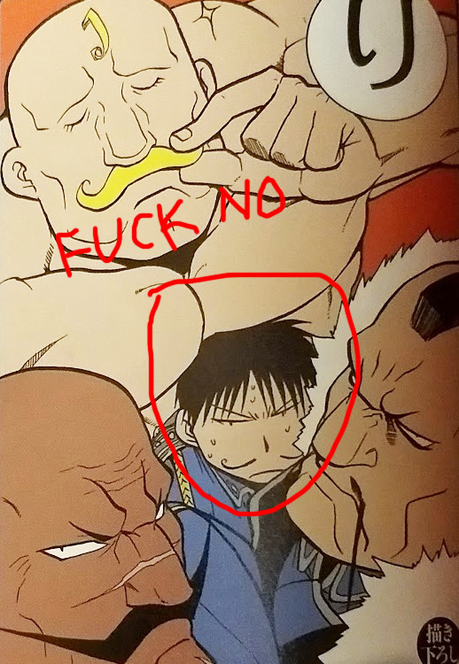
Captioned: 立派 だねヒゲはかん漢のいげん威厳です More or less… “Fine mustaches are quitethe majesty of the greatest men!”
Arakawa.
Arakawa NO.
ARAKAWA SENSEI I LOOK UP TO YOU AND ADORE YOU AND RESPECT YOU SO MUCH. HOW. HOWWWW. HOW COULD YOU DO THIS TO ME.
No. No no no no no no no no no no no no no no no no no NO.
She drew him with a mustache too.
[hyperventilates] She. drew. him. with. a. mustache. too.
AND IT LOOKS - EVEN - WORSE!!!!
Go to hell, demonstache, go to fucking h-e-double-hockey-sticks.
WHY DOES LIFE, THE UNIVERSE, AND EVERYTHING HATE ME??? WHY CAN’T WE HAVE NICE THINGS IN LIFE???
The best thing about the art is that Basque Grande is in there, which means we can’t put this on an official timeline or take it FULLY seriously. But the fact Arakawa has drawn it, too, makes option #1 the slightest bit harder to faithfully headcanon (even though I will, forever, think it’s the BEST solution for how to handle Roystache).
So I am unendingly appreciative of your #2 suggestion: it was a lost bet. I think I can accept that emotionally. XD XD XD It’s a good headcanon. No one’s telling me that Team Mustang doesn’t take lots of ridiculous bets. Team Mustang is always being ridiculous. It’s in line for them to pull something like this. Also… it could have been Ed again. Another Edward Elric “Fuck you, General” dick move. And because Ed’s smart, he would even have given, in the bet, a detailed list of requirements including how long Roy would have to wear it before it got shaved.
And it will get shaved. It WILL get shaved.
Arakawa’s post-1915 art demands it.
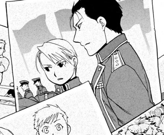
Ahhhhhhh much better. That looks. So much better.
La la la I can’t hear you over the sound of HOW CLEAN SHAVEN ROY MUSTANG TAISHOU IS. THAT’S my boi. THAT’S MY FUCKING GENERAL BOI AND NO ONE IS TAKING THAT FROM ME!!!
#clois4ever30#long post#non-dragons#FMA#FMAB#Fullmetal Alchemist#Fullmetal Alchemist: Brotherhood#Fullmetal Alchemist Brotherhood#Roystache#Roy Mustang#swearing#analysis#I guess????? if you can count angry screaming analyzing XD#my analysis#blabbing Haddock#ask#ask me#bless you for sending this ask#bless#please don't judge my translation too hard I'm a linguist but I've only been studying Japanese for six months
112 notes
·
View notes
Text
Gray Log’s Monochrome Gallery: Hoshino’s Chapter Covers Selection
Other DGM translations
Presenting the chapter covers that Hoshino herself has selected with her commentary! It includes the her personal Top 3 too!
First place:
Chapter 167 “Hint”
I like the balance of the whole picture and how it combines scariness and cuteness. You can feel the bond between them, but at the same time something feels off. Moreover, I think I did a good job at giving it a meaningful air.

Second place:
Chapter 193 “Friend”
My second favorite.
I drew this cover just after the last scene of the chapter, the one where Kanda destroys the rampaging Alma, and I remember being overcome with emotion. Alma had become very dear to me by then, so I wanted to give him one of his lovely expressions for last.
However, drawing him smiling was difficult to do. Regarding the letters saying “friend” behind Alma, they are supposed to be made with “blood.” Had this been a color page, I would have probably painted them in a black to red gradation, instead of pure black.
I’m sure this Alma is turning towards Yuu, a smile coming to his lips.

Third place:
Chapter 105 “A Stage in Rouge”
I adore Krory and Eliade’s tragic love.
It’s a pitiful one, but I love it (laugh) and I think this cover was able to express it well. I think it’s a shame that, due to time constraints, the rose garden in the background ended up looking so rough, but there is something in how you can only see Eliade’s shoulder that’s really sad and painful. The situation, with Krokins holding an umbrella, is cute too, to the point I feel like praising past me (laugh).

The Nominees:
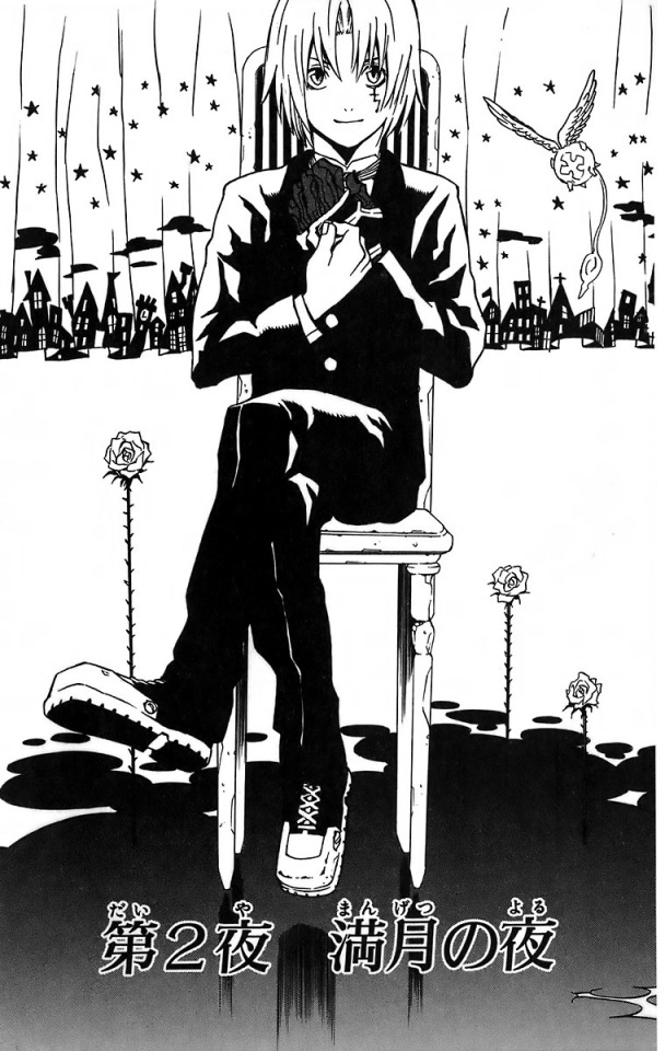
Chapter 2 “Full Moon Night”
The current me wouldn’t ever come up with a composition like this, would I? There is something nostalgic in realizing that I once came up with these kinds of ideas. The resemblance to the movie “Nightmare before Christmas”, the likening of the end of the curtain to a city, the roses blooming from what appears to be a pool of blood… The me back then had some spooky yet cute ideas, didn’t she?
Chapter 43 “Laughter”
Of all the Tyki I’ve drawn, I think this one is the most handsome (laugh). Often, whenever I forget how to draw him, I give a look at this cover (laugh). It’s a refreshing image, very much like him. I like the simple background too.

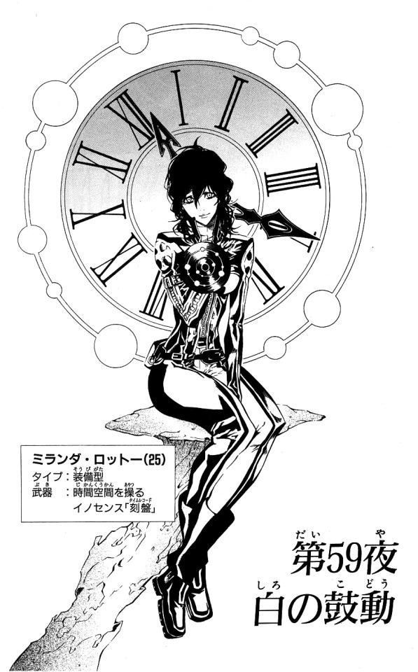
Chapter 59 “White Heartbeats”
Miranda sitting with her legs crossed is a sort of refreshing sight, isn’t it? (laugh) The second uniform fits Miranda really well, so I’m glad I got to draw a full body picture of her.
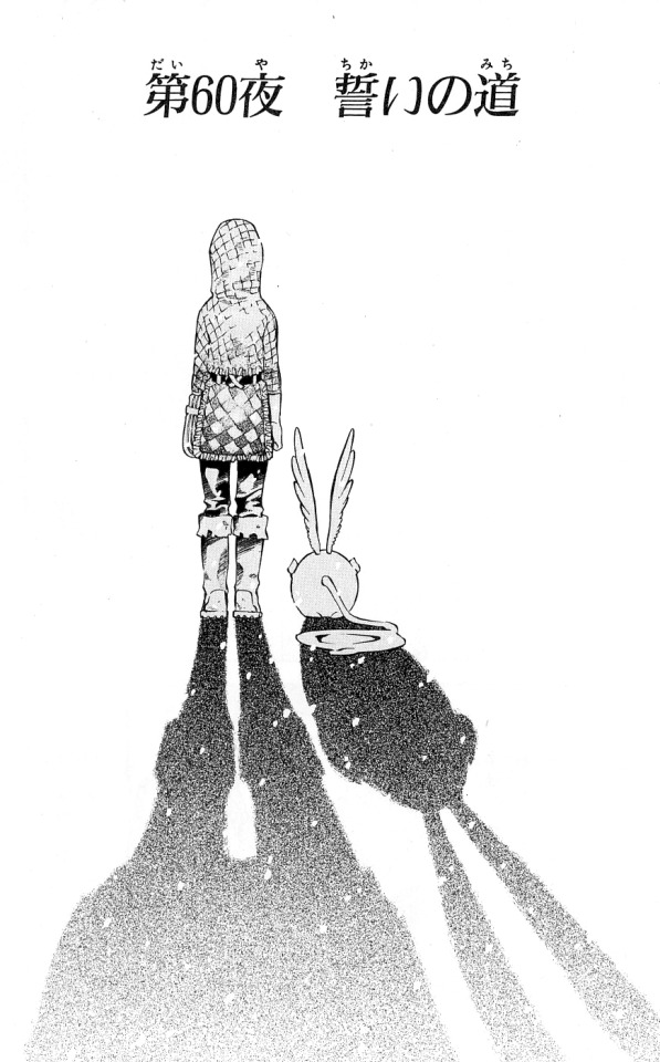
Chapter 60 “The Path of Oath”
A back view of Allen and Tim, which sort of parallels the Mana and Allen cover that took first place. You ought to look at Tim’s shapely, terse butt! The tight line between its legs is especially cute!
Chapter 62 “Battle Plan”
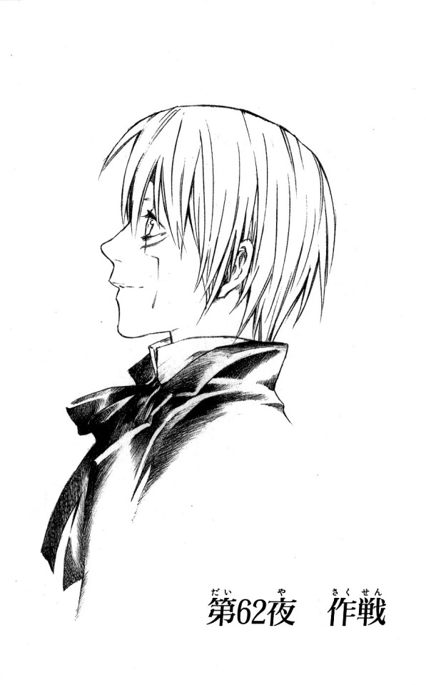
This cover was drawn with just a pencil. It illustrates nicely the pencil’s characteristic softness, or so I think. After seeing this, I felt like drawing my manuscripts using a pencil (laugh). However, erasing the sketch seems like it would be a problem…
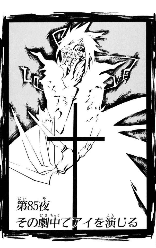
Chapter 85 “To Portray ‘Love’ in that Play”*
I like this one because of how well it fits the chapter’s title and how good is this composition for a cover. I was able to portray the uncanniness in Allen’s Innocence in it. It’s a good depiction in more than one sense, so I like it.
* Translator Note: I’m not 100% sure about this one, but I think this title may have a double meaning. The first, as seen above, being “to portray ‘love’ in that play” and the second “to portray ‘myself’ in that play.” アイ (pronounced ai) is in katakana, a strange choice if you were talking only about 愛 (also ai, meaning love). The only other option that makes sense in context is the English “I”, which is also written as アイ in katakana. Both are very fitting, so I think this was intentional.
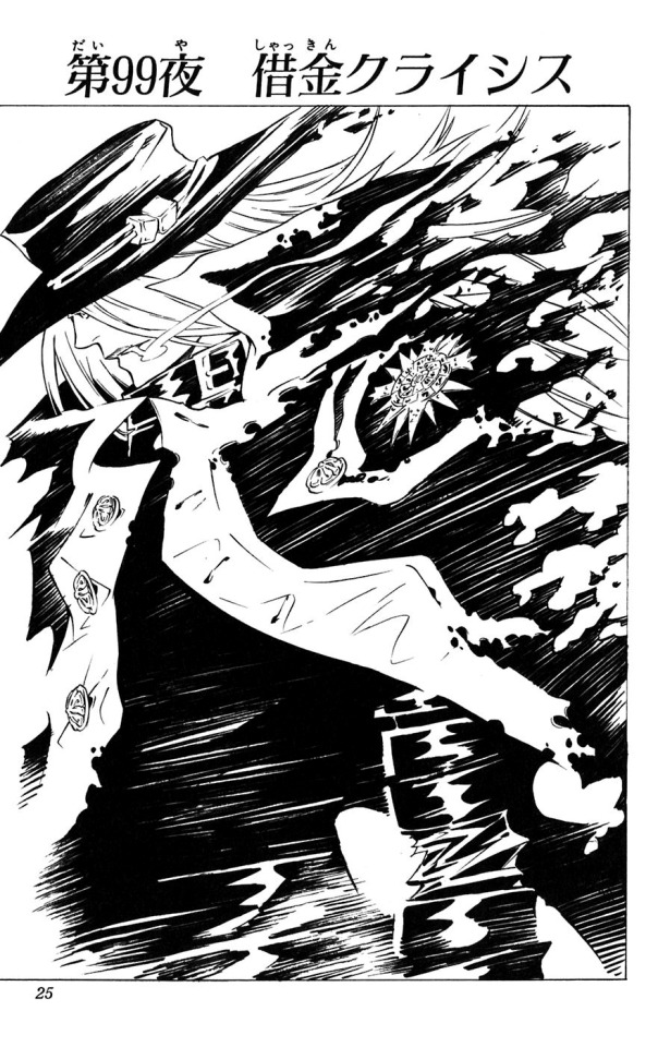
Chapter 99 “Debt Crisis”
I was in a real hurry when I drew this one. I can clearly remember myself drawing in a rush with the calligraphy pen. The detailed parts, like the buttons or the hair, were made using a normal pen, but everything else was drawn with the calligraphy one.
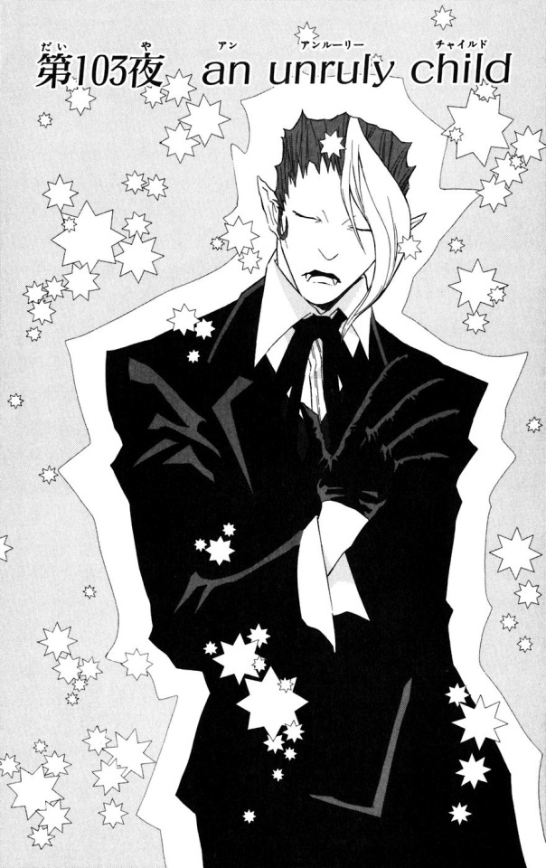
Chapter 103 “An Unruly Child”
I like a lot of covers depicting Krory, don’t I? It’s the same pose I gave Allen in chapter 14, but it’s a good fit for Krory as well. I like it. The gentleman look is a good match for Krory, don’t you think? He’s tall too, and that gives him the air of a fashion model.
Chapter 119 “La + vi”
If you were to use only objects, I think this picture would be the only possible metaphor for Lavi’s character. The small objects within the coffin are all the things he has recorded in his travels. This represents that Lavi is empty inside, that he’s filled only with information. There is also a reason for the birdcage to be empty, but that’s still a secret!
I was able to cram a lot of information about Lavi in this one page, so I’m quite fond of it.

Chapter 123 “Voice of Darkness”*
I drew this as my idea of how Allen’s “Crown Clown” would look if it took human form.
* Translator Note: The furigana says こえ, voice, but the kanji is 吟, which means “recital” or “lament.”

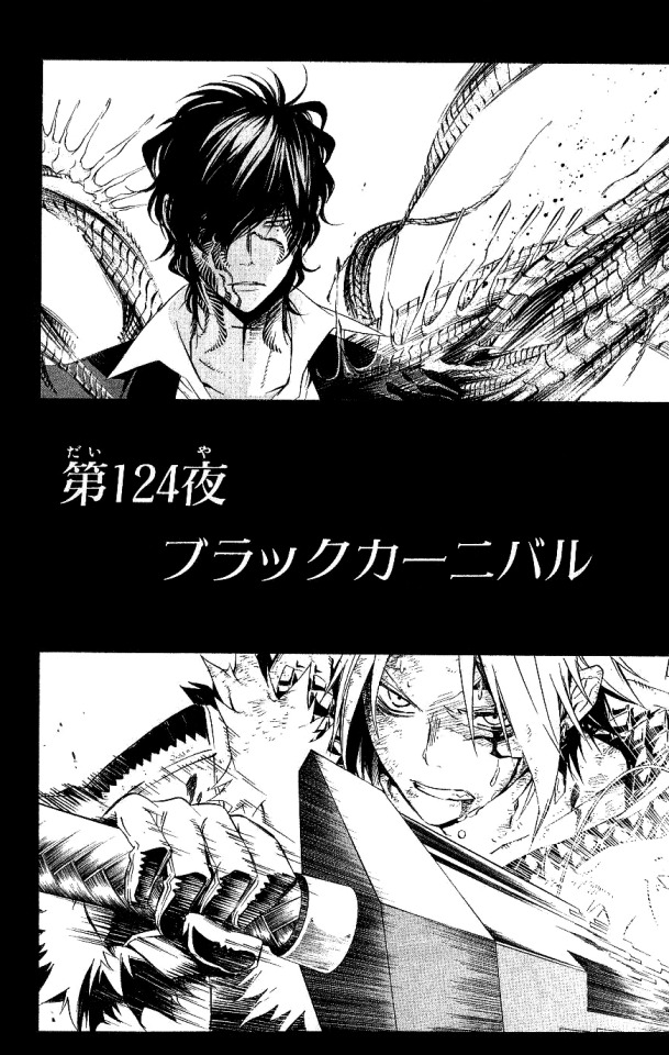
Chapter 124 “Black Carnival”
This cover doubles as a panel of the manga, but I drew it so Allen and Tyki were the picture of “eeriness” and “fear.”
Chapter 130 “Eyes of Hatred”
I’m satisfied with how I drew Allen’s eyes here. Back then, that made me so happy. The smoke trail and the frills in Cross’ hand are lovely and well done too.

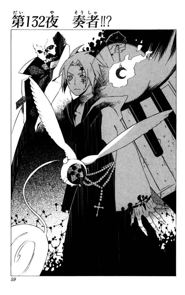
Chapter 132 “The Musician!!?”
After lots of worrying about this cover, I thought "let's include every element associated with Allen!" and this is how it turned out. This page took an unusual amount of time.
Chapter 138 “But Time Goes On”
Drawing this cover was fun. In Allen’s drawers there are only sweets (rations) and detailed debt accounts (laugh). The room is so small there isn’t enough space for two beds, that’s why Link is waking up an a futon.

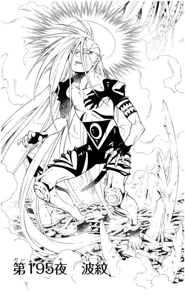
Chapter 195 “Ripple”
I managed to draw a good pose here. There is no other character in DGM that could pull this off (laugh). At the time, my assistants thought that the flashing light over his head was hilarious (laugh), but I wanted to add it for the symbolism!
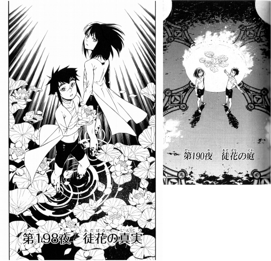
Chapter 198 “The Truth of the Barren Flowers” & Chapter 190 “The Garden of Barren Flowers”
After drawing this, I was filled with satisfaction. This cover marks the first appearance of Alma in a cover without a smile, I think. It’s an image of Kanda and Alma once they learnt the truth of the “Second Exorcist Project.” My goal was to liken them to lotus flowers, and I think I was able to convey that idea here. The cover, title included, forms a set with the one for chapter 190. They are standing outside the lotus at first, all to get inside at the end. The idea was to use these two pages to represent the beginning and the end.
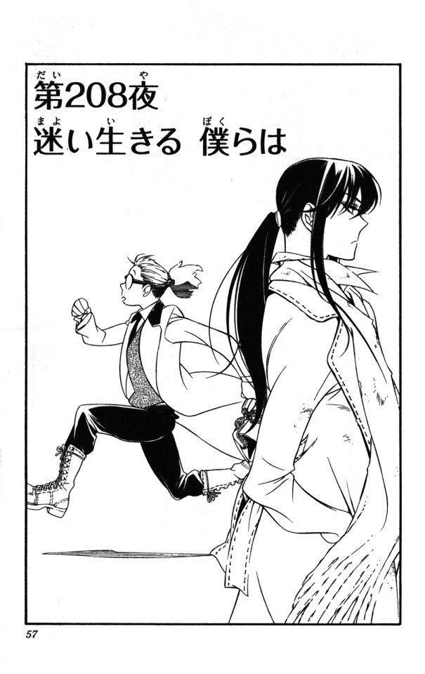
Chapter 208 “We, Who Live Lost”
Those who depart and those who return. This image left a huge impression in me, as it was the first time I drew something with that kind of concept. It was really fun to do. Johnny’s pose is absolutely uncool, yet for some reason it makes me want to cheer for him. I like that about it.
Chapter 209 “In Search of A.W. – Travelling Companions”
I like this Reever. I want you, readers, to imagine who is in the photo he is looking at. Ehehe. What’s bringing out that smile?

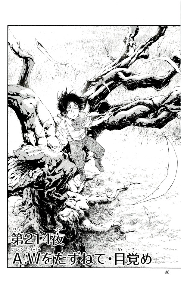
Chapter 214 “In Search of A.W. – Awakening”
This was my first time drawing a full body picture of Nea. Just as the theme of “Kanda and company = lotus flowers” exists, the same goes for “Nea and company = the wind.” If you can perceive that more or less in this scene, that’ll make me happy.
603 notes
·
View notes
Text
I spoke to Alice a long time ago and have been very slow in getting this interview up on the site, for which I apologise.
I’d seen Star Bright in the small press section of my local comic shop (without realising that Alice worked there at the time) and was intrigued by it, flicking through, but never quite committing as it wasn’t my normal art style. When I put out a call for interviews and reviews and Alice responded I was pleased as it gave me the reason to engage and test that prejudice. I’m glad I got that chance as I was particularly struck by Star Bright, so struck I awarded it one of the five Paper Underground awards zine love gave out for 2019. I was very moved by the story, it ended with an admittedly quiet emotional outcome, but it hit with quite a heavy weight.
I also want to thank Rob Zwetsloot for their additional responses (and help with editing!!)
That there are only 200 copies, and not all are sold, seems to me a big shame. It’s a strong and accessible work, even for younger children and it seems like a comic that could fly with the right publisher to raise awareness and get some strong distribution.
Star Bright can be found online, on twitter and bought here
Alice Clarke can be found online, on twitter , on instagram and facebook
Rob Zwetsloot can also be found on twitter
ZL – Hi Alice, could you give a brief introduction about yourself first of all?
AC – Hi Iestyn! I’m a Brighton born & raised artist. I’ve been drawing since a young age and graduated from the University of Brighton with honours in Illustration in 2017. I lived in Texas for two years from when I was about twelve, which is where I first came across manga in my middle school library, and ever since then I’ve been hooked on comics.
ZL – I guess the obvious question is, what have you been doing since the strip finished up at the end of October 2018, apart from, running a successful Kickstarter to get it physically published?
AC – It took quite a few months to fulfil the Kickstarter as I was doing almost everything by myself and I was working full time. In April I quit my job to sort and pack all my earthly possessions and on the 1st of May I moved to Japan – so since then it’s been an adjustment period I suppose! Comics-wise I’m working on my first solo comics project, a lot of which has been building up the courage to start drawing. I’m thumbnailing it right now!
ZL – How did it feel to see the Kickstarter do so well, and then receive positive reviews from the likes of Broken Frontier as well?
AC – It took me a long time to work up the confidence to even try to make a comic in the first place and I only feel I was able to do it with the support of my wonderful co-creator and writer, Rob Zwetsloot, as well as friends and peers who cheered me on every step of the way. So, for the Kickstarter to be such a success, I was completely overwhelmed and overjoyed. I am extremely grateful that people such as Stephen at Page 45 and Holly at Broken Frontier took the time to read and review our work and say such nice things about it.
ZL – You got a lot of backers, I was wondering how many copies you had produced over and above those to fill the initial Kickstarter orders and how well they are selling, and where people can buy them if they want a copy?
AC – We had a pretty small print run of 200 copies, around half of which were for the Kickstarter. We have around 30 left over not including copies may be left on shelves in comic book stores – my previous workplace, Dave’s Comics in Brighton, Page 45, all the Travelling Man stores… You can buy them on my Etsy store! Rob is fulfilling orders at the moment since most of our readers are in the UK, it didn’t make sense to send them to myself in Japan.
ZL – I’ve read Star Bright myself and – terrible person I am – as soon as you said it took you two and a half years I went and looked at the first drawings and the last ones to see what improvement there was. I was struck by two things straight away.
The character designs were strong from the outset, it is easy to tell characters apart and there’s great scope for communicating their emotions, which is very important in this story.
Your figure work and anatomy were very strong by the end, also your line work was much more assured.
Do you see the difference and how do you feel about your progress?
AC – Thank you so much. That’s not terrible at all – I always do the same, I think it’s fascinating to see someone’s growth in this way! For me personally, I feel the change is immense (I actually can’t bear looking at the old pages haha) and I learned so much as I drew each page of the comic – people aren’t kidding when they say if you want to get better drawing, draw a comic. It forced me to draw many things I would never usually draw (backgrounds!!) and think about how to lay out each page and panel in a way that was visually interesting but conveyed more than just an illustration on its own would. I think I also got a bit more confident in my work and was more willing to take risks with angles, poses, etc.
ZL – Is there a point where you thought that the drawing really hit its stride and you felt that you were achieving an outcome you could be proud of, were you proud right from the start?
chapter 3 frontispiece
AC – I don’t think I was particularly proud of my work (meaning the drawings themselves) until maybe end of chapter 3, chapter 4. A long way in, I know, but I have a lot of self-confidence issues with my drawing (thanks art school) and it wasn’t until that far in that I think I found my stride and the way I wanted to draw the comic. I am pretty proud of all the pages at and after that point.
ZL – What was the genesis of this comic, did you know the writer Rob before you started working together?
AC – I think we knew of each other through mutual friends and the UK cosplay community, but it wasn’t until I put it out on Twitter that I was looking for a writer for a comic project that we really started talking. Rob came to me with a rough outline of ideas and character concepts and I just loved it straightaway, the rest is history!
ZL – I find it interesting that you call it out as an LGBT comic, because, to me at least, it’s far more universal, dealing with social anxiety and self-image. I’m particularly interested to see a comic written by someone with different life experiences that handles the feelings and emotions of teenage girls so convincingly and wondered what inspiration and insight Rob drew on to write the story. Did you work together on the storyline and character decisions or was this a more traditional writer and artist collaboration?
AC – As LGBT creators we always want to create work that reflects ourselves and our community in one way or another, and while Star Bright may not feature a story with a hard-hitting LGBT subtext, I think it’s important that people can read and access comics and books that feature gay and trans characters without that necessarily being the focus of the story. Especially as a book aimed at a younger audience who may not have figured out or even thought about those things yet (I know I certainly hadn’t when I was Zoe’s age…) I wanted to manifest LGBT themes in a manner that was more suggestive but also conspicuous. Accepted. Like Robin and Sarah always showing up holding hands, Zoe and Star’s progression from friendship to something more just being accepted. I hope that makes sense.
Robin and Sarah in the background holding hands
Rob is non-binary, so I think those self-image issues and feelings of anxiety and not fitting in would not be too dissimilar to a young teenage girl’s at all. Although it was chiefly Rob who wrote the story, it was quite different when originally brought to – there are whole characters we decided together not to use in the final version. I would say we were co-creators more than anything else when it came to the script, and as someone who was once exactly in Zoe’s shoes, a young teen girl struggling at school with loneliness and friendship troubles, I did my best to help nuance Rob’s wonderful script in a way that echoed my experiences. In that way I think we are a little bit outside the traditional writer-artist style of collaboration. Rob also gave me almost complete freedom with page layouts and pacing, only really giving me stage direction and visual pointers when they had a strong idea for how a certain page or scene needed to be drawn. I think our collaborative method was really symbiotic and we both helped each other constantly to build on our strengths and grow our skills.
ZL – This sounds like an interesting point and I’d like to bring Rob in on this and get their point of view, how did you find the experience of writing about teenage girls?
RZ – First and foremost, I wrote these characters as just people, with wants and desires, different history and life experiences. I think that’s important with storytelling, otherwise you’re concentrating on just one part of them (and it reeeaaaalllllly shows when you do). A lot of Zoe’s character was based on me growing up and some of the problems I faced. It was sort of wish fulfilment for how I’d liked to have been able to face my issues while I was still a teenager. It’s been nice to learn that a lot of other people had these sorts of experiences, so I wasn’t quite as lonely as I thought – although I guess the irony there is, we were all too lonely to reach out to each other at the time. Having said that, while writing the story I was worried that I might end up not writing the girls ‘correctly’ – despite the agnostic approach to creating the characters, I don’t have experience as a teenage girl. I think at one point I was even asking friends “did you ever just talk in Simpsons quotes as a kid?”.
However, I said to Alice at the start that she should correct me if I did something wrong. It really helped with the way the scripts were written. I’d write the chapter, do my edit passes, tweak it until I was happy with it (or as happy as I could get), and then Alice and I would read through it together and punch it up, almost like a TV show writers’ room. We’d add bits and change stuff for story reasons, consistency, for better visual layout in the comic, etc. It definitely would not have been as good as it is without her input. I think Zoe ended up an amalgam of Alice and myself in the end, and really the only mistake I made with them was initially writing them a bit too mature. We added in more of the uncertainty and confusion of being fourteen and left it up to the reader.
ZL – What impressed me most with the art on this was how you used it so efficiently to highlight emotional states, it’s interesting to see someone approach a Japanese style comic that develops the use of body language and silent connections more than the hyper normal, speed line mania one usually sees being aped. The approach lifts what is really a small, introverted narrative and lends it a heavy sense of emotion, rather than playing up an opportunity for melodrama. I’m wondering if there was a conscious decision to play the story that way, or whether it was something that came from the characters as they emerged, or whether it was something that the two of you brought from your own influences?
powerful loneliness
AC – Thank you very much, I’m really pleased you picked up on some of my visual choices. I am not really sure, I think for my part I just tried to draw and convey the story and the emotions in a manner that felt natural to me. Some of my most favourite storytelling techniques in comics are found predominantly in manga, so a lot of the ways I decided to draw certain scenes involving drama and emotion are probably very influenced by Japanese comics. I find the quietness and subtlety of melodrama in manga oftentimes much more emotive and appealing than some of what I’ve seen in western comics, and I think it’s closer to reality so it works better for stories like Star Bright where the narrative is close to home and relatable, (well, except for the whole alien thing haha).
ZL – I don’t know whether you were aiming for this, but it’s definitely something that I picked up, whilst this is clearly a comic aimed at teenagers, a YA style, it’s also something that I, as an adult could read and identify with. The style is engaging and endearing and open and it feels like I’m getting an insight into the lives of the girls and girls that age in general. What was the aim of creating this story, who were you hoping to talk to and what was it you felt you had to say to them?
AC – Thank you so much. I really like books that have a wide appeal, that have something for everyone. Many of my favourite series fans’ ages range hugely so I guess maybe it’s a natural way for me to create work (Cardcaptor Sakura, Jojo’s Bizarre Adventure, Lord of the Rings…) For me, not having a voice when amongst my peers and the smothering feeling of loneliness and being misunderstood as a teenager was something I had rarely, perhaps never seen represented in books and comics I’d read, so I really wanted to voice it myself with this comic. With Star Bright, I was hoping to talk to that lonely girl who spends her school breaktimes at the library reading by herself, who begs her mum for sick notes, so she doesn’t have to go on school trips, the girl who’s always last to be picked in P.E., who never has a pair for group work. I’m sure there are lots and lots of Zoes out there in the world, and I wanted this book to find them somehow and let them know they’re not alone, and if they didn’t find them yet, there’s definitely a Star waiting for them.
ZL – It’s also surprising how, if you gave it as an elevator pitch, something seemingly sweet and so low stakes in terms of character arc, manages to be so engaging and supple in its storytelling. I genuinely came away feeling happy and like something good had happened in my day. Part of that was how well the art managed to communicate the characters feelings, both using body language, character interaction and then more subtle artistic effects, for example, when Star first goes and stays with Zoe’s friends. How much thought and how many tries did it takes to nail that approach? Did that solution just come naturally to you or did you think it through and try different approaches?
Double pages – illustrating what happened
and how it feels
AC – Wow, thank you. That means a lot to me! We spent a lot of time reworking the last chapter and a half or so, trying to figure out the emotional beats and get the height of the drama just right for the bus scene with Zoe and Star. Like you say, it’s a low-stakes story and I was always worried that it wouldn’t be enough to engage some readers. It’s hard to know how many tries and rereads it took to get the script right, since I was always working with Rob right up until I had even finished drawing the page to tweak lines of dialogue, etc. I can say however that there are almost no pages I drew more than once or that changed dramatically from their original thumbnail sketch.
ZL – Final question, I promise!
What are your plans for the future, would you like to do more comics and see them published, or stick to webcomics, or are you out of the comics games for a while?
AC – I would love to have my comics published someday, it’d be a dream to be published by somebody like First Second. But small steps, for now I’d like to try and successfully complete something solo and really indulge in my interests.
ZL – …and you Rob?
RZ – At the moment I’m (very slowly) working on a new story concept that may end up as a book. As for Star Bright, it’s over for now but we may always return to it in the future.
ZL – Thanx for all your time
— Paper Underground Award announcement —
all art copyright and trademark it’s respective owners.
content copyright iestyn pettigrew 2020
the long list interview – Alice Clarke and Rob Zwesloot I spoke to Alice a long time ago and have been very slow in getting this interview up on the site, for which I apologise.
0 notes
Text
Andy Marken on Sundance
Maybe the Problem of Sundance is the Distribution, Not the Content
"My mommy always said there were no monsters. No real ones. But there are." – Ripley, Alien: "Resurrection," Brandywine Productions, 1997
The reason a year seems to pass so quickly is that it starts so darn fast and the only constant is fast, faster and fastest change. The M&E (media and entertainment) industry took up a lot of attention (and space) at CES – the everything for everyone show. Even before all the screens, cameras and storage solutions were packed up and shipped home; people were unpacking their skies, parkas, cameras, storage and hopes in Park City, Utah for Sundance, the first huge film festival of 2018. Studios, cinemas and networks had raised ticket prices, monthly cable fees and ad rates to stay in the black. And they had rehearsed their reasons for the slump in theater attendance and declining home screen eyeball numbers. Obviously, the downturn wasn't because of sequel fatigue or weak lineup of films/shows. Of course, it was all because of FAANG (Facebook, Amazon, Apple, Netflix, Google); BAT (Baidu, Alibaba, Tencent); and the insatiable millennial appetite for new/different OTT (over the top) content.
New Beginning – At the opening session at this year's Sundance Film Festival, founder Robert Redford made it abundantly clear that the event would set itself apart from the Hollywood stigma and focus on fostering new and open conversations in the industry.
Back in 1978, the state and city fathers had no idea what they were getting into when Robert Redford, Sterling Van Wagenen, John Earle and Cirina Catania put together a modest, once-a-year event to attract to filmmakers to Utah.
The independent American-made filmmaker testing ground has arguably become the worldwide event for self-made film artists and the place to show off, be seen, explore new creative endeavors/techniques in addition to launching a successful video production career.
This year's Sundance Film Festival had all of that – and more/less.
It set the stage for the broader and more defining/more diverse role films, shows and video content can play in the future.
Stories and talent from under-represented communities found their way to Park City where The Sundance Institute gave them the national/international stage to be seen/heard as well as the chance to be picked up by distributors for an even larger audience.
Institute founder Robert Redford drew a line in the snow on the opening day, saying that the event was moving beyond the Miramax founder. Going forward, the event would provide a platform for filmmakers to examine, air and creatively discuss events of the day. He made his position very clear when he said, "The role for men right now is to listen. To let women's voices be heard and think about it."
But Sundance has typically been ahead of Hollywood in promoting women filmmakers.
Lower, Higher – Slated recently reported that females in the film industry were generally given smaller budgets and lower salaries, even though they brought in greater returns for investors than their male counterparts.
Despite the Sundance focus, there's still a gender disparity with male directors getting nearly three times the number of screens for their projects than females. While according to Slated, the female ROI (return on investment) is greater, they still get fewer opportunities, resources and lower compensation. To deliver balance this year, Sundance judges selected projects from 43 female feature-film directors and 42 percent of the short films were directed by females (37 percent of the 122 feature films premiered). The crop of new films, documentaries and long/short series presented enlightened, bold, humorous, thoughtful and thought-provoking stands on race, gender, history and world issues. For the indie filmmakers – male or female - the big question was (as always) sales. The days of brokering deals and hobnobbing with both Hollywood's elite and soon-to-be elite has changed dramatically in recent years. It reflects the industry change. It used to be content companies/studios made TV shows and movies and sold them to pay-TV distributors, who sold them to consumers. With the increase in mergers and the aggressive nature of FAANG and BAT, it's a new landscape. This year's festival featured 110 films from more than 13,000 submissions from 29 countries, in 14 categories including premieres, docs, indie episodics, shorts and younger lives works. And while having people cheer and praise your creative work is still high on any indie filmmaker's wish list, so is money.
Major Shifts – With the growing presence of FAANG and BAT competitors and major growth in OTT viewing opportunities, the traditional Hollywood landscape is changing dramatically with significant M&A (merger & acquisition) activity.
Perhaps because of the bloat of overpriced sales in recent years and the growing number of dealmakers and wanna' bes who increasingly attend Sundance, the Savannah College of Art and Design (SCAD) panel discussion during the 10-day event was SRO (standing room only). Hosted by YouTube, even veteran Sundance attendees wanted to pick up new hints from 'How to Get Your Film Out There - The Digital Experts Weigh In' panelists. The panel session wasn't a roadmap to financial success, but folks were taking lots of notes. That's because indie institutions like Fox Searchlight (acquired by Disney) and Focus Features have seen tough competition emerge in recent years. The deep-pocketed FAANG and BAT crowd were back again this year with checkbooks and viewing schedules, looking for worldwide streaming rights to content for their subscribers. At the same time, distributors were cautious this year because so many done-deals had unraveled after filmmakers faced misconduct accusations and high-stakes bidding failed to produce sales at the box office or on the multitude of streaming screens. Despite the obstacles, distributors came to Sundance because it's a launching pad for titles and a great opportunity for them to discover new movies to acquire and for new filmmakers to work with in the future. Hope springs eternal! While diversity and gender issues were in the back of the minds of many attendees and distributors, it didn't hurt that two of last year's biggest entries - "Get Out" and "Mudbound" - were serious Oscar contenders this year. "Call Me By My Name" also deserved to be mentioned and there were even more recognized in other competitions. Sundance and the financial winners like to talk about the major deals, even when the content produces nothing but red ink. While Sundance always features diverse voices; this year, the quality was promoted as being even better and there's nothing like a great crowded screening at the Eccles Theater or at the new 500-seat Ray Theater that featured completely immersive audio, thanks to the inclusion of the Dolby Atmos sound system.
Unique Search – Sony was one of the first to sign a big check for the highly unusual and tense film "Search."
Search is a hard film to explain but it worked for Sony because they picked it up and it makes you feel that they just might have drawn some of it from your family, you. Shot entirely on computer screens, John Cho's daughter is missing; and over the course of the drama, you see how little he knows about her and what she does. You reflect on your own family and say," Jeezz, I don't have a clue." It has more twists and turns that keep you guessing and make you feel you should go home, throw away all of the devices in the house and do something weird, like sit down and talk to your family. Search was one of the few films at Sundance that made you think at Sundance. While some of the dealmakers called the parade of content "awful," "boring," or just plain "weak," I disagree with the feedback because each had a message a filmmaker had a burning desire to share with the world. That's damn brave and something the people with the check books wouldn't have the guts to do. All the dealmakers were looking for some magic, something that would make them a hero to their bosses because it made a boatload of money. Those miracles only come along once in a blue moon; and even then, most of the distributors only see it in the rearview mirror and by then, it's a little late. Many of the films had vision and quality and there were even a few that had broad viewer appeal--even if the purchase prices weren't astronomical. Some buyers were pleased with their festival experiences, arguing that there were many films of vision and quality, even if there were fewer films that had broad appeal. Getting that global appeal is becoming more difficult as theater tickets continue to rise and distributors toy with simultaneous theater/payTV distribution, international releases and OTT ad-supported viewing. At the same time, they have to more aggressively combat torrent sites that are hell-bent on stealing from filmmakers, crew, distributors, everyone in the industry. But this year, all 360-degrees of VR (Virtual Reality) proved it has a decided place in visual storytelling. After director Alejandro González Iñárritu's VR experience, Carne y Arena, won a special achievement award at the Oscars last year, the technology made a major leap forward in becoming a legitimate artform.
VR Landing – Giving viewers a first-hand and very personal view of the universe that surrounds us, "Spheres" was the first VR film to crack the seven-figure sales mark at this year's Sundance.
That was also shown with hard cash when Spheres – a three-part series that lets you explore the depths of space in VR – sold for a solid seven figures to CityLights. The key now will be getting people to pay to watch. There are still naysayers who proclaim that VR is just like 3D, a passing fancy. We asked Andrew Shulkind, an award-winning cinematographer, who stopped by the OWC event at Sundance, about the state of VR. Shulkind has shot traditional films like The Ritual, The Vault and Panic Room as well as over 40 of the top cinematic VR projects for top brands, studios and sports leagues. "There are exploratory, definitive pieces like Dinner Party that easily fit into the traditional film festival format," he said, "but then there are super edgy, experimental pieces like Spheres and Dispatch that really lean into the complete potential of what we can do with virtual environments and the efficiencies of AI to deliver both singular and social experiences." Shulkind, who was at Sundance with Intel and Google showing the near and long-term potential of VR, noted he had taken a work break to check the work of friends at Starbreeze Studios, StarVR and iNK Stories.
New Frontier Highlight – The VR experience of "Hero" gave Starbreeze Studios the opportunity to show people the full potential of VR and personal action/reaction.
"If you want to experience the full potential of VR right now you've got to check out 'The Hero Experience'" Shulkind emphasized. "It's extraordinary and meaningful and exactly what VR should be at this minute." "For decades, motion pictures were the most refined example of nuanced storytelling. But the interactivity of gaming, with the advances of processor power that allow for hyper-realistic graphics and better shading has created a massive industry that is outpacing the motion picture business and encourages its own brand of nuance. Combine those two powerful legacies with the efficiencies and ubiquity of mobile devices, cloud computing and increasing content spends and you have the makings of a completely new form of expression at levels of immersion never possible. Modern versions of content will require something of the viewer, both from an engagement standpoint, but also in terms of user information. These experiences will be underwritten by the value the user's shared data brings to the platform." The Hero Experience literally puts users in the danger zone as never before and it is impossible to come out of the experience unchanged. Shulkind added that Hero Experienceand a few other mixed reality projects that tap the talents and storytelling possibility of filmmakers make the experience deeper, richer and constantly changing. Shulkind doesn't see virtual reality, augmented reality, mixed reality, traditional commercials, or movies as separate verticals. "Cinematic imaging is imaging, no matter how big the screen; and we need to start defining entertainment (or content, if you insist) more broadly to encompass all of these types of storytelling." Meanwhile, he's keeping his feet in both camps, having recently shot content for a Chinese theme park, projects with Intel's volumetric studio, TrueVR and the NFL that was debuted at CES, as well as a Pepsi commercial for the Super Bowl. Sundance has always been a place for all voices, but it feels especially poignant this year when the contradictions of race and gender inequality are finally coming to light industry–wide. "Big changes are finally afoot, both in terms of the quality of stories being told and who gets to tell them," he noted. "That goes for content creators and distributors. The splashy parties used to be Miramax and Sony Picture Classics and Fox Searchlight; and now, the biggest parties in the best locations are Oculus, Kickstarter, Google/YouTube, Intel, Imdb.com Netflix, and Amazon. The quality of immersive entertainment doesn't yet match up with the award–winning commercials and movies that we know and love, but that day is coming." Sundance 2018 may not have been hugely profitable for filmmakers; but then, overnight sensations usually take time to be discovered.
Or, as Ripley said, "I don't know. I'm a stranger here myself."
0 notes