#also i can still do it from my phone but not from my desktop browser
Explore tagged Tumblr posts
Text
I am not, in fact, able to submit polls to anyone else. Not sure why. Sorry.
#I HAVE TRIED#also i can still do it from my phone but not from my desktop browser#and i can do polls from THIS blog but not from my main#which is probably the reason i can't submit them either- submissions only come from main
6 notes
·
View notes
Text
im going to b honest at this pointt i am actually getting a bit sad abt not having polls. like all those other ppl who have them already are probably also allowed to leave the house alone can i at least have this
#not to be dramatic just got sad at seeing everyone else have them when i dont like.#ik tis childish that at unrelated moments of small bad like i bring 'oh but my situation is so shitty :((' into it#but yk what not to do that again but im the one whos had to be 'mature' when it comes to that situation so i can be a bit childish#over stupid bullshit on tumblr dot com okay#flappy rambles#sorry for being so fucking .ugh#edit: also if u have polls and ur first thought was to submit me one thats very kind of you but unfortunatly that wont work#bc you cant edit poll submissons from desktop/mobile browser#and i cnat get the app bc despite being an adult my piece of shit parents still have the app permissons thing set up on my phone !!!
4 notes
·
View notes
Text
About deco my tree
If you, like me, used the decomytree-site to receive and send messages lately, you've probably also seen the post warning that the site might have nefarious intentions. This is likely correct. When I went to look at my messages today, it told me "Currently, only the app can open messages due to high usage." That is clearly complete bullshit. It's probably self-evident, but DO NOT DOWNLOAD THE APP. This is base level scam stuff: trick people into getting excited about a service, then lock it to only one platform where the user will have to give up some information in order to get what they want.
(Obviously, I can't say with 100% certainty that something sus is afoot, but my warning bells are ringing very loudly. I am leaning towards this being more of an attempt to lure money out of people than an information stealing attempt, but you can never know.)
I took a look at what the app requirements are:
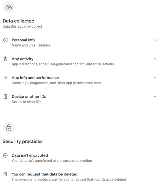
This ain't great for something that allegedly only is for leaving cute messages for other people. I'm looking specifically at the "Data isn't encrypted" part. If you've taken a look at your tree today, you've probably noticed that ads for an AI app have appeared here and there in the UI; this is by the same company behind deco my tree.
Now. If you still want to see your messages, there is the option of running the app in a virtual environment that isolates it from the rest of the device, and thus from the data on it. I think iOS and Android both might have native sandbox environments, but I'm not familiar with them. What I did was download an android emulator to my computer and installed the app there. It's completely separated from the rest of my OS and will cease to exist when I nuke the session after reading and saving all my messages.
The emulator I used is called Bluestacks. It has ads and will take up ca 5GB of space, but it's a reputable emulator, and I've used it before to play android games on my desktop. Once you're in there, you can navigate to your tree in the already existing Chrome browser on the desktop (or home screen, I suppose), and find the link to their help center, where they have a download link for the apk file without needing to go through the Play Store (which you'd have to log in to using a google account). Also a bit suspicious, but handy in this case. I've also included the links above for you to use. Once you've downloaded the .apk the app will open and you'll be able to log in and see your messages.
Side note - if you used a generic password that you use in several other places for this tree, I highly recommend changing it in all other places, especially if you usually combine it with the same email you used for decomytree.
Another fun thing I noticed is that the app refuses to load the earliest three messages on my tree, for whatever reason. But when I navigate back to the website (inside the emulator), it now opens the messages just fine since it can tell I have the app installed. 🙃 The app also continuously displays ads for the same AI app mentioned above, trying to trick you into clicking on them when you're swiping through your messages. It also does this fun thing:
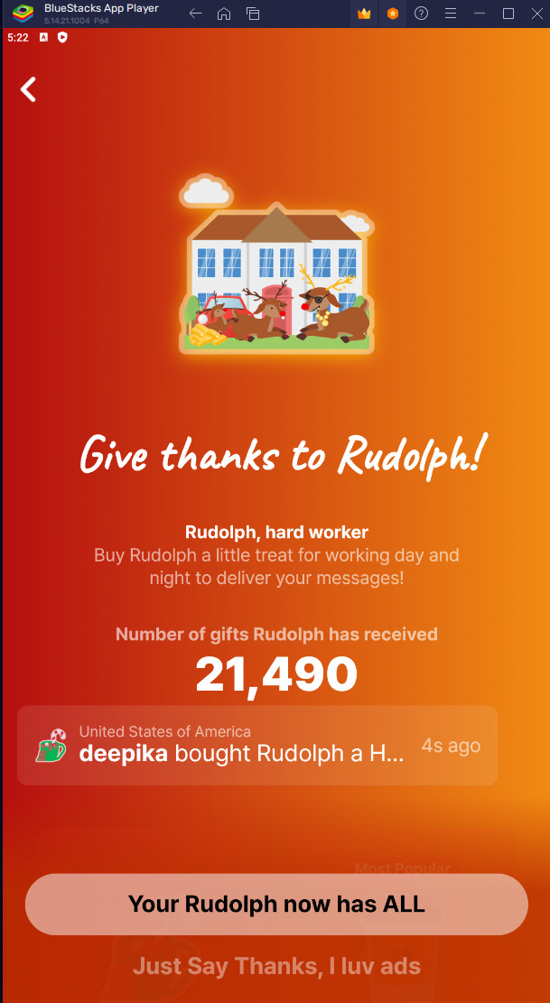

Yeah. Bypassable, but highly irritating, and guaranteed to catch at least some poor people that don't know what to click on to make it go away.
TL;DR: don't download the app directly to your phone, use a sandbox to isolate it to see your messages, and then ask it to delete your account (and hope that it works, because so far the so-called verification code has failed to appear in my inbox). And change your password if you've used the same one elsewhere on the internet.
211 notes
·
View notes
Text
Hey You Should Check Out Freegal!
I'm surprised I've never seen a post on this service before (Or if I did I don't remember it, but if you know of one please send it my way and I'll add it to the queue here!).
Just this week I was clued into Freegal at one of my local libraries and I love it! It's music streaming service somewhat similar to Spotify or Tidal that libraries can get subscriptions for. Not only is it all free for library card holders to use, not only can you stream music with no ads at all, you can download a limited number of songs every week. For free. No weird rules that restrict you by making it only accessible through the app or anything. The MP3 file goes right into your device and it's yours to move or copy or burn to a CD or WHATEVER non-commercial use you wanna do with it!
To use it, you'll just need a card from a participating library (You can search for your library on the Freegal website) and an email address to make an account. You can access it through your browser on a desktop/laptop, or there's an app you can download through your phone's app store.
If you're like me and want to stop relying on music streaming services, Freegal is a great place to start! The exact limit differs between libraries as far as I'm aware, but it lets you download three to five songs a week, resetting on Monday. Even after you've hit your weekly limit, you can still add songs to a wishlist to have a convenient place for everything you want to download in the future!
I'd say one of the only downsides is that the selection isn't as big as the other services like Spotify. You're probably not going to find many of your favorite indie artists on there, but there's still a really decent selection and you're more than likely going to find something you're familiar with and enjoy! Also the app is...a bit rough around the edges and slow to load things at times (at least on Android, I haven't seen it on an iPhone) but it's not too bad. Imo everything else makes up for it.
I hope this post is informative and that you all have cards to participating libraries! If you don't, consider looking around for other libraries close by! It's a great service that I highly encourage you take advantage of, and increased awareness and demand for it might encourage more libraries to participate!
424 notes
·
View notes
Text
animated tumblr icon masterpost
(EDIT (7/10): it is no longer possible to have an animated icon if you did not have one previously. staff has admitted that this "feature" was added accidentally and that it's already been patched. i'll be removing any now-irrelevant segments from the intro and the FAQ. check the notes if you want to see earlier versions of this post)
two days ago, tumblr added the ability to have an animated icon by using an animated webp without giving out any official information on it (from what i can tell). i'm making this post to reduce the amount of questions i get about this. i'll be updating it with any new information i come across. if you have any questions after reading this post, feel free to ask
before i start, as of now, the web version of tumblr plays animated icons automatically which means icons with flashing lights/colors are a danger to people with photosensitivity. do not abuse this feature! remember to keep your icon safe for others by avoiding using any animated images with flashing lights/colors
also, please note that i do not use the tumblr app and i don't know how it works or how it differs from the web version. i use the desktop website as well as the website on my phone's browser (safari)
with that out of the way, here are some frequently asked questions:
7) if a blog has an animated icon, the animation only plays if i click on the icon. otherwise it's stuck on the first frame. why is this?
it's probably because of the platform you're using tumblr on. i use the web version and this doesn't happen to me, it just automatically plays on its own continuously. from what i can tell, this bug(?) only occurs on the tumblr app (depending on which device you use)
8) i use the app and i can't see anyone's animated icons, it's stuck on the first frame no matter what i do. how do i fix this?
check to see if you need to update the app
9) all the animated icons on the page suddenly froze up, what do i do?
try scrolling a little bit, that should unfreeze them. i don't know why this happens or why doing that fixes it 🫥
10) i had an animated icon and now it won't move. why did this happen and how do i fix this?
unfortunately i don't know why this happens, sorry. i could be wrong but from what i've seen i don't think you can fix it ☹️
11) i currently have an animated icon, if i upload a different animated webp image will it still work?
from what i've seen, no. if you want to keep your animated icon as it is, i'd suggest not changing it
12) i have an animated icon, if i edit my blog appearance (without changing the icon) will it mess up my icon?
if you edit your blog appearance via the desktop theme editor (https://www.tumblr.com/customize/yoururl), it should be fine
348 notes
·
View notes
Text
Converting plain text fics to .epub
Hey guys! As I’ve entered the wonderful world of The X-Files fandom, I’ve encountered many wonderful old-school fics that are hard to read because they’ve been shared in plain text (.txt) format. I’m sure some of you know already how to convert them to easily-readable epubs, but I thought I’d share how I do it just in case anyone has been suffering through terrible formatting.
Basic tutorial under the cut!
The first thing you need to do is download Calibre. It’s a life-changing desktop app that allows you to edit ebooks.
Once you’ve got Calibre all set up, go ahead and download the fic you want to convert. I’ll show you here with the legendary Tempest, found on Gossamer.

Gossamer has a handy download button, but not all of the old-school fanfic sites do. However, you can still download them as txt files using your browser. It’s different for every browser, but generally it’s under “file” and “export as” or “download page” or something.
Anyway, as you can see, once you download it as a .txt file, it messes up the formatting, making it incredibly annoying to read.

To fix this, you’re going to drag and drop the file into Calibre to add it to your library. Select it, then click “Convert books” at the top. There are a lot of settings you can change, but most of the time, you won’t need to mess with any of them. Just choose “epub” as your output format (top right), click OK, and you’re good!
(This process also works for other file formats like pdfs.)
Once it’s done converting, double click on the title to preview the book and make sure it looks good. If it still has issues, you can try converting it again with heuristic processing turned on (it’s located on the left side of the conversion screen). The conversion process isn’t perfect, but it will take care of the most egregious formatting errors.
Next, click on “edit metadata” at the top and locate the original txt file under the list of formats at the top right. Select it, then click the little green recycling icon to delete it. You can also change the title, author, cover, and series info while you’re at it.
Finally, go back to your library, click “save to disk” at the top, and choose “save only epub format to a single folder” to save the epub file to your computer. From there, you can import it into your ebook app of choice. I use iBooks, so all I have to do is open the file on my computer and it automatically adds it to the library on my phone and laptop.
That’s it! Now you have a readable ebook.

Let me know if you want me to add pictures of the process! I can’t guarantee I know the answers to any questions, but I’d be happy to try to help if you need it.
There’s also a Calibre plugin that allows you to combine multiple epubs into a single file. This is super helpful for fics with chapters uploaded separately. If anyone wants to know how to do that, let me know!
41 notes
·
View notes
Note
Okay, so. Sorry I have quite a few questions about the dating sim!
1: will you have to pay for it?
2: will it be on a website or like an actual app you have to download?
3: any updates for the little sprites or any updates in general
4: how close are you to finishing?
1. The game will be completely free to play though donations are possible, some of these questions have been answered in my #FAQ
2. The game will have to be downloaded on phone or desktop as it has many assets that would not run on browser, unless I change the format of it from ren'py to something else, which seems possible too.
3. The sprites for Leo and Donnie are completely finished, however, due to time constraints (My personal life including work and other various projects) I am considering making simple sketch sprites for each turtle for the beta first, so that the game can be played without the fully finished assets.
4. Though the script of the game for each turtle is mostly developed, programming all different options, all effects of the game, and etcetera, is not quick work, and it is only me working on it, so it will not be finished soon, I also have the Leo x Reader Anastasia interactive fic which at this point runs completely as a dating sim already.
In fact, despite it being a Leo x reader, Donnie has been added as a romanceable character in the Anastasia AU fic, it makes me think that to accelerate the process of the ROTTMNT dating sim I could change the format to match the Anastasia fic instead, however, if I don't do that then it will take longer.
Again, this game is a very tough process and there are many things in my real life preventing me from dedicating as much time as I would like for it, but help, especially with the programming of the game is always welcome.
Once the script is fully finished I will start the coding, but due to the amount of options I am adding it is still a work in progress.
36 notes
·
View notes
Note
Hi, do you still have modded spotify rec for android? Mine stopped working and the new one I got gives me ads, doesn't show any song in my my playlists either.
if u were using xmanager then yh ik on the reddit n discord a lot of ppl are getting issues personally im not really getting many issues it's still usable for me but i suspect it myb has to do with the phone version bc my phone is pretty outdated. i saw someone say u can download the real spotify app n adguard dns on ur phone n it will block the ads but ofc u wont get any of the premium features n i hvnet tried it myself. spotube is a good alternative to spotify but i wld highly suggest making a second spotify acc copying over ur liked songs n other playlists to it n then logging in with tht one to spotube so u dont accidentally lose ur og account.
my tips for xmanager which i cant verify but it's just what seems to work for me. i frequently use spotify on the desktop application (modded as well) as well even if im listening on my phone i usually control from my laptop since im in front my laptop so if it's possible to log in on desktop or web (mine is not modded) i wld suggest doing tht from time to time n seeing if it helps. usually when it's giving trouble i play a song on web with browser vpn on n hving the xmanager open on my android at the same time n tht helps n then i close web n go back to android. downloading an older version of xmanager also works sometimes i was using 512 for a bit then i reupgraded. also i find sometimes if xmanager isnt working del it download real spotify app play a song for a bit then delete n reinstall xmanager sometimes tht does the trick. if u dont hv access to a laptop myb see if visitng spotiyf web player on ur phone using show desktop version will help.
unfortunately i hvent found any xmanager alternatives. um those apk sites some ppl have said u can find modded vers there but ive nvr tried any personally n they tend to be hit or miss so you'll hv to keep trying till u find one. n again when trying those apps i wld advise making a 2nd spotify acc n siging in with tht first n testing it.
lately ive been really trying to find alternatives but so far no luck. if u follow me u can keep a look out I'll def post if i find an alternative to xmanager if not u can always send another anon sometime to check back.
4 notes
·
View notes
Text
2. Writing Set Up: Where to Write Your Draft
Before you even start writing, you’ll need to find a writing program/medium you feel comfortable working with.
I promise you—from start to finish—you’ll look at your draft for a couple of hours at minimum, so I suggest you choose a program/medium that aligns with your individual needs. Now it’s time for you to identify what those needs might be.
Here are some options:
Creativity strikes while you’re cuddled up in bed or on your commute to work?
Try writing on your phone/tablet (unless you’re the one driving, of course!)—you can use pre-installed apps like Pages (iOS) or your Notes/Memo app. You can also download free writing applications like Google Docs. Google Docs works on and offline on basically any mobile device, which is great for when you’re on the go!
You prefer writing/typing on a computer?
There are many desktop writing programs like LibreOffice (free for Windows, Mac and Linux), MS Word (needs to be purchased/subscription-based), countless online text editors or the browser version of Google Docs.
You need to physically feel the words flowing through your body?
Well, imagine you’re a classic author and write them down by hand on generously perfumed paper (preferably with royal blue ink)! Of course, you can also use Post-it notes or that coffee-stained notebook from 2013. Regular paper will do, too, though it’s obviously not as cool.
Of course, there are many more options to choose from, but since you’re just starting out, I suggest you try free and more readily available programs first. Everything has its pros and cons, but digital writing is generally pretty clean-cut and saves you the trouble of digitising hand-written drafts (which you’ll need to do if you want to share your writing online! Unless you want to share scans of your beautiful handwritten writing, of course!).
But before you settle for one (or more!) program/media of your choice, you might want to consider a few things:
Is your writing easily accessible to you? → Can you add to your draft whenever and wherever creativity strikes?
Does your writing program save your progress automatically? → You don’t want to lose hours upon hours of work because you forgot to save your progress!
Is your writing secure? → Is your writing uploaded to a cloud? Will you still be able to access your writing if your computer crashes or you lose your login data/ phone/notebook? Can you easily create external backups of your files?
It really doesn’t matter what you need to write down at this early point. Be it an idea, rough outline, dialogue, stream of consciousness, mind map or a finished draft—you just want your entire writing process to happen in a secure, accessible location that you feel confident working in. There is no perfect writing program; whatever program works best for you is the best program for you!
For example:
I almost exclusively write on Google Docs since it meets all my personal writing needs: It’s a free cloud service that syncs my files all across my devices (phone, laptop, tablet) regardless of where I am. It has an intuitive interface with all the basic writing/formatting tools I need.
Once a month, I download my most recent drafts as “.docx”-files and back them up on an external hard drive—so even if I can’t, for whatever reason, access my Google Docs account, my files are still secured in a different location.
Sometimes, I make use of handwritten notes, too—though I keep losing them or can’t decipher my handwriting…This seems minuscule or even funny, but it’s hard to come back to an idea when you’ve literally lost the physical manifestation of it!
Next: The Idea: Coming Up With and Developing Your Idea (with examples)
Masterlist
6 notes
·
View notes
Note
Hey question sorry if it’s odd to ask but like I’ve been trying to move from google to firebox but the option on import everything dosen’t appear.
I was kinda hoping if you can give an explanation on how to do it cause I’m really confused. I saw you explain it awhile back but it didn’t really click.
Again sorry if it’s an odd request
That's OK!
It's really easy. I'll give you screenshots in case it's easier for you to have images as a guide.
Note: Do this on the PC version of Firefox. You can't do it on your phone as far as I'm aware. However, if you do this on your PC and create a Mozilla account to sync your browser in various devices all the bookmarks and passwords will be also transferred to the mobile app.
Open Firefox
Click on the hamburger menu that is usually on the right

Now click on settings
it should open on the General Settings (you can see that on the menu on the left). Click in General if it isn't.
It should be right there already visible. It's the Import Browser Data option.

After that it should give you the option to choose Chrome. Firefox searched for another browser and if all is well it will have detected the Chrome on your machine.
Follow the procedure (I can't show you now because I'm using a Linux Virtual Machine that doesn't have Chrome installed).
If you still have doubts don't be afraid to ask. I'll do my best to reply and try to help you with my actual desktop. It was that I'd just turned off my PC when I saw this ask and didn't feel like having to turn it on again as I'm a bit tired (I'm writing this on a Chromebook).
5 notes
·
View notes
Text
I wrote out this list of instructions/recommendations for making Firefox your default browser, and setting up some extensions I recommend. This is all my personal preference - I’m no expert, but I made these instructions for some friends and family, so I figured I’d share here, too! All the extensions are linked for convenience.
1. Download Firefox, pin to dock of computer, set as default browser
Why Firefox? Mozilla is a non-profit organization, so unlike Google, they aren’t looking to continually turn a profit, and is an open-source project, meaning you can check the code at any time. Firefox and Safari are independent browsers, but others like Chrome, Brave, and Microsoft Edge all run on Chromium - meaning they’re essentially all Google. The downside to using them is that if your entire internet access is connected to Google, then Google is going to collect data on everything (and then turn around and sell it all over the place).
2. Add DuckDuckGo, set as default search engine for Firefox
Why DuckDuckGo? Unlike Google, DuckDuckGo doesn't collect data from users, and allows IP addresses to remain hidden/protected. Doesn’t use cookies to track activity. Doesn’t share IP address, search terms, etc. with sites you visit (Google, Yahoo, and Bing all share this data). I find that the search results are more “clean” and I usually find what I’m looking for faster, and with fewer “listicles”/bullshit SEO-filled nonsense.
Downsides: Some complex searches may not work (niche content can be missed, but pretty much everything else is good) - so if searching for academic sources, I recommend using Google Scholar instead. Also uses Apple Maps instead of Google, which I don’t like as much, but isn’t a huge problem on the desktop. I have some privacy-centric extensions listed below, which help protect me when I do need to turn to Google.
3. Import browser data from old browser.
4. Set homepage/new tab defaults → Settings.
5. Download Firefox on phone, follow instructions to sync to computer desktop.
6. Install extensions! Improve internet browsing experience! Check out my list of recommendations below.
7. When installing extensions, take a look at the “themes” and customize the look of your browser.
Ad Blockers
Adblocker Ultimate (blocks ads)
uBlock Origin (also blocks ads)
AdGuard Adblocker (guess what this is.)
AdBlock for Firefox (I just really hate ads and want to cover my bases)
Privacy extensions
Privacy Possum (interferes with data collection by sites, helps prevent tracking)
Don’t track me Google (speeds up search results, removes Google tracking feature)
I still don’t care about cookies (allows cookies for sites/prevents pop ups - use with cookie auto delete for privacy)
Cookie autodelete (automatically deletes cookie info from sites, pairs well with above)
Youtube extensions
Return Youtube Dislike (shows the number of dislikes on Youtube - Youtube removed this feature in 2021 for no good reason)
DeRound Youtube (personal preference - makes Youtube thumbnails “sharp”. I think it looks nicer like this.)
Youtube NonStop (prevents “are you still watching” prompts)
SponsorBlock (removes embedded sponsor promotions within Youtube videos)
Other helpful stuff
Unpaywall (checks database of 16 million legal, open-access articles when you view a paywalled scholarly article to see if there’s an open version available)
Don’t Accept image/webp (lets Firefox tell sites webp formats don’t work - enables easier access to downloadable jpeg/png formats on search results)
Absolute Enable Right Click and Copy (some sites block the right click copy/paste option, this extension restores that ability - this seemed to interfere with my use of Google Docs so I disabled it for the site, but it may be coincidental. Need to investigate - this extension is newer to me.)
Facebook Container (prevents Facebook/Meta from tracking all your web activity)
LeechBlock NG (can be enabled to prevent you from using certain sites in a certain timeframe - good for productivity)
Recommended extensions for Tumblr users
Shinigami Eyes (works on other sites too, but highlights trans-friendly people/orgs/etcs green, highlights anti-trans in red. Very useful for Tumblr - makes identifying and blocking hateful users easier)
XKit Rewritten (Tumblr XKit! OG XKit doesn’t work anymore, but I’ve had success with this one. Helps customize the site, sometimes can be used to get rid of/override stupid UI updates)
My personal XKit recommendations:
Toggle on:
Anti-Capitalism (hides ads)
Mutual Checker (notes who your mutuals are, useful if you follow a lot of people/have a lot of followers and want to know who your “friends” are - especially helpful if you have friends who often change icons/urls)
No Recommended (gets rid of recommended stuff - I clicked “hide” for all the options - I only want to see things posted/reblogged by the people I follow, or things I search for specifically. Clears up the homepage, too.)
Quick Reblog (I personally love this feature - I have it set up “above the reblog button” and checked “yes” for showing the blog selector (useful if you have multiple blogs on the same account), and the “show tags” field. With Quick Reblog, when you hover over the “reblog” button, it pops up a little box that lets me quickly select what blog (defaults to main), add tags, then reblog, queue, or save the post as a draft. I don’t usually add a comment, and never using Quick Reblog, so I didn’t enable that field. You can add more settings, but this is how I like to use it!)
Tweaks (I clicked “Restore links to individual posts in the post header”, “Remove the coloured shadow from focused posts”, “Hide the ‘blaze’ and ‘tip’ button labels”, “Hide my follower count where possible”, “Hide the ‘’Now, where were we?’ button”, and “Hide the Tumblr Live carousel” (I also “snooze” Tumblr Live weekly, but still). Again, these are all personal preferences! This is just how I like the site set up).
19 notes
·
View notes
Text
On The New Tumblr Desktop Dash
I've been using the new Tumblr desktop dashboard for a few days now and I have some Thoughts that I thought would be useful to put out in to the wild. Most of the reaction I've seen has been...abnormally harsh about this UI update, so I think it would be interesting to actually go through the changes and point out what I like, what I don't, what I think could use some improvement, and maybe break down a little about why those Twitter comparisons are way off the mark.
More below the fold, but the tldr for me is - I think it's great! At the end of the day, I feel like I use the desktop version of Tumblr more and more since the change. Whereas before I used to just pick up my phone and refresh the app, now I get a hit of dopamine flipping over to the Tumblr tab when I need a work break.
The change is clean and logical, and as someone who came to Tumblr a year ago and still never quite grokked what all the icons at the top meant, having them spelled out is much nicer than guessing what they mean, even for someone who has become more familiar with the site. And to be clear, from what I can tell that's the goal of this change - to make it easier for newer people to use Tumblr and find their way around. Despite all the hate this change is getting, that is an unabashedly good thing.
The Left Nav
It's really, really clean. The old dash had a lot of unused space on the left, it makes sense to carve some of that out to have a menu that actually lays out what each icon means. The font size and style is comfortable without overcrowding. It just feels more...confident? Like these are the features Tumblr has. Use them! It's also just a more familiar web browser experience for anyone who has been using web apps since the dawn of email.
The badges also fit much nicer with the left nav. They don't float above an unclear icon, they're right next to what it says on the tin. You got 20 new posts to read, buddy. 5 new notifications. 1 anon ask. It's just better on my eyes.
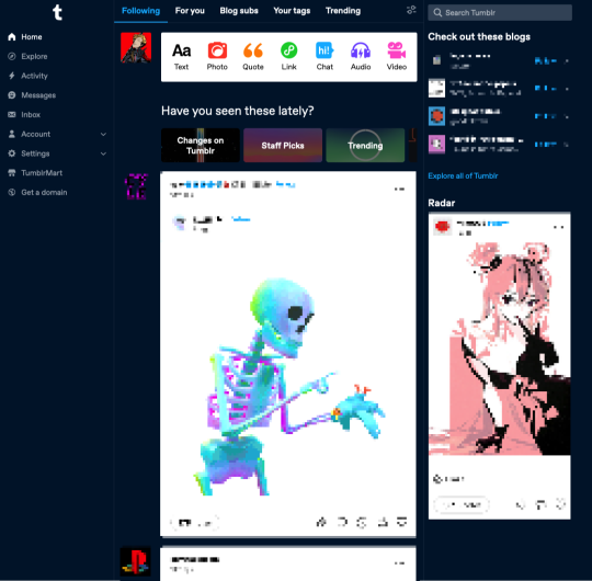
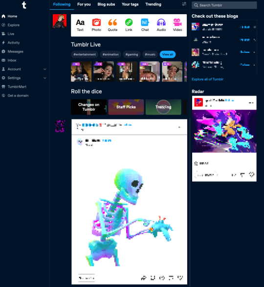
I do understand the gut reaction that things are "too" cluttered. One of the first things I did was snooze Tumblr live and that helped me out a lot. Just removing all of the noise of live tags and loading-in thumbnails of people I'm not interested in watching went very far. It brought the post content further up on the screen.
A little before and after snoozing Live:
Explore
I didn't even know what Explore was used for before. It was a compass icon. I think I thought it was some kind of search? I can't remember if I ever clicked on it before. Explore is much more interesting to me. It makes me curious. For a site that struggles with getting new users to find new content, it's a beacon that says "Find some cool new stuff!"
My problem with Explore is that clicking on it...doesn't get me much. The landing page just takes me to a feed from @todayontumblr that almost never has any content that I'm interested in. The "For You" tab on my regular dash is where I go mining for new blogs, along with "Your Tags." If Staff finds this change leads to more Explore click-throughs, I'd love if the tab itself get some love and made it a hub for finding new content easier. Maybe mixing up a feed of any tags you're following, trending posts, and other algorithmically sorted goodies that I'll want to take off the shelf and put in my chronological dash. I want it to be a place with the goal of encouraging me to follow new blogs.
Live
The transition to the Live page doesn't feel good to me. You're taken to a totally different kind of page, and the UI jumps all the way to the left. It feels like you're going to a separate site. At least when you snooze Live it also removes the menu item. That's really nice! But I'll save Live thoughts for another day.
Activity/Messages/Inbox

I never knew how much I suspected these things were a bit redundant, but I'm glad now that they're separated and labeled correctly. I don't have to remember what the face icon/mail/lightning bolt all mean or why they're different. Things are much cleaner in that regard.
I don't really care for the popups when you click on them. Those do feel cluttered to me, like I'm going to lose sight of my dash, or the notifications. I don't have much UX advice here, other than to say I think I prefer how the Inbox is handled, where you're just taken to a full page view of the page. However maybe another solution would be how the Account and Settings icons are conducted...
Account/Settings
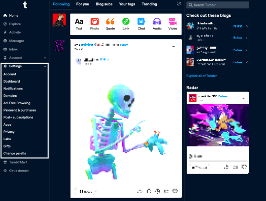
This is the section that sold me on the new dash. On the old dash, I found navigating the Account and Settings options...ephemeral. I was afraid I was going to lose my place if I didn't find the menu I needed. Here, having them slide out as a drawer, keeps me in place and lets me orient myself easier. It's made exploring settings overall frictionless. I've changed dash palettes like ten different times just because I could and it was easy to find. Maybe something similar for inbox/messages/activity would make the UI feel more consistent and less overcluttered-feeling?
I do notice that the Account dropdown adds a new scrollbar which makes things like the t logo and badges jump to the left. That can be a bit disorienting.
TumblrMart/Get a Domain

The Get a Domain menu item is fine, but TumblrMart feels like it needs some love. On a new refresh, clicking the icon loads for a total six seconds before the mart pops up. By this point, if I wasn't intentionally testing, I would have just moved on. Again, I also just don't like pop-ups like this. Feels loosey. Much prefer the full-spread domain page you get.
Create
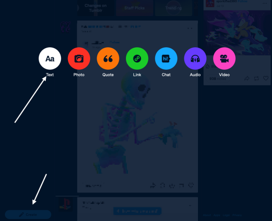
This is maybe my least favorite change. Every time I switch to my Tumblr tab, I see it in the bottom left and think it's the "Where were we?" button. When I do want to create a post, it feels like I have to travel far to get to the button, and then I have to travel again when the dots come up to select what type of post I'm making.
I wonder if just tucking it at the bottom of the menu under "Get a domain" would be better? Or at the top of the menu? Not sure. I feel in my jellies there's a better spot for this one.
On Twitter
If I can address the most frequent criticism I see on this site, which is that @staff are trying hard to "ruin" Tumblr by "turning it into Twitter," I understand that gut reaction.
But I'd encourage folks to think about that for a minute. UIs change, and a left-aligned nav is extremely common for a reason. Since the dawn of email, menu navigation has been relegated to a left sidebar. Twitter is not "burning to the ground" because their nav bar was on the left. Having a left sidebar means literally nothing in the grand scheme of what makes a website what it is.
What, truly, has this nav update changed? It does not change the functionality of the site at its core at all. It doesn't change what you can post, how you can post, what content you find, reblogs, or tags. For a site that struggles with new users "getting" the site and finding their way around, this nav change makes it much easier to settle in with something a bit more ubiquitous to the modern browser-viewing experience.
Thus leading me to believe the only reason people hate on this change so vehemently is they don't want to see new users or any effort at all to attract them at all, and I think that's exclusionary crap. Knock it off.
Change is Scary!
That said, the change is scary! Having your muscle memory interrupted isn't fun and can take a while to get used to. Every change has a growing period. I get that. For me, I got over that period fairly fast, but I recognize this process is different for everyone, especially those who have been around here for a lot longer than I have.
The change is also open for valid criticism. There are usability and likely accessibility concerns for sure. Staff needs time to iterate, and they need to know what problems are actually worth fixing and addressing. "I hate it turn it back" doesn't help anyone - it doesn't help Staff, and it doesn't help new users who are trying find a new place on the internet to call home after *shakes fist at the rest of the internet.*
I really like this change as a starting point, and I can't wait to see it iterated on further.
And on a small end note, if you also have thoughts and opinions that you want to tell Staff, please, please, please remember there are other human beings on the other end of line.
#tumblr#dash#tumblr dashboard#dashboard#I get dispirited when I see prominent blogs reblogging metaphors about sandwich shops and Radio Shack.#They're not being made in good faith.
9 notes
·
View notes
Text
if you popped into the Ted tag in the past two or three days, you might have been hit with the sight of a supposed DM between “him” and a fan:
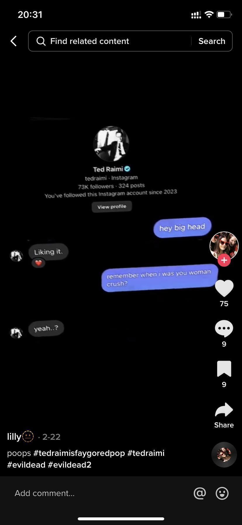
however, this appears entirely false and i’m fairly certain i can prove it’s fake:
1.) Ted doesn’t talk like that. it is the most jarring part of all, aside from that this was probably entirely fabricated altogether. i’m not saying i’m privvy to his DMs or texts and how he messages people but it’s so far off from how he interacts with people on social media that it genuinely doesn’t read as him at all
2.) the misaligned text and the randomly fluctuating text size. the text size is not congruent throughout, the first message is abnormally larger than the next 3 lines, and those lines don’t match each other at all - even with the shot taken at an angle as it is, they would not look like that tilted. it is not leveled flat and straight like normal text would - nothing about it matches what an actual message layout would appear as
3.) there is not a single timestamp or date included. it is impossible to hide timestamps with the current instagram UI at the very start of correspondence in DMs
let me walk you through it-
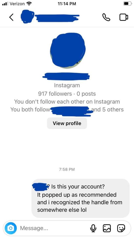
screenshots of DMs through iPhone:
screenshots of DMs through Android/Samsung:
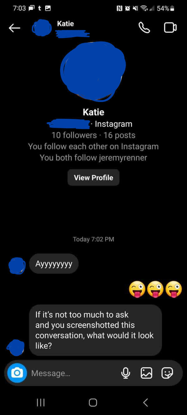
you can only get the giant PFP, the followers count, post counts, whether or not you follow each other, and any accounts you both follow from the very start of your DM correspondence - meaning this only shows up with the very first messages you send to an account. after sending more messages, the block of account information is no longer visible as it gets pushed up by further exchanged texts
you will also always have a date and/or timestamp at the top of the beginning of your first DMs, that’s not exclusive to one phone or tablet OS - the app itself is fairly congruent between different brands and their OSs. it is also not exclusive to accounts that follow each other or not
any other DMs from that point on will look generially like this:
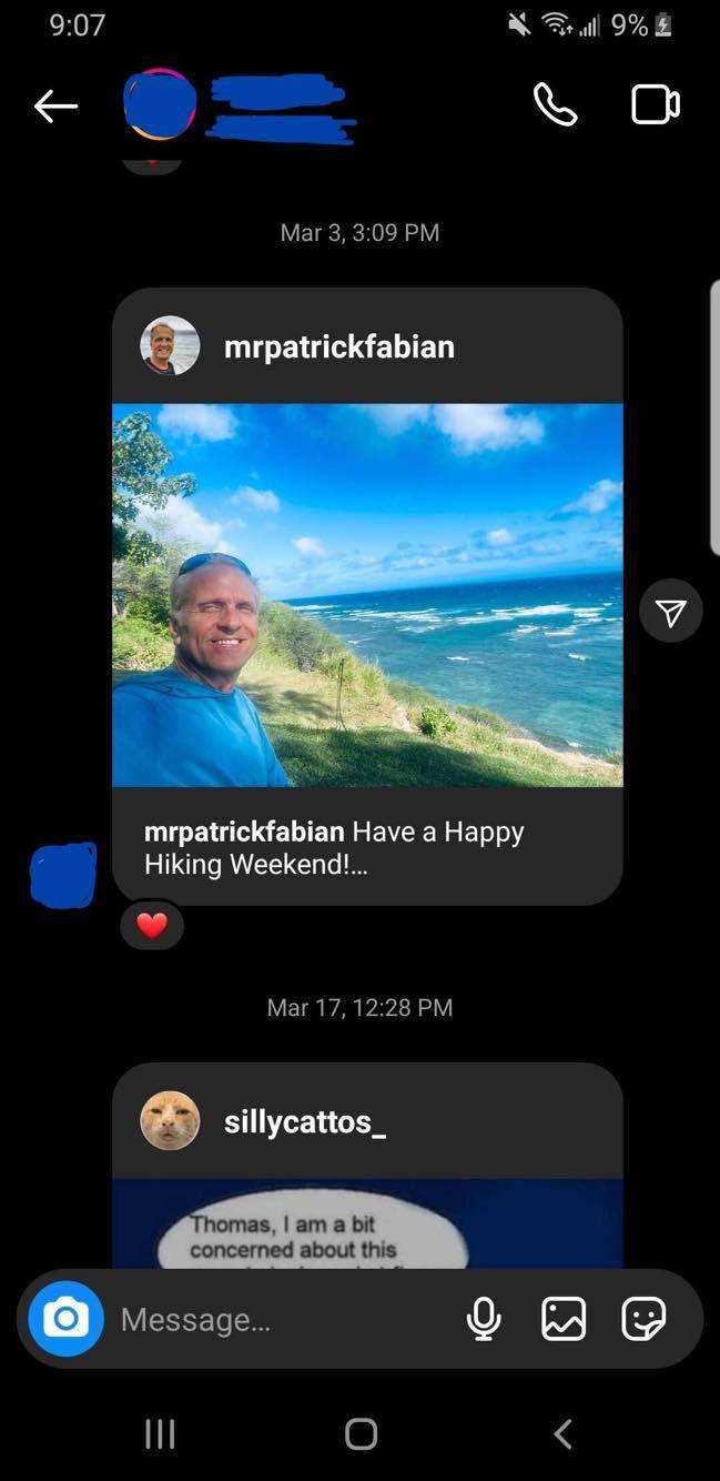
you can literally only get the giant PFP, follower count, post count, etc. from the very start of your correspondence, it disappears with the more messages exchanged. and it will not appear anywhere else except on mobile or tablet
all DMs look like this from desktop - it doesn’t matter which browser, because i tested it on Firefox, Chrome, and Edge (screenshots i can also share, if you want them) and they all are the same:
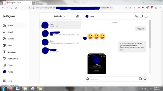
dates and timestamps still at the top of the start of message threads - you cannot remove dates and timestamps from the beginning of direct correspondence with the way the instagram UI is now - it will always show the date and/or time the very first message was sent. and the block of instagram account information will only appear at the very start of messages first being exchanged
also, the big PFP, follower count, post count, etc. is not available through desktop, only mobile and tablet, so it cannot be duplicated anywhere else
there is too much not adding up and the fact that it has proven impossible to replicate through conventional means leads me to believe and state with conviction that it is fake, manufactured
i’m not sure which app was used to do it, but based on how the picture was taken - the angle and the distance - leads me to believe a watermark or app interface was cropped out purposefully. there are multiple apps and sites out there that can be used to create such fake interactions, but beyond not knowing just which one was used, i’m also not going to exhaust myself trying to search more than i have
could i be wrong? yes, i’m not going to say that it’s impossible for me to be missing something, i’m not an instagram expert by any means
do i think i am wrong? no. too many things just don’t add up
i’m more than willing to eat my own words if everything i’ve just laid out can be proven wrong, but i genuinely cannot replicate what is displayed in that screenshot, which leads me to believe it is fake
it also lends precedent that she has been lying repeatedly about supposed interactions that i also believe have never taken place. but that’s for a whole different post of its own
if, again, anything could be brought to light to prove anything i just said to be incorrect, i would gladly recant. but i don’t see that happening. she’s locked down every account she has and the likelihood of Ted seeing any of the fuss being made about all this goes down every day, since he is so rarely online and interacts with so few replies and almost no @ s from people he doesn’t follow
10 notes
·
View notes
Text

supernatural s8e1 we need to talk about kevin (w. jeremy carver)
new season, new me. *silent wish goes up for smaller sideburns*
of course they had to include "dick is coming" in the recap. we can't let the opportunity for a dick joke slip out of our hands

very xfiles

okay i threw this in lightroom real quick to make it less dark because what is going on here? it's very... strike a pose, for feral!dean. and the kids are like from a painting. it's very dramatic. maybe i will paint it some day.


well the infamous benny appears. i also didn't realize purgatory was gonna be a time jump like hell. read something not too long ago that was fairly evocative of the environment of purgatory so i was thinking some of the show happened there (though i suppose flashbacks are also a possibility).
lol i'm already upset, broad strokes know how this goes with their reunion emotionally.
this is so ridiculous. i was just complaining how i felt so blah with the end of s7. well here we go, let's hurt my feelings with brother conflict stress and i'm gonna be upset about it? make up your mind

okay so some fics i've read are like "sam didn't look for dean while he was in purgatory" but i did not pick up that for all intents and purposes, sam had no reason to assume he wasn't dead.
there's a lot going on in this scene. like the semi dodging the cas questions, how he got out, etc.
SAM Yeah. Yeah, I – you were gone... Dean. Cas was gone, Bobby was dead. I mean, Crowley even shipped off Kevin and Meg to parts unknown. DEAN So you just turned tail on the family business.
are you kidding me right now, dean? like he should carry on hunting because it's the family business??? i'll chalk this up to being mad and fucked up for being hunted for a year.
SAM Nothing says "family" quite like the whole family being dead. DEAN I wasn't dead. In fact, I was knee-deep in God's armpit killing monsters, which, I thought, is what we actually do. SAM Yes, Dean. And far as I knew, what we do is the thing that got every single member of my family killed. I had no one – no one. And for the first time in my life, I was completely alone. And, honestly, I-I didn't exactly have a roadmap. So, yeah, I-I fixed up the Impala, and I just... drove.
💔
DEAN After you looked for me. Did you look for me, Sam? [SAM looks away.] Good. That's good. Now, we – we... always told each other not to look for each other. That's smart. Good for you. Of course, we always ignored that because of our deep, abiding love for each other, but not this time, right, Sammy?
well i can see now why fics harp on this point. so i'm assuming sam thought dean was in heaven. would dean expect sam to try to get him back from there too? tucking 'deep and abiding love' into my pocket
okay right i've talked about this before too, how sam is always the fuckup begging for forgiveness and dean is the righteous man. and i'm tired of it! this thing with the voicemails from kevin tran is just... cruel. i don't like the point they're making.
real life, anyone in sam's situation would be a fucking mess. i still don't really think sam would flake on the phones with kevin like that.
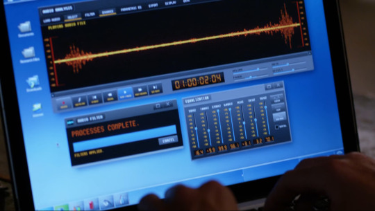
whoa whole new desktop. so long untitled 1 and 2

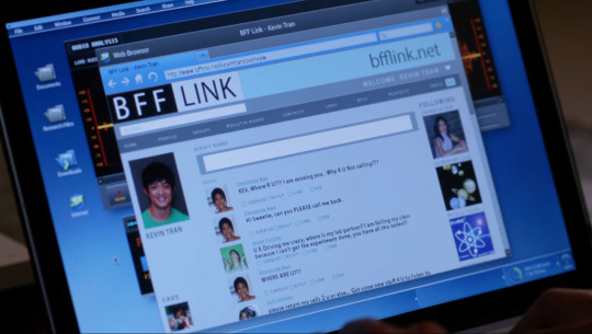
oh we get urls now in the new web browser! and look at that, already an invalid web url http://www.searchtheweb/main missing your tld, friend 😔 1 out of 2, at least
lying about the dog in the car too. all right
okay, purgatory flashback after all. umm. what happens when you die in purgatory? respawn there? or is that the way to the big empty i've heard about

DEAN Hmm. So what was it, hmm? What could possibly make you stop just like that? A girl? Was there a girl? SAM The girl had nothing to do with it. DEAN There was a girl. SAM Yeah. There was. And then there wasn't. Any more questions?
*heavy sigh*
not getting through this episode tonight. reconvene tomorrow
4 notes
·
View notes
Text
Interesting development tonight while trying to make Tumblr work a bit better on my phone while my tablet doesn't want to work with it -I figured out how to fix my blog URL from redirecting to in-dashboard view (tumblr.com/[user URL]) on my mobile browser, regardless of which URL format I use ...and I believe it's a workaround for the issue of Tumblr's login wall popping up in blog-view even for people who have chosen in their settings to keep their blogs viewable to everyone by being able to have your blog work in [User URL].tumblr.com format on mobile.
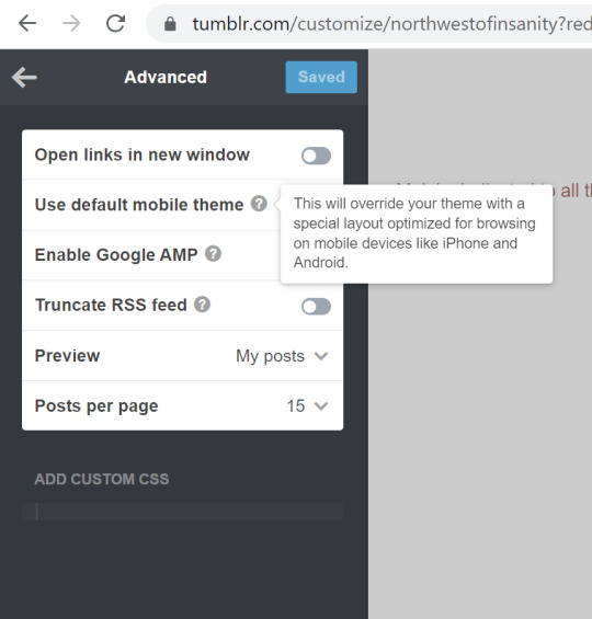
For anyone who wants the ending point first before the context, TL;DR -it has to do with THIS. If you're curious or need the visual of what exactly the difference the "Use Default Mobile Theme" setting makes, and why it might be a problem, context follows:
So, for about a year now, the picture below is how my blog -and most other users' who use the basic Tumblr theme instead of a custom blog -comes up on a mobile browser:
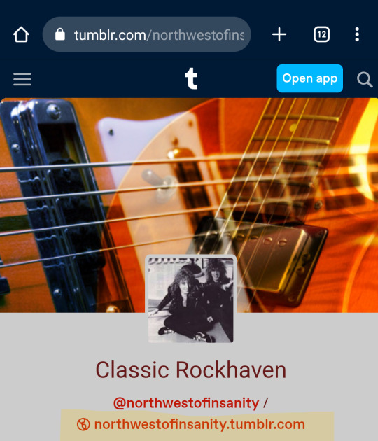
It displays under the dashboard header, like I opened it from a post, and the URL stays in the dash-view format - tumblr.com/[user URL]. I could tap on the highlighted, second link for my blog page I had enabled with [user URL].tumblr.com, and it would *still* revert itself into dash view, and the previous URL. Also, this rendered my blog unviewable to anyone without an account, as the login wall would pop up in short order after loading -and I do in fact have friends who I occasionally share some of my Tumblr posts with, but they do not have or want to make an account. (Yes, you may ask me "why not just go with a completely different custom theme so that it has to load properly?" -Well, I do have "custom theme enabled" selected -as one known step for allowing public view -but I stick with the "Official Tumblr Theme" because I like the simplicity and accessibility of it, and I've had a lot of menus not display right or be confusing to find on other people's custom themes, and while it's their choice to use what they like for their own blogs, I want *my* blog to be accessible and easy to navigate, for my own sake as well as anyone else. And it's not like this has always been a problem with my blog theme, right? So, why should it be?)
But then I also realized that I have a few users I follow using the Tumblr official theme for at least their mobile site who still had it loading the way it used to for me, and switching properly to [user URL].tumblr.com, and bypassing the login wall as far as I could tell. Now that I've finally figured out how to switch back after what changed about a year ago, when I tap on that second link on my phone browser, it looks like this:
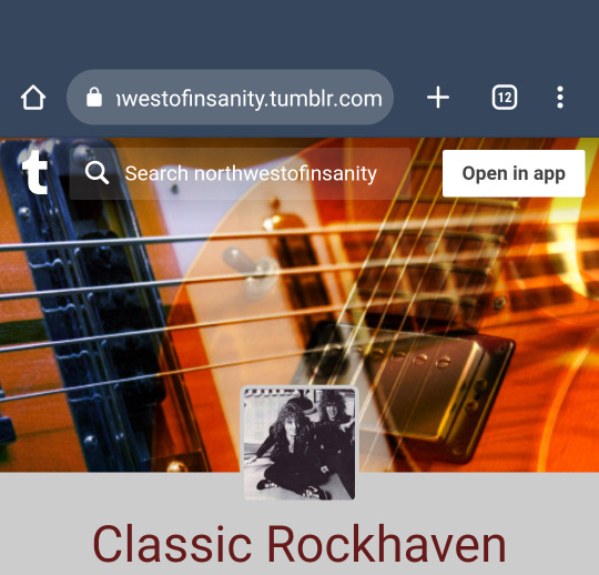
Look! It's the proper URL with the blog search bar at the top. I can share my own posts with my friends who don't have a Tumblr account, and they can *see* it without the login prompt blocking it up if their using a phone. Better yet, I haven't quite figured out this part, but ever since "featured tags" became a thing, my phone mobile browsers won't let me search anything other than featured tags on the search bar in tumblr.com/[user URL] view -I could tap "enter" all day after typing it in, and it just doesn't register or go anywhere at all, and I've yet to get any answers from help requests on that... (Note: I can search blogs on in-dash view just fine on desktop -that's only a glitch on my phone). But that search bar at the top in the proper URL view works like a charm for anyone lucky enough to be dealing with that same glitch, and is so much easier than having to manually type in search or tag URLs for non-featured tags.
So, that brings us to what changed:
I started digging through my blog and theme settings for *anything* that would possibly fix this, and was even about to resort to switching to a custom theme with the simplest layout possible if necessary (Again, I've had the "custom theme enabled" toggle on for as long as it's existed, as a known step for bypassing the log-in wall despite also allowing public views on blogs.) Then, I finally noticed an "Advanced" panel on the very bottom of the editing tray that led me to the solution
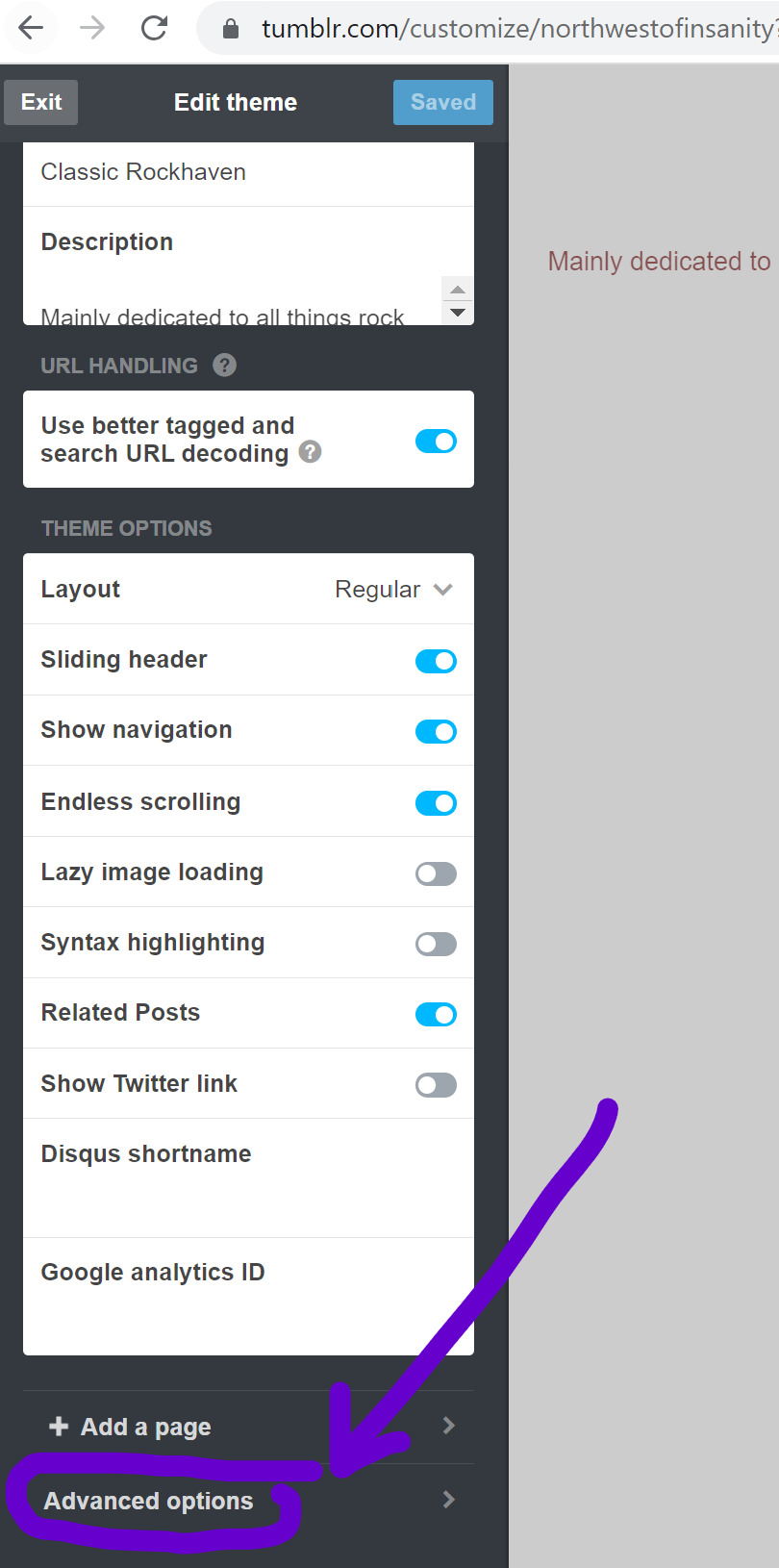

The toggle for "Use Default Mobile Theme" was enabled on my advanced settings -something that did not exist when I designed my blog in 2017. (And aside from a minor tweak to my blog description, that theme has remained the same from that very night forward). As it states, "This will override your theme with a special layout optimized for browsing on mobile devices like iPhone and Android". What it doesn't say is that it will ALSO override the switch to [user URL].tumblr.com, and keep your blog opening in in-dash view on mobile browsers, regardless of your other view settings. As soon as I found that and toggled it off, one of my greatest headaches with using Tumblr on my phone over the last year was cured.
Now, I still can't navigate easily on other users' blogs who have that enabled, whether by choice, or by not knowing how to fix this issue, but again -their blog, their choice. Throwing this out there for anyone who's been as perplexed by this as I have been and might not know you *have* a choice.
#tumblr troubles#tumblr problems#tumblr mobile web#i cannot tell you how much this has been driving me crazy!#hope this helps someone
2 notes
·
View notes
Text
Privacy Badger is a project from the Electronic Freedom Foundation, and will 'learn' from websites visited which links are trackers or not
Facebook Container (and Container Tabs) keep facebook in its own bubble, unable to track you accross your other tabs. It also disables the tracking in the 'share to FB' links
Container Tabs are all around userfull--have 5-6 individual profiles on firefox which don't share information with each other! they're labeled work/shopping/bank/personal etc. It's private window, but useful
DuckDuckGo Privacy Essentials -- don't bother with the browser imo, but the search engine+extention are legit. if you sign in, they offer email masking; for lower effort, it's still a decent filter
and not firefox, but holyshit i love it:
Blockada--you know how one of the worst parts of doing stuff on your phone vs a desktop is how you cant add adblock extensions to an app? or how you always put your phone in airplane mode to play games, to avoid ads? This is the(a) solution, and it's so easy. it acts like a VPN or pihole, if you're familiar, and filters the internet requests based on adlists you can curate. ad- and tracker-free internet, across the board, including shitty mobile games my phone is so much faster, and it took so little effort compared to a pihole
The Chrome browser exists to show you ads and track where you go so that Google can show you more ads. Please stop using Chrome. Firefox is open source, and while Mozilla is not perfect, it isn’t actively fucking evil the way Google is. It has a bazillion plugins, including various (FREE!) ad block plugins (I recommend uBlock Origins, which will even block YouTube ads – you can watch videos without interruptions again!). It will also function very effectively with a lot more tabs open than Chrome. I’ve got around 800 tabs open right now (not loaded, of course, except for maybe 2 dozen; it’s been a heavy browsing day), and my wife has between 2k and 3k at any time.
We are in the New Browser Wars. This time there’s a helluva lot of money up for grabs, because a lot of it is about running those ads. Monopolies are bad for consumers.
Just go download Firefox.
115K notes
·
View notes