#I get dispirited when I see prominent blogs reblogging metaphors about sandwich shops and Radio Shack.
Explore tagged Tumblr posts
Text
On The New Tumblr Desktop Dash
I've been using the new Tumblr desktop dashboard for a few days now and I have some Thoughts that I thought would be useful to put out in to the wild. Most of the reaction I've seen has been...abnormally harsh about this UI update, so I think it would be interesting to actually go through the changes and point out what I like, what I don't, what I think could use some improvement, and maybe break down a little about why those Twitter comparisons are way off the mark.
More below the fold, but the tldr for me is - I think it's great! At the end of the day, I feel like I use the desktop version of Tumblr more and more since the change. Whereas before I used to just pick up my phone and refresh the app, now I get a hit of dopamine flipping over to the Tumblr tab when I need a work break.
The change is clean and logical, and as someone who came to Tumblr a year ago and still never quite grokked what all the icons at the top meant, having them spelled out is much nicer than guessing what they mean, even for someone who has become more familiar with the site. And to be clear, from what I can tell that's the goal of this change - to make it easier for newer people to use Tumblr and find their way around. Despite all the hate this change is getting, that is an unabashedly good thing.
The Left Nav
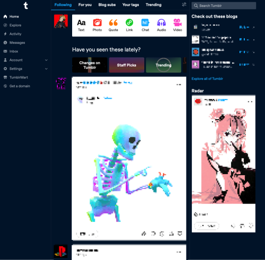
It's really, really clean. The old dash had a lot of unused space on the left, it makes sense to carve some of that out to have a menu that actually lays out what each icon means. The font size and style is comfortable without overcrowding. It just feels more...confident? Like these are the features Tumblr has. Use them! It's also just a more familiar web browser experience for anyone who has been using web apps since the dawn of email.
The badges also fit much nicer with the left nav. They don't float above an unclear icon, they're right next to what it says on the tin. You got 20 new posts to read, buddy. 5 new notifications. 1 anon ask. It's just better on my eyes.
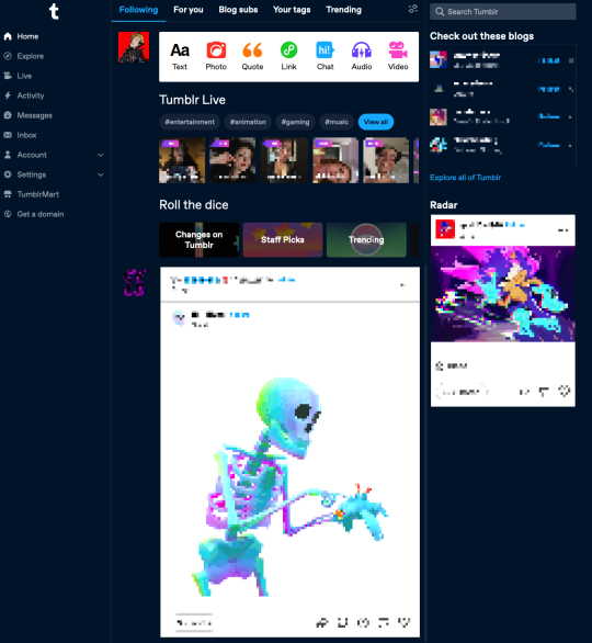
I do understand the gut reaction that things are "too" cluttered. One of the first things I did was snooze Tumblr live and that helped me out a lot. Just removing all of the noise of live tags and loading-in thumbnails of people I'm not interested in watching went very far. It brought the post content further up on the screen.
A little before and after snoozing Live:


Explore
I didn't even know what Explore was used for before. It was a compass icon. I think I thought it was some kind of search? I can't remember if I ever clicked on it before. Explore is much more interesting to me. It makes me curious. For a site that struggles with getting new users to find new content, it's a beacon that says "Find some cool new stuff!"
My problem with Explore is that clicking on it...doesn't get me much. The landing page just takes me to a feed from @todayontumblr that almost never has any content that I'm interested in. The "For You" tab on my regular dash is where I go mining for new blogs, along with "Your Tags." If Staff finds this change leads to more Explore click-throughs, I'd love if the tab itself get some love and made it a hub for finding new content easier. Maybe mixing up a feed of any tags you're following, trending posts, and other algorithmically sorted goodies that I'll want to take off the shelf and put in my chronological dash. I want it to be a place with the goal of encouraging me to follow new blogs.
Live
The transition to the Live page doesn't feel good to me. You're taken to a totally different kind of page, and the UI jumps all the way to the left. It feels like you're going to a separate site. At least when you snooze Live it also removes the menu item. That's really nice! But I'll save Live thoughts for another day.
Activity/Messages/Inbox

I never knew how much I suspected these things were a bit redundant, but I'm glad now that they're separated and labeled correctly. I don't have to remember what the face icon/mail/lightning bolt all mean or why they're different. Things are much cleaner in that regard.
I don't really care for the popups when you click on them. Those do feel cluttered to me, like I'm going to lose sight of my dash, or the notifications. I don't have much UX advice here, other than to say I think I prefer how the Inbox is handled, where you're just taken to a full page view of the page. However maybe another solution would be how the Account and Settings icons are conducted...
Account/Settings

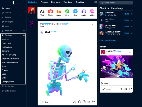
This is the section that sold me on the new dash. On the old dash, I found navigating the Account and Settings options...ephemeral. I was afraid I was going to lose my place if I didn't find the menu I needed. Here, having them slide out as a drawer, keeps me in place and lets me orient myself easier. It's made exploring settings overall frictionless. I've changed dash palettes like ten different times just because I could and it was easy to find. Maybe something similar for inbox/messages/activity would make the UI feel more consistent and less overcluttered-feeling?
I do notice that the Account dropdown adds a new scrollbar which makes things like the t logo and badges jump to the left. That can be a bit disorienting.
TumblrMart/Get a Domain

The Get a Domain menu item is fine, but TumblrMart feels like it needs some love. On a new refresh, clicking the icon loads for a total six seconds before the mart pops up. By this point, if I wasn't intentionally testing, I would have just moved on. Again, I also just don't like pop-ups like this. Feels loosey. Much prefer the full-spread domain page you get.
Create

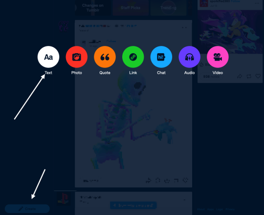
This is maybe my least favorite change. Every time I switch to my Tumblr tab, I see it in the bottom left and think it's the "Where were we?" button. When I do want to create a post, it feels like I have to travel far to get to the button, and then I have to travel again when the dots come up to select what type of post I'm making.
I wonder if just tucking it at the bottom of the menu under "Get a domain" would be better? Or at the top of the menu? Not sure. I feel in my jellies there's a better spot for this one.
On Twitter
If I can address the most frequent criticism I see on this site, which is that @staff are trying hard to "ruin" Tumblr by "turning it into Twitter," I understand that gut reaction.
But I'd encourage folks to think about that for a minute. UIs change, and a left-aligned nav is extremely common for a reason. Since the dawn of email, menu navigation has been relegated to a left sidebar. Twitter is not "burning to the ground" because their nav bar was on the left. Having a left sidebar means literally nothing in the grand scheme of what makes a website what it is.
What, truly, has this nav update changed? It does not change the functionality of the site at its core at all. It doesn't change what you can post, how you can post, what content you find, reblogs, or tags. For a site that struggles with new users "getting" the site and finding their way around, this nav change makes it much easier to settle in with something a bit more ubiquitous to the modern browser-viewing experience.
Thus leading me to believe the only reason people hate on this change so vehemently is they don't want to see new users or any effort at all to attract them at all, and I think that's exclusionary crap. Knock it off.
Change is Scary!
That said, the change is scary! Having your muscle memory interrupted isn't fun and can take a while to get used to. Every change has a growing period. I get that. For me, I got over that period fairly fast, but I recognize this process is different for everyone, especially those who have been around here for a lot longer than I have.
The change is also open for valid criticism. There are usability and likely accessibility concerns for sure. Staff needs time to iterate, and they need to know what problems are actually worth fixing and addressing. "I hate it turn it back" doesn't help anyone - it doesn't help Staff, and it doesn't help new users who are trying find a new place on the internet to call home after *shakes fist at the rest of the internet.*
I really like this change as a starting point, and I can't wait to see it iterated on further.
And on a small end note, if you also have thoughts and opinions that you want to tell Staff, please, please, please remember there are other human beings on the other end of line.
#tumblr#dash#tumblr dashboard#dashboard#I get dispirited when I see prominent blogs reblogging metaphors about sandwich shops and Radio Shack.#They're not being made in good faith.
9 notes
·
View notes