#also had to add shadow/specular/normal maps
Explore tagged Tumblr posts
Note
Hi love! Your recent post (coming soon…) is so cute!! I was wondering wcif the Amazon boxes? 👉🏻👈🏻

amazon boxes by yourdorkbrains (I made them simlish for my personal use - which I don't believe they allow recolors/retextures to be shared???)
96 notes
·
View notes
Text
Me: Oh yeah, aliens are also a thing in the Sims...eh, well, that’s not really my cup of tea; I probably won’t do anything with them
Sims: Oh hey btw when you make an alien Sim you can make both their alien form as well as a human disguise form
Me: ...
...
...
...OK FINE TIME TO MAKE AJA AND KREL LET’S GOOOOO
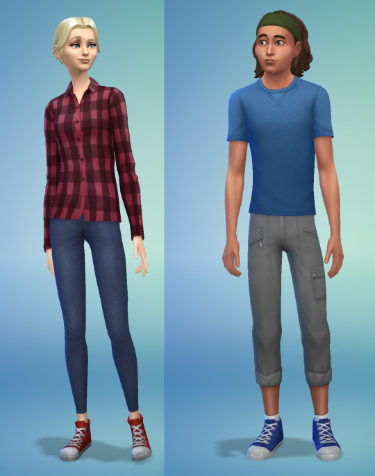
So their human forms turned out to be pretty straightforward. I think they came out pretty decent nearly right off the bat! :)
Their Akiridion forms, on the other hand...those were tricky, as they involved a lot of custom content. And when I say custom content I mean literally MADE BY ME. ^^�� I hand-altered pretty much every part of their Akiridion forms in some way or other.
Their hair is still a default EA mesh, but I wasn’t satisfied with the default color swatches so I had to go in and custom-recolor them.
I do have some CC I downloaded a while ago for Akiridion eyes, but for some reason custom eye colors don’t show up as selectable swatches in my game despite being in my mods folder, so I had to make some of my own...in the “face paint” category rather than the “eye color” category. But hey it worked! So fyi for anyone interested, you CAN override eye colors with face paint; I’d recommend that route if you wanna make some custom eyes o3o
(theoretically you could also use this technique to have your Sim change eye color with each outfit, if you want!)
The clothes were the trickiest part. EA does have a glowing “alien suit” that’s pretty cool, but it only comes with green glow. At first I tried to just use that suit with a custom swatch for blue glow, which did actually work (looked a little rougher than the official swatch but was still functional, glow and all):
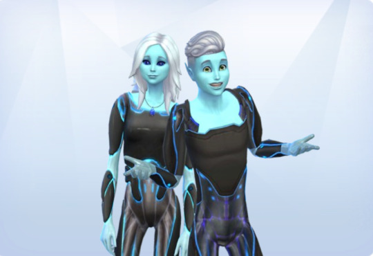
(screenshot taken before fixing the eyes, obviously ^^”)
...but I still wasn’t quite satisfied with the overall aesthetic. It would be ok for an oc but didn’t really look enough like Aja and Krel to me. But what else could I do? I’m not good enough at modeling in Blender to create my own custom mesh for the outfits, and I couldn’t think of any EA full-body outfits that had the right shape I could recolor....
...UNLESS....
...what if I just painted it directly onto their skin as a “tattoo” like I do for custom fur patterns on the furry mod?!
This was a good start, but of course under normal circumstances Sims aren’t allowed to be “naked”; even if you remove all the clothes you can in CAS it’ll still give them non-removable underwear in its place. In order for the tattoo idea to work properly, I had to find a way around that as the game wouldn’t recognize the “tattoo” as clothes and try to make me put a different outfit on top of it.
So what I did was grab some skintight swimsuits and just...deleted the diffuse texture (as well as specular/shadow/etc maps), effectively rendering the swimsuit invisible in-game. So as far as the code is concerned, they are technically clothed...it’s just invisible so you can see under it without triggering the default underwear...and IT WORKED!!
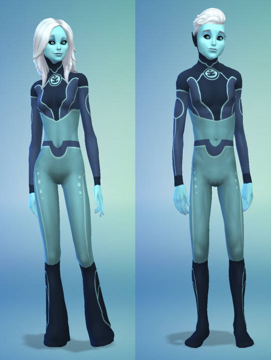
They’re not perfect, you can definitely see where I didn’t quite line up the UVs right, but I think it’s a pretty darn good start!
At the moment they’re using the exact same texture, based on Aja; I know Krel’s outfit design in the show is slightly different than his sister’s BUT I wasn’t sure if the technique would work and didn’t want to waste time making two separate nonfunctional textures, so I just used Aja’s as the test. Now that I know it works, though, I’ll go back and make a proper one for Krel later. For now they’ll just have to match haha.
Aja is also sporting @zaneida-and-sims4’s Angor Rot style legs, cuz I thought it was a bit closer to the show, even if it caused some more issues with the texture lining up. I tried to give them to Krel as well, but for some reason it wouldn’t show up as an option for him. Sorry Krel, you’ll have to stick with regular human legs. ^^; If it makes you feel better, they don’t work on Blinky either (I would be tempted to wonder if maybe they only work on females were it not for the fact that they DID work on NotEnrique...oh well).
I did also experiment with a mod that allowed for extra arms, HOWEVER the arms were basically just an accessory and didn’t actually have any animation on them. While they would cool in screenshots, in-game it just looked really distractingly stiff and awkward, so I ultimately opted for just two arms.
Varvatos Vex is not currently in the game; I MIGHT add him in later but if I do he’ll be a dog like Aarrrggh. We’ll see though.
So that’s that! I probably won’t play much from the perspective of this house directly, but I look forward to finding them out and about in the world... 👀
#3below#aja tarron#krel tarron#sims 4#trollhunters sims#well I guess 3below sims technically...but i don't think I'll use them enough w/o the trollhunters crew to warrant a separate tag ^^;#arcadian sims I guess?? ¯\_(ツ)_/¯
106 notes
·
View notes
Note
Hi! sorry if this is a bother but is there a specific tutorial you followed to learn how to create your own meshes? because every single one i found or someone else linked isn't exactly a tutorial for beginners and requires you to basically already know what your doing.
“how did you make your hairs from scratch? did you follow a tutorial? what was your process? I want to try but I don’t know where to start”
hello friends! :) tbh there was no one specific tutorial… honestly, i spent a lot of time frankenmeshing to get familiar with the processes and blender but never actually released much
but unfortunately, i definitely don’t recommend starting to create meshes from scratch as a beginner because i know i tried and it did NOT end well alkfjsdalkf
diving into blender without knowing what you’re doing is VERY frustrating, i know from experience LMAO so i’m listing tutorials/resources under the cut from beginner to from-scratch meshing that i know are helpful, have been helpful to my friends, or that i realized after messing around to learn something would’ve helped me a TON
there’s some i’m missing i can’t find for the life of me rn so i’ll add to this later on too! also feel free to send me any tutorials you feel helped you :)
items with an *asterisk are ones i’ve personally used or wish i would’ve had when i started
beginner
i’d recommend starting with frankenmeshing clothing first! and then move onto frankenmeshing hair :) so clothes and beginner tutorials will be in this section, and hair tutorials will be in the next!
*blender guru’s blender beginner tutoriali didn’t use this tutorial in particular (thought i would have definitely saved me a lot of time) but blender guru on youtube has really good videos on blender for complete beginners! here is his full playlist of tutorials for 2.7! you probably only need the first one or two just to get your bearings in the program as you won’t really need to use much of materials or lighting for making sims cc
@teanmoon‘s blender cheat sheetpretty self-explanatory!
basic mesh shortening tutoriala good first project to do in blender imo
@deetron-sims‘ frankenmesh tutorialdespite not fully using this, i referred to it a few times when i’d get stuck lolit also contains stuff for normal maps and shadows! i don’t create LODs this way usually, i normally decimate a little bit for each LOD that isn’t LOD 0 (unless LOD 1 looks like trash, in which case i will import my LOD 0 onto there)
*edge split tutorialmarch 18, 2020: here is my version with updated pictures!okay so the pics are broken, but it’s pretty self-explanatory! if you ever get a weird shadow at the ends of your clothing after removing doubles, you need to do this!! i always remove doubles and do this :) i could attempt to redo the tutorial with pictures on tumblr if requested!
*@theslyd‘s multiple mesh tutorial aka making things bgc as wellnot for hair! (cut layers for hairs are for hat compatibility!) but definitely helpful for clothes… had to figure this out for myself so knowing this ahead of time would’ve been really really good
*@deetron-sims‘ specular tutorialthis is a meshing list but i needed to include this because it is a massive pet peeve of mine LMAO i know some people just import blank speculars and specular masks, which works, BUT if the item underneath (ie. tights or if you’re using a shiny mannequin) has any sort of specular or shine at all, then it will show through! you need to create a specular mask based off the alpha of your texture and then import in the blank specular itself if you want no shine to come through! i don’t create my speculars the way this tutorial does, but it works all the same :)
*texture location templatei would definitely recommend getting comfy with uv_0 mapping as a beginner! it just moves around textures really so you wouldn’t mess up morphs/weights :) the template also helps you understand why some cc conflicts with each other! because they’re placed in the same area, the game reads both textures for both items together
intermediate
various hair frankenmesh tutorials@okruee‘s video tutorial@simandy‘s written/picture tutorial (part 1 and part 2)another video tutorial (was told by @inkyblick, “i literally followed that // and i’m a dumbass with blender // but if I could do the thing, so can they”)
*@blogsimplesimmer’s hat chop tutoriali would recommend using @pralinesims‘ daydreamin hat set to do hat chops! they’re smaller which makes sure most hats fit! typically when i do hat chops, i use about 5-6 hats per chop in blender to make sure everything fits right…
what i usually use…horizontal chops: praline’s low (with extra fluffy hairs, you may have trouble with the low one, which is fine if you must omit because it’s rare you get a cap that low anyway) and regular caps, base game newsboy cap, get to work CapSurgical, discover university grad cap and bike helmet (i make sure the straps at the back of the head don’t clip out of the hair!)slanted chops: praline’s backwards and lifted caps, base game BaseballBackwards, base game CapPuffy, base game KnittedKuffi, ugly seasons CapKnitBrim
making sure that my hairs work with all of those hats, i haven’t run into a problem with any particular hat yet in game!
hair meshing tipswatch @aharris00britney‘s speed meshes! (or anybody else really, sometimes you can pick up some stuff and learn new tricks!)
quick uv_1 tutorialhaven’t used this myself but it looks rly helpful
also *@teanmoon‘s uv_1 and weight guides really help you understand what those things are for!!
advanced
*joint list for sims 4 skeletonsi use this for when i’m weighting my hairs! i don’t weight transfer at all because i can never get weight transfers to work right for me
*@tsminhsims‘ easy weight assignment for hair (1 / 2 / 3)i use this to weight my hairs :) i’ve made adjustments since as now i understand what affects where now but it’s a good starting point!
ALSO! i would recommend doing uv_1s and weights from scratch for practice on ea hairs before going in and doing on a from-scratch mesh so that you can know how to do it (since you could get frustraed by spending all that work on a mesh and not being able to get in game)
*blender tutorial - hair with curvesthis is the technique i use for my hairs, albeit adapted a little for myself after getting the hang of it! also you only really need to watch the first 10 minutes of the video as the rest is about lighting/texturing which we don’t need for sims 4
*@tekri’s tutorial on meshing from scratch in mayai’ll be honest, i really really tried this… buut i cannot work in maya at all LMAO the blender parts of this could be helpful for you though! there’s vertex painting, weights, uv_1, and hat chops! :)
the reason i suggested getting comfy with uv_0 mapping is because i haven’t exactly used a uv_0 tutorial myself, but rather understood how it worked and just went from there :) it’s kinda tedious but honestly the simplest part of the whole hair making process imo
other tutorial masterlists
@ridgeport’s cc making tutorial list@simlaughlove‘s tutorial page@tekri’s guide lists4s forum tutorial list
#Anonymous#ev.rss#tutorial masterlist#tutorials#i hope i got everything!#but yeah#if you want me to add a tutorial to the list#just let me know!!
228 notes
·
View notes
Note
What is triangle count? If pokemon from Sword and Shield model has a different triangle count but looks exactly the same as in Sun and Moon model, is it the same model?
You’re probably thinking about a 3D mesh. Some people refer to it as a model, but the word “model” often carries other connotations with it. I said I wouldn’t write anything more about Pokemon in specific, but this is an opportunity to segue into a more general look at how 3D graphics work in general and I think that’s a worthwhile topic to cover, so let’s take a dive down that rabbit hole. We’ll start with the mesh. A 3D mesh usually looks something like this:

As you can see, this is a polygonal mesh for bulbasaur. It is comprised of a bunch of points in space called vertices that are connected to each other in varying degrees. These connections between vertices are called “edges”. Typically, edges are grouped into threes and called “triangles”, each of which represents a solid surface on the model. The general complexity of the 3D mesh is proportional to the number of triangles it is comprised of. As a point of reference, Spider-Man PS4′s various spider-suit meshes had between 80,000 and 150,000 triangles.
However, you may have gathered that this mesh isn’t the entirety of the 3D model. It’s is just the shape of the thing. You also need to know what it looks like, what parts are colored what, and so on. This means you need to add a texture map to it in order to see what parts of it look like what. A texture map is a 2D image that has certain established points “mapped” to vertices on the 3D mesh. It ends up looking something like this:

You can see how specific parts of the Texture Map in the upper left get applied to corresponding parts on the 3D Mesh - there’s a section of the Texture Map for the tail, the face, the body, the paws, etc. We can also have multiple texture maps for a single 3D mesh. Here’s another example - each of these guns uses the same 3D mesh but a different texture map.

Are these models the same? Well… they all use the same 3D mesh, but clearly they have different texture maps applied, each of which required somebody to create them. Let’s hold off on judgement for a moment though, because we’re not done yet.
This is a normal map:
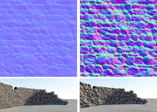
It describes the heights and shape of a surface that isn’t smooth. It lets us make smaller numbers of triangles look like they have a lot more details without needing to break them up into significantly higher numbers of triangles. The two examples here are both using the same 3D mesh, but with different normal maps applied. Are these two models the same? Well, they both use the same 3D mesh and texture map, but not the same normal map. But let’s hold off for a moment again because we’re still not done.
There’s also specular maps…

… and ambient occlusion maps…
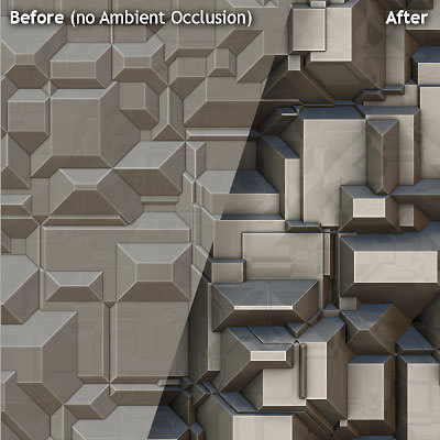
… and Shaders…
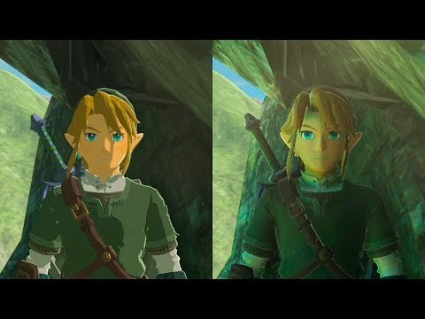
… all of which can be different while keeping things like the 3D mesh and/or texture map the exact same, especially between one game and another. This also is only discussing elements of the model and doesn’t go into things like the rig (animation skeleton) or the individual animations that can also be different.

There’s clearly a lot of work that goes into the creation of a 3D model. We obviously have to build the mesh but we also have to build things like the texture map, the normal map, the specular map, the ambient occlusion map, and any specific shaders. For a game like Pokemon, in some cases you might keep the old mesh and the texture map, but create brand new normal maps, specular maps, ambient occlusion maps, and shaders. So you end up with something that looks like this:
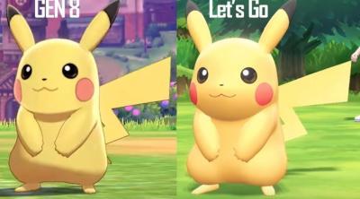
Clearly the specularity is different - look at how more shiny and reflective the Let’s Go version is. The shaders are also different - note how much better defined the lines are around the model in gen 8. The mesh itself is probably the same. The texture map might be the same. The normal map is definitely different - you can clearly see how the shadowing is different between the two, especially around the chin and lower torso. So is this a new model or an old one? My answer is “yes” - some parts of it are new and some are not. But is it the exact same model? They are clearly not the exact same model - there has definitely been work done between the two. Claiming otherwise would be foolish.
[Join us on Discord]
The FANTa Project is currently on hiatus while I am crunching at work too busy.
[What is the FANTa project?] [Git the FANTa Project]
Got a burning question you want answered?
Short questions: Ask a Game Dev on Twitter
Long questions: Ask a Game Dev on Tumblr
Frequent Questions: The FAQ
#3D Graphics#texture editing#computer graphics#graphics programming#Game Art#bump map#normal map#ambient occlusion#specular map
580 notes
·
View notes
Text
Mister Bug and Lady Noire Sets (or master post for the first part)
So, I’ve watched the episode again in a better quality (not HD but enough at this point) and taken reference pictures. As always with new suits (Rena, AquaBug etc) I catch -tons- of mistake, but since I doubt we’re going to have another kwami swap, I’ll base my Sets on this ep and fill with personal preference where needed.
First of all, do you think Lady Noire is the right name? On the English dolls is written as Lady Noire, but when we first had a glance at her doll promo (portoguese?) it was Lady Noir (if Thomas or Winny confirmed somewhere please tell me).
Now, let’s talk about their costumes and how I want to make them.
-:-:-
LN has 3D decor similar to CN suit, but green and with small dark grey/black beads.

She’s wearing heels but shorter than QB, and with the same green decor but less/not puffy.

The baton is attached to the left side, the green lace is closed by a what looks like a flattened sphere with the green cat paw on the other side (I’ll talk about this in other pics too because it’s what has been affected more by animation mistakes).

She has green trim around her legs, neck and ears too, with the same dark beads theme going on, except for the ears that don’t have any kind of bead/stud unlike CN.
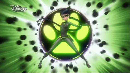
You can see the bead behind her leg. And her braid is very very long. Also, darker than her ice transformation iirc (in which she already has darker hair than usual).
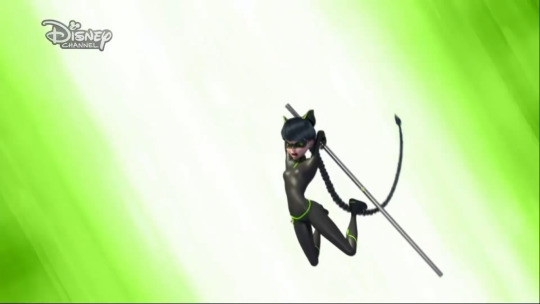
They both have colored sole decor unlike their normal selves.


They have the same mask as if it depends from the kwami (pointed for LN and round for MB). LN also takes her eye color from Plagg (as Viperion with Sass) but MB has Adrien’s green eyes.

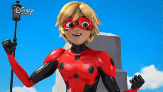
The area below the green trim on the arms is thicker as if she’s wearing gloves (the same way CN pads do around his trims).

The bead on her neck is flattened.

MB has layered outfit as QB, it’s not as thick as the pads on the chest, arms, etc but it’s there.

The shoulders are heavily padded, I think more than his regular suit. I didn’t considered the spots at this moment because they caused me nightmares with LB but they have geometry going on, and they are lesser than LB for obvious reasons.

As you can see on LN, the thing on her hips is now a black circle, that sometimes fly, sometimes is flat (It just makes me want to scream in frustration). MB hips lace is black instead of red as LB.
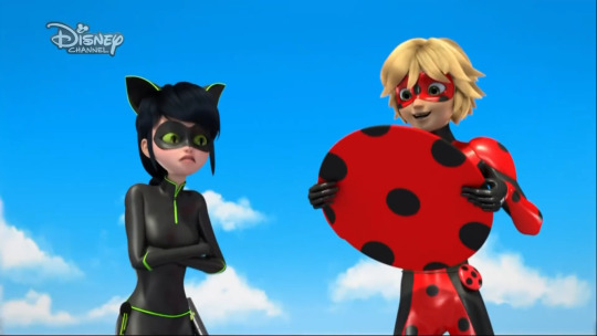
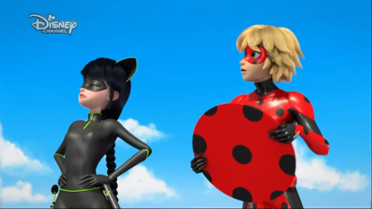

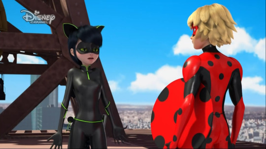
While there’s a clear net pattern in MB suit (same as LB with shining edges), LN doesn’t show any particular pattern in this quality (while CN had shining exagons), but, from the way her suit reflects light, I assume she has the same pattern as CN mask, which seems patternless unless the camera is very close and you can see very small exagons.

As I said, very very long braid.

She has smaller claws than CN!! And she wears the ring in the same finger/hand iirc (sorry, it has been long time since I paid attention to it).

The legs seems to have dimension too as if they are boots.

Layered arm between black and red areas.

Layered leg.

LN main beads has become some sort of flat distorted paw.

LN leg trim confirmed 3D with a round bead.

Layered (or just bump map) chest too, even between reds.
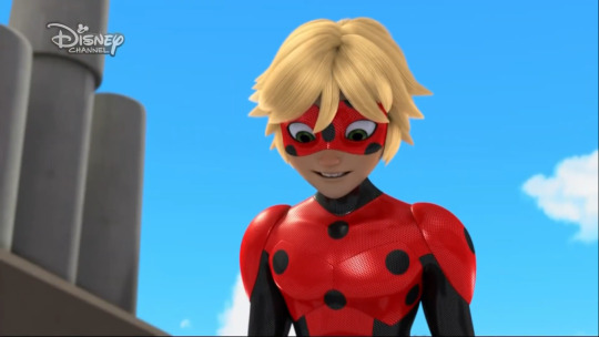
-:-:-
How do I intend to proceed with the sets:
The green trims on LN arms and legs are going to be 3D as my CN ones, but I won’t make the gloves/boots thicker to fake dimension (as I haven’t done with CN pads. At the time because I wasn’t able to, now because it’s a very little detail for the game). The trims on the neck and shoes are probably going to be just texture, but separated from the main suit uv space to make them clear around the edges. All the beds are going to be 3D, the neck one will be more flat.
I will reuse CN baton, ears, and ring (and probably QB hips lace too), properly adjusted for female frame and in the right position. The ring and baton will only have one swatch (full miraculous and green paw, I’ll probably add the inactive miraculous for both but not the grey baton). I won’t change the baton according to CN reference sheet they shared after I made the set (just one paw in one side, while mine has it on both), but I’ll probably fix the mesh artifacts now that I’m able to.
I have to remake the hair for LN (but they’ll have the same CAS swatch color as Mari’s other ones to avoid conflicts with the game genetics), for MB you’ll have to download CN hair (I won’t change them, they are a little wonky because they were my first complicated hair mesh but I like to have him with the same hair). LN hair won’t be that long, they’ll end around the ankles to avoid further problems with clipping.
For LN shoes I have to use the same tecnique I’ve used for QB (separated in CAS) due to the heels.
For the mask, I’ll try to reuse the original ones as much as possible, I’ll just adjust the shape/shadows where needed due to the different frame.
MB will be all 2D despite layered (as I did for QB) except for the shoulder pads. I’ll add a proper normal map to fake the plates on his chest.
MB yoyo will be the same as LB, but I’ll probably adjust the uv and texture now that I know what I’m doing, the lace will be black. For LN hell paw symbol, I’ll go with a flattened black sphere with the green paw on it.
The specular (reflection) of the suit will be net for MB and exagons for LN (as my original LB and CN suits). There will also be the one with the solid specular for both as usual.
I’ll make the claws for LN but similar to my CN set, I don’t think they would be good looking in game as short as in the show.
I’ll convert LB earrings for males and add only the active, inactive swatch (even if they aren’t going to be seen with MB hair).
I think I took everything into account. It’s not that much work, since I already have the base for the suits ready and the 3D stuff they added shouldn’t be difficult (except for LN hair). I don’t know when I’m going to make them, but expect them very soon (probably before Chloé and even Evelynn). In any case all the four sets (Evelynn, Chloé, Lady Noire, Mister Bug) should be ready before the end of september.
(Maybe one day I’ll make their photoshoot outfits too. I don’t know where to add HM and Mayura mask combined, probably need to add a new category in my extra sets. If I’ll ever make Juleka because she’s going to receive a miraculous, and she’s still a teen -not adult like Alix, that I still need to figure out how to categorize-, I won’t do her hair with the hairclip, just her regular ones.)
#faq#long post#the sims 4#sims 4#ts4#the sims 4 lady noire#the sims 4 mister bug#sims 4 lady noire#ts4 lady noire#sims 4 mister bug#ts4 mister bug#the sims 4 miraculous ladybug#sims 4 miraculous ladybug#ts4 miraculous ladybug#the sims 4 miraculous#sims 4 miraculous#ts4 miraculous#Lady Noire#Mister Bug#Reflekdoll#ml spoilers#ml spoiler#mlb spoilers#mlb spoiler#miraculous spoilers#miraculous spoiler
40 notes
·
View notes
Text
“Along For The Ride”, a reasonably complex demo
It's been a while since I've been anticipating people finally seeing one of my demos like I was anticipating people to see "Along For The Ride", not only because it ended up being a very personal project in terms of feel, but also because it was one of those situations where to me it felt like I was genuinely throwing it all the complexity I've ever did in a demo, and somehow keeping the whole thing from falling apart gloriously.
youtube
The final demo.
I'm quite happy with the end result, and I figured it'd be interesting to go through all the technology I threw at it to make it happen in a fairly in-depth manner, so here it goes.
(Note that I don't wanna go too much into the "artistic" side of things; I'd prefer if the demo would speak for itself on that front.)
The starting point
I've started work on what I currently consider my main workhorse for demomaking back in 2012, and have been doing incremental updates on it since. By design the system itself is relatively dumb and feature-bare: its main trick is the ability to load effects, evaluate animation splines, and then render everything - for a while this was more than enough.
Around the summer of 2014, Nagz, IR and myself started working on a demo that eventually became "Háromnegyed Tíz", by our newly formed moniker, "The Adjective". It was for this demo I started experimenting with something that I felt was necessary to be able to follow IR's very post-production heavy artstyle: I began looking into creating a node-based compositing system.
I was heavily influenced by the likes of Blackmagic Fusion: the workflow of being able to visually see where image data is coming and going felt very appealing to me, and since it was just graphs, it didn't feel very complicated to implement either. I had a basic system up and running in a week or two, and the ability to just quickly throw in effects when an idea came around eventually paid off tenfold when it came to the final stage of putting the demo together.

The initial node graph system for Háromnegyed Tíz.
The remainder of the toolset remained relatively consistent over the years: ASSIMP is still the core model loader of the engine, but I've tweaked a few things over time so that every incoming model that arrives gets automatically converted to its own ".assbin" (a name that never stops being funny) format, something that's usually considerably more compact and faster to load than formats like COLLADA or FBX. Features like skinned animation were supported starting with "Signal Lost", but were never spectacularly used - still, it was a good feeling to be able to work with an engine that had it in case we needed it.
Deferred rendering
During the making of "Sosincs Vége" in 2016, IR came up with a bunch of scenes that felt like they needed to have an arbitrary number of lightsources to be effecive; to this end I looked into whether I was able to add deferred rendering to the toolset. This turned out to be a bit fiddly (still is) but ultimately I was able to create a node type called the "G-buffer", which was really just a chunk of textures together, and use that as the basis for two separate nodes: one that renders the scenegraph into the buffer, and another that uses the buffer contents to light the final image.
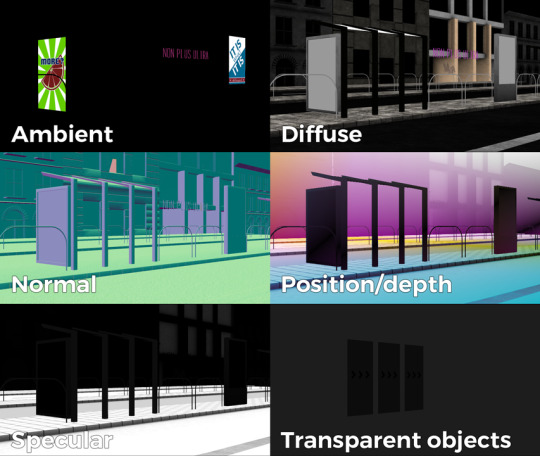
The contents of a G-buffer; there's also additional information in the alpha channels.
Normally, most deferred renderers go with the tile-based approach, where they divide the screen into 16x16 or 32x32 tiles and run the lights only on the tiles they need to run them on. I decided to go with a different approach, inspired by the spotlight rendering in Grand Theft Auto V: Because I was mostly using point- and spot-lights, I was able to control the "extent" of the lights and had a pretty good idea whether each pixel was lit or not based on its position relative to the light source. By this logic, e.g. for pointlights if I rendered a sphere into the light position, with the radius of what I considered to be the farthest extent of the light, the rendered sphere would cover all the pixels on screen covered by that light. This means if I ran a shader on each of those pixels, and used the contents of the G-buffer as input, I would be able to calculate independent lighting on each pixel for each light, since lights are additive anyway. The method needed some trickery (near plane clipping, sphere mesh resolution, camera being near the sphere edge or inside the sphere), but with some magic numbers and some careful technical artistry, none of this was a problem.
The downside of this method was that the 8-bit channel resolution of a normal render target was no longer enough, but this turned out to be a good thing: By using floating point render targets, I was able to adapt to a high-dynamic range, linear-space workflow that ultimately made the lighting much easier to control, with no noticable loss in speed. Notably, however, I skipped a few demos until I was able to add the shadow routines I had to the deferred pipeline - this was mostly just a question of data management inside the graph, and the current solution is still something I'm not very happy with, but for the time being I think it worked nicely; starting with "Elégtelen" I began using variance shadowmaps to get an extra softness to shadows when I need it, and I was able to repurpose that in the deferred renderer as well.
The art pipeline
After doing "The Void Stared Into Me Waiting To Be Paid Its Dues" I've began to re-examine my technical artist approach; it was pretty clear that while I knew how the theoreticals of a specular/glossiness-based rendering engine worked, I wasn't necessarily ready to be able to utilize the technology as an artist. Fortunately for me, times changed and I started working at a more advanced games studio where I was able to quietly pay closer attention to what the tenured, veteran artists were doing for work, what tools they use, how they approach things, and this introduced me to Substance Painter.
I've met Sebastien Deguy, the CEO of Allegorithmic, the company who make Painter, way back both at the FMX film festival and then in 2008 at NVScene, where we talked a bit about procedural textures, since they were working on a similar toolset at the time; at the time I obviously wasn't competent enough to deal with these kind of tools, but when earlier this year I watched a fairly thorough tutorial / walkthrough about Painter, I realized maybe my approach of trying to hand-paint textures was outdated: textures only ever fit correctly to a scene if you can make sure you can hide things like your UV seams, or your UV scaling fits the model - things that don't become apparent until you've saved the texture and it's on the mesh.
Painter, with its non-linear approach, goes ahead of all that and lets you texture meshes procedurally in triplanar space - that way, if you unwrapped your UVs correctly, your textures never really stretch or look off, especially because you can edit them in the tool already. Another upside is that you can tailor Painter to your own workflow - I was fairly quickly able to set up a preset to my engine that was able to produce diffuse, specular, normal and emissive maps with a click of a button (sometimes with AO baked in, if I wanted it!), and even though Painter uses an image-based lighting approach and doesn't allow you to adjust the material settings per-textureset (or I haven't yet found it where), the image in Painter was usually a fairly close representation to what I saw in-engine. Suddenly, texturing became fun again.

An early draft of the bus stop scene in Substance Painter.
Depth of field
DOF is one of those effects that is nowadays incredibly prevalent in modern rendering, and yet it's also something that's massively overused, simply because people who use it use it because it "looks cool" and not because they saw it in action or because they want to communicate something with it. Still, for a demo this style, I figured I should revamp my original approach.
The original DOF I wrote for Signal Lost worked decently well for most cases, but continued to produce artifacts in the near field; inspired by both the aforementioned GTAV writeup as well as Metal Gear Solid V, I decided to rewrite my DOF ground up, and split the rendering between the near and far planes of DOF; blur the far field with a smart mask that keeps the details behind the focal plane, blur the near plane "as is", and then simply alphablend both layers on top of the original image. This gave me a flexible enough effect that it even coaxed me to do a much-dreaded focal plane shift in the headphones scene, simply because it looked so nice I couldn't resist.
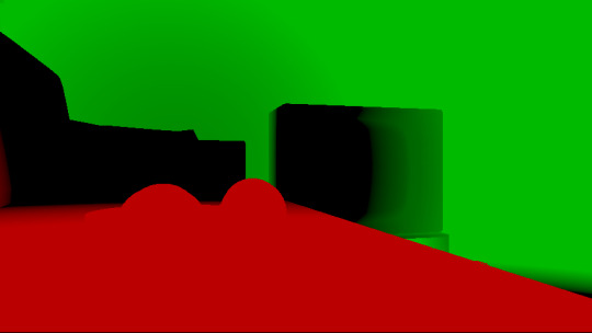
The near- and far-fields of the depth of field effect.
Screen-space reflections
Over the summer we did a fairly haphazard Adjective demo again called "Volna", and when IR delivered the visuals for it, it was very heavy on raytraced reflections he pulled out of (I think) 3ds max. Naturally, I had to put an axe to it very quickly, but I also started thinking if we can approximate "scene-wide" reflections in a fairly easy manner. BoyC discovered screen-space reflections a few years ago as a fairly cheap way to prettify scenes, and I figured with the engine being deferred (i.e. all data being at hand), it shouldn't be hard to add - and it wasn't, although for Volna, I considerably misconfigured the effect which resulted in massive framerate loss.
The idea behind SSR is that a lot of the time, reflections in demos or video games are reflecting something that's already on screen and quite visible, so instead of the usual methods (like rendering twice for planar reflections or using a cubemap), we could just take the normal at every pixel, and raymarch our way to the rendered image, and have a rough approximation as to what would reflect there.
The logic is, in essence to use the surface normal and camera position to calculate a reflection vector and then start a raymarch from that point and walk until you decide you've found something that may be reflecting on the object; this decision is mostly depth based, and can be often incorrect, but you can mitigate it by fading off the color depending on a number of factors like whether you are close to the edge of the image or whether the point is way too far from the reflecting surface. This is often still incorrect and glitchy, but since a lot of the time reflections are just "candy", a grainy enough normalmap will hide most of your mistakes quite well.

Screen-space reflections on and off - I opted for mostly just a subtle use, because I felt otherwise it would've been distracting.
One important thing that Smash pointed out to me while I was working on this and was having problems is that you should treat SSR not as a post-effect, but as lighting, and as such render it before the anti-aliasing pass; this will make sure that the reflections themselves get antialiased as well, and don't "pop off" the object.
Temporal antialiasing
Over the last 5 years I've been bearing the brunt of complaints that the aliasing in my demos is unbearable - I personally rarely ever minded the jaggy edges, since I got used to them, but I decided since it's a demo where every pixel counts, I'll look into solutions to mitigate this. In some previous work, I tried using FXAA, but it never quite gave me the results I wanted, so remembering a conversation I had with Abductee at one Revision, I decided to read up a bit on temporal antialiasing.
The most useful resource I found was Bart Wroński's post about their use of TAA/TSSAA (I'm still not sure what the difference is) in one of the Assassin's Creed games. At its most basic, the idea behind temporal antialiasing is that instead of scaling up your resolution to, say, twice or four times, you take those sub-pixels, and accumulate them over time: the way to do this would be shake the camera slightly each frame - not too much, less than a quarter-pixel is enough just to have the edges alias slightly differently each frame - and then average these frames together over time. This essentially gives you a supersampled image (since every frame is slightly different when it comes to the jagged edges) but with little to no rendering cost. I've opted to use 5 frames, with the jitter being in a quincunx pattern, with a random quarter-pixel shake added to each frame - this resulted in most edges being beautifully smoothed out, and I had to admit the reasonably little time investment was worth the hassle.
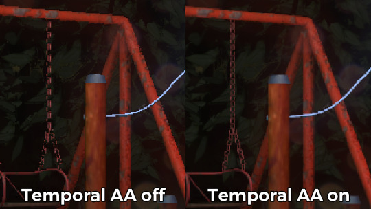
Anti-aliasing on and off.
The problem of course, is that this works fine for images that don't move all that much between frames (not a huge problem in our case since the demo was very stationary), but anything that moves significantly will leave a big motion trail behind it. The way to mitigate would be to do a reprojection and distort your sampling of the previous frame based on the motion vectors of the current one, but I had no capacity or need for this and decided to just not do it for now: the only scene that had any significant motion was the cat, and I simply turned off AA on that, although in hindsight I could've reverted back to FXAA in that particular scenario, I just simply forgot. [Update, January 2019: This has been bugging me so I fixed this in the latest version of the ZIP.]
There were a few other issues: for one, even motion vectors won't be able to notice e.g. an animated texture, and both the TV static and the rain outside the room were such cases. For the TV, the solution was simply to add an additional channel to the GBuffer which I decided to use as a "mask" where the TAA/TSSAA wouldn't be applied - this made the TV texture wiggle but since it was noisy anyway, it was impossible to notice. The rain was considerably harder to deal with and because of the prominent neon signs behind it, the wiggle was very noticable, so instead what I ended up doing is simply render the rain into a separate 2D matte texture but masked by the scene's depth buffer, do the temporal accumulation without it (i.e. have the antialiased scene without rain), and then composite the matte texture into the rendered image; this resulted in a slight aliasing around the edge of the windows, but since the rain was falling fast enough, again, it was easy to get away with it.

The node graph for hacking the rainfall to work with the AA code.
Transparency
Any render coder will tell you that transparency will continue to throw a wrench into any rendering pipeline, simply because it's something that has to respect depth for some things, but not for others, and the distinction where it should or shouldn't is completely arbitrary, especially when depth-effects like the above mentioned screen-space reflections or depth of field are involved.
I decided to, for the time being, sidestep the issue, and simply render the transparent objects as a last forward-rendering pass using a single light into a separate pass (like I did with the rain above) honoring the depth buffer, and then composite them into the frame. It wasn't a perfect solution, but most of the time transparent surfaces rarely pick up lighting anyway, so it worked for me.
Color-grading and image mastering
I was dreading this phase because this is where it started to cross over from programming to artistry; as a first step, I added a gamma ramp to the image to convert it from linear to sRGB. Over the years I've been experimenting with a lot of tonemap filters, but in this particular case a simple 2.2 ramp got me the result that felt had the most material to work with going into color grading.
I've been watching Zoom work with Conspiracy intros for a good 15 years now, and it wasn't really until I had to build the VR version of "Offscreen Colonies" when I realized what he really does to get his richer colors: most of his scenes are simply grayscale with a bit of lighting, and he blends a linear gradient over them to manually add colour to certain parts of the image. Out of curiousity I tried this method (partly out of desperation, I admit), and suddenly most of my scenes began coming vibrantly to life. Moving this method from a bitmap editor to in-engine was trivial and luckily enough my old friend Blackpawn has a collection of well known Photoshop/Krita/etc. blend mode algorithms that I was able to lift.
Once the image was coloured, I stayed in the bitmap editor and applied some basic colour curve / level adjustment to bring out some colours that I felt got lost when using the gradient; I then applied the same filters on a laid out RGB cube, and loaded that cube back into the engine as a colour look-up table for a final colour grade.
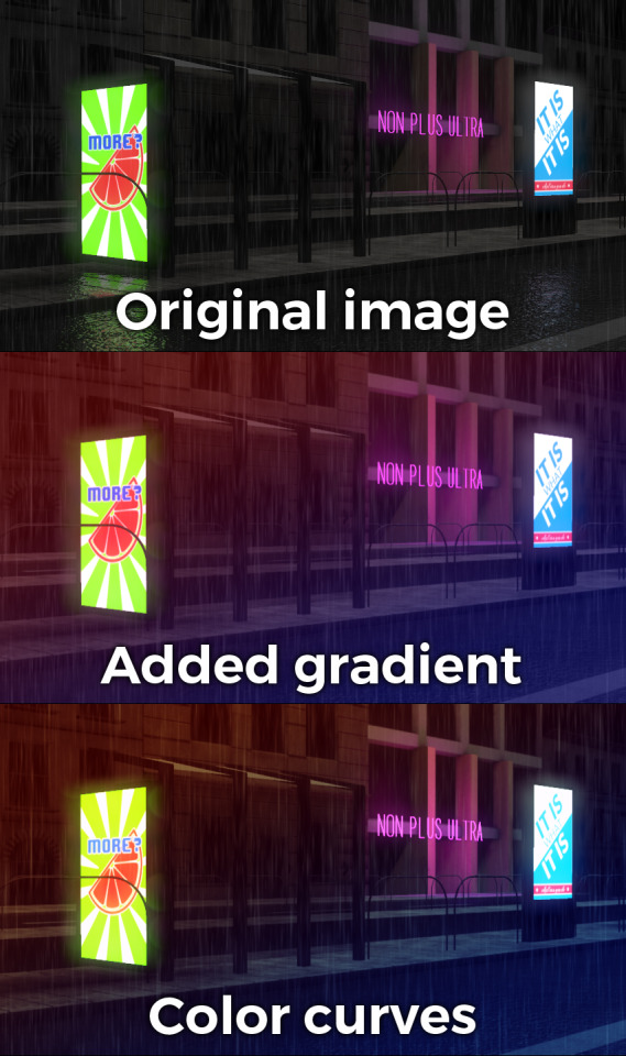
Color grading.
Optimizations
There were two points in the process where I started to notice problems with performance: After the first few scenes added, the demo ran relatively fine in 720p, but began to dramatically lose speed if I switched to 1080p. A quick look with GPU-Z and the tool's internal render target manager showed that the hefty use of GPU memory for render targets quickly exhausted 3GB of VRAM. I wasn't surprised by this: my initial design for render target management for the node graph was always meant to be temporary, as I was using the nodes as "value types" and allocating a target for each. To mitigate this I spent an afternoon designing what I could best describe as a dependency graph, to make sure that render targets that are not needed for a particular render are reused as the render goes on - this got my render target use down to about 6-7 targets in total for about a hundred nodes.

The final node graph for the demo: 355 nodes.
Later, as I was adding more scenes (and as such, more nodes), I realized the more nodes I kept adding, the more sluggish the demo (and the tool) got, regardless of performance - clearly, I had a CPU bottleneck somewhere. As it turned out after a bit of profiling, I added some code to save on CPU traversal time a few demos ago, but after a certain size this code itself became a problem, so I had to re-think a bit, and I ended up simply going for the "dirty node" technique where nodes that explicitly want to do something mark their succeeding nodes to render, and thus entire branches of nodes never get evaluated when they don't need to. This got me back up to the coveted 60 frames per second again.
A final optimization I genuinely wanted to do is crunch the demo down to what I felt to be a decent size, around 60-ish megabytes: The competition limit was raised to 128MB, but I felt my demo wasn't really worth that much size, and I felt I had a chance of going down to 60 without losing much of the quality - this was mostly achieved by just converting most diffuse/specular (and even some normal) textures down to fairly high quality JPG, which was still mostly smaller than PNG; aside from a few converter setting mishaps and a few cases where the conversion revealed some ugly artifacts, I was fairly happy with the final look, and I was under the 60MB limit I wanted to be.
Music
While this post mostly deals with graphics, I'd be remiss to ignore the audio which I also spent a considerable time on: because of the sparse nature of the track, I didn't need to put a lot of effort in to engineering the track, but I also needed to make sure the notes sounded natural enough - I myself don't actually play keyboards and my MIDI keyboard (a Commodore MK-10) is not pressure sensitive, so a lot of the phrases were recorded in parts, and I manually went through each note to humanize the velocities to how I played them. I didn't process the piano much; I lowered the highs a bit, and because the free instrument I was using, Spitfire Audio's Soft Piano, didn't have a lot of release, I also added a considerable amount of reverb to make it blend more into the background.
For ambient sounds, I used both Native Instruments' Absynth, as well as Sound Guru's Mangle, the latter of which I used to essentially take a chunk out of a piano note and just add infinite sustain to it. For the background rain sound, I recorded some sounds myself over the summer (usually at 2AM) using a Tascam DR-40 handheld recorder; on one occasion I stood under the plastic awning in front of our front door to record a more percussive sound of the rain knocking on something, which I then lowpass filtered to make it sound like it's rain on a window - this eventually became the background sound for the mid-section.
I've done almost no mixing and mastering on the song; aside from shaping the piano and synth tones a bit to make them sound the way I wanted, the raw sparse timbres to me felt very pleasing and I didn't feel the sounds were fighting each other in space, so I've done very little EQing; as for mastering, I've used a single, very conservatively configured instance of BuzMaxi just to catch and soft-limit any of the peaks coming from the piano dynamics and to raise the track volume to where all sounds were clearly audible.
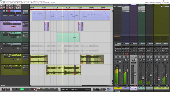
The final arrangement of the music in Reaper.
Minor tricks
Most of the demo was done fairly easily within the constraints of the engine, but there were a few fun things that I decided to hack around manually, mostly for effect.
The headlights in the opening scene are tiny 2D quads that I copied out of a photo and animated to give some motion to the scene.
The clouds in the final scene use a normal map and a hand-painted gradient; the whole scene interpolates between two lighting conditions, and two different color grading chains.
The rain layer - obviously - is just a multilayered 2D effect using a texture I created from a particle field in Fusion.
Stuff that didn't make it or went wrong
I've had a few things I had in mind and ended up having to bin along the way:
I still want to have a version of the temporal AA that properly deghosts animated objects; the robot vacuum cleaner moved slow enough to get away with it, but still.
The cat is obviously not furry; I have already rigged and animated the model by the time I realized that some fur cards would've helped greatly with the aliasing of the model, but by that time I didn't feel like redoing the whole thing all over again, and I was running out of time.
There's considerable amount of detail in the room scene that's not shown because of the lighting - I set the room up first, and then opted for a more dramatic lighting that ultimately hid a lot of the detail that I never bothered to arrange to more visible places.
In the first shot of the room scene, the back wall of the TV has a massive black spot on it that I have no idea where it's coming from, but I got away with it.
I spent an evening debugging why the demo was crashing on NVIDIA when I realized I was running out of the 2GB memory space; toggling the Large Address Aware flag always felt a bit like defeat, but it was easier than compiling a 64-bit version.
A really stupid problem materialized after the party, where both CPDT and Zoom reported that the demo didn't work on their ultrawide (21:9) monitors: this was simply due to the lack of pillarbox support because I genuinely didn't think that would ever be needed (at the time I started the engine I don't think I even had a 1080p monitor) - this was a quick fix and the currently distributed ZIP now features that fix.
Acknowledgements
While I've did the demo entirely myself, I've received some help from other places: The music was heavily inspired by the work of Exist Strategy, while the visuals were inspired by the work of Yaspes, IvoryBoy and the Europolis scenes in Dreamfall Chapters. While I did most of all graphics myself, one of the few things I got from online was a "lens dirt pack" from inScape Digital, and I think the dirt texture in the flowerpot I ended up just googling, because it was late and I didn't feel like going out for more photos. I'd also need to give credit to my audio director at work, Prof. Stephen Baysted, who pointed me at the piano plugin I ended up using for the music, and to Reid who provided me with ample amounts of cat-looking-out-of-window videos for animation reference.
Epilogue
Overall I'm quite happy with how everything worked out (final results and reaction notwithstanding), and I'm also quite happy that I managed to produce myself a toolset that "just works". (For the most part.)
One of the things that I've been talking to people about it is postmortem is how people were not expecting the mix of this particular style, which is generally represented in demos with 2D drawings or still images or photos slowly crossfading, instead using elaborate 3D and rendering. To me, it just felt like one of those interesting juxtapositions where the technology behind a demo can be super complex, but at the same time the demo isn't particularly showy or flashy; where the technology behind the demo does a ton of work but forcefully stays in the background to allow you to immerse in the demo itself. To me that felt very satisfactory both as someone trying to make a work of art that has something to say, but also as an engineer who tries to learn and do interesting things with all the technology around us.
What's next, I'm not sure yet.
3 notes
·
View notes
Text
Surface shader basics
In addition to writing shaders almost from the ground up, unity also allows us to define some parameters and let unity generate the code which does the complex light calculations. Those shaders are called "surface shaders".
To understand surface shaders, it’s good to get to know basic unlit shaders first, I have tutorials on them here: https://ronja-tutorials.tumblr.com/post/172104877882/basic-unity-shader https://ronja-tutorials.tumblr.com/post/172170158512/properties https://ronja-tutorials.tumblr.com/post/172173911737/textures
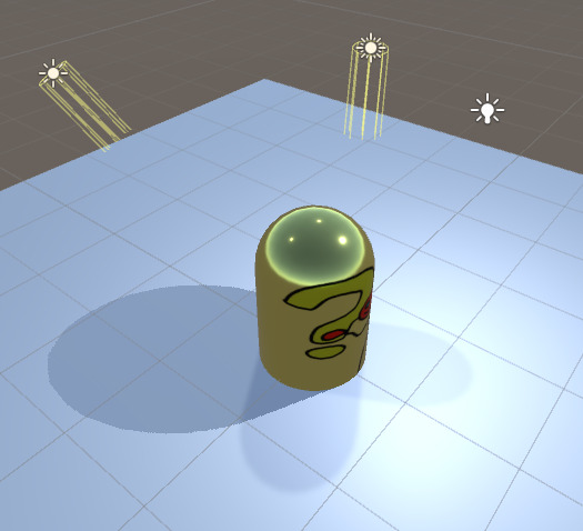
When using surface shaders we don’t have to do a few things we have to do otherwise, because unity will generate them for us. For the conversion to a surface shader we can delete our vertex shader completely. We can delete the pragma definitions of the vertex and fragment function. We can delete the input as well as the vertex to fragment struct. We can delete the MainTex_ST variable for texture scaling and we can delete the inclusion of the
UnityCG include file. And we remove the pass beginning and end, Unity will generate passes for us. After all of that our emptied Shader should look like this:

Now that we broke our shader, we can add a few things to make it work again as a surface shader.
First we add a new struct and call it Input, this will hold all of the information that we need to set the color of our surface. For this simple shader, this is just the UV coordinates. The data type for our coordinates will be a 2-dimensional float like in the previous shader. Here the naming is important though, we’ll name it
uv_MainTex, this way it will already have the tiling and offset of the MainTex texture. If the texture had a different name, we’d have to use uvTextureName to get the coordinates which fit that texture.

Next we’ll change our fragment function to a surface function. To make that change obvious we’ll rename it to surf.
Then we replace the return type (the data type in front of the function name) with void, so the function doesn’t return anything.
Next we extend it to take 2 arguments. First, a instance of the input struct we just defined so we have access to information that’s defined on a per-vertex basis. And second, a struct called
SurfaceOutputStandard. As the name makes you assume we will use it for returning information to the generated part of the shader. For that “returning” to work, we have to write the inout keyword in front of it. That second struct is all of the data which unity will use for it’s lighting calculations. The lighting calculations are physically based (I’ll explain the parameters later in this post).
Next we’ll delete the sv_target attribute from the method, because like the rest, it’s done somewhere else by unity.
The last change we have to make to make the surface method work is to remove the return statement (that’s why we changed the return type to void). Instead we set the albedo part of the output struct to our color value.

The final step to make the shader work again and to make it correctly handle light is to add a pragma statement, declaring the kind of shader and the methods used. (similar to how we declared the vertex and fragment methods in the basic shader).
The statement starts with #pragma, followed by the kind of shader we’re declaring (surface), then the name of the surface method (surf) and last the lighting model we want it to use (Standard).
With all of that our shader should work again and show correct lighting.


To expand the shader we can now make more use of the material properties. The different values in the output struct are:
Albedo
Albedo is the base color of the material. It will be tinted by the light color of the lights that illuminate it and is dark in the shadows as weexpect things to be. The albedo color will not affect the specularlighting, so you can make a black material which is still visiblyglossy. It’s stored as a 3-dimensional color vector.
Normal
This is the normal of the material. The normals are in “tangent space”, that means that after returning them, they will be changed into normals that are relative to the world. Having the normals in tangent space meansthat if we write up (0,1,0) into that variable, the normals won’tactually point up, but away from the surface (that’s the way normals are encoded into normal maps so we can copy information directly fromnormal maps to this variable). Normals arestored as a 3-dimensional directional vector.
Emission
With this you can makeyour materials glow. If you only write into this, you shader will looklike the unlit shader we made previously, but is way more expensive.Emissive colors are not affected by light and as such you can make spots that are always bright. You can write values with a value higher than 1 into the emission channel if you render with HDR color (you can setthat in the camera settings) which allows you to make things looksreally bright and make things bloom out more when you have a bloompostprocessing effect. The emissive color is alsostored as a 3d color vector.
Metallic
Materials look differently when they are metals than when when they aren’t. Tomake metals, you can turn up this value. It will make the object reflect in a different way and the albedo value will tint the reflectionsinstead of the diffuse lighting you get with non-metals. The metallicvalue isstored as a scalar(1-dimensional) value, where 0 represents a non-metallicmaterial and 1 a completely metallic one.
Smoothness
With this value we can specify how smooth a material is. A material with 0smoothness looks rough, the light will be reflected to all directionsand we can’t see a specular highlight or environmental reflections. Amaterial with 1 smoothness looks super polished, when you set up yourenvironment correctly you can see it reflected on your material. It’salso so polished that you can’t see specular highlights either, becausethe specular highlights become infintely small. When you set thesmoothness to a value a bit under 1, you begin to see the specularhighlights of the surrounding lights. The highlights grow in size andbecome less strong as you lower the smoothness. The smoothness is alsostored as a scalar value.
Occlusion
Occlusion will remove light from your material. With it you can fake light notgetting into cracks of the model, but you will probably barely use it,except if you’re going for a hyperrealistic style. Occlusion is alsostored as a scalar value, but counterintuitively 1 means the pixel hasit’s full brightness and 0 means it’s in the dark.
Alpha
Alpha is the transparency of out material. Our current material is “opaque”,that means there can’t be any transparent pixels and the alpha valuewon’t do anything. When making a transparent shader, alpha will definehow much we can see the material at that pixel, 1 is completely visibeand 0 is completely see-through. Alpha is also stored as a scalar value.
We can now add a few of those features into our shader. I’ll use the emission, metallic and smoothness values for now, but you can obviously also use the other values.
First we add the 2 scalar values, smoothness and metalness. We start by adding the values as half values(that’s the data type used in the surface output struct) to our global scope (outside of functions or structs).

Then we also add the values to our properties, to be able change them in the inspector. Properties don’t know the half type, so we tell them the variable are of the type float. That’s enough to make the variables show up in the inspector, but we’re not using them yet.

Similar to how we assigned the color variable to the albedo of the material, we can now assign the smoothness to the smoothness of the output struct and the metalness to the metallic output variable.


This works fine, but it’s easy to assign values higher than 1 or lower than 0
to the values
and get very wong results and it’s hard to see how high a value is. To fix that we can assign the values as range properties instead of float properties. Range properties allow us to define a minimum and a maximum and unity will display us a slider between them.


Next we add the emissive color. First as a variable in the hlsl code and then as a property. We use the color property type, just like we did for the tint. We store a half3 as a type because it’s a RGB color without alpha and it can have values bigger than 1 (also the output struct uses a half3). Then we also assign the value in the surface output like we did with the others.


Apart from the fact that a object that glows everywhere looks ugly, we also only can assign normal colors to our material, not HDR colors with values over 1. To fix that, we add the hdr tag in front of the emission property. With those changes we can now set the brightness to higher values. To make better use of emission, you should probably use textures, you can implement other textures the same way we implemented the main texture we use for albedo.


Finally I’m gonna show you two small things that make your shader look a bit better. Firstly you can add a fallback shader under the subshader. This allows unity to use functions of that other shader and we don’t have to implement them ourselves. For this we will set the standard shader as a fallback and unity will borrow the “shadow pass” from it, making our material throw shadows on other objects. Next we can extend our pragma directives. We add
the fullforwardshadows
parameter to the surface shader directive, that way we get better shadows. Also we add a directive setting the build target to 3.0, that means unity will use higher precision values that should lead to a bit prettier lighting.


You can find the source code here https://pastebin.com/aPNAPmWs.
If you have any questions feel free to contact me here on tumblr or on twitter @axoila.
2 notes
·
View notes
Text
Journal - How to Create Photorealistic Architectural Renderings Using Unreal Engine 4
Ronen Bekerman is an industry leader in Architectural Visualization who hosts in-depth tutorials on his specialist blog. Architizer is pleased to present a selection of these guides written by some of the world’s best rendering artists.
Keeping on the trail we took in the previous installment of this series, “A Photographic Approach to Architectural Visualization“, we will check how these effects can be transported into the world of real-time, more specifically with Unreal Engine as the champion of game engines making their way into the realm of ArchViz. To present this case, let’s take a trip down memory lane starting at the point that sparked it all for me and for the ArchViz community at large as well.
Here, Lasse Rode of Berlin-based studio xoio takes Unreal Engine for a good spin as he strives for photorealism using a real-time tool. He does this with his great-looking, and mostly white, Berlin Flat scene as seen on the forums. Follow along as Lasse explains getting started with Unreal Engine 4. Enjoy it!
Introduction
My name is Lasse Rode, and I am part of studio xoio. We are a small agency specializing in visualization and illustration works for architecture and product marketing. Usually we work in a kind of “traditional” 3D environment utilizing applications such as 3ds Max and the like. We are constantly checking out new rendering engines and currently making big use of Corona Renderer, V-Ray and Octane. Each engine has its strengths, and we always try to use it like that: each for the best purpose.

Lasse Rode’s modeling techniques enable realistic renderings to be created in a relatively short amount of time; images via Corona Renderer.
Back in August 2014, I stumbled upon some drop dead gorgeous Unreal Engine 4 architectural visualization tests by Frenchman Koola, which immediately reminded me “The Third & The Seventh” by Alex Roman, only this time it was done in REAL-time.
In my eyes there have been several main trends within our industry: The strive for (photo)realism and becoming faster — if not real time. Not having to wait for your rendering to come out of your render farm was always a dream for us — especially when rendering animations!
For a long time, the main downside of the “real-time-thing” was the lack of quality you could achieve compared with pre-rendered still images or animations. So even though it looked very interesting, the application of it in a visualization context seemed hard to imagine. And honestly, the “gamey” look of it made it hard to sell for high-demanding clients from the architecture and brand fields.
This has changed rapidly. The results possible with real-time engines today are very beautiful and convincing!
Why Unreal Engine?
The release of UE4 gained a lot of attention within our industry, and the possibilities seemed to be endless. The PBR (Physically Based Rendering) material system and the easy-to-use importing pipeline for getting your models into the Unreal Engine were the most compelling reasons for us to give it a try — in addition to the quality of output possible! If you have seen the work of Koola (also available as a download in the Unreal Engine Marketplace), which went viral some weeks ago, you are probably as convinced as we are that Unreal Engine 4 is capable of impressive quality.
In the following article, I want to give you an outline of the workflow I used to make the Berlin Flat scene you can download from the Marketplace and share some techniques and tricks I came across during the process. Some of them I found myself, while others are derived from information I found on the web. The Unreal Engine Forums and Documentation are a vast and great resource, as are the starter content that comes with the engine and the assets and scenes you can get from the Marketplace.
The Berlin Flat
I made a series of images of this flat in a historic building in Berlin at the beginning of 2013 using 3ds Max with the Corona Renderer. It’s a flexible way of handling the color-mapping, which really helped to pull off the very whitish mood of the whole set. This actually was also the reason for choosing it when giving UE4 a try.
I noticed UE4 being very successfully used on scenes with gloomy lighting and busy textures. I suspected it to be not that easy to get precise shadows and GI within an ultra-white interior. And honestly: It is a tricky task!

Above is one of the original renders done with 3ds Max and Corona Renderer. To have a look at the entire set, click here. Below is the UE4 video made with this scene …
youtube
Viewing on mobile? Click here.
The Original Scene
The entire model was done in 3ds Max in a rush, so I actually detailed only the parts that are visible in the final images. Of course, this is an approach that is not possible in a real-time environment. Repurposing the scene for use with Unreal Engine, I had to reduce the scope a bit because furnishing and detailing the complete space would have taken too much time for testing purposes. I decided to export only two rooms: the ones you see on the lower part of the screenshot below.

Exporting the Geometry for Unreal Engine
This is a very easy task IF you keep some things in mind!
It makes sense to split things up a bit. Because the lightmass is calculated with a separate map for every object, it is good to be a bit careful with high values especially on big plain objects like walls and ceiling. Because of this, I only exported the inner faces of the walls that we actually see.
I also added a bit to the top and bottom of the walls to intersect them later with the ceilings. I found this to be a good way to prevent “light leaks” — lighting artifacts that happen when geometry is not closed or not intersecting. This is no problem when having a gloomy scene with lots of busy textures, but because we are going to have an ultra-white space, it is important to get as precise GI as possible, especially in the corners.

The second crucial thing is to create unwrapped UV coordinated for the channel the GI is going to be stored in by Unreal Engine’s lightmass calculation. In 3ds Max, this would be UV-channel 2.
Channel 1 is for use by all the other textures like diffuse, roughness, normal, etc. Unreal Engine counts the channels starting from 0, which can cause some confusion in the beginning — but once you get it, it is fairly simple.
Note: Unwrapping is only important for the light-map channel! For the texture channel, any kind of mapping can work, such as cubic or cylindrical mapping. In most cases, a simple “flatten mapping” in 3ds Max unwrap does the job to create sufficient UV-coordinates!

If you want to put your scene together in UE4 like it has been in your Max-scene, it is good to leave the entire “space” in place when exporting because the object’s coordinates are easier to align. For single objects like chairs and other assets, it is very comfortable to export it only once and install them in your Unreal Engine scene. For this purpose, it is good to move them near the center of your 3ds Max scene because the new object’s pivot in Unreal Engine will be there.

I used high-poly geometry without any LOD (Level of Detail) simplification. This is only recommended in small scenes like this one, but because I’m after a smooth experience and don’t want to have any jagged edges on my furniture, this was logical for me. I have no doubt there’s room for optimization, though!
Make sure your assets are merged into one object and have different material-IDs applied to handle the different materials later in UE4. Then, save your geometry as an FBX file and off you go over to the Unreal Engine editor!
Importing Into Unreal Engine 4
Importing FBX files into Unreal Engine 4 works pretty smooth! I did it in several steps.
I prepared different files that made sense:
The geometry of the room in a separate FBX file
Different file for the assets, each with some objects in them
Just make sure to uncheck the “Combine Meshes” to receive your objects separately and not baked into a single mesh!

Materials
I’m a very straightforward guy and a big fan of simple setups! It’s a philosophical thing, but achieving things with the least effort possible is far superior to using a setup only you understand or you can’t remember when opening a scene half a year later.
So this example of a shader is very simple, consisting of a diffuse map, desaturated and blended with black color. The same map is then color corrected and inverted to put into the roughness channel of the material. Done.

A normal map would have been too much here, but feel free to explore the materials for yourself in the scene!

Here you see the wood material applied to the chairs and the table — a dark dyed wood with a crisp matte reflection revealing the wood structure and texture.
In this image you see two more materials that might be of interest: firstly the curtain, which is backlit by sunlight and is a two-sided material:

You have to set the Shading Model to “Subsurface” and add a constant node with a value smaller than 1 and wire it to the Opacity property of your material to get this effect.
Secondly, the jar in the foreground has a very simple glass material:

It has a fairly dark diffuse color, zero roughness and a high specular value. I also involved a Fresnel-node with a value of 1.5 to control the opacity and refraction. There are a lot more complex ways to generate more realistic glass — but I honestly had some trouble to really get control over that, so this easy glass seems to be good enough.
Note that I checked “Two Sided” and set Translucency Lighting Mode to “TLM Surface” in the Details tab on the left.

One other material I want to show here as well is the floor because this one is the only one to have a normal map applied:

Here you see a material defined by a diffuse color, a roughness texture and a normal map. The diffuse color is a simple very light gray, defined by a 4-value constant.
Roughness looks a bit more complex: On the left, you see the same map three times scaled differently with a TexCoord node. The red channel of each is then multiplied with the others and then wired as an alpha into a Linear interpolation node (Lerp) to blend to values; 0.3 and 0.2 in this example to get a subtle noisy reflection on the floor planks. This is then fine tuned with a “Power” node to get just the right amount of roughness that looks OK.
The normal map again is influenced by a TexCoord and is then flattened a fair amount via a “FlattenNormal” node to get a subtle relief on the material.
Preparing the Assets
Before dropping the assets into your scene, it is always best to apply the materials onto them within the geometry editor. You only have to do it once and can still apply different materials in the main scene if needed. This is a fast process: Here you see it is important to apply different Material-IDs to your objects to put the different materials where they belong!

Building the Scene
This is kind of brief, but: Put the thing together. First you have to drag in the room geometry. The best way is to select all the parts needed and drag and drop them into the empty scene. Afterwards all the furniture and assets have to be placed in the environment.

Here you don’t see the back faces of the outer walls. As I’ve explained above: They are only single-sided for better lightmass calculation.
For this exact purpose it is also good to set the lightmap resolution for your larger objects to a high value, for the walls I set it at 2048, for example.

As mentioned above, light leaks can be an issue. To prevent these, I put black boxes around the whole scene. It looks kind of messy from the outside — though more clean on the inside!

Lighting and Lightmass
The lighting is also a fairly simple setup: I used the “Koola method” — a combination of a sun and planes with spotlights in front of the window to simulate a skylight. It is rather effective and easy to control!
To calculate the global illumination, only a few tweaks are important:

I drastically increased the lighting bounces and the indirect lighting quality. I also decreased the smoothness to 0.6. Details are pronounced better and the shadows don’t wash away so much.
Further to this, I set the direct lighting to a dynamic shadow, which is important to have the light moving later in the animation!

The last step before hitting “Build” is to set the Lighting Quality to “Production”!

This should result in smooth lighting everywhere.
Actually when getting to this point the first time, I was kind of thrilled! This is actually the strongest part of this engine: to thrill you. Being able to move inside my “rendering” in real time was really a delightful moment!
Post Processing
One of the greatest features is the possibility to apply color correction and camera effects just within the editor. This can be done with a Post Process Volume for global settings. I did some tweaks on the saturation, fringing and vignette, the bloom, disabled the auto exposure by setting the min. and max. values to 1 and increased the overall brightness by setting the Exposure Bias to 1.42. I also added a lens flare, which I find really awesome happening in real time!

Setting up the Animation
The ability to move freely inside the scene makes doing animation a very easy and pleasing task because of the instant-feedback nature of the real-time environment. As a frequent user of compositing software, it took not much time for me to adapt to the integrated Matinee tool and set up an animation.
First thing to do is setting up a Matinee Actor.

When opening Matinee, you will see a window with a track section and a curve editor.

Setting up the cameras and animation work is very self-explanatory. Motion is controlled by key frames and curves just like any other animation software. Also the “cutting” work is done just within the Matinee editor.
I created a couple cameras moving slowly through the space: Seeing exactly what you are doing really helps to tweak the timing of cuts and speed of camera movement!
You can see the camera trajectories just in the editor and control the editing on the fly! After getting the rough “cut” done in Matinee, I then exported the complete animation as an AVI and fine-tuned it in Premiere and aligned it to the music.

Conclusion
The entire process starting at exporting from 3ds Max and importing into Unreal Engine 4, working out the shading and lighting to produce the animation and then posting on YouTube took me about one day. This speed is unheard of in ArchViz and reflects very much the key potential that lies in the use of Unreal Engine 4 for visualization works.

Some screenshot details from the animation
The absence of render times in terms of “producing” images really makes the process of creation very flexible and free. The fast feedback of your action is the real revolution!
We are constantly thinking and testing the possibilities of applying this kind of production and workflow into our daily work and our environment as a whole.
There are a lot of possible applications, and we are very eager to explore them!
I hope I gave some insight into my motivation and process and wish a lot of fun with the Berlin flat scene.
Kind regards,
Lasse.
This article was first published on Ronen Bekerman Architectural Visualization Blog in December 2014 and refers to software available at that time. Enjoy this article? Check out the other features in our series on “The Art of Rendering”:
Methanoia Reveals the Story Behind Architecture’s Most Striking Visualizations
When Architectural Visualization Gets It Right: Victor Enrich’s Surreal Art
7 Magical Demonstrations of Hyper-Real Environments
Alex Hogrefe Creates Stunning Architectural Visualizations Using SketchUp and Photoshop
How Technology Will Revolutionize Architectural Representations
The post How to Create Photorealistic Architectural Renderings Using Unreal Engine 4 appeared first on Journal.
from Journal https://architizer.com/blog/practice/details/the-art-of-rendering-real-time-photorealism/ Originally published on ARCHITIZER RSS Feed: https://architizer.com/blog
#Journal#architect#architecture#architects#architectural#design#designer#designers#building#buildings
0 notes
Note
hey! First of all , I love you to death adn I love your posts! Second, could you please link us to the tutorial you watched to do the blanket for that pose of yours? I would really apreciate it! thank you so much! ^3^
hi anon! omggggggg ;_; you’re too kind thank you so so muchhhh ;_; i did hunt for one when i first decided i needed to make blankets lmao but there’s not a tutorial out there to my knowledge dedicated to making pose blankets for sims ;_; i just did it by piecing together bits of my knowledge about blender physics lmao. i’m in the process of editing a video tutorial together but i’m just trying to summon up the courage to post it and let you all hear my annoying weird accent and my shitty laptop microphone LMAO. i’ll get the video tutorial up this week (hopefully tomorrow) which will explain everything in depth (it’s much much easier to talk through it and show rather than try and explain lmao), but in the meantime if you want to start making them right now, i’ll put together a little basic tutorial under the cut below. assumes some knowledge of object creation cos i’m not gonna go through it in complete detail here (e.g. how to make the mesh ready to use in game by adding a ground shadow, importing into tsrw, the usual checklist of things to do before importing it etc etc), just because it will take me too long and i’m incredibly tired rn lmao :’( the video will have complete detail and show you how to make the mesh ready to use in game and stuff but yeah, if you want to follow this one now i’ll link some other tutorials for those other parts
you need blender, milkshape, photoshop/gimp, dds plugin, and tsrw and all the usual add ons aka the align normals plugin for milkshape and any plugins that the tutorials i link to need
1. open your pose in blender. make sure you’ve already saved the pose as a clip file before you do this next step otherwise you’re gonna lose it forever :’(. go to file>export>export to .obj. then reopen blender, delete the cube, and go to file>import>import from .obj (or something like that) and select the .obj file you’ve just exported. you should now have weird solid body versions of your pose on your screen. you need to click on all of the individual group parts while holding the shift key (you’ll see them all light up in orange), then hit ctrl + j to join the parts together. your sim pose mesh should now be in one part.
2. follow this tutorial until about 6 minutes 30 seconds in. you need to set up the pose as a collision object, and depending on the pose, follow the tutorial and create a “ground” collision, or import a bed or sofa and set that up as a collision object, rather than the ground plane. ignore the part about the texture, although do unwrap the plane before you deform it for the sake of ease. also, be wary of how much you subdivide the blanket. you can see the verts/face count at the top of the screen, and the objective is to keep this as low as possible. too high and either your game or tsrw is gonna reject it. i personally always try and keep it under 10k verts, and even that is probably way too high. i’m just a sucker for a smooth looking blanket lmao
3. once you’ve followed the tutorial and your blanket has fallen into a nice position and you’re happy with it (you can move through the animation using the timeline to select the exact point you want), just export to an .obj file once more, and reopen blender’s startup screen.
4. again, delete the cube, and open the most recent .obj. now the cloth is frozen and the animation is lost. now you can delete the pose and the ground/bed/chair/whatever collision surface you had on the bottom to stop the cloth falling infinitely through blender lmao. also delete the lamps and cameras in the scene so you can see the textures properly.
5. now select your blanket and go into edit mode and pull up the UV/image tab. hopefully you unwrapped your mesh earlier, and you’ll see a nice grid in this part. this is your UV map, and now we’re gonna bake a texture.
6. go to your little world icon on the left hand side and tick the ambient occlusion box. then turn the samples up to around 20-25ish for a nice hq texture. if you have a slower computer, i’d advise maybe around 10-15 instead. tbh it doesn’t really matter so much, it’s only a blanket (but like i said, i’m a sucker for a smooth blanket hahaha) then click on the camera icon on the left and go down to bake. in bake mode, select ambient occlusion, and set the margin to 2. now in your UV/image tab, select new and just hit ok. you’ll now have a black square behind your UV map. now, once more under the camera tab, hit bake and wait as the most satisfying thing happens before your very eyes (watching this is my favourite FAVOURITE part)
7. once it’s baked and looking fab (you can check out the texture by selecting texture under viewport shading), go to save as image and save it somewhere convenient.
8. now i prefer a thick, duvet like blanket, because i’m always cold and like to be cosy all the time, but if you want a thin sheet this next part is optional. select your blanket mesh once more in edit mode, hit the space key, and type in duplicate. select duplicate, and then hit ‘E’. you can now make the blanket as thick or thin as you like by moving your mouse. left click again when the blanket is at your desired thickness.
9. finally, export it as an .obj. now you can make all the texture things. i like to open the bake in photoshop and apply a blur filter to smooth it out. then i make an alpha channel which is completely white and save it as a DXT5 interpolated alpha dds file. then make the mask and specular. if you’re unfamiliar with this process, here is a tutorial (you don’t really need the multiplier part because you already baked one, and you will probs just need a red fill layer for the mask unless you want a fancy one) (also ignore the bump map part, objects don’t often use them)
10. open your mesh in milkshape and align normals and assign joints. follow this tutorial, which should cover everything you need to know about this part! i’m v bad for saying this but i don’t tend to bother with remapping the ground shadow part when i’m making these blankets. they’re something you’re gonna use for a second and i personally don’t bother, but of course you can if you want to! save it as a .wso in order to import it into tsrw.
11. import your mesh into tsrw. if you don’t know how to do this or create sun shadows, please follow pages 44-46 of this tutorial. then you’ll need to add your textures and export the package! follow page 63-69 of this tutorial (also contains a handy overview of the different components if you still aren’t sure how to texture the blanket). you should be done! now you can pop your package or sims3pack in game and test it out with your pose! :)
if any of this doesn’t make sense or you have any questions or i’ve missed anything (i’m literally half asleep), please feel free to message me. like i said, hopefully the video tutorial will be up tomorrow, which covers things in a lot more detail. hopefully this is at least a little helpful though anon, good luck!
7 notes
·
View notes
Text
A Treatise on McQuevian Hand-Painted Texturing Automation
Originally posted on the Big Robot blog, Gamasutra, Kotaku, and RockPaperShotgun.
What follows is an expanded take on what we touch on in that video. If that sounds good, read on!
Tölva’s world and tone are exciting for a number of reasons – lasers, exploding robots, unfathomable space mystery and the phrase “combat archaeology”, to mention but a few – but here we’re going to talk about how we crafted that rich, screenshot-friendly visual style. We will try and understand the majesty of Mr Ian McQue’s concept art, learn the fundamentals of ‘splattery precision’ and some other made up terminology, as well as comprehending the beauty of a clean normal map bake or efficient UV layout. You know you’re in deep when you can appreciate UVs. We intend to go deep(ish).
So… Defining the look of Tölva was a process of looking at our inspirations and influences and breaking them down into their constituent parts. This way we could take what made a certain look ‘work’, and begin to create a process that we could apply to a variety of assets while maintaining consistency with one another as well as looking appealing in isolation. This meant taking Ian McQue’s sketches and paintings and finding common shapes, colours, types of brush stroke, silhouettes, and starting to form a “McQuevian language”.
Often robots, vehicles, or ships, were chunky with lots of rectangular protrusions breaking up their silhouettes. Layering of details was important, with colour often going from darker to lighter as the layers got closer to the exterior. Angles were often a few degrees off being parallel with each other but still consisting of straight lines, rarely curved. The dumpier a spaceship, the thinner it’s aerials and wires: contrast from form.Often robots, vehicles, or ships, were chunky with lots of rectangular protrusions breaking up their silhouettes. Layering of details was important, with colour often going from darker to lighter as the layers got closer to the exterior. Angles were often a few degrees off being parallel with each other but still consisting of straight lines, rarely curved. The dumpier a spaceship, the thinner it’s aerials and wires: contrast from form.
We could use these style guidelines to judge how well something would fit in the world, and how close it was to the source. I’d sometimes create reference boards using a tool called Kuadro, a convenient way of laying out image files on the desktop and storing their scale and position in a file. I’d be conferring with Jim at various stages throughout an asset’s creation- he would direct the design, and mine his extensive and tasteful tumblr image library, or doodle thumbnails to illustrate specific requirements. Interpreting sketches from one angle and turning them into 3D geometry has been a particular challenge for me on this project, but following these guidelines, and practicing this approach has enabled me to get better at it through the course of the project.
The first step towards actually making something, once reference was set up, was blocking out a 3D form in Maya using simple primitives and keeping things low detail. Often if this stage went well the geometry could be reused for the final low polygon asset. Then I’d take this base mesh into zBrush and play with the shapes, maybe add things that were more awkward to create in Maya. If I was feeling really fancy, I might do a paintover.
Sculpting, Detailing, Baking
Once something is starting to feel like a strong design I can start to commit to adding details, again referring to the guidelines as I bevel edges, chamfer corners, and smooth any (rare) curved surfaces. Then come surface details that will be baked down into the normal map such as wires, nuts and bolts, screws, handles, cutlines. It’s easy and enjoyable to go overboard at this point and fill every surface with greebly goodness but any artist will tell you that the eye needs space to rest. Not only are you looking for space to rest within this asset, but often you will need to look at the game as a whole and decide whole assets need to act as rest points devoid of any noisy detail, in making up the composition of the world.
At this stage I’m also starting to break up edges with wear and tear and damage where seems appropriate, this is one of the most satisfying parts- chipping away and scratching up clean surfaces requires little moment to moment decision making and I can let this almost therapeutic activity absorb my attention. It’s important to split objects as I go into logical groupings based on their material types, I will use these later to bake a material ID map which is essential to the texturing process.
One of the of the recurring aspects of creating such a mechanical world is designing (relatively) convincing joints, paneling, and other robotic goodness. It was important to spend enough time look at machined parts or engines so that I could start to internalise where a cut line might occur, which panels needed screws, how a curved edge might be carved out of a larger piece. Manufacturing is often about starting with a form and reducing it from there, and the same approach works really well when sculpting.
Then comes a series of steps that are dull but very necessary to getting a clean bake but once that’s done I can move onto texturing. A tight UV layout, good smoothing groups on your low polygon model, and a precise cage mesh all aid in a clean bake.
Generating an Automated McQue Texture process Or: How to Hand Paint Textures, Without Using Your Hands.
Good modelling is essential and a stunning texture won’t save a bad model, but texturing drives a lot of Tölva’s look and helps distinguish it from other games. It’s also what was most clearly imitable from the concepts. We were fortunate enough to be given access to the list of secret brushes that Mr McQue utilises most frequently and to such effect, and using these able to create an automated process that streamlined the texturing of hundreds of assets. We essentially created a system where I fed in my sculpts and a McQuevian texture was churned out for me to tweak and finesse. This worked by taking the right brushes in Photoshop and creating a tiling pattern with each, attempting to recreate a certain type of stroke or scribble that could be found in any given concept piece. With these ‘master strokes’ I could tile relatively convincing McQuvian patterns across a surface, tinting its colour, and using the pattern to break up the edges of masks in Photoshop. Daub, dash, splatter, speckle, spray, smear, squiggle, strokes, crosshatch, and grainy swirl would become my best friends over the next 2 years. Grainy swirl was great for organic or noisy surfaces like mud or concrete, while crosshatch had a natural galvanized metal flakes look. Each pattern came into its own as I built a library of reusable materials from these tiling patterns.
The tool tying all this together was the Quixel Suite’s dDo, a Photoshop based texturing tool aimed at primarily at creating PBR materials very quickly, which we had employed for our own nefarious aims. Feeding the sculpt data from the bake (tangent and object normals, ambient occlusion, material ID, gradient, sometimes a height map) dDo could tell me where edges were, crevices, what was at the top of the mesh, what was only facing down or upwards. The amount granularity in terms of how you define the masking of a material is very powerful, and once I’ve made decisions about where a material should be confined to I can apply that as a preset to any other asset. “Here’s my paintedMetalC material, it will have chips and scratches on the edges, sunbleach on the top, water damage on the undersides, and some lichen in the crevices.”
I found the simplest way to structure a texture was to have a form layer at the top that brightened upward facing surfaces, and conversely darkened downward facing surfaces, with an edge brightening layer to accentuate the objects natural shape. Our ambient light in-engine is a single colour and so baking in some subtle lighting data helped objects have some shape even when in total shadow. Next, a weathering layer that universally affects the asset. Things like dust, stains, and other environmental effects go here. Beneath this all the materials are applied to their corresponding material IDs from the high polygon sculpt bake.
From this point I’ll start to work in overlaid scanned details from the dDo library, these won’t affect the diffuse channel very much (deliberately), but will add some physically based detail and reflectance values. The materials that make up Tölva and it’s inhabitants are 90% diffuse covered and 10% specular, meaning they are largely matte looking surfaces with bits chipped away to reveal the metal beneath. McQue’s style has very little exposed steel, or polished chrome and there is no glossy plastic, so I tried hard to match that. More on the PBR side of things later.
Once materials are assigned to the whole texture there’ll be a lot of tweaking of the tiling pattern’s intensity, colour, size. Material specific details will also go on, like rust that only affects metals. Then in some cases I’ll add bespoke hand painted details like glyphs, diagrams, or bits of weathering that only appear where there’s a pipe or something and that can’t be defined by the automated process. But this is the only part of texturing where I’ll actually paint a specific detail onto a specific part of the texture, everything else is controlled by dDo and my masking.
The colours we use are often collections analogous colours making up 60% of an asset, then it might have a darker or more saturated variant covering another 30%, and then remaining 10% has a bright or rich accent colour. Usually the best way to get a decent start with this is to colour pick directly from a concept and go from there, can’t get more accurate than that. As we got further into the project certain palettes would mean different things to me about where they were in the world and who created them, making decisions about colour schemes much easier.
Once all this is done I can save individual materials as presets, or entire documents to be reused on similar assets, this is largely what facilitated us in getting the texturing done as a efficiently as possible.
Implementation: Make Everything Modular
Being able to cannibalise existing assets for reuse is an invaluable tool when you’re trying to squeeze as much variation into the world as possible without burdening your VRAM usage further. The mileage you can get from an asset is often surprising in terms of reimagining it for other purposes. If you model things with discrete watertight intersecting meshes rather than combining everything and deleting interior faces, you can at any point split these out and reassemble them into a new variation of that asset.
This is probably obvious to veteran game artists but was something I was often in two minds about at the start of production, modularity vs bespoke detail. The other thing to bear in mind with this approach is baking with your meshes well exploded so occlusion data doesn’t interfere with neighbouring meshes, preventing you from reusing that one piece in a prominent place because it has a massive shadow across one side of it. Meshes can be merged using boolean operations to merge intersecting meshes and create totally new shapes, which we did to create cliff faces comprising multiple rotated cliffs into one uber cliff.
Creating asset kits is a common technique in games utilised particularly well by the Bethesda teams. Tölva has less of a need for complicated interconnecting architecture but we were still able to get some use out of concrete piece kits that we made to build more industrial areas, and kits of damaged spaceship to decorate the space wreck debris that litters the world. Creating these kits for the environment team (er, Jim) took a sizeable amount of the art dev time. Another example of this kit-based approach are the weapons attachments, all modelled as separate items that could be rearranged and mixed together to create weapon variants.
Working in the sizeable world of Tölva meant pushing a lot of geometry onto the screen at any one time. Occlusion culling and culling regions far from the player helped alleviate some of this but ultimately we were going to have to create level of detail meshes for a lot of polygon heavy, or frequently used assets. This is a fairly simple process and its amazing what you can get away with when an object is at distance.
Expanding the look with Shaders
I have no programming skill or experience to speak of, but I found fairly quickly I was being limited by my ability to create simple shaders to achieve effects commonplace in games and desirable within our sci-fi aesthetic. Unity plugin Shader Forge became my go-to tool for solving these problems, it’s a node based shader writing solution that is approachable but still crammed with maths terminology most artists have never heard of. Using this I was able to assemble and visualise shaders that had pulsing lights, tinted a material based on ID maps, did weird things with transparency, or just layered textures based on normal direction. This saved me using up precious programmer time – Tom was full time on the project, and Dan part-time, so their brain cycles were at a premium! – and gave me control over very specific parts of the look. This kind of autonomy is very precious when you work remotely and there isn’t always someone on hand for you to pester with technical queries. Being a visual scripting system it does have the downside that when it breaks, I often had no idea why, or how to fix it. These issues weren’t insurmountable but did lead to a day of debugging from our resident shader expert, Tom Betts.
I would approach materials very differently if I was starting this project from scratch tomorrow. Coming from a CG background pretty much everything is given a specific texture that uses the full UV tile, and that was pretty much my only option to get the look we wanted at the time. As my understanding of Shader Forge evolved I was able to create a sort of shader version of how my textures were set up inside dDo. I was limited to 4 masks (RGBA channels of the ID texture) plus a base layer, and I could tile and tint some of the McQue patterns within those masks. Each McQue pattern had the diffuse pattern stored in the red channel, specular in the green, and gloss in the blue.This allowed me to get good resolution on textures for assets that were 5, 10, 100 metres long. The ID and normal maps were still limited by resolution but the tiling worked very well. It serves well as a halfway house between a 1:1 mapped texture and tiling materials, but lacks the subtlety and detail of a 1:1 or the variation and fidelity of having a library of materials applied to submeshes.
Terrain texturing
Our initial approach to terrain textures was to treat them as purely two dimensional, abstract patterns. As the style developed it became clear we were going to need something a bit fancier to fit the aesthetic, especially given the fact that terrain filled the majority of the frame a lot of the time. I began sculpting tiling terrain materials in zBrush, creating quick sculpts that could be exported to Unity quickly to test tiling, detail, and blending between layers. It was important to use detail meshes like small pebbles and shards of rock that already existed to tie the textures to actual 3D props sitting on the terrain. This was the first organic thing I’d had to sculpt that wasn’t a rock or cliff and the soft shapes weren’t fitting the style at all. The solution ended up being to reduce the polygon count of the sculpt using zBrush’s decimation tool to create a more faceted organic surface. Feeding this through dDo and using existing material presets was pretty straight forward. The height map was used by the RTP terrain setup to cleverly blend layers together based on depth, creating a much more pleasing blend that a simple fade.
Lighting/Rendering/Post Processing
PBR or physically based rendering has become a buzzword and marketing tool as it’s adoption has spread, symbolising a graphical upgrade over traditional game rendering. Mwoar detail mwoar realism mwoar immersion. Much as I love all those things it’s most important contribution from the artist’s perspective is having a controlled environment within which to work where you can create a material and have it react to light in a predictable manner, not only between scenes and lighting setups in the game engine, but also between software packages.
Having this predictability is even more useful when your game has a full day night cycle and is going to appear in all sorts of lighting conditions. Even if your game isn’t crammed with brushed metal and lacquered pine (highly reflective surfaces being a sure sign of a game trying very hard to get the most of its PBR) it can still massively benefit from a physical approach. Having a nice fresnel falloff on a largely diffuse material makes every object lit at a glancing angle look fantastic, materials are energy conserving so nothing washes out in a way that just appears like a white value being clamped.
McQue’s paintings have naturalistic quality to their lighting, this is ideal for PBR. His colour palettes have a fairly limited range, there are few bright whites or really dark blacks, much like real world albedo colour values. This allows a PBR lighting model to really shine without being overpowered or limited by overly saturated or contrasting texture colour values. PBR is not a style, it’s a tool. You can push your look in a number of directions with colour correction, lighting, and post processing- but you are starting from a well calibrated, stable, neutral position that is easy to control. Using PBR also means you can draw on nearly 200 years of photographic knowledge. Exposure, tone-mapping, HDR, colour correction, bloom, lens flare, chromatic aberration, depth of field, vignette: these are all techniques that have either been part of photography and film for a long time, or are simulating things that a lens does naturally. Also use linear colour space everyone, it has been VFX industry standard for forever, there’s no reason not to.
Having this linear colour space PBR setup means we are generating accurate colour values in the render that, after tonemapping, exceed the screen’s full brightness value. They are brighter than white, this is what makes the render high dynamic range. We use these values on our light emitting (emissive) materials particularly to trigger a bloom effect, but also to illuminate any dirt or scratches on the lens you’re viewing the game through.
Nothing says sci-fi like bright blinking lights!
2 notes
·
View notes