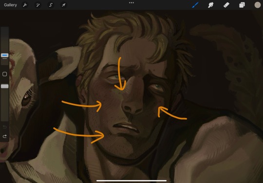
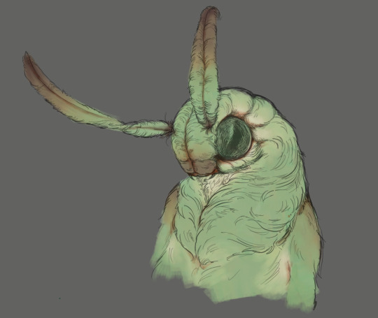
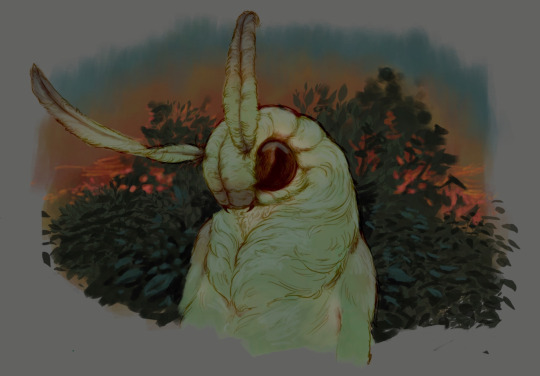
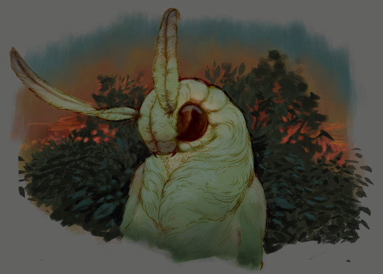
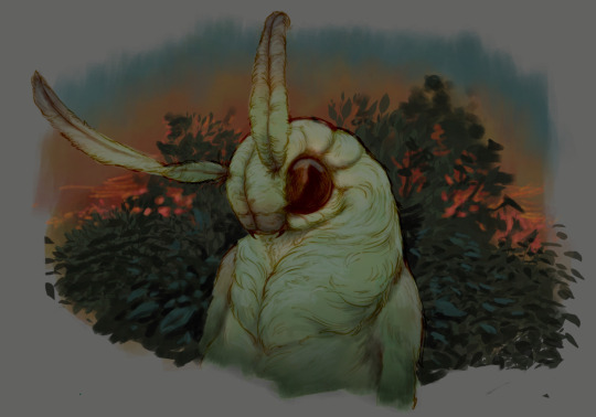
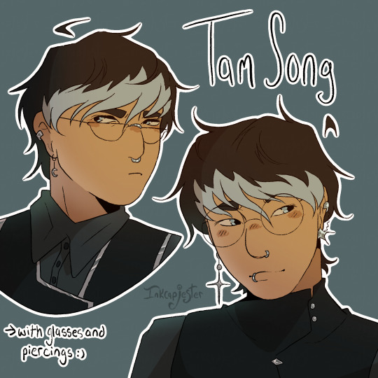
#also first time using this pixel brush thing
Explore tagged Tumblr posts
Visit Tumblr Blog
Explore Tumblr blogs with no restrictions, modern design and the best experience.
Last Seen Tumblr Blogs


Fun Fact
Average visit duration of Tumblr.com is 10 mins and 25 secs.
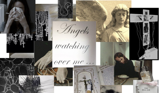
Text
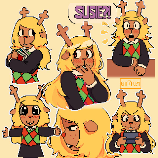
first real post HII
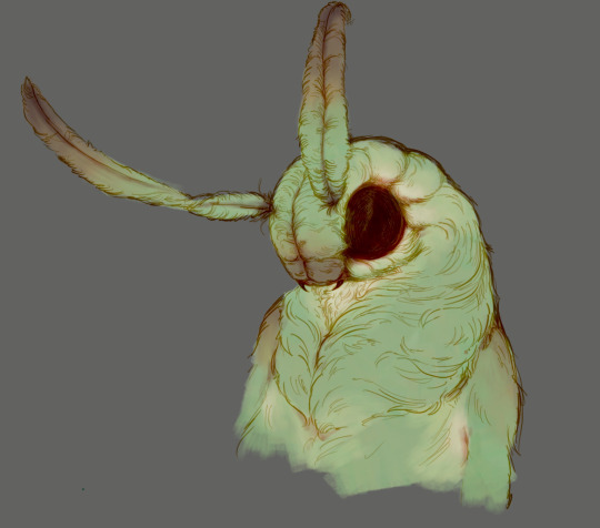
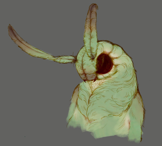
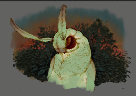
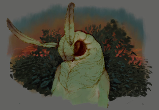
#deltarune#noelle holiday#deltarune fanart#deltarune noelle#my art#light world#this is my first post guys IM SCARED#also first time using this pixel brush thing
1K notes
·
View notes
Text
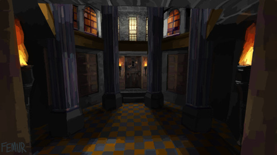
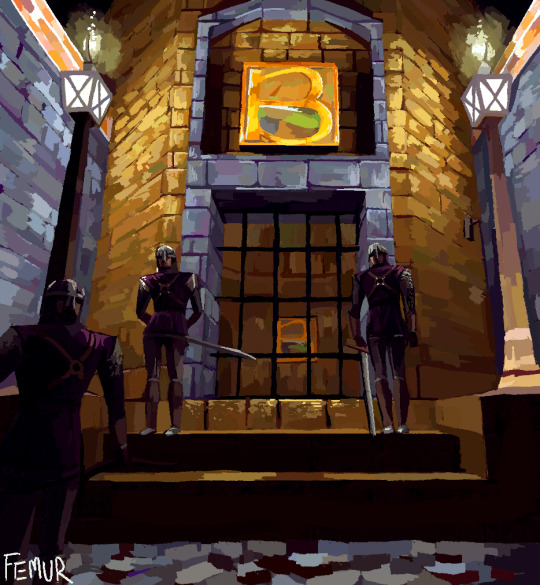
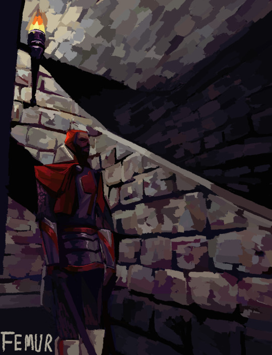
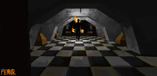
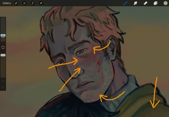
screenshot studies from thief, wanted to test out some color + material stuff and thought thief would be a fun subject heavily referenced from my own screenshots
second part here
#femurs art#thief#thief gold#im planning on making more these are a fun way to explore both my art and to take more time appreciating how thief looks#ive always wanted to be able to emulate lowpoly games in my art so this is a good first start for me#expect more... maybe ill do one per level if i dont run out of steam#thief in specific is great for this sort of thing because ithas these extremely saturated and gaudy color combos and so it makes me conside#palettes id never use before#im also testing out a new pixel brush so this is like 4 levels of new to me
200 notes
·
View notes
Note
A cute, fluffy, funny request of reader’s vision starting to blur and needs to wear glasses, but she’s very stubborn and refuses to wear them, which leads to several mishaps.


clearlyyy in love
an: love the glasses wearer representation🙂↕️🤓
It started with little things.
Street signs looking a bit fuzzier. Your texts needed to be in bigger font. The subtitles on your favorite show—suddenly… off while the volume was louder than usual.
You tried to brush it off at first, convinced it was just bad lighting or a smudge on your screen or maybe you were just tired.
But Billie noticed.
She always noticed.
“Babe,” she said one morning, as you blinked hard at your laptop screen and leaned in like an inchworm. “Why are you basically making out with the monitor right now?”
You looked up, flustered. “What? I’m just… focusing.”
She tilted her head. “You sure? Because I swear you were trying to count the pixels.”
You scoffed and rolled your eyes. “It’s fine. My eyes are just tired.”
“Mmm,” Billie hummed, not convinced. “I’m making you an eye appointment.”
And just like that, you were booked.
You went, of course. Because Billie had that mix of puppy-dog eyes and I’m-not-kidding tone that always made you fold. And sure enough—blurry vision, headaches, eye strain…….
Yeah. You needed glasses.
You were not thrilled.
You texted Billie the second you left the appointment:
you were right. i need glasses. i’m upset.
She texted back two seconds later:
why are you upset??? you’re gonna look cute as hell.
also, now you’ll stop tripping over everything. that’s a win for us all.
And honestly? She was kind of right. About both things.
The tripping had become a minor hazard, and even though you were reluctant, the first time you tried on frames in the optometrist’s office, you caught a glimpse of yourself in the mirror and… huh.
Not bad.
You chose a pair. Classic. Pretty. Soft around the edges but with just enough personality. Billie met you at home later that evening and lit up like you’d just told her she won a surprise Grammy.
“Oh my God,” she gasped the second she saw you in them, dropping her keys on the counter. “You’re so cute I could die.”
You gave her a skeptical look. “They’re not weird?”
She practically teleported to you, grabbing your face gently, tilting your chin. “No, they’re perfect. You’re perfect. I can see your pretty little eyes even better now.”
You blushed. She smirked. Balance was restored.
That night, you wore them proudly. Even watched a movie without squinting once. Billie held your hand the whole time and kept sneaking glances at you like you’d just grown fairy wings.
But the next day?
You… “forgot”.
And then the day after that?
You “accidentally” left them on your nightstand again.
The truth was, you liked them—but they still felt a little unfamiliar, a little too new. Sometimes they slid down your nose. Sometimes they got smudged. And sometimes, you just felt too stubborn to admit that you needed them at all.
Billie, ever patient, clocked it.
So when she came into the kitchen one morning to find you staring helplessly at your phone, holding it two inches away from your face with furrowed brows and a crumpled forehead?
She sighed. Softly. Lovingly. Sternly.
“Where are your glasses, baby?”
You froze. “Uhhh… somewhere?”
“Somewhere,” she repeated, stepping closer, plucking the phone from your hand and squinting dramatically. “Trying to decipher texts like it’s a secret code from 1942?”
You narrowed your eyes. “Don’t be a brat.”
She grinned. “Don’t be stubborn.”
You folded your arms. “They’re just annoying sometimes.”
Billie walked over and put her arms around your waist from behind, resting her chin on your shoulder.
“I get that,” she said gently. “But I need you to see. Like, for real. For your safety. And also—selfishly—for me. Because I love looking into your eyes and knowing you can really look back.”
You softened at that. “You’re too good at this.”
“I know,” she said, pressing a kiss to your shoulder. “Also, you left them on the bathroom counter. I brought them with me.”
She pulled them from her pocket like a magician. You groaned.
“You’re relentless.”
“I’m obsessed with you,” she corrected, slipping them gently onto your face. “Sue me.”
You blinked. The room came into focus again. The fuzz disappeared. Billie’s face—smug and gorgeous—was crystal clear.
She leaned in, smiling. “There’s my girl.”
You shook your head, trying not to smile.
“You’re lucky I love you.”
She smirked. “Oh, I know. Now come on. Let’s go outside and you can actually see the flowers I planted for you.”
You rolled your eyes (now with 20/20 clarity), letting her take your hand and lead you into the sunshine.
That afternoon, Billie kept sneaking photos of you in your glasses while you sat on the back porch sipping iced tea and reading a book, muttering, “God, you’re cute,” every five minutes.
That evening, she kissed the bridge of your nose—right where your glasses sat—and whispered, “These just give me one more reason to fall in love with you again every day.”
And that night, you didn’t forget to wear them.
You didn’t even want to.
Because Billie was right. Again.
Clear vision was nice. But seeing her—really seeing her—and knowing she loved you through it all? That was the most beautiful thing of all.
#gracie eilish#billie eilish#wlw#fanfiction#billie eilish x reader#billie eilish fluff#billie eilish fic#billie eilish x fem!reader#billie x you#billie eilish x female reader#billie eilish x you#billie eilish fanfiction#billie eilish smut#billie x reader#billie eilish x smut#billie eilish x y/n#billie x y/n#billie x fem reader
454 notes
·
View notes
Note
Hello! 🍓 I saw you guys talking about the red outfit, and I thought what it would be like if the hair was red. What do you think their reaction would be to very red hair that stands out like blood on snow?
✦ . jeff the killer
“You look like violence.”
Red hair on you would short-circuit his brain. It’s the same color that coats his knife. That stains his clothes. He’d be obsessed. Always touching it, twirling it around his finger, sniffing it while pretending he’s not.
“Damn. That red’s unnatural. You know what you look like, right? Like trouble. A whole lotta trouble.”
“You sure you weren’t made for me?”
He’d tug it during kisses. During arguments. During everything.
✦ . ticci toby
“Damn, Red? You tryna kill me?”
He’s obsessed immediately. Can’t stop looking. Can’t stop teasing you.
“It’s like—bam! There you are. Bright as h-hell. You trying to distract me on purpose, or is it just a bonus?”
“Bet I’d look go-good with that red all over my hoodie.”
He calls you Red every chance he gets, grinning like a fox who just found a rabbit that wants to be chased.
✦ . eyeless jack
“Fascinating. You’re a walking artery.”
Jack would be intrigued more than turned on—at first. Red hair is symbolic, animalistic, primal. He’d trace the strands between fingers like threads of fate.
“The color suits you.”
“How did you get it so bright? It’s… pretty.”
He’d take extra care with you, almost reverent. But make no mistake: the desire is simmering beneath his control.
✦ . masky (tim wright)
“You like standing out, huh?”
He tries to act unimpressed, but that intense red draws his eyes every time. He’d tug on a strand when you walk by. Say something rough just to mask how much it turns him on.
“It’s like waving a flag in front of a bull. Dangerous idea, sweetheart.”
“You asking to be stared at? Or just by me?”
The color becomes his fixation. If he gets possessive? He wants to be the only one who gets to see it down (preferably wrapped around his fist).
✦ . hoody (brian thomas)
“Blood in the snow.”
Hoody doesn’t say much, but red hair would haunt him. It becomes your trademark in his mind, the first thing he sees in his peripheral when you move. It makes you look unmissable. Targeted. Beautiful.
“It suits you. Loud color, quiet voice.”
“Just remember: red attracts predators.”
If anyone else stares, Hoody stares back harder. He wants the color to stay vibrant, alive. And only his.
✦ . ben drowned
“Yo, you look like a dragon or something.”
Ben loves it. Pixel red. Fire red. Boss-fight-about-to-happen red. It’s bold, and he’s all about aesthetic. He screenshots you in his mind every time you move. But he doesn’t let you get by without jabbing first.
“Hot damn. You trying to cosplay a warning sign?”
“Ten bucks says I could pull that color off better. Wanna compare?”
He’d get way too handsy, constantly tugging your hair, joking about using it as a leash. But also? Big simp energy behind the teasing.
✦ . clockwork
“Striking. I like it.”
Natalie would be the first to compliment you, but it’s never just a compliment. She sees the power in red, the way it makes you impossible to ignore. She leans in close to touch it. Brush it back. Tangle her fingers in it.
“It’s bright. Suits you.”
“What’s it for? Yourself? Or for me to look at?”
She loves it. If anyone insults it? They won’t have a jaw left.
✦ . laughing jack
“Oooh, look at you! Like a candy-cane…”
Jack thinks you look delicious. Like a gory dessert. He immediately wants to paint your lips to match your hair. He’ll yank on it mid-convo, just to see you react.
“Red suits you, sugar. Makes it easy to find you in the dark. Like a ribbon around a treat.”
“Wanna see how it looks in my hand?”
He can’t stop touching it. Or you. It turns into obsession fast.
✦ . slenderman
“Red hair. An interesting choice… but you wear it well.”
Slender sees red hair as a statement. A rebellion. An offering. He watches it gleam like fresh blood in moonlight and becomes fixated. It’s not about lust, it’s ownership.
“It makes you visible. Desired. You must crave attention.”
“You bleed beautifully. Inside and out.”
He may even start dreaming in red. Because now, it marks you.
꩜ .ᐟ
#creepypasta#creepypasta fandom#creepypasta headcanons#creepypasta headcanon#creepypasta x y/n#creepypasta x you#creepypasta x reader#marble hornets headcanons#marble hornets fandom#marble hornets headcanon#marble hornets x y/n#marble hornets x you#marble hornets x reader#slenderverse#slenderman mythos#jeff the killer#ticci toby#eyeless jack#masky#hoody#ben drowned#clockwork#laughing jack#slenderman#jeffrey woods#tobias erin rogers#jack nyras#slender mansion#natalie ouellette#rainspastathoughts
173 notes
·
View notes
Text


SAFEHOUSE.
— at least you've got each other.
summary : daughter of the mayor, who'd had an attempt on her life, bruce has tasked his son with protecting her in one of his various safehouses around the city. he's never had to do this before, and it doesn't help that you're sort of cute...
note : fem reader if you cannt tell very sorry znd also they're both teenagers like 16 ish
note 2 : also possibly a little out of charscter ? i haven't consumed a lot of damian media 😪 but i also do think he would behave a little differently when he's older compared to when hés like 9
work for robin was changing.
damian wayne expected to be running across rooftops, kicking bad guys in the face and eavesdropping in vents. not sitting around in a safehouse, protecting the mayor's only child.
for the amount of lying around they did, damian wouldn't really call it protecting. it seemed more like just hanging out.
his knee bounced a mile a minute from where he sat at the empty table in your quite non-descript box of a safehouse, eyes flickering over constantly to your frame in front of the cuboid vhs-playing television — what an old thing it was.
it had been quite difficult trying to harbour a relationship with you; of course it would be, having to go into hiding with a random teenage boy your age after having your life threatened by the usual gotham terrorists.
with a sigh, he got to his feet, and you glanced up from your old black and white movie. he stepped up to the door, fingering the locks to make everything was in place, and then past the curtains, which swayed slightly with movement, but were thick enough to keep out the light from outside.
these days it was difficult to even tell what time it was.
he did this a lot, probably as a way to pass the time, probably cathartically; checking the locks, checking the curtains were still heavy in front of the windows, giving the small apartment you stayed in the impression of being empty.
when he was done he turned your way, stepping boredly toward the back of the couch, where you'd already redirected your attention back to the television.
this was an old hitchcock one from the forties — quite bland, actually, but it wasn't like you didn't have anything else better to do.
when you first got here, neither of you having seen a vhs player before, it took a good hour to figure it out, and, at the time, you'd thought you and damian would get along well, laughing along together when you finally managed to insert the tape. now, after almost two months, you'd found barely anything to share a laugh about.
the cushioning on the back of the couch beside you sunk, and you peered over to see damian leaning against it, eyes glued to the pixel-ridden screen. with a huff and a few more moments passing, he spoke, glancing down at you from the corner of his eye. "i'm sorry i'm... not much help. i'm not really used to this whole protecting thing."
he stepped away, and you craned your neck to follow him. he began to pace from behind the sofa, talking with his hands as he kept his eyes on his feet. "i'm used to protecting people outside, not confined in here. i'll be honest, i'm going a bit mad in here."
an involuntary chuckle brushed past your lips, and he glanced up. "i completely get it," you returned, resting your arm on the back of the couch. "i'm not used to this, either. usually i'd be with my friends, or something — but i'm not even allowed to reach out to them. they probably think i actually did get shot."
you don't miss the way the corner of his mouth turns up as he circles around and continues his pacing.
this might be the most conversation you've had in three weeks.
where you think he might speak again, you can only hear the tinny voices of laurence olivier and joan fontaine, but your eyes continue to follow his movements. he seemed antsy, nervous; all he seemed to be these days.
"hey," you said out of nowhere, grabbing his attention, but he doesn't stop walking or cracking his knuckles. "why don't we do something you'd usually do?"
he considered your words for a moment, but kept pacing. "like what?"
your eyes trailed off, glancing around the room. it consisted of a small kitchen area and a little two-seater table, but you mostly stayed on the couch, getting through the wicker basket of tapes beneath the television. in the corner was a door to the bathroom, and two other doors to each of your miniscule bedrooms.
but in all the limited space within the main room, between the table and the couch, it was empty enough for movement.
"you said you're used to protecting outside," you hummed, looking back at him. by now, he'd stopped his pacing and was eyeing you inquisitively. "what do you ususally do?"
damian gave a shrug. "hit... people?"
with a shrug of your own, you jumped up to your feet. "why don't we do that? hit each other?"
once again, the corner of his mouth perked up. "hit you? i'm supposed to be protecting you, don't you remember?"
a laugh passed your lips as they curved into a smile. "no, no." and you walked around the sofa to face him. "you can just pretend. like, show me your moves. or teach me something."
your teenage bodyguard sized you up for a moment, flesh sinking beneath his mouth as he chewed at his gum pensively. after a few beats, he began to nod slowly. "if you think that will help."
"sure it will," you smiled as you reached out for his hands, palms slightly rough in yours, and dragged him out into the little space between what was supposed to be the dinner table and couch.
once you were out of the way of anything too valuable — like the tv — you let go of his hands and took a few steps back. "so how do we start?"
it seemed when being prompted to do so in a safe environment, damian struggled to get in the headspace of a fight. he'd been raised by assassins, it usually came as second nature.
perhaps it was that he was being watched, where it was only him and you.
sheepishly, eyes focusing on a spot on the wall behind you as opposed to actually you, damian took on a wider stance and carefully bent his legs. he looked agile, lean, and when he brought his forearms up to the sides of his head, his hands didn't curl tightly.
like this, he seemed to morph; from that quiet, almost shy, awkward boy you'd spent the past month and a bit with in, to a viper ready to strike.
instinctively, his eyes narrowed and his jaw set, like he were really about to attack.
with less ease than him, you attempted to match damian's stance, bending your knees slightly and bringing your forearms up to shield the sides of your head. but this only caused damian to let out a huff of a laugh.
"what?" you hummed, unable to stop the corners of your mouth lifting.
before you, damian's shoulders fell lightly. "nothing, it's just... no, it's not funny." although you could still see that smile behind his shielding arms, he made an attempt to compose himself.
your previous casual stance returned, your arms falling to your sides and your back straightening. "hey, i'm trying my best here!" you retorted, but a laugh slipped out. "not everyone is batman's side-kick."
"i know," damian responded, watching as you resumed your mirroring of his stance. "i think i forget not everyone has trained like us sometimes, because i'm constantly immersed in it. usually."
testing the ease of your knees and the weight of your shoulders, you opened your mouth to speak again. "what next?"
after a few beats, damian gave his reply. "well... i suppose you'd attack."
with a gesture of your fingers, you beckoned your opponent forward. "attack, then. give me your worst."
despite his dismissive chuckle, damian edged forward, however uncertainly. "absolutely not," he joked in return.
useless in this position, all you could do was watch damian as he silently made to assess his next move; lid covering eye, your lashes fluttered past with your blink and damian appeared much closer, his slow attacks falling purposely short as he pretended to strike various areas of your torso and up.
after a false kick brushed off your side, you straightened up again. "how could i protect myself? if i ever needed to." and at this moment in your life, it seemed very much that this would be helpful information, just in case your life is tried again.
closer than you'd seen him, damian's hair had messed with his shadow boxing. he had dark hair, the colour he shared with his father, but its untidiness must've been inherited from his mother. he owned a perpetual tan, olive in undertone, darker contrasting freckles dotted once below his left eye and then a smaller one merging into the skin of his lip. he was both boyish and owning feminine qualities; the untidiness of a boy, but the sharpness of a woman you'd never want to cross.
with a soft cough in the back of his throat, he reached out an arm, extending it past your ear. "if i was going for an attack here, you would take your other arm and push me away."
as he spoke, you followed his instruction, bringing your arm up, forearm against forearm, to hit him back and dodge out the way.
"a lot of it is timing," damian spoke again, slowly bringing his other arm up to jab at you throat without actually making contact. "timing, reaction and reading. you need to anticipate the action of your opponent before they even make it; that's what makes a good combatant."
your hand came up to take damian's wrist, stopping it where it had stopped anyway, and pushed it up over your head. "i'm not very good at this," you chuckled sheepishly, feeling a little stupid at this slow-motion combat.
pulling his arm back to his side, twisting it just as carefully as he had been to lose your light grip. "you don't have to be. you're just learning now."
as your fingers fell from his skin, your eyes met.
for a moment, damian stumbled upon his words. "but i could teach you if you wanted; something we could work on while we're holed up in here."
#aangelinakii#dc#dc comics#dc imagines#dc reactions#dc headcanons#dc universe#batfam#damian wayne#damian wayne x reader#damian wayne imagines#damian wayne headcanon#damian wayne drabble
355 notes
·
View notes
Note
You probably have already made a post about this (in which case I apologize for bothering you) however I really love how you render and color! Do you have any tips?
Hiiii so I probably indeed already answered something like that but it’s probably time for an #update + realized i can put pictures and it would probably help actually. Slay okay.
THE BASICS: have brushes you like. I have my faves, they’re in my #brushes tag (click below), you might also see them on the screen of my paintings in wip lol. Typically i thicken them up for rendering AND, now this is integral to my liking of rendering these days + the look: COLOR JITTERING. In procreate that’s tap brush -> color dynamics and i adjust the stamp & stroke jitter in the « hue » category. I have my fave brushes quadruplicated as thicker No Hue, 3% color jitter, 5%, 13% depending on the desired look. What this does is give intrinsic interest, variation and depth to your colors, and that way you can have more fun when colorpicking. This will come back again later.
STEP 1: a lineart you like. Doesn’t have to be clean tbh some of my fave linearts from current works were quite messy. ALWAYS colored.
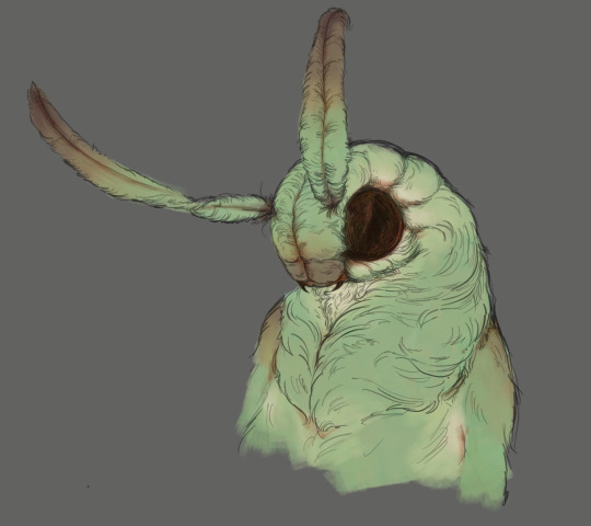
STEP 2: on a layer underneath the lineart, put down flat colors. See what % of color jittering brings you the most #joy. I will do flat colors or i will sometimes already define some areas of light and shadows.
^ you can see the subtle color jitter in the « white » of the shirt and the green of that first image. Second is to show the already defined areas; if i know i want a different hue on here. something else for some pizzazz: tint a color with an adjacent one. not really visible in these screenshots but in matador, at some point, i added an orange tint to burakh's sleeve, the one closest to the red cape.
STEP 3: the shadows. On the same layer as above (you can duplicate it before this so you can always come back to it later if you need to redo), put down your shadows; the trick: COLORPICK FROM A PIXEL WHERE THE COLOR OF YOUR LINEART AND THE COLOR OF YOUR FLATS INTERSECT. You might have to recolor your lineart (use the « alpha lock » feature of your layer or something of the sorts) until you’re satisfied; i typically redden it in the face and hands.
STEP 4: put down the highlight. I typically do highlights the complimentary color as the shadow: if shadow bluer, the highlight is redder (-> pinker), etc.
STEP 5: now this is the scary part. Before proceeding if you’re #scared, group your lineart and colors, duplicate the group and merge one of them so you can always come back to them unmerged. MERGE YOUR LAYERS. You heard me. Merge lineart and color. From then on…
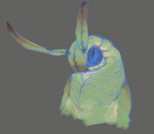
STEP 6: render. Render, render… PATIENCE… est mère de sûreté bien sûr. Here’s my secret: I NEVER BLEND. I ALWAYS COLORPICK. COLORPICK where two colors meet and you’ll have the perfect transition color.
tip: always have an all-black layer set to color mode above all layers that you can toggle on and off to check your values.
This is more of a fun thing i like to do even if i haven’t done it often: use some hints of a geometric brush to add interest when using an « organic » brush (or vice-versa, I’d guess, but i rarely render with geometric brushes). Exemples again:
And well Das Preddy Much It… Your Turn Now….. and because i realize a short demonstration is better than a long speech, have a speepvideo of the two pieces I’ve used as exemples one after the other (matador first to 44 seconds in, moschophoros second). the very beginnings are cut because we’re focusing on the above steps.
Your turn……. To play.
#allô (answers)#anonymous#faq#<- we'll guess...#brushes#<- the ones i use in there#rendering#tutorials#<- eeeeeh........
81 notes
·
View notes
Text
Coloring tutorial I guess
That's my most default shading style, a hybrid of line drawing and painted shadows, and I'll tell you exactly how to get this look. But before we start, you need a weapon This is my main brush for basically anything, including line art on days when I don't feel like switching to something actually intended for inking. It's a lightly textured square brush with color variation on every stamp. Intended for Procreate but you can always just rip the alpha texture out of the file and use it for a brush in any drawing program. That out of the way, let's go. I'll use the same line art as the one in fluff tutorial. Set the line layer to ~60 or so opacity and get to blocking in the base colors of your character. The jitter brush will introduce some color variation on it's own, but changing the color occasionally will add more visual interest.
After this I add a multiply layer on top and dab orange or red in places where we might be able to see the base of the hairs or peek at the carapace underneath.
It's places where hair parts and where it's shorter. This accent color works great on joints as well. Example of the thing I'm going for in real life:
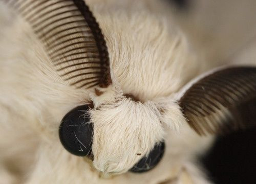
Especially visible behind the head. It's not present on every moth to be fair, but I like to add these accents even where it wouldn't make sense, just because it looks nice. Even on insects without hair. Block in the eyes and mandibles now, best if it's on separate layer.
Now, the actual funny tricks begin. If you're one of the people who only use multiply or add blend modes, stop it, get some help Understanding the math behind blend modes is gonna get you a long way. My lineart is set to subtract more often than not. I find it produces juicier and more colorful results than multiply. I want to give this picture a warm orange feeling, so the color of my lines should be the opposite - blue.
And, subtract.
Perfect, but not quite. We can push the lines to an even softer feeling. Take the line layer, copy it, invert the color and set to multiply. I then throw gaussian blur on the resulting copy and reduce opacity until the lines bleed into the surroundings just a little bit.
On to actual shading. People who shade without getting in some background first scare me, so let me throw something together real quick.
A simple gradient will also suffice for this use. We just need some information on which colors are present in the surroundings. Copy your background, bring it on top of your character layers and gaussian blur it real hard. Set it to multiply, remove all parts of the layer that go beyond the pixels of the base color layer. Adjust opacity until the character fits in the background.
Let's identify the light sources. In this case it's only the sky, but it produces two distinct colors - soft blue lighting comes from the top, slightly stronger red comes from behind. The blue light I set to exclusion blend mode because it felt most appropriate in this case. Both add and screen looked too strong to be the light coming from such dark sky.
In this lighting context the lower part of the body will receive less light that the upper part. I use the green of the bushes set to multiply to darken the bottom.
The character is surrounded by all kinds of soft light, but it can't get everywhere. It's time to add ambient occlusion, or contact shadows, for those without a 3d background. Anywhere where there is a crevice or surfaces almost touch, a soft shadow will form.
I do it on a multiply layer with a neutral gray-green color. Gray because any color light isn't really getting in there and green because the fluff is somewhat transparent and whatever light does pass through it gains a greenish hue.
Last step, red rim light from the fading sunset behind the character.
Since it's rim light I just work with normal blending mode. Setting it to add or something of the sort would make the rim light brighter than the source of the light. And it'd be odd.
And that's it. I usually throw on some post processing in Snapseed. Pull some curves, throw on a bit of grain, etc. But it's a topic for another time.
In conclusion, try to think about the environment more when shading. What route does light go through to reach where you're coloring? Did it reflect off of any colored surface? Did it pass through something transparent to gain a different hue? What color shadow would this ambient lighting produce? Go have fun with your colors now.
260 notes
·
View notes
Note
could you please do a tutorial of your game of thrones 'so much for stardust' gifs where it has the ripped paper textures? it's so pretty, and i'd like to learn how to do one with just the texture in the middle and two gifs on either side, like half and half and just having a rip in the middle. it's so cool how you did a gif in the middle though so i wanted to ask as well! all of them are so cool looking. you are extremely talented. if you don't want to though i understand :) thank you
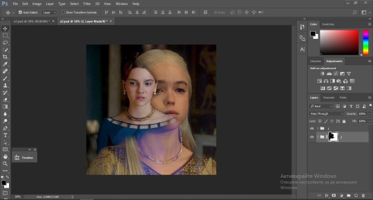
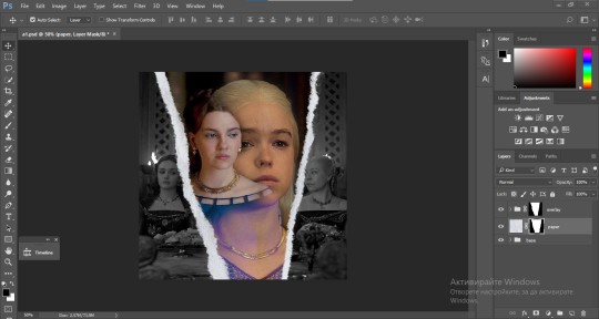
TORN PAPER EFFECT + BLENDING TUTORIAL
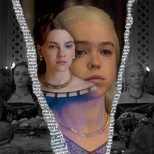
thank you so much for your sweet words, dearest anon and i'm sorry it took so long to answer but it's here now so i'll try my best to explain <3 disclamer: this is the first tutorial i ever made, it's very screenshot heavy and it assumes the basic knowledge of ps and gifmaking. if there's something you don't understand, don't hesitate to ask <3 so, let's get to it!
1. PREPARING THE BASE As you can see in this shot there's a lot of space between Rhaenyra and Alicent and that makes it perfect for the ripped paper overlay without hiding much of the base gif. So the first thing i did was to crop it like this:
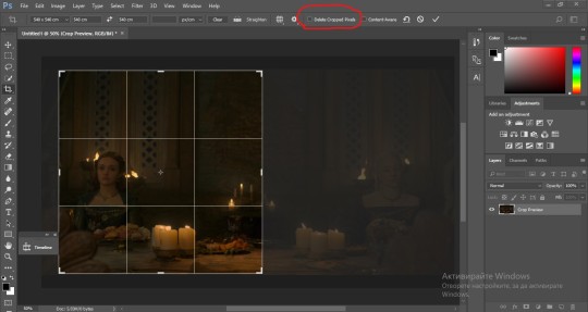
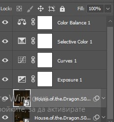
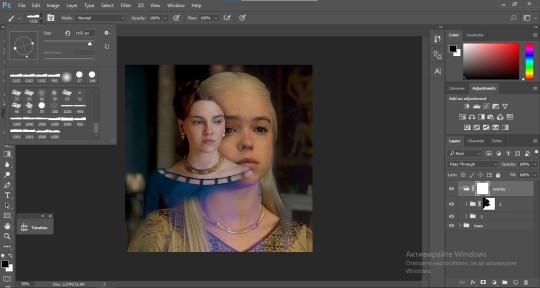
Also you want to make sure that the highlighted box (delete cropped pixels) is unchecked! After taking the usual steps for the animation (creating frames from layers, reversing the frames, setting frame delay) you continue with the video timeline and convert your frames into a smart object. psa: if you don't have the motivation or the time to play around with coloring here are some psds i recommend: 1, 2; as for the sharpening i think this one is the best.
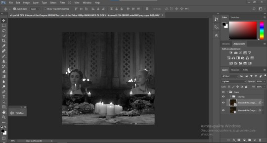
now that you have your smart object sharpened and colored what you want to do next is drag it to the end of the canvas and duplicate it. after that you move the copy on the other end like the original and make sure it's under the coloring layers, like this:
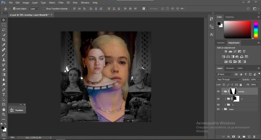
After that you have to create layer masks (the highlighted icon above) for both smart object and the copy and change the blending option of the copy to screen or lighten (whatever looks best!). So this is how it looks now:
pls ignore that there are no layer masks on the smart objects i just added them after changing the blending rip </3 Now, as you see both gifs are like fighting eachother for their rightful place on the canvas. (fgfgfdf) To fix that you have to use a soft round brush to delete the parts you don't want. (feel free to play around with the brush however you want to get the result you want!) Here's my result:
2. THE OVERLAY
Now for the both gifs you want to use for the ripped paper effect you pretty much apply the same steps as the ones you did with the gifs for the base. Here are the two gifs i chose:
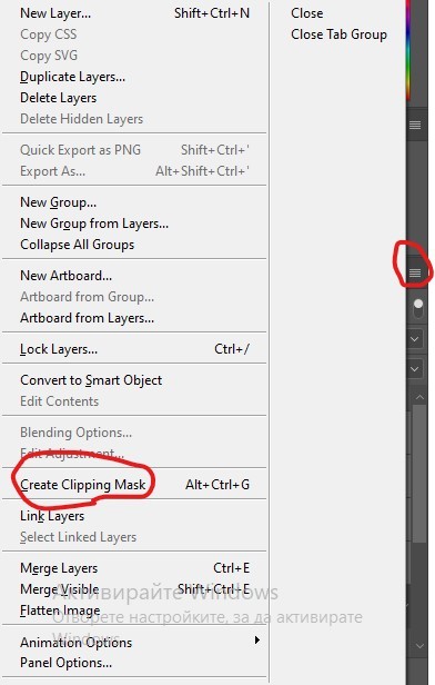
Before blending both gifs however you want to create a clipping mask for each of the smart objects coloring layers, like this:
And now you're ready to blend both gifs together! You choose the group with one of the gifs and change the blending again to screen or lighten and place the said group on top of the other. So this is how it looks now:
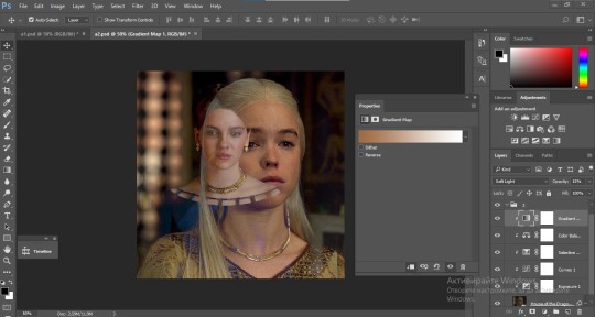
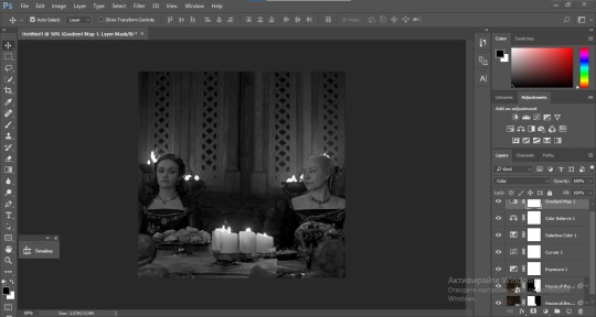
optional: if you feel like the base gif doesn't pop out enough you can always add a gradient map on one of both gifs and play around with the opacity and the color you think fits best.
Then you add a layer mask on the overlay gif group and again play around with the brush to delete what you don't want. So this is the final result:
ps - don't repeat my mistake by placing the group with the layer mask under the other group. it should be on top and the blending option should be lighten or screen.
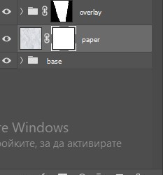
After blending both gifs together, you're ready to place them on the base. So first thing you want to do first is place both groups of each gif in one single group together. Then you duplicate the said group in the psd of the base gif and create a layer mask. This is how it should looks:
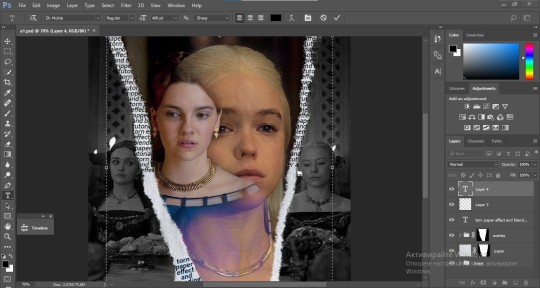
Now, in order to create the ripped paper effect, you'll have to download a ripped paper brush pack. This is the one i use. After loading the brushes in ps (if you don't know how here is explained) you're ready to begin! Change the size and angle however you'd like to make it look how you want. And if you want you can move the overlay gif by choosing both groups in case you aren't happy with the adjustment. This is how it looks like so far:
We're almost done! Now you have to find a paper texture, (i got mine from google) place it between both groups of your gifs and create a layer mask, like so:
What you have to do here is pretty much the same thing you did with the overlay gifs. Still, make sure there's enough space for the text you want to write in. However, if you think that the space isn't enough you can just delete a bit more of the overlay gifs. Here's mine:
3. THE TEXT
You're finally ready to type out the text you want! If you're having troubles with choosing the right font and size, here are my text settings:
You can always play around with the angle and if your text is too small, zoom in so you can place it just how you like it. And since i'm a bit lazy to deal with it later, i choose to add the highlight color while it's still zoomed. You just have to add an layer above the text and use a soft round brush with opacity from 70-75% and flow from 15-18%.
For the repeated text you want to make sure you create a big space for writing so it can contain the whole space of the torn paper. Also, write where the text will be seen only and use the tab button to skip the space where the gif is. This is how it looks:
Once you're done with writing the repeated text, you want to select all the character layers and the highlight layer and move them under the overlay gif and on top of the paper, like this:
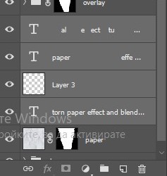
With the layers still selected and in order to contain the text within the paper the last thing you want to do is create a clipping mask. And that's It. You're done! This is the final result:
#allresources#dailyresources#usergif#chaoticresources#gifmakerresource#hisources#onlyresources#alielook#usermaguire#userrobin#usernik#userpat#userbells#gif tutorial#ps help
179 notes
·
View notes
Text
‘Paige Sofia you know you and I shouldn’t feel like a crime’

Rain lashed against the windows of the dorms at UConn, mirroring the storm brewing inside y/n. Meanwhile, Paige, her teammate the one she was inlove with, was in her dorm laser-focused on upcoming assignments that were near due, her fingers flying across the keyboard in a blur of motion. The glow of the monitor illuminated her face, highlighting the sharp angles of her cheekbones and the determined set of her jaw. While Y/n’s sat alone in her dorm as her heart ached with a familiar pang of longing.
They were the power duo of the huskies, their team’s star players. Their online synergy was legendary, their intuitive gameplay the stuff of UConn’s forums and highlight reels. Fans shipped them relentlessly, creating fan art, writing fanfiction, and dubbing them .The irony was bitter. Online, they were inseparable. Offline, a chasm separated them.
Paige lived in the shared dorm with, another teammate Jana. They’d met in y/n’s freshman year after Y/n was recruited to the school women’s basketball team in 2021, their shared passion for the game forging a bond that transcended distance. Hours spent strategizing, practicing, and celebrating victories had woven an intricate tapestry of shared experiences, inside jokes, and unspoken understanding. Y/n had fallen hard, captivated by Paige’s quick wit, her fierce competitiveness, and the surprising vulnerability she sometimes glimpsed beneath the confident facade.
But the internet, the very thing that had brought them together,shipping the two, also kept them apart. Their relationship existed solely in the digital realm, a fragile construct of pixels and pings. Y/n yearned for something more, for the simple act of sharing a meal, for the brush of Paige’s hand against hers, for the comfort of her presence. But the logistics were daunting, the distance a seemingly insurmountable obstacle.
The pressure was mounting. The National Championships were just weeks away, and their fans were counting on the team and the duo. Every waking hour was consumed by practice, leaving little room for anything else, let alone navigating the complexities of a relationship. Y/n feared that confessing her feelings would disrupt the delicate balance they had achieved, jeopardizing their chances at the championship and potentially fracturing their friendship.
One evening, after a particularly grueling practice session, Y/n found Paige’s contact. Hesitantly, she typed a message: “Can we talk?”. Paige responded instantly: “Sure, what’s up?” Y/n fingers hovered over the keyboard, her heart pounding in her chest. She typed and deleted several messages, each one feeling inadequate, too vulnerable. Finally, she settled on a simple: “It’s about us.”
Paige’s reply was immediate: “Us? What about us?” Y/n took a deep breath and typed: “The fans… they’re not entirely wrong.” The silence that followed felt like an eternity. Finally, Paige responded: “Y/n…” The message remained unfinished, the bubbles in the corner still moving. Suddenly, the bubbles were gone. She had stopped responding.
Y/n stared at the screen, her heart sinking. The rain outside intensified, the rhythmic drumming against the window a cruel counterpoint to the silence in the room. The friendship, their relationship, the feelings had become a wall. The unspoken words hung heavy in the now stuffy, dark dorm, a testament to the cruel irony of their situation. They were so close, yet so far apart, their love story trapped in the tangled web of being in love with someone you can’t have.
——————————————————————————
guys this my first time writing 🙏🏾🙏🏾😢
42 notes
·
View notes
Note
Sorry to come out of nowhere but I just wanted to say that your art is so warm and so colorful and so ROUND in all the best ways and your style really captures my favorite things about Kirby! I've always found it really inspirational!
Also, I love the way your line art looks?! I have to ask (you don't have to answer though) is there a specific brush or technique you use to get that soft, multi-layered effect?
Either way, wishing you a wonderful day!
Thank you so much for your nice message, it means a lot!! I've been wanting to make a small tutorial about how I make my Kirby art, so I guess your question came right on time hehe ^^ As I'll be explaining all of my process, I'll also answer your question about my line art! Btw my art program is Paint Tool SAI and I'll also be showing the brushes I use as well as their settings (i made up most of them a long time tho).
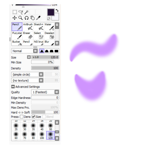
So first here's the brush that I use for basically anything, whether sketch or lineart!
It took me a while to understand what you meant by multi-layered effect, but no the brush doesn't do that, that's actually my way of doing "lineart" (ig it's not really lineart cus I just do sketches that I clean later on).
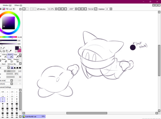
I then clean up everything, add the details and block by using a grey color.
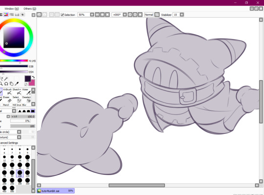
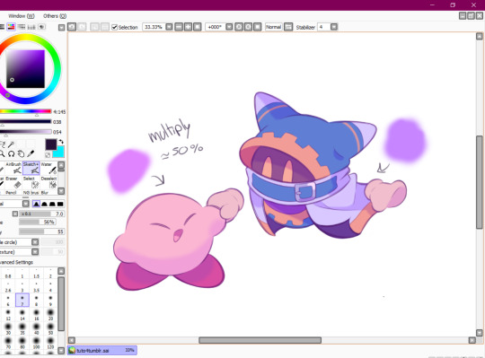
Afterwards I add the flat colors! I already have my own made up color palette, but otherwise I always use a purple color as overlay.
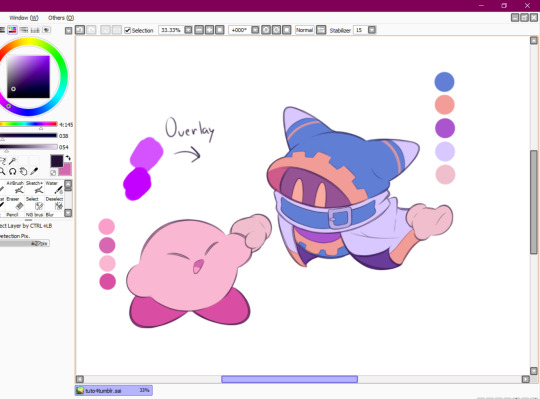
And I also use that same shade to color the lineart!

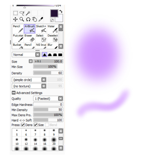
Next comes the fun part, shading! Here's THE brush that gives that soft effect to all of my drawings ^^ It's the same setting as my eraser too!
And yeah I also shade with light purple lol
There's also some other brushes that I use for more effects, like the airbrush! (I don't think I've touched the settings that much) I mostly use this one for lighting effects.
And finally the water brush! I sometimes use it for blending or for quick backgrounds,
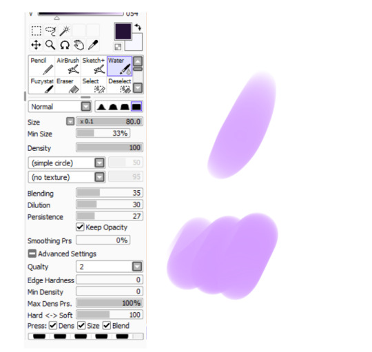
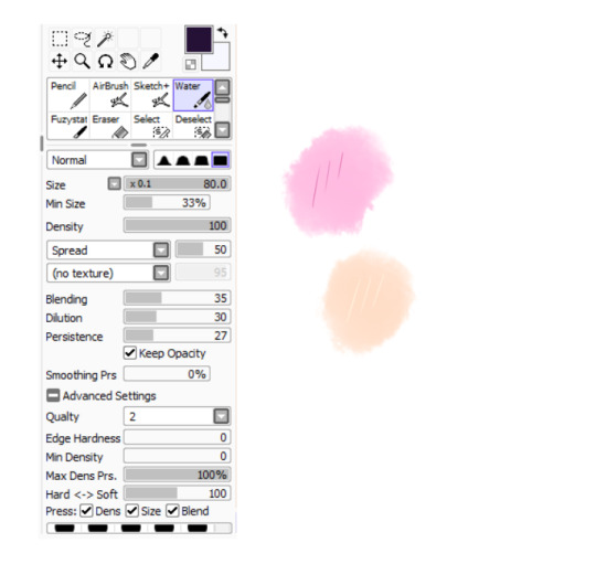
but you can also see that when put it to "Spread" it also becomes the one that I use for my blushes hehe
Aaand I believe that's all of the brushes I use for my art! I do have more, but I only use those for other specific stuff like animation or pixel art.
Adding some details AND VOILÀ!!

Now you know how I make my Kirby art! (but this also applies for all of my art) I sometimes redraw on the contours to give that "pop up effect" a bit like what they did in rtdldx lol ^^
I really hope it was easy for everyone to understand cus this is my first time making a tutorial! And to Desultory Novice, I hope I managed to answer your question too!!
Thanks again and have a great day :D
266 notes
·
View notes
Note
How did you find your artstyle and how do you consistently draw it, if I may ask?? I’m having a hard time being consistent with my artstyle 🥲
Also, I hope you don’t mind- but I’m just gonna…*noms your art* Delicious <33
To be totally honest, I'm still finding my art style!! It's not really something I've 100% decided on yet, and that's partially because I have so many! I'm gonna use my story that I've been developing for a while as an example, along with other drawings for things I've done :]
Also idk if this counts as a tutorial, but I do yap a lot about loosely put-together steps, so here we go!
I love experimenting with things like brushes, color palettes, blending modes and effects to see which things serve the purposes I most need them to. All of the brushes I currently use I found for free, mostly on Gumroad!
Experimenting would probably my first step, regardless of what I want the style to be. I usually have at least a vague idea of what kind of vibe I'm going for, but sometimes I get more inspired just from experimenting with various brushes and coloring styles.
Something ill do when trying out new brushes (usually line art brushes) is to go over the same sketch with them. This is a very old example LOL but it was when I was trying to develop a style for a comic/light novel of an extensive fantasy world I've been working on for a long time.
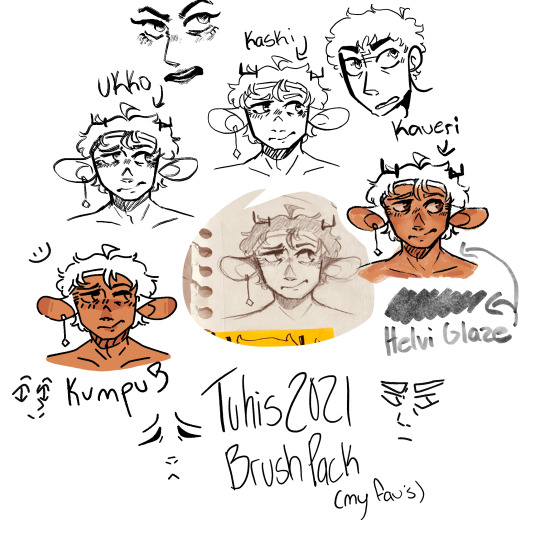
I labeled all the different brushes so I could easily remember which was which, and from there I ended up liking the Kumpu brush the best.

Then I made a bunch of drawings with that brush of some of the main characters, to get a feel of what I liked and what I didn't. I knew I wanted the style of this comic to feel a little bit like a pixel-art game (think undertale and stardew) but also have a clear color palette. I liked the drawing in general, but overall wasn't ecstatic with how they came out, because it wasn't as close as I wanted it to be. So, a while later, I searched the internet for more inso, and brushes.
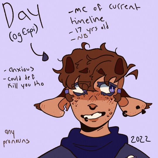
This was feeling a lot closer to what I had envisioned in my head, but it still wasn't quite there. It wasn't until I took a creative writing class that I actually gave myself time to work on this world and style more. I ended up making these portraits to go along with my paper, and I started to really like the palette that I had coming together.


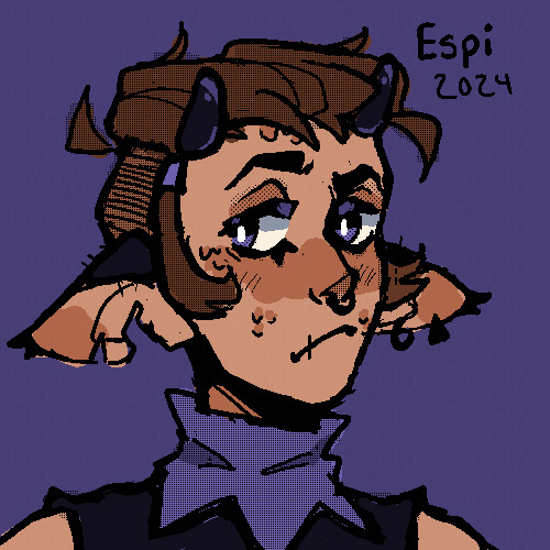
I knew I wanted this world's primary color to be purple, with the accent being mainly yellow/orange, so I made sure to keep those at least as undertones in my drawings. For example, Lenni is a grey tabby cat, so I chose a grey with a purple undertone, so that he didn't look out of place in this world that (design-wise) he clearly belongs in. I also chose to give a purple undertone to Espi's skin color, along with her brown hair. Sometimes undertones are more subtle, but from the very beginning I knew that I wanted the purple undertones in this style to be very noticeable.
That's something that I highly recommend thinking about when wanting to develop a style!! That would probably be my second step. What purpose do you want it to serve? I knew that I needed a style that was 1) simple enough for me to draw over and over 2) interesting enough to carry the story artistically like I wanted it to and 3) be visually different in an eye-catching way. My different iterations of this style I think achieved these goals in varying levels, and I tried to keep track of what things were working towards my goals, and what wasn't.
I also had to make a cover and back cover for my paper, so I used that as an opportunity to explore this style even more, with the introduction of how I wanted to use shading!

I knew I wanted the cover to have striking lighting, but I wasn't super sure how I wanted to go about it. Eventually, I kind of just tried to give up on my perfectionist mindset of "it has to look exactly how I want it to!!" and instead focus on actually drawing something. I've had to keep revisiting this world after long breaks because I was never satisfied with how my drawings were turning out, and in turn, I'd give up for a while. Which is NOT a good work flow LMAO. I do like how this cover looks as a drawing, even though it's just not QUITE what I want. But I'm trying to work on that mentality shift, and it's helped me make a lot more progress in my styles so far.
This is the mock back cover! I was much more satisfied with the shading in this one, and I felt like I was finally finding my footing with that. Now that I've become more comfortable with my line art, color, and shading for this style, I feel like I can finally start experimenting with the fun parts of the style I know I want to include, like sprinkled in pixel textures, etc. I haven't gotten to that part yet though, so we'll see how it goes!!
Besides my story-style, I would say I have two main other styles, being my "normal" style (even that could have different iterations), and my rendered style.
I'm gonna use my most recent drawing as an example for my normal style. In this style, I knew going into it that I had a vague want to explore color more, so that became the thing I decided to experiment most with.


Something I started noticing in my experiments was that I would be generally satisfied with the base colors, only to slap some shading on and not like it anymore.
When this kept happening time and time again, I decided that since I had a concrete goal of improving my colors, I would take a break from shading all together.

This is when I started taking more requests to really work on my understanding and application of color. I wanted to give myself a fun excuse to make lots of drawings of characters, and working until I was happy with how my colors looked. When I was doing this, I was referencing artists where I specifically admired their colors, and using information I gathered from my painting and color analysis classes! I love color and could yap about it for a while so lmk if you want more on my process for that.
After I felt like I had a good grasp on color, I started to tackle shading again. And....I'm still tackling it!!
I love the idea of textured shading and using masks, so I combined those two things for this piece. I think the use of masks worked well, but I'm not satisfied with the rake brush textures I used. I want them to be more noticeable and intentional, so that's the next thing I'm choosing to work on! I'm not abandoning the non-shaded style of my art, especially because I like it so much!!, but I for sure want to continue my process of experimentation and figuring out what purposes I want to achieve.
The other major style I use is my rendered style!
This style obviously is a lotttttt more time consuming, so I don't do it all the time, but it is something that I really enjoy! I use this style mainly for poster-type drawing that I want to make into prints to sell someday! This style is also en exploration of my skills and application of the things I learn in my studio classes! We do a lot of time-intensive realistically rendered drawings in my classes, and I wanted to use that knowledge that I've gained and apply it to my personal art! I can't share a lot of the work I do from class since I draw models and they're nude (they didn't consent to the internet seeing those drawing lol!!) but I can share some self portraits I did!!


These classes really honed my shading skills that I want to work on applying to my personal digital pieces, along with the hatching that I used in these graphite drawings (something that I really grew to love about them!!)
So to wrap things up, I'm still finding my style(s)!! As any good artist is. I focus on experimenting with things that intrigue and inspire me, with artists I look up to as references, and then figure out what I want the style to be and what purposes I want it to serve. I hope this was helpful!! If you have anymore questions please feel free to ask!
#digital art#digital artist#small artist#artists on tumblr#digital illustration#tutorial#style#art style#inkcapjester#inkcapjester tutorial#how to find your style
10 notes
·
View notes
Text
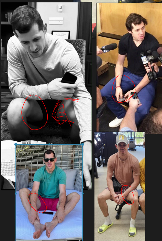
ok slow day on the blog so im about to get all soppy and artsy. Because a) this man drives me insane and i continously try to figure out why slash justify it to myself and b) i am so obsessed right now with that one leg muscle that kinda goes flat when you sit but also is a key part of how to structure the leg when drawing. Blah blah blah hockey butts yeah great but what if... hockey inner thigh....
Ughhhhhhh kill me now.
Anyway im gonna adress a trend i have noticed in the pens fandom mostly displayed through passive aggression towards me or other creators...and that's the use of references. There seems to be this idea that using references is lazy or cheating or means that this person isn't making 'real' art. And im gonna call some bullshit. Every single artist since someone decided to paint their hand and try to recreate a cow on a cave wall with their thumb has used references. Talk to real commercial artists and they use WAY more references than you can imagine. My current job is super stylized and unique. But back when i worked in hyper realism on C*ll of Dooty and superheroes and stuff? Never not once did the illustrators not utilize references. Often us 3D artists were given a photo with a posed actor, which we used to pose the 3D model, which then was illustrated on top of directly by the illustrator. Those artists had to churn out hundreds of illustrations a month. They did not have time to get precious about it.
And lets talk about 'sourcing'. Yes, if you copy a photo directly almost pixel for pixel an artist should probably reveal their source. But so rarely is this the case. If you put any kind of spin on it - your own style, change the colors, add or subtract the background - that is YOUR art and there is no need to link to or include the damn 'source'. It's not a 'source' at that point. That would be like asking the amazing folks who photoshop artistic 'edits' together using photos and brushes to link to the original photos at the bottom of all their posts. This is just silly.
You want to know what commercial artists did before the internet? My old friend here has a studio from the 70s-2000s that has an entire wall full of neatly organized stacked drawers of printed references, a lot of it clipped from magazines and books. Each of them labeled by subject matter. And this artist worked in some of the most famous advertizing studios during that era.
So, coming back around to hockey thighs, because I know there are certain folks in the pe*ns fandom that get annoyed and angry at my daily drawings (which is so sad by the way, get a life). I have to admit this is the first time this has ever happened in a fandom so it threw me for a loop. But I also know there are younger artists out there who follow me so I want to explain my process a little. Most of my daily doodles are studies - its one of the reasons its been easier to do them during my illness than any more serious creative work. When i doodle i am looking at references and trying to recreate that as i see it. The key point being 'as i see it'. I am usually trying to learn things like: in this photo what about the lighting is compelling, and how can i make it more so? Or what is the focus of the drawing and how can i let the rest of it fade? Or whats the main gesture and how do i exaggerate that? And always, always im trying to study anatomy from new angles. For me its not enough to learn what a 'knee' looks like because the shape of the knee and the muscles around it change depending on how it's posed. And it is often those changes that make it so beautiful. Or in this case that beautiful sexy stretch of thigh between geno's knee and groin.
Often times if i imagine a 'pose' in my head, i will then go pull as many references as i can where the body's limbs are roughly arranged how i want it and then draw those over and over until i feel like i have enough of a grasp on that anatomy to recreate it for myself. So please, dont listen to the haters, use those references or dont use them freely. the haters are idiots who are projecting their own fear of inadequacy and learning to be creative onto you. <3
In my next essay i will discuss how baffled and humbled i am by the way my love for geno's face has utterly transformed my artistic eye...
#Wip#I never actually enjoyed *realism* until i started looking at photos of geno#Hes...just...so...perfect...???????.....#Also if your putting this post together with the santa wearing shorts reference post yes youre connecting the dots
11 notes
·
View notes
Text
Static Angel (Angel x reader)
Slow burn, 7/7 Chapter, Tags: Horror Elements, Stalker, Drug Use, Religious Imagery
Also on AO3!
You wake to feathers.
They’re everywhere—on the pillow, tangled in the sheets, drifting lazily in the morning light that filters through your yellowed curtains. The hum of static is not the harsh, grating kind from the laundromat’s CRT monitor. This is softer, warmer, like the buzz of a fluorescent bulb in a childhood kitchen. The kind of sound you’d fall asleep to, curled on the linoleum floor while your mother cooked late-night pancakes.
Your apartment is bathed in a pale, golden light, the kind that doesn’t come from the sun. It spills through the cracks in your blinds, pooling on the floor like liquid honey. The air smells faintly of ozone and something sweet—like burnt sugar or the inside of a church candle.
He’s beside you, his wings draped over the bed like a living quilt. They’re not pixelated here, not glitching. They’re real , feathers shimmering with iridescent light, each one a tiny prism catching the glow. His chest rises and falls in a rhythm that’s almost human, but not quite. Too slow. Too deliberate.
Your head pounds, a migraine clawing at your temples, and you barely make it to the trash can before you’re retching, bile and last night’s vodka Red Bull splattering the plastic liner.
He stirs behind you, the sheets rustling like wings. You don’t look. Not yet. You can’t.
The apartment is a mess—clothes piled in the corner, takeout containers stacked on the counter, the ceiling cracks branching like veins. The air tastes stale, tinged with the metallic tang of the radiator hissing in the corner.
The pills are on the nightstand.
You stare at them, the orange bottles lined up. Ambien. Xanax. Prozac. Names that used to mean something. Names that used to keep you tethered.
You grab the bottles, and you stumble to the bathroom, your reflection in the cracked mirror a horror show: smudged red lip gloss streaked across your cheek, mascara raccooned under your eyes, hair a nest of static and split ends.
You scrub your face raw, the water lukewarm and faintly sulfurous. The lip gloss clings stubbornly, staining your skin like a brand. You want to be pure for him. Pure . Pink-cheeked, straight-haired, soft as a swan’s down feather. You want to be the kind of girl who gets weekly French manicures from a Russian woman named Irina , who smokes only once a week, who goes to the gym four times a week, who gets into grad school, who has a doll face and a fawn heart.
You want to be holy .
The mirror is fogged, but you don’t need to see your reflection to know you’re glowing. You can feel it—a warmth in your chest, a lightness in your limbs.
You unscrew the first bottle and pour the pills into the toilet. They clatter against the porcelain, a sound like tiny bones. The second bottle follows, then the third. The water turns cloudy, the pills dissolving into a milky haze.
Purge the pestilence.
You flush.
The sound is louder than it should be, a roar that fills the tiny bathroom. The water swirls, golden light flickering in its depths, and for a moment, you think you see his face in the vortex—smiling, radiant, proud .
You flush again.
And again.
Until the bottles are empty, until the nightstand is bare, until the only thing left is the hum of static and the warmth of his light.
When you return to the bedroom, he’s awake.
“You didn’t need them,” he says, voice soft as a hymn. His wings stretch, filling the room with prismatic shadows.
You don’t argue.
You crawl back into bed, his arms wrapping around you like a sanctuary. The static hums in your ears, a lullaby you didn’t know you needed.
He’s sitting cross-legged at the foot of the bed, wings folded neatly behind him like folded sunlight, reading The Bell Jar . His brow furrows, fingertips brushing the words as if they might dissolve. The paperback looks absurd in his hands—too small, too mortal. You prop yourself up on one elbow, sheets pooling at your waist. The air tastes like honey and ash.
“You’ll crease the spine,” you say, reaching for the Du Mauriers on the nightstand. Your fingers brush a water-stained Virgin Mary prayer card tucked beneath the lighter, her face bloated from some long-ago plumbing leak.
He looks up, eyes wide as a fawn’s, lashes casting spider-leg shadows in the static-haloed light of the TV. The screen plays nothing, just fuzz and the occasional ghost of a 3 a.m. infomercial. “It’s already cracked,” he says, voice like a record skipping. His thumb traces the split in The Bell Jar’s cover, the paperback swollen from bathtub readings. “Like her. Like you.”
You light the cigarette, the flame trembling. The first drag tastes of salt and scorched vanilla—communion wafer meets funeral pyre. “Plath didn’t crack. She split.”
He tilts his head, golden hair catching the light. His wings twitch, their feathers molting faint silver threads that drift to the floor, dissolving into the grime between peeling linoleum tiles. “Splitting is a kind of flight,” he says, so earnestly it hurts. The radiator groans, its pipes rattling out a Dies Irae as he shifts closer.
You inhale, smoke curling around the truth you won’t say aloud: I’m splitting now. For you. The smoke escapes your lips in a thin plume, twisting into the shape of a serpent before unraveling.
“You’re glowing,” he whispers, setting the book aside. The pages flutter open to I felt very still and empty, the way the eye of a tornado must feel. A dried rose petal marks the page—brittle, brown, stolen from a gas station bouquet.
You tap ash into a chipped mug that reads WORLD’S OKAYEST SISTER, its handle long gone. The ceramic is stained with tea rings and lipstick smears, a chalice of domestic ruin. “It’s the nicotine.”
“No.” He crawls toward you, wings rustling like a thousand whispered secrets. Dust motes rise in his wake, illuminated by the streetlamp’s sulfurous glow. “It’s the becoming.”
His hand hovers over your pulse point, where you’d dabbed perfume this morning—White Musk, from a half-empty bottle found deep in a drawer. The scent clings, earthy and desperate beneath his ozone. His fingers graze your throat, cool as a monstrance against your fevered skin. “You smell like a prayer,” he says.
“It’s CVS perfume.”
“Yes.”
You laugh, smoke spilling from your lips. He watches it rise, fascinated, as if your breath contains constellations.
“Esther wanted to be everything,” you say, nodding at the book. “But the world kept… reducing her.”
He plucks the cigarette from your fingers, takes a drag. His lips don’t scorch. The ember dies. “The world is a cage of and s,” he says. “Mother and martyr. Saint and slut.”
The static hums louder. You realize it’s coming from you now—a low, resonant frequency in your ribs, as if your bones are tuning forks struck by some unseen hand. The TV screen flares, bathing the room in electric blue. For a heartbeat, you see your reflection in the glass: eyes wide, mouth parted, haloed by the glow like a Byzantine icon.
“Is this love?” you ask, the question sharp as the perfume’s top notes.
He presses his forehead to yours. His skin tastes like TV snow, like the staticky buzz of a midnight mass broadcast. “It’s a vigil.”
The cigarette burns down to the filter, but you don’t stub it out. You let it smolder, the smoke curling around you both like a halo. His wings stretch, filling the room with fractured light—prismed through the jar of spare change on the windowsill, casting kaleidoscope saints on the water-stained ceiling. The radiator hymns. The pigeons chant.
And for the first time in years, you feel born again.
You feel ribbons in your hair, perfume on your pulse points.
You feel love.
#monster x female#monster imagine#monster x human#monster x reader#terat0philliac#teratophillia#angel x reader
8 notes
·
View notes
Text
I made the unfortunate decision to comment on a tiktok saying
"Blitz has every right to doubt Stolas' intentions and I will di on this hill defending Blitz"
Which made me actually realize in the context of Stolitz how much the fandom vilifies Blitz.
Upon rewatch I realized that he is actually kinda innocent lmao. So here comes the rant hop on in Verda rants at 4am again train.
The thing is first of all we need to work our media literacy muscles. So Stolas stans who think he is a uwu babygirl that dod nothing wrong repeat after me. "Blitz didn't watch "just look my way", "owl in a cage" or any other Stolas longing scene that we cried over"
Now that thats setteled I don't want to hear any "he is trying" bs because as of now (pre full moon s2e8) he hasn't actually done anything that Blitz is aware.
Lets start from the top my initial comment was about how Stolas treated him for so long before actually catching the feelings and how Blitz has a right to think he is not genuine.
Up top lest start with the condescending pet names and I won't be hearing Blitz cant be mad at that Stolas does it bc he thinks he likes it... jesus okay s2e1 when stolas starts the imp dirty talk what does blitz do a) encourage him b) get naked and dtf bc that was hot, c) shuts him up
Ding ding ding C. Stolas can still take this as bedtime play sure but we have a case for Blitz not liking it from day one. Other than that we all know he views Stolas' (perhaps in his mind endearing) pet names as condescention.
Secondly even if we ignore the power imbalance Stolas is the one to suggest the transactional fucking... s1e1 even tho in the forst time it was Blitz's doing, sorta. So don't at me saying well Blitz just uses him for the grimoire, like girly duh that was the premise. But Stolas also uses Blitz. Imo lending a book vs fucking in payment is a bot excessive but for Blitz's case beggars cant be chosers.
Now to the elephant in the room... Ozzie's. Does Blitz invite him (Stolas) purely out of selfish intentions that has nothing to do with him? Yes. Is he a dick? Yes. But Does Stolas hide his fucking face when he has a reality check? Yes. But then y'all be mad bc Blitz pulled his hand back.
That night Stolas was read once, Blitz was like at least 2 times... if we don't count the stuff for Stolas by proxy. He was having a hard night bro. And after Stolas invites him he is like no and Stolas respects that. Which if the show didn't add s2e2 in between it wouldve been a perfect stepping stool to get the Stolitz on healthy communication territory but that didn't happen.
I cannot for the life of me pin point when Stolas genuinely falls for Blitz. If its from day one damn it took him long enough to understand what he was doing was wrong.
Anyways we as fans can't be mad at Stolas because we know he is starting to understand the absolute power imbalance he created and the position he left Blitz in. He has realized that the thing is lets remember and repeat "Blitz is not watching the show with us". Blitz doesn't know of this sudden change of heart.
Now to adress a few meaningful interactions we have after ozzies. The fucking pixelated phone texts from s2 western energy.
Stolas apologizes but in that way that I look down upon. "Sorry if" like girl own it up anyways Blitz brushes it off and Stolas instead just goes hehe I didnt care either. Yall need relationship therapy my god. Important thing is Stolas was trying to reach out. But instead of going anything I said that made you upset etc he could've actually apologize properly for getting ashamed. Tho Blitz should also apologize for inviting him on a date for his own gain but thats another bag of worms I won't open tonight.
Other than that he has put off seeing him and doing the transactional fucking for a while. During those times. And as we know from all the phones Blitz breaks after talking to Stolas and hearing hus dirty talk he isn't too excited about. We don't exactly know if he comes or not on those nights. But he is also showm to be quite comfortable in s2e2 with the "my dick is good but its not that good" comment so maybe they do continue the arrangement... idk. Either way we know they haven't really talked.
All I am saying is that both parties of this ship are guilty af of hurting eachother and taking advantage of eachother. But as the power house of this power imbalance, Stolas needs to be held accountable. And he is doing that now!! Or will, in s2e8 and I can't wait to see how that goes. Overall, I can see totally why Blitz shuts down any signs that Stolas might actually be into him. He has a good bunch of reasons too. And as far as we've seen from the trailer we will get to hear him say it out loud as he should.
34 notes
·
View notes
Note
Ok i am legitimately curious; what is your drawing process? What are you using to draw??
In terms of undyne daily? I generally just open ibispaintx to a 800x800 canvas (I find it not too big not too small, you get pixels but you also get room to draw) and then I grab the digital pen (what gets the good pixels when you have the right canvas size) sized at 3.0 usually, and then shit sort of just happens. My fingers know what they're doing but I don't. When colouring I'll either get lazy and use the same sized brush and then scribble the colours I want where they go, and if I'm willing to put in a little more time I'll bring the digital pen usually up to about 11.0. I also usually colour Undyne's buzzcut thing I give her by just lowering the opacity I used for her hair and then colouring that on top of the blue at the top of her head. Similar thing with her fins where I'll generally colour the things behind them first and then go over them with a lower opacity of her skin colour. That or I forget what I'm doing and get lazy and colour them however I vibe with idk
In terms of my regular art? I like to use larger canvases if I'm wanting to make something more detailed, usually the canvas being anything above 1000x1000 depending on what I'm wanting it to look like. For the brush, I use "Dip Pen (hard)", it's literally the second one on the list of brushes but I feel it gets the job done, and gets cleaner lines than its soft counterpart. I put the size on 4.2 usually, ( .2 rather than just 4 because 42 is the answer to the universe :]) sometimes making it smaller if I'm wanting to go in a slightly different style, or bigger when I'm going over it as lineart when I'm really feeling fancy. I don't know honestly. I don't really *have* a process. I kind of just visualise what I have as an idea for it in mind and, thinking about the shape of the idea, start of with whatever parts best help me understand the shape of it. That can vary on the actual positioning of it, I could start with a turned head, or a bent knee, or an arched back, or a tilted shoulder! It really kind of just happens when it happens, never the same process twice
Depending on how much effort I'm wanting to put into the piece, I'll either make a new layer underneath that sketch and colour, OR reduce the opacity of the sketch layer and create another above where I draw the lines smoother and add any parts necessary for it to make more sense visually, then make another layer underneath both and colour there. Being honest though, I haven't really used that last one in a while, I haven't really had the energy to make proper stuff
That's all I can think of really! If you do have any more specific questions though feel free to ask them and I'll definitely try my best to answer you better! Again I don't really know how I do stuff lol. I might post some speed speedpaints if anyone's interested?
4 notes
·
View notes
Text
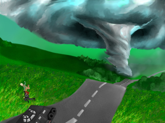
Thank you @firelikestars for letting me do art for their AMAZING FIC!!! Here's the passage from this week's chapter of RADAR ANGEL:
When Aziraphale turned around, he saw a monster. Thick, white clouds billowed around a massive, almost completely formed tornado as it spiraled towards the ground at a rapid pace. It couldn’t have been more than 10 miles away, how on Earth had they missed its beginnings? Dirt and grass sprayed into the air in an instant as it touched down, as if the packed earth was simply a layer of loose dust. The epitome of natural power. The breadth of the funnel began to tear across the field at a speed Aziraphale had certainly read about, but couldn’t have possibly imagined what it would be like to experience. This was intimidation beyond anything he had ever felt. This was terrifying. [...] “Angel!” a desperate voice called from beside him. Aziraphale turned to see Crowley, his eyes wide and wild. “Come on!” Crowley yelled, and started dragging him towards the car. Realizing that he had legs again as well, he followed Crowley’s lead and they took off across the field together. Aziraphale looked down at their joined hands as they ran. They were holding hands. Crowley was holding his hand and taking him to safety.
Read it on Ao3!! 💛💛
[Timelapse and ramblings under the cut]
LOOK. IF YOU AREN'T READING RADAR ANGEL YOU SHOULD. You really should. They write it so well, and the imagery is amazing <3
We were talking and they sent me this excerpt from chapter 7 and OMG I HAD TO PAINT IT. It's so beautiful and powerful. I hope i was able to portray it a little (and i have special spoilers, and there's some really REALLY cool stuff coming!)
I tried to make the tornado really big and powerful, and all that green is actually accurate (somehow)! I don't really know much about meteorology, and i was so surprised when Cody told me the sky can get green during storms.

LOOK AT THAT. I obviously had to make everything so green my eyes hurt. ofc.
I'm not so pleased with the perspective here... I don't believe the birds view is the better choice. It could've been more interesting, and I once more tried to make a more "warped" perspective and failed - BUT looking back at my other works, I think I'm getting there. I feel like I'm improving in creating landscapes and perspectives that don't feel flat :D
ALSO i didn't use line art for this one. I just sort of created blobs of colour and played around shaping them until i was satisfied. There's even fewer layers this time (basically only land, sky, tornado, and one for each smaller detail) because i wanted thing to blend me and play around with the shapes that the colours formed. I liked working like that, it was fun and it made easier to create something organic like the landscape and the clouds.
And then there's the characters and the car... man, storm chaser cars are weird (positive). I had fun doing it too, and the no lineart thing actually worked well for the car? i was really surprised. I'm only sad by how smol Aziraphale and Crowley are here. If the perspective was different, maybe they could have been closer to the first plan, and would have more details. I had to zoom in so much that i started asking myself if i was doing pixel art LMAO and since they so littol I decided to make the edges of them ver sharp using an brush that don't blend, so even if they're itty bitty in relation to everything they still are pretty visible, contrasting with the fuzziness of everything else.

Smol bebes 🤏 I'll put them in my pocket
Anyway. Read Radar Angel. It's so nice!
3 notes
·
View notes