#also carpal tunnel
Explore tagged Tumblr posts
Text
no ghost of you update this week im enduring the horrors (essay season)
2 notes
·
View notes
Text
i have to go back to school in two weeks. graaahhh, arrrgghhhh…ourgghhhhh
#bt#i have to finish my notes before then but ouggrghrj#i love learning but i hate studying#cuz my back hurts whenever i write my notes#also carpal tunnel#and adhd#ourgrgrhshsh#i need to invest in an office chair man#drawing as much as i can rn cuz once i get back academic guilt is nawt gonna let me pick up my tablet pen#yaoi cant save me now
2 notes
·
View notes
Text
#i got carpal tunnel from my job as a car detailer#didn't help that i'm also an artist and used to sleep with my hands in the t rex position tho#polls#submitted#queued#arm#arms#pain#chronic pain#disability
405 notes
·
View notes
Text

helen and paris (and aphrodite)
#this too is yuri#was gonna include og meme but you get it or you dont lol#sorry for the inactivity i am a student and also potential carpal tunnel..eek#tagamemnon#helen of troy#helen of sparta#aphrodite#iliad#paris
733 notes
·
View notes
Text
Here there be dragons >:)
This is animation is an adaptation of page 34 of @steelheart-redux! Go read it! Now!!
#my art#animation#steelheart redux#shr#dragons#also join me in my spell circle to heal sparks' carpal tunnel#maybe together we can manifest it
499 notes
·
View notes
Text
AN ARTIST'S GUIDE TO HANDS
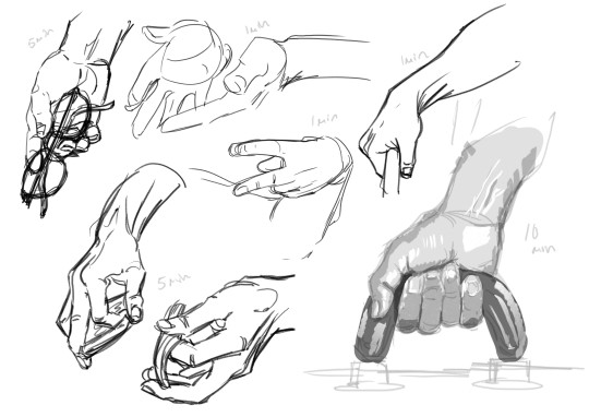
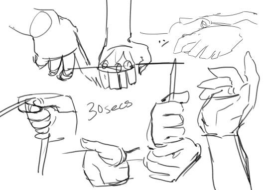
No, sorry it's actually not an artist's guide to drawing hands. Those are just warmup studies (which I'll talk about in this post.)
This is a guide to Your Hands and how to take care of them when making art.
No one ever sits down and teaches artists how to take care of their hands. They didn’t even teach me this while I was in art college. This is just what I've learned myself through years of pain and scouring the internet for advice.
This is going to be a long one and geared towards illustrative traditional/digital/pen/pencil artists specifically, but artists of other mediums and crafts should take care of their hands too! Well, we all should take care of our bodies in general, but this is about hands.
(advice is below the read more)
First off I'm not a professional or anyone with actual medical advice. I'm just some guy with chronic hand pain who makes art. This advice is free for you to use or discard.
WARMUPS!
Ever sit down in the morning to draw and wonder why your art is so stiff and looks so much worse than what you were drawing last night? It's because you didn't warm up!
You know how for physical sports they all warmup and do stretches before getting into the actual sport. To prevent injuries and all that? Yeah, it's good to do that for art too.
One way to warmup is to just draw lines. Try to keep them as straight as you can. Going up and down and diagonal. Draw squares. Big squares. Small squares. Circles! You are warming up, keep it loose and relaxed! Basically just scribble away.

(examples. I usually keep going until there is no paper white left. This can double as practice for drawing straight lines without a ruler, which is a great skill to have when freehand city drawing.)
Before hopping right into drawing people you can try doing some quick gesture drawings. Line of Action has timed sessions with a large variety of clothed or nude models. I usually do the 30 min class as it has a nice balance of short and long timed poses. The point isn't to draw nice art, but to warm up. Try to get the basic form down, not the details. I find that doing a full class session can really help my drawings feel more loose and grounded in reality for the rest of the day.
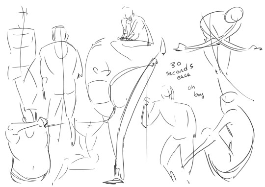
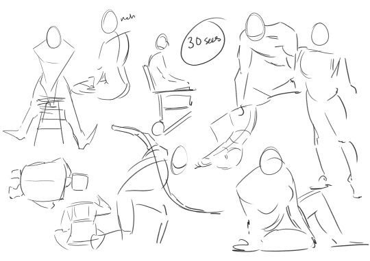
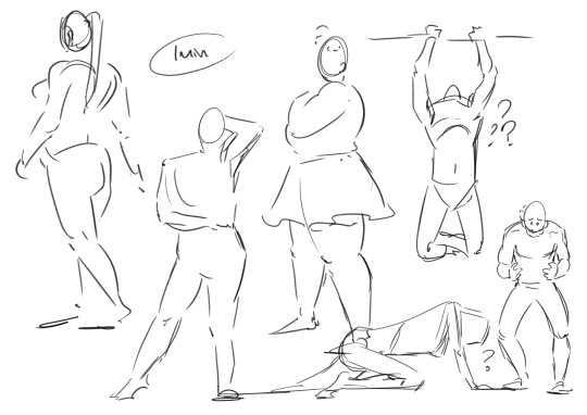
Some examples I found in my folders. I suggest looking into what a line of action (not the site) is and giving it a try with some of the studies!
COOLDOWNS!
For sports it's to return your body back to your everyday baseline after a workout.
Example; you are working on a big project! A masterpiece! It's detailed and cool! You have been focusing on this for hours and drawing so intensely. But you need to stop working for the day.
A cooldown is for winding down out of the go go go mindset. Put away the big project and do a couple small doodles and sketches. You are relaxing your hand and letting it stretch out. Keep the sketches loose. Let the art happen slowly. Don't polish anything, that can happen another day. Just ease yourself out of drawing.
...
Cool! Now we get into the meat of this thing.
HAND PAIN
How to avoid it and how to manage it if you already have it.
I love you artists and creatives, I am begging you to please take care of your most important creative tools. I really don't want this to sound like scare tactics like "oooh you better do this or blah blah!" Nope. I just had to learn all this the hard way and I'm extremely passionate about it.
Take this advice or don’t ╮(゚~゚;)╭ I can't tell you what to do, I'm not your dad
Adjustments and Small Solutions
If you are feeling physical discomfort while drawing there are many different solutions to try! Here are some suggestions that may or may not work for you.
Hold your pencil more loosely. Stop gripping that thang so tightly!!! Relax that hand! They make these… squishy pen grip things... I think they are called Adaptive Pencil Grips or Adaptive Writing/Drawing Aids? They stop your hand from being all cramped up by making your drawing tool wider. It's going to take a bit of time to adjust to drawing with it, but it's worth it for those who hold pencils too tightly.
Don't press as heavily. For traditional art, if you find yourself pressing really hard to get darker lines try moving to a softer pencil. Most standard pencils are HB, the B pencils have softer graphite. Experiment until you find the right one for you. For Digital, adjust your pressure settings so you don't have to press as hard to get thicker lines. You should not be pressing so hard all the time, it wears out both your hand and your tablet! It takes a bit of time to adapt to pencil or pressure changes. Try doing some unimportant sketches, they don't have to be good. You are just training your hand and mind to adjust using less pressure.
Draw with your arm and not your wrist! It's small repetitive motions that cause the most strain. You probably hear this one a lot, what does it even mean? It means moving your arm with the motions of your line, and trying not to make too many tiny movements with your just your fingers or wrist. This one is hard! It takes time and conscious thought to change the habit. Tips? Work bigger. Zoom in more. Use bigger sheets of paper.


(Motions exaggerated for a clearer example)
Change the angle of your drawing surface. They make angled tablet holders, angled desks, angled desktop raisers. Experiment, find and angle that is comfortable and the one that causes the least pain. (It's also good to make sure you don't have to hold your head at an uncomfortable angle when drawing. Staring straight down or hunching over a paper flat on the table can cause pain!)
Compression Glove? Wrist brace/tensioners? Some folks use them and I've been thinking of getting one for years now. I can't give advice on this one, because I don't have experience with it. Look into it if you want!
Managing Pain
First things first.
IF YOUR HANDS START TO HURT WHILE YOU ARE DRAWING. STOP! Put the pencil/pen/paintbrush/whatever down. The art will still be there for you to continue tomorrow.
I know from experience that it's extremely hard to pull away when you are hyper focused on an art piece. It's hard to remember all sorts of basic needs like food or bathroom when hyper focused. But you Need to stop when you feel that pain. (Preferably even before the pain…)
Take Breaks! Let your hands rest when you can. Just like a machine, if you don't schedule maintenance, the machine will schedule maintenance for you. Often that means having to wait a few days for it to return to functional. Best to take a day off from heavy usage or take an occasional 30 min break throughout the day to let your hands rest.
Stretching is important! Full body stretches are good; your arms, shoulders, neck, and spine are all connected, but I'm specifically talking about HAND and wrist stretching. There are a lot of stretches and massages for carpal tunnel and arthritis out there. I find they work for hand pain in general. Move into and out of each stretch slowly. Do not push a stretch if it hurts!! Be gentle!!
I am not a qualified professional and I will not be giving out specific stretches (that is beyond my personal comfort level). There are other artists out there who have made helpful stretching info-graphics which are cool, but I will not be because i don't want to be responsible for someone accidentally hurting themself. Ask your doctor for stretches & advice or look some up on your own.
Don't feel bad about forgetting to stretch frequently! Of course it is good to do it regularly and frequently, but I would be a hypocrite if I said that I remember to stretch daily. Setting timers for stop and stretch sessions can work for some people, but also doing stretches whenever you remember is fine! If you are sitting on the toilet you can idly do some hand stretches. On the bus? Laying in bed? At the beach? Do a couple stretches! Even just once a week is better than… nonce a week.
Using Cold or Heat to treat pain. If you really overdid it, put your hands in some cold water or wrap a cloth around an ice pack and apply it to your hand. Cold works best for me, but warmth works for others. This is just pain reduction and reducing inflammation from overuse! This is not a permanent solution.
If your hand hurts a lot! Frequently! Talk to your doctor? Idk mine has never given real advice. Just gently poked my hand and told me there isn't much to be done about it :/ but there are really good doctors out there who will care and give helpful advice!
Again. IF IT HURTS TO CONTINUE DRAWING. STOP DRAWING! This is not a "no pain no gain" type situation. Drawing so much that you hurt yourself isn't noble, it's just… limiting yourself. You only get one set of hands. These things are very handy to have.
Other Advice
Things I couldn't figure out how to fit into the earlier sections.
Your other hand can't handle the strain! Lets say you hurt your drawing hand... the other hand is right there free to use for art. Right? Wrong. Your other hand can't keep up with the demand, it hasn't been trained to the same extent as your dominant hand, it does not have the built up muscle. If you want to use that hand for drawing you are going to have to use it s l o w l y and train it bit by bit over a long period of time. When I tore a tendon in my right hand I decided to just keep drawing with my left and I got Really Good at it. It only took like two months before my left hand hurt too much to move. Then I had 0 functioning hands to pull up my pants. Not fun!!
People who draw on phones. That is extremely impressive! I'm amazed by the things people can create on such a small space. But phone artists are the ones I see most frequently mentioning hand pain. please please please make sure you are taking breaks. Would a stylus work instead of using a finger?
Outside of Drawing. Sometimes it's things outside of drawing that are causing the pain. For me there are multiple sources, but I also have tiny baby hands. Holding a phone too long causes pain. The handheld mode for my Switch causes A Lot of pain. The way my hand rests while typing on my laptop hurts! Playing tense videogames for too long hurts! Find the source of your pain and make some changes. The same things will apply to most; take regular breaks, do some stretches, and find soft things to prop up or rest your arms on.
Change your Artstyle. This one is more of a last resort. You might have to change your art style if you are getting sharp pains every time you draw. I loved drawing tight clean lines and many small fancy details, but drawing like that left me in so much pain at the end of the day. In 2023 I had to take the better part of year off from illustrations just to learn how to sketch and draw more loosely. I had to learn how to be gentle. To stop gripping my pencil so tightly. Learn! Adapt! You might discover a new style that you love even more!
A lot of this stuff gets more complicated in a work setting where you have to draw fast and long in order to get paid. Things like reducing your workload can help, but that can be... financially rough. But outside of that, it’s ok to be a slow artist. Going full steam and hurting yourself is not worth it.
Aaaaaanyway, thats all folks. Today's rant brought to you by me! The guy with chronic hand pain who always forgets to stretch! The guy who got frustrated with a sketch yesterday and decided to push to keep drawing for just one more hour! The guy who woke up this morning and had to spend 2 hours massaging and stretching their hands. The guy who probably shouldn't have typed all of this out because ooww ow ouch

If your hands do hurt, it's going to be ok! You don't need to be a speed demon who draws all the time. It's ok to take your time and take frequent breaks. You are going to do great things! Just be gentle with yourself...
#art advice#carpal tunnel#hand pain#last tips!#don't punch people... use your elbows or smthn. your hands are too precious to wreck punching a jerk#if you are an artist and enjoy longboarding wear wrist guards. lifesaver fr#i hope this thing is readable. it's long and my eyes are tired#also i am an artist not a writer... forgive my grammar
1K notes
·
View notes
Text

once every few months, ghost gets comfortable enough to leave his mask rolled up at teatime
once every few months, soap gets carpal tunnel
#call of duty#simon ghost riley#john soap mactavish#ghoap#ghostsoap#local woman has something other to offer than angst!#imagine theres 5 more A5s of this or enough to get carpal tunnel#also. thank you so much for your support.#vif
564 notes
·
View notes
Text
Every time I see writing advice like 'remember to stretch your wrists!' I remember the horror my physiotherapist had when he learned I was stretching my wrists before writing but also had chronic nerve pain.
Now this is important. It's nerve pain. He stared at me and then said: Stop stretching.
I stared at him in shock and he said: Muscular pain is different from nerve pain. Stop stretching. Nerves don't respond to stretching like muscles do, it's two totally different treatments. Don't believe me? Stop stretching until our next session and tell me how you go.
And folks I've been free from nerve pain in my wrists ever since. After about a decade. And that's 2 straight years now. 2 years.
I still get muscular pain, which I stretch when that comes up and only when it comes up. But the specific pain I had from ulnar nerve impingement in both hands completely vanished. I was unknowingly making it worse because I thought stretching the nerves was the same as stretching the muscles, and thought the answer applied to everything.
(Tl;dr everyone is different. My physiotherapist is studying to become a medical doctor and will quit out of the field soon, but I always appreciated that everything he told me was solidly backed up with peer-reviewed studies and never came out of nowhere. Also his 'try it for a month and see' was so much better than 'I know I'm right' - because it left a door open for the people who realise what they thought was nerve pain was probably muscular in origin).
#personal#nerve pain vs. muscle pain#different treatments for different things#any writing advice telling you to stretch your wrists#CANNOT be applied universally#until you know exactly what's causing your pain#and friends if it's carpal tunnel or guyon's canal or ulnar nerve#the best treatment is actually resting your wrists#and not stretching#if the stretching is helping chances are there's muscular stuff going on too#anyway i'm not a doctor#but it's worth trying salkfjdsa#also i'm allowed to do other stretching#i just had to unpack the myth that stretching relieves nerves#the same way it relieves muscles/tendons
351 notes
·
View notes
Text
Shout out to fat people with chronic pain. Use that mobility aid, get yourself a tasty treat, and don't give a fuck what anyone else thinks. Your body deserves love and care no matter what!
#thefatfemme#Chronic pain#fat positive#fat liberation#Disabled#body positivity#Self love#fat acceptance#fatphobia#mobility aid#No this has nothing to do with my hips and back screaming today why do you ask#Also if anyone who sees this uses a cane while also having wrist pain#Do you have any good ways of mitigating the wrist pain while using the cane?#Cause I have tendonitis and will likely develop carpal tunnel from grooming dogs and some days my wrists are just terrible#Can't grip for shit#And while rn I can manage without a cane for the most part#there are also days where my back and hips act up and a cane would be a major help
997 notes
·
View notes
Text
why Aurora's art is genius
It's break for me, and I've been meaning to sit down and read the Aurora webcomic (https://comicaurora.com/, @comicaurora on Tumblr) for quite a bit. So I did that over the last few days.
And… y'know. I can't actually say "I should've read this earlier," because otherwise I would've been up at 2:30-3am when I had responsibilities in the morning and I couldn't have properly enjoyed it, but. Holy shit guys THIS COMIC.
I intended to just do a generalized "hello this is all the things I love about this story," and I wrote a paragraph or two about art style. …and then another. And another. And I realized I needed to actually reference things so I would stop being too vague. I was reading the comic on my tablet or phone, because I wanted to stay curled up in my chair, but I type at a big monitor and so I saw more details… aaaaaand it turned into its own giant-ass post.
SO. Enjoy a few thousand words of me nerding out about this insanely cool art style and how fucking gorgeous this comic is? (There are screenshots, I promise it isn't just a wall of text.) In my defense, I just spent two semesters in graphic design classes focusing on the Adobe Suite, so… I get to be a nerd about pretty things…???
All positive feedback btw! No downers here. <3
---
I cannot emphasize enough how much I love the beautiful, simple stylistic method of drawing characters and figures. It is absolutely stunning and effortless and utterly graceful—it is so hard to capture the sheer beauty and fluidity of the human form in such a fashion. Even a simple outline of a character feels dynamic! It's gorgeous!
Though I do have a love-hate relationship with this, because my artistic side looks at that lovely simplicity, goes "I CAN DO THAT!" and then I sit down and go to the paper and realize that no, in fact, I cannot do that yet, because that simplicity is born of a hell of a lot of practice and understanding of bodies and actually is really hard to do. It's a very developed style that only looks simple because the artist knows what they're doing. The human body is hard to pull off, and this comic does so beautifully and makes it look effortless.
Also: line weight line weight line weight. It's especially important in simplified shapes and figures like this, and hoo boy is it used excellently. It's especially apparent the newer the pages get—I love watching that improvement over time—but with simpler figures and lines, you get nice light lines to emphasize both smaller details, like in the draping of clothing and the curls of hair—which, hello, yes—and thicker lines to emphasize bigger and more important details and silhouettes. It's the sort of thing that's essential to most illustrations, but I wanted to make a note of it because it's so vital to this art style.
THE USE OF LAYER BLENDING MODES OH MY GODS. (...uhhh, apologies to the people who don't know what that means, it's a digital art program thing? This article explains it for beginners.)
Bear with me, I just finished my second Photoshop course, I spent months and months working on projects with this shit so I see the genius use of Screen and/or its siblings (of which there are many—if I say "Screen" here, assume I mean the entire umbrella of Screen blending modes and possibly Overlay) and go nuts, but seriously it's so clever and also fucking gorgeous:
Firstly: the use of screened-on sound effect words over an action? A "CRACK" written over a branch and then put on Screen in glowy green so that it's subtle enough that it doesn't disrupt the visual flow, but still sticks out enough to make itself heard? Little "scritches" that are transparent where they're laid on without outlines to emphasize the sound without disrupting the underlying image? FUCK YES. I haven't seen this done literally anywhere else—granted, I haven't read a massive amount of comics, but I've read enough—and it is so clever and I adore it. Examples:


Secondly: The beautiful lighting effects. The curling leaves, all the magic, the various glowing eyes, the fog, the way it's all so vividly colored but doesn't burn your eyeballs out—a balance that's way harder to achieve than you'd think—and the soft glows around them, eeeee it's so pretty so pretty SO PRETTY. Not sure if some of these are Outer/Inner Glow/Shadow layer effects or if it's entirely hand-drawn, but major kudos either way; I can see the beautiful use of blending modes and I SALUTE YOUR GENIUS.
I keep looking at some of this stuff and go "is that a layer effect or is it done by hand?" Because you can make some similar things with the Satin layer effect in Photoshop (I don't know if other programs have this? I'm gonna have to find out since I won't have access to PS for much longer ;-;) that resembles some of the swirly inner bits on some of the lit effects, but I'm not sure if it is that or not. Or you could mask over textures? There's... many ways to do it.
If done by hand: oh my gods the patience, how. If done with layer effects: really clever work that knows how to stop said effects from looking wonky, because ugh those things get temperamental. If done with a layer of texture that's been masked over: very, very good masking work. No matter the method, pretty shimmers and swirly bits inside the bigger pretty swirls!
Next: The way color contrast is used! I will never be over the glowy green-on-black Primordial Life vibes when Alinua gets dropped into that… unconscious space?? with Life, for example, and the sharp contrast of vines and crack and branches and leaves against pitch black is just visually stunning. The way the roots sink into the ground and the three-dimensional sensation of it is particularly badass here:

Friggin. How does this imply depth like that. HOW. IT'S SO FREAKING COOL.
A huge point here is also color language and use! Everybody has their own particular shade, generally matching their eyes, magic, and personality, and I adore how this is used to make it clear who's talking or who's doing an action. That was especially apparent to me with Dainix and Falst in the caves—their colors are both fairly warm, but quite distinct, and I love how this clarifies who's doing what in panels with a lot of action from both of them. There is a particular bit that stuck out to me, so I dug up the panels (see this page and the following one https://comicaurora.com/aurora/1-20-30/):

(Gods it looks even prettier now that I put it against a plain background. Also, appreciation to Falst for managing a bridal-carry midair, damn.)
The way that their colors MERGE here! And the immense attention to detail in doing so—Dainix is higher up than Falst is in the first panel, so Dainix's orange fades into Falst's orange at the base. The next panel has gold up top and orange on bottom; we can't really tell in that panel where each of them are, but that's carried over to the next panel—
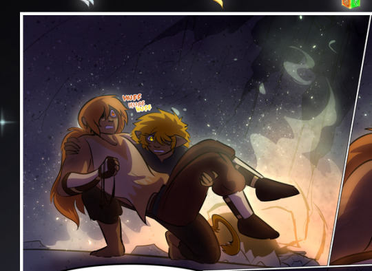
—where we now see that Falst's position is raised above Dainix's due to the way he's carrying him. (Points for continuity!) And, of course, we see the little "huffs" flowing from orange to yellow over their heads (where Dainix's head is higher than Falst's) to merge the sound of their breathing, which is absurdly clever because it emphasizes to the viewer how we hear two sets of huffing overlaying each other, not one. Absolutely brilliant.
(A few other notes of appreciation to that panel: beautiful glows around them, the sparks, the jagged silhouette of the spider legs, the lovely colors that have no right to make the area around a spider corpse that pretty, the excellent texturing on the cave walls plus perspective, the way Falst's movements imply Dainix's hefty weight, the natural posing of the characters, their on-point expressions that convey exactly how fuckin terrifying everything is right now, the slight glows to their eyes, and also they're just handsome boys <3)
Next up: Rain!!!! So well done! It's subtle enough that it never ever disrupts the impact of the focal point, but evident enough you can tell! And more importantly: THE MIST OFF THE CHARACTERS. Rain does this irl, it has that little vapor that comes off you and makes that little misty effect that plays with lighting, it's so cool-looking and here it's used to such pretty effect!
One of the panel captions says something about it blurring out all the injuries on the characters but like THAT AIN'T TOO BIG OF A PROBLEM when it gets across the environmental vibes, and also that'd be how it would look in real life too so like… outside viewer's angle is the same as the characters', mostly? my point is: that's the environment!!! that's the vibes, that's the feel! It gets it across and it does so in the most pretty way possible!
And another thing re: rain, the use of it to establish perspective, particularly in panels like this—

—where we can tell we're looking down at Tynan due to the perspective on the rain and where it's pointing. Excellent. (Also, kudos for looking down and emphasizing how Tynan's losing his advantage—lovely use of visual storytelling.)
Additionally, the misting here:
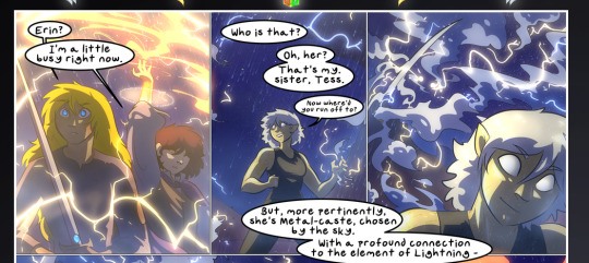
We see it most heavily in the leftmost panel, where it's quite foggy as you would expect in a rainstorm, especially in an environment with a lot of heat, but it's also lightly powdered on in the following two panels and tends to follow light sources, which makes complete sense given how light bounces off particles in the air.
A major point of strength in these too is a thorough understanding of lighting, like rim lighting, the various hues and shades, and an intricate understanding of how light bounces off surfaces even when they're in shadow (we'll see a faint glow in spots where characters are half in shadow, but that's how it would work in real life, because of how light bounces around).
Bringing some of these points together: the fluidity of the lines in magic, and the way simple glowing lines are used to emphasize motion and the magic itself, is deeply clever. I'm basically pulling at random from panels and there's definitely even better examples, but here's one (see this page https://comicaurora.com/aurora/1-16-33/):

First panel, listed in numbers because these build on each other:
The tension of the lines in Tess's magic here. This works on a couple levels: first, the way she's holding her fists, as if she's pulling a rope taut.
The way there's one primary line, emphasizing the rope feeling, accompanied by smaller ones.
The additional lines starbursting around her hands, to indicate the energy crackling in her hands and how she's doing a good bit more than just holding it. (That combined with the fists suggests some tension to the magic, too.) Also the variations in brightness, a feature you'll find in actual lightning. :D Additional kudos for how the lightning sparks and breaks off the metal of the sword.
A handful of miscellaneous notes on the second panel:
The reflection of the flames in Erin's typically dark blue eyes (which bears a remarkable resemblance to Dainix, incidentally—almost a thematic sort of parallel given Erin's using the same magic Dainix specializes in?)
The flowing of fabric in the wind and associated variation in the lineart
The way Erin's tattoos interact with the fire he's pulling to his hand
The way the rain overlays some of the fainter areas of fire (attention! to! detail! hell yeah!)
I could go on. I won't because this is a lot of writing already.
Third panel gets paragraphs, not bullets:
Erin's giant-ass "FWOOM" of fire there, and the way the outline of the word is puffy-edged and gradated to feel almost three-dimensional, plus once again using Screen or a variation on it so that the stars show up in the background. All this against that stunning plume of fire, which ripples and sparks so gorgeously, and the ending "om" of the onomatopoeia is emphasized incredibly brightly against that, adding to the punch of it and making the plume feel even brighter.
Also, once again, rain helping establish perspective, especially in how it's very angular in the left side of the panel and then slowly becomes more like a point to the right to indicate it's falling directly down on the viewer. Add in the bright, beautiful glow effects, fainter but no less important black lines beneath them to emphasize the sky and smoke and the like, and the stunningly beautiful lighting and gradated glows surrounding Erin plus the lightning jagging up at him from below, and you get one hell of an impactful panel right there. (And there is definitely more in there I could break down, this is just a lot already.)
And in general: The colors in this? Incredible. The blues and purples and oranges and golds compliment so well, and it's all so rich.
Like, seriously, just throughout the whole comic, the use of gradients, blending modes, color balance and hues, all the things, all the things, it makes for the most beautiful effects and glows and such a rich environment. There's a very distinct style to this comic in its simplified backgrounds (which I recognize are done partly because it's way easier and also backgrounds are so time-consuming dear gods but lemme say this) and vivid, smoothly drawn characters; the simplicity lets them come to the front and gives room for those beautiful, richly saturated focal points, letting the stylized designs of the magic and characters shine. The use of distinct silhouettes is insanely good. Honestly, complex backgrounds might run the risk of making everything too visually busy in this case. It's just, augh, so GORGEOUS.
Another bit, take a look at this page (https://comicaurora.com/aurora/1-15-28/):
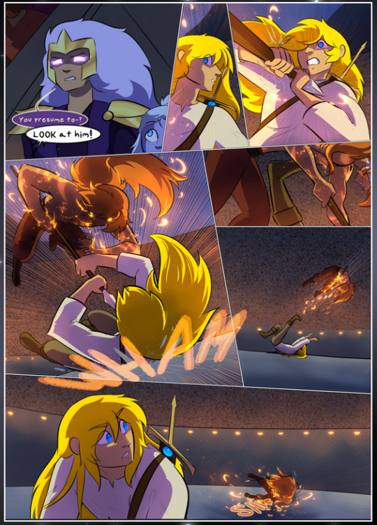
It's not quite as evident here as it is in the next page, but this one does some other fun things so I'm grabbing it. Points:
Once again, using different colors to represent different character actions. The "WHAM" of Kendal hitting the ground is caused by Dainix's force, so it's orange (and kudos for doubling the word over to add a shake effect). But we see blue layered underneath, which could be an environmental choice, but might also be because it's Kendal, whose color is blue.
And speaking off, take a look at the right-most panel on top, where Kendal grabs the spear: his motion is, again, illustrated in bright blue, versus the atmospheric screened-on orange lines that point toward him around the whole panel (I'm sure these have a name, I think they might be more of a manga thing though and the only experience I have in manga is reading a bit of Fullmetal Alchemist). Those lines emphasize the weight of the spear being shoved at him, and their color tells us Dainix is responsible for it.
One of my all-time favorite effects in this comic is the way cracks manifest across Dainix's body to represent when he starts to lose control; it is utterly gorgeous and wonderfully thematic. These are more evident in the page before and after this one, but you get a decent idea here. I love the way they glow softly, the way the fire juuuust flickers through at the start and then becomes more evident over time, and the cracks feel so realistic, like his skin is made of pottery. Additional points for how fire begins to creep into his hair.
A small detail that's generally consistent across the comic, but which I want to make note of here because you can see it pretty well: Kendal's eyes glow about the same as the jewel in his sword, mirroring his connection to said sword and calling back to how the jewel became Vash's eye temporarily and thus was once Kendal's eye. You can always see this connection (though there might be some spots where this also changes in a symbolic manner; I went through it quickly on the first time around, so I'll pay more attention when I inevitably reread this), where Kendal's always got that little shine of blue in his eyes the same as the jewel. It's a beautiful visual parallel that encourages the reader to subconsciously link them together, especially since the lines used to illustrate character movements typically mirror their eye color. It's an extension of Kendal.
Did I mention how ABSOLUTELY BEAUTIFUL the colors in this are?
Also, the mythological/legend-type scenes are illustrated in familiar style often used for that type of story, a simple and heavily symbolic two-dimensional cave-painting-like look. They are absolutely beautiful on many levels, employing simple, lovely gradients, slightly rougher and thicker lineart that is nonetheless smoothly beautiful, and working with clear silhouettes (a major strength of this art style, but also a strength in the comic overall). But in particular, I wanted to call attention to a particular thing (see this page https://comicaurora.com/aurora/1-12-4/):
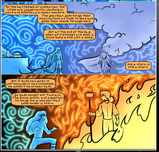
The flowing symbolic lineart surrounding each character. This is actually quite consistent across characters—see also Life's typical lines and how they curl:
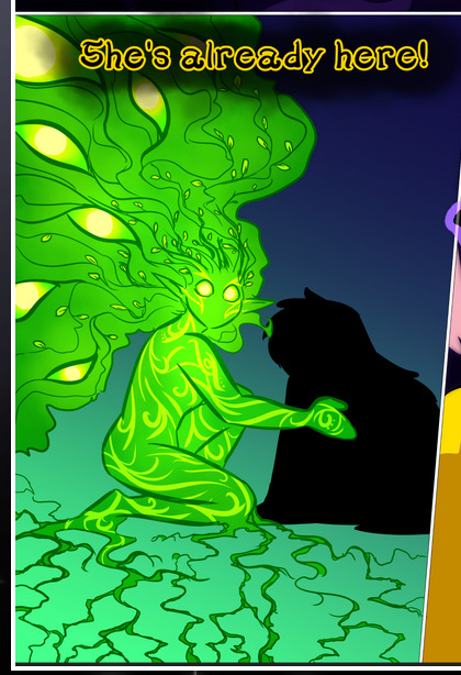
What's particularly interesting here is how these symbols are often similar, but not the same. Vash's lines are always smooth, clean curls, often playing off each other and echoing one another like ripples in a pond. You'd think they'd look too similar to Life's—but they don't. Life's curl like vines, and they remain connected; where one curve might echo another but exist entirely detached from each other in Vash's, Life's lines still remain wound together, because vines are continuous and don't float around. :P
Tahraim's are less continuous, often breaking up with significantly smaller bits and pieces floating around like—of course—sparks, and come to sharper points. These are also constants: we see the vines repeated over and over in Alinua's dreams of Life, and the echoing ripples of Vash are consistent wherever we encounter him. Kendal's dream of the ghost citizens of the city of Vash in the last few chapters is filled with these rippling, echoing patterns, to beautiful effect (https://comicaurora.com/aurora/1-20-14/):
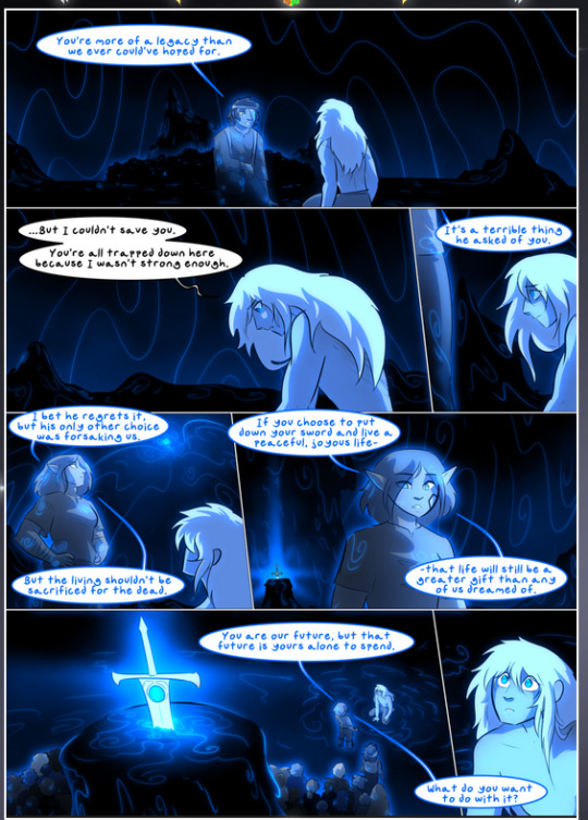
They ripple and spiral, often in long, sinuous curves, with smooth elegance. It reminds me a great deal of images of space and sine waves and the like. This establishes a definite feel to these different characters and their magic. And the thing is, that's not something that had to be done—the colors are good at emphasizing who's who. But it was done, and it adds a whole other dimension to the story. Whenever you're in a deity's domain, you know whose it is no matter the color.
Regarding that shape language, I wanted to make another note, too—Vash is sometimes described as chaotic and doing what he likes, which is interesting to me, because smooth, elegant curves and the color blue aren't generally associated with chaos. So while Vash might behave like that on the surface, I'm guessing he's got a lot more going on underneath; he's probably much more intentional in his actions than you'd think at a glance, and he is certainly quite caring with his city. The other thing is that this suits Kendal perfectly. He's a paragon character; he is kind, virtuous, and self-sacrificing, and often we see him aiming to calm others and keep them safe. Blue is such a good color for him. There is… probably more to this, but I'm not deep enough in yet to say.
And here's the thing: I'm only scratching the surface. There is so much more here I'm not covering (color palettes! outfits! character design! environment! the deities! so much more!) and a lot more I can't cover, because I don't have the experience; this is me as a hobbyist artist who happened to take a couple design classes because I wanted to. The art style to this comic is so clever and creative and beautiful, though, I just had to go off about it. <3
...brownie points for getting all the way down here? Have a cookie.
#aurora comic#aurora webcomic#comicaurora#art analysis#...I hope those are the right tags???#new fandom new tagging practices to learn ig#much thanks for something to read while I try to rest my wrists. carpal tunnel BAD. (ignore that I wrote this I've got braces ok it's fine)#anyway! I HAVE. MANY MORE THOUGHTS. ON THE STORY ITSELF. THIS LOVELY STORY#also a collection of reactions to a chunk of the comic before I hit the point where I was too busy reading to write anything down#idk how to format those tho#...yeet them into one post...???#eh I usually don't go off this much these days but this seems like a smaller tight-knit fandom so... might as well help build it?#and I have a little more time thanks to break so#oh yes also shoutout to my insanely awesome professor for teaching me all the technical stuff from this he is LOVELY#made an incredibly complex program into something comprehensible <3#synapse talks
786 notes
·
View notes
Text
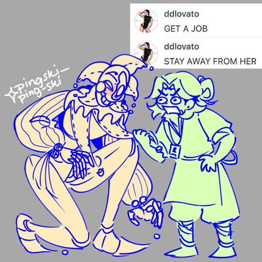
the girls are fighting
#pingdoobles#fnaf daycare attendant#fnaf dca#fnaf sun#fnaf sb#sundrop#dca#dca au#dca community#dca fandom#pluck my heartstrings#fnaf dca au#pmh sun#IM BACK!!! feels weird to draw again i haven't actually touched my tablet and drawn ANYTHING in 5 days which is so strange#i draw pretty much every day or every other day so it's weird for me#make sure u stretch frequently guys and take care of yourself also DONT get carpal tunnel in both your hands :thumbs_up:#guys im 5'1 if we're generous idk what the size diff is i just know he's like 8-9 ft tall#i will still go toe to toe with this lanky ass bastard and get my ass whooped all the same
307 notes
·
View notes
Text
one of these years... ONE OF THESE YEARS.... people will send me nice / normal messages instead of whatever this is LMAO

#(pushes glasses up face) heh... curious... you used to claim you had back pain... now you say you also have other problems....#tsk tsk tsk... excuses... we all know that carpal tunnel and mental illness are not real.... now give me the free art you feeble Female#sergle.txt#mark my words it'll happen. people will act human towards me at some point. It'll happen for sure#I like the implication that the only reason I needed my breast reduction was so others could get more art out of me#and not because the pain and discomfort was inhibiting my life
163 notes
·
View notes
Text

my hands are hurting, drew keikei to cope!!!
#been doing wrist stretching and wore my splint. but they're still hurting kinda bad.#like when i twist my right hand. the ache's pretty uGLYY!!!#and my left hand: from my wrist up until the entirety of my pinky finger also feels iffy but tolerable.#tho my mistake was i was still drawing the entire day + doing chores like washing dishes so thats prolly why they still hurt#CARPAL TUNNEL DO BE SO BAD!! EUGH#my art#2024#haikyuu#haikyuu!!#hq#hq!!#haikyu#haikyu!!#tsukishima kei#kei tsukishima#tsukki#haikyuu tsukki#haikyuu tsukishima#hq timeskip#haikyuu timeskip#art#fanart#digital art#digital drawing#sketch#doodle#anime#manga
158 notes
·
View notes
Text

we’re the has-beens of husbands, sharpening the knives of young wives
#ITS FINALLY DONE YAYYYYYY#there r like 4 references 2 the music video here teehee >:3#scribbles draws a thing#the carpal tunnel of love#fall out boy#fob#andy hurley#patrick stump#pete wentz#joe trohman#fob art#fob fanart#watercolour art#god this took forever#hope yall like it<3#ignore how pete is too small#shush#also im like horrible at drawing joe thats why i nvr draw him so idk sorry
125 notes
·
View notes
Text

You know where to find me~
And I know where to look~
#fence posts#skizzleman#zedaph#hermitcraft#hermitblr#skizzaph#hermitshipping#hermitshipblr#me when I see pink and blue together (it’s skizzaph)#honestly this drawing was a realky fun challenge to do in a cartoony style :P#also I think this drawing gave me carpal tunnel cuz owchie owchie owie (which is incredibly bad as I have so so many tests in the next week)
374 notes
·
View notes
Text

MITHRUN IS OF TOL INSTEAD OF KERENSIL DUE TO MARRIAGE don't lemme see people "correcting" me in tags or comments when it's in all caps
anywho, this was going to be another illustration for my fic, but didn't work out ie couldn't fit a scenario like it in the upcoming chapter that i'm still working on. decided to post it anyway 'cause i had fun. PS that's a phone Kabru's got, didn't feel a need to finish a background after all that plaid
#dugeon meshi#kabumisu#kabru#mithrun#you can literally see where my carpal tunnel flared up#never drawing plaid again#if mithrun's dress looks off that's because it is indeed on purpose#he's still super underweight at this point and while the bodice and skirts have been tailored#due to their design of the tight waist and large shoulders he still kind of drowns in them#i'm quite partial to those large shoulder sleeves#style inspirations for the fic and drawings are 1890s and 1910s#though i feel marcille fits better with the 1850s/60s with their full skirts#but HEY this fic also takes place in bizzarro year 3000+ so does it REALLY matter?#no no it does not matter we just going where it feels right
83 notes
·
View notes