#also another colored square background
Explore tagged Tumblr posts
Visit Tumblr Blog
Explore Tumblr blogs with no restrictions, modern design and the best experience.
Last Seen Tumblr Blogs


Fun Fact
Post activity is at the highest at 4:00 pm EDT; notes peak at 10:00 pm EDT.
Text

sketch of my warden :] really enjoying origins so far
#dragon age#dragon age origins#grey warden#da:o#dragon age fanart#da: origins#boooo boo another half body with a color square in the background tomato tomato#anyways im like 8 hours in but the learning curve is crazy#im so bad at tactical combat LMAO#IM MAKING IT WORK THOUGH!!! and its super fun to figure out im just built for action combat systems#im kind of deeply obsessed with alistair so far#silly silly guy and im actually really into his voice performance#one of the most real sounding video game characters ive heard#the voice performances in general are actually really good lol#i like playing elf mages it seems also.#im a sucker for spellcasting and just generally never pick humans#also this game's dialogue trees are SO in depth???? love it#itseart
251 notes
·
View notes
Note
your rendering is so good how do you do it
Thanks, I love your rendering too!! Gonna try and make a tutorial ^^
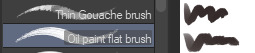
To start off, I'm on Clip Studio Paint and these are the brushes I use! First two for rendering characters (round brushes) and the other two for mostly backgrounds (square brushes)

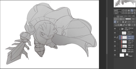
I used to do lineart, but it takes too long >:( now I just make a sketch and sorta clean it up!

Next I fill it in with a gray color. For simpler pieces I just put in the flat colors, but for more paint-y pieces I do grayscale -> color! I'll be doing that here :)
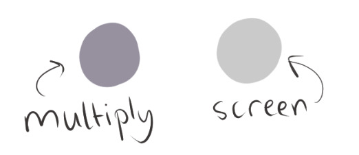
Also, I make 3 clipped layers on top of the gray - two are multiply, and the top one is screen. On the first multiply, I do a soft gradient using an airbrush
On the next multiply layer, I fill everything in with either a cool-ish or warm-ish gray, depending on the mood ^^
I also determine a light source, and use the lasso tool on the screen layer to block out where (I think) the light hits! Tbh I just do wherever feels right lmao, but I recommend having a reference! I like doing it in triangle patterns
Then adjust the opacity of each layer to whatever feels right, and merge everything (I don't merge the sketch/lineart yet, I do it before adding colors in!)
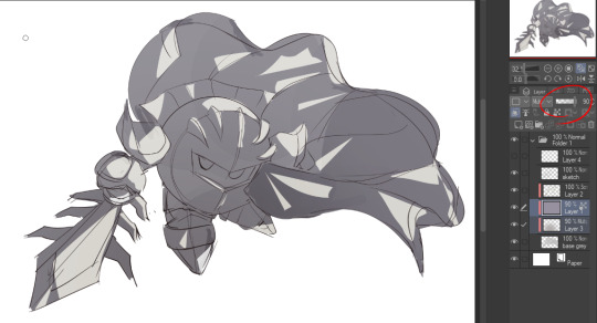
Now... rendering. Some tips I have are color pick (greys) off of the canvas and use them to paint! Clean up the sketch more, erase edges, but I save details (like Galaxia's red gem, his eyes, etc.) for the end, or during coloring.
After I'm sorta happy with it, I merge the sketch layer, then duplicate it, and add a gradient map! I did this sunset-y one but changed the hue to yellow-ish, then lowered the layer's opacity ^^
Play around with the hue-saturation-luminosity setting!

Now go crazy with blending modes! Multiply, overlay, color, glow/color dodge, etc. Feel free to layer them up on top of each other too, and this is to add the character/piece's actual colors in. For example, I used a white-blueish overlay layer for his mask and glove, blue for his cape, blah blah
Now I clean the sketch up/refine it more. Also, to "harmonize" the color palette, you can add a colored gradient on top. Then set it to multiply, and add overlay/glow dodge layers with any colors you see fit! I like using teal and light/warm orange! Here is an example of a colored gradient:
Another tip is to add saturated colors on the edges of both lighting and darker shadows, before blending it:

Also I usually add in a light blue/grey in shadowy areas, and lower the opacity for reflective light:

Also! You can lasso + use an airbush with a light blue to block out parts of the background (his cape here, for example). It helps with more depth!
Finally, I like adding sparkles on low opacity :3 And gaussian blur to certain areas! I'm using radial blur on this piece though ^^

For the background, I like doing blocky shapes!! I use my square brush on 90% ish opacity, to color pick different hues from the piece. For lighting I use a glow dodge layer, here's a mini timelapse as well as the finished art!
At the very end, play around with the hue/saturation and contrast tools to change the colors :)
#iiii hope this helped??#first time making a tutorial sorry!!#art tutorial#kirby meta knight#meta knight fanart#meta knight#nintendo kirby#kirby nintendo#kirby fanart#kirby series
591 notes
·
View notes
Text
okay. okay this is not a serious theory but every time I think about it I come up with new "evidence" for it. basically the gist of it is TAWOG'S SHAPE PEOPLE ARE EUCLYDIANS. maybe refugees? "but didn't everyone in eucyldia die?" ignore that. just pretend they skipped town before the fire or something, this is not airtight. it's not even close. it's basically a joke treated seriously. i know the shows are not in the same universe but
hear me out.

Part 1: At face value.
point numnber one: these guys are 2D. the gumball universe has 3D people and 2D people, and the Shape People are 2D, or drawn as opposed to modeled.
point number two: physical traits! other than the obvious 'they are shapes', some or all of the Shape People:
Lack visible mouths (mind you, these Shape People's mouths appear when they speak). Bill also lacks a visible mouth but very occasionally gets one (one page of the Book of Bill, a polaroid in the Weirdmageddon intro).
Can have one eye. the rectangle in the top image is a one-eyed shape person, but there's also this familiar-looking yellow one-eyed triangle Shape Person (who pre-dates Bill's first proper appearance, by the way):

They have noodle arms. little noodle arms
this one is hard to explain but the positions of their arms aren't fixed. this applies to all/most Gumball characters but not to all gravity falls characters. how do I explain this uhh

look at how one of his arms is attached to his bottom plane and one is attached to his side plane. sometimes both of them hang down at the bottom and sometimes both are on the sides. POINT IS-


look at that!
in the rightmost image above you can also see a tiny sliver of a 3D edge like Bill has.
Each Shape Person is also a single color.
Part two: Culture.
note: this one only really applies to the three shapeople i've been using as examples this whole post- Ed the triangle, and his black pentagon and rectangle friends? family members?
I know there are other shapes who look less like them and whom these things don't apply to, but we can blame that on interbreeding with Elmoreans/cultural assimilation or something. okay, let me begin.
point number three: Ed's group is implied to not be from Elmore. when we first see him he's mistaking a bus stop for another shape person:

he also-
point four: the Shapeople language includes one spoken(?) system with colorful squares representing it. on the TBOB website the words of Euclydians are written in colorful square substitution cipher. there are also other shapes for the shapeople, mind you.


back to point 3: not from Elmore. The next time Ed's group appears, they're framed like tourists and ARE HAVING TROUBLE MAKING SENSE OF A 3D (well, i guess 2d but in the other way) MAP.


Gumball tries and fails to talk to them in their language, and ends up making a cultural faux pas. and in Ed's final scene there's an interesting line...

my people? He could be talking about his species, but the existence of a culture implies to me that this line refers more to a homeland. in other words the shape people are from the same place, which we sort of knew because they speak the same language. also has bill ever been seen giving a thumbs up or down? i'm pretty sure he hasn't but maybe I'm wrong, someone correct me here.
point number five: grasping at even more straws.
Despite their origin, the one known named shape person's name is Ed, which falls into the same cultural sphere as Bill.
We know that Ed's type of shapeople are physically capable of speaking English because the black rectangle does so at one point.
one of the symbols in the shapeople language is a skull. we see that Bill's mind has a bill skeleton with a skull that also fits the humanoid-ish template.
final point that does not help the theory but is still weird: Bill's baby photo seems to have a live-action background?? and so does the image of teen/preteen bill? look at these. i'm not implying that elmore IS euclydia somehow, that makes very little sense to me as of writing (though i guess it was destroyed and now Bill has a fear of TV static, which, like, maybe I could phenagle a theory here if I really tried but it seems like even more of a reach than this existing theory.) I dunno, maybe Euclydians would have wanted another 'realistic' dimension to flee to.


(we also see this squishy rosy-cheeked shaperson baby at one point, make of it what you will).
#the amazing world of gumball#gravity falls#tawog#tbob spoilers#theory...#i have to stress how not serious i am about this#euclydia#shape people#postfallofit#postfallfallsfalsestarts#“but wouldnt this make gumball take place 1 trillion years before gravity falls?” yes#someone write a fanfic about this because i am not going to add yet another fic to this blog
169 notes
·
View notes
Text
Book Of Bill Spoilers‼️
Rant about Bill’s Original dimension
OKAY I REALLY NEED TO TALK ABOUT THIS BECAUSE IT HASENT LEFT MY MIND
Bill’s world is COMPLETELY DOGSHIT AND OPPRESSED HIM IN EVERY WAY POSSIBLE
We know that Bill’s world is very similar to Edwin Abbott’s Flatland, as said in the Bill Cipher AMA and the picture of flatland in the book if bill on the chapter cover of his origins.


So we can assume that the same laws and way of life that exists in flatland also apply to Bill’s dimension.
First of all, Bill could be canonically adopted.
Just to give a little background, in flatland, if a shape has a son (only men are shapes, women are lines) that shape gains one side. (A square has a son, it’s a pentagon and etc). Isosceles triangles that are deemed acceptable to have kids don’t follow this rule. The isosceles triangle would correct one of its angles by a half a degree, continuing until they become an equilateral triangle. This is their whole purpose so that they can eventually have a triangle start a new line of polygons that can make circles.
In Flatland, isosceles are deemed lower in society than polygons and are less educated than polygons. So once an isosceles triangle has a equilateral child, they are IMMEDIATELY TAKEN AWAY FROM THEIR FAMILY AND PUT WITH A POLYGON FAMILY SO THEY CAN BE INTEGRATED INTO A “NORMAL” SOCIETY AND NOT CORRUPTED BY THE ISOSCELES.
Not only is Bill’s existence really rare and takes a lot of time and generations, he is immediately taken away from his family and put in a family that are higher on the social latter than him. This could EASILY lead to his family not respecting him in any way. (Really proves what Hirsch said in one of his Q&A)

Another thing that royally fucks him over is his mutation to see the third dimension
He was born with mutation that if he even TALKED about it he would be EXECUTED. A square (the protagonist of Flatland) was only sent to jail for life but since Bill is a triangle he would have easily been executed, no questions asked. The flatland government loves executing people in the book. That’s like if a person was color blind and said the sky was grey they would be killed.
So Bill’s vision is illegal, he’s the lowest on the social chain, in a family that is higher socially and could easily discriminate against him. What else could his family do?
FORCEFULLY MEDICATE HIM WITHOUT HIM KNOWING.
Yeah on the silly straw page the codes tell us that Bill when he was younger was taken to the eye doctor by his family and got a sort of prescription that made the 3rd dimension go away. We don’t know how long he didn’t know but we can assume it was for a while.
“The Doctor says Three sips a day Will make the visions Go away”
“Eye doctor of a different kind Who wants to make his patient blind”
He was literally forced to be normal.
And to get off track a little, I understand that “make his patient go blind” means ‘blind from the truth’ but what if they actually tried to make him go blind so he couldn’t see the third dimension anymore?? DO YOU REALIZE HOW FUCKED UP THAT IS?? BILL IS BASICALLY THE GYPSY ROSE OF HIS UNIVERSE
Back on track we also need to talk about how Bill DESPISED being normal.
We know that Bill is a wild person, always looking to have fun, loves the weird things in life! But in his world, everyone hated things that were not socially acceptable. In his universe, his socially assigned purpose in life was to get a family and have kids. Like I said, everyone wants to have kids in his universe that eventually become circles (the highest on the social latter). Bill would NEVER want to have such a boring and meaningless life! For his only purpose was to continue a line of oppression and meaningless things like “social status”. But his world would probably force him to have kids or else throw him in jail.
Really explains why he said no one has a purpose, and that you can make your own, because he made his own.


Also his differences caused him to possibly get bullied in school. This is implied from his description of his pyrokenesis power

There’s a bunch of reasons why he would want to destroy his dimension, But from what we know, it was completely by accident. Now we don’t know if he was lying, but from his origins page and the other evidence we know that it was at least partially on accident or something that so out of control that it destroyed his whole dimension. He wanted to prove everyone wrong by showing them the beautiful stars he saw, but ended up killing them instead.


And he regrets it.
He had SO MANY reasons to hate his dimension and destroy it without a second thought, but he misses it, misses his family, his people. They haunt him.
None of this trauma excuses anything he does in the future, but the fact that he misses such a horrible place that treated him terribly to where he literally goes insane from guilt and self hatred is truly tragic.
If anyone has anything to add to the “shitty things that happened to Bill in his universe” feel free to add!
#gravity falls#the book of bill#rant post#analysis#Bill’s Dimension#LONG LONG RANT#Flatland is fucked up#sorry long post#sorry not even remotely sorry#he’s so traumatized
128 notes
·
View notes
Text
New Hobby Alert!! Knitting
Alright guys, everyone and their mother (including mine) seems to adore knitting, but where's the finesse? Where's that umph?! Where is the vision of an old lady clicking her two needles together to the irritation of everyone on a train????!!! That's right, I have entered my grandmother era as the weather starts to chill and picked up knitting and here are my thoughts that no one asked for:
Knitting is as close to meditation as my distracted brain can get.
Love that I can watch youtube in the background and pretend its productive because I am knitting as I do it.
There are way more stitch types than I thought.
There are way more patterns out there than I thought.
In classic overachiever fashion, I have decided to try and knit a tapestry. Yes, I have only ever made a scarf. No, I don't know how to knit with two colors. No, I don't know what the fuck floats are (seriously though, do they matter? At the end of this I have some questions to ask yall).
Bonding with my mom feels nice!
Also free gifts I can give to people because my mom has a bunch of small balls of yarn and I can just make little squares and turn them into bunnies (tutorial I used). Pics below the questions if you want to see.
Why is it that with every other product you can throw away the label, but with knitting not only do you have to keep the yarns label to know how to properly use it, but also every other tools label too? This is bullshit.
On the flip side of that, I think it is super cool that the labels have patterns that utilize the yarn on the back.
Finally, I am glad I started this. It really has introduced me to some really cool people and I've found a little community through knitting.
Questions below (pls if you know answer them, ya girl is struggling)

Ok so this is the pattern I want to do. The issue is that on row one, it is a 9 stitch float and I don't know how to avoid that. Is there a way to pin it down? If so can you show me a video for it?
Another question I have is, is the knit stitch supposed to look like a classic 'V' in the front but, purl in the back? What is the benefits of switching between purl and knit? Is it just for stretchiness? Also I think I bastard-ized my purl. Essentially, I just did a knit stitch but, every time I transferred all the knits to one side, I switched which hand my needles were in basically just only knitting with one hand for all the rows. I can't remember which hand I started with. Below is the result.


Is there a tool where you can input a pattern (like the one I have above) and then it can track what row you are on for you? Like it highlights the row you are on and then when you press space it moves up a row? That would be so fricken cool if it did.
Lastly, here are the promised progress pics:


Should have chosen a different button for the tail but oh well.
#knitting#fabric arts#crochet#yarn crafts#yarnblr#crochetblr#free stuff#yarn#stitching is wild#start somewhere#cheap
53 notes
·
View notes
Text
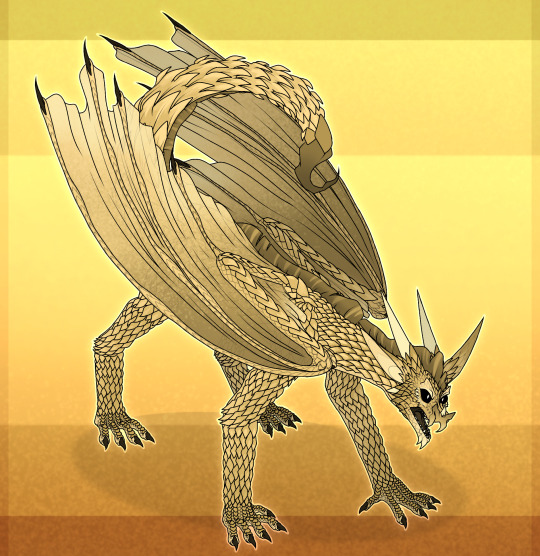
Dragons of Pyrrhia (headcanon designs)
• Skywings:
-The shape of thorns on the spine is similar to the feathers of birds
-Narrow pupil, giving dragons very good vision, allowing to see a clear picture at long distances
-Arrow point, able to drive through the opponent with a sharp push
-The shape of the wings is similar to that of a bird
-Are the best flying dragons
-High ears, good hearing but inferior to sand and night dragons
-Very sharp claws, thorns, horns
-Pent face; the upper jaw may have various shapes, reminiscent of beaks of different birds
-Height reaches 4 meters
*The design was based on common European dragons and birds
• Mudwings:
-Rounded horns of various forms (like the horns of sheep, buffalo, bulls and goats). Necessary for defense
-The keeper of the horned nest is bigger than the other dragons from one clutch
-Large lower fangs, needed for eating and defense
-A large, rectangular muzzle with raised nostrils facing upwards so that the earthy could breathe, being almost entirely in water or mud and only looking at the top of its head
-Very mobile ears, necessary to discharge dirt/water that has entered
-Solid scale, which in some way pulls the face, because of which the grounders look almost emotionless and dark (this feature appears with age, so dragons look too cheerful and emotional against their background)
-On the sides of the neck and tail are thorns, same as on the back, extra protection for weak spots of the dragon
-Massive tail with a cluster of large thorns at the end, some kind of a pin necessary for protection. The tail itself is very mobile
-Although they are predatory animals, their pupils have square
-In general, the earthlings are slow moving, fly worse than other dragons due to their massive and heavy
-Some of the largest dragons, second only to ice, due to their short limbs and neck (reaching up to 5 meters)
*The design was based on ankylosaurus, crocodiles and artiodactyls
• Seawings:
-Long, massive tail with fins that may differ in different individuals
-Behind the ears is a fin with luminous appendages
-Round/oval eye
-Round, flat face (in the perspective where I drew this not very noticeable), giving a more rounded shape to the whole body
-There is a sexual dimorphism (external differences of the sexes). The distribution of the proboscis on the mordocus is different: in males they are near the nostrils, in females on the chin. With age the proboscis becomes longer
-2 row of teeth
-No earshell
-Horns often turn in
-Luminous glands and patterns are not only necessary for underwater communication, but also for attracting marine life in the dark
-They have, like earthen, rather short limbs. Only in the case of marine this feature is caused by frequent presence in water, where they use the tail more often than the paws for movement
-Also, the flying is not very good. But unlike the earthly, they have another reason, namely the anatomy of the wings, which is more adapted to swimming (plays the role of certain fins) than for flying
-Not too big, can reach a maximum of 2.5 meters
*The design was based on sharks, deep sea fish and partly dolphins
• Rainwings:
-Snake face (or more precisely, face of a cobra)
-Clawfoot
-The hind legs have a specific structure: 3 long fingers and one opposite finger located on the other end of the paw (structure like bird's feet)
-Double nostrils
-Huge ruffs, which in the stressful environment is fully opened and gives the dragon magnitude
-Eye structure closer to the snake
-Movable thorns on the neck (play the same role as the ruffs)
-Long horns with multiple ends, which resemble tree branches
-The horns themselves are brown in color, with few scales on them to completely change their color. Horns are usually hidden among the same branches, which have grown in the forest
-Long flexible neck, able to writhe like a snake
-The eye also has a collar resemblance, is some protection of the eye from branches and other foreign objects
-Claw on the thumb of wings is very long, the end slightly bent. It is necessary to grab with the help of wings branches
-Height reaches 3 meters
*The design was based on snakes, chameleons, dilophosaurus (Jurassic Park ver.), geckos, flying foxes and partly tropical birds
• Nightwings:
-Nose of a bat giving dragons good sense
-Huge ears, thanks to which they have a sensitive ear, the best among all dragons
-In addition to silver teardrop scale may have a star on his forehead, which shows the ability to see the future
-There are night with black teardrop and stars indicating that the dragon was born during the moon, but the egg was hidden from their light, because of which the night ability is not and only the black scales indicates its lost ability
-The lower part of the body, from the neck to the beginning of the tail, is present with a small fur that was previously necessary for warming itself and eggs (due to the low temperatures at night, during which the night wakes). But due to the relocation first to the volcanic island, then to the rainforest, the wool became practically useless
-There is a glare in the pupils, it does not affect the vision
-Good night vision, besides their eyes can shine in the dark (like cats)
-Structure of the hind feet specific: 4 long fingers (much longer than rainwing) and one opposite finger. This is necessary for strong coupling between branches and other surfaces
-Claws on the hind legs are also much sharper than on the front (for the same reason as the leg structure itself)
-Small web on the wings between the thumb and the rest. Need to use thumb to grab objects (similarly rainwings)
-Not too big, reach a maximum of 2-3 meters, but there are exceptions
*The design was based on the work of chiroptera, especially bats
• Sandwings:
-The upper fangs are very close to the nostrils, creating the illusion that they seem to grow from the nose
-Long ears, necessary for heat transfer and to prevent overheating. (the crest, presumably, also plays a similar role) Also add a dragon's pretty good hearing
-More than half of the body is covered with hard scales. Such armor is more necessary for dragonets, whose poison is much weaker than the adult dragons. For protection they curl into a ball, pointing up the tail with a spike. Because of their hard from the genus scales it is difficult to pierce them. By old age, these scales become much softer than in childhood
-End of the tail, namely a thorn, similar in structure to the tail of a scorpion
-Crest has the property of "flattening", so many individuals have some streaks
-Growth reaches 3.5-5 meters
*Design based on girdle-tail lizards and scorpions
• Icewings:
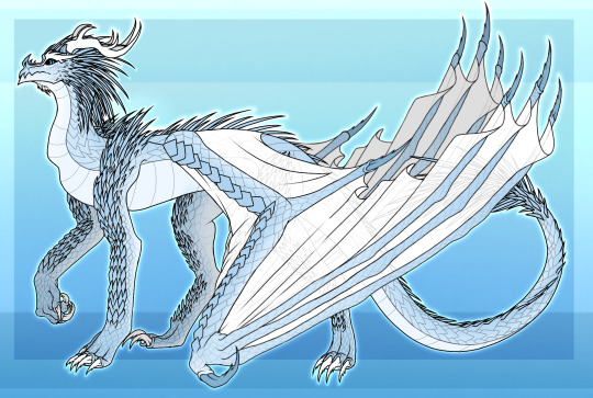
-Narrow-eyed
-The body is covered with sharp scales, from which protrude thorns
-Ear shell, like in the seawings, missing
-Large antlers, resembling deer antlers
-Very long limbs that make their gait remotely resemble a deer
-Have a pointed nose
-There are clumps of scales above the eyes, similar to eyebrows
-There are some small, soft thorns at the beginning of the neck
-The largest dragons in Pyrrhia, capable of reaching almost 6 meters
*Design was created partly based on the appearance of reindeer
#wof rainwing#wof nightwing#wof oc#wof art#wof#wof oc art#wings of fire#wings of fire sandwing#wings of fire art#wof headcanon#wings of fire headcanons#rainwings#wof skywing#skywings#skywing#mudwings#wof mudwing#nightwings#nightwing#seawing#wof seawing#sandwings#sandwing#wof sandwing#wof icewing#icewings#artists on tumblr#dragon art#art#dragon
128 notes
·
View notes
Text
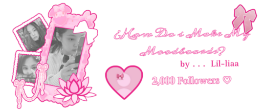
𝓛𝓮𝓪𝓻𝓷 with 𝐋𝐢𝐚!! ♡
2,000 𝒔𝒑𝒆𝒄𝒊𝒂𝒍 followers ♡⋆౨ৎ˚⟡˖ ࣪

Hi!! It's Liaa and if you don't know me i'm a kpop mbd creator i'm not sooo old or recent, but I do have some notable tips that I can give you if you need a push to improve (or start creating) your moodboards based on my criteria and experience ♡ bonus at the end!
Before you r e a d this : This guide is not a rule! You don't have to apply all the tips, feel free to apply them depending on your own style and taste.

In choosing the image on which the mb is based I want to separate them into 3 levels
Easy: An image that has common and striking colors that you can find popular aesthetics - easy to combine, harmony in colors etc!
Not so difficult: an image that has one or more not so popular colors,a background or image a little more complete, with aesthetics not so seen or visual
Difficult: The image has a color filter (dying) It has extra decoration or accessories, it has a specific bright (or duller) color (it means in any case that any image to combine will have to be edited to get the exact color)
Not everything is as difficult as I describe it! Getting started tips to make it much easierrr
# 𝐓𝐈𝐏 𝟏 : ¿Where to find?
Ways to find the aesthetic you are looking for!
Searches on Pinterest
Color + color aesthetic
Color- X Soft X Bright X Palid X Dark
Object - Subject-Color-Animal-Place-Serie/movie-country- Aesthetic
𝓐𝓮𝓼𝓽𝓱𝓮𝓽𝓲𝓬𝓼 that you may be 𝐥👀𝐤𝐢𝐧𝐠 for
I recommend this website that, apart from showing you many aesthetics, tells you the story of how it came about and more info!
Click to "Find aesthetic"

# 𝐓𝐈𝐏 𝟐 : ¿How to decorate it?
1. Collages on PICSART cute and easy♡ Make sure that the images complement each other from one side to the other so that there is balance and very importantly give it a center image!
2. Dividers You can make them yourself (On PICSART again) or find them here on tumblr!
I also have my own dividers if you want to check them out ദ്ദി ˉ͈̀꒳ˉ͈́ )✧
3. Gifs I always move the images a little to make it more striking! (you can do it in capcut and create the gif here on tumblr♡) another tutorial of example gif here
4. Texts! separate the angles you can always put a poem or some lyric music! (To add color to the text I have a tutorial here) You can always add "bios", symbols or kaoemojis since they are closely linked to the aesthetics in the texts
5.Pngs: It's very cutee and also gives an extra resource ((I don't use it as much as before but it can work well on quite a few mbds) I would recommend putting it in the middle
# 𝐓𝐈𝐏 𝟑 : ¿How to combine images? (My way to do it!)

Taking into account the general color palette, look at the image and check if the most prominent colors are warm or cold (including the background will be very useful) this way it will be easier for you to combine the tones without really having to find the exact color of the image! It will make it look much better.
# 𝐓𝐈𝐏 𝟒 : Center and sides
Keep in mind the center of your moodboard! As it is still a square (think like it's a painting) you can have more balance if you put certain colors or certain photos on one side or the other and put the main photo (or a collage) in the middle! So that it harmonizes and draws more attention.
# 𝐓𝐈𝐏 𝟓 : Tonal degrees
Always keep in mind what tonal degree the color of the photo has. Depending on that, you can look for images with the same tonality! As I already mentioned, if it is more opaque or stronger or brighter, it makes it much easier to identify a better combination.
# 𝐓𝐈𝐏 𝟔 : Combination
At first glance, you might be able to identify the most prominent colors in a photo, but taking into account color theory, the color of that photo only exists when it is contrasted by another, that is, based on the combination of colors with each other.
So when choosing photos to match, look for the two colors together in the photo to give a more similar impression even if the colors are not exact (In any case, you can also edit the color of images that have the same tone as your photo by changing the image and the difference would not be noticeable)
# 𝐓𝐈𝐏 𝟕 : More ways to apply aesthetics . . .
Related objects: depending on the image, there are also usually certain objects that can be related to the aesthetics of the photo. You can always add details with reference to the aesthetics that, without necessarily matching the photo, can look good.
Angles and sizes: Looking at the reference photo we can find photos that have the same dimensions as this one will make it look pretty good and make sense to put together
Requirements for adding a photo: to make it easier to combine you can write down things to keep in mind so that they combine, for example:
1.Color and Color palette
2.Size, shapes and angles
3.Common objects
4.Balancing abundance (for example if a photo has a lot of details, you have to find similar ones and at the same time find photos that have less details to give it a better impression.)
# 𝐓𝐈𝐏 𝟖 : Your own Style and have fun!
Don't rush into having your own style, eventually your mbds will be guided by your tastes and then you will have your own stamp unconsciously so don't rush!
Have fun and take your time making mbds, that's the secret formula to making a good moodboard♡
𝓑𝓸𝓷𝓾𝓼 𝐁𝐎𝐍𝐔𝐒𝓑𝓸𝓷𝓾𝓼
Match Technique 💋🎀: My painful technique for making everything match so well comes from my perfectionism and I'll tell you what I do,sometimes the photos match each other perfectly (which is perfectly fine lol if you want you can leave it like that) but to make sure.. what I do is separate each of the images and compare them to each other to see the contrast and thus realize if they really match.
Searching: ¿How did we get to the final result? There will always be many times in sex where you simply won't like the result, I always recommend having at least two stages when looking for a good result.
This requires quite a bit of experimentation.
Stage 1 "Draft" : Where you look for the basis of what you want
Stage 2 "Improvements" : You look for the parts that don't fit and why.
Stage 3 "Details": The finishing touches!
𝐓𝐲𝐬𝐦 𝐟𝐨𝐫 𝐑𝐞𝐚𝐝𝐢𝐧𝐠! These are my own techniques and I know that probably not everyone puts so much science into this but I hope I have helped you improve certain things 💕 xoxo
(English is not my first language, I would really appreciate it if you could tell me to correct any mistakes!)
#𓇻゜𐬹#🗣𝓣𝗎𝗍𝗈𝗋𝗂𝖺𝗅 ; 𝓑𝔂 𝗟𝗶𝗮#(๑>◡<๑) © 𝐅 𝐑 𝐀 𝐌 𝐄 𝐒 @his-tomorrows⭒ 𝇈 𝅄#and @mochilly#moodboard#messy moodboard#kpop gg#coquette moodboard#kpop moodboard#soft moodboard#pink moodboard#aesthetic#aesthetic moodboard
89 notes
·
View notes
Text
*❆ League of Villains Holiday Party Headcanons ❆*
This accidentally posted a week early while I was proofreading it on my phone, so there's another one that's supposed to come before it. It's not super important that they're in order, it's just expanding on the intro to the other one. Oh well! Christmas Party HCs
Here's what everyone at the LOV is doing to prep for their holiday party!

Toga is decorating with whatever she can find. Strands of popcorn, stocking-like socks, anything colorful. Kurogiri pulled a box of streamers out of storage for her (he doesn't remember why they have them, All For One hated things like that, but he's happy they're finally getting used.)
Dabi no. No thank you, he'd rather not. Eventually, he does end up with a job - opening the door to get carolers to go away. He doesn't say a word, just stands there and stares at them. The longest group has lasted about ten seconds before bailing. (but really, who goes caroling at a bar?)
Twice is so excited to spend the holidays with is new-found family but he's not entirely sure what to do. He makes up for it by constantly bouncing between groups, checking in with everyone, and sending doubles to get in the way help with everything.
Shigaraki also doesn't know what to do. But instead of getting in anyone's way, he decides to play video games in the living room, making his presence/boredom known, and figures someone will ask him for help when they need it.
They don't ask.
He speed runs Super Mario Bros 17 times.
Spinner picked the music. Sure, it's not the most traditional Christmas music, but people seem to be enjoying it. Even Dabi hasn't complained yet.
Magne is running some sort of scam at the mall. She left dressed as one of Santa's elves and came back with a stack of gifts for everyone.
She will not elaborate.
Kurogiri is the backbone of the party. He made the drinks, baked five different kinds of cookies, and invited a few of their closest friends allies. He also arranged most of the activities and made Tomura shower before people show up.
Compress finally found the perfect job for Twice - helping him chose a tree. They started looking at the big one in the town square, but decided that was too big to fit anywhere in the headquarters.
Then, they went to the local tree farm sale but all of those trees were just too small.
So, low on options, they head to the mall. After running into Magne (who was pretending hard not to know them) they finally find it! The perfect 12 foot tall, beautifully decorated tree. A few of Twice's doubles create a distraction, allowing Compress to secure the tree.
Upon returning, he released it from the marble it was captured in, much to the awe of most of the room. When anyone asked where it came from, they both replied that it's a Christmas miracle (Magne laughed in the background, but let them keep their secret.)

masterlist
#league of villains#league of villains headcannons#league of villains christmas#mha hcs#my hero academia headcannons#christmas headcannons#my hero academia#bnha#mha#bnha hcs#toga himiko#dabi#mr compress#twice#tomura shigaraki#magne#spinner#jin bubaigawara#kurogiri#lov#touya todoroki#sfw
52 notes
·
View notes
Text
Straw marquetry, mark three!!!! Okay. So. I did two projects where i pasted my material directly onto a backing and then adjusted the edges. And I still haven't done any where I build tiles and assemble them on the backing later. But first I wanted to swerve off the road into something slightly more the realm of traditional wood marquetry, because I wanted to see if I could cut pieces out of a sheet of material, and fill it with something else.
The answer: pretty much!! There's still room for improvement here, I've done VERY little with cutting out Shapes at all, and not all wood veneer techniques map to straw (if i sanded this surface down, I would cry). And I also picked out all circle shapes because ??? I hate myself I guess. But I've been sitting on this GORGEOUS red straw and the perfect frame, and my self-control finally snapped
So, I plotted out a series of overlapping circles, sized very scientifically (based on four bowls in my kitchen) and traced them out onto my primary backing sheet. I wanted to cover with straw up over those lines, but not to waste unnecessary material.

Then I used my bowls as guides to cut out the first few circles and worked to fill them! In traditional marquetry, the advice is to work from background to foreground, so that's what I did here! And i traced out the size of the holes to determine the area i needed to cover for the inset pieces. The lumpiness of the circle below is to account for the overlap from the next piece to follow, making sure there's a clean surface to cut for that window.

I also did some VERY light color sorting, to try to pull out dark red for the biggest circles, pink red for the midsize ones, and orange for the smallest. The orange worked, the others are a bit more ambiguous! Part of the issue is that color variation within a single stalk can be extreme, and I didn't want to get lost in the weeds of subdivisions. The other is that this craft is positively ALLERGIC to overhead lights, as you can probably guess from many of my photos, which meant a lot of my sorting calls were wide open for second-guessing later.

Now, unlike wood, I wasn't really able to glue these to each other. That might change if I step up the backing to a thicker board, but here we were basically working on cardstock. Something to explore later! So for now, I attached my circles using masking tape, but I did experience a SMIDGE of damage to my finish here and there, so I'll drop to a lower tack tape next time. Once everything was assembled, I glued it all to another piece of red paper, squared it up to fit the frame, pressed it overnight, glued it to a piece of foam board, then pressed again.

And then I framed it! This was delightful, and I'm in love with the way the smallest circles pop. And I finally figured out that the trick to photographing these things lying flat is to turn OFF the overhead walls, lmao. I'm extremely pleased with how this came out and looking forward to future projects! This one is so striking, I really look forward to finding more ways to continue escalating, ahahaha


103 notes
·
View notes
Text
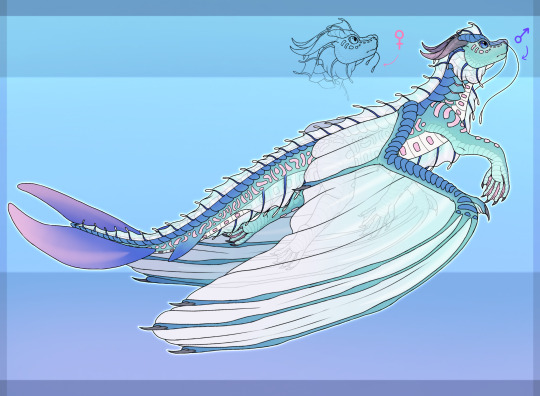
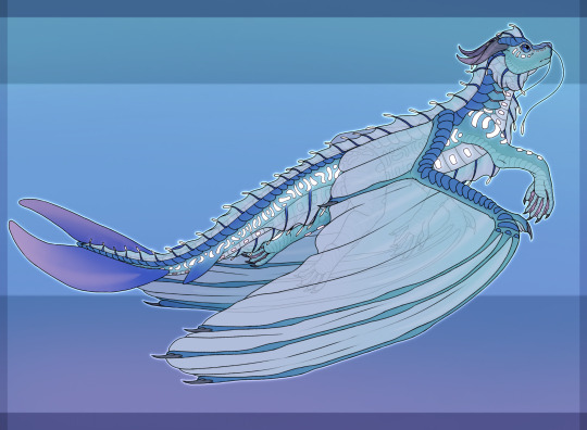
SBK Tarot PT3
Almost halfway through the set now! I've had to slow down a bit because of finals and life stuff, but pretty soon I’ll have way more free time to continue this series. The people in this set are: Kittrix, KingElffe, and DrTrog!
Cards under the cut!!
Part 1 (Fool, Leon, and Marm)
Part 2 (Avid, Viking, and Doovid)
VII: STRENGTH
For someone who at one point had a reputation of "taming" wardens and creating chaos with them, I felt Kittrix deserved the spot on this card. While the card Strength is all about passion and well, strength, it also shows compassion and positivity through not killing the large beast (warden in this case), but disarming and controlling it instead.
XI: JUSTICE
One of the cards I simply knew who was going to be on it the moment I started this. The entire Birch Box trial made me laugh so hard, and Elffe as the judge was such a great decision. This was one of the more simpler cards to make, but I had alot of fun with it nonetheless.
XXI: THE WORLD
Okay so I really put alot of thought into this design. I knew Trog was going to be on this card because of the implication that they are essentially a god because of their data pack control and such. Tube was then added to symbolize the completion and wholeness they share together, two sides of the same person, diverging yet completing one another. The background being squares and triangles show the unity of both Trog and Tube’s shapes, once again clashing and complementing at the same time. They're glitching to symbolize the way the code bends around Trog (in reference to times they would jumpscare others with admin powers) Also I added little differing details like different eye shapes, hair, and of course tie color to really show they are their own people despite one being a clone.
21 notes
·
View notes
Note
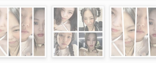
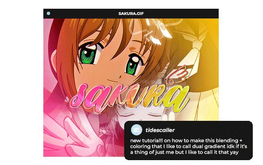
Hello, this gifset for pscentral event 37 is really pretty ✨
https://www.tumblr.com/tidescaller/779330612766081024/pscentral-event-37-trios-the-girl-the-boy-and?source=share
would you please consider posting a tutorial on how you made the blending multi gifs and colouring in the first gif?
Hi anon, so glad you liked it! I'll try my best to explain as detailed as I can. Just a small note that I'm not an expert, I'm still pretty new to blending edits in general so I'm learning as well as everyone ૮(˶˃ᆺ˂˶)
But before that real quick, and if my tutorial isn't enough, I'll leave you a list of amazing tutorials/guides that help me a lot when it comes to everything gifmaking related, so shoutout to them!
basic blending tutorial
coloring tutorial
blend gifs tips
blending, coloring and text effects guide (video)
another one similar to the previous one
gradient text
text outline
HOW TO: Blend multi - gifs / Dual Gradient coloring
You will need any version of Photoshop (I use CC 2019) and basic knowledge on making gifs.
STEP 1: THE BASE
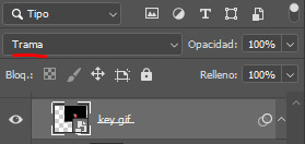
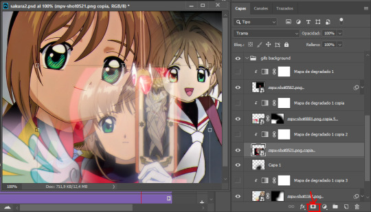
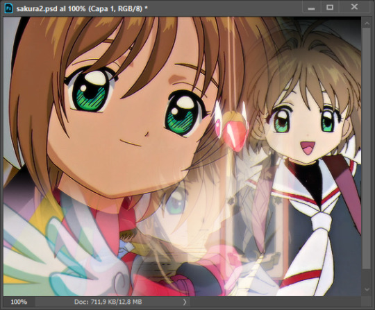
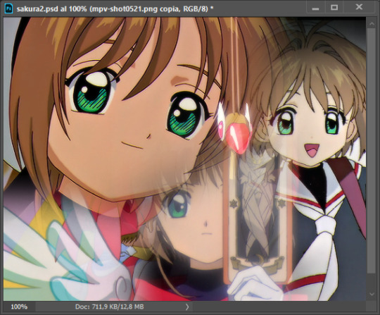
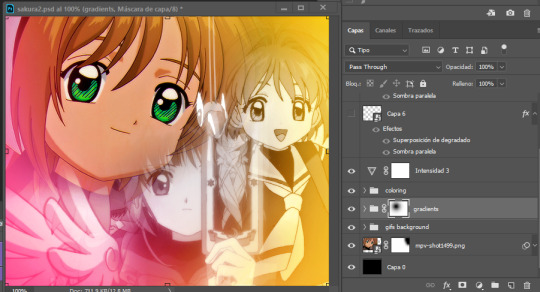
1.1 - Make sure your canvas is 540px width. Mine is 540x450. Choosing which gifs to blend is kinda tricky and no one can tell you what's perfect. Everything depends of the scenary your show, movie, anime whatever you're working on has; but a tip is to use scenes that have dark areas, since it's easier to blend then. 1.2 - Make your individual gifs: crop, color, sharpen, all that, and make sure all of them are the same amount of frames. 1.3 - Before duplicating your gifs into your empty canvas, convert them all into smart objetcs. This will help to simplify stuff, have a much more organized work space and help you load your preview faster.

STEP 2: BRING YOUR GIFS
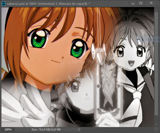
Now all you have to do is right click on every gif you made, go Duplicate layer… and sent it on your empty document. I would suggest doing one by one, so you can work better. Duplicating them all at once can be a little bit intimidating and might have you confuse how to combine your gifs. Try imagining what you want your gif to look like and where you want each element to be. As an example, I wanted the key scene when it kinda drops to be falling from the top of my gif and also as a separation of the one in color and the one Sakura is roller-skating.
STEP 3: BLENDING
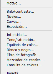
3.1 - Okay, now that you more or less know what you want your gif to look like you can start by changing the blend mode of your gifs. Photoshop has mutiple options on this and it applies to all types of layers. For blending, one of the two (or more) gifs you are working is going to be on top, that's the one you're gonna have to change its blend mode in order to start this process. Generally, Screen is the one to go to.
3.2 - Some people group (selecting your layers > ctrl/cmd+g or right click > group) all the gifs so they can then change the group's blend mode into Screen but I personally like to do separately cause if I need a gif to fill some of the background I would keep it as Normal.
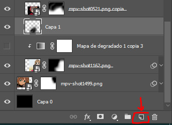
STEP 4: LAYER MASK
The key gif works perfect with Screen blend as it has a black background, but of course this won't be the case for most gifs you want to put in the main one. For those unwanted pixels we don't need, we use a Layer Mask. 4.1 - In order to do that, select your gif by clicking on them and next click on the layer mask button.
4.2 - Now you'll see a white square next to your gif layer. This will help by reducing the opacity of those things we don't need of your gif. What is white is 100% opacity and what is black 0%. So all you have to do is click on the layer mask, pick the brush tool and paint over what you want to "delete". Pay attention to use a soft brush, and the size of it should be around 200 and 300px. 4.3 - Repeat the process with all the gifs that need it
STEP 5: EXTRA LAYER
Sometimes a gif will look too bright/transparent/softened over the other ones. In order to fix this, you can create a new layer (the button right next to the trash can)
and paint with a black soft brush over the part you need to bring back. I don't know exactly how to explain it properly but I'll try with these before and after images. I'm adjusting the one with Sakura and her card:
STEP 6: COLORING
6.1 - OKAY, now that we have all that sort out and the gif has a proper structure is time to add some color. As I'm going to do a dual gradient after and leave only one of these 5 gifs with color, I'll use a black and white gradient map and add it to every individual one as a clipping mask (right click on the gradient map > create a clipping mask). Like this:
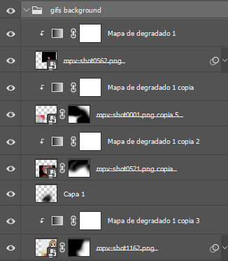
6.2 - Now that we have this I can add my own psd. I started making my own psds for every edit I make and I'm not ready in any way to explain that, but I learn how to do this with this tutorial. With that, my gif now look like this:
STEP 7: DUAL GRADIENT
Finally for this part I recommend making another group (the folder button next to new layer) and add a new layer for the different colors you add. This is all about painting and playing with the blending modes for these layers. There's no right way to do this, you just have to play around and see what works best for you and the scenes you have. You will end up with something like this:
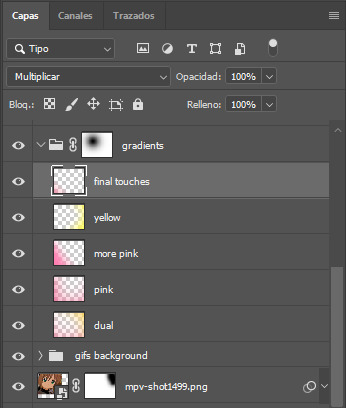
Tips for this step are: 7.1 - Use a soft brush, size it up to 1000px, zoom your gif out and start painting out of the canvas. This will help create that gradient effect we are looking for. 7.2 - Change the layer's opacity/blend mode. This is (again) about playing around with colors. I changed these settings for all my layers that are part of the gradients' group. In order: dual is Screen + 90% opacity, pink Vivid Light + 70%, more pink Lighten + 90%, yellow Hard Light + 70% and final touches Multiply at 100%. I also mixed up the colors, not only staying with certain yellow or pink. 7.3 - The gradient tool works the same way as the brush tool! Just make sure the gradient is any color you're working with + transparent. 7.4 - I also added a layer mask to my gradient's group to erase some of the extra color in Sakura's face. All this will result on this:
And that's pretty much it! For the text part, I was going to add it but the tutorials I linked at the beginning explain it perfectly so shoutout to them. As always, if you have any other doubt, send me an ask and I will answer it as fast as I can! Always happy to help ⸜(。˃ ᵕ ˂ )⸝♡
#answered#anonymous#*tutorial#photoshop help#gif tutorial#blending tutorial#photoshop tutorial#coloring tutorial
23 notes
·
View notes
Note
What does swwh mean?
Also your art has really pretty colors <3
I’m not very familiar with the v,ore community so I don’t know a lot, I used to be uncomfortable with it due to sexual themes, but learning about a non-sexual side of the v,ore community is nice.
I’d love a run-down about some of the terminology, for someone who doesn’t really know anything
Sure thing! Swwh stands for swallowed whole! It was my attempt to make an alternative name for v,ore exclusively for nonsexual purposes, both for the safety of those who enjoy vore sexually and nonsexually (so, minors/nsx enjoyers out of main tags, and nsfw accounts out of minor/nsx accounts!) - the other one's "e-a/t" or eaten-alive trope.
Another one is extreme cuddling, which is a term exclusively for nonsexual, safe/nondigestive/nonfatal v,ore, which i find to be a very endearing term for it. Unfortunately there are now a lot of sx accounts using this term, (and not everyone knows about the latter part of the description) though it doesn't hurt to keep posting under it, obviously. The newest one is vorarefixation, I believe.
There was also the term vescor and vittle made by the same coiner of "e-a/t," as an alternative to "predator and prey" respectively. This one I haven't seen too much, but it might still be around.
Also, same here! I used to not like v,ore in any capacity but then I saw art that forever changed my brain chemistry to see the wide, wide possibilities for portraying intimacy. And was even more surprised to find a nonsexual community for it, especially on tumblr! - I thought I was just gonna have to keep this shit to myself forever.
Also, thank you for the compliment on my colors!!! This is an artstyle I use almost exclusively for the type of content on this acc. I draw neon frames on a black background and fill it in, and the whole artstyle is also sort of reserved for romantic/intimate situations (I'd love to draw this, but: i imagine that if a character is swooning/in love, the neon frame appears and they turn into the artstyle). I also used to do an anticipatory thing where I would sort of imply I was gonna draw something via posting just the squares on the black background with my friends, so the artstyle got dubbed the "suspicious squares."
#love mentioning the suspicious squares. my FAVORITE#bichambered-reservoir#ask#nsx vore#extreme cuddling#swwh#e-a/t
27 notes
·
View notes
Text
AI art and how I spot it
So occasionally, folks, something will cross my dash and my spidey senses will go off because something about it doesn't seem... right, and I can't put my finger on it.
(Note, this is by no means a comprehensive guide nor is it meant to be one, just a handful of things I look for when the question comes up.)
(1) Look at the hands and face. Generative "AI" (the quotes are deliberate because there's nothing "intelligent" about it) has gotten better at rendering them, way more so than even a year or two ago. But often, the hands give away that something is wrong: the fingers are twisted improbably, or fused... some are different sizes or drawn entirely incorrectly or even rendered different in terms of detail.
If you're looking at potential AI art of people, look at the face. AI has specific issues in a few key arenas:
The Eyes - the pupils often won't match or will bleed out into the iris. And obviously, check their color if you spot art of a beloved character. AI can be terrible at giving them a detail as small as this correctly.
Same Face Syndrome - no really, I've found this to be a thing. I'm not sure what Firefly, DALL-E and Midjourney are trained on (this is so not my field) but hilariously, the faces all sort of blend together (especially in less photorealistic art). Male or more masculine-presenting characters seem to get the same square jawed Henry Cavill look; female or more feminine-presenting ones get doll-like faces with pouty lips and bedroom eyes.
Weirdly perfect skin - this is more for photoreal art but do you see pores or is their skin perfectly, doll-like smooth? Do items - the person, their clothes, stuff in the background - seem very glossy or rendered to the point of uncanny valley? Then that's a good sign you should question what you're seeing.
(2) Look at character specific details. Are they there? And if they are, are they correct???
For example, you may be looking at a picture of elves. Do they have pointed ears? If these are specific characters, are their hair and eye colors right? Do they have scars, if they're supposed to? Minor details like these often get lost in prompts or misinterpreted and, in scenes where there are multiple people, applied to the wrong characters.
(3) Follow the lines: outlines, clothing, hair, the background. The biggest thing I've used to tell whether something is AI or not is what the lines do. That is: do they flow into another, or stop abruptly? Do the lines make sense for the material or object you're supposed to look at? Do they blend in with the other colors around it?
For example: if a character isn't wearing a shirt, but there are lines suggesting they are, you should be suspicious. The same goes for random, nonsensical flourishes or tattoos on someone, or hair that isn't connected to the rest of the scalp or the hair around it.
(4) Lastly, text. This is another area in which the technology has advanced significantly, but text still looks wrong in the majority of AI art. Also, look for text where you shouldn't expect it. I've seen whole-ass artist signatures poorly folded in. Anyway, here's an example, below:
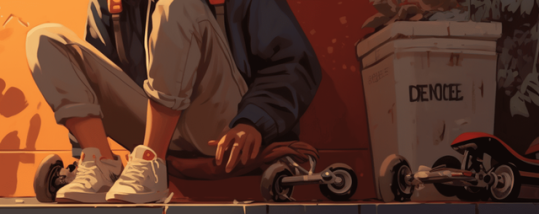
Why is that skateboard that way? What the heck is on that trash can? (Image taken from goldpenguin.org - it's one of their examples of how to spot AI images.)
Again, this isn't meant to be a comprehensive list, but once you get used to examining art with a more critical eye, these things become difficult to unsee. I may make a longer, more formal post on this but for now, hopefully this helps folks!
14 notes
·
View notes
Text
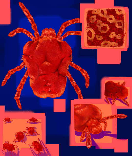
Insert An Invert Week 4: Around Logs; Velvet Mites
(ID under read more, sorry its kinda long)
[Image ID: A digital painting. Taking up most of the top left corner is a red velvet mite from a top down view. It is surrounded by peach colored squares that overlap each other, three of which are larger than the others. Four of these squares contain other images of velvet mites. The square in the top right corner features a closeup of yellow, O like patterning present on some mite species. The smaller panel below it has the body of a might, its head is not visible, and it is casting a purple shadow. The larger panel below it features the face and front two pairs of legs of another mite. Its front pair of legs are extending out the square towards the left. It is also casting a purple shadow. The square in the bottom left corner depicts six smaller mites in a group. They are also casting purple shadows. This is all set on a blue background, which is lightest under the large top down mite, and becomes darker throughout the rest of the piece. End ID.]
#its not one specific species of velvet mite#more of a velvet mite collage#arachnids#bug art#bugs#bugblr#my art#insertaninvert2024#art#id art#id in alt#id in alt text#id
116 notes
·
View notes
Text
Kairi -- Beauty of the Beach

Hello y'all!
And yes, surprisingly, I have another Kingdom Hearts fan piece since last year! Here we have Kairi this time at the beach! ❤️
Sorry if her hand is a little off :(. And I struggle to draw her hair ughhhh >M<
Anyways, I did replay Kingdom Hearts Final Mix last week and I bought the Story So Far of my own back in January, along with KH3 (that was the all-in-one package). And I was going to see what I can do in the game and how to do it right after last time. I also bought a Sora amiibo to have for a collection, btw ^^.
I kind of rushed this to get it done, and my head wouldn't still throbbing for some reason >M<. And to be honest, it was okay of how I did it, I struggled with the hair and background. Ah yes, and yesterday, I got more artists canvas' from Ross, more books from Books-A-Millions and a coffee shop that became my another favorite coffee shop is White Duck Espresso. The mocha espresso shake I had was absolutely really good ^^. The first time was actually back in either late March or somewhere in April. It's a drive through, same as Scooter's Coffee ^^.
Hopefully I can start getting back into painting as soon as the studio barn is cleared up from the Christmas stuff we had for two years
And that's all I am going to say because my headache aggghhhh.
Anyways, I hope y'all had a good evening! I try to take it easy ^^;
Kairi & Kingdom Hearts ©Tetsuya Nomura, Hironobu Sakaguchi, Yoshinori Kitase, Disney & SQUARE ENIX
Artwork ©RosePrincessArts
No copyright infringement is intended
Used: Soho Studio pencils, Fine Artists ink pens, Creative Experts non-toxic alcohol markers, Master's Touch Fine Art alcohol markers, illustration & neutral colors alcohol markers, Uni POSCA markers & calligraphy pen
#traditional art#fanart#disney fanart#disney#square enix disney#square enix#square enix fanart#kingdom hearts#kingdom hearts fanart#kh fanart#kh#kh kairi#kairi#beach
16 notes
·
View notes
Text
Cathedral Window Experiment

In another edition of Just Like Your Grandma's Quilting™ I have fond memories of another quilt my grandmother made - one not at all like any other. A cathedral window quilt has no batting and is layer upon layer of fabric folded into origami like shapes. Traditionally done entirely by hand it can also be done by machine and there are a number of methods floating about for both options.
I gave it a go a couple years back and got bogged down in making backing squares. This time I decided on a hybrid approach. I made the backing pillows (the white) by machine and then I am finishing the colored squares by hand - which gives me the traditional look while not spending 257 years making white folded pillows. I used this tutorial for the background, but the instructions recommended a colored square size that was too small. My background squares are 10" and my colored squares are 2.5". I have basted my colored squares in by hand using hand quilting thread (easy to remove) in a color I dislike (and bought for $0.25). The backing is a remnant and the colors are from my scrap bin.
I am taking notes and while my assembly technique needs finessing, I like the method I used. I may try some others at a later date just to see how they turn out.
I don't actually have a real plan for this panel, but its roughly pillow shaped. Its not flat enough to be a good placemat.
22 notes
·
View notes