#added links of my gifs to the corresponding places
Explore tagged Tumblr posts
Visit Tumblr Blog
Explore Tumblr blogs with no restrictions, modern design and the best experience.
Last Seen Tumblr Blogs


Fun Fact
Tumblr.com is the 103rd most visited website in the world.
Text
Good Omens S1 Parallels - 1/?
Saturday Morning Funtime is a particularly interesting episode for me, because it suggests something about the structure of parallels Season One. Also, it's easier to start with a single episode than trying to cover the whole show at once. I'm going to show you six different scenes from Saturday Morning Funtime and how they link together.
Let's start with the pun pointed out by Danny Motta in his video (link here to relevant timestamp if you haven't seen it). Danny made the link between this scene near the start of E4, where Aziraphale gets exercise:

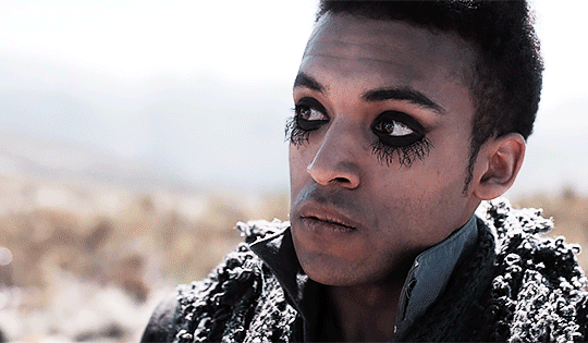
And this scene at the end, where Aziraphale was exorcised (according to Shadwell, at least):

Cool, seems like a funny pun. But there's no way to know it was intentional right? Well, I think I can argue it was. Let's look at another scene.
We have this scene where Hastur destroys 3 Erics on the plains of Megiddo. Since each demon has a corresponding animal, I'm going to go ahead and place bets on the Eric's being rabbits, and Hastur destroys 2/3 of them.
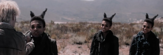
And then later we have this scene where Hastur again destroys 2/3 rabbits, but this time they're cartoon bunnies - the first one he beheads like a costume, the second he rips out it's throat.
youtube
Ok, but again, why am I linking these two scenes? No deep character insights, or thematic elements are being displayed here... Except that's a key reason I'm pointing them out - they're seemingly pretty pointless, so why bother to make them? Well, maybe the sum is bigger than the parts. One more example and then I'll show you how this comes together.
Here's a scene which I think is pretty good foreshadowing of something that will happen later in the episode - Hastur and Ligur talking about the dripping pipes down in Hell. Hastur has a little bucket he's collecting water in, which he uses in a toast:

And later, we have this particularly gruesome scene of Ligur becoming toast at the hands of a bucket full of (holy)water:


Ok, so six scenes, three sets of parallels... now's where the magic happens... I take E4 as a whole... loop it over on itself like a piece of trick rope from Goldstein's magic shop and....
Tada! Here's the episode laid out in 2 minute increments.
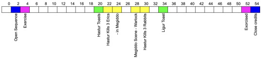
Some pretty interesting places to have parallels, no? That two minute block at the start is a lead in before the opening credits, so the Exercise and Exorcism scenes are coming directly before and directly after the open and close sequence (shown above in blue).
I'd be lying if I said it didn't remind me of the overall chiastic structure that some people have worked on, such as this one by @drconstellation, just on a smaller scale.
It's also interesting to note that each of these parallel pairs relates to someone getting discorporated - Eric, Ligur and then Aziraphale.
What's the point?
So, I promised that I would share a little on why this might be important. In my opinion? It appears like there is some detailed structure to Good Omens, at least in S1.
It should also be noted that these scenes were added only for the show in order to produce this effect - Aziraphale exercising with Gabriel, Hastur and Ligur talking about the pipes, the three cartoon rabbits in the theatre - they were all newly created for the show.
Why go to the bother of creating these little parallel moments at corresponding points along a mirrored structure? Especially when these don't necessarily have ramifications for characters or plot? Is it just good story telling or is it something more? These are all questions worth asking in my opinion. I think it relates to how this show treats words and language in a very Pratchetty fashion. The whole show is a dedication to Terry, after all.
Of course, if things were so simple, I think we would have figured it all out long ago. Parallels, puns, wordplay... they're all quite slippery things. There are things I would consider to be parallels which don't line up with this same structure. For example, the scene from earlier with Gabriel and Aziraphale exercising? The "lose the gut" gut-punch foreshadows this other gut punch scene in E4 too:

Despite examples to the contrary, the presence of parallels and wordplay that do line up along a mirrored structure makes me want to explore this further. If you're also interested in this and want to collaborate, please let me know.
This will be a continuing series, as and when time allows, because parallels seem to be absolutely everywhere. Future posts will look at parallels at different levels (within scenes, across episodes, and across seasons).
Let me know if you spot any others - I'd love to hear about them. They might be hidden in the visuals, wordplay, puns and more...
----------------------
With thanks to all the detectives for keeping me clue hunting @embracing-the-ineffable, @theastrophysicistnextdoor, @noneorother, @somehow-a-human, @komorezuki, @maufungi, @lookingatacupoftea, @havemyheartaziraphale, @251-dmr, @dunkthebiscuit, and @ghstptats <3
#Youtube#good omens#good omens meta#terry pratchett#good omens parallels#good omens theories#good omens analysis#good omen details
134 notes
·
View notes
Text
Phoenix Wright heart eyes

An unused animation where Phoenix has hearts for eyes. The animation was supposed to be used when encountering April May for the first time in court, however later on during development it was changed so that Phoenix's first meeting with her ended up being before the trial began, during the investigation phase instead during which Phoenix's sprite isn't on screen so the animation ended up not being used in the final game.
https://gamecom.neocities.org/Ace_Attorney/AA_Unused_Content/en/#Phoenix-Unused-Anim-1
Starbeans Café crossover cameos


Unused leftover text and sprites suggesting that the Starbeans café was meant to feature cameos from different Nintendo characters instead of just E Gadd as in the final game. There is (mostly) finished text and animations showing Wario, Fox McCloud, Olimar, Samus, Excitebike racer and Link. The text corresponding to each character is unique and reflects their source, like Fox getting a call from Slippy Toad and Olimar speaking in narration.
https://tcrf.net/Mario_%26_Luigi:_Superstar_Saga/Unused_Cameos
Korean cats
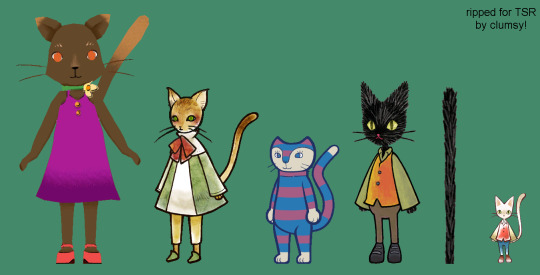
youtube
In the Korean version of Super Paper Mario, there exists 11 unused stages, with an artstyle that doesn't match the rest of the game. These stages come with collision. A few of them have these cute anthropomorphic cats in them, which are non-interactable and don't even have collision. They may have been intended to be NPCs, but they're built straight into the levels instead of being objects placed in the levels. The cats don't match the Super Paper Mario style, but in my opinion, they don't seem to match each other's styles either. Four of the cats appear together in a couple levels and are named after various Super Paper Mario developers, but one of them appears alone in multiple levels, and its Maya group labels it as the player character. The weirdest thing is that these files only exist in the Korean version of Super Paper Mario and no others, which means they were added in after official release. The biggest theory for this is that some developers were starting developement for a new game using Super Paper Mario as a base. If this is the case, nothing has come of it, which is a real shame; the art looks really cute and I would've loved to see what kind of game this would be.
https://www.youtube.com/watch?v=OdF0tKTNW0I
#poll#cut content contest#Phoenix hearts#Ace Attorney#Starbeans cameos#Superstar Saga#cats#Super Paper Mario
12 notes
·
View notes
Text
tagged by @headgehug !
top four albums lately... with a challenge that I added for myself... HMM!!!
I'll try to put in albums i never mentioned on here, that's the challenge!


...oh dear.
Metropolis: The Chase Suite (Special Edition) by Janelle Monae: I was aware of Monae's existence, but the first song I really paid attention to was Mushrooms & Roses. It was played in a certain Austrian fast food and I immediately loved the piece and thought I'd better listen to it without crowd noises. I added it to my playlist and that was it for a while. Then the following year (meaning, this year, right now), we got a class on Black Arts and had to do presentations. Ours is on Afrofuturism... and during my preliminary research, I found that she was linked to it. And I also recognized them as part of the cast for Glass Onion -a movie I heavily recommend. A queer artist? I had to delve into her production. So I listened to her first studio album, The ArchAndroid. I really liked it, one of the tracks (which is a reversed bit from her first EP) led me to listen to The Chase and I immediately fell in love with it. The album is short (26:13) so I recommend giving it a full listen, but otherwise, you should at least check out the Violet Stars Happy Hunting!!!/Many Moons diptych.
Halo by Hoops: The album was supposed to be released in 2020 for the band's return, but questionable stuff happened ("questionable" as in "I don't want to delve into this but you're free to Google this") and they disbanded. So technically, the album is only available as a leak. I initially only heard They Say, but the whole album keeps this shoegazy, low-fi, vaporwave, chill music. I think I heard that song in a store about two years ago, but I only just (an hour before finally making this post) listened to its corresponding album, and it's a real treat.
The Gone Girl soundtrack by Trent Reznor & Atticus Ross: It wouldn't be right if no soundtrack made the cut, now, would it? My immediate favorite aspect of the movie was its score. It's electronic, but in a chill way. The melodies are muffled, the constant parasite sounds contribute to the delicate eeriness of the atmosphere, and yet it's a delightful album I regularly come back to. The movie is naturally also a favorite of mine. Recommended: Sugar Storm, Empty Places, Just Like You, Background Noise, The Way He Looks At Me, Technically, Missing. You should actually listen to the whole album (or at least its first two thirds) as it works very cohesively, but I think the above pieces form the core of the album.
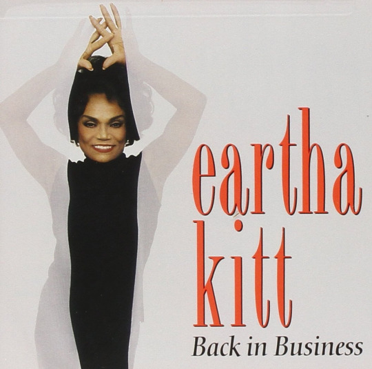
Back in Business by Eartha Kitt: For some people, Eartha Kitt was Catwoman (meow!). For other people, Eartha Kitt was Yzma - and that includes me. She actually had a song for The Emperor's New Groove, and it's a banger! So one day, I decided to give her discography a listen. Immediately enjoyed BiB. It's the kind of album you listen to in the evening, in the lounge of your spacious flat, as the window lets the summer air fill your place. I heavily recommend listening to Moon River, as well as maybe Speak Low if you want another track. But naturally, you can't discover Eartha Kitt without listening to *the* track that fueled everybody on the dancefloor, forty years ago.
tagging @frog-in-bog @sagegarnish and anybody else who wanna join in on the fun
#music#janelle monae#eartha kitt#hoops#trent reznor#atticus ross#gone girl#soundtrack#songs#pop music#electronic music#shoegaze#vaporwave#disco#queer artist#vocal jazz
7 notes
·
View notes
Text

Dear Dawsongfg,
Chief Mod Edgeworth:

I did most of the costumes, but I will also give credit to Co-Mod for creating the sprites for Mia’s, the Skye Sisters’, and others I’m not remembering. The rest of the sprites I did.

Dear Ladynoirthebest23,
Chief Mod Edgeworth: Nope. We’ve pretty much shown all of them. In fact, I was literally making new sprites for the new letters to characters I felt their names could have a costume to go with them. I’m glad you love them regardless.

(Referenced Link)
Dear Spookylampwinneroperator,
Chief Mod Edgeworth:

Erm... the link is broken I’m afraid.

Dear charicla,
Chief Mod Edgeworth:

Thank you very much. I always try to make every Holiday feel something special on this blog. I’m also grateful for the other mods for helping out.
Co-Mod: Thanks a bunch! And to you and yours as well! 🎄 (I just recently learned the Start + . technique for adding emojis to anything in Windows. 😄)

(Referenced Letter)
Dear Anonymous,
Chief Mod Edgeworth: Don’t worry, we ALL know what you meant.

Dear Ladynoirthebest23,
Chief Mod Edgeworth: That would be the Robert Donny Jr. adaptation. Game of Shadows was especially good. I especially love how it goes into Sherlock’s mind and shows how he plans all of his fights and the outcomes of it.

It also has the only adaptation of Sherlock Holmes where John Watson finds out right away that Sherlock wasn’t dead in its movie adaptation of The Final Choice. I really hope they make a third movie, because I would love to see Sherlock’s return and Robert Donny Jr. returning back.
Co-Mod: Same goes for me. From what I can remember from seeing it a few years ago, both movies were quite the thrill in terms of story buildup and action. To be fair, I haven’t read any of the books, but topping the kind of writing and acting in those films is top-notch.

Dear Dawsongfg,
Chief Mod Edgeworth:

You seriously need to place the link to the previous letter because I have no idea what you’re talking about. My memory isn’t good enough to remember any specific letter you sent me like what? When was this sent?


November 1st at 10:15 PM.
What? I did say we know the date and time all letters are sent.

Dear Neuroticsurgicalclinicdirector,
Chief Mod Edgeworth: That’s interesting. All I really did with Dr. Grey’s costume was put his sprite on grayscale.

Dear Skibot99,
Chief Mod Edgeworth: It’s talking about the old mods like Modot, Modthorne and so on. I will fix this. It may be partly my fault because there were a few times when Tumblr decided to get rid of all the links and I had to fix it at least two times. It was frustrating to say the least.

Dear Dawsongfg,
Chief Mod Edgeworth: I suppose, but those can often confuse me because I don’t play chess and only know the basics of it. Using correspondence chess or any chess boards where you have to solve riddles in letters is not something I would recommend if only because I’m likely to make mistakes. I’m good at roleplaying as characters in letters, not chess.

Dear Dawsongfg,
Chief Mod Edgeworth: I honestly find it interesting when a villain isn’t your typical twirly-mustached villain. I love it when villains are smart and competent in their craft. It makes them so much more interesting.

(These three videos)
Dear Dawsongfg,
Chief Mod Edgeworth: It’s good. I really like the different versions of the soundtrack.
Co-Mod: Yeah, I’m just gonna cut to chase...

That was some amazing work! I’ve made some things in DAWs before, so I know how tedious it can be.

(Referenced Letter)
Dear Dawsongfg,
Chief Mod Edgeworth: I’m assuming the link you were referring to was a letter from another set of mod letters, because I don’t see anything in this batch that matches up with what this letter is talking about.

I have done letters where multiple versions of a character answer it, but it’s all one at a time. Rarely do I have multiple characters answer it and, when they do, it’s often during what we mods call “breaking canon for the lolz” where we break our own rules of how letters are answered because it’d be funny. One such example is having Athena answer a letter mocking her angrily by having her be so angry that she creates an explosion or sends Vikings to attack. However, even with “breaking canon for the lolz,” it has to make sense within context. It can’t be random. I don’t do random comedy anyhow.
- The Mods
#Mod Post#charicla#ladynoirthebest23#spookylampwinneroperator#neuroticsurgicalclinicdirector#skibot99#Co Mod#Chief Mod Edgeworth#Mod Commentary#The last batch from December#Yes mentions of Halloween are in the letters but that's because we don't receive the letters until they reach the bottom of the inbox
3 notes
·
View notes
Text
Random-Mailbox's Favorite Sailor Moon Fics - Week 7 - Reveals

This week we are doing trope that @floraone (and everyone else I have spoken to) has been looking forward to the most - Reveals! Below is a collection of multi-chapters and one-shots that stood out the most to me as fitting of this theme.
As always, my apologies in advance for spoiling some of these for you (Fic Titles are linked to either FFN or AO3 entries)
The Reveal - @kasienda
When talking about Reveals as a trope - this series is the quintessential reading material for anyone in this fandom. It is a mix of one-shots and semi-connected stories that show the impacts of being superheroes on everyday life, friends and family.
Revelations - Shelliebelle
A one shot that I seriously think belongs with @kasienda 's Reveal series. Mamoru figures out that Sailor Moon is Usagi based on her sheer exhaustion and corresponding injuries. He then tries to help her best he can.
Win a Date with Tuxedo Mask! - @tinacentury
One of the cutest reveal stories I have ever read! Motoki, who hears and sees everything, decides to meddle a bit and gets involved in helping Mamoru raise money for his old orphanage, as well as getting his friends together. We get a very confident Usagi and Mamoru who is jealous of himself and trying to do his best suave Tuxedo Mask imitation.
Impulse - @areptiledysfunction1107
Tuxedo mask shoves Sailor Moon out of the way of a Youma attack and gets hit with a mysterious fog. Next morning, Mamoru starts seeing things (or is imagining technically?) that are quite risqué and keep getting progressively worse, causing him to start acting a bit out of character (There is also super cute art throughout the story too!)
Since I Found Out - @lyraterra
Super fun multichapter that is based around the OG anime's Dark Kingdom arc - except the reveal of identities taking place in the story's first chapter. This change guides the retelling of the events of the original story in a new and exciting way - adding in psychometry, soul bonds and saving the Shitennou.
Perfect Imperfection - @allyunabridged
Tuxedo Mask accidentally figures out who Sailor Moon is in the middle of a battle, and realizes how much of Usagi’s behavior is due to her Senshi duties . As the week progresses, he does his best to let her get to know him better without the usual bickering. Except old habits die hard, now impacting their teamwork in battle. Adorable, fluffy ending to this one.
Deception - @floraone
When Luna finds Usagi and turns her into Sailor Moon, Mamoru and her have been together for 6 years and are currently living in the same apartment. Luna insists that Usagi absolutely cannot tell her significant other (that she trusts with everything!) about this, leading to some very questionable excuses and hilarity as Tuxedo Mask takes full advantage of figuring her identity out for himself.
Day 3. "Whatcha staring at?" - @lilliebellfanfics
The lemoniest story of the bunch. Usagi is pining after Tuxedo Mask, thinking about their last “get together”. Tuxedo Mark has a hunch of who Sailor Moon is and after following her for a few days, finds her taking a bath at the Hikawa shrine.
D’aimer et D’être Aimé - @she-dreams-in-pink
Mamoru finds Usagi at the counter at The Crown working hard on what he presumes is homework, earning him a scoff when he tries to joke about it with her. But who is this letter really for and what is it about?
Drunken Confessions - SailorMoonFanForever
Girls, Motoki and Mamoru get together at Mamoru’s apartment to have a little fun in a safe environment. Alcohol + Game of Truth and Dare end up lowering Usagi’s inhibition and cause her to admit things to Mamoru that she wasn’t planning on telling.
Miraculous Musings: Vignettes of a Miracle Romance (Chapter 28: hidden identity) - @goddessalthena
Mamoru keeps writing something on napkins while having his coffee at the front counter of The Crown Arcade. What if Usagi notices? Or one time he drops it on the ground “by accident” before leaving?
Have I captured all your favorite reveals stories? Please add more to the comments!
Next week we will cover 👻Halloween🎃 and costume related fics, since the post will go up on October 31st before trick-or-treaters start showing up at my place.
Here are the links to the previous posts to explore more amazing works based on different tropes: Sex Positivity, Established Relationships, Groundhog Day, Unfinished Stories, Darker Stories, Potions 🧪
#sailor moon#fic list#fic rec#usagi x mamoru#sailor moon x tuxedo mask#reveals#revealed secret identities
104 notes
·
View notes
Note
PLEASE GUSH ABOUT THE LEGO BATMAN MOVIE
Welp, I've officially been asked and so I'm taking this permission and running with it.

To save y'all I'm gonna hide this insanity below the cut. I am not an expert in any of these topics and I wrote this on my phone so apologies for any errors!:
This is structured around some nonsense essay titles I made up in about five seconds, but actually turned out to cover most of what I love about this film <3
The essential duality of hero and villian in Lego Batman
So first to address what Hideo Kojima says here (I can't believe I just wrote that...)
So one of the main themes/story beats of Lego Batman is that Batman is a hero who looks and acts a lot Iike a villian both in the context of the film and throughout his canon.
This is both true of his appearance and his arrogance and rejection of teamwork/asking for help and human connection.
In the film this is contrasted with Joker who is a villian, but desperate for human connection, good at teamwork/asking for help, less visually scary, and actually a big softie to many important people in his life (see Harley and Batman).
Both characters are explicitly called out about this contradiction by Phyllis the gatekeeper of the phantom zone who questions whether Joker is really evil enough for super jail and Batman good enough to be a hero.
For example, late in the film Joker demonstrates his explicitly ambiguous villainy by helping save the day by encouraging the Gotham villians to join the efforts to rejoin the city (literally and figuratively 😉)
As is pointed out in the tweet linked, both of their hero and villainy is largely in relation to each other. Batman is only a hero in relation to the Joker who is in turn classified as a villian. Both Batman and Joker are definitionally incomplete and aimless without each other.
Added to this are the bad guys from the phantom zone who are framed as evil, and truly evil in a way that the Joker is not, but Batman might be due to his treatment of others.
Each of these villians are spurred to action by the Joker by him invoking their corresponding heroes - as these essential opponents with whom each bad guy has a similar relationship. In this way the villian/hero dyad is reinforced.
And as Hideo Kojima says "They are more than rivals, they are inevitable." Like...
So we are left with the question of what defines heroism and villainy? For Lego Batman a lot of the answer lies in our relationships and relations with others and our community.
60 years of canon: making a 21st Century Batman film

Okay so as a reward for reading this far, I will tell you a badly kept secret. I freaking love superheroes and Batman in particular. I've read enough comics and seen enough films etc to get the majority of the in-jokes and references in this film (and there a crap tonne). Those are my qualifications for the following statements:
I firmly believe this is one of the best portrayals of Batman and Bruce Wayne in all Batman media. Just... somehow this dumb movie just got him perfectly.
Somehow it captures both the inherent comedy of Batman, and also the angst and the drama of Batman.
Somehow also manages to be one of my fav Dick Graysons and Alfreds. Parenting your troubled child, anyone?
So Lego Batman is in the same universe as the Lego movies.
I absolutely love how they integrate references to the comics, to the shows, to the movies, to Batman's rogues gallery etc, and I think in a way that isn't too alienating to newbies and just super fun as fan. Condiment Man! The Penguin and his penguins! Catwoman hacking and saying "Meow Meow"!
References the big classic gotchas of Batman on a loving way, rather than in a needly way! Yes, why is crime so high?
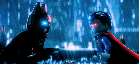
Batman hating Superman in a very dumb fun way is my favourite trope in Batman media, just after Batman and Superman being in love 😘
How to write a multiverse: the case of Lego Batman
It integrates the world rules of The Lego Movie i.e. this world takes place on a literal table, probably in the same basement.
This manifests in the climax but also throughout! In the first act bomb threat, the phantom zone villains, and just... Will Arnett Batman!
Batman is still a Master Builder! It's blink and you miss it, but it's an element in the climax and throughout.
So it's kinda fun if you're familiar with the other movies and the wider multiverse, but it really doesn't ruin anything if you aren't.
Just a refreshing approach in this world of multi-film tie-ins!
The music slaps!!!!!!!!!!!
Who's the (Bat) Man?: The music of Lego Batman
The Batman intro song? Amazing. Literally a joke a second.
Super fun pop songs!!!!!!
The song that plays when Batman looks at Barbara lolololol
The busby berkley style number at the end??? iconic!!!! The message you're left with being "Friends are family"????????
Animation in the 21st century: the case study of Lego Batman

The animation is sooooooooo coool!!!!
So there has been this general trend towards realism in CGI animation which is... okay... It's pretty technically cool, but for lots of people who love animation it can result in a loss in terms of what makes animation a great medium in of itself - for me this looks like experimentation with motion, colour, shape, and style!
Lord and Miller (the producers of this film) have also been involved with some of my favourite animated films of the last decade - for example, the Cloudy with a Chance series and Into the Spiderverse. I don't know if that's a conscious thing on their part (could google, but this is already too serious without extra research lol), but essentially if they're involved in an animated film I'm gonna be confident I'm gonna love the animation.
This film is brightly coloured, deeply silly, and a film that is firmly rooted in it's medium.
Obviously everything is lego shaped but the way they use that!! Sometimes you forget they are little lego people, but sometimes they hit you over the head with it! With stop-motion sytle! With little visual jokes! With their little lego arms!
Everything is so shaped!!!!
Bromance, clostedness and the homoerotic in Lego Batman

TL;DR Batman and the Joker are gay for each other.
Okay so one of the central conflicts of this film is that the Joker wants Batman to tell him that he values their relationship. And when Batman refuses he makes the face in the gif above...
Like damn dude, that is one sad lil guy
Joker spends the rest of the movie trying to make Batman say the Joker has an important and meaningful place in his life and acts very divorced until he does.
Obviousssllllllyyyyy this is not necessarily inherently homoerotic or romantic... but also... fellas...
The resolution of the film is Batman admitting that the Joker is special to him and affirming his value. 🥺🥺🥺
There is a lot to say about Batman's performance of hypermasculinity, including the way he pushes away all discussion of emotions and relationships. This is strongly contrasted with Joker's more queer-coded characterisation and Robin's actively camp portrayal. However, the resolution of the film is partially driven by Batman finding a place for both the Joker and Robin in his heart and life, and allowing himself to relax his performance of solitary toxic masculinity.
Arguably the film is leaning towards Barbara/Batman as a romantic pairing but ultimately they end up as like a friend dynamic which is honestly kinda lovely.
One of my fav reoccuring jokes is that Batman and Bruce Wayne are "roommates" and are co-parenting Dick/Robin. Like it's not a joke that Robin maybe has two dads, but that Batman is so reluctant to open up to people he'll lie about his identity to such an extent. Also Robin is just soooooooo psyched about having two dads! (see gif below and my final lil rant).
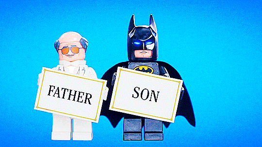
Found family, generational trauma and fatherhood in Lego Batman

Oh look, it's tumblr's favourite trope! Who doesn't love a bit of found family? Batman canon has a very strong history of this trope which is largely absent from the live action films (which i am so cool and chill about of course)
As mentioned, Robin thinks he has two dads for like half the film and is so stoked!!!! He loves his new family deeply, completely, and immediately.
Alfred is Batman's dad!!!!!! And Batman is Alfred's son!!!!!!! And Robin is Alfred's grandson!!!!
Batman lost his parents to the violence he seeks to remedy and locks away his heart and rejects his friends and family out of fear of losing them to that violence too 😭😭😭😭
Padre! Papa! Dad!
Cuz friends are family!!!!
I realise this gets more and more incoherent as it goes on so I can only apologise hahahah. Anyway, I hope you enjoyed! Go watch Lego Batman!!!!!!
21 notes
·
View notes
Text
Our first time – Chapter 1
A/N: before I start, I would like to apologize for not having written anything in months, but the fact is that the university has really brought me to isolate(what an irony, since I am in a coastal area/beach/where the sun shines a lot)
Besides, these have been difficult days, so due to lack of time and serotonin it has become impossible for me to update… but hey, hey!!!. It's almost vacation, so (x2) I hope to finish writing the pending fics.
That said, with you, my first little trilogy of imagines/fics/one shot/shots¿?.
Pairing: Simu Liu x Cuba/mexican!reader
Summary: It's your first time…
At the Oscars (reblog/like/share if you thought I was talking about something else)
Warnings: This will be extensive and possible spelling errors, due to the rush and hours I'm writing this, anyway let me know if I missed something.
~~~~~~~~~~~~~~~~~~~~~~~~~~~~~~~~~~
A MONTH AGO
February 10, 2022
Time: 05:27 a.m.
Location:Toronto Pearson International Airport
After a long journey of 12 hours, 6 out and 6 back, they were finally back home or something like that.
"Gosh, I haven't been this exhausted in a long time, what about you, Cariño?" When you turned to look to your boyfriend, you could see how he was falling asleep on one of the benches in the place.
Carefully and with your bags already in hand, you sat down next to him.
Seeing him so tired stirred up a few feelings in your being, this varied depending on the reason, but because this time you were his reason., the reason that both of you met in the middle of the night at an airport, it made you feel blame him a little and more if you added the fact that you would have to wake him up, however, your intentions were interrupting when you saw, rather, felt your cell phone vibrate, and not just once, but several times.
Concerning that something was wrong, you saw him immediately.
There were hundreds of messages and missed calls, among many there were missed calls from your representative, your manager, your assistant, your agents and of course, from your mother, which for obvious reasons were the most common.
You planned to communicate with your mom first, because it was her, your mother, however, for the second time your intentions were interrupted by the recent call from your manager.
"Hello?…" You answered as you walked away from Simu.
"Fuck (Y/N), where have you been all this time?" He answered you in a slightly annoyed tone and with exasperation in his voice.
"Mm, I don't know, maybe celebrating my Birthday with my family, friends and Simu, you know... actually, if I remember correctly, I think I told you since last year that I was planning to travel to Cuba to spend my birthday. …”. You answered with weariness and some sarcasm, something typical of you.
"But anyway, what happens? Because having almost 50 missed calls from you must be for something important, right?" You asked, to which you immediately had an answer.
"Yes, you have missed a lot, "Checa". And there it was, that joking attitude that both used to have from time to time.
"You know very well how things are there, by the way, are you going to tell me now? Or could it be that I can call mom? Because I assure you that if I don't call her back, she is capable of traveling here and…". Your chatter was cut short at her next words.
"(Y/N), you're nominated for the Oscars"
You immediately felt your nose burn, your eyes fill with tears and your pulse quicken, it took you a few seconds to recover from the news, so your voice came out broken.
"I swear if this is a joke..."
"Check the lists. I've just sent you the link"
Even with the call on the phone, you on the verge of having a heart attack and your hands shaking like jelly, you were able to access the link.
Little by little the presenters were naming the nominees, with each passing second, anxiety began to play with you, whether it was true or not, you tried to get rid of that feeling by advancing the video to your corresponding category.
Oh my god... it was true, you really were nominated.
Without caring a lot, you began to shout and celebrate with emotion, the happiness you felt was such that you did not realize that a worried Simu was awake.
"What... what happened? Love, are you okay...?" The fact of seeing you cry, laugh, tremble, and with your hands covering your face at the same time only increased his concern.
"(Y/N), talk to me." This time he muttered in a serious tone. "What's…?" His question was halfway through when he saw your cell phone at your feet, when he took it he knew the reason for your shock.
Without thinking twice, he takes your hands away from your face to start hugging you and celebrating with you. For your part, your mind was not in the here and now, so you did not impose any imposition on his caresses.
You remained crying with happiness on his shoulder for a long while longer until finally you calm down.
Already away from him, you noticed how your tears had accidentally soaked his hoodie. "Shit, honey your hoodie, I'm so sorry I am”
"That's the least of it now."
"But...". You tried to continue and no, you failed because of her sudden interruption
"Honey, you...? My God, you're nominated!!!"
"That's right..." You answered with the same or higher level of enthusiasm than he did
"I'm so happy and proud of you... How did you find out..."
"Martha"
"When...?"
"Today..."
"Oh my god, oh my god, (Y/N), You... You really did it!!... You..."
"I know, I can't believe it..." You commented, still in shock.
After a while, not hearing the voice of your manager, you knew he hung up.
You still couldn't believe what you were experiencing.
Finally, after years of hard work, nights full of insomnia, sacrifices, tears, bad days when you assured yourself that you got there, rejections, changes, and what seemed to be a streak of bad luck, your work finally began to pay off.
Out of nowhere, you felt how your body lightened, as if that streak of bad luck that had followed you for years disappeared into thin air. It was rare, as you had only experienced it a few times to date.
The first, is when you get your first opportunity in the industry.
The second, was when you meeting Simu for the first time
And the third and final, today.
#"perfil en donde se simpea 24/7 a simu liu#simu liu x you#simu liu x reader#simu liu x y/n#simu liu fanfiction#simu liu oneshot#simu liu imagine#one shot#imagine#fic#the academy awrds 2022#the academy awards#oscars 2022#oscars#mexican reader#cuban reader#latina reader#slangs#cuban slangs
42 notes
·
View notes
Text
How to make anything into a noun

Did you know that you could literally create "nouns" with any word or phrase in the Korean language? By "nouns", this doesn't mean it actually becomes a noun per se, but it becomes a noun form that can be used with any grammar principle that involves "nouns".
1. A/V + 기
+기 functions to turn verbs and adjectives into nouns and corresponds roughly to '-ing' in English. Other than that, it also turns A/V or clauses into nouns. As compared to +는 것, this is rarely used for long phrases and mainly for simple A/V.
Verbs: e.g., "먹기" - eating, "요리기" - cooking
Adjectives: e.g., "크기" - size, "밝기" - brightness
Entire phrases: "집이 멀어서 학교에 오기가 힘들어요."
e.g., "제 취미는 요리하기예요." = My hobby is cooking.
e.g., "한국말을 공부하기가 어려워요." = Studying Korean is difficult.
2. A/V + 는 것
This grammar builds on the grammar of noun modifiers! Noun modifiers involve adding +는 as a "noun modifier" for verbs, and +ㄴ/은 for adjectives. Remember that noun modifiers are awesome because they allow you to let phrases which include A/V descriptions to be placed in sentences that:
End in an adjective - "제가 만나고 있는 사람은 예뻐요."
End in a verb - "저는 제가 자주 가는 곳애 가고 있어요."
End in 이다 - "저는 예쁜 여자예요."
Without going too much into the noun modifier grammar, 는 것 basically builds on this to create singular nouns. This grammar is especially used for longer phrases.
*refer to this amazing lesson by HowtostudyKorean.com that explains this!
e.g., "저는 친구가 사과를 가져오는 것을 원해요." = I wish for my friend to bring apples.
e.g., "나는 엄마가 요리하는 것을 먹고 싶어요." = I want to eat the food that my mom cooks.
e.g., "나는 그 사람이 먹고 있는 것을 먹고 싶어요." = I want to eat what that person is eating.
3. A/V + ㅁ/음
This grammar similarly changes A/V into nouns and is more commonly used for singular words and less so for long sentences. If it is used for those purposes, it mostly shows up in books/poems and less so in speech.
*refer to this amazing lesson by HowtostudyKorean.com that explains this!
e.g., "꿈" - dream; "아품" - pain; "싸움" - a fight
e.g., "나는 형이랑 싸움에서 이겼어." = I won in a fight with my brother.
These are super complicated so I suggest you refer to the resources I linked to better understand the grammar! This post is simply my simplified notes for me to understand (:
1 note
·
View note
Photo


- ̗̀ How to Make Gifs with Photoshop and KMPlayer (Very Detailed) by quirkyresources © ̖́-
♡ All my tutorials ♡
Hi! I'm no expert, but I've been making gifs for at least like four or five years, and over that time I've learned a lot, so I want to share that stuff :) Also, someone requested that I teach them how to gif. I hope this helps!
This tutorial will teach you how to create simple but quality gifs, like the ones in the gifset above! Those gifs are all from TV shows, but it should apply to giffing almost anything. I’ll be using KMPlayer and Photoshop.
This is the gif I’ll be showing how to create, as an example:
If you have any questions at all, please feel free to message me here :) And I’m somewhat new to writing tutorials, so if you notice that I got something wrong, please let me know. Thanks!
Please like/reblog if this is at all useful to you. Thank you so much if you do!
You need:
KMPlayer (link below)
Photoshop (I'm using CC 2017, but I think any version with the timeline should work)
A video to gif (recommended source below)
A sharpening action (recommendations below)
A PSD / or to know how to color gifs (recommendations & tips below)
I'll go over:
How to buy/download PS, download KMPlayer, and download a video!
Taking screencaps in KMPlayer
Importing the screencaps into Photoshop
Cropping and timing the gif, organizing layers, etc.
Adding a PSD or tips for coloring it yourself
Adding subtitles & learning font settings
Saving for web
Posting to Tumblr
Various tips along the way!
The tutorial is under the cut. Have fun and good luck! ♥
[Note: If a photo looks too small, right click it and choose "open in new tab"]
Step 1: getting Photoshop, KMPlayer, and quality videos
Get Photoshop: I was able to buy my Photoshop, so I don’t have any free downloads to recommend, I’m sorry! But there are plenty of other Photoshop blogs on tumblr that can help with this stuff :) And there are some deals from adobe that might help you afford it if you want to buy it instead. They had a great one for college students that totally helped me. Anyways, if you can get it somewhere/somehow, here are the next steps...
Download KMPlayer: Here's the link (it's free!): kmplayer.com You can use it to watch videos, but in this case we use it to take screencaps of them to use for gifs.
Get your video: If you’re going to download a movie or show, I recommend getting torrents from thepiratebay.org and using μTorrent to download them. (Here's a tutorial for how to download stuff with it.) Be careful with viruses and stuff, though! When you look for a video, try to get one that's as HD as you can find, meaning one that is 720p or 1080p! That tells you what the height of the frames will be, in pixels. They are usually big files, but should be much better quality than others. Also, try to find videos that do NOT have network logos or ads on them!! They can make gifs look pretty bad, and it takes some serious cropping to get rid of them, which then makes it look even less quality.
Step 2: taking your screencaps Open your video in KMPlayer. (Open KMPlayer and press CTRL O.) Get to the exact scene/clip you want to gif. (Tip: it's hard to find the exact place you're looking for, so I recommend using your right/left arrow keys to skip through a little at a time.)
Once you're at the part of the video you want to gif, press CTRL G. This brings up the "frame extraction" window. This is where, as you can probably guess, you extract the frames for your gifs! Here are the settings I use:

I use these exact settings almost every time, except for the image format section. I go between JPEG and PNG. I use JPEG if I'm making a smaller gif (like 268px width or less) and I use a PNG if I'm making a larger gif (like 540px width.) This is because (or at least I've heard) PNGs are the highest quality option, JPEGs are the middle, and bitmaps are the lowest (don't use them!!) The only downside is that the higher the quality, the higher the screencap's file size. So use PNGs sparingly if that matters to you.
You can also change the "prefix" of the screencap filenames.
After figuring out all of these settings, click "start"! Then press play on the video, play until the end of what you're giffing, and press "stop" and pause it.
Then, in the frame extraction window, click the "open" button that’s to the far right of the "extract to" bar. This will open up the folder location of your new screencaps.
Step 2.5: organizing your screencaps What you'll want to do now is organize the screencaps into separate folders for each individual gif. This is something that's good to do whether it's all from one scene or you're doing a compilation of different clips. This is because, when you upload the screencaps into PS, it's best to have them in their own little folders!
(Tip: Personally I use 75 frames or less in each gif. This is because that’s the limit on the sharpening action I use, but I also think it's a good amount to stop at.)
Step 3: importing your screencaps into Photoshop
Next, we're finally going to move the screencaps you took into Photoshop. Yay!
Open file > scripts > load files into stacks. (Tip: Sometimes this function doesn't work on certain Photoshop downloads. If this is the case for you, here's a tutorial on how to get around that!) This brings up this window:

Click "browse" and find the folder with the screencaps you want for your gif. Select all of them and click "open". Then click "ok" and wait for them to load. Each screencap will load as its own layer in the layers panel, which is what you want to start with.
Step 4: changing the screencaps from layers into frames in the timeline
Once they're all loaded as layers, go to window > timeline. This brings up the timeline!
At this point, things should look something like this:

Now we can start using the timeline! In this method we convert the layers into frames that live inside the timeline, which we’ll use to make the gif move.
First click on the button in the middle of the timeline panel that says "create frame animation" right here:

Then click on the little three bars icon on the top right corner of the timeline. Click "make frames from layers" on the thing that pops up .
It depends, but you might need to reverse the frames (if it imports them in backwards). So just click on that three bars icon again and click "reverse frames".
Step 5: cropping the gif
It's really important to know the Tumblr dimensions! If you have a gif that doesn't fit the dimensions most Tumblr users view it at it can get distorted.
So the width dimensions you should use are:
A row of just one: 540px wide
A row of two: 268px wide each
A row of three: 177px & 178px & 177px
A super helpful explanation of good dimensions to use is this one made by karazorel. It's very close to the way I do it.
So to crop it, go to the crop tool (duh, sorry) and enter in the dimensions you want into the area I highlighted here:
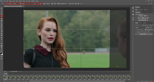
Here's what the gif looks like so far:

You'll probably notice it moves really fast and stops moving after playing once. That's because we haven't gotten to the step to fix that yet. But that's next!
Step 6: timing, looping, etc.
Timing: Select all of the frames. You can do this by selecting the first frame, holding shift, and clicking on the last frame. Now click the little arrow next to where it says "0 secs." under any of the frame previews right here:

Click on "Other..." and type "0.14" into the text field. That represents the number of seconds, or usually the fraction of a second, that each frame will play for. (It's "0.14" in this case because of the way we entered the settings in KMPlayer in the "Frames to Extract" section. The number depends on what you enter there.) Press enter/okay.
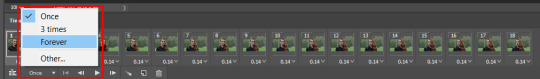
Looping: Next change the looping setting from "once" to "forever". Here's where I'm talking about:
Step 7: sharpening the gif frames
This step can either be done at this point (before coloring it) or later (right after coloring it.) I go back and forth on which is better, and different people say different things. So just play around with it!
I use this sharpening action. It can sharpen up to 75 frames, which is a really good amount in my opinion.
Once you have a sharpening action downloaded, go back to Photoshop and go to window > actions. Click this little menu button, then click "Load Actions...".
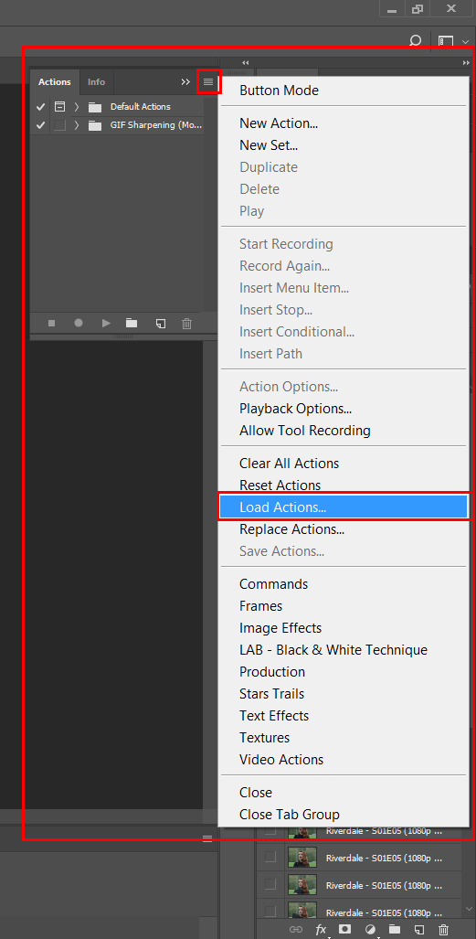
In the window that pops up, choose whatever sharpening action you downloaded and open it. This will load it into your actions panel!
Next, click the menu button on the upper right corner of the timeline panel and click "Flatten Frames Into Layers". Now there will be a new set of layers that are labeled Frame 1, Frame 2, Frame 3, etc. Keep those, and then you can delete the OLD set of layers. (That can significantly lower the file size, and it doesn’t mess anything up if you do it right!)
Now select the very first frame in the timeline, labeled "1", and select the corresponding layer, labeled "Frame 1".
Then open the sharpening action's folder within the actions panel and select the folder labeled with the number of frames you have in your gif. For example, I have 18 frames in my gif, so I selected the folder labeled "18 frames". Or at least that's the way they labeled things in the action I'm using. You may have to explore yours to figure it out.
Then click the play button on the actions panel:

Now that should have sharpened all of your frames/layers! Woohoo! Here's what the gif should look like by now, all cropped, timed, looped, and sharpened:

If this way of sharpening doesn't work for you, here are some other gif sharpening tutorials:
How to use sharpening actions in Photoshop CC by peacelovegifs
Gif sharpening tutorial by manofsteel.co.vu
Sharpening for Photoshop CC by completeresources
Sharpening all gif frames at once by thosetutorials
Sharpening masterpost by itsphotoshop
Gif sharpening action tutorial + download by themazerunnrs
Step 7.5: grouping your layers (a baby step!) A bonus step that I recommend you do is to put all your layers into a group to keep things neat. Just select all of them and press CTRL G.
Step 8: adding a PSD and/or coloring it yourself!!
Here's the fun part! Now you can let out your creativeness with the coloring. It takes a LOT of practice to get good at this, trust me. I've been doing this for YEARS and I still hate my results sometimes. But if that happens to you, too, don't let that stop you from trying again! (God, I sound like a motivational speaker or something, sorry!)
Here’s some background on PSDs for beginners, but you can totally skip this bit...
"PSD" stands for "Photoshop document", meaning a file you make or edit in Photoshop (sorry, kind of self explanatory). On Tumblr, when people talk about PSDs, they're usually referring to a document with layers that add effects (mostly adjustment layers) to a gif/photo/graphic, etc. Also referred to as a "coloring". They usually include things like brightness/contrast, vibrance, curves, selective color, etc. People post these so you can download them and use them for your own work! (Just don't repost and claim as your own. Not cool, man.)
All you have to do is download the file, open it in Photoshop, make sure you have the layers panel open (windows > layers), and drag the PSD file's window on top of your file's window, but keep them separate so you see both at once. Then drag the PSD file's group of layers (but not the background!) over to your file.

(Then you can close the PSD window.) Then on YOUR file, mess around with the adjustment layers and stuff to change it to whatever you want it to look like. I usually edit mine like crazy!
Anyways, here are what your options are.
Finding a PSD (and then I recommend editing it to however you like it)
Here are places to find some great PSDs on Tumblr! (FYI, some are tag pages with sections for PSDs, with different types to choose from. So look around.)
QuirkyResources (Navigation) (Yup, shameless self-promo!)
QuirkyResources (My PSDs)
CompleteResources
ItsPhotoshop
ChaoticResources
YeahPS
DrunkandColoring
AresColoring
That's just a few of my favorite sources, so message me if you want more recs! :)
Coloring it yourself
I'm not going to do a full-on coloring tutorial right now, but here is my tag for those made by other people!
Basically you should learn how to use the most important adjustment layers: curves, brightness/contrast, selective color, color balance, hue/saturation, vibrance, levels, exposure, and gradient maps. At least those are the ones that I use the most and find super useful. Many of the tutorials in that coloring tutorial tag I just linked go over how to use those. So check them out!
In this case, I used my current fave PSD by dracoharry. (I’ve noticed it works on most shows I gif, so it’s super useful! I actually used it for all of the gifs in the gifset I made for this post.)
Here are the layers I kept hidden/showing:

FYI, I changed the layers' settings and whatnot a bunch.
And here’s what my result was:

Step 9: adding text & learning font settings (optional)
This is usually when I add text to the gif, if relevant.
There are various fonts and settings you can use for this, but to make things easier, here's a font PSD by adorkablelena. It’s for subtitles/quotes. I recently started using it. It's really cute! If you're not into it though, here's my tag for other font PSDs you can check out.
When you find a font PSD you like, open it and drag it into your document the same way you would with a regular PSD.
Select the text tool and replace the text with your quote. (Tip: Try not to misquote or misspell things if you can help it! I've done it and it sucks when that happens. Ugh.)
As far as colors go... For the primary quote I make the text white, and the secondary quote I usually make it yellow (#ffde00). And if there is a third I'll use some shade of orange, and anything after that I just use whatever I can make look the best. The stroke color I use varies sometimes, but I usually use black (#000000).
Finally, select the move tool (V) and make sure "smart guides" are turned on. To check this, go to view > show > smart guides, and make sure it's checked. Now when you drag around the text (select its layer first), you can see little purple vertical/horizontal guides pop up when you drag the text to the center of either direction. For the subtitle we're making, we want it to be centered horizontally and close to the bottom of the gif, but not too close. Also, if you have more than one line of text, just press enter somewhere in the text that splits it into similar-sized lines. Here's an example of all of this stuff put together:

Step 10: saving for web
There are a lot of settings to remember and play around with when saving for web, and specifically for Tumblr.
First, go to file > export > save for web (legacy).
Here you'll see a lot of settings to choose from, but they're not as intimidating as they may look!
Here are my usual settings:

Red highlight: There are multiple options in the top drop down list in the area I highlighted that are good to use. I usually use “Adaptive”, but “Perceptual” and “Selective” are good options too. In my experience, the rest make your gif look pretty gross. For the drop down list under that I choose "Pattern". This arranges the pixels in a pattern, and I like the look of that more than the two other viable options, ”Diffusion” and “Noise”.
Orange highlight: This is where you choose the number of color shades that are in the gif. I use the top amount allowed, 256, because this achieves the highest quality possible! If you need to make the gif's file size smaller, you can lower this amount, but I don't recommend it. If it's a B&W gif you can sometimes get away with using less and have it still look just as quality.
Yellow highlight: Looping options: Forever. Very important! Like I showed earlier, you can also set this setting before you get to the "save for web" option. Either way, this makes it so the gif loops forever.
Green highlight: Gif size! As I mentioned earlier, there is a limit for Tumblr. This example is a pretty small gif (592.9K) and the current file size limit on Tumblr is 3MB. Tumblr seems to change this limit a lot though, so you may want to look that up once in awhile to stay up to date.
Turquoise highlight: Always check the box next to “Convert to sRGB”. I just learned that this setting is important. It basically keeps the vibrance intact when you take it from Photoshop to Tumblr. Read a much better explanation here! :)
Then just click "Save...", choose the file location, and press "Save" again.
Step 11: uploading/posting to Tumblr
Now, last but not least, it's time to upload it to Tumblr! I probably don’t need to explain this, but I’m going to anyways. It's super-duper easy. Just go to your dashboard and click on this button:

Then the post creation window pops up, and just go on from there. Upload your images/gifs, drag them around to arrange them however you like, and add a caption if you want.
(Tip: Don't forget to add tags! It's super important to add tags if you want people to actually find your post. Only the first 5 tags show up in the main Tumblr tag-search results (ugh wtf, right?) but sometimes the other ones you add will show up on the general search page. I don't really get how to explain it or how it works tbh, sorry! But I do know that many fandoms have developed their own tagging-language to find people's posts more easily (and avoid spam) which is very useful once you figure it out. For example, if I was posting a gifset of Cheryl Blossom from Riverdale, I'd tag it with things like "riverdaleedit" and "cherylblossomedit" and maybe "madelainepetschedit". So basically the name of the show/character/actor/ship plus "edit", no spaces. Or an abbreviation of any of those, like "spnedit" or "dwinchesteredit". I hope that at least makes a little sense? As far as the amount of tags that will show up on individual blogs, I'm not positive, but I believe you can use up to 30. After that the post won't appear on the tag's page. Grrr.)
Then, of course, just post it! I recommend saving it as a draft and then posting it at a time when a lot of people are likely to be on Tumblr. (There's research done on this timing!)
THE END! :D
I really hope that was at least somewhat helpful. Sorry if it was annoying that I went into sooo much detail, I just thought I should explain everything so it would make sense to most people, especially total beginners. Again, if anyone has any questions at all, you can absolutely ask me here! Or let me know if you think I got anything wrong, I would definitely want to fix it! Thanks for reading, and please like/reblog ♥ I’d really appretiate it!
#photoshop tutorial#completeresources#itsphotoshop#chaoticresources#yeahps#tutorials#gif tutorials#gif making#how to make gifs#gif making tutorial#mine#mine: tutorials#peachresources#riverdale#riverdaleedit#coloring tutorial#sharpening tutorial#photoshop tips#ps tips#photoshop 101#ps 101#500
632 notes
·
View notes
Text
How To Create & A/B Test Facebook Landing Pages
All those “Likes” your business has on Facebook? All that traffic you’re generating with News Feed ads? It’s worthless if you don’t have an end-goal in mind.
To turn Facebook traffic into sales, businesses are increasingly looking to powerful marketing tools called Facebook landing pages.
What is a Facebook Landing Page?
A Facebook landing page is a standalone web page, disconnected from your website’s main navigation. It’s created solely for the purpose of getting Facebook users to take action—to buy, signup or download.
Because it’s designed with persuasive elements like a compelling call-to-action, benefit-oriented copy and an attention-grabbing headline, a landing page is more efficient at convincing its visitors to take action than any other web page.
However, it takes more than sound design to convert your visitors. Your landing page also needs to be used the right way. Driving all your Facebook traffic to just one page won’t work.
In order for it to perform to its full potential, your landing page needs to be tailored to the campaign it’s part of. That means each promotion you run needs its own page.
Here’s how to create one for your next Facebook campaign, and how to optimize it using A/B testing.

The Essentials of an Effective Facebook Landing Page
Every Facebook landing page, regardless of what campaign it’s part of, should feature these elements:
1. No Outbound Links in the Navigation, Body or Footer
Without links in the navigation menu, footer or body of your page, your visitors won’t be able to escape easily before converting. They’ll remain focused on clicking your call-to-action instead of the link to your “About us” page.
“But what if they want to learn more about my business?”
If it’s designed correctly, your prospects shouldn’t need to leave your landing page to learn more about you. It should contain a virtual elevator pitch—just enough about you to communicate who you are and why your offer is worth claiming.
If they want to learn more about your company culture or why you got into business, they can return to your website after they’ve evaluated your offer.
That goes for any other page on your website too. Navigation links to your “Contact us,” “Careers” and “Locations” pages should be omitted. Your logo shouldn’t be linked to your homepage. Right now, the only thing your prospects should be focused on is clicking that call-to-action button.
Take a cue from this NetSuite landing page:

2. A Benefit-Oriented Headline
Teasing out the benefit of your offer isn’t always easy. That’s why professional copywriters get paid the big bucks to do it.
Still, you don’t need years of training to figure out why your visitors should claim your ebook, free trial offer or product. Remember this: your prospects should be able to answer the question “What’s in it for me?” as soon as they reach your landing page. So tell them immediately in the biggest, boldest letters on your page—the headline.
Make sure to be clear about the true benefit to them and be wary of fake ones.
For example, are you offering your visitors an ebook on how to learn expert copywriting techniques? Or are you offering them a resource from which they can learn the writing secrets that experts use to sell more products?
Most professionals don’t want to learn copywriting techniques, but they do want to learn how to write to sell more of their product. Sometimes it takes working a little harder to find your product or service’s true benefit, but it’s always worth the extra digging.
3. Strong Message Match
When Facebook users click your ad, they need to know immediately that they’re in the right place. That’s why the ad that’s driving traffic to your landing page should match with the message of your landing page. This is known as “message match” and it’s crucial to establishing trust with your visitor.
Everything from your page’s headline to its colors should match the referring advertisement. Take this Salesforce page ad and its corresponding landing page, for example.
Here’s the ad:

And here’s the landing page users see when they click through:

Notice how the headline of the ad matches the headline of the landing page exactly as well as its colors? Even the image is exactly the same.
These similarities assure your visitors that they’re in the correct place. Without them your prospects will feel confused at best and at worst, deceived.
4. Concise Copy That Highlights Benefits Over Features
Remember to consider the situation of your landing page visitors as you craft your content. These aren’t people reading for pleasure. They’re busy. They’re on your landing page to quickly evaluate your offer and be on their way.
Don’t drone on, get poetic or try to show off your big vocabulary. Write like you talk. Use bullet points to quickly highlight the benefits of your offer and separate text blocks into small digestible chunks for effortless reading. Make it easy for your visitors to skim your content because that’s what they’re most likely going to do.
Notice how the bullet points on this Digital Marketer landing page entice visitors to convert by stressing the highly specific benefits of downloading the company’s Facebook ad templates.

5. Engaging Visuals
Because they’re able to convey information quickly and efficiently, images and videos have a place on every type of landing page. They’re especially useful on longer ones that need to be packed with a ton of information, like sales pages and click-through landing pages.
Infographics and explainer videos can replace large portions of text that could potentially scare your visitors away. They can also help your prospects better understand your product or service quickly. It’s good to describe your offer, but in many cases it’s even better to showcase what it is and how it works.
Here’s a great example from bookkeeping service, Bench (click through to play around with the image):

While it’s not on a landing page, this interactive image is a great example of what you could include on yours to better explain your service and how it works.
6. Social Proof
If there’s a long waiting line outside of a restaurant, we assume it serves good food. If our friends tell us a particular movie was entertaining, we’re more likely to see it. This is called “social proof” and it can be a valuable persuasive tool on your landing page.
Testimonials from satisfied customers helps prove that people find your product or service valuable. With widgets and buttons that count your social media fans, you can show visitors that your business is worth following. By displaying logos of well-known companies you’ve worked with or big-name publications you’ve been featured in, you can boost your perceived authority.
Take a look at how Jeff Bullas uses social proof on his homepage:

And check out how agency, Amadeus Digital, uses it to persuade prospects to retain their agency:

The reason it’s so powerful is because buyers take cues from other buyers. In fact, 88% trust online reviews as much as recommendations. Boost the perception of your business by displaying on your landing page the many brands, industry authorities and satisfied customers who find your product or service valuable.
7. Attention-Grabbing Call-To-Action Button
Your call-to-action (CTA) is the most important element on your landing page. Without it your visitor literally cannot convert. When you create yours, don’t settle for using a gray button that reads “Submit.” Your CTA needs to get visitors’ attention and make them excited about converting. Instead, try to stress the benefits of claiming your offer with personalized copy.
For example, if your landing page’s goal is to sign people up for a webinar that teaches them the step-by-step system you used to generate an extra $5,000 in monthly revenue with Facebook, don’t use “Sign up” or “Register.” Try something like “Show Me The Social Media Secret To Higher Revenue” or “Teach Me The Revenue-Boosting Social System.” The difference is something your visitors will actually want to click.
How to Improve Your Facebook Landing Page
There will always be room for improvement on the first iteration of your landing page, and the second, and the third. The headline might not resonate with visitors the way you expected. The copy might be a little too verbose. But you won’t know what to improve until you collect data and test. And one of the easiest and most effective ways to do that is with the A/B method of testing.
What is A/B Testing?
A/B testing refers to the process of comparing two different landing pages at a time—one “A” version and one “B” version. Everything else, though, remains the same—like traffic sources and campaign run times, for example.
The Two Ways to A/B Test
A common misconception is that in order to conduct a true A/B test, you can only test one element at a time. For example, if you wanted to discover the effectiveness of your headline, you would test your original page featuring the original headline against a variation page with a different headline. Whichever page converts more visitors at the end of the test has the better headline, since that’s the only difference between the two pages.
That’s the most accurate way to test, but it’s not the only way.
On many occasions, it’s impractical to test only one element at a time. The duration of a single A/B test can be long, which means to optimize an entire page, it would take an extended amount of time and resources that many marketers don’t have. So during major site redesigns or optimizations, they test multiple elements at a time.
They test a variation page with a different headline, form and maybe featured image against their original. At the conclusion of their test, the page with the higher conversion rate is the winner. Why it’s the winner, they won’t know exactly. But, think of it this way: if your page generates more conversions, do you really care if you know whether it was the headline or the image or the form that caused it?
Maybe you do. Or maybe you’ll just be satisfied that your new page has generated more conversions. Which method you choose will depend on how much you want to know and the amount of time and resources you have.
What you can’t choose is the rest of the testing methodology. There are some exact steps you’ll need to follow to make sure you can rely on the results of your A/B test.
Step 1: Gather Data
You should never test without a reason to. Use your website and social media analytics tools to find out how your visitors are behaving. Heat mapping software can show you whether your visitors are noticing your CTA button. Google Analytics can show you if your prospects are abandoning your page immediately.
You have to first identify your page’s problems before you can fix them.
Take an example from Lim Cheng Soon at Pair, who used a heat map to see how visitors were interacting with this mobile app landing page:

Here’s what the test showed:

You’ll notice some small green dots and some bigger red and yellow ones. The bigger, red and yellow ones are locations on the page where visitors paid the most attention. According to Soon:
“Turns out, I found out too many people click on the navigation bar on the top instead of clicking the conversion button (link to AppStore and Google Play). So I made up a theory that having too many ‘distractions’ around the conversion button wasn’t such a good idea.”
So he tested that theory by running A/B tests that hid the social sharing button and the “Download for Free” text.
The results? A 12% boost in conversion, but only because he knew where his landing page was lacking by collecting data first. Without that vital step, you won’t know whether your test will actually make an impact on your conversion rate.
Step 2: Create a Hypothesis
From that data, develop a hypothesis. For example, “Using heat mapping software, we noticed that our visitors were mistaking a photo for the call-to-action button. Because of that, we think that changing the design of that photo to make it look less like a button will divert more attention to the real CTA button.”
At the conclusion of the test, you can accept or reject that hypothesis.
Step 3: Calculate Your Sample Size
Before you can end your test, it will need to reach something known in the scientific world as “statistical significance.” The term refers to the number of visitors you’ll need to generate to each of your pages (original and variation) before you can be confident that your results aren’t due to chance.
The accepted level of statistical significance in most industries is 95%. At a 95% level of significance, you can be 95% sure that the results of your A/B test can be attributed to the changes you made to your landing pages, and not to chance.
Use this calculator from Optimizely to determine how many visitors you’ll need to each of your landing pages before you can reach 95% significance.
Step 4: Create Your Variation Page
Now it’s time to make the adjustments you hypothesized would boost your conversion rate. If you thought it was a new headline that would persuade more visitors to take action, create your test page with a new headline. If your data showed you might need a new image, create your variation with a new image.
Whatever you choose, be sure your control page remains the same. Without a baseline to compare your variation to, you won’t know if your new page is performing better or worse.
Step 5: Eliminate Confounding Variables
Many scientific tests are conducted in a lab for a reason. It eliminates any outside factors that might threaten to poison your results. Something as simple as the occurrence of a holiday or a tiny mistake in the code of your landing page could impact the results of your test for the worse.
There’s no way to completely eliminate all confounding variables. The best you can do is control for as many as you know about. Learn more about how to do that here.
Step 6: Test Everything
Before you begin running your test, you need to ensure everything is working correctly. Make sure:
Your CTA button directs prospects to your “thank you” page when clicked.
Your form is passing information into your CRM system.
The links in your ads direct you to the right page.
Your landing page is displaying correctly in all browsers.
Step 7. Drive Traffic
Now you’re ready to begin driving traffic from Facebook to your landing page. Remember that Facebook allows you to get really granular, so at some point it might be worth testing traffic from different types of ads (sidebar, news feed, audience network) or even different segments (male, female, married, single, etc.) to see how they impact your conversion rate.

Most importantly do not end your test before you reach 95% significance. You can’t be remotely confident of your results until that point. And even then, you can’t be sure of anything.
Conversion optimization influencer, Peep Laja, describes a time when reaching 95% confidence wasn’t enough:
“The variation I built was losing bad—by more than 89% (and no overlap in the margin of error). Some tools would already call it and say statistical significance was 100%. The software I used said Variation 1 has 0% chance to beat Control. My client was ready to call it quits. However, since the sample size here was too small (only a little over 100 visits per variation) I persisted and this is what it looked like 10 days later.”

The variation that had 0% chance of beating control was now winning with 95% confidence.”
The longer you run your test, the more confident you can be of its results. The moment you reach 95% significance isn’t the moment you should stop, it’s the earliest you can stop. If you have the time and resources to run your test longer–do it.
Step 8. Analyze & Improve
Now it’s time to look at your results. Did your variation achieve what you thought it would? Or is your original still reigning supreme? Make changes, or don’t, based on your results. And never stop testing.
There’s always a better version of your landing page waiting to be created.
https://growinsta.xyz/how-to-create-a-b-test-facebook-landing-pages/
#free instagram followers#free followers#free instagram followers instantly#get free instagram followers#free instagram followers trial#1000 free instagram followers trial#free instagram likes trial#100 free instagram followers#famoid free likes#followers gratis#famoid free followers#instagram followers generator#100 free instagram followers trial#free ig followers#free ig likes#instagram auto liker free#20 free instagram followers trial#free instagram followers no#verification#20 free instagram likes trial#1000 free instagram likes trial#followers instagram gratis#50 free instagram followers instantly#free instagram followers app#followers generator#free instagram followers instantly trial#free instagram followers no survey#insta 4liker#free followers me#free instagram followers bot
0 notes
Photo

Change was afoot for Google My Business in 2017 – are you up to date with all the developments? Google devotees will be familiar with the relentless cycle of updates and changes to the search engine’s services, and Google My Business was no different. New developments were announced almost every month in 2017, and although a number of the updates were relatively small scale, they’re all worth knowing about. If it’s been a few months, or perhaps longer since you looked at your listing, it’s time to get up to speed with what has changed. JANUARY GMB got friendlier for businesses with multiple locations. Location insights via the new Google My Business API. Version 3.2 of the API added support for insights on the locations in your account. The first update of the year meant developers can now build applications that better manage other branches and third parties, making it easier to handle large or complicated Google My Business accounts. The API gives users the opportunity to manage locations at scale by editing location information, reading and responding to customer reviews and creating or updating posts, (including photographs). MARCH GMB brought more detail about your businesses accessibility. Enter accessibility attributes for your business. This update collects information about your business’s accessibility, and then shares that information with customers. You’re asked to respond yes or no (in fairly specific terms) to questions regarding the availability of features like wheelchair-accessible entrances, seating or parking, and those details are then displayed for your customers’ reference. APRIL Brought more insights about how customers find your business. This was a big month for My Google Business, and saw a number of changes to the API function, insights feature and attribute options. Add full menus to your locations via the new Google My Business API. A minor development of the API feature that means users can update menu details such as descriptions and prices. Download bulk insights for your listings. Insights are crucial clues as to how customers access your listing. For the most part, customers find sites via Google Search and Maps, and insights give you access to that information. But this new feature means you can download insights for multiple listings, which should create a picture of how the online presences of different chain locations are performing on the platforms through which customers most regularly find them. Enter URL attributes for your business to add links to more kinds of information, such as a restaurant’s menu. This update does what it says on the tin: as of April, Google My Business users could add URLs for locations or menus by entering the relevant URL in the corresponding attribute column. JUNE Major update gave users better communication of their offers and events & free mobile friendly websites. Post timely updates on new products, special offers and upcoming events. Stay engaged with your customers by sharing news directly from your listing. Posting through Google My Business means you can share services, products and events on heavily used platforms like Google Search and Maps. ‘Timely’ posts are displayed in seconds, so you’ll always be able to keep your customers right up to date with targeted news and information. Create a free mobile-optimised website for your business. An optimised mobile site is a useful freebie that comes with claiming your listing on Google My Business. Google compiles the mobile site (which is also optimised for desktops and laptops) from content it finds in your listing, and will automatically update it whenever you change information on your listing or post photographs, for example. Then it’s there for you to edit and customise as you see fit. JULY Useful data so you can optimise your photos. Download photos data for multiple locations with a bulk insights report. Another bulk development, this option shows you the number of photos associated with your listing and how often they’re viewed, as well as comparing those views with the figures for businesses providing a similar service to yours. These were made available from July in bulk insight reports, in the following sections: Total owner photos Owner photo views Total customer photos Customer photo views. AUGUST Allowed users to interact with you directly through your GMB listing. Add links to specific actions like online orders or reservations. Make it easier for customers to take action directly from your listing. This means customers can follow through on plenty of key actions, including reserving a table, booking an appointment, placing an order, and many more. OCTOBER Brought 3rd party integration options. Create and update posts via the new Google My Business API. Version 4.0 of the API adds support for posts, hotel amenities and more. Versions of the API grow more sophisticated with each month. October’s update widens the scope, giving third party platforms the ability to submit Google Posts for companies using Google My Business. The new API also feature better quality photographs, notifications of review being updated and post analytics (e.g. time a post was viewed before the CTA button was clicked). NOVEMBER Helped you describe your business better. New selection attributes let you choose from predefined business descriptions like ‘No Kosher food’, ‘Some Kosher food’ or ‘Strictly Kosher food’. This update broadened the range of attributes you can use to describe your business. Previously yes/no attributes were available (“Outdoor seating: yes/no”) alongside the URL attributes introduced in April. The new selection gives users the chance to be more specific about their businesses services and provisions. December was change-free, but if preceding years are anything to go by we can expect to see another deluge of updates as 2018 rolls on. If you’re a Google My Business owner looking to make the most of the service’s improvements, keep your eyes peeled… The post Google My Business 2017 – Updates You May Have Missed appeared first on FOUND.
0 notes
Text
How To Create & A/B Test Facebook Landing Pages
All those “Likes” your business has on Facebook? All that traffic you’re generating with News Feed ads? It’s worthless if you don’t have an end-goal in mind.
To turn Facebook traffic into sales, businesses are increasingly looking to powerful marketing tools called Facebook landing pages.
What is a Facebook Landing Page?
A Facebook landing page is a standalone web page, disconnected from your website’s main navigation. It’s created solely for the purpose of getting Facebook users to take action—to buy, signup or download.
Because it’s designed with persuasive elements like a compelling call-to-action, benefit-oriented copy and an attention-grabbing headline, a landing page is more efficient at convincing its visitors to take action than any other web page.
However, it takes more than sound design to convert your visitors. Your landing page also needs to be used the right way. Driving all your Facebook traffic to just one page won’t work.
In order for it to perform to its full potential, your landing page needs to be tailored to the campaign it’s part of. That means each promotion you run needs its own page.
Here’s how to create one for your next Facebook campaign, and how to optimize it using A/B testing.

The Essentials of an Effective Facebook Landing Page
Every Facebook landing page, regardless of what campaign it’s part of, should feature these elements:
1. No Outbound Links in the Navigation, Body or Footer
Without links in the navigation menu, footer or body of your page, your visitors won’t be able to escape easily before converting. They’ll remain focused on clicking your call-to-action instead of the link to your “About us” page.
“But what if they want to learn more about my business?”
If it’s designed correctly, your prospects shouldn’t need to leave your landing page to learn more about you. It should contain a virtual elevator pitch—just enough about you to communicate who you are and why your offer is worth claiming.
If they want to learn more about your company culture or why you got into business, they can return to your website after they’ve evaluated your offer.
That goes for any other page on your website too. Navigation links to your “Contact us,” “Careers” and “Locations” pages should be omitted. Your logo shouldn’t be linked to your homepage. Right now, the only thing your prospects should be focused on is clicking that call-to-action button.
Take a cue from this NetSuite landing page:

2. A Benefit-Oriented Headline
Teasing out the benefit of your offer isn’t always easy. That’s why professional copywriters get paid the big bucks to do it.
Still, you don’t need years of training to figure out why your visitors should claim your ebook, free trial offer or product. Remember this: your prospects should be able to answer the question “What’s in it for me?” as soon as they reach your landing page. So tell them immediately in the biggest, boldest letters on your page—the headline.
Make sure to be clear about the true benefit to them and be wary of fake ones.
For example, are you offering your visitors an ebook on how to learn expert copywriting techniques? Or are you offering them a resource from which they can learn the writing secrets that experts use to sell more products?
Most professionals don’t want to learn copywriting techniques, but they do want to learn how to write to sell more of their product. Sometimes it takes working a little harder to find your product or service’s true benefit, but it’s always worth the extra digging.
3. Strong Message Match
When Facebook users click your ad, they need to know immediately that they’re in the right place. That’s why the ad that’s driving traffic to your landing page should match with the message of your landing page. This is known as “message match” and it’s crucial to establishing trust with your visitor.
Everything from your page’s headline to its colors should match the referring advertisement. Take this Salesforce page ad and its corresponding landing page, for example.
Here’s the ad:

And here’s the landing page users see when they click through:

Notice how the headline of the ad matches the headline of the landing page exactly as well as its colors? Even the image is exactly the same.
These similarities assure your visitors that they’re in the correct place. Without them your prospects will feel confused at best and at worst, deceived.
4. Concise Copy That Highlights Benefits Over Features
Remember to consider the situation of your landing page visitors as you craft your content. These aren’t people reading for pleasure. They’re busy. They’re on your landing page to quickly evaluate your offer and be on their way.
Don’t drone on, get poetic or try to show off your big vocabulary. Write like you talk. Use bullet points to quickly highlight the benefits of your offer and separate text blocks into small digestible chunks for effortless reading. Make it easy for your visitors to skim your content because that’s what they’re most likely going to do.
Notice how the bullet points on this Digital Marketer landing page entice visitors to convert by stressing the highly specific benefits of downloading the company’s Facebook ad templates.

5. Engaging Visuals
Because they’re able to convey information quickly and efficiently, images and videos have a place on every type of landing page. They’re especially useful on longer ones that need to be packed with a ton of information, like sales pages and click-through landing pages.
Infographics and explainer videos can replace large portions of text that could potentially scare your visitors away. They can also help your prospects better understand your product or service quickly. It’s good to describe your offer, but in many cases it’s even better to showcase what it is and how it works.
Here’s a great example from bookkeeping service, Bench (click through to play around with the image):

While it’s not on a landing page, this interactive image is a great example of what you could include on yours to better explain your service and how it works.
6. Social Proof
If there’s a long waiting line outside of a restaurant, we assume it serves good food. If our friends tell us a particular movie was entertaining, we’re more likely to see it. This is called “social proof” and it can be a valuable persuasive tool on your landing page.
Testimonials from satisfied customers helps prove that people find your product or service valuable. With widgets and buttons that count your social media fans, you can show visitors that your business is worth following. By displaying logos of well-known companies you’ve worked with or big-name publications you’ve been featured in, you can boost your perceived authority.
Take a look at how Jeff Bullas uses social proof on his homepage:

And check out how agency, Amadeus Digital, uses it to persuade prospects to retain their agency:

The reason it’s so powerful is because buyers take cues from other buyers. In fact, 88% trust online reviews as much as recommendations. Boost the perception of your business by displaying on your landing page the many brands, industry authorities and satisfied customers who find your product or service valuable.
7. Attention-Grabbing Call-To-Action Button
Your call-to-action (CTA) is the most important element on your landing page. Without it your visitor literally cannot convert. When you create yours, don’t settle for using a gray button that reads “Submit.” Your CTA needs to get visitors’ attention and make them excited about converting. Instead, try to stress the benefits of claiming your offer with personalized copy.
For example, if your landing page’s goal is to sign people up for a webinar that teaches them the step-by-step system you used to generate an extra $5,000 in monthly revenue with Facebook, don’t use “Sign up” or “Register.” Try something like “Show Me The Social Media Secret To Higher Revenue” or “Teach Me The Revenue-Boosting Social System.” The difference is something your visitors will actually want to click.
How to Improve Your Facebook Landing Page
There will always be room for improvement on the first iteration of your landing page, and the second, and the third. The headline might not resonate with visitors the way you expected. The copy might be a little too verbose. But you won’t know what to improve until you collect data and test. And one of the easiest and most effective ways to do that is with the A/B method of testing.
What is A/B Testing?
A/B testing refers to the process of comparing two different landing pages at a time—one “A” version and one “B” version. Everything else, though, remains the same—like traffic sources and campaign run times, for example.
The Two Ways to A/B Test
A common misconception is that in order to conduct a true A/B test, you can only test one element at a time. For example, if you wanted to discover the effectiveness of your headline, you would test your original page featuring the original headline against a variation page with a different headline. Whichever page converts more visitors at the end of the test has the better headline, since that’s the only difference between the two pages.
That’s the most accurate way to test, but it’s not the only way.
On many occasions, it’s impractical to test only one element at a time. The duration of a single A/B test can be long, which means to optimize an entire page, it would take an extended amount of time and resources that many marketers don’t have. So during major site redesigns or optimizations, they test multiple elements at a time.
They test a variation page with a different headline, form and maybe featured image against their original. At the conclusion of their test, the page with the higher conversion rate is the winner. Why it’s the winner, they won’t know exactly. But, think of it this way: if your page generates more conversions, do you really care if you know whether it was the headline or the image or the form that caused it?
Maybe you do. Or maybe you’ll just be satisfied that your new page has generated more conversions. Which method you choose will depend on how much you want to know and the amount of time and resources you have.
What you can’t choose is the rest of the testing methodology. There are some exact steps you’ll need to follow to make sure you can rely on the results of your A/B test.
Step 1: Gather Data
You should never test without a reason to. Use your website and social media analytics tools to find out how your visitors are behaving. Heat mapping software can show you whether your visitors are noticing your CTA button. Google Analytics can show you if your prospects are abandoning your page immediately.
You have to first identify your page’s problems before you can fix them.
Take an example from Lim Cheng Soon at Pair, who used a heat map to see how visitors were interacting with this mobile app landing page:

Here’s what the test showed:

You’ll notice some small green dots and some bigger red and yellow ones. The bigger, red and yellow ones are locations on the page where visitors paid the most attention. According to Soon:
“Turns out, I found out too many people click on the navigation bar on the top instead of clicking the conversion button (link to AppStore and Google Play). So I made up a theory that having too many ‘distractions’ around the conversion button wasn’t such a good idea.”
So he tested that theory by running A/B tests that hid the social sharing button and the “Download for Free” text.
The results? A 12% boost in conversion, but only because he knew where his landing page was lacking by collecting data first. Without that vital step, you won’t know whether your test will actually make an impact on your conversion rate.
Step 2: Create a Hypothesis
From that data, develop a hypothesis. For example, “Using heat mapping software, we noticed that our visitors were mistaking a photo for the call-to-action button. Because of that, we think that changing the design of that photo to make it look less like a button will divert more attention to the real CTA button.”
At the conclusion of the test, you can accept or reject that hypothesis.
Step 3: Calculate Your Sample Size
Before you can end your test, it will need to reach something known in the scientific world as “statistical significance.” The term refers to the number of visitors you’ll need to generate to each of your pages (original and variation) before you can be confident that your results aren’t due to chance.
The accepted level of statistical significance in most industries is 95%. At a 95% level of significance, you can be 95% sure that the results of your A/B test can be attributed to the changes you made to your landing pages, and not to chance.
Use this calculator from Optimizely to determine how many visitors you’ll need to each of your landing pages before you can reach 95% significance.
Step 4: Create Your Variation Page
Now it’s time to make the adjustments you hypothesized would boost your conversion rate. If you thought it was a new headline that would persuade more visitors to take action, create your test page with a new headline. If your data showed you might need a new image, create your variation with a new image.
Whatever you choose, be sure your control page remains the same. Without a baseline to compare your variation to, you won’t know if your new page is performing better or worse.
Step 5: Eliminate Confounding Variables
Many scientific tests are conducted in a lab for a reason. It eliminates any outside factors that might threaten to poison your results. Something as simple as the occurrence of a holiday or a tiny mistake in the code of your landing page could impact the results of your test for the worse.
There’s no way to completely eliminate all confounding variables. The best you can do is control for as many as you know about. Learn more about how to do that here.
Step 6: Test Everything
Before you begin running your test, you need to ensure everything is working correctly. Make sure:
Your CTA button directs prospects to your “thank you” page when clicked.
Your form is passing information into your CRM system.
The links in your ads direct you to the right page.
Your landing page is displaying correctly in all browsers.
Step 7. Drive Traffic
Now you’re ready to begin driving traffic from Facebook to your landing page. Remember that Facebook allows you to get really granular, so at some point it might be worth testing traffic from different types of ads (sidebar, news feed, audience network) or even different segments (male, female, married, single, etc.) to see how they impact your conversion rate.

Most importantly do not end your test before you reach 95% significance. You can’t be remotely confident of your results until that point. And even then, you can’t be sure of anything.
Conversion optimization influencer, Peep Laja, describes a time when reaching 95% confidence wasn’t enough:
“The variation I built was losing bad—by more than 89% (and no overlap in the margin of error). Some tools would already call it and say statistical significance was 100%. The software I used said Variation 1 has 0% chance to beat Control. My client was ready to call it quits. However, since the sample size here was too small (only a little over 100 visits per variation) I persisted and this is what it looked like 10 days later.”

The variation that had 0% chance of beating control was now winning with 95% confidence.”
The longer you run your test, the more confident you can be of its results. The moment you reach 95% significance isn’t the moment you should stop, it’s the earliest you can stop. If you have the time and resources to run your test longer–do it.
Step 8. Analyze & Improve
Now it’s time to look at your results. Did your variation achieve what you thought it would? Or is your original still reigning supreme? Make changes, or don’t, based on your results. And never stop testing.
There’s always a better version of your landing page waiting to be created.
https://growinsta.xyz/how-to-create-a-b-test-facebook-landing-pages/
#free instagram followers#free followers#free instagram followers instantly#get free instagram followers#free instagram followers trial#1000 free instagram followers trial#free instagram likes trial#100 free instagram followers#famoid free likes#followers gratis#famoid free followers#instagram followers generator#100 free instagram followers trial#free ig followers#free ig likes#instagram auto liker free#20 free instagram followers trial#free instagram followers no#verification#20 free instagram likes trial#1000 free instagram likes trial#followers instagram gratis#50 free instagram followers instantly#free instagram followers app#followers generator#free instagram followers instantly trial#free instagram followers no survey#insta 4liker#free followers me#free instagram followers bot
0 notes