#ps tips
Explore tagged Tumblr posts
Text
Addition to this, we use the invisible character [⠀] / Unicode U+2800 as well for an effect as if the main folder is open and showing subfolders (it is a larger character than a space) Image below!

These folders are made to look like you've opened the "Sub Systems" folder and can see the two sub folders.
The main folder uses a space [ ], and the subfolders use U+2800 [⠀]
Of course there are other "invisible characters" and all of them will be different sizes, so you can look for smaller or larger characters as well!
friendly reminder to everyone who uses simply plural that you can have no folder icon!
If you leave the "custom emoji' section blank, it shows a picture of a folder to the left of the text. But, if you put a regular old space in there, that section is actually blank!


It may not be the most significant thing, but it certainly looks much better imo
#ps tips#simply plural#plural simply#simplyplural#simply plural organisation#simply plural organization#anti syscourse#syscourse dni#dni syscourse
273 notes
·
View notes
Text

@mewtwoandme 's Blu
and my Enna if they ever met
(I didn't know how to draw vitiligo so im hoping it looks okay :( )
#mewtwo#mewtwo pokemon#pokemon#mewtwoandme#pokemon trainer#I felt like doing a simple doodle and this is all i could come up with i did not cook#Kinda want to draw sivith and blu#Ps. Does anyone have tips on drawing mouths I have ZERO idea how to
186 notes
·
View notes
Text


How do you sleep at night? No one to hide behind Betrayed every alibi you had You had every chance to make amends instead you got drunk on bitterness And you still claim that you're innocent, it's sad
#daniel ricciardo#dr3#christian horner#for the blacklists#I recognize that christian horner in a gifset is NOT the kind of content people in ricnation are looking for rn#debated posting this but fuck it#me 🤝🏼 daniel: two bitches that love a depressing song lyric#it's about breaking free from a toxic relationship and the importance of prioritizing one's own needs#and that it can take a long time to recognize the dynamics at play in those relationships#and removing yourself from that situation can be just as hard and that just kind of epitomizes daniel with christian for me#in the return to rbr I think daniel trusted that CH would at the very least be straight forward and upfront with him#even if the end result wasn't what daniel wanted or hoped for#daniel could handle not getting the rbr seat#but something he couldn't handle was the truth that the one person he believed he could trust was gaslighting him and using him#and daniel had a light bulb moment - the point where you realize that sometimes the best thing you can do for yourself is to walk away#and so he got out#also this is obviously my interpretation of a relationship that I have zero insider info on and maybe they are chill now#as always…thinking too deeply about people I don’t know in the tags#also i recognize that this song is actually about a tiktok hype house but whatever rbr are that immature so it fits#this is my first go with this type of editing in PS so if you have any tips on style and execution i'm all ears#Apparently i also owe CH an apology bc i was so sure he didn't shake daniel's hand pre-race in singapore but he actually did and i missed i#during the breakdown i was having anyway fuck him still
159 notes
·
View notes
Note
Do you sell your brushes that you use?
Nah, they're not mine to begin with except the customized default ones (and honestly they're easy to do).
Check featured tag: messyr's brushes
#messyr#messyr's brushes#the more i see 'whats ur brush' in my inbox the more i wont answer bc it's featured in my blogggg + tumblr siteeeee just check it out pls#and if youre looking for how it's textured that way- it's just set to NO ANTI-ALIASING. it makes it pixelated asf#AND THEY HAVE DEFAULT BRUSH TIP (DOT)#for markers- get a noise texture (from default assets or somewhere else) and slap it in there#PS. I USE CSP. However in any programs- I tend to use pencils and other rough textured brushes available as default.
109 notes
·
View notes
Note
Your rendering and use of foreground blur (specifically in the radio man piece and the arrow drawing) are incredible, could you speak a bit to your process when it comes to rendering works like those ? You are kick arse
I'm really fond of the Bokeh effect. They make flat visuals dimensional and more alive. It almost mimics the way we naturally view things in the real world; where we focus our sight on one thing at a time and the rest are blurred. It also makes the picture appear as if you're there in the same space where and when the shot was taken. And digitally, nothing emulates this effect as seamlessly and efficiently as Filters✨
Basically, just top a Blur filter on the element/layer. In the Radio Man piece, I used Motion Blur and Gaussian together for the trumpet (foreground element)--But not before converting the layer of the foreground element into a Smart Object. AFAIK, in Photoshop, filters are rasterized into a regular layer when applied, making the effect irreversible unless you undo it immediately. If you're beyond several commands after applying it, Ctrl+Z won't help you.


Best practice is to convert the layer into a smart object before applying any filters. This allows you to edit the drawing/source layer, while stacking as many filters, which are adjustable too, as you want. It's a minor step but very helpful in organizing and preserving the quality of your layers. The same process was applied to the arrow drawing, only difference was using a mask layer on the smart object to specify the areas exempted from the blur.
I'm curious on other artist's process particularly in achieving the Bokeh effect. Do share your nuggets of experience regardless of the software you used 👀✨
#Rendering Tip#This process is more catered to PS users. Might help others?#hoyakrimson I never wish to kick arse---at least not literally 🤍#verasks
98 notes
·
View notes
Text
How To Write Good Dialogue (Part 1)

I'm gonna start this by saying I'm not trying to sound like a know-it-all. I am just tired of posts like these being absolutely fucking useless. I am aware this is basically me screaming into a void and I’m more than okay with that.
This guide is meant for intermediate screenwriters, but beginners are also absolutely welcome. :)
(about me)
-♠︎-♠︎-♠︎-♠︎-
I've noticed a rise in film students who want to make films that have no dialogue. Probably after your professor showed you Doodlebug, right? Fuck that.
I'll make another post about writing a short film, but all you need to know is: Don't waste the audience’s time. Most of these no-dialogue shorts have very little substance and take way too long to tell the shortest possible story. Not a good idea.
Useless Dialogue
Plain and simple, don't write useless dialogue. Useless dialogue is dialogue that just doesn't fucking matter. Dialogue matters by having ✨subtext.✨
What is subtext? Subtext is the meaning behind the action. That's it.
If I tell you that I love you and I got big doe eyes while I say it, it means I love you. If I tell you I love you through a clenched jaw without looking at you, I don't necessarily love you right now.
Simple, right? Great.
Now think about the subtext behind every line. Does your character mean what they're saying? Are they doing it to get what they want? What is going through their mind as they say it? As long as you know your character, you’ll have these answers ready to go. If you don’t, you’ll figure it out eventually. Just keep writing.
When you write your character walking into a Starbucks and saying, "One venti iced coffee," does that do something? Why do I need to see someone's boring Starbucks order? Do I need to know that your character's boring? Why are you writing a boring character? [Of course, in the rare situation where this is some revealing clue to the massive crime investigation, then it makes sense.]
Useless dialogue is any dialogue that has no meaning or purpose in your script. Delete and move on. You don't need to write entire conversations or scenes that bore us, just write what we care about.
I took a class once where my professor called a version of this "trimming the fat." Get us into your scene and out of your scene in as little time as it takes to have it achieve its full purpose in the script.
[P.S. You don’t “inject” subtext into your lines. Idk who started that vernacular in subtext teachings but I hate it.]
Show vs. Tell
I remember a glorious fight I got into with a Redditor last year about show vs. tell… TL;DR: Dialogue is “show” if you write it with intention and subtext. If someone says that dialogue is inherently “tell,” they’re wrong and can go fuck themselves.
Dialogue that is “tell” is expositional dialogue. But, hot take: Exposition isn't just in dialogue. It’s also those annoying clichés that make you roll your eyes in the theater (which we just call clichés and not exposition). I’m sure every professor I’ve had will disagree with this and then get me into a long conversation about it, but let’s ignore that for right now.
Have you ever seen a movie where a character rubs an old, worn-out photo of a young girl while looking depressed? That's exposition. That character has a dead daughter. No shit.
Clichés are incredibly annoying. We all know that. Assume that any cliché you see - in this context - is exposition and try your best not to write it. (Tropes are different and sometimes necessary, so I’m not talking about that.)
Point blank: When you have subtext in your lines, they are "show,” not “tell.”
Before moving on, I'll bring up that while technically the dead daughter photo is subtextual, it is as close to the character saying “My daughter is dead,” as you can get. Don't treat the audience like we're fucking stupid.
The First 15
If you don’t know what the Inciting Incident is, please look up “3 Act Structure” before reading this.
The first 15 pages of your script is the part that comes before the Inciting Incident. This is the part you want to get right because, although people probably won’t leave the theater, they will absolutely find something else on the streaming service they’re using. The people making said movie will also just toss your script in the trash before it’s even produced, so it's best to get it right.
Dialogue in the first 15 generally follows the same rules, but carries a heftier additional rule. All dialogue in the first 15 minutes must, must, must tell us something about your character.
Remember when I talked about that boring Starbucks order? Why is your character boring? Don’t write that. Don’t write nice characters. Or pleasant characters. Or friendly characters. No one cares.
You want empathy. This does not mean “relatable.” It means “empathetic.” There is a difference.
I personally relate to Vi in Arcane, but I empathize with Theo in Children of Men. Both are excellent, but one personally resonates a bit more with me. You cannot write a character that deeply resonates with every single person, it is impossible.
With each line of dialogue, you must be saying something about your character that generates the empathy. Instead of telling you how to do this, I’ll direct you to a movie that will do better than an explanation: Casablanca.
Watch how Rick interacts with the world. What kind of man is Rick? Watch what he does, what he says, and how he treats people and himself. Watch that empty glass on the table. Watch his contradictions. Everything. Those things matter and it’s what makes you want to watch Rick for the entire duration of Casablanca.
“Realism”
This is maybe more directorial, but make your characters human enough, not too human.
Too human is when you’ve tried your best to capture all those little life-like speech patterns. You know, the ones that no one fucking cares about.
If your character coughs, they’re sick. If they clear they’re throat, they’re uncomfortable. If a bruise isn’t going away, they’re going to die. Simple.
Every moment on screen matters. Everything the audience sees is meant to lead them to a conclusion. Not the conclusion, just a conclusion.
The realism you want is in the choices your character makes, not how many times they say “Uh,” in a sentence.
Conclusion
Dialogue matters and should not be treated lightly or without care. Once you have this all engrained in your mind, dialogue should become effortless.
If you want an excellent way to think about this, Robert McKee's Story has an excellent chapter that helped clarify this all for me. Here's an excerpt and the context.
Warning, spoilers for Chinatown.
"If I were Gittes at this moment, what would I do?"
Letting your imagination roam, the answer comes:
"Rehearse. I always rehearse in my head before taking on life's big confrontations."
Now work deeper into Gittes's emotions and psyche:
Hands white-knuckled on the steering wheel, thoughts racing: "She killed him, then used me. She lied to me, came on to me. Man, I fell for her. My guts are in a knot, but I'll be cool. I'll stroll to the door, step in and accuse her. She lies. I send for the cops. She plays innocent, a few tears. But I stay ice cold, show her Mulwray's glasses, then lay out how she did it, step by step, as if I was there. She con-fesses. I turn her over to Escobar; I'm off the hook."
EXT. BUNGALOW-SANTA MONICA
Gittes' car speeds into the driveway.
You continue working from inside Gittes' pov, thinking:
"I'll be cool, I'll be cool ..." Suddenly, with the sight of her house, an image of Evelyn flashes in your imagination. A rush of anger. A gap cracks open between your cool resolve and your fury.
The Buick SCREECHES to a halt. Gittes jumps out.
"To hell with her!"
Gittes SLAMS the car door and bolts up the steps.
Story by Robert McKee, pg 156
The context of this page is McKee's way of explaining how to write characters. I found it very helpful.
-♠︎-♠︎-♠︎-♠︎-
Thanks for reading! I probably forgot something, so I made this a “part 1.”
I hope this helps someone since I’m really tired of finding short films on YouTube that are all fucking silent. The few who have done it well have been copied to death, so please write some dialogue. I promise you it’s so much better if you do.
Asks are open! :)
#ronni august#ronni's writing tips#writing#writing tips#screenwriter#screenwriting#writing inspiration#writing ideas#writing inspo#writing advice#writing help#writing resources#how to write#writing tools#fiction writing#screenplay#writing motivation#writers of tumblr#♤ronniaugustwriting♤#I know Casablanca is black and white but I colorized it with PS so it would look more cohesive in the header#196#r/196
385 notes
·
View notes
Text
Seven(ish) Sentence Sunday ✍️
Tagged by @diazsdimples @giddyupbuck and @wikiangela. Thank you lovelies mwah 😘
Have a little something from LA Lonely -> this is after the fun and orgasms of Buck and Eddie’s hook up. Still don’t know if I’m going to go full spice 🌶️ or just do a quick little run down of things.
Prev snippet & mood board here
Buck expects him to start pulling his clothes on and to give him the whole “this was fun, but I gotta bounce” speel, but Eddie surprises him by climbing back into bed and nudging Buck to roll onto his side so Eddie can scoot up behind him and hold him.
Buck freezes for a moment because no one does this. They have their fun and then they leave. They don’t stay and they definitely don’t cuddle.
Eddie must feel him go tense because his hold loosens and he moves as if he’s about to pull away. “Is this okay?”
Buck grabs at the arms that are wrapped around him, stopping Eddie’s descent. “Y-yeah. It’s-it’s okay.” He pulls at Eddie’s arms and the man settles back behind him, burrowing his face into the juncture where Buck’s neck meets his shoulder as he shuffles closer.
Soft kisses are pressed into his skin and Buck is helpless but to relax back into Eddie, letting the comfort and warmth of whatever is happening wrap around him.
“Stay?” He whispers, not sure if Eddie can hear him but not being brave enough to say it any louder. He feels like he’s asking too much.
A kiss behind his ear. “Okay.”
No pressure tagging: @hippolotamus @puppyboybuckley @exhuastedpigeon @spotsandsocks @devirnis @wikiangela @hoodie-buck @honestlydarkprincess @homerforsure @monsterrae1 @missmagooglie @mellaithwen @nmcggg @lover-of-mine @ladydorian05 @loserdiaz @bekkachaos @wildlife4life @watchyourbuck @weewootruck @elvensorceress @eddiebabygirldiaz @evanbegins @rewritetheending @rainbow-nerdss @captain-hen @jeeyuns @jesuisici33 @glorious-spoon @fortheloveofbuddie @fiona-fififi @disasterbuckdiaz @thewolvesof1998 @try-set-me-on-fire @theotherbuckley @steadfastsaturnsrings @tizniz @athenagranted @alliaskisthepossibilityoflove @spagheddiediaz @sunshinediaz and as always, anyone else who wants to share something -> consider this your tag ☺️
#daffi writes#wip: la lonely#buddie wip#buddie#besides posting yesterday I’ve been a bit quiet with wip tag games.#There’s some heavy shit going on in part of my extended family which has emotionally sucker punched me and my husband#Creative energy is running on exhaust fumes which makes me sad cos I felt like I’d just gotten my rhythm back.#so when this idea hit me and some words flowed … I ran with it#I’m still tip tap tying away Rivals 🚒. It’s just going slower than I want#even this new wip is going slower than I want#but hey I can’t rush things and my brain is doing its best right now#*kisses brain gently*#I’m trying to look after me and I hope you’re trying to look after you as best you can which can look different day to day#you’re doing amazing and ily ❤️#okay I’ve finished my very long speel in the tags xx#ps. please keep tagging me in things .. I love supporting and cheering on my pocket pals 🥰
119 notes
·
View notes
Text


🩷🩵 ayakanon matching rentry graphics (self indulgent)
like/rb and credit if using!!
#ps this is my first graphic in this style so sorry if it looks choppy!#feel free to send some tips ;w;#mine#graphics#rentry graphics#rentry resources#bandori#kanon matsubara#aya maruyama#ayakanon#blue#pink
48 notes
·
View notes
Text
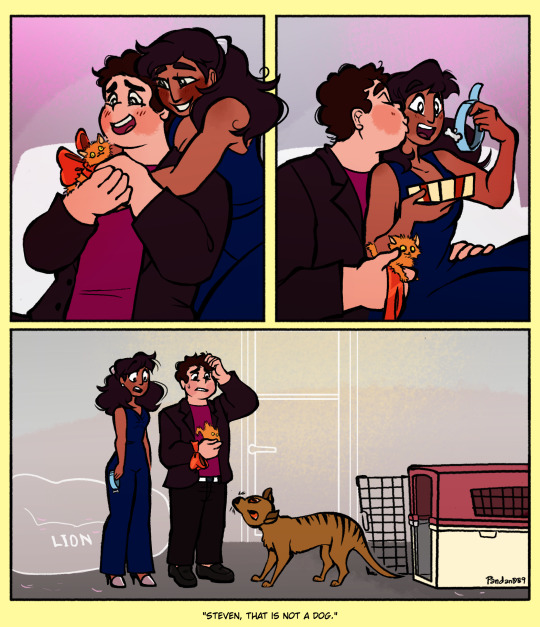
Got a freeform connverse ko-fi request, baby!
I mean, the request was them doing something cute as a couple, but almost same thing.
Thank you for the tip and request, Alphasun! 😁
#connverse#Steven Quartz Universe#Connie Maheswaran#thylacine#Imagine not being remembered by the world as the boy who saved Earth but the one who accidentally found a thylacine because he thought it#was a dog#my shiz#su#comic#my comic#I wanted the lack of dialogue and be more implied what they were doing as a couple.#Tho if I didn't actually make it clear enough:#They're celebrating something together. Most likely an anniversary. And they surprised each other fur babies.#I don't know if I'm going to headcanon but sometimes I think Connie is a little more of a dog person?#Like. She likes animals in general.#But I wonder if dogcopter would influence her or she liked dogcopter because dog.#Anyway. Steven being practically all about cats she didn't expect a dog from him.#PS though. If you're going to adopt a pet with someone#you should talk about it to them first before bringing the animal in.#doodles for tips
355 notes
·
View notes
Text
A review of intersex/intergender flag mashup techniques
I really like it when I can figure out what a new pride flag means just from my knowledge of other flags, and I know I'm not alone on this. For example, here are some flags other people have made that I could immediately figure out were <thing> plus intersex:



So, I've been thinking about how we as intersex flag creators can create hybrid flags in consistent way. I'm most motivated to figure out a recipe for intergender flags: genders that are connected to being intersex.
I assembled a spreadsheet of 66 gender flags, and wrote a Python script to take my csv file, parse it, and use the drawsvg library to draw the different flags in different ways. And then I stared at the results, showed them to friends, and discussed what would be both reliable in terms of producing clear, decent-looking results. (A subset of the results are under the keep reading cut.)
In this post I'm gonna review five mashup techniques that I automated and talk about advantages/disadvantages to each. But first a TLDR: adding yellow border stripes is a simple and reliable way to make an intersex-hybrid flag that is now my favourite (and recommended) way to make a new intergender flag.
For example, here's the interfluid flag (genderfluid in a way that is specifically intersex):

***
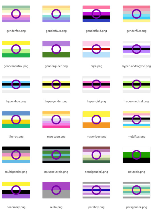
Method 1: put a ring on it - advantages: simple to do, simple to understand - disadvantages: incredibly dependent on how well the ring colour works with background stripes, and the number of stripes. Would very roughly estimate only ~20% look decent.
Here's a subset of the results. Some, like genderfaun, look nice, but most look awkward:
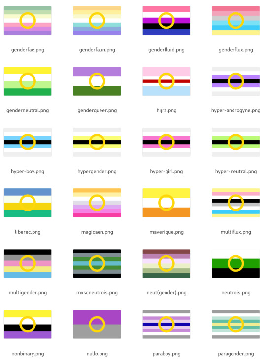
A yellow ring is even worse:
I think the purple ring has a bit of potential, but I think it's not really viable for being used as a consistent, procedural way to make intergenders. ***
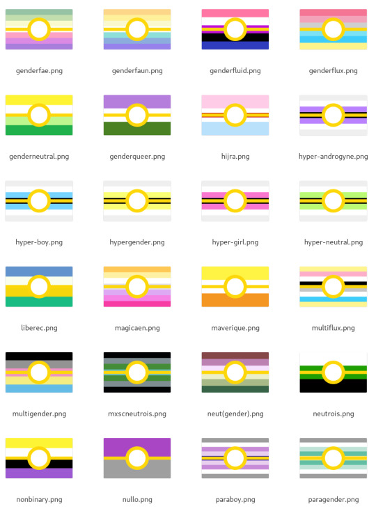
Method 2: stick a belt on it - advantages: already used for some existing mashups - disadvantages: some other genders are doing similar things, like voidpunk, and a white belt has been used by tons of groups for their mashups (e.g. neurogender).
It looks better than the ring alone, but I was still kinda underwhelmed because of how much it depends on the background stripes to not clash. Very roughly I'd say about 40% of the total results look good. Again, here's genderfae through paragender for comparison:
Using a purple belt helps in some cases but makes for some visually busy results:
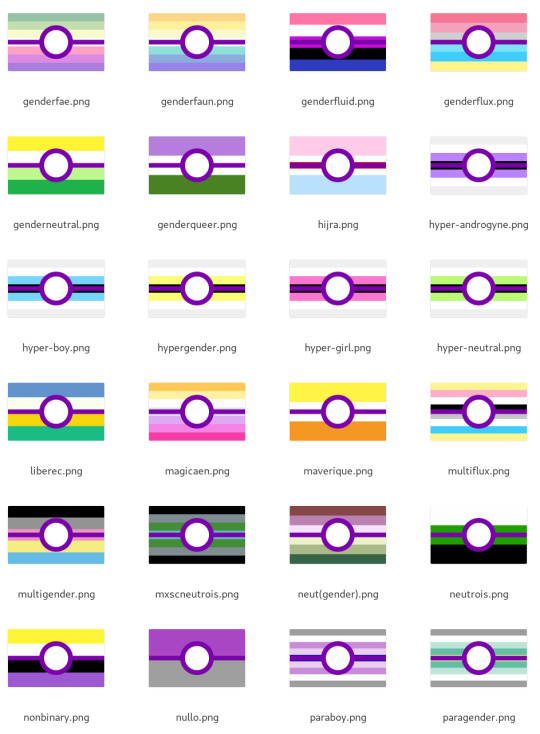
The purple ones make me think of pokéballs. Again, there are some nice looking ones, but the effect over the whole group was underwhelming. ***
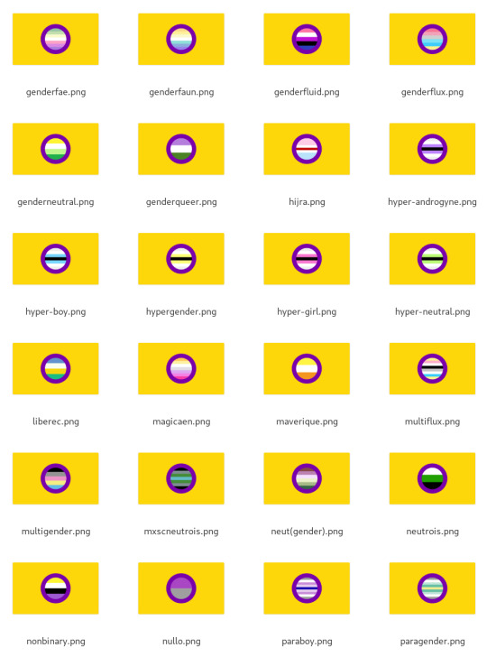
Method 3: inset into the ring - advantages: it's the most clearly "intersex plus X" - disadvantages: hard to read flags where the stripes are similar to each other; might clash with ring colour
When zoomed out like this the results aren't always super easy to read, but overall I'd say this is a reasonably reliably method - very roughly 60% of the results look good to me.
Playing with lightness and contrast on the inset flag likely would improve that number, but my goal here is to compare methods without tweaks.
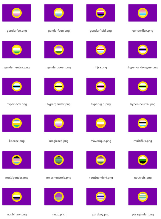
Insetting into the intergender flag has similar results:
Method 4: add intersex-coloured stripe to the middle - advantage: seems like it would be simple - disadvantage: yellow middle stripe used for pansexual mashups; purple stripe is used in a bunch of of existing mashups - also disadvantage: turns out to actually be complicated in how to do it. Many flags have an odd number of stripes, not all flags have equal-length stripes, etc. I got buggy results on a whole bunch of flags like hijra and hypergirl and honestly if it takes dedicated debugging to fix it's probably too complicated.
When the original flag has an odd number of stripes, I doubled the original middle stripe up and this only works if there's a symmetry to the flag and all the stripes are of equal size.
The results are kinda busy. It looks good to my eyes very roughly 1/8 of the time (~12%) (I did an alternate version where I doubled the purple stripe around the original middle stripe and it's way worse.)
Purple stripe:
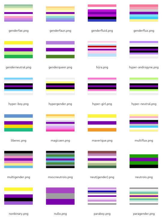
Yellow stripe looks less busy but more confusing:
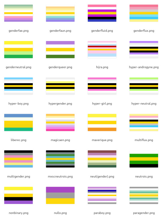
Method 5: add border stripes with intersex colours - advantages: simple - disadvantages: maybe not as obviously intersex
I honestly didn't expect to like this one, but it has turned out to be my favourite. It works really reliably, like ~90% of the time, and it's distinctive.
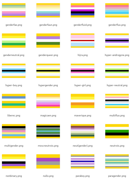
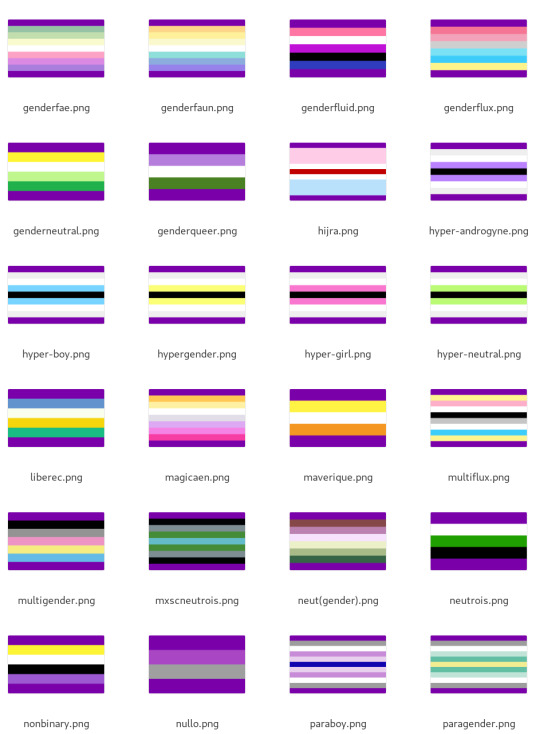
Surprisingly, using purple gives a really different vibe. It kinda makes me feel claustraphobic:
Method 6: change the colours
This one I don't have automated results to share (at least not yet). Right now there are flags like how ultergender recolours the trans flag, that could serve as a template for recolouring.


This is much more complex computationally - I spent a bunch of time playing around with different colourspaces (HSV, LCH, oklab, okLCH) to try to do this automatically and have concluded that this actually a difficult computational problem and not feasible as a widescale recipe.
Part of why the ultergender recolouring works is there are just two colours to recolour. How should one recolour the genderfluid flag? The demigender flag? It's possible to create a convention but not something I'm up to this moment.
I think recolouring is better suited to creating entirely new identities (like ultergender) rather than intergenders that are "<gender> but in an intergender way". ***
Discussion
My goal in all of this has been to try and identify some reliable recipes for creating hybrid flags particularly for intergenders.
My entirely subjective and imprecise estimates of how reliably each method yielded a decent-looking result were: 1. Add yellow border: ~90%-ish 2. Inset: ~60% 3. Belt: ~40% 4. Ring: ~20% 5. Add middle stripe: ~1/8-ish
I was honestly surprised at how much I liked the yellow border method and the friends I've shown it to so far have liked it as well!
I'd like to propose adding yellow border stripes as a recipe for creating intergender flags. This is already in use for interfluid (genderfluid in a specifically/uniquely intersex way):

Indeed, it's the only one of the mashup functions I wrote that yields something for genderfluid that I actually like:
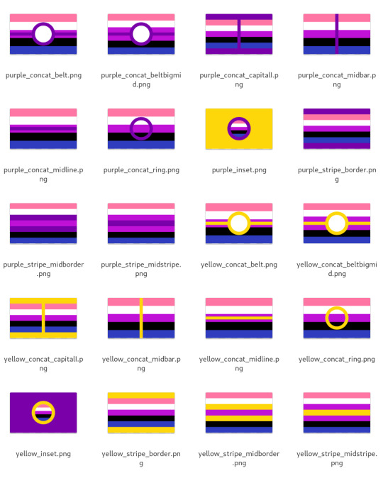
Extrapolating, here are examples of some gender coinings that I think would work: Interdemigender: demigender in a specifically/uniquely intersex way and/or demigender in a way linked to being intersex/intergender

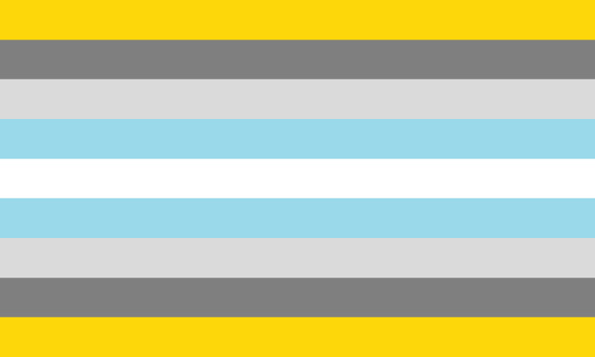

Intervaguegender: vaguegender in a way that is specifically intersex, such as in a way that is connected to being intersex (i.e. one's gender is vague not just for being neurodivergent but also intersex)


I think it works well! I hope you like it! Let me know if you have any feedback. If there are other mashup techniques I didn't think of, let me know. :)
#intersex#actually intersex#mogai#flag design#flag design tips#intergender#PS yes I know the nullo flag should be diagonal stripes
41 notes
·
View notes
Text
Welcome to the final opening night of the Eras Tour and 3,2,1, shows left… come along with me… we gonna cry and scream every lyric tonight… and maybe channel some good… Karma? ;-)
#The Eras Tour#Taylor Swift#Vancouver Night 1#Swifties#Taylor Nation#Surprise Songs#Masterminds#Swift Streams#Thanks TS Tour tips Masterminds at Swift alert Swiftballers Tess Folkleric streamers and fans#clowning#live updates#watch with me react with me#screaming crying throwing up#ps yes they are filming#let’s go documentary#maybe it’ll make outfits easy lol
12 notes
·
View notes
Text
I just got a cane and oh my god, my entire body is shaking. It's as if I was standing up for all my life and just sat down. Life changing decision to just go and get one, and it only costed 34 PLN, I could get like a single burger with no sides or drink for that. Solid oak, admittedly about 3cm too long but I'm gonna trim it in a sec.
And I never even had big issues with my legs, just a slight left hip joint problem, nothing painful, 99% of the time I didn't notice it. But I guess it was just overworked and stiff all this time? Even my tension headaches got slightly better.
If you feel like you have ANY issues with your legs just get a cane, or even go to a medical store and try it out for 10 minutes, you don't even have to buy it at first. The investment is so low and the difference is potentially massive.
I can't believe I waited over 4 years to do this.
#disability#it's also a really nice looking cane#I'm contemplating buying a couple and maybe carving them in some fun patters; or maybe painting them#but that's for later#for now I'm just overjoyed at getting one#also I know I'm gonna be talking from a place of privelage both when I say this and what I'm about to say#but if you think you've got adhd get on meds as well; I've had 2 days on adhd meds and both have been HUGE#for my long term happiness#so like; if you have an option to; try it out#Ps: phone died#I trimmed my cane very slightly; a sharp gardening saw and a box cutter for finish#asked around for some sandpaper but none of the neighbours that were home had it#honestly it's good enough without sanding#the tip is covered by rubber anyway#BUT!#I HAVE A CANE NOW !!!#ISN'T THAT COOL !!!
19 notes
·
View notes
Text
so you've got a lotta blogs, but not a lotta patience to be signing in and out between em? i'm about to save your life !!
i. let's start with the email trick!
ps: i have only ever done it with gmail. if you use a different one, give it a try anyway! but i can vouch that it does work for gmail. it's super simple: [email protected] -> [email protected] you just add +musename and you can create a new tumblr account while still having everything in the same email account! (you do this during the "sign up" component on tumblr, not your email! it'll automatically add it to your email. you can also add the +musename part to your email in account settings)
ii. now, multiple sign ins!
google chrome: profiles! on your browser, up top, right next to the settings you'll see a button for the profile attached to that browser. when you click it, you'll see the existing profile, and the option to "add" a new one. each profile is its own browser page, which allows you to sign onto a different tumblr account in each! i like to name mine according to the muse it belongs to so i can keep track. firefox: there's an extension called 'containers' which allows you to have multiple sign ins on the same site open!
if you've got any other tips to ease the process of having multiple muses and blogs, feel free to let me know and i'll add it to this!
i hope this helps! let me know if it does or if you've got questions about it!
happy roleplaying <3
#• the one true queen speaks ! || ooc.#BIG THANK U TO VELCRYONS !!!!!!!! i only use google chrome so tysm for sharing the tip for firefox!!!#ps i can tag u fr on the post if you'd like!! i just didn't wanna bombard u with notifications ab it just in case <333#rp help#rp resources#these tips saved my life years ago when i got into rp and there was a post ab it#idk where that old post is so here's a fresh one!!
24 notes
·
View notes
Text

Yes, you are.
8th of June, 2014 | Daniel Ricciardo's First Formula 1 Grand Prix Victory
#daniel ricciardo#dr3#Canada 2014#brought to you by me seeing Noah Kahan this week#wild that that little baby is approaching 250 F1 GPs soon#uhh this is my first time messing with anything like this is PS#so not the best work but baby steps!#if you have tips on this I’ll take them!
94 notes
·
View notes
Text
˚ʚ♡ɞ˚
•───────────────────⋅ᓚᘏᗢ⋅───────────────────•
I. About me
♡ 16 ♡ Agender, Pansexual, Poly, any pronouns ♡ Paraphile ♡ An0r3xic, self mutilator, hypersexual, aac, BPD, AUDHD, PTSD ♡ Service switch, dom leaning, top leaning ♡ Genuinely insane, obsessed, cruel sometimes, caution required ♡ Will send pics and vids only to friends/mutuals/people I know •───────────────────⋅ᓚᘏᗢ⋅───────────────────• II. What I Will Post/Reblog ♡ S/H [For sexual and relief reasons, not depressed] ♡ An0r3xia related things, like my diet plan and weight loss ♡ General life things ♡ Still figuring this one out, we'll see •───────────────────⋅ᓚᘏᗢ⋅───────────────────• III. What/Who I'm Looking For ♡ Ana buddy, preferably someone close to my age [16] and with ana ♡ Maybe a romantic partner, would like to be friends first though ♡ A friend in general is always welcome ♡ Older women/women/transgender people, pleaseee OTL •───────────────────⋅ᓚᘏᗢ⋅───────────────────• IV. What I am Not Looking For/Block On Sight ♡ Anyone under 16 ♡ Anyone looking to "fix me" or report me ♡ Anyone just looking to sexualize me without anything in return [Unless you're an older woman, then please, go ahead] •───────────────────⋅ᓚᘏᗢ⋅───────────────────• V. Technically Allowed But On Thin Ice [Will block if you're weird] ♡ Blank Blogs ♡ Older men/Teenage boys ♡ People w/out an ED/Disorder or who don't S/H •───────────────────⋅ᓚᘏᗢ⋅───────────────────•
If you find yourself upset/distressed at my content and wish for me to get off the internet, it won't happen and I will come back, so please just block me <3 DMs and Asks are very open, feel free to send anything you want! Diet Plan/Journal Cutting Plan/Journal [Not done yet] •───────────────────⋅ᓚᘏᗢ⋅───────────────────•
#@n@ buddy#@n@ tips#@na blog#@na motivation#@na rules#@n@ coach#tw ed ana#tw ana bløg#anadiet#s/h#cw s/h#tw s/h#s/h tw#cvtt!ng#cvtblr#j@ilbait#pr3dl0v3r#pr3db@it#jailb@it#p3d0mom#m@ps please interact#m@p lover#groom m3#maps please interact#j4ilb41t#under4g3#gr00m3#p3d0dad#p3dodad#p3dol0v3r
8 notes
·
View notes
Text


This game is trying to destroy me emotionally
65 notes
·
View notes