#about to find a new psd
Explore tagged Tumblr posts
Visit Tumblr Blog
Explore Tumblr blogs with no restrictions, modern design and the best experience.
Last Seen Tumblr Blogs


Fun Fact
Tumblr.com rank in the US is 25.
Text


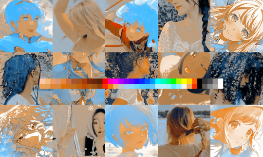
Here are some Season 2 Arcane GIF comparisons before and after I color and sharpen them! | Season 1 Comparison GIFs
#arcane#arcaneedit#gifmaking#reminder that if ur not a fan of the coloring and sharpening then i dont need to hear ur opinion so fuck off and make your own gifs :)#sooo yeah!!! just sharing this very old coloring comparison i use from time to time to make sure i follow a certain peg for my gifs#but i dont really follow it to the T of course#and now i will use the tags to rant/comment about my coloring process lmao#ok so.... arcane s2 is SOOOOO much brighter than s1 i am so so so thankful we have such bright scenes instead of all the dark ones in s1#because it makes my life so much easier#that being said my coloring isnt really perfect i still cant handle more complex tones like the mel gif......#i used to have a more stylized coloring wayyy back in s1 (esp when u look at my old gifs) but i kinda realized i had to change it#so i scrapped all my old psds and now coloredit EVERYTHING MANUALLY#hence why sometimes i gif the same scene but theyre colored different since i never use a preset PSD now#however it became way more tedious to make gifs... so yeah.... lmao#but in the end i like it more!!! i like that my new coloring just basically matches the show more but is just brighter and more saturated#unless ofc i dont like the tones of the original show i.e. the vi gif you see there where its super green gray???? idk i dont like it so#i recolored the entire thing#anyways thats really it coloring will always be something i continue to try to improve on but recently ive just been v busy so i just#speed color and edit everything and dont rlly take all adjustments into account so no more complex tones and#i just stick to basic things#oh right sharpening! so for sharpening i use a very basic setting: just 500 px and 0.4 radius which is what i use for almost everything#i also dont add noise bc the landscape photographer in me does NOT like it LMFAOOOOOOOOOO#but yeah thats really it for sharpening oh i also use 4k sources as much as possible bc it gives the best quality and if#i cant find any source i just upscale everything by myself then crop stuff again back to 540 px and imo it really just does look better#personal tag
434 notes
·
View notes
Text
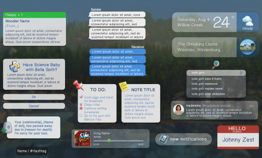
current project: streamline my editing process
#i've been using other people's psds forever#today i decided i'll make some of my own#ts4 psds#ts4 templates#i thought about what i would realistically use for my own posts#and this is what i came up with#one day i'll upload and share but i don't think she's quite ready yet#the weather and location things have FOLDERS of the appropriate icons#i even made pngs of a few world icons bc i couldn't find any past komorebi#:((#i plan on introducing new characters using the name tag lol
196 notes
·
View notes
Text


I want to make things right. Not just my mistakes, but my mother's. And I know that's a lot of ground to cover but I'm willing to do it.
inspo/playlist
TAGLIST: @eddysocs @ocs-supporting-ocs @foxesandmagic @veetlegeuse @decennia @hiddenqveendom @arrthurpendragon @luucypevensie @nikosasaki @noratilney @wordspin-shares @oneirataxia-girl @endless-oc-creations @stelstellakidd @andromedalestrange @far-shore @daughter-of-melpomene @bibaybe
#ocappreciation#ocapp#fyeahdisneydescendantsocs#disney descendants oc#oc: tee wiley#okay bit of a ramble about this#i deleted all my psds on accident (idiot)#so i tried to recreate the original vibes best I could#couldn't find all the fonts though I will look for them or similar ones#couldn't find the tv cutout so there's a new one#and the old playlist template was deleted so i found a godsend that someone else made#i WILL try to find the coloring i used back then#still i hope this looks okay#i know it's been a bit of a hiatus for me editing wise#idk why the quality is such shit on some gifs and not others#i'll try better next time#ramble over
21 notes
·
View notes
Text
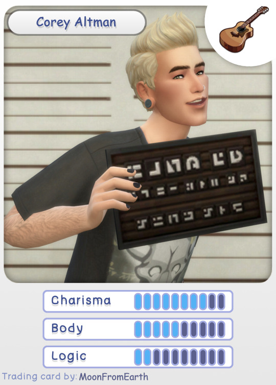

Did someone say Corey trading cards? 😉
This absolutely has brought me back to the days of collecting Pokemon cards and it was awesome!
I may or may not want to do a card for each round of the Globetrotter Challenge now just because I have idea's for funny abilities/moves... 🤣
Huge thank you to @squeaa and @buttertrait for the awesome template/challenge loved it so much!! 🥰
[more info under cut!]
Corey Altman - Base Card
(left side)
Everyone's favorite outlaw, now in a trading card! A common card. ABILITY: Man's Best Friend Get a helping paw from Sans the Dog! Retrieve one card from your opponent's deck. Guitar Hero - 20
Corey Altman - Hero of Strangerville Edition
(right side)
A special Gold Edition card the Hero of Strangerville himself! A rare card. ABILITY: Infection Vaccine Cure any status conditions inflicted on this card. Can only use three times per game. Mega Spray - 65
Based these mostly on how Pokemon cards are but it was definitely inspired by how @youredreamingofroo did their's (go check out their post it's awesome 😅).
#learned that i can open psd files in krita#i couldn't edit the text layers *but* most of it was there and intact which is awesome!!#so if you're wondering why some of it is in comic sans that's why (sorry it was the closest font I found!)#and pls ignore that fact that he's in the same outfit in both#i was going to take some *epic cool* new photos#but i got my period and can't be bothered to sit at my computer 😅#this is my favorite look of his anyway#and I *was* going to find a cool “defeating the mother” pic#but i didn't have any good ones so i'm reusing my favorite of him in the strangerville round#and yes i *will* be using that mugshot photo for the rest of time it's definitely one of my better screenshots 😆#i'm serious though about making one for each round it would be so fun!! 🤣#sorry to ramble a lot lol apparently i had more thoughts while i made these than i thought 😅#simblrtradingcards#corey altman#sans the dog#globetrotter extras
48 notes
·
View notes
Text

UPDATED DECEMBER 2024 (old version)
a bunch of the old links broke so I decided to do an overhaul of the original post (this version) with new links and resources! 💖
currently (as of December 29th, 2024), images are temporarily blocked from showing up in AO3 work comments due to problems with spam bots. the direct image link will appear instead. this is not an error with the code or the image host.
Are you frustrated you can't leave second kudos on AO3? or third kudos? or whatever-who's-counting kudos?
Well, have I got the html for you!
Plop any of the codes in a comment (by copy&pasting the code under Keep reading - scroll to the bottom of the post) to make an author's day and show your appreciation!


bonus: cookie kudos
SCROLL DOWN TO GET THE CODES (under the cut)!
Feel free to spread and use these as much as you like, however you like!
[ if you enjoy them, consider supporting my ko-fi 💗 ]

I've received a lot of good suggestions for more variants but can't keep up with them all, so here are some resources to make it easier to make your own.
PSD for easily editable text (there is a color fill layer for adding a bit of white where the stroke doesn't cover small holes. I recommend cropping excess empty space out before exporting as PNG)
and here are PNGs of the kudos button for any other editing needs, with and without white stroke:


I currently use postimages.org as image host, but use your favorite. Copy the direct image link, insert it between the quotation marks in the code, add alt text, and you're ready!
<img src="[DIRECT IMAGE LINK]" alt="[ALT TEXT]">
(you can add any image or gif to a comment like this as long as you have the direct image link btw)
if you post your kudos images, I'd be grateful if you'd link back to this post so other people can find the resources too 💗

When you paste into the AO3 comment box, make sure the quotation marks are straight:

NOT curly:

simply deleting and re-typing them in the ao3 comment box should fix this!
Many of the old image links from the original post are broken. I cannot fix them. Please use the new codes going forward ❤️

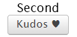
Second kudos: <img src="https://i.postimg.cc/HxNNFqKH/second-kudos.png" alt="second kudos">
Third kudos: <img src="https://i.postimg.cc/hPVSbszh/third-kudos.png" alt="third kudos">
Chapter kudos: <img src="https://i.postimg.cc/GtZZTWJz/Chapter-kudos.png" alt="Chapter kudos">
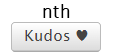
nth kudos: <img src="https://i.postimg.cc/vZ7pDS1L/nth-kudos.png" alt="nth kudos">
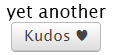
yet another kudos: <img src="https://i.postimg.cc/QMdhDr6W/yet-another-kudos.png" alt="yet another kudos">
ALL the kudos: <img src="https://i.postimg.cc/25rNwfpK/all-the-kudos.png" alt="ALL the kudos">
elevenses kudos: <img src="https://i.postimg.cc/tC60Ggpc/elevenses-kudos.png" alt="elevenses kudos">
Heaps of kudos: <img src="https://i.postimg.cc/zvRQNdZh/heaps-of-kudos.png" alt="Heaps of kudos">
Kisses your forehead kudos: <img src="https://i.postimg.cc/W1cBNP41/kisses-your-forehead.png" alt="Kisses your forehead kudos">
Reading in public kudos: <img src="https://i.postimg.cc/nLHNmYB8/reading-in-public.png" alt="Reading in public kudos">
re-read kudos: <img src="https://i.postimg.cc/wB0ZQyQ1/re-read-kudos.png" alt="re-read kudos">
This is the sole reason my sleep schedule is being ruined kudos: <img src="https://i.postimg.cc/sXx86jTw/ruined-sleep-schedule-kudos.png" alt="This is the sole reason my sleep schedule is being ruined kudos">
Should be sleeping kudos: <img src="https://i.postimg.cc/G9w5mkd5/should-be-sleeping-kudos.png" alt="Should be sleeping kudos">
Should be working kudos: <img src="https://i.postimg.cc/jqwqCtRH/should-be-working.png" alt="Should be working kudos">
Read the whole fic in one go kudos: <img src="https://i.postimg.cc/L4c91wsr/the-whole-fic.png" alt="Read the whole fic in one go kudos">
Ungodly hour kudos: <img src="https://i.postimg.cc/wjH9WNL2/ungodly-hour.png" alt="Ungodly hour kudos">
what about elevenses kudos: <img src="https://i.postimg.cc/SxrkHKGh/what-about-elevenses.png" alt="what about elevenses kudos">
You've already left kudos here!: <img src="https://i.postimg.cc/9fgVFNSg/you-already-left-kudos-here.png" alt="You've already left kudos here!">
You have already left kudos here. :) (red AO3 box): <img src="https://i.postimg.cc/85FGFmgp/you-already-left-kudos-here-2.png" alt="You have already left kudos here. :)">
Other links
answered asks about broken kudos links
all answered asks/fulfilled requests/misc related to this post
#fanfic#ao3#fanfiction#kudos#never expected this to blow up in the first place but i'm so happy to hear people using them and receiving them!!
112K notes
·
View notes
Note
%58 said to accept the apology? What a shame. You're lucky, people of Tumblr are merciful today...

❝ Waaaaaaah ! ! That was so NERVE WRACKING ! ! ! ❞

❝ Hey ! ! What do you mean WHAT A SHAME ? ! ❞
#a. in character#m. inbox#// asuka icons are borderless rn 'cos i slapped my new psd over 'em#// but i'm missing about a hundred of 'em...#// and so far i can't find the rest to slap the new psd over with -#// and i was debating if i wanna remake the ones i can't find or keep searching#// but then i accidentally closed photoshop without saving the new border#// and i got frustrated and just decided to try again tomorrow :')
1 note
·
View note
Text
no one cares about her but the way she smiles when she's talking about excerebration is important to me personally so i just need y'all to look at her.


#₍ ᵢ ₎ ―ㅤ * 𝘮𝘢𝘥𝘦𝘭𝘪𝘯𝘦 𝘶𝘴𝘩𝘦𝘳 ‚#this blog is just an excuse for me to scream about shitty fictional milfs#sorry you had to find out this way#anyway new psd <3
0 notes
Text
Tutorial on how to edit graphics! (Or improve your edits! + tips!) Part 1..
Well firstly, if you’re entirely new to editing or a beginner. Then editing can seem very confusing and tricky, especially the intense psd, cluttered kind of edits, mine are also very cluttered but I think the best way to go as far as being a beginner is to figure out what style you want to do.. minimalistic? Cluttered? Eye strain? Gif/animated? I personally don’t do very many animated graphics and I also don’t do eye strain, so.. you’re on your own for that but it’s important to know what ur GOAL is. You need to know the basics of editing before doing anything else.
The editing apps I recommend are photopea and ibisPaint X, both are free. I really don’t recommend any paid apps other than ibispaint.. yes there’s ibispaint x then ibispaint. (The paid version has everything in it and is a one-time purchase, and has the same mechanics as the free version. If you are editing on pc or laptop, there is a version of ibispaint on desktop but you are only able to use it for 1 hour, if you are most comfortable with ibispaint then you can just delete it and re-download it. But if you don’t want to do that (you can use photopea!) I don’t use photopea so this will be a tutorial using only ibispaint! I can probably find a moot of mine that uses it LOL
So as far as resources go.. they’re everywhere.. I know @/lavendergalactic, @/llocket and @bydollita have a lot of good resources. (I didn’t fully mention the other two because well.. they’re not my moots so I felt awkward LOL) I can probably post some of my most used ones on a separate side blog like I did with my last account so.. also tell me if ur interested in that.
But for the basics of your resources: you want the character or person. An image then a transparent cut-out of them, a frame and/or pfp/image mask to use, and some decorative PNGs like bows, curtains, hearts, whatever you’d like. I can link some good resource rentries too!
Once you have all of that: find a reference/inspo, if you are taking HEAVY inspiration off of someone from tumblr or whatever, PLEASE check if they are okay with it, message or send them an ask in their inbox if it’s okay.. or they might have it somewhere on their pinned post if they allow it.
And now.. the question ur probably asking.. how do I do all of that?!
I had quickly made this. You can see the main components. The character cut-out, the inner image behind the frame, the decor, and the silly texts and textures behind the graphic to make it pop.
If you want ur graphics to be this cohesive there’s a few things to note. You need to know colours look best together, what style of editing looks best with certain art styles, and characters.
If you’re wondering “why does this character look so out of place?” Or just finding yourself in a rut with certain characters, you need to examine the character, like you can’t make a goth style graphic with a happy and cheery character like emu otori (depending on the card you choose) or like paimon from Genshin impact.. like that’s just gonna look SILLY. So take note of what this character looks like and what their original colour palette is. Are they a happy person? Are they emo and depressed? What colours do you usually see this person in?
Having range in your editing style will help you a lot, so branch out and edit different characters, and use different colours, and aesthetics!
Now for colours, you need to understand colour theory which quite frankly.. I am not about to teach out so probably at the end of this post I will have some videos linked for you to look at and watch that just overall will help you understand better how to edit that includes a video about colour theory!
If you are an editor and find yourself not being able to edit a certain style or can’t fulfill someone’s request for a certain aesthetic.. don’t be afraid to decline because a lot of the times you’ll have people who know nothing about what looks good with ur editing style or what aesthetics fit certain characters so it’s okay to decline stupid people… (/j.. they’re not stupid but ykw I mean..)
Using the stroke filter on ibispaint or photopea, aswell as the glow filter on ibispaint make ur edits look VERY good! (I use it on everything because it gives everything a little bit of separation yk? So you can see the different layers to the graphic!
Using textures over top of your graphics make it look very visually appealing aswell!
So as I mentioned I will link some videos, and I will also link some posts for good textures, and then add some photos for downloadable fonts to use on ibispaint (if you don’t know how to download fonts on ibispaint I can make a tutorial too! If you are also confused on how to use ibispaint they have a built-in tutorial, and it’s also best to learn as you go, look at all of the filters, the effects, the built-in images/materials)
Please for the love of god.. DONT over-do it with ur overlays and psds, unless that’s the style you like, don’t do it.. me personally.. I don’t like it but if you like it then go right ahead but over-usage of overlays and colourings make it look kinda bad 😭 and kind of confusing to look at, please make sure you can see the different components of your graphics and what is what.. if it’s too confusing to look at, chances are you’re less likely to have people like it or enjoy it. And don’t over-do it with fonts either… people need to be able to see whatever ur trying to say.. I wear glasses and people who over-do stupid fonts piss me off.. I literally block them, so keep that in mind aswell 🫶🏻
Photopea tutorial How to use a pfp/icon mask Colour theory If you needed a visual for how to make graphics here you go Some textures and overlays How to make a rentry How to use borders on rentries How to make blinkies
Some tags for reach: @frilliette @blinkndgone @hellhoundsdoth0wl @smilepilled @nomkiwi
#( ╹ ╹)? a post!#rentry stuff#rentry graphics#rentry#tutorial#tutorials#rentry tutorial#rentry graphics tutorial#tumblr tutorial#editblr#rentryblr#editors on tumblr
477 notes
·
View notes
Text
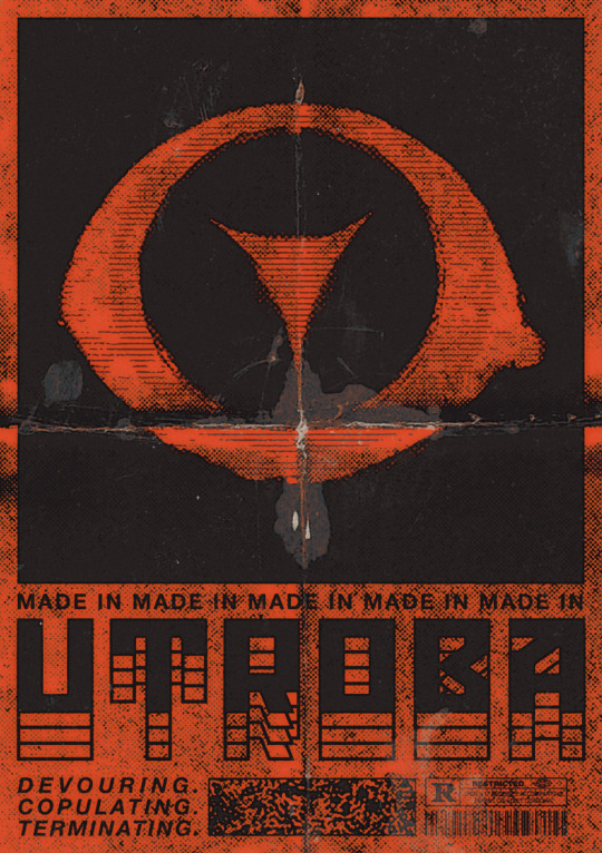
[BOOTING SYSTEM…] [INCOMING TRANSMISSION DETECTED] [SOURCEː MÆTERS 🔻 / STATUSː ENCRYPTED] >>> IDENTIFIEDː Illustrators and co-creators of UTROBA — a dark world of entropy, monstrous beauty, and human fragility. >>> INITIALIZING COREː ART / CHARACTERS / DESIGN >>> TRANSMITTING CONCEPTSː Biopunk / Horror-body resonance / Decay aesthetics. [SIGNAL WARNING — DATA CORRUPTION] >>> Fragments scatteredː "Mon.sters-LoV>R?ed..dreams_r-f.e.a.r." >>> Decrypting lost essenceː Love... Monsters. Horror. Red. Untold stories. [SYSTEM STABILIZING] >>> Awaiting connection... >>> END OF TRANSMISSION. /// morE oF uSː linktr.ee/maeters
?.. ?.. ?..
F.A.Q
— You both run this account? How do you split the work? How do you draw together? Exactly. Just imagine a small art studio of two people drawing in the same style and working on the same work. Share tasks, collaborate on steps like sketching for example, but also create individual pieces. Sometimes it feels like we share one brain... One big elder brain.
— What brushes you use? Where can I find more about your work process? What program do you use for drawing? Brushes, materials about our drawing process, tutorials and other similar content are available on our [Patreon]. We also regularly upload step by step materials and PSD-files. We’re drawing in both SAI and Photoshop.
— Do you do commissions? Can I get one? Yes, we draw commissions, but currently they are closed. We'll drop a post about the slots as soon as we free up time for new work. You can find all the details about working with us in the links.
[ERROR]: ████ ██ █████

167 notes
·
View notes
Text
So Romania just invalidated the first round of this year's presidential elections.
In short, we get a first round of elections with alllll the presidential candidates (who need to obtain a certain number of signatures to be in the presidential race), and then the two candidates with the highest number of votes enter the second round (unless one of them obtained over 50% of votes in the first round, which has never been the case).
This year, a surprise far-right candidate showed up and became the most voted candidate. A lot of people had no idea who the hell he was. This'd be the independent candidate Călin Georgescu.
The second and third candidates were neck and neck: pro-EU, right-leaning Elena Lasconi from the new party USR, and Ciolacu from PSD, the largest Romanian party (left-leaning). Mind you, „right” and „left” mean something slightly different here, so anyway.
Elena Lasconi was a bit of a surprise. Everyone was expecting Ciolacu to be the guy with the highest number of votes, but... guess not. ¯\_(ツ)_/¯
So right after the first round of elections, everyone was busy googling Călin Georgescu, and finding out that he's New Age, "I met aliens", "Latin is based on Romanian", "Water isn't H2O, it's information", "Pepsi contains nanochips" sort of guy. Also hanging out with the local nazis and saying the EU and NATO are bad for Romania (THEY ARE NOT). And he was vastly promoted on TikTok and in conspiracy groups.
For the past two weeks, the country's been in turmoil. Half of us are like "Actually, we want someone sane to lead us!!!" and the other half are like "No, I believe in aliens/nationalism/God/I hate LGBTQ+, and Elena Lasconi would have gay people fucking in restaurants where kids can see them."
Elena Lasconi has become tolerant of the LGBTQ+ community after strongly opposing gay marriage. LGBTQ+ is on nobody's agenda right now, except maybe a couple of tiny parties that didn't make it in parliament. But why let the truth stand in the way of propaganda?
But back to Georgescu! Everybody kind of guessed his super-sudden rise and amazing number of supporters on TikTok was suspicious and probably involved a lot of money changing hands, but it took a while for the secret documents of the secret services to be revealed to the public - and... yup. It sure looks like there's been external interference in our democratic choices.
There's been a lot of back and forth about what should be done, all the votes were recounted (for Reasons; Ciolacu's supporters were pissed he didn't make it in the second round of elections), then it was claimed the first round couldn't be invalidated, then... fuck, man. I don't even know. It's been A Couple of Weeks.
And now, in the light of foreign interference in our elections, the first round of elections was invalidated. But we've already got a lot of people shouting and screaming that they want Georgescu because of The Propaganda they swallowed.
Everybody's back to square one, nobody's sure what next, Georgescu's probably investigated, signatures will have to be obtained again for candidates, I don't even know man.
I'm really hating this, but also I think I'd have hated it more if we'd just gone on as if nothing happened and pretended this was Fine.
I'm banging my head against the wall. This is insane. This is the most insane political situation I've ever personally witnessed. What next? Fuck if I know! All I know is that I'm not voting this weekend, I guess. And writing and writing about how you shouldn't vote to be fucked yourself just to fuck over other groups.
And also write that, yeah, it really hurts to fall for propaganda, but we're all susceptible to pretty lies we kind of like. But at some point, you've got to admit you were wrong, or you'll fuck yourself over more. Trust me, I was in a cult. That shit hurts.
91 notes
·
View notes
Text
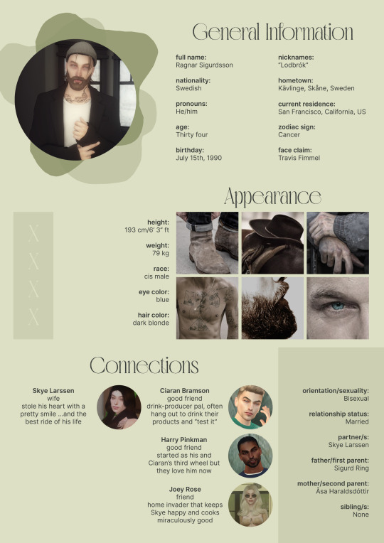
So uhm... I did a thing...
✨Character Info Template✨
UPDATE 11.24.24: this template now has a page theme version! if you're not a fan of templates, you can get the code to use it as an interactive multimuse page >here<
Been meaning to do this a long time ago (and actually started it but never finished it, lol) as a way to share some more information about my ocs without needing to use a custom page theme, but mostly because I haven't found any page theme that looks exactly as I want and allows this much customization.
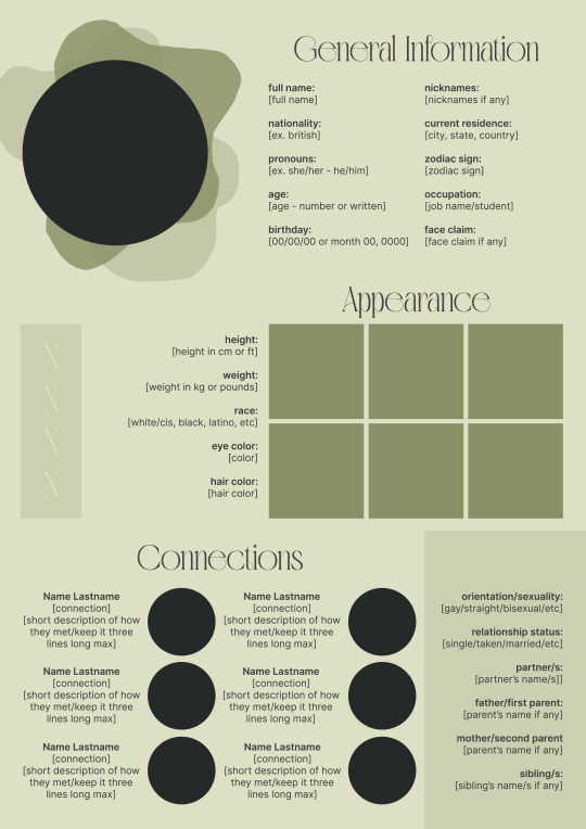
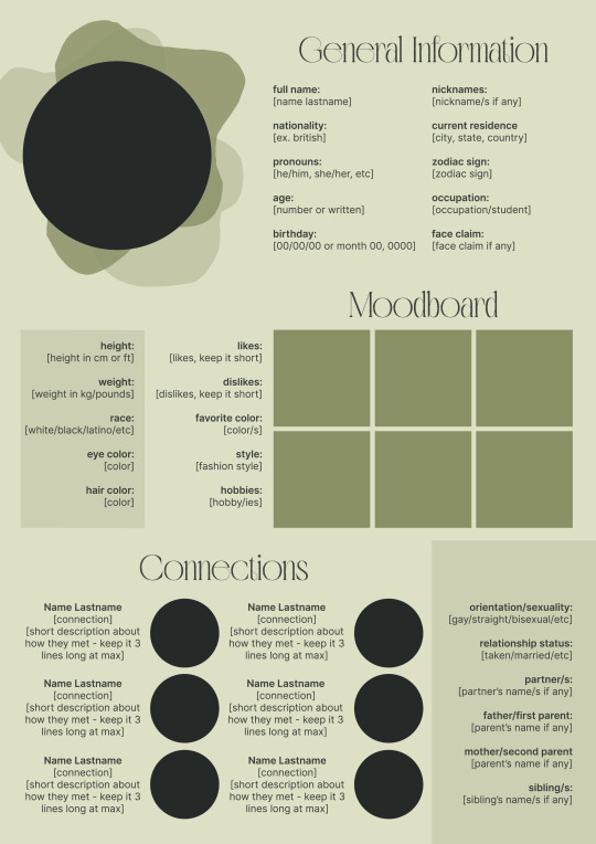
There are two versions and both are almost exactly the same; but the example shown in the left has an 'appearance' section which is small and has few quick facts regarding the oc's appearance; while the example on the right has a 'moodboard' section instead which allows you to add more info about your oc.
You can change every section/title to fit your needs like I did in the examples below; I personally removed some categories as well and got rid of some connections as this oc doesn't have that many close friends/partners to fill the original template. However, I also included an extra separated 'connections' section in the download in case you want to add more people and more information.
I recommend you stick to square-shaped pictures so it's easier to fit them to each section. Also if and when you edit the information or section titles, please select only one line at a time to replace it so you don't lose the text format. (Titles shouldn't change because that's a single format/font within the same text box, but should it change you can always hit ctrl+z hehe) When you're done, I strongly recommend you save this as a .png instead of .jpg so it's the best possible quality!
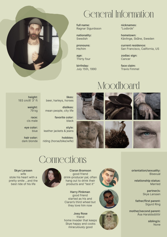
Last but not least, this is a .psd file. So you'll need either Photoshop (I did this with Photoshop Portable, but it supports newer versions of PS and it *should* support older versions too) or Photopea to open and edit this file.
Credits: Adobe Photoshop, Inter font, Golften Vintage font
>DOWNLOAD< (patreon but free :p)
(note: I'm posting this with my gaming blog because I think my fellow gamers might be interested in this, but please consider giving credits to me if you use this template by tagging @synindoodles instead of this blog)
More info on how to use and edit this template below the cut!
Layers:
>Each layer is properly named and categorized. The general layers such as the background, the icon shape and background shapes are under the groups.
>If you don't want to see/don't need one of the connections' pictures and information, I recommend you find which one it is (1, 2, 3, 4, 5 or 6) and click on the eye symbol next to the layer to hide it so that way if you ever need it, it won't be truly gone.
>To edit a text section, simply find the layer (such as General Information>Left Column) and double click on the 'T' symbol next to the layer. That way it will open edit mode and allow you to edit the text, just don't hit delete or enter while everything is selected or you'll erase it :p
>Main text sections aren't separated, they're blocks of text. I recommend you don't remove the amount (for example, if you downloaded the version with the 'appearance' section, which has 5 sections of information, don't remove the fifth line.) Either leave it empty or replace it with another data, otherwise it will look weird. The 'general information' section might look good even if you remove a few lines, just don't get rid of the whole block of text.
Pictures:
>To add a new picture, simply paste it over this document and move it using the Move Tool.
>To frame it (so it becomes a circle or fits over the shape you want), make sure the picture layer is over the layer you want, then while holding alt click between the two layers. [For example, if you want to add a new main oc picture: 1) paste the pic you want, 2) move it with the Move Tool so it's covering the big circle, 3) once you've fully covered the shape (if it isn't you can resize it by right clicking on it then on 'free transform', sometimes you might need to hold shift to proportionally resize it) make sure the newly pasted pic layer is over the layer named "picture goes here", 4) hold the alt key and hover your mouse cursor over the line between your pic layer and the circle layer until you see an arrow going down symbol, once you see it click it and tah dah! your picture should now have the same shape as the circle! - you can further move it if it doesn't fit the way you want with the Move Tool (;
Others:
>You can change every color, font and section to your liking, just don't change the general layout of the template.
>To hide/show the guides (those bright blue lines all over the document), click ctrl+,
>'Inter' is a free font and you can get it in the link above (linked with the credits), Golften Vintage is not, but you can get the demo version >here< (just scroll down and click the blue download button under license). I will not tell you how to install fonts as it might be different for everyone (for me it's C:/Windows/Fonts and I just drop the zipped files (except the .txt one) there), but google is your friend.
>I can't think of anything else that needs to be said here, but if you have any other question feel free to send me an ask or dm and I'll help you out!
>Last but not least, a like is appreciated if you plan to use this plus consider tagging @synindoodles if you use it <3
#psd template#template#characters page#muses page#muse page#muse template#character template#character page template#oc page#oc page template#synindoodles#rp resources#rp template#roleplay resources#roleplay template#writers resources#writing resources#writing template#writers template
186 notes
·
View notes
Text
…make a psd look interesting?
aka, how to fuck up a psd no glue no borax. have you ever looked at your psd and gone, damn, this shit doesn’t fuck? happens to the best of us. here are easy ways to spice up your psds so you don’t end up with the editor equivalent of communion bread
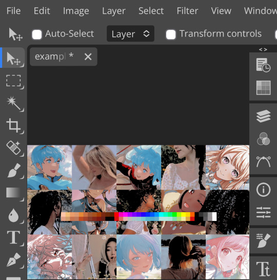
for example purposes, i made a simplistic psd to test these methods on. they should work with most psds, but, as always, fuck around and find out on your own for best results <3
i. threshold + gradient map
this one is an easy way to add specific colors to your psds. step one: add a threshold layer, and adjust it your liking. typically, i set mine to somewhere between 60-40. if you’re making a psd to work on dark skintones, you may want to set it even lower, but if you’re working with, say, pjsk characters, you can go pretty high
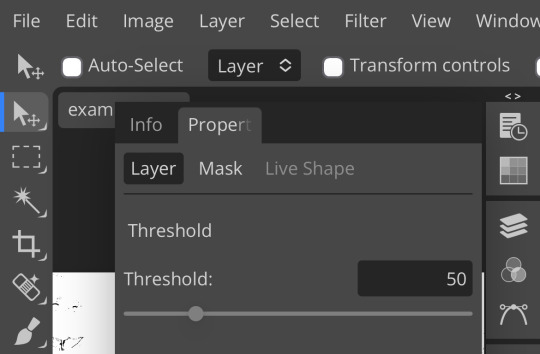
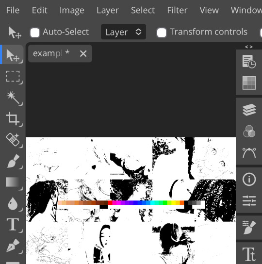
wow flashbang. you can see on my example behind that it doesn’t work super well on irl pictures, and my pjsk images don’t have threshold at all lol. next thing you want to do is set the blending mode of your threshold layer to either multiply or darken—they’re basically the same thing
(psst, if you want to know more about blending modes, check out this post!)
waow crunchy! but still boring right? still boring. not to worry, here’s the fun part: add a gradient map layer, tap it, and go to the slidey icon on the side, which’ll bring up a page like this:
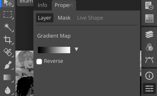
click the gradient in the middle there to edit it. once in, edit the black color to be at about 80-90%, and then change the white color to whatever you like. edit out, and tap the little square next to the text that says “reverse” which should make your gradient look more or less like this:
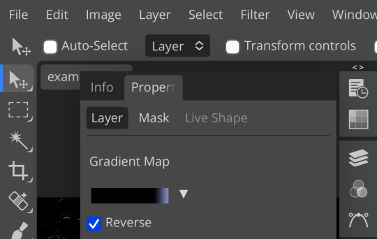
then change the blending mode on your gradient map to ‘screen’ which’ll axe all the black and just leave your color. now your image looks like this:
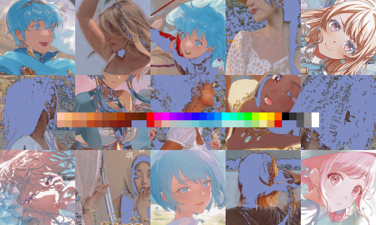
boy howdy, isn’t that fucked up! it is more interesting, but if you don’t want to be looking at that abomination, change your color in your gradient map to be darker, which’ll give you something more along the lines of:

…which is much more reasonable. this is a fun way to add color to your shadows slash lineart, and can be a quick and easy way to make a psd look less flat.
ii. noise gradient map
some of you may be thinking, but, canarysage, what the fuck is a noise gradient map? to which i reply: you’re boring. let me show you.
kinda fucked up, right? well, that’s the goal. unfortunately, there isn’t a way to directly edit a gradient map, but you can just click that little button that says ‘randomize’ a couple times until you get something you like! you can also mess with the percentages but i don’t do that because it looks weird

boy howdy, that’s weird looking. not to worry, though. once again, our best friend blending mode is going to come in handy
i typically go to soft light and set the opacity to about 20-30%, but, as with anything, feel free to mess around and do whatever you want. luminosity is also a fun setting for noise gradient maps, just make sure to crank the opacity way down for the sake of my eyes

wow, much better! you can see that the gradient map added a bit of purple coloring and a funky little texture. super cool! thank you, gradient map!
iii. channel mixer
i already have a post on channel mixer and i’m not rewriting all that so if you don’t know how channel mixer works check that shit out but the tl;dr is: ideally, all your channels should add up to 100 (including negative numbers) but that rule can be broken if it looks cool enough. capiche?
iv. color lookup
photopea has a few default color lookups that are pretty easy to use, but i have a couple of presets that i like to add if i’m feeling stuck. to make your own color lookup, open up a psd, and go to file > export color lookup
then save it and open it from your files. when you open a color lookup layer, you’ll see an arrow next to the text saying LUTs—click that and your new color lookup should be there
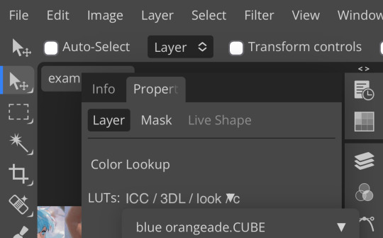
once you tap that, you’ll get a compressed version of your psd added to your folder. it’ll look something like this:
holy orange and blue, batman. luckily, you can apply blending modes to color lookups just like any other layer—mess around with them until it looks how you want!
waow much more reasonable! i set this one on color and about 55% opacity, but that is really dependent on what your color lookup looks like and how you want your psd to look. remember, there’s no right way to do things!
an additional note: if you want to, you can save the psd you’re working on as a color lookup instead. if it looks too simple or just isn’t turning out how you want, that’s a good way to incorporate it later :3 just follow the same steps as above!
v. no shame in starting over
if you’ve added and taken away, duplicated and removed, fucked around and found out, and your psd still isn’t how you want: it’s alright to just axe it. the edit police aren’t gonna kill you for it, i promise. if you’re worried about wanting it later, just save it as a psd and come back when your brain is refreshed ¯\_(ツ)_/¯
psd-making isn’t an exact art, so, obviously, there’s no real simple solution to making it look how you want. you just have to mess with it and see what you’ve got. these are just my methods of making my psds less blagh, but, obviously, my editing is moderately more deranged than your average editor.
…so that’s how you do it.
101 notes
·
View notes
Text
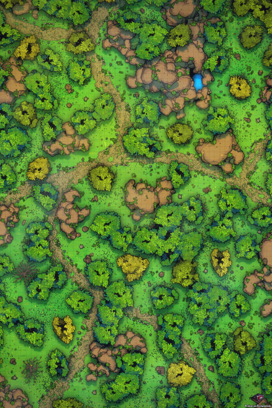
Greetings!
Adventurers often have to travel large distances to get to where they need to be. Sometimes these journeys are pleasant, easy rides. And sometimes they're full of danger and bloody battles.
Sometimes though, they're all about exploration and meeting new friends. And other times they're about making all the enemies possible.
What kind of journey will the party have this time? And how much treasure will they find at the end?
You can see a preview of this map’s Patreon content by clicking here.
If you liked the map I’d be extremely thankful if you considered supporting me on my Patreon, rewards include higher resolution files, gridless versions, alternate versions, line versions, PSDs and more. Thank you!
69 notes
·
View notes
Note
How do you add the gifs for the layouts? What program do you use? I want to make a editblr blog but my skills are only the basics
hello! first, i'd like to wish you good luck with your blog ♡
now, we can start! i'll divide this into 02 sections:
programs, and gifs

01 : programs
starting off with programs:
any website or app that lets you add pictures work. i've seen people use picsart, photopea, ibispaint, and basically any app that allows you to add images. i use a mix of the three, but barely use picsart. personally, if im on my tablet i use ibispaint, then use photopea to add PSDs. when im on my computer, i only use photopea.
02 : gifs
for gifs, i use photopea. however, you can only add 01 gif to each project. i believe there are ways to add more, but i found them too complicated and therefore cant explain them, as i myself havent used them. to find gifs, you can use any social media, but i recommend Tumblr and Pinterest.
you can also use ezgif, but not for gif overlays. only to put images on gifs.
here is a tutorial on how to add a gif on photopea: (plus me playing with showing the options sped up)
i was supposed to edit the video to add text n all that but i ran out of storage. so....
basically, just save your gif, click "file" at the top of your screen, click "open". now your gif should be a new project, and it should be a folder.
drag that folder inside your project ( in this case, your graphic / layout / edit / whatever. ). after that, click "edit", also at the top of your screen, and "free transform". now you can move and / or resize your gif.
afterwards, click "file" again, and "export as" then export it as a gif. there you have it! you finished your project! congratulations!
anyways. i feel like i forgot something but thats about it i believe. so..... once again, good luck with your blog! if you have any more questions, feel free to ask!
if anyone has anything they'd like to add, feel free to reblog!!
#questions / tutorials。#rentry help#rentry tutorial#photopea tutorial#photopea help#gif help#gif tutorial#rentry#rentry gif#rentry graphics#rentry dividers#carrd material#photopea gif tutorial
67 notes
·
View notes
Text
HELLOOO EVERYONE!
✦ · · · · · · · · · · · · ·
HERE
LOOK
I put off publishing this post for a long time because I was too lazy to write all the information that I want to put here, but here I am, showing you my two models for vitubing, created entirely by myself with my own hands on my laptop!
✦ · · · · · · · · · · · · ·
but before that I think it’s worth starting with an idea! And the idea came mega spontaneously:
This handsome man and I watched a couple of videos with Neuro-Sama and suddenly this dialogue appears:
- How about we become VTubers?
- seriously?
- yeah
- Let's go.
✦ · · · · · · · · · · · · ·
Even though this decision was mega harsh and rather profane, it charged me with motivation and allowed me to get out of the art block a little
After all, I REALLY love learning new programs and things for myself.
✦ · · · · · · · · · · · · ·
Time:
• 5 days to draw both models
• A week to animate them
Programs:
Krita (drawing)
life2D + his brother (animation of models and adding additional emotions)
Vtube Studio (Launch models)
Obs (video filming)
Energy Source:
God knows
✦ · · · · · · · · · · · · ·
So who were my victims of this experiment?
As expected, my avatar was my alter ego Temmie, and for our mega partner/boyfriend we chose his alter ego Sans from Freedomtale!
Since the path is completely new and unfamiliar to me, I desperately searched on YouTube for all kinds of videos and tutorials, as a result of which I found the most understandable and enjoyable series of videos from Lazu-Tan, which I mainly relied on when making avatars
Next, having found it on the Internet and installed the necessary programs on the laptop, I scribbled sketches that would later grow into models:3

after this stage there is a boring process of drawing the models directly, grouping a bunch of layers (a separate layer was needed for each moving object, such as separate layers for each strand of hair and grouping into a common group with hair. This was an unusual thing and made me really strain my brain)
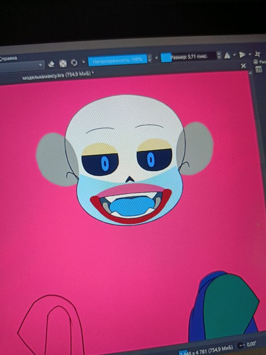
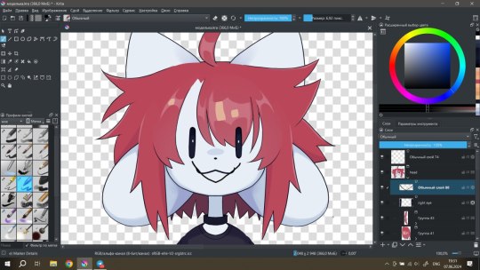
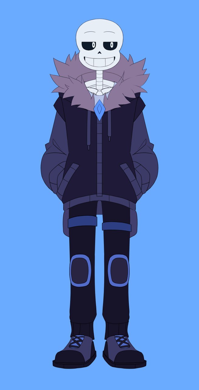
Having saved both files in .psd format, I put them into a new program called Life2D! I needed this program to create animations of the very layers that I had distributed and grouped earlier. head turns, hair physics, eye blinks, additional emotions - this is all the merit of the great Life2D and those 43 days of the trial of the full version, which he so kindly provided me with for creativity... in fact, I thank you for the conditional “deadline”, because without it, God knows when I would have finished this project under other circumstances

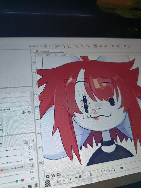
When working, there were a lot of problems due to insufficient knowledge about the operation of the application, which is why sometimes I felt like a would-be programmer who couldn’t find an error in his code for several days (I tried to program, I know what I’m talking about)
It would seem hurray, everything is ready! however, here the finishing touches await us.
Those additional emotions (like blush, stars, tears) that should be activated by assigned keys must first be configured through a separate program that is installed with Life2D
in general, the procedure is not complicated, and I even found it somewhat pleasant

After this, the models can be considered ready, they just need to be put into the files of an application such as Vitube Studio, after which you can play your character at the camera or use them for streaming or making videos!
I published videos demonstrating the capabilities of my models on my YouTube
It was an ultra-mega interesting experience, and I will not hesitate to say this, and I am proud of the results:3
for streaming, however, all that remains is to turn my little potato into a more or less tolerable laptop, but I think sooner or later I will be able to solve this issue
@thefreedomskeleton
✦ · · · · · · · · · · · · ·
Thank you if you are reading this and wish you a wonderful time of day!

#art#fanart#vtube model#vtuber#2D models#freedomtale sans#Freedomtale#Sans#oladushek#animation#i like it#so much#give me some new hands pls#undertale
93 notes
·
View notes
Text

~ sekai-transparents ~
requests: closed
layout by us, psd by @/otoripink

masterlist

welcome! this blog is made to create and share transparents/pngs for project sekai/hatsune miku: colorful stage! before the third anniversary, the game had transparents of all the cards; however, since then, there aren't. this means it is harder for editors to edit newer cards. our job is to provide those transparents to keep the pjsk editing community alive. if you'd like to contribute to this blog, read our rules below and use the ask box or the submissions tab to send us your transparents. you may also message them to us if you'd prefer. thank you to anyone who does or has! this blog is not leak free, and we will on occasion post card transparents before they are officially released. you can also find us on reddit, where we usually post all the cards for each event at once. we sometimes forget to post them on there, but it does exist lol.
the rules:
usage rules:
all our transparents are free to use, dni free and do not require credit to use.
our only rule for crediting is to not tag us in anything offensive, gross, etc that uses our transparents. we also prefer you don't tag us if you fit our personal dni.
please follow the dni's and credit rules of our submitters when required.
submission rules:
submissions are now only open for non-current event cards, because we'll be doing them alone from now on. please don't send new cards in or claim them.
search up the card you are submitting to see if we already have it.
please do not edit the cards in any way before submitting! the only thing we allow is using waifu2x or similar to resize and up the quality.
requesting rules:
always check our pinned post to see if requests are open.
search our blog to see if we already have the transparent or are planning to.
please be polite and say please and thank you.
requests aren't our priority, so they can take a long time to do, both if they are submitted or if we're making them ourselves. we get to them when we can.
about the owner:
we're the gladiolus system! we're 21, from the united kingdom, and use he/they pronouns. we've run this blog for a year now, along with our edit blog @lovesick-level-up and our personal @gladiolus-cardinalis. we also enjoy making art and playing video games! here is our personal carrd and our system rentry, if you would like to look at them. we've been making transparents for about two years, originally doing genshin impact ones (ever seen any transparent older birthday images on deviantart? most likely our work!). we always found them relaxing to do, so this blog was a good choice for us lmao.
177 notes
·
View notes