Text
One more week! Week 8 completed
There's only one week left until the end of the Bootcamp, how quickly it has gone by! It seems like only yesterday we were starting the Bootcamp.
This week has been very intense, the start of the final group project with real clients. It has been a week of understanding, processing, receiving information and processing it. Mentally, it has been very tiring but very rewarding. I have been able to focus much more on the Research part (something I felt I needed to improve) and of course I have enjoyed for the first time having done it more slowly, calmly and in a more conscious way.
We are looking forward to this last week, which will be not only intense but also sentimentally very exciting.

2 notes
·
View notes
Text
7th week done :)
Week 7 done, probably the most intense week of the bootcamp. Final individual project finished!
It has been really rewarding to receive feedback from external people this week, in my case from Danae. She has helped me to improve all the aspects related not only to the Business side, but also to the UI of my prototype. It has been really wonderful to receive honest, realistic, useful and above all, feedback that makes me a better designer.
I think this is very necessary especially with the final projects because the feedback and the opinion of the teachers ends up being distorted. When you see someone improve from the first week, you automatically see that improvement as a Glow. But if an external person comes in who doesn't know anything about us, they keep pushing us to keep improving.
Anxious to start this final group project and to feel this same sensation again, but now in a group way and with a real client, I can't wait!
2 notes
·
View notes
Text
UX/UI and its methods.
Interesting text and super necessary that every designer should do himself the favor of reading it.
As an engineer and product designer that I have been for 4 years during my university degree, and now as a student of UX/UI, I have seen many designers follow without reason and without objective a concrete methodology accompanied by phrases like ''just because my teacher told me to do this'', ''I do this because in the last project we also did it''.
This way of working and executing is really inefficient. It is true that there are steps that always go together (after the Research comes the definition of the problem, always), but do not make a method from which you know you are not going to get anything. For example, an Affinity Diagram is a very powerful tool when you have a lot of information and you want to generate new ways of thinking. However, you don't always need to do it, it depends a lot on the research you have done and how you have done it.
That said, planning well what method you need to do to show and extract more information from your own work and progress in the project will make you have a better critical thinking and you will of course be a better designer.
0 notes
Text
Three weeks ahead (week 6 done)
Week 6 finished, only 3 to go, what a sadness and what a shock!
The truth is that Ironhack has flown by and I can't believe that we are about to start week 7. This week in particular has marked a before and after in my personal development as a designer. We had to focus only on the Research part, something in which I have not always excelled in particular, I still have to learn a lot in that aspect.
The truth is that with time and effort, I have learned how to write insights that are direct, user-centered and actionable, and how to translate them to my problem statement without ever mentioning the final product. The problem is the problem, and the solution is the solution, but you never have to research and generate the solution at the same time.
Looking forward to finish this project and start the final group project, I just dream about it!

2 notes
·
View notes
Text
Remote Contextual Inquiry: how to get the best experience from a software
After having informed myself about what Remote Contextual Inquiry consists of, I can conclude something very basic and very generic which is: observing the behavior of users using a product in their environment is the key to go from a usable product to a product that has a really valuable experience and makes a difference.
So Contextual Inquiry focuses on finding those things that users are curious about and would do in a more natural, fluid way, being themselves, compared to Usability Tests, that some users focus too much on the task that designers have assigned to them, and maybe it doesn't end up being quite natural and real.
From what I have been able to read, since I have not yet had the pleasure of practicing this methodology, I see that it is a methodology that allows us to see what for many designers would go unnoticed. It tries to find the unfindable. Look for patterns, thoughts, new ways of referring to the same thing, possible customizations for a specific group of users...
In conclusion, I believe it is an extremely valuable methodology in which the objective is to observe, observe and observe. And that is when we can learn, learn and learn.

0 notes
Text
5th Week as an UX/UI Designer
5th week at Ironhack BCN.
Probably one of the most intense weeks at Ironhack for me, not because of the amount of work but because of the need to get out of the comfort zone so many times (having to code a whole page for the first time).
Although I really enjoyed the design part of the project, I found it difficult to feel comfortable with the deliverables and I felt that I lacked a lot of knowledge about HTML and CSS before taking the step of coding an entire page. It has been interesting to collaborate with future Web Developers and learn on a self-taught basis, but it has often caused frustration.
The only thing left to say is to thank my tutors for dedicating so much time and patience to explain HTML and CSS, not only new functions but the logic behind the code.
Looking forward to start a new week at Ironhack with the individual final project :)

4 notes
·
View notes
Text
40% completed. 4th week.
This week has been very challenging on a personal and academic level since the project has not been an easy task at all. The subject, designing an app with e-Learning content, has been something that has forced me to leave my comfort zone and I have had to make a great effort to get into the role of the user and to understand all the current market apps . I am satisfied because this week I have done a great research process, something that in other projects I have tended to avoid and make the jump to Figma and the prototype too early. Due to this, I generated features that did not completely solve the pain points found, and my designs were not user-centered. Looking forward to starting my fifth week at Ironhack with a project in pairs and making the leap to web design !!!!!!
2 notes
·
View notes
Text
iOS and Android, is there enough space for both worlds?
In this Tumblr post, I intend to reflect on different design guides that characterize iOS and Android, and how to unify both styles in a single friendly design for both sides.
Before doing so, I will choose a User Persona from the three proposals, for my Designing an e-Learning App project. Despite this choice, the final product must satisfy the goals of the three people + pain points that I conclude from my own research.
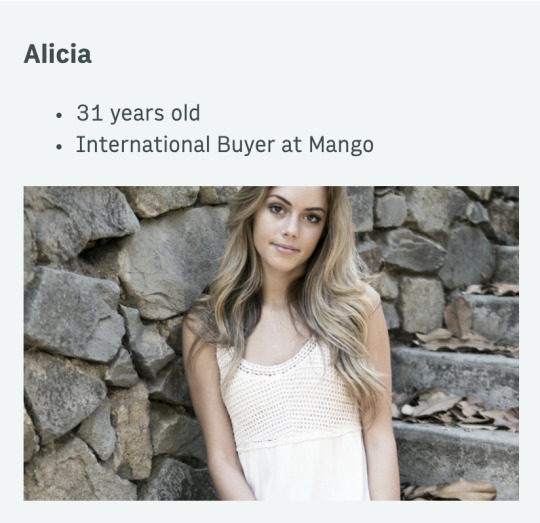
My User Persona, Alicia.
But to start, I will focus on Alicia (proto-persona 3), a young 31-year-old girl, International Buyer in Mango. She originally studied fashion, but she wants to revive past interests and move to the field of Marketing within her own company, and for this she needs resources and courses to train in that field. Therefore, the most efficient resource for her situation are self-paced learning portals that allow her to combine it with her work.
She uses iOS as a preferred software.

iOS important things to keep in mind: 1. I will follow Uniformity
Although my user is only iOS, for the Android version I will continue with the same uniformity and consistency as in the iOS version. I believe that in this way, my visual identity will maintain a similar style and I will never lose the essence of my brand.

2. No more than 4 (or 5 maximum) icons in the nav bar
Following the Android and iOS guides, I must keep in mind that I cannot add more than 4 icons (or 5 if necessary) to the navigation bar. In this way, Android users who are used to having 3 or less will feel comfortable, as well as those of iOs, who tend to have 4 or 5 at most.

3. Do not forget that in iOS there is no menu to go back!
A very common mistake, from what I have seen in examples of Android designs transformed into iOS, is that they forget the back button, and therefore leave the user stuck on a screen with no possibility of exiting. Therefore, it is important not to forget it! The iOS guidelines always require assigning a button or interaction to go back, on the other hand, an efficient and functional flow would not be possible.

4. Hamburger Menu
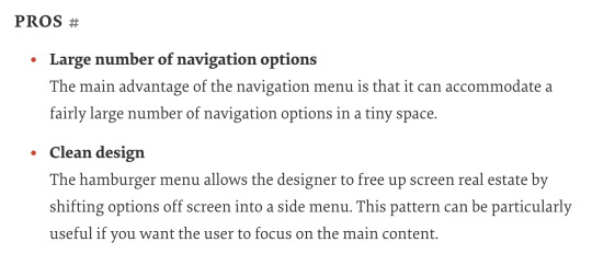
The Hamburger Menu is a type of menu that works for both Android and iOS. The positive thing that it has, compared to other types of menu, is that it allows you to display multiple actions and sections. Knowing what the app is going to be about, I consider that this will be the correct menu option for my app, although it must be tested in usability tests, but in terms of theory, it fits with what I need.


5. As a conclusion and as a last point, remember that there should not always be a difference as a general rule.
After having read the four texts about guidelines for Android compared to iOS, I think it is necessary to highlight that there should not always be a difference between these two. It seems that if you design for one or the other, everything must be reversed (menu at the top in iOS, menu at the bottom in Android, among many other things), but that should not be the case. In fact, many brands opt for completely identical designs, with very subtle micro-differences that keep the essence in spite of everything.
So as a last point to say that, do not fall into the obviousness of looking for a thousand differences and complicate your work as a designer: the differences must be sufficient but necessary, and not apply more differences than are required.

4 notes
·
View notes
Text
Third week done!
This week has been really rewarding and different from the previous ones, and the general feedback is clearly positive!
This week not only has been a group-project, but we have gone from making Mid-Fidelity prototypes to High-Fidelity, something super challenging and interesting at the same time. The truth is that I have enjoyed each of the days, in which I learned all kinds of animations in Figma and automatically had the opportunity to put it into practice in the project.
As for my team, it has been a pleasure to work with Mireia and Anna, and I take the opportunity to highlight how important it is to have good communication, because this leads to a better result. It has really been a fluid project, easy to carry and easy to present.
Looking forward to the next week, with an individual project and a new briefing :)
2 notes
·
View notes
Text
Learning to see 👀...
Really interesting and insightful way to perceive learning and how important is to learn to see 👀: ''Our mind is not a camera. Seeing is not a passive act. We see what we expect to see''.
When we grow as designers, we just not learn certain skills or how to use a software, we learn how to look at things and how to perceive designs, and that is true! The eye of a designer is constantly evolving and that is what differentiates you among other designers.
A few weeks ago, I read an article that spoke about this exact same topic. It said that designers grow their skills slower than they develop the ''eye for design''. That's the reason why we sometimes hate our own creations: we start designing when our skills are in a specific level but our design eye tells you that this design is not enough, and it ends up in frustration. It's important to have this in mind, just chill and enjoy the progress.
I also enjoyed reading about a fact the article illustrated: difference between designers and non-designers. During my career in design, I crossed paths with many people who have not studied anything related to design, and have that affinity with it that you get really surprised. Therefore, if it is true that the eye for design is practiced and encouraged, but there are people who have that '' plus '' despite its background. Really insightful article that all designers must read some day during their career.
2 notes
·
View notes
Text
Week 2 successfully completed!
This week has been challenging but very rewarding!
It was my first individual project at Ironhack in which I had to face alone decision making, usability testing and the creation of the product prototype.
It has been great to do this project after the group project last week, since this project of week 2 has been like an upgrade compared to the project of week 1 and that has made this week more bearable and we all moved around our comfort zone, knowing what steps we should take every time and how to do it.
Week 3 looks very good and I am already looking forward to starting the project, focusing more on the UI part with a previously defined briefing.
I will continue to gather strength this weekend and look forward to one more week at Ironhack!
1 note
·
View note
Text
First session of Design Crits.
Yesterday I felt quite uncomfortable and out of my comfort zone planning my Design Crit speech, I didn’t know what to expect cause I’ve never did it before.
But the truth is that it is the key to improve your design and I'm sure it will become a must to my design process. Also, reflect on other designs is something that expands your horizons and makes you a better designer.
From my point of view, one of my favorites discoveries this week.
So happy to have carried out this session :)
3 notes
·
View notes
Text
A week as an Ironhacker
This first week has been very rewarding and amazing. I have learned the basics of UX / UI and how to make the right decision at the right time.
Coming from Industrial Design Engineering, I had the expectations that maybe this first week it would be a bit boring for me, attending lessons that I had already learned in my career, but it was not like that!
It has been impressive to see the results of my colleagues in this first project, they rock! Very motivating to see that we are all on the same line with a lot of desire to learn.
This following week I hope to go one step further with what I learned this week, such as making more faithful prototypes and making better decisions based on the research carried out.
4 notes
·
View notes
Text
My first day at Ironhack
And finally ... achieved!
My first day at Ironhack has been very intense and rewarding. New faces, new ways of working and discovering what will be my second home in the next nine weeks.
As for my colleagues, and those that I still have to know in depth, they are spectacular people that we have connected from the first moment and they will be a great support during the bootcamp.
Nevan, Lina and Dani have also been lovely, how cool to have them as a teachers! :)
This week I hope to learn the basics of UX / UI, as well as everything behind it, through projects and lessons.
7 notes
·
View notes
Text
Hi!
Let me introduce myself! I have always been passionate about design since I was a child and this led me to pursue my dreams in this area. I just finished a degree in Industrial Design Engineering which gave me both visions, the most design side in which I'm creative and the engineering side in which I take those ideas to reality. I’m and ambitious, hard-working and driven individual who isn’t afraid to face a challenge. I’m passionate about my work and I know how to get my job done. And I’m an honest person who doesn’t believe in misleading other people and tries to be fair in everything I do.
I want to continue expanding my knowledge in the world of UX / UI Design, realizing that I feel comfortable and enjoy designing digital products. At Ironhack, I want to grow, attend, listen, speak, propose and enjoy and become who I want to be in the not too distant future.
2 notes
·
View notes