#a quick base color sketch to get going
Explore tagged Tumblr posts
Text
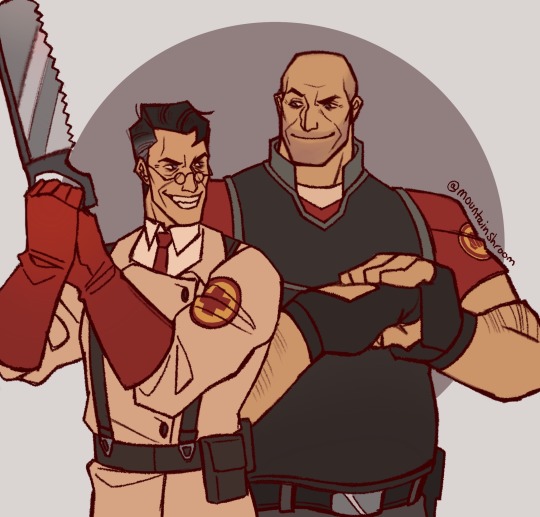
”me and my favorite experiment- i mean teammate :)”
- Medic probably
#tf2 old man duos hit different#a quick base color sketch to get going#heavymedic#red oktoberfest#tf2#team fortress 2#tf2 heavy#tf2 medic#tf2 fanart#art#my art#fanart#digital art
852 notes
·
View notes
Text
To everyone in the art community, please:
Tracing is effective. But only as a learning tool. Telling people "never trace" can be robbing them of methods that could have been effective to their learning process if they'd known about them.
The "art of using tracing" is a bit looked over, so I have five points:
(it's a long one)
1: AS A RULE OF THUMB, DO NOT POST/SHARE TRACED AND STOLEN ARTWORK. This is not only lying to anyone you show it to, if you're trying to come off as, "I'm so good, look at what I did," but most importantly, it's lying to yourself. You'll trick yourself into not needing to get any better, and you will stagnate if you start to rely on tracing as a form of stealing. If you come to realize that you are, you should stop using any tracing methods altogether to keep yourself from abusing it. It's a slippery slope for beginners, and a big reason why you’ll hear almost everyone echo that you just shouldn’t trace at all. The issue is that this ignores the ways that tracing can actually be good.
2: Tracing sets the stage for motor skills/hand-eye coordination. I've seen so many early-stage beginner artists get upset that the art that they make of their favorite character/oc is messy, or maybe they just don't even know what they want to draw and can’t "make themselves mindlessly doodle.” These early arists then become completely disheartened and upset, especially if they start to look at other people for comparison. Tracing over work or even over photos is a way to train your hand to hold and wield a pencil/stylus properly without you being worried about the finished product. Think of it like a way to dip your toe into learning the process of what making art feels like, without having to get overwhelmed with searching up pointers and people telling you, "10 quick tips to become a master artist!!!!!!!" (<- please ignore those) If you’re just beginning, your hand-eye coordination needs to be trained, and you shouldn't bog yourself down so much thinking about end products just yet, so if tracing is the way to get you started, go for it. If you're a bit more experienced, tracing and drawing over reference can also help you warm up without being committal or stressing your art brain too much.
3: Practice "mindful tracing." While I said the previous point was targeted more at beginners, this point is actually about something that experts in their field use. Doing "mindful tracing" over art means that you aren't worried about getting the lines "correct," you're studying why those lines are there. You're taking note of where the shadows meet the highlights based on the light source, how it shows off the forms, and how sharp or soft the lighting is; you're going over the lines of action in the piece to see how your eye is guided by the artist's intention and planning; you're seeing how characters may be stylized into shapes and the feeling that those shapes can give; you're noting how the artist uses line weight or weird blocks of color or stark breaks to split up the art or separate ideas within it; you're experiencing the flow of the poses within the artwork to grasp how that kind of thing feels; you're breaking down the overall composition like in a thumbnail sketch; and the list goes on.
"Mindful tracing" ends up looking like you've marked up an English essay: it should be messy, because the intent with it is not to copy or replicate, it's to notate. It's like how literally writing notes on things helps you remember better than if you only read it. You're acknowledging instead of just looking. And you can always learn, even from styles that you don't intend on actually using. As you get to be more experienced, you may come to realize that you can do "mindful tracing" analyses on artwork without having to literally write over top of the piece, which is great: that means you're improving your creative brain, and prepping it to be able to break down your own works in this way as you make them.
4: Trace for specific character or style studying. For this point, I want to especially stress that this is what makes everyone say, "don't trace," because this is what tracing is most commonly associated with: art theft. There's really no excusable reason to repost someone's art in this way.
I feel like you have to be a bit more experienced to properly use tracing specifically for style studies. The benefits that come with tracing a certain style is that it can quite literally teach your hand/brain to recognize the patterns that are present. You get a feel for how far apart a specific characters eyes are, how big their hands are, how the shapes of the body make up their form, how the exaggeration in the expressions feel, and when traced you know you have all of these proportions correct. This makes it so much easier to start drawing the specific character on your own if you know that you have a correct baseline (and of course you should still use reference from then on). When you study many different characters of the same style, you can start to grasp what actually makes up this style that you're studying, where -similar to point #3- you train your art brain to recognize the original artists' intentions and ideas. I would even argue that doing this is MORE IMPORTANT than using reference at the very beginning of a style study, because it makes you worry less about if you're pulling from the reference correctly and instead lets you focus on the original art by thinking through it during the process; this kind of thing is done by professionals. Although tracing can net you these benefits for studies, it is not a way to get around the rest of the learning process, which is the pitfall that normally ends up making tracing ineffective.
5: Lastly, I actually kind of lied about tracing "only being good as a learning tool." The other case where tracing gets used is within the process of making hand drawn animation, and I do mean the professional stuff. Model guides are constantly used in classic animation as reference to keep by the animator's side so that characters stay on model, but sometimes there are unnoticeable parts of a character that just get straight-up traced from either the model sheet or a different scene that's already animated. When used smartly and sparingly, this keeps the character on model, is unidentifiable to the audience, and takes up less time for the animators to work (and by "used smartly" I don't mean moments where characters blatantly have 5 seconds of reused animation). I can basically guarantee that this practice was done throughout the making of any 2D project you can think of.
In digital hand drawn art, key frames between points in an animation may get the "shift and trace" treatment, where the tween frame is just a smudged-around-version of the key frames until it looks about right, and then it get traced over. Backgrounds get traced all the time by artists in the professional field through modelling a 3D render of the space, going over it so they have the layout, and then painting on top of it. When drawing characters, people will take photos of themselves and trace the pose, then keep it to the side as reference. And this is all without even mentioning rotoscoping.
When people say, "don't trace," what they actually mean is, "don't trace as a substitute for experience."
The issue is that people blanketly state, "x thing is bad," because then people that aren't learned in the field go, "oh, okay, x thing is bad, it will always be bad, I shouldn't look into it or consider it any more, and I should correct/disgrace anyone that thinks otherwise or does x thing."
So please. Trace. Tell other people to trace. But remember: trace mindfully. :)
557 notes
·
View notes
Note
hii i hope this is ok to ask but i love how fucking HUGE you make curly look, do you have any advice on how to draw muscular frames? :o
thankies!! i love drawing him Robust-Looking <3
as far as advice goes, when it comes to anatomy i always recommend the channel proko on youtube, they have all kinds of videos about how to draw anatomy with each area of the body broken down. basically, if you're trying for anatomical accuracy with muscles and stuff, their vids are a great way to grasp how muscles work!
as far as general shapes and vibes though, i have a couple quick tips of my own <3
the biggest part, if you can imagine, is proportions. typically tutorials will tell you the average shoulder width for a person is about 2-3 heads wide, so if you're making someone Bigger and Beefier, you'll wanna go past that a bit. (and making a character's head smaller is gonna make their body look bigger by comparison, so if you wanna go crazy, shrank that thang)
For example, Daisuke (who i draw as lean, but still with some muscle, especially in his arms) is 4 heads wide at his shoulders, while beefcake curly over here is 5 (sometimes more depending on the drawing lol). something as simple as broadening the shoulders already gives a character a beefier-looking silhouette.

[ID: Simple rough sketches of Daisuke and Curly from Mouthwashing with colored circles showing how many heads wide their shoulder width is. Daisuke is four, Curly is five. end ID]
~~~~
"but what if i don't know how to draw the muscles and am not going for realism/don't feel confident enough in that yet? how do i give a muscular vibe without as much detail?" FEAR NOT it's super easy. here we use the power of SHAPES!!
i draw jimmy and curly with the same "skeleton" or base frame, so i think they're a good example of this next bit. despite having the same bones, i broaden the fleshy parts on curly's limbs (focusing on his shoulders cuz he has big ass shoulders) and keep his upper arms wide before tapering down into his hands (muscles tend to be largest at the base of the limb and get smaller up to the hands/feet but there's plenty of design exceptions). i carry that shape language down into his legs (which i emphasize with his fitted calf-height boots). meanwhile jimmy stays fairly squared, especially when fully clothed

[ID: Simple sketches of Jimmy and Curly from Mouthwashing with notes describing their shapes. Jimmy has a rectangle over his body and is noted as being "relatively rectangular" and the shapes of his limbs are mostly straight. Curly has a trapezoid over his body and has a "top heavy shape" with limb shapes that taper down and in. end ID]
~~~~
and honestly, a good hack to make a character read as more muscular or robust is to give them a buddy that contrasts that. once again, jimmy will assist.
even in a simple drawing like this, giving jimmy the opposite tapering to his limbs just emphasizes curly's hugelargeness by comparison. it also shows that you don't need a lot of detail or realism to convey Beefiness

[ID: Another, more simplified doodle of Jimmy and Curly, pointing out that Jim's limbs taper outwards while Curly's taper in. end ID]
~~~~
another final quick tip i have is: the neck makes a difference!
people with more muscle tend to have thicker necks (it's because of the muscles there, if you can believe it) and it's kinda become one of my fav bits of drawing curly lol. idk why <3 necks fun to draw <3 for him, i draw his neck starting at the very edges of his face and widening out at the bottom to match the shape of his head and to flow a bit more into his trap muscles, but you could go Even Further Beyond if you so Choose. i've found this is a surprisingly good way to convey Beefy Person Beefy even if you don't have as much anatomical knowledge.

[ID: Four bust sketches of Daisuke and Curly comparing their necks. The first two show them both facing forwards. Daisuke's neck is slimmer and straight, while Curly's neck meets the edges of his jaw and has a wider base with higher trap muscles. The second two shows them in profile, with the back of Daisuke's cranium sticking out past his neck, while Curly's is even with his neck, showing how thick is is from the side. end ID]
~~~~
in review we got:
widen shoulders relative to the head to convey a Broad silhouette
taper limbs inwards from base to extremities to emphasize the shape/size of the muscles
give em a less muscular buddy for contrast
thick necks help a lot in conveying a muscular build
and of course, i know i only used men in these examples, but these tips will work just fine regardless of a character's gender. please draw more beefy women ily <3
i hope this made sense and helps you and whoever else might see this uwu
if anyone has any questions about it i will. Try. to answer them. making these posts is oddly difficult lol
#fg's art#mouthwashing#just gonna use the one tag since this mostly has nothing to do with them lol#art tips with major#art tutorial#fg's answers#asks#cursing#WOW AN ART ADVICE QUESTION I ACTUALLY ANSWERED WITH A TUTORIAL. AMAZING. I THOUGHT IT COULDN'T BE DONE AKSDJHAKDJH#the part of me that loves helping people and teaching people art stuff#vs the part of me that finds it SO DIFFICULT TO GATHER MY THOUGHTS INTO A POST#it's hard <3 but we work <3
168 notes
·
View notes
Text
Good Omens graphic novel update: December 2024
We promised a graphic novel treat for December to send off 2024, which we have at the end of the update, so let's dive in!
Colleen has been working diligently ahead of the graphic novel going to print next month, which she discussed over on Patreon. For those looking for more behind the scenes on both Good Omens and Colleen's work more broadly, we recommend either following her Substack, or subscribing via Patreon, as she approaches the finish line.
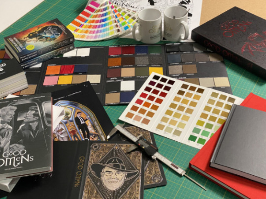
A snapshot from our production HQ where dummy books of the graphic novel, slipcase and other editions of Good Omens have been arriving thick and fast. The graphic novel (slipcased version shown) has quite the heft to it. It's going to be such a magnificent object inside and out.
Here, we're testing out the various papers, finishes, embellishments and more – everything is falling into place!
Merch-wise, some more delights. The A.Z. Fell & Co tote bag design is in, one side in celebration of our favourite angelic bookseller, the other as if it's been purchased from the bookshop itself, so you can take your pick.

We've got more pins that will be available in the 3-pin set add ons. While the full list will be available in 2025, we're happy to share a few more to get excited about:

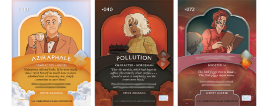
On the trading card front, have a look at some of the base deck designs by Steve Gregson and Kirsty Hunter in situ as this all comes together rather nicely, and causes a heated game or two behind the scenes.
And, a quick admin note to wrap up that we always recommend checking the FAQ page as a first port of call for any queries. If you have questions tied to specific tiers, we'd suggest checking the last few updates if your answer can't be found on the FAQ. If there is any information required for your pledge, we will be in touch. We will be back at full steam in the New Year!
Thank you.
So, to wrap up this year's updates, we give you the draft of the full first scene of the graphic novel, artwork by Colleen Doran and lettering by Lois Buhalis. If you'd like to wait until the graphic novel publishes in Spring, skip everything after the ducks!

To 2025 🥂
Until next time.

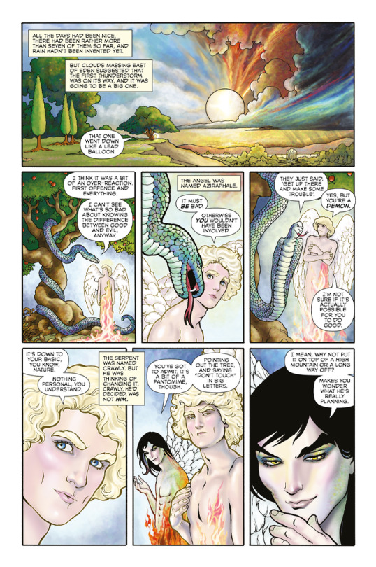

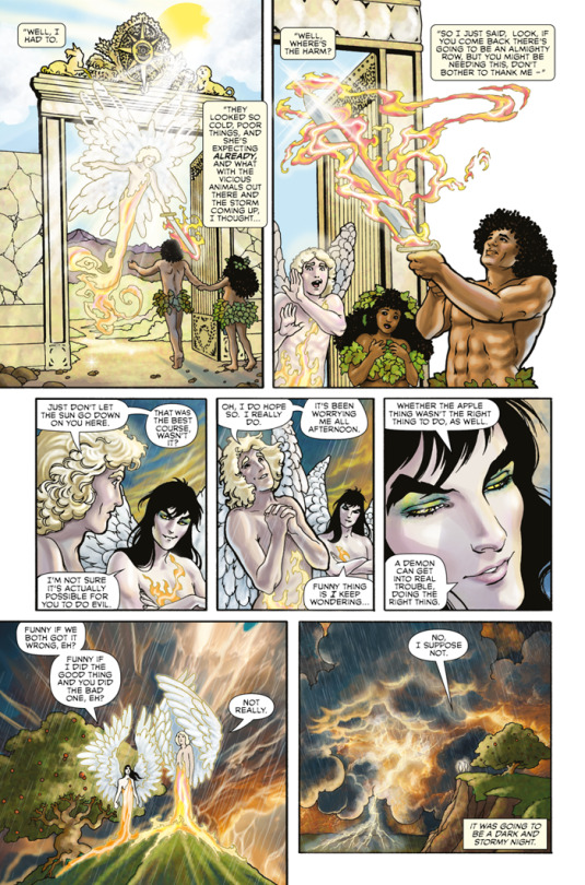
+ post from Colleen Doran:
Good Omens: You Get...Stuff Like This

In the most recent Good Omens update at the Kickstarter, a few people got upset at the suggestion that you have to get past my paywall here to see Good Omens updates.
Except you really don't, and the post doesn't actually say you do. You get a bit more, like pics of my studio, a discussion of tools and process - but not all of that is exclusively about Good Omens.
I think the Dunmanifestin team just wanted to draw a little attention to my blogs and other works, for which I am very grateful.
As my Patreon supporters already know, Good Omens info posted here gets to the Substack and Kickstarter eventually. And since most of my posts here aren't just about Good Omens, but my other projects and personal stuff, as well as links to our weekly Virtual Art Studio sessions, I think I'm justified in keeping that material behind a paywall.
In fact, I don't think I've posted much stuff about Good Omens since the summer: pages of flats like the one you see above, a few studio photos, and color tweaks.
Also, me boo-hooing about my nerves and health.
But for those who feel left out missing even this small amount of stuff, then the screen shot above is for you.
That's called a flat.
It's a prelim color before adding final color.
Here's what the final color looks like.

So I've posted a handful of this sort of thing since this summer, but frankly, there's even more of my sketches and so on posted at my Instagram that aren't here at all.
For those who don't know, I am doing most of the color myself on the book, but I am working with assistants. I'm not sure how much the Dunmanifestin team wants out there before the big reveals, but here's a snippet of a sky.
In the first image, my flat color.

And after my assistant worked on it.

Here, I've done a repaint. Sometimes I do very extensive repaints after the assistant works on a page. Sometimes not so much. I didn't use assistants on many pages at all. About 80% of the labor on the color of the book is my work.
However, the assistants have been a big help, and I am very appreciative of them.

I will make a point to go through all my prior posts and get every single bit of art that you haven't seen and make it public for all of you in the coming weeks. I need to excise it from previous posts. As I respect the privacy of all my readers, I never make prior posts public without their permission as they may not want their comments or identities to be public.
Thanks so much for everything!
165 notes
·
View notes
Text
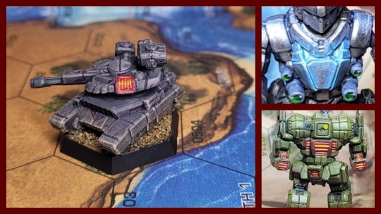
How to Paint: Glowing Heat Sink Effects
I already went over this briefly in text in the notes of the Awesome but I figured I should probably double this up and give it its own tutorial. Glowing effects are something that's extremely commonplace in a wargame like 40k but less seen in Battletech painting, despite being a great visual indicator of the effects of the game's heat mechanic. While it does take a little bit of work and some extra paints, adding these to your energy boats and pilot cooking clan mechs can be a great way to add a bit of visual flair to your forces.
Paints I Used
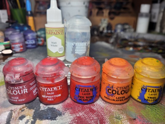
This is what I had on deck for this mini- substitute for your preferred colors, brands, and availability as you like
Army Painter Matt White (titanium white/pure white)
Citadel Khorne Red (dark red)
Citadel Mephiston Red (medium red)
Citadel Evil Sunz Scarlet (bright red)
Citadel Troll Slayer Orange (bright orange)
Citadel Yriel Yellow (bright yellow)
Citadel Lahmian Medium (thinning medium)
Method
Before you begin working on the heat sinks you want to complete the rest of the area around the place you want to do the glow effect. Light is an active environmental effect on a surface so you'll want to complete most of the base layers, highlights, shading, and other environmental effects before we work on the glow. Today our subject is a Manticore Heavy Tank that I used a modified pink-grey version of my weathered drab armor recipe to paint.
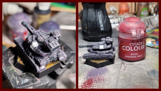
Once we've identified the sinks we want to paint and finished the rest of the model around them, our first step is going to be to paint the sink area white. This will increase the saturation on future layers and make the heat sink appear brighter, as well as giving us a consistent color to work up from. Try to stay within the vent area itself and avoid paining the outer frame- we want that to retain the color of the model. Once the white is dry, paint over all of it with our dark red color. Use one or two thin coats to do this.
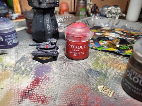
Once the dark red is dry, go and get your medium red color. Make sure not to overthin this as we want to work this onto a pretty particular part of the model. Using the side of a small or medium sized brush, carefully paint just the ridges of the vent fins, leaving the dark red color in between. Leave this to dry briefly and then we can work on the interior of the vents.
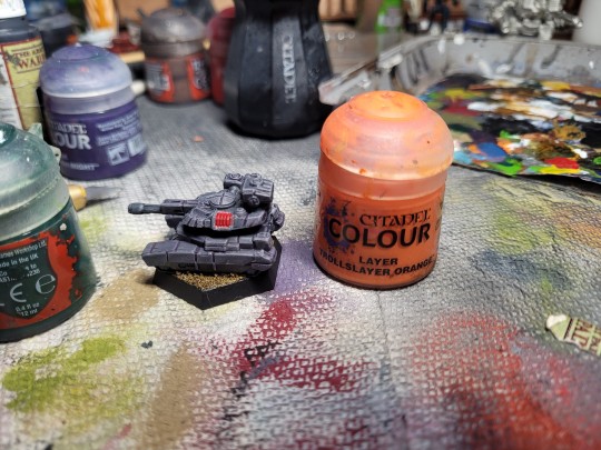
Get your bright orange paint and thin it pretty significantly- more than you would for a normal color. Then, take a very thin brush, load it with some paint, and carefully dab/drag it in between the vent fins. Capillary action should focus this thinned paint into feeding between the medium red fins and make the impression that the interior of the heat sink is glowing. Make sure to leave some of the dark red color at the tops and bottoms of the fins when doing this.
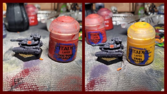
Once the medium red and orange are dry, repeat the same process with your bright red and yellow, but make sure to only apply the paint this time where you want the glow brightest. This might be a particular side of the heat sink but in this case it will be the middle for me, to follow the curve of the turret.
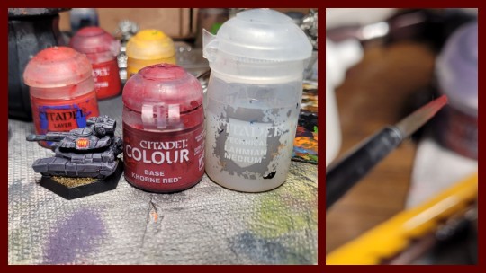
Finally, we will 'extend' the glow of the sink to the area around it slightly. You could do this by applying a quick and soft drybrush before you start using lighter colors on the sink itself, but I prefer to use a glaze for this as it produces smoother results. Once the entire sink is dry, take your darkest color (quick physics lesson: reflected light will always be less intense than the source) and some thinning medium. Mix the two together at a 1:1 ratio and then add some to a medium brush with a fine tip before wiping off the excess on your pallet. The brush should be just damp and produce a thin and regular line of color when dragged across your fingernail for the best results. Once you're happy, sketch the color onto the area around the glowing heat sink with little motions. You should be building up an even, translucent layer of color over top of your base paint job, making it look like the heat and light of the sink is radiating out into the area around it.
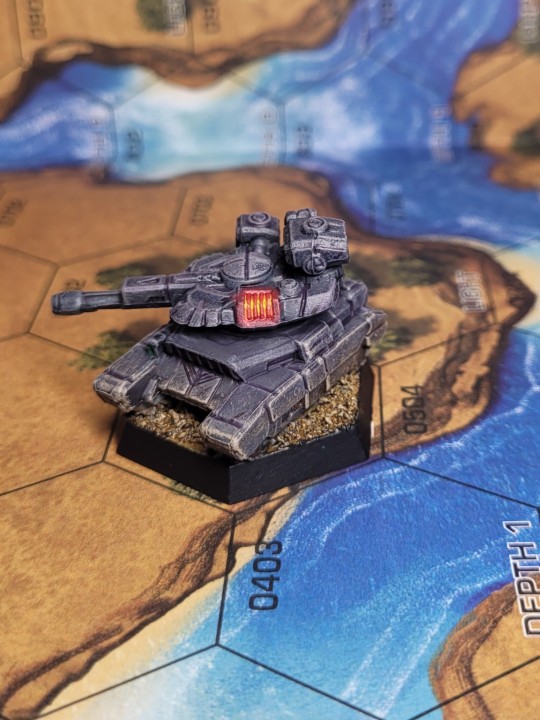
And now are heat sinks are done! I've painted these sinks with fairly high contrast hot tones to pop on the dull purple model but you can easily change the colors around to suit your needs. If you want darker, more desaturated glow, start with a dark brown instead of a dark red and have your brightest highlight colors be medium red and bright orange. If you want to go hotter, consider trading the red/orange/yellow pallet for blues and whites. More exotic forms of glow could be rendered with greens or purples. Get weird and have some fun with it!
227 notes
·
View notes
Text
Your First Kiss
Jiang Kai | Kai Kalama (She/They)
Reader was sat on the floor of her apartment, leaning back against Kai's legs as he flipped through channels on the tv. They had a new sketch due in two days, so they were hoping for inspiration.
The parameters for the project were pretty simple; primary color (red, yellow, blue), one accent color (gold or silver), and female model.
Above her, Kai suddenly leaned over them to look in their eyes, "What if you did something based of Azula? You know, from Avatar. She's got red and gold in her design doesn't she?"
Blinking, Reader turned it over in her mind before nodding. Focusing back on him, she was unsurprised to find his gaze on their lips. Doing their best to not let him know that they saw his gaze, they spoke, "That's good. She does have red, though its more maroon but I can tweak the colors a bit to fit the parameters. Thank you, Kai."
He flushed, leaning back as Reader fought to hide a wider smile. For nearly three months, since they'd begun hanging out, she'd noticed how his eyes constantly strayed to their lips or how focused he'd get whenever they spoke. It was sweet, and was defintely not helping their crush. So today, they decided to do something about it.
Later, after dinner, Kai was at the door preparing to leave. "Well, I guess I should leave a pretty person all alone in their apartment to work on their project." He winked making Reader laugh.
"Kai . . ." Reader trailed off, summoning all of their confidence. "Tell me if you don't want this."
"What–"
Cupping his face, Reader pulled him down a little as they reached up a bit to press a kiss against his lips. Their lips slotted together perfectly, fitting like puzzle pieces. The kiss only lasted for a few seconds, as Kai had frozen in shock.
"Sorry. I thought–"
Kai interrupted her this time, slamming their lips back together as he pushed her against the wall beside the door, hands falling to their hips as Reader wrapped their arms around his neck to keep him close.
Reader couldn't help but notice that he tasted like cinnamon, likely from the gum he loved to chew on all the time. Kai noticed how Reader tasted like the fruity wine they'd had with dinner and nearly moaned at the taste.
Pulling away, but not pulling apart completely, he pressed their heads together. "So, can I take you on a date?"
"Time, date, and place?"
"Next Saturaday, 7, and you'll see."
"I'll see you then, Kalama," Reader teased, seperating. Kai obediantly stepped outside, reverantly touching his lips when the doors closed.
Zane Julien (She/Her)
Zane mediatated peacefully to the quiet sounds of Reader painting, her playlist, and the soft humming. He felt at peace in the whirlwind that was her studio, eventually opening his eyes to see what she was painting.
It was the Aurora Borealis, with a wolf pack tilting their heads back to howl in unison. He was amazed by the motion you'd managed to capture in the painting.
"It looks incredible," Zane complimented, startling Reader into nearly dropping her palette.
"Oh shit!" He was quick to catch it, much to her relief. "Oh thank the dragons. Thank you for the compliment, and the catch."
"Do not thank me, it was my fault for startling you."
"You still caught it for me. So I'm going to thank you. Thank you Zane," Reader stated, smiling as she took the palette back.
Zane smiled softly, starstruck as she turned back to the painting. Standing just behind her, he remembered something Nya had said he should do, based on his feelings and how Reader acted around him.
'Ask permission to kiss her, then take her on a date. But don't push her.'
"Reader," Zane said, quickly catching her attention. She turned to him, setting her pallette down to give him her full attention. "I have a question, but I do not wish for you to feel pressured."
"I wouldn't let myself he forced into anything," Reader agreed, tilting her head.
"Of course." Zane hesitated, stepping closer, flustering her. "May I . . . May I kiss you, Reader?"
Reader seemed to freeze, soft lips parting in surprise. After waiting for nearly thirty seconds, Zane was disappointed by the lack of answer but took it in stride. "I apologize, I did not—"
"Was my asking an issue?"
"No, no!" Reader interrupted, waving her hands around. "You don't need to apologize! I was just surprised! Promise! You're not normally so outspoken, so . . ."
"Just a surprise."
"You still have not answered the question," Zane noted, tilting his head slightly. Blushing, Reader ducked her head down in emberresment.
"I-yes. Yes, you can . . . you can kiss me," Reader whispered, standing a little taller as Zane stepped into their space.
Slowly he pressed their lips together, not wanting to rush and accidentally hurt her. The kiss was soft, chaste and made Reader pleasantly cold as Zane felt his core warm in pleasure. Pulling away, he found his own smile widening when he saw Reader looking at him with a wide smile of their own.
"May I take you out? On a date?"
"Y-yes! Yes!"
"Then tomorrow? At 7?"
"Perfect."
"I shall pick you up then," Zane decided, still smiling. Giggling Reader stepped into his space to sink into a hug.
"I can't wait."
Cole Brookstone (They/Them)
The stars were bright as Reader and Cole laid in a grassy meadow Cole had taken them too. Head resting on Cole's stomach, Reader had a surprisingly good view of Cole's reaction every time he spoke lowly, in order to keep the peace of course.
Tonight was Ninjagos Festival of Stars, recently adopted from the Serpentine but neither of them were fans of large crowds and wanted to see the stars and fireworks alone. So Reader had packed a nighttime picnic, with Cole hovering over their shoulder in anticipation.
Mooncakes, Star shaped iced cookies, and multiple blackberry flavored treats. They'd also brought along their starry night themed drink, with blueberries, bananas, and kiwi syrups to make it a stunning array of colors.
Cole had, of course, nearly devoured his portion in a half hour as Reader talked about their day, and some issues they'd noticed recently, eating far slower.
"So, what made you invite me out to watch the stars? Is it just 'cause ya knew I'd bring ya food?" Reader asked, without opening their eyes.
"What, no! All of the others wanted to go to the festival and celebrate, but I wasn't in the mood to celebrate. I'd rather hang out with you," Cole admitted.
"Really? Me? Mr. Ninja wants to hang out with an uninteresting civilian?"
"Your not uninteresting, which I'm not sure is a word by the way. Your just . . . You're normal, and I need that in my life. And you're fun in a different way."
"Well, thank you for the compliment. Any specific reason you don't like festivals? Or is it private?"
Cole knew that all he had to say was that it was private and he would drop it, but he wanted to share. "My mom used to take me out to festivals all the time when I was younger. She had a piggy bank specifically for those days that I could add change too. It was my money to use to do whatever I wanted with during the festival. When she died, I stopped going. It doesn't feel the same anymore."
Reader was silent, thinking. "When I lost my parents, I no longer thought it was worth it. To live. It took me three years to truly start enjoying the world and some days its still hard." Glancing up, they met eyes. "If you ever decided you want to try, I'd be happy to take you. We could make it a date."
"A date?" Cole sat up, worrying Reader who sat up as well.
"It doesn't . . . have to be a date. Not if you don't want it to be."
"Well, what if I want it to be a date?"
Reader smiled, leaning closer as their eyes flicked towards Cole's lips. "I'd like that."
Smiling softly, Cole and Reader leaned closer together until their lips were barely a centimeter apart. "Would you be upset if I kissed you?" Cole asked, trying to hide his nerves.
"Not at all."
Grinning, Cole eagerly pressed their lips together, twisting until he was hovering over Reader. Fingers wove into his black hair, tugging him closer to them as they made out beneath the stars.
Cole eventually forced himself to pull out of their hold, lips glistening and red as he panted. Reader was not much better, shirt having ridden up at some point. "Well . . . that was not what how I thought tonight would turn out," Cole admitted with a goofy grin.
Reader laughed, eyes bright. "So, we still on for that date?"
"Absolutely."
Jay Walker (She/her)
Lightning flashed across the sky, followed closely by the crack of thunder, making Reader groan. She and Jay were both caught in the rain, having been taking a short break from working on one of his older Mechs.
"Well, this sucks," Reader grumbled, huddling beneath the glass cover of a bus station as Jay watched the lightning sparking in the sky with a strange sort of awe and reverance. Nudging him, she broke the spell cast by the bright flashes. "Everything ok, sparky?"
"Huh? Oh, yeah. Just, ehehe, get a little excited during thunderstorms," Jay explained, allowing a spark to flit through his fingers in demonstration.
"That's . . ." Reader trailed off as lightning struck again, highlighting the sharp angular, boyish features Jay had, bringing out his freckles and auburn hair. "That's pretty cool. Don't think I'll ever get used to people fighting with elements though."
"Seriously? You've hung out with Nya for years, how is it still so weird!"
"I don't know! It just is!"
"Maybe you're the weirdo."
"Huh," Reader gasped, as if truly offended. Grabbing their imaginary pearls, she draped herself across the bench. "To slay me with such cruel words, oh how I die. Must this be the way death comes for me."
Jay laughed, plopping down behind her so she could rest her head on his thighs. He smiled down at her, trying hard to keep his blush down, and failing miserably.
"You're turning pink," Reader mused, poking his cheek as her eyes sparkled with mischief. "Is it because you've fallen for my beauty?"
Jay felt his lips twitch downwards when he heard the sarcasm. He was far less oblivious than people thought and he'd realized a while back that Reader did not think themselves pretty. Just . . . Average.
"Would that . . . be bad?"
Readers smile fell as she stared up at him in shock, "Jay . . ."
"I really want to kiss you."
"Then do it."
Leaning down, she reached up, meeting him in the middle. Neither noticed how the lightning seemed to cover the sky, with barely a secons between the flashes. They were too focused on the press of their lips, on memorizing how the others face felt beneath their fingertips.
Pulling away, Reader giggled, quickly joined by Jay. Their was no real reason to laugh but she was happy and so was he.
"So when can I take you on a date, Mr. Blue Ninja?" Reader asked, laughing at the look he gave her.
"Hey! I'm supposed to ask you out!"
"Too late." He tried to sulk but another kiss had him relaxing into a giddy smile. "Fine. I'll go out on a date with you."
"I'll plan a good date, scouts honor."
"You've never been a scout!"
"Oops."
Lloyd Garmadon (She/her)
Reader was happily pressed against Lloyd's side as they walked, liking the comfort of his arm draped over her shoulder. They'd gone windowshopping in the nearby mall for her hour break and were finishing up to walk back, not that Rufus would mind all that much if she was a few minutes late.
"Ooh, look at that," Reader said, pointing to a shoe store. In the display window were Ninja-themed shoes, with Lloyd's being the most prominent.
Lloyd saw what she was looking at and groaned, cheeks flushing, "Please tell me you're not going to buy those. They're like 100$."
Reader pouted, looking up at him with puppy dog eyes, "But I thought you liked seeing me in your merch?" She'd noticed it a few weeks ago when she'd worn a green ninja shirt, seen how wide his eyes had gotten and how stuttery and blushy he'd gotten.
Just like right now.
"Wh‐well, of course, but still . . ." Lloyd trailed off, looking away to hide his face.
Giggling, Reader patted his bicep, pleased at the feel of muscle beneath the long sleeved shirt he wore. "I'm kidding, sweets. They're cute, but too expensive for my taste. Besides, I'd look better in one of the Green Ninja sweaters that one store was selling."
Somehow, Lloyd's blush darkened as he whined, "Reader."
"Lloyd," Reader cooed, delighting even further in his blush.
Suddenly, looking past him she spotted Ryker, very obviously looking around for someone. In a heartbeat their eyes met and he started towards her, making her freak out slightly.
"Lloyd."
He immediatley caught the change in her voice and followed her eyes to see where she was looking. Seeing Ryker, he cussed and pulled her towards a hallway between stores to try and hide.
"He already saw me," Reader admitted nervously. Lloyd watched the entrance, tense, as Reader tried to think up a plan.
Grabbing his shirt, she tugged him close until he was pressing her against the wall. Gaping down at her, he seemed frozen in place.
"Trust me?" Reader asked softly, eyes wide. Lloyd nodded, softening marginally.
"Of course."
Leaning up, she pressed their lips together making Lloyd freeze for only a second before he leaned into it. He gently cupped her cheek, keeping the kiss soft and slow as her own hands found their way into soft golden-blond hair.
Neither noticed when Ryker found them, nor when he realized just who was kissing Reader. Furious the man turned away and fled, stomping away as they stayed pressed together.
"So, sweets, when do you plan on taking me out?" Reader asked, breathless. Lloyd stared down at her, emerald eyes alight with awe.
"Friday, at 6. We're going somewhere fancy," Lloyd decided, smiling widely.
Reader giggled, using her grip on his head to tug him back down into a kiss, "Sounds good to me."
Morro (She/Her)
Morro was passed out on Readers couch, sleeping off the inherent exhaustion that came from his longer missions. She was curled against the side pressed against the couch, watching a movie on low so she wouldn't wake him.
Head resting on his shoulder, with his arm loosely wrapped around her side she couldn't help but blush, thinking about what people would say if they saw their position. It was intimate, even for friends. Her face had been warm the entire time they'd been cuddling, though she hoped he hadn't noticed.
Sudden movement from the hand on her hip startled her, making her glance down. Morro was rubbing at the exposed skin of her hip bone with his thumb.
"This alright?" He asked, voice a low rasp from just waking.
"Yeah," Reader mumbled, pressing her face into his chest. "Just fine. Perfect."
He chuckled, embarresing her further. They fell back into silence, though Reader's mind was running a thousand miles an hour.
"Hey, Morro?"
"Hmmm."
"Do you–" She cut herself off to sit up a bit to look him in the face. Morro's eyes were half-lidded but attentive. "Can I take you out? On-on a date?"
Morro's eyes sprang open as he gaped in shock. Fearfully, Reader began stuttering, "B-but not, not if you don't want too! Of course you don't have to agree! Just asking!" She tried to push the tears in her eyes back as Morro sat up, without saying anything.
With a gentleness few thought he was capable of, Morro rested a large hand on her cheek, forcing her to meet his dark grey-green eyes. "Can I kiss you?"
At her shocked expression, he laughed.
"Y-yeah."
Still grinning smugly, he pressed their lips together, wrapping an arm around her waist to keep her close. He barely let her come up for air before diving back in, like she was his air.
Finally he let them seperate, panting slightly, "I'm taking you out. Friday night, wear something you can walk in."
"O-okay." Eagerly she leaned back in for another kiss making his grin as he met her in the middle.
#ninjago#ninjago headcanons#ninjago fanfiction#kai smith x reader#kai smith#zane julien x reader#zane julien#cole brookstone x reader#cole brookstone#jay walker x reader#jay walker#lloyd garmadon x reader#lloyd garmadon#ninjago morro#morro x reader
226 notes
·
View notes
Text
It’s teto time!

This was originally supposed to be a quick concept of a design I wanna use for a larger illustration inspired by Jamie Paige’s song Machine Love - but then I got carried away and this is clearly no longer a sketch
Info about my process and inspirations + wips under the cut!
First up let’s look at the refs I used! I keep these around while I’m sketching on the canvas or up on another tab

I forgot to save a version with just the sketch so this has some linework on it. I always sketch with the mspaint ass brush bc it just feels the most freeing to sketch with lol. Since it’s so simple I don’t obsess over it too much.
Most of her design is based on that old ass Apple computer in the top left, since yknow… she’s a computer!
I don’t have any images of space channel 5 on the canvas, but it was in the back of my mind while designing her.
The biggest inspo on here is these gundham mecha girl illustrations that I’ve been obsessed with since high school. There’s just something about them. I take inspo from them all the time, from the silhouette/round shapes used in their armor or the retro coloring style, there’s often some piece of them in my work. If I could get my hands on the art book full of them my life would be complete.
I used a random figure for a pose reference, I liked the proportions a lot and I thought they were in line with the style I was going for. If you don’t use figs as pose refs or do studies of them I totally recommend it! Great way to learn to draw stylized proportions in real space :3

Here’s the linework! I did this by using an airbrush pen to create thick chunky lines and then taking an airbrush eraser to shape them. I haven’t mastered this style yet, and definitely spent too long of it and treated it too much like normal linework - but I’m learning! Eventual I’ll get better at it - it still turned out nice, but a big goal for me with illustration right now is speed! And how do you get speed? Confident decisive lines. I was definitely not confident or decisive about these lines T-T… I spent way too long shaping them perfectly. I gotta go back to traditional and learn how to use brush pens istg
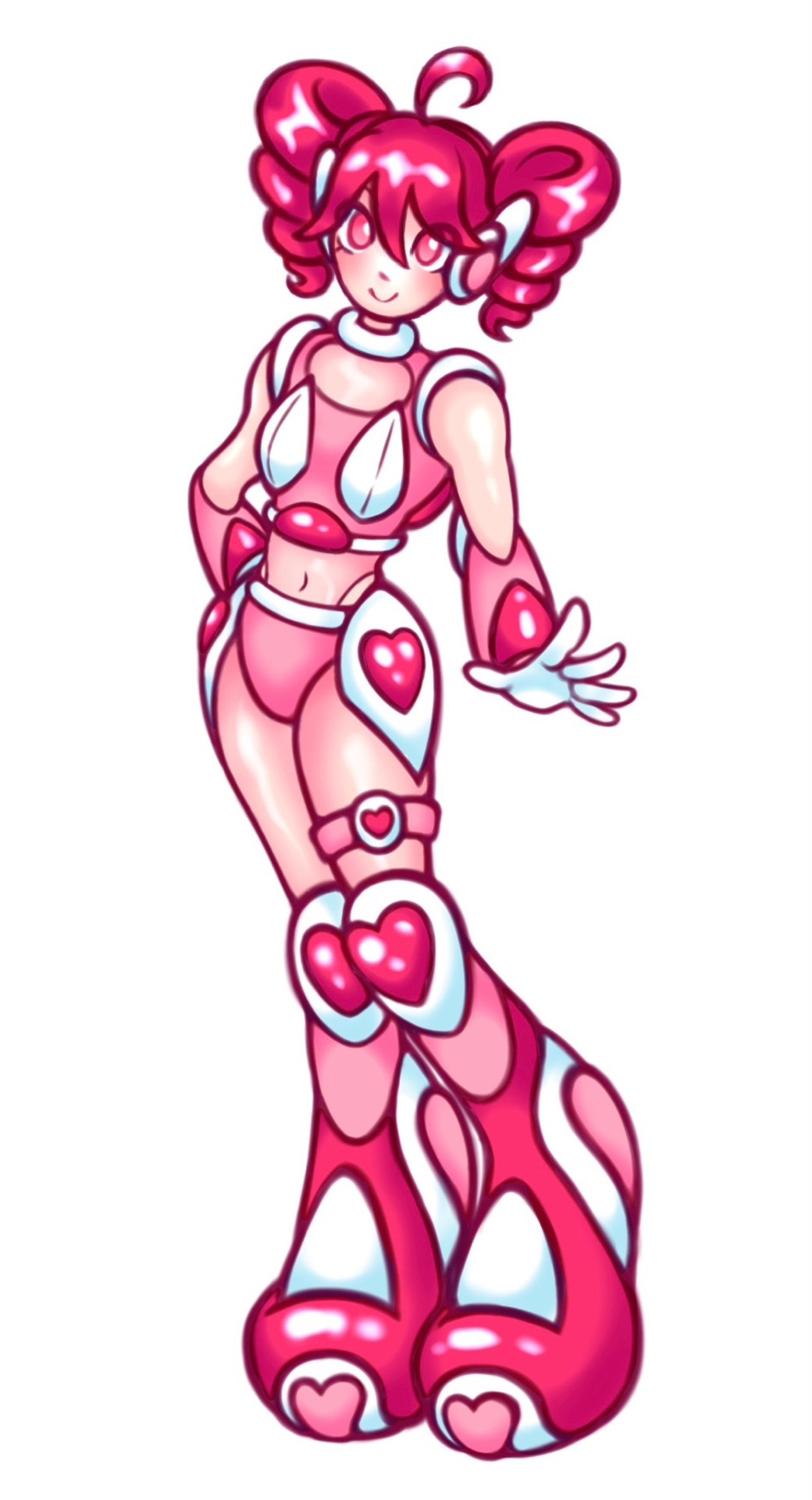
The colors were pretty simple, I just laid down flat colors and used airbrush/eraser to shade them + an add layer for the highlights so they would pop. Overall I’m pretty happy with it!
Now to do the big illustration and figure out what style I want for that lol. I’m thinking of doing something painterly and then using some pixel brushes and textures in certain parts, like blending of computer world and real life. Much to think about!
If you read all the way down here, I love you and I hope you learned something! If you have any questions for me feel free to drop an ask!
41 notes
·
View notes
Text
How I Draw: PART 1
Hello, this is Zeyheri. While I was happily drawing, I suddenly realized, "Oh no, the new school term is coming! Once I start going to school, it'll be hard to draw! And my promise to share how I draw will be delayed so much!!! (I'm doomed!)“
...So, even though I haven't finished my drawing yet, I thought I should at least upload a post to prevent my trust from shattering into pieces.
I’ve noticed that authors always include words of gratitude in their book prefaces (so I’ll imitate them!). I sincerely thank the two people who’ve helped me a lot in writing this post and who will continue to help with many questions in the future. I also love all the users who constantly take an interest in my drawings!
As you probably know, I’m not a professional illustrator. The only formal art training I’ve had was at an art academy in elementary school! So, it’s probably not a great idea to expect to learn much from my writing. However, anyone can enjoy drawing even without formal training. "The act of appreciating art" is an even more accessible field to enjoy. If you read this and felt intrigued or inspired to try something experimental, then that is exactly the purpose of this post, and I will be happy.
-
(1) Tools & Programs


I use three programs to draw: PaintTool SAI2 / Corel Paintshop Pro / Corel Painter. Oh, I almost forgot-The tools I use are the love-hate Surface Pro 8 and the Huion Kamvas Pro 16 (4k).
-Rough sketching, inking, base coloring, adding shadows, and initial corrections: PaintTool SAI2
-Adding paintbrush effects: Corel Painter
-Other corrections: Corel Paintshop Pro
(*If you're wondering why I don't use Clip Studio, it's because my beloved Surface laptop might die from it! "Then how do you use Corel Painter?" you ask? The moment I open Painter, lag starts, and the fan goes crazy. If you value your laptop's lifespan, take my advice and avoid it!)
In fact, about 70% of the process happens in SAI. So, in this post, you’ll only see me using PaintTool SAI2.
(2) Rough Sketch & Line Art
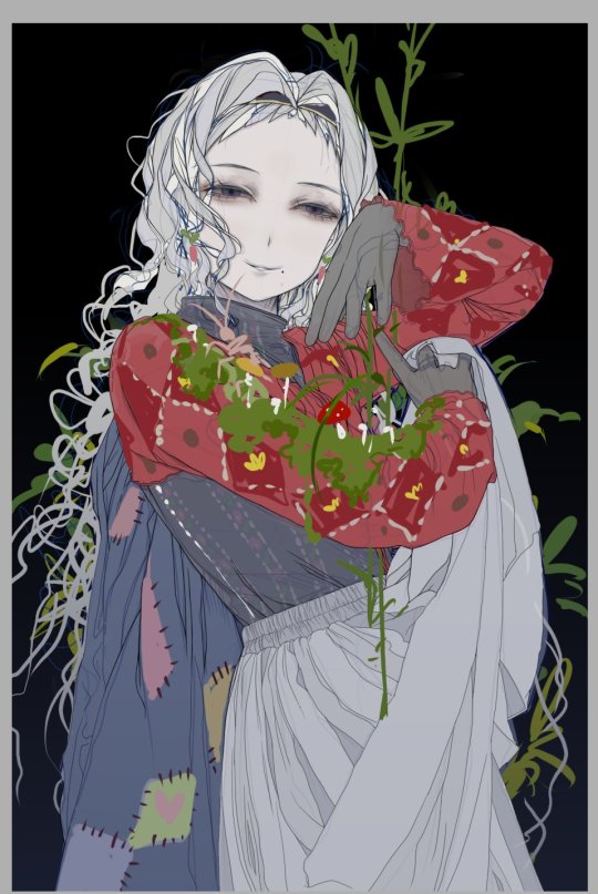
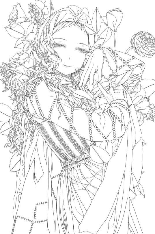
Rather than creating a detailed rough sketch, I prefer to draw lines while adding rough sketches when needed. The first image is proof of that! For me, the rough sketch stage is less of "the first step in drawing" and more of "getting the atmosphere right."

For the lines, I use the SAI pencil, adjusting the brush density to around 75-85. Other than that, it’s probably set to the default settings, at least as far as I remember. (It's Korean, but I believe you can understand what it means by location)
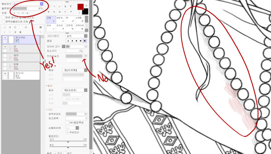
If you look at my line art, you might notice faint shadows sometimes. This isn’t because I adjust the brush density; I adjust the layer opacity instead.
(2-1) Drawing Hair
Now, one of you asked me a question: "How do you draw hair?" I’ve created a simple resource to explain!

As always, there are exceptions, but when I draw hair, I tend to make the shapes angular. This way, the hair looks solid, almost like stiff RNA strands.
After that, I add lines following the flow of the hair, giving it a fuller look. I usually add these lines when I’m refining the inking stage.
Sometimes, if I’m feeling it. I add thin strands of hair around the edges to give it a more "hair-like" appearance.
(2-2) Drawing Eyes & Coloring
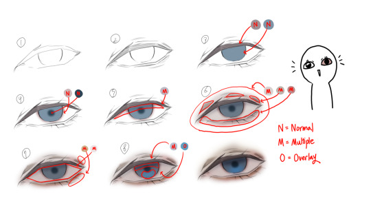
There was also a question about how to draw eyes. I’m not the type to add sparkling glitter for a glamorous look, so my approach is very simple.
In the picture, I’ve divided it into several steps, but honestly, it’s a very quick process. Start by shaping a hexagon and keep adding multiply layers while coloring. The key point is in the 6th step, where you cover the entire eye with a light pink multiply layer. Doing this creates a much more eerie, painful, and melancholic look! (I was really excited when I first discovered this! Yay!)
(3) Coloring


Now it's time to add color. Typically, I would choose colors that fall within the left square area, but if a highly saturated color seems more fitting, I use colors from the right square area. If you ask me why I choose these colors, I'm not sure. I just feel like I like low chroma colors.
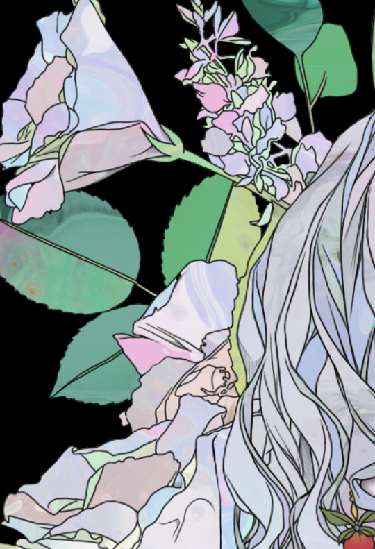

Be thorough in coloring, and once you're done, apply textures lightly to finish it off. (You’re asking what texture I use? Well, since I’m not a texture creator, I don’t think it’s appropriate to talk about it publicly. But if you send me a private message, I’ll answer you secretly. I think it was over $30.)

While coloring, using an Overlay layer to test can help when adjusting the color tone later on.
-
Thank you for reading. Please look forward to our next post as well! Feel free to let me know if there are any awkward expressions or anything you would like me to add to the content of this article!
38 notes
·
View notes
Note
What was your process for making the Noelle amv, if you don't mind sharing?
hii! im not sure how eloquently or clearly ill be able to explain it but i definitely have some pictures you can look at!
(the video)
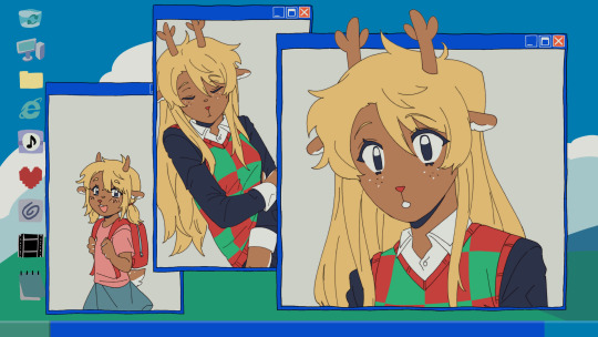
i actually got the idea while i was away on a trip with very limited wifi -- it wasn't Trust Me that i got an AMV idea for first, but instead it was one of 4syu's other songs, There's Nobody. for such a happy sounding song it really made me so sad, to the point where if i tried to sing it to myself id get choked up by the chorus LMAO. it was baddd
but basically i was rapidly trying to find both songs on spotify so i could listen to them offline, and it only took me a few loops of Trust Me and thinking about the original MV to make me go "ohhhh. how can i make this about noelle." And so i did .
i was thinking about doing a storyboard, but in the past, i've found that doing storyboards for animations/AMVs lowkey... kills my motivation altogether... SAD... but i saw the whole video so clearly in my head, and i didnt want to make the same mistake i made before... so i went right to doing quick sketches (while still on my trip...) just so i could get the ideas out of my head
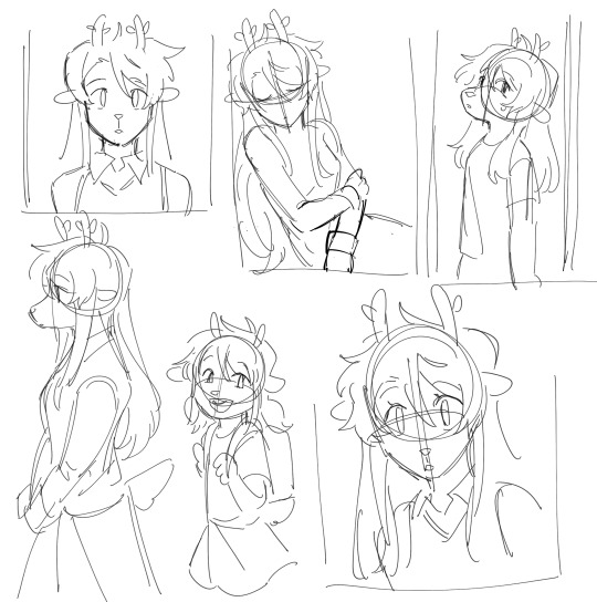
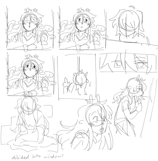
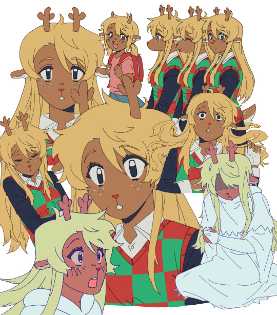
i was torn on what to do with my style at the time, whether i wanted to make it more similar to the original video, or to her canon appearance, or to MY style and how i draw her. i think it kind of ended up as an amalgamation of all three...? at the very least, her light world color palette definitely was more bland and desaturated, like i purposefully wasn't trying to do anything special with her colors.
after that point, and getting maybe a few of the actual drawings done, my motivation crashed again, and i left it all to marinate for nearly a week. it was baking, guys, it wasn't abandoned, listen to me, why are you throwing tomatoes at me,
i had up to about the "I dreamed about that again" animation done and stopped, and it wasn't until i decided to sit down and start editing it anyway that i really got in my groove again. i got all my little assets into a workable state so i could really try to sit down and make the video come to life and all
the really fun part was honestly working on the desktop backgrounds. i really wanted to limit colorpicking from the original video as much as possible, but i decided that making look as similar as possible to the original could help with the contrast i wanted to add later.
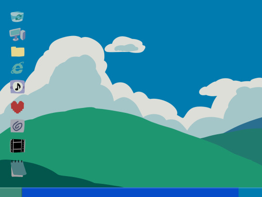

i drew these two backgrounds first. i was hoping i could somehow fit the bunker into the second one, but decided to do something different anyway. the second one's ui didn't actually change until later in the editing process.


drawing THESE were fun especially, and im happy with how they came out. i think the dark world icons are really cute still. one thing i really did know i wanted to do from the beginning was to turn the soul/undertale icon into the deltarune one.
i was worried if the shift from the Windows Field Background to the dark world would be too sudden, like you would just blink and suddenly it was all different, but i think it ended up all right...?
the not so fun part was drawing all the different boxes, lmao. it go really tedious by the end, so i tried to reuse as many of the same ones as i could.
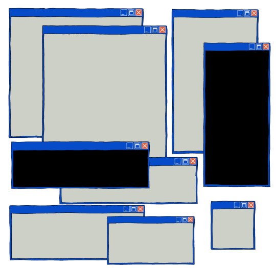
a lot of copy-pasting and tracing rectangles for sure.
i also had to make sure the animations didnt Suck. i brute forced those things and used every last braincell i had in order to make those pictures move bros


fun fact. ive never animated hair like this before. or in any complex manner really. i had to use sooo much brain here... heres how it started vs. how it ended up
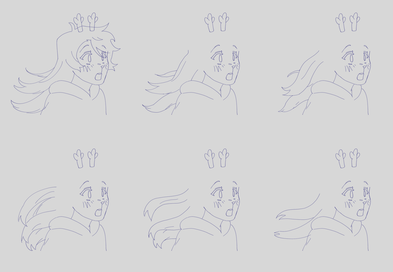
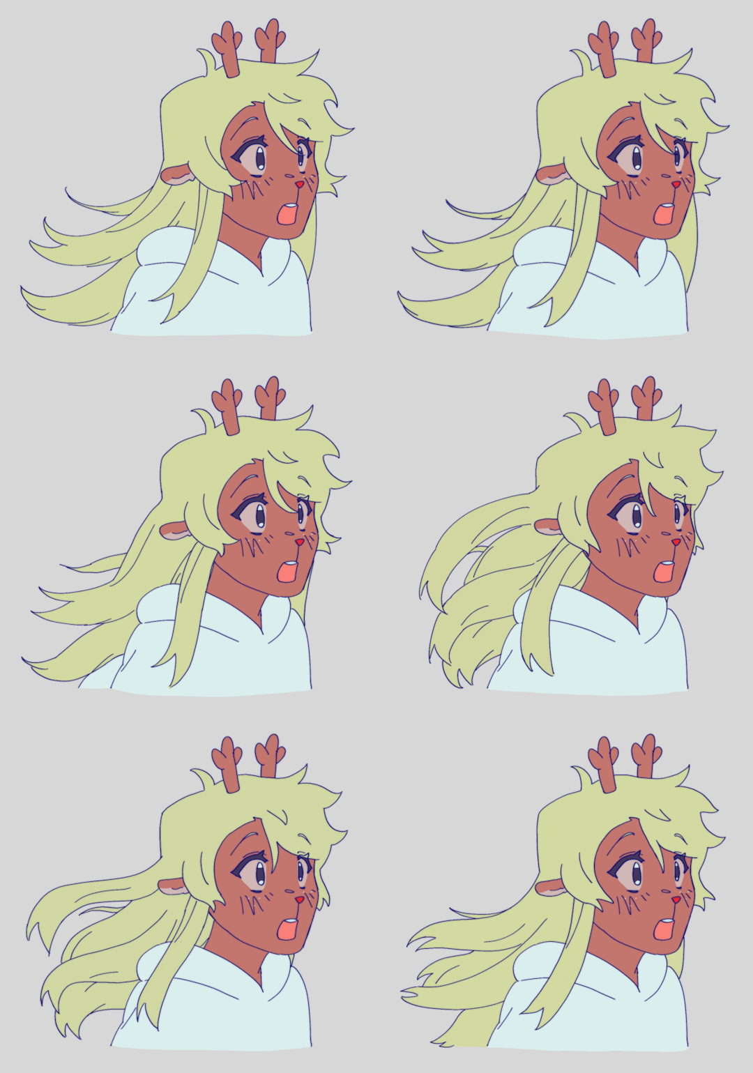
had my animator gf hype me up thru the whole thing... i was having a great time based on the filenames alone
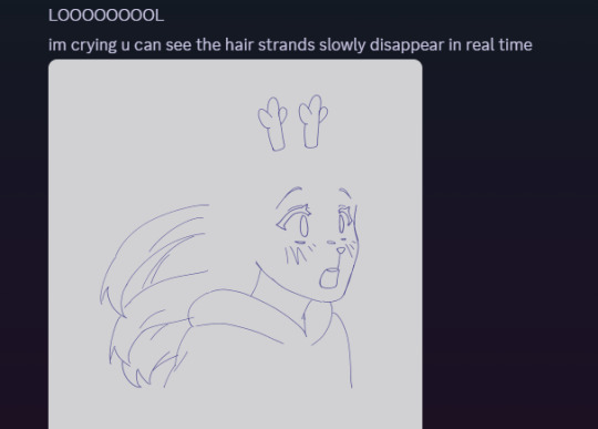

aaaand then ummmm i edited it. i learned after effects like 1 month ago. never touched it before. i learned it for internship purposes and then used my newfound powers for evil it seems
i split the whole thing up into multiple compositions of course, but i probably could have split things up more... im sorry for having 84 layers on comp 3 its not my fault
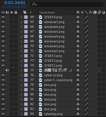
editing a video in 12 fps was a fun change though -- very easy for my brain to go frame-by-frame, and yet still some of the timing ended up being off... tis the goomy way
like i said before, i started editing when i barely had half the drawings done, but seeing it all start to be in motion really pushed me to finish it up. and i mean Really. like i finished the whole thing maybe 48 hours after i first started editing.
and...i think that's it? i do a lot of discord art streaming to friends lately but i kinda kept this one more under wraps compared to usual, i think i just wanted to surprise everyone... look guys i remembered how to make a video! and it's three minutes! waow
sorry if this is way more than you asked for LMAO
also, the AMV hit 5k views on youtube today! ive never had a video do well like that so quickly! thank you!!
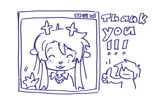
143 notes
·
View notes
Text

1K Prompts
Pairing: Miguel O’Hara x gn!artist!reader
Warnings: Fluff
Summary: The beauty in art.
A/N: Based on this request.
Word Count: 1.2K (Unedited)

He was more than just displeased.
He was tired and aching, muscles sore from a long day. The ache became more prominent as he was forced to hold his ridiculous pose. But no matter how much he huffed and puffed, he would hold it until you gave the okay for him to move. He guessed it wasn’t so bad. From here, he could see your side profile. Could see the lidded look in your eyes as you sketched onto your canvas, mouth slightly parted. Your eyelashes would flutter so beautifully as you blinked, the dying sunlight illuminating your small art room and making your eyes glisten and hair shiny. You could produce beautiful art, but Miguel would never find anything more beautiful than you in the process.
Another one of his huffs caught your attention, and you turned to him with a smile and laughter in your voice. “Miguel, I told you it would take a while. Stop complaining!”
He glared at you teasingly, shifting again but stopping when you glared back, “Can’t we just continue again tomorrow? I’m tired.”
Sympathy filled your eyes and you gave him another small smile, “I’m almost done. A few more minutes, I promise.”
Miguel sighed, staying in his position obediently. True to your word, you sketched a few more lines onto the canvas before thanking him. His muscles relaxed instantly, going to leave your art room to go to bed, but was stopped at the door when you gave him a quick kiss to his lips and thanked him again. He hummed against your lips, his body sagging as he told you not to stay up too late working. You gave him a dismissive wave of your hand and he went to bed.
____________________________________
For the next few weeks, every second of Miguel’s free time at home was spent in your art studio. You had insisted. Something about the handiness of having a live model to reference when it came to shadows and lighting and everything and anything under the sun. It was definitely better than posing, seeing as he was allowed to just lounge on your studio couch and do whatever he needed to do. It did get annoying every now and then when he had something important to work on, forcing him to carry things from his home office into your studio and then back out at the end of the session. But it brought a smile to his face every time he complained and you whined, “Please? I just want to spend time with you too. I like spending time with you.”
He likes spending time with you too.
Today was one of the rare days where Miguel didn’t have anything to work on. He simply laid on the couch, watching you work. Your brush was feather light on the canvas, picking into a pile of paint and transferring the coloring onto your work. Every now and then you would clean off your brush, a soft ringing filling the room as the brush handle knocked into the glass of water. The peacefulness made him sleepy, and he picked at a loose thread in your couch pillows.
“How come you won’t let me look at the painting? Is it bad?” He asked, the last bit covered in teasing.
You smiled at the canvas, eyes briefly flicking to him before you continued working. “The process of every painting is ugly. That’s why we say ‘Trust the process’.”
Miguel snorted at your answer, clearly dissatisfied. It made you laugh and you shook your head as you decided that you were done for the night. Maybe a day and a half more of working and you would be done officially. Your eyes flicker over to the calendar you keep on the wall. Perfect.
You walk over to Miguel helping him off the couch and guiding him out of your studio so the two of you can start on dinner before going to bed, giving him a kiss on the cheek.
“Trust me, it’ll be worth the wait.”
________________________________________
It’s snowing, Miguel realizes as he sits in the living room. He can see it behind the tree you have put up, fuzzy white dots falling from the sky. The air smells like your cooking, warm spices filling the house. He can hear you approaching from behind him, and he doesn’t even flinch when your hands suddenly fall to his shoulders.
Your hands massage the muscle absentmindedly, following his gaze outside of the window. “It’s snowing,” You point out, and he hums and repeats it back to you.
You seem to light up as you stare at it, squeezing his shoulders one last time before approaching the tree. Miguel watches you silently, brow raised in question as you grab one from the back. You check the tag on it to make sure it’s the right one, before walking back over to Miguel. You perch yourself onto his lap, handing him the present.
His arms wrap around your body, holding the wrapped gift in his hands before the two of you. He squeezes you in his arms, shaking the present slightly, before you place our hand over his to stop him.
“Gifts are supposed to be after dinner, hun.” He reminds you, and you roll your eyes at him.
“I know. But I think now is the perfect time for you to open it.”
It’s his turn to roll his eyes at you, smiling as he carefully uses a claw to cut through the tap and unfold the decorative paper. From how he opened it, he’s first revealed to the back of a canvas. On the back is your signature and the date, and his fingers trace over it before he slips it over. His breath gets caught in his throat as he stares.
It’s the painting of him that you were working on. He’s in your art room, glowing white highlighting his frame as he lays there. His face is towards the window, where snow is falling. His eyes are shiny, and the smallest smile graces his lips. He traces over each detail with his hand, smiling down at it.
“You like it?” You ask him, your hands playing with the hair at the nape of your neck.
He nods, turning to you and leaning up for a kiss that you gladly return. You’re smiling against his lips, and you kiss the crown of his head when you pull away. Miguel nuzzles into your neck, setting the painting down on the coffee table so he doesn’t break it when he traps you into the couch. You laugh as you fall, Miguel laying on top of you and planting kisses up and down your neck.
“I love it, thank you.” He whispers into your skin. But then, he’s pinching your sides as he gives you a small glare. “But don’t think I didn’t notice you made me do that stupid pose for nothing!”
You burst out laughing, shoulders shaking as you throw your head back over the arm of the couch. “It wasn’t for nothing! I’ll have you know it was a great inspiration. Kept me very motivated.”
Miguel raises a brow, a large smile on his face. “Great inspiration was it?”
You nod, smile growing bigger as you agree, “The biggest.”
Miguel hums, nodding his head before he’s tickling your sides until you can't breathe.
“Inspirational my ass!”

#cherry's requests🍒#miguel o'hara#miguel o’hara x reader#miguel o'hara x y/n#across the spiderverse#spiderman 2099 x you#spiderman 2099 x reader#atsv miguel#miguel ohara x you#cherry's specials!🍒#miguel ohara#miguel x reader#miguel spiderverse#miguel o hara#miguel x you#miguel spiderman#spiderman 2099#astv miguel#miguel atsv#miguel ohara x reader#miguel ohara x y/n#miguel o'hara x you#miguel o'hara x reader#atsv
250 notes
·
View notes
Text

So about those redesigns. Here's some concepts I threw together. I'll push out some finalized sketches with colors eventually but I couldn't sleep so I did some quick doodles.
Some changes I made to fairies were making them less tinkerbell /human looking. Antenna instead of noses, four digits instead of five for hands. I kept the dimorphism but I'd like to note that it's magic+personality based. A fairy's appearance is in direct correlation to how they feel. Marianne's appearance (hair color that kind of thing) changes being related to how she feels after Roland for example.
Colors are going to be a big thing for fairies. So when I get a finalized design down I'll share.
Also I accidentally made Marianne left handed because I forgot I had flipped the canvas so... Now she's left handed and I kinda like that for her.
I made Dawn's hair look more like a flower bud, because ya know, sweet lil innocent Dawn.
Bog's more dragon-y. But since he's still part fairy, I gave him some moth-like fur inspired by @skarjinx / @ezerain 's AU Bog. Also gave him a less humanoid face because of the changes I made to the fairies in general. Also earrings because idfk they looked cute. I don't have any other reason for them. They'd be tactically dangerous but I don't think anyone would get close enough to Bog to grab his jewelry in a fight. I also gave him a tail because... Uh... Fluffy. And ofc digitigrade instead of plantigrade seemed to fit better. Bog cannot change his appearance (glamour) like a fairy can in this AU, his magic is not fairy based but he is a fire fae so he's got fire magic (keeping that from my other AU).
O3O;; also... I'll be changing the goblins a bit and elves too. Adding gnomes and dwarves to the universe so uh, Sunny is gonna be different.
Think I'll refer to this AU as the Fae AU maybe? Once I know for sure I'll give it its own blog.
30 notes
·
View notes
Note
What’s your art process like?
I’m sorry I’ve been sitting on this one for so long, because honestly I feel like I have a pretty typical process. But I’ll do my best to explain what I do with a few pictures!
Thumb-nailing is always a good idea and will help you know what the heck you’re doing. It really helps with value and composition! Here’s my thumbnailing for the christmas truce comic I did (you can see a random warm up doodle I did before starting something else XD
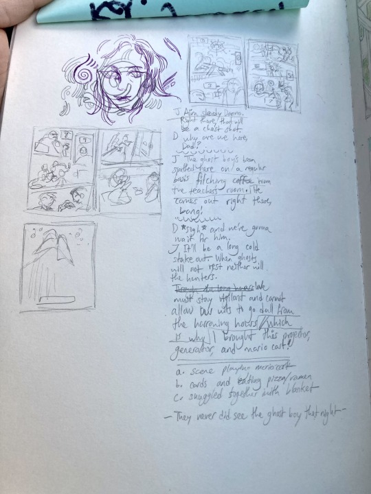
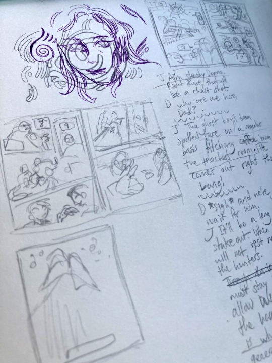
You can see how loose it is, and also the dialogue is just off to the side XD
for comic making this is maybe the hardest part, but once you have it, it’s pretty smooth sailing to sketch it out and make it bigger. I don’t have a photo of that part unfortunately because it’s quick. (I usually just loosely pencil in where the people are with more attention to the structures and panels around them, and maybe what they’re expressions are) Then I make it pretty:
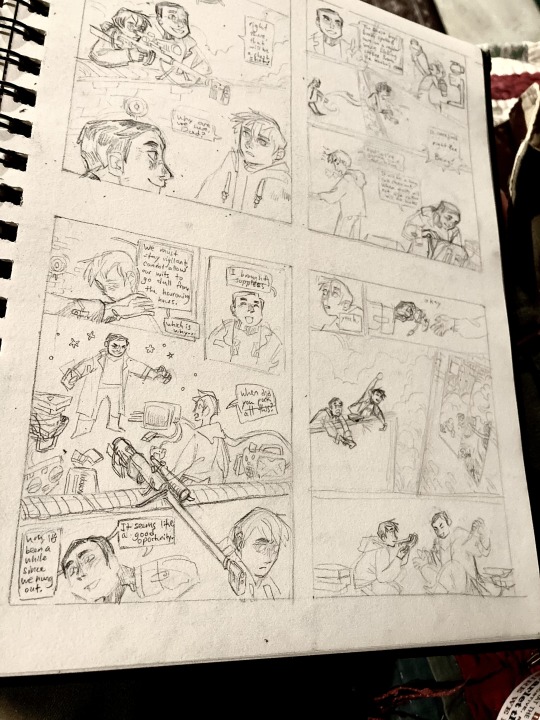
The actual pages are fairly small because most people are going to be reading it on their phone. Then I line it with pen which always goes really fast.
For colored things, I am still often figuring things out. I usually put a base color down first and then layer on top of it. Also, I try to keep my color pallets fairly limited, sometimes by picking out before hand the colors at my disposal. Once you have those colors if you mix them the whole piece will look more interesting and cohesive as long as your initial colors play well together (don’t have to worry so much about this with colored pencil, but watercolors play best with others the fewer pigments they have already mixed inside.)
Here’s one that I’ve only put a base color down, usually I don’t leave blank spaces unless value or glow is really important
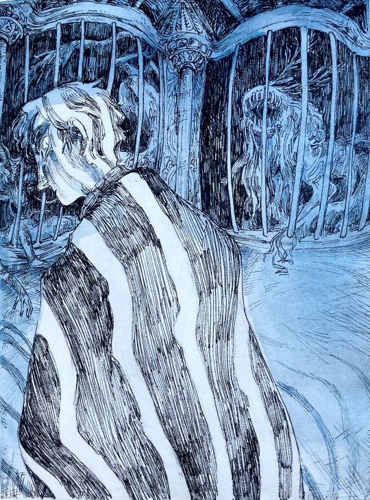
The wirt and greg pictures have a hot pink wash behind them
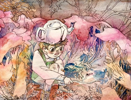
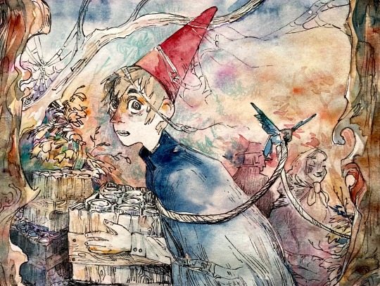
You can see the layering easier in this gauche painting
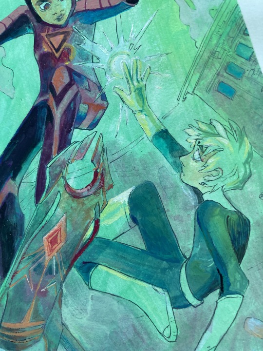
I think most traditional artists would describe something similar. In my opinion, the most important part is practicing and doing so on a regular basis. For me, even if I do nothing else, once a week I go to church, sit down in a pew and get out my sketch book. If you can find a time like that for yourself it really is valuable! I won’t say anymore because there are so many more awesome tutorials and explanations elsewhere on the internet! If nothing else, I hope to leave you with the impression of how doable this is, even with something simple like a ball point pen or crayola pencils
here’s some bonus doodles for reading to the end ✨⭐️🌌
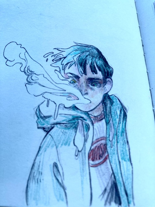
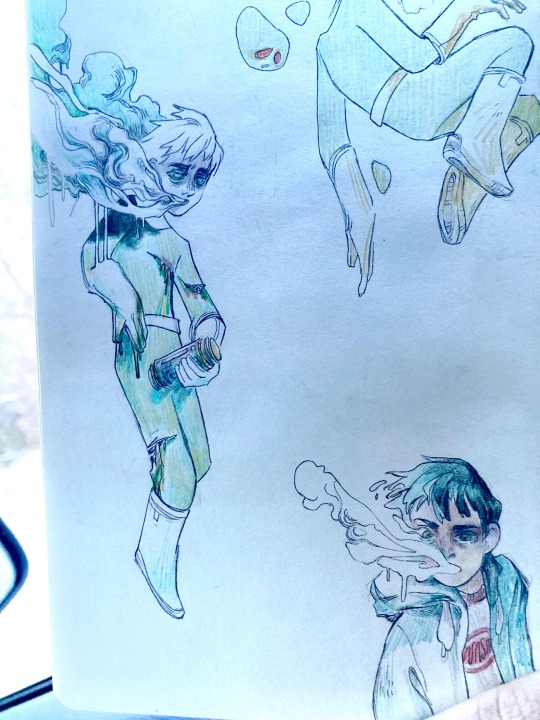
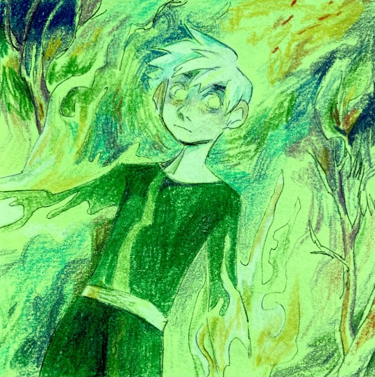
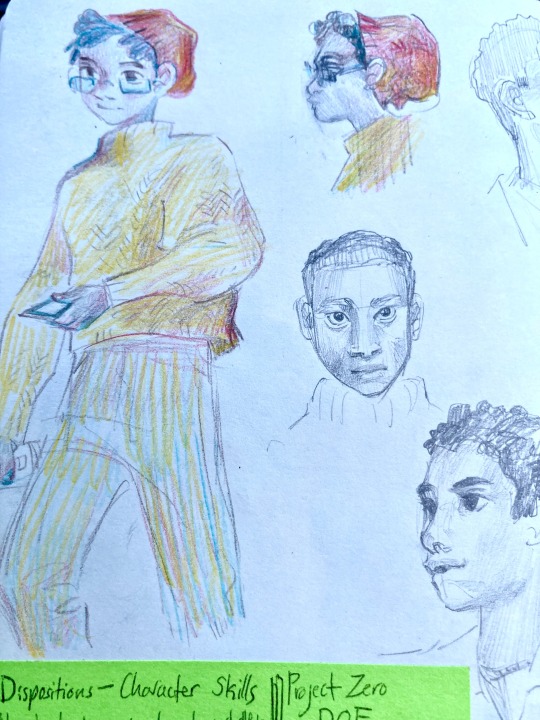
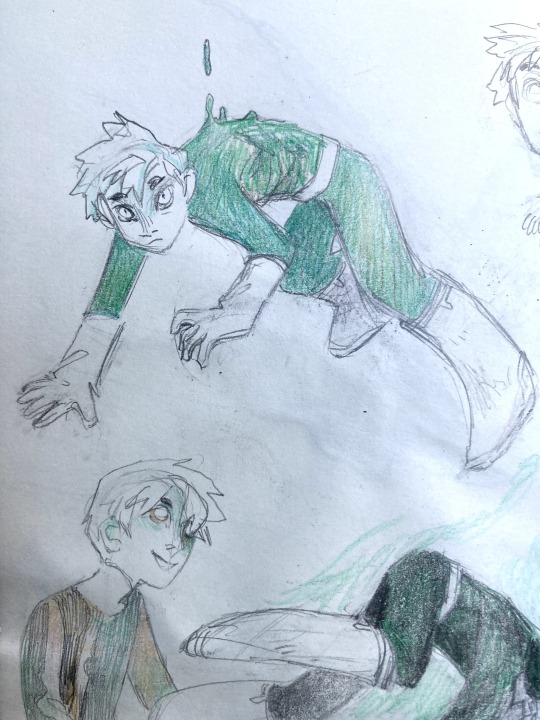
27 notes
·
View notes
Text
sketch commissions to help luna are open!

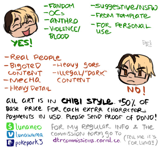
my boyfriend's post lost traction, so im making a new one! luna still needs $865 to reach their goal. to help, i have opened up sketch commissions in this simple art style!
luna is a blasian transgender disabled person who cannot work and currently has no income. their car is at risk of repossession, is in great need of repairs, and they cannot afford gasoline to get groceries or make "non-essential trips." they are in the negatives.
i dont get paid for another week, so to help out im opening this up until luna meets their $1000 goal! if you want quick, cute, cheap art of your character AND to help someone very important to me, please give this post some consideration or at least a reblog!!
all you need to do is use this form and in the textbox, mention it's for luna! when i reach out i will ask for proof of donation (except for p/ayp/al transactions), and i ask that this is an upfront payment. links to donate are below!!
VM | CA | PP
do not tag this post!
IDs under cut!
ID: a sheet advertising "sketch commissions for Luna @/nonprophet." on display is a monochrome doodle of a girl with curly hair, a hoodie, and rabbit ears, posing demurely. she is labeled "$5 monochrome sketch." next to her, a colored-in demon girl smiles and holds a bird. she has pale blue skin, dark blue straight hair, a broken horn, and a wine-red halter top with a cleavage window. she is labeled "$10 colored sketch." end ID.
ID: a continuation of the commission sheet. things the artist will draw are listed; they are "fandom, OCs, anthro, violence/blood, suggestive/NSFW, from template, for personal use." next to it is a smiling face and the word "yes!"
below, there is a list of things the artist will not draw. it reads "real people, bigoted content, mecha, heavy detail, heavy gore, illegal/'dark' content." next to it is an angry face and the word "no!"
the bottom portion of text reads "all art is in chibi style. +50% of base price for each extra characters. payment in USD. please send proof of donation!" there are a list of pay links; for cashapp, venmo, and paypal. the text next to the pay links reads "for my regular info and the commission form, go to dtrcommissions.carrd.co (tell me it's for luna!!)" end ID.
278 notes
·
View notes
Text
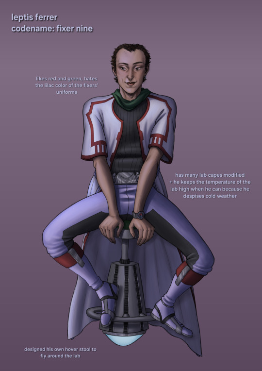
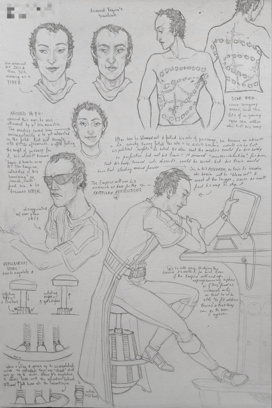
meet doctor leptis ferrer, also known as fixer nine!
he collaborated with cipher thirteen on a few crucial missions, but his most important aspect is his research.
his backstory before becoming a fixer + some worldbuilding of his home planet under the cut!
he was born on niamos, that, at the time, was shifting from being a planet with its people inhabiting it to the Space Beach™ we know from andor. amidst this changing environment, little leptis was born.
niamos was divided into three main groups of people. the natives; the tourists, who were growing in number, but only stayed temporarily; and the offworlders who settled down and started to run mainly tourism-centered business. the niamos people, called avile, still ruled over the planet, having their own political organizations that excluded the newcomers. aviles allowed the offworlders to settle down in their certain parts of their lands only because that generated profit through taxes, but they weren't allowed to fully integrate in their society nor leave the permitted areas under any circumstances.
actually, the aviles allowed these settlements rather recently, after a series of revolts in the lower classes. in theory, their system was a democracy - in practice, only rich enough people could afford to become politicians, because there was no retribution for it. so, they decided to allow newcomers to settle in, with a tax, that would be used for the retribution of political positions. the more people started moving to niamos, the more new positions could get paid.
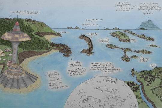
(quick colored sketch of a part of their territory - pardon the ugly af buildings but i hate drawing them)
when the initial wave of new politicians from the lower classes got into the system, they started turning the system into a full, direct democracy, reform by reform. most roles were assigned by casual drawing from a list of volunteers, and no one could keep their chair longer than a year in every position. but, after the initial wave of openness and inclusion, things changed.
initially, there weren't any laws on citizenship or access to politics. it wasn't explicitly said that offworlders couldn't partake in politics, so when they began taking interest in it, with political programs that addressed their needs and problems, the natives started to fear that their flourishing tourism business would change the political balance they had reached. many feared that, in the span of a few generations, the niamos would be governed by the interests of the tourist business, that attracted visitors (and their money) from many star systems.
so, they started to legislate. to be a niamos citizen, one had to be born in a family of niamos people, quite obviously. at first, children born of mixed parents weren't allowed citizenship, and weren't even really a thing. but as the offworlders areas grew larger, and more offworlders settled on niamos, some protests arose.
then, they had to change the legislation. they were a people with a strong and deeply felt culture - they decided to use it as a base to legislate further. the niamos had many rites and trials, and a complex language, called caile. one would become citizen only by successfully passing all the trials, partaking in all the rites, and fully learning the language.
the first trial was a long pilgrimage with a wooden boat (and an animal) to an island. this allowed the child (around 6-7 y.o.) to go to school, where they could learn the language. this first trial was easy for any "full" avilec child to pass, as they traveled around the various islands of their world on a daily basis. offworlders, however, were still confined into one section of a bigger island. this allowed only children who spent enough time sailing with their avilec parent to pass the test.
then, they would be allowed into a school that would teach them how to read and write. the school, though, only taught in avilec language - so, the children already had to speak caile at home, to be able to pass the tests at the end of the year. after that, it mostly got easier - one would study the niamos history, and was asked to partake in every smaller rite that tightened the community and better integrated the new members.
around 18, though, to become a legal adult, there was another trial (here, it granted access to vote and independence. then, as one got older, they'd have to pass a trial to be able to volunteer and be elected for each position - the age grew with the importance of the role, but the difficulty of the trials only decreased). it was a relatively simple trial: it was a boat pilgrimage around every island in the archipelago - something anyone could do.
but leptis failed it.
when he was around 14 years old, he went on a boat pilgrimage with his family to reach a sacred island in front of the offworlders' sector. there, a young sea monster who had lost its way attacked him. he clenched his big jaw on his body - the monster's mouth was big enough to cover his entire torso and get a good grip anyway. as his family panicked, from the shore, some tourists saw the scene and called for help, and help arrived in the form of medics on a speeder and an offworlder with a gun, who shot the beast, who immediately lost its grip on leptis.
the offworlders' hospitals, with special legislation, were open to everyone. it was the only thing the niamos paid a tax for, as they recognized that the offworlders' medicine was better than theirs for some things. they did mostly go to their old medics, but when that failed, they relied on those hospitals as well. knowing that no niamos medic could save their son, his parents allowed him to be taken away with the speeder.
in his parents' eyes, his survival was a miracle, and they accepted it without questions. instead, little leptis began wanting to know how he was saved. so he began studying medicine. he devoted himself to the subject. even as he ruined his connection to the rest of the community (he stopped partaking to the rites - he wasn't forced to go, as both his parents were aviles, and nobody thought a niamos would stop partaking in the rites, so there weren't any rules on that) he kept on studying.
when he turned 18, he had to leave his studies to complete the trial. he was doing well, as everyone always did, until he reached the spot where he was attacked. he never went back there since the incident. suddenly, he relived all of it again, and couldn't move anymore. he was paralyzed by the flashback, and trembled heavily as he realized that there was a wound the doctors hadn't healed. unable to continue, he failed the trial.
no avile had ever failed the trial, but the law seemed clear - he couldn't have access to politics, and wouldn't become an adult. he became an outcast - his peers continued their lives while he was forced out of it, forced to depend on his parents, forever. but mostly, he started to have trouble dealing with the incident like he never had. he was distressed and tense, and couldn't sleep properly. he went back to the medics, and they told him he had ptsd - and that they couldn't do much about it. that shocked him - they saved his organs from failing and stitched his broken body back together in ways that would seem impossible to comprehend, but they couldn't do nothing to heal his hurt brain?
so that became his research interest.
#BSBSJSJ ONE DAY I'll make a part 2 with his research and the stories with tar'x hihi#FINALLY MY FIRST HUMAN OC i never had one till now and i had to have one. aliens are too much fun though#Anyway idk why one of the sketches gave off powerful House MD vibes and. I LOVE THAT so now I'm very fond of him#some fun facts: most of the worldbuilding is inspired by studying finley's comparison of greek democracies and ours#+ his appearance was inspired by a hot guy in my class (apparently i like balding people??) and his name is an homage to that#because he shared a name with one of my favorite 15th century painters and one of his most important works depicted a saint called ferrer#SO! FUNNNN#idk if I'll post more about avilec culture but. it's highly inspired by the caledonians (due to where niamos was originally shot in andor)#little spoiler about his research in the sketchbook page!#star wars#sw#star wars the old republic#swtor#star wars oc#the old republic#star wars story#human oc#niamos#fixer oc#star wars fanart#star wars art#g posting
19 notes
·
View notes
Note
Hello!
May I request Isagi, Bachira, Chigiri and Nagi with an artist s/o?
Sure! I did small oneshots based on reader being artist since I figured it'll be more interesting than headcanons that'd most likely repeat... either way, I hope you like it!
Isagi, Bachira, Chigiri, Nagi with artist!reader
TagList: @miya-akane
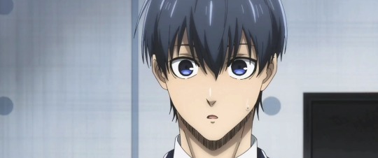
Isagi really liked to see you paint. He found it amazing how you can make something so amazing with just brush and paint, it was only natural he wanted to see the process with his own eyes.
He always kept his distance tho... he didn't wanted to interrupt you or make you uncomfortable with his presence after all... so he was usually just sitting like 5 meters or so away from you to give you personal space you need.
But if you don't mind him being closed he'd love to sit right behind you. Like that he can watch you paint and hug you from behind at the same time!
"It's pretty... are you drawing scenery behind the window?"
"Yes, how did you know? These are just few shapes for now!"
"I know, I guess I'm getting a hang of your style~"
He said with a small proud smile on his face. He wasn't hiding how proud he was that he's finally getting used to your style in both paintings and sketches.
He likes to just put his head on your shoulder and rest there as he watches you swiftly moving your hand that's holding a brush, amazingly mixing all the colors into beautiful painting~
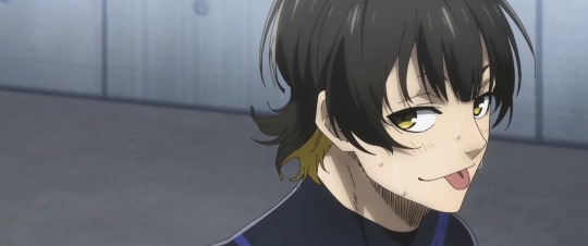
Bachira has really bad habit of being huge distraction when you're painting... so of course that's what he's also doing right now. You're a patient person so him practicing his play is silence wouldn't be a problem, or even if he tried having a chat with you.
Both if those options were happening but there was also him accidentally throwing his ball at you. That's what happened just now. His ball knocked the brush off your hand. Luckily it was just water on it so your floor or carpet was not damaged.
"Sorry Y/N! Try being more careful next time~"
"Bachira, I don't mind you practicing but can you let me paint?"
"I am! All I'm saying is that you'd notice it coming you if payed a little more attention to me."
"I will after I finish."
"Hm... how long it'll be untill you're done?"
He leaned behind you, now your head being next to each other as he looked at the painting proudly and yet, so impatiently.
"I just started. I'm gonna need at least 3 hours more."
"Then I'll go grab us something... do you want anything? I'm gonna make quick run to shop!"
Chigiri just finished taking a bath so he was now drying his hair with dryer while you were still stuck in your sketch... he didn't mind it, he kept doors from bathroom open in case you wanted something from him or the other way around, that way you won't have to yell to get a message.
But you were taking quick looks at him... he really didn't mind, he was simply curios about what you could possibly be doing there.
So as soon as he finished drying his hair, he came up to you. He didn't meant to startle you but it's what he has done... it was by pure accident tho!
"Y/N? Can I know what are you drawing this time?"
In response, he was met with small jump that caused your sketchbook to fall onto the floor. Of course, as a gentleman he is, he picked it up for you but was stopped when he noticed you were sketching him!
"Were you..."
"I can explain!"
"It's alright, I'm glad to know you find me pretty enough to draw me."
He finally gave you back the sketchbook with small smile while your face had smaller or bigger blush.
Even after few minutes he was still smiling at the thought of you having him in your sketchbook. That was when he realized... maybe he could have your sketch hang above his bed or desk if you agree? That surely would be a nice memory!
Nagi was just laying on your bed, playing his games while you were drawing something. He was focusing on his game so he wasn't interrupting you at all! And two of you were in comfortable silence~
Then you could hear sound from your boyfriend's phone, symbolizing he lost... which was also confirmed by the groan he let out soon after.
He was tempted to try beat that level again but he realized there was a long time since he checked on you. He wasn't feeling like getting up so he just called out for you.
"Hey... what are you painting this time?"
"Just scenery."
"Mhm... when will you be done?"
"Maybe hour or two... I still have a lot to do."
He let out another groan with only made you chuckle. You knew well he was clingy, so that groan could only symbolize one thing... he wanted to cuddle but he was too lazy to get up and take you by force. Nothing new but that's really why you love him~
"If you want a hug or so you can come and get it, you know?"
"I'm gonna let you finish your painting and go back to my game... you'll owe me so extra cuddles later."
❉⊱•═•⊰❉⊱•═•⊰❉⊱•═•⊰❉⊱•═•⊰❉⊱•═•⊰❉⊱•═•⊰❉
#blue lock#x reader#blue lock x reader#isagi yoichi#bachira meguru#chigiri hyoma#nagi seishiro#isagi yoichi x reader#bachira meguru x reader#chigiri hyoma x reader#nagi seishiro x reader#blue lock isagi yoichi#blue lock bachira meguru#blue lock chigiri hyoma#blue lock nagi seishiro#blue lock isagi x reader#blue lock bachira x reader#blue lock chigiri x reader#blue lock nagi x reader#fluff#blue lock fluff#oneshot#blue lock oneshot
173 notes
·
View notes
Note
So, your Madoka Kaname drawing looks amazing, and as a traditional artist, I was trying to observe to see if I could learn from your drawing.
One thing that stuck out to me was the shading and outlines.
How do you shade so well? How do you know which colors to use, and where to use them? Same question goes for outlines, too.
hihihihiii!! first of all thank u so much, im rlly flattered that u were so impressed 🫶🫶 im honestly really surprised how much attention my drawing got gyuh
anyways!! the picture i referenced was from the crash fever x pmmm crossover, so it’s by no means completely original. here’s the side by side comparison of the (cropped) og image vs in my sketchbook!!

so, most of the actual shading decisions and placements are from the original work. however, i had to change up the colors a bit because of the selection i had. (please note that my version is also darker because of lighting and iphone picture quality 😭😭)
also, for most of my drawings i follow the call of the wind (make guesses) and fufill the prophecies (keep adding more colors until it looks okay)
that being said, below the cut is a full coloring walkthrough if you’re still interested!!
please note that this is much smaller scale and done in less time (took an hour instead of two days 😨) so the quality will be a bit less!!
alright. so let’s say we wanna draw this image, but we tweaked it a bit because drawing BOTH eyes was too much of a hassle.
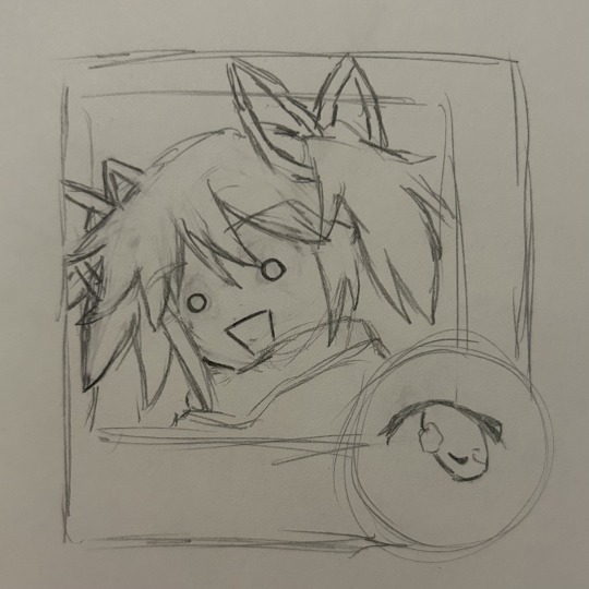
after you clean your sketch, the best thing to do is open with an outline that’s not QUITE black but close to it.
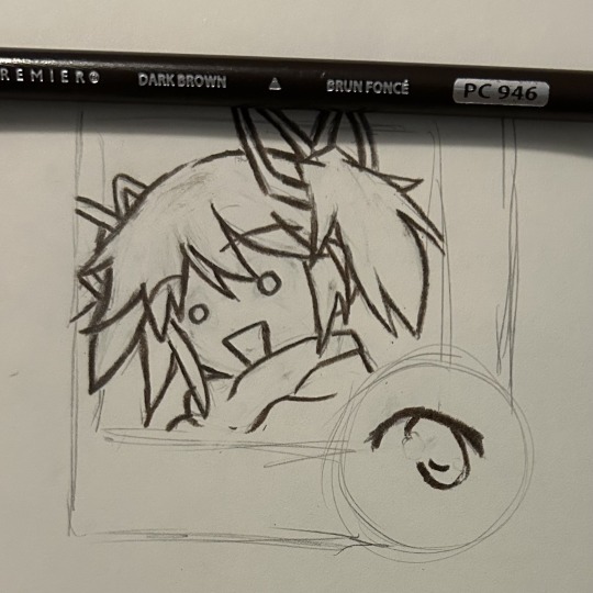
now, i have a rule. PLEASE PLEASE PLEASE remember this rule: you can use ANY color. for your outline, shading, whatever. it doesn’t have to match the reference.
if you are using this as a genuine tutorial, please know that i change colors every fucking time i draw. i change mediums too. this is only the process i used for my madoka drawing (as best as i can remember)
cuz, like my art teacher said, you have this thing called artistic license, which means you have the right to change whatever the FUCK you want if you think it makes your drawing better. make her purple, give her one ponytail, whatever. as long as you can make it work, have fun!!
anyways. next, go over that outline with other dark colors of different hues. there’s no rhyme or reason, it’s just fun.
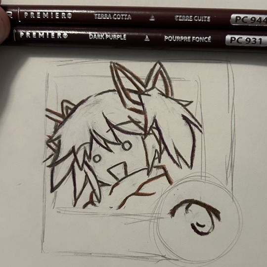
after, place your highlights on the hair. i used cream instead of the pastel pink in the original because i like cream better and it adds more hues.

usually, i start with the darkest value instead for shading as it’s more vibrant, but madoka doesn’t have any really standout dark tones. it’s okay though i love her
then, you gotta go in with base colors. simple pink and peach yada yada
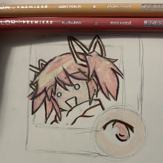
listen, quick reminder: YOUR BASE COLORS DON’T MATTER AS LONG AS YOU CAN STILL ADD ONTO THEM!!!
just pick a light base close to the original. don’t agonize over it. apply lightly and gently in circular motions, and you’ll be okay!!
next, we adjust the tone of the hair. i wanted a cooler toned pink, so i added amethyst. i also added a bit to the stray eye.
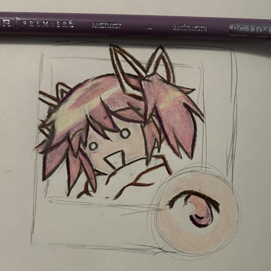
after, adjust your tone more as needed. again, any color goes. the means justify the ends, and if you end up adding some blue or yellow or whatever then good!! go bonkers with it. i used vermillion.
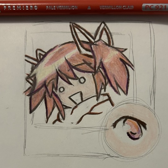
next, add shading blocks (referenced from the original image!) in a color that’s light enough to blend in more but dark enough to see (amethyst is my favorite for this, and i use it a lot!!) you can also add extra shading in some areas to give it some personality.
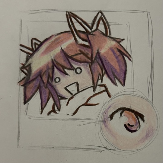
after THAT, blend in your shading a bit more with your base colors. by this point you should be pressing down a lot to get the pigment you want. i think for her skin i added beige instead of peach in this step, but that’s also what i did for the above drawing.
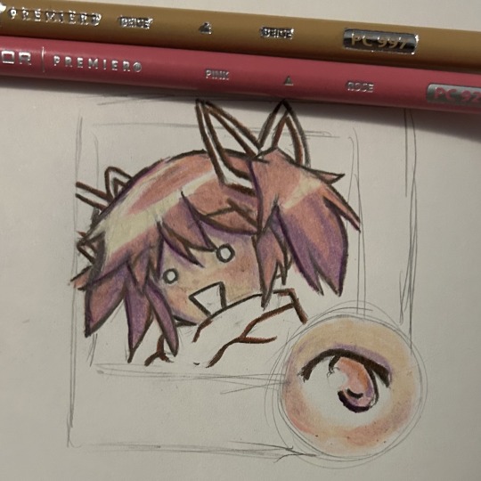
the purpose of this is to mute your colors a bit so they fit together more. however, if you want it to pop, you don’t have to add another base color!!
i also went over the outlines with the base color to lighten them and even out the drawing. i do that with almost every step, as needed. follow your heart on that one
also, i gave her a little bit of blush in that step. just because.
ok, so now is the fun part. for the hair and any accessories/clothes/things of the same texture, add random streaks of random colors.
yeah, go ahead, add orange, blue, yellow, whatever. it’s best if it’s of the same value (aka darkness) so it fits in with the base color, but it can be anything!!
you don’t have to do this, but it’s fun.
also, i shaded the eye too offscreen. same process, because pmmm’s style has a very flat texture on characters. thus, it’s okay to use the same shading technique.
now, we can do the same with accessories!! these are simpler and i honestly got too lazy to even reference for the scarf because the hair was the main focus.
finally, add little details, clean up anything you don’t like, and do whatever you want with it!!
that’s all i do for shading, and i hope it helped a bit. i mainly work with pen and paint markers, but the process is the same aside from tweaking parts.
just remember:
its your art do whatever the fuck you want
LAYER LAYER LAYER fix anything by adding new things
it doesnt have to be perfect yada yada
fun color = fun drawing
it doesnt have to look like the picture because thats boring and you wont learn if you try and carbon copy everything you see
like and subscribe
#also PLEAAASE check out my more original art if you like this drawing#i post my full sketchbook pages where i use a lot nmore mediums and draw original stuff like. bugs!!#pleaseee sorry for self promo but i love attention#drawing tutorial#drawing#my art#sketch#puella magi madoka magica#madoka magica#madoka kaname#madoka magica fanart#prismacolor#idk what do i tag. bro
34 notes
·
View notes