#colleen doran
Explore tagged Tumblr posts
Text

New day, new pin reveal. Is that a thing? Let's make that a thing.
We're gradually unveiling some of the pin designs available in the mystery packs on Kickstarter. We'll be adding a dedicated add-on section to the Kickstarter campaign page to lay out what's available and answer some questions people have had about it, so watch this space.
Get the graphic novel, pins and more over on Kickstarter.
#good omens#good omens graphic novel#neil gaiman#terry pratchett#colleen doran#crowley#bentley#aziraphale#bookshop#agnes nutter#enamel pins
8K notes
·
View notes
Text
Good Omens graphic novel update: June 2024
Welcome to the June update. A lot of behind the scenes work at the moment but we're grabbing the travel sweets, popping in the Bentley and hitting the road. More on that below.
Admin
Ongoing reminder that the project FAQ can be found here.
I pledged using my Apple ID, or no longer use the address my pledge is attached to, or I cannot work out what email address my pledge is connected to. What should I do? Please contact us via your Kickstarter account where the pledge is connected; we will be able to see on our system which address it is. If it's one you have access to, great! The FAQ has information on how to resend your invite link to access the PledgeManager. If it's one you are not able to access, then you can let us know which email is preferred and we can update this on the system, which will automatically send a new invite.
Events
We've had a lot of queries about when the Good Omens team will be attending events more formally, after some Aziraphale and Crowley spotting at conventions we'd been to previously. Well, we're excited to confirm the first: Good Omens HQ will be at ACME Comic Con in Glasgow, Scotland this September.

We'll be bringing the actual-real-life-home-to-Crowley-and-his-plants Bentley from Season 2 of Good Omens, the first time the car has been made available publicly for fans to come see and get photos with, ahead of its journey back to the set and the start of Season 3 filming.
We also see Quelin Sepulveda, aka Muriel, has been announced for the event for some additional ineffable joy.
You can get your tickets for ACME Comic Con here. We hope to see some of you there.

While we won't be rocking up with the Bentley to this next one, we want to let you know about Ineffable Con which, though sold out in person, is also taking place virtually in July. The fan-run event hosts great panels, auctions and more, with money raised going to Alzheimer’s Research UK, in memory of Sir Terry Pratchett.
Where next? We have - not an exaggeration - a list of about 200 events somewhere from when we asked fans this on Instagram and while we can't promise quite that amount of convention attendance, we're certainly looking to do some more things in future with Good Omens at large. Watch this space.
Good Omens items...
This month has largely seen prototypes and samples for the wider Good Omens merch store arriving, and while we can't share those yet, we are certainly excited to see more fan product suggestions coming to life. That does, however, leave our public item updates a little slim on the ground.
To make up for that, here's some new panels from Colleen:

Also known as, "What could possibly go wrong?" And:

Also known as, "Well why don't you ▇▇▇ ▇▇▇▇▇▇ ▇▇▇ ▇▇!@#▇" or words to that effect, we'd imagine.
Update from Colleen
Following such a positive response to Colleen's piece last month, bringing you behind the scenes into making the Good Omens graphic novel, we are delighted to say that she has agreed to write something for our updates going forward! For June, she's going more in depth into the process of flatting and the technicalities of colouring on screen vs print. Over to you, Colleen.
---
I mentioned the other month that I use a flatter to help me with technical work on GOOD OMENS, and here is a great example.
This is my original, hand drawn line art.

And this is the flatting file which was created using the MultiFill computer program.

It will put your eyes out.
The raw image above demonstrates how the color art lines up solidly under the line art. If it doesn't do that, you get a weird phenomenon in print called ghosting, a tiny little line of white around each segment of color. I had this issue on one major project and ended up redoing every single color file after I got a look at the first printing. Nearly two weeks of work.
The same image with the line art on top.

The layer order looks like this.

Background copy is the clean, line art layer.
I scan the art at 600 dpi, then make the blacks pure black, the whites pure white. Then I convert back to greyscale, then RGB, then duplicate the layer. Then I delete the white on the upper layer so the line art layer is transparent but the blacks on that layer are not.
If you have blacks on a layer that has been multiplied, you can see slight color through those blacks. You want pure black.
The lower layer is where I use the MultiFill program to create the digital flats. First you use MultiFill to drop in the random colors, then the companion plug-in Flatter Pro to make those colors seal under the black lines.
This probably sounds like a silly thing to worry about, but if the flat colors don’t line up perfectly under the black line art, you get the dreaded ghosting I mentioned. You can see it below in this image. It’s a tiny little white line that will appear around the black lines and color areas.

This drives me nuts and is an absolute nightmare to fix.
It’s a very common problem, especially for people who work for web and don’t anticipate the problems going from web to print.
What looks great on your computer can cause big problems in print.
From here, my flatter Jul Mae Kristoffer, who is way over in the Philippines, does flatting that is more in keeping with the areas of color I want to isolate. As you see on Layer 1.

But again, this is still pretty ugly, and not what I would use for final color. Flatting is a technical issue, not a creative one, though in some cases a flatter will make choices you may use. Most of the time they don't.
Here is my final color page.

Sometimes my MultiFill flats are so wonky I have a hard time getting my brain to snap out of what I see before me. If I get stuck, it's a good idea to just pick at it and come back to it later.
If it really, really bothers me, I’ll take the MultiFill flatter layer and desaturate the color so it doesn’t poke my eyes out.
Here’s an example. The digital flat file.

The desaturated flat file that doesn’t make me want to poke my eyes out.

And the final color.

Sometimes I just put in a solid white layer so I don’t see the flats at all. Flatting is there to allow you to easily pick spots to color in, and doesn’t usually appear in the final work.
Sometimes I want to create my colors using transparent color over a white ground, which is more delicate in the final.
Here’s an example from Neil Gaiman’s American Gods. I also selected all black line art here and converted it to sepia to give it a vintage look. Except for the fairies. They’re green.

A colorist must also consider color settings.
Different clients can have different requirements. I find these color settings, which I got from the Hi-Fi Studio, to be pretty solid. I use them as my default for all my projects unless otherwise requested. If your publisher has other settings, they’ll usually send you a csf file which you can upload to Photoshop. The program will save your files and you can just switch between them as you need them.

This tells the printer things about the paper and the spread of the ink you will use. That’s what dot gain means - it makes printed color look darker than intended, so you set up your files to account for it.
When you hover your pointer over each box, it will tell you what each setting is supposed to accomplish.
Another really important thing to consider when coloring comics is color range.
I’m coloring this book in RGB range, but for print you use CMYK.
I’m about to confuse the heck out of some people with this post, I’m afraid. But here we go.
Here is this shot in RGB color setting.

And here is the same page calibrated for print in CMYK.

The biggest shift is in the reds. Print cannot match those reds.
You may not see much difference here, but it’s the sort of thing that drives artists crazy.
A computer should be perfect for conveying exactly what you want, right? It's all just 0's and 1's, binary information, and that information should be the same from one computer to the next?
Nope. Not even close.
First off, computer monitors must be calibrated. You can use a computer program or a tool that measures the color on your computer screen and then adjusts the color to an industry standard.
Have you ever been in an electronics shop where a bunch of TV shows were on display, all of them playing the same show, and have you noticed how different the color was from one TV to the next?
It's like that.
I freely admit I don't pay a whole lot of attention to calibration, but if I were a professional photographer I would. I'd have a little spectrometer attached to my screen and software would adjust my monitor to the best possible standard range. As it is, I just use the default setting on my computer and hope for the best.
If your monitor is properly calibrated and your art is shown on another monitor that is properly calibrated, the art will look almost identical from one monitor to the next.
YAY!
But from one monitor to the next, that's about where the resemblance ends.
Colors are calibrated to something called RGB, or Red, Green, Blue.
All colors come from a mix of red green and blue. At their greatest intensity, all the colors in the spectrum together become pure white light.
This is why RGB is called ADDITIVE color, because you ADD colors from the spectrum to get ALL colors, and all colors create the entirety of the rainbow, and pure white light.
Your computer monitor, your phone, your television, all images are created via light using RGB, a gamut that covers all possible colors that can be created.
That's a lot.
And that's why some of the colors you see on your TV or phone are so deep and intense.
For the widest possible range of color and intensity, you use RGB.
Unfortunately, there is what you can create with light, and then there is what you can create with pigment or ink. And that is why printing what you see on your computer almost never looks exactly like what you see in a book.

For printing, you must use a color setting known as CMYK. This stands for Cyan, Magenta, Yellow and Key/Black.
In printing, the pure blue is actually Cyan and the pure red is actually Magenta.
CMYK color range is not created by addition, but by SUBTRACTION. In order to get the color you want, you reduce the percentage of one of the four colors for ink mixing. Mixing all colors, instead of giving you white, gives you black.
The gamut of CMYK is limited to what can be created with ink.
You've probably heard the term four color press? This is what that means. Four colors, with each color of ink run over the paper on rollers which, combined in varying layers of opacity, create all the printing colors you see.
But remember, what you see on your computer monitor and what CMYK gamut can handle are two different things.
Now, I’ve been really careful with the color settings on Good Omens, so there haven’t been any big surprises, but let me show you a snippet of a project I did for the French fashion house Balmain.
The RGB version:

And then this shot after it was converted to a CMYK file for print.

That's a pretty big difference.
Now, you see this shift mostly with vibrant colors, such as that pink there. But other colors hardly changed at all, right?
That's because this issue is about range of color. CMYK and RGB occupy a shared range which you can see demonstrated by this graphic I got from Wikipedia.

The graphic shows the RGB ranges supported by various digital formats. SWOP CMYK is the most common range my publishers use. Note that the bounding box line shared by the RGB and SWOP CMYK formats shares about half the range space. So whatever RGB colors you use that are outside that range will be digitally converted to the smaller SWOP CMYK range.
And you may not like what you end up with.
As you can see, some of the most ethereal and intense colors get lost outside of the SWOP CMYK boundary.
A look at the Dark Horse Comics color settings in Photoshop. Theoretically, this information should prevent your art from looking like mud on publication.

Now, after I just told you the dangers of coloring in RGB then converting to CMYK for print, I tell you I am coloring Good Omens in RGB anyway. There’s a couple of reasons for this.
Remember, RGB give you a greater range of color, so it can be to your advantage to preserve your original files using a format that gives you the greatest range.
Again, here is the unaltered file.

You can see what the CMYK result will be simply by clicking the Proof Colors button here. This will show you how the art will convert.

And the Gamut Warning will show you which colors are out of gamut range for print.

The intensity of that magenta and that purple in the top right are not going to print true.
This is how it will look in final.

So even if you do what you think is perfect color on screen, there is no way it can perfectly convert to print. Almost everything will involve a little bit of compromise.
Even though you have to consider the color shift issues, preserving your files in RGB gives you greater wiggle room, especially if you get lucky someday and get to work with a printer who can print in 6 colors. Or maybe some technology you don’t know about will pop up and make printing super glorious. Who knows.
Regardless, you should keep an eye on that gamut and color for CMYK print, while preserving your master files in RGB.
Until next time.
851 notes
·
View notes
Text

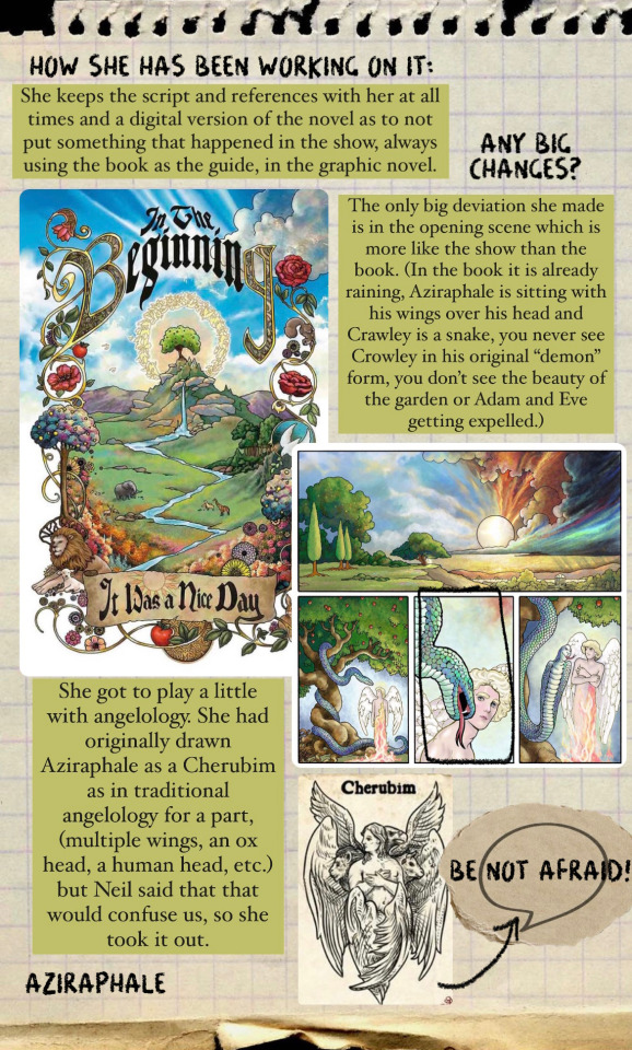
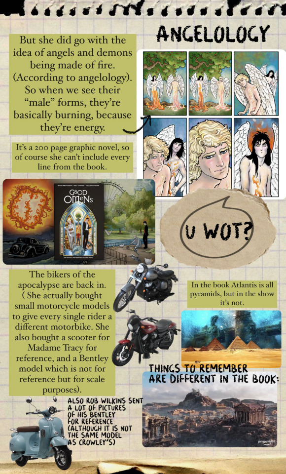
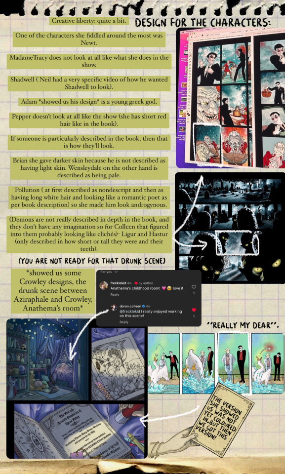
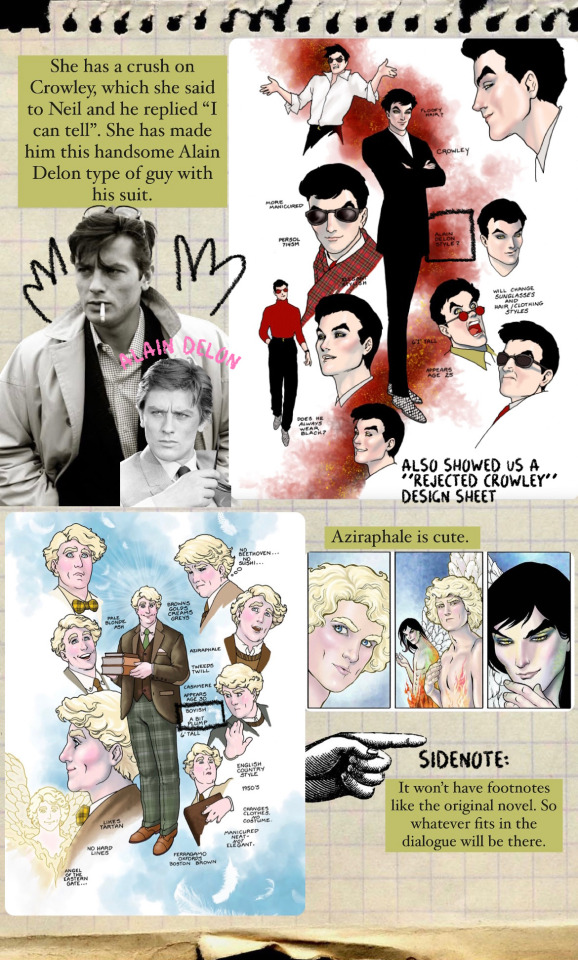

So the Good Omens: Official and Ineffable Graphic Novel is getting a-closer and closer. Here are some fun facts that Colleen Doran shared with us during the Ineffable Con 4.
(These frames featured here are all sneak peeks that have been shared with us; except for the Atlantis one, that is there for comparison purposes and obviously photoshopped Crowley on a horse).
Perhaps as another fun fact: apparently Neil Gaiman started a sort of bet for the Kickstarter campaign- whoever got closer to the total amount would get a cake! Neil actually had the closest bet, but he gave cakes to everyone else instead. Colleen on the other hand said she had the lowest bet.
@colleendoran is truly magnificent! An OG GO fan and once again, we are eternally grateful for your constant hard work!
#crowley#good omens#aziraphale#good omens fun facts#ineffable husbands#terry pratchett#neil gaiman#easter eggs#good omens graphic novel#colleen doran#ineffable con#TIC4
2K notes
·
View notes
Text
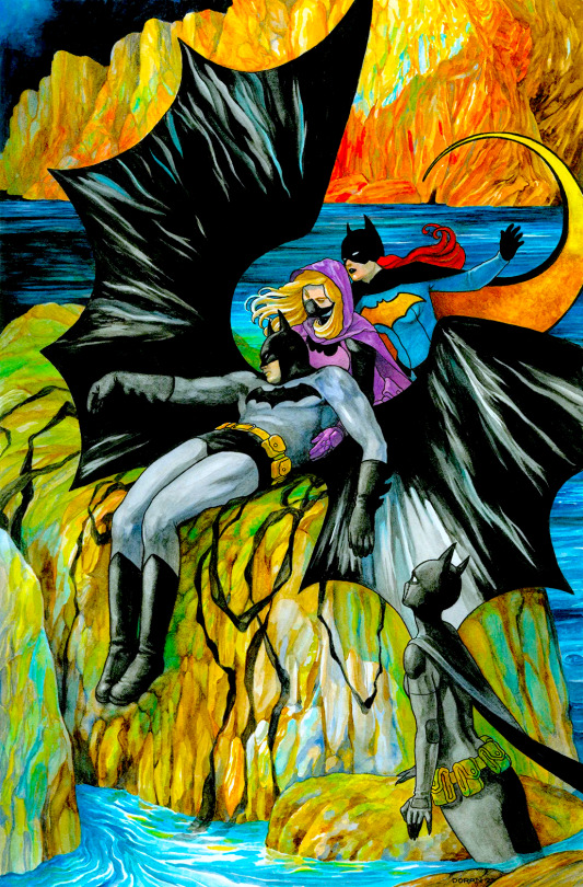
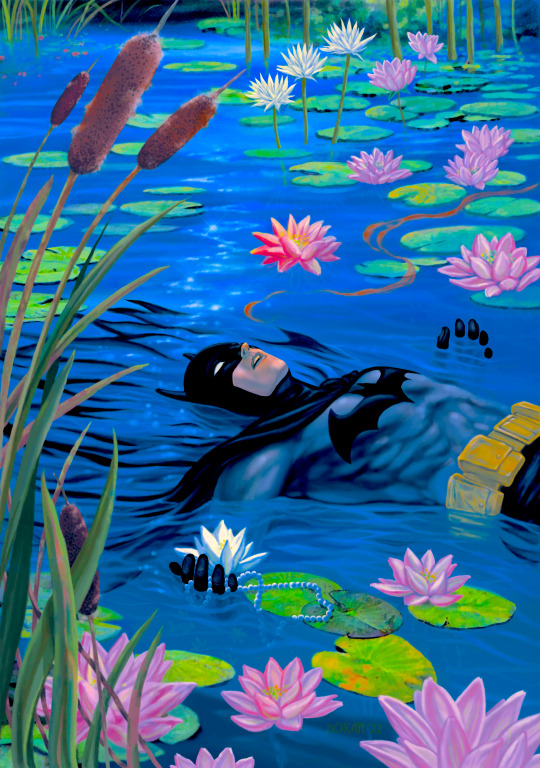
Batman by Colleen Doran
#bruce wayne#batman#dc comics#colleen doran#detective comics#dc#batgirl#batfam#stephanie brown#cassandra cain#barbara gordon#cover art#variant cover#comics#cover edit#gorgeous
838 notes
·
View notes
Text
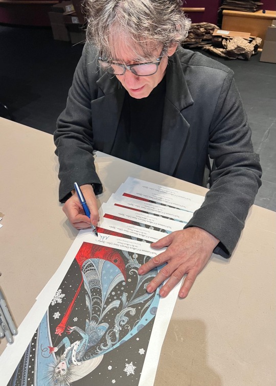
Grateful for you!
This is our November gratefulness sale, here is a code for 25% off anything on the website! Code will be good until Monday Nov 27th 2023 at midnight PT.
Please use this code at checkout at www.neverwear.net: Grateful25
This 25% off code makes the new $45.00 Snow Glass Apples print painted by Colleen Doran (unsigned) $33.75
(we also now have signed-by-Neil in stock, the code brings them from $150 down to $112.50)
Here are some examples of the sale price in action:
Neil’s New Year’s Wish painted by David Mack in a smaller size goes from $25.00 down to $18.75, on a beautiful pearlescent stock
The embroidered “Make Good Art” beanie goes from $18.95 to $14.21
The Neil-advice on writing notebook goes from $29.95 to $22.46
The 23 piece postcard/sticker set goes from $23.95 to $17.96
Come see us, we are grateful for all your support.
Plus we will randomly be putting surprises in to thank you, such as a Dickens magnet-- or upgraded signed prints-- you never know!
www.neverwear.net
1K notes
·
View notes
Text
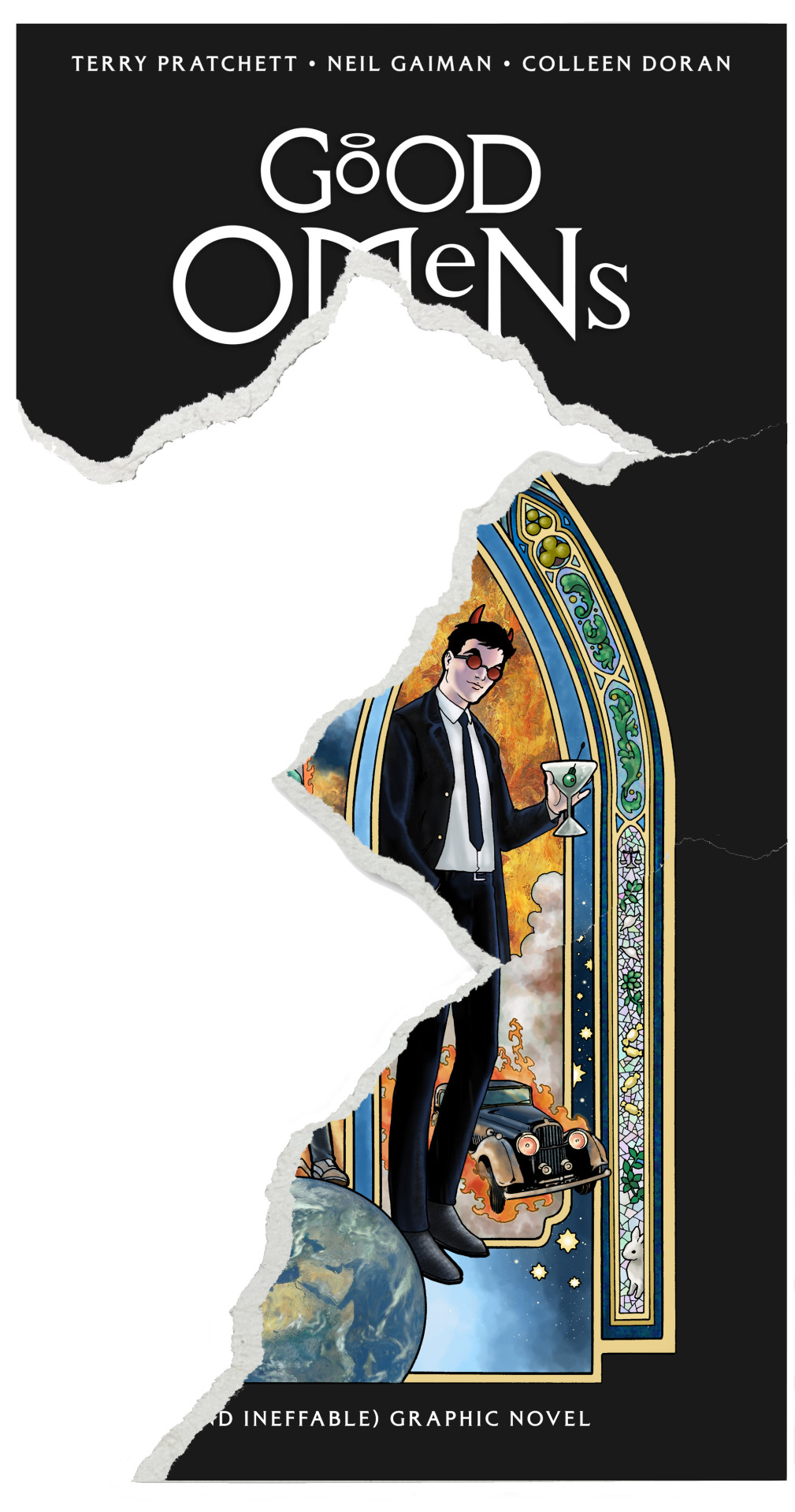
Three pieces so far! The clue for the next one references Discworld, but I can't find it. Maybe it hasn't been posted yet!
#good omens#good omens graphic novel#graphic novel cover#puzzle cover#neil gaiman#terry pratchett#colleen doran
2K notes
·
View notes
Text
It's a good day for News...
Just as Agnes Nutter prophesied, Good Omens, the official (and ineffable) graphic novel, adapted by @colleendoran, launches exclusively via @kickstarter this summer.
Sign up to be notified when the launch happens here: https://www.kickstarter.com/projects/dunmanifestin/good-omens
2K notes
·
View notes
Text
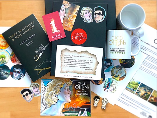

A heavenly package was just delivered to us! 📦 Thank you Good Omens HQ! This is quite tickety-boo! Just look at the mug! 😍☕️
Good Omens: The official (and ineffable) graphic novel, adapted by Colleen Doran, will launch on Kickstarter - Aug. 1st!
Sign up here!
1K notes
·
View notes
Text

Dream—Colleen Doran
#the sandman#sandman#dream of the endless#morpheus#sandman x art#sandman art#colleen doran#brush and ink#queue crew
100 notes
·
View notes
Text

Kara and Krypto by Colleen Doran
98 notes
·
View notes
Text

Doctor Strange
Art by Colleen Doran
58 notes
·
View notes
Text
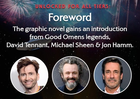
It takes two half miracles to hide an Archangel, but three to do a foreword (and surprise bonus afterword): thanks to you all smashing the £2m stretch goal on the Good Omens graphic novel Kickstarter, we're delighted to add the ineffable *trio* of Michael Sheen, David Tennant & Jon Hamm.
We're in the last few days of the Kickstarter. Get your copy today.
#good omens#good omens graphic novel#neil gaiman#terry pratchett#colleen doran#crowley#aziraphale#graphic novel#kickstarter#michael sheen#david tennant#jon hamm
4K notes
·
View notes
Text
BEST CROWDFUNDER
Good Omens Graphic novel won with overwhelming 63,5%!!! 🥳❤

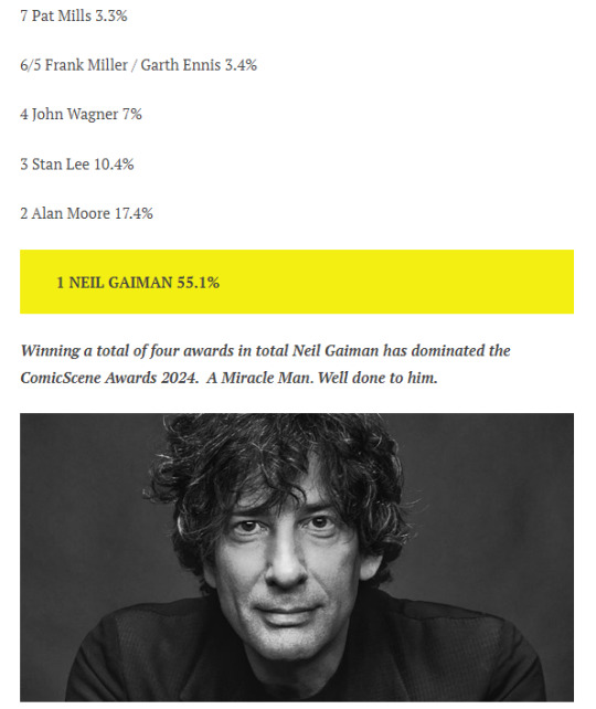
BEST WRITER OF ALL TIME
Congratulations Neiiiiil! Wahoo! 🥳
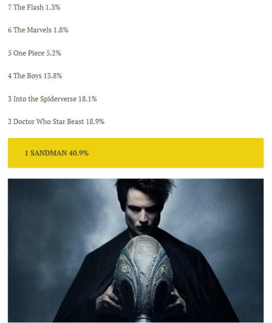
BEST COMIC ADAPTATION
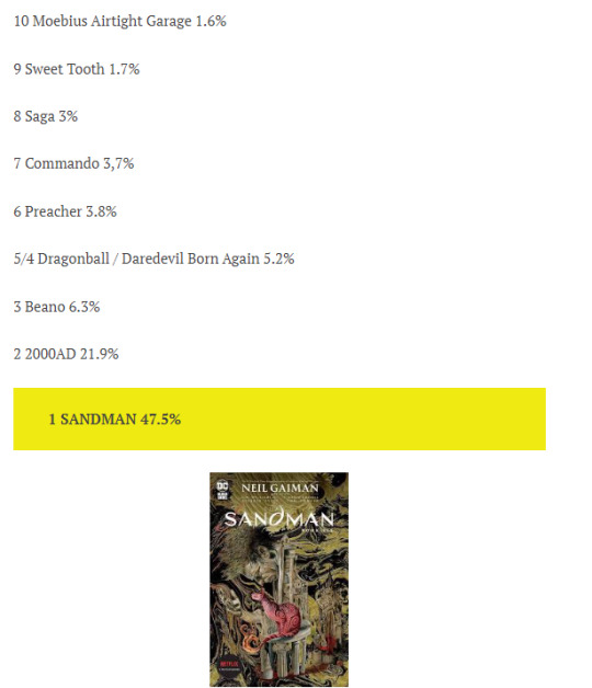
BEST COMIC OF ALL TIME
#good omens#terry pratchett#neil gaiman#colleen doran#graphic novel#good omens graphic novel#graphic novel kickstarter#sandman#awards#awards win#WAHOO! :)
923 notes
·
View notes
Text
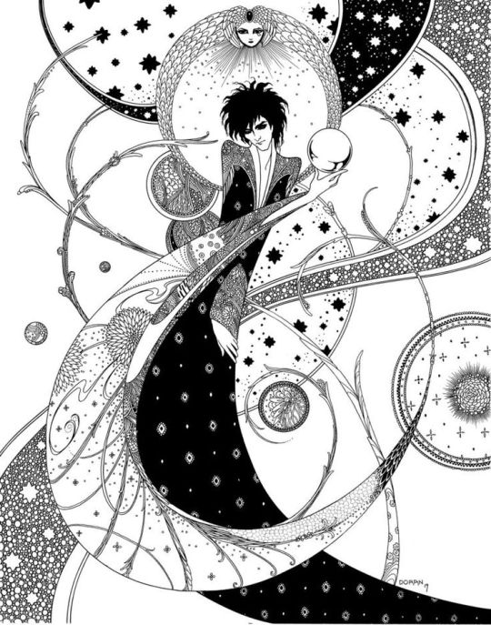
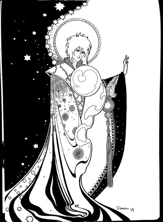
Morpheus and Daniel - art by Colleen Doran
215 notes
·
View notes
Text

Batwoman by Colleen Doran
#kate kane#dc comics#batwoman#dc#cover art#cover edit#colleen doran#comics#batfam#batman urban legends
142 notes
·
View notes
