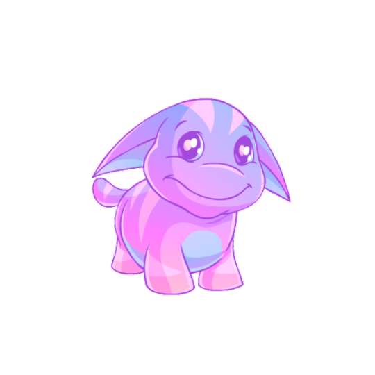
#a bit chaotic but i like the colour scheme
Explore tagged Tumblr posts
Visit Tumblr Blog
Explore Tumblr blogs with no restrictions, modern design and the best experience.
Last Seen Tumblr Blogs


Fun Fact
Premium Tumblr themes are available from anywhere between $9 to $49.
Text
hughie lockscreen <3
26 notes
·
View notes
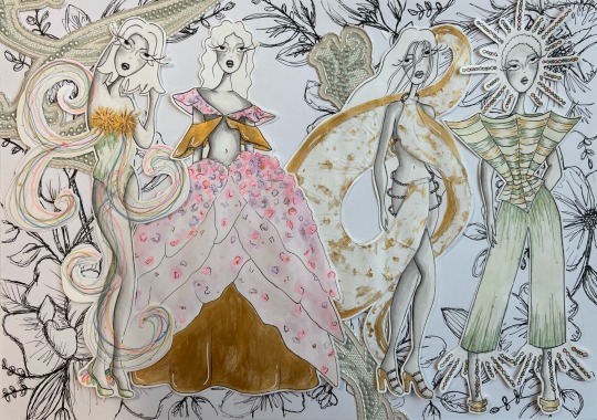
Text
Marriage and Vassal marks
This is specific to Chapter 8 of Oh Dragon Fly.
A visual to the descriptions I gave you in the chapter of the different marks that Bloo, the Trix and Valtor got during the ceremony.
A general note for all of them. Bloom subconsciously designed each of those marks, since she is the one who is holding the vows and oaths.

Ok first of all an overview of all of them together.
Bloom and Valtor are the only ones that have marks on both of their arms. While the Trix only have one mark on the wrists of their right hand

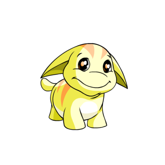
Bloom
The red lines are the marriage marks that symbolize her marriage to Valtor. I choose dark reds as the main colour because it's the color that I associate the most with him. Both in his coat, but also because of his demon form. They look rather like blood from afar, but the main idea behind them is that they are literally ties that tie Bloom to Valtor. The Trix vassal marks are only on the puls point of her right hand, since that's where the contact was made. It's a snowflake for Icy, Darcy has swirls that are barely visible and Stormy had lighting.

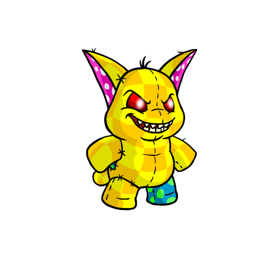
Valtor
Hs is the largest mark out of all of them covering both of his underarms from wrist to elbow. Valtors and the Trio's mark all have the same color scheme since it's Bloom they are bond to.
Valtor absoltulycan not stand his marks. They are chaotic and wild and completely nonsensical, everything he is very much not (unless he looses it cough). On the other hand they are very much Bloom. They are her artsy personality and basically look like someone went wild on Valtors arm with a paintbrush and paint. The brighter sports of colour also tent to glow if Bloom get's emotional.
Bloom would also say they are less a representation of Valto as a person and moe of his actions, because everywhere he shows up chaos ensues.
I added a note to Valtos skin tone. He and Bloom have the same, but he's a bit paler than her, because of Omega and hiding away from people for so long.

Icy
First of all a note to her skin tone. Icy is pale pale! Like she looks permanently on the verge of hypothermia.
The marks for the Trix are all only on their right wrist and wrapping around it. For icy it looks like frost flowers. Beautiful, but also very dangerous since they happen when it's really cold.

Darcy.
When I designed Darcy's mark originally thought about mist but while drawing it I realized it's like ink in water making it hard to see clearly or like a shooting star. It's representing her as the sneaky one who is hard to see if she doesn't want to be found.

Lastly Stormy
Stormy's mark is simple its lightning. Representing both her and her magic. It's also the brightest mark out of all of them. You will know when Stormy is in the room with you because she's like a force of nature, but sometimes she surprised you. Either way she's dangerous.
30 notes
·
View notes
Note
Dear Saulus,
Are you perhaps still into the perfumerie craft? A fellow durge Dana is looking for a new fragrance for a celebration with Gale. Im sure you know of the mage's sensitivity to scent.

Dana is a high elf. She is cunning when she has time to scheme but quite chaotic and unpredictable in emergencies or ambushes (she's a wild sorcerer after all). Her favourite colour is blue. Her favourite season is spring. Her favourite flowers are daffodils, oleanders and wisterias. She is a skilled alchemist and specialized in poison both in spells and potions.
Her backstory is a bit long but I have a feeling you two would get along.
Any idea for an alluring smell to seduce her beloved wizard ?
Hey Medra! Sounds very interesting - no I do not like the word in this context - fascinating and very alluring and tempting. Inspirational. But I am taking a break from writing at the moment. Or more from posting my writing. Because I need to rethink whether tumblr is interested in my style of writing. To put it that way. When I feel the appreciation of writing again and find it worthwhile to post it, then I will love to write about Dana and interact with your muse like Tavs very gladly.
15 notes
·
View notes
Note
I'm not in the loop with the whole IWTV thing, but with the posts I've been seeing since yesterday I'm intrigued. Could you explain?

First of all, I'm glad you liked the posts @bookwormsontherun (although right now I don't know what posts you're referring to exactly), I normally try to not post too much of one topic but rather a good mixture of my interests :>
So, what is IwtV in general: Originally the movie IwtV from 1994 and the series that started in 2022 are the TV-adaptations from the book series "The Vampire Chronicles" by Anne Rice. IwtV is the title of book 1 and the plot of season 1, but they decided to stick to the title on further seasons too. Although they changed a few things in the series (the biggest fear of every reader), like the time frame, skin colour of a few characters and some locations, it turned out really good.
What is it about: Generally there isn't only one plot, because nearly every book has one of its own. The element or in this case the person who is connecting everything is the vampire Lestat (the blonde guy you probably saw in a post). In book 1 and season 1 + 2 Lestat's love Louis tells us how he experienced meeting him, getting turned into a vampire and then living with Lestat. A huge turning point is when there comes the tragically young vampire girl "Claudia" into the picture - she is in different ways very important to both of them and also a eternal memory of the author's daughter who died very young. Louis tells all of that to the reporter Daniel, who is recording it. Later on everything gets turned into a published book called (guess what) "Interview with the Vampire". 😄
Naturally the vampire community isn't very fond of people who are running around, telling the whole world about their existence. So this will be a upcoming problem to solve in the future season(s).
A person I have to mention too, is the vampire Armand, the former leader of the Parisian coven and a former lover of Lestat. I think in the series his part seems a bit changed, because now his relationship with Louis is much more visible. We see scheming, lying, gas lighting, anger and fear of loss issues, but also a sad backstory and a deep need to be loved.
In the upcoming season 3 the focus will be on book 2 "The Vampire Lestat" and maybe book 3 ("The Queen of the Damned"), where the point of view changes into Lestat's perspective. He gets his chance as a widely known rock star, publishes a book of his own (can you guess the title? 😂), meets very old and important people, and puts a few things right, which Louis said in his book.
Why would I recommend the books and the series: First of all because the writing itself is beautiful - the chosen language and the detailed descriptions of places and thoughts paint you a picture of the world the characters live in. Also don't expect a plot full of fast action, detailed sex scenes or joke after joke. It's not that. You come across questions about life, love, death, loss or your place in this world, and sometimes you need to look closely and think about things twice, before you can fully grasp the intention of a scene or chapter. But I like that - nowadays we are living in a time, where everything has to be fast and beautiful cinematic shots or descriptive things are not as important as before. Also with all the streaming platforms we are faced with a huge amount of series and movies, where everything needs to be evermore bigger, sexier or more brutal to survive. But in the case of the Vampire chronicles the fandom base is already there and pretty big, so they don't have to fight for every breath and are able to show us scenes, which are beautifully made, but with less action.
Secondly- the longer you read, the more you understand the characters and their decisions, which can be very complex or chaotic. Also it gets more and more apparent, that you can't trust just one perspective - you never know what the absolute truth is (if there is any, because everything is told from a wholly subjective view).
Thirdly: Anne Rice is an early example of writing about other sexual orientations than heterosexuality in a way that reached many people in quite a short time span (the 1st book was published 1976). This gets clearer and clearer in the later books and it's very interesting to see how the author is able to show you things without going into detail.
Fourthly: The cast and the producers are huge fans themselves, so they want to put as much of the books into the series as we do, which is great. For example they sometimes used the lines from the books word for word and if you know them it's beautiful to recognize them while watching :3
I hope this helps, thanks for your question! 🤗
#interview with the vampire#iwtv#iwtv ask#it was probably more than you asked for but well..#mine#vampire chronicles#anne rice#iwtv amc#the vampire lestat#amc iwtv#amc immortal universe
21 notes
·
View notes
Note
omg can you review the mighty poogle 🥺


The Poogle is one of those really abstract Neopets wherein it's just a Creature(TM). What kind of creature? Who knows. I guess they're meant to be vaguely dog-like (seeing as Poogle racing is a thing, and it does sound vaguely like "poodle"), but they really don't lean towards any one specific animal, which is always something I enjoy.
What makes Poogles appealing is undeniably how chubby they are; it makes them look extra cuddly and is part of what gives them their distinctive noses (or lack thereof) and double chins. It also comes with a bit of lore about them living primarily in cold-weather regions, kind of like how seals have blubber to keep them warm.
Beyond that, I also like their stripes; they break up the design just enough without feeling too distracting, similar to their underbellies. The shape of the stripes is also mimicked by their distinctive ears.

I will fully admit though: Poogles got the raw end of the deal when it comes to customization. Not the absolute worst conversion job, mind you, as for the most part they look pretty dang similar—same pose, same proportions, same markings, etc.
However, what got completely messed up is their faces. Originally, Poogles had a soft, fleshy snoot that had two sets of lines to indicate that it was mostly fat and that it went back in space a bit. Removing this upper line makes their snouts look hard, and also has the side effect of making their snout and even their entire head look too wide.
Likewise, the chin got messed up. The Poogle originally had a pretty distinct double chin/fat neck that, once again, showed how chubby they were. More importantly, their chin lines weren't closed off, so their heads bled directly into their bodies. On converted Poogles, they now just look like they have one weird normal chin instead of a chin and neck. The end result is actually kind of uncanny if you stare at them for too long. It's a shame, because like I said, everything else about the conversion works, and there was no reason to change the elements they did. They're still cute, mind you, just slightly less so.
Favorite colours:

MSP: Species-specific colors always tend to be iconic and a delight, and MSP Poogles certainly are no exception. They're basically the same thing as a regular plushie Poogle, except Evil(TM), with red eyes and a nasty set of sharp teeth (side note: canonically, all Poogles actually have sharp teeth; you just rarely see them). The unconverted version also is bipedal, unlike the regular unconverted plushie, which was quadrupedal.
Both converted and unconverted MSPs have a super fun chaotic gremlin energy to them, and both designs are good depending on which stance you prefer (I kind of like the converted quadrupedal, though granted, the loss of some stitching and extra softness is a bit of a shame.)
Toy: This color literally just released last month, but a toy Poogle based off of the good old iDog is just delightful. Even if you don't know anything about iDogs, the design is still good, with the eyes serving to complete a multi-colored hexagon that draws attention to the head, and the rest of the body considering of just a smooth off-white and black.
Zombie: The mindless eyes on this one are just absolutely delightful and give it a ton of personality. I also like the details, such as a few stitches here and there, a scraggly mouth, scratch lines against the usual stripes, and liver spots. As a bonus, it looks good both with PB clothing and without.
BONUS: I don't normally mention "recolor" Neopets as much on these reviews just because they tend to be mostly by-the-numbers, but the pastle Poogle is honestly gorgeous, with subtle gradients and a low-contrast blue and pink color scheme, helped by colored lineart. It's nothing fancy, but it's definitely one of the all-time best pastels out there.
91 notes
·
View notes
Note
Would Ness rate herself and the rest of the gang?
- Unofficial Question Giver
Ness:
“Eira! Eira’s very pretty. Her outfit has a very cohesive blue colour scheme, being mainly blue and the fur collar matching the fur on the cape and the yellow hues of the shoes. The pants bring in a darker colour to the outfit and the long hair brings in a bit of mystery. I have to give her a 9/10”

Ness:
“Ack, putting aside my bad experiences with Kari, they have a very dark colour scheme, being mostly black. The only colour thats really there is the bright orange leaves in the antlers, bringing in a small spark of fierceness or hidden danger in kari’s case. They also kept the moth hair, along with the cape technically being a default cape, defining their ‘dangerous moth’ thing that they have going on. It’s an 8/10”

Ness:
“Lark! He’s got not a lot of bright or saturated colours, making it give a pretty down to earth personality vibe. The cape also opens to show his pants more, giving a more adventurous spirit, but the darker cape and the mask that covers half his faces adds a bit of a mysterious vibe. He can have the 8/10!”

Ness:
“My own outfit? Let’s see, I went for a light, simple but cute outfit. The white cape woth gold accents easily gives a pure essence, and the beige pants keep the neutrality. The pastel rainbow flower is there to add a touch of colour that contrasts the overall muted colours, but since the flower is pastel and not overly saturated, it doesn’t stand out too much. Personally, I think it’s pretty cute. 8/10”

Ness:
“Oh come on, Beefy again? Well fine, I’ll rate him properly this time. As much as I hate ti say, it’s actually a pretty good outfit. Despite the mismatch of outfits, the bright colours kind of do come together nicely, matching in saturation. It’s cohesive too, with the yellow cape matching the yellow accents on the pants and the sunglasses being similar in hue. The party hat matches the blue hues and white accents of the pants. The bright varying colours clearly show a chaotic nature who likes to have fun, especially with the sunglasses and party hat. The cape also vaguely looks like a tortilla. Matching his name. Unfortunately I refuse to give Beefy a high score or else he’ll be smug at me for the rest of the week so it’ll have to be a 4/10.”

#beefys outfit has too much to analyze on why its actually a good outfit LMAO#i wont lie i uniromically like his fit#like its actually kinda good#or maybe ive looked at it for too long LMAOOO#daikon’s sky ocs#getchyer ness outfit rating now lads
34 notes
·
View notes
Text


Tacroach Snakification modifications!
While the Tacroach has a pretty easy colour scheme to work with, the Baja Tacroach was a bit more chaotic to work with. Fortunately, by focusing only on the shell, the brown meat filling and the fish meat pieces, I was able to get a visual scheme that I actually ended up liking more than that of the standard Tacroach.
Something very interesting and fortunate about the Tacroach is that it actually uses a duplicate of the Preying Picantis textures, while only using a small part of it. This left a lot of unused texture space for me to put in my own textures, in this case some wide area of meat and fish textures.
The fish texture recreation was done in Texturelab using some repeating lines and gradients with directional warps.
33 notes
·
View notes
Text
Huntikmas Day 2- The team as build a bears
Sophie:

Sophie is Pawlette obviously, always the go to model BaB use to display their more sophisticated costumes and outfit designs. In terms of clothing I've gone for Sophie's more random style, she's got a pink shirt to get the colour in and a denim skirt which is kind of similar to the one she wears in show. And the converses she gets to keep but I suppose the laces should probably be undone.
Dante:

Based on a classic, back from the dead, everybody wants him... Dante is Pumpkin Kitty! Aside from that the colour scheme also goes very well with Dante's coat and hair and although the cat and pumpkin spice vibe might not quite be right, the other factors were too funny to ignore. Outfit wise there's no way BaB could ever manage the coat and it would be a crime to even try so instead we've gone for casual. Black V-neck, beige trousers and the boots kind of cover like half his wardrobe so it's a good fit.
Lok:

Playful Pup and Lok have the same kind of energy, friendly and a bit naive but equally a very sturdy and solid choice. Obviously Lok would need the Indiana Jones costume so I just had a bit of fun with the rest of his wardrobe. He's got a wholesome shirt but a bit quirky so he's not just got inspirational quotes stuck to his chest, the jeans like the show and the Ireland hoodie to remind him of home. He's also got the rainbow shoes because he is a rainbow himself and deserves the colour.
Zhalia:

Made for the bearcave but has somehow become a favourite with a younger audience, Zhalia is the devil bear. In this comparison obviously Zhalia was made to be an assassin/spy and has somehow ended up on a team predominantly populated by children. Keeping similar to the show, she's just got some jeans boots and a green tank top but when I imagine this all together it looks slightly punky and different which I think works.
Cherit:

Cherit is the timeless bear because who knows how old he is. Not much to say here other than the robes not only give him the white colour, but he also deserves to relax after thousands of years of human nonsense and being fired as a canonball by Eathon Lambert.
Den:

Ngl the main reason for the highland cow as Den is the crazy hair, it's uncanny. I just went a bit nuts with Den because it was really hard to pull an outfit together for him. Starting with the shorts… I can see him wearing them on a beach or something, I think he’d find them funny. Meanwhile the shirt was tricky because Den makes a lot of self confident jokes about being the best but he’s not got an ego, it’s just jokes. I don’t have time to analyse his self esteem issues here but I went for the mothman shirt because it’s the right level between his humour but not over the top. I think the mothman joke distracts from it being all about him. As for the shoes he’s just got some nice simple trainers to tie off this chaotic look.
Harrison:

Zombie frog because he’s been through the wars and he’s always looking rough. I’ve gone with the stranger things T-shirt because we all know how Harrison likes being in a club. I think it also adds to the edgy and antisocial but actually just misunderstood vibe he’s got going on. Black jeans to keep with the aesthetic and the same trainers as Den so they’re matchy matchy.
Honourable mentions!:

I considered the too hot to handle one for Den but going back to the ego thing I decided it was a bit too much. Meanwhile the take you out joke dates back in the Huntik fandom between Dante and Zhalia so it came close.
9 notes
·
View notes
Note
hiii hina <333 ok so now i must know, what are some of your favourite character designs? like, the elements are so compelling and go so well together to form a design that is cohesive and visually appealing. and is there a particular piece of media that just has consistently banging character designs?
OOH OKKOKOK listen. i am no expert i have not been classically trained in fact i have not taken a single char design course but to me, good character design boils down to 2 main elements: a. recognizability and b. visual storytelling and the concept of show, don’t tell. recognizability is where more technical elements like shape language and silhouette come into play. u want an audience to be able to instantly know a character with minimal confusion, and that is made much easier if u have good working knowledge of shapes, colours, and proportions. That’s what /makes/ a good design, but what /SELLS/ that design is the underlying meaning. WHy do characters look the way they do. what can you learn from the way they look. there is undoubtedly a time and a place for designs that are just cute to be cute but if u want to make a lasting impression beyond “oh this character is hot/cute/attractive” u gotta dig deeper.
i am going to yap now smile
i wld b remiss and a liar and a fraud if i did not talk about arcane in regards to character design. fr me arcane is THE media that does not miss with a single one of their designs. this show is fucking stunning points at every character . every single one of them . hand in marriage. u learn SO much about everyone and their roles/personalities/fighting styles just by looking at them not to mention they’re all fucking 10s this show is a bisexual’s nightmARE anyway personal favourites vi and jinx but ths just me being predictable
vi /looks/ like a fighter the minute u see her. her build her gait everything about her screams this woman will snap me like a twig (pLpslslplpslpslpspl). u see tht she’s rough and brash but one thing i rly find interesting is her hair colour. like fr one its brightness distinguishes her as a main character, but also pink being typically associated with femininity/love/nurture/compassion is SO interesting paired with vi. not only is it kind of subversive bc vi is not traditionally “feminine”, but she does embody all of those traits in that her reason for fighting comes from a place of wanting to nurture and protect. i could talk for hours about vi anyway. hand in marriage,,./.?? hand in marriage pls/?????????
jinx i LOVE I LOVE I LOVE . she’s wiry she’s chaotic she’s asymmetrical and that MEANS something it /shows/ her mental state n the way she fluctuates between her identities of jinx and powder. I love the hints of pink/purple not only as visual nods to vi but also as alluding to shimmer and the dangerous undercurrent it gives her. not 2 mention her design works so well alongside her sister like. besides the obvious pink/blue juxtaposition everything about them from their body types their colour schemes the way they carry themselves the way they dress… it’s peak . nothing tops arcane in character design for me
a few other noteworthy mentions:
illumi hxh - listen idk what the fuck he’s wearing but it’s a 90s shounen i’ll forgive him. illumi’s design is brilliant imo. he’s not in your face like hisoka who u see and know immediately that this guy is insane, he’s beautiful but sleek in a way that makes him almost reptilian. it’s a subtle kind of off-putting and u want to recoil when u see him but it’s just understated enough that u don’t know Why until it’s too late. the wide, catlike dead eyes the jet black hair… his design lends SO well to what he represents for killua, he’s this ever-present shadow he’s an oppressive force we see phantoms of illumi’s eyes Boring into killua we see his hair forming a sort of cage god the visuals the visuals im so . im unwell about the zoldyks actually.
kaneki tg - this one is a bit tricky bc at first glance kaneki /is/ just ur standard dark hair protag but!! the way his design and specifically his hair r used as a visual representation of his mental state and character arc is so good i lovelovelove the progression and storytelling u see through his design alone.
- early kaneki w his shorter plain black hair makes him look innocent and unassuming bc he /is/. he was no one special, what happened to him was just pure bad luck. - ghoul kaneki w white hair showing the mental break after he’s tortured, stripped of his innocence/sanity/humanity - HAISE MY LOVE the two-toned hair showcasing how he has literally become a blank slate after his amnesia and the events of tg and the resulting limbo between identities ((also idk if it’s just tht ishida’s style had changed by :re but haise’s hair in particular is so FLUFFY it makes him look very non-threatening which might be a coincedence but might also be intentional in showing how he’s taken on more of a gentle mentor role by this point)) - reaper kaneki and we r once again back to black but whereas before it made him look plain and unassuming with the new context it makes him look /lethal/. ((also directly contrasts arima's design, having a near identical silhouette with the only difference being his black to arima's white)) - endgame kaneki finally settling back on white as a way to show tht after everything he’s been through he’s come back permanently changed: he is a ghoul, he’ll never b able to go back to the way things were or reclaim his humanity, but he’s gotten to a place where he's at peace with it now tl;dr cataloguing a character’s journey and mental state through their appearance >>>>>>>
LAST THING IK IVE YAPPED SO MUCH GOMEN ,, i did want to tack on my feelings about, wouldn’t u know it, genshin fucking impact, bc i did say i think there is a place for character designs that r just pretty to be pretty and i think a lot of genshin designs r good examples of this. i’ve seen some people getting upset about genshin being lazy with character design and making their characters unnecessarily Busy, but as someone who doesn’t play and doesn’t know anything about the game let me just say tht if the goal is to get players to spend money fuckin congratulations . i too would whale for some of these designs. bc i don’t play i don’t know for sure whether or not characters' appearances have any relevance to their lore or if it’s mostly just bells and whistles purely for aesthetic, all i know is am not immune to alhaitham.
#kikuism#answered#WROTE A NOVEL GHDSGKKJS#get me talking about arcane n i cannot be held responsible for the word count
16 notes
·
View notes
Text
Did I ever post my MASH OC?
I feel like I probably didn't... Maybe I did. I don't remember. She might've been below the cut in another post. But since she will likely be in many of my kinktober fics and potentially whumptober too, I figured that I should probably introduce her here!
I'll give basic info here and for anyone who is interested, the more detailed stuff below the cut :)
Della Woods
Nicknames: Dell
Age: 29 (at the beginning of her time at MASH)
Birthdate: March 12, 1922
Gender: Female
Pronouns: She/Her
Sexuality: Straight
Height: 5’6”
Blood Type: AB-
Medical Conditions: Secondary dysmenorrhea (her cramps get so bad that she’s doubled over, dizzy, nauseous… the first time anyone sees her that way they’re very concerned)
Allergies: Bees (anaphylaxis)
Overall Health: Good
Rank: 1st Lieutenant
Hair Colour: Chocolate Brown
Hair texture: Curly
Common Hair Styles: Loose (comes to just below her jaw), half-up
Eye Colour: Honey brown
Makeup: Usually eyeliner, mascara, and lipstick (if she has them/has the time)
Piercings: Ears (Wanted to give her a nose piercing but apparently they weren’t really a thing in the US in the 50s… but now having thoughts of her showing up after R&R with one and Mulcahy being flustered hehe)
Body Type: Lean
Skin Colour: Pale
Features of Note: medium sized bust, wide hips
Scars/Birth Marks: Scar just above her left hip that trails onto her abdomen and back
Cause of Scars: Sliced by sheet metal during shelling
Dominant Hand: Left
That's basic info... if you want to know more, it'll be below the cut! Also, if there any any names you don't recognize now, it's because they're other OCs or family of the OCs!
Ethnicity: Caucasian
Hometown: Toronto, Canada -> Philadelphia, PA (moved after going to nursing school in Toronto and working in a hospital there for a few years)
Living Situation at home: Lives alone in an apartment after her friend moved out to get married
Family Back Home: Gary Woods (father - 50), Helen Woods (younger sister - 18), William Woods (younger brother - 15)
Occupation: Nurse (has psychiatric experience)
Relationship Status: It’s complicated
Love Interest: John Mulcahy (she calls him John bc the devs couldn't make up their minds what his first name was and that's what he told Gail to call him)
Relationship Trajectory: colleagues > best friends > uh ?? > only fooling themselves > lovers
Best Friend: John Mulcahy, Kellye Nakahara
People they avoid: Gail Harris, Joel Walker
Why?: her and Gail are similar enough to butt heads but Della doesn’t realize that it’s partially jealousy on Gail’s part (and her being territorial without even realizing it for herself); he’s just a fuckin dick
Personality: playful, kind, extroverted, wears her heart on her sleeve
Temperament: energetic, can be chaotic at times, very open
Alignment: chaotic good
Strengths: very perceptive of others’ emotions, calming demeanour when needed, adaptable
Weaknesses: quick temper, stubborn, can hold a grudge
Love Language (Giving): Physical Touch, Words of Affirmation
Love Language (Receiving): Quality Time, Physical Touch
Favourite Colour: Blue and Purple
Biggest Fear: birds (specifically chickens)
Other fears/yucks: dark places (like a dark shed or building, not like being outside in the dark), storms, spiders
Hobbies: scheming with Radar and Lee OR Klinger OR Whitney OR Hawkeye and BJ, jogging, dancing at the O-Club, knitting
Extracurriculars at school: Field Hockey and Lacrosse (played Lacrosse while at uni/nursing school?)
Quirks: very clumsy, somewhat messy handwriting, a bit messy
Specialized Skills: has some training with psychiatric patients
Good at: calming people down, understanding what people need without being told
Bad at: cooking, making the beds in post-op
Any trauma?: her mother (Pamela McNamara) died when she was 16
Childhood was…: good! She was close with her family!
Main Confident: John Mulcahy and Kellye Nakahara
Role in Friend Group: the therapist (also a clown but that’s not important)
Languages they speak: English, French, a tiny bit of Korean, a bit of ASL
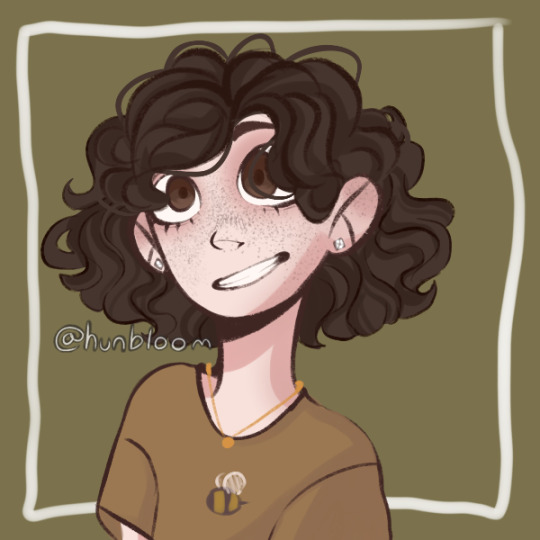
I made this piccrew from a template made by @/hunbloom for her original character design. I’ve drawn her a few times since but the only one I’m really happy with is a kinda cheeky one with Father Mulcahy that I used a base for initially. But if people want to see it, I’ll definitely post it!
#mash#m*a*s*h#Della Woods#mash oc#father mulcahy#mash posting#mashposting#mashblr#emm rambles#emm makes ocs#Em’s Whumptober 2023
6 notes
·
View notes
Text
Dyeing
Brusho Inks
For this design I used blue brusho inks in which I sprinted on to a damp piece of whit cotton in which bled creating the design bellow. This is my favourite brusho sample and even though it bled a bit more than expected I think it still creates a very cool effect in which I really like the end result of.

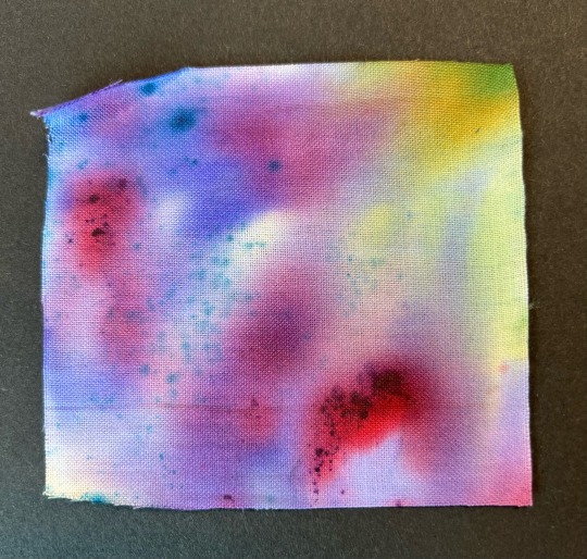
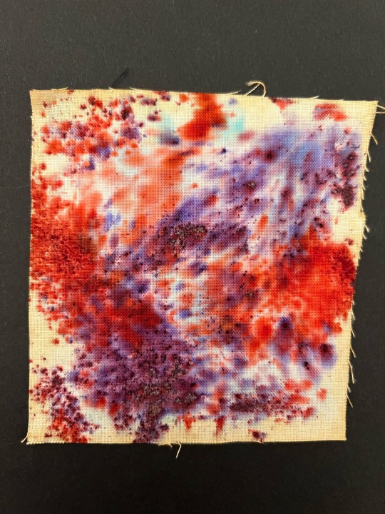
Here I have layered a variety of different colour brusho inks onto white cotton to create this abstract piece. I really like the effect this created where you can still see the dots of blue and red powder however emphasised with the beautiful gradient in the back featuring pops of green purple and red creating this really unique and textured piece.
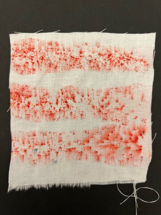
Here I have created this striped effect using red brusho inks. I applied liquid brush in lines on the white cotton then sprinkled the powder on top to crate the stripes and where the brusho has bled it has formed this really nice blurred effect. I really like how this sample turned out due to the really cool yet simplistic pattern it creates. I further like how the liquid brusho looks more pink really making the red pop.
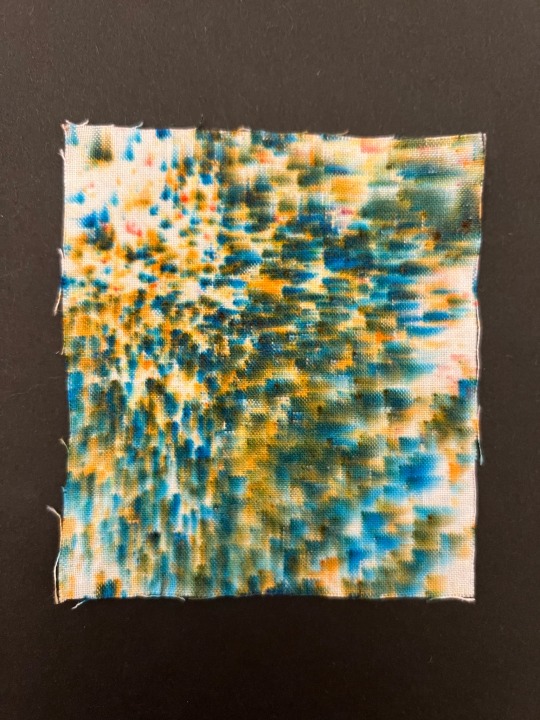
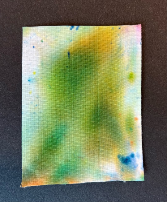
For this piece I wanted to create a spotty effect using green brusho powder in which the powder has split into blue and orange. Although the colour didn't come out green I still really like how it turned out and how it kind of looks 3D due to the subtle blurred effect. As well as this I like how it is darker and more blurred in some areas creating a more detailed and unique piece.
Here I experimented with a different coloured base in which I then layered red and purple brusho on to differentiate from the typical white background I have in my other brusho samples. I like how this design came out due to the blend of the two powdered colours and how saturated the colours are however I don't really like the background colour, I wanted it to be yellow but it came out a more rustic colour similar to that of my coffee samples.
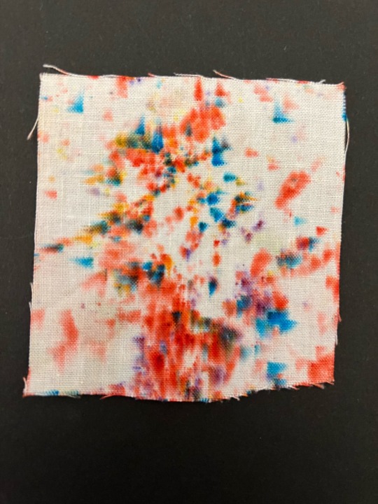
Similar to some of my other brusho experiments I created this rainbow spotted pattern with powdered brush and white cotton. I really like how this design came out as its not s chaotic and overpowering as some of my other designs creating a much more detailed and clearer design. I also like the rainbow colour scheme with as it makes the design a bit more different than that of my others.
Dip Dye
Here I dipped a piece of whit cotton into red and purple brusho ink, resting the fabric in the water at the edge so the inks spreads up the sample to create a nice gradient. In conclusion, I like the gradient the two colours created and the fairly even coverage the brusho inks have however as you can see a few splotches of blue and yellow brusho has bled on to the sample slightly ruining the effect of the ombre.

Here I used the dip dye technique to create this half and half piece using white cotton and blue brusho. For this experiment I wanted to first see the coverage and opacity of the ink as well as how clean the line where the ink stops rising is or if it would blend and create a gradient. As you can see the colour is very vibrant and not splotchy at all and although the line between the blue and white isn't perfectly straight I still think it is quite a good method to create the half and half look. In addition, I accidentally got some different coloured brusho powder on the blue in which I really love the effect of creating this subtle rainbow.

Bubble wrap
Here I applied brusho inks to a piece of small bubble wrap, as you can see the brusho bled quite a lot creating this not so nice looking design in which I do not like the end product of.
0 notes
Text
My Final Design Boards


These are my final 4 design boards for my collection “Freedom”. For the background I created these floral line drawings using a black and white colour scheme as I felt my designs were quite chaotic and colourful so I wanted something to contrast with this. As well as this I layered some vintage wallpaper in which I cut these swirls out of, over the top to add a bit more of a vintage feel to it and some texture. By slightly changing the place of the green swirls and illustrating different flowers on each page it creates a more diverse look however all still linking together. In conclusion, I really like the outcome of my 12 piece collection and think the background compliments my illustrations nicely as well as not looking too overpowering and chaotic.
1 note
·
View note
Text
Week 12: 5 Feedback Questions
In week 12 we had a session where we hung up printed versions of our posters and wrote down a question about each other's posters, resulting in 5 questions for each person.
1. What does the colour/registration at the bottom refer to?
The colour/registration at the bottom was to simply show the main colour scheme I used for the poster, as it was inspired by another creative. After analysing a bit more, I decided to remove it since it didn't serve an important enough purpose in my poster.
2. Is the 'e' intentionally missing? Why?
I cut out edge of the 'e' similar to the other letters. This is because I didn't want all of the letters to continue behind the objects. I didn't make the overall word too legible because I wanted it to be 'buried' under the elements, making the scene more chaotic.
3. Have you tried different layouts of placing the elements?
In my initial sketches I spontaneously laid out the elements as I wanted it to be chaotic and playful, but I always made sure to keep the elements central to the desk and chair. In hindsight, I could have experimented more with composition and scale of the objects.
4. How will you continue this illustrative style on the inventory?
For my inventory, I just intend on changing the colours of the headings, as I wanted a simple, rigid inventory to create a juxtaposition between the two sides of the poster.
5. Have you thought about putting the number sequence in the same corner of each illustration?
I believe the number sequence looks like it connects to each specific object in a clear way, so I don't think the arrangement of the numbers needs to be particularly changed.
0 notes
Note
1, 2, and 5 for Nym?

1. Their name is Nym (They/Them), they're a tiefling with elven parents. My head cannon is actually that they're from somewhere near Waterdeep originally, but moved about a lot before starting to settle in Balders Gate pre-game.
They're not a dark urge in this play through and sit somewhere between chaotic good- Chaotic neutral.
I spent ages in the character creation screen trying to decide 😳
2. The character creator is a good base, but it doesn't dull represent how I see them. For example the limited body types, although they are more femme looking and are comfortable like that, they're not that skinny as the body base and are probably a bit softer, and less skinny hour glass shaped.
Their face shape is similar but I image them having a sharper/slimmer jaw like as well as a straighter/slightly roman nose. I imagine they have a few body scars but I'm undecided as to what/where.
The main thing would be their tattoo along their spine, the mark of the Fae they made their pact with. But I'm yet to design it.
Hair I'm happy with but I think colour scheme would be slightly different. Like the exact tones would vary a bit.
Also they have no visible pupils as per my idea of them.

5. I think the first humanoid (other than intro stuff) Nym killed was to rescue Lae'zel and yes, it kind of bothered them. But as per backstory and personality ideas, I don't think that was Nyms first kill.
They have killed in their backstory (revenge things lmao) and do kind of have the attitude what needs doing has to be done, and it won't always be kind or clean. Survival is important. Protecting those you give a shit about is important.
0 notes
Note
what does Ness think of my three main outfits at the moment?


There’s not much variation but I think they’re cute
Ness:
“It’s a nice outfit! I like how the pants match the black accents on the cape. It’s a very cool combo in general. The horns match the mask markings as well as the blue of the pants. The horns also give off a graceful feel also with the flowing markings on the mask. Good cohesive colours scheme and outfit! 8/10”

Ness:
“This time it’s more of a yellow and white colour scheme! The horns don’t have any blues to match anymore but they still have the same graceful vibes. The scarf matches the belt thing in the pants and the bird matches with the whites and yellows. It’s a bit cluttered at the head but it’s not too bad, nothing to be done about the clipping. 8/10”

Ness:
“Ooh a simpler outfit! There’s more clipping on the head with the larger teacup, still keeping the head more cluttered. Now that the rest of the outfit is more simple, the more complicated head area stands out more. It can feel a bit unbalanced, but if you want that sort of chaotic touch, it could work in your favour! 7/10”

7 notes
·
View notes
Text
!spoilers for stranger things s4!
... ok im genuinely surprised that so many people are sort of giving up on will and mike getting together when ive never been this confident about a ship??? ever???
if im wrong ill take the L but Cmon Now :
• the show recap purposefully shows the mike and will scenes, putting an emphasis on their dynamic instead of the mike and el scenes
• last season el and mike were going thru it but in the end, el tells him that she loves him and he stood there sort of slack jawed and stunned and couldnt say the words back even then within that scene
• which brings us to the beginning of s4 where mike still cant say ily to el even through the letters and correspondances hes had with her, either a) cuz hes going thru some insecurity about his feelings and the show is building up to a big romantic gesture or b) because hes internally struggling and a part of him knows if he said 'ily' back to el in a romantic context, it wouldnt be true
• meanwhile will is very blatantly pining what with The very pointed slow romantic tune that plays whenever he gazes at mike for a bit too long, and he evidently has a painting for mike and im guessing its contents will be revealed in volume 2 next month
• as for the way mike is treating will, giving him a bit of the cold shoulder at first, the awkwardness and avoiding his gaze, it could be because he feels guilty and weird about how he left things tense between him and his bestie, but then again mikes attitude feels like hes going thru it with el and it could b because he has some underlying feelings for will that he hasnt realized yet and is unknowingly taking out these frustrations on will (rip)
• and i did appreciate how mike apologized to will and that heartfelt talk they had as will was packing his stuff - again, the talks and discussions they had were continuously will trying to console mike despite his shit attitude towards him, so mike finally saying that 'he doesnt deserve to be treated that way' and the Pure hopeful expression on wills face and mikes big smile when they established each other as being each others besties again,.,.,. what was the reason What was the reason
• also this has nothing to do with anything but the background posters in wills room of Jaws 1975 and the og little shop of horrors musical (the lyricist to that musical being howard ashman, a gay man) ... gay!! Gay (source for this being im a mega stan of these two things and i am gay thank you vry much)
• back to the topic at hand tho, i feel like theres some sort of specific costuming choices what with the characters outfit colour schemes and id do a deeper analysis if i knew what i was talking about
• like smthing smthing about how mike brings el yellow and blue flowers and shes dissapointed with how he still signed the bouquet by writing 'from, mike' not 'love, mike', and from what google says about flowers blue can be interpreted as representing peace or a balm to anxiousness, i read somewhere that it also represented desire and romance tho, but for yellow its apparently 'the ideal color for symbolizing friendship'
• then again will has been wearing yellow and blue plad shirts and mike has been wearing an equally chaotic mix of yellow and blue in his outfits and those are just two contrasting colours that compliment each other well, indicating that the writers just purposefully wanted their outfits to be coordinated wink wink
• and to just really get into it theres this General disconnect between el and mike and how they just arent on the same wavelenght anymore, el's message that she leaves behind for mike also being signed with a 'from, el' not 'love, el', seeming to indicate that unless mike apologizes and professes his love to her in volume 2, their romance is kinda officially fizzling out
• honestly ive always rooted for mike and el pre realizing that will and mike was a possibility in the shows plot, and what with el going THRU IT in the following episodes of season 4, i feel like her and mike latched onto each other super hard at the start of the show and whats coming to light now is that their bond is just as valid if it remains platonic
• so we dont see the california gang as much as up until episode 7 it focuses on the vecna plot, and with the last 2 episodes of the season releasing in july being longer and the usual recipe for a stranger things finale being everyone meets up near the end, im guessing will, mike and el are gonna make their way back to hawkins somehow and join the others in the upside down, either intentionally or by force
• by that i mean that theres this specific payoff that has to come with the reveal of what will was painting in episode 1, and el herself says its for a crush, and we know that crush is mike, and so will is still dragging this painting around with him in his backpack for it to be revealed at a surely emotionally charged moment for him
• think of it this way: theres surely gonna be more mike and will screentime in volume 2 now that weve gone thru all of that setup, and whats the point of heavily implying will is crushing on mike all for mike to just be like 'oh haha thx bestie im an ally and all so hashtag gay rights good for you but i love el sorryyy 🤪'
• like Why parallel how mike and el cant seem to work as a couple anymore and mike just seems desperately trying to salvage their relationship and say what she wants to hear, all while having this constant pensive and frustrated look on his face vs how mike was being super dodgey and sketchy with will to giving him these super soft looks and almost being in tears when they had that conversation and reconciled as besties for like 10 seconds?
• it seems cruel to string ur (queer) audience along with the possibility of byler being real only for mike to admit how much he loves el romantically and will to end up heartbroken... like wow... such compelling storywritting (sike) and theyd get Major shit for it Instead of the potential praise if they were to just go thru with endgame byler
• and heres my final crackhead theory but since vecna feeds on peoples guilt and its the dissapearance of will and his connection to the upside down that opened a gate and the upside down being stuck in time on the day he did dissapear,.,., what if the closer he gets to hawkins and the gates he becomes its next target? will could have potential guilt relating to keeping his sexuality/crush hush hush, and being in the closet in the 80s is just surely a shit enough time so i can just imagine the possibility of him being vecnas next or final victim to pick on, and it would be the perfect wake up call for mike to panic at the chance of losing will Yet Again
• or idk im getting a cw supernatural vibe that will is gonna confess to mike, then get yeeted into super hell I Mean the upside down, but lets hope that this time mike pulls his head out of his ass and realizes that the reason things with el feel off is because hes been repressing his feelings for will because hes an oblivious and emotionally stunted dork!!!
anyway thank you for coming to my TED talk my inbox is always open if you also want to scream about all things strange
#ill take the L if im wrong but i do feel pretty confident at the moment#stranger things#stranger things spoilers#st s4#stranger things season 4#stranger things season 4 spoilers#will byers#mike wheeler#eleven#jane hopper#stranger things will#stranger things mike#stranger things eleven#st spoilers#finn wolfhard#noah schnapp#vecna stranger things#vecna#byler#stranger things meta#byler meta
690 notes
·
View notes