#Will probably redraw this one day when I get better at texture
Explore tagged Tumblr posts
Text
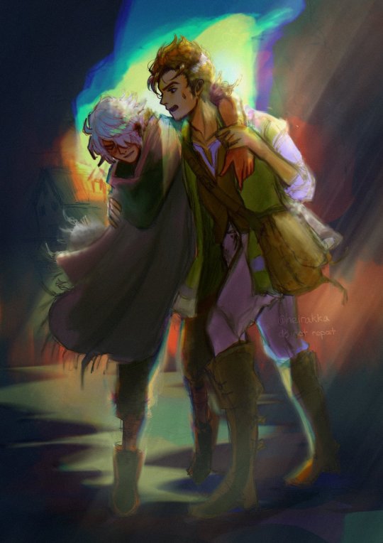
ough I give up on this one so, throws this at ya’ll and scurries away
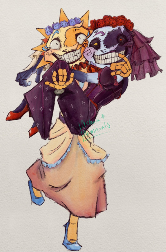
#They’re about to topple over your honor#fnaf#fnaf daycare attendant#fnaf moon#fnaf sun#moondrop#sundrop#fnaf dca#five nights at freddys#fnaf au#sun x moon#moon x sun#they getting married your honor#Will probably redraw this one day when I get better at texture#my art <3
445 notes
·
View notes
Text

A TAD BIT LATE BUT HEY BETTER LATE THAN NEVER 2024 year IN ART I found it quite shocking how much improvement there was, as I did not notice any changes over the year. Also apparently I have allergy to the colour green as I barely use it anywhere, I'm talking, I could count on my hand the amount of drawings containing the colour green . While looking over all the drawings, the most common theme was, unsurprisingly, d&d related drawings.
From all the drawings I have begun, I finished 68% (25/37) of all started drawings. Per month I manage to draw 2 art pieces, which I am pleased with. Of all the unfinished drawings, most barley have a sketch, whilst few are still in the process of making. Before doing the math, I was convinced I had finished around 80% of drawings instead of 68%, but close enough. This year has been full of pieces that I've disliked, but that's art, can't always love all of your pieces. But the same goes in the opposite direction, so here are my top 3 faves and dislliked pieces Top 3:

3. This was during "inktober" except I gave up on the ink part and then just started ignoring the days themes, and in the end diregarted drawing once piece per day, instead opting in to make a more complete piece over the span of multiple days, so I guess I just did my own thing??? Nevertheless, this was a practice with the painting brushes on krita and omg, it turned out so well?? I would have never expected for myself to actually draw something like this, especially without using eyedropper tool!

2. This was made during December, I took part in a 3 day media bootcamp, and safe to say, it truly was a bootcamp! We basically had +/- 24 hours to create a trailer for a show/podcast/film, while in that time we are getting additional lectures how to break through in Latvia media! Before going to the camp, I had no idea that we'd do any of that. Luckily, I had brought my drawing tablet as well as my laptop, thus became the groups artist.
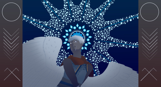
1. My best piece in 2024. also made during Inktober, I was experimenting with a vector art look. Something funny, I didn't realise vector art literally meant using vectors, so I made it all using a lot of fill tools and selections.. way too many selections, I am afraid to look at the layers... This is art of a friends D&D character as I was feeling lost on what to draw.. The worst:
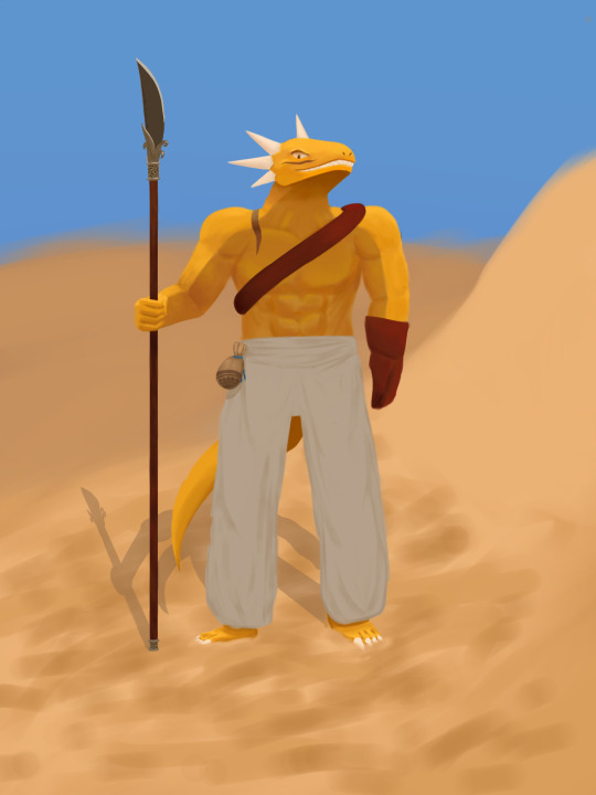
3. This one is a still a push as this was made during whole december, and I seem to only have finished on 5th jaunary 2024, but works for me. This was still when I was still drawing on my phone.. I remember feeling so proud of this because oh how it looked with all the textures, all the effort and actually trying to draw something smooth.. ngl if we ignore ALL THE FLAWS, it looks good? I had no clue how to draw pants and was allergic to using references "because I'm good enough to draw without using references" sure buddy, you were xD Throughout the year, I just can see how his design slowly changes, first off head shape before was a mystery, each drawing, different shape, consistency? who dat? This drawing serves as a reminder that I should practice drawing landscapes other than lush forests, because omg what are those sand dunes..
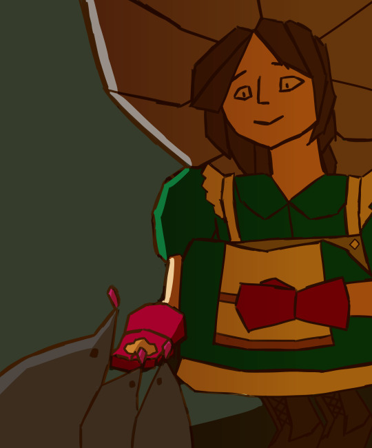
2. I CAN'T DRAW WOMEN, LET ALONE GNOMES!! Here's what drawing on a phone with a cracked screen did to me, drawing mostly straight lines. When I got a drawing tablet, I still continued on using straight lines, as I had grown used to it. I feel like I screwed myself over in the drawing with the awkward angle, without reference.. The light makes absolutely no sense here! Where does the light come from? Idk, ask the stars, maybe they can answer..
1. This was when I first got a drawing tablet.. I get the feeling I was going for but the execution is... Yeah.. Ngl, I should attempt to redraw this, I like the concept I had.
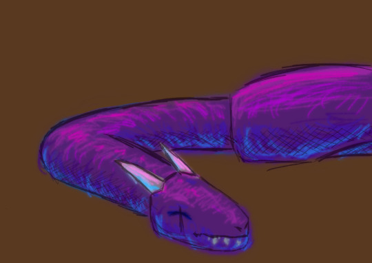
I hope next year I manage to finish more works, for that elusive 80% , and probably switch up the drawing subject a bit, adding some variety in the mix finally, as I feel like I've lost my edge in environment I used to have.. Perhaps create some OC's as I have only my dnd characters and nothing else~
3 notes
·
View notes
Note
just popping in to say that i absolutely adore your art! you’ve become one of my biggest inspirations and so inspired me to finally make the translation to digital art. do you have any tips for a beginner? thanks so much and I hope you have a great day!!
oh my gosh!! thank you so much!! you really don’t know how much it means to hear that so thank you, you just made my day!!
i’ve been collecting resources for someone i know who used to only do traditional art years ago, and is recently making the switch to digital, so i’ll link my all time favorite spreadsheet which covers a lot art-wise!! and then i’ll give some of my own advice at the bottom :)
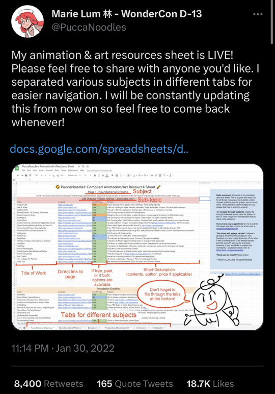
( it’s sorted by the type medium whether it be illustration / animation / storyboarding. they also have a whole section for foundational drawing and links out to websites for poses. it’s also updated every so often! :) it also lists resources and information about programs !! prices are included too! )
—————
now, i’m not too sure how to give advice about art, but i definitely want to try and offer some help! :)
i have been drawing digitally for maybe ~8 years. the switch was really hard, but don’t let it discourage you!! i went on youtube and watched a bunch of speed paints and timelapses of my favorite artists at the time to try and understand how they did certain things. and to be honest, my art was not great! and i’m still improving; things i look at from even 3 months ago i will put my head in my hands at.
anyone would probably tell you to just practice when you say “i want to learn how to draw digitally” but they don’t often tell you what to practice either. i don’t really like that advice (even though it’s mostly true— it just doesn’t feel very beginner-friendly!!). so here are a few things that i wish i was told instead of “just practice to get good”
1. i really recommend finding an artist you like and looking at how they do certain things. try to figure out what you like about it; is it the texture, the colors, the lines, the compositions, etc. maybe think about incorporating the way someone uses bright colors (for example) in your own art (if you like the way the artist uses bright colors).
2. reference photos!! they are key. especially having multiple references, maybe one for lighting, a pose, background, etc. the more the better! — i recommend maybe maybe a folder on your device for references ^^
3. keep your old drawings! — some people tend to get discouraged (me) when they think they’re not improving. best thing i ever did was keep my sketchbooks and try to keep as much of my earliest digital art as possible.
one of my first digital drawings ever VS my redraw from last year…. which i want to redraw again now!!
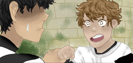
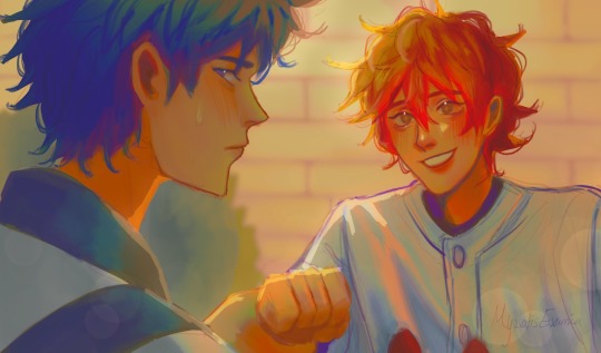
4. this one is going to sound a little funny, but draw your favorite character! - having a character to constantly draw helped me a ton. especially an original character;
5. if you are feeling uninspired, find a screenshot of some media you enjoy and try to redraw it or do a study of it :). i did this often when i didn’t know what to draw but wanted to draw!
6. experimenting with brushes!! — if you are also stuck, maybe try to download or even create some new brushes. …. i have too many brushes
—————
i really wish i could offer all the advice to help you succeed!! i’d love to see your progress as well!! the main thing i can say is that not everything you create will be a masterpiece, but not every work of art is a mistake either. don’t regret spending time drawing if you love it, even if you aren’t in love with what you create. if you can recognize that something may be off, whether it be proportion-wise, color-wise, ANYTHING, you’re still seeing a way for improving your work. which means you are still improving!
i wish you the best anon!! if you ever have any more questions i can try to help, and i am rooting for you!!!!
you can do it!!!!! :) (ft. drawing i did in elementary school)
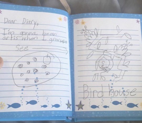
#zack speaks a lot tag#zack replies tag#long post#question mark (?)#i spent so long typing this the images got bugged i hope they work#seriously!! good luck! i hope you get to make the art u want to!!
3 notes
·
View notes
Text
Drawing The Musketeers 23
I seem to have developed a pattern now of drawing characters in the order I first drew them back last year. Which means it’s this bad boy’s turn again:
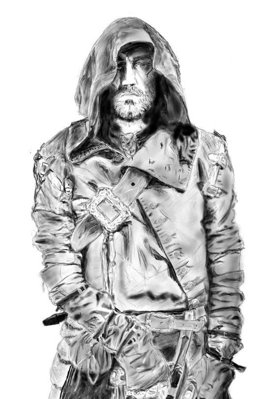
[Image description: a detailed digital pencil drawing of Matthew McNulty as Grimaud in the BBC’s show The Musketeers, in full 17th Century(ish) costume. He is a stocky, white man with a close, scruffy beard and a dark, forked scar by his left eye. This is the only eye visible from the deep hood covering his head, and he’s glaring impassively toward the viewer. He is wearing a hooded coat with a great many straps and buckles, including a massive one where the huge, turned-down collar falls over the enormous diagonal strap across his chest. He has a cloth pouch at his belt.His right hand appears to be drawing a couple of inches of sword from his scabbard, but it’s difficult to tell. His clothes are deeply folded and creased, and it’s just possible to tell that he is wearing fingerless gloves and a ring on each visible finger. End image description.]
Where do I start with this? Okay:
Look, it’s a long way from perfect, but I’ve been drawing this for a solid chunk of two days. You have to stop somewhere, right?
I have no idea what’s happened with his hand, and I could probably have shaded it a lot darker and got away with it, but here we are.
You know how I’m usually cursing lace? This time I’m cursing buckles.[Counts swiftly] 13 of them. I think there’s a 14th that’s really obscure but see above re: not going back.
I’ve learned a lot. Some of it is about software issues vs. hardware issues. Some of it is about texturing using reduced opacity. Some of it is about drawing with white instead of black (a real luxury of digital drawing).
I’ve also learned that Grimaud’s characteristic cloak/ coat thing had removable arms, and I’m mildly disturbed at the thought.
I’ve also learned that he had a random shiny ribbon tied to his Ridiculously Huge Clan Chieftain Buckle and I feel like there’s a story there...
You can probably already tell the section I did last, when I was in a fair amount of pain and fatigue. No prizes (and besides, you get to find out in the progress shots).
The eye works! The eye really works!
I was reminded all over again that Matthew McNulty is a very attractive human and that he and the makeup/ costume department did their utmost to make him look horrible and it didn’t really work.
There was a point where I had to stop for the day and added some red pen annotations. The following day I realised I was thinking “I can fix him,” and if that doesn’t sum up a significant portion of the Grimaud Stans, I don’t know what does...
I am very pleased with the big strap detailing, the money pouch, the buttonholes, the hilt of the main gauche, and the arms.
I kept going back and adding more face shading. I’d go “Ah, that’s enough,” then look at it again after some Endless Buckle Finagling and think: Nope, needs more shade. I still think I should have gone back and added more shade.
I appear to have shaded over some of the facial hair of which I was very proud. OH WELL.
I did a lot of deleting and redrawing. I am glad I did so.
I am falling into a real danger of perfectionism, and I’m not sure what to do with that.
It’s unbelievably better than last time I did Grimaud...
Measuring obsessively really made a difference.
Next time I’m doing someone wearing more contrasting clothes and maybe even smiling.
I like learning.
My arm hurts.
⬅Drawing 22
Progress shots behind the cut. There are a metric arseton of them, mind you!

[Image description: dark grey, wobbly outline of the above-described figure. Various points are marked in short, dark lines down the middle of its length - frown lines, nostrils, mouth, beard, various straps and belts. The edge of the hood on one side is outlined. End image description.]
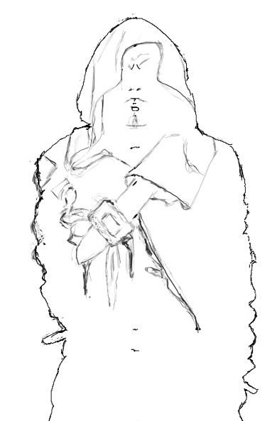
[Image description: The above outline, but chest strap, collar, large buckle, join of coat, and more detail on the hood are sketched out. End image description.]
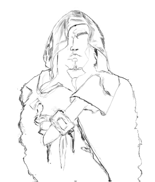
[Image description: above image but cut off at waist. Shading on hood and some features are outlined. End image description.]
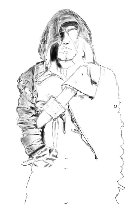
[Image description: Above image but full-length again; the shading on the hood and on the right arm are much more detailed. End image description.]

[Image description: above image but far greater detail in the shading of arm and hood. Creases on the left arm are sketched out. Hand and pommel of sword are sketched out. Hilt of main gauche is complete. End image description.]
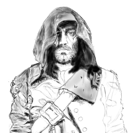
[Image description: above image but cropped to chest. Face is completely detailed. Shading and buttonholes on collar are apparent. Buttons on chest are sketched out. End image description.]
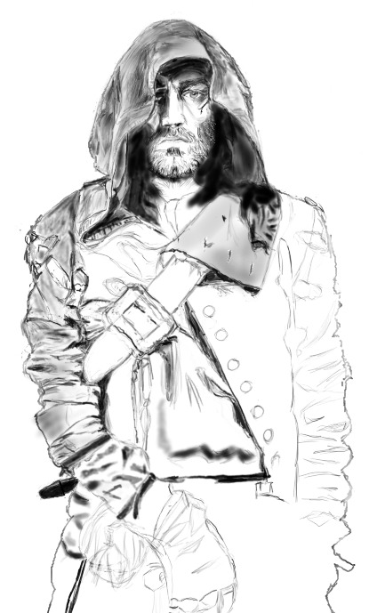
[Image description: above image but full-length.More shading on abdomen and lower arm half-sketched out. Hand has more detail. All chest and abdominal buttons sketched. End image description.]

[Image description: above image with deeper and more intricate shading. Chest buckle has been reduced in size and detail added; right arm now in proportion along with fold of hood. Shirt lacing has been added. End image description.]
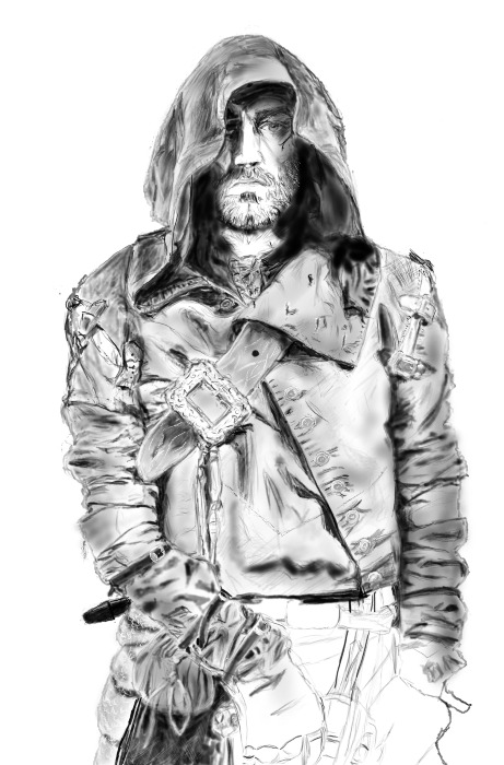
[Image description: above image with hip and pouch completely shaded. Chest strap now has intricate detail and shading. Belt and sword hilt sketched out along with left hand. End image description.]
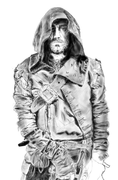
[Image description: above image but all shaded now except left hand. End image description.]
#musketeers#the musketeers#bbc musketeers#bbc the musketeers#drawing the musketeers#digital art#digital drawing#digital fanart#grimaud#lucien grimaud#Matthew McNulty#images#image descriptions#Aaaaah! BUCKLES!#fanart#huion#huionart#krita#kritadigitalart#oc
33 notes
·
View notes
Text
Was chatting with a coworker the other day and two things crossed my mind...
that I've been at this weeb shit so long that I forget what I just sort of take for granted and what might not be commonly known little factoids, and
that VIZ's attempt at a monthly Shonen Jump magazine has been gone so long most people probably never saw them. (nevermind the old RAIJIN Graphic Novels that tried the same thing)
So, here's some fun little things you might not have known about manga if you've only ever read English publications and/or digital scans...
For one, there's the matter of print formatting... In general, Japan actually uses their own standards for print that tend to differ from those in the US; The JIS(Japanese Industrial Standards) series A and B. Magazines like the typical anthology format manga are printed in JIS B5, which is comparable to the US Letter standard, or the ISO A4.

This was the same format that RAIJIN Comics printed in as well, and although I don't have a copy of the old English Shonen Jump for reference, if memory serves they printed in the same format as well in an attempt to really sell that "authentic" manga feel. Sadly, I don't know that the effort or attention to detail was much appreciated. Neither published a volume comparable to a Japanese weekly or even monthly serial magazine, though --not by a long shot. But this might not be the most practical for comparrison, since there actually just isn't much of an English language equivalent format. (unless you count actual magazines that happen to include comic illustrations or miniscule comic strip segments)
Despite the mammoth size of a serial magazine, Japanese tankoban are actually smaller than the North American equivalent. But notably the Japanese small book format isn't just a matter of contending with nearest print standards... What I believe is the JIS B40(although I could be wrong) tends to be the standard print size of small books in general, not just manga, and it's a print size that is only marginally smaller than VIZ's standard size manga, but with the very particular benefit of being deliberately portable. The small difference in size is the difference between a Japanese manga fitting in my coat pocket where as the English equivalent can't.
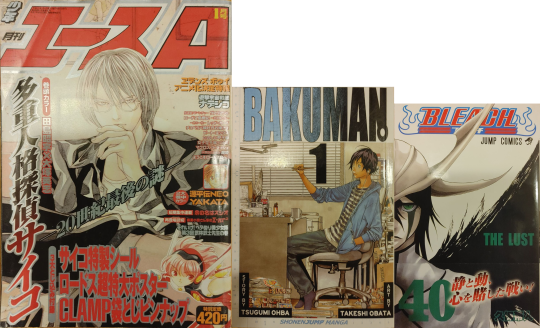
(I realize I photographed a copy of Shonen ACE, and not Weekly JUMP, but I measured a copy of Weekly JUMP for the thickness and not the copy of ACE; the copy of JUMP was around 506pg, while the copy of ACE was 570pg. Those are both older though, and the most recent digital copy i have of Weekly JUMP actually had around 520pg)
And I don't think it's always addressed just what a difference there is, culturally, in how Japan approaches the print medium. It's kind of an old cliche by this point, and I don't know how accurate it's remained in the past decade or so, but the quintessential image passed around between comic nerds has always been the Japanese bullet train; A place packed with commuters all passing their transit time with isolated preoccupation with music and/or reading, with manga being the king of this time killing arena. And its not just about sheer popularity driven by interest, American comic vendors have long envied the sheer accessibility of manga in Japan.
Here in the U.S. we used to have a thriving newsstand retail scene for comic books, and a kind of similar ease of grab and go comic purchase, rather than the explicitly niche interest driven "direct market" model that has been slowly but surly strangling the comic market ever since. But in Japan serialized manga has remained in relatively quick, impulse friendly, arm's reach of readers on the go. And what lubricates that business model more than anything is price.
I still remember a time when VIZ dominated the English manga market by offering at $7.95(and am I crazy or am I remembering a time when it got down to $6.99?) but now'days it's settled on a low end of $9.99. You know how much the recent vol.29 of My Hero Academia goes for? ¥484. That's less than $4.50.
You know how much that big ass magazine with 500+ pages and 21 different series goes for? Do you think it's more or less than the little pocket-size tankoban? Did you guess something close to ¥290? That's less than $2.75. But how does something bigger in both page size and page count managed to sell for less???
There are a few secrets to that, but one is that the things are packed to the gills with ads. But that's the boring answer. The other feature contributing to keeping an accessible cost on weekly/monthly manga is something we don't think about much in the U.S.; it's the paper and print quality.
The nice little books are printed in what you might expect as far as starch white paper and clean black inks, but those big honkin' phone book(do people still know what phonebooks look like??) size magazines are printed on cheap recycled pulpy newpaper with typically rough print jobs. This is most noticeable in the quality of solid blacks, and when scanning the texture of "white" space.
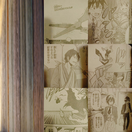
(I tried to take individual photos of different series chapters to show off the fact that the paper is differently colored... but my phone's camera seems to be smart enough to auto balance that kind of thing when there's no other context to anchor it to. (It doesn't help that it's night and my lights have a harsh yellowing glow to them.) but on th left you can still kind of see the different paper colors; this particular issue alternated every 3 chapters between pink-ish, green/gray, a kind of off-white/gray, and sepia, but I've also seen blue-ish, oranges, and a different shade of yellow different from the sepia-ish one.)
Back in ye olden days when it came to fan scanlations, more slapdash teams and projects would often stumble over levels in photoshop (too much black and the pulpy paper texture shows up as grainy shadows, but too far white and the edges of lineart get crunchy and ugly) but those who had more robust readership and a regular streamlined flow of work, we'd actually go in and touch up the solid blacks and whites by hand. We'd also redraw art to erase overlaid text so the type setters could lay the new English in over top.
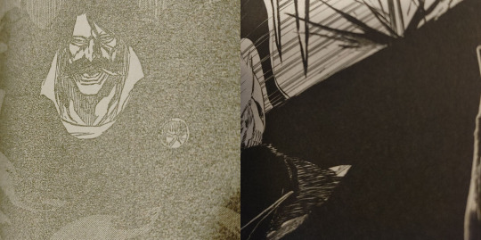
(Weekly Jump: Left, Bleach tankoban: Right)
They do however keep a few coveted color pages in better quality paper and ink. In contrast, the standard quality tankoban actually don't include color pages at all, and just print what had been color pages in grayscale. There are also all kind of irregularities between publishers and special editions and such, but on the most basic level this difference in quality both keeps serial prices down, while also incentivizing tankoban purchase.
In the U.S. we might still have the draw of an ad-free reading experience in our TPB, but the print quality between a biweekly issue and a TPB are basically the same. Incidentally, even though manga are generally drafted at a much larger scale than even the serial magazine proportions anyway, the scaled down size of the tankoban also serves to sharpen the image. When put side by side the nice clean tankoban print looks noticeably better than the serial.
Now'days the English scanlation scene seems to be conducted almost entirely through ripped digital releases (at least as far as I can tell with popular, regular weekly titles) which is great for quality, frankly, but it does kind of lack the charm and personal touch of a band of amateurs finding round about solutions to a convoluted bootlegging pipeline. But obviously I'm a little biased.
[edit]: Oops i posted this without really ending it in any sensible ro conclusive way... I feel like ive lost sight of the point since i first drafted this but I guess its mostly just me pining after if we could just get super cheap, disposable quality, bulk manga in that classic Japanese magazine model to work here in the states. I already tend to sell manga in big runs, even at $9.99+, and frequently I'll have customers put volumes back, or clearly want the next volume but just can't afford it and wait to come back. If I could sell these customers more volumes, and more importantly more titles, at the same price, I would love to. I would love to see these things fly off the shelves. I would love to see people keeping up with multiple series. I would love to see someone look at a 44vol long series and actually feel like that's a number of volumes they can afford.
5 notes
·
View notes
Text
Honestly the amount of people who say artists and writers should do stuff for free, or try to rip them off on comissions still royally piss me off.
I think the worst part of it is the entitlement, I dont want to make this too much about generations but a lot of commissioners are millenial/Gen z's who grew up on the "steal and pirate everything" mentality, take everything that you can because no one else is going to hand it to you. which I can get behind, when you are screwing over MULTI BILLION DOLLAR COMPANIES. NOT THE STRUGGLING ARTISTS AND WRITERS who are trying to keep food on the table as desperately as you probably are!
It's simple, you wouldn't walk into a restaurant, order food and tell the server "sorry I don't have any money, but I've got like a few thousand followers on social media, I can get your name out there, get the restaurant some exposure" NO! They don't need "exposure" they need you to pay the damn bill!
On top of that, most of these artists and writers ALREADY HAVE FOLLOWINGS. They already have thousands of people following them, waiting for the chance to get a commission, who are willing to pay for said commission, they don't need "exposure" when they're already out there! He'll even the artists and writers with a few hundred don't need it, they'll get more followers as time goes by, their skill alone will see to it.
And what is with people trying to get free art and writing? It's not going to work! You can't harass someone until they cave, trust me, you'll be long since blocked before you even have the opportunity. I don't do comissions, online anyways, but my own friends and family, people who actually know me STILL PAY ME whenever they ask for me to do art for them because they KNOW it takes TIME AND EFFORT.
How many times do we need to have this discussion???? Like when is it going to finally click that people who need to pay their bills just as much as you do AREN'T going to do this shit for free!?
Here's the thing about art and writing, that you've heard a billion times but still aren't getting; IT. TAKES. TIME. AND. EFFORT. TO. GET. DONE. the art isn't going to magically appear and the writing isn't going to suddenly write itself, if either were so convenient YOU WOULDNT BE ASKING AN ARTIST OR WRITER IN THE FIRST PLACE!
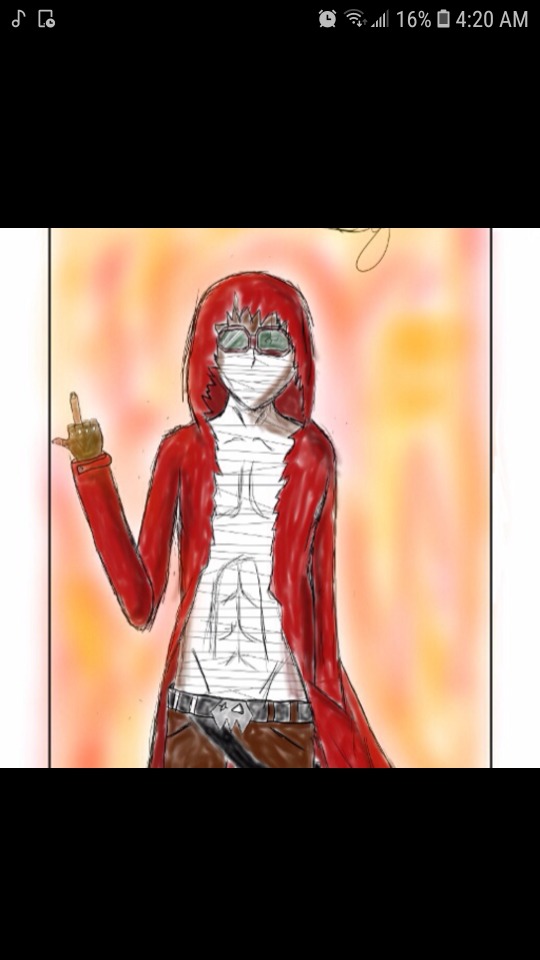
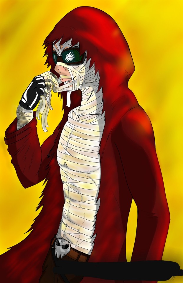
Look at that, you see that? The first picture I did back in 2012-13, the picture beside it? I did that TWO YEARS AGO. I didn't suddenly know exactly what to do, or had anything close to a god given talent for drawing (I'm not that talented). The first picture WAS THE ABSOLUTE BEST I COULD DO AT THE TIME THAT I MADE IT. In the time between these two drawings I admittedly took a break from art, but then I got back into it four years ago. EVEN STILL that was four YEARS of starting over from the basics, relearning everything, learning new things, wanting to actually improve my art.
Which, guess what, DID NOT HAPPEN OVER NIGHT. It was HOURS UPON HOURS of my limited free time as an adult drawing over and over and over and over again, every single goddamn day to get to the point that I was able to make that redraw look as good as it does in comparison. He'll, my art now puts them both to shame! Because I spent the time improving my quality!!
Now look at these artists doing comissions, they've probably put EVEN MORE of their time to get that good! They've put in LITERAL YEARS of sweat, blood, tears, frustrations and dedicated hardwork. Some did the same as me, self teaching and lots of practice, others probably had to go to school, which definitely wasn't cheap. But all of us put in that time and effort TO REACH THESE POINTS. Of being better artists, developing our styles, getting faster at drawing.
And maybe you think that this is super easy, right? That I or every other artist can just fire some art off and boom its good and done in like an hour?
FUCK. NO.
Even now it takes me several hours a day OVER MANY DAYS to make something exceptionally good! It doesn't matter how good an artist is, it still. Takes. Time.
Maybe the issue is that you don't understand how much actually goes into art, let me break it down for you, the steps that most people follow to finish ONE drawing.
-Rough draft: general character outline, get a feel for what I want to draw.
-Rough sketch: I start doing a bit of pencil to start filling in details like mouth, nose, eyes, hair, clothes. Ect.
-Penciling: I go over the rough sketch and clean everything up, maybe do some editing, this is when you can start making out all the details.
-Ink: I trace over the finished pencil with a pen tool and actually have the line art, everything looks clean, presentable, it actually looks like a character now. I'll spend time editing this and possibly redoing the inking many times over to get to a point where I like it.
-Flat color: I decide on which colors to use for skin tone, clothes accessories. Ect.
-Shading/highlights: I figure out where my light source is and how strong it is, I then apply the correct amount of lighting and shadows to the color to give it depth, I also have determine the texture of skin, clothes and accessories to make everything look real and natural.
-Blending: I smooth out the shading and highlights so that it looks more natural and isn't too hard (noticeable difference between color) so that it looks as natural as possible.
-Finish: I go over last minute details, finish any editing or corrections that need to be done. Once it's good I call it a day.
Each process is longer in length then the previous, with the exception of the final editing (as long as everything looks good) and even the rough draft can take some time. Over all this is SEVERAL HOURS of work for a SINGLE DRAWING.
So is it sinking in yet? How much is put into doing even a single character drawing? God forbid if its done with background. This isn't a "scratch a pen around and be done with it in ten minutes" kinda deal, no, this is SEVERAL HOURS OF SOMEONES LIFE BEING PUT INTO THIS
And if you still have the AUDACITY to try and wrangle free art from an artist then there's no helping you, you're just a selfish piece of shit, no question and I want nothing to do with you.
Someone might say "But I got free art/writing from.-" look I don't give a shit if someone did something for you THAT ONE TIME, these other artists and writers? Totally seperate and different people. You're one freebie experience does not, and should not apply to other artists and writers.
"But what if I really want this commission but don't have the money right now?" Well, that's tough shit. Save up and properly commission them when you can, it's not their problem.
"But what if I'm in a really bad financial situation and really want it?" That sucks, and I'm sorry, but again, not their problem. Chances are this is their only source of income and they need to make money so that they don't end up in a similar situation.
"They have a gift! They should share it!" What kind of cheap ass- LOOK, just because someone is talented or really good at something does not automatically obligate them to do anything for total strangers in anyway shape or form. These are living, breathing people, the same as you. They need to eat, they need to pay rent/mortgages, they need to pay vet bills, send their kids to college, do their taxes and everything else that YOU YOURSELF need to do. Asking anyone to spend their time doing something for free, when that something is how THEY ARE SURVIVING is beyond asinine. Not only that, this obviously isn't a hobby to them, it is very clearly THEIR JOB. Would you want to do a job where you didn't get paid at all? Doing a shit ton of work for absolutely nothing? No? Didn't think so.
"It shouldn't be about the money!" Well unfortunately, as with almost every other job, it is. We live in a world where we desperately need to make money in order to survive. That's the painful fact of the matter. If money never had to be an issue ever again then this would be a very different story. But it's not, plain and simple as can be.
Look, these people are just like you, artists and writers who are just trying to get by in a shitty ass world, using the one thing they have that let's them have an income. Leave them be, don't try and trick them, guilt them, or cuss them out when you don't get your way. Either properly comission or leave them the hell alone, plain and simple.
2 notes
·
View notes
Photo
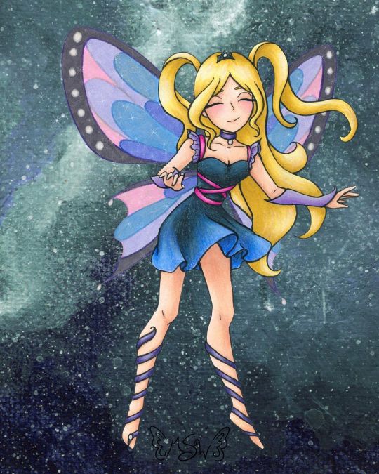
Fairy Enchanting
A bit later than I expected, but here we have the art that I used for the examples on my Commission Sheet! (Unoriginal title is unoriginal and also a pun based on "very enchanting") When I started thinking about putting together a commission sheet in the first place (which was something I wanted to do for the new year, as before I was just using a lengthy pricelist), I knew that I wanted to make a piece of art specifically for it and track my progress as I went, so that I would have an example for each stage in the process I take commissions for. And for the art, I more or less wanted to "go all out" since it's supposed to be an example, and I figure the example needs to be as close to top-notch as possible. Admittedly, I probably could've done even more than this, but me being me I procrastinated and ended up having less time to work on this that I initially expected, so... In deciding what the drawing would be, I also decided to return to my roots a little, and a do fairy as an homage to back when I used to do Winx art all the time. Likewise, as Enchantix to this day is my favorite transformation from the show, I drew heavy inspiration from it, and I'm sure that's so obvious that if you know the show I probably didn't have to point it out to you. Anyway. I actually didn't start completely from scratch with the sketch; I re-used this pose from a previous sketch I did that never saw a full-finished piece. I liked that other sketch okay, but it didn't feel like a "finish me" project. I did have to alter the feet because the original sketch was made with feet for ballet slippers (bigger heels, more rounded/curved toes, etc.) and much later on in the process I ended up angling the leg on the left more outward, as that felt more natural for the direction I was taking this new sketch in. In sketching all the bits that make this sketch otherwise unique from the old one, as I mentioned, I was taking heavy inspiration from Enchantix. One of my favorite parts of the transformation has always been the leg-wrap/barefoot sandals, for reasons I can't explain. So those were a must. I also really like how the Enchantix outfits tend to be short dresses that are more form-fitting at the top and more flowy and soft at the bottom. Here, I decided to bring the ribbony look on the leg wraps up into the bodice, and to frame the collar/shoulder area I used a sleeve & choker style similar to what I did for the dress for Ink Dance, which itself was based on a dress I actually own and love to pieces despite never getting a chance to wear it because of how fancy it is. The main difference for both of the drawing versions is that I skipped the lace overlay that connects the sleeves and choker, mostly because both pieces are traditional and drawing lace/mesh traditionally, especially when it's so teeny, is a nightmare I do not want to engage with. And the choker part fits nicely, as in Enchantix each fairy has a necklace (usually a choker) that holds their fairy dust bottle. I'm not sure if this fairy has one or not, but she very well could! Enchantix usually has long gloves, but I altered these to be shorter and fingerless (more like Magic Winx or Believix gloves) since this fairy is also based partially on myself, and I'd be more likely to wear that kind than the full-length formal gloves. And for the hair, as is maybe obvious, I was primarily inspired by Stella's for her Enchantix, since I've always loved that part of the transformation sequence for her's. Also, even though it doesn't look that way on my commission sheet, IRL I drew only one wing and left it separate, off to the side, to make positioning and flipping it easier. Once the sketch was done, I did try inking it traditionally/by hand once, and I just really wasn't happy with how it turned out. And I also realized I had drawn the skirt billowing/ruffling in completely the wrong direction anyway; It was moving to the left when it should've been moving to the right like the hair. So I had to take time out to fix that. As opposed to wasting more paper trying to ink traditionally after that fiasco, I instead went with what had been my gut instinct anyway; I scanned the sketch in and did the lines in Photoshop. Well, most of the lines. I was a dumb-dumb and when I did the lines for the wings, 1. it took forever because they're large curves everywhere and 2. I used a slightly bigger brush than for all the other lines, as I had mistakenly thought I was going to be re-sizing them significantly and the lines would be altered to for me when I did that. When I realized that wasn't the case, I did not want to have to redraw most of those curves again and risk not being able to get the right a second time. So I ended up booting a copy of the wings I'd already done into Paint Tool Sai and made use of the linework layers to redo the wings without having to draw the same line fifty times. Then I booted that back into Photoshop and adjusted the wings to be angled/aligned with the rest of the lines as I saw necessary. It was also at this point that I played around with positioning the leg on the left more outward than what it was on the sketch and ended up going with the position you see here. I could have then gone back and added weight to the lines in some places, but at this stage, I was already thinking that I wanted to print the lines out and use my digital lines to hopefully get cleaner traditional ones, as opposed to just printing the lines off outright. (Mostly because I wanted to use some super thick mixed media paper that I would bet serious money will not go through my printer.) That's what I ended up doing, and I have to say that attempt went a lot more smoothly than me trying to ink from the original sketch. And once I had the initial lines done, then I went back and thickened them in certain places. And I should probably mention here that the wings were a little tricky to figure out how to handle traditionally, as that's not something I've had to do very often. I ended up using my clear stardust gelly roll when I did the normal inking, and then, later on, I used colored pencils to go back over the outlines before coloring them in. After doing some tests, I started coloring with markers for the hair and skin, and a little colored pencil for some blush. I tried to get a little more bold with the shading than I usually do, which I'm sure still looks pretty tame compared to most. But I'd rather the shading be too light than too dark. Originally, I thought I was going to do all or mostly all of the coloring with alcohol markers. (Sidenote: is it just me or does it seem like there’s a lot of alcohol marker related stuff going on in the art world lately??) But then I did some testing with the lines I originally inked and didn’t like, and was reminded why I normally don’t use alcohol markers for gradients like the one on the skirt...frankly, I’m not very good at them...yet. Even though the test went better than expected, I still wasn’t happy with it. Then I tried a few more tests with watercolor, and that didn’t fare much better. Watercolor would’ve worked if the gradient wasn’t also supposed to be shaded, I think, but trying to shade it without using another supply wasn’t working. That left me with good ol' tried and true colored pencils. But colored pencils are relatively slow and textured, and I didn't really want that for the skin. The texture would've worked for the hair, but I didn't want to make the time investment for it either. And so I ended up sticking to my mixed media instincts and I used the colored pencil exclusively where I had to (on the dress so I could get the gradient for the skirt right) and then I used alcohol markers everywhere else, shading and all. With the alcohol marker doing most of the work, then I came back and added additional shading/highlights with the colored pencils as needed to everything except the skin. I added blush, but otherwise, I was quite pleased with how the skin turned out and didn't want to touch it for the risk of ruining it. The dress is supposed to be black/really dark gray, but I did brighten it up a bit with some of the blues from the skirt gradient as opposed to pulling out specific grays, so it definitely looks/feels more navy in the final product. Although my relatively dark/saturated color choices for her outfit made figuring out what to then do with the wings more challenging. I didn't want the wings to be the exact same colors as the rest of the drawing, because then they'd blend in too easily and be too distracting from the rest of the piece. But at the same time, I wanted them to match/look like they belong. (Again, similar to how the wings are in Enchantix) After some back-and-forth testing and a LOT of color sampling, I decided to color the wings in with alcohol markers in colors that were similar to her clothes but overall lighter/more pastel and outline them and the sections inside the wings again in colored pencil. Most of the colored pencil is slightly darker than the marker colors I picked, but I went with purple for the black/gray rims of the wings because I thought a dark gray or black would be too harsh. I'd already decided I wanted to do a slightly more complex background digitally, but even with that in mind, the traditional drawing still felt like it was missing one more thing after that. Namely, the wings didn't seem special enough. I realize that sounds a little weird; I was just talking about how I didn't want the wings to be too distracting, but I think there is a delicate balance to having them be special in the way fairy wings should be while still not overpowering everything else. And I'm not sure I achieved that, but I at least tried to. Though not a perfect solution, I ended up adding some metallic watercolor on top of the "true" (less purple-y) blue and pink sections on the wings. You can't really tell here on the scan, and what little you can appears to be the wrong color, but in person, both colors now how a lovely pink or blue sheen to them when you move the picture in the light. (The metallic paints, in this case, are very opalescent, so they're almost completely transparent when you see the flat color despite still have a really pretty metallic sheen in the light.) After that, I felt there wasn't much more I could do traditionally, so I scanned it and moved on to that background. At this point, I was kinda pressed for time because me being me, I had unintentionally put making my commission sheet off to the last minute. I really wanted to have it finished before the ball dropped on New Years' Eve ("new year, new me" and all that jazz), and I still hadn't finished my example art by sunset time the day of. So I had to keep things moving. Early on, I'd had the idea to either digitally make a slightly more complex (but not too complex; I wanted to keep at least a little of the sanity I have left) background or perhaps make a special watercolor piece to use as the background. Unfortunately, I just didn't have the time for that anymore if I wanted to have the commission sheet finished by my self-imposed deadline. (And if we're splitting hairs, in theory, I could still go back and change the background if I wanted to, for reasons I'm about to go over, so of all the things to get rush-cut that's really not so bad.) What I ended up doing instead was taking some of the left side of my Starfall Mountains painting (I was looking for a background-type thing I'd already done/made that would suit this drawing or that I could quickly tailor to make it work, and I'm just as surprised as anyone else that this frustrating tiny painting ended up being the one I liked best of my options) and I blew it up to comfortable cover the background here, flipped it around so the colors would flow a bit better, and used the hue/saturation slider to make it more of teal color for a little more contrast. But of course, there was still just one more thing missing, even after all that. After a little tinkering, I decided I didn't like trying to making the wings transparent (I could do it, I just didn't like the way it looked in this case), so I went in and added a touch of sparkles digitally to both tie them more into the piece as a whole and to give them a little more pizzazz. And finally, blessedly after all of that, the artwork was finished, I was very happy with it, and I could move on to making the actual commission sheet. I have to say, for as rushed as it was towards the end, I do really like how it turned out. More particularly I like just how blended both digital and traditional art ended up being here. To me, this is the next step beyond what I was able to do for mixing digital and traditional art with my Doodle Moon piece, and if I weren't currently in the middle of a tablet crisis, I'd really want to do more with this concept of going back and forth between the two on one artwork. However because of the tablet situation, the thought of really trying to do that right now kinda fills me with dread, so we're gonna have to wait a little while on that. I do also really like the anatomy/proportions in this. Which is not something I normally feel comfortable saying. It's not the best art I've ever made or anything, but looking at it makes me happy. It's good to see it finished and it's good to think of where a lot of the ideas for it came from. (Re: Nostalgia for my life a few years ago) I'm not sure if I will since it kinda counts but also kinda doesn't(?), but I'm tempted to put this and some of my old Enchantix drawings up on the "Draw This Again" template, just to show how far I've come. I'm still thinking about it, we'll see. Speaking of "we'll see," I got word that the sketchbooks from the contest I made Designiest Design for back in October are finally in, which means the prize packs should be sent out anytime now! I'm excited to see how the sketchbooks turned out and get my hands on the Powder Pack and see how said powders work! I was admittedly starting to wonder how that was coming along, so that was some good news and a nice surprise I'd really been needing here lately. Rest assured, there will almost definitely be an art piece talking about that stuff once I have it in my hands!
____ Artwork © me, MysticSparkleWings ____ Where to find me & my artwork: My Website | Commission Info + Prices | Ko-Fi | dA Print Shop | RedBubble | Twitter | Tumblr | Instagram
#fairy#enchanted#enchantix#enchanting#fae#faerie#magical#magical girl#magic#winx#winx club#galaxy#space#mixedmedia#digital art#traditional art#alcohol markers#colored pencil#acrylic#photoshop#photoshopcc
2 notes
·
View notes
Text
Tag from @hitodama89! This time I’ll just answer questions and won’t come up with any new.
What is your favorite Pokémon and why? I have played only Pokemon Emerald, so my faves are Mudkip and Mightyena. Mudkip is cute, absolutely adorable. Mightyena is very similar to me, so I think we’d come along as a trainer and her pokemon :)
Did you follow the recent E3? If so, what game made you most excited? I did not actively follow it so I have most likely missed many wonderful game news. I’m the most excited for FFVII Remake, as that game changed my life, literally. I also heard there’s new Breath of The Wild coming. While I do not play BOTW, I’m happy for the news and except to see Sidon and his sister (if possible for her that is)
Is there some childhood cartoon that you feel really shaped you in some way? What is it? I must say Turtles, because the TV series made me a fan, which made my mom to order me Turtles comics. I’m forever thankful for her for that. Comic artist Chris Allan was A HUGE influence to me. I learned so much by simply mimicking him and redrawing his art. He taught me many things; anatomy, poses, different textures, expressions and shading with black. I was 9yo.
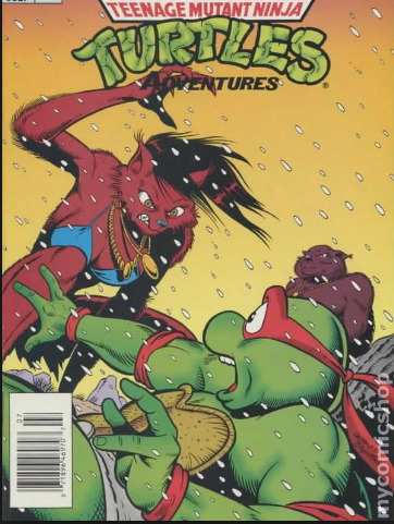
Name one food/dish you wish you could prepare perfectly. SUKIYAKI. I never get it right. It’s OK but not as good as my friend’s version in Osaka, even when I follow her recipe.
What is a perfect outdoors temperature for you? Chilly, no matter what time of the year it is. 10C is chilly during summer. 0C is chilly in fall and spring. -10C is chilly in winter.
Do you feel like your horoscope is a good fit for you? Astrological fact is that your sun or year sign is only a small fragment of your whole personality and astrological chart. So, while I’m Sun Aries, Aries does not fit me 100% because other placements in the chart defy and change it. I’m not aggressive flirt or super sporty, which are common traits for Aries, but I’m independent and resist the idea “Things must be done this way because they have always been done this way”-attitude. In Chinese zodiac I’m Water Pig, but I just got my hands on my full BaZi report. Turns out my Day Animal is Metal Dog and my Self’s element in rigid and masculine Yang Metal. Pig is social and loves food and good gatherings and is very naive, but my Yang Metal and Metal Dog are the reasons why those Pig traits don’t fit me. Yang Metal is rugged, masculine, hard, sturdy, and if handled well, turns into a beautiful and lethal sword. Dog is loyal for its pack only, being suspicious of others, and prefers his own territory. He does not socialize much with others and treats unknown with indifference and respect at the best ;’D
You can create a new “— Awareness Day”; what will you choose to be the topic of it? Childfree by Choice. I don’t think we have any Awareness Day for this? In Finland we do have Day for Childless People close to Mother’s Day, but I feel it is mainly meant for those who have been unable to have children and mourn their loss. Many of us have been born like this and thus relate to sexual minorities. Many of us say that becoming a parent feels as illogical and unnatural as waking up tomorrow with a different sexual orientation or a gender identity.
Which was more fun to you as a child, Christmas or your birthday? Why? CHRISTMAS! It was the only time of the year when there was no lack. We had plenty of food and chocolate and fruits. Candles and always presents, too. It was, for me at least, the moment of the year when everything was fine and calm and alright. Not to mention that I got to rest from school, as an introvert elementary high (7th-9th grade) were hell. I have no idea how I survived those 3 years without breaking completely apart with no return to better health...
You learn to talk to animals, but only to one species. What species will you choose? Tough one! Birds as a whole species would be interesting, but if it can be just a specific single species, then probably tigers.
What is your favorite shirt like? Nowadays I mainly use dresses and tunics tbh. I have one shirt which says “With My Witches”, which is a nice slogan :D I do have a leopard pattern hoodie, which is very old and very worn and it’s breaking apart, but it is so comfortable and feels good on.
You can ask one question from the universe and get an absolute thruth about it as an answer; what will you ask? Very tough one. I already speak with the Universe and do get answers, but some things are kept hidden. Perhaps I’d like to know more specific advice on how to reach my goals; what tangible actions I should take, when and to what direction?
9 notes
·
View notes
Text
Going to post some of my art later, but wanted to talk about my relationship w/ art bc I think it’s frustratingly fascinating and explains why I’m so inconsistent.
This isn’t really meant for anyone in particular/ anybody at all, nor is it fandom related so no tags.
I’m not a very visual person— if someone told me to imagine an Apple, I’d be able to, but it would be blurry and the color would be dull. If I wanted to include multiple colors, or just bright colors, I wouldn’t be able to maintain it visually in my head. Same thing with more detailed images— everything is murky, and I have to “zoom in” if I want to imagine the details of something.
What’s infuriating about this, though, is how my ability to visualize something varies day to day. On good days I can retain pictures I’ve seen better/longer, and I can create pictures that are more detailed and colorful in my head. On bad days, I can hardly visualize anything. If I do, it doesn’t last for long.
Having these uncontrollable moments where my brain is functioning at a different level is infuriating. It makes me feel dumb, lesser. And for the past two years there has been a significant decrease in my “good days” (could be bc of the pandemic and how it affected me mentally, burnout from school, physical health stuff— so many possible factors) so there has also been a decrease in how much I draw.
I don’t draw to be creative. (If I did, I would have drawn even less bc of how hard it is for me to imagine things) I draw because I like how it feels. Being able to recreate something through my brain with all the details, the sharp lines, the different textures— it’s euphoric. I hardly ever feel as in tune with myself and the world as I do when drawing. But it’s been so difficult to get to that point, especially this past year. The last time I really made something was sometime during November 2021.
I’m trying to get back into art, but it’s hard. It’s even more discouraging when I can see the difference in my art from good and bad days. (Visually there is a difference, but there’s also the reminder of how I felt when I was drawing each piece)
These two sketches were from a good day, each one probably took around 25 minutes
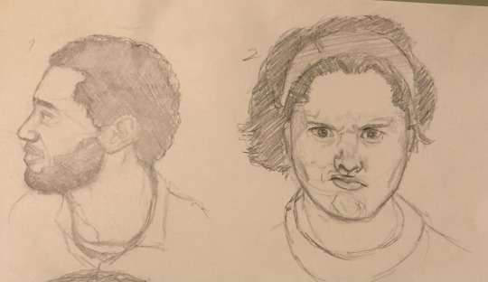
This one took me at least an hour (probably closer to 2, iirc)
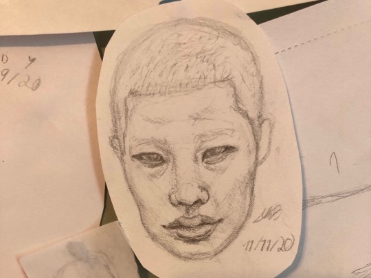
I can say both drawings look good, but they’re different, y’know? I feel like I shouldn’t have struggled so much when drawing the 2nd image— the lines aren’t as sharp because I had to keep erasing and redrawing to get it to look right.
I’m still trying to get out of the extreme “I should be better” mindset, but it’ll take a while. I started a new drawing today and am hoping that I’ll continue to draw more. :)
For anyone that read through this, I hope it was interesting lol. I’ll be posting my art from the post few years after this.
0 notes
Photo
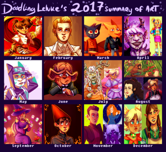
a bit later I usually am with these, but here’s what I’ve been up to in 2017. While I feel like my improvement isn’t as obvious as ith as been in previous years, I still feel like this was a really good art year for me. I actually did a lot of pieces that I really liked and actually still like months later! that is a completely new sensation for me! I feel like I’m really getting to where I want to be with my art, so hopefully this will continue in 2018.
for the first time I feel like commenting on my choices for this thing, mostly cause I just want to but also in case someone wants to know how I feel about my own art. but because theres a lot of drawings here that’ll continue under the cut
wow I use red and pink/purple hues way more than I thought. anyways.
january - this year I wanted to get better at doing at least somewhat interesting backgrounds (even if it just means a simple colour) and experimenting more with different textures and styles, and I still think this tenten was a good start. I had been wanting to draw something like this with her for ages and I’m glad I finally was able to pull it off.
february - february didn’t really have any drawings that stood out to me, but this month I started drawing a lot more “casual” trek stuff, as in stuff that doesn’t need to have a punchline. I see a lot of problems with it now, but I really liked this seven when I first drew it.
march - again, not a month where I found anything particularly good, but it was the month when I got into night in the woods (still a big fan of it) and this was honestly the best of the nitw art I did.
april - I am pretty sure the demon kankuro was a redraw of an older, shittier demon kankuro I can’t be bothered to find. Its a bit messy and his facial features are off, but I still think theres some nice details and colours. At this point I had also started to use a bit of after effects (the blur around the edges). the 80s ino is part of a konoha girls in vintage clothes thing that admittedly isn’t all that good looking, but it was a lot of fun and probably my favourite outfit drawing.
may - I spent most of this month doing art memes inbetween exams and dying, but this random kankuro somehow found its way in. yeah its not spectacular or anything but it kinda happened on a whim and its not a style of colouring I use very often. I don’t remember what brush I used but I love how it looks. pardon my french but I’m pleased with how this turned out.
june - I moved this month so I’m surprised I had time to draw at all. this sad nog represents my inner turmoil and stress at the time. probably. anyways, I feel like this was the first time I was able to cartoonify a ferengi somewhat successfully. I also finally started toning down my exessive highlighting.
july - I spent most of july stuck in the mountains with no internet, yet somehow I still managed to draw a bunch of shit I still really like. The magical girl temari was the first time I tried to do a combination of solid and blended shading. I’ve had issues with my shading for a long time and I think this was a step in the right direction. It was mainly inspired by how much I liked the solid shading of the other one, which is also the only good drawing I’ve ever done of that oc.
august - what the fuck how did I draw so many things I like in august. For the deanna I just suddenly got the idea to try something art nouveau, and while its not perfect I’m still happy with the result. The hair took forever but I’m still in love with it, and I’ve been incorporating some of those elements into my art ever since. The temari REALLY benefited from solid shading instead of me drowning it in exessive layers of purple like I usually do when I shade. idk what to say, I love it and I genuinely think its one of the coolest things I’ve ever drawn. for the top one I wanted to do something original and different from my usual stuff. The background is a bit messy but I still like the overall result and it has inspired me to draw more casual stuff that doesn’t necessarily need to be posted here.
september - no contest here, the konoha witch series took a lot of time, but I’m still happy with the result.Well for some of them at least. Ino is hands down my favourite and I think its obvious that shes the one I put the most thought and effort into (even though it started with a random sketch of tenten). Apparently I have some kind of bias towards pink and purple, which might explain why I think Ino just ended up with the nicest looking colours out of all the girls.
october - I didn’t have time to do a big halloween piece this year, but this wirt was still pretty halloween-y. the colours turned out better than I expected, especially the shading on his face. The background doesn’t really make sense, but I think it looks nice so ya know, whatever. This was also the first time I watched over the garden wall so this also has some sentimental value I guess.
november - Huevember month! which meant a lot to choose from! the kira I did on the last day of november is honestly my favourite out of all the huevember drawings I did. I don’t do a lot of drawings with the light source in the back, but I think it really worked here. idk I just think the colours and the style look really neat. It feels weird being so positive about my art hah but I don’t have anything I dislike about this one. I do have a few problems with the temari, but I just really like the colours, and I like that I did something interesting with the colours for once in my life. The tilly is in all honesty not a fave of mine, I actually kind of dislike it BUT it did get featured on after trek so I feel like it was a significant part of my ~art year~
december - I’ve had a lot on my mind this month, so sadly I’ve been really inactive here. The elf temari isn’t really all that special, but then again I don’t think its directly bad and I think the colours turned out better than what they usually do when I try shading my lineless art. The other one is a redraw of a drawing I did back in may, and while I (as always) have some problems with it I do think its a big improvement over the old one (which is so ugly that I was genuinely surprised to find that it was drawn...this year).
thank you if you bothered to read all of this! I know this was completely pointless but at the same time I’ve found that artists often hav completely different opinions on their art than others do so there might possibly be something a little bit interesting here. just a tiny bit.
#listen its late as hell im the only one still up and i felt like blathering#summary of art 2017#something happened over summer idk what but from july and onwards ive started to really like my art
17 notes
·
View notes
Text
Headbow Assembly Instructions:
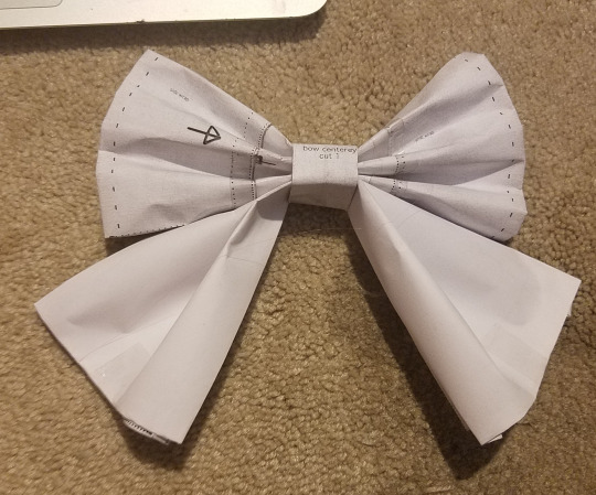
Revised headbow pattern here:


Terminology: Pattern=the pattern pieces that you cut out and sew. Print=the design you will print on the fabric.
All of these are transparent .png’s, so you should be able to open them in photoshop or gimp and plop them on a print or texture you like, and then print out the pattern. The guideline of where to place the print within the individual pieces has been removed so that you don’t have to worry about hiding the dotted lines while you sew. If you need to, reference the first iteration of the pattern to see roughly where they should go. However, keep in mind that this usually looks better when every piece has all of the print in it.
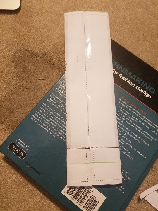
Because I wanted to save you a page of expensive printable fabric, I couldn’t get all the pattern pieces going to same direction, so you will need to rotate your print. Tutorial on that will be coming soon. For now, if you want to add your print onto the bow, start by printing out and assembling a paper one like I’m going to do here. Then, take a marker or something visible and draw an upward arrow on all the pieces. Take apart your paper bow and make sure that your pattern’s facing the direction of the arrow when you put the pieces into photoshop. If that paragraph made no sense, don’t worry. I’m only a day or two away from the printing your own print tutorial. (I’m pretty much limited to computer-sewing for the next two weeks and I’m going stir crazy)
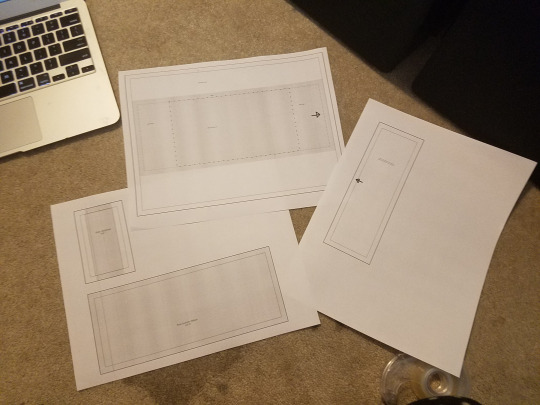
Since I can’t sew, I’m going to assemble this bow with paper and tape, to show the assembly steps.

This menu changes depending on what printer you’re using. It might look different, but it should have these settings somewhere in a menu that looks sort of like this.
When you tell it to print in 300dpi, the pictures will automatically want to print at 8.5x11, which is the size of the USA standard printer paper. Sorry to A4 paper users; I’ll redraw this for your printers sometime.
“ignore page margins” tells your printer to print as far to the edge as it can, which makes sure the outer boundary edge isn’t cut off. It also tells your printer, “really, please stop trying to make this picture fit into an 8x10 space.” which they sometimes need to hear.
Printing this is probably the most difficult step in the whole thing.
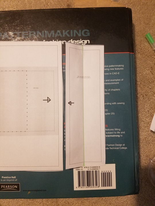
Put the sides with the arrows together and sew with a 1/4″ seam allowance. Note that on pattern version 1, the arrows do not match up. This has been corrected on pattern version 2. There’s a chance that the top and bottom of the pieces ALSO don’t match up (because I drafted this at night, with my non-dominant hand, sitting on my bed and trying to fall asleep, so there’s some errors floating around in there). If you can’t get this piece to match up, fold both in half crosswise and mark where the centers are, then match the centers to each other.
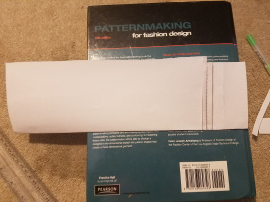
Fold in half and sew the long side together.
Turn it to front and adjust it so the seam is along the middle of the back.
Match the short ends, right sides together, and sew along the short edge. Turn it to the front and center the seam along the back.
This is just the same thing you did in the last step, but you’re doing it crosswise now.
(If you’d rather, you can tuck one short side seam allowance into the end, and insert the other end, making a loop. Then, sew it up by hand. It’s a little bit neater this way)
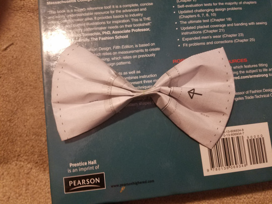
Fan-fold the center of then bow. Pin it in place and sew it aside.
Note: it looks best when the edge folds of the bow point away from you. Here you see the back of the bow, with the top and bottom edges pointing away from the viewer. I had to refold my bow before I did my final assembly.
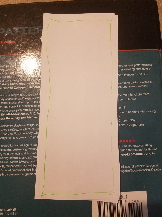
The bottom ribbon part of the bow is pretty simple. Stack the right sides together, and sew around all the edges, leaving a hole to turn out (green line in this picture). Turn it to the front and press. Fan fold it like you did the top bow.
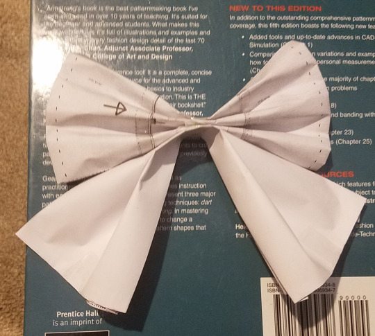
Stack it onto your top part of the bow and pin. Set it aside.
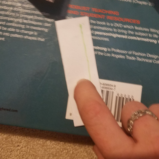
(Blurry picture count +1`)
Fold your center piece in half lengthwise, right sides together. Sew along the long side and turn to front. Center the seam in the back and press it so it looks neat.
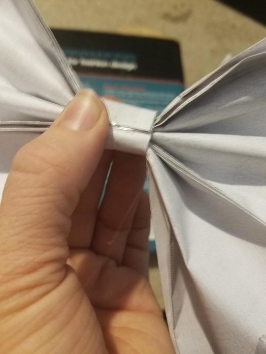
(Blurry picture count +2!)
Tuck the seam allowance of one end into itself. Wrap the center piece around the bow, and tuck the raw end into the end with the seam allowance tucked in. Leaving room for a headband to slide into the center loop, hand sew the center loop closed.
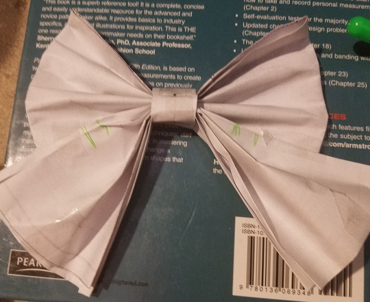
If your bow is refusing to sit up and be pretty, tack the top part of the bow to the bottom part using a tack somewhere in the indicated green area. Exactly where is up to where it looks good on your fabric.
Make sure the tack only goes through the back part of the bow, and is invisible from the front.
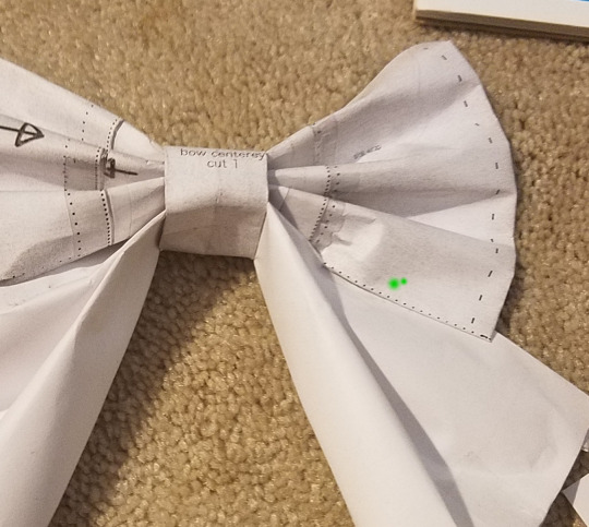
When you tack the two pieces together, don’t just tack the edges. Overlap the two pieces and place the tack roughly where the green dot is. This makes the bow stand up pretty and look like a bow, and it makes the layers stay flat, instead of collapsing into fan folds.
I like to do the tacking stitch where there’s about a 3/16ths--1/4th inch of slack in the tack, which lets the pieces move around naturally when you move your head.
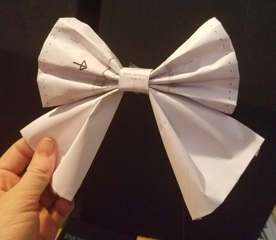
For comparison, here’s the bow before I tacked (well, taped) it in place. Not a wrong shape, just different. You’re the designer and the master of your own destiny and you get to decide what you want your bow to be.
Now, just stick it on a headband and put it on your head!
.
Hope that clears up my incredibly vague instructions that I posted the other night!
#long post#20dollarlolita#lolita fashion#lolita#lolita headbow#lolita sewing#free pattern#free lolita pattern#free sewing pattern#head eating bow#sweet lolita#sewing lolita#diy#diy fashion#diy lolita#printable sewing pattern#20dollarlolita quality posts
158 notes
·
View notes
Text
Buncha replies...
Because I’ve been neglectful. For @aquilasims, @littleblondesim, @celebkiriedhel, @wesleesims, @kayleigh-83, @olivesplum06, @holleyberry, @twofingerswhiskey, @penig, @taylors-simblr, and @fuzzyspork...
aquilasims replied to your photoset “Yup, subway tile…or some of the colors could also pass for brick. :)...”
darn. i would love to use this in my game but i have a mac :(
Yeah, sorry about that. :( I was going to make a Mac-friendly version, too, but when I sized down the image to accommodate the stretching that happens when a 256x512 texture is used, it kinda messed up the tiling between the 256x256 “blocks” that I initially drew ( so that I could make floors, too, eventually). The tiling between the “blocks” was skewed by like half a pixel (which was really noticeable because the “grout” between the tiles is only two pixels wide) and I didn’t feel like redrawing the whole thing. But now that I think about it, it might look OK if the 256x768 textures in the wall files were sized down to 256x512 which would “flatten” the individual tiles somewhat. Then perhaps the stretching that the game does would re-stretch them to about the right dimensions and not screw up the tiling. I’ll have to experiment a bit, see how it looks...
littleblondesim replied to your photo “And Simon became a Real Grown-up™. He let his hair down and sprouted a...”
Time to be a big boy and get a big double bed!
Well, unfortunately for him the firehouse he lives in now only has single beds, too. :) But it does have couches so, since he lives there alone at the moment, he could bring home some “company”... Or, knowing this neighborhood, company will just barge right in. :) I still don’t know what’s up with that...
celebkiriedhel replied to your photoset “Matching recolors of the cheap counters, stove, and refrigerator, in...”
I can do that - do you want a cabinet with or without doors?
With doors, I think. But then again, without might be good, too; I could see it as a good place to store “cookbooks” and those wouldn’t necessarily have to be behind doors. So, if you’re feeling ambitious, both? :) Or just with doors. Whatever you feel like, really. :) And thank you! You’re awesome. :)
wesleesims replied to your photoset “Pet stuff! Suzy grew up into a basenji. (I love basenjis. They’re one...”
very cute, but not a basenji (; i'd guess a shiba inu? they do have basenjis in the game, too. and yeah, feisty is the right word for basenjis, but despite being difficult at times, they are still one of the best dogs out there! but i may be a bit biased since we have two of them at home ;D
Yeah, you’re probably right. The head’s a bit too bulky for a basenji. I just saw small and curled tail. :) But yeah, they’re awesome dogs. I love their yodel. :) And their wrinkled foreheads. And their feistiness. And their lack of stink. I’m definitely getting at least one when some of my current pack pass away. (8 dogs is enough, when they’re all together, especially because they’re all large!)
kayleigh-83 replied to your photoset “It’s winter! Time to take care of the autumn leaves because I don’t...”
oops trigger happy on the enter key.... try that again... every time I've tried to burn the leaves my Sims have ended up setting themselves or something else on fire, so I gave up on it! LOL I do like getting witches to zap them though!
I’ve only ever had that happen once. I think the key is not to have anything around when you light up the pile. :) Kind of like how fireplaces will light stuff that’s within a tile away unless you’ve modded that out, like I have. (Maybe that prevents leaf-pile fires, too, now that I think about it; it probably uses the same coding.) But then, I think fires are kind of fun sometimes. (In the game, that is! Not in real life! *laugh* )
olivesplum06 replied to your post “I’m bummed. :(”
Have you downloaded felicity island for TS2? It's a copy of the CS island, that along with all the build, buy & CAS stuff it's pretty close to CS!
I haven’t, no. Mostly because I don’t want to play castaway scenarios in TS2. I actually prefer Castaway Stories for that. I like its “careers” and its way-more-logical routing. (Like, Sims can actually talk to each other when standing on a slope; the lack of that in TS2 drives me NUTS! And I imagine that it would be a real problem with that TS2 version of Felicity Island, since that map is ALL slopes.) And I definitely prefer the way CS handles “walkbys.” (No “greeting” needed; they just make themselves at home, gives it a genuine communal tribal feel.) And its want trees are more appropriate for castaway scenarios, of course. And I especially like its things like spearfishing and its swimmable on-lot water (without having to screw around a lot to make on-lot water swimmable, like you have to do in TS2) that also increases hygiene.
So...Yeah, I definitely wanna play it in Castaway, not TS2. The only downside is, yeah, having to play the stupid story again. But, I can do that in one session, since I just do exactly what I have to do to get to the next “chapter,” without screwing around and with playing on higher speeds whenever I can, because I don’t care about the story at all. I just want to unlock all the stuff. :)
holleyberry replied to your post “I’m bummed. :(”
Oh No! Well, at least you'll have fun setting it all back up.
Yeah. :) And I’m thinking I might see about the possibility of making a completely empty template for the freeplay island, so that there won’t be any “townie” natives or premades. Like the empty Pleasantview template you use when you don’t want the “standard” townies. My biggest disappointment with the first stab at this scenario was that, while I could use the Visitor Controller to prevent the “natives” from waltzing onto my castaway lots, I could only set it in a way that prevented ALL non-household Sims from “walking by” because Castaway doesn’t seem to internally distinguish between townies and playables. That sort of killed the “tribal” atmosphere I wanted. So, I’m thinking that if I can make it so that there are no “townie” natives and premades from the get-go, that would be better than using the Visitor Controller. So...Yeah, it was probably for the best because I was kind of thinking about starting over to address this issue anyway...
twofingerswhiskey replied to your photo “More devastation for poor Simon. At least Sharon was still hanging...”
sleep when you're dead? ;)
Something like that. :) I still haven’t quite figured out the logic behind ghosts being pissy if their bed isn’t there. I mean, why on Earth would they care??!
kayleigh-83 replied to your post “I are sad. My brother and his husband went back home to hell Indiana...”
I sometimes attempt to catch up when I've been behind and I have to say I sure wish mobile was set up like the desktop site, where it will show you on your list of followed blogs when the last time they updated was. Then you can just only click into ones that have been updated since the last time you were on! Sometimes I just wanna lay in bed or on the couch and catch up on the ipad, but it doesn't show you that info! Fix it Tumblr, fix it!
HAH! Well, you’re better off than me. The Tumblr app for Kindle (my only mobile device) hasn’t been updated in, like, four years. The dashboard on it doesn’t work anymore, and it doesn’t even have messaging. And all looking up your followers does is bring up an alphabetical list of them. The only thing I can really do in the app for Kindle is see notes and look at my own posts/queue. And I can make posts, but I don’t often do that because I hate virtual keyboards. I’m pretty sure the apps aren’t actually made by Tumblr, though, but are made by third parties. So I’m afraid that for this, it’s not Tumblr we need to be yelling at but the folks who make the apps.
But yeah, because of this I only “do Tumblr” when sitting at my desktop, which definitely cuts down on opportunity. Otherwise, I could do it when, like, sitting in waiting rooms at doctors’ offices....
kayleigh-83 replied to your photoset “Jupiter became a grown-up dog and…uh…well… I swear, my game habitually...”
Hahaha my dogs are the same, my game seems to give me a lot of sorry looking mutts. Lol
What I don’t get is that the small dogs in my game seem to be OK, but the big dogs are just...what? I mean, why would only one dog size be weird? Why not both?
taylors-simblr replied to your photoset “Because you can’t have awesome 50s kitchens like this…...”
I'm pretty sure our new kitchen has that gold lino ha ha
Heh. Well, it WAS a very popular color in the 60s/70s. “Harvest Gold” and “Avocado” were The Shit, at the time. :) Probably not so much in the late-40s-through-early-60s that I’m targeting, but...Well, not having a dark yellow would’ve thrown off my spectrum, man. ;)
penig replied to your post “I are sad. My brother and his husband went back home to hell Indiana...”
It's supposed to be fun, not an obligation. You can always use the archives to catch up on situations involving continuity, at your leisure, and if you miss stuff - so do we all.
I know, I know...I just feel bad because I like to give notes and especially replies and stuff. Tumblr is just so...non-validating, you know? Like, made for the short-attention-span generation. I suppose clicking the little heart shows “enough” appreciation, but it seems like very little, and not doing that at all just feels like shirking. But yeah, I know that’s all on me. I just wish there was more time in a day, is all. :)
taylors-simblr replied to your post “I are sad. My brother and his husband went back home to hell Indiana...”
Same with me except I need to catch up on over a years worth of stuff, tumblr just moved too quick. If you're not on it daily it's hopeless to try and see everything
Yeah, it does move fast. Made for short attention spans, like I said. :) I actually wouldn’t feel bad about it if I was gone for a long period of time, though, like “maternity leave.” I mean, no one could be expected to catch up with a year or more of posts. :) But I just tend to have a few days or a week here and there where I just don’t have the time (or, sometimes, the will) to really keep up like I’d generally like. And sometimes I just scroll through looking to see if the stories I keep up with have updated and don’t even leave any “likes” otherwise. That really makes me feel bad, but sometimes all I have time for is a quick scroll-through looking for certain user names. :( Bad iCad! No biscuit! :)
fuzzyspork replied to your photoset “Sandy made a lot of devastated noises, but… I’m kinda not buying it....”
The sims lack of a mourning period is sometimes annoying. :P Maybe she needs to fill that giant hole left behind in her heart when Goops passed and she thinks there's only one way to do that?
Maybe. Although it’s not like she really had time to fall in love with anyone else, anyway, given that she died like two days after Goopy did. :) Of course, she didn’t “know” that was going to happen. :)
But yeah, mourning in the game is weird. Especially because it’s limited to only the Sims who were in the same household as the deceased. When Goopy and Sandy croaked, the only kid left in the house was Simon. The other two kids didn’t do any mourning, of course. Toddlers get that fear of relatives dying, so they’ll sometimes take a mood hit, but only sometimes and if they, say, learn to walk, that’ll instantly get rid of that bad mood. And even Simon wouldn’t have been in his birth household if I played him how I usually do, kicking kids out when they reach “Inteen 18,” either to college or out on their own. He was only there because he was “destined” for the firefighter career, which only has an adult track, so it didn’t make much sense to kick him out until he was an actual adult rather than an Inteen one.
Anyway, yeah, this is one thing I’d change about the game, if I could. One should mourn one’s parent’s death (assuming that you have a good relationship with them), even if you no longer live with that parent. It’s just weird, otherwise.
#aquilasims#littleblondesim#celebkiriedhel#wesleesims#kayleigh-83#olivesplum06#holleyberry#twofingerswhiskey#taylors-simblr#penig#fuzzyspork#replies
10 notes
·
View notes
Link
Deep Dive is an ongoing Gamasutra series with the goal of shedding light on specific design, art, or technical features within a video game, in order to show how seemingly simple, fundamental design decisions aren't really that simple at all.
Check out earlier installments, including creating tension in Card Thief, achieving seamless branching in Watch Dogs 2’s Invasion of Privacy missions, and creating the intricate level design of Dishonored 2's Clockwork Mansion.
Hi, I’m Barney Cumming, artist and designer of Crawl. I created the art and animation for the game, and will be talking a little about the process and decision-making that went into the project. I've been working as an animator, designer and artist for video games in Australia over the last eleven years, with these past four under the banner of Powerhoof, a two-man games company started with programmer buddy David Lloyd.
I started making pixel animations on the computer at roughly eleven (around 1993), using HyperCard and a program called PC Animate Plus. In 1999 I started animating with 3D Studio MAX R3, which led me into the games industry; initially as a 3D animator, and later as a designer. In 2013, Dave and I quit our industry jobs to have a go at making something a bit more personal to our tastes, and to escape the crushing boredom of the mobile market and all those microtransactions.
Crawl is our first commercial game, a local-multiplayer dungeon crawler where all the traps and monsters can be controlled by your real-life friends. The art style is very low resolution, with screens tending around 150 pixels high (where screens on the NES for example were closer to it’s full 240 pixels high). Crawl uses off-grid, scaled and rotated sprites, (rather than adhering to classic restrictions in these areas), to give a style which freely combines elements from modern and retro sensibilities.
In developing this low-res art style for Crawl, we start with a simple list of requirements:
It must be efficient enough for our one-person art team to create and animate upwards of fifty unique monsters, as well as innumerable hero weapons, environments, props, menus etc, within a reasonable timeframe.
It has to be visually striking. Not just look good, but look good in some unique way that stands out from the way other games are looking good.
As I’ll be making all the art, the style should emphasize the things I’m good at, quick at, and experienced at, and deemphasize all my weaknesses.
It should be fun to make. If we’re going to be working our asses off on this thing, it’s best not to choose a style I already find laborious. Fortunately if we meet the other three requirements, this one tends to be a given.
Despite all my industry experience being with 3D art/animation, and not having touched pixels for a good fourteen years, after initial testing it quickly became clear that pixel art could be just the right tool to let us realize our design. If I took the resolution low enough, I could give the impression of “knight” “demon” or “spider” very quickly (compared to modeling, texturing and rigging in 3D), I would have access to all the fluidity of 2D animation (which you can’t ever get from a 3D rig), while magically being freed from how slow I usually am at drawing in 2D. I could focus on my strengths - animation and character movement - and avoid all my weaknesses.
I knew my tiny little 5 or 10 pixel high monster sprites wouldn’t be visually striking compared to all the amazing game art out there, but keeping them so low-res (so quick to draw and redraw) would allow me to really go crazy with the animation fidelity, and seeing such modern high-fidelity animation applied to such low-resolution art (which we’re used to seeing with only the most rudimentary animations) was a pretty bold look to my eye, and not one I’d seen anywhere else.
If we were trying to be visually appealing in the same way as other games, going for a well-trodden style but just trying to outdo everyone on execution alone, we’d have needed so much raw art firepower to be noticed above all the competition. So this technique of making our own little competition off to the side in which there are no other competitors, is a sneaky way of standing out without quite competing. It’s a bit like wanting to break the world high-jump record, but seeing it’s way too high, so creating your own “highest jump while also wearing a sparkly hat” category and winning that instead with a much lower jump (and a much cooler hat). So the style goal I set was to take incredibly low-resolution characters, reminiscent of the games I played as a child, but instead of recreating the way those old sprites really moved, I’d animate them to look how they did in my imagination. As a kid, those clumsy two-frame attacks were heroic lunges, and the simple run animations were athletic and full of life. I wanted to recreate the version I saw through the rose-tinted lenses of my childhood imagination.
For the smaller characters, the animation process is simple. I’d start with the key poses (frame numbers with boxes around them) which in this case is mostly one frame for each swing of the sword, with the pose being drawn in the posture the hero holds on immediately after each swing. Beyond that it’s mostly just inbetweens, apart from a few cases (frame numbers with underlines) where I’ve pulled part of the pose out a little further from the upcoming key, to give a stronger anticipation.
You’ll notice practically none of my inbetweens are actually half way between the two poses. If things are moving very smoothly and robotically you’ll get half-way inbetweens, but in the case of combat (and most other animations in an action game) the movements are very staccato, so half-way inbetweens won’t suit. To get the desired movement, most of my inbetweens are actually copies of either the previous or next keyframe, with slight tweaks to indicate which direction the movement is about to go in (or which is has just come from) and some delayed and tweaked body parts to indicate where the force and weight are pushing, dragging and pulling things down. The actual “action”, the biggest movement of each strike, tends to happen between two of my frames, and I just draw a big motion-blur smear to indicate the movement of the blade over that time. This technique, which amounts to mostly just cushioning around keyframes, gives very snappy, staccato results.
For larger, more complex creatures, I’d do most of the animation work using fairly simple stick-figure type lines (which are very quick to draw and redraw) before painting over with full detail once I’m happy with the movement. Any style or process which allows you to change your mind and redraw a pose quicker, will always result in better animations as you are freed to take more risks. You can see the process is quite approachable when broken down into simple individual tasks, with the most important decision being the order in which to do it all. If you work hard on secondary movements before you’re entirely happy with the primary, you’ll end up having to redo all that work once you change the primary. Or even worse, you’ll be tempted to just accept an imperfect animation, to avoid redoing the work. Immediately after animating that bird creature, I decided I didn’t like the direction I’d taken and redid the animation from scratch. The efficiency of low-resolution allowed me this extra creativity and experimentation, by stripping much of the sunk-cost in time spent experimenting. If this animation has taken a few days rather than a few hours, I probably wouldn’t have bothered to try again.
Of course as a small team we still try to minimize the wastage and reuse anything we can. When it came to designing combat functionality for the bird creature, I had initially envisioned him having a big “squawk” as one of his attacks, where sound waves would fly out like projectiles, and make the hero dizzy on contact.
The attack wound up playing badly in-game, no matter how much I tried to make it work. Although the attack was scrapped I did quite like the squawk animation, so when I settled on a “grab and bite” move, I reused the old squawk frames for the anticipation on his grab.
The speed of drawing in that art style wasn’t only about making better animations, it was about game-design efficiency and the ability to experiment. I could have a brand new character designed, animated and fighting in game within a day, allowing even our most risky ideas to be tested. With a higher sunk-cost for each failed experiment, we’d have been both risk-averse in our initial ideas (playing it safe and designing moves similar to ones which had worked in the past), and much more prone to making do with not-quite-right gameplay after all that work had been done for the art.
For us little developers, art can be a tightrope between visual impact and cost. We were lucky enough to find a style for Crawl that we loved the look of and was also efficient to make, but with that now old-hat, it’s time to find a new twist for the next game. Maybe low-resolution but wearing sparkly shoes this time?
0 notes