#Verlage on Stage
Explore tagged Tumblr posts
Text
"Das Gedicht" – Uwe Kullnick spricht mit dem Verleger Anton G. Leitner, Jan-Eike Hornauer und Uwe-Michael Gutzschhahn über den Verlag
Jan Eike Hornauer, Uwe Michael Gutzschhahn, Uwe Kullnick, Anton G. Leitner (v.L .) “Das Gedicht” – Uwe Kullnick spricht mit dem Verleger Anton G. Leitner, Jan-Eike Hornauer und Uwe-Michael Gutzschhahn über ihren Verlag (Hördauer ca. 60 min) https://literaturradiohoerbahn.com/wp-content/uploads/2024/10/VoS-Das-Gedicht-Leitner-upload.mp3 Anton G. Leitner gründete 1992 seinen Lyrikverlag. Die…

View On WordPress
#Anton G. Leitner#DAS GEDICHT#Jan-Eike Hornauer#Kinderlyrik#Lyrik#Uwe Kullnick#Uwe-Michael Gutzschhahn#Verlag#Verlage on Stage#VoS
0 notes
Text
The insane story of how Pia was cast as Elisabeth
"Still completely overwhelmed by the offer to play this role - not just any role, but the main role in a world premiere - I began to study not only the book of the play, but also the story of Elisabeth of Austria. [...] What is the historical truth, which real figures are behind the roles in the musical? All of these questions suddenly became relevant to me, and I found all of the answers to them in Hamann's books. [...] While studying the countless photos of Elisabeth in the picture section of the book, one particular image suddenly took my breath away. When I looked at the photo of the empress's death mask, I thought I recognized the delicate facial features of my colleague Pia Douwes.
What happened next is something Pia still likes to tell as an anecdote. After a performance of Les Misérables, I showed up in a coffee house with that book in my hand, put it on the table in front of Pia, turned to the page with the picture of the death mask and said: "Pia, look, that's definitely you!" She replied, somewhat piqued: "Hello, Uwe, that's a death mask and I'm sitting here and I'm still alive. Thank God!" Despite my uncharming comparison, she couldn't deny a certain resemblance. Apparently, that evening I spent a long time chatting to her about all the details I already knew - the musical and the historical details about the empress. A plan had been maturing in my mind for a long time: I wanted to stand on stage alongside Pia in the role of the empress, or at least I could imagine it very well. In Vienna, the castings for the title role had long been underway and were almost complete, but Pia nevertheless began to put out feelers through contacts in the scene. Names like Dagmar Hellberg and Daniela Ziegler had already been mentioned, and the division of the role within the play between a young and an old empress was also being considered. [...]
As chance or fate would have it, director Kupfer had to go to the Amsterdam Opera for work, and so he and his production team, including Viktor Gernot, who had flown in especially for the role of the already-cast Emperor Franz Joseph, took the opportunity to conduct a casting for the title role on site. After Pia had sung "Wie du" and "Ich gehör nur mir", everything was clear for Sylvester Levay, who was also present at this important decision. The subsequent duet with Gernot was just a formality."
From Uwe Kröger's autobiography "Ich bin, was ich bin. Mein Leben". Amalthea Verlag 2014.
#theatre#musicals#elisabeth das musical#screaming i cant believe this is how it happened#fate etc ajjsjsjd#actors#uwe kröger#pia douwes
81 notes
·
View notes
Text
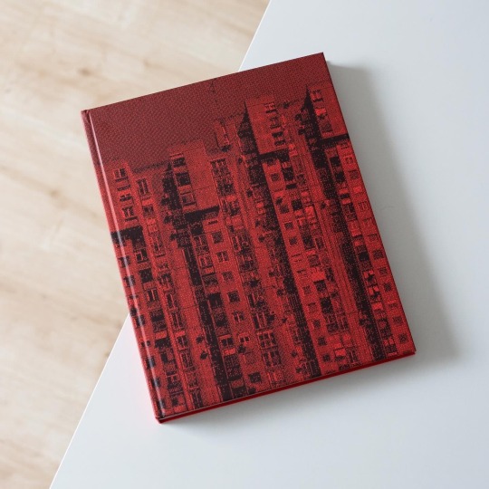

On the left bank of the Sava River and opposite the old town lies Novi Beograd, New Belgrade, the Serbian capital’s fastest growing municipality. It is a planned city and today’s inhabitants and businesses benefit from its rather modern infrastructure, a distinctive advantage over the old town. Novi Beograd’s construction began in 1948 but especially during 1960s and 1970s the municipality grew and numerous housing blocks and public buildings were erected. Because of these Novi Beograd in recent years has become something of a brutalist icon that is roaming social media platforms but is simultaneously subject to great change due to permanent new construction.
But while most photographers focus on the undeniable appeal of the architecture, Norwegian Marius Svaleng Andresen takes a closer look at the intersection of architecture and everyday life and the architecture in relation to the individual. In his book „Life in the New“, published last years by Kerber Verlag, Andresen explores the actual life going on inside, outside and in between the architecture: in view of the little stories of life the monumental architecture recedes into the background and becomes the stage of day-to-day life. People peeking out from behind the curtain, old men playing cards, a woman cleaning her windows and children running around, all of them populate Andresen’s photographs and bring up the question of what it is actually like to live in Novi Beograd. Apparently the photographer, who is also a journalist, asked himself this question too and met with 12 individuals who tell their own story of living in New Belgrade: there is Mirjana, the widow of a former military airport commander, who has been living in Novi Beograd for more than 50 years and at first didn’t really like it. And there is also Filip, the dog loving graphic designer and rapper, who philosophizes about the stepped volumes of the blocks and how they symbolize his daily struggle to reach the top.
In tandem with his sensible photographs Andersen provides an unusual, more humane portrait of Novi Beograd that is both visually stunning and emotionally touching. A warmly recommended read!
#marius svaleng andresen#architecture#serbia#novi beograd#belgrade#architectural photography#photo book#kerber verlag#book
41 notes
·
View notes
Text


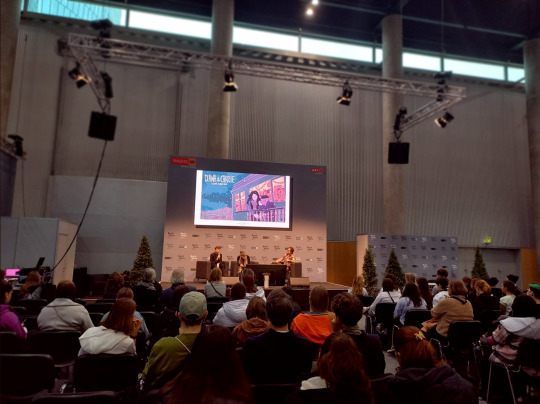
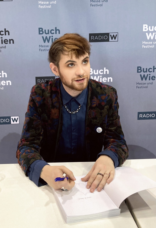


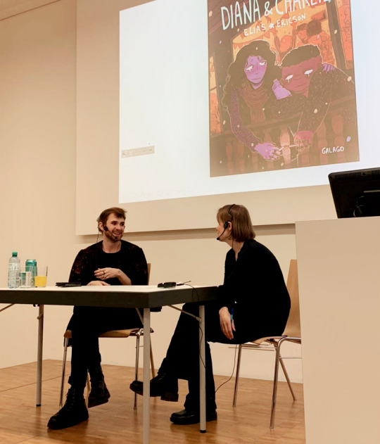
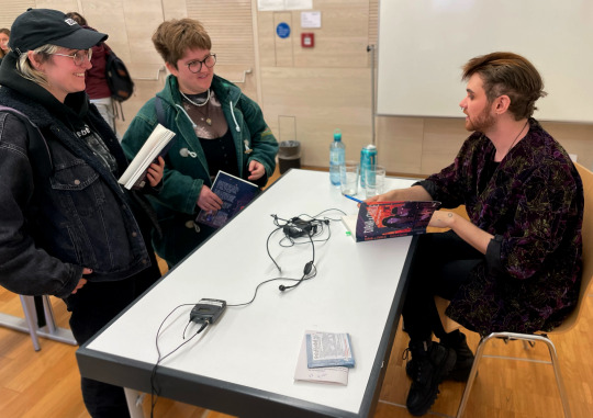
My book Diana & Charlie just got published in German by Luftschach verlag, and I got invited to visit Vienna!
I went to the book fair Buch Wien, got interviewed on stage and had a book signing afterwards. I also had a book talk at Universität Wien for students who had been reading my book for their Swedish studies. I got interviewed for Austrian radio. (You can read the article here!) Fianlly, I was invited to visit the Swedish embassy - a both very nice and surreal experience!
This visit was really fantastic... I've always considered my work pretty niche, so getting this kind of recognition is a bit hard for me to grasp, haha. Regardless, I'm thankful, of course. I hope I get to visit Vienna again sometime.
Thank you to everyone involved in making this visit possible, and thank you to the readers that came up to me! You were so sweet!! <3
#vienna#buch wien#book fair#austria#wien#universität wien#diana & charlie#diana und charlie#german#luftschacht#luftschacht verlag#sweden#swedish#sverige#svenska#book release
65 notes
·
View notes
Video
Jarmila Novotna by Truus, Bob & Jan too! Via Flickr: German postcard by Ross Verlag, no. 6837/1, 1931-1932. Photo: Walter Firner, Berlin. Czech soprano Jarmila Novotná (1907-1994) was one of the world-renowned opera luminaries of the 20th Century. Her film appearances were unfortunately few and far between. Jarmila Novotná was born in in Prague, Czech Republic in 1907. She studied singing with Emmy Destinn. In 1925, the 17-years-old Novotná made her operatic debut at the Prague Opera House as Marenka in Bedřich Smetana's Prodaná nevěsta (The Bartered Bride). Six days later, the lyric soprano sang there as Violetta in Giuseppe Verdi's La traviata. The following year, she made her film debut in the silent film Vyznavaci slunce/The Sun Disciples (Václav Binovec, 1926), starring Luigi Serventi. In 1928 she starred in Verona as Gilda opposite Giacomo Lauri-Volpi in Verdi's Rigoletto and at the Teatro San Carlo in Naples as Adina opposite Tito Schipa in Gaetano Donizetti's L'elisir d'amore. In 1929 she joined the Kroll Opera in Berlin, where she sang Violetta as well as the title roles of Giacomo Puccini's Manon Lescaut and Madama Butterfly. When talking pictures arrived, she headlined in German films like Brand in Der Oper/Fire in the Opera House (Carl Froelich, 1930), with Gustaf Gründgens, Der Bettelstudent/The Beggar Student (Victor Janson, 1931), and the film version of The Bartered Bride, Die Verkaufte Braut (Max Ophüls, 1932). Hal Erickson at AllMovie on Die Verkaufte Braut (1930): “The original libretto, involving the comic misadventures of two mismatched couples, is given a respectable amount of attention, but the film's biggest selling card is the photographic dexterity of Max Ophuls, who never met a camera crane he didn't like. Since filmed opera was seldom big box-office in 1932, Ophuls concentrates on the farcical elements of the story; especially worth noting are comic contributions by Paul Kemp and Otto Wernicke, who seldom let their German film fans down. Curiously, star Jarmila Novotna, whose ‘live’ appearances in The Bartered Bride were much prized by contemporary critics, doesn't come off all that well in this film version.” Other films followed such as Nacht Der Grossen Liebe/Night of the Great Love (Geza von Bolvary, 1933) with Gustav Fröhlich. In January 1933 she created the female lead in Jaromir Weinberger's new operetta Frühlingsstürme (Spring Storms), opposite Richard Tauber at the Theater im Admiralspalast, Berlin. This was the last new operetta produced in the Weimar Republic, and she and Tauber were both soon forced to leave Germany by the new Nazi regime. Jarmila Novotnà returned to Czechoslovakia to star in the film Skrivanci pisen/Lark's Songs (Svatopluk Innemann, 1933). In 1934, she left for Vienna, where she created the title role in Franz Lehár's operetta Giuditta opposite Richard Tauber. Her immense success in that role led to a contract with the Vienna State Opera, where she was named Kammersängerin. She also appeared there with Tauber in The Bartered Bride and Madama Butterfly. In the cinema, she starred in the Austrian operetta film Frasquita (Karel Lamac, 1934) with Heinz Ruhmann, the Austrian romantic thriller Der Kosak und die Nachtigall/The Cossack and the Nightingale (Phil Jutzi, 1935) with Iván Petrovich, and in the French-British operetta film La dernière valse/The Last Waltz (Leo Mittler, 1935), which was made in two language versions. She then left the film industry to concentrate on her stage work with the Viennese State Opera. After the Anschluss of Austria, she had to leave Vienna. In January 1940 she made her debut with the Metropolitan Opera in New York, as Mimí in Puccini's La bohème. From 1940 to 1956, Novotná performed regularly at the Met. In 1946 she returned before the cameras in a straight dramatic role in the Hollywood production The Search (Fred Zinnemann, 1946), starring Montgomery Clift. The Search is a semi-documentary film on the plight of WWII orphans. Novotná played a Czech mother who has lost contact with her young son when they were in Auschwitz and she now travels from one refugee camp to another in search of him. Novotna's then played turn of the century diva Maria Selka in the biopic The Great Caruso (Richard Thorpe, 1951), featuring Mario Lanza. The film traces legendary tenor Enrico Caruso's ascension from adolescent choir singer in Naples to the uppermost ranks of the opera world. Mario Lanza's tenor voice made this film one of the top box-office draws of 1951, and this helped to popularize opera among the general public. On TV she appeared in The Great Waltz (Max Liebman, 1955), which charts the life and times of composer Johann Strauss, Jr. She also played Hans’ mother in the TV musical Hans Brinker, or the Silver Skates (Sidney Lumet, 1958), starring Tab Hunter. Her last screen appearance was as an interviewee in the documentary Toscanini: The Maestro (Peter Rosen, 1985). At 85, Jarmila Novotná passed away in 1994 in New York. Sources: Hal Erickson (AllMovie), Wikipedia, and IMDb.
#Jarmila Novotna#Jarmila#Novotna#Actress#Actrice#European#Film Star#Cinema#Cine#Kino#Film#Picture#Screen#Movie#Movies#Filmster#Star#Vintage#Postcard#Carte#Postale#Cartolina#Tarjet#Postal#Postkarte#Postkaart#Briefkarte#Briefkaart#Ansichtskarte#Ansichtkaart
6 notes
·
View notes
Text


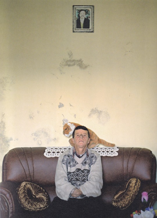


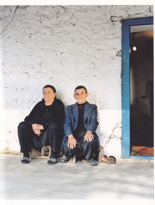

Sworn Virgins
Pepa Hristova
Text : Sophia Greiff, Danail Yankov
Kehrer Verlag, Heidelberg 2013, 228 pages, 71 col. 63 b&w ill., 22x26,5cm, ISBN 978-3-86828-347-1
euro 92,00
email if you want to buy [email protected]
Exhibition Stadtmuseum München, FotoDoks 2013 15.10.2013 – 19.10.2013
In her debut 'Sworm Virgins', Pepa Hristova deals with the last man-women of Europe. These so-called sworm virgins are respected, acquire the status of men and they fill their role so perfectly that they are hardly recognizable as women outside the family
"Pepa Hristova, born 25 April 1977, is a Bulgarian photographer, based in Hamburg and Berlin. She has a degree in communication design with a specialization in photography from the Hamburg University of Applied Sciences and became a member of the Ostkreuz photographic agency in Berlin in 2006. Hristova was born in Sevlievo, Bulgaria. Hristova's photographic work is driven by her fascination with the fractured beauty of the east and her interest in social phenomena and archaic traditions, leading to an examination of the unknown, changing side of Europe. She focuses on the alienation of Muslims in orthodox Bulgaria, documents a centuries-old custom in North Albania with ‘Sworn Virgins’ or looks behind the closed doors of Bulgarian children's homes. Hristova approaches her subjects with intuition and emotion and experiments with different genres and the ambiguity of photographic imagery. Snapshots combine with staged images and precise observations of situations, opening up an associative space, in which there is still scope for individual interpretations and points of contact." 13/01/24
10 notes
·
View notes
Text
Anita Dorris

German postcard by Ross Verlag, no. 4194/1, 1929-1930. Photo: Atelier Ernst Sandau, Berlin.
Beautiful German leading lady Anita Dorris (1903 - 1993) started as a stage actress in 1921, after which some 15 silent films followed. Dorris was beloved in the late 1920s and smoothly made the passage to sound. In 1930, however, she married Austrian film director E. W. Emo and withdrew from the cinema. Her daughter, Maria Emo, would also become a well-known stage and film actress.
6 notes
·
View notes
Text
Anita Dorris, 1929

German postcard by Ross Verlag, no. 4821/1, 1929-1930. Photo: Mario von Bucovich (Atelier K. Schenker).
Beautiful German leading lady Anita Dorris (1903-1993) started as a stage actress in 1921, after which some 15 silent films followed. Dorris was beloved in the late 1920s and smoothly made the passage to sound. In 1930, however, she married film director E. W. Emo and withdrew from the cinema. Her daughter, Maria Emo, would also become a well-known stage and film actress.
2 notes
·
View notes
Text
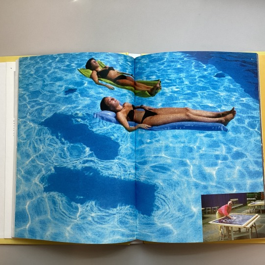
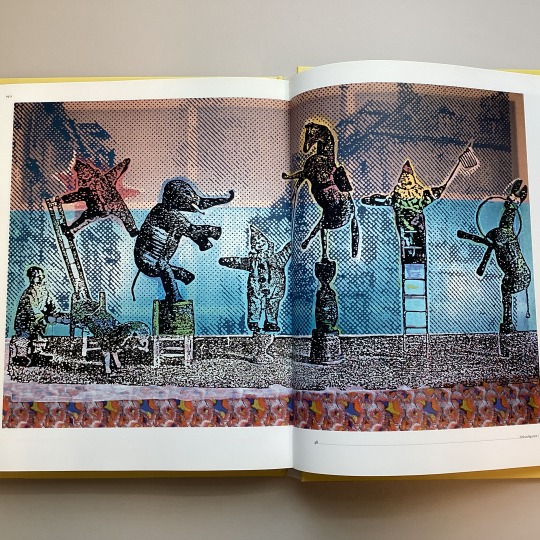

Summer fun is over, though here in much of the United States we're experiencing the heatwaves, so it's a perfect day for the beach day! But technically it is Fall and it's the time for “works & days.” But don’t be sad! Take Sigmar Polke (1941 –2010) as an inspiration to get through this semester with a sense of humor, curiosity, and imagination with floods of color and experiments, experiments, and more experiments. Good luck this semester, and remember, we’re always here for your reference and research questions!
Image 1: Photo of two women floating in a blue pool with a small insert of the artist at work outdoor on the lower right corner. P. 82-83
Image 2: Zirkusfiguren/Circus Figures, 2005
Image 3: Book cover, “Bühnentrick. Die zersägte Frau/Stage Trick, The Sawed Woman, 2005
Sigmar Polke : works & days Curiger, Bice, 1948- Cologne : DuMont Verlag ; Zurich : Kunsthaus Zürich, c2005. English Catalog of exhibition held Apr. 8-June 19, 2005, Kunsthaus Zürich, Zurich, Switzerland. c2005 HOLLIS number: 990099260280203941
#SigmarPolke#GermanArtist#Artist#HarvardFineArtsLibrary#Fineartslibrary#Harvard#HarvardLibrary#heat waves#Fall
6 notes
·
View notes
Text
CRITICAL ANALYSIS
Nitsche, M. 2024. Video Games as Material Performances. In: Dreifuss, R., Hagemann, S. and Pluta, I. ed. Live Performance and Video Games: Inspirations, Appropriations and Mutual Transfers. Bielefeld: transcript Verlag, pp. 255-268. https://doi.org/10.1515/9783839471739-018 Michael Nitsche, the author of the book Video Game as Material Performance, is a professor at the School of Literature, Media, and Communication (LMC) at the Georgia Institute of Technology. He teaches courses on digital media for master’s and PhD programs. His previous books, including Video Game Spaces and other works on digital media, establish him as an active figure in this field. In Video Game as Material Performance, he adopts a philosophical perspective on the relationship between humans and objects.
The author’s writing style in the book begins by introducing topics through the theories of philosophers and theorists. He then incorporates his own insights, exploring the connection between these theories and the modern digital world. While the text is rooted in philosophy and abstract ideas, it effectively unpacks complex philosophical concepts through detailed explanations, making them more accessible to readers.
After examining traditional Eastern puppetry, the book suggests that in the modern era, puppetry must transcend the idea of simply being a puppet. Instead, it should evolve into “performing objects”—entities imbued with spirit, identity, and meaning that can be recreated in the digital realm to function like puppets controlled by a puppeteer.
In the past, particularly in traditional Eastern puppetry, puppets required a puppeteer to bring them to life during live performances. In today’s modern world, digital puppets need an independent and continuous force to keep them “alive.” This force manifests through narrative and interaction with humans, allowing these digital creations to actively engage with audiences.
The author also delves into the meaning of intra-action, explaining that in the context of puppets and objects, their existence and vitality depend on mutual interactivity. Their “life” is inherently tied to their interaction with humans. The author provides an example from object theatre in the past, referring to objects that have been preserved from earlier times and are kept in museums or homes. These objects act as “memory containers,” meaning they hold the memories of those who once owned them.
The author’s aim in this text is to adopt a philosophical and abstract perspective on the existence of objects and puppets. By redefining the concepts of puppetry and puppeteering, the text offers thought-provoking insights into how new puppets, imaginary characters, designed objects, and spaces created for video games and cinema can be redefined and imbued with identity and meaning.
One of the impacts this text had on me is that having a deeper perspective on details, studying the history of objects and puppets, and understanding their hidden stories make these items more tangible and relatable for humans. By knowing their identity and past, people develop a stronger sense of connection and interaction with them.
For a game designer, whose profession involves designing objects and puppets (characters), these considerations should be reflected during the design process. Questions such as: Who does this object belong to? What story does it hold? Why should this object exist in this specific place?help the designer create objects with more depth and interaction.��This approach not only leads to designs with greater detail and unique perspectives but also influences other aspects of game development, enriching the overall process in later stages of game creation.
Another impact this text had on me is the discussion of the interaction between puppets and humans. In the past, the puppeteer gave life and identity to the puppet through constant force. However, today’s puppets, or video game characters, don’t experience this interaction in the same way. Neither the puppeteer guides them, nor is there truly someone playing the game in the conventional sense. This interaction is a combination of character design, storytelling, and their animations, which imbue the puppet with a sense of liveliness and identity. Characters in games and animations remain memorable and “alive” because their creators, or “puppeteers,” pay close attention to the details and narratives surrounding them. Other positive aspects of this text include its interdisciplinary and comprehensive nature, which, by addressing history, philosophy, street theater, and video games, encourages the audience to engage their imagination and pause to gain a complete understanding of the ideas presented. It allows readers to draw their own conclusions through imagination and reflection. When discussing the philosophy of ancient objects, it subconsciously prompts the audience to analyze and compare them with the modern world and emerging objects.
Additionally, linking the discussion to game design and innovative ideas such as the concept of intra-action enables game designers to develop new definitions regarding objects and their interaction with users and humans. Furthermore, the focus on Eastern culture and the study of puppetry and Eastern objects provides a global perspective on the topic, considering that the author of this book comes from the West.
In my opinion, some points that could have improved this book include the overly complex and philosophical language. The subject of the book was already complex and philosophical, so it could have been made more accessible to a general audience and students by providing more explanations of specialized and unclear terms. Another aspect that could have aided the understanding of the text would be engaging with a critique of the views of philosophers and theorists. The author did not challenge these views, and as a reader, I felt that I lacked the ability to fully understand or critique certain theories.
Another expectation I had from this text was that, in explaining past issues, the author would have used examples such as Eastern puppetry and French theater for analysis. However, compared to video games and the modern world, there were no such examples, and there was no in-depth analysis of characters, games, or films of today. To better address the subject, the author could have used contemporary examples.
In the end, this literary and philosophical text, by leaving certain gaps amidst the concepts it presents, compels the reader to think, compare, and reflect. It teaches you that objects are not mere tools but are participants in creation and meaning.
0 notes
Text
"Hentrich & Hentrich" – Uwe Kullnick spricht mit der Verlegerin Nora Pester über ihren Verlag - Verlage on Stage
[vc_row][vc_column][vc_column_text] “Hentrich & Hentrich” – Der Verlag für jüdische Kultur und Zeitgeschichte – Uwe Kullnick spricht mit der Verlegerin Nora Pester über ihren Verlag – Verlage on Stage (Hördauer ca. 60 min https://literaturradiohoerbahn.com/wp-content/uploads/2024/05/Verlag-on-Stage-Hentrich-Hentrich-Pester.mp3 Hentrich & Hentrich hat sich ausschließlich auf…

View On WordPress
#Hentrich und Hentrich#jüdische Kultur#jüdische Zeitgeschichte#Nora Pester#Uwe Kullnick#Verlag#Verlage on Stage#VoS
0 notes
Text
Of the Beetle in Nature and Culture.
Finding creative inspiration in connections between the Arts and Science through the concept of symmetry Pt2.
The BEETLE (or COLEOPTERA) is an order of holometabola (or endopterygota), which means they undergo a complete metamorphosis between larval, pupal and adult stages. The beetle ia a bilateral animals are more or less symmetric with respect to the sagittal plane, while plants and sessile animals have radial or rotational symmetry (e.g. echinoderms have five fold rotational symmetry). Its order is a fascinating one, sporting somber and flamboyant pigmentation, and seemingly infinite aesthetic variations.
"Pigmentation in beetles comes either from pigmentation or optical interference or both factors in combination. […] Optical interference colours result when light reflecting and refracting through the micro-thin transparent outer layer of the cuticle interacts visually with the pigmented layer beneath." (Living Jewels, Poul Beckmann, Prestel-Verlag, 2004).
Some are aposematic (or at least batesian mimics): advertising by an animal through bright colours and patterns of its toxicity to predators, signalling it is not worth attacking or eating (e.g. hycleus lugens, coccinellidae, etc.). Others have effective camouflage.
Some beetles’ bright colours are ordinarily hidden by somber elytra, in order to stun the predators with their sudden appearance at take off.
Some are bioluminescent in order to attract attention and signal a potential mate, such as the lampyridae (commonly, fireflies), phengodidae and elateridae. These are delicately built and soft bodied, and their light varies in pattern and in colour (from light green to orange).
Historically, beetles have been mystified creatures, often associated with the creation of the universe (e.g. in ancient Egypt) or with sin (e.g. in christianity).
The scarabeus sacer (sacred scarab, dung beetle or kheper in ancient Egyptian) was linked with Khepri, god of creation and the rising sun, via imagery (the rolling of dung into a ball by the beetle resembled the rolling of the sun by the god) and etymology (kheper and Khepri both derive from the same root meaning ‘coming into being’ or ‘to transform’). The kheper also held funerary significance, as in the case of heart scarabs and of similitude between the pupa and the mummy.
Ritual objects and jewellery are often crafted from the elytra (the hard forewings, not actually usable for flying), or shapes of beetles made out of bone, ivory, stone, and tjehenet (a kind of faience, self-glazing clay).

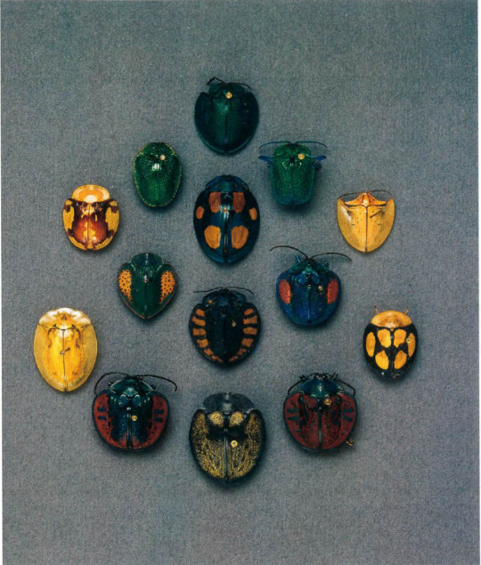
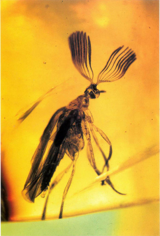
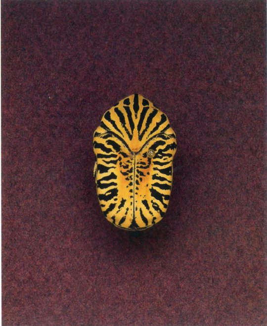


(Images from An Inordinate Fondness for Beetles, A.V. Evans, C.L. Bellamy, photography by L.C. Watson and G. Poinar, University of California Press, 1996.)
1 note
·
View note
Text


For a long time the complete oeuvre of Bauhaus artist Xanti Schawinsky (1904-79) was inaccessible due to a legal battle. This was all the more pitiful since his multifaceted art crossed genre borders. Fortunately, the legal disputes were settled and Schawinsky’s work can finally be received by the public at large. Currently and up until January 5, 2025 the Mudam Luxembourg shows the comprehensive retrospective „Xanti Schawinsky - Play Life Illusion“ that spans six decades of fervent art production.
Alongside the exhibition Hirmer Verlag recently published the eponymous catalogue that isn’t your average exhibition catalogue: as the its subtitle hints at, it is a collection of texts, letters and pictures that primarily lets the artist talk himself and whose title quotes a performance Schawinsky developed in 1936 with students at Black Mountain College. To the latter he was lured by Josef Albers after he had escaped both N@zi Germany and f@scist Italy. What Schawinsky continued to carry with him was the multidisciplinary Bauhaus education: in 1924 he enrolled at the Weimar school and soon developed his idea of the „Spectodrama“ in which he connected art, architecture, theater and music. During this period the conflict/relation between man and machine became a major topic and would remain with him for the rest of his life. When in 1926 the Bauhaus relocated to Dessau Schawinsky was involved with the setup of the stage workshop and until his departure in 1929 explored the possibilities of photography and painting.
In the decades after Bauhaus and Black Mountain College graphic design became Schawinsky’s living before in the 1950s he fully committed to art and frequently experimented with the performative dimension of painting. The results e.g. were „Smoke Paintings“ or „Untitled (Architecture)“ in which he prefigured future aesthetic developments and became a reference for other, younger artists.
This continued inventiveness makes Schawinsky one of the most interesting former Bauhäusler and the present catalogue makes these trait come to life: in his texts and letters he reflects on his art but also brings to life the buzzing environment he existed in. A great read!
17 notes
·
View notes
Text
Seminar 1 - Prep Reading - Fragmentation and Regime Interaction in International (Environmental) Law
This session aims to provide a basic overview of the academic and policy debate regarding fragmentation and regime interactions in international (environmental) law. In our discussion we will attempt to conceptualise the phenomenon of fragmentation, locate its causes, evaluate its consequences, and identify means of managing those of its consequences that we deem as negative. We will also discuss the role that problem-framing plays in terms of encouraging or discouraging positive regime interactions, both between environmental regimes and between environmental and environment-related regimes.
This session will be led by Dr Mara Ntona.
Required reading
Completion requirements
Peter H Sand, ‘Literature Review Article: International Environment Agreements’ in Peter H Sand (ed), International Environmental Agreements (Edward Elgar 2019), available here: https://www.elgaronline.com/view/Research_Reviews/9781788118644/intro.xml
Margaret A Young, ‘Fragmentation and International Environmental Law’ in Lavanya Rajamani and Jacqueline Peel (eds), Oxford Handbook of International Environmental Law (2nd edn, OUP 2021), ch 5, available here: https://academic.oup.com/edited-volume/41336/chapter/352410662
Hope Johnson and others, ‘Conceptualizing the Transnational Regulation of Plastics: Moving Towards a Preventative and Just Agenda for Plastics’ (2021) 11 Transnational Environmental Law 325, available here: https://www.cambridge.org/core/journals/transnational-environmental-law/article/conceptualizing-the-transnational-regulation-of-plastics-moving-towards-a-preventative-and-just-agenda-for-plastics/B6BD29139610E779500C205A41FDB5E3
Questions
Completion requirements
Read the papers by PH Sand and MA Young and consider the following questions:
What do we mean when we speak of the fragmentation of international (environmental) law?
What are the causes of fragmentation?
What are the consequences of fragmentation?
What are some ways of managing the negative consequences of fragmentation?
Instructions for our in-class exercise
Completion requirements
Read the assigned paper by Johnson et al. At this early stage in your studies, the paper is likely to appear complex - do not let that discourage you! For the purposes of this exercise, you are asked to concentrate only on the authors’ general argument and not on the minutiae of the legal regimes they bring up in their analysis. The following questions will help you maintain your focus:
Broadly speaking, which regimes play a role in the transnational regulation of plastics?
Broadly speaking, how do these different regimes conceptualise plastics?
Broadly speaking, what are the pros and cons of different legal conceptualisations of plastics?
During class, you will be divided into groups and asked to come up with answers to the following questions:
What is problem-framing and why is it important in environmental law and governance?
Is problem-framing a question of ‘either-or’ (i.e. a choice between alternatives) or a question of ‘both/and’ (i.e. a question of emphasis)?
Groups will have 15 minutes to discuss these questions and write up their answers. Each group will then be given the opportunity to present their work to the rest of the class.
Further reading
Completion requirements
Rüdiger Wolfrum and Nele Matz, Conflicts in International Environmental Law (Springer-Verlag 2003)
ʻFragmentation of International Law: Difficulties Arising from the Diversification and Expansion of International Law - Report of the Study Group of the International Law Commission finalized by Martti Koskenniemiʼ (13 April 2006) UN Doc A/CN.4./L.682 and Corr.1
Le Club des Juristes: International Group of Experts for the Pact, ʻDraft Global Pact for the Environment by the IGEPʼ (La Sorbonne, 24 June 2017)
Margaret A Young, Regime Interaction in International Law: Facing Fragmentation (CUP 2012)
Donald Anton, '"Treaty Congestion" in Contemporary International Environmental Law' in Shawkat Alam and others (eds), Routledge Handbook of International Environmental Law (Routledge 2013)
Anne Peters, 'The Refinement of International Law: From Fragmentation to Regime Interaction and Politicization' (2017) 15 International Journal of Constitutional Law 671
UNGA, ʻGaps in International Environmental Law and Environment-Related Instruments: Towards a Global Pact for the Environment - Report of the Secretary-Generalʼ (30 November 2018) UN Doc A/73/419
Jeffrey L Dunoff, 'Multilevel and Polycentric Governance', in Lavanya Rajamani and Jacqueline Peel (eds), Oxford Handbook of International Environmental Law (2nd edn, OUP 2021)
0 notes
Video
Gustav Fröhlich in Abenteuer eines jungen Herrn in Polen (1934) by Truus, Bob & Jan too! Via Flickr: German collectors card in the series 'Vom Werden deutscher Filmkunst - Der Tonfilm', album no. 11, image no. 87. Photo: Itala-Film / Ross Verlag. Gustav Fröhlich in Abenteuer eines jungen Herrn in Polen/Love and Alarum (Gustav Fröhlich, 1934). Smart German actor Gustav Fröhlich (1902-1987) played Freder Fredersen in the classic Metropolis (1927) and became a popular star in light comedies. After the war he tried to escape from the standard roles of a charming gentleman with the part of a doomed painter in Die Sünderin (1951), but the effort went down in a scandal. Gustav Friedrich Fröhlich was born an illegitimate child in Hannover, Germany in 1902. His father, Gustav König, was a well-known engineer, and his mother Hedwig Therese Sophie Fröhlich, the daughter of a worker. Gustav was raised by foster parents. His foster family moved around western Germany a lot while he was growing up, living in cities like Wiesbaden and Wurzburg. He studied at the Homuth Realgymnasium Friedenau in Berlin. During World War I the young Gustav volunteered for a duty in occupied Brussels as supervisioner of the press. In 1919 he started his career as a trainee at a newspaper, but he spent his spare time as a emcee at local variety shows. He also wrote two issues of a dime novel, Heinz Brandt, der Fremdenlegionär/Heinz Brandt, the Foreign Legionnaire. After some entrances at a vaudeville theater under the stage name Gustav Geef he took acting lessons in Heilbronn. In the next few years he appeared on different minor German stages. In Berlin he played from 1923 till 1925 at the Volksbühne am Bülowplatz under the direction of Erwin Piscator. Later he appeared as The Prince of Homburg at the Deutsche Theater under the direction of Max Reinhardt. His film debut was a small role in a Dutch-German film produced in Germany, De bruut/Ein neues Leben/The Brute (Theo Frenkel, 1922) with Erna Morena and Adolphe Engers. He then played a secondary role as composer Franz Liszt in Paganini (Heinz Goldberg, 1923) featuring Conrad Veidt. The following years, he played in such films as Friesenblut (1925) opposite Jenny Jugo. Then Fröhlich landed his breakthrough role as Freder Fredersen in Metropolis (Fritz Lang, 1927) by chance. He was only scheduled to play one of the workmen but four weeks after the beginning he was discovered on the set by Thea von Harbou, Fritz Lang's wife. Lang immediately cast him in the lead because of his striking good looks. A new star was born. After Metropolis, Gustav Fröhlich was typecast as the fresh-faced, naive 'boy next door' in such silent films as Die elf Teufel/The Eleven Devils (Zoltan Korda, Carl Boese, 1927) with Evelyn Holt, Heimkehr/Homecoming (Joe May, 1928) opposite Lars Hanson, and Asphalt (Joe May, 1929), in which he played a honest policeman who is seduced by a crook (Betty Amann). In 1930, Fröhlich was called to Hollywood by Warner Brothers to do German versions of American sound films, such as Die heilige Flamme/The Holy Flames (William Dieterle (as Wilhelm Dieterle), Berthold Viertel, 1931) and Kismet (William Dieterle, 1931), both with Dita Parlo. Back in Germany, he soon was subscribed for Max Ophüls’ musical comedy Die verliebte Firma/The Company's in Love (1931) next to Lien Deyers, and for Robert Siodmak's crime drama Voruntersuchung/Inquest (1931) with Albert Bassermann. He often worked with director Géza von Bolváry. Between 1931 and 1933 they made six films together. These include Ich will nicht wissen, wer du bist/I Do Not Want to Know Who You Are (Géza von Bolváry, 1932) with Liane Haid, and Was Frauen träumen/What Women Dream (Géza von Bolváry, 1933), which was co-written by Billy Wilder. Fröhlich often played smart gentlemen in lighthearted musicals and romances. Because of his carefree attendance, Fröhlich was seldom allowed to play other characters. One of his greatest successes was his part of the helpful and likable policeman in Oberwachtmeister Schwenke (Carl Froelich, 1935). He also directed films like Rakoczy-Marsch/Rakoczy march (Gustav Fröhlich, Steve Sekely, 1933), Abenteuer eines jungen Herrn in Polen/Love and Alarm (1934), and after the war Wege im Zwielicht/Paths in Twilight (1948), Der Bagnosträfling/The Prisoner (1949) with Paul Dahlke, and the crime drama Die Lüge/The Lie (1950) with Otto Gebühr. Between 1931 and 1935 Gustav Fröhlich was married with Hungarian Opera star and actress Gitta Alpár. When she was pregnant form their daughter Julika, he left her. According to Alpár, because she was Jewish and he did not want to hurt his career in Nazi Germany. After the war, Fröhlich tried a reconciliation with Gitta Alpár but she never forgave him. Reportedly this gave him a tough time at old-age. From 1936 till 1938 he lived together with actress Lída Baarová, his costar in Barcarole (Gerhard Lamprecht, 1935) and Leutnant Bobby, der Teufelskerl/A Devil of a Fellow (Georg Jacoby, 1935). After losing Lída to Joseph Goebbels, Froelich had a quarrel with him. There is an urban legend that the quarrel culminated in a slap in the face of the powerful and feared Propaganda-Minister. Allegedly, Froehlich was banned from playing his trade for two years (1941-1943). Lída Baarová later denied this in her memoirs. In 1937, he rented his house in Berchtesgaden to Adolph Hitler's architect, Albert Speer. In 1941 Fröhlich remarried with Maria Hajek. Since 1941 he had to serve for the Wehrmacht, interrupted by film engagements like Der Grosse König/The Great King (Veit Harlan, 1942) starring Otto Gebühr as Prussian king Friedrich the Second. Gustav Fröhlich was seldom involved in Nazi Propaganda films, a fact that helped him to establish a new film career after World War II. He tried to escape from standard roles of the charming gentleman by playing a doomed painter in Die Sünderin/The Sinner (Willi Forst, 1951). The effort went down in the chaos of a scandal because of the film's open treatment of several taboos such as suicide and euthanasia, plus a brief nude performance by Hildegard Knef. He went on to play leads in light entertainment films including Haus des Lebens/House of Life (Karl Hartl, 1952) with Cornell Borchers, and Die kleine Stadt will schlafen gehen/The Little Town Will Go to Sleep (Hans H. König, 1954) with Jester Naefe. He remained a busy actor after the war but his roles changed from leading men to supporting parts as he got older. From the 1960s on, he had only a few TV film entrances including a part in the comedy Laubenkolonie/Allotment area (Heribert Wenk, Bertold Sakmann, 1968) with Paul Dahlke. He was more active in the theatre, a.o. for the Renaissance-Theater in Berlin and the Schauspielhaus in Zürich. In 1973 he was honoured with the Filmband in Gold, the German Film Award for Lifetime Achievements. Ten years later, he published his autobiography Waren das Zeiten - Mein Film-Heldenleben/Those Were Times - My Life as a Film Hero (1983). His last public appearance was in 1986, when Giorgio Moroder presented his revised version of Metropolis. From 1956 on, Gustav Fröhlich lived in Lugano, Switzerland. There he died in 1987 of a complication after surgery, at age 85. His wife Maria Hajek had passed away earlier that same year. Sources: Lara Goeke (The Gustav Fröhlich Fan Page), Bruce Eder (AllMovie), Thomas Staedeli (Cyranos), Wikipedia (English and German), and IMDb. For more cards of this series, check out our album Vom Werden Deutscher Filmkunst.
#Gustav Fröhlich#Gustav#Fröhlich#German#Actor#Acteur#Schauspieler#Darsteller#European#Film Star#Kino#Cinema#Film#Cine#Picture#Screen#Movie#Movies#Filmster#Star#Vintage#Collectors#Card#Sammelkarte#Verzamelkaart#Carte#Cartolina#Tarjet#Vom Werden Deutscher Filmkunst#Ross
1 note
·
View note

