#UX/UIDesign
Explore tagged Tumblr posts
Text


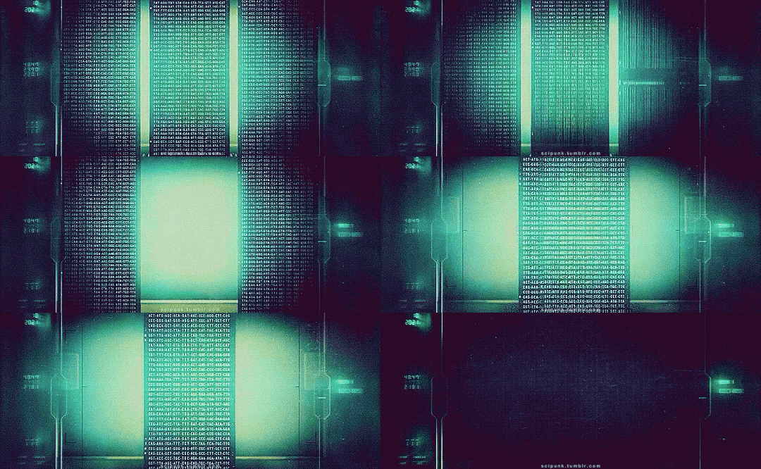
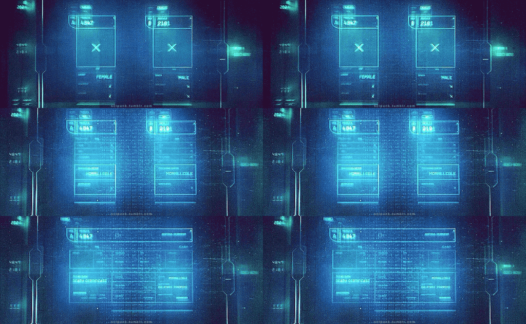
Blade Runner 2049 (2017)
#blade runner 2049#scifiedit#science fiction#computing#scifi aesthetic#cyberpunk aesthetic#graphic design#glitch#user interface#user interaction#gifs#gifset#dennis villeneuve#genetics#dna#computers#flashing gif#uxdesign#ui ux design#uidesign
552 notes
·
View notes
Text
“I Need Your Support to Continue My Studies and Build My Future from Gaza🍉🍉
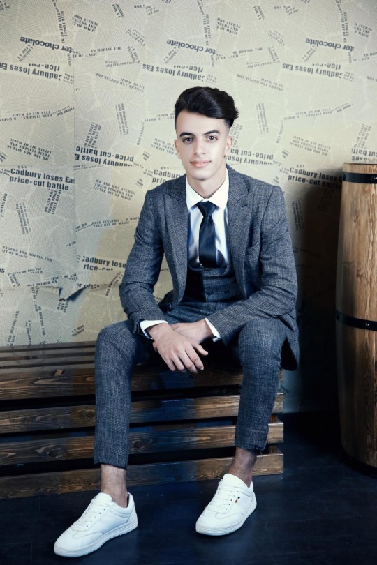
My name is Mahmoud Naeem Abu Hatab, from Gaza.
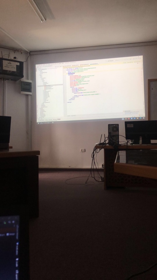
I am a university student majoring in Software and Databases at Al-Azhar University. Since the beginning of my academic journey, I have been passionate about User Experience (UX) and User Interface (UI) design, as well as website development. These fields inspire me, and I dream of advancing my skills and building a professional career in them.
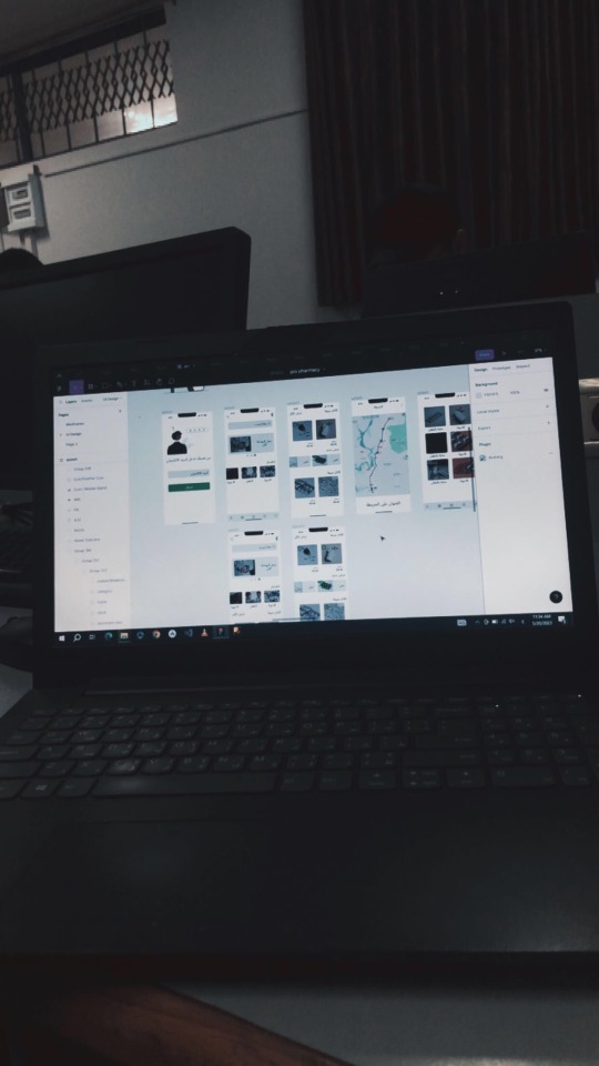
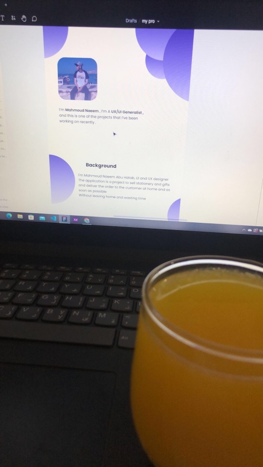
Unfortunately, during the recent war, I lost my laptop, which was essential for both my studies and work. I was forced to flee my home and relocate to southern Gaza due to the difficult circumstances. Despite my efforts to replace my laptop, the financial situation has made it impossible to afford a new one.
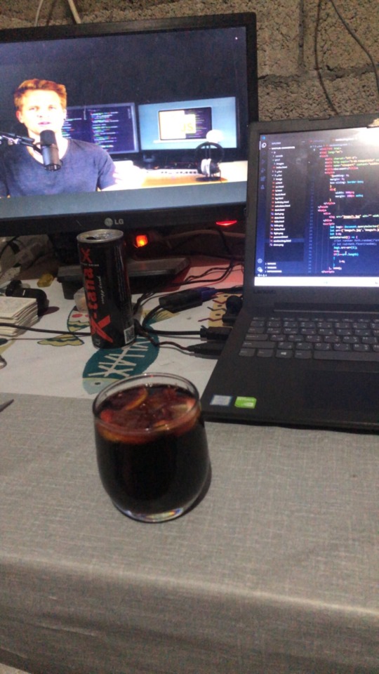

Without a laptop, continuing my studies or seeking job opportunities in programming and design has become extremely challenging. This directly affects my academic progress and future career.
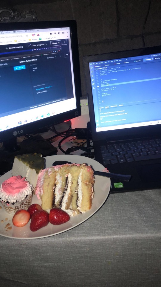
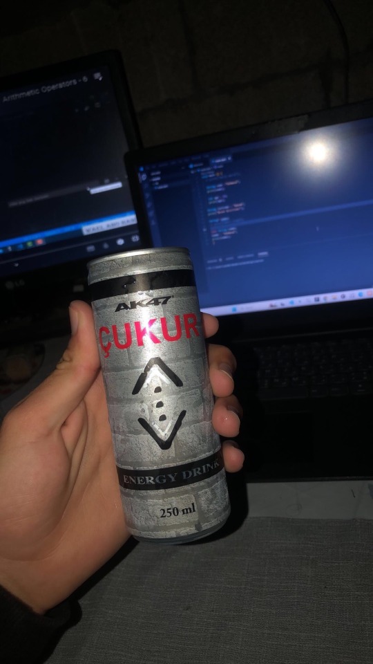
Today, I am reaching out to ask for your support to help me purchase a new laptop. Having a laptop would allow me to resume my studies and work on programming and design projects that are crucial for improving my skills. It is a vital step towards completing my education and pursuing my dream of becoming a professional in programming and UX/UI design.
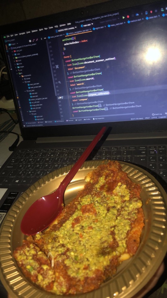
I know that the situation in Gaza is difficult, but I believe education is the only path to building a better future for myself and my family. If you are able to contribute any amount to help me get a new laptop, it would be a real opportunity for me to get back on track academically and professionally.
I am determined to keep learning and working despite the challenges, but I need your support to achieve this goal. Every donation or act of help, no matter how small, will make a significant difference in my life.
If you’d like to support me, you can donate through:
GoFundMe
OR
USDT

If you can assist in any way, please don’t hesitate to reach out to me.
Thank you for your support and kindness! 🌿
@gaza-evacuation-funds @appsa @nabulsi27 @palestinegenocide @orblesbian @palebluebutler @pallasisme @fallahifag-deactivated20240722 @vakarians-babe @sayruq @ @plomegranate @riding-with-the-wild-hunt @queerstudiesnatural @tamamita @apollos-boyfriend @riding-with-the-wild-hunt @queerstudiesnatural @palestinegenocide @sar-soor @akajustmerry @annoyingloudmicrowavecultist @feluka @marnosc @flower-tea-fairies @flower-tea-fairies @tsaricides @tsaricides @belleandsaintsebastian @ear-motif @brutaliakent @raelyn-dreams @troythecatfish @4ft10tvlandfangirl @90-ghost @paper-mario-wiki @nabulsi @prisonhannibal @beepiesheepie @walcutt @schoolhater98 @commissions4aid-international @sar-soor @zigcarnivorous@tododeku-or-bust@turtletoria @brutaliakhoa @flower-tea-fairies @schoolhater @baby-girl-aaron-dessner @sayruq @omiteo777 @malcriada @neptunerings @bat-luun @kaneverse @nightowlssleep @staretes @friendshapedplant @soon-palestine @aria-ashryver @heritageposts @magnus-rhymes-with-swagness-blog @khangerinedreams @kordeliiius @mazzikah @feluka @dlxxv-vetted-donations @girlinafairytale @a-shade-of-blue @vakarians-babe @babygoatsandfriends @self-hating-zionist @mangocheesecakes @dlxxv-vetted-donations @gazaboovintage @gazavetters @wellwaterhysteria @sar-soor @applebunch @irhabiya @sayruq @xxx-sparkydemon-xxx @junglejim4322 @reptilianspecies @dr-lapdance @tamamita @cantsayidont @fairweathermyth @dear-indies @eruthiawenluin @katealot @lenasai @stalinistqueens @ayeshjourney @gaza-evacuation-funda @el-shab-hussein @irhabiya @nabulsi @ibtisams @dlxxv-vetted-donations @tododeku @a-shade-of-blue @gaza-relief-fund @catnapdreams @northgazaupdates @buttercuparry @stuckinapril
#voic of gaza#gaza#free palestine#palestine#free gaza#save gaza#save palestine#help gaza#help palestine#programming#studying#uxdesign#ui ux design#uidesign#ui#ux#user interface#user experience#figma#xd#web design#web development#web developers#mobile design#html#css#js#javascript#java#front end development
290 notes
·
View notes
Text


HTC P6300 Panda
#2000s#00s#cellphone#design#electronic#frutiger aero#graphic design#graphics#gray#green#grey#homescreens#htc#htc p3600#microsoft#mobile.#old phone#old tech#phone#photography#tech#technology#uidesign#ui#ui ux design#white#windows phone
372 notes
·
View notes
Text

#motion graphics#art#graphic design#ui design#animation#scifi art#cyberpunk#cyberpunk art#futuristic#ui#ui ux design#uidesign#black and white#monochrome#gif#dark aesthetic#dark scifi
865 notes
·
View notes
Text
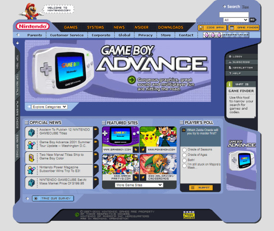
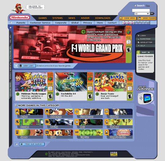

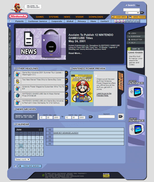
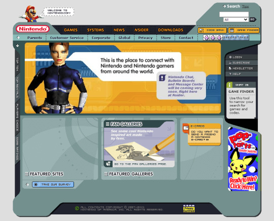

Nintendo in 2001
#2001#2000s#01#00s#art#console#cybercore#cyber y2k#design#graphic design#games#gaming#graphics#internet archive#internet#kaybug#nintendo#old internet#old tech#screenshots#tech#technology#uidesign#ui#ui ux design#video games#y2kcore#y2kore#y2k aesthetic#y2k art
538 notes
·
View notes
Text
Saw this tweet on my feed earlier.
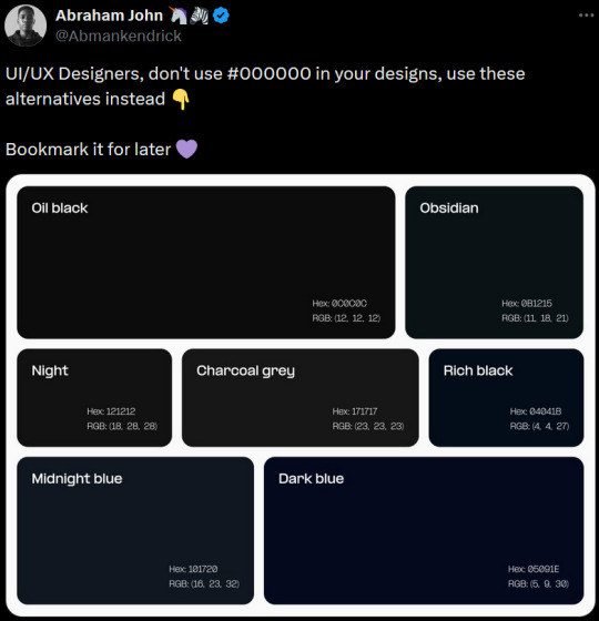
Although this is sensible advice, I thought I'd take it a step further. In order to understand UI/UX design rules, you need to learn to break them to use them. Therefore I give the following advice:

The weak dark mode users will run away in fear while the strong stay. This is natural selection at its peak and you cannot change my mind
105 notes
·
View notes
Text
hey font nerds
[ does anybody know any good fonts for a lil my "pc as a website" project? ]
pwetty pwease? >:3 # this is a threat
REQUIREMENTS: - Kinda like Android Material UI but more suited for a "modern" PC desktop [ I like Inter ExtraLight for example :3 ]
or: - something good for icons. tray, notifications, you get the gist [ - i know nerdfonts and i can guide myself through their patcher so combining them with a "sleek" main font should be no problem. Wanna get more into python stuff anyways. ]
[ but wait, there's more: - i'm getting cozy with a mono font on my current setup, so if there's any that give of a more like "coffee house vibes and today is cocoa day" vibe, they're also very much appreciated OwO # ^> again, a threat.]
[ oh and also: - access to adobe-fonts is not a problem, i have a adobe license from work # ^ sharing is caring 💚 ]
⬇️ ⬇️ ⬇️ OBLIGATORY CONTRACT INFO DOWN BELOW ⬇️ ⬇️ ⬇️
SERIOUS ENQUIRIES ONLY! (middle click)
[ oh and plz many thanks :3 # < this time i really mean it :3

💜
]
#linux#196#kthxbai#fonts#free#adobe#design#graphic design#web graphics#ui#ux#ui ux design#portfolio#uidesign
25 notes
·
View notes
Text
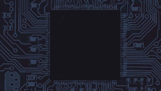
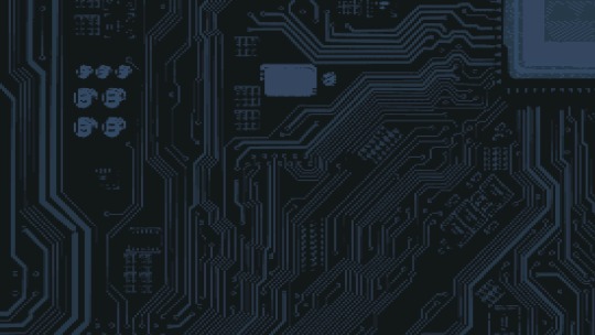
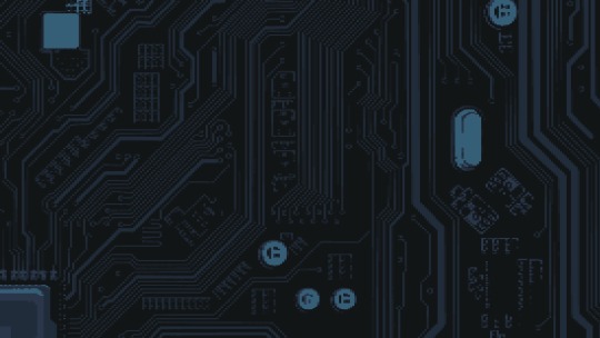


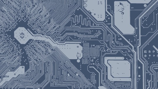
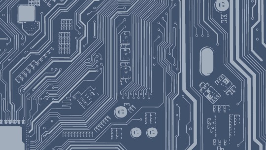
Some assorted class work from this week- I’m working on the UI for our game and the backgrounds have been coming out so GOOD AND TASTY I think I’m learning to love doing pixel art my dudes
52 notes
·
View notes
Text
Excited to share a glow-up for Mighty Marbles! 🎉 Check out the old vs. new level transitions—what a difference! Now every level even has its own name. 🚀 Which style do you prefer?
I love making this game with passion and I am so excited to share it with the world, but somehow I need to let the world know. Unfortunately the way steam works is the more wishlists the more visibility, so if you are interested it is super appreciated :)
Wishlist on steam or visit the website to find out more mightymarbles.com
#ui#gamedev#indiedev#video games#game development#indie games#indiegamedev#unity3d#puzzle games#puzzle#ui ux design#uidesign#user interface
9 notes
·
View notes
Note
You're so right abt all these websites looking freaking the same. Too polished, corporate typa style bs. And it's not only websites, it's applicable to books too. Everything looks bland and the same. I honestly miss early 2000s style. I don't care if it was tacky or anything. At least they were interesting and each one was unique in it's own brand of quirk lol
Hiya! 💗
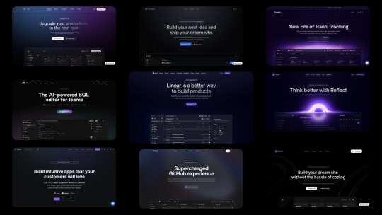
I agree! I love different styles shown in websites! Everything nowadays are following this trendy of "spacey subtle but a lot few colours" and they say it's all for user experience so I wonder is it the users' fault or are the designers just following a trend they got from another designer and so forth and not really what the user wants? I mean, I bet now the users who view the websites are noticing, like we have, that oh the same style again. I don't know as I'm not a UX/UI designer so I can't judge entirely but from a user perspective I am tired of websites all looking the same, I mean even those old government websites look better than this gradient spacey look that's going on.
But just as they're a trend, they will die out soon. I remember when glassompishm was super duper trendy, when I started learning how to code websites around 2021-2022, it was everywhere and now it's not as popular, I see less of it now, so we'll see what's next 🤞🏾
On that, this is why I like neocites with it's diversity and uniqueness! Also check out mine hehe~!
#my asks#codeblr#coding#progblr#programming#studying#studyblr#learn to code#comp sci#tech#programmer#ui ux design#uidesign#web design
59 notes
·
View notes
Text
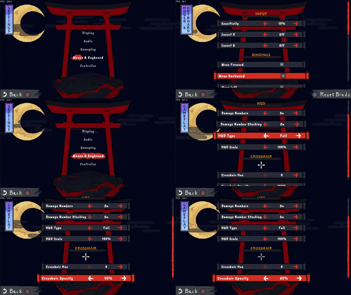
It took more work than I thought it would, but I polished up the game's UI and added some options. It even works with controller pretty well now!
#indiegamedev#game dev#game development#indie dev#indie games#gamedev#screenshotsaturday#retro fps#indiedev#uidesign#ui#ui ux design#design#programming
29 notes
·
View notes
Text


The Fifth Element (1997)
#the fifth element#90s#cult classic#retro futuristic#cyberpunk aesthetic#retrofuture#retro futurism#new york city#aesthetic#90s movies#90s aesthetic#cyberpunk#graphical user interface#user interaction#user interface#graphic design#motion graphics#ui#ui ux design#uidesign
487 notes
·
View notes
Text
Here are Eight Basics of Responsive UI Design Services that can Guide the Creation of User-friendly and Adaptable Interfaces:

What are Fluid Grids in Responsive UI Design?
Use fluid grids that proportionately scale elements instead of fixed widths. This allows your design components to resize based on the screen size.
Fluid grids are a key part of Responsive UI Design that works well on different screens, like computers and smart phones. Unlike fixed grids that use set sizes in pixels, fluid grids use flexible measurements like percentages. This means the elements on the page can change the size of their container. This design helps keep the content looking good and organized, no matter what device is used to view it.
In a fluid grid, the layout is made with flexible columns and rows. For example, a design with three columns can change to one column on smaller screens. This ensures users have a smooth experience, no matter how they access the website. This flexibility is essential today, as people use many different devices to view content.
Additionally, fluid grids help with usability, making it easier for users to read and navigate without needing to scroll sideways or deal with empty spaces. Tools like media queries and fluid grids let designers fine-tune how content looks on different screens. In short, fluid grids are essential to responsive design, ensuring websites are easy to use and look good on any device size.
What is Flexible Images in Responsive UI Design?
Implement images that scale and adjust within their elements. Techniques like CSS's max-width property can help images adapt to various screen sizes.
Flexible images are vital in Responsive UI Design that look good on devices like phones, tablets, and computers. Unlike fixed images, which stay the same size no matter where you see them, flexible images can change their size based on the space they are in. This means they can grow or shrink to fit nicely in their spot on the webpage.
In responsive UI design, using flexible images makes the website more attractive and easier to use. Since people use different devices with different screen sizes, images must look good in a manageable amount of time. Designers use CSS media queries to show the correct size images, which helps save data and makes the website load faster.
Also, flexible images help keep the website looking balanced and organized. They prevent images from being stretched or squished; ensuring important content is visible and engaging. Using flexible photos is essential for making websites that are easy to navigate, nice to look at, and work well for everyone, no matter their device. This way, the website can make a positive impression on all users.
Importance of Media Queries in Responsive UI Design.
Utilize media queries in CSS to apply different styles for different devices and screen sizes. This lets you customize the layout based on the characteristics of the device.
Media queries are important part of responsive UI Design Services for making websites look good on devices like smart phones, tablets, and computers. As more types of devices are created, it's important to ensure everyone can use a website easily, no matter their device. Media queries help designers show the right styles for different screen sizes, making it easier for everyone to visit the website.
One big advantage of using media queries is that they allow for flexible design. Instead of creating different designs for each device, designers can make one style that changes based on the user's device. This saves time and makes it easier to update the website.
Media queries also help websites work better and load faster. This means web applications can show only the necessary styles for each device. This is important today because people want websites to load quickly and work smoothly.
Media queries are a key to responsive web design services because they help create a personalized experience. This ensures that anyone can easily access content and find it nice to look at, no matter their device.
Mobile-First Approach in Responsive UI Design
Start the design process with mobile devices in mind. This strategy ensures that the core features are developed first for smaller screens before expanding to larger displays.
The mobile first approach to responsive UI design means creating plans for small screens, like phones, before making them more notable for tablets or computers. This is important because more and more people are using their phones to go online, so it’s wise to focus on their needs first. By designing for mobile devices first, designers can highlight the most important features and information, making it easy for users to find what they need without being overwhelmed by too much other stuff.
This method leads to cleaner and simpler designs. Since phone screens are smaller, designers must pick what is necessary, resulting in easy-to-read layouts and straightforward menus. It also helps improve loading times and performance because mobile users might need faster internet. So, giving them a quick and smooth experience is significant.
Starting with mobile designs also helps teams consider how to make the designs fit larger screens later. This way, the design can expand quickly instead of changing things made for computers to work for phones. It promotes flexible thinking, allowing designers to add more advanced features when the device can manage them.
The mobile first approach improves the user experience and can help SEO. This means that websites friendly to mobile users often appear higher in search results. This method is essential for today’s web design because it meets the needs of the growing number of mobile users.
Responsive Typography in UI Design Services
Choose flexible typography that adjusts size and line height based on the viewport. This enhances readability across various devices.
Responsive font is essential to create responsive UI Designs, making it easier for people to use websites and apps on different devices. It helps ensure that text is clear and looks good, no matter what size screen someone uses. This means changing font sizes and spacing to make reading comfortable on big and small screens.
Designers can create a clear structure for the information when they use responsive fonts. For example, headings can be more prominent on a computer but stay just the right size on a mobile phone. This way, important information is easy to find quickly. Choosing fonts that look good and are easy to read is also important.
Further, responsive fonts help create a strong brand image. A business's consistent text styles that adjust well across different platforms help build a connection with its audience. In short, using responsive typography in UI design is essential for making user-friendly and engaging interfaces. This leads to happier users who are likely to return. Investing in this type of design is a smart choice for creating a modern and flexible user experience.
Touch-Friendly Navigation in Responsive UI Design
Design navigation elements that are easy to interact with on touch screen devices. This includes larger buttons and simplified menus to improve accessibility.
Touch-friendly navigation is essential for creating responsive UI design because many use mobile devices like phones and tablets. When designers make things easy to touch, it helps users enjoy and use the app or website better. Unlike regular computer mice, touch screens need more oversized buttons, more space between them, and simple actions that work well with fingers of different sizes.
To make navigation easy, designers should make buttons at least 44 pixels wide and tall. This site helps people tap the right button without making mistakes. Also, having enough space between buttons helps prevent accidentally tapping the wrong one, this can be annoying.
Using swipe gestures is also a good idea. For example, users can slide their fingers left or right to switch between pages. This makes using the app more fun and encourages users to check out different options. Hamburger menus or expandable navigation drawers can keep the design clean while giving access to more choices.
Lastly, it's important to show users when they press a button. This could be a visual change or a slight vibration that lets them know their action was recognized. By focusing on these touch-friendly features, designers can make better experiences for mobile users, making their time with the app or website more enjoyable.
Testing Device Responsive UI Design
Regularly test your Responsive UI design on various devices and screen sizes to ensure a consistent user experience. Emulators and physical devices should both be part of the testing process.
It is essential to see how websites and apps look and work on different devices. People use many types of devices like smart phones, tablets, and computers. Because of this, websites need to change to fit various screen sizes.
To do this, developers use different techniques. They make flexible designs, use pictures that can change size, and use unique code called media queries. Testing means checking how things look and work on all types of screens, from big to small mobile ones. Developers use tools in web browsers, responsive design checkers, and emulators to help them test.
Getting feedback from real users is also very important. It helps find problems people have when using the site on different devices. Also, checking how fast the site works is necessary to keep it quick, even when making it fit different screens. Ultimately, testing and improving the design for various devices makes it easier for everyone to use, makes users happier, and helps them stay on the site longer.
Performance Optimized UI Design Services
Optimize images, minimize code, and utilize lazy loading techniques to ensure fast loading times across all devices. Performance can significantly impact user retention and satisfaction.
Performance Optimized UI Design Services focus on creating user interfaces that are easy to see and use. Today, when we use apps and websites, we want them to work quickly and smoothly. A good user interface (UI) is essential for this. These services help pages load fast, reduce waiting times, and make users feel happy using a product.
To improve the UI, key parts include:
Using resources wisely.
Getting rid of unnecessary code.
Using clever caching methods to save time.
Designers work closely with developers to ensure the designs look nice and work well on devices like phones and tablets. By using testing tools, teams can keep making the UI better.
Ultimately, Performance Optimized UI Design Services help make users happier, encourage them to use the app or website more, and increase sales. These services are crucial for any successful online strategy in today's competitive world.
Implementing these principles can lead to responsive designs that provide a positive experience for users, no matter the device they choose.
#ui#ui ux design#uidesign#uxdesign#ui ux company#ux#ux research#user interface#design#ui ux development services#ui ux agency#ui ux development company#responsivedesign#responsive web design#responsivewebsite#responsive web development#responsive wordpress themes#web design#website design#web development#website development#website developer near me#website developers
3 notes
·
View notes
Text

Nokia 6680 (2005)
#2005#2000s#05#00s#art#blue#cellphone#cell phone#design#electronic#frutiger aero#graphic design#graphics#homescreens#icons#mobile.#nokia 6680#nokia#old phone#old tech#phone#photography#tech#technology#ui#uidesign#ui ux design#vector
234 notes
·
View notes
Text
meu primeiro redesign!
[ br / eng ]
[meu primeiro redesign e como isso é mto confuso/my first redesign and how this is so confusing] lição mágica aprendida hoje: paciência.
˚✧ antiseptic ݁ ੭
BR :
’ㅤㅤㅤok é estranho postar depois de algum tempo MAS EU JURO QUE TENHO FEITO COISAS!
primeiramente, percebi que eu não ia conseguir aplicar meus estudos se eu não colocasse em prática (obviamente?), então do q adiantaria estudar se eu não faria nada com isso?
eu estava navegando na minha maravilhosa shein com esse pensamento, quando eu parei pra analisar: POR QUE EU NÃO FAÇO UM REDESIGN DA SHEIN?
sim. eu fiz.
Este site é propriedade da Shein e é destinado exclusivamente para fins de estudo. Todos os direitos sobre os materiais, informações e elementos gráficos apresentados neste site pertencem à Shein e estão protegidos pelas leis de direitos autorais.
ok pra começar: eu não fazia ideia do que fazer. não pensei em nenhuma teoria ou nada, eu só simplesmente fiz???
acredito que esse post vai ser o mais curto do perfil, mas irei tentar explicar meus processos pra não ficar tão sem conteudo. ao final do post, terá o link do resultado caso queira pular!
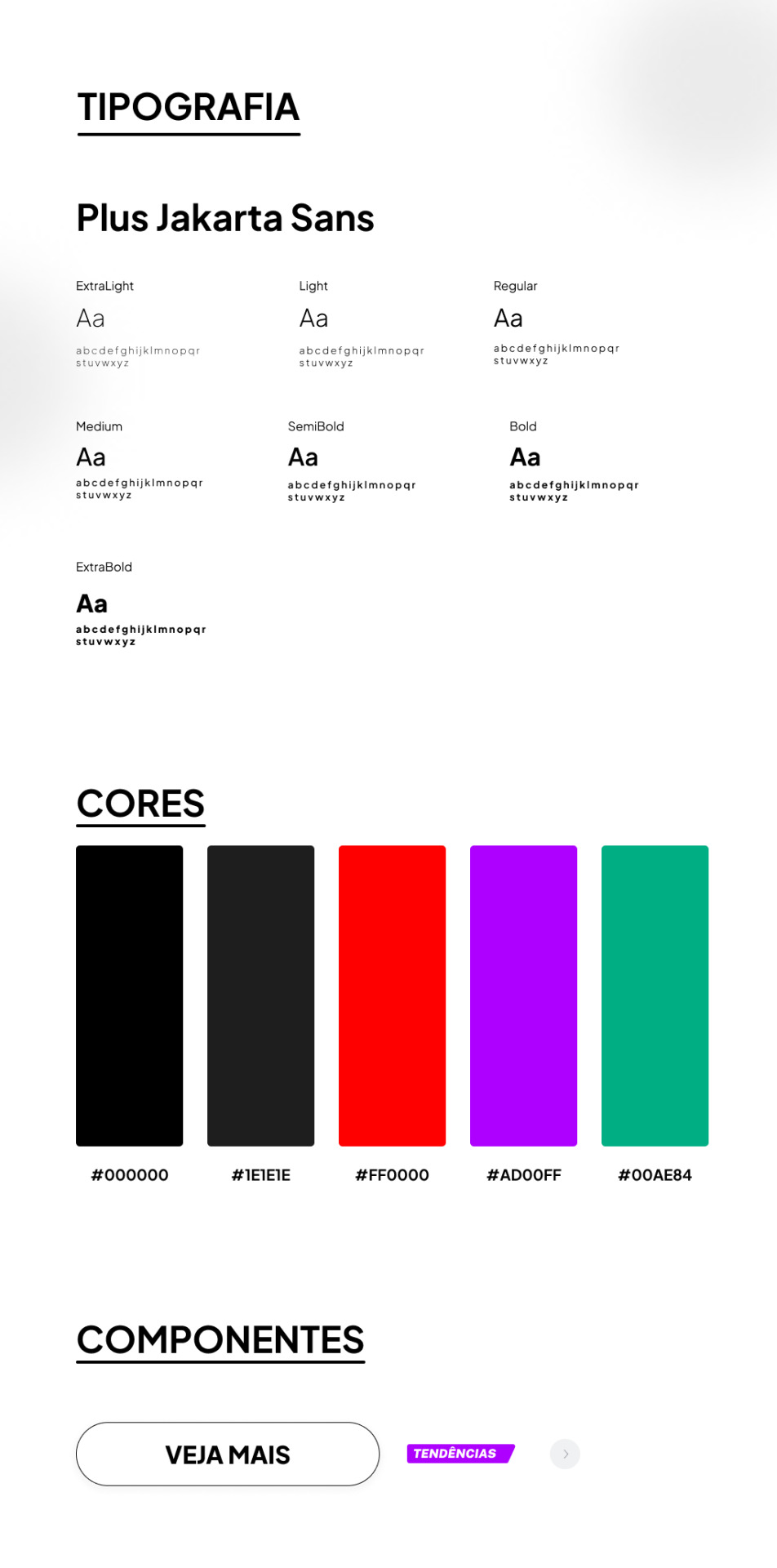
TIPOGRAFIA:
a escolha da fonte foi uma abordagem que precisava ser elegante e moderna, sabia que essa fonte foi criada sob encomenda do 6616 studio para um projeto do governo provincial de jacarta chamado ‘+Jakarta City of Collaboration’, lançado em 2020. ela se inspira em fontes como Neuzeit Grotesk, Futura e outras sans-serifs grotescas dos anos 1930, apresentando um contraste quase monolinear e curvas agudas.
a plus jakarta sans é caracterizada por suas formas modernas e limpas. ela tem uma altura-x ligeiramente maior, o que proporciona um espaço claro entre as letras maiúsculas e a altura-x. além disso, a fonte é equipada com contadores abertos e espaços equilibrados, garantindo uma boa legibilidade em uma ampla gama de tamanhos.
agora que te dei um contexto histórico dessa fonte, vou te explicar algumas razões que me fez escolher ela (não, não foi aleatorio ok). a fonte reflete uma estetica moderna e contemporânea, proporcionando espaços claros e legibilidade em vários tamanhos, tornando uma escolha versátil para diferentes elementos, desde t��tulos até textos menores.
CORES:
confesso que nessa parte não tenho muito a dizer, o preto é uma cor elegante e básica, tornando a comum. em termos técnicos, o preto é a ausência de luz ou cor. no espectro de luz visível, a cor preta absorve todas as cores e não reflete nenhuma delas para os olhos. legal, ne?
sobre o vermelho, é obvio que eu precisava de algo chamativo; o verde normalmente simboliza elementos da natureza, mas em alguns contextos ele também representa renovação, então, imaginei que essa era a melhor cor pra representar sobre avisos de roupas ou quaisquer coisas novas.
agora o roxo, não sei dizer o que me levou a escolher essa cor, confesso que entrei no site da SHEIN e dei uma boa olhada no motivo de ela estar ali e tudo o que me faz pensar, sinceramente, é porque ela é chamativa, o que faz o usuario ficar ansioso e pensar nossa meu deus TENDENCIA eu preciso comprar!!
CONCLUSÃO
esse foi meu primeiro trabalho concluído, de fato. tanto como webdesign como redesign, eu realmente gostei muito de ter feito e me diverti ao longo do processo, mas eu ficava ansiosa pra terminar e percebi que eu tentava atropelar algumas etapas, isso deve ser mais comum do que eu imagino e eu preciso treinar isso, mas tirando isso.... consegui trabalhar bem olhando as referencias do proprio site da SHEIN e acredito que fiz um retrabalho bom!
POR FAVOR SHEIN ME CONTRATA
dúvidas, sugestões ou críticas? me mande um ask, ele está aberto para qualquer tipo de coisa que tenha surgido durante o post. ♥︎
ah, e sobre o resultado final, claro....... eu postei no dribbble! provavelmente vai ser a plataforma que utilizarei em todos os meus posts para mostrar o design final, ent caso vc n queira ver meu monologo, basta pular direto pro final!
https://dribbble.com/shots/24251593-SHEIN-Redesign?added_first_shot=true
[meu primeiro redesign e como isso é mto confuso/my first redesign and how this is so confusing] magic lesson learned today: patience.
˚✧ antiseptic ݁ ੭
ENG :
’ㅤㅤㅤok it’s weird to post after some time BUT I SWEAR I HAVE BEEN DOING THINGS!
firstly, I realized that I wouldn’t be able to apply my studies if I didn’t put them into practice (obviously?), so what would be the point of studying if I wasn’t going to do anything with it?
I was browsing my wonderful shein with this thought, when I stopped to analyze: WHY DON’T I DO A REDESIGN OF SHEIN?
yes. I did.
This site is owned by Shein and is intended exclusively for study purposes. All rights to the materials, information and graphic elements presented on this site belong to Shein and are protected by copyright laws.
ok to start: I had no idea what to do. I didn’t think of any theory or anything, I just simply did???
I believe this post will be the shortest on the profile, but I will try to explain my processes so as not to be so without content. at the end of the post, there will be the link to the result in case you want to skip!

TYPOGRAPHY:
the choice of font was an approach that needed to be elegant and modern, I knew that this font was custom made by 6616 studio for a project of the provincial government of Jakarta called ‘+Jakarta City of Collaboration’, launched in 2020. it is inspired by fonts like Neuzeit Grotesk, Futura and other grotesque sans-serifs from the 1930s, featuring an almost monolinear contrast and sharp curves.
the plus jakarta sans is characterized by its modern and clean shapes. it has a slightly larger x-height, which provides a clear space between the uppercase letters and the x-height. in addition, the font is equipped with open counters and balanced spaces, ensuring good readability in a wide range of sizes.
now that I’ve given you a historical context of this font, I’ll explain some reasons that made me choose it (no, it wasn’t random ok). the font reflects a modern and contemporary aesthetic, providing clear spaces and readability in various sizes, making it a versatile choice for different elements, from titles to smaller texts.
COLORS:
I confess that in this part I don’t have much to say, black is an elegant and basic color, making it common. in technical terms, black is the absence of light or color. in the visible light spectrum, the color black absorbs all colors and does not reflect any of them to the eyes. cool, right?
about red, it’s obvious that I needed something eye-catching; green usually symbolizes elements of nature, but in some contexts it also represents renewal, so, I imagined that this was the best color to represent about clothes warnings or any new things.
now the purple, I can’t say what led me to choose this color, I confess that I entered the SHEIN website and took a good look at why it was there and all it makes me think, honestly, is because it is eye-catching, which makes the user get anxious and think oh my god TREND I need to buy!!
CONCLUSION
this was my first completed work, in fact. both as webdesign and redesign, I really enjoyed doing it and had fun throughout the process, but I was anxious to finish and I realized that I tried to rush some stages, this must be more common than I imagine and I need to train this, but apart from that… I managed to work well looking at the references from the SHEIN website itself and I believe I did a good rework!
PLEASE SHEIN HIRE ME
questions, suggestions or criticisms? send me an ask, it is open for any kind of thing that may have arisen during the post. ♥︎
ah, and about the final result, of course… I posted it on dribbble! it will probably be the platform that I will use in all my posts to show the final design, so if you don’t want to see my monologue, just skip straight to the end!
https://dribbble.com/shots/24251593-SHEIN-Redesign?added_first_shot=true
#design#aesthetic#art#english#designinspiration#brasil#design ux#ui ux design#uidesign#ui ux company#ui#ux#redesign#shein#sheinstyle#design ui#web design#website#user interface#prototype#digital art#figmadesign#figma#creative#dribbble#dribble
8 notes
·
View notes
