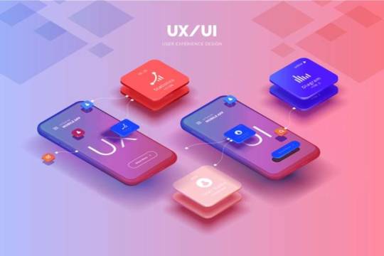
#UI UX Development Agency
Text
Questions To Ask Before Hiring A UI UX Development Agency In New York
Looking for a top UI/UX development agency in New York? We specialize in creating user-friendly, visually stunning designs that enhance digital experiences and drive business success.
0 notes
Text
Understanding the Basics: An Introduction to the Laws of UX Design

So, you've decided to take the plunge and start your own business. Maybe you're a budding entrepreneur in London, a tech whiz in Silicon Valley, or a visionary in Dubai. Whatever your story, you know that in today's digital age, having a killer website is non-negotiable. But here's the thing – it's not just about slapping together some fancy graphics and calling it a day. Enter the world of UX design, where psychology meets technology to create websites that not only look good but actually work for your users.
Let's dive into the basics of UX design laws, shall we? Don't worry, we're not talking about legal jargon here. These are more like the golden rules in ui ux development that'll help you create a website that your customers will actually enjoy using. And trust me, a happy user is more likely to become a loyal customer.
1. Hick's Law: Keep It Simple, Stupid
Imagine you're at a coffee shop in New York City. The menu has 50 different types of coffee, each with its own fancy name. Suddenly, ordering your morning brew feels like sitting for a PhD exam. That's Hick's Law in action – the more choices you give people, the longer it takes them to make a decision.
a) The Paradox of Choice
In the online world, too many options can lead to decision paralysis. Your potential customers might just give up and go elsewhere.
b) Simplify, Simplify, Simplify
Take a leaf out of Apple's book. Their product pages are clean, focused, and guide you smoothly towards making a purchase.
c) Progressive Disclosure
Think of it like peeling an onion. Reveal information gradually, giving users only what they need at each step of their journey.
Real-world example: Remember how Amazon started? A simple search bar and a few product categories. Even now, with millions of products, their homepage remains surprisingly clutter-free.
2. Fitts's Law: Make It Easy to Click
Picture this: you're trying to tap a tiny "Buy Now" button on your smartphone while riding the Tube in London. Frustrating, right? That's where Fitts's Law comes in – the easier it is to interact with an element, the more likely users are to do so.
a) Size Matters
Bigger buttons are easier to click. It's not rocket science, but you'd be surprised how often this is overlooked.
b) Location, Location, Location
Put important elements where they're easy to reach. On mobile, think about thumb-friendly zones.
c) Visual Feedback
Give users a clear signal that their action has been registered. A color change or subtle animation can work wonders.
Real-world example: Take a look at the BBC News app. Notice how the headlines and navigation elements are generously sized and spaced? That's Fitts's Law in action, making it easy for users to tap what they want, even on a bumpy bus ride.
3. Miller's Law: Chunk It Up
Imagine you're at a networking event in Dubai, and someone rattles off their phone number without pausing. Chances are, you'd forget it immediately. But if they group the numbers (like 055-123-4567), suddenly it's much easier to remember. That's Miller's Law – we can only hold about 7 (plus or minus 2) items in our short-term memory.
a) Group Related Information
Organize your content into logical categories. It makes it easier for users to process and remember.
b) Use Visual Hierarchy
Headers, subheaders, and bullet points aren't just for show. They help break up information into digestible chunks.
c) Progressive Disclosure (Yes, Again!)
Don't overwhelm users with all the information at once. Reveal details as users dig deeper into your site.
Real-world example: Check out how Gov.uk organizes its vast amount of information. They use clear categories, concise headlines, and a clean layout to make finding information a breeze, even when dealing with complex topics like taxes or immigration.
4. Jakob's Law: Don't Reinvent the Wheel
You know how when you walk into any supermarket in the UK, you pretty much know where to find the milk? That's because we're creatures of habit, and we expect certain things to be in certain places. The same applies to websites.
a) Stick to Conventions
Put your navigation where people expect to find it. Top or left is usually a safe bet.
b) Use Familiar Icons
A magnifying glass for search, a shopping cart for... well, shopping. Don't get too creative with the basics.
c) Follow Platform Guidelines
If you're making an app, stick to the design languages of iOS or Android. It'll feel more natural to your users.
Real-world example: Look at any major news website – BBC, CNN, Al Jazeera. Notice how similar their layouts are? That's not lack of creativity; it's Jakob's Law in action. Users can navigate these sites easily because they're familiar.
5. Law of Proximity: Keep Related Things Together
Imagine you're at a farmers' market in California. You'd expect to find tomatoes near other vegetables, not next to handmade soaps, right? That's the Law of Proximity – things that are near each other seem related.
a) Group Similar Elements
Keep your "About Us" link near other company information, not floating randomly on the page.
b) Use White Space Wisely
Don't be afraid of empty space. It can help create visual groupings without the need for borders or backgrounds.
c) Consistent Styling
Use similar colors, fonts, or shapes for related elements to reinforce their connection.
Real-world example: Take a look at Airbnb's search results page. Notice how each listing is a distinct unit, with the photo, price, and description all neatly packaged together? That's the Law of Proximity making it easy for you to compare options.
6. Von Restorff Effect: Make It Pop!
Ever been to a bazaar in Istanbul and noticed how one particularly vibrant rug catches your eye amidst hundreds? That's the Von Restorff Effect in action - we remember things that stand out from the crowd.
a) Highlight Key Information
Got a limited-time offer? Make sure it stands out on your homepage. Use a different color, size, or even animation to draw attention.
b) Break the Pattern
If your website uses a lot of rectangles, try using a circle for an important call-to-action button. The shape difference will make it pop.
c) Use Contrast Wisely
A bright red "Sale" tag on a primarily blue website will definitely grab eyeballs. Just don't go overboard, or you'll end up with a visual circus.
Real-world example: Check out how Dropbox's homepage uses a vibrant blue "Sign up for free" button that stands out against the white background. It's impossible to miss, making it clear what action they want you to take.
7. Doherty Threshold: Speed Is King
Imagine you're at a coffee shop in London, and it takes 20 minutes to get your latte. Annoying, right? The same principle applies to your website. The Doherty Threshold states that productivity soars when a computer and its users interact at a pace (<400ms) that ensures neither has to wait on the other.
a) Optimize Load Times
Every second counts. Compress images, minify code, and use caching to speed up your site.
b) Provide Instant Feedback
When a user clicks a button, something should happen immediately, even if it's just a color change or a loading spinner.
c) Prioritize Above-the-Fold Content
Load the visible part of your website first, so users can start interacting while the rest loads in the background.
Real-world example: Google's search results appear almost instantly as you type. This rapid response keeps users engaged and coming back for more.
8. Peak-End Rule: First Impressions and Last Impressions Matter Most
Think about your last vacation. Chances are, you remember the highlights and how it ended more than the mundane middle bits. That's the Peak-End Rule - people judge an experience largely based on how they felt at its most intense point and at its end.
a) Create "Wow" Moments
Include unexpected delights in your user journey. Maybe a congratulatory animation when they complete a purchase?
b) Smooth Out the Rough Spots
Identify the most frustrating parts of your website (like checkout) and make them as painless as possible.
c) End on a High Note
After a user completes an action, don't just show a boring confirmation. Thank them, offer a small reward, or suggest a next step.
Real-world example: When you complete a course on Duolingo, you're greeted with a celebration animation and encouraging message. This positive ending keeps users coming back for more.
9. Aesthetic Usability Effect: Pretty Does Matter
You know how people tend to flock to the trendiest-looking café in Dubai, even if the coffee next door might be better? That's the Aesthetic Usability Effect - users often perceive aesthetically pleasing designs as more usable.
a) Invest in Good Design
A well-designed website isn't just pretty - it builds trust and credibility with your users.
b) Maintain Consistency
Use a cohesive color scheme and consistent styling throughout your site. It looks more professional and feels more usable.
c) Don't Sacrifice Function
Remember, beauty shouldn't come at the cost of usability. A gorgeous but confusing website won't do you any favors.
Real-world example: Apple's products and website are prime examples of the Aesthetic Usability Effect. Their clean, minimalist design is a big part of why people perceive their products as intuitive and easy to use.
10. Zeigarnik Effect: The Power of Unfinished Business
Ever had a song stuck in your head until you finally heard the end? That's the Zeigarnik Effect - people remember uncompleted or interrupted tasks better than completed ones.
a) Use Progress Bars
Show users how far they've come in a process. They'll be more likely to complete it if they can see the finish line.
b) Save Partial Progress
If a user starts filling out a form but doesn't finish, save their progress. They'll be more likely to come back and complete it.
c) Create a Sense of Achievement
Break long processes into smaller steps. Each completed step gives a sense of progress and motivates users to continue.
Real-world example: LinkedIn uses a profile completion bar, showing you how "complete" your profile is. This subtle nudge motivates users to fill out more information and engage more with the platform.
Remember, whether you're launching an e-commerce site in New York, a tech startup in Tel Aviv, or a consulting firm in London, these UX laws can help you create a website that not only looks good but also works effectively for your users. By understanding and applying these principles, you're not just building a website - you're crafting an experience that can turn visitors into loyal customers. And in today's competitive digital landscape, that can make all the difference.
Wrapping It Up
Look, I get it. As a business owner, you've got a million things on your plate. The last thing you need is to become a UX design expert overnight. But here's the thing – understanding these basic laws in fundamental of ux designs can make a world of difference to your website or app.
Think of it like this: if you were opening a physical store, you'd put thought into the layout, right? You wouldn't put the cashier in a hidden corner or stack your best products where no one can reach them. Your website is your digital storefront, and these UX laws are like the basic principles of good store design.
Remember, your website isn't just a pretty face for your business. It's often the first interaction potential customers have with you. Whether you're a cool tech startup in Tel Aviv, a boutique consulting firm in Manchester, or an e-commerce pioneer in Riyadh, your website needs to make a good first impression.
So, as you embark on your entrepreneurial journey, keep these UX laws in mind. They're not just for the big players – they can give your small business a professional edge right from the start. And hey, if all this still sounds Greek to you, don't sweat it. That's what UX professionals are for. Consider it an investment in your business's future.
After all, in the digital world, user experience isn't just nice to have – it's the difference between a website that works for your business and one that doesn't. So go ahead, apply these laws, and watch your digital presence transform from just another website to a user-friendly powerhouse that turns visitors into customers. Your future self (and your bank account) will thank you.
0 notes
Text
❗❗❗𝗙𝘂𝗻 𝗙𝗮𝗰𝘁❗❗❗

Did you know that the term User Experience was first coined by cognitive scientist Don Norman while working at Apple in the 1990s? 🧠💻 At #uxtitan, we’re proud to continue advancing the world of UX design, just as it began decades ago!
𝐇𝐞𝐫𝐞’𝐬 𝐰𝐡𝐲 𝐔𝐗 𝐦𝐚𝐭𝐭𝐞𝐫𝐬:
✅ Transforms how users interact with products
✅ Elevates digital experiences to the next level
✅ Drives user satisfaction and business success
✅ Pioneers in human-centered design
✅ Roots in innovation since the '90s
Follow us at @uxtitan_official to stay ahead of the UX game and create impactful digital experiences! 🚀✨
-
-
-
#userinterface#userexperience#usercentereddesign#uxhistory#uxinnovation#uxevolution#uxdesign#uxbenefits#uxsuccess#uxresearch#uxwriting#uxstrategy#uxportfolio#uxdesigner#uxagency#uxconsultant#uxtips#uxcommunity#uxinspiration#uxdesignchallenge#uxdesigntips#uxdesignprocess#uxdesigninspiration#uxdesignportfolio#uxdesignresources#uxdesignstudio#marketingagency#uiuxagnecy#usa
#digital marketing#search engine marketing#search engine optimization#artists on tumblr#batman#bill cipher#billford#deadpool and wolverine#dungeon meshi#web development#ui ux company#uislot#ui ux design#uidesign#jeon jungkook#disordered eating mention#kardashians#scripture#gun control#ui ux development services#ui ux development company#ui ux agency#uxdesign#ux research#[memes]#uxm#graphic design#web graphics#web designing#interior designing
12 notes
·
View notes
Text

#instagram marketing perth#Branding#Brand Strategy#Graphic Design#Website Design#Brand Identity#Branding Agency#Corporate Branding#Custom Web Design#Brand Development#Visual Identity#Website Development#Branding Services#Digital Branding#Brand Consultancy#Responsive Web Design#Logo Design#Brand Guidelines#Website Designers#UX/UI Design#Web Development#E-commerce Website Design#SEO-Friendly Web Design.#social media management perth#social media agency perth#tiktok advertising perth#facebook marketing#facebook advertising perth#instagram advertising#facebook marketing perth
2 notes
·
View notes
Text

OneZeroEight Brandcomm Pvt. Ltd. is a top branding agency in Pune renowned for its excellence. Established in 2013, our award-winning team offers comprehensive services including brand building, UI/UX design, marketing communication, SEO, SEM, ORM, and social media marketing.
Reach out to us to ensure your brand's unique identity with the expertise of the best designing agency in Pune.
#branding#brandidentity#ui ux design#ui ux agency#ui ux development services#ux#marketing communication#logodesign#logodesigner#logo#logo design#creative design#innovative design
2 notes
·
View notes
Text
Have you ever landed on any website with a very bad user experience? Such as low loading speed, low image quality, and not responsiveness etc.
#UI UX Designers#webdevelopment#webdesign#seo#responsive web development#digitalmarketing#edmonton seo agency#egghead marketers#seo services edmonton#digital marketing#seo agency edmonton
5 notes
·
View notes
Text
#freelancing #fiverr #app design #UIUX
#uiux
2 notes
·
View notes
Text
ui ux design
Our team of UI/UX experts is dedicated to transforming your ideas into visually stunning and highly functional digital solutions.
2 notes
·
View notes
Text
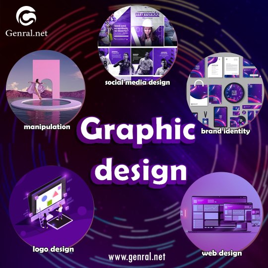
Software development / Digital marketing Agency.
General.net the leader in Dubai and Egypt for services Web/App Design & Development services and the best Marketing Services.
With us you can Build…Market…Compete
Our company specializes in providing comprehensive software solutions for businesses and excel in today's digital landscape and And many digital marketing services.
Building robust social media accounts, creating impactful advertising campaigns, developing cutting-edge mobile applications, and designing engaging websites.
The most important services we provide:
Social Media Marketing
Search Engine Optimization
Search Engine Marketing
Google Ads
Paid Social Marketing
Influencer Marketing
Email Marketing
Branding
Graphic Design
Website Development
Web Design
Mobile App Development
Mobile App Design
#Digital marketing#Digital marketing agency#web development#graphic design#3D design#UI\UX Design#Software#web design#social media marketing#social media#Back end#SEO#Egypt#logo design#Dubai#UAE#ecommerce#marketing
3 notes
·
View notes
Text
Yoga and Meditation Website: Motion Graphic
Hi everyone,
As we continue working on the website for the Yoga and Meditation brand. Hope you guys like it! Let me know what you think. Feel free to leave comments down below. I really appreciate that.
Show some love by pressing “L”, and save it for later inspirations Follow Master Creationz for more cool stuff.
🔥 Instagram: @mastercreationzportifolio
🤩 Behance: Master_creationz
Medium: Mastercreationz
#dribbble#behance#ui ux company#uiux#ui ux design#ui ux development services#landing page#userinteractions#user experience#uidesign#website#website motions#after effects#website design#digital presence#creative agency#uiuxagencyinindia
3 notes
·
View notes
Text
#web design#website design#web design company#web design course in delhi#web design services#web design agency#web design and development#ui ux design
2 notes
·
View notes
Text
𝗟𝗼𝗼𝗸𝗶𝗻𝗴 𝗳𝗼𝗿 𝘀𝗼𝗺𝗲 𝗨𝗜/𝗨𝗫 W𝗲𝗯𝘀𝗶𝘁𝗲 𝗶𝗻𝘀𝗽𝗶𝗿𝗮𝘁𝗶𝗼𝗻?

Check out #UxTitan top picks! We’ve handpicked a selection of visually stunning, user-friendly sites that are sure to impress.
𝗛𝗲𝗿𝗲’𝘀 𝘄𝗵𝗮𝘁 𝘆𝗼𝘂’𝗹𝗹 𝗹𝗼𝘃𝗲:
✅ Sleek designs that are eye-catching and intuitive to navigate
✅ Innovative features that elevate the user experience
✅ Websites crafted to deliver seamless and efficient interactions
Want to see more? Follow us at @uxtitan_official and get inspired by exceptional web design! We can't wait to hear what you think!
#artists on tumblr#batman#bill cipher#billford#deadpool and wolverine#dungeon meshi#gravity falls#house of the dragon#hugh jackman#jujutsu kaisen#web development#web design#web graphics#web weaving#tech#technology#graphic design#ui ux design#ui ux company#ui ux development services#ui ux agency#ui ux development company#productdesign#userexperience#website agency#website analytics#website and app development company#website accessibility#website audit#digital marketing
4 notes
·
View notes
Photo

https://www.timothymaurer.nl/
#Timothy Maurer#design#studio#UX/UI designer#low-code developer#Naam Agency#portfolio#white#grid#typography#type#typeface#font#Univers Next Pro#2023#Week 06#website#web design#inspire#inspiration#happywebdesign
5 notes
·
View notes
Text
UI/UX design - Webdizer
Our team of expert UI / UX Designer and specialists create visually stunning, functional and user friendly designs. We’re deliver design solutions that are current, empowering, brand-centric, and future-proof. Our User interface designers will collaborate with you to create engaging visuals that really resonate with your target audience for powerful user experience.
#web design agency#web design and development#ui/ux design software#web deign solutions#digital marketing services#it consultancy
2 notes
·
View notes
Text
UI/UX design for our friends at The Hardware Hut.
2 notes
·
View notes
Last Seen Blogs