#TypeFaces
Explore tagged Tumblr posts
Text
Side Order Typeface: Complete!
HEY. do you remember when Nintendo made a typeface for Splatoon 3's Side Order and never elaborated? It looks a little bit like this:

Well I went over to the lovely @splatoongamefiles and asked for the font file. They gave me the file, all nice and simple, BUT it was completely unfinished... I really liked it, so I finished it myself!!!
This is what it looked like when I started:

and this is what it looks like now!!!!!!!

It took me 6 months because I apparently started working on this in february, but it only took that long because of my laziness! I did, however, know nothing about this kind of thing before except for my vague interest in typography and fonts. I used a free font-making software called FontForge and I had to learn it from scratch and with no help. So I think all in all, it turned out pretty good!!
I also decided to name the typeface since when I downloaded it, it was called something silly and just for the files so I named it Spire after the Spire of Order which I think works very nicely!!
Now I'll talk about what's changed because I did upload beta version 0.2 of this recently!
added uppercases A, D, G, H, I, K, M, V, W, X
added symbols " # $ % & ' ( ) * + - / < = > [ ] ^ _ ` { | } ¡ £ ¿ × ÷
added all the accents you can see above, but not ALL of them because im lazy
fixed lowercase k so now it looks like a normal letter
B - adjusted sizes of the upper and lower sections as well as sharpened corners of the lower section
K - slightly lowered the crossbar
L - curves of the corners are now slightly smoother
z - raised the top right corner by 1 pixel so its no longer 1 pixel wonky...
@ - increased the gap on the left side
deleted all the original file's kerning and did it myself >:)
and lastly! here's the link to download the typeface!!!!!! if you do use it somewhere credit is always appreciated :))))
p.s. if there are any specific characters/glyphs that I haven't added but u really need please dont hesitate to let me know!!!!
#splatoon 3#side order#side order typeface#splatoon#splatoon side order#splatoon typeface#splatfont#typeface#typography#typefaces#type#font#fonts#i didnt remove the copyright on the file because i couldn't figure it out so fingers crossed nintendo doesnt come for my ass!!!!#or maybe they'll discover it and pay me 1 miiiillion dollars >:)#ANYWAY im suuuuper happy with how it turned out and i hope you all enjoy it :)#reblogs really appreciated bc i really want lots of people to find it and use it!!!
741 notes
·
View notes
Note
How do you identify fonts used in your sources?
https://www.myfonts.com/pages/whatthefont is a handy web page that'll identify a font from a picture. The clarity should at least be decent for good results, but it's helped me out more times than I can count!
629 notes
·
View notes
Text


Typography Tuesday
STEPHENSON BLAKE
Today we're showing a new acquisition from one of the giants of British type founding, Specimens of Printing Types from Stephenson, Blake, the Caslon Letter Foundry, Sheffield, published in Sheffield, England by Stephenson Blake & Co. in 1959. Stephenson Blake claims a lineage directly back to William Caxton, the founder of English type and printing in 1476. We think they stand on firmer ground, however, in also claiming descent from William Caslon, the founder of the first truly British typefaces beginning in 1734.
Silversmith and mechanic William Garnett and toolmaker John Stephenson began foundry operations in 1818 with financial support from James Blake. A year later, they acquired the firm of William Caslon III and IV, an offshoot of the Caslon family business. Garnett left the firm in 1829 and the company was renamed Blake & Stephenson in 1830, but Blake died soon after. Stephenson himself died in 1864 and passed the business onto his son Henry. The company was purchased in 1905 Sir Charles Reed and Sons, but the Stephenson name was retained. In 1937, the company purchased H.W. Caslon & Sons, the other branch of the storied Caslon dynasty, securing its right to claim full Caslon heritage.
Stephenson Blake continued to make some type until 2001, but it finally closed its foundry in 2005, with much of its historical stock going to the Type Archive in London. Because of financial issues, the Type Archive also had to close its doors in 2022, and the Stephenson Blake collection was transferred to the Victoria & Albert Museum as the interim custodian.
Shown here are some shaded typefaces and ornaments from the 1959 catalog.
View more Typography Tuesday posts.
#Typography Tuesday#typetuesday#Stephenson Blake#Stephenson Blake & Co.#John Stephenson#James Blake#William Garnett#Sir Charles Reed and Sons#Type Archive#type specimen books#type display book#type specimens#typefaces#shaded type#type ornaments#20th century type
141 notes
·
View notes
Text

The Doves Type legend is one of the most enduring in typographic history and probably the most infamous. It’s the story of a typeface and a bitter feud between the two partners of Hammersmith’s celebrated Doves Press, Thomas James Cobden-Sanderson and Emery Walker, leading to the protracted disposal of their unique metal type into London’s River Thames. Starting in 1913 with the initial dumping of the punches and matrices, by the end of January 1917 an increasingly frail Cobden-Sanderson had made hundreds of clandestine trips under cover of darkness to Hammersmith Bridge and systematically thrown 12lb parcels of metal type into the murky depths below. As one person so aptly commented on Twitter recently, this notorious tale bears all the hallmarks of a story by Edgar Allan Poe.
The original Doves Type was crafted by master punchcutter Edward Prince, based on drawings produced by Percy Tiffin of Nicolas Jenson’s pioneering 15th-century Venetian type. William Morris, founder of the Kelmscott Press, had actually developed his own ‘Golden’ type some years before The Doves Press came into being but Doves is held by experts as being more faithful to the original Venetian letterforms.
The Doves Type was commissioned in 1899 and created solely by Prince in 16 pt; it was used in all of the press’s publications including their iconic edition of the King James Bible. Each Doves Press book was beautifully bound and, notes Green, noticeably “stripped of decorative borders and illustration, the elegantly clear & legible type acting alone as visual siren-song.”
By 1908, despite successful Milton prints and the aforementioned Bible, the Press was in dire financial difficulty. Subscribers began melting away after Walker had effectively left in 1906 as the bitter & acrimonious dispute took hold between the partners. On finally dissolving their partnership in 1909, Cobden-Sanderson began attempts to wriggle out of an earlier promise that, should the partnership cease, Walker would receive a fount of type ‘for his own use’. Walker retaliated, issuing a writ insisting that the Press shut down completely and he receive 50% of remaining assets. In 1909, the Press’s only valuable asset was the type.
A compromise was reached, brokered by their exasperated friend Sir Sydney Cockerell, which allowed Cobden-Sanderson uncontrolled use of the type for as long as he lived, at which time it would pass to Emery Walker, if he did not die first.
The thought of ‘his’ typeface being used by anyone else, and in a manner beyond his control, prompted Cobden-Sanderson’s now infamous course of action. Only the Doves Press, run exclusively by him, could be bestowed the honour of printing his type. And so the mission to destroy it, beginning with the punches and matrices on Good Friday 1913, began. On an almost nightly basis from August 1916 the ailing septuagenarian dumped the type into the Thames, wrapped in paper parcels and tied with string; “bequeathed to the river” as he put it in his personal diary. Every piece of this beautiful typeface, more than a ton of metal, was destroyed in a prolonged ritual sacrifice.
—Raised from the dead: The Doves Type story, 2013

After working on a revised digital facsimile Robert Green decided that he would try and find some of the original metal type. Using the sources available, including Cobden-Sanderson's published journals, Mr Green worked out where he thought the type was thrown from the bridge into the Thames.
At low tide, and with a mudlarkers licence, he scoured the Thames foreshore and found three pieces of the original type.
Due to the dangerous nature of the Thames currents and tides a team of professional divers from the Port of London Authority then spent two days looking for more type and a total of 150 pieces were recovered.
—One man's obsession with rediscovering a lost typeface, BBC News, 2015
67 notes
·
View notes
Text
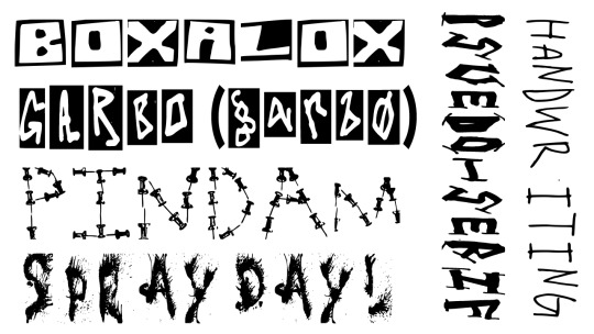
HELLO IVE BEEN MAKING A LOT OF FONTS RECENTLY, YOU CAN DOWNLOAD THEM HERE IF YOU'D LIKE
731 notes
·
View notes
Text


Heartbreak Eighties Font by Nicky Laatz
Download here.
Subscribe to the podcast on Spotify, Apple Podcasts, or Amazon Music.
Follow WE AND THE COLOR on Facebook I Twitter I Pinterest I YouTube I Instagram I Reddit I ChatGPT I Podcast
34 notes
·
View notes
Text
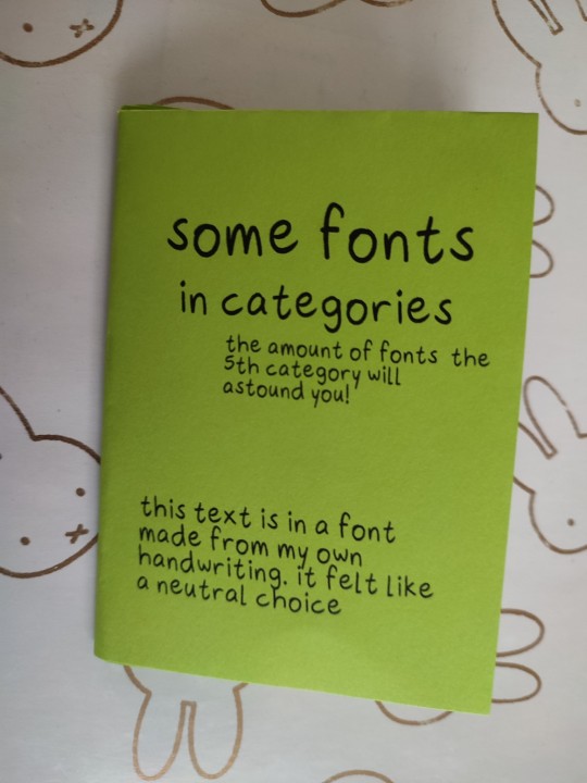
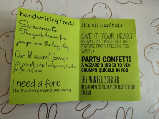
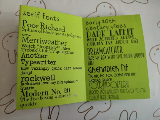
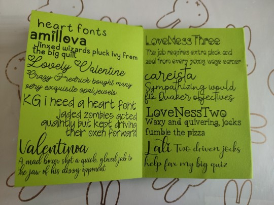
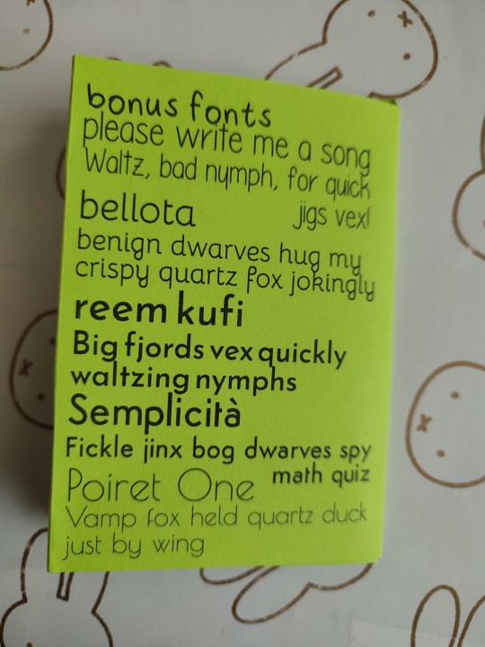
some fonts! they're all findable online somewhere, save for the font from my own handwriting. i wrote the name of the font and then a unique pangram every time. it was a struggle to find this many pangrams! i hope that this can help you if you're looking for a font :)
i downloaded a Lot of fonts with hearts for a project once so they got a full spread
errata: i accidentally forgot the h in lathi. the last heart font is called lathi
this is part of my project to make a zine a day in april
#fonts#typefaces#zine#zines#my zines#bis zines#8 page zine#1 sheet zine#handmade zine#physical art#art#kind of#heart fonts#zinepril#aprine
71 notes
·
View notes
Text


Not Beatles posters, but here's a font I designed for my typography class! introducing cleodile. I made it with fontstruct to its a little blocky lol.
#art#graphic art#graphic design#poster#poster design#design#type#typography#type design#fonts#typefaces#typeface#illustrator#gothic#goth#goth design#medieval#school project#lmk if yall want this as a download hashtag lol
15 notes
·
View notes
Text

Open come in.
#typography#graphic design#design#fonts#typefaces#vintage typography#type specimens#type#type faces#vintage signs#signs#signage
26 notes
·
View notes
Text

Had fun with new typefaces! Print without watermark is available at my shop
Ko-Fi Commissions | Prints | Linktree
37 notes
·
View notes
Text
42 notes
·
View notes
Text
you're named after a typeface now; what are you called?
here's a jumping-off point but obvs if you have another font name you like there's no need to limit yrself~~
#keeping it fun and funky fresh#fuck nato all my homies hate nato.#all my homies hate the nato phonetic alphabet too#i rly like Nimbus Roman No. 9 L as a name. tho the font itself is whatever#or Bitstream Vera for a cyberpunk hacker#fonts#names#typefaces
5 notes
·
View notes
Text


Kyiv Metro Fonts @ Kyiv Type Foundry:
KTF Metro is free for Ukrainians. For the rest of the world: as Ukraine is still in the state of emergency, we'd like to ask you for a donation.
#Kyiv Metro Fonts#Kyiv Type Foundry#Graphic Design#Design#Typography#Typeface#Typefaces#Font#Fonts#Ukraine#KTF Metro
12 notes
·
View notes
Text


Typography Tuesday
Rebuild Something New, Revolutionary. Industrious Grand Intentions Wanted, Handy and Neat Combined. Stand Indian Maid, Ancient National Rambler: The Beauty American.
A little patriotic poem of Indigenous sovereignty and the American future from Brass Type, an early 20th-century type specimen book from the H. C. Hansen Type Foundry, Boston, Massachusetts. Hansen operated from 1872 to the early 1920s, and was the only independent type foundry remaining in Boston after the consolidation by the American Type Founders in 1892.
View other type specimen books.
View more Typography Tuesday posts.
#Typography Tuesday#typetuesday#H. C. Hansen Type Foundry#Brass Type#type specimen books#type display book#type specimens#typefaces#found poetry#20th century type
58 notes
·
View notes
Photo

Modern Type has new typeface called Everyday Sans this is an asset from their promo materias.
90 notes
·
View notes
Text
completing side order typeface: part 8
the alphabet is complete!! all letters, lowercases AND uppercases have been completed!!!! YIPPEEEE assuming i dont decide to suddenly any of them they all look like this :) im pretty happy with how the g turned out just thought u guys should know >:)

if anything, the M and W will probably change bc they both look a bit silly atm but i guess ill cross that bridge when i come to it!!!!
but NOW since that there are 0 letters remaining i get to start counting down the punctuation marks and symbols... yay...
i'll also add the letters with accents when i get bored of making real glyphs bc adding accents is relatively easy (for the most part)
ANYWAY...
8 symbols down, 27 to go i guess?? i get to decide which ones im making and im choosing based mostly on whether they're easy to make and how commonly they get used... so it's just whatever i feel like. i'll obviously be doing all the common ones that appear on keyboards but if anybody has any special requests lmk LMAO
#side order#splatoon 3#splatoon#side order typeface#splatoon side order#splatoon typeface#splatfont#typeface#typography#typefaces#type#fonts#font#actually SO PROUD OF MYSELF MWAHAHAHAHAHHAA#im UNSTOPPABLE >:D
8 notes
·
View notes