#Trying my hands on Manga styled comic
Explore tagged Tumblr posts
Text


I've grown tired of holding into this one.
This is a semi-old drawing. If it's looking meh, that's why. ^^;>
OK, so- I started this back in 2023 (you know, when a certain new year sketch was dropped) and I thought I was being a comedic genius, but I didn't finish it at the timeline I set up so I left it be, then 2024 came and I though, 'oh! Let's give it another go'. Same thing happened. Revisit a couple of months later and though, might as well have it ready for the next Easter. So I finally, finished it up.
I planned to wait, but my patience run out. XD
#BKDK#BakuDeku#MHA#katsuki bakugo#izuku midoriya#Kacchan#Deku#BNHA#My Hero Academia#boku no hero academia#Comic#Featuring Katsuki's ability to break the 4th wall!#Trying my hands on Manga styled comic#Both are not my strangest suites#But I think I did well enough#I remember distinctly agonizing over Deku's neck.#Only to remember that it would be covered with the cape. :'D#It's been just barely 2 years and I already want to change so much#At least that means I've improved. QwQ#Kido art#My art#My stuff
144 notes
·
View notes
Text
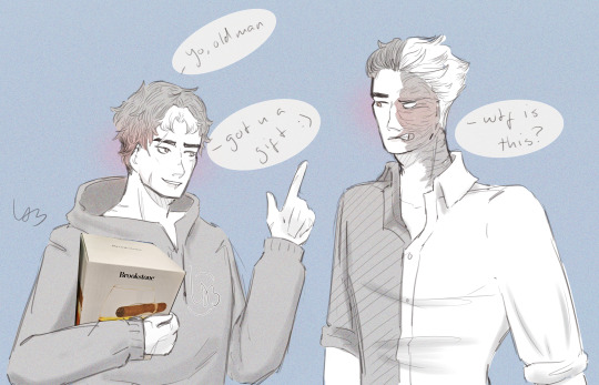
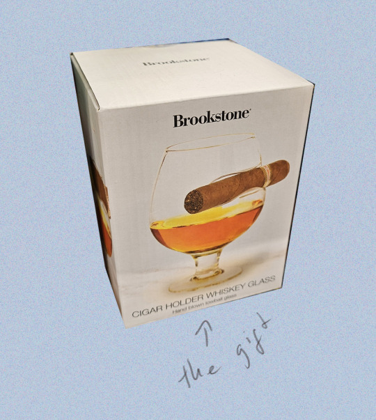
I saw this super goofy looking whiskey glass and decided I needed Jason to give it to Harvey as a joke (Harvey thinks it's dumb, but he does take it out sometimes to use when he's having a rough one.)
#I wanted to do a follow-up of him using it secretly but.... maybe? we'll see!!#this is the first time I've ever drawn Harvey and yk what? not bad#I'm trying my best here and hey! it's working out!#don't look at Jay's hands <3 I couldn't be bothered to make them nice <3 this is a silly little scribble#also looks better than 90% of my art bc I was looking at references so I could draw them nicely#uuuuugh references making your art better is so illegal to me </3 why can't my head be enough </3#art#fanart#digital art#illusketch#comic#... I guess?#the grains#manga style#jason todd#jason todd wayne#red hood#harvey dent#two face#batfam#well. sort of.#also I'm liking the grains colour style#it's a little bit gorgeous and stylish and maybe even a bit cool...#also also I tried to do that cool thing where people use their name/sign like a logo on people's clothes#I want to be cool too...#also... never sure how I want to draw Jay's hair lmao#I think like 50% of my private fics are written about him and yet I rarely draw him bc#I just can't decide on his hair....
44 notes
·
View notes
Note
I've been wanting to ask for a while but never was brave enough to. I'm not a very good artist myself but whenever I try to do a comic by the second panel; my art, mind and hand are all worn out from doing one panel.
How do you keep your panels and art style so consistent throughout the comic?
hi!! thank you for being brave to talk to me! I really enjoy discussing technique!
I think comics seem simple and easy to make, but they're a looong process.
👉First of all: start small. like, ONE page small. TWO pages, etc. just tell one joke, or one kiss, etc. it'll make the entire process less daunting. but do think of the beats of the story like...
1- character A is doing a thing 2- character B makes a comment 3- character A gets embarrassed
/ end
something simple, but you can cut up each little beat into two panels if you like, or just keep it at 3 and explain more with the dialogue.
��for the drawing part, you should really start with a really ugly basic sketch to outline what kind of dialogue and story progression you want to make on each page.

this is a sketch of page 11 of my Bunny Crossing comic:
as you can see, I put a lot of focus on drawing the more delicate moment where Bilbo notices Thorin remembered the comment, so I just actually drew his face in detail there. But the rest was just enough for me to know later where each character is, or if I needed to draw a background, where the dialogue should go, and such.
👉divide your work into days. if it makes you exhausted, you can take one entire day to draw the rough sketch. Then, another day for the dialogue and speech bubbles. Then, another day to actually draw the panels and the more polished sketches of each character. Then, another day for the lineart. Then, shading. etc.
👉try drawing grayscale first. Don't add colors until you're sure you'll have the energy to finish it! It'll get you used to the process, you'll iron out any errors easier.
👉consistency comes from the process itself. I try to be careful while drawing the sketches for my panels, because a good sketch can help you so much in the long run!
👉look for reference on other people's work! manga artists and western artists have loads of footage of themselves drawing online, you'll get inspired for sure!
I hope this helped a little bit! Do respect your own rhythm! 💖 also, if it doesn't help, not everyone likes to draw comics, and that's ok! It IS a very repetitive process. static illustrations are amazing too, and I envy the skill!
88 notes
·
View notes
Text


My most prized possession is…✨
Back at it with another Diasomnia comic! It started out as a very wholesome idea, but then I got the inspiration for just a little angst to add at the end 🤪 I had a lot of fun trying all sorts of different backgrounds and brushes for this piece! I wanted to try my hand once again at a manga style and I think I’ve gotten better at it.
It’s a lot of fun to explore the Diasomnia quartet as there’s just so many paths you can take from wholesome found family to dreaded mortality, which is why I think I keep drawing them so often. You’d think they are my favorites as I draw them a lot, but Pomefiore still ranks as number one dorm….for now, we shall see what Book Seven has in store 🤡
#lilia vanrouge#silver#silver vanrouge#sebek zigvolt#malleus draconia#diasomnia#twst#twisted wonderland#twisted wonderland fanart#twst comic#twst fanart#ツイステ#ツイステッドワンダーランド#fanart#art#my art#doodle
877 notes
·
View notes
Text
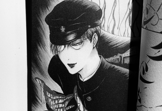
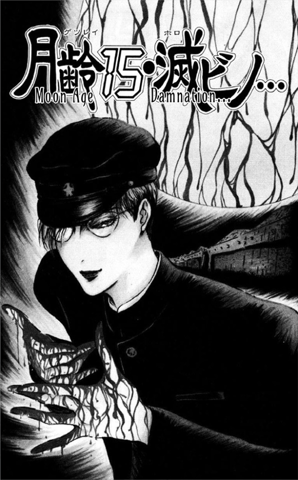
MOON AGE 15 : DAMNATION (English Translation) Moon Age 15: Damnation is a 1988 short comic by pseudonymous author Not Osada, who openly drew influence from the Tokyo Grand Guignol's work in such a way that can arguably give a loose insight to the TGG's mysteriously anomalous works. While only a slight window into what could've existed in Ameya's vision, each contemporary rendering of his world of gore-soaked medical equipment and rusted metal is valuable in what it represents. As mentioned in my prior Litchi essay, the fragments of the Tokyo Grand Guignol we have now are descendants of a cultural phantom, standing as shrouded windows to a strange intangible stage that's positioned somewhere between post-Maruo inferno, industrial subculture and decadent poetry. While Osada’s manga featured notably grizzly and cruelly morbid scenarios, his stories were made explicitly for the shoujo market with a distinctly shoujo-influenced art style. Characters appear almost doll-like with their visual perfections, all while they’re often dismantled and reassembled in bizarre surgical practices by sadistic doctors. Much like how Zera expresses horror to seeing his own imperfect organs in contrast with his youthful appearance, our pristine victims share the same internals as any other slaughtered cadaver, all in a maddening spiral of narratives that contemporary readers often described as resembling descents to insanity. This fixation of the contrast between perceived beauty and grotesqueness is arguably traced back to the Tokyo Grand Guignol’s own works, with lines accentuating the youthful features of certain characters while audience members were known to fondly look back on the actors’ appearances. Litchi himself was described as being a “cute” robot despite the violence it was programed to carry out. It’s possible that this collision is inherent to Ameya’s conceptual destruction of the TGG. A known detractor to poetic writing, he called on a romantic author to pen the screenplays to the TGG’s first three plays so he could “destroy” them in his direction. The use of beauty could arguably be a mockery of it, taking these idealized dolls and leaving them trapped in worlds of fascism and hospital rooms that are haunted by the stinging stench of antiseptics and blood. Plastic hospital drapes were used in place of stage curtains and autopsy films were shown to the wide-eyed characters, who spoke of pure blood and dirty blood, the antithesis of blood, mercuro. What is beauty a representation of in the Grand Guignol’s works with the prominent fascist leanings of the protagonists? Considering the perspectives of our characters where the Hikari Club and the deranged teachers and Nazi doctors are treated as protagonists rather than explicit antagonists, the plays could arguably be read as the decay of a self-convinced beauty under fascist rule. Songs of the pure-blooded ubermensch fading into silence as the singers all collapse, lost in their own delirium as they pump mercurochrome into their hearts and try to rationalize their own organs that resemble the internals of the so-called ‘landraces’ they rendered into lifeless meat. It’s the natural conclusion of fascism, a collapse that occurs in demented violence to the face of a denial of death. I was originally split on publicizing my translation due to copyright-related complications, but after seeing the increasing gatekeeping of TGG materials at the hands of a rapidly growing market riddled with competitive spending and scalping, I feel obliged to share it to the public who (like myself) can’t afford to spend the now literal hundreds that are required to access angura ephemera that was meant to be openly available to the public to begin with. When originally finding this story, the book it was featured in was only 5 dollars. Now it goes for 60 to 200. That's ridiculous. With all the preamble out of the way, the story is under the cut...
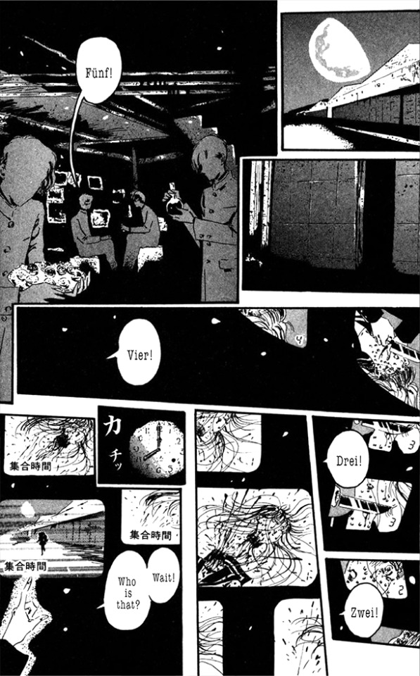
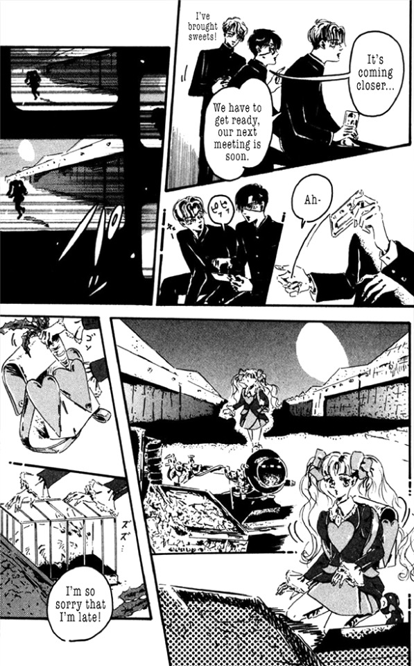
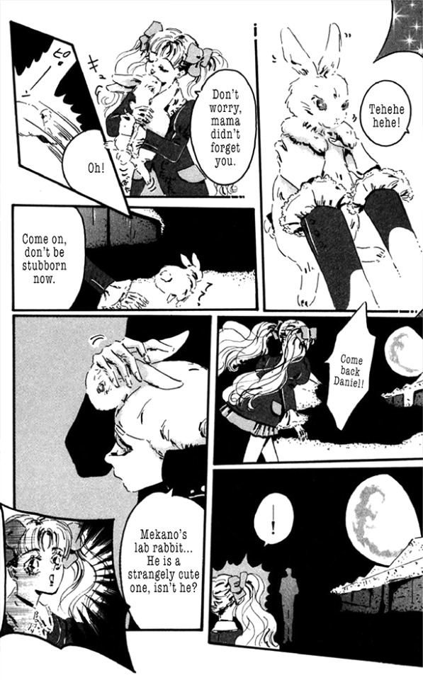
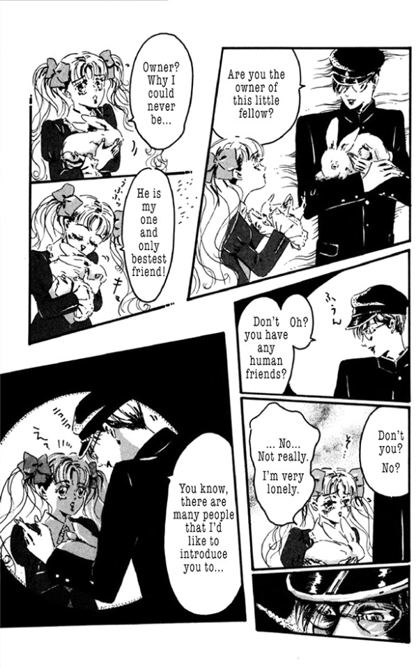
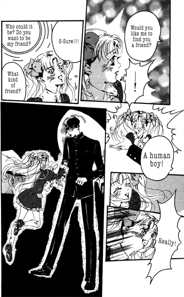
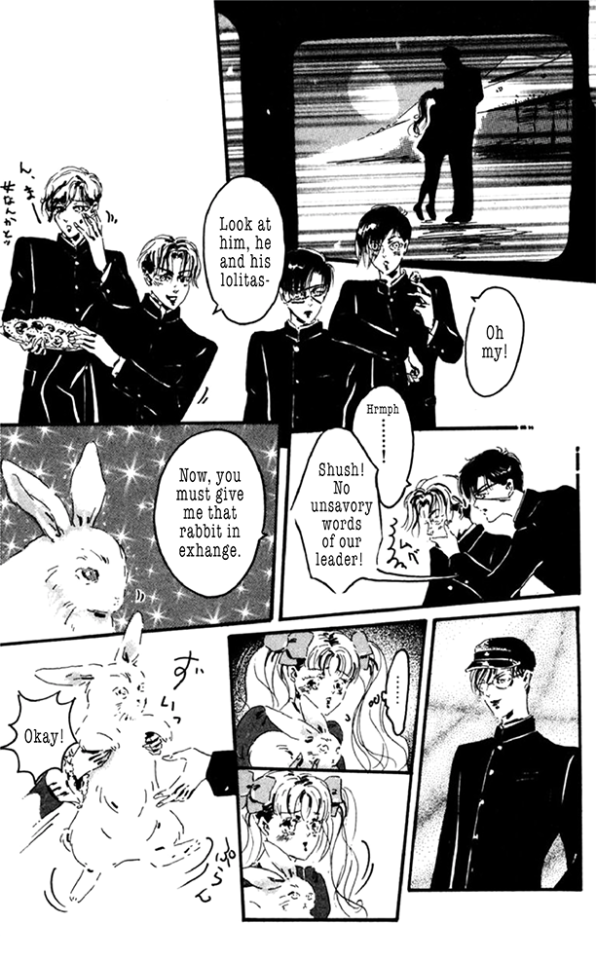
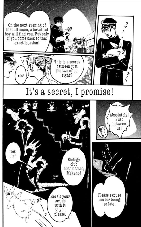
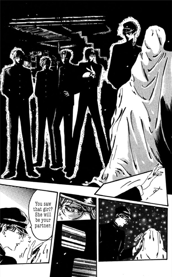
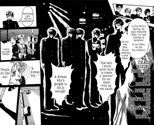
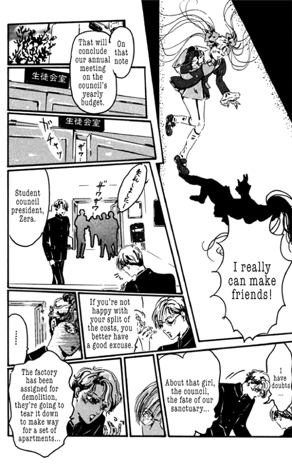
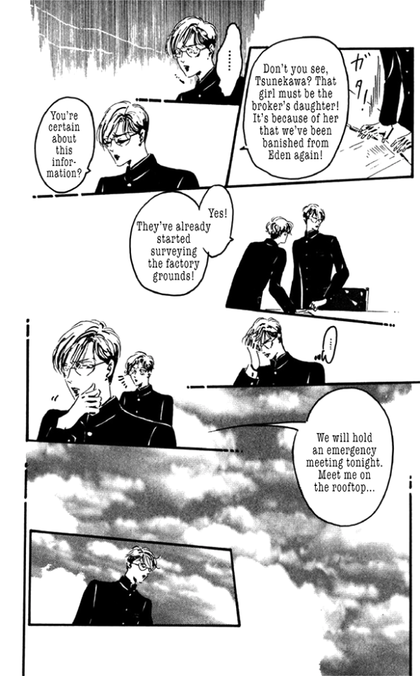
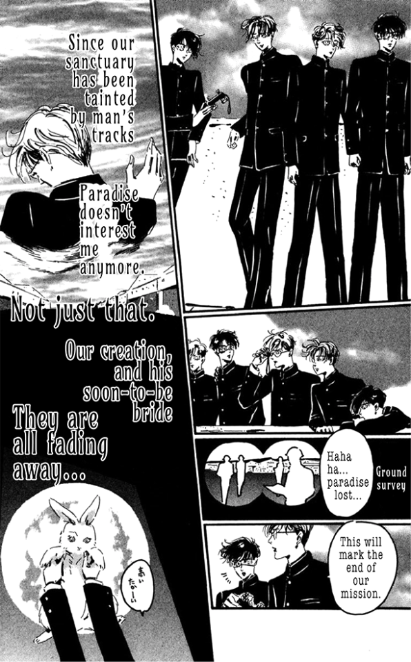
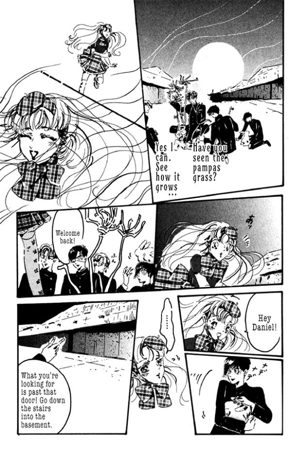
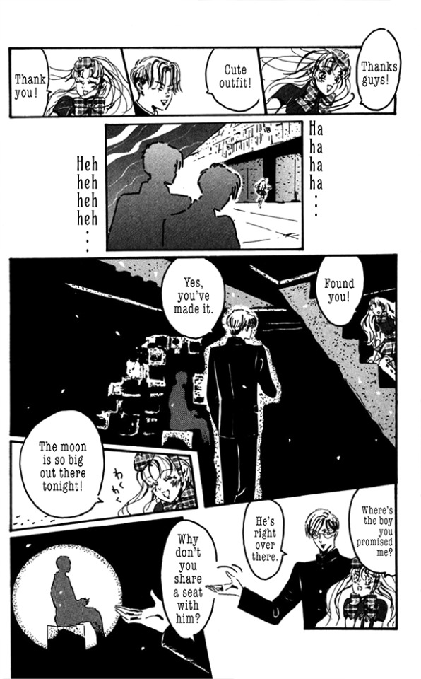
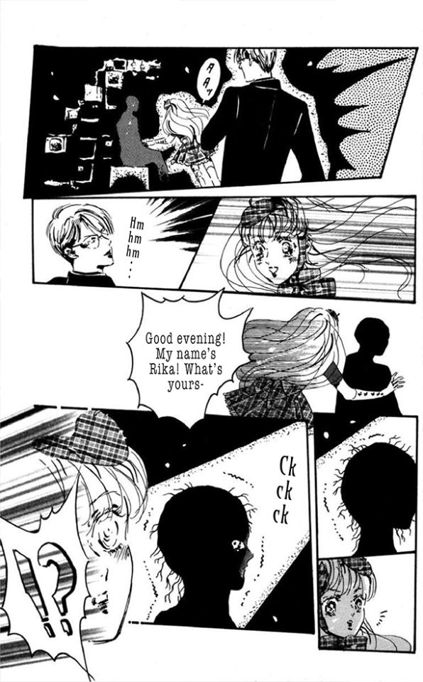
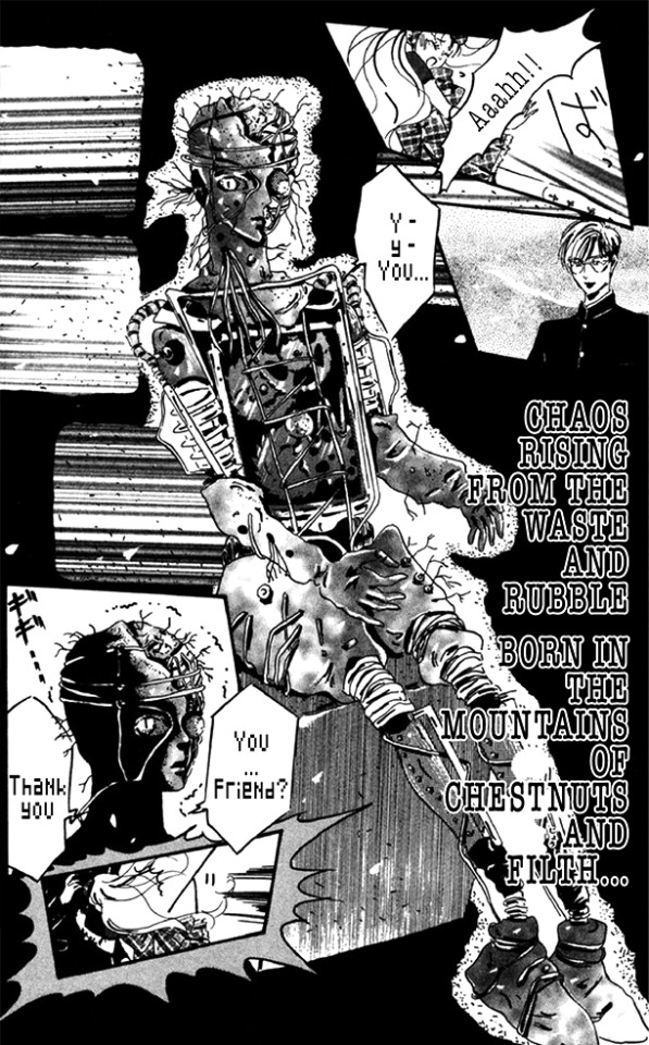
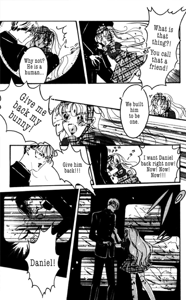
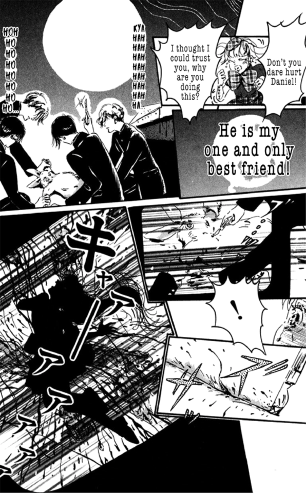
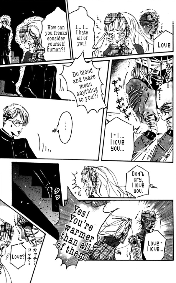
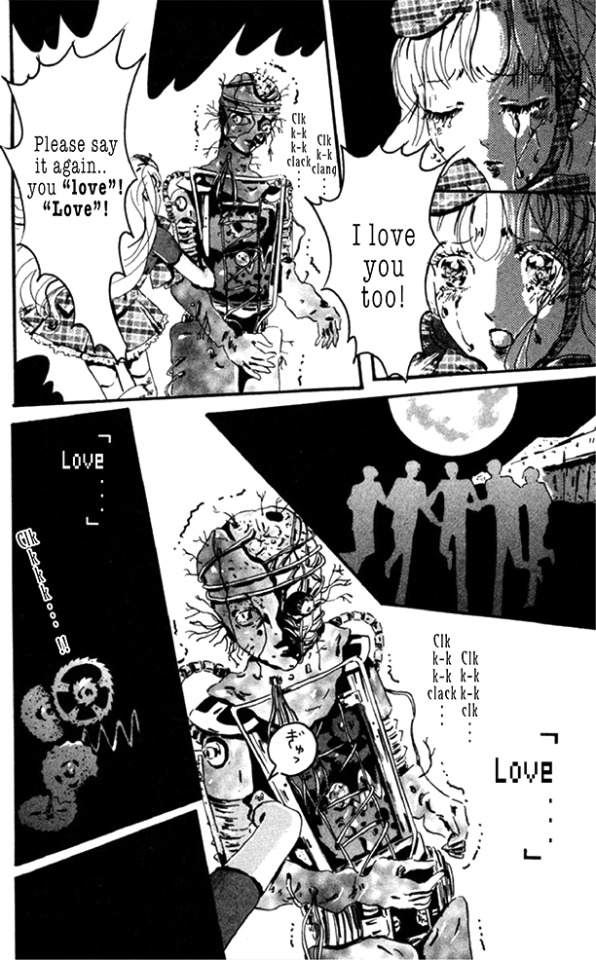
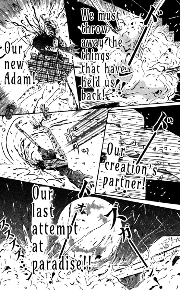
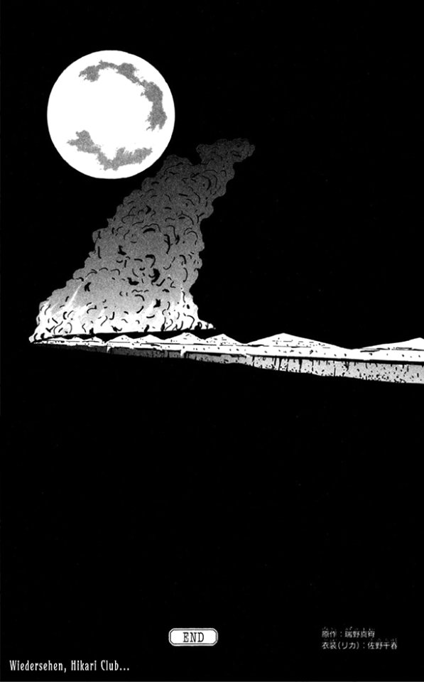
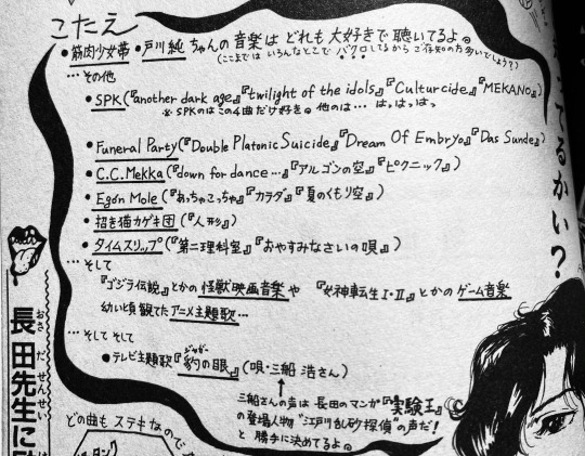
While I made my best effort to maintain accuracy to the source material in translation despite my practically nonexistent understanding of Japanese (my translation method is a Frankensteining of language learning videos, a Japanese to English dictionary from the Internet Archive and Google Translate with a lot of localizing and dissection in between), there are several details I feel I should note for the sake of transparency. One smaller one was the inclusion of the term l * lita. It was in the original text, and I was honestly very unsure of including it in my translation as it’s a term I’m personally icked out by. While I was ultimately recommended to keep the line as is for accuracy, I wish to state that it's a term I'm personally very uncomfortable with in what it represents. The other note, which is the more prominent one in the final product, are the references to The Last Attempt at Paradise. In the original text the club members solely refer to their hideout as paradise and Eden, leaving a lot of excess space in the speech bubbles after translation when making the shift from Japanese text to English. The Last Attempt at Paradise was the name of S.P.K.’s 1982 live album that documents their set at the Off the Wall Hall venue in Lawrence, Kansas. Often considered one of their best concerts and a highlight of the industrial genre, the S.P.K. Appreciation Society of Sydney in their All The Way With S.P.K. / American Tour article describes the concert as being the group's “best performance to date”, further adding that they “Flattened (an) enthusiastic audience with massive P.A. amplification of FX bass regeneration”. This insertion wasn’t done at random, as the Tokyo Grand Guignol’s works were heavily engrained in the original industrial scene of the 80s. Both the 1985 and 1986 performances of Litchi began on a playback of the S.P.K. song Culturcide (from their 1983 Dekompositiones EP), and it was likely that use of the track that led to Not Osada’s early fixation on S.P.K.’s music. At the end of Blind Beast, in a sort of reader Q&A Osada is questioned about some of his favorite music. At the top of the list he features the tracklist of the Dekompositiones EP and the track Mekano from their 1979 Mekano / Contact / Slogun single. Interestingly enough he states that he only likes those four songs from the band, following the text with laughter in regards to their remaining discography. I’m unsure if this means he was unimpressed with their noisier work (which would be curious knowing his liking of Mekano with how it originated from their earliest noise-adjacent album) or if he was directed to their later Machine Age Voodoo material and was alienated by it. In the same Q&A he also mentions the band Funeral Party, who featured specially commissioned art by Suehiro Maruo on their Dream of Embryo single. It's apparent that he also had a copy of the compilation album Vision Of The Emortion, as the list also includes C·C·Mekka and Ego'n Mole, who were both featured in the album alongside Funeral Party's only two other documented tracks, Das Sunde and Gears - Night. S.P.K. references are sprinkled throughout this story along with Osada's other Litchi-adjacent entries. Aside from one of Zera's henchmen being named after the Mekano track, it's very likely that the frequent references to Eden are in homage to the lyrics of Mekano. The first lines of the track include the verses "One by one, odd to even. Break the scenes, rudely eden...".
Moon Age 15 was originally printed in 1988 as a two-part miniseries in the horror magazine Complete Collection of Horror and Occult Works - HELP, namely in volumes 5 and 6. While being an early work that derived from the TGG, it still wasn’t the first comic to adapt the Litchi stage play, with Das Blut : Blood and Eternal Girl preceding it with their 1986 publication in Osada’s debut anthology Night Reading Room, sharing the same year as the TGG’s early closure following creative conflicts between Norimizu Ameya and K Tagane (the group's author, who remains anonymous to this day). It’s to be noted however that while Das Blut and Eternal Girl were the first stories to feature the Hikari Club as antagonists, they are only tangentially related with Moon Age showing more distinct Grand Guignol archetypes (musings of the full moon, examinations of the Hikari club’s misogyny, idealization of technology, and even an early rendition of the Litchi robot itself). First kept solely as a brief serial, Moon Age was later reprinted in abridged form as a short story in the 1996 Blind Beast anthology. While copies of HELP are notably hard to find and demand high prices, I was given an in depth view of both volumes that featured Moon Age’s serialization by a collector earlier last year. While the drawings are still the same on a rudimentary level, the length of the serialized version is notably longer than the later Blind Beast variant, with the HELP serialization being over 40 pages while Blind Beast’s is only 24. This was the product of the manga being entirely revised for Blind Beast’s print, with the layouts being drastically altered along with basic revisions of the line art. Certain scenes that would usually take 2 to 3 pages in the HELP version were condensed to 1, resulting in a unique tradeoff where one version feels unusually spacious in its framing while the other is heavily condensed and almost chaotic by comparison. It’s only a thing that springs on you once you compare the two variants, I saw the revised version first and originally didn’t pay any mind to it. One thing that is certain is the polishing of the art. The brush work in the Blind Beast version is refined with a more elaborate sense of weight and flow while the HELP version is notably rough with the prominent use of rudimentary screentones. It reflects as a somewhat rougher variant of the art shown in Night Reading Room. It feels strangely digital, like it’s the product of early computer art. The line-by-line reuse of the decapitation scene from Eternal Girl being shown on the TVs further adds to the strange digital feel of the art style.
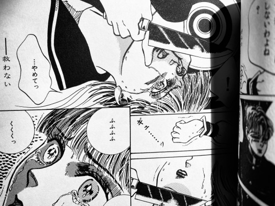
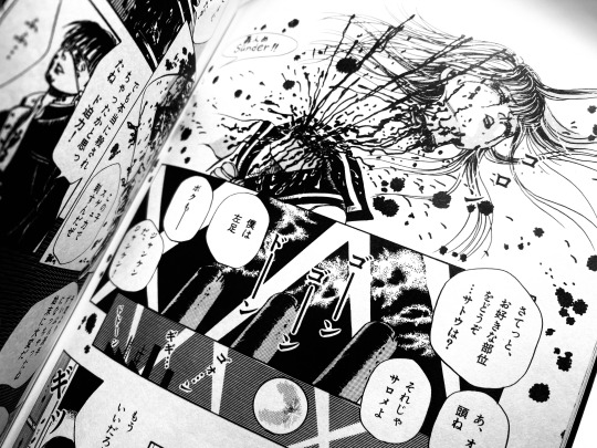
Similar to Moon Age, Osada's other stories of the Hikari Club featured the members luring girls to their brutal deaths. In Eternal Girl the members bring in a student and film her mutilation for a snuff film that acts as the story's namesake, in Das Blut they corner another student to the woods where they hang her, and in Jinta Jinta they kidnap a student who bullied one of her classmates to suicide before trepanning her with a strange device that's somewhere between an electric chair and a drill. Not Osada was very recently namedropped in the concluding essay of an English print of Kawashima Norikazu’s Her Frankenstein under the alternate Nagata Nooto anglicization of Osada’s pseudonym. Their name is a curious case as while there is a prominent written variant (長田ノオト), it’s seen numerous English iterations. In Osada’s own English signatures it is written as Not Osada (with the name apparently being derived from a German phrase), but other variants include Osada Nohto, Osada Nooto and Not Nagata. If I'm not mistaken, it could count as one of the first English acknowledgements of Osada's works in print.
67 notes
·
View notes
Note
You write unhinged Leo so well, and I really like how you write him. I was wondering if you had tips on unhinged characters 😂, or do you just get inspro from existing characters 👀
aksdakjsdh thank you so much ;w;
And honestly???? I’m not totally sure how to give tips— but I love, love, love unhinged characters in media, so I’ll use them as examples
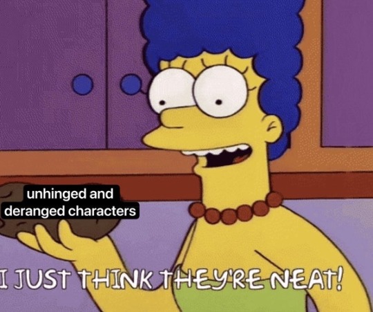
(long rant below lol)
I’ve always been a big fan of silly, ‘crazy’ characters in animated movies and cartoons. I grew up on Batman the Animated Series and the original Teen Titans, which were full of silly, fun tragic characters.
Don’t get me wrong, i love a good edge-lord— but as a tot i thought the colorful, theatrical, insane bad guys were more fun to watch than the big scary serious ones (ESPECIALLY if they had a good villain song. A+ good shit)
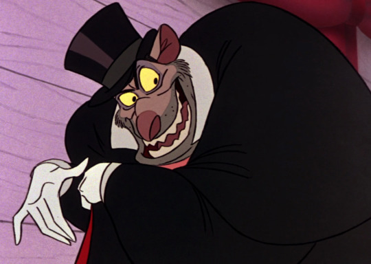
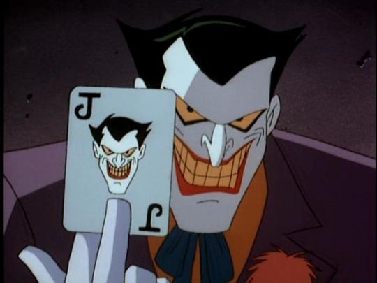
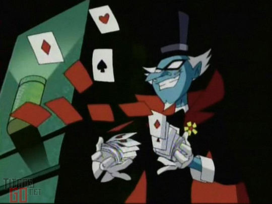
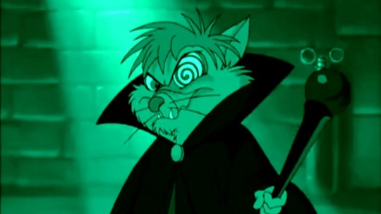
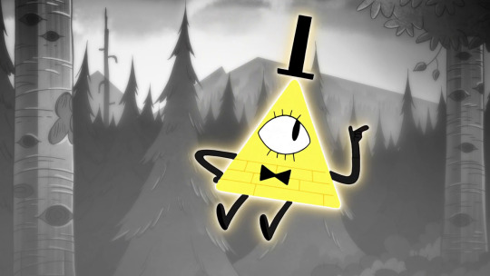
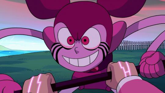
(From left to right: Ratigan from Great Mouse Detective, Joker from Batman the Animated Series, Mumbo Jumbo from Teen Titans, Martin from Secret of Nimh 2, Bill Cypher from Gravity Falls, and Spinel from the Steven Universe movie)
And not just bad guys!! There are a ton of unhinged good/neutral characters that i absolutely adore.
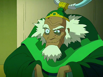
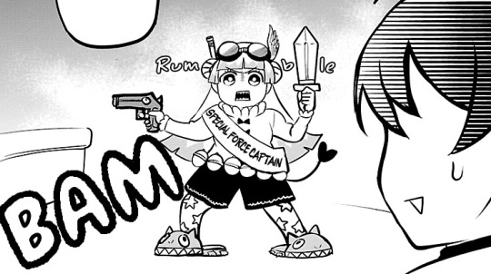
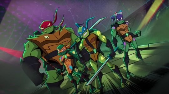
(From left to right: King Bumi from ATLA, Clara from Welcome to Demon School Iruma-kun, and, of course, our silly 2018 turtle boys)
((There are many more characters in both categories, but I’ll slide these examples in here for now))
My personal brand of “Unhinged” or “Crazy” characters definitely leans on comedy. That’s what i enjoy seeing and reading! I personally like it because it can help keep a story fresh and interesting. There’s an element of surprise and unpredictability with what a character might do, and i love that!!
I also really enjoy a touch of feral behavior in my unhinged characters. The lack of clarity and the danger that imposes can be a very fun tool to use, no matter the character’s moral compass. (I’m feral for feral behavior lol)
And impulses. Whether a character has a few screws loose or is generally a goober, they like to act on impulses. This often goes hand-in-hand with comedy, and that’s something I enjoy!! We get a lot of moments like that in Rise, and that was one of my favorite parts of that TMNT iteration.
But as far as writing goes, it’s been tricky for me. All of the characters I grew up or love have been visual— trying to find a good balance for reading has been a puzzle I’ve been figuring out as I go.
I read a lot manga (lol nerd) and comics, and I love how thoughts/dialog are depicted. Especially the really dramatic or impactful moments. (I’d add examples but I’m already at the Tumblr image limit LAME)
As strange as it sounds, I try to capture that “impactful visual” style in my writing. If I had ANY advice on writing unhinged characters, pay attention to pacing—
Short. Fast. A calculating thought. Perhaps a run on sentence that lacks punctuation to represent the rushing and disorganized thought process. A question? An answer with little thought. Is this moment amusing; describe how. Is it upsetting; describe how. Are the thoughts starting to scatter? M aybe s o…
Big moment statement.
Action or plan of next big move. Flow should never seem too uniform. Even in normal writing. Don’t be afraid of accentuating— but don’t overdo it. Remember, unhinged characters are impulsive. Have fun with that.
Just as a quick and dirty summary— when it comes to unhinged characters, I like to use comedy, feral behavior, and acting on impulses. I also like to keep it as visually appealing as possible for characters to give the eyes a little treat after reading walls of text. I like to use fun text formatting to help with the fun too (But don’t overdo it! Don’t make it feel like a chore to read) (<- says the girl who goes into way too much details sometimes lmao whoops)
But ultimately— have FUN!!! Unhinged characters are fun, so make sure you have fun writing/drawing/creating them!!
#BIG CRY THANKS#thanks for coming to my ted talk lol#hopefully this was somewhat helpful ;w;#or at the very least fun to read#I’m so glad people seem to enjoy how I’m writing Leo#because this is the first time I’m writing ANYTHING like this#pastel prattling#I’m sure as soon as i post this I’ll think of more obvious characters#but take this for now lol
82 notes
·
View notes
Text


Roundup-catch up: October 2024!!
Sooooo close to catching up now. October I was just trying to get through it but as always gotta make the time to read.
Z-chan by Shingo Iguchi I first learned about in the book Dream Land Japan by Frederick L Schodt. A lot of the works he highlighted in that book actually remain untranslated or only got one recently (I had actually forgotten he did a spotlight on Murasaki Yamada!) Z-Chan was one of the works that got a spotlight, having initially run in Garo as part of a larger multimedia arts project by Iguchi. The surreal story of Z-Chan and the mouse Richard Sex operates on multiple levels and parallel worlds with with a serialized novella about the little gnome people with colored hats who live in parallel to Z-Chan inserted between or on top of the manga itself. A really beautiful and innovative use of the comic form, with an ending that will stick with me for a long time going forward. The Lotus edition which I read is to my knowledge the "complete" version including the appearance of the bear named Baron.
Otaku Vampire's Love Bite by Julietta Suzuki just strted its english language run. And while it isn't a high school romance but made me remember how I don't really have any fantasy romcoms in my life right now so its a beyond welcome presence. I feel like I'm in good hands with Julietta Suzuki, Kamisama Kiss was very formative for me but I didn't keep up with any of her follow up work. I really like the art style she's adopted now and the humor and clashing personalities is just what I'm hoping for. Cynically though this opening volume is a rather interesting illustration on how participation in otaku culture is increasingly consumer oriented. So in volume 1 I'm like mister male lead not very taken by the titular otaku vampire's fannish behavior as must confide in all honesty, find it to be kinda sucker behavior to do what she does which is filling her home with the low effort plastic merch the animanga industry is pumping out in dizzying amounts but I'm hoping the later volumes will get more into the creative, social, or community building aspect of being a fan that I do find to be a more interesting angle to the culture. But its funny and I'm interested in seeing how her world of vampires will intersect with our world in the upcoming volumes.
Natsuko Taniguchi has been extremely productive these past few years and there's even more stuff from her back catalogue waiting for me. And she got 2 ongoing serials! The one I want to highlight (as I havent read the second yet lol) is Jaa Anta ga Tsukutte Miro yo (Well, Why Don't You Try Making It) is one young man with an outdated chauvinistic mindset getting knocked to the present day when his cute, diligent, master of his beloved high effort japanese style dishes, girlfriend of many years suddenly dumps him. Autopsying the corpse of his shattered relationship quickly reveals that he's nitpicky and thankless behavior did him no favors. Forced with the reality of the situation he realized he must change, bc no Reiwa era woman wants a man stuck in the chauvinist Shouwa era.
What I like is how its not just His story, but Hers as well. His ex girlfriend is herself unpacking the culture of the good and perfect woman that she had completely immersed herself in. Her hair and clothes never strayed off trend, she strictly monitored how she behaved in front of men so they wouldn't be put off by her, never got along with other women especially ones who were bad at performing like she did. But it all changes once a young woman with a flashy style and "alien" like hair color crashes into her world and makes it just a bit bigger. I didn't stress it in the last roundup but social commentary is on the trend alert for manga in the 2020s and I'm really looking forward to see where it will go.
Like I've talked about before about veterans who just really know what they're doing... Tennen Kokekko by Fusako Kuramochi was made when she was 20 years in the industry. By this point she's a very early adopter of digital tools for art and the way she draws is near unrecognizable from her work in the 70's-80's. I wish the bunko covers were less plain because ohhh my god. To see someone play with layouts, techniques, and form while telling a beautiful but complicated coming of age story that isn't just the young protagonists' story but the adults' as well. My mistake is not talking about this series as I was reading it bc now I'm just way too overwhelmed about what I want to say that I can't get anything out aside from gushing but this work truly is by someone who really polished their storytelling abilities and never stopped challenging themselves artistically. Might make a spotlight post because the live action movie being the only thing that made it over to the english language truly does make me feel like we've deprived of something. Ooooooor it will appear in the queue 🙂↕️
#just to be clear ive never been above buying those little knick knacks once in a blue moon#but i found the mass production of it nauseating bc its truly low effort shit thats going straight to landfills#truly low effort like im talking just slapping a screenshot on acrylic is the level of effort ive seen#recommendation corner#roundup#my scans#long post
23 notes
·
View notes
Note
Your art is so pretty 😭🩵 do you happen to have any advice on how to improve/ any art tips?
Thanks for sharing your work, stay safe!🩵
thank you so much!! these are some things that come to mind
study your favorite artists + what they do successfully (i think this person has a neat way of doing studies! there's a lot of artist studies on youtube, I think it's a respectful way to emulate and learn from an art style without claiming it's yours)
real life is your best reference! you'll be able to see how values, shapes, textures work irl, and in turn that could also help you see how other artists choose to simplify and stylize things
also don't be afraid to use refs for your art. my reference doc for my kzsc comic alone was 179 pages, with the first 60~ being ingame pose/outfit/weapon refs, and the rest being inspos from manga panels I liked + other art pieces that I felt captured motion and paneling really well.

draw things you like! and don't expect that every piece you draw has to be perfect (especially if you're trying to gain an audience with your art). you'll get burnt out really fast that way :'> not every piece has to be posted; even for me, I think 60% of what I've been drawing has been OCs that I don't post, but they make me happy!
it's normal to feel like you're missing out on trends given how fast things go by nowadays, but its important to work at your own pace.
but also don't force yourself to draw if you're not feeling it/haven't had breaks in a long time. it's really important to get up and stretch so you don't injure your hand too, health is important!
199 notes
·
View notes
Note
May I request a sayain buddy whose like goku and loves fighting and eating and is always up for a good challenge, and can the interaction be with young justice acting as their wild-card if things go south.
First time writing for this kind of Buddy, lets do this!
Hope you enjoy!
Buddy the Half Saiyan and meeting the Young Justice
SFW, Platonic, Slight Familial, Half Saiyan Buddy
YOUNG JUSTICE
It was Constantine’s fault.
Scratch that, Constantine and Zatara’s fault.
The League had contacted them both to help with a mission that required to summon ‘help’.
Constantine and Zatara were trying to do the spell, but their bickering and arguing messed the spell up.
And out popped a dizzy 10-year-old with a strange hair style on the floor.
Buddy rubs his head as he tries to sit up. Zatara: “Look what you did Constantine!” Constantine: “Look what I did!? You’re the one who—” Buddy: “Umm, excuse me?” Both men look at the slightly frightened boy. Buddy: “Do you know where I am? One minute I was with my brother and Mr. Piccolo and the next I’m here.” Zatara: “Mr. Piccolo?” Constantine looks lost in thought before his eyes widen. He walks over and offers the boy his hand. The boy looks at the hand curiously before taking it. Constantine: “What’s your name kid?” Buddy smiles a bit. Buddy: “I’m Son Buddy!” Constanine: “… Son Buddy… As in Son Goku?” Buddy smile widens. Buddy: “Yeah! You know him?” Constantine: “… Oh Fu—” Zatara: “Constantine! Wait how do you know his name? And know who Goku is?” Constantine: “My personal life is my personal life, Zatara.”
The two men explain to Buddy that he was accidentally sent to their world from his.
IN their world, his world was simply a manga, a comic.
They are a bit surprised that Buddy does take the news… a bit well.
Yes, the boy does freak out a bit, but not because he was in a new universe.
Buddy was worried for his family and friends that would soon need to fight the Andriod’s.
They needed all hands-on deck!
They needed him!
It was at that moment that Batman and some of the other Leaguers came in.
Buddy is just confused as more people in funny looking costumes come in.
He gets a bit wary feeling certain power levels, but most of them seem nice enough.
One of them, Batman he thinks, tells him that until he could get back home, he was going to have to stay with the Young Justice.
Meanwhile with the team…
Everyone is wondering who Batman is bringing in and why to, and quote, ‘Don’t fangirl’, for some reason.
After initial introductions (and making sure certain members did not crowd the poor boy) Buddy starts making friends almost instantly.
Aqualad was a bit curious when Batman brought a 10-year-old to the cave.
But that didn’t stop him from being as polite as possible.
He does not know what to do with the kid when he takes a moment to size them up.
It made him feel a bit uneasy, but soon Buddy smiled and waved at the group.
The Atlantean has seen fast eating before, he has Wally as a teammate.
But NEVER had he seen someone eat so much and so fast before.
Kaldur doesn’t understand when Wally and Dick tell him NOT to spar with Buddy, to leave that to Connor.
… But he could not resist those puppy dog eyes.
It was a trap.
Kaldur is on the ground, eagle spread and feeling the pain. Buddy is just sitting on his chest looking at him curiously. Buddy: “You, okay? I didn’t hurt you too bad with the warmup right?” Kaldur: “I am fine—did you say warm up?” Buddy grins as he hops off Kaldur’s chest while stretching a bit. Buddy: “Yeah! When are we going to start the real fight?!” Wally has a bucket of popcorn and watching the entire thing. Wally: “Buddy, I think the only one here that could beat you right now is Connor.” Buddy stops stretching a bit before thinking. Buddy: “Makes sense, he does have a higher power level than you guys.” Kaldur: “What’s a power level?”
Connor does not know what to think of this little boy.
He does his best to not interact with him.
Little kids= weak right?
Connor told this to Robin, and he still hasn’t stopped laughing.
Isn’t too phased by the sudden appetite the kid has.
I mean he’s seen Wally eat fast too, what’s the problem?
…Gets a bit concern when he learns that is not normal for human behavior.
Only starts to get close when Buddy tells the group that he is half human and half Saiyan.
Another not fully alien in the team, he’ll keep an eye out for him.
Is borderline annoyed when Buddy keeps on asking him to fight.
Superboy snaps as his fist goes to punch Buddy in the face. Buddy only stands in place as the fist in only smushing part of his cheek. Connor gives him a surprised look while Buddy only smirks. Buddy: “Finally, a real fight! Come get me Connor!” Connor lunges forward but narrowly miss the 10 year old’s body and is kicked in the back. Buddy: “And stop holding back!” Wally and Robin are watching intently from the sidelines. Wally: “This is the greatest day of my life.” Robin: “Do you think he’d fight Superman?” Wally: “Not in base form, maybe Super Saiyan or Super Saiyan 2.”
Connor did prove to be much more of a challenge than the others.
He even made the half Saiyan put in a bit more strength and a couple of Ki blasts when things got a bit hairy.
Connor gets his behind served time and time again.
But the pair have bonded and that’s what counts.
M’gann loves the little boy.
Even more when she hears he is part alien.
The Martian is the nicest of the group.
She reminds Buddy a bit of Mrs. Briefs.
M’gann has used her shapeshifting abilities to change her hair to look like Buddy’s.
Is happy to cook anything for Buddy.
M’gann pulls out a tray of slightly burnt cookies. M’gann: “Would anyone want more?” Most of the team groans with funny stomachs… except Buddy. Buddy: “Yes please!” Connor: “How!?”
Artemis, Dick and Wally are the first ones to know right off the bat who Buddy is.
Dick and Wally know the manga and Artemis learned the basics after hearing too many conversations between the two.
Since the three of them have more background knowledge on the half Saiyan, its easier for them to bond.
That being said the trio have a hard time not saying any spoilers.
Especially finding out which Saga Buddy is in.
Out of the three of them, Wally is the one who can keep up with Buddy’s speed.
Artemis and Dick managed to use their weapons on Buddy for a while before the kid quickly adapted to them.
Like father like son.
Buddy is looking down in front of the three of them. Buddy: “Hey… do you think I’ll be as strong as my dad? I mean I’m not a Super Saiyan, but I defently get stronger right?” The trio have flashbacks to Gohan and Buddy’s Super Saiyan 2 transformation and the entirety of the Buu Saga. Dick pats Buddy on the head. Dick: “You’ll get stronger.” Artemis: “Just remember to keep training, you and Gohan.” Buddy beams a bit at the response. Wally: “Yeah, you and your brother better keep up the good work!” Buddy smiles before thinking a bit. Buddy: “Brother’s?” All three teens freeze noticing the mistake. Buddy shrugs. Buddy: “I guess Trunk’s is going to be like our little brother.” Artemis, Dick and Wally internally: “Like father, like son.”
Buddy is not allowed to leave the cave too often as the days turn into weeks.
The half Saiyan did get cranky at the lack of room and getting bored of fighting Connor all the time.
Thankfully, Buddy is allowed on missions that need extra back up.
It’s during one of these missions that Buddy finally turns Super Saiyan.
Wally was not crying in the background, and you can’t prove it.
Thankfully, its around this time that Constantine and Zatara finally get the portal ready for Buddy to leave.
Buddy is saying his goodbyes to everyone. Buddy: “If you ever need my help, just drop by and ask! Bye!” The team waves goodbye as Buddy runs into the portal. Next thing Buddy knows he is standing a few feet from his home. Buddy blinks seeing someone come out of the house. It was his mother with a laundry basket. Chichi blinks too before dropping the laundry basket and racing to her little boy. Chichi: “BUDDY!” Buddy just accepts his fate letting his mother hug and cry. His own tears starts prickling out. Chichi: “Oh my sweet boy! Where have you been!?” Buddy: “Sorry Mom, but it wasn’t my fault this time.” WHOOSH! Buddy turns around at the familiar sound. Goku, Gohan and Piccolo were standing there. Gohan: “Buddy? Buddy!” Buddy smiles widely with his arms open as Gohan barrels into them. Goku lifting them both up into his arms sighing in relief. Gohan: “DON’T YOU EVER DO THAT AGAIN! I COULDN’T FEEL YOU! I C-COULDN’T F-EEL YOU!” Buddy just latches onto his twin while Piccolo pats his head affectionately. It was good to be home.

#dc#dc comics#young justice x platonic reader#young justice x reader#dragon ball x platonic reader#dragon ball x reader
43 notes
·
View notes
Text

[ID: Scene drawn in sanguine type colour showing a crowded street in the darkened background and Kotetsu Kaburagi and Barnaby Brooks Jr in the foreground, wearing their season 2 clothes. Kotetsu is holding up one hand and looking to the sky, a speech bubble beside him saying “Looks like it’s gonna rain”. There’s another speech bubble in a darker shade on the other side over the crowd, near where Albert Maverick can be seen within the crowd but not entirely present, this one saying “You’re still not alone Barnaby”. Barnaby is looking over his shoulder towards the image of Maverick with a shocked expression. Only Kotetsu and Barnaby’s eyes are in true colour. End ID]
-
Whumptober Day 16: Hallucination
Speech bubbles translate roughly as:
Kotetsu - “Looks like it’s gonna rain”
Maverick - “You’re still not alone Barnaby”
Some season 2 era Barnaby still being tormented by Maverick because that sort of mind manipulation can’t just be shaken off
I’m trying to work on trying some comic/manga style arting and this is my first attempt at something that could work as a panel
-
Context for people not in the fandom who don’t mind spoilers:
Albert Maverick killed Barnaby’s parents when Barnaby was 4 years old, and Barnaby saw him do this. Maverick used his powers to change Barnaby’s memory so it was a stranger with a tattoo on his hand who did it, and then adopted Barnaby to raise him and basically groom him to be a pawn to be a superstar hero and boost ratings for Maverick’s show about superheroes tackling crime and natural disasters. Eventually, after meeting his partner Kotetsu (on the far right), Barnaby learns the truth via some more memory editing and stuff to break the edited memories, and Maverick ends up being killed.
There’s not a massive amount in canon that addresses the psychological whump, other than Barnaby keeping a photo of Maverick in his apartment but turning it away, him having a fear of betrayal, and him admitting that he doesn’t feel like his life is his own. So here’s an addition - hallucinating his whumper in a crowded street.
#tiger and bunny#kotetsu t. kaburagi#albert maverick#Barnaby brooks jr#taibani#whump#masks whump art#anime art#manga art#anime whump#hallucination#mind control#psychological whump#brainwashing#memory alteration#whump art
25 notes
·
View notes
Text
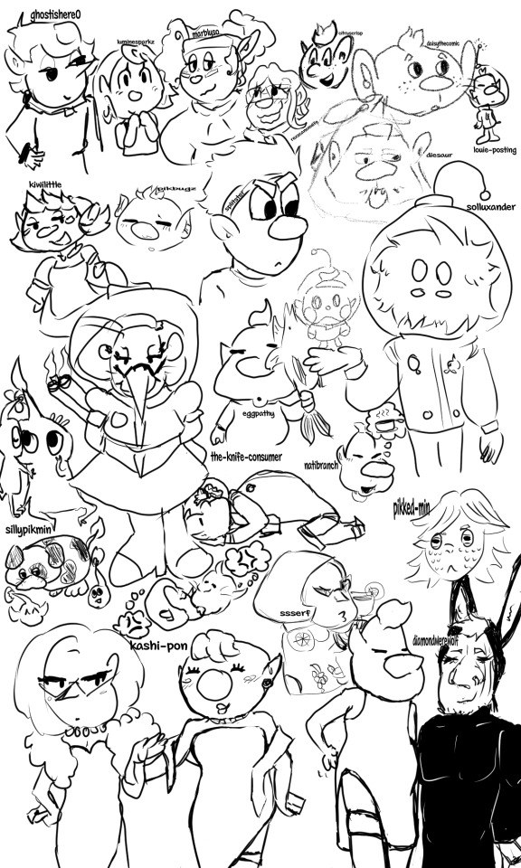
Art practice by trying some other artist's styles that I'm a huge fan of!
From Top Left to Bottom Right:
@ghostishere0 - the original reason I started this doodle, as I wanted to draw a "shepherd lovers squad" and their OC (who I don't know the name of F) was the perfect fit for it.
@luminesparkz - the best interpretation of Pom pikmin. If I were Mr. Nitendo, I would make them the official comic creator along with the manga comics.
@marblyso - If I was a little more unhinged and made a shrine to Erma Shepherd, it would be mostly marblyso's art of her, it's my absolute favorite Erma depiction <3
@rexscanonwife - another OC that I don't know the name of, but she makes such a cute pair with Shepherd and has such cute art that why not, let Shepherd have multiple canon wives at this point.
@citruscrisp - I think this is secretly Alph in an alternate universe where he makes comics about himself, because citrus has Alph's character SPOT ON, and also loves to put that boy in a situation (which I am happy for, I enjoy seeing that boy in a situation)
@daisythecomic - oooaaaaaaaaaa they look like little mice people they look so soft and sweet I love them so muuuuuuuuuccchhhhhhhhh
@louie-posting - I can't not include actual Louie Pikmin on this list.
@kiwilittle - the soft, the sweet, the one who makes the best family style art, really making me wish I was an inch tall so I could go to holidays with the olimar family, also their wife design is so cute that if Olimar didn't already get it I would shoot my shot for her m a a m
@pikbugz - really nails the soft aesthetic that makes pikmin such a calming series, and their coloring style is so soft and good that it gives me the ratatouille nostalgia flashback moment.
@splitster - more than just the wraith au guy, they are the one who makes incredible and funny comics; I've seen so many fics with the rescue corps where I can pick up that yes, this trait came from a splitster comic, and that's a GOOD thing. Made me actually LIKE Dingo, the nerve.
@diesaur - I can't do diesaur's incredible, unique art justice, they are amazing at using geometrics and have the best charlie (his little teefs...)
@solluxander - Cars, one of my favorite pikmin Ocs I've ever seen! Collin deserves a slightly unhinged sentient fluffball boyfriend, and I always love seeing the new ways Cars will interact with him.
@sillypikmin - all hail the best pikposter, who I'm still convinced is an actual leafling living on actual pnf-404, literally every time I have a bad day I look at drawings of Moss and feel better.
@eggpathy - thank goodness they came back to give us old man yaoi. I keep their drawing of olimar kissing the pikmin good night on my phone and look at it before I go to sleep and so far I have yet to have a single nightmare.
@the-knife-consumer - the only person I trust with Louittany, toxic yuri my beloved, I just adore their beasty brittany design so so much, I wish I could have a small brittany to live in my house...
anyway they have the best headcanons for our beloved blorbo hamster people
@natibranch - there's a voice line of Louie going "wa-ha!" in this really cute sing-song voice and every time I see any art by natibranch I hear that sound in my head as a little burst of serotonin, they just nail that exact feeling so so well.
@pikked-min - Another of my favorite Pikmin OCs, Yuva! A really interesting and unique character concept with a lot of thought put into the worldbuilding, followed by a strong unusual personality that had me looking at the pikmin world through a new perspective entirely. Please, someone, give them some sunglasses. Read the fic it's so good
@ssserf - artistic and deep while still somehow looking like official nintendo tm art, genuinely the best at the pikmin proportions, how could I resist trying my hand at the classic amazing beautiful Brittany Fruit Sweater moment, literally SO iconic
@kashi-pon - while I was working on the part of this that was just kashi's various highlife dresses there was a part of me that wanted to dedicate the rest of the space to paying homage to the joke comic of Louie lifting his skirt to show Olimar that he's wearing shorts, except this dress....well......
@diamondwerewolf - the reason we got louie in a little bunny outfit anyway, and thus why we got kashi's dress version. you single-handedly turned Louie into a tumblr sexyman, how could you
82 notes
·
View notes
Note
Hello! I wanted to request a matchup of that's okay :) I'm fine with either BSD or JJK, whichever one you think works better
My pronouns are he/him, and I tend to dress in a more formal/ouji fashion style if that makes sense. As for my personality, it tends to vary based on the day. Sometimes I'm really tired and don't want to do anything, and I'll jokingly complain to my friends. On other days I tend to not have strong reactions to events, even if they do make me feel strong emotions. On other days, I'm really emotional, and I'll be really bubbly about the things that make me even the slightest bit happy. I tend to be pretty quiet around people I don't know, but I can be pretty chaotic around people I'm close to. I'm a generally affectionate person, even with just my friends. Despite the fact that I constantly make jokes and don't take a lot of stuff seriously, I try to be there for my friends when it really matters and helping other people helps give me a sense of purpose.
Some of my hobbies include reading (mainly classic literature, but mangas/comics are also common), playing video games (especially Splatoon and Honkai: Star Rail), knitting, drawing, researching viruses, and baking/cooking.
As for male or female character, I'd prefer male, but I don't mind either way.
Thanks in advance if you do this! :)
I hope you like it! Sorry it's so late!
You got...
.
.
.
Toge Inumaki!

○ Toge isn't much of a talker, so he's the listener to your yapper. He'd listen to you go on and on about everything you like ♡
○ I think Toge is a huge nerd, he plays games like Honkai and Genshin, so I definitely see you two playing together!
○ If you ever knit him anything to wear, he's never taking it off. School? He's wearing it, uniform or not. Mission? He's wearing it, tho he's gonna be extra careful
○ He doesn't mind all your jokes, letting out small chuckles at each one, no matter the timing
○ And on days you're just too tired to do anything, he'll sit by your side and let you know he's there for you with a couple taps on your hand ♡
10 notes
·
View notes
Note
How would you describe your art style and the techniques you use, if it’s not too much trouble?
I'd describe it as a mix between modern american tv animation style (Gravity Falls, Steven Universe, Bee & Puppycat, etc) and trad pub middle grade graphic novel art style. I've purposefully pushed for my art to be as "marketable to the american market" as possible, but my hand also leans towards western styles. I do end up sneaking in some manga influences every now and then (Yuhki Kamatani's layouts are beautiful, and I always liked Haikyuu. Art wise I find the characters really appealing) plus my coloring style comes from years of being inspired by webcomics of all sorts. Basically we try to be Gurihiru haha (those power Asians are way above my level though).
Professionally for work, my techniques are fairly standard for comics I think? Except instead of like penciling, inking, coloring a graphic novel in various stages- we just finish everything in one go a page at a time to keep the process fresh ("the webcomic method"). For the fancomics I draw for fandom, it's a looser version of what I do for work. Apart from Sons of Mars, all of my fancomics are just cleaned up sketches with colors slapped on and handwritten speechbubbles. I do everything digitally.
#askjesncin#i got a lot of comments early on when I drew dc fanart that my stuff looks soft and friendly#it's from years of figuring out our shape language for the american middle grade market#“middle grade author draws edgy john constantine comics for fun”
16 notes
·
View notes
Text
its been so long (like less than a week) since ive burger posted so here we go: headcanon list guys!
also cw - mentions of mental illness/trauma
bob : very much based off my own dad (one of my favorite people alive), bisexual, autistic depressed and clinically anxious, lies on the floor a lot because of back problems, works through injury and illness (the family's doing a bit better on money now but he's lived his whole life in fear of being unable to support the people he loves and their wellbeing), saw that tina aligned herself with femininity from when she was a really little kid (supports her endlessly, was the first one to buy her a dress), gives the kids his old records/cassettes/cds, quality time is his love language, loves crappy old movies from the 80s (like weird science), winona ryder was his childhood crush, tina shows him phoebe bridgers and he loves her (cries to kyoto bc dad issues), so desperately trying to not become his father, dreams about his mom a lot, has been getting gray hairs since he was 17 (purely from stress), bad episodes of insomnia, claims he doesn't mind being away from linda (if shes not in the same room as him for more than an hour he needs to cry, she is his absolute best friend), really adores teddy like a stupid younger brother, fucking hates mr frond with a burning passion
linda : truthfully i dont have much for her. i dont need to really give her any headcannons i worship her the way she is, but shes def adhd and autistic
gene : genderfluid (he/she), audhd, live laugh love fiona apple, bad sensory issues, cant wear pants unless theyre baggy, sisters buys him reusable earplugs, got linda's family's loudness, talks shit WAY too loud, jazz bitch, can surprisingly do a cartwheel really well, walks around belting 90s music (everyone hates it except lin), loves makeup and looks amazing in it (tina is secretly really pissed that he looks better in it than her), can fall asleep anywhere, will eat anything once, has bit alex/courtney as a form of affection (tina and louise too but theyre used to it), will sit on tinas floor and vent to her at any given moment, remembers nothing except for the most obscure random things about the people he loves, incorporates music in all of his school reports, loves salty food especially
louise : unlabeled (she/they), autistic, loves japanese candies and snacks, phone screen chronically cracked, permanently cold hands, tina does her hair, makes own jewelry and pins, loves broaches and mints but always forgets which is in which tin, has drank paint water by accident, very artistic, loves to draw in comic book/manga styles, secretly really enjoys being around jimmy jr (finds him really funny), loves a good ironic trucker hat, if you can read this the bitch fell off, needs glasses (ends up getting funky ones like lindas), short fingers that are always painted light green and pink, lots of scars on hands from skateboarding, learns bass later in life, starts saying "oh my god" like bob
tina : transfemme (she/her), autistic/has clinical anxiety and depression, speaks with the most subtle new york accent (residual from linda), multilingual (fluent in spanish, conversational in french, knows some korean, can say random words in various others), loves bad campy horror movies, incredibly soft but always sweaty hands, layers her hair (learns to cut her own), because of everything thats happened she is extremely paranoid about family dying, sensitive skin, has a bunch of digestive issues (throws up a lot), sometimes has violent tendencies (feels guilty for them always), sleep walking/chronic nightmares (wakes up screaming a lot), watches drag race with bob, #1 phoebe bridgers/lucy dacus/julien baker fan, adores sleater-kinney, loves riot grrl music, bites nails, extremely clumsy (scars), loves big jackets over dresses, takes naps because she cant sleep at night, truly is her fathers daughter
i do not think anyone will read this whole thing, but i hope you like it if you did
#bobs burgers#tina belcher#louise belcher#gene belcher#linda belcher#bob belcher#headcanon#belchers#burger family
9 notes
·
View notes
Note
hello hello i was wondering if you have any pet peeves regarding frev or art stuff people do that put you off?
Interesting question 👀
Well with Frev, nothing in the community esp annoys me that much- I think I'm just so damn delighted to have found ppl who are into a niche thing as much as me! And everyone I talk to often is so nice and we ttly get each other, I got no complaints 💖
With Frev on a wider scale though, my pet peeve are these very patronising comments I get from non-frev enthusiasts mostly on IG. They always follow a pattern of being a (generally myth-based or reductive) critique of Robespierre, in the form of a question. Smth like 'wasnt that guy a dictator?' And then when I answer these questions, normally trying to debunk etc. Without fail each time, the commenter will reply to me with random facts, really emphasising the dates and names. It always comes across as if they're testing me (esp when these facts are put in the form of a question), or trying to prove they know more than me. And I have a feeling that if I was a cis-man, with a less cutey art-style, I wouldn't get responses like that.
With art related things, the kind of behaviour I dislike is generally more related to work, because it's my full time job, so these things pre-occupy me the most...
-The consistent dismissal from western publishers/editors, of various techniques and styles that are influenced by manga: Big expressions, rhythmic pacing, expressive hand drawn speech bubbles. These are just some of *many* examples that are sharing the 'feelings/emotions first' approach that manga has. This approach is what I love about comics. This approach is what has made manga the leading comic market all over the world.
Editors for whatever reason, really dislike this approach lol
If its feelings-first, they are quick to either designate you as a childrens-artist only, or will do their best to make you remove every technique that heightens emotions too much. So you'll notice most manga-influenced western comics remain in the middle grade, sometimes YA genres at bookshops. But pls listen editors, people *love* this kinda stuff! Manga sells more than western comics. Webtoons are huge, and follow these techniques generally. You will have so many best sellers on your hands, if only you'd stop with this very Western fear of feelings and push those stories a little further!
-The only other art thing that rly puts me off is like, heirarchy behaviour lol Art is hard enough without bringing all of that kinda stuff into it.
I'm a community-over-being the best kinda person. And some people do get very competitive, in the art/small press world. Such ppl will rapidly change their behaviour towards others depending on what they think they can get out of a relationship. Some people take sides in arguments based purely on popularity, or amp up their enthusiasm towards someone they think is gonna get them a good review/ a place at a comic con, or who is presently the most popular artist etc etc. Someone who was once really friendly with you will suddenly ignore you, for various reasons.
In my experience, someone ttly changed their relationship with me once *I got a book deal*, so for them it wasnt about being around the most popular people, but in fact, I think they needed to be around someone who wasn't as successful as them. Since they like completely ghosted me after a fairly close friendship, I'll never know for sure. I only came to that conclusion because more than one person had been through a similar experience and that was why. So thats a thing that happens....It's complex, and emotionally draining.
Anyway, I dont like it when ppl build relationships or a community around these factors- I prefer when ppl are upfront/honest and simply either like or dislike your work in an upfront and honest way, if that makes sense 😅
#put under cut cos it was long and two separate topics dont wanna spam#sorry this was long#and no esp hot takes lol#art#frev#webcomic
11 notes
·
View notes
Text
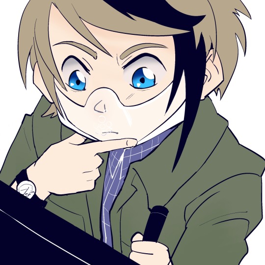
Hannibal - Manga Adaptation
Hiya!
This blog is dedicated to making a manga adaptation of the first two seasons of the NBC show Hannibal. And, also, some fun Hannibal-related posts.
I was searching for something like this on the Internet as reference material when I wanted to draw some fanart. Disappointed by the lack of manga-style Hannibal art and comics, the urge to take matters into my own hands struck me. While I would typically overthink starting a hefty project such as this one, I have no doubt I will actually follow through with it. (Worst case: I get to print this whole thing and have a full Hannibal manga. That seems like a pretty good worst case to me.)
I'm doing this alongside my Masters in Psychology so bear with me if there are small breaks during exam seasons. However, I will try to plan ahead.
Do feel free to shoot me asks/messages concerning Hannibal, art, or anything else you can think of. I may not be very sociable but I am a very curious person. Expect (about 2) weekly updates on the project!
-Jamy
#blog intro#blog info#hannibal#nbc hannibal#murder husbands#hannibal nbc#hannibal lecter#nbc hannigram#will graham#hannibalmanga#hannibalthemanga#fannibal#hannibal fanart#hannibal fandom
41 notes
·
View notes