#This was my quickest art piece that I finished!
Explore tagged Tumblr posts
Text
Dorimu Headshot Drawing

So, I made a Headshot Image for my Digimon/Warioware Crossover character I made for his Toyhouse page. I hadn't drawn this character since a year ago and since I am back on my WarioWare fixation, I thought I should draw him again! I probably put waaaay too much effort on what's essentially a simple profile pic for an OC but I kinda like what I made. I don't have too much gripes about this.. So, I thought all you kind people of the internet will enjoy!
Created on: 4-13-2023
#My Art!#digimon#dorumon#warioware#I guess?#fan character#crossover oc#This was my quickest art piece that I finished!#This was done in a couple of minutes to maybe an hour#Usually it takes a couple days to a month to complete something#I'm kinda proud of this#He's kind of fun to draw sometimes#Then again I think most Dorumon in general are fun to draw#I like to imagine how fun it would be to animate one#also feel free to ask about the page#I need to make a ca.ard that lists all of my links...#I'll get too that later...
2 notes
·
View notes
Text

Happy halloweeen. :)
This is the commentary track(?) to my digitober. It's just rambling, so don't expect anything too interesting.
This first picture came out on a whim, I originally didn't intend to do anything for this october. I had just arrived home from helping my mom out with something, and was in a good mood. I think this picture, as sketchy as it looks, reflects that feeling. I'm content with it - and it's halloween themed! All the better.
For the second, I tried to follow the "official inktober" list (something I'd drop quickly in the following days). I'm disastrous at making backgrounds, so I gave it a shot for practice sake. I think it's not a bad result, it almost kinda tells something of a story.
"Boots", hah. It's not terrible, but it's also missing a lot of polish. I think the idea behind it works well for a cute/sexy picture of Angewomon. Maybe some day I'll revisit it? I should put more practice into drawing the human form in the meanwhile lol.
I really dislike the fourth one. I think Lianpunmon deserves better art, so I'll definitely do it again some day. My skills are so undeveloped, it's very obvious seeing this poor hatching.
Speaking of hatching, I bit more than I can chew with this one. The composition isn't interesting enough either, and just like with Lianpunmon there's no story here. At least Angewomon seemed to be interacting with the viewer lol.
The sixth is something I liked better. It's kinda shody, but there's something of an urban fantasy thing going on.
The Vamdemon one I can see the faults: I need better line control, the shapes aren't locked in as well as they should be. Yet, I'm partial to it…
Rapidmon deserves better lol. I still really dig the idea behind this drawing, I just wish I'd have given myself the patience and time needed to render a kickass explosion.
SkullGreymon, I have little to comment. It has zero story, but it's carried by the vibes. It's the first (and arguably last lmao) time I think I was cooking with the halftones.
The tenth is arguably the peak of the entire month. It has some story, a neat composition, and acceptable execution. Strangely enough it was one of the quickest to make: I had an idea, and it came out in a few minutes (compared to some other drawings where I was fighting for my life), and it ultimately was one of the most interacted with drawings in my entire blog. Funny how that goes.
I like a lot the Piemon one, as bland as it is. It's like a design piece, more than a drawing. It helps that the perspective deformation hides my poor linework haha.
I went too hard on the Mephismon X one, to the detriment of the piece. Instead of adding texture, it just looks dirty. Damn.
The thirteenth one was my poor attempt at making a background. Originally, Bakemon was gonna have this devious, whimsical look, but as I finished drawing the stairs I thought "I'd be kinda tired after climbing a few floors", so I changed Bakemon's expression to reflect that. Just a little trivia.
The Jesmon is what I'd argue was my peak. Shapes are locked (as best as my skill lets them), values worked well, it told a story. It's my favourite of the month.
Fiftenth was made, mostly, trying to catch some Adventure buff to the ammount of interactions I'd get. I mean, I had fun drawing the characters, but the reality is that I had petty reasons. I don't dislike it though.
I know exactly what I wanted to do with the sixteenth, and I didn't achieve it. Looking back, I think I should've done it in BW, rather than grayscale, to make it pop more. Fix the composition too. It's too plain. Shame, I really like Lilithmon X's design.
Seventeenth was also one where I just phoned it in. I think the values are all over the place; though I do like the harsh light. Impmon is a lot of fun to draw, all things considered.
Greymon was fun, lots of fun to draw. But this was another piece where I went too crazy trying to use halftones, I ended up making something that lacked impact or presence. I do like, in a self deprecating way, how the background seems okay until you look at it directly and see that it's kinda bad lol.
I made Nefertimon's torso too long! I only realized when I was doing the finishing touches lol. Yet I like the whole thing a lot, I think the texture and lightning kinda sells it as a photo (the white border was an attempt at selling that further). Saw someone refer to it as "the last thing I see before I die", and that comment might stay with me forever lol.
The twentieth is another I had a clear picture in my head as to what I was actually hoping to make, but failed to. Instead of landing some sort of finish, it's on a weird gray (lol) area. Making clouds is hard y'all.
Twenty one is one where I managed to stick the landing to what I had in mind. I think the composition needed a few more minutes of baking, but overall I'm content with the result. Death-X-DORUgoramon is a complex design, so any degree of succesful translation is a win in my book.
I think I needed to draw some more background Kuramon for the twenty second. Y'know, to really sell the swarm thing. It's kinda too clean.
Before twenty three, I had never given myself the time to draw a tree shilouette. It was fun to turn off my brainfor a bit and just draw line, after line, after line, after line. I did the tree first, and then I tried to figure out how to make Shurimon. Originally, I wanted him to be hunched over more dramatically, almost as if he was climbing down the tree, but I was incapable of drawing it in a satisfactory manner. So this is what I got.
Twenty four is so bad! I think Monitamon came out fine, but the background elements are so poorly done! I'm so embarrassed! lol
Kabuterimon was really fun, very dramatic looking. I think it has some serious readability issues with the hands, but I don't dislike the idea I had at all.
Hackmon's drawing was done almost like a sibling piece to the fourteenth, Jesmon's. Like, Huckmon is somehow watching his exhausted future, yet he stands stoic. On it's own, I think it's plain. Like, it has some charm, but it's lacking in impact compared to the fourteenth. But maybe that's for the best of the story?
The Wizarmon sticker came through me realizing I wasn't practicing my lineart! So I did a sticker instead. This was actually version two, but number one was so bad I had to redo it. Despite it being a humble sticker chibi, it's overall the day I spent the most time drawing.
Twenty eight came from me realizing I hadn't done any Alphamon! So I did what I thought would look badass. As much as I like Alphamon, though, his shapes are difficult for me to grasp so it came out shoddy and weak lol.
Twenty nine, Ragna Lordmon vs Ragnamon, was hurt by me recording it. While an exciting thing to do, I felt like I wasn't allowed to do anything but move forward quickly, or to change things (I'd have moved both Ragnamon and the main Ragna Lordmon body closer to the center) that would've made the composition flow better. It's not an abject failure, and the video is fun to watch, but still…
Dorumon is a simple piece that I was a bit surprised to make. My birthday is not information I tell people, but I was just compelled to share a bit of myself. I dunno, it feels weird. I'm weird. It came out cute at least.
And at the last! Noble Pumpmon again. I'd love to tell you that I applied everything I learned throughout the month and it's my best piece and stuff, but that isn't the reality. It's a better show for a similar amount of effort compared to the October 1st drawing, but it's not some crazy good display of betterment. A bit, yes, but less than I had hoped.
If you made it this far into this silly wall of text I wrote, I thank you. I thank everyone who interacted with my drawings, it pleases me a lot to see that someone gave it a like, or a share, or a comment. I learned about myself, and my limits, through this experience. It was tiring, but setting myself the goal of "make a drawing a day" was, paradoxically, liberating. Like, now I had a reason to draw! (despite me having some comission work to do lmfao). It was nice. This was one of the most entertaining octobers in recent years. Thanks again to everyone who participated in some fashion.
181 notes
·
View notes
Text


Fellow classmate and good friend of mine asked me would I draw solid snake from metal gear solid and to say I was overjoyed was an understatement. Its relevant in more ways than one outside of our assignments as working on this reignited that sense of determination and joy in my flow. It took time which is honestly where I'm happiest personally. Not the quickest at what I do generally with Art but I've learned to use that as a strength. This piece was created on bristol board using various pencils and fine liners. I love how smooth bristol board is to work on as it offers a slight sheen to finished work but is very durable for layering most mediums.


UPDATE: a second request so I drew up another one!
19 notes
·
View notes
Note
How long do you typically spend on each TMayNT drawing? Of the ones you've done so far, which one took the longest? Which one was the quickest?
OOOOOO! These are great questions, thanks so much for asking!
Hmmm, the length of each piece definitely depends on what I’m doing, but on average I would say most of these pieces take roughly 6-8 hours to finish? I enjoy posing a whole lot and bc of that I often use a lot of full bodies which takes me longer to finish. If it’s not a full body I can normally knock those out in 4 ish hours.
The one that took me the longest was honestly the first one! This bad boy right here.

It was the combined effort of multiple characters, multiple poses, and also not being extremely familiar with each shows style. I had to spend a lot of time during the sketching phase to try and emulate the styles as best I could and that took a loooong time. But I’m super happy with this piece! It’s one of my favs and was a great help in learning how each show tackled the characters designs as well as how other artists drew them too! I’ve gotten significantly more comfortable drawing each iteration of turtles now.
The one that took the shortest? Hmm, technically I think the Splinter one would classify as the shortest, however, it was Mother’s Day and I was so busy I called the piece early. I still plan on going back and finishing it. So with that in mind… I think it might be this one.

Which is funny considering it’s a full body + a prop, a mechanical one at that, but I was honestly in a mad dash trying to finish this piece cause I knew it was late. As the artist themself I’m very nit picky and in this piece it’s the line work where I can tell that I was rushing. I normally try to make my lines as smooth as possible for a finished piece but that takes a LOT of time and effort. So I used my sketching brush for the lineart to force my brain to shut off and get this one done. I’m not unhappy with it by any means! I really love the posing and had a lot of fun with it, but some of those lines, specially on the hover board, really annoy me now lol.
Thanks again for the ask!! Not to sound egocentric, but I really enjoy talking about my art and the trials and errors throughout it all.
I’ve learned a whole bunch doing this challenge. It’s been pushing me a lot and overall been super fun. Everyone has been so nice too!! Seeing the little comments from ppl always makes my day. I’m so very thankful for the creator putting it out there for me to participate in, and I’m thankful for everyone who decided to follow me along thru this challenge! 💞💞💞
29 notes
·
View notes
Note
How long do you typically spend on a drawing? Of the ones you've posted, which took the longest? Which was the quickest?
hmm well i usually make comics so its just a bunch of multiple drawingsss... depending on the lenght a comic can take me from 1 hour to 6-8 hours
most joke-doodles never take more than 15-20 minutes
my longest (finished) comic took me two days lol (i started late at night and then finished it the next night)
as for the quickest...uh. this one. i drew it as fast as i could, both to get it out asap and also bc i drew it before going to therapy and i didnt want to come home and have to continue working on it after the comfort of therapy
of the like actual pieces that arent comics? maybe this one was the longest? or this one... i struggle with shading so im guessing these took the longest bc i had to sit there and ponder for hours how to even do anything ASHGHSDG
idk if im fast or slow but i take a LOT of breaks and almost because my art style is simple and i dont rly sketch beforehand other than some guidelines for height/anatomy i spent alot of time getting the first line perfect so its usually pretty hard to tell how long i spend on art
59 notes
·
View notes
Note
Do you have any tips for someone who is trying a more realistic aproach for their art style? your painting and lighting are so good that I had to ask 🤠
Thank you!
So this question is actually pretty hard to answer, mostly because I still consider myself a beginner/hobbyist, and I'm pretty sure a lot of my technique comes from the ~5 years of classical art training I received in middle school and high school, and that's so fuzzy I can't tell what's intuition or muscle memory! I can go over some of my workflow/thoughts though and hopefully some of it is useful!
The first thing is that for realism, You. Need. References. It is impossible to replicate the level of detail in a realistic painting without a reference. I usually pick a reference, try to draw that reference exactly, and once I have the proportions correct, I'll change it to match the character/scene I'm drawing (move an arm, tilt the head, add a hand, make the eyes bigger, add anime hair etc. haha). Over time you'll get more comfortable moving away from a specific reference and piecing together a bunch of references into something more unique.
Here is an example of a recent post that was fairly simple. I take the reference image (link to reference here) and try to match it, and then I change it to match the character details, in this case, Kashimo.
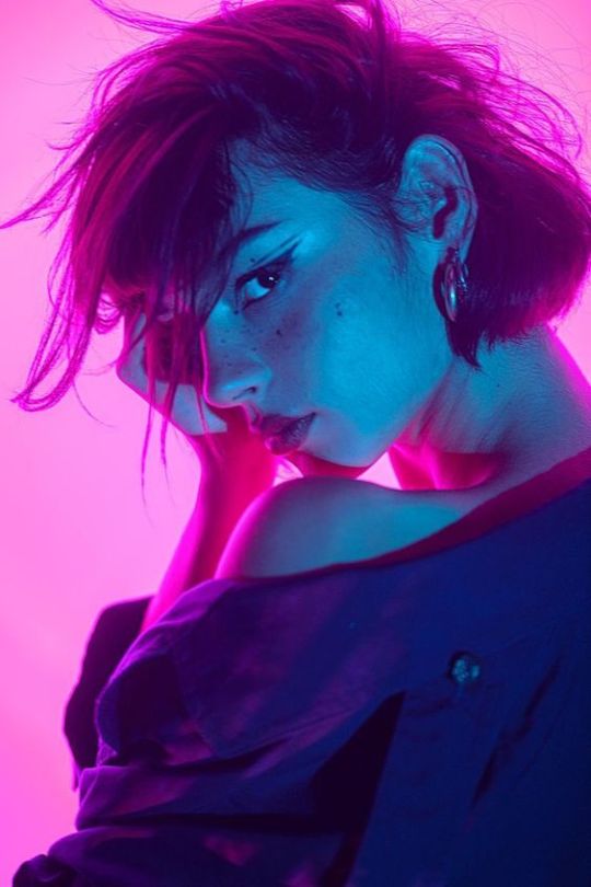

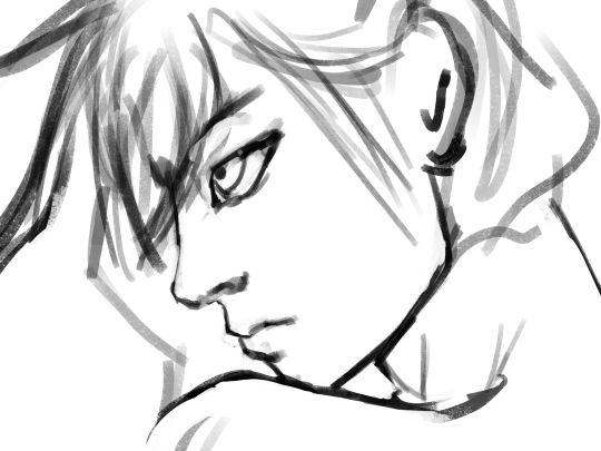
As for the lighting, when I first started, my colors were a mess! I already know basic color theory which helps, but it didn't help enough haha. What I think helped me learn the quickest was color picking - in krita you can select a color directly from an imported reference figure. So I'd find a reference that I really liked the lighting on, and color picked from it while paying attention to the actual color I was grabbing (how warm it was, gray it was, what the typical skin tones were, etc).
Later on as I started to learn what types of color palettes I really liked working with, I'd open the reference photo in Krita and tweak the image's contrast and sometimes completely change the lighting and colors. However, at some point I started using it as a crutch and my skills stagnated, so you need to be careful! However, now I've progressed to the point of doing a painting in black and white and adding the colors later (with no color picking!), sometimes even without a reference for the color. This was a slow and painful process, so don't expect things to make sense overnight!
Also, don't forget that you don't have to make the colors perfect in one shot. Usually I'll color things using a color layer with minimal detail and basic color tone (Itadori's hair is soft pink, his hoodie is bright red, etc), and then create shadows and lighting with multiply and overlay layers (blues and purples for night, etc.). Eventually I'll build up the color and merge all the layers together, and then add details in full color. I can color pick from other parts of the painting to maintain consistency. Then to finish things off, I almost always tweak the colors and contrast using filter layers.
Here is an example from that same Kashimo painting, going from black and white to full colors using color, multiply, and overlay layers, and then ending with full color details.
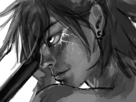
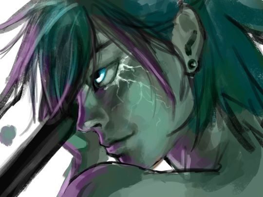
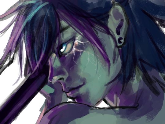
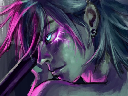

As a side note, starting out in black and white can make things so much easier. When you're only worried about values, you can really focus on shadow depth and the shapes of things. It's so much easier to explore rendering when you're not trying to do color on top of everything! Don't try to do everything at once.
The rendering style I use is based heavily on trying to replicate the feeling of actual oil painting. I use the (free!) art program Krita, and my favorite, most used brush is from a free pack I downloaded from deviant art (here). I use the brush called R T Masked4 (shown below) for basically 90% of any painting I do. I use about 4 brushes total on a typical painting (R T Masked4, that same brush but tweaked to be narrower for hair details, a smudge brush that I discovered maybe 10 days ago that I'm now obsessed with, and sometimes a scratchy brush for additional texture).

One last thing - don't be afraid to use tracing! Block in a reference photo to get the head and shoulders in the right place!! Trace a few hands to see how it feels!!! Obviously don't trace somebody's art and present it as your own, and it should only be rough approximations of shapes so you learn how to break down the body into parts. Otherwise, it won't be helpful at all. I only use photographs for tracing, including pictures I've taken of myself. One of the more helpful things I'll do is free hand my drawing and try to make it match the reference as closely as possible. Then, on a separate layer, I'll trace the reference photo (again, no details, just general positioning/shapes), and compare it to my original drawing. I can immediately see the issues, and I'll use the liquify tool to get things in the right place. I've learned that my horizontal spacing is usually pretty good, but I struggle with vertical spacing, especially on faces. So now I triple check my work for those specific things!
This kinda turned into a book, I'm sorry! I hope some of this is helpful and doesn't sound like the 10:30pm ramblings of someone who didn't get enough sleep haha.
78 notes
·
View notes
Text
AO3 Wrapped (Writers' Edition)
Found a list for this here, and following in the vein of a mutual on another platform I thought I'd go ahead and answer all the ones that I can to commemorate my first year as an actual fic author.
1. How many words have you written this year?
209,263...on AO3, anyway. I'm not counting my blog or YouTube scripts for any of this.
2. How many works did you publish this year?
6
3. What work are you most proud of (regardless of kudos/hits)?
Hard to pick. What Burns Between Us kicked everything off and has been the blueprint for all the stories that have followed, but I think I might actually like To Make as Much of Vices as Virtues a bit more. I somehow wrangled an even longer fic laden with flashbacks and relatively dark content out of two NPCs who don't even have official art. Also, because of this fic I can say that I've written the only Papp/Roque smut currently on AO3.
4. What work of yours has the most hits?
What Burns Between Us
5. What work of yours got more feedback than you expected?
To Make as Much of Vices as Virtues, because it's as mentioned such a tiny pairing. A lot of those comments came from just two people, but still.
6. Favorite title you used
Children Believe What We Tell Them is such an ironic twist on a classic film line (in translation, anyway). Given the subject matter of that fic I was tempted to go for a more familiar reference to Disney's Beauty and the Beast, but Cocteau worked a lot better for me in the end.
7. If you use song lyrics, which artist’s songs did you pull from the most?
I don't, but I do pull titles and original/incidental character names from literary sources: Wilde, Whitman, Chopin, Faulkner, and even Freud among others.
8. Pairing you wrote the most for this year?
Osvald/Partitio, a.k.a. the first of the many ships I've had that managed to inspire me to write fic. I'm still not entirely sure how that happened.
9. Favorite pairing you wrote for this year?
It's either them or Papp/Roque, and while I had to fill in more substantial gaps in canon to flesh out the old man yaoi I do think I'm going to have to say Osvitio again for this one.
10. What work was the quickest to write?
Through the Long Moonlit Night, which I rushed out in roughly ten days to get it done in time for Halloween. That was on me for getting inspired to write a monster fic with less than two weeks to go for it to be timely.
11. What work took you the longest to write?
To Make as Much of Vices as Virtues was around three months total, and it also took more initial planning compared to What Burns Between Us which largely follows the motions of canon.
12. How many WIP’s do you have in your docs for next year?
Oof, I don't even want to think about it. Eight or ten, at least...including a couple of non-Octopath ideas.
13. What’s your longest work of the year?
To Make as Much of Vices as Virtues, at over 77K words.
14. What’s your shortest work of the year?
Polymorphous Perversity, at just over 6K and my first actual oneshot.
15. What WIP are you taking into next year with you?
I do have both a short Papp/Roque piece as well as my first stab at Temenos/Crick (with Osvitio) in the works that I may or may not finish before the end of the year. The big one in the planning stages currently though involves Osvald trading places with himself in a different universe to explore weird new facets of his character...and also to make Partitio cry some more, because that's what I do.
16. What’s your most common “Additional Tags” tag?
Alternate Universe, unsurprisingly. My first fic establishes a partial AU running alongside but still distinct from canon Octopath Traveler II, and all the rest follow it in one way or another.
17. Your favorite character to write this year?
Roque Brilliante, because he's such a humorously terrible person and yet isn't hard to wring pathos out of either because at the end of the day he's a sad old queen who got dumped on so much he decided not to have any morals. He absolutely doesn't deserve the happy ending that the game gives him, and I've kept it that way by never writing a proper redemption arc either...but he has a husband and son who love him in spite of his many, many flaws so he gets that ending anyway.
18. The character that gave you the most trouble writing this year?
Osvald Vanstein, especially for his PoV segment of Wooing That Drifting Imagery. Canon doesn't offer much in the way of post-revenge flaws for him, so coming up with some that both matched his in-game character as well as the time period while also maintaining his relentlessly analytical voice was quite the challenge. I've gotten feedback on how off-putting Osvald's "benevolent" sexism comes across that I have ideas for how to tease at in future fics, so that's good. Additionally, I've received two comments calling my Osvald autistic/autistic-coded which...I guess? That definitely wasn't my intention or even anything I was thinking about. Canon Osvald is coldly rational to a fault and struggles with expressing himself even when he's saving the day with magic laser beams made of the Power of Love, so I just ran with that. (Him having a colossal dick on the other hand is purely for the comedic value.)
19. What’s one pairing you want to explore next year?
I've already mentioned that I want to try out Temenos/Crick for at least one fic. Hikari/Agnea may show up in some of my projects as a background element too. Aside from that, more of the same - although I've always thinking of strange new ways to explore those ships.
20. Which work of yours have you reread the most?
I reread my fics a lot, but proportional to their length I think I've looked back on Wooing That Drifting Imagery the most. It takes a lot of risks on the conceptual level: Partitio in full drag getting some kind of partial gender euphoria, Osvald's PoV, the kinky sex scene that goes sour, the prominence of my OCs.
21. How many kudos in total did you get this year?
148
22. Which work has the most comments?
What Burns Between Us, both in quantity and in number of unique commenters.
23-25.
All regarding collaborations and gifts, N/A
26. What’s your most common category?
Does this mean fandom category? Octopath Traveler II is currently my only category then. That may or may not change next year...although if I do get pestered into writing Fire Emblem fic it's probably not going to be exactly what anyone expects.
27. What do you listen to while writing?
Nothing specific; I'm not a very musically-oriented person. That's the main reason I don't do the whole Spotify Wrapped thing.
28. Favorite work you wrote this year?
Probably Wooing That Drifting Imagery, because of the risk-taking and all the New Orleans references I got to slip in.
29. Favorite line/passage you wrote this year?
Hard to pick. Possibly the ending of Chapter 5 of Wooing That Drifting Imagery:
Stepping forward, Partitio places his arms around Osvald’s neck and leans gingerly against the man’s shoulder, careful not to smudge the powder on his face. “What are you doing?” His hands are on Partitio’s waist, but he seems unsure. “Only…seein’ what it feels like to hug my husband.” Above him, Osvald’s breath catches. He wonders if they’re feeling the same thing. Partitio closes his eyes and inhales deeply. There are memories of sweat and dirt and darkness and the shame of need, of clinging to a muzzled prisoner with fire in his eyes and heart for protection from the unrelenting elements and the cruelty of man. Those memories are set aside – not wholly out of sight, but off in a corner. In their place emerges not one of Shrevelin’s fabrications, but something else both new and strangely familiar. There’s Osvald and his solid, gentlemanly warmth, and the faint fragrance of springtime that enfolds them, and the layers of fabric that separate them solely as a matter of modesty and not of the scorn of the world. Perhaps, when it’s only the two of them in this moment – which will fade like sunlight vanishing behind the trees into dusk, but linger still in the mind – he can be she. Osvald is her husband. She is his wife. “I’m ready.” Osvald takes up his hat and his cane, and offers his arm. Together, they stroll into the New Delsta sunset.
I liked writing this subtle transition where Partitio "sets aside" the memories of the start of his relationship with Osvald, internalizes the Mrs. Vanstein role to match how he's currently dressed as a society wife, and starts using feminine pronouns for himself...even if it's dropped several sentences into the next chapter out of anxiety over being in public. This is also the first time that Partitio refers to Osvald as his husband, when both of them had rejected marital labels for each other in the previous fic specifically because they're firmly stuck in the heteronormative mindset that they can't marry because Partitio isn't a woman. Well, now he sort of is.
30. Biggest surprise while writing this year?
That I wrote fic at all? If not that, then how well my fics have been received in this corner of an already small fandom. I love getting to read comments and bookmark notes and so forth saying how much people like my writing even though I'm still technically an amateur.
8 notes
·
View notes
Note
Would you ever consider doing a colouring tutorial?
Heyooooooo
I've done a coloring post before (a few months prior), but somehow, my coloring/painting process has changed a lot since then lol. I'll give a breakdown of my process (and go into specifics on coloring) here, but please do take it with a grain (or a spoonful) of salt... I'm still very much learning, and though you can use my process as a guide, experiment on your own to find what works for you! This post got a little long I'm ngl so. open at ur own risk. it's really just me rambling and being a bit too pretentious for my own good
using my recent post as an example, my process is basically just:
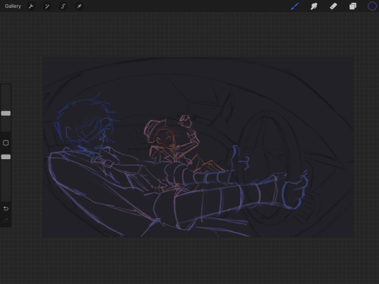
first i get a clean sketch (after many hours of pain finding detailed references lol), not gonna go into that since you asked abt coloring
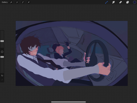
then i immediately go to block out shapes over the sketch. For big paintings, I don't do lineart (because i find that it eliminates a lot of depth that can be achieved with shapes and shading) — for smaller sketches and pieces, i'll do lineart tho.
I started darker to lighter in this painting because I knew I wanted harsh light. For me, it's a lot easier to project "additions" onto a surface — ie, if there's a harsh light, that's the addition vs. a shadow in neutral lighting as the addition. dunno if that makes sense, but breaking tones down like that helps me understand how i want to chronologically color smth and choose my bases:
for example, since I knew I was gonna have harsh light here, I felt comfortable with just getting the tones for my shadows down immediately. There won't be many midtones due to how extreme I saw it to be, so there was no point in finding a neutral base tone.
how i choose colors varies from painting to painting, but for this one, I decided to lean purple-blue because skk are just one of many red and blue gays (same reason why most of my other skk works lean red-blue-purple), and also because I knew I wanted my light to be on the warmer side — thus, the shadows and unlit areas will be cooler.
i also wanted it to recede (to emphasize the perspective and for depth), so for the base colors, i made them cooler + darker as they went back. This wasn't as clear in the finished product, but i think it did a good job at reminding me the vibe i wanted as i rendered
By how much I've written for this step, I guess you can assume that it's the step I put the most consideration into — and you'd be right. I think base colors really determine the vibe, and it sets you up for the rest of the painting. Sometimes I have to color adjust my bases over and over (with hue adjustments, color balance, curves) until I'm satisfied. I think that satisfaction is obtained w/ more ease as I've painted more and more. Alongside the sketch, this step takes me quite a while. Sometimes it's fun to mess with really wild color combos, but that's another topic.
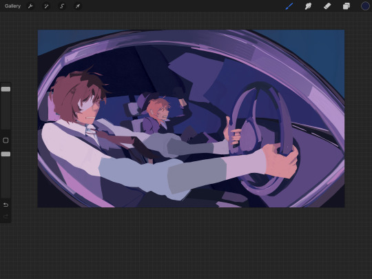
Then I block out the lighting, which is probably the most drastic step but also somehow the quickest for me. Once you understand how light affects color (warmth, tone, etc) and you gain confidence with it, blocking out values in relation to base tones isn't too hard. That ofc takes practice and a lot of fundamental understanding of Shapes & Colors but there's a lot of stuff online abt the theory specifically from professionals, so I'm not gonna lecture y'all as a fanartist for glorified literary author rpf

then i just start rendering, layer by layer. above is a screenshot i took mid-rendering; at this point, dazai's clothes were basically done but I later worked on the face + hair more and textured the tie.
I try to do the stuff I want people to focus on first, because at least for me, that's when I have the most energy to make smth detailed — the more detailed an area is, the more naturally drawn you eye is to it (this is because the brain likes areas of high contrast, and details are entirely founded on the placement of contrast).
My art has never been too extremely detailed — I enjoy flatter + bigger shapes, styled texturing and silly patterns, but I find that "detail" still translates into "effort". When I look at paintings, it's very clear where someone put most of their effort — and when I can't tell, then I know I have a very confident + experienced artist who can effectively distribute their workflow (goalz). So yeah, I render in my very silly poly style but still keep that in mind.
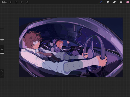
eventually, I finish rendering. This part is kinda a blur tbh, and it always varies from artist to artist. I'd say the things I keep in mind are:
shape + form (making sure my rendering doesn't mess up gesture or vibes, and that it keeps things loose)
composition (making sure i don't overdo areas where i don't want people to focus on)
and tone (ensuring that the depth and believability of the scene stays intact so that my non-realistic style can work)
I added the bullet because i wanted a reason for the goofy expressions, just a bit more pizazz so that skk's drama was also believable lol. also visual storytelling or whtv (but that's not something i usually prioritize, it mostly comes with the concept and sketch).
I also added the bullet for some compositional spice. the dark shadow on dazai's arms was there to also emphasize the warped perspective, but it also left a weirdly empty vibe that I didn't enjoy lol. So yeah, bullet! and ofc my favorite, weird flowy line pattern thing that doesn't adhere to the laws of physics
I think a lot of my traditional painting experience leaks into my digital painting practice. I don't like lineart too much, and since I mainly work with acrylic, I rely on opaque color blocks, layering, and "carving out" shapes. probably explains my affinity for solid flat brushes in Procreate,,,,, but yeah. It's a little all over the place, but at its core, it's a lot of technical stuff mixed with habits after finding what works for me.
Dunno if this helps at all, or if it was interesting lolol. Thank you for reading until the end if you're still here! I appreciate it. I'm still learning but I've definitely learned a lot since I started this blog so it's exciting to track my progress. I'm sure I'll see this in a few years and laugh lolol.
#pleuart#pleucas#casasks#sorry it got a little long#i did Not proofread this so there will prolly be a bunch of typos. just shout at me i'll fix it
71 notes
·
View notes
Note
How long do you typically spend on a drawing? Of the ones you've posted, which took the longest? Which was the quickest?
OOO that is a tough question because I don't typically time my art. BUT you caught me at the perfect time because I made a post JUST before starting a project at 1:58 and finished at 2:45- so I finished this drawing in just under an hour:

Though, this drawing has no shading, just flat colors and some blush. If I added shading it would have probably tacked on AT LEAST 15 more minutes. I spend a lot of time shading because I am still figuring it out XD
I think how long I take on a drawing depends on how perfectionist I feel on that day and the amount of motivation I have to work on said piece (I work faster the more inspired I am.)

This is the art that I remember taking the longest. I REALLY wanted it to look good so I was feeling extra perfectionist and I'm not good at drawing characters with the type of clothing One wears or city landscapes. So that made me have to redraw parts of his outfit and the city like... a billion times XD
I think this one took somewhere around 2-3 hours??
As for quickest drawings- any of my request drawings. Most of those were just quick colored sketches to get me out of an art block! They at most took 30 minutes.
41 notes
·
View notes
Note
How long do you typically spend on a drawing? Of the ones you've posted, which took the longest? Which was the quickest?
I wish I knew... but time is very very relative when I draw but in general you can be sure I finish pieces in one go/day because it only takes a longish break for me to not like my art or not like working on it anymore 😆
38 notes
·
View notes
Note
How long do you typically spend on each TMayNT drawing? Of the ones you've done so far, which one took the longest? Which one was the quickest?
So my art process consists of finding a base (if there is one), sketching it out on paper and then finishing it on my phone. It takes me a few hours (maybe about two to three) to sketch and that’s if I don’t feel too stressed out or distracted (don’t know why my mind does this to me.) I would get extremely lucky if I ever sketch the night before.
The piece that took the longest is definitely a tie between Day 8 and Day 11.
One of my longest pieces would be Day 8. I believed I explained this in its original post. Long story short. I love Traximus, love the Triceratons, but it took me forever to figure how his face would even look. Like the original base was human but somehow I have to fit a Ceratopsian’s head on it. And then there was Raph and his shell. Took quite a bit.
The other one is my Favorite Splinter. It’s 2003 Splinter but in my AU. It was mostly figuring out a side profile of his body, his tail, and his hands and feet. I thought he looked alright at first until I noticed his head looked a little disproportionate from his body. (Heck his whole body feels disproportionate.) His coloration at the very least saved it for me.
My quickest piece? It’s Day 14. Literally just a title of a Movie. I used to do just title of things all the time. Even made covers for fanfics that won’t really happen ever. So it wasn’t too hard to get it done within a couple of minutes. It might say 24 seconds on my speed paint time but it definitely took like maybe almost ten minutes. (Maybe a little more.)
Long and short of it, the time on a drawing varies. (Sorry for the rant. It’s the best way I can explain anything nowadays.)
#friendlyneighborhoodterrapin#ask box#asks answered#tmaynt related#ninjakitten’s nonsense#teenage mutant ninja turtles#teenage mutant ninja turtles 2003#teenage mutant ninja turtles 2k3#tmnt#tmnt 2003#tmnt 2k3#tagging it as 03 since the majority of the links are 03 related
7 notes
·
View notes
Text
Finally! After a week of work, and procrastination, I have finally finished my next art piece!
This one is of the Rise Turtle Tots, which, just so you know, I did not do them any justice. I was originally going to draw the version inside Donnies flashback, but then I looked at Raph’s helmet and decided, nope. So yeah, just a little heads up.
Click for better quality.

Turtle tots in all their full glory. They were supposed to look a bit younger, but by the time I finished Raph I gave up trying to make them look that way, so they are now toddlers, which is probably what they are supposed to be anyways. Drawing their poses was the bane of my existence, probably because I had never done it before.

Ralph is the only one that I can see as an actual child, but only because of his head, everything else screams muscle young teen. He, surprisingly, was the easiest to draw despite being somewhat detailed. Some creative liberties, for the bandages, were taken.

I don't know why but he was the hardest to draw despite being the least complex. His arm brought me the most trouble, it did not look correct the other times I tried to draw him. His eye was originally red/blue, but then I changed it, because yeah.

One of the quickest to draw, and the one I procrastinated on the most. Similar to Donnie, he was originally supposed to have blue/red eyes, but then the detail in his eyes gave me the wrong feeling and I was like, no. His pose is the one I had the most trouble looking right, I had never done it before.

Who is this, this is not a child, this is a very young teen. His hands, his hands, why were they so hard to draw, he is the most simple of his brothers, so why. I had no idea what to do with his eyes, so while I was trying to decide on Donnies eyes I chose the one I thought would look good on Mikey. He looks so smug.

This is the reason why this piece took so long. It is based on a fanfic on Ao3 called ‘Lime Meets Emerald’ by Crackficsfornothing. It is so good and their art is, ‘chef’s kiss’. It is a crossover fanfic between 5 different TMNT iterations, so go check it out when you have the chance.
#rise of the teenage mutant ninja turtles#rottmnt#donatello hamato#leonardo hamato#michelangelo hamato#raphael hamato#rottmnt fanart#tmnt fanart#lime meets emerald#turtle tots
33 notes
·
View notes
Note
How long do you typically spend on a drawing? Of the ones you've posted, which took the longest? Which was the quickest?
eehhh depends on the drawing
The stuff I do in notebooks is pretty fast, like, I dunno, ten minutes at most maybe. A little longer if I color it. I don't post all of it 'cause it's so messy.
Stuff with just flats or with real basic shadows might take a few hours, like three or four or something. Depends on what I'm doing. Like I think this one of Donnie only took an hour or two? Maybe three? The Bad Things Happen Bingo covers take me about that long too. Tbh, I spend most of my time picking the fonts with those lol
I'm not a very fast artist. Even the sketches like this take me a good while. I cleaned that one up and colored it, yeah, but it's just sketch, no line art. It's a mess.
Couldn't say what my quickest has been? If we're talking fully finished piece, value and lighting, like whole scene and everything? To be perfectly honest, it's either something from Art Fight or that cool Sidelines piece I just did the other day. Pretty sure that took me about a day?
As for the longest, if we're not talking strictly static art, then it'd be my "What If I Promised You a Happy Ending" Animatic. It took uuuhhh tbh I forgot how long I was working on it, at least like a week. But I am still very proud of it. If we're talking static art and aren't counting animatics, then I thhhiiiinnnkkk my longest one might be the one I did for my Grab a Slice! Big Bang fic, "Mortal Shell". That took a couple days, if I remember right.
anyway TL;DR: depends on the art, traditional sketches are the fastest thing i do
3 notes
·
View notes
Text
@atdutiesend commissioned an art piece:
Hajime for Yi Sang: Have you ever masturbated to the point you got sore? / What is the quickest you’ve ever brought yourself (or been brought) to orgasm? / Is it hot or gross to get ejaculated on? / Do you care/have a preference what partners do with their pubic hair?

With his hand smearing canvas, finished defiling corpses, sorting them by hair, eyes, limbs, & bones, letting Hajime watch as the student does their work. Ah, the art of carnal lust - a rarity, given that many ring members do not have time for such simple joys, due to the act allowing many to rest, but there's no time.
"I must confess thy sins from my mind, I fondly stroked myself so much to your works." Cutting up Grey locks, placing them in a wonderful guidance. "I feared that my mentor could catch me shutting my eyes for a brief moment, for they would use me as an example to keep going." Legs twitch just a little, breathing becomes panted. Body trembles with memoirs from his mind.

Yet, Yi Sang doesn't stop at all. Grabbing stained Palette, & painting with what seems to be a broken paintbrush, over & over, "A long time ago, I encountered a woman who tended to my body for one night. ; Long day in the works, & it just us... So who could know? The way she let me learn...~" A shake of his head, tearing the sketch, starting another. "The past deserves little care, so my subject ever changing, ever flowing."

A chuckle comes from lips, sound of jagged breathes follow, "My god... If you wish to climax on me, or under my clothes, & force me to walk around with your proof, I'll never question your decisions." Nails dig though paper, blinking optics.
"Mhm~ I prefer some care... I may be a student of the ring, a bird clipped, but I am not someone without standards, dear muse."
75 NSFW Asks || always accepting
1 note
·
View note
Text
cthrun kitties bts!
so I painted this art at a painting event where you could eat and paint. Funfact about this art, it took me an hour to do! which is the quickest I've ever finished a painting!! I started it around 7 something and finished at 8:50 ^o^
also..since it was a painting event, they had the cheap $1 acrylic paints so i did have to do multiple layers so that's why it looks messy (i brought my own paint to mix in but yeah that $1 quality...lol, i still love how it looks tho cithis's face could be touched up a lil...)
another good thing - I was able to grab a bunch of tiny canvases for free as well! love going to events where i can get free stuff. its awesome
with the mini canvases, I wanna do more things with them, like imagine a piece where it's cithis and mithrun looking at each other with a heart in the middle,,,that would be so cute...maybe a puzzle piece esque art as well...i got lots of ideas yall!!
0 notes
Text
What do you do when you want to climb out of your own skin
Today started out pretty great, actually. I woke up at 5 when my alarm went off and not only did I feel relatively rested, but I realized that the allegedly planned power outage didn't happen. So, my sleep never got interrupted, my fan never shut off and unrelated to the power but very related to my sleep quality, I didn't snap a post off of my dental appliance in my sleep.
I can feel myself clenching my teeth while I sleep some nights. Most nights, if I'm honest. Which is annoying as according to my out of network dentist, should not happen. This high tech, $4,000 piece of acrylic hand crafted for me specifically with state of the art lasers and 3D imaging, is supposed to prevent me from grinding and clenching at night, and help me breathe better.
It does help me breathe better, but I still clench and grind. And when I bring it up, it's explained to me that, "Well, in a perfect scenario, you wouldn't," as if that makes it okay that I spent a year paying it off and months getting adjusted to it only to learn that it isn't exactly what I was promised.
In any case, I didn't break a post off. So I do not have to glue it back together for the third time this week.
I woke up refreshed all things considered. I got out of bed, put in my contacts, dropped my dental appliance into the cleaning solution and followed the little entourage my cats do every single morning as they walk me to the food dish so I can fulfill my obligations as cat mom and feed them, for they have never ever been fed ever.
I got my energy drink, I took my meds, I checked my farm in Klondike and I reviewed what I had to get done today.
Wash the car, get chicken food, cut A's hair, put on her press on nails, meet with the pet sitter, take a 7a.m. conference call, write social media posts for my unpaid side hustle, fold laundry, etc. etc. etc.
I text my partner, tell him good morning and send videos of the cats. He'll see them eventually, I get up before he does.
Then the car. Easy, no problems, I love that car. Washed and half way waxed before I had to stop for the call.
Got on the call, simple. No one really wanted to talk so it was done and over in 20 minutes and we went back to the zero communication this job requires.
Go back to finish the car, get a good morning from my partner finally, text him back a few times, updating on the car progress, telling him I need to make a run into town to get chicken food, that I'm about to take a quick shower.
He replies with, "Can I call?"
I say sure, thinking I just needed the quickest rinse, I can hop in before he even sees this response and be practically done before he calls. And that's more or less true.
He calls and says, "Just wanted to tell you I love you, I can let you go if you're busy," and I reply that I am, but I always feel bad when someone acts like I said I was too busy to talk to them. I am busy, but I'm always busy, you asked if you could call, I said yes so clearly I'm not so busy I can't talk. Otherwise, I would have said that typically. So, I feel a little put out.
Does he not *want* to talk to me? Why would he set it up like that? So that I immediately have to like, reassure him I'm not too busy, even though by accepting the call, I did say that, didn't I?
---------------------------------------------------
We had a little disagreement the night before last, so small in fact that he didn't even realize I was upset. I tried to let it go, but upon reflection, I couldn't. I felt very disrespected when it happened and when I brought it up, it was brushed away.
I wanted to bring it up again, the next morning but swallowed that desire to be understood because he had a very important day ahead of him and I didn't want to trouble him with my feelings. So, I let it go, and tried to genuinely stop thinking about it and I think I did manage to do that. I felt okay, I thought, that was a silly thing to get so upset about, sure he brushed it off and that's actually what upsets me, because it's a pattern but like, I can learn to accept things and is it really worth a whole discussion and would I actually feel better if I brought it up again, in fact, I feel fine now so I should just drop it.
But, I wasn't fine and when he called me later that day, I felt really cheated out of being heard and understood, and since he was no longer doing the very important thing, I figured it was an okay time to bring it up. He had a long drive home, this was an ideal time to have what might be a little longer of a discussion.
Turns out, no and I was wrong and now I have to apologize for making him feel bad for feeling disrespected and I regret bringing it up and he "was just trying to help," but I never asked for help so now he, "will never try to help again, fine," which obviously wasn't what I wanted and now I've ruined the whole thing.
He tells me he's sorry, but he justifies what he did and I don't understand why I can't just express my hurt and be heard and understood, and he probably feels like no matter what he does it's never good enough. And now we're both sad again.
Again, I let it go, I shouldn't have brought it up, I'm the worst girlfriend ever and now I feel obligated to be extra sweet to make up for hurting my partner's feelings for not being grateful for his unsolicited help that didn't feel helpful in fact, made me feel like an outsider in my own romantic relationship. But, I should have just let it go, it wasn't that important.
------------------------------------------
So, this morning, when he calls me, I'm sure I'm finally over the thing. But I'm not. He gives his opinion on something absolutely unimportant to our relationship but because it slightly pushes back on something I said 10 seconds ago, it feels like a personal attack and I'm immediately right back where I was last night where I'm wondering why on earth you're trying to justify the actions that caused me to feel insecure in this relationship and why do you always have to contradict every single thing I say, why do I constantly feel like I have to fight to be heard, why are you even taking the side of the thing that upset me...
and there it is.
---------------------
I don't know what happened to me when I was growing up that makes me feel like no one ever understands me and worse, never tries to understand me. I don't know what it was.
But I know it's making my adult life feel like I can't make any progress in my relationships and interactions with people.
I don't know if it's even me, but I sure as hell will feel the shame and guilt of causing harm, even if I didn't really do anything. Especially because I don't know if I did anything.
Am I too sensitive? Am I right? Did I express myself in a healthy and mature manner? Am I doing what I'm supposed to but I'm trying to do it with someone who is incapable of doing the same? Is it my job to help them learn? Why are they like that? Why do they meet me with shame and silence anytime I say, "That hurt my feelings, I wish you wouldn't do that," is it because I'm wrong?
I don't know.
But what I do know is I feel like I've worked so hard and done so much reflection, but the near constant feeling of never being truly understood makes me think I've done it all wrong and after all this work, will I ever do it right? Or am I doing it right with the wrong person? I do think I have "wrong people" in my life, but I don't think he is. Which leads me to ask myself, "what more can I do?"
Can I convince myself that I'm understood, even if it doesn't feel like it? Why is it even important?
I sometimes miss my walls. I miss the ability to shut people out and not care if they understood or not. That I could just be mean to people when they hurt me and never felt any obligation to express it in a vulnerable way with the goal of learning how to be with someone. I wasn't necessarily happier. But I felt like I at least understood myself.
0 notes