#Technical Program
Explore tagged Tumblr posts
Text
youtube
[HD] Surya Bonaly - 2000 World Pro - Technical Program - Ninkou Latora - Cirque du Soleil
#Surya Bonaly#2000 World Pro#Technical Program#Ninkou Latora#Cirque du Soleil#Figure Skating#Youtube
2 notes
·
View notes
Text


"Now, the vow will be honoured, and my Lord brother's soul will return."
Radahn stans keep winning, but I personally am in Miyazaki's walls rn
#my art#shadow of the erdtree spoilers#sote spoilers#shadow of the erdtree#elden ring#godwyn prince of death#godwyn the golden#miquella the kind#miquella the unalloyed#promised consort radahn#fromsoft#i do not think critiques of radahn are as shallow as “pay $40 to fight a boss we already fought”#the dlc is good right up until the final boss#most of the new bosses are good#i loved midra and metyr and messmer and the dancing lion#radahn as consort just comes completely out of left field and just seems like a huge disconnect between the dlc and base game#radahn's story was done with the festival#and it's a good end! i like the festival and the base game radhan fight#but here he shows up again out of nowhere when godwyn is the obvious choice and a godwyn boss fight would be new and interesting#you can even still have your villain miquella story#puppeting his brother's living-but-soulless corpse unable to accept#that just because godwyn is breathing and follows his command like a deprecated computer program#even godhood can't bring his brother's soul back#his body must be slain and he must die a true death#we could have at least gotten a line of dialogue from radahn but nope#ok rant over#this pic is sloppy but idc#no cleanup we die like men#yes i know miquella's model technically has only three arms but i gave him four bc three looks silly
2K notes
·
View notes
Text
okay but what if. video game designer marinette...
#miraculous ladybug#marinette dupain cheng#this is brainstorming for one of my WIPs technically but#i increasingly headcanon marinette as realizing in university that fashion design isn't really what she thought it would be#and then having a crisis of what the heck do she wants to do with her life. and taking a long time to figure it out#and feeling like she's falling behind because all her friends know that now. and adrien even knows what he wants to do now#and he keeps reminding her of all the times she told him not to worry. that he'd figure it out in the end. but she's like IT'S DIFFERENT#and every time she finds something she finds 100 reasons she can't do it or won't like it--mostly cause she's sort of lost faith in herself#maybe i just want to project the mid 20s experience™️on her okay? KJBADFKJDKJBGFKB#BUT YEAH SHE'LL FIGURE IT OUT IN THE END#and i think she could get so into gaming. she can't decide if she wants to do more game design or art or programming aspects#so she tries out multiple different programs before settling into a job#but then she's a badass#do you see the vision?
990 notes
·
View notes
Text


Been chilly lately
#dirkjake#jake english#dirk strider#homestuck#homestuck fanart#they’re both from hot ass environments I don’t think they’d ever get used to Washington or wherever the fuck the consort kingdom is#last one is technically brain ghost dirk from a fic I’m writing but I digress#MS paint is the ideal program to draw him in like a weird bug
547 notes
·
View notes
Text
rise and grind, the weekend is over. .
edit i rorgot a semi related very rough car doodle

#edbearartstash#dedan#zacharie#hugo#technically lmao#off game#off mortis ghost#i animated this outside my usual program thats why it looks so ugly
492 notes
·
View notes
Text
exam 5 for me... tomorrow!
honestly have been feeling really nervous for this exam since my classmates have either failed it or just barely passed. and i had less time to study this time around because i rushed to book the exam.
so i drew this little encouragement early cuz i need the reminder that no matter what happens tomorrow, i did what i could and i didn't compromise on my boundaries—and that is its own victory.
and i hope that you'll be reminded to celebrate your own big and small victories too!
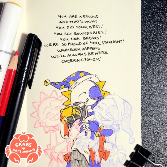
"You are nervous and that's okay! You did your best! You set boundaries! You took breaks! We're so proud of you, Starlight! Whatever happens, we'll always be here, cheering you on!"
#fnaf sun#fnaf eclipse#fnaf moon#fnaf dca#dca fandom#crab art#bright colours#traditional art#self-insert#my OC Esther#on a funnier note (gonna ramble)#i realized today that i could technically bring a sprite to drink in my exam#we're only allowed water in a clear drink container without any labels#so like... sprite is clear enough to work right?#and if they ask about the bubbles i'll just say it's sparking water#(i hate sparkling water but they don't need to know that)#but yeah might do that cuz i think the sugars will do me some good#3 hour exams are inhumane#anyways going to sleep now because i need sleep more than sugar#the worst thing that could happen is i fail and i have to pay another $115 to retake the exam and i receive the disappointment of my mom#i could buy a sun and moon plushie with that money#maybe even an eclipse plushie too#so the stakes are pretty high i think#if i pass i'll buy those plushies hehe#maybe just one for now because i still have more payments to make for my program#okay okay no more rambling going to sleep now
761 notes
·
View notes
Text


Some life series doodles I did during tests lol
#justtrashdoodles#mcyt#life series#wild life smp#wild life spoilers#technically#limited life#grian#mumbo jumbo#goodtimeswithscar#solidaritygaming#tangotek#gtws#jimmy solidarity#tango tek#ah yes my favorite art program: notes
195 notes
·
View notes
Text
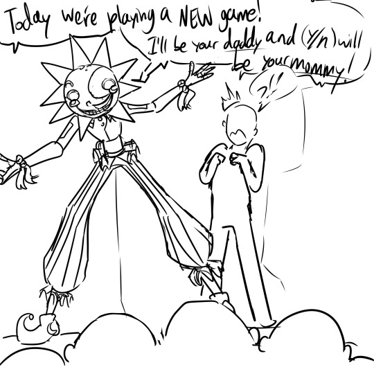

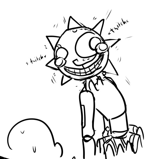
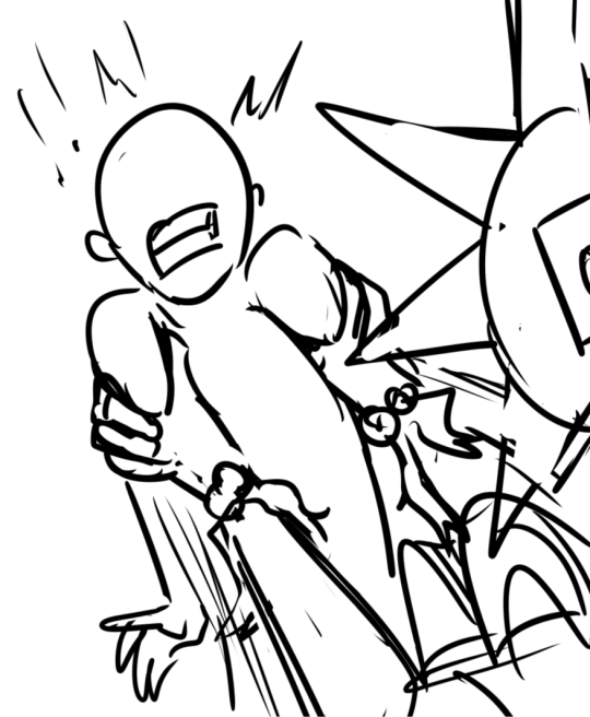
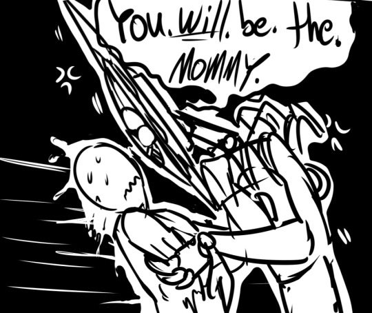
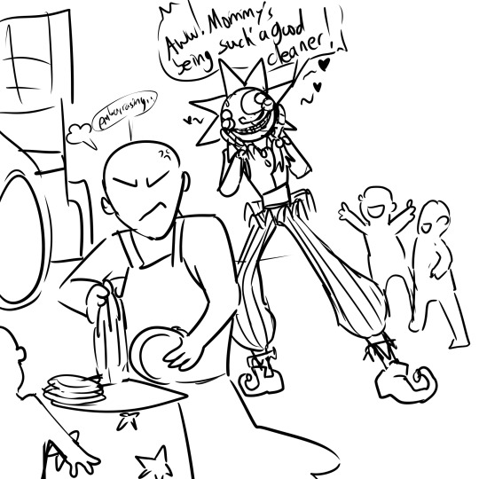
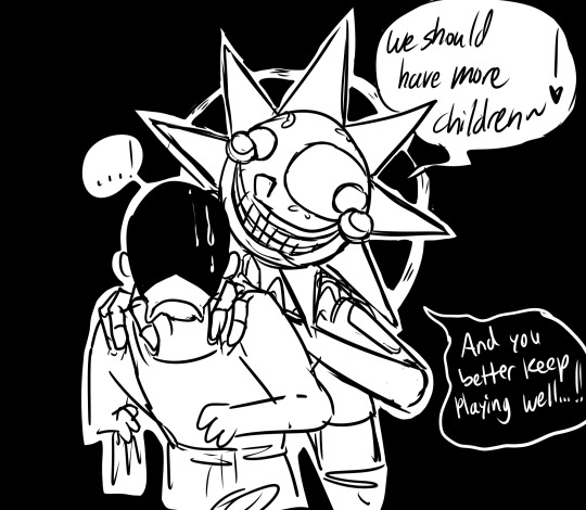
An idea that's ALWAYS stuck with me...
#the rest cant be shown on tumblr lewl#fnaf sb sun#fnaf sb dca#sundrop#sun fnaf#fnaf sun#my art#fan art#technically semi suggestive#doodles#idea#anon is any gender as well#and sun goes by a nuclear family programming but wont be picky about who plays as the mom
307 notes
·
View notes
Text

Caption for Tech.
#still don't think the regs are programmed#the bad batch#star wars the bad batch#bad batch#clone force 99#the bad batch star wars#bad batch tech#tbb tech#technically...#tech tuesday#tech bad batch#the bad batch tech#tech the bad batch#tech tbb#ct 9902#star wars memes#star wars humor#the bad batch memes
327 notes
·
View notes
Text
why Aurora's art is genius
It's break for me, and I've been meaning to sit down and read the Aurora webcomic (https://comicaurora.com/, @comicaurora on Tumblr) for quite a bit. So I did that over the last few days.
And… y'know. I can't actually say "I should've read this earlier," because otherwise I would've been up at 2:30-3am when I had responsibilities in the morning and I couldn't have properly enjoyed it, but. Holy shit guys THIS COMIC.
I intended to just do a generalized "hello this is all the things I love about this story," and I wrote a paragraph or two about art style. …and then another. And another. And I realized I needed to actually reference things so I would stop being too vague. I was reading the comic on my tablet or phone, because I wanted to stay curled up in my chair, but I type at a big monitor and so I saw more details… aaaaaand it turned into its own giant-ass post.
SO. Enjoy a few thousand words of me nerding out about this insanely cool art style and how fucking gorgeous this comic is? (There are screenshots, I promise it isn't just a wall of text.) In my defense, I just spent two semesters in graphic design classes focusing on the Adobe Suite, so… I get to be a nerd about pretty things…???
All positive feedback btw! No downers here. <3
---
I cannot emphasize enough how much I love the beautiful, simple stylistic method of drawing characters and figures. It is absolutely stunning and effortless and utterly graceful—it is so hard to capture the sheer beauty and fluidity of the human form in such a fashion. Even a simple outline of a character feels dynamic! It's gorgeous!
Though I do have a love-hate relationship with this, because my artistic side looks at that lovely simplicity, goes "I CAN DO THAT!" and then I sit down and go to the paper and realize that no, in fact, I cannot do that yet, because that simplicity is born of a hell of a lot of practice and understanding of bodies and actually is really hard to do. It's a very developed style that only looks simple because the artist knows what they're doing. The human body is hard to pull off, and this comic does so beautifully and makes it look effortless.
Also: line weight line weight line weight. It's especially important in simplified shapes and figures like this, and hoo boy is it used excellently. It's especially apparent the newer the pages get—I love watching that improvement over time—but with simpler figures and lines, you get nice light lines to emphasize both smaller details, like in the draping of clothing and the curls of hair—which, hello, yes—and thicker lines to emphasize bigger and more important details and silhouettes. It's the sort of thing that's essential to most illustrations, but I wanted to make a note of it because it's so vital to this art style.
THE USE OF LAYER BLENDING MODES OH MY GODS. (...uhhh, apologies to the people who don't know what that means, it's a digital art program thing? This article explains it for beginners.)
Bear with me, I just finished my second Photoshop course, I spent months and months working on projects with this shit so I see the genius use of Screen and/or its siblings (of which there are many—if I say "Screen" here, assume I mean the entire umbrella of Screen blending modes and possibly Overlay) and go nuts, but seriously it's so clever and also fucking gorgeous:
Firstly: the use of screened-on sound effect words over an action? A "CRACK" written over a branch and then put on Screen in glowy green so that it's subtle enough that it doesn't disrupt the visual flow, but still sticks out enough to make itself heard? Little "scritches" that are transparent where they're laid on without outlines to emphasize the sound without disrupting the underlying image? FUCK YES. I haven't seen this done literally anywhere else—granted, I haven't read a massive amount of comics, but I've read enough—and it is so clever and I adore it. Examples:


Secondly: The beautiful lighting effects. The curling leaves, all the magic, the various glowing eyes, the fog, the way it's all so vividly colored but doesn't burn your eyeballs out—a balance that's way harder to achieve than you'd think—and the soft glows around them, eeeee it's so pretty so pretty SO PRETTY. Not sure if some of these are Outer/Inner Glow/Shadow layer effects or if it's entirely hand-drawn, but major kudos either way; I can see the beautiful use of blending modes and I SALUTE YOUR GENIUS.
I keep looking at some of this stuff and go "is that a layer effect or is it done by hand?" Because you can make some similar things with the Satin layer effect in Photoshop (I don't know if other programs have this? I'm gonna have to find out since I won't have access to PS for much longer ;-;) that resembles some of the swirly inner bits on some of the lit effects, but I'm not sure if it is that or not. Or you could mask over textures? There's... many ways to do it.
If done by hand: oh my gods the patience, how. If done with layer effects: really clever work that knows how to stop said effects from looking wonky, because ugh those things get temperamental. If done with a layer of texture that's been masked over: very, very good masking work. No matter the method, pretty shimmers and swirly bits inside the bigger pretty swirls!
Next: The way color contrast is used! I will never be over the glowy green-on-black Primordial Life vibes when Alinua gets dropped into that… unconscious space?? with Life, for example, and the sharp contrast of vines and crack and branches and leaves against pitch black is just visually stunning. The way the roots sink into the ground and the three-dimensional sensation of it is particularly badass here:

Friggin. How does this imply depth like that. HOW. IT'S SO FREAKING COOL.
A huge point here is also color language and use! Everybody has their own particular shade, generally matching their eyes, magic, and personality, and I adore how this is used to make it clear who's talking or who's doing an action. That was especially apparent to me with Dainix and Falst in the caves—their colors are both fairly warm, but quite distinct, and I love how this clarifies who's doing what in panels with a lot of action from both of them. There is a particular bit that stuck out to me, so I dug up the panels (see this page and the following one https://comicaurora.com/aurora/1-20-30/):

(Gods it looks even prettier now that I put it against a plain background. Also, appreciation to Falst for managing a bridal-carry midair, damn.)
The way that their colors MERGE here! And the immense attention to detail in doing so—Dainix is higher up than Falst is in the first panel, so Dainix's orange fades into Falst's orange at the base. The next panel has gold up top and orange on bottom; we can't really tell in that panel where each of them are, but that's carried over to the next panel—
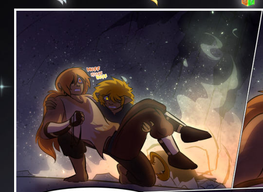
—where we now see that Falst's position is raised above Dainix's due to the way he's carrying him. (Points for continuity!) And, of course, we see the little "huffs" flowing from orange to yellow over their heads (where Dainix's head is higher than Falst's) to merge the sound of their breathing, which is absurdly clever because it emphasizes to the viewer how we hear two sets of huffing overlaying each other, not one. Absolutely brilliant.
(A few other notes of appreciation to that panel: beautiful glows around them, the sparks, the jagged silhouette of the spider legs, the lovely colors that have no right to make the area around a spider corpse that pretty, the excellent texturing on the cave walls plus perspective, the way Falst's movements imply Dainix's hefty weight, the natural posing of the characters, their on-point expressions that convey exactly how fuckin terrifying everything is right now, the slight glows to their eyes, and also they're just handsome boys <3)
Next up: Rain!!!! So well done! It's subtle enough that it never ever disrupts the impact of the focal point, but evident enough you can tell! And more importantly: THE MIST OFF THE CHARACTERS. Rain does this irl, it has that little vapor that comes off you and makes that little misty effect that plays with lighting, it's so cool-looking and here it's used to such pretty effect!
One of the panel captions says something about it blurring out all the injuries on the characters but like THAT AIN'T TOO BIG OF A PROBLEM when it gets across the environmental vibes, and also that'd be how it would look in real life too so like… outside viewer's angle is the same as the characters', mostly? my point is: that's the environment!!! that's the vibes, that's the feel! It gets it across and it does so in the most pretty way possible!
And another thing re: rain, the use of it to establish perspective, particularly in panels like this—

—where we can tell we're looking down at Tynan due to the perspective on the rain and where it's pointing. Excellent. (Also, kudos for looking down and emphasizing how Tynan's losing his advantage—lovely use of visual storytelling.)
Additionally, the misting here:
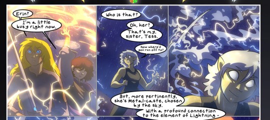
We see it most heavily in the leftmost panel, where it's quite foggy as you would expect in a rainstorm, especially in an environment with a lot of heat, but it's also lightly powdered on in the following two panels and tends to follow light sources, which makes complete sense given how light bounces off particles in the air.
A major point of strength in these too is a thorough understanding of lighting, like rim lighting, the various hues and shades, and an intricate understanding of how light bounces off surfaces even when they're in shadow (we'll see a faint glow in spots where characters are half in shadow, but that's how it would work in real life, because of how light bounces around).
Bringing some of these points together: the fluidity of the lines in magic, and the way simple glowing lines are used to emphasize motion and the magic itself, is deeply clever. I'm basically pulling at random from panels and there's definitely even better examples, but here's one (see this page https://comicaurora.com/aurora/1-16-33/):

First panel, listed in numbers because these build on each other:
The tension of the lines in Tess's magic here. This works on a couple levels: first, the way she's holding her fists, as if she's pulling a rope taut.
The way there's one primary line, emphasizing the rope feeling, accompanied by smaller ones.
The additional lines starbursting around her hands, to indicate the energy crackling in her hands and how she's doing a good bit more than just holding it. (That combined with the fists suggests some tension to the magic, too.) Also the variations in brightness, a feature you'll find in actual lightning. :D Additional kudos for how the lightning sparks and breaks off the metal of the sword.
A handful of miscellaneous notes on the second panel:
The reflection of the flames in Erin's typically dark blue eyes (which bears a remarkable resemblance to Dainix, incidentally—almost a thematic sort of parallel given Erin's using the same magic Dainix specializes in?)
The flowing of fabric in the wind and associated variation in the lineart
The way Erin's tattoos interact with the fire he's pulling to his hand
The way the rain overlays some of the fainter areas of fire (attention! to! detail! hell yeah!)
I could go on. I won't because this is a lot of writing already.
Third panel gets paragraphs, not bullets:
Erin's giant-ass "FWOOM" of fire there, and the way the outline of the word is puffy-edged and gradated to feel almost three-dimensional, plus once again using Screen or a variation on it so that the stars show up in the background. All this against that stunning plume of fire, which ripples and sparks so gorgeously, and the ending "om" of the onomatopoeia is emphasized incredibly brightly against that, adding to the punch of it and making the plume feel even brighter.
Also, once again, rain helping establish perspective, especially in how it's very angular in the left side of the panel and then slowly becomes more like a point to the right to indicate it's falling directly down on the viewer. Add in the bright, beautiful glow effects, fainter but no less important black lines beneath them to emphasize the sky and smoke and the like, and the stunningly beautiful lighting and gradated glows surrounding Erin plus the lightning jagging up at him from below, and you get one hell of an impactful panel right there. (And there is definitely more in there I could break down, this is just a lot already.)
And in general: The colors in this? Incredible. The blues and purples and oranges and golds compliment so well, and it's all so rich.
Like, seriously, just throughout the whole comic, the use of gradients, blending modes, color balance and hues, all the things, all the things, it makes for the most beautiful effects and glows and such a rich environment. There's a very distinct style to this comic in its simplified backgrounds (which I recognize are done partly because it's way easier and also backgrounds are so time-consuming dear gods but lemme say this) and vivid, smoothly drawn characters; the simplicity lets them come to the front and gives room for those beautiful, richly saturated focal points, letting the stylized designs of the magic and characters shine. The use of distinct silhouettes is insanely good. Honestly, complex backgrounds might run the risk of making everything too visually busy in this case. It's just, augh, so GORGEOUS.
Another bit, take a look at this page (https://comicaurora.com/aurora/1-15-28/):
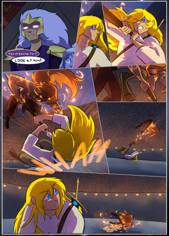
It's not quite as evident here as it is in the next page, but this one does some other fun things so I'm grabbing it. Points:
Once again, using different colors to represent different character actions. The "WHAM" of Kendal hitting the ground is caused by Dainix's force, so it's orange (and kudos for doubling the word over to add a shake effect). But we see blue layered underneath, which could be an environmental choice, but might also be because it's Kendal, whose color is blue.
And speaking off, take a look at the right-most panel on top, where Kendal grabs the spear: his motion is, again, illustrated in bright blue, versus the atmospheric screened-on orange lines that point toward him around the whole panel (I'm sure these have a name, I think they might be more of a manga thing though and the only experience I have in manga is reading a bit of Fullmetal Alchemist). Those lines emphasize the weight of the spear being shoved at him, and their color tells us Dainix is responsible for it.
One of my all-time favorite effects in this comic is the way cracks manifest across Dainix's body to represent when he starts to lose control; it is utterly gorgeous and wonderfully thematic. These are more evident in the page before and after this one, but you get a decent idea here. I love the way they glow softly, the way the fire juuuust flickers through at the start and then becomes more evident over time, and the cracks feel so realistic, like his skin is made of pottery. Additional points for how fire begins to creep into his hair.
A small detail that's generally consistent across the comic, but which I want to make note of here because you can see it pretty well: Kendal's eyes glow about the same as the jewel in his sword, mirroring his connection to said sword and calling back to how the jewel became Vash's eye temporarily and thus was once Kendal's eye. You can always see this connection (though there might be some spots where this also changes in a symbolic manner; I went through it quickly on the first time around, so I'll pay more attention when I inevitably reread this), where Kendal's always got that little shine of blue in his eyes the same as the jewel. It's a beautiful visual parallel that encourages the reader to subconsciously link them together, especially since the lines used to illustrate character movements typically mirror their eye color. It's an extension of Kendal.
Did I mention how ABSOLUTELY BEAUTIFUL the colors in this are?
Also, the mythological/legend-type scenes are illustrated in familiar style often used for that type of story, a simple and heavily symbolic two-dimensional cave-painting-like look. They are absolutely beautiful on many levels, employing simple, lovely gradients, slightly rougher and thicker lineart that is nonetheless smoothly beautiful, and working with clear silhouettes (a major strength of this art style, but also a strength in the comic overall). But in particular, I wanted to call attention to a particular thing (see this page https://comicaurora.com/aurora/1-12-4/):
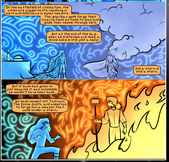
The flowing symbolic lineart surrounding each character. This is actually quite consistent across characters—see also Life's typical lines and how they curl:
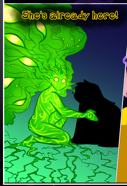
What's particularly interesting here is how these symbols are often similar, but not the same. Vash's lines are always smooth, clean curls, often playing off each other and echoing one another like ripples in a pond. You'd think they'd look too similar to Life's—but they don't. Life's curl like vines, and they remain connected; where one curve might echo another but exist entirely detached from each other in Vash's, Life's lines still remain wound together, because vines are continuous and don't float around. :P
Tahraim's are less continuous, often breaking up with significantly smaller bits and pieces floating around like—of course—sparks, and come to sharper points. These are also constants: we see the vines repeated over and over in Alinua's dreams of Life, and the echoing ripples of Vash are consistent wherever we encounter him. Kendal's dream of the ghost citizens of the city of Vash in the last few chapters is filled with these rippling, echoing patterns, to beautiful effect (https://comicaurora.com/aurora/1-20-14/):
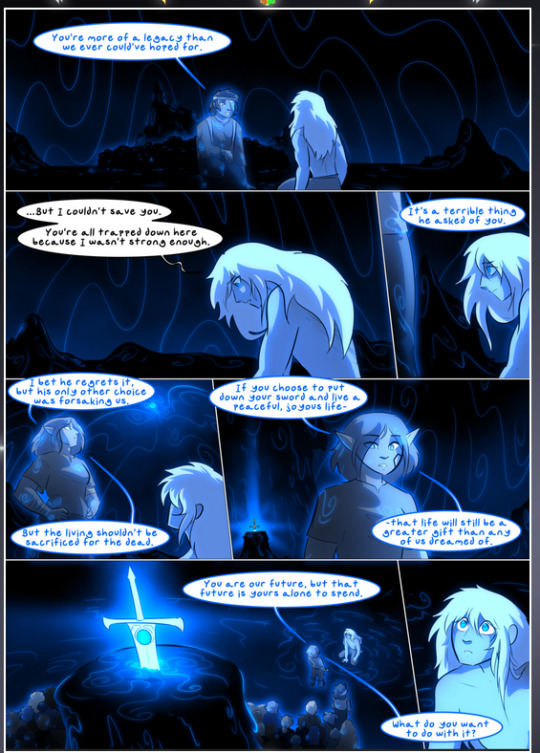
They ripple and spiral, often in long, sinuous curves, with smooth elegance. It reminds me a great deal of images of space and sine waves and the like. This establishes a definite feel to these different characters and their magic. And the thing is, that's not something that had to be done—the colors are good at emphasizing who's who. But it was done, and it adds a whole other dimension to the story. Whenever you're in a deity's domain, you know whose it is no matter the color.
Regarding that shape language, I wanted to make another note, too—Vash is sometimes described as chaotic and doing what he likes, which is interesting to me, because smooth, elegant curves and the color blue aren't generally associated with chaos. So while Vash might behave like that on the surface, I'm guessing he's got a lot more going on underneath; he's probably much more intentional in his actions than you'd think at a glance, and he is certainly quite caring with his city. The other thing is that this suits Kendal perfectly. He's a paragon character; he is kind, virtuous, and self-sacrificing, and often we see him aiming to calm others and keep them safe. Blue is such a good color for him. There is… probably more to this, but I'm not deep enough in yet to say.
And here's the thing: I'm only scratching the surface. There is so much more here I'm not covering (color palettes! outfits! character design! environment! the deities! so much more!) and a lot more I can't cover, because I don't have the experience; this is me as a hobbyist artist who happened to take a couple design classes because I wanted to. The art style to this comic is so clever and creative and beautiful, though, I just had to go off about it. <3
...brownie points for getting all the way down here? Have a cookie.
#aurora comic#aurora webcomic#comicaurora#art analysis#...I hope those are the right tags???#new fandom new tagging practices to learn ig#much thanks for something to read while I try to rest my wrists. carpal tunnel BAD. (ignore that I wrote this I've got braces ok it's fine)#anyway! I HAVE. MANY MORE THOUGHTS. ON THE STORY ITSELF. THIS LOVELY STORY#also a collection of reactions to a chunk of the comic before I hit the point where I was too busy reading to write anything down#idk how to format those tho#...yeet them into one post...???#eh I usually don't go off this much these days but this seems like a smaller tight-knit fandom so... might as well help build it?#and I have a little more time thanks to break so#oh yes also shoutout to my insanely awesome professor for teaching me all the technical stuff from this he is LOVELY#made an incredibly complex program into something comprehensible <3#synapse talks
786 notes
·
View notes
Text
Ty Lee | all-american bitch
I know my place and this is it
[video description: an amv centered on Ty Lee set to “all-american bitch” by Olivia Rodrigo. The video focuses on Ty Lee's dynamic with Azula throughout the years, and juxtaposes Ty Lee's bubbly flirty persona with her extremely efficient chi-blocking fighting style and shrewd observations. end description.]
cw for flashing. extended video description under the cut
First verse contrasts scenes of Ty Lee, Azula, and Mai as children with scenes of Azula threatening Ty Lee in Return to Omashu, and from then on being a weapon for Azula in her mission. Scenes mainly pull from the trio’s early book 2 action as they chase Aang.
First chorus: on “Forgive and I forget”: Ty Lee mid-air doing a flip cuts to young Ty Lee landing a flip. young Azula pushes young Ty Lee to the ground and laughs. Ty Lee chi-blocks a kyoshi warrior on "And I act like it. She flirts with Sokka on “Got what you can’t resist” and chi-blocks Katara on “perfect all-american”
Second verse features mainly scenes from the end of book 2 when Ty Lee, Azula, and Mai are in Ba Sing Se disguised as Kyoshi warriors. Many of the scenes show Ty Lee being undignified, contrasting with the lyrics (but fitting the ironic tone of the song). These scenes include Ty Lee jumping into the sludge during The Drill, her covered in mud, and flying through the air with Mai after Appa flaps his tail at them.
Second chorus: “Forgive and forget”: Ty Lee after her circus performance agreeing to join Azula. Other clips juxtapose Ty Lee during The Beach with Ty Lee fighting during The Boiling Rock.
“I know my place”: Rapid cuts of Ty Lee and Mai beside Azula, cut to Ty Lee anxiously looking side to side during The Boiling Rock confrontation. On the second “I know my place”: Rapid cuts of Ty Lee hugging Mai, and Mai and Azula preparing to fight.
“And this is it”: Ty Lee chi-blocks Azula.
Bridge: Scenes from the fallout of Ty Lee betraying Azula - Mai and Ty Lee being arrested − cut together with Ty Lee’s emotional outburst during The Beach campfire scenes. During the screaming and fast-paced music, there are rapid cuts of Ty Lee fighting and moments beside Azula, in between cuts shots of Ty Lee crying.
Outro: Ty Lee bowing to Azula during Return to Omashu. Then Ty Lee crying during The Beach party, and Azula apologizing to her.
#it's finally here... my ty lee thesis statement :)#apologies again for bringing usamericans anywhere near atla ...... but . you know. empire for an empire#this is literally the first time i've edited a video on any program at all in over a DECADE#and of course the ideas/moments that inspired me to do this whole thing were the most technically complicated to do lmao#i learned so much for this please clap#finally. shoutout to o who I literally could not have done it without!#and to every atla fanvid I studied... mutuals you are all so skilled! <3#flashing cw#ty lee#amv#r.post
464 notes
·
View notes
Text
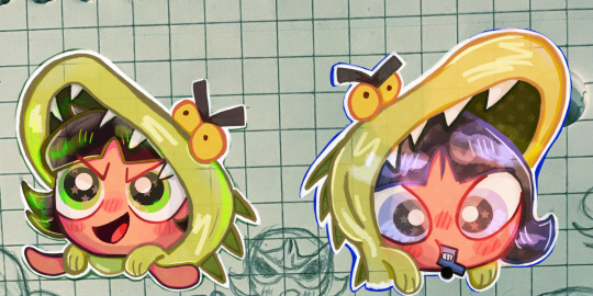
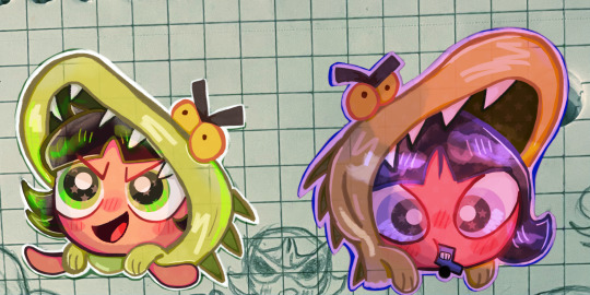
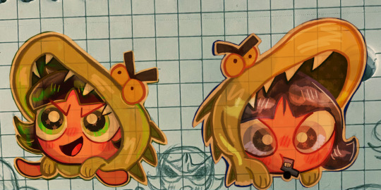
A long while ago now I actually went back to the buttercup anniversary page I did,,
and decided to color in buttercup and concept buttercup! :>
(I have so many versions of this one, mostly messing with concept buttercup,,,)
#artists on tumblr#art#fan art#traditional to digital#cute art#concept powerpuff girls#powerpuff girls art#powerpuff buttercup#powerpuff girls#powerpuff fanart#powerpuff girls fanart#ppg buttercup#buttercup#concept buttercup#sketchbook program#ppg fanart#ppg#technically a screencap redraw sort of I guess
187 notes
·
View notes
Text

my half of an art trade with my friend @dustyzippo !! i don't actually go here so i don't know anything abt this character but i'm really proud of how this drawing came out so i decided to post it :'D
#great god grove#huzzle mug#ggg huzzle mug#fanart#digital art#illustration#artists on tumblr#program: medibang paint#this my first lineless in a hot minute.... i kind of missed doing lineless art tbh#even if it's technically not true lineless i just get rid of the lineart afterward
128 notes
·
View notes
Text
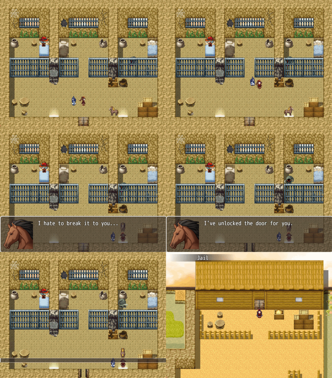
Wangxian goes to horse jail for their crimes against equines.
#poorly drawn mdzs#mdzs#wei wuxian#lan wangij#game dev diary#Going forwards you'll see me talk about game dev stuff with 'we' and that is because this is a collaboration!!!#I am doing the art and my friend who has coding experience is in charge of the technical stuff.#We're testing out the basics of the program and figuring out the limitations before getting into the meat of our own project.#This is the part where I soft-announce that I'm working on a game. We're still early into development but it's coming along B*)#Originally the playable character was the horse and the NPC you talk to was WWX but I asked to switch it up for this gif.#We will be changing the window skin for dialogue portraits so no handmade art there yet.#My friend added the official art as a placeholder and it made me laugh very hard.#The thrill of seeing the little guys I spent hours drawing walk around is unparalleled!!! They are alive!!! Moving!!!
337 notes
·
View notes
Note
Is all we can do right now is just wait for the right moment, like the one you mentioned, Pepper?


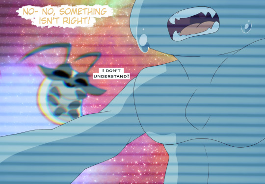


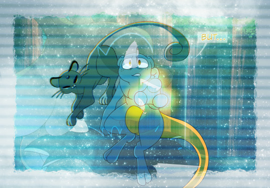

Pepper: I- we have to waut for that right moment. We need to- i'm... I'm getting too distracted, i need to focus.
It is alright to feel Pepper. Isn't that what you told me? But you cannot think of this Ash as your uncle. Objectively, it is not true.
Pepper: That is peddljng two different ideas in my head System, I get it, i swear i do. But putting it into practice is another scenario.
Of course, i don't doubt that.
Pepper: I meed to figure out what the fuck that little bitch did to them- if it does it again then-
I'll review the tape, but the camera was off a majority of the time. I tried getting the humans to annoy them to keep it on but-
Pepper: Yeah... I know...
(Pepper has seemed to vaguely acknowledge your questions, but she didn't seem to answer many- if any of them)
@haycoat-art @dingbat-things @pixelgamer07 @churchofyolk @one-simpleman
#pokemon#mewtwo#missingno#mew#pepper blips#system#sm champion ash#quest of a king#shadowking#sm kanto prince indigo#post#i am not tagging all the individual pokemon that showed up#cause technically it's all system and not other pokemon#but a lil looksee into Pepper#we'll do one more with her before entering our regularly scheduled program!!#event: world's collide
156 notes
·
View notes
Text
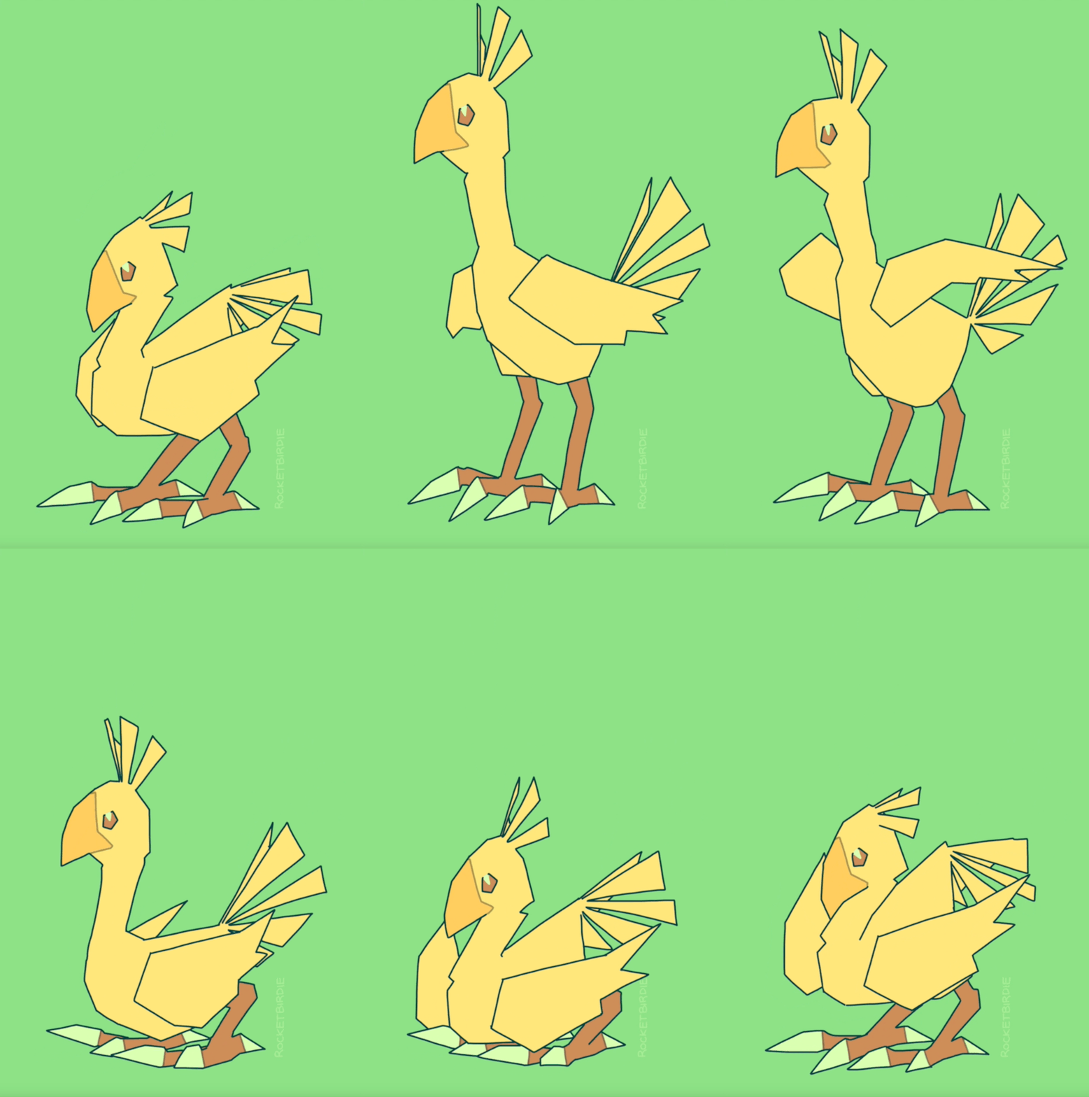
wark it girl!!
#:>#last time i did any kind of animation it was with flipnote on the dsi. time sure flies!!#um.#don't ask me what my process was for this one.#wanted to see if i could squeeze something out of my cheap little art program. TECHNICALLY yes i could. no i will not do it again.#let's just say... maybe i'll do more animation if i actually get some actual real animating software one day lmao#my art <3#chocobo#ffvii
174 notes
·
View notes