#TYPEFACE
Explore tagged Tumblr posts
Visit Tumblr Blog
Explore Tumblr blogs with no restrictions, modern design and the best experience.
Last Seen Tumblr Blogs


Fun Fact
The total number of visits Tumblr.com received during January 2021 is 327 million.
Text

Font with whimsical ornamentation.
Fun and farming for little lads. 1893.
Internet Archive
84 notes
·
View notes
Text
Maritgode Regular : Font Free Downloads
Maritgode Regular is a handwritten signature script font created by Letterena Studios.
https://www.fontfreedownloads.com/en/maritgode-regular.font-free-download

#MaritgodeRegular#art#creative#graphicdesign#wallpaper#fonts#typography#calligraphy#design#webdesign#handwritten#calligraphic#type#typeface#lettering#handlettering#weddingfonts#ttf#otf
25 notes
·
View notes
Text

Neubau (NB) / NB International™ Pro (E21) / Specimen / 2021
32 notes
·
View notes
Text
@Wisdom
#black fashion#fashion#black men#black culture#black lives matter#black people#black history#black is beautiful#blacklivesmatter#vintage fashion#fonts#typography#instagram#typeface#digital
13K notes
·
View notes
Text
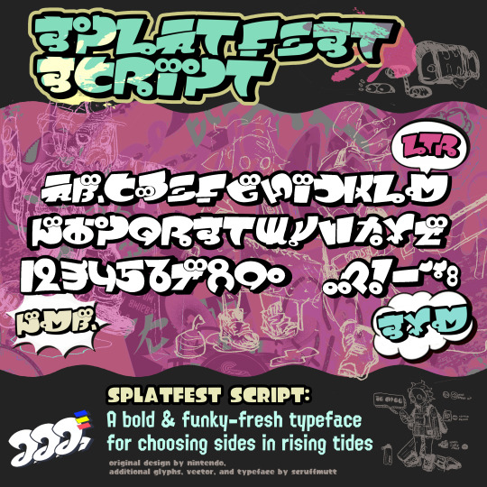
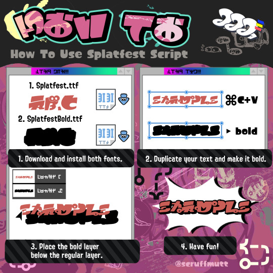
Have you ever wanted to be 100% accurate when creating Splatfest-related art? Consider downloading the Splatfest Script today!
#splatoon#splatoon 3#splatfest#typeface#font#graphic design#nintendo#this was my fun ADHD hyperfixation project for the week#well. i can't guarantee 100% accuracy#but trust i put a lot of time into making sure my translations were right
2K notes
·
View notes
Text
I made an Interview with the Vampire font
As testement to my mental illness and 30+ year obsession with these vampires, I went and made a font from the lettering used in the tv show.

I've never made a font before, but I'm proficient in Adobe Illustrator, so after hunting down all the letters in the credits (in both weights!), I hand traced all the glyphs, and aligned and trued the various points. That actually wasn't too bad - the more time consuming part was creating from scratch all the symbols and numbers that weren't included in the credits at all (and I'm pretty happy with everything but the @ symbol tbh!)

It's a captal-only font, with the default being the thick version, and if you install the additional RueRoyale-Thin.otf, you'll get the thinner version in all caps, too.
Because I had a bunch of the ornate lettering and the little Immortal Universe logo already vectorised for vinyl cutting, I added those in as easter eggs, too. I've tried my best to included all the accented upper case characters for the foreign fans, but I've probably missed something, and I had to stop somewhere... If you see something horribly wrong though, please tell me in the comments.
You can download the font (2x .otf files, at under 1MB total) here.
This is a fan-created font, for fans to use FREE OF CHARGE, so I'm hoping that keeps AMC's lawyers off my tail. If you use it and want to credit it, please link back to the original tumblr post here in case I need to make any updates on it. Enjoy! ❤️
#iwtv#interview with the vampire#iwtv fandom#iwtv font#fan font#typeface#font#free fonts#iwtv details#iwtv design
658 notes
·
View notes
Text
Side Order Typeface: Complete!
HEY. do you remember when Nintendo made a typeface for Splatoon 3's Side Order and never elaborated? It looks a little bit like this:

Well I went over to the lovely @splatoongamefiles and asked for the font file. They gave me the file, all nice and simple, BUT it was completely unfinished... I really liked it, so I finished it myself!!! (files and images under the cut <3<3)
This is what it looked like when I started:

and this is what it looks like now!!!!!!!

It took me 6 months because I apparently started working on this in february, but it only took that long because of my laziness! I did, however, know nothing about this kind of thing before except for my vague interest in typography and fonts. I used a free font-making software called FontForge and I had to learn it from scratch and with no help. So I think all in all, it turned out pretty good!!
I also decided to name the typeface since when I downloaded it, it was called something silly and just for the files so I named it Spire after the Spire of Order which I think works very nicely!!
Now I'll talk about what's changed because I did upload beta version 0.2 of this recently!
added uppercases A, D, G, H, I, K, M, V, W, X
added symbols " # $ % & ' ( ) * + - / < = > [ ] ^ _ ` { | } ¡ £ ¿ × ÷
added all the accents you can see above, but not ALL of them because im lazy
fixed lowercase k so now it looks like a normal letter
B - adjusted sizes of the upper and lower sections as well as sharpened corners of the lower section
K - slightly lowered the crossbar
L - curves of the corners are now slightly smoother
z - raised the top right corner by 1 pixel so its no longer 1 pixel wonky...
@ - increased the gap on the left side
deleted all the original file's kerning and did it myself >:)
and lastly! here's the link to download the typeface!!!!!! if you do use it somewhere credit is always appreciated :)))) and do let me know because i'd love to see!!! <3
p.s. if there are any specific characters/glyphs that I haven't added but u really need please dont hesitate to let me know!!!!
#splatoon 3#side order#side order typeface#splatoon#splatoon side order#splatoon typeface#splatfont#typeface#typography#typefaces#type#font#fonts#i didnt remove the copyright on the file because i couldn't figure it out so fingers crossed nintendo doesnt come for my ass!!!!#or maybe they'll discover it and pay me 1 miiiillion dollars >:)#ANYWAY im suuuuper happy with how it turned out and i hope you all enjoy it :)#reblogs really appreciated bc i really want lots of people to find it and use it!!!
749 notes
·
View notes
Photo


(via Remnants of a Legendary Typeface Have Been Rescued From the River Thames)
692 notes
·
View notes
Text


Mayhem font by Lewis France
MXM vector pack for this font is available here.
839 notes
·
View notes
Text
Attico36 Graphic Assets for showreel during Desina Festival Napoli. 19.04.2024
#graphic#design#grafik#graphicdesign#visual#editorial#type#typo#typography#typeface#logo#logotype#illustration
843 notes
·
View notes


Text
Yesterday afternoon, when I was in a bit of a frazzle getting ready to go out, the postie knocked on my door and delivered the most magical gift I've ever received 🥹
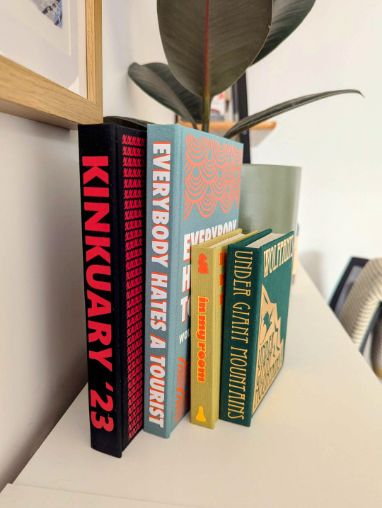
Not one, but FOUR gorgeous binds from @plor-bindery 😭


I am utterly blown away by Plor's generosity, skill, and attention to detail. These have become the most treasured items on my bookshelf... dare I say my home (don't tell my cat)?!
More incohrent gushing and pics under the cut...
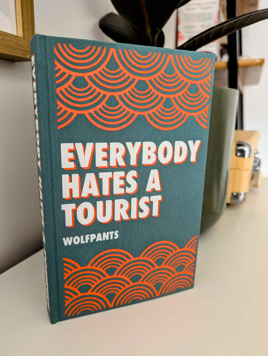
Everybody Hates a Tourist


That colour combination! The texts-as-a-blurb! The magical burst of rainbows (and pineapples!)! And don't even get my started on the interiors...
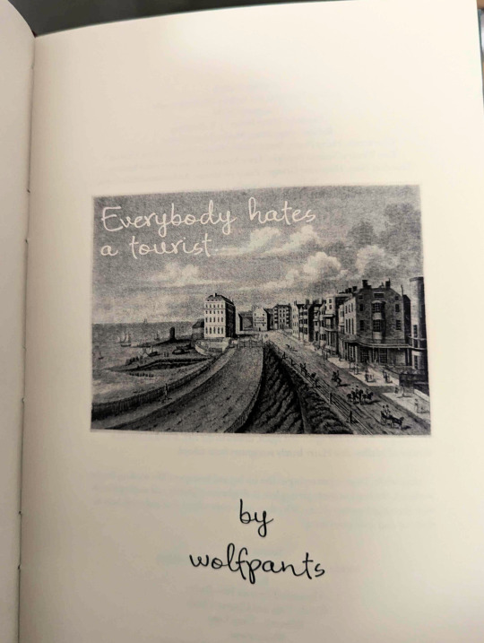

The postcard picture - also found on the fic's banner and Spotify playlist - made me gasp. And each chapter has its own gorgeous illustration, and - god, can we talk about drop caps please?! And the texts?
-
Under Giant Mountains


The foiling here is just *chef's kiss*, and that colour green is so gorgeous. The dragon! The quote! I also love the size of this one, it's so smart to choose a smaller format, it feels like a proper vintage book, like something found on Draco's shelf in his little cabin. Absolute perfection.
-
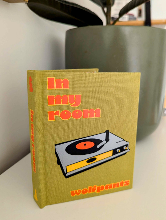
In My Room

I cannot believe I am holding a bound Dron book in my hands 😭 And one with such thoughtful artwork, so true to the story! The record player! The chess board with the chess pieces, weed and vinyls! I want the endpaper for this one plastered on my walls please... it's so Ron.


-
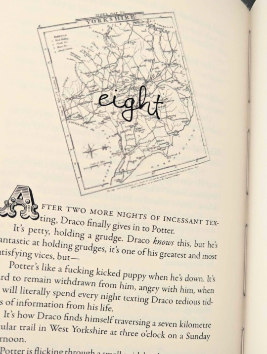
Kinkuary '23

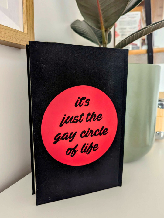
When I opened the package and unwrapped this one last, I thought Plor had sent me a vintage book, but then after flipping through it, I realised it was covered in a modesty jacket 😈 Which I love, because again, it feels so... naughty and Victorian 😌 Picking that quote from the gay orgy fic is the absolutely cherry here. Brilliant! Inspired!
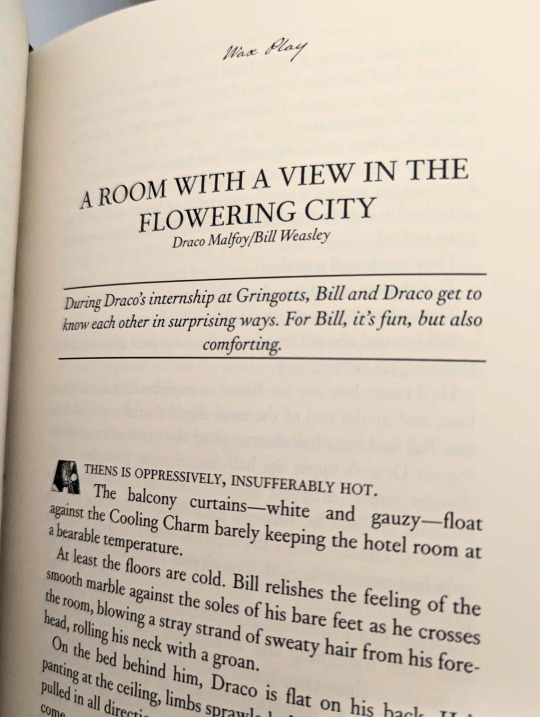
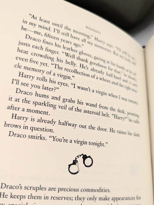
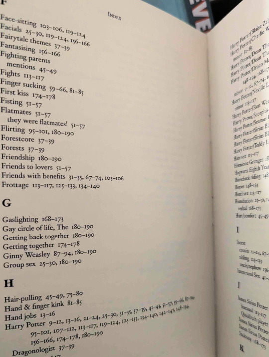
There is so much detail here I don't even know where to start. I love how each story includes its description, how each scene is separated with handcuffs, and... the index! Reading through some of my (quite frankly insane) tags had me absolutely howling (shoutout to "Draco Malfoy... is HORNY").

Here they all are, taking pride of place on my shelf. Honestly, the most beautiful gift. I can't even begin to explain what it feels like to hold my own writing, in black and white and on paper, in my hands. So surreal. I am so, so grateful. Thank you so much Plor, you lovely, lovely human!
#I am crying#truly I was as I was opening all of these#fanbinding#bookbinding#ficbinding#typesetting#typeface#hp fanfic#drarry#drarry fic#dron#dron fic#wolfpants kinkuary 23#under giant mountains#everybody hates a tourist#in my room
340 notes
·
View notes
Text

Edoardo Benaglia / Mario / Typeface / 2024
419 notes
·
View notes
Photo
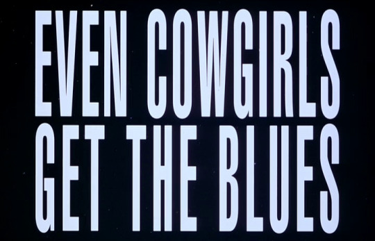
Gus Van Sant Even Cowgirls Get The Blues (1993)
3K notes
·
View notes
Text

36. Kronos digital clock typeface.
200 notes
·
View notes