#TWK Lausanne
Explore tagged Tumblr posts
Text

Nader Grammas
#Nader Grammas#designer#lighting#design#studio#simplicity#objects#portfolio#typography#type#typeface#font#TWK Lausanne#TWK Ghost#2024#Week 39#website#web design#inspire#inspiration#happywebdesign
4 notes
·
View notes
Text


The current typeface my group was using was GTK Ekstra but I believed it wasn’t very legible as a body copy but was better suited towards headers. I chose to prototype this typeface against others which I did as shown above. I wanted to also test different point and leading sizes. In the context of a page. I did this so I could see what typeface at a small point size would work and be most effective. As a computer screen is much different to a page. I chose TWK Lausanne as the best fit for purpose and the trialled type/leading size aswell as how it would interact with surrounding element and mocked up a potential layout to guide my design direction and choices in further layout as a template.
0 notes
Photo

TYPOGRAPHY EXPERIMENTATION
The typography I tested was four different typefaces all which had different characteristics and personalities. I recognised through research that my target audience and the tone of this message was better suited for sans-serif. So I conducted research into my favourite sans-serif typefaces.
Felix black was strong and had a larger width, but it was too dark with small counters. Stellar Light was great but too thin and would fade into the background.
TWK Lausanne was by far my favourite; with Swiss and Helvetica nuances however had been reconstructed by TWK foundry so that the ascending and descending lines are very short and give the typeface a compact, refined aesthetic.
0 notes
Text

ZERODOIS
#ZERODOIS#sofa#sofas#heartcrafted#Portugal#design#objects#portfolio#colors#typography#type#typeface#font#TWK Lausanne#2024#Week 12#website#web design#inspire#inspiration#happywebdesign
11 notes
·
View notes
Text

Etablissement
#Etablissement#architecture#paysage#agence#studio#Paris#Bruxelles#portfolio#low impact#black & white#N&B#type#typeface#font#TWK Lausanne#2023#Week 50#website#web design#inspire#inspiration#happywebdesign
9 notes
·
View notes
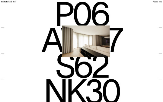
Photo

https://bernard-boos.com/
#Studio Bernard-Boos#architecture#product#design#studio#Berlin#portfolio#big type#white#typography#type#typeface#font#TWK Lausanne#2023#Week 22#website#web design#inspire#inspiration#happywebdesign
19 notes
·
View notes
Text

Holcomb Studio
#Holcomb Studio#home#interior#objects#shop#typography#type#typeface#font#GT Super Text#TWK Lausanne#2023#Week 51#website#web design#inspire#inspiration#happywebdesign
5 notes
·
View notes
Text

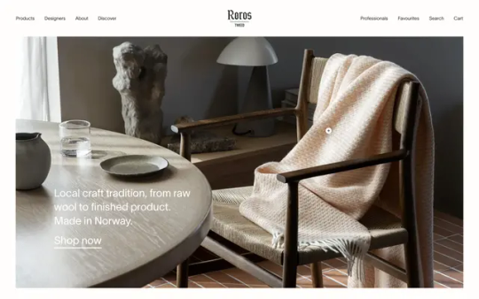
Røros Tweed
#Røros Tweed#Norwegian#craftsmanship#craft tradition#raw wool#textile#designers#products#shop#white#type#typeface#font#TWK Lausanne#2023#Week 50#website#web design#inspire#inspiration#happywebdesign
4 notes
·
View notes
Text

Unspoken Agreement
#Unspoken Agreement#design#studio#portfolio#slide#black#type#font#TWK Lausanne#2023#Week 35#website#web design#inspire#inspiration#happywebdesign
6 notes
·
View notes
Photo

https://akutostudio.com/
#Akuto Studio#Chord Machine AKT-0.1#music#waiting list#Lausanne#Switzerland#red#white#black#typography#type#typeface#font#TWK Lausanne#2023#Week 14#website#web design#inspire#inspiration#happywebdesign
4 notes
·
View notes
Photo

https://www.mg-tucker.com/
#M.G. Tucker#photographer#photography#studio#New Orleans#artists#musicians#food and drinks#portfolio#typography#type#typeface#font#TWK Lausanne#2023#Week 09#website#web design#inspire#inspiration#happywebdesign
3 notes
·
View notes
Photo

https://491projects.com/
#491 Projects#online#shop#platform#design#iconic#objects#artists#white#typography#type#typeface#font#TWK Lausanne#2022#Week 48#website#web design#inspire#inspiration#happywebdesign
3 notes
·
View notes
Photo

https://www.exoape.com/
#Exo Ape#design#digital#studio#The Netherlands#portfolio#typography#type#typeface#font#TWK Lausanne#2022#Week 18#website#web design#inspire#inspiration#happywebdesign
2 notes
·
View notes
Photo


Typography Testing
Lucy and I both understood the importance of having a neo-grotesqu typeface as the foundation for ‘Formula’. The noe-grotesque fonts are key progressive typefaces that rely on the foundation of classic swiss type design and systems; while maintaining these nuances they lean towards the digital age, market and through mass output of typefaces in the digital era, only few stand out with small details that bring superior character, emotion and style to the forefront of typeface design. I began testing a series of typefaces that I beleived had these nuances within a typeface. I narrowed it down to GTF Ekstra. This typeface was far more extended than TWK Lausanne and would serve as a great Header or Title but also had a very modular approach with interesting bowls and shoulders. I began testing and ideating this typeface in the ocntext of Formula and kerned the letters to make the title stronger and bolder but also decreasing the irregular space between letters to allow for viewing. I decided that the title itself was storng alone and didnt need to be overly illustrative and that a seperate symbol or illustration could accompany this without jeporadising the form and uniformity of the header.
0 notes
