#THE COLOR SCHEMES... THE COMPOSITION.... THE VIBES!!!!!
Explore tagged Tumblr posts
Visit Tumblr Blog
Explore Tumblr blogs with no restrictions, modern design and the best experience.
Last Seen Tumblr Blogs


Fun Fact
Average visit duration of Tumblr.com is 10 mins and 25 secs.
Text
severance comic process write up (unasked for)

i finished season 1 of severance jan 24 and maybe by then NL had already begun his apple tv tirades. so maybe that's why i thought of the get it twisted speech? dont remember exactly but i was like wait......... this kinda fits...... and basically the images were forming in my head and i had to get them out. this is the best kind of inspiration to have. when it feels like you are afflicted with a life-threatening disease and the only cure is to draw pictures
i decided i wanted square panels and a black and white color scheme pretty early on. i wanted the pacing to feel kind of fast, so one line per page (basically i was trying to match the monologue). black and white also made sense because 1) i didn't want this to take 2 years like my last comic 2) fits theme of the show and the monologue rapidly whipping back and forth 3) i thought maybe i'd riso print this in the beginning and 1 color would be cheapest/easiest
the sketching phase was really smooth. it was like the images were in my mind already and just needed to be brought to life. my motivation was strong as well (i thought it was really funny and if no one liked it at least i really really liked it).

^ my sketches. most compositions made it to final without major edits. i did cut almost all of the last 8 because i didn't feel like I needed the moment to be dragged out so much AND i was getting pretty tired by that point lol.
one page i'm glad i changed was the ms casey one. the reason i changed it at first was because i thought it was too similar to the irving/burt one. and then i ended up really liking the new composition.
as i moved to final, i had a couple of inspirations in mind. i'm a huge fan of sophia foster-dimino's work, and in particular her sex fantasy comics


^ books/zines i looked at for inspiration. second image is a spread from sex fantasy #4.
i also was inspired by jennifer xiao's comics and how chootalks and nogoodwithcat handle linework and value


i was inspired by jennifer's pop up ads comic for this page. i like the humor in her work and wanted to bring an element of that into my comic.


i love these drawings by choo that showcase these eerie tableaus of desserts/cakes/hammers/etc! i was trying to evoke the same vibe with the two "get it twisted" pages with the stack of waffles.
also, just tons and tons of references taken from the show and stock images.

i pretty much just worked for two weeks straight until i finished. what unemployment does to a motherfucker. even though it's fanart and the words aren't mine, it's a pretty personal comic. i got suddenly laid off last fall which has made me feel all sorts of feelings, and then starting up my job search this year has been grueling. it kinda blows my mind that anyone expects you to love your job. i love my cat. i love the people important to me. i love moving my body and eating good food and listening to music and being out in nature. i love the color green. i dont love my fucking JOB lmfao!!!!!!!!!!!!!!!!!!!!!!!!!!!!!!! are you freaking CRAZY???????? literally do NOT get it twisted. but also please hire me. <- this dichotomy has been making me nuts
anyway. the reception to my comic has been mind blowing. people have said some insanely nice things. i also really appreciate anyone who's read and enjoyed the comic without knowledge of severance or northernlion LMAO honestly amazed and in disbelief.... ty so much..... it really means a lot!!!!!!!!!!
okay i ran out of things to say for now byeeeeeeeeeeee
324 notes
·
View notes
Text
Ok! I've finally decided to put together a (somewhat) comprehensive tutorial on my latest art~
Please enjoy this little step-by-step 💁♀️
First things first--references!
Now I'm not saying you have to go overboard, but I always find that this is a crucial starting point in any art piece I intend on making. Especially if you're a detail freak like me and want to make it as realistic as possible 🙃
As such, your web browser should look like this at any given point:

Since this is a historical piece, it means hours upon hours of meaningless research just to see what color the socks are, but...again. that isn't, strictly, necessary 😅
Once I've compiled all my lovely ref pics, I usually dump them into a big-ass collage ⬇️
(I will end up not using half of these, alas :'D)
Another reference search for background material, and getting to showcase our models of choice for this occasion~
When picking a reference for an actor or model, the main thing I keep in mind (besides prettiness 🤭) is lighting and orientation. Because I already kinda know what pose I'm gonna go with for this piece, I can look for specific angles that might fit the criteria. I should mention that I am a reference hound, and my current COD actor ref folder looks like this:
Also keep in mind, if you're using a ref that you need to flip, make sure you adjust accordingly. This especially applies to clothing, as certain things like pants zippers and belt buckles can be quite specific ☝️
Now that we've spent countless hours googling, it's time to start with a rough sketch:
It doesn't have to be pretty, folks, just a basic guideline of where you want the figures to be.
The next step is to define it more, and I know this looks like that 'how to draw an owl' meme, but I promise--getting from the loose sketch above to below is not that difficult.
Things to keep in mind are--don't go too in-depth with the details, because things are still subject to change at this point. In terms of making a suitable anatomically-correct sketch, I would suggest lots of studying. This doesn't even have to be things like figure drawing, I genuinely look at people around me for inspiration all the time. Familiarize yourself with the human form, and things like weight, proportions, posing will seem a little more feasible.
It's also important at this stage to consider your composition. Remember to flip the canvas frequently to make sure you're not leaning to one side too often. I'm sure something can be said for the spiral fibonacci stuff, which I don't really try to do on purpose, but I think keeping things like symmetry and balance in mind is a good start ✌️
Next step is just blocking in the figures. Standard. No fuss 👍
Now onto the background!
It's frankly hilarious how many people thought I was *hand-drawing* these maps and stuff 😂😂 I cannot even begin to comprehend how insanely difficult that would be. So yeah, we're just taking the lazy copy and paste way out 🤙
I almost always prepare my backgrounds first, and this is mostly to get a general color scheme off the bat. For collage work, it's really just a matter of trial and error, sticking this here, slapping this there, etc. I like to futz around with different overlay options until I've found a nice arrangement. Advice for this is just--go nuts 🤷♀️
Next, I add a few color adjustments. I tend to make at least 2 colors pop in an art piece, and low and behold, they usually tend to be red and blue ❤️💙There's something about warm/cool vibes, idk man..
Now we move on to coloring the figures. This is just a basic block and fill, not really defining any of the details yet.
Next, we add some cursory values. Sloppy airbrush works fine, it'll look better soon I promise 🙏
And now--rendering!
I know a lot of beginner artists are intimidated by rendering, and I can totally understand why. It's just one of those things you have to commit to 💪
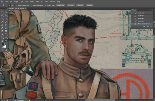
I've decided to show a brief process of rendering our dear Johnny's face here:
Starting off, I usually rely on the trusty airbrush just to get some color values going. Note--I've kept my sketch layer on top, but feel free to turn it on and off as you work, so as to not be too bound to the sketch. For now, it's just a guideline.
This next stage may look like a huge jump, but it's really just adding more to the foundation. I try to think of it like putting on make-up in a way~ Adding contours, accentuating highlights. This is also where I start adding in more saturation, especially around areas such as ears, nose and lips. Still a bit fuzzy at this point, but that's why we keep adding to it 💪
A boy has appeared! See--now I've removed most of the line layer, and it holds up on its own. I'll admit that in order to achieve this realistic style, you'll need lots and lots of practice and skill, which shouldn't be discouraging! Just motivate yourself with the prospect of getting to look at pretty men for countless hours 🙆♀️
I'll probably do a more in-depth explanation about rendering at some point, but let's keep this rolling~
Moving forward is just a process of adding to the figures bit by bit. I do lean towards filling in each section from top to bottom, but you can feel free to pop around to certain parts that appeal to you more. I almost always do the faces first though, because if they end up sucking, I feel less guilty about scrapping it 😂 But no--I think he's pretty enough to proceed 😚
They're coming together now 🙆♀️ Another helpful tip--make sure you reuse color. By that, I mean--try to incorporate various colors throughout your piece, using the eyedropper tool to keep a consistent palette. I try to put in bits of red and blue where I can
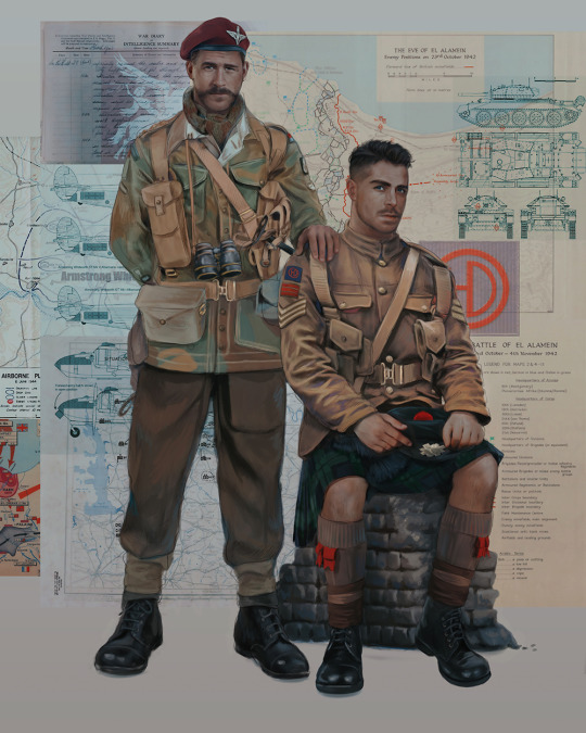
Here they are fully rendered! Notice I've made a few subtle changes from the sketch, like adjusting the belt buckles because I made a mistake 😬 Hence why you shouldn't put too much stock in your initial sketch~
The next step is more of a stylistic choice, but I usually go over everything with an outline, typically in a bright color like green. Occasionally, I can just use my initial line layer, but for this, I've made a brand new, cleaner line 👍
And the final step is adjusting the color and adding some text:
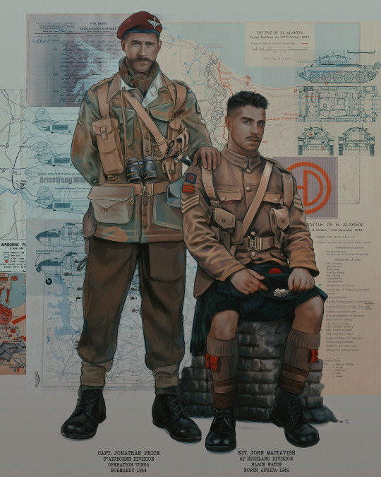
Tada!! It's done!
All in all, this took me the better part of a week, but I have a lot of free time, so yeah ✌️
I hope you appreciated that little walkthrough~ I know people have been asking me how I do my art, but the truth is--I usually have no clue how to explain myself 😅 So have this half-assed tutorial~
As a bonus, here is a cute (cursed) image of Johnny without his mustache:
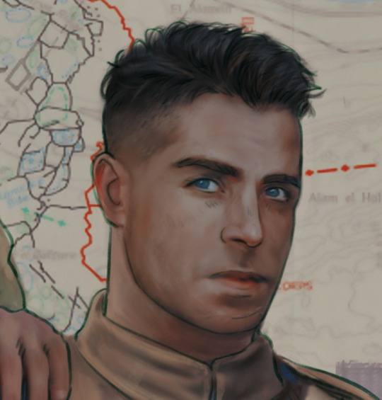
A baby, a literal infant child !!! who put this wee bairn on the front lines ??! 😭
Anyway! peace out ✌️
#tutorial#my art#art tutorial#since people have been asking#I remembered to save my process from this latest work~#enjoy 🙆♀️
1K notes
·
View notes
Note
how do you figure out color schemes? it takes me so much time to just play around with things that MAY work, but your art is always so seamless and has really beautiful combos
Colors are such a weird topic in art because it's either as complicated as astrophysics or it's ✨vibes✨
But usually what I do is pick a color I want to stand out, make everything else around less saturated or far away from it in the color wheel or not as dark. Or all of the above fjfbf
Example 1, Aayla's blue is the only blue in this drawing. The only color that's close in "temperature" is Quinlan's green robe which is placed on the other side of the composition to bring some balance to the drawing. But also this green is still rather "warm". So the blue stands out no matter what

In this one it's Ahsoka's orange skin. Everything else is cold. Except her head pice which is less saturated. And I added red accents to really make the orange more vibrant

This one is even more obvious. The orange is the only warm color. Even the yellow is yellow-green so it's cold. And the purple you see in the background is warm but it's also mixed in her orange.

As to why I combine the rest of the colors with each other it's less of a system and more of me being a psycho and having what I call fun dhdhdh
Which is usually trying to use as many weird combinations of colors as humanly possible
Don't know if this made any sense, feel free to ask more questions!
260 notes
·
View notes
Text
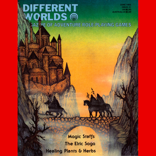
Different Worlds 21 (June, 1982). A two month break! Alan Burton on the cover. Absolutely adore this one. Great color scheme, great composition, very late ‘70s fantasy fan art vibe. There is something in this that reminds me of some of the stranger art in the David Day Tolkien books.
#roleplaying game#dungeons & dragons#tabletop rpg#rpg#d&d#ttrpg#Chaosium#Different Worlds#Alan Burton#noimport
164 notes
·
View notes
Note
Okay the wars part of the comic is SO FREAKING GOOD i cant emphasize how AMAZING the art is and the style is so SOOOO perfect for him oh my god i love it so much it’s so good you’re such an amazing artist i’m just in awe
You're going to make me blush 😳
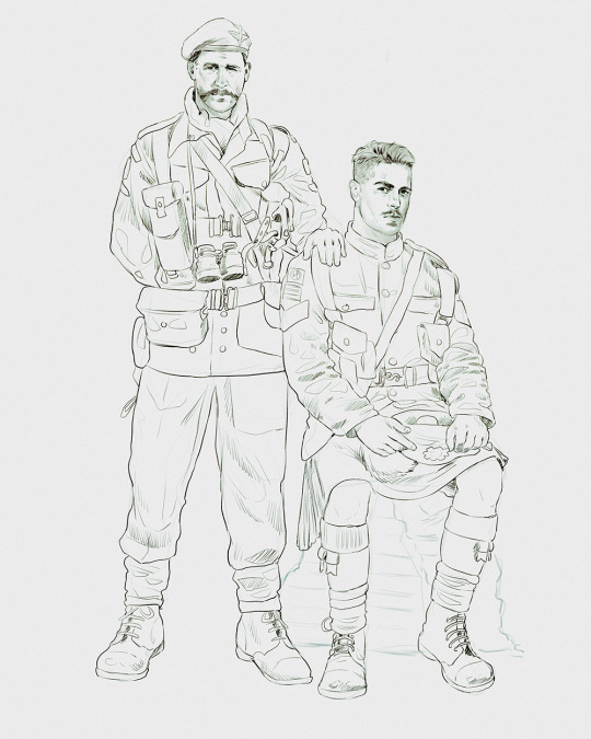
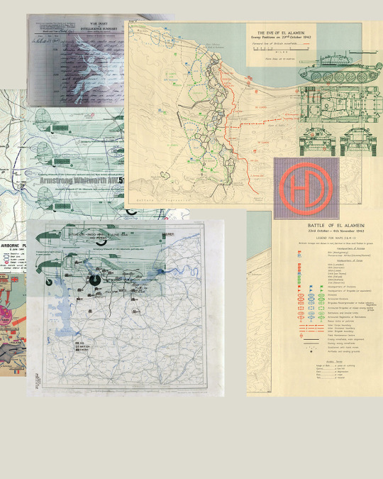
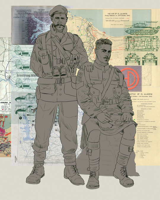
For those three pages in particular, I had a precise idea of the style before starting (that was not the case for every character). I wanted to have something that reflected a sense of gigantism, of him being a tiny cog in the war machine, so it was important to have a lot of characters and big-scale buildings.
From there I tried to emulate the vibe of old european paintings, in particular the 18th-19th century ones, made to glorify a battle. The hero being a tool for propaganda, I was going for something aesthetic, with dramatic lighting and grandiose composition.
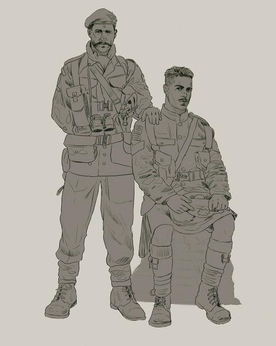
I also wanted to have a more sinister vibe, so I adapted the color scheme to something more subdued on the second and third page. I also kept in mind an old trauma of mine (Otto Dix paintings about the first World War) to avoid forgetting about the deeper discomfort that needed to be transmitted in the heat of painting something pretty.
In the end, I'm not a master and I have my own style that is hard to shake off, so I don't know if it does justice to its inspirations, but I think it looks cool too ! ✨️
8 notes
·
View notes
Text

I haven't done one of these in forever! I think the last one I did was... four years ago? I thought it would be fun to make one again with my improved art skills and show the work that was put into this piece.
The final piece was one of three idea prompts I submitted for the zine. I was already sketching out thumbnails while I was waiting for approval, but I did draw for one of the rejected prompts as well. (Unfortunately I don't have access to them at this time but I'll add at a later date).
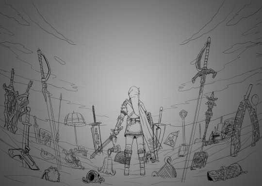
Once the weapon prompt was approved, I got started on a rough sketch. (The sketches were drawn cleaner than what I would normally do to make sure it was readable haha). The toughest part of the piece was its composition. Scattering the weapons was hard because I needed to make sure everything looked balanced and focus was placed on the master sword.
What ended up working for me was I managed to grab as many weapon models from the game as I could find, threw them into Blender, and arranged them until it looked good. A bonus of doing this was having good references for both the piece and the individual weapons themselves (which came in handy when I had to draw some of the detailing). The models were also size accurate so that helped a ton too. I did have to upscale the smaller weapons so they'd be more visible on the cover.
Some of the weapon placement was deliberate, others were put there to fill in space or for another reason. The majority of the characters wielded some variation of a sword so I sprinkled in different weapons and other things to break up the repetition. That includes stuff like the Fierce Deity Mask and Toon Zelda's helmet. The more sillier weapons like Tingle's balloon and King Daphnes' sail were placed in the back so they wouldn't clash too much with the other weapons.
I'll talk about some of the more of the symbolic stuff further down the post.

I also drew an alternative version of this piece with Link being in the center instead of the master sword.
Fun fact: at one point I did consider including Ganon since he's technically playable, but realized he doesn't have a weapon. This would have meant I would also had to include the big Cucco from the cucco mode so neither were ever conceptualized.
I intentionally left the art's tone ambiguous just in case the mod team had something in mind. I did picture it having a dawn color scheme though, and the mods wanted the cover to have a peaceful/hopeful vibe so that worked out. I did however add some sunset choices in my color concepts for more options. The four I made also had sepia versions to fit with the aesthetics of the game.
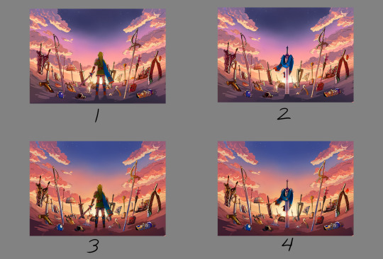

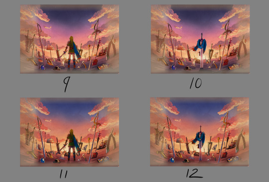

8 was the one the mods chose. However, I did end up slightly adding 6's colors into it to make the sky pop. This ended up being the finalized color concept.
(It looks a little fuzzy because I ended up layering 8 and 6 on top of each other and I didn't position them correctly fghj).
When I do illustrations I start with the background first so I can use its colors for the foreground and midground. I normally don't draw clouds this big and up close so I had to be pretty delicate with how I rendered it. I'm glad I only had to do one side and just duplicate it to the other. Also I made the oranges in the sky and clouds subdued.
After the background was done, I tried rendering the ground and it was a disaster. This was early on in the rendering phase, but what was meant to be dirt started to look like sand. I tried to see if adding textures would help but it made the problem worse. I ended up taking a break from the ground and moved on to the weapons.
Next was the most grueling part of the piece: linearting. I am not kidding when I say doing the lineart took three whole days. I was also juggling with my other illustration I was working on for the zine so the timeline ended up stretching to a week. I'm a detail-oriented person and stuff like this isn't usually that bad for me but this one was pretty rough. The sweat and tears paid off, I think!
After lineart was done, I went back to render the ground again. It was becoming more polished and included more small rock formations, but the dirt-looking-like-sand bit wasn't improved. I opted to add grass instead since that would be easier to render. That was probably the right call because I think that helped with the desired tone for the cover.
I flipped-flopped between working on the grass and the weapons. This screenshot was when I had added the shading, textures, and some highlights. Oh, and I slightly tweaked the sky a bit.

With the grass and rendering done comes my favorite part: color editing. Started throwing overlays, soft lights, what have you on everything and used color balance to level out the colors. Also added light reflection on the ground for some of the weapons.
Something was missing from the illustration and I had no idea what it was. A friend had suggested particle effects and that did the trick! Everything was set and done and I submitted my illustration. When I saw the cover with the title for the first time, I noticed that the illustration was made a bit brighter than what I originally had (likely so the title stuck out better). I actually really liked that change and edited my own copy of my illustration accordingly.

With that said, now I want to talk about some of the more subtle details in this piece. You guys probably noticed these already, but I want to talk about them anyway! I mentioned deliberate weapon placements some ways up so let me go over that first.
Ghirahim's sword, Zelda's rapier, and the master sword are placed in sort of a triangular way meant to represent the triforce (although I think I messed up on the distance between them). I originally wanted Ganondorf's swords being in Ghirahim's spot but I was worried about contrast issues with the swords' darker color scheme and battling attention away from the master sword. I think the idea still works considering Ghirahim is Demise's sword (and Demise is like the Ganondorf of that game). Though Ganondorf's current placement can be viewed as him being a looming threat, for Hyrule Warriors and other Zelda titles.
I have Lana's tome and Cia's scepter close together to symbolize them being two sides of the same coin. Toon Link and Toon Zelda's were placed on opposite sides of the piece but slightly facing each other. Toon Link's and Tetra's are also diagonal from each other, both also representing a type of connection to each other. It's a similar deal with both forms of Midna's weapons as well as Yuga and Ravio. Speaking of Ravio, his weapon is the only one partially buried, sort of peaking over at the master sword to reflect his cowardice natureand being Link's Lorule opposite (at least the Link from a Linked Between Worlds). A similar idea with Fi is that she is somewhat of a silhouette behind the master sword to reflect her growth in Skyward Sword. (I know technically Fi is represented twice here, but her "weapon" in Hyrule Warriors is a different blade so that's why).
Like I said before not all weapons have symbolic placements like this, but a number of them do.
One more weapon detail I wanted to point out is on the master sword. I had this planned from the very beginning but I intentionally draped Link's scarf over the master sword so that the triforce of courage on the blade is the only one visible. I also intentionally highlighted the engraving to make it more prominent.
In the background, the sky is shaped in a way to resemble the Hyrulean royal crest. With the gap in between the clouds looking like the wings, the Master sword acting as the body, and the three visible stars as the triforce (but I messed that up slightly). Only thing I didn't include was the feet of the crest. It's not an exact 1-to-1, but here's an outline for a better visual:

On the topic of stars, there are 29 in total to represent all 29 characters. The brightest star above the master sword is meant to represent Link, but the other 28 are scattered around. Some are more visible than others so it may be hard to spot them all, but they're there.
Saving this last detail because it doesn't really have anything to do with Zelda and more to do with my art. I have always wanted to do this with my work for a while but haven't implemented it until now so I wanted to bring it attention.
From now on, all of my illustrations will have a hidden little angler fish blended into the scenery. I got the inspiration from Adventure Time's snail that appears in almost every episode incorporated somewhere and thought I could do something similar with my art. I'll show you guys where I placed this one, but you'll have to find the next ones on your own.
Not the clearest, but I promise in the future it'll be better drawn (and in case you're wondering, yes there are also little anglerfish in the other zine illustration too!). I just thought this would be a fun way people can interact with my art (and also act as an additional signature).
And that's it! If you have read all of my rambles, thank you!
32 notes
·
View notes
Text
Finished Harmony of Dissonance!
-Saw all endings and got 200% map completion
-Story was pretty good, I very much enjoy the game tackles the angle of how the Belmonts are cursed to eternally hunt down Dracula and inevitably their loved ones get dragged into it and they suffer yet still press on.
Again, Maxim's portrayal was handled really well as a sympathetic figure. He wanted to help Juste escape a torturous existence and ended up biting off more than he could chew, not really knowing just how soaked with evil the relics of Dracula are. Part of that was arrogance to prove himself better than Juste, but the two actually feel like proper friendly rivals compared to Hugh and Nathan.
-For a criticism, Lydie was certainly a character that was there. Igavanias have this issue that, due to how they're structured, sometimes characters just aren't developed or consequential. I don't really know what she was there for, other than to provide a second emotional crutch for Juste and Maxim. To the game's credit, Death does have a line where he says "When something is dear to you, its effect upon you becomes immeasurable" which becomes applicable to Juste just as much as it does Maxim, especially if you see all the endings. Technically, you could also argue that this same theme affects Death himself to the same degree given how many times he dies and comes back, all in service of Dracula.
It just doesn't reach Lydie the same way, unfortunately. I don't know how one would improve that (given how Mina in the next game kind of has the same issues iirc, it's clear that it's something to grow out of lol) but as it stands, her presence is pretty weak.
-Presentationwise, again, it definitely has aged in the graphics department EXCEPT the enemy sprites. What a marvel it was that such detailed sprites, especially the bosses, were put on the GBA. They were always a sight to behold.
But I know the reason why they were able to do that is by sacrificing space, and the thing that took the hit was the music. I mentioned it in the first post, but it bears repeating. I don't think it's the compositions that are that bad bad, but it's the lower quality soundfont and the lack of musical variety that hurts the score.
There are, I think, two tracks in the game that use a higher quality soundfont, and those are the title theme and the credits theme. Those two tracks are incredibly high quality, and exceptionally lift up the compositions. Were the rest of the soundtrack like that, I have little doubt that it'd be received much better, if still paling in comparison to other tracks in the series.
-Figured there were two castles lol. It does seem unoriginal, but given that Iga explicitly wanted "Symphony of the Night but again" I can't really knock the game too much.
I will knock the game for its environments not being too distinct between the two castles, with the major differences being color schemes and subtle vibes (Castle B has red skies while Castle A has normal ones). If the game had a worse map system, it'd be a real drag to try and explore since I wouldn't otherwise remember which castle I was in. Thankfully, each Castle has a separate map with different colors, and one combined map of yet another color that does a neat layering trick to best show the player what rooms in which castle have been cleared.
That also made going for 200% completion much easier, though that goes into my next point.
-Warp points kind of came a bit too late to have the most meaningful effect. Of course, given that you have to explore two different castles, you're not warping with the intent to backtrack too much until the endgame, but it does bring a layer of tedium that otherwise wouldn't have existed.
This includes how warping from one point to another within the same castle is locked to the player until you get the appropriate hint card. I'd rather that ability just be unlocked from the start, with the player being told so directly.
This all kind of culminates in my last criticism, which is the grind for 200%, since a lot of things just aren't made clear to you where they are. The crushing boots, the various keys, and even some of the Dracula relics-the latter of which are required for the best ending I think-are all in locations that, to my knowledge aren't explained or hinted at, some even being behind invisible walls. I love exploring in Igavanias, but to me, part of the process and the fun is seeing clearly what you're missing, remembering that and coming back later when you have it and are much stronger. For some of these items, that wasn't the case, since I couldn't visibly see what I was missing or could do in order to get to the rooms. Not good design when I have to look up online where to find certain things I'm missing.
-That said, the overall flow of the game is still incredibly fun. I never once felt like I was just trying to get the game over with, and that's because I actually liked interacting with the systems the game put in place. Juste is strong and moves fast, has a typical RPG inventory of healing items, and has access to magic that isn't just screen nukes to pile on damage, many spells have incredible utitlity, like shields, taking care of grounded or air enemies the best, or cornering enemies to a part of the screen.
It's varied and fun, and promotes experimentation to figure out what suits your playstyle. Me personally, I like blitzing through rooms with shields like the Wind Cross spell, Wind Holy Book spell, or Thunder Holy Book spell; targeting enemies with Ice Dagger, Ice Axe and Ice Holy Water; and separating enemies from me with Thunder Holy Water and Fire Fist.
There's also the typical high damage high MP cost spells, like Grand Cross and Hydro Storm, but also basicaly a fucking Hadoken when using the Wind Fist spell which is cheap on MP and incredibly strong.
There's just a lot of stuff that feels good to use. The only thing that got a bit of snag to it is the high jump, where to use it you have to hold down then press up and jump at the same time, which is like, a fighting game maneuver? But in a platformer, it doesn't feel as good, and a big downgrade from the high jump in Circle of the Moon in terms of controlling it and the ease of motion it gives you.
-Overall, I had a really, really good time with Harmony of Dissonance. There were times where I felt it was pretty easy (the final boss in particular seems like a big overcorrection from Circle of the Moon, to give an example), but that was only about 10% of the time, and the rest of it I feel was curved pretty well.
I definitely forsee myself coming back to this one in the future, especially since there's Maxim mode, so trying a different gameplay style would be on the top of the list.
Aria of Sorrow is next, and I'm so excited to see my confused diva babygirl Soma Cruz again 🥺🥺🥺
#castlevania#castlevania harmony of dissonance#juste belmont#playingHoD#also reading the item descriptions for the furniture made me realize it's all what *Juste* thought of them and asfgasbgfasb#he's such a nerd lmaoooo he looks at a warrior statue and is like#“that's gonna be ME someday :D” which is so fucking funny
10 notes
·
View notes
Text
It's October and that's all the reason I need to celebrate Izzy lets go!!!
I could talk for an hour about how Izzy's art and playlists spoke to me and why I just HAD to have him do our art, but that's another post for another day. For now lets talk about a few of the early pieces.
THE MALL
his first official piece for us. The bonus episodes and the corresponding postcards was a it of an experiment (it's experiments all the way down) and we were all so impressed with this that we just had to figure out a way to hire him. I was on the phone with Pacific when he saw it and I could practically feel the shock when the colors hit him.
More under the cut, don't forget to follow @filthyguts!
4.10 Audrey Burns
(I AM WORKING ON THE LETTERING) the fisrt normal episode piece. I had no idea what was coming my way, Izzy's style is strong at its core, but the fringes and fiddly bits have such nuance and flavor. Popping colors, photobashing, giant expressions and poses, and a rare smile from our boy. He's dressed in the Hilton uniform because that's what this Hotel was based on. This one has a real Stinky Cheese Man vibe.
4.11 The Owner - V
a rare sequel episode that ties in directly with S1. Izzy really got to play with the composition, breaking it apart with the characters themselves (notice the V shape!) and infusing it with the chaos of the episode, but unified by color scheme. More photobashing (is that what its called?) and a rare view of his Hotel herself design. I love the his Owner so much. Them little grabbers!

4.12 X - X
Originally titled "? - ?" but changed because that's unpronounceable, this one is very popular on our store. Lobby Boy clutching the title and the Owner made of Hotel photos (ELEVATOR BUTTON ARM!) reinforcing the helpless power the characters have over their environment. That smiling crazed face is exactly what I pictured in season 1, and something about the colors and texture reads as fish scales to me it's like the Manager is here too (fish!Manager enjoyers unite)
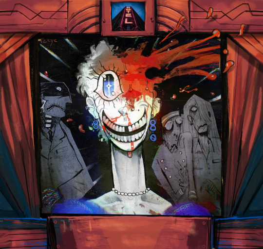
4.12 Judy Blashy
One of my very very very favorites. The whole cast together, and though they all wear masks of fear you can still get their character dynamic in an instant (i like how the LB is in front of the Manager--Izzy has always understood that he is not fragile fine china that could shatter at any moment, but a mongoose under the house who doesn't like loud noises). Madam Hotel's mad, gap toothed grin, her room number earrings, her NECK LOOK AT HER NECK!!! and of course a great big splash of blood where the Owner smooshed her (mirroring the Managers head getting bonked in S3, and don't get me started on people losing eyes) I love that when we added the Goosebumps frame he drew some more blood flying out over it, always reinforcing that breaking of what seems like real boundaries effortlessly.
That's it for now, go follow Izzy anywhere you can, he posts art all the time and it's always incredible (I don't even know who Kira is but I sure like the way Izzy draws him)
Thank you Izzy, you are a rock star and I cannot and will not imagine what the Hotel looks like without you!
#The Hotel podcast#filthyguts#he also has great taste in movies#fashion icon#animator#a professional and delightful guy
99 notes
·
View notes
Note
hihi! srry if youve answers this but mobile isnt making it easy to search. what's your general process for making moodboards? it's weird bc I have nooo problem making stim boards! but mbs are rly difficult for my brain evn though I wanna. how do you do it?
Hello hello! I haven't answered this before, but it's a great question!!
I usually start with either an original idea or a request that I feel like doing (sorry people who've been waiting a long time), and at that point I usually have some idea in my head of the color scheme or vibes that I want it to have and set out to Pinterest!
I gave my list of go-to items to search in a previous ask, which can be found here!
Once I've found at least 9 pictures (sometimes more than 9 for extra options) I crop them all to a 1:1 ratio so they appear as a grid of squares instead of rectangles, and sometimes make minor alterations to the color temperature (warm or cool tones) so the pictures all look coherent!
After that I play around with the composition of the picture, which can take a while depending on how many colors I'm working with. Here are 2 examples of what I mean!
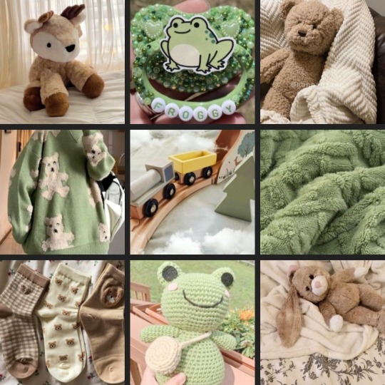
This one has 2 main focus colors (as most of my moodboards do), green and brown, so the composition of it alternates between the two colors the whole time! I would also do this if it had 3 main colors. This just makes it look more even overall; to me, at least.
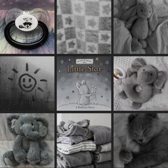
This one, on the other hand, is just 1 focus color, which is grey! So I didn't worry as much about the composition of it. I could move anything here to any other place, and it would be approximately the same! I treat moodboards with more than 3 focus colors the same way as moodboards with just 1, so those are less deliberately structured.
After all of that, I choose which dni banner I think fits best with what I made, write my tags out, and I'm done!! This process usually takes 20 minutes to an hour and a half, depending on how long it takes me to find the right pictures!
I hope this walkthrough of my process was helpful, and obviously there's no singular correct way to make moodboards!! Good luck Anon!
#i have Internet again!#i think I'm going to just get back to my regular schedule tomorrow#anyway#this was fun!!#my process is pretty rigid#i do it basically the same way every time#sometimes it's time consuming other times it's not#i don't have much time to work on original ideas these days#though i do still make some#anyway i really hope this helps you!#if you can make stimboards your page is already so different from mine!!#i can't make them#despite popular demand#this got so long#again#whoops#Pip's barks
24 notes
·
View notes
Note
I *love* the motif deck; the composition, the flexibility, your watercolors are wonderfully done, and while I'm hoping to be able to buy it eventually, I'm desperately poor and can't rn (if I can sell some earrings I maybe can though lol) but every time you post a sample reading it's... also dragging me to filth, and strangely tiding me over, so thank you and also wtf how do you do this
I'll be honest, I don't know how I do anything. I'm just trying to make it to Friday.
The Motif Deck was born from an idea I had a couple years ago, which was an oracle deck with no words attached to the cards so that the reader was encouraged to free-associate. But when I was sketching out the thumbnails I only had four colors in my pen set and I was working on it while at a laundromat so I couldn't get more because someone might steal my laundry. But I ended up really enjoying the simplicity of the color scheme so that got stuck in my head for a bit.
The drive to do an oracle deck with no standard meaning came from doing tarot for like six years (at that point, it's more like 10 now). I've always been a really talented reader and I picked up on the concept right away, but the symbols in tarot seemed a little hard to connect with (which lead me to make @thesweeneytarot ). So I started reading based on vibes. Like... what colors do I see most of in this spread, where are the cards facing, what seems out of place, how do we create a story based on what we have in front of us.
Proved effective! I was doing really well on tarot readings. It felt less like divination this way and more like a puzzle, like a story, like a game.
So what if there was a deck that was made for this style of reading? How do you even start that? What would it look like? Could I make something like that? Where do I start?
Then my friend introduced me to a game called Dixit, and it's sister game Mysterium, which uses untitled surreal art cards to tell a story. And I noticed that sometimes the art cards would have similar objects in them, like red ribbons or gold keys or blue fish. And it was interesting to me how the person in the storytelling position would make different associations than I did and I considered this a feature, not a bug.
I toyed a bit with doing divination with Dixit cards, but I found them a bit too obtuse for my liking and there were too many details to get caught up in.
So I was like... okay, I like this. What do I like about this? Let's do this but make it simpler.
...then covid.
So the idea sat on the backburner for awhile.
Then i got back into doing tarot readings and got the itch to try something new, started thinking about That oracle deck again, but now I'm thinking about those primary colors and how I tried like four different color combinations in my thumbnails and couldn't remember what they were meant to mean between them.
Then thinking about color theory. Like actual color theory but also the meme. And how the red ribbons in Dixit could be the strings of fate or they could be streaks of blood, or the red design on the hospital floor could be 'energetic and positive' or they could be... streaks of blood...
Like... sure, colors might have set meanings... to some people. But they also have meanings in their context. The color of a thing tells a story just like the thing itself.
So this is how I came up with the idea of repeating the images in different colorways.
So now we have my elements: no words, no inherent meaning, simple images, repeating objects interacting with each other, and cards repeating in different colorways.
And then the hard part, which was making it. I do actually have an art degree, so making the paintings wasn't difficult for me, but the logistics was hard. Because I had to decide which objects were common enough to be understood by everyone, and I had to pare the number down to something reasonable because this deck was bound to be massive.
Which took another year.
And now it's done! The slow parts go slow and the fast parts go fast.
I'm the kind of person who like... if I get into my head that I want to make something, I'll find a way to make it. And like... my philosophy for making things has always been that I intend to sell one, and that's to myself. But if I like it, someone else might, so I make it available for other people.
But I'm really glad that other people like it or are even just curious. Like, when you're making a 'product' (which almost feels rude to call something that I did for myself) the hardest part is getting people interested in it. So the fact that so many people think it's cool makes me so happy. (Am I cool now???)
Thank you!! And sorry for the overshare. I just got really excited.
44 notes
·
View notes
Note
What shameless related piece of art are you most proud of?
Also, when you start a piece do you have a specific colour scheme in mind?
this is hard!!! i work in a few different styles and so i have a favorite for each type of way i work i guess. which i think makes perfect sense. but uuhhmm ...i guess one of those favorites is still smokey mickey. its getting warm out and i hate it. i need the wintery ntw vibes back please (im not a summer person🥲)
i was gonna say usually but then thinking about each thing i've drawn in the last year....uhm actually... i tend to have a plan but that plan often changes a least a little bit before im satisfied. the sbb verona grand artwork though i had NO clue it was gonna be red and green. that was a weird one as the whole color scheme fell into place after i had drawn pretty much the whole composition.
10 notes
·
View notes
Note
Helloo! You have very wonderful graphics and layouts! ♡ if I may ask, do you have any tips on making graphics?
-@tuesdaysmotell

tips for graphics :3 !!!!!!
(or just things i do.. except im bad explaining)

1. Composition
• so initially for the graphic composition, i like to take pngs and transparents all of the same "vibe" if yu get me.. ex. a webcore themed graphic i will take things that remind/or is inside it, for steampunk themed i will take gears and etc etc.
but dont be afraid to mix up! for example yu can see some keys, flowers that i put on some.
• and put as many pngs that yu can! limit doesn't exist, but keep in mind that yu still need to produce something more "eye pleasing", both to yu and the people thats gonna see it, to draw attention, yu got it.
• plan something before, sure, doing things from your mind in the moment can turn out pretty good but mentalize some idea to make it easier to follow and consequently better! it seems dumb but it does makes a difference.
2. Colors
• i take colors very seriously, so my tip is dont be afraid to mix up and use a big variety of color combos yu see :33333
3. Overlays
• USE!!!! IT!!!!! AS MUCH AS YU WANT!!!!! play with the overlay settings and positions, the more yu explore the better it gets
also tip, color the overlay with the same color scheme as yur graphic, just trust mwe it gets better
I THINK ITS THE END???? SWORRY IF I SAID SHIT OR SOMETHING WRONG IM JUST SAYING WHAT I DO OR WHATEVER
took me 3 days and i finished this while baking cookies bye
FEEL FREE TO ASK MWE ANYWAY :33333
#ᛝ the messy little angel ꒱ .#ᛝ hy who speaks.. ꒱ .#ᛝ the angel's requests ꒱ .#tumblr graphics#graphics#rentry graphics#graphics tips#tips
6 notes
·
View notes
Text
here is the seventh one. this is a considerable step down in complexity, but there is a sense to this. if we view the compositions as a series-- which, they are!-- then the first seven are a cycle. we have seen a depression gradually process itself via the question of creation. 1 was the most like a conventional blog so far, pretending to be an unfinished conventional blog. 2 and 3 sequentially deteriorated the form from there. 4 was a moment of clarity, using the format of the blog to approach the subject matter at its most clear. 5 was both a breakdown and also a moment of visual clarity, showing the visual elements at their climax. 6 expressed interest in returning to creation, and as such it was a more mature creation than 4. and now, with 7, we have a full return into a conventional blog. the sequence can also be compared to a musical scale, with intervals and chords between numbers. (it's probably a minor key of some sort.)
7 takes the form of a blog by the name of Jordan Made Another Blog. this naming convention puts it in the tradition of, or at least as a reference to the tradition of, my blogs Jordan Eats Normally Now, Jordan Eats Normally Again, and My, Either Eating's New Again. (well, that last one doesn't sound relevant to JMAB, but, there's hidden secrets to these names.) the abbreviation JMAB is also why 7's original URL was "jassignedmaleatbirth," which is now the meta-description for the webpage, as you can see in tumblr's link formatting above. it's a really silly joke but one that delights me.
the background of this blog has been changed from the original, as the original was just one of the default backgrounds for Blogger. I had deliberately gone with a default background in pursuance of completing the vibes of a conventional blog. but for the Website release, I elected instead to just.. replace the image. the original was some moody trees, so I took a picture of some moody trees (specifically, from Topography Genera). this change affected the color scheme of the blog, so I also took some time to figure out the new colors.
so. yeah. I've repeatedly established now that the conceit of 7 is The Return Of The Conventional Blog.
I have talked before, on this tumblr, about the content of 7. I'll summarize anyway, for posterity's sake.
so this time around, "composition no. 7" is presented as the title of a post, because the actual effort this time went into the 'narrative presentation.' not even strictly the narrative, but the writing style.
the post has two actual sections (unlabelled). the first is a paragraph or two (it ends with "I don't really want to be so silent anymore"), and the second is the entire rest of the post.
section 1 is dense, with much more forethought. it's closer to the writing style of 4, 6, and the upcoming 8. heady, self-reflective, meta. if we look at this musically, it's where the Main Theme of the composition no. series receives its seventh variation.
section 2 is more like how I used to write, it's narratively-driven and much more casual in style. I went into the post with a story to tell, and after I'd composed the hard thoughts, I could finally just get that little story out there. it's still rhythmic, honestly I love having the juxtaposition of these two ways of writing in here as both of them feel very musical to me!
the actual narrative is kind of a joke. the blog is entirely honest with you-- it is a true story, with some unknown innocent explanation, that, without said explanation, accidentally feels like the opening to a horror story. specifically, as a horror story in the Fear Mythos, it'd be a blog about the Manufactured Newborn. (you may remember the Newborn as the Fear at the root of the Sunsetters song "Railroad to Metropolis.") I also must here observe that the implied presence of the Newborn meshes well with the overall conceit of a return to blogging. newborn, new blog, the pregnant concept of the new.
so that's already, like. everything.
in true composition no. fashion, 7 was another blog I kept thinking I should write more of. I had intended 7 to be a blog I'd return to and make more posts for. but, honestly, for the many reasons stated above, it kinda is cohesive. it is appropriate for the series. it is interesting as an installment in the series!
and that brings us to the end of the seven-composition cycle, the initial cycle of composition no. it wasn't long afterwards that I began work on an eighth one, which would continue to gestate in my head for years, and even now I'm still writing it. I still have ideas for it, and I even made new visual art for it. I had done seven installments that were short. I was interested in what might happen if I tried to make a larger composition. it would, necessarily, contain echoes of (and be informed by) all seven of the compositions. and it would follow the trajectory of the series by giving us something long-form on the subject of that troublesome depression I was in. I will bring it over to the Website too. and, like with a number of projects on the Website, I'll have to make sure I do continue it.
thank you for reading!
3 notes
·
View notes
Note
I’m intrigued, you gotta elaborate on that
HELL YEAH OKAY these thoughts are largely unorganized and don't necessarily imply heavy meaning but again pattern recognition makes brain go brrrrr so color theory time! Easy start is Tim and Jay having complimentary color schemes, they are opposites both in Canon and on the color wheel, and yet they go so well together and are always paired (Jay also wears a lot of red and brown((red+green)) in canon). they are different and yet so painfully similar
Hoody and alex were very close to being compliments (yellow and purple/ blue and orange) but just slightly missed the mark with blue and yellow. However they are both needed simultaneously to create green i.e: dragging Jay into this. all of these intermixing colors are surrounded by the threat of the operator, that which is black and white.
tim/masky and hoody are toften referred to as "the twins"(better represented when tim is in the masky jacket matching hoody's yellow) and are also analogous (close by on the color wheel, red orange and yellow are all analogous), however one color stands between them on the wheel/ Brian hiding his identity and Tim's memory issues prevents them from true connection.
jay and alex are also analogous, having been close before and jay still harboring some type of connection towards alex which has been separated by alex going off the deep end. while both alex and hoody have no compliments, alex is the most isolated in his journey, never working with anyone (like hoody teaming up with masky) and only using others as a way to tie up loose ends.
In entry 86, Tim and alex swap colors as Tim wears a blue flannel and alex gets covered in blood lol
I didn't have a way to fit it into the composition but also masky's palette of a black and white mask + yellow jacket (back to the twins bit and also his history with the operator) kinda gives conflicting vibes at first which matches how we perceive them early on, unclear (for both hoody and masky) if theyre working for or against the operator
OH and Tim Alex and hoody are all primary colors (cant mix anything to create them) and have heavy connections to the operator while Jay is a secondary color (still affected but somewhat less involved, makes sense considering how protagonists are often stand-ins for the audience)
#lane speaks#ask the alien#okay i think that's it it for now fghkdjhk#elfgrunge#marble hornets#mh#i lov colors :]
13 notes
·
View notes
Note
Do you have any drawing tips? I’ve been doing it all my life but I’ve been in a block recently. I haven’t quite found a drawing style that I like. How do you go about drawing anatomy?
ngl I was also in a block but then I found rhett hehehe
whoops im a yapper so I'll put it under the cut!
tldr: Kaycem vids, anatomy for artists drawing form & pose by tomfoxdraws, copy a little, draw a lot, use references, try a bunch of stuff, and have fun :D
-------
For style, I look at other artists that I admire and break down what specifically I like and try to do the same. Is it their line art, color scheme, composition, or their stylization? If its stylization, then is it the proportions, facial features, etc.? Its easy to say you like everything, but narrowing it down gives you something to focus on.
Yoinking one aspect from one artist prevents you from copying one person, but there's also more to style than what you like. I think Kaycem mentions this, but your art style is an amalgamation of the shortcuts you take. Some you learn from other artists, others you make on your own based on what you like to draw and what you know how to draw.
idk what im trying to say😭 My style woes come from a lack of technical and fundamental proficiency. Stuff looks wonky because the anatomy, proportions, or perspective is wrong. I can't always tell what's wrong, but it still looks wrong ya kno? So learning from other artists can give you a good starting point, but ultimately, your knowledge is the deciding factor
.....speaking of......
I like Kaycem's art bootcamp series on youtube. There's 30 videos, mostly around 2:30 hrs long. I watched them on 2x speed and drew along, pausing if needed. The vids are recorded livestreams, so there's some off-topic stuff, but I just use that time to catch up or skip past it. He has some edited versions, but not for all 30 days. Lowkey forgot everything, but my drawings at the time were some of my best imo! (i fell off 😔)


I also found anatomy for artists drawing form & pose by tomfoxdraws really helpful for understanding 3D form! (there's pdfs online if you know where to look👀) I read the text, copy the drawings, and apply what I learned.
I only got through the head section and haven't touched it in months 💀oops I definitely need to get back to it


Some of the stuff Kaycem mentions are also in tomfox's book, so its a nice introduction! I've also tried proko's anatomy vids but they're a little more complex. Sinx also has some good vids. EmilioDekure's videos are also helpful and he has a slightly simpler style if that's more your vibe. Just try a bunch of stuff and see what works!! The stuff you absorb will combine with stuff you like to create a style you can tweak as you learn and experiment.
(ngl I feel like the only anatomy I've kind of figured out is the upper arm 💀so I use references to fill figure out the rest)
--------
Sometimes I like studies bc you mostly copy stuff, but other times its soo draining. Trying to apply the knowledge can be especially frustrating so remember to take breaks to have fun!!


I loove drawing straight in pen, sometimes without construction lines at all. It trains you to be more intentional with your marks, but it's also super relaxing/meditative for me. I just copy what I see, which takes less brain power imo. It's not as helpful for learning form bc I'm only thinking in line. It is good for observational skills, though, which come in handy for copying refs when you can't figure out the anatomy teehee
(also i hate pencil smudges)


Like everyone always says: just gotta practice! The time will pass anyways!! Sometimes a drawing turns out good, then the very next one looks like garbage, but who cares! Enjoy the process! The next one will be better!!! Never stop drawing!!! Yippee!!!!
#this is so long im so sorry 😭#I hope some of it was helpful tho!#the app has a 10 image limit??? wtf#was gonna add some oc drawings for fun :(#i would share my pinterest but i follow irl friends 💀#wish I could include some older drawings too but I don't have my old sketchbooks with me 😔
0 notes
Text
Blog Post #8
Case Study 1: Rrkade Poster Design

Client & Project Overview
The Rrkade Poster was commissioned to promote Dathek’s 9th Annual Birthday Bash, an underground music event featuring a blend of hip-hop and electronic music. The event promoter requested a visually compelling 11x17 poster design that appealed to the target audience while incorporating specific visual elements:
Skeletor Illustration
Star of Chaos
Comic Book Style
Cyberpunk Elements
My role was to translate these creative requests into an eye-catching, effective promotional poster that clearly communicated essential event details.
The Challenge
The main design challenge was balancing creative direction with clarity of information while ensuring the poster was visually engaging. I needed to:
Adhere to the requested art style and thematic elements.
Maintain a clear information hierarchy so that event details were legible and well-organized.
Incorporate various artist logos, typography styles, and branding elements while ensuring visual cohesion.
The Approach
1. Research & Discovery
Defined client needs (poster size, file format, budget).
Gathered event details (title, lineup, date, location, ticket price, age restriction, promoter/collaborator logos).
Researched similar posters and industry trends for inspiration.
Identified brand assets and necessary design elements.
Discussed theme, font choices, and color palette with the client.
Created a mood board to guide the creative direction.
2. Concept Development
Sketched rough layout ideas.
Experimented with composition and hierarchy to prioritize key event details.
Selected an initial typography and color scheme.
3. Design & Composition
Structured layout in Adobe Illustrator to ensure a balanced design.
Designed illustrative assets in Adobe Illustrator
Integrated artist logos and promotional branding.
Fine-tuned typography for legibility and visual impact.
Experimented with color arrangements and effects (glow, drop shadows, gradients).
4. Review & Refinement
. Shared initial drafts with the client.
Gathered feedback and made adjustments.
Fine-tuned alignment, spacing, and color balance.
Ensured text was clear from various distances.
5. Finalization & Export
Converted the design to CMYK for print and RGB for digital.
Exported high-resolution PDFs
Conducted a final quality check for any errors or formatting issues.
6. Delivery
Delivered finalized files to the client for print and online distribution.
Ensured client satisfaction with the final output.
The Solution
The final design successfully blended comic book-inspired illustration, cyberpunk aesthetics, and high-energy typography to create an engaging and visually striking poster. Key features of the solution included:
Bold, stylized typography that emphasized the event name and details.
A dynamic Skeletor-inspired illustration as a centerpiece.
Neon and cyberpunk color schemes for an underground, high-energy vibe.
A structured yet artistic layout that effectively presented all necessary event details.
High-resolution output for both print and digital distribution.
Results & Key Learnings
Results:
Successfully met the client’s visual and functional expectations.
The poster was well-received by event attendees and social media audiences.
Provided an engaging promotional tool that helped generate event awareness.
Key Learnings:
Client collaboration is essential to aligning expectations and refining the concept effectively.
Balancing artistic elements with functional clarity ensures a visually compelling yet readable design.
Cyberpunk and comic-book styles can be challenging to merge but create a striking impact when executed well.
Conclusion
The Rrkade Poster Design successfully captured the event’s underground energy and unique aesthetic while effectively communicating all necessary event details. Through strategic research, creative exploration, and iterative refinement, the final design delivered on both artistic and functional goals.
Case Study 2: Swell Coast Handyman Services Branding


Client & Project Overview
Swell Coast Handyman Services is a professional handyman business that provides reliable home maintenance and repair services. The client sought a visually compelling brand identity that communicates reliability, expertise, and a strong coastal charm. The design needed to be professional, memorable, and versatile for various applications, including business cards, stationery, signage, and digital platforms.
As part of my Graphic Design program at VIU, I took on this project to develop a logo and branding system that encapsulates the essence of the business while ensuring strong brand recognition.
The Challenge
The main design challenge was to create a visual identity that:
. Conveys the rugged yet professional nature of handyman services.
. Reflects the coastal theme in a subtle yet striking way.
. Maintains a balance between modernity and timelessness.
. Works well across multiple mediums, from digital platforms to print collateral.
The Approach
1. Research & Discovery
. Defined client needs: Identified size requirements, file formats, and intended use cases.
. Understood the brand: Gathered insights into the business’s services, target audience, and core values.
. Researched inspiration: Examined similar handyman logos, coastal-themed branding, and competitor designs.
. Identified branding elements: Explored potential color schemes, typography, and design assets.
. Understood audience perception: Analyzed what the logo needed to communicate visually to potential clients.
2. Concept Development
. Created a mood board: Compiled inspiration images, color palettes, and typography samples aligning with the desired aesthetic.
. Brainstormed logo concepts: Sketched rough ideas integrating coastal imagery such as lighthouses, waves, and forests with handyman elements.
3. Design & Composition
. Designed logo variations: Selected and refined visual elements, typography, and color palette.
. Developed brand collateral: Designed business cards, letterheads, and other stationery applications.
. Ensured brand consistency: Established how the logo and brand elements could be applied effectively across all materials.
4. Review & Refinement
. Gathered feedback: Presented drafts to the instructor and classmates for critique.
. Adjusted typography and layout: Ensured readability and balanced proportions.
. Refined details: Improved spacing, composition, and overall visual harmony.
5. Finalization & Export
. Prepared vector files: Converted the final logo into scalable vector formats for flexible use.
. Exported in various formats: Provided PNG, SVG, and PDF versions for both digital and print applications.
. Conducted final quality checks: Ensured sharpness, alignment, and overall cohesion of all elements.
6. Delivery
. Delivered final branding package, including logo files and business card/stationery templates, to the instructor.
The Solution
The final branding for Swell Coast Handyman Services successfully integrates a coastal, professional aesthetic with a clean and rugged design. Key elements of the brand include:
. A lighthouse motif symbolizing guidance, reliability, and strength.
. A structured yet dynamic layout that balances professionalism with a friendly, approachable feel.
. A subdued yet impactful color palette inspired by ocean hues, evoking a sense of trust and craftsmanship.
. Typography that is bold and modern yet timeless, ensuring easy readability across all applications.
Results & Key Learnings
Results:
. Created a brand identity that aligns with the client’s industry and values.
. Developed a cohesive set of branding assets applicable to both digital and print mediums.
. The design was well-received by peers and effectively communicated the intended message.
Key Learnings:
. Balancing professional and thematic elements ensures an identity that is both engaging and practical.
. Researching industry trends and audience expectations is crucial for effective branding.
. Client feedback (or in this case, instructor critique) plays a vital role in refining a successful final design.
Conclusion
The Swell Coast Handyman Services branding successfully captures the essence of a dependable, coastal-inspired handyman business. Through a strategic approach combining research, design exploration, and refinement, the final identity stands as a versatile and compelling representation of the company’s services.
Case Study 3: Downtown Nanaimo Reimagined Flyer


Client & Project Overview
The Downtown Nanaimo Reimagined Flyer is an informational piece highlighting upcoming changes to the Nanaimo downtown core. The Downtown Nanaimo Business Association had an established brand identity, and my role was to maintain design consistency by adapting existing brand elements for new materials. I ensured that the flyer aligned with the brand’s visual style by incorporating the official fonts, color palette, and overall aesthetic taken from their website. Using 3D renderings as reference for the cover and back illustrations, the design showcased the future look of Commercial Street while presenting all necessary information about the project within the flyer. I took on this project as part of my work with MindsAi Creative.
The Challenge
The primary design challenges included:
Accurately replicating the existing brand’s visual style for consistency.
Maintaining alignment with the brand’s typography, color palette, and design motifs.
Creating materials that feel like a natural extension of the existing brand identity.
The Approach
1. Research & Discovery
Analyzed the existing brand: Studied the company’s website and previously designed assets to understand its style.
Examined typography and color palette: Identified the exact fonts and color codes used in the brand.
Understood brand voice and aesthetics: Ensured all design decisions aligned with the company’s visual and tonal identity.
2. Concept Development
Outlined key design elements: Listed essential brand motifs, color pairings, and typography rules.
Planned layout structures: Ensured new designs adhered to the brand’s established hierarchy and composition style.
3. Design & Composition
Matched typography and colors: Used the exact brand fonts and color palette for consistency.
Designed assets based on existing style adapted from the website.
4. Review & Refinement
Compared against existing brand assets: Ensured accuracy in design replication.
Gathered feedback: Reviewed drafts with creative director for consistency.
Fine-tuned details: Adjusted spacing, proportions, and color balance.
5. Finalization & Export
Packaged final files with InDesign project file and pdf so they could be further edited by Creative Director if necessary.
Conducted final quality checks.
6. Delivery
Delivered final design package.
The Solution
The final deliverables successfully extended The Downtown Nanaimo Business Association’s brand identity while maintaining full consistency with its existing style. Key elements of the design process included:
Strict adherence to brand guidelines to ensure a seamless visual experience.
Typography, colors, and layout directly matching the established branding.
New materials that feel like a natural extension of the brand rather than a separate design.
Professional execution ensuring high readability and visual appeal across all mediums.
Results & Key Learnings
Results:
Successfully adapted the brand’s aesthetic into new materials without deviation.
Maintained a cohesive visual identity across print and digital platforms.
Received positive feedback on the seamless integration of new designs into existing branding.
Key Learnings:
Careful research and analysis of an existing brand are crucial for accurate adaptation.
Matching typography, color palette, and layout structure ensures brand consistency.
Attention to detail in spacing, alignment, and proportion significantly impacts the final quality.
Conclusion
By carefully analyzing and replicating The DNBA’s existing brand identity, the final deliverables seamlessly extended its visual presence into an educational flyer format. This project reinforced the importance of precision in brand adaptation, ensuring all materials align perfectly with established aesthetics while effectively communicating the brand’s message.
0 notes