#SupportingHeroes
Explore tagged Tumblr posts
Text
instagram
A Day for Warriors: Today is Welfare of Cancer Patients, we celebrate their strength, resilience, and unwavering spirit. 🌟
#CancerWarriors#EmbracingHope#WelfareForCancerPatients#StrengthInUnity#TogetherWeFight#BraveSouls#SupportingHeroes#NeverAlone#CancerAwareness#InspireCourage#HealingWithLove#Instagram
0 notes
Photo

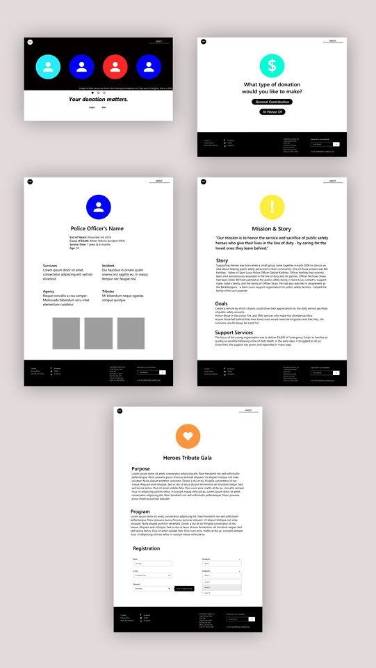
Over these past few weeks, I’ve been working on a new project where I recreate a website design for a non-profit organization. The organization I’m working on is called Supporting Heroes. When site mapping their website I found that there were over 92 separate links on just one page. They also had no organization to them, and a few were redundant and seen on separate pages. The website is packed full of information, however it’s not presented in a structured or simple manner and this makes the website seem untrustworthy. The point of this project is to propose a new and more effective design that lays out the website’s information in a clear way, so that the viewers will want to donate to support their cause. Site mapping helped me figure out which links were a bit redundant or unnecessary, and from there I made a new one for my website ideas.
While working on this project, I learned how to use Adobe XD and began wire framing the new website I had in mind. I’m still a bit unfamiliar with Adobe XD, but I like how this project has challenged me to experiment with new programs. For the next few steps, I think I might start working on my actual website design in Photoshop and then try prototyping in Invision. I’ve started watching a few tutorials in Invision, and I think this application has more customization than Adobe XD.
As I continue working on this project, I need to keep in mind that my proposed website shouldn’t look too “flat”. That means adding in some shadows and gradients. I think this was something I was a little hesitant about incorporating in my last project, because with print designs gradients are something I avoid. However, in web design gradients are a tool that add dimension to what appears on our screens. I must also ensure that the size of the text on my design is cohesive with my hierarchy.
One thing I appreciate about this project is that I get a chance to work with other students. Receiving feedback and critiques from my group members is helpful in the process as I work more on developing my design. They also come up with new ideas and suggestions that I wouldn’t have thought of, and overall help make my website design stronger and more effective. I look forward to working on this project more and am excited to see how it turns out.
2 notes
·
View notes
Photo

रवि बसवानी (29 सितंबर 1946 - 27 जुलाई 2010) की पुण्यतिथि पर उन्हें नमन। वह एक प्रसिद्ध भारतीय फिल्म अभिनेता थे, जो साई परांजपे के चश्मे बद्दूर (1981) और कुंदन शाह की पंथ कॉमेडी जाने भी दो यारो (1983) में अपनी भूमिका के लिए सबसे प्रसिद्ध थे, जिसके लिए उन्होंने 1984 में सर्वश्रेष्ठ हास्य अभिनेता का फिल्मफेयर पुरस्कार जीता था। उन्हें विख्यात किया गया था। उनकी कॉमिक टाइमिंग और शब्द के सही अर्थों में एक चरित्र को कम आंकने के लिए। 30 साल के करियर में उन्होंने करीब 30 फिल्मों में काम किया। हल्द्वानी में उनकी मृत्यु हो गई, नैनीताल से दिल्ली जाते समय, जहाँ उन्होंने अपनी आगामी पहली निर्देशित फीचर फिल्म के लिए स्थानों की खोज की थी। बासवानी ने अपने करियर की शुरुआत 1981 में चश्मे बद्दूर से की और एक कॉमेडियन और/या एक चरित्र कलाकार के रूप में कई सफल फिल्में कीं। वह कई बार भारतीय टेलीविजन पर भी दिखाई दिए। उन्होंने जाने भी दो यारो, कभी हां कभी ना, छोटा चेतन, अब आएगा मजा और नसीरुद्दीन शाह की पहली निर्देशित फिल्म यूं होता तो क्या होता जैसी फिल्मों में काम किया। एक टेलीविजन अभिनेता के रूप में, उन्होंने 1980 के दशक में दूरदर्शन पर लोकप्रिय कॉमेडी धारावाहिक, इधर उधर सहित कई टीव��� धारावाहिकों में अभिनय किया, जिसमें उन्होंने पाठक बहनों, सुप्रिया पाठक और रत्ना पाठक के साथ अभिनय किया। उसके बाद उन्हें बंटी और बबली और प्यार तूने क्या किया जैसी फिल्मों में चरित्र भूमिकाओं में देखा गया। 2004 में, जब भारतीय फिल्म और टेलीविजन संस्थान, पुणे ने 26 वर्षों के बाद अपने अभिनय पाठ्यक्रम को पुनर्जीवित किया, तो वह नसीरुद्दीन शाह के साथ इसके समन्वयक और शिक्षक बन गए, जिन्होंने पाठ्यक्रम को फिर से डिजाइन किया। हालांकि बासवानी ने अगले साल इस्तीफा दे दिया। #deathanniversary #oldisgold✨ #memories #forgotten #NaseeruddinShah #vintagebollywood #bollywoodnews #chashmebaddoor #janebhidoyaaro #artists #supportingheroes https://www.instagram.com/p/Cggf9CmMqWf/?igshid=NGJjMDIxMWI=
#deathanniversary#oldisgold✨#memories#forgotten#naseeruddinshah#vintagebollywood#bollywoodnews#chashmebaddoor#janebhidoyaaro#artists#supportingheroes
0 notes
Photo

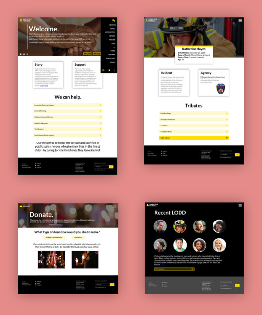
This is the result of my redesign for the Supporting Heroes non-profit organization. When site mapping the website, I found that there were many redundant links and it was hard to find specific pieces of information because there were many different categories to choose from in the navigation bar. In my original wireframes, I just had one tab for navigation under the “About” section. I decided to turn this into a hamburger menu. I also noticed that in my past design for my favorite things website, it had more of a print look to it. I tried to change this all up in this recent project, and I researched some other websites that had good homepages, and an overall cleaner look in their design. Some websites that inspired me were Airbnb.com and Mint.com. I like how these designs used more visuals in their homepage and had a neat layout of information. I also added more detail to this design, including certain transitions in my prototyping and animation that is cohesive with the overall design. Adding gradients was another small feature, that really added a lot more to my design and to me made it seem more legitimate.
I went through a couple of road blocks with this redesign process. I started out working with Photoshop, because I wanted to work with Invision to do more prototyping with my design. However, I found that trying to do this was a lot at once, because I would have to do all of the visuals in Photoshop and then transfer text from InDesign into Photoshop, and it wasn’t always guaranteed that the text would look good after it was transferred. So, for the sake of time, I decided to just reconfigure everything in Adobe XD and it made things much easier. I still would like to do some work with Invision however, because I’m curious about some of the different things I could do with animation and prototyping. In the next few projects, I might try working with some new programs. I think it’s important to be able to adapt and learn how to use new apps when designing, since it’s a challenge and will help me improve.
There are still things in this redesign that I think I could improve on. The text on some pages was too big and needed to be scaled down. Also, for the page that had Katherine Hayes’s memorial I felt like there was something unresolved there. Her image in the back was cut off by the box of text that had her information, however when I moved down this text box it made it seem out of place with the image above it. I think I could’ve spent more time on the layout of this. I’m also not proud of the logo redesign I did. Originally it was just a place marker because I needed something small and simple to have in the corner of the page for the users to go back to the homepage, however it just seems basic and doesn’t go with the mission of the website. If I did more of a rebranding to this website I would try to make a better logo. I had fun with this project though, and enjoyed the process of making improvements on something and redesigning web pages.
1 note
·
View note