
This blog contains designs and projects for my art classes at the University of Louisville. Feel free to take a walk :)
Don't wanna be here? Send us removal request.
Statistics
We looked inside some of the posts by alexissimonhitegd-blog and here's what we found interesting.
Average Info
Notes Per Post
15
Likes Per Post
15
Reblog Per Post
0
Reply Per Post
0
Time Between Posts
1 month
Number of Posts By Type
Text
4
Photo
10
Last Seen Tumblr Blogs


Fun Fact
In February 2021, Tumblr had 518.6 million blog accounts.
Text
Reflection
Today is the last day in my web design class and I feel content with how this semester has gone. I’ve created so much and my designs have come a long way. Web design was something that was kinda in the back of my mind last semester, but I had no idea where to begin with the subject. Since then I’ve made five website designs (one in another class), and I’m proud of the work that I’ve done. I’m still going to take the edits and notes I’ve received on each project, and will change things over the summer. My work could always be more user-friendly and improve overall. I plan to include some new aspects, like nicer iconography and animations with carousels that I’ve learned in the class too. I will also keep improving on my illustration style and work more on exercises over the summer. This class has helped me not only learn more about the aesthetic of web design, but also the functionality of it. This includes how the user interacts with it, and their experience on finding a certain item. Since taking this web design class, I’ve also learned how to present my work to an audience in an engaging and interesting way. I’m excited to put some updated work on my website over the summer, and look forward to improving my portfolio.
1 note
·
View note
Text


This week our class has been working hard at a charrette with Caitlin Cambron, a UX designer. I didn’t know hardly anything about UX design before this week and it really interested me. I almost wish I had known a bit more about it towards the beginning of the semester, so I’d be able to apply what I learned this week to past projects. (Although, the majority of my projects will be revised over the summer so they are more functional and better for my portfolio.) In these past few classes, we evaluated websites based on their usability rather than the overall look and aesthetic the website offered. The best way to test the usability was by trying to complete a task on the website, and finding the easiest solutions for problems.
I was in group 1 and had to evaluate an e-commerce website based on user research, user flows, and the wireframes the website had. Towards the end of the week, we had to present our findings to the rest of the class. This was a pretty hefty list of tasks to complete, however I think our group did a great job considering all of the challenges we faced. One of these challenges, was that while the creator of the e-commerce website had no web design experience -nor anyone with similar credentials evaluating the website- it really didn’t look half bad. It also functioned okay based on my user’s research. So, that meant we had to look a bit harder for faults in the website in order for it to improve more.
Another challenge our group faced was with technology. I think if I could go back in time I’d suggest a different approach to our presentation. It might’ve been easier if we shared all of the information we found in a google document for the homework as well. That way, for Wednesday’s class the presentation would’ve been already put together and we could instead focus more on how we’d present, not what we present. I also felt guilty because Austin was putting the presentation together by himself as we were sending him our work. It seemed like a really stressful position to be in because he had to get together all of our information, and type up the notes we had for our slides all in 30 minutes. Plus, interesting fact, if you ping a word document in basecamp the only person that can edit it is the creator. Microsoft Word does this super cute thing where it locks up the document to everyone else, so no one can edit it and it makes it difficult to copy that info into a presentation. That was another setback in the presentation development.
Honestly, we tried to keep our cool when it came down to actually presenting and overall we did a good job. In the future, when we have jobs and have to present our findings there is no guarantee that everything is going to flow smoothly. There are always going to be challenges and setbacks, even during the presentation and how we choose to respond to them matters. I’m glad we went through that in class, rather than out in the professional world. I feel more prepared to work with others and solve problems as a team. This week I learned about UX design, working together, and how to stay cool when things don’t go as planned. Coming up with efficient solutions to problems is something that every website needs to do in order to have great usability, but it’s also something we need to know how to do in real life.
1 note
·
View note
Photo
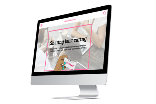
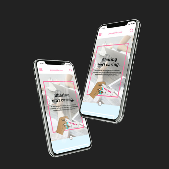
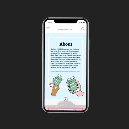
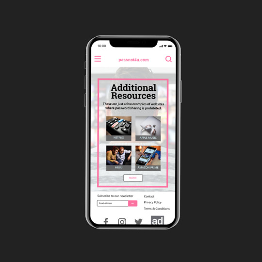
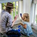
Since my last post, I’ve been working hard on a new website prototype! For this project, I had to create a campaign to educate people on a blue law (law that prohibits commercial acts on a Sunday or just a law that seems a little unusual). The blue law that I picked was the Tennessee Login Law which prevents people from sharing their passwords for Netflix, Hulu, or Apple Music accounts with their friends. I chose this law because it surprised me, and I wasn’t sure that it really existed at first. Many people (myself included) share their passwords for Netflix and Hulu without didn’t giving it a second thought. After doing some more research I found out that if someone is caught repeatedly doing this they could be charged with a felony. I went over a few ideas on how to inform people of this law, in a fun way, but also make sure that it wasn’t focused on just one type of website where password sharing was prohibited (making sure the website was original and inclusive of all information).
Making sure my overall design was completely original, was actually harder than I thought. This is because my first few billboards and advertisement ideas for this campaign were based off of the familiar Netflix logins and account pages. So, I had to take a step back and keep in mind that the goal for this law was to prevent password sharing. I created illustrations based off of this idea- including imagery of cafes and people together on their computers to show the types of environments where the “illegal activity” would take place.
I haven’t presented my project yet, so I have some more time to prepare and clean up my presentation. One thing I noticed after I had finished my billboard designs and the website is that some of the colors ended up being a bit more muted than they were supposed to be. I used the pink color to accent the website and grab the user’s attention, and mainly green backgrounds for the login pages. I tried to use the same color palettes I had in my illustrations. However, I feel like there could be a more clear connection with the color and the concept for my website. When I was looking at other people’s website designs and color choices, I noticed they put a lot of thought into these decisions and used bold and enticing colors which went along with the concept for their campaign. If I were to do this project again or something similar, I’d start out with a solid color palette and then incorporate it into my illustrations instead of starting with illustrations first. I’d also experiment more with type sizes, because I think some of my text is larger than I’d like it to be (especially in the desktop version). Overall, I think I accomplished a lot in the time that I had, but there’s still more that could be improved for my portfolio.
2 notes
·
View notes
Photo
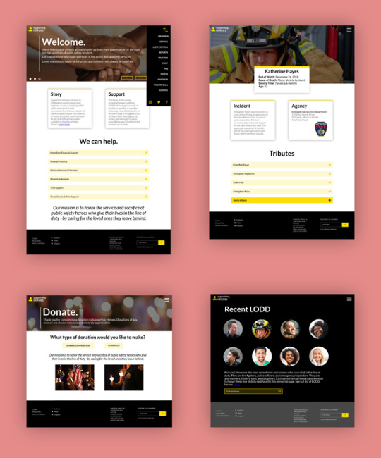
This is the result of my redesign for the Supporting Heroes non-profit organization. When site mapping the website, I found that there were many redundant links and it was hard to find specific pieces of information because there were many different categories to choose from in the navigation bar. In my original wireframes, I just had one tab for navigation under the “About” section. I decided to turn this into a hamburger menu. I also noticed that in my past design for my favorite things website, it had more of a print look to it. I tried to change this all up in this recent project, and I researched some other websites that had good homepages, and an overall cleaner look in their design. Some websites that inspired me were Airbnb.com and Mint.com. I like how these designs used more visuals in their homepage and had a neat layout of information. I also added more detail to this design, including certain transitions in my prototyping and animation that is cohesive with the overall design. Adding gradients was another small feature, that really added a lot more to my design and to me made it seem more legitimate.
I went through a couple of road blocks with this redesign process. I started out working with Photoshop, because I wanted to work with Invision to do more prototyping with my design. However, I found that trying to do this was a lot at once, because I would have to do all of the visuals in Photoshop and then transfer text from InDesign into Photoshop, and it wasn’t always guaranteed that the text would look good after it was transferred. So, for the sake of time, I decided to just reconfigure everything in Adobe XD and it made things much easier. I still would like to do some work with Invision however, because I’m curious about some of the different things I could do with animation and prototyping. In the next few projects, I might try working with some new programs. I think it’s important to be able to adapt and learn how to use new apps when designing, since it’s a challenge and will help me improve.
There are still things in this redesign that I think I could improve on. The text on some pages was too big and needed to be scaled down. Also, for the page that had Katherine Hayes’s memorial I felt like there was something unresolved there. Her image in the back was cut off by the box of text that had her information, however when I moved down this text box it made it seem out of place with the image above it. I think I could’ve spent more time on the layout of this. I’m also not proud of the logo redesign I did. Originally it was just a place marker because I needed something small and simple to have in the corner of the page for the users to go back to the homepage, however it just seems basic and doesn’t go with the mission of the website. If I did more of a rebranding to this website I would try to make a better logo. I had fun with this project though, and enjoyed the process of making improvements on something and redesigning web pages.
1 note
·
View note
Photo
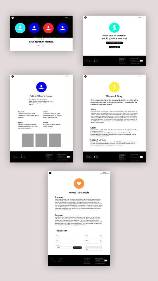
Over these past few weeks, I’ve been working on a new project where I recreate a website design for a non-profit organization. The organization I’m working on is called Supporting Heroes. When site mapping their website I found that there were over 92 separate links on just one page. They also had no organization to them, and a few were redundant and seen on separate pages. The website is packed full of information, however it’s not presented in a structured or simple manner and this makes the website seem untrustworthy. The point of this project is to propose a new and more effective design that lays out the website’s information in a clear way, so that the viewers will want to donate to support their cause. Site mapping helped me figure out which links were a bit redundant or unnecessary, and from there I made a new one for my website ideas.
While working on this project, I learned how to use Adobe XD and began wire framing the new website I had in mind. I’m still a bit unfamiliar with Adobe XD, but I like how this project has challenged me to experiment with new programs. For the next few steps, I think I might start working on my actual website design in Photoshop and then try prototyping in Invision. I’ve started watching a few tutorials in Invision, and I think this application has more customization than Adobe XD.
As I continue working on this project, I need to keep in mind that my proposed website shouldn’t look too “flat”. That means adding in some shadows and gradients. I think this was something I was a little hesitant about incorporating in my last project, because with print designs gradients are something I avoid. However, in web design gradients are a tool that add dimension to what appears on our screens. I must also ensure that the size of the text on my design is cohesive with my hierarchy.
One thing I appreciate about this project is that I get a chance to work with other students. Receiving feedback and critiques from my group members is helpful in the process as I work more on developing my design. They also come up with new ideas and suggestions that I wouldn’t have thought of, and overall help make my website design stronger and more effective. I look forward to working on this project more and am excited to see how it turns out.
2 notes
·
View notes
Photo
We’re back at it again with these blogs! This is the first project that I’ve done in my web design class this semester. I struggled a bit with this project, and that was mainly because this was my first experience in attempting to create a website design. Throughout the rest of my design classes, I’ve been so used to doing print and that is reflected in the work I submitted to this project. After viewing some other presentations, I realized that I need to get more into the mindset of web design. Just like how in Leslie’s typography class last year we were encouraged to look at certain details in print and with books (page numbers, how table of contents was handled, the color schemes and systems), I need to take some time to check out these details in websites (how navigation bars are styled, the best place to put a website header or logo, how the footer is handled, where the calls to action need to be). These stylistic elements are important and they were something I missed in this project because I didn’t take the time to really appreciate them. I also noticed that my spacing where the top of my body text is was packed a bit too close to the top of the page and it wasn’t properly aligned with the title. Looking back at this project, I also feel like the aesthetic of my homepage doesn’t really fit with the elements of my other web pages, and it’s not very consistent. I think my idea and concept for this website is interesting though, so I would like to continue to work at this design and make it more effective overall. I may end up adding a follow up post to show some improvements and extra additions I’ve made to the project. I think that once I research more websites and take a closer look at some effective ones, I’ll start to make some improvements. I look forward to it, because web design is something I’m really interested in learning more about and I would love to continue working at.
1 note
·
View note
Text
Hey guys!
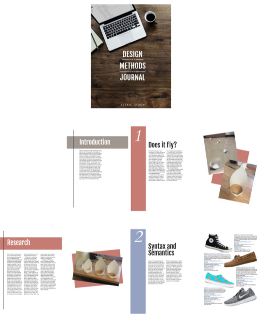
So as today’s class is my last, unfortunately that means this is my last blog post. This Design Methods class has taught me not just Graphic Design, but problem-solving skills, time-management, and how to take and give constructive criticism. For my very first project, Does It Fly? I was given an assignment with a few parameters and from there had to make a piece of paper travel a great distance. I learned problem-solving skills from this, and had to experiment with different ideas, before finding the first one. Later on, I had to create a poster that clearly exemplified a quote. For this assignment, I had to first go through a brainstorming process to find out which idea best represented its quote. This project taught me how to brainstorm, and ensure that each concept is clear and understandable for its audience. I had to do the same thing when creating a book cover. For my final journal project, I had to compile everything from this class into a journal, working with typography to find a neat way everything could be organized. This class has taught me so much, and I’ve loved working together with everyone in it. We give each other constructive criticism that helps when creating designs, so that we know how we can make each project better. I can’t wait to use what I’ve learned from this class in the future.
1 note
·
View note
Photo
Hi friends!
So, the semester is coming to a close, and I’ve just finished up my final project. For this project, I created a journal filled with all of the different assignments and works that I have finished for this class. I actually compiled each project together with the blog post that I uploaded for it. The blog posts that I’ve been doing give a little update on each project, and how I approached the problem. For this project, I had to pay attention to the placement of each image, so that it flows together with the captions, and typography that goes along with it. I had some difficulty with the style and typography of the text pages, because I wasn’t too experienced with working with text. I had to make sure the text size was a good weight and the spacing flowed together with it. I also had to ensure that the lines weren’t too long, so that it could be easily read. I chose to add some extra color to the sides of my type pages, so that they weren’t as mundane. Overall, I’m very pleased with how this project turned out. It exemplifies my progress over the semester, and how as I’ve gained more knowledge and experience with graphic design my work has improved.
1 note
·
View note
Photo
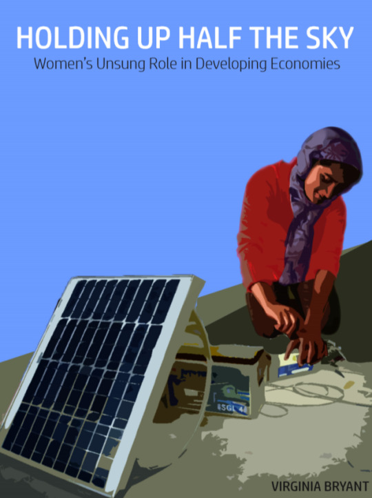
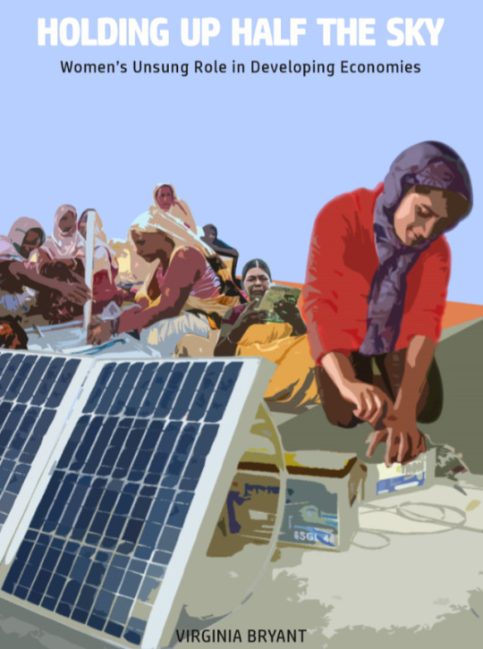
Hi friends! So, over these past 2 weeks I’ve been working on my book cover design. In my last update, I introduced this project and was working on a concept map. Once that was finished, I did a little bit of research on the title “Holding Up Half the Sky: Women’s unsung role in developing economies.” I came up with this designed based on the work that women do for the Barefoot College in India. The women come from different developing countries and work together, learning engineering skills and build solar panels. My first design for this concept had only one woman working on a solar panel and had some very bright contrasting colors. The author’s name was also hidden in the corner of the cover. After doing some editing, I changed the cover and made the contrast lower. I didn’t want the bright colors to take away from the concept of the design. Also, because the book’s subtitle is “Women’s unsung role...” I thought it made sense to show different women from all over the world working towards the same goal. Then I changed the typography of the title to a thicker typeface that worked better with the lighter background. I also made the author’s name centered at the bottom of the cover. For my final project, I’m going to be working on my Design Method Journal! It’s going to be compiled of the different projects I’ve been working on throughout this semester. At the moment, I’m coming up with a layout and style for the typefaces I plan to use for each page. I love all of the projects I’ve been working on for each class, and I think this is going to also show how my skills have improved over these past few months. This Book Cover Design, for example, has helped me to realize that I need to find specific typefaces that flow well with the image. Just changing things like a Sans Serif font to a Serif can really make all the difference, and it’s important to also make sure the tracking and leading on each typeface is symmetrical and goes well with the font itself. I can’t wait to for my next post, where I’ll present some more work that I’ve done for my final project!
1 note
·
View note
Photo
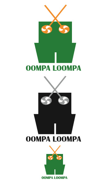
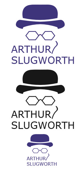
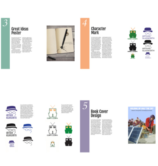
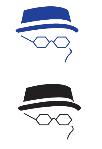
Hey guys! It’s been a hot minute since I posted, and I thought I’d give a little update on my last project with logo design. For my Oompa Loompa logo, I decided to use the solid colored shape, instead of just an outline. I also used a bold, thick, all-caps text to go with it. The syntax of this font just made sense to me for the character. Now, I also edited my Arthur Slugworth font quite a bit since my last post, but I think that it could use some more work. During the midterm critique, students said that the first logo seemed a bit wider than it had to be. I realized the side profile I had for the character did seem a little off, so I edited it so we have a front view of the face. I also went back into the movie and looked at the character himself. I changed the hat, so it looked more like the bowler one he was wearing. I edited the scar so that it was almost outlining his cheekbone, like it was in the movie. The thing about Arthur Slugworth’s character in Willy Wonka and the Chocolate factory, is that he doesn’t show up quite often in the movie, and you’d have to study his character to see the scar. So, after realizing this, I guess the scar wasn’t really needed for my logo. Different students said they didn’t realize it was his scar, they thought it could have been a part of his glasses, or something else. Overall, it confused a lot of people, and I think it might’ve been just better to leave it out and center my font underneath the logo with just the hat and glasses. For our next project, I’m going to design a book cover. The title is Holding Up Half The Sky and it’s about women’s unsung role in developing economies. When I was first coming up with ideas for this project, I made a really quick concept map. However, none of the ideas I came up with really seemed to fit the title. They were kind of rushed and just didn’t fit in with the purpose of this book- empowering women globally and shedding a light on women especially in developing countries. So, over the break I did some research. I found that there’s actually a place, called Barefoot College in India, that is dedicated to helping women from rural parts of the world, and giving them an education and a job the is fit especially for them. These women work together engineering and creating solar panels. I created a second concept map using a few of these ideas, and I’m working on a design that incorporates women working on this initiative and literally lighting up our world. I’m playing with a couple of different ideas right now, but I am a bit concerned that my concept could be a little bit too specific and that a few people might not understand it’s significance. Next time, I’ll give an update on my book cover design. :)
0 notes
Photo
Hello friends!
So this week, I’ve been working on a new project with logo design. This is called Character Marks, and the goal is to create a simple logo that exemplifies a character from Willy Wonka. These are the two designs that I’ve been editing. For my Oompa Loompa logo, I started off with outlining my idea. Then I figured out that my design needed more weight to it, so I edited it down some more and simplified the design. For Arthur Slugworth’s logo at the top, I started out with the simple design that I created in black and white. I then edited it some more and added more white space so the design is more cohesive. I also tried to round out the scar more and make sure it was to scale. The logos still need some more work though, and I was considering editing the Slugworth design so that the face is looking straight ahead, and everything is more symmetrical. I’ve also been experimenting with different typefaces, trying to find one that is the best fit for the logo. For Slugworth’s logo I want a typeface that has a similar line weight to what is being used for the glasses and scar in his logo. I also want a simple more rounded typeface for the Oompa Loompa logo, and maybe something wider to better exemplify the character. Overall, this has been a fun project to work on and I’m glad that I get the chance to experiment with Illustrator. It was difficult to work with at first, but after watching a few tutorials, I got the hang of it. I also used the pen tool often for these designs. Working with logos has been a bit of a challenge, but I’m starting to improve. I have to ensure the logo can still be read even if it is scaled down very small, and the typeface must also match the logo. Logos might be one of the most difficult projects, because there is a lot to consider.
1 note
·
View note
Text
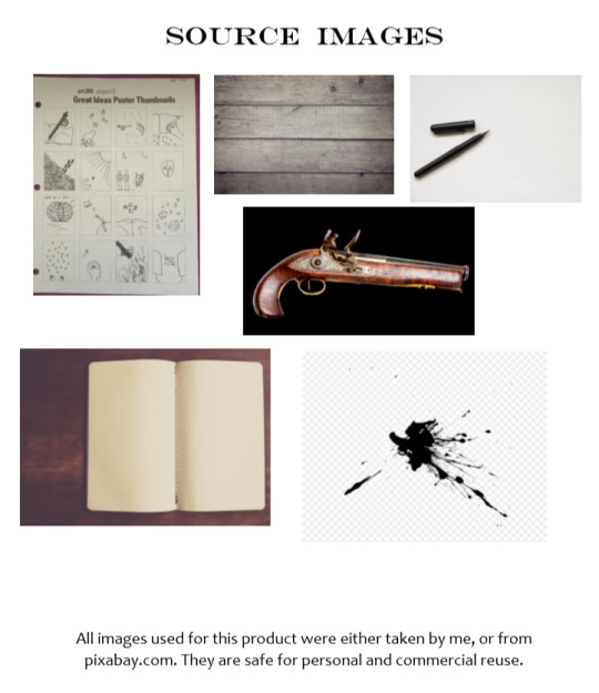
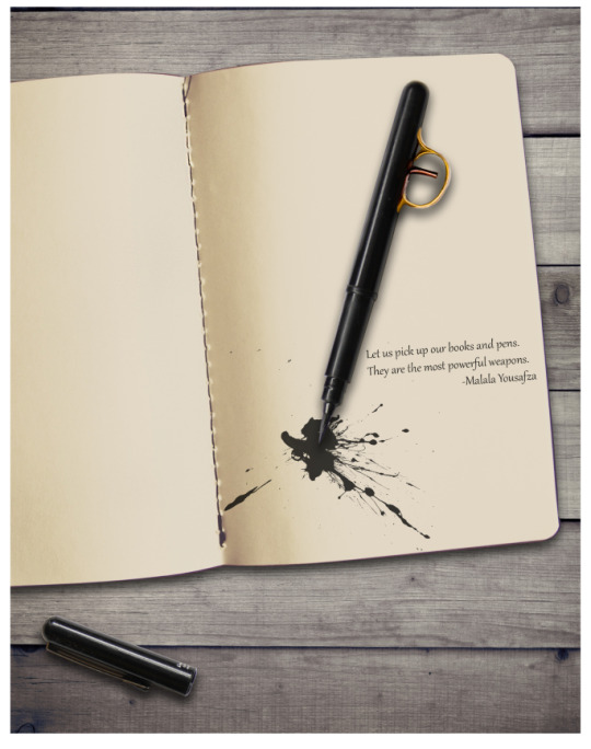
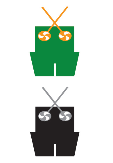
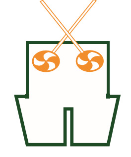
Hey guys! I just finished my third project for this week! This is my Great Ideas poster. The purpose of this project was to create a visual that represents a famous quote. For this project, I intended for my audience to figure out what quote my poster represented with just the visual and not the text from the quote itself. I spent a majority of my time on the image for my project. During my class’s critiques, I found all the different styles really interesting and that everyone has their own interpretation for a quote. Some people created a poster that was based on the syntax of their text to understand the meaning behind the quote. Others worked with specific designs and patterns to carry out the meaning of their text. It was interesting to me how two people could have the same quote, but have very contrasting visuals for it. This really showed me how different and creative everyone’s mind is, and how designers must take into consideration the audience’s perspective. For this project, I made my visual using various images and compiling them together to create a design that exemplified Malala Yousfza’s quote “Let us pick up our books and pens. They are the most powerful weapons.” My idea I had earlier for this concept was seen in the thumbnail sketches of my last post. I wanted to create a pen that had a trigger on it and have the ink leaking out of it, like a bullet shot. This added action to my design, and it was easy to see that it represented Malala’s quote. Another design I saw had the same quote with a visual of a wall full of weapons and in the center a book and pen. The book and pen were the vocal point and the quote was written underneath it. Another design for this quote had a piece of notebook paper in the center with a pen on one side and a knife on the other. The quote was written in the middle of the paper. Both of these designs clearly exemplified the quote, and while all of them were different each one had its own impact on the audience.
1 note
·
View note
Photo
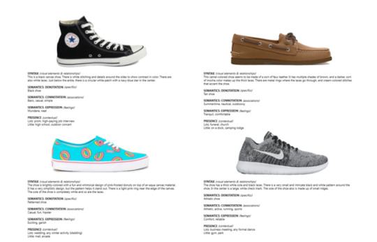

Hey guys! I’m back with some more projects! So last week, I mainly worked on the poster at the top with the various shoes. For this assignment, I had to focus on syntax and semantics. Syntax is the certain style or shape something has, and how this affects the audience’s perception of it. Semantics is the actual meaning that it carries. So, with the black converse at the top left of my page, the syntax is that it is a black canvas shoe with white stitching and details. The connotation of this expressed through semantics is that it is a casual and simple shoe. This shoe would have a lot of presence at a high-paying corporate job interview. It wouldn’t have a lot of presence at an outdoor concert. These concepts are all crucial to know for graphic design. When making a product or creating a poster, the designer must know what kind of effect the text and layout has on its audience. Is it clear, and does it accurately show the concept? Or does it need more work? This brings me to another project that I will work on more next week. I’ve sketched up some little thumbnail designs for a Great Ideas Poster. This poster will have a visual design that must accurately represent the quote that goes along with it. The first thumbnail on the top left is of a pen writing on a book with a trigger on it, almost like a gun. This represents the quote from Malala Yousafza, “Let us pick up our books and pens. They are the most powerful weapons.” This thumbnail is one of the ideas that I think I would like to execute for this project, although I also like the sketch in the third row, and second from the right. It’s a plane flying over a book that looks like a map of the world. This would go along with a quote from Saint Augustine, “The world is only a book, and those who do not travel read only a page.” There are many thumbnail ideas here that I appreciate, and I almost want to make more than one poster for this project. Next week I will be working on making some designs for these with Photoshop.
1 note
·
View note
Photo


This week I was challenged to create something out of 8.5″ by 8.5″ paper that could fly a great distance. The instructions for this assignment were very open, and I could also use any type of paper that I wanted. I made four different types of circular gliders for this project, and each one was different in its own way. They had varying types of paper being used, and different styles of design. I tested out each model and dropped it from about 8 feet in the air before seeing which one would travel the greatest distance. My approach to the problem was through a lot of research and experimentation. I found that the best model had the lightest paper (newsprint) and a thin ring around the bottom of it. The only thing I would like to have changed is the distance I dropped them from when testing them out. I should have dropped my gliders from a higher spot, so my results were more accurate. However, I think my project was a success because my circular glider landed over 200 inches away. I solved the problem, and created something that could travel a great distance. This project helped me realize that a great deal of design is trail and error, and trying many different models before finding the best solution. I need to combat the problem by looking at it from different angles, instead of focusing on just one perspective.
1 note
·
View note