#So aim to simplify the design
Explore tagged Tumblr posts
Text


Ink Test: "New" Uniform
#helluva boss#striker#inking#zebra disposable brush pen - extra fine#Very sensitive ink pen and you have to take it for account#You can get thin-thin lines to a medium thick#So this pen requires some more practice and controlling the pressure to get the right line#The size would work well for comics and smaller works since you can get those finer details#Not my favorite from the set but I like it well enough#IMP AU#Legit just took off his coat and hat and there you go#When designing for comics (and especially animation) remember: you're going to be drawing said character A LOT.#So aim to simplify the design#Especially dangling bits#Striker already screams *cowboy* with his boots#bandana#accent#attitude#and (if needed) his hat and horse#Does he occasionally wear his hat on missions? If it's daylight sure#at night he'll leave it at the office till he gets back#rambling in the tags
19 notes
·
View notes
Text
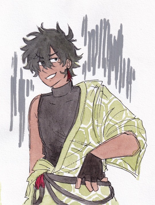

vocal synth character designs have become Too Complicated in the past. uh. 15 years for my little watercoloury brain to handle so i will always have to simplify them forever but i was thinking yknow i can just make them fun new outfits too. module type deal. alternate outfits!!! so i was trying to make genbu one but it does just look like something youd see in the stageplay adaptation of a historical-setting otome game LOL
#art#traditional art#watercolour#fanart#synthv#genbu#which a stageplay adaptation of a historical otome game costume isnt bad or anything#hell i wouldnt be here today as an artist without drawing so many characters with those types of character designs LOL#but its not quite the vibe i was aiming for. maybe i need to add more techy elements. i need to put some LEDs on that bad boy#genbu im replacing your belt with hdmi cables or some shit. watch out#i will still simplify his normal design too tho so i can draw it because i like it a lot. particularly the like#slutty little sheer panel on the side? whats up with that brother. awesome
13 notes
·
View notes
Text
Mastering Mobile App Localization: The Ultimate Guide

#In an increasingly globalized world#mobile app localization is crucial for developers aiming to expand their reach and connect with international markets. Localization involve#content#and functionality to suit different languages#cultural nuances#and regional preferences. This comprehensive guide will walk you through the steps of effective mobile app localization#ensuring your app resonates with users around the world.#1. Understand Your Target Audience#Before diving into localization#it's vital to thoroughly understand the markets you are targeting. Research the languages spoken#cultural norms#legal requirements#and local technologies. This foundational knowledge will guide your localization strategy and help you prioritize which elements of the app#2. Internationalize Your App#Internationalization is the process of designing an app's architecture so that it can support multiple languages and regions without requir#text directions (like right-to-left scripts)#local date and time formats#and numerical values. Preparing your app in this way simplifies the subsequent localization process.#3. Localize Content and UI#The next step is to translate and localize the app’s content and user interface. This goes beyond mere translation; you must also adapt gra#icons#and layouts to align with local customs and expectations. It’s advisable to work with native translators who understand the linguistic subt#4. Adapt to Local Regulations and Legal Requirements#Different markets may have specific legal standards regarding data privacy#digital transactions#and censorship that can affect your app. Ensure that your app complies with local laws and regulations to avoid legal issues and build trus#5. Test and Optimize for Local Markets#Once localized#thoroughly test your app in each target market to catch any issues with translations#or functionality. Consider conducting usability tests with local users to gather feedback and understand their user experience. Use this fe
0 notes
Text
"As the world grows “smarter” through the adoption of smartphones, smart fridges, and entire smart houses, the carbon cost of that technology grows, too.
In the last decade, electronic waste has become one of the fastest-growing waste streams in the world.
According to The World Counts, the globe generates about 50 million tons of e-waste every year. That’s the equivalent of 1,000 laptops being trashed every second.
After they’re shipped off to landfills and incinerated, the trash releases toxic chemicals including lead, cadmium, arsenic, mercury, and so much more, which can cause disastrous health effects on the populations that live near those trash sites.
Fortunately, Franziska Kerber — a university student at FH Joanneum in Graz, Austria — has dreamed up a solution that helps carve away at that behemoth problem: electronics made out of recyclable, dissolvable paper.
On September 11, Kerber’s invention “Pape” — or Paper Electronics — earned global recognition when it was named a national winner of the 2024 James Dyson Awards.

When she entered the scientific competition, Kerber demonstrated her invention with the creation of several small electronics made out of paper materials, including a fully-functional WiFi router and smoke detector.
“Small electronic devices are especially prone to ending up in household waste due to unclear disposal systems and their small size, so there is significant potential to develop a more user-friendly end-of-life system,” Kerber wrote on the James Dyson Award website.
“With this in mind, I aimed to move beyond a simple recycling solution to a circular one, ensuring long-term sustainability.”
Kerber’s invention hinges on crafting a dissolvable and recyclable PCB board out of compressed “paper pulp.”
A printed circuit board (PCB) is a board that can be found in nearly all modern electronic devices, like phones, tablets, and smartwatches.
But even companies that have started incorporating a “dissolution” step into the end life of their products require deconstruction to break down and recover the PCB board before it can be recycled.
With Kerber’s PAPE products, users don’t need to take the device apart to recycle it.
“By implementing a user-friendly return option, manufacturers can efficiently dissolve all returned items, potentially reusing electronic components,” Kerber explained.
“Rapidly advancing technology, which forms the core of many devices, becomes obsolete much faster than the structural elements, which are often made from plastics that can last thousands of years,” Kerber poses.
PAPE, Kerber says, has a “designed end-of-life system” which anticipates obsolescence.
“Does anyone want to use a thousand-year-old computer?” Kerber asks. “Of course not. … This ensures a sustainable and reliable system without hindering technological advancement.”"
-via GoodGoodGood, September 13, 2024
#ewaste#e waste#e waste recycling#e waste management#e waste solutions#paper#sustainability#green tech#tech news#sustainable technology#recycling#good news#hope
587 notes
·
View notes
Text
Doll History: Catwalk Kitties
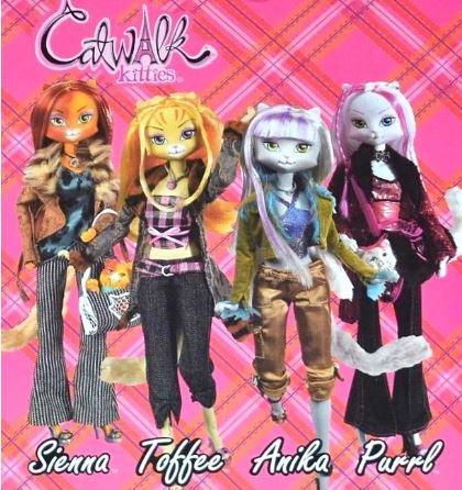
Tagline: “Sleek, chic, and très magnifique, these fabulous felines do everything with poise and style! So get ready to strike a pose and strut your stuff, because every trend starts on the catwalk…”
Company Lanard
Debuted: 2005-2006
Height: 11 inches/28 cm
History
Catwalk Kitties is a series of anthropomorphic feline fashion dolls who work as models at the Catwalk Kitties modeling agency in Paris, France. Unlike other toys, there was a focus on making sure there was as little advertising as possible-only appearing in a few toy catalogs. The series designer stated that the dolls were designed with the aim of being profitable to Lanard with minimal advertisement:
“With the doll market being incredibly competitive, the goal was to come up with a new idea for fashion dolls that would instantly appeal to girls and be profitable to Lanard without advertising. I really felt that the only way to compete against Barbie and Bratz, who were both heavily advertised, was to have a new hybrid type of fashion doll. The idea for the line came from "hands on" manipulations, drawing, painting and markering, on a naked fashion doll body with an enlarged head. I brought a couple of trend tear sheets and a porcelain cat/ fashion/ collectible statue along with the rough model into a brainstorm to pitch the idea. I then worked with and creatively directed the talented group of artists & designers at Lanard to sketch and formalize all of the feline fashions and details that are uniquely the Catwalk Kitties. Traditional fashion and hair grooming play patterns were used by wrapping the world of modeling around the dolls.”
According to the catwalk kitties wiki: While complete dolls are rare on the secondhand market, It is common to find unused factory stock heads on sites like Aliexpress and Ebay. Many collectors purchase these heads and put them on the bodies of other dolls such as Monster High and Barbie.
Characters:
Anika- a light gray cat with purple hair streaks.
Callie- a calico cat with orange and gray hair.
Chase- a pink cat with magenta hair streaks.
Jet- a black cat with white hair streaks.
Minx- a red point Siamese cat with blonde hair.
Purrl- a white cat with magenta hair streaks.
Sienna- a tortoiseshell cat with auburn hair.
Sushi- a gray and white tabby with purple hair streaks.
Toffee- a yellow tabby with blonde hair.
Topaz- a light gray and white tabby with blue hair streaks.
Doll Lines
Series 1
The first series of Catwalk Kitties dolls with a total of 6 dolls
Characters Included: Anika, Minx, Purrl, Sienna, Sushi, Toffee
Series 2
This line included four of the original six characters from Series 1(excludes Sushi and Minx). The dolls were identical, only with their hairstyles differing slightly. They also had fewer pieces and were stamped 2006 on the packaging.
Playsets
Four playsets were released as a part of the Catwalk Kitties line. Each playset came with a new character doll: Callie, Chase, Jet, and Topaz
Fashion Photographer - Jet
Makeup Artist - Topaz
Modeling Agent - Chase
Deluxe Paris Runway Playset - Callie
Petite Dolls
A line of 5.5” (14 cm) mini dolls were released, featuring the same characters as the mainline. A total of 10 mini dolls were released.
Main Series
Contains: Chase, Purrl, Anika, and Toffee
Le Scooter Series
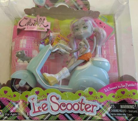
Contains: Anika and Toffee
Budget Dolls
A simplified version of the petite mainline
Contains: Anika, Chase, Purrl, and Toffee
Unreleased Dolls
Le Cafe Petite Playset (Sushi)
Le Boutique Petite Playset (Minx)
Le Coupe Petite Playset (Sienna)
Le Scooter Petite Playset (Topaz)
47 notes
·
View notes
Text
Info! (PLS READ BEFORE SENDING ASKS)
FIRST, i'm completely happy to have anyone do style studies, do a comic inspired by Dewclan in any capacity, make a clangen comic in the same style, reference poses from the comic, reference designs from the comic, layout of the comic etcetc. BE FREE BE FUNKY!! (just pls show me i wanna c) 1. A frequently asked question is, 'How did you start with just 2 cats?' The answer is, I started with a full clan and manually killed them all on the first moon! You can kill or exile cats in their profile section. :3 I play expanded mode! I downloaded the latest version of the game from here. 2. All clan names, cat names, designs and events are randomly generated, created in and by the Clangen game! BUT! • I take liberties with designs mostly just to simplify them or add fancy things, like Lyrestar's star shapes irises and the forehead star mark. i think it's C00l to give leaders star motifs. Lyre wasn't born with the star shapes, he got 'em when he became leader! • Some events are given additional flavour and context
3. BE PREPARED for style changes. I'm getting more and more used to stylizing and figuring out how i'm gonna do this comic.. UPDATES are tagged 'AnotherMoon' ASKS for me are tagged 'kAsks' ASKS for Dewclan, are tagged 'AskinDewSomething' CLANGEN REBLOGS are tagged, 'SATURDAYSHARES' (i'm gonna reblog a clangen page every saturday for to share a funky comic or 2)
ALSO IMPORTANT!!
298 notes
·
View notes
Note
i really like how much depth your art has, do you think you could show how you break down bodies when sketching if that makes sense? it’s something i struggle with a lot in my art! 。゚(゚´ω`゚)゚。
ok apologies in advance, this is probably going to be a really long and tangential rant about art that may or may not actually help you in learning how to construct bodies. im just gonna put it under a cut to save everyone from seeing this huge text wall.
i dont think its gonna be possible for you to replicate my methods here, because theyre mostly just really specific shortcuts for finding certain proportions and reference points for anatomy, which i'm fairly versed in, but not as much as i'd like to be. the shortcuts you'll need will be different from mine. im glad you think my art has depth, that is something i am trying to seek very intentionally right now, and i dont think im even close to the depth of form i am actually aiming for. so like. this makes making a tutorial kind of inherently hard. nevertheless, i threw this quick sketch together after like 3 failed attempts. (i was doing those attempts digitally, ended up giving up on that and going back to traditional because its what im most comfortable with rn)
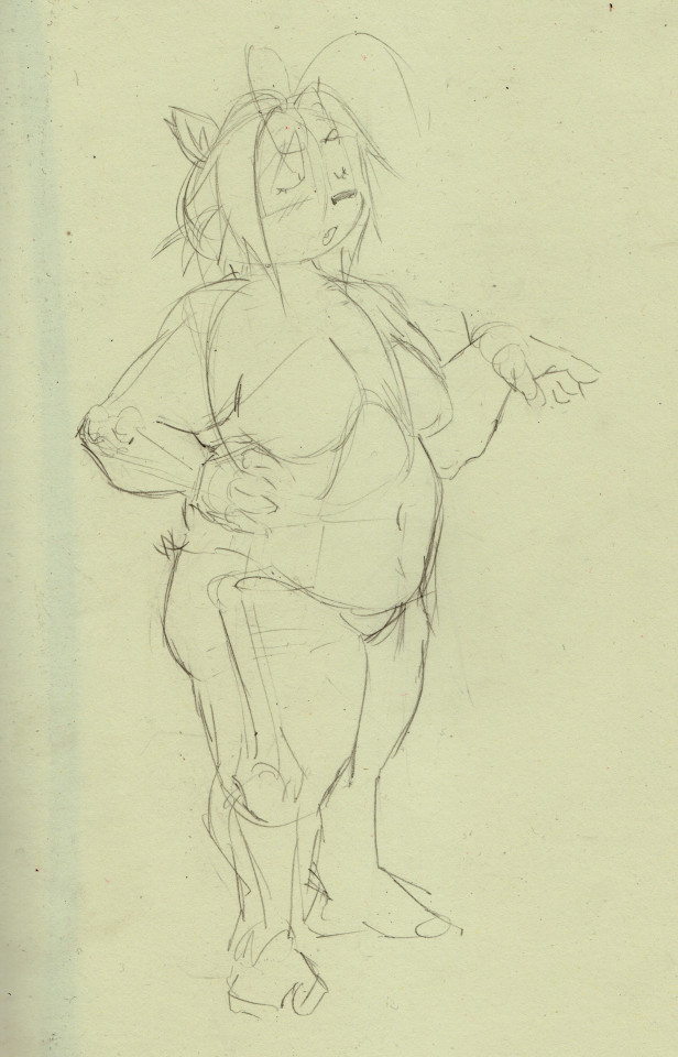
i didnt get all the steps i took to get here because scanning that much would be cumbersome but ill try to explain how i got here. i start with the head almost every time.

i use a lot of symbolic/graphic shapes when drawing heads and dont stick to using forms very often besides the circle at the center of the head, which i use as the base to form these graphic shapes around. think of it like "wrapping" the ball in various textures and masses. the eyes are usually "textured" onto the head, notice how the her left eye looks narrower then her right. of course i try to make sure her bangs sit along the curve of the sphere and her ears look like they sit on opposite sides of the head. its easy to forget that part, making the head look unsymmetrical. the particular masses of leica's head would be her snout, which is just a curve extended slightly outside the diameter of the ball, and her hair, which are two strange organic shapes that are quite hard to draw, two hair sprig anime antennae things (forgive me, i forgot the word for them,) and the back of the head, which i usually need to extend slightly. its a little too extended here, needs more on the top, i fix this in the final pass. this was a quick sketch, so i didnt focus too hard on the forms of the head beyond the most essential ones for her design, but i sometimes highlight the form of cheeks with curved hatching, or try to make the eyes appear more sunken-in as they are on human faces. i dont know how to proportion the neck and torso correctly until i draw the head, so i always do it first. next, i did the torso.
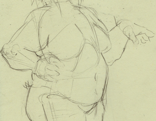
so heres why i said that you probably wont be able to replicate this approach. you do kind of just have to practice anatomy, i cant just make it make sense because im not very good at explaining this stuff, but ill try to go through what i did here. so, i generally use simplified bone shapes to find proportions and reference points, as well as more complicated shapes like those of elbows and knees. i try to study fairly often because im not satisfied with here im at with this stuff yet. of course, i dont think i'll ever be. so i'll usually start with the ribcage, add a shoulderblade out the back to find the shoulder, the armbones come out of that, the bone in the upper arm connects to the ulna with a sort of three-pronged attachment, one big knurl in the middle, which forms the thrust of the elbow, two little ones on the side. i think those are part of the ulna but i dont remember. see, you dont really have to know what exactly they do as long as you know what they look like. the ulna does some goofy rotation shit i dont understand, connects to the wrist, and then we have a hand, which, i mean, im not good enough at hands to even be telling you how to do it, but i just have a big squarish mass and some little hotdog fingers coming out of that. you can see on her left hand that ill have a big circle forming the the area on the hand where the thumb attaches... theres more depth to the hands, i think you can easily find better tutorials then i could offer. anyway, under the ribcage theres the pelvis, represented with a box. ill get into that when i talk about the legs. i wanna briefly talk about the way i add the flesh and fat to the bones.
so, i really can't give a comprehensive crash course on anatomy, but i can point you towards the morpho series, which is where i get most of this stuff from. you can get very far with the volumes Simplified Forms, Fat and Skin, and Skeleton and Bone Reference Points. moving on, i just kind of have a feel for where the masses attach by now. the important thing to remember when drawing fat characters like this is that the fat should "hang" from the bones and flesh, drooping down slightly. leicas fat hangs substantially, so she's not very wide despite her weight. this is important to her character design i feel. i almost always draw characters naked first when doing serious drawings because it will come in handy knowing where the forms of the body are when i add the clothing. by focusing on the way her body looks naked, i can modify the impression of those forms when adding clothes, and when i add them later on in this drawing, leica will take on the distinctive boxy look i try to draw her with.
if you look at the arm, youll see that the place the line of bone sits is very high compared to the whole mass of the arm, the flesh and fat of the arm "hang" from the bone, and then the upper arm squishes against the bent forearm too. even if the anatomy in the arm is indistinct, it can still look convincing when the forms act realistically against one another. the elbow has much less fat connected to it, so its more bony then the rest. this isnt actually consistent on all people so like, think about that kind of thing when designing characters, like i was talking about before, fat can sit in infinite different ways. maybe if i was doing a more objective anatomy lesson i'd draw cath, because i do have a sort of vague understanding of muscle placement that doesnt come through here, but probably would if i was drawing a scrawnier character. let me know if you want that.
a word on the breasts too: they hang a bit lower then you'd expect, keep that in mind. the attachment point is also angled, as the line shows. the line starts roughly in the middle of the torso and ends around the armpit, but the form of the breast can go underneath the armpit or even connect around the fold of fat in the back. many things to think about. i love boob shapes. ok lets finally get on with it and talk about the legs.
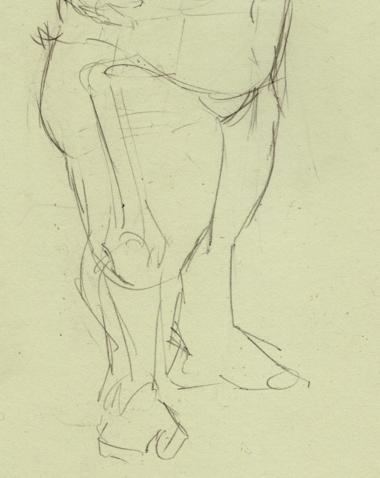
so, the really specific shape of the pelvis doesnt matter that much unless youre drawing a really thin character, so its just a box here. out from the sides of the pelvis, extending out more then you'd expect, is the femur, which ends in a similar joint to the arm. this shape helps me figure out the form of the knee. two masses on each side with a bunch of complex and weirdly shaped bones forming the kneecap, which i have omitted because i dont yet know shit enough to include them. i am learning though. so, obviously the feet are just scribbles here because im just gonna put her feet in socks anyway. you really dont have to do more then you have to. a few tips i can offer here, the butt should hang a bit too when drawing fat characters, i think the butt is supposed to start just below the pelvis if i remember, but take that with a grain of salt. i also didnt really do that here but its hard to tell because she's facing mostly forward. again, i dont think i can really communicate what's going on here. morpho has a lot of great drawings explaining the shapes and muscles of the legs, all things i might focus on more when drawing a scrawnier character. for this case, i regrettably don't go too hard on the legs. also i should note that legs would usually be much longer, leica is really short so ive exaggerated the proportions to communicate that. i may change my mind on that front in the future and give her more grounded proportions. the important thing to remember with legs is just getting a nice hierarchy of forms going. bigger thigh going into smaller calf going into smaller foot. it mostly comes automatically now.
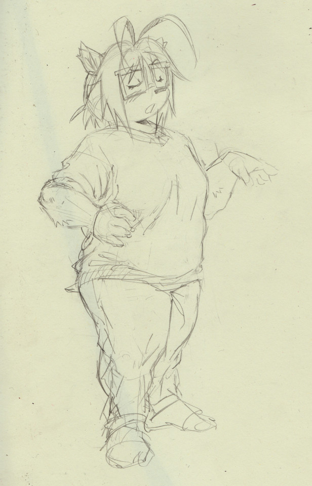
i added the clothing, shaped up her head a bit, added a bit of fur. i put her in her classic outfit, just a sweater and jeans. i enjoy the big thick folds that come out of these clothes, and big areas of white space too. its nice. i try my best to form all the folds around the forms of the body i drew earlier. thats one case where i really really have no idea what im doing and could never explain it in words. its just some fun intuitive play with loops and lines. this is at around the stage for a sketch where i'd do inks, or if it was going to be a finished pencil drawing i'd erase out parts piece by piece and replace them with nicer and more defined lines and tones.
i guess that's all i can offer , i hope that halped.
156 notes
·
View notes
Note
Since Bethesda was so insistent on moving away from Morrowind's combat system for Oblivion and Skyrim, what would you have replaced it with?
contrary to what it might seem, I don't think replacing the skyrim combat system wholesale with sekiro or dark souls is really a viable solution to the problem, because it's fun for a mod load order, but it definitely makes the game feel unskyrim
so I'd approach this more from the angle of "what needs to be added to fill the void left behind by the simplified combat"
design rambles below the break. this is less of me offering actual solutions and more of me just saying what I'd do if I were given all the resources and executive power in the world for it, from an armchair. and it goes without saying these are all just Opinions
one of the largest basic design issues with modern bethesda melee combat is that it's tied really hard into melee being a single button input. if they want to stick with that, they should at least implement directional attacks and blocking (which I'll mention now is not something new for TES) with a simple aiming scheme, possibly similar to mount&blade's
stealing something else from m&b while I'm at it, two attacks colliding from the same direction within a tight frame window should clash
enemies need to have attacks you don't want to get hit by. somewhere in their list of moves, enemies need to do something different that necessitates either dodging, blocking, or otherwise reacting in any way. they also need to gapclose, but that's a given
healing consumables need to have a cooldown. as funny as cramming items in your face by the stack during combat is, it's a bandaid to an enormous design flaw in melee combat not being interesting. if you really wanted, you could keep some of that flow by having a skill for mixing preexisting potions together into single doses
addendum to that previous point, players should have a hotbar that allows lower cooldown consumption of certain items, which cannot be reconfigured in combat
magic needs to be stronger and riskier. heavy armour should eat into your damage and efficiency significantly, medium armour should do it just a little bit, and casting past your magicka pool should start consuming health at twice the rate it consumes magicka
blocking should have a higher damage reduction cap (it is currently 85%-95% DR depending on armour) but scale depending on how precisely you block an attack and eat into your stamina much more (with a stagger at zero, to steal another mechanic)
as they are, the entire shout system is a symptom of bad design. having a cooldown-based system that gives non-magic characters spells removes the strongest incentive to play magic characters. I'm actually not sure what to even do about this one that doesn't involve cutting all of the overlapping skills and keeping its focus on weird utilities? as a rule, I kind of hate every gameplay concept that uses "this is something only the player can do" as its skeleton, so this is a tough one for me to poke at
hitstop
174 notes
·
View notes
Note
Genuine question, because I've been struggling HARD on how to nail Afton in my own artstyle - how do you study with yer take of him? I know the sketches n whatnot, which are honestly inspiring to me, and of course studying Matthew Lillard would help - but you have such a specific flow that is incredibly charming to me.
How did you work/study in terms of yer anatomy & facial structure fer yer art? Whether it be Afton studies or yer older pieces like Markiplier! Ya got such a nice flow between 'cartoon' & 'realistic' that is genuinely scratching every part of my brain. /vpos /gen 🙏🏼🧡🧡
that's a good question 😂 if I draw something long enough, someday I'll get an enlightenment what I like + what looks good. the struggle is finding the right amount of details/ lines and keeping it balanced
well for example with Markiplier: my first studies were more realistic and had a lot of detail, which takes more time draw 😩
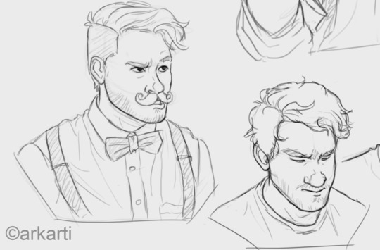
Went the more simplified route: - less details!!! keeping the lines at a minimum - round nose + face/chin - minimalistic beard - stylized hair (kinda like disney 2D characters)

biggest factor to make it more cartoony/ simpler was that I wanted to do animatics with him, so I had to go the "low poly" design route and make it easy to draw. tried to study what makes the face characteristic for the person. works more or less - sometimes I cannot get it right either :'DD So I said ♪ meet me halfway ♫ and tried to aim for the middle of these styles 😂
Same goes for William - my first drawing of him (for a shitpost animatic, left side) was a bit too complex, so I had to simplify it (right)

GET SIMPLIFIED, IDIOT (affectionate) 🙏
#ask#tutorial#kind of?? I guess??? I tried lmao#happy with William by now#and yes I am using /that/ side view of william again cuz it's my favorite :3#Mike is a whole other chapter: I cannot get it riiiight (yells) haven't found a good way to draw him consistent yet 😔 also barely draw him#maybe this is connected.. who knows~ but thats just a theory. a GAME THE- (gunshot)
71 notes
·
View notes
Text
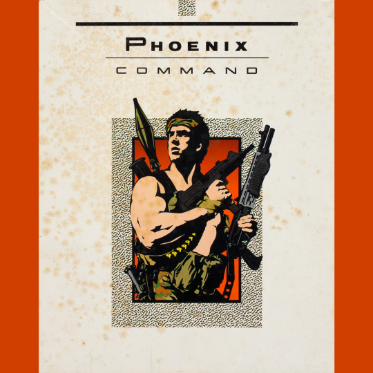
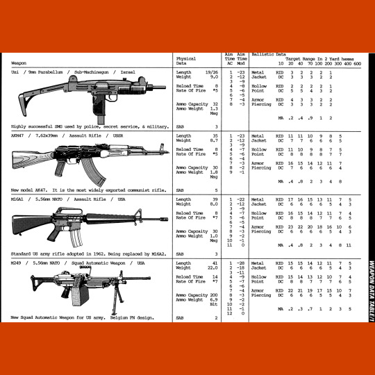

Phoenix Command (1986) isn’t technically an RPG. Rather, it is a small arms (and later, through expansion, all sorts of arms) combat system intended to replace existing systems for such in your favorite game. Why you would do such a disservice to your favorite game like that is beyond me, but hey, who am I to judge?
This thing is painfully complex. There are an eye-watering 35 different hit locations tied to a percentile table (Rolled a 30? That’s a hit to the stomach/spleen!). Weapons all have an aim time that impacts accuracy. There is an alphabet soup of abbreviations. There are tables galore, not a one of which I can parse. It’s gotta be one of the most complicated RPG systems ever conceived.
I love it. It’s so unapologetic. I will never play it or take it seriously, but I will forever appreciate its utter hostility to fast and smooth gameplay. That clip-art Rambo on the cover, covered with so many guns he probably can’t move, is the best possible mascot. He sums it all up perfectly.
Even better: the designers couldn’t even deal with this shit. When Leading Edge produced Living Steel and the various licensed games (Dracula, Aliens, Lawnmower Man lol), they used a simplified version of the Phoenix Command combat system. Humbled by their own creation. Beautiful.
61 notes
·
View notes
Text
There's something that really needs to be taken into account when discussing whether or not Teen Titans Go deserved the backlash it got from fans of the original show and it's this: the people behind the show literally scammed said fans first.
When Cartoon Network was running its DC Nation programming, they produced a lot of short cartoons with DC characters. One of these was “New Teen Titans”, a shorts series made in a chibified version of the 2003 show style, with the original voice cast reprising their roles, with similar humor to the 2003 show and references to plot points from the 2003 show. These shorts got so popular, the DC/CN representatives launched a campaign to get New Teen Titans greenlit as a full show “if we get enough viewership for the shorts, we might get a full show” style.
The fan support was immense, and CN started producing their Teen Titans show. Social media was abuzz with more simplified character designs that were still recognizable as the 2003 versions of the characters and with how much of the original cast they were able to get on board this project. Up until the first episode of Teen Titans Go aired, fans were being led to believe that they were being delivered the closest thing they’d ever get to Teen Titans 2003 season 6. When “Legendary Sandwich” aired, people found out that they’d been misled, downright lied to.
The Teen Titans Go crew acting like a bunch of petulant children over the completely deserved outrage only soured relations between the show and fandom further as they refused to take responsibility for their role in the ruse, whining about how they shouldn't be compared to a show whose popularity they coat tailed on to get their show most of its attention, never mind how the purposeful misdirection of the Teen Titans 2003 fandom is how TTG even got greenlit in the first place.
Comparisons between Teen Titans Go and Teen Titans 2003 aren't unfounded when the show was pitched to the audience as a direct continuation. You don't get to literally scam people and then play the victim when the people you scammed are upset. Just because the people scammed didn’t lose money doesn’t mean they didn’t get scammed. The next time you see the argument that the TT 2003 fans need to grow up, consider this: who is actually more childish here; the people upset they got scammed or the people who are so upset they got caught scamming people that they have made several episodes insulting their victims’ intelligence even further for a show they claim is just innocent fun aimed at kids?
23 notes
·
View notes
Note
opinions on yoshis story? imo that game doesnt deserve to have music that good
I haven't played very much of it and I've been meaning to do something about that forever. I've played some of it and I've watched others go through most of it.
I know I've seen a little bit of modern grumbling (I don't know if this was a point of contention when the game came out because I was three at the time. OK I looked up some reviews from the era and it looks like it was also a thing people were mad about back then. LOL) over the fact that the game isn't more like "Yoshi's Island" & that it feels like it's aimed more at younger audiences. I dunno. I've never been bothered much by games with some tie to one another doing something different. (Some of the response reminds me of Transformers fans being upset over Hasbro making toys and shows for very young children sometimes; admittedly maybe I'm off the mark here.)
It's a very easy game if you want it to be. You can just eat any fruits you want forever and it's over in a blink. And it's fine. It's fine if the video game lets you beat it very fast if you want to. You can also try to collect only one single kind of fruit in a level and that makes things take longer and makes them feel like more of a scavenger hunt (especially if you're trying to get all the melons). I think that's neat. There's sort of an interesting design trajectory from "Super Mario World" to "Yoshi's Island" where the levels become a little longer, a little more meandering, a little more exploratory, sometimes (not always, and not massively, but it's still there) a little less linear. No time limit. Going for collectibles instead; making every level about getting a score of 100 (if you want to). You can see that iterated on in "Yoshi's Story"! No singular end point of the level. Bigger rooms to explore (while still keeping levels relatively short). More of a focus on puzzle solving and exploration. Collectibles simplified to one meter that you fill up, but there are multiple things that can fill it & you get rewarded for only collecting one kind. (And also the hearts that let you pick what level you go to next. There's a lot of "opening up more of the game for yourself if you want to go out and look for it" here. Are there other collectibles, actually? I don't really remember...) Secret fruits that give even more points. It makes the levels feel more like puzzle box toys that you roam around in. It's neat that they designed that for younger kids and it's neat that you can make it more difficult if that sounds fun to you. (I would have to play more of it myself to decide if going for all melons is fun for me specifically. But I like it on paper, y'know?)
The pop-up storybook theming is cute and the visual aesthetic of the game overall works really well. It feels like arts & crafts dioramas made by kids (or with kids) so they could play pretend with their toys while reading a storybook. It's got very strong toy feel overall. The music is really fun!!! It does the dynamic soundtrack thing where some parts of the track change depending on your health!!! I'm always clapping my hands like a seal with a game's music changes depending what I'm doing!!! Maybe it's a little silly of me to say this, given that it's a sentiment I've had in the past, but nowadays I scratch my head a bit at "the music in this has no right to go this hard" type comments. It goes hard because the musicians got hired to make it like that. (I'm imagining a guy who thinks the "Yoshi's Story" music is the hardest music ever created and I'm smiling serenely about it. I hope he's real & I hope he's out there somewhere.) I'm glad they let Totaka do something that feels at least a little experimental for the goofy Yoshi babies storybook super happy yay & jumping throwing game soundtrack. It's a fun contrast, isn't it? It feels very of-the-era in a way I'm having trouble externalizing outside of "well it's a little weird and multi-genre". It's neat that they all have a shared melody that they draw on.
Thanks for reading my short essay on a childrens' video game I haven't played a lot of yet. I need to go take a shower now.
80 notes
·
View notes
Text
Spend all night drawing ugh..
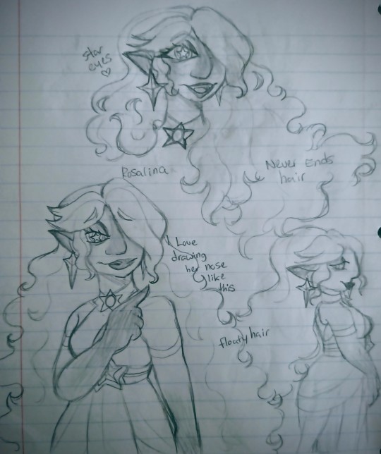
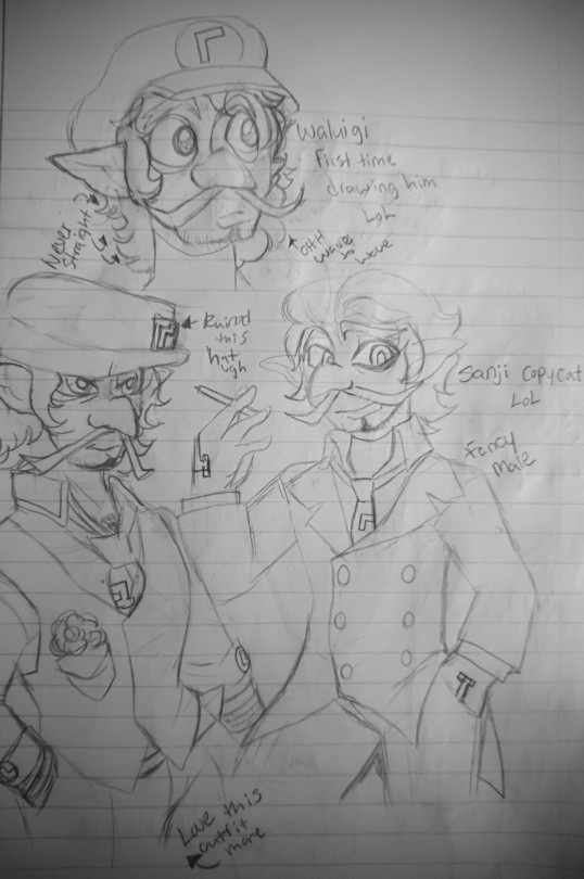
First time drawing Waluigi, so please forgive any imperfections. Additionally, I plan to develop a love story between Rosalina and Waluigi, with a focus on parenthood and family issues. They always meet at night, as they prefer to keep their relationship private.
In his lowest moment, Waluigi found himself in a gloomy state of mind, feeling lost and alone. Then he saw something incredible - a huge star-shaped woman that seemed to be floating in the air. He attempted to run away but was caught by Rosalina, who was exploring the planet and was intrigued by his appearance. Despite his ego, Waluigi was somewhat intimidated by Rosalina's beauty, especially her eyes, though he secretly admired her, and was surprised that someone as attractive as her would even bother speaking to him. He pretended to be confident, but deep down, he knew he was not as conventionally attractive as other male beings he had encountered. Nonetheless, Rosalina found Waluigi's face unique, particularly his nose, and the two ended up getting to know each other over their shared personal stories. After weeks of silent communication, they officially became friends, and their bond grew stronger as they continued to spend time with each other.
I will do more research on Waluigi and Wario's personalities and background. I also decided to make Rosalina able to change her height in my alternate universe, which adds another layer of complexity to her character. In this AU, Rosalina suffers from a deadly sickness that killed her mother, but she is able to survive thanks to her extensive use of cosmic magic. Parts of her body have taken on a space-like appearance due to her magic, and these areas become like Neptune when she gets angry, making it dangerous to touch her. I also chose to portray Rosalina's nose as hooked, and changed her skin and hair color to be different from her original design to differentiate her from the Mario universe. If I were to color her in the future, I would aim to accentuate the space theme even further.
Also Him
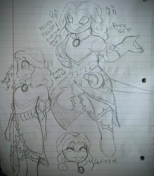
Drawing Prince Peasley for the first time was quite challenging, as I mostly focus on female characters. However, I am working on improving my skills when it comes to drawing males. I decided to incorporate some intricate details into his outfit to make him look presentable, but may simplify his ensemble later on. I am currently satisfied with the result and look forward to creating more stunning sketches of Prince Peasley.
Prince Peasley remains a Beanish prince and a well-respected hero in the Beanbean kingdom, but I wanted to add elements of plant themes to his character design to make him stand out even more. Although his first outfit will be redesigned again, he takes great pride in his hair and facial features which he believes are charming and lovely. His personality remains the same, and I plan to introduce a nephew whom he eventually adopts into my AU. This will coincide with the fan children I have previously created.
Welp, that's all for today. I love adding information to my designs and some background to the characters.
@bberetd @maceincognito @house-of-xiii @magnas27
#smb fanart#supermariobros#super mario bros#princess rosalina headcanon#princess rosalina#redesigns#waluigi fanart#waluigi redesign#waluigi#waluigi x rosalina#wasalina#wasalina fanart#prince peasley#prince peasley fanart#prince peasley redesign#artwork#art#handdrawingart#fanart#super mario#nintendo#mario fanart#super mario galaxy#mario & luigi: superstar saga#creamypeach writings
43 notes
·
View notes
Text
Thoughts on the new Megamind movie and series
Hello friends it is Bug review time!
I have watched the new movie and show all of one time each. I'm gonna talk about what I liked, what I disliked and some thoughts on the new characters and places where there are cracks in the story to drive a roadtrain worth of fanfic through
A disclaimer before we begin, I am thirty or forty years old and I am not the target audience for this shit. I love Megamind and am a hardcore Megarox shipper and also a world building focused fiend. The original definitely had a broader age bracket appeal but this is a show aimed at something like 6-12 year olds. Therefore for better or worse they had to simplify and audience surrogate the shit out of a lot of this.
Megamind vs the Doom Syndicate
To be honest I think you could skip this and go into the new series cold. It's not a movie its a movie length pilot. It was fine and it definitely smacked of Studio Interference going "But you have to explain and set everything up!" (spoilers you don't). The Doom Syndicate is fun if very kid friendly and I'm looking forward to seeing more of them. Behemoth and Knighty Knight are my pals and Pierre Pressure and Lady Doppler are my catty bitches.
The dialogue was good but the pacing felt lopsided. It really felt like they were retreading things that happened in the original movie, especially Minion's entire arc which he just went through two days ago? They did a good job with it but still!
Stuff I loved
FAKE EVIL DATING - I wish they'd shown them actually having to pretend to evil date. But of all the things I thought I was going to get it certainly wasn't that! (So much fanfic y'all. So Much Fanfic).
All of the Doom Syndicate calling out that Megamind and Roxanne obviously have A Thing and neither of them dealing with it well.
Roxanne just casually hanging out in the Lair and also taking charge. that's my girl! Also she's a complete morosexual and she and Megamind deserve each other.
Mayor Roxanne. I didn't adore HOW they did it, I think you could tease a whole season (or an exceptional fanfic) out of Roxanne finding herself not only bored of her job but dealing with the trauma of "Every time I look at the camera I see Hal beyond it and maybe I have some issues with that" and wanting to make changes.
Megamind's Bedroom! There was a sound like a million fanfic writers crying out in glee.
Minion and Roxanne being bros!
Minion out of his suit! It was creepy yet adorable!
The Mayor being useless. When you are used to having a hero who solves every problem, why wouldn't you have a useless Mayor? (I like that he comes back in the show)
The Doom Syndicate in general. They had a good range of designs and were at their most fun when bickering together.
Mr Cuddly Snuggles.
Stuff I didn't love
It felt like a retread of a lot of things that happened in the original movie. Which it has been 14 years so fair, but also if you're going to set something two days after the events of the movie, why make it a photocopy of the original?
Everything that Keiko was doing in the movie that could or would have been done by Roxanne if we were still going via the original characterisation (Roxanne broke into an entire villain's lair right after Megamind took over the city but Keiko's the one with the bat???).
Megamind just spent a whole movie going on about how he didn't share the spotlight and it caused a rift with his oldest friend (again) but sure, we couldn't do this without you small child we just met an hour ago. Its pure audience surrogate and YoU CAn'T bE mEaN to CHiLdrEn! but it makes the pacing feel even more lopsided that this can be so rushed when the whole Minion thing (and not even touching on the whole Bernard issue) got all the attenion and sure we'll just shove this in as well.
(This is the part where I admit parentification of characters is a MASSIVE squick for me and anytime I read about people wanting to make Megamind and Roxanne Keiko's new parents it makes me want to throw up in my mouth.)
Also Exposition voicing the "I was bad but you showed me I didn't have to be" is sooooo not for me. One thing the original movie was extremely clever about was showing how privilege and wealth played a part in Megamind and Metro Man's eventual roles. Megamind wasn't just a bad guy, he was raised in a prison, totally othered, looked different to everyone else on the planet and sent to the naughty corner even when he tried to do things right. While Metro Man was a white western male fantasy who landed in the lap of luxury and even his bunker is a monument to himself.
This was totally discarded for the new movie and I think its the poorer for it, simply because it was such a SMART and SUBTLE thing that is actually relevant.
Again, for kids. Not aimed at me. But I still think it does a disservice to kids not addressing that whole very important aspect.
End result: It's been 14 years since we got any content and I will take it for what it is, a movie length pilot of Baby's First Megamind for a superior tv show. An opportunity for a thousand gifsets and Roxanne running somebody over with a firetruck. If you're watching to get something out of it you probably will. I will be writing 12394393487 fanfics about Megamind and Roxanne actually having to prove they are dating to the Doom Syndicate.
Megamind Rules
Definitely better quality than the movie (I'm not going to talk about the animation etc because frankly the answer should always be pay your animators better and give them more time).
LOVED Megamind just breaking into Roxanne's office. Nice to seee some things never change. LOVED the Bodyswap episode (again, so much fanfic). LOVE LOVE LOVED Megamind and Roxanne laying on the kitchen floor together. We did not get enough scenes of them alone together.
LOVED Christina Christo, tired adults just trying to get their jobs done is my JAM and CREAM and SCONES and I love her (also why I loved Roxanne in the original). Loved her and Minion hanging out in episode 5. They need to be buddies more.
LOVED Roxanne wanting metal tickets for Megamind, everything about them having a shared history and interests filled my heart with glee.
LOVED the shot of Roxanne aiming the degun, Mucho sexy.
Loved Roxanne and Lady Doppler havign a history. How come we got more about tha than we did Megamind and Roxanne?
LOVED Megamind and Roxanne bonding over old kidnappings.
Ep 3 was heaps of fun. Doctor Doughnut was silly yet joyful. and I appreciate the Go Fish gang appreciation of his evil laugh.
The move from news reporting to streaming is actually a reasonable thing to happen, but I wish they'd delved into it better from Roxanne's side of what the shift away from traditional reporting and media meant for her. Social media and news have changed A LOT since the original movie. Again its one of those rich seams that fanfic exists to delve into.
LOVED the cockroach episode, but a missed opportunity for YOU RAISED A CHILD (TWO CHILDREN!) IN JAIL HOW ABOUT WE EXPLORE THAT A LITTLE MAYBE??
I guess we just...have a giant Minion in the lake now?
LOVED the Doom Syndicate just hanging out. Lady Doppler is me, sitting on a bench drinking tea.
The cliffhanger is a cliffhanger because they wanted a cliffhanger. But so help me if Roxanne isn't working from the inside in the next 8 episodes I will riot.
Characters
Megamind. Learning to be a person is right. Every time he got to be one on one with another character he became more himself. Every time he was one on one with Roxanne I was riveted.
Roxanne. My girl! They sidelined the shit out of her in this series! Sure she went off and got herself top job (Megamind and Minion calling her "Your majesty" was for me specifically) but so much of what made her a fun character in the movie (complete lack of fear in the face of villainy, her banter with Megamind, her willingness to just break into a villain's secret lair to find shit out got pushed onto Keiko and it left Roxanne with nothing to do. I don't know what they're planning for the future but I could see Christina taking over as Mayor eventually and Roxanne joining the crime fighting crew.
I HATED every time they called her Roxie, that was set up as an unwelcome nickname in the movie so I don't know why they backflipped on it here. HOWEVER I am prepared to accept it on the basis it made Megamind saying "Roxanne" in episode 8 that much more impactful (though they still could have used Miss Ritchi).
Keiko. I love Keiko as a character? But I hate her role in the show. She's the audience surrogate and the "Kid Relatable" for the kids to latch onto and they had her Exposition Voice in the DS movie what was actually much more cleverly crafted and characterised in the original movie. As a person she's cool and I like having her in the show I just wish it wasn't at the expense of Roxanne. They could have kept her as streaming socials girl and still left the investigation/danger to Roxanne and it would also have meant more time to explore what the Megarox relationship could be building towards/developing from.
I cringed all the way through Keiko dealing with the Doom Syndicate because it was telegraphed from a mile away such a tropey Kid Approved plot. I LOATHE making the tension about characters who have fucked up needing to admit they fucked up when its way more impactful to have them fess up immediately and put all the tension into how to solve the problem.
Machiavillain. He looks like a cunty Barbie villain and I love that for him. I assume we have to be getting the other 8 episodes at SOME point because otherwise that's a lot of Adam Lambert for not a lot of payoff.
Minion/Chum. ALSO learning to be a person and I have always had a soft spot for him. Showing that he has about as much sense as Megamind is a delight.
Christina Christo. I love her and I love that she and Megamind are constantly arguing for Roxanne's affection. Probably my favourite new addition.
End result: It's very Studio Approved For Kids! Enjoyed the show a lot more than the movie length pilot. Needs more Roxanne. Needs 10000 more game nights with Minion's electroshock orgasm ball.
Megamind was and is a PARODY of the superhero genre, break more rules! Don't just plod through the studio approved plot points! Having the original movie be all adults was actually really refreshing because you could get a lot more out of subtle shit without having to spell it out. One of my biggest peeves and the cause of a lot of fanfic is why is shoving Megamind into the hero role any better than shoving him into the villain role? Let him go be a mad inventor without having to save the city! Let him be a crime fighting villain!
And finally, so help me if Roxanne isn't front and centre beside Megamind where she belongs in the next season I will start biting.
FUTURE FANFIC I AM LOOKING FORWARD TO READING/WRITING
All of the evil fake dating. Make them have to fooool the Doom Syndicate. Make Roxanne need to stay over. make it only one bed. Make kisses with Megamind where they haven't even talked about the Bernard thing yet and they are both so messed up about it. (Fun fact! I wrote a fic with this premise way back before the show was even announced.
We're still fooling the Doom Syndicate and oh no they want to help plan the wedding.
We're still fooling the Doom Syndicate and oh no now we're actually getting married.
Roxanne actually dealing with her issues after the movie and why and how she goes into campaigning for Mayor.
Megamind and Roxanne breaking in the mayoral office (obviously).
Filthy sexy bodyswap shenanigans
How did Roxanne figure out Megamind's ticklish spots?
10 thousand character driven Roxanne hanging in the Lair moments
10 thousand Megamind hanging on the couch in Roxanne's office moments
A highly charged Roxanne and Lady Doppler bitter evil exes interaction (just for you @ejga-ostja)
Doom Syndicate shared public workspace office. Or just some random person going in to use the printer and constantly getting dragged into lackeying for them.
Metro City Meme War
An actual introspection on the move away from traditional news media and how it impacts Roxanne's decision to seek a new career.
Christina and Roxanne eat doughnuts and bitch about municipal planning
A Christina POV watching Megamind and Roxanne flirt/have awkward moments/dance around the Thing via a crack in the office door
A Christina and some other person in city hall epsitolary fic told via emails reporting on Megarox developments to the person running the pool and slowly getting more invested in these morosexuals getting together.
Megamind coming to find Roxanne for game night and finding her sacked out on the couch because being Mayor is HARD and napping on the floor beside her because being a hero is hard too
An absolute fuckton of hypnosis kink
Roxanne using her mayoral powers to address the fact that Megamind and Minion were raised in a prison and NOT ON MY WATCH THERE WILL BE REPERCUSSIONS AND WE ARE GONNA ADDRESS SOME SHIT
#Megamind#Megamind rules#megamind vs the doom syndicate#bug thoughts#someone save my girl she doesn't deserve to be sidelined for a kid character#Keiko is fine she is just IN THE WAY#shoo child the adults need to have nasty sex on the control desk
54 notes
·
View notes
Text


Nr.320, The King Tiger or Tiger 2 with Porsche turret.
Both turrets used on the Tiger II were designed and built by the Krupp company. So why are they so often called the ‘Porsche’ and ‘Henschel’ turrets?
The answers can be found in the tank’s early design. This post is a greatly simplified account of the story.
The earliest work on a heavy tank armed with the 88mm KwK 43 gun was carried out by the Porsche company. The resulting design was known to the company as the Typ 180 and to the German Army as VK.45.02(P).
Ferdinand Porsche, the company’s chief designer, developed several versions of this design, each powered by a different engine or engines. His aim, or perhaps obsession is a better term, was to build a vehicle with the highest automotive performance possible. However his designs proved unreliable and none of his VK.45.02(P) variants entered production.
32 notes
·
View notes
Text


welcome to SKETCHES I DREW IN 2 SECONDS i'm working on a new project which is a bead curtain to cover the eyesore that is my not-in-use fireplace. that nook is filledddd with items such as 'box for vaccum cleaner' and 'tire pump' because my house is small <3 also i was just looking for a place to make a bigger piece of art and this seemed like a good candidate - i'm aiming to make a bead curtain that is about 120cm wide by 50cm tall but i don't really have dimensions nailed down yet. i'm working on this project by rotating it in my mind and researching methods and materials instead of actually learning how to create a pixel art design BUT this will change soon perhaps >:) so far this is a friend collaboration project, with thomas sending me the original inspiration to make a bead curtain (although i interpreted his idea differently than he intended :P) and dizzy sending me galaxy brain link to fish bracelet patterns which will help me get my head around simplifying a design into this style :3 i think i'm going to use wooden beads because i think they will be easiest and least expensive to get hold of. my limitation will be colour availability. this fireplace sits perhaps 2 metres to my left rn (where my chair is aka where i spend most of my time #disabledlife) so i want it to look NICE! hopefullyyyyy i can find bead colours that i like! introductory post OVER but if you'd like to send me any inspiration or ideas or show me something you've made please doooo it's been so fun to share my fish projects on here!!!
9 notes
·
View notes