#Shray Mecham
Explore tagged Tumblr posts
Visit Tumblr Blog
Explore Tumblr blogs with no restrictions, modern design and the best experience.
Last Seen Tumblr Blogs


Fun Fact
If you dial 1-866-584-6757, you can leave an audio post for your followers.
Text

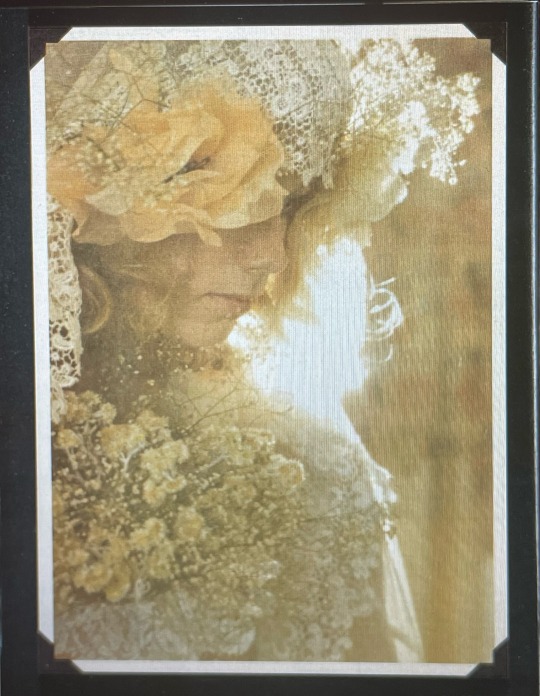
Lori Mattix and Shray Mecham photographed at Rodney Bingenheimer's English disco, June 1973 ♡ Photographed by Richard Creamer
#lori mattix#lori maddox#shray mecham#70s#1970s#classic rock#rocknroll#70s aesthetic#groupie#groupies#groupie aesthetic#groupie love#lana del rey aesthetic#70s groupie#groupie girl#almost famous#70s rock#rockstar gf#rockstar girlfriend#vintage#rock and roll#vintage aesthetic#70s vintage#vintage style#70s girl#rock#70s style#old school cool#70s fashion#summer aesthetic
56 notes
·
View notes
Text


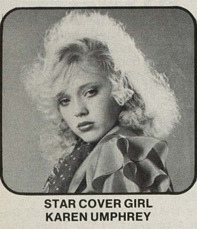
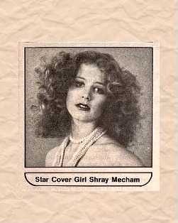
On February 1973 the American short lived "Star" magazine published its first issue (volume 2, #1).
It focused on glam-rock music and teen fashions and was mainly for girls and giving them beauty tips and how to behave in relationships and meet rock stars.
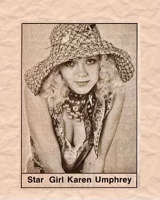
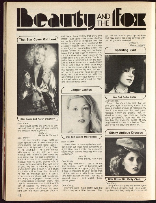
Teen model Shray Mecham was on the cover and back cover of the first issue, as well as inside (photos 2 & 5), and teen model Karen Umphrey was also featured inside the magazine in varius articles (photos 3 & 4, 6 to 8).
***
To read the whole issue (all of them!) and see all the musicians, sections and the other models featured, please go to the amazing star1973.com website (were we got these photos from). Ryan did an amazing job!
Please, credit his website if you re-share these photos anywhere.
#Star magazine#1973#1970s#Shray Mecham#karen umphrey#model#teen model#star 1973#star groupie magazine
2 notes
·
View notes
Photo

Karen Umphrey and Shray Mecham, Star Magazine, April 1973
#karen umphrey#shray mecham#star#models#groupies#fashion#star girls#classic rock#glam#glam rock#check out my latest piece on karen this weekend!#the meggie sue @ substack#faves
24 notes
·
View notes
Text
18 notes
·
View notes
Text
shray mecham and Sabel starr in star magazine 💋
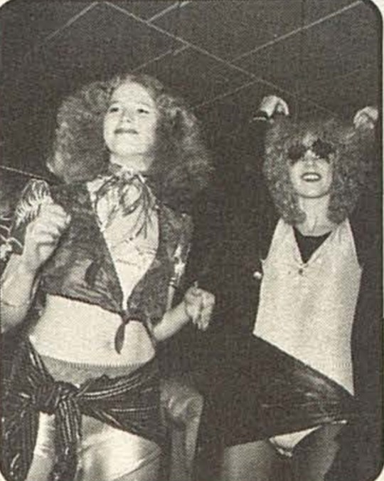
#70s rock#punk rock#punk music#70s punk#early punk#new york dolls#johnny thunders#david johansen#rock groupie#70s groupie#sabel starr#sable starr#shray mecham#glitter rock#glam punk#glam rock#max's kansas city#star1973#star magazine
10 notes
·
View notes
Text
going to homecoming for the first time today…
i decided to dress 70’s and my hair is HUGE and my eye makeup looks like shray mecham and i look like i should be snorting coke backstage at a stillwater concert. iggy pop would def write songs about me and jimmy page would def kidnap me rn
i’m so hot literally like where is my boyfriend… why is he nonexistent?
#my diary#online diary#tumblr diary#diary#digital diary#girlblogger#girlblogging#personal diary#gaslight gatekeep girlblog#pinterest girl
17 notes
·
View notes

Text

« We are not Groupies. Groupies sleep with rockstars because they want to be near someone famous. We are here because of the music, we inspire the music. We are Band Aids.
No more sex. No more exploiting our bodies and hearts. Just blow-jobs, and that's it! »
46 notes
·
View notes

Note
Hey thanks so much for answering my earlier question! I was just wondering for my next, have you ever received input from some of Sabel's friends or loved ones? Reason I ask this is because you seem quite well informed about her..on a personal level.
Sorry for answering this late again. Yes I have, Debra Ann, Shray Mecham (Sabel’s friends) and Sabel’s sister Corel Shields know about me running the blog. :)
3 notes
·
View notes
Text
Shray mecham not sabel! :) still a very very iconic photo though! 💋


sable starr and lori maddox
43 notes
·
View notes
Photo

Shray Mecham by Henry Diltz, 1973
#shray mecham#henry diltz#groupies#models#star#groupiesoutrageously#agnetafrieberg#shray is my 2nd fav bb groupie/star girl after karen <3#faves
79 notes
·
View notes
Text
Task 4 - Final Piece
[Behance link]
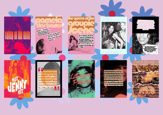
I made a groupie-related zine, Valley Of The Dolls, as my final piece idea.
As it primarily focused on the 1960s and 1970s, I opened Coolors and searched for psychedelic palettes. I didn’t want the colours to be too acidic and bright, but I also wanted them to stand out. The 1960s focused more on pastels - mint, baby pink, baby blue - while the 1970s focused more on bright tones - mustard yellow, burnt orange, deep red, and denim blue. I used the Psychedelic Sunrise palette for the majority of the work, and took all my colours from Coolors.
COVER
For the cover of the zine I wanted it to be simple while hinting at the content inside. I chose a photo of a young Beatles fan in 1968 from Pinterest for the cover, as I liked the layout of the photo, and the model had a suitably doe-eyed groupie look. I opened it in Photoshop, and created a gradient with a hot pink at one end and a deeper purple at the other. I then went to Layer > New Fill Layer > Gradient and filled the image with my gradient. I set the layer’s Blending Mode to Darken so the gradient would shine through instead of turning dark on the black and white of the image. I then brightened the image with Adjustment layers such as Brightness/Contrast and Curves to increase its visibility. After making sure the image was sharpened, I started on the text. I used Cooper Black for my title as I thought it looked sufficiently ‘retro’ while still being readable. I decided to give my text a gradient effect as well, but in a more unconventional way. I selected a bright orange as my starter colour, and then duplicated the layers a few times. For each new row of text, I selected a lighter shade. I then positioned my title, rasterised the layers, flattened the layers, and centered them.
PAGE 1/PAGE 2
For page 1 and 2, I decided to focus on Pamela Des Barres, the most infamous groupie of the scene. I wanted to make her pages light and very 60s, as she was active during the late 60s groupie scene in Los Angeles. I chose a sugary pink background for her pages, and I typed the page titles in Bauhaus 93 font. I wanted to jazz the pages up a little, so after rasterising the ‘Pamela’, I selected it with the Magic Wand Tool and inversed the selection. On a new layer, I filled the area above the word with a golden brown. For the photo of Pamela, I chose an image from a photoshoot of her in the late 70s. I chose that one specifically because I liked the composition and it was easy to build text around. After cutting it out with the Pen Tool, I resized the image and made it completely black and white with the use of a Gradient map. To colour the background, I made a pink to black gradient and placed it under the text. I chose a quote from her that I thought highlighted the overall groupie ethos of ‘music is life.’ I capitalised a few of the letters in the sentences to make it look a little more ‘jagged’, and I drew white boxes around the text with the Polygonal Lasso Tool.
For the second page, I followed the exact same formula of the first. I selected a picture of Pamela that was taken in the late 60s, and is probably one of the most well-known photos of her. I cut it out with the Pen Tool, and placed it so that her left leg would be on page one. I added a short biography of her on page two, next to the cutout.
PAGE 3/PAGE 4
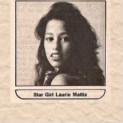
For pages 3 and 4, I decided on ‘baby groupie’ Lori Mattix as my subject. I thought Lori would be an interesting choice as she started in the groupie scene very young (14), and had a few comments on the more negative side of the scene. I chose a pale blue for her background to emphasise the fact that she was young, and kept the same pale pink from Pamela’s page for her text. I used a sans-serif font for her title. To make it just an outline, I typed out and arranged the titles. I then selected them all using shift + the Magic Wand Tool before turning off their visibility. I went to Blending Options, and gave all the selections a stroke of 3 or 4. I then selected off, and rasterised the type. I chose a photo of Lori from the mid-70s, with model Shray Mecham in the background. I used a black and white gradient map, brightened the photo a little, and then put it under the text.
For the second page, I found a photo of Lori from the 70s. I resized it to fit the whole page, and covered the top half of her face with a black box. I used the Rectangular Marquee tool to do that. I then added a short biography, in the same style of Pamela’s page, and created a speech bubble with the Lasso Tool coming from her mouth. I coloured the main bubble white and the tail pink. I then added a quote, and sharpened the final image.
PAGE 5/PAGE 6
For Jenny Kee’s pages, I decided to go for a more psychedelic and arty style. Kee is a lesser-known Australian-Chinese groupie who found worldwide fame as a fashion designer, but as a youth she was active in the Swinging London scene of the 60s. I found a black and white photo of Kee posing in front of an elaborate design of fabric and bric-a-brac, and created a new Gradient Fill layer. I used bright red and orange for my gradient, and set it to Multiply. For her title, I used a font I really like called Flowers Kingdom. I typed ‘MISS JENNY KEE’ as one word on three separate layers. I went to Type > Warp Text and used the Rise setting at +23. I copied this at various degrees for the other two text layers.
For page 6, I copied the pop art style of the 60s to make the image. I found another photo of Kee and resized it to fit the entire page. I then went to Filter > Color Halftone, and set a halftone at the lowest setting on the image. I then added a black and white gradient map, before adding a black border on a separate layer with the Rectangular Marquee Tool. To place the text, I again used the Rectangular Marquee Tool + Shift to create a square. I positioned it slightly to the left, centering it, and filling it with the same orange from the gradient. I them typed a speech mark and resized it to make it large, colouring it with the same red from the gradient. I then duplicated the speech mark and rotated it 180 degrees, positioning it at the bottom right of the square. I used the Text Tool to make a textbox, adding in a quote from Kee. I set the orange box to Multiply, and the commas to Multiply.
PAGE 7/PAGE 8
For page 7 and 8, I centered on Lithofayne Pridgon, the woman who allegedly inspired Jimi Hendrix’s ‘Foxy Lady’. I wanted to keep her pages really simple. I found a photo of Pridgon and resized it to fit the page with the ‘Show Transform Controls’ tool. I then went to the Adjustments panel and used a Gradient Map to increase the shades of the image, and a Levels layer to adjust the contrast of the image. I used a Colour Fill layer with a dark mint green tone, and set it to darken. For her title, I used a font named Dollie Script and set it to a coral orange. I rotated it a little with the Show Transform Controls tool.
For page 8, I used a still from a video of Pridgon. I went to the Adjustments panel and used a Brightness/Contrast layer to make the image brighter. I then used a Gradient Map in black and white to desaturate the image. I filled a layer with the same coral orange colour and set it to Darken in the Blending Modes of the image. For her quote, I created a textbox and added the text. I also seperated the distance between each line. I turned the text a dark gold colour, and on a new layer, I made a box around the text in pale pink. I then used the Rectangular Marquee tool to clear the box until it ‘highlighted’ the text. I then centered everything.
BACK COVER
The back cover was a direct response to the simplicity of the front cover. I found three images through Pinterest, and positioned them on top of each other. For the torn pages effect, I downloaded a pack of brushes that had a ‘ripped paper’ effect, and resized them. I then painted the brushes on seperate layers at the joins of the photos. I then used the Eraser Tool and a layer mask to erase the parts of the image and brush that overlapped, leaving a neat tear on each image. I then went to Filter > Noise > Add Noise, and added some grain over the images. The quote of the back cover is a David Bowie quote, written in the font Royal Acidbath. I used a textbox to spread the text all over, and made it as large as I could.
EVALUATION
My zine took major inspiration from Andy Warhol’s pop art pieces - bright colours, bold text, and maximalism, as well as halftone effects. I think that this was a good project to push myself on, as I had to condense a lot of history into a small zine and a few quotes, as well as getting the vibe of the zine across. I’m disappointed in myself for not using materials I bought, such as textured paper, in my final zine, but overall I really like the piece and I’m really happy with how it came out.
0 notes
Text
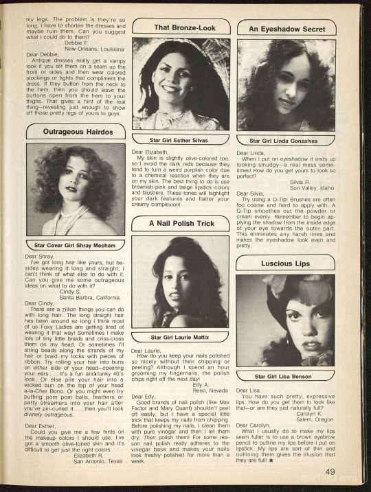
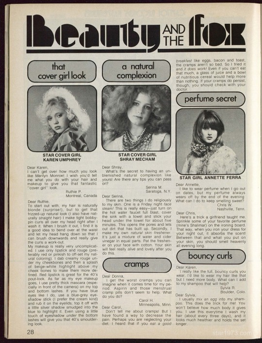
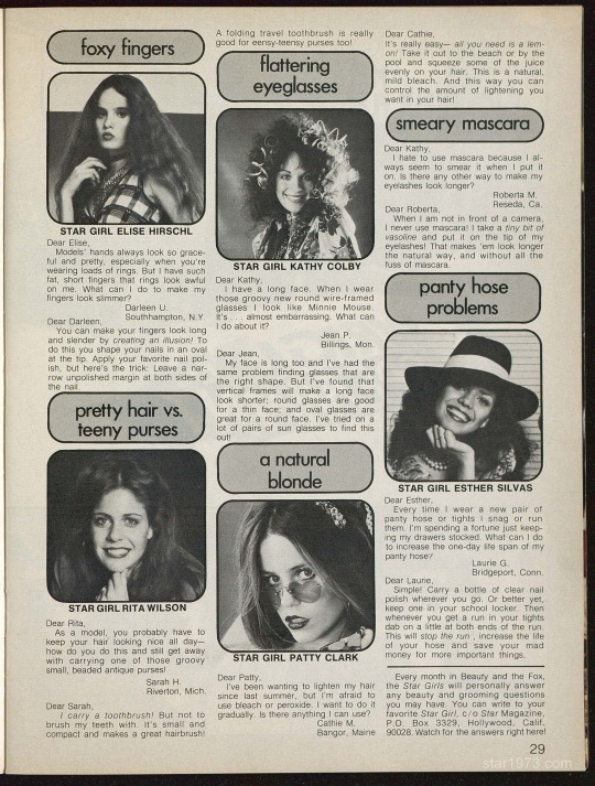
star girl beauty tips! 💋💋
i actually use Karen's tips for my hair 😭, it works so well!


#70s rock#70s glam#glam rock#70s groupie#rock groupie#baby groupie#sunset strip groupies#sabel starr#sable starr#lori lightning#lori mattix#lori maddox#shray mecham#karen umphrey#groupie#glam punk#star magazine#70s fashion#70s makeup#70s hair#beauty tips#hair tips#nail tips
744 notes
·
View notes

Photo


Shray Mecham for Star Magazine | 1973
83 notes
·
View notes