#Responsive WordPress Design
Explore tagged Tumblr posts
Text
Simplifying Your Workflow: PSD to WP Conversion Explained
PSD to WP conversion is the process of transforming Photoshop designs into fully functional WordPress themes. This service ensures that your website retains the original aesthetic while becoming interactive and responsive. By hiring professionals for PSD to WP conversion, you can achieve a seamless integration of design and functionality, ultimately enhancing user experience. Elevate your online presence with a tailored WordPress theme that reflects your brand.
#PSD to WP Conversion#Custom WordPress Themes#Professional PSD to WP Services#WordPress Theme Development#Convert PSD to WordPress#Responsive WordPress Design
0 notes
Text


Rainbow Dash Equestria Girls.
200 + 100x100 RP icons.
DOWNLOAD: https://drive.google.com/file/d/1UwlLljEdXko0a7z1qdyTx_-cLAVCxT1C/view?usp=drive_link
Warning: THERE MIGHT BE DOUBLES. We didn't directly cap this we did a pinterest run for it for a quick run through. THERE MIGHT even be leftover fan art. If you spot fan art in this, please let us know.
Free to use. Reblog & Credit if using.
#my screenshots#art#caps#graphic design#capsekai#rp icons#free rp resources#equestria girls#rainbow dash#tumblr icons#girls icons#messy icons#pfps#icons without psd#female icons#gg icons#kpop icons#icons#rp resources#rp response#jrock rp icon#cartoon icon#livejournal#xanga#100x100#greatestjournal#deadjournal#dreamwidth#wordpress icon
18 notes
·
View notes
Text
Sneha Trivedi Freelancer | Web Designer | Freelancing Service Provider | Indore
https://tinyurl.com/3rdw5ctz
Sneha Trivedi is a skilled web designer with over 6 years of experience in creating stunning, user-friendly websites. Specializing in both web design and graphic design, she brings a unique blend of creativity and technical expertise to each project. With a strong background in the latest design trends and technologies, Sneha also collaborates with top web hosting companies to ensure seamless hosting solutions for her clients. Her comprehensive services extend to internet marketing, helping businesses grow their online presence through tailored strategies. Whether it’s design, hosting, or digital marketing, Sneha provides end-to-end solutions to elevate brands online.
#sneha freelancer#website designer#web hosting#graphic design#logo design#creatives#banner design#responsive design#bootstrap website#wordpress website#html coding#indore
2 notes
·
View notes
Text

Are you in search of the top web design company in Hyderabad? Look no further than Webxperts Digital Solutions! Our team of skilled professionals is dedicated to creating stunning websites tailored to your specific needs. Enhance your online presence with our state-of-the-art web development services and designs. Contact us today +91 8466886735 Visit : https://webxperts.in/Hyderabad
#SEO#UX Design#UI/UX#Responsive Design#Mobile Development#Ecommerce#WordPress#Content Marketing#Social Media Marketing#Online Advertising#web development#digital marketing
2 notes
·
View notes
Text

In the digital landscape, your choice of a web development company significantly impacts your online success. Consider various factors like portfolio, references, technology expertise, communication, budget, support, and timeline. Armed with this guide, you can make an informed decision. Transform your online vision into reality with Egghead Marketers. Begin your remarkable web development journey here.
#webdesign#responsive web development#webdevelopment#seo#digitalmarketing#web development company#edmonton seo agency#web development#wordpress development#website development#website design#web developers#web design
6 notes
·
View notes
Text
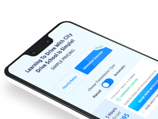
City Drive School
Driving School & Booking
A case study about the website built for City Drive School. Where we will deep dive into the build.

The Request
City Drive School wanted a place they could carve out a slice in in the Driving School Market, with well established compe.otitors. It was important to build a website that oozed quality and met the expectations of young, modern users.

Mobile Prioritised Design
We built City Drive School to work using smart responsive design that guides users through the company goals. We added sticky booking and call button on mobile devices, to increase bookings.
3 notes
·
View notes
Text
#web designing tools#web design tools#website designing tools#UI design tools#web designing software#web design software#web designing#web designer tools#website designer tools#responsive web design tools#wordpress#wix#spacesquare#shopify#figma#adobe dreamwaver#figma web design tools
3 notes
·
View notes
Link
#wordpress development agency usa#custom wordpress development services#professional wordpress web development#wordpress theme development#wordpress plugin development#responsive wordpress website design#wordpress e-commerce development#wordpress website maintenance and support#wordpress migration and upgrade services#seo-friendly wordpress development
2 notes
·
View notes
Text
10 Features You Should Expect from a WordPress Customization Service
WordPress customization services offer tailored solutions to transform your website according to your specific business needs. From custom themes and plugins to SEO optimization and mobile responsiveness, these services enhance functionality and user experience. With expert developers, you can create a unique, fully optimized WordPress site that stands out. Ensure your website reflects your brand identity and grows with your business.
#WordPress customization#Custom WordPress themes#WordPress plugin development#WordPress SEO services#Responsive WordPress design#WordPress site optimization
0 notes
Text
Discover Your Next Favorite Read: Responsive Bookstore & Media Store Website......
Welcome to our Bookstore & Media Store
Our user-friendly website allows you to effortlessly browse and shop for the latest bestsellers, timeless classics, and hidden gems. With detailed product descriptions, customer reviews, and personalized recommendations, finding your next favorite read has never been easier. Enjoy a seamless shopping experience with secure checkout, multiple payment options, and fast delivery. Dive into the world of books and media with our beautifully designed online store.
#Responsive Website designing for Music Band#Buy Wedding Photography Responsive Website#Best Photography Portfolio Responsive Website#Best Makeup Artist WordPress Website
0 notes
Text
Affordable Website Design for Small Businesses
Small businesses, your online home matters! Learn how affordable, custom web design can help you stand out and grow. #WebDesign #SmallBusiness #OnlinePresence #jfvworks
#affordable website design#small business website#custom WordPress websites#budget-friendly website design#professional website design#brand-focused web design#responsive website design#online presence#website design services#website development#Affordable Website Design for Small Businesses#Affordable#Website Design#Small Businesses#JFV Works
0 notes
Text

Elevate your digital presence with DesignLab, a premier website designing company in Pune. We specialize in responsive design, mobile-friendly websites, CMS development, and e-commerce solutions, offering tailored services to meet your business goals.
#Web design and development company in Pune#Website design#Online shopping#CMS#Responsive design#mobile friendly#e-commerce#Web Development in Pune#WordPress Website#E-Commerce Website#Mobile friendly Website#CMS development#Content management system#custom.net software development#vb.net application#Website Maintenance#website designing companies
0 notes
Text

Create your business website today.
What you get:
Responsive Website
SEO Friendly
Security
Speed optimized
Landing page
Business website
eCommerce Website
For contact: [email protected]
Fiverr: Hire: https://fiverr.com/s/e6LKqzk
Portfolio: http://wasimakram.dev
1 note
·
View note
Text
In today’s digital age, having a strong online presence is crucial for any business or individual. And when it comes to building a website, WordPress has become the go-to platform for many. But simply choosing WordPress doesn’t guarantee a successful site. That’s where a skilled WordPress website designer comes in. In this podcast, we’ll guide you through the process of evaluating and hiring the perfect WordPress website designer to bring your online vision to life.
#webdevelopment#webdesign#seo#egghead marketers#WordPress website designer#WordPress website#WordPress#responsive web development#web design#web development#web developing company#wordpress development#web designing#website development#digitalmarketing
3 notes
·
View notes
Text

Unlock the potential of your business with a stellar website!
A well-crafted website isn't just a digital presence – it's a powerful tool that can elevate your brand, attract customers, and drive success. 🚀✨ From enhancing credibility to reaching a wider audience, your website is the key to online prosperity. Invest in your online storefront today and watch your business soar to new heights! 💻📈
#Web Design#Custom WebDesign#Web Development#WordPress Design#Drupal Design#Responsive Web Design#Website Redesign#UIUX Design#Ecommerce Web Design#Web Design Services#SEO Optimized Design#Tech Solutions#Business Web Design#Digital Solutions#Modern Website Design#Website Design Agency#Professional Web Design#Mobile Friendly Web Design#Small Business Web Design#Web Design For Businesses#Custom Web Development#Creative Web Design#Affordable Web Design#Website Design Experts#CMS#Content Management System#Branding#Graphic Design#Logo Desig
0 notes
Text
A Festive Treat: A Stunning New Website by Digital Marketing PTA

Better gift to give your business than a brand-new, stunning website? This Christmas, Digital Marketing PTA is spreading holiday cheer with an exclusive offer designed to elevate your online presence.

Why a New Website is the Perfect Christmas Gift for Your Business
A well-designed website is more than just a digital brochure; it’s a powerful tool that can:
Enhance Your Brand Image: A professional website reflects your brand’s identity and values.
Improve Your Online Visibility: A search engine optimized website attracts more organic traffic.
Increase Your Sales and Leads: A user-friendly website converts visitors into customers.
Build Trust and Credibility: A modern website instills confidence in your brand.
Our Christmas Offer

To help you make the most of this festive season, we’re offering a special Christmas deal on our website design and development services. Our package includes:
Custom Website Design: Tailored to your specific needs and brand identity.
Responsive Design: Ensures your website looks great on all devices.
SEO Optimization: Improves your website’s visibility in search engine results.
Content Creation: Engaging content to captivate your audience.
Hosting and Domain Name: Reliable hosting and domain name registration.
Limited Time Offer: R4500 for 5 Pages Website Included Web Hosting, Domain Registration, Email Accounts, Basic SEO and Social Media Optimization
For a limited time, take advantage of our special Christmas offer:
20% off your total project cost.
Free basic logo design and social media business pages.
Why Choose Digital Marketing PTA?
Experienced Team: Our team of skilled web designers and web developers has years of experience.
Cutting-Edge Technology: We use the latest web development tools and techniques.
Customer-Centric Approach: We prioritize your needs and goals.
Affordable Packages: Our pricing plans are tailored to fit your budget.
Don’t Miss Out on This Holiday Deal!
This Christmas, give your business the gift of a stunning online presence. Contact us today to learn more about our Christmas offer and to book your consultation.
Call Now: 0642463678
Mail Now: [email protected]
Visit Our Website: www.digitalmarketingpta.co.za
Digital Marketing PTA
Your Digital Partner
#websitedesign#websitedesignpretoria#webdevelopment#website design agency Pretoria#web design agency Pretoria#web design services Pretoria#web design company Pretoria#web developer Pretoria#responsive web design Pretoria#e-commerce website design Pretoria#WordPress website design Pretoria
0 notes