#NOT ONLY WAS THE CLIP WRONG
Explore tagged Tumblr posts
Text
Damn Daisuke

Idk i thought of this while watching a vid
ITS DOWN HERE⬇️
WATCH THE FULL THING ITS HILARIOUS
#has this been done yet#I spelt sweetener wrong twice and was gonna keep it but I couldn’t handle seeing it like that Keke#daisuke mouthwashing#daisuke fanart#mouthwashing fanart#shitpost#mouthwashing#mouthwashing daisuke#he wants that cookie so effing bad#NOT ONLY WAS THE CLIP WRONG#BUT A TAG WAS WRONG TOO ARGHHHH#double check posts yall. double check em
32 notes
·
View notes
Text
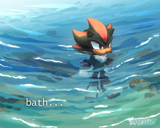
it's shadow's turn to be put in water | [Speedpaint here]
I thought I would be cool and added a bunch of rock under the water, but if you watch the speedpaint, it ended up making me frustrated instead lmao. anyways this one didn't end up being too clean because I wanted to do a low stress painting
original meme under the cut

#sonic#sonic the hedgehog#sonic fanart#shadow the hedgehog#sth#digital#water#clip studio paint#my art#in my hubris i thought I could figure out how to render semi-wavy water#but alas. i was wrong#i can only draw still or completely agitated water lmao. the in between is hard
2K notes
·
View notes
Text
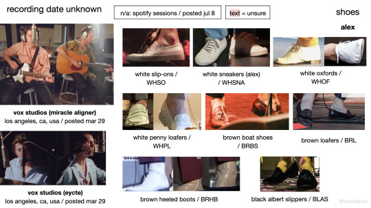
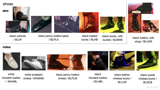
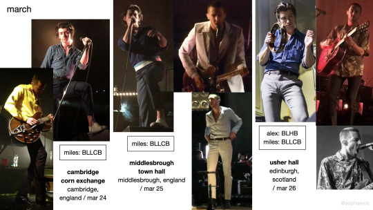
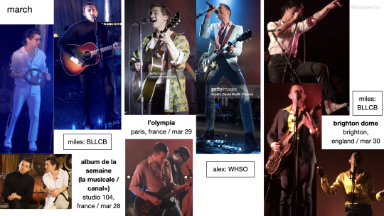
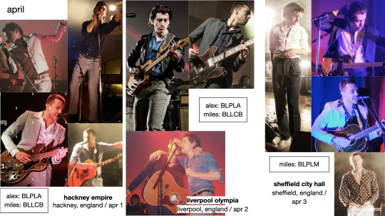
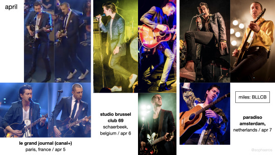
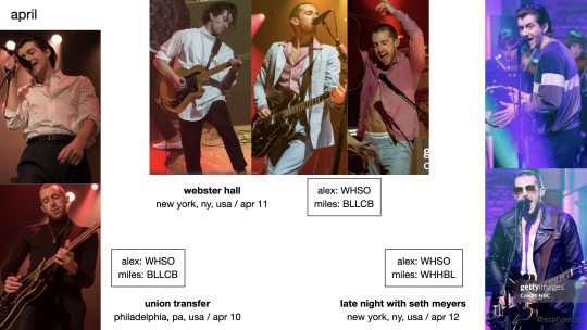
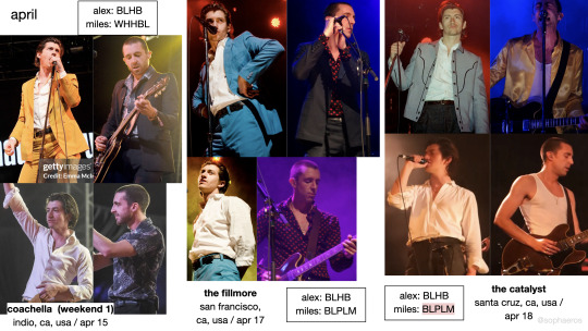
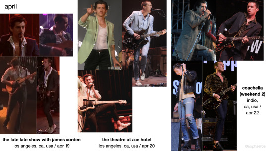
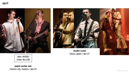
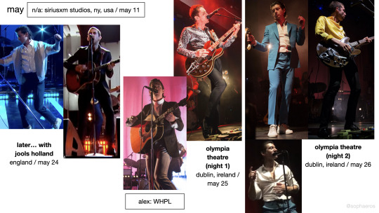
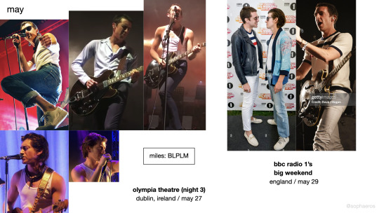
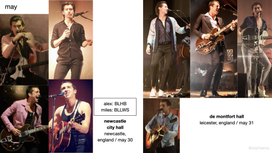
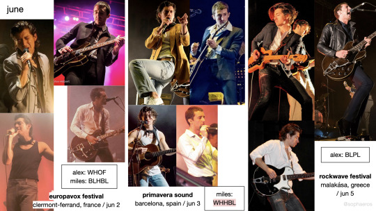

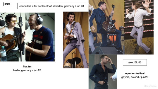
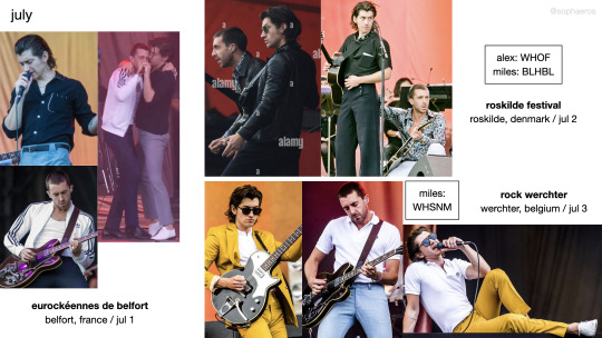
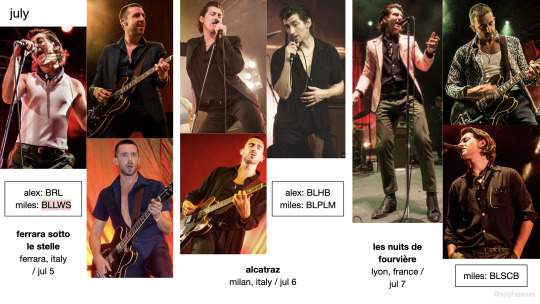
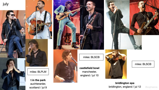
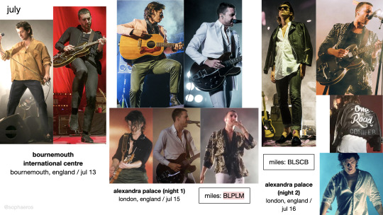
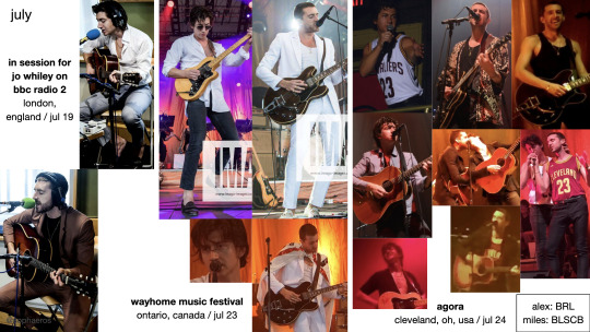
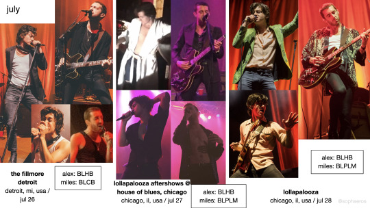
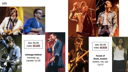
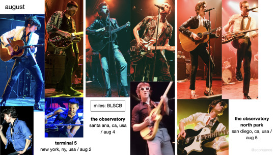
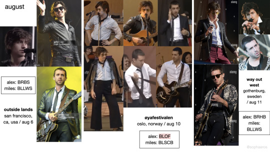
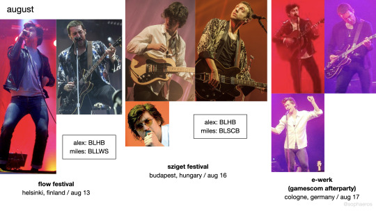
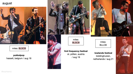
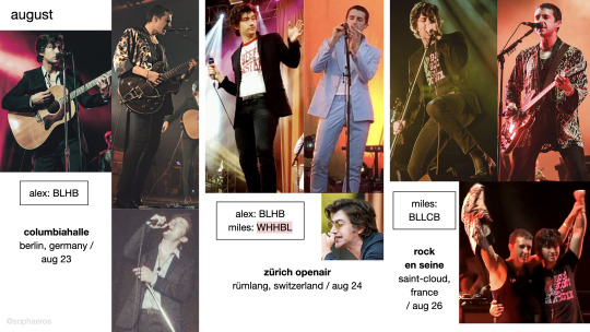
the last shadow puppets - everything you've come to expect: 2016 tour outfits — almost all clothes custom made by ray brown sources
#bands#tlsp#the last shadow puppets#alex turner#miles kane#eycte era#fashion#my content#honestly idk what to tag this im just so relieved it's done after 11 fucking months#a good portion of that time was spent not looking at the document to be fair but still#please click on the sources list btw i did mla citations ^-^for fun.#if anything's wrong or missing please let me knoww#i hope this. idk helps you identify what show a clip was from. which is my original intention with this#or appreciate how fucking many outfits they had during this goddamn tour#i know it's messy. i know. i could only gaf so much.#i felt so cringe adding my username in but just in case a slide gets posted somewhere else out of context (incredibly wildly unlikely)#i wanted people to know where to find the rest. in case they were interested. i dont know
208 notes
·
View notes
Text
2's comedic timing is through the roof
#2nd doctor#classic who#doctor who#who clips#and i've only seen 1 episode with actual footage in it so far. already screenrecording every good moment of his#in the 2nd clip of the compilation i love the way he asks it.#like. later doctors would instantly be like 'how dare you thats a dumb idea whats wrong with you'#but he has fun with it. hes like 'lol sure okay. i respect the vision. juuuuust one small problem though-'
173 notes
·
View notes
Text
One of the things we did right as a generation was bring back colorful hair clips …… I love colorful hair clips
#You just cannot go wrong w a lone colorful hair clip near ur hairline#They’re so fun to me#but I only rly incorporate them when my hair is straight bc they cannot handle my curls
79 notes
·
View notes
Text
near death experience
local science woman discovers her arch-nemesis was secretly ugly the whole time and TRIES TO BITE HIS FACE OFF

My favorite thing about Magolor is that he is a normal and well-socialized person with healthy formative life experiences who reacts to earnest, positive social interactions in a stable manner

#kirby#lrblev art#comic#sketch#magolor#susie haltmann#magosusie#susolor#magolor doesnt need professional help! professional help needs magolor!!!#susies hair clip is on the wrong side in the second img because i mirrored the sketches at some point and i only realized now okay!?#im NOT FIXING IT RIGHT NOW grrrrrrrrrrr grrr grrr bark#haha wow! its so crazy to be living you-know-where. wow that election sure was something. i think im going to draw pictures of a catboy
87 notes
·
View notes
Text
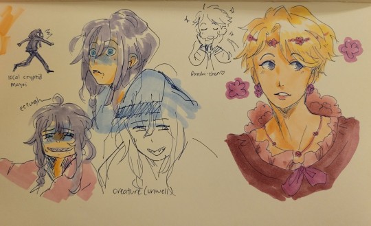
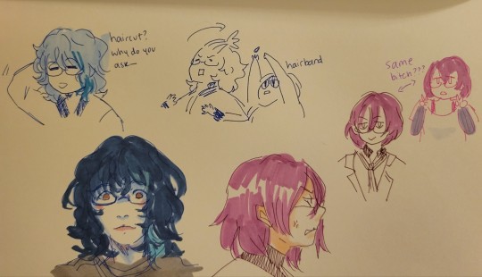
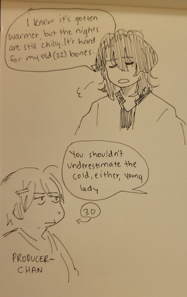
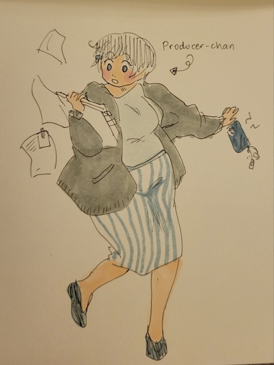
Ensemble Stars... so many new little guys in my phone... 🎶
#doodles#enstars art tag#ensemble stars#mayoi ayase#arashi narukami#rei sakuma#tsumugi aoba#ibara saegusa#gowther#oc art tag#for producer-chan of course#she's got one of my favorite work outfits on. i always feel so well put together in that one#also please tell me im not the only one in the ibara-gowther lookalike boat it was the first thing i thought when i saw him#I'm having fun. first day. first proper 10 pull on fancy mayoi banner and poof! there he was#what a character. somethin wrong with him (affectionate)#i want to put hair clips or headbands or hair ties in these boys' hair tho. so much covers their faces#those bangs in the way... how can you SEE#i say as if I'm not a chronic bangs-in-the-face haver#ah well anyway it's been a while but i drew something!!! i drew some stuff!!!!!#woohoo!!!!!#please enjoy the silliness
91 notes
·
View notes
Text
apples 🥺
#apples 🥺#was reminded of this clip bc of my lady jane#guildford loves apples#and I love how dennis says it#someone give him a hug#also I only noticed it today#I love that max is just nodding and agreeing with what dennis says like he has a point#let horses buy apples#dennis tyde#max bennett#chris bean#harper's locket#the goes wrong show#tgws video#mischief theatre#mischief comedy
125 notes
·
View notes
Text


The Strangers: Chapter 1 (2024, dir. Renny Harlin)
Froy Gutierrez as Ryan Madelaine Petsch as Maya
Please do not save, repost, or edit these gifs for any reason, use the reblog button instead. Also please do not interact if you’re a celeb rp blog or if you write taboo content on your blog, thank you!
#IT'S THE DAY!!! I'm still clipping the movie I took a break but 4k my beloved <3#the strangers chapter 1#the strangers: chapter 1#the strangers chapter 1 spoilers#the strangers: chapter 1 spoilers#froy gutierrez#froygutierrezedit#madelaine petsch#madelainepetschedit#mpetschedit#fgutierrezedit#horroredit#filmedit#userdevon#gifs:mine#(also needless to say if you're a dick on my gif set I will block you#new post button is free - use it <3)#edit: also I literally only noticed the font color on the last gif is wrong - second line is also Maya. Blogger just had an oppsie#corrected it in the op now but if you see the other version going around... my bad
124 notes
·
View notes
Text


ADKSBFKDKSLVJGH IT WORKS
#THIS WILL WORK ON ICHIBAN TOO DNKDNMFKFM#IT TOOK ME FOUR HOURS AND IVE STILL GOT TO IRON OUT SOME KINKS BUT#i literally just did this bc. i was bored 😭😭😭 and as a test run for the only mod that matters#ada speaks#blender stuff#ill release this when i make sure it doesn't clip 😭 there are a few spots that do and i need to test more thoroughly#i am. going to attempt something more ambitious next time. uh. yeah.#half of it is already figured out. but i want a really good dress that suits him 🤐#everybody who makes drag kiryu is wrong and here's why--#severely limited by available bones we may be but thats no excuse to give kazumi an unfitting outfit 🙃#its about the tattoo. i have my gripes#>tormented by hcs
66 notes
·
View notes
Text
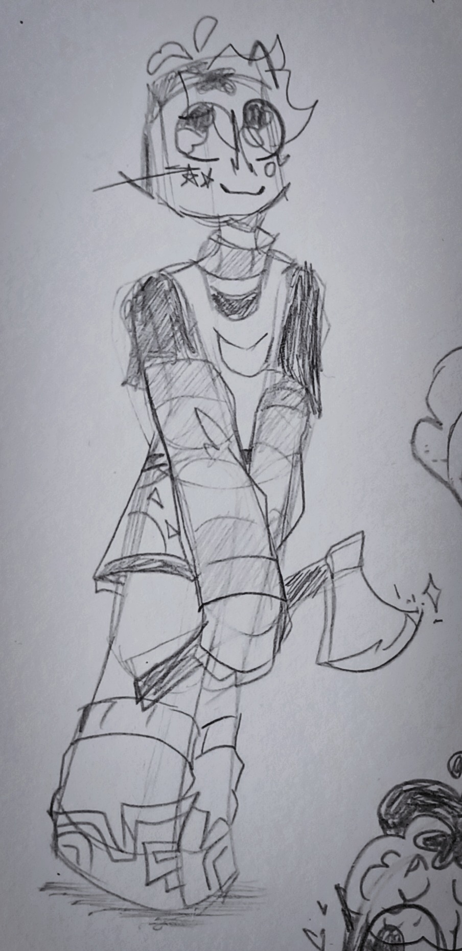
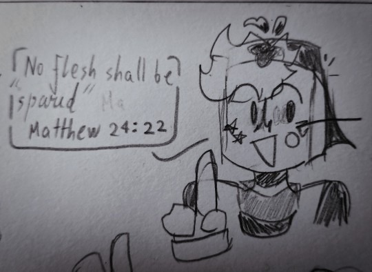
ominous and threatening sketchy ... sniffle ...
★ some extra stuff under cut :
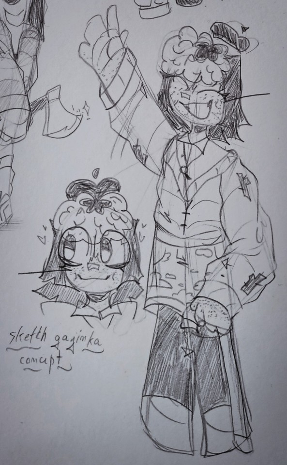
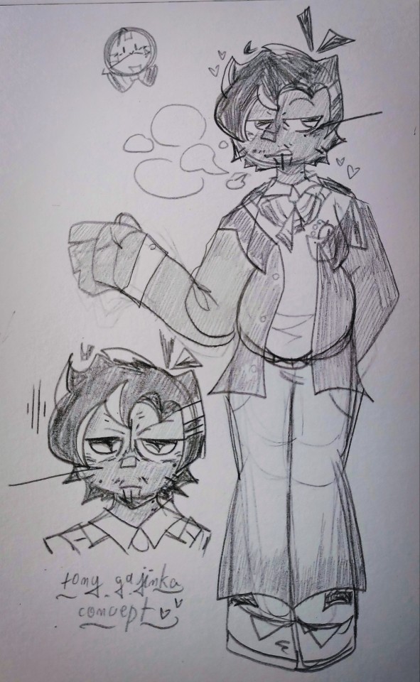
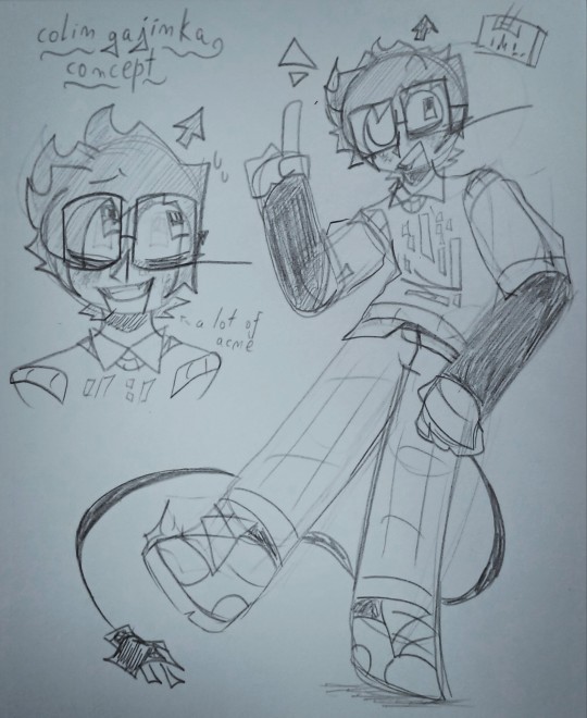
some concept drawingz i made for the little guyz of an unfinished fic of mine
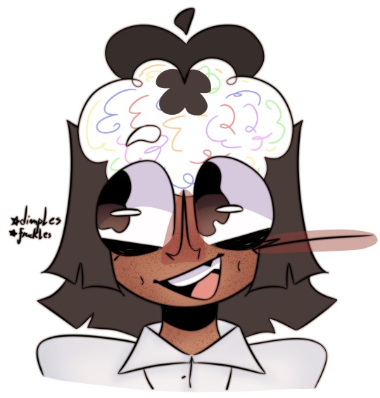
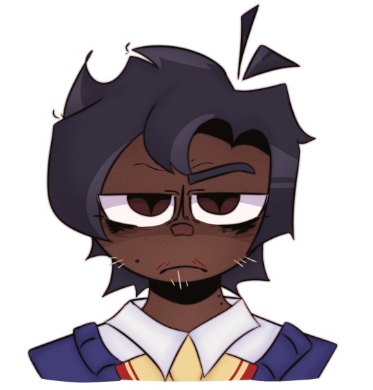
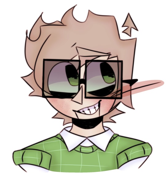
and headshotz that i redrew digitally
#the bit where sketch iz quoting a bible verse iz based on the jacksfilms reactbot#like . i can't watch a clip of that thing saying that without thinking “damn . sketchbook core” for some strange reazon#why . of course !!! itz cuz hez an angel who can do no wrong !!! my sweet sweet guardian angel !!!#and the first one waz like . made ironically#i waz gonna do a follow-up drawing that would be like “cloze your eyez . spooky ...” while i writhed in bed – y'know mouthwashing reference#but whatever . therez alwayz next time#im have mixed thoughtz on the humanizationz – i still feel like shit when i think about that unfinished fic#i might tweak them if i ever try to finish that thing ; i just wonder if they'd hate me for thiz#sigh#dhmis#dhmis art#dhmis au#high voltage au#dhmis sketchbook#sketch the sketchpad#dhmis hv sketchbook#^ hez the only one from the hv au actually included#dhmis tony#tony the talking clock#dhmis colin#colin the computer#honestly . i felt kinda awkward giving sketch dimplez – ive had people tell me to smile less becauze they make me look bad in photoz#and like . i get it . theyre right – i don't want them to have to put up with that too#i just really wanted to project smth of my own onto them#i did the same with my acne . but actually i really love my acne . it makez me look masc az shit#now all i have to do iz get tonyz killer eyebagz and facial hair and id be perfect ....#i dropped the ball with the digital drawing'z coloring huh ༎ຶ‿༎ຶ#well . what can you really expect from me#i dunno#like and subscribe and comment what your opinionz on the conceptz are and maybe i won't burn my house down !!!
26 notes
·
View notes
Note
im so thankful i found this account because i NEED to get this off my chest. it irritates me to my core and i dont think anyone else feels the same way.
STELLA'S DIALOGUE IS SO FORCED AND I HATE IT. i understand she hates her ex-husband for cheating and thats fine, but the way she talks about him and her tone when she does it feels so incredibly forced and it agitates me. i've known this since the first episode of season 2 and i'm pretty shocked nobody else has noticed this.
helluva boss WANTS you to hate stella, but they do it in a way where its being shoved down your throat in a "hey, look at this! isn't she SUCH a horrible person for hating stolas??? isn't she SOOOOO evil?!" kind of way. its fine if you make a character people aren't supposed to like, but if you do it in a way where people can tell its forced it doesnt work.
i believe stella has potential, and i think she'd be a great villain-like character if it weren't for the fact that when they make her talk about stolas, it sounds forced. it's literally nothing but mocking, hating, and making fun of him and it makes me want to bash my head into a brick wall. YES she is allowed to have hatred for him, but i don't want to hear it every fucking time she talks about him. it's repetitive, unnecessary, and pretty annoying if i'm being honest.
tl;dr: stella's dialogue whenever she talks about stolas feels incredibly forced and it's always pissed me off since she started doing it at the beginning of season 2.
sorry for the long rant, but this is something that has bothered me for a while and the new episode just fueled that hatred further.
You said it, Anon
#confession#I'm not the only (or the more popular) crit confession account but I'm glad you chose mine to air your grievance 👍#because I've come across a clip of the new episode (where she doesn't let Via take the call) and felt the exact same way#she's grating to watch but for all the wrong reasons#helluva boss critical
36 notes
·
View notes
Text

you have my soul, you have my heart ♡
#LUCY#Band LUCY#Shin Yechan#Choi Sangyeop#Cho Wonsang#Jo Wonsang#Shin Gwangil#LUCY fanart#take 2 because i'm a distaster and posted this on the wrong blog haha#still figuring how out to tag these lol#kitkatart#i did it!! it's finally done!! on time!!!#well maybe not on time but in time lol#2022 encore concert live clip of flare my love#flare really is one of my absolute favorite songs#no matter how many times i hear it i fall in love with it every time#but this version in particular is so magical :)#i was thinking i might make a few freebies of the individual member versions for the vancouver show#do you think people would like that? i've never made freebies before so i'm not sure!#i think i'd be too shy to post about it and then hand them out but we'll see haha#okay back to chores and concert prepping again#i cannot believe i'm going to two lucy concerts and then have a work conference like two days after#i was only going to go to one concert but was convinced to go to a second at the last minute. to be fair it didn't take much convincing#this really did take forever but part of that is probably bc i haven't drawn anything real in like more than a year#also was i testing the procreate layer limit or was the procreate layer limit testing me lol#okay i'm done now i'll stop yapping :D#i hope you're all doing well!!#UPDATE: i did pass these out as freebies and also to the lucys AHHH#I will never be over seeing them live and getting to meet them oh my gosh#they were soooo amazing and so so so sweet 🥺 other walwals at the concerts were also so nice!!
65 notes
·
View notes
Text
That one club scene in Identity:
Tron: This is where programs come to get wasted.
Beck: Wait, look!
*points to Galt who runs and disappears*
Tron: I don’t believe it!
*they run closer but there are too many programs*
Beck: Oh no, now we’ll never find it!
Tron: Hold on, I got an idea.
*they both walk over to a club DJ program*
Tron: Hey can I turn off everything but the black lights?
Club DJ program: Sure I don’t care about anything.
Tron: Cool!
*he turns off everything and the music stops, leaving the black lights on*
*the entire club lights up white, with crazy stains everywhere and the programs in the club light up white too, including Lux, Beck and Tron obviously don’t light up*
Beck: WOW THIS PLACE IS GROSS!!
Tron: Yeah the Occupation was here last week.
#incorrect quotes#wayyy too long#i spent way too long on this#oh well#i’m cringe but i’m free#beck tron uprising#tron uprising#tron#tronblr#btw this dialogue is based on a Family Guy clip lmao#dirty joke sorry#literally saw that clip and my Tron brainrotted ass instantly went omg deleted Tron Uprising Identity scene/goofy#well that sure explains why sirens have white suits /goofy#moon rambles#and yes I want to animate this someday LMFAO#btw I’ve only watched through Tron Uprising once so far#if I get some details wrong I’m sorry
23 notes
·
View notes
Text
Marceline is one of my favourite adventure time characters not because of her design or her personality or her backstory. but because she really encompasses the experience of being an adult with an old, fraying comfort stuffed animal that you love more than anything else in the world and no one really “gets it” so you are constantly having to downplay how stressed you are about losing it
#that sky witch episode just hits different. iykyk#no one understands the stress of being an adult with a comfort toy#marcy’s better than me because I never would’ve given up hambo for that portal#i’m normally peak PB defender supporting women’s wrongs but that clip causing discorse is the only scene in the show where I hated her#adventure time#hambo#marceline
151 notes
·
View notes
Text
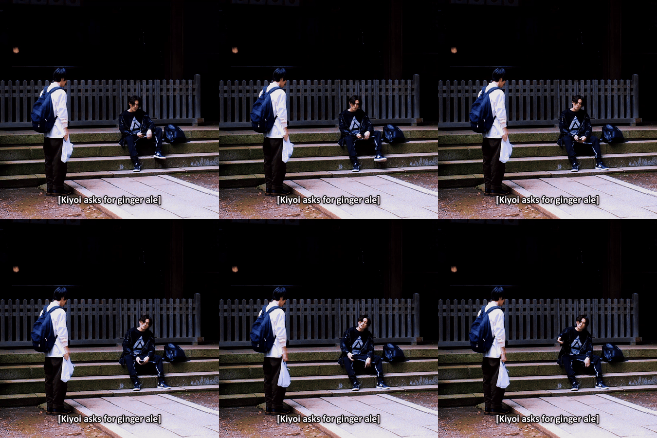
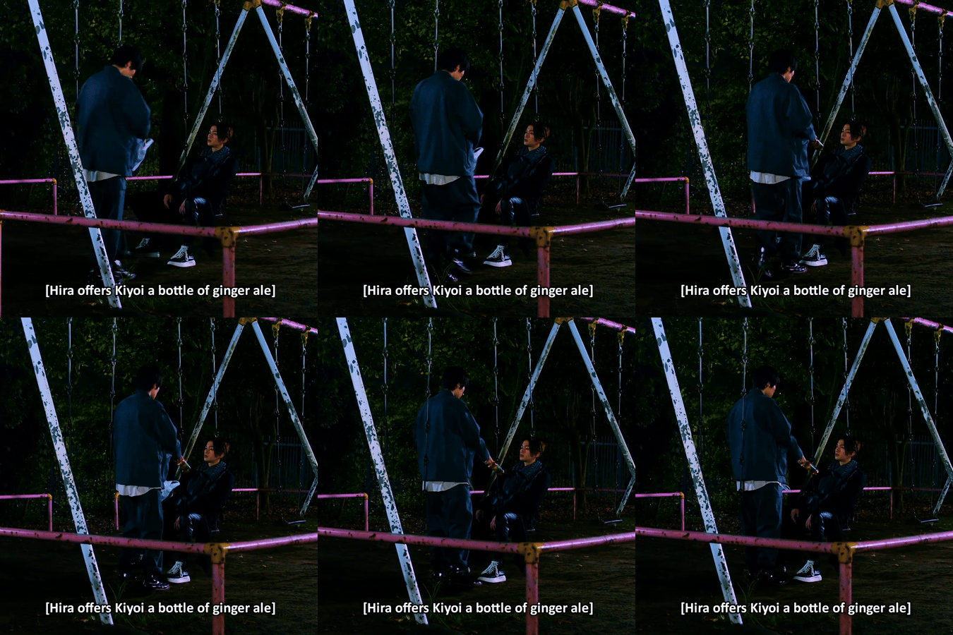

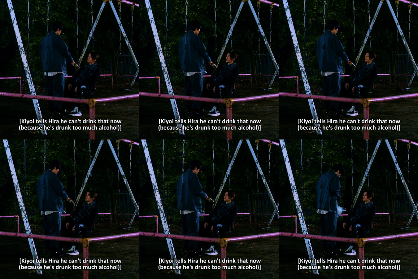
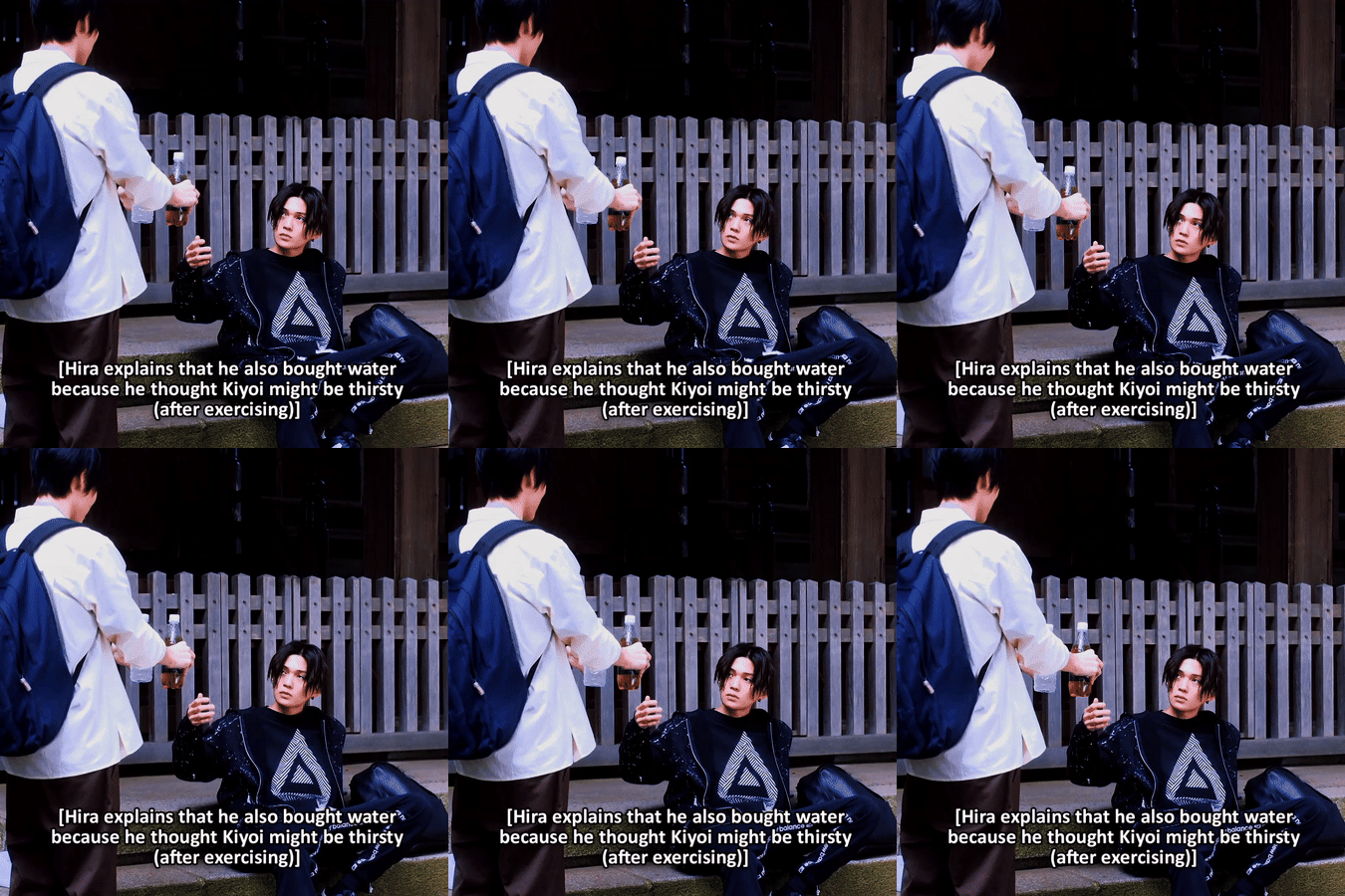

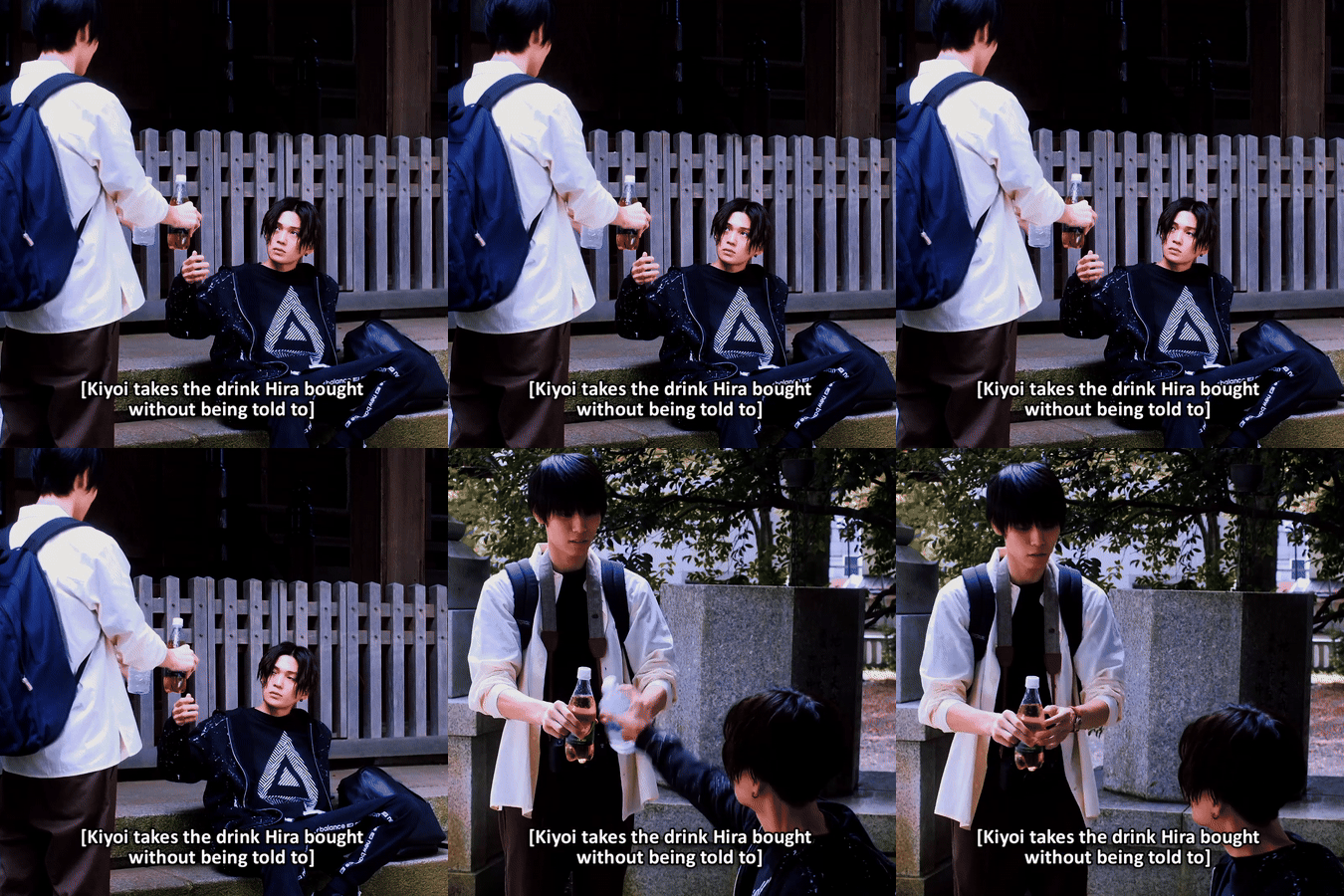
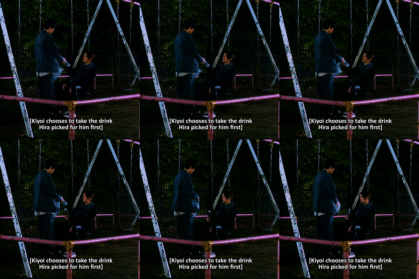
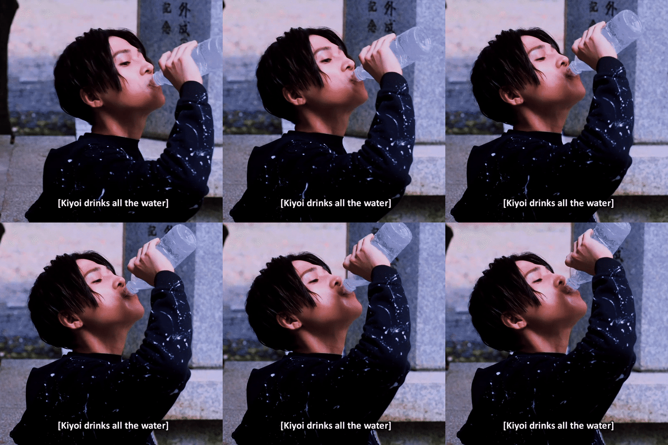
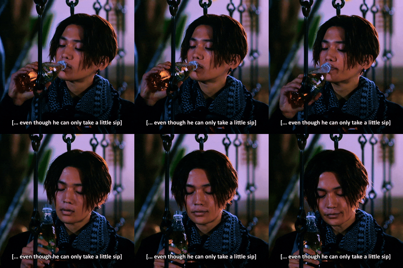
1x01 || 1x04
#utsukushii kare#my beautiful man#1x01#1x04#hira kazunari#kiyoi sou#parallels#gifset#*brace's#//#Kiyoi is so Not Normal about the things Hira does for him#about Hira looking after him and Hira taking his preferences into account#Hira thinking about what will make Kiyoi the happiest and what will make Kiyoi the most pleased#he's just so Not Normal about the way Hira cares about him and showers him with genuine undivided attention#and he's so thirsty for it he chugs it down faster than the bottle of water#///#guys I don't do this kinda thing very often (try to describe what's happening in a scene IN the gifs)#but I thought this time just the visuals and dialogue weren't enough (for you to understand the cause of all my screaming)#I might be wrong in a few of my interpretations though...#I think Hira might have brought water as well because he thought Kiyoi might be VERY thirsty#and not because water is better when you're thirsty...? I tried to leave it for open interpretation#also we don't know if KY asked HR to buy him ginger ale (although he may have done that out of embarrassment/to get HR out of his sight)#or if Hira did that because he thought Kiyoi was angry at him and he waited with a peace offering until Kiyoi was done with his practice#I left the ''without being told to'' because even if Kiyoi hasn't asked for ginger ale THIS time‚ he has asked before#but he never asked for water and he wasn't expecting Hira to get that for him because Hira *wanted* to#plus. in the 2nd scene I'm not sure why Kiyoi says he can't/won't drink ginger at first.#but I'm assuming it's because it might upset his stomach in its current condition? so he wants to‚ but it's better if he doesn't?#(also. the 2nd scene makes me think of that extra clip in which Hira asks Kiyoi why does he only drink ginger ale#and Kiyoi responds ''because that's what you give me'' 😪)
97 notes
·
View notes