#My fucking ass
Explore tagged Tumblr posts
Text
A cis woman is not any better or worse than a cis man,
stop pretending otherwise.
Stop trying to convince me that I'm somehow in community with you because your a vaginagirl or a fucking bleeder,
I don't care--whatever silly thing you use to define your womanhood.
I am not a part of your 'sex class',
we are not a community.
I am not your sister.
#to multiple people in particular actually#'sex class'#'oh your just a misogynist'#'cis women aren't capable of harm! its always cis men!'#my fucking ass#cis men hardly scare me#cis women are no fucking better
24 notes
·
View notes
Text
ah fuckles
reading through the official art book and saw THIS:

[ID: A screenshot of a digital illustration from the official Nimona Artbook. Everything is simplistic, minimalistic, and geometric. It features Meredith Blitzmeyer, a dark-skinned woman with long grey hair, shiny glasses that reflect all the light, so they appear opaque, a labcoat with a belt over it, and simple pants. She holds a purple beaker above her head with a smile. She stands behind a pink and white table. The background is purple with circles radiating outwards. the top of the background is geometric triangles and squares in shades of blue, white, brown, black and that appear like a medieval kingdom. end ID]
we could have gotten blitzmeyer in the movie everyone
i shall weep to myself in silence
(but I'm actually a bit glad they didn't put her in the movie: i can't fucking believe they thought she would be purple-themed. She's GREEN-themed. OK? GREEN. Her ultimate invention was NEON GREEN. YOU MOTHERFUCKERS. GREEN IS LITERALLY ON THE OPPOSITE SIDE OF THE COLOR WHEEL.)
#nimona#blitzmeyer#meredith blitzmeyer#nimona movie#nimona comic#spoilers#sorta#motherfucking fuckers#i can't believe they thought she would be purple-themed#pUrPle#my fucking ass#NIMONA dyed her hair purple in the second act of the comic to refer to her changing attitudes#so they should have themed NIMONA purple at the end or smth#not blitzmeyer#not. the literally most not-purple-themed character of all time
47 notes
·
View notes
Text
I NEED CONTENT OF POISON MUSHROOM AND ROCK MUSHROOM ITEM INVASION RIG HR THE FUCK NOW BUT IM TOO LASY TO DRAW I NEED THE TWO BOYS. I NEED THE SILLIES. I NEED TO PUTHTEM IN A JAR AND STUDY THEM. LOOK AT HOW SILLY THEY QRE LOOK.


HELP

i forgot i made this
HELP I NEED HEXF RKD RIGHT NWOW
#shitpost#all caps#tw all caps#cw caps#caps lock#tw caps#caps lock tw#silly gays#SILLY MUSHROOMS!!!!#what they doin?! bein gay?! 😂😂#on god#‘those are fucking objects’ gay ones at that#also#my fucking ass#idiot
2 notes
·
View notes
Text
Tried learning to code but then visual studio made me cry 👍
#Visual studio code#Microsoft#It's so frustrating#For no reason#Then all the sites are like#“Its so easy and good and the only con is that it is a little slow sometimes”#My fucking ass#Coding#Can anyone help?#Cause i already downloaded it#Frustration#Learning#Its like that tiktok thing#“I try not to kill myself”
3 notes
·
View notes
Text
and gods forbid you choose pan because no pan doesn't exsist, it's transphobic and there's only bi!
People will be like "you can be every gender at once, your gender can be a metaphor, gender binaries are fake, you can do whatever you want forever, and also you have to pick one (1) of the four acceptable sexualities approved of by the council"
6K notes
·
View notes
Text


could you imagine trying to navigate this bar drunk, this is the 9th circle of hell
71K notes
·
View notes
Text
If y'all really want to improve usability, bring the old editor back. Allow us to backspace when we accidentally hit enter on mobile. allow us to block quote multiple paragraphs without creating weird and ugly spacing issues.
Without the "quote" post type differientiation, one of my favorite stylistic features of my theme is gone. I want it back.
The editor is difficult to use not intuitive. Even the cool things about it like colors. Since you can't change colors while you're typing, you have to type your thing, highlight it, and select the color, it messes with the flow of creating a post.
I am typing this on mobile and I accidentally hit enter when Ibwas hitting the period. Insteaf of backspacing, where my thumb was already at, if I really needed to stay on that line, I'd have to go up there and click on it. That's bad usability.
If you want to improve usability, give us the option to search our DM's.
If you want to improve usability my GOD bring back the "all notes" tab so we can more easily track which reblog made a post pop off. the reblog map has no names, nor can you click on it so it's useless to tracking your post and the success of said post. This helps for conversation tracking too.
Since we're talking about conversation tracking... Let's talk about prev tags. Now, I hate prev tags, but people use it all the time. If you want to improve usability and conversation tracking, make it so I can click on the url of the person that is being reblogged from and find their reblog again. Wouldn't be hard, cause you just broke it.
If you want to improve customization and usability, allow us to fully opt out of tumblr live, which none of us wanted, asked for, or use.
If you want to improve usability, GET RID OF THE FUCKING LIGHTBOX. Which literally took away the ability to PAUSE. you know, you can pause on tiktok and instagram and youtube and twitter... but not on tumblr!!!! What????? this makes videos unusable. And we have told you we hate it, y'all habe ignored it tho.
If you want to improve customization, LET LINKS TAKE YOU TO SOMEONE'S CUSTOMIZED THEME IF THEY CHOOSE!!!! I worked on that for hours, but I'm likely the only one who ever sees it when i need to find something on my blog. Fucking why???
If you want to improve usability, let us choose which polls to subscribe to and get pushnnotifs about so we can casually vote in polls we don't care about that much without getting push notifs spammed.
Tumblr’s Core Product Strategy
Here at Tumblr, we’ve been working hard on reorganizing how we work in a bid to gain more users. A larger user base means a more sustainable company, and means we get to stick around and do this thing with you all a bit longer. What follows is the strategy we're using to accomplish the goal of user growth. The @labs group has published a bit already, but this is bigger. We’re publishing it publicly for the first time, in an effort to work more transparently with all of you in the Tumblr community. This strategy provides guidance amid limited resources, allowing our teams to focus on specific key areas to ensure Tumblr’s future.
The Diagnosis
In order for Tumblr to grow, we need to fix the core experience that makes Tumblr a useful place for users. The underlying problem is that Tumblr is not easy to use. Historically, we have expected users to curate their feeds and lean into curating their experience. But this expectation introduces friction to the user experience and only serves a small portion of our audience.
Tumblr’s competitive advantage lies in its unique content and vibrant communities. As the forerunner of internet culture, Tumblr encompasses a wide range of interests, such as entertainment, art, gaming, fandom, fashion, and music. People come to Tumblr to immerse themselves in this culture, making it essential for us to ensure a seamless connection between people and content.
To guarantee Tumblr’s continued success, we’ve got to prioritize fostering that seamless connection between people and content. This involves attracting and retaining new users and creators, nurturing their growth, and encouraging frequent engagement with the platform.
Our Guiding Principles
To enhance Tumblr’s usability, we must address these core guiding principles.
Expand the ways new users can discover and sign up for Tumblr.
Provide high-quality content with every app launch.
Facilitate easier user participation in conversations.
Retain and grow our creator base.
Create patterns that encourage users to keep returning to Tumblr.
Improve the platform’s performance, stability, and quality.
Below is a deep dive into each of these principles.
Principle 1: Expand the ways new users can discover and sign up for Tumblr.
Tumblr has a “top of the funnel” issue in converting non-users into engaged logged-in users. We also have not invested in industry standard SEO practices to ensure a robust top of the funnel. The referral traffic that we do get from external sources is dispersed across different pages with inconsistent user experiences, which results in a missed opportunity to convert these users into regular Tumblr users. For example, users from search engines often land on pages within the blog network and blog view—where there isn’t much of a reason to sign up.
We need to experiment with logged-out tumblr.com to ensure we are capturing the highest potential conversion rate for visitors into sign-ups and log-ins. We might want to explore showing the potential future user the full breadth of content that Tumblr has to offer on our logged-out pages. We want people to be able to easily understand the potential behind Tumblr without having to navigate multiple tabs and pages to figure it out. Our current logged-out explore page does very little to help users understand “what is Tumblr.” which is a missed opportunity to get people excited about joining the site.
Actions & Next Steps
Improving Tumblr’s search engine optimization (SEO) practices to be in line with industry standards.
Experiment with logged out tumblr.com to achieve the highest conversion rate for sign-ups and log-ins, explore ways for visitors to “get” Tumblr and entice them to sign up.
Principle 2: Provide high-quality content with every app launch.
We need to ensure the highest quality user experience by presenting fresh and relevant content tailored to the user’s diverse interests during each session. If the user has a bad content experience, the fault lies with the product.
The default position should always be that the user does not know how to navigate the application. Additionally, we need to ensure that when people search for content related to their interests, it is easily accessible without any confusing limitations or unexpected roadblocks in their journey.
Being a 15-year-old brand is tough because the brand carries the baggage of a person’s preconceived impressions of Tumblr. On average, a user only sees 25 posts per session, so the first 25 posts have to convey the value of Tumblr: it is a vibrant community with lots of untapped potential. We never want to leave the user believing that Tumblr is a place that is stale and not relevant.
Actions & Next Steps
Deliver great content each time the app is opened.
Make it easier for users to understand where the vibrant communities on Tumblr are.
Improve our algorithmic ranking capabilities across all feeds.
Principle 3: Facilitate easier user participation in conversations.
Part of Tumblr’s charm lies in its capacity to showcase the evolution of conversations and the clever remarks found within reblog chains and replies. Engaging in these discussions should be enjoyable and effortless.
Unfortunately, the current way that conversations work on Tumblr across replies and reblogs is confusing for new users. The limitations around engaging with individual reblogs, replies only applying to the original post, and the inability to easily follow threaded conversations make it difficult for users to join the conversation.
Actions & Next Steps
Address the confusion within replies and reblogs.
Improve the conversational posting features around replies and reblogs.
Allow engagements on individual replies and reblogs.
Make it easier for users to follow the various conversation paths within a reblog thread.
Remove clutter in the conversation by collapsing reblog threads.
Explore the feasibility of removing duplicate reblogs within a user’s Following feed.
Principle 4: Retain and grow our creator base.
Creators are essential to the Tumblr community. However, we haven’t always had a consistent and coordinated effort around retaining, nurturing, and growing our creator base.
Being a new creator on Tumblr can be intimidating, with a high likelihood of leaving or disappointment upon sharing creations without receiving engagement or feedback. We need to ensure that we have the expected creator tools and foster the rewarding feedback loops that keep creators around and enable them to thrive.
The lack of feedback stems from the outdated decision to only show content from followed blogs on the main dashboard feed (“Following”), perpetuating a cycle where popular blogs continue to gain more visibility at the expense of helping new creators. To address this, we need to prioritize supporting and nurturing the growth of new creators on the platform.
It is also imperative that creators, like everyone on Tumblr, feel safe and in control of their experience. Whether it be an ask from the community or engagement on a post, being successful on Tumblr should never feel like a punishing experience.
Actions & Next Steps
Get creators’ new content in front of people who are interested in it.
Improve the feedback loop for creators, incentivizing them to continue posting.
Build mechanisms to protect creators from being spammed by notifications when they go viral.
Expand ways to co-create content, such as by adding the capability to embed Tumblr links in posts.
Principle 5: Create patterns that encourage users to keep returning to Tumblr.
Push notifications and emails are essential tools to increase user engagement, improve user retention, and facilitate content discovery. Our strategy of reaching out to you, the user, should be well-coordinated across product, commercial, and marketing teams.
Our messaging strategy needs to be personalized and adapt to a user’s shifting interests. Our messages should keep users in the know on the latest activity in their community, as well as keeping Tumblr top of mind as the place to go for witty takes and remixes of the latest shows and real-life events.
Most importantly, our messages should be thoughtful and should never come across as spammy.
Actions & Next Steps
Conduct an audit of our messaging strategy.
Address the issue of notifications getting too noisy; throttle, collapse or mute notifications where necessary.
Identify opportunities for personalization within our email messages.
Test what the right daily push notification limit is.
Send emails when a user has push notifications switched off.
Principle 6: Performance, stability and quality.
The stability and performance of our mobile apps have declined. There is a large backlog of production issues, with more bugs created than resolved over the last 300 days. If this continues, roughly one new unresolved production issue will be created every two days. Apps and backend systems that work well and don't crash are the foundation of a great Tumblr experience. Improving performance, stability, and quality will help us achieve sustainable operations for Tumblr.
Improve performance and stability: deliver crash-free, responsive, and fast-loading apps on Android, iOS, and web.
Improve quality: deliver the highest quality Tumblr experience to our users.
Move faster: provide APIs and services to unblock core product initiatives and launch new features coming out of Labs.
Conclusion
Our mission has always been to empower the world’s creators. We are wholly committed to ensuring Tumblr evolves in a way that supports our current users while improving areas that attract new creators, artists, and users. You deserve a digital home that works for you. You deserve the best tools and features to connect with your communities on a platform that prioritizes the easy discoverability of high-quality content. This is an invigorating time for Tumblr, and we couldn’t be more excited about our current strategy.
65K notes
·
View notes
Text

#daddy k!nk#daddy's good girl#daddy’s babygirl#desire#intimacy#intimate#lust#passion#black and white#passion and desire#kiss here#kiss#couple goals#ass slap#couple#sitting#slap my ass#fuck#seduction#casais#intimate moments
24K notes
·
View notes
Text
The movie Wicked is proof that any source material can be vastly improved by simply making the intense female friendship much gayer + the mutual male love interest both wildly bisexual and lowkey down to just be their third
#i can’t believe they improved Fiyero’s character so much just by making him intensely into both women at the same time asdakdga#Elphaba: *screaming at people*#Glinda: yeah baby you tell em! my girlfriend is gonna kick your ass!#Fiyero: god I’m so fucking turned on right now why am I so turned on by this#ideal dynamic tbh#i have other much more meaningful thoughts on this movie but this was so funny I had to post it#It was a very very good movie ngl#wicked#wicked movie
15K notes
·
View notes
Text

#good omens#good omens 3#at least gaimans not involved in the production i guess#sigh#FUCK!#aziracrow#it better be 30 minutes of making up and 60 minutes of making out#crowley#aziraphale#my loud ass voice#david tennant#michael sheen
9K notes
·
View notes
Text


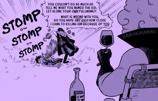
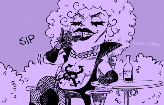
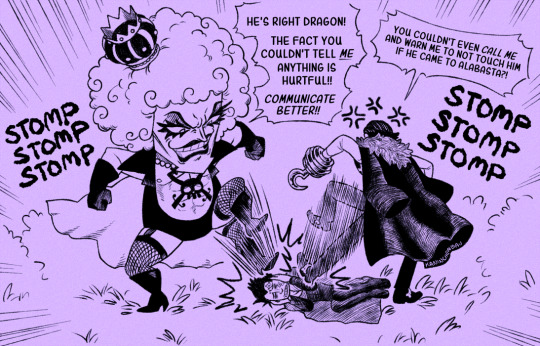
A h-heartfelt reunion..?
Bonus

#Sir Crocodile#Monkey D Dragon#Emporio Ivankov#Dragodile#Crocodad#My art#One Piece#We're not gonna talk about the work I should be doing rn I have Severe Procrastinitis and I'm doing my best okay#Alternative version where it was both Crocodile and Garp beating Dragon's ass before Iva-chan joined in but that was too much effort lmao#I'm a believer in Dragon being a Wind Logia so don't worry guys he is 100% taking this beating intentionally#He knows what he did and he's dealing with the concequences of his actions. With grace.#You know I realize Iva-chan should be two whole meters taller than Crocodile but we're just gonna ignore that#Look Iva-chan taking Crocodile's side and being like ''Crocoboy is right you fucked up bad Dragon'' brings me joy#And for real I've been wanting to draw this for months. But never did because I had other shit to do. Which I still do#But. You know. Sometimes you need to draw a shitpost. It's ✨ self-care ✨#And appearently One Piece shitpost comics have become the thing I draw for myself on occassion
17K notes
·
View notes