#My first ref sheet in this style
Explore tagged Tumblr posts
Text

NEW BORZOI REFERENCE SHEET 🫴✨️
#My first ref sheet in this style#On my most autistic girl evor#I prefer this way more over my old ref sheet#Gave her characteristics I've wanted her to have forEVER#digital art#art#artists on tumblr#furry art#furry artist#furry community#furry fandom#gay artist#samhaven#digital artist#furry#furryart#my art#artwork
21 notes
·
View notes
Text

What a beautiful wedding

#jimjamjommeron#jimmy ludijk#qsmp#q!slimecicle#q!foolish#foolish fanart#foolish gamers#charlie slimecicle#slimecicle#qsmp fanart#first time drawing foolish#he's quite fun to draw#might make a ref sheet for him in my style#lemme know if that's something I should do/post
77 notes
·
View notes
Text


Been working hard on some refsheets for Artfight. 😤
#artists on tumblr#art#digital art#oc#ocs#original character#original characters#oc reference sheet#refsheet#ref sheet#oc ref sheet#furry#anthro#anthro bunny#anthro rabbit#bunny#rabbit#furry art#anthro furry#anthro art#zebra stripes#my ocs#spirituallupineart#'why are you posting them together' i think it's funny how very differently styled they are#transgender#night theme#hearts#heart markings#gonna do my best for artfight it'll be my first year doing it!#bunny rabbit
15 notes
·
View notes
Text
posting my turtle designs so i'll hopefully draw them consistently pt. 1
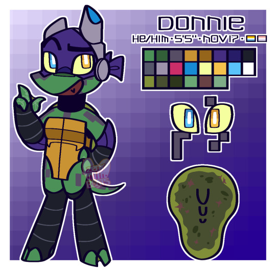
the title pretty much sums up what's going on with these goobers. the designs are about 5-6 months post-invasion (with the invasion happening in late March) + include personal headcanons like scars, birthdays, heights, etc. y'know, normal ref stuff
so, uh, enjoy? 👍🏾
up next ↓:
[Raph | Leo | Mikey | Height Chart]
#wasn't sure if i wanted to give them digitigrade legs or plantigrade at first#i went with digi cause i think they look better with the turtles in my style#but it's possible that'll change at some point#anyways i baked a cheesecake with my dad a few days ago + was feeling motivated 💪🏾#just realized that the close-up for the markings on donnie's right eye are wrong#rottmnt#rise of the tmnt#rise of the teenage mutant ninja turtles#save rise of the tmnt#tmnt#teenage mutant ninja turtles#rottmnt donnie#rottmnt donatello#tmnt donnie#tmnt donatello#character reference#character ref sheet#reference sheet#zero drawings here
33 notes
·
View notes
Text
turnarounds and character sheets for class


#first 2 are my style#second 2 had to be in rubber hose style#so i used olive oyl as a ref :3#art#homp does art#drawing#digital art#homp does digital#homp ocs#character design#character sheet#character turnaround#homp dhaca#rubber hose#popeye#dnd#dnd art#dnd oc#dnd oc art
1 note
·
View note
Text
It's almost July so 'tis the season, and I haven't really seen an information post go around despite Tumblr being full of artists and OCs, so for those not informed -
What is Art Fight?
copied from https://artfight.net/info/about , illustrated by Queijac

Art Fight is an annual art game that lasts for 1 month. [ Note: usually takes place during July ] Users can register on the site to join in. Each year, participants are split into two teams to which they are assigned randomly.
[ Illustration: a furry character colored blue and a human character colored red brandish art supplies at each other like weapons. ]

Players "attack" people of the opposing team by making art of original characters you choose belonging to members of the other team. You are free to use almost any style (see Attack Rules section of the rules).
Your team receives points based on what you create for the other team with each attack.
[ illustration: the blue furry character shows off a red drawing to the red human character, who is bending down to see it and looks excited. ]
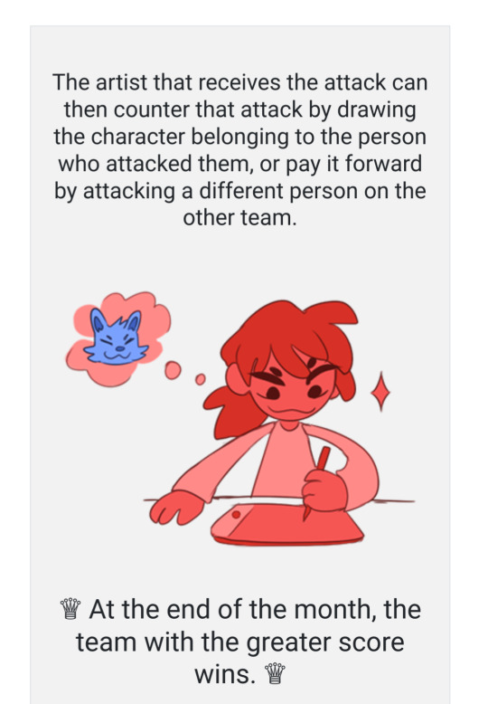
The artist that receives the attack can then counter that attack by drawing the character belonging to the person who attacked them, or pay it forward by attacking a different person on the other team.
At the end of the month, the team with the greater score wins.
[ Illustration: the red human is sitting at a table with drawing tools in front of them thinking of a blue character. They are holding a pen and looking determined. ]

But remember, while there are point scores, the real goal is to celebrate characters with your fellow artists. Art Fight is about giving and recieving amazing art. ♥
If you're interested in joining up before this year's event period starts (or during it! You can join at any time) come and take part here ! The teams for this year are going to be revealed on the 23rd, so you have plenty of time to add your characters and scope out potential targets :3c
Extra info:
Digital art and traditional art are both accepted, including sculpture, fursuits, 3d modeling, animation, and more!
There is sometimes a bit of site downtime at the start of the event as traffic spikes. This is normal, is briefer each year, and will resolve after a bit. I recommend downloading a few ref sheets in advance if you plan on drawing from the first minute
Don't start art early! It's against the spirit of the thing to sneak in extra work time. If you're just doing it to give people art, you can always make it a normal, no-points-involved gift!
Character reference images and attacks created have to be non-sexual. The site has content filter guides and submission rules that go into more detail about what is and isn't allowed!
Don't have character references finished? Here's a quick guide on what's best to include at the minimum.
my profile is @ canonkiller owo
3K notes
·
View notes
Note
this may be too much to ask but do you have a tut on how to draw turtles in the mm style?? (or just at all my ass is suffering. i need to draw tmnt but my brain doesnt know how :c)
Sure ! I’ll try my best to explain (I made one after the first tottmnt trailer came out it’s outdated so I’m remaking it)
If you’re talking abt mm movie style , I don’t think I’m skillful on them enough to make an art tutorial 😭💔they’re hard for me to draw too
Info on keep reading :D !!
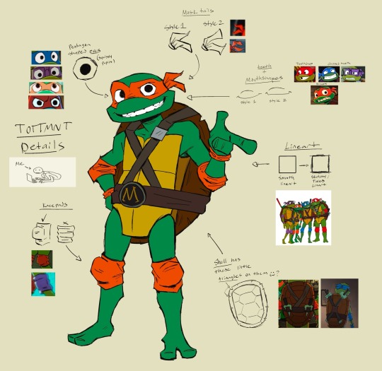
- I take hundreds of screenshots + download promo art and a create collage of it , use it as a ref sheet. I study on the shapes , proportions , and style of each character.
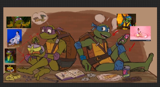
- Then I pick an image from the pile to see if it’s a good pose (if not, I find poses from other resources to draw) or expression I want to use as reference for my drawing
- then I start sketching , adding the sharp details . Clean up on lineart and color later
Other Notes :
- Tales of the TMNT artstyle uses sharp sketchy lines to give it that sketchbook artstyle
- In some frames from the show, Their eyes are pentagon shaped & pupils are not fully colored in. Mask tails have different styles too
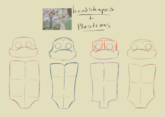
- Each turtle not only have different headshapes , they have different plastron shapes too (these are fugly examples I accidentally deleted the OG layer of this and had to redo it LMAO)
- Looking at Tales crew art also rlly helps! (There’s a lot of them on the #/talesofthetmnt tag on insta & twitter)
the Tales of the TMNT artstyle is easy to nail imo , it’s like more of a simpler version of the rise of the TMNT artstyle if that make sense ?? That’s how I personally feel lololol
If you never drawn TMNT before , just go slow on your art process , look at references, & take your time . Draw the characters in your own style first if you want :] just to feel more comfortable and less stress trying to replicate the iteration’s style . overall , have fun <3
I usually suckkk at these art tutorial stuff but hope this helps :D !!
#tales of the tmnt#mutant mayhem#my art#tmnt#if there’s anything specific ur still curious lmk and I’ll do my best to answer ‘:D
210 notes
·
View notes
Note
I absolutely love these designs! and was just wondering what inspired them? I'm curious of what the plot's about, since everyone's species swapped
why not answer this question with another ref sheet(?) :3

I’d like to say, first and foremost, thank you very much for the love 🫶 i love getting asks and requests, these sillies live in my brain and drawing them is their rent
Second, i’m probably gonna keep plot talk on the DL unless i decide not to make a comic! Sorry :,3
Last but not least, inspirations. hooo boy this is a doozy
Firstly i wanna say i was inspired to make a comic specifically because of older ut comic dubs (Christmas party, handplates, Aftertale, etc) along with Scott Pilgrim and @akanemnon’s Twin Runes comic! (check them out i love twin runes a lot!!!)
The idea for the au is really just “What if the humans were monsters and the monsters were humans?” or, also “what if the (former) monsters were on the surface and the (former) humans were underground?” Classic Overtale plot!
Going in order, starting with AXIS, he’s actually one of the newest designs! i made him in my german class last week („•v•„U ) I wanted Axis to have a design change but remain a robot, maybe being more humanoid due to being made by a human! Changed his pipes and light bulb into what resembles hair and his wheel into roller blades!
Next up, Ceroba! i’ll be honest, i really don’t like Cerobas canon design that much. Love the colors but the short skirt and boots are not it, especially if she’s intended to be a more traditional japanese character. Like she’s not a magical girl, she’s in her 30’s?? Anywho, i made her prominently orange instead of pink (again, magical girl) along with lightening natural hair due to age and stress!
Clover. Clover Clover Clover!!! what do i even say about this precious little pup?! :3
I guess i could start with them being a Kitsune, of course, being switched with the Ketsukanes. Seeing as Ceroba is a mother and is often portrayed as taking a motherly role to clover, i figured a kitsune would fit them nicely! Along with being a cute, fun to draw, and curious troublemaker! I always like to remind myself that Clover’s just a kid.
Next up, Star! or, in this au, Stanley Sterling, the performative sheriff of a humble little town! i decided to switch up his poncho a little, for the sake of changing his design, gave him chaps (i like to call em pantaloons hoohoo!) and teal tassels for days! He’d prolly know more about cowboys than canon Starlo because, yknow, he lives on the surface!
Ah Martlet, or now, Marlette! but most just call her Marley. She has ~4 different outfits planned, a cozy, aviator style one for “Snowdin”, a sleeveless shirt with her flannel round her waist and a bandana for “the Dunes” and that flannel over her shoulders for “New Home”! along with a tee and pj’s for the epilogue. Her outfit is easy to manipulate so it only stays the same so often. Also, talon boots! ;]
And Dalv! Poor fella stayed a monster for the plot 😿 but i changed his design so he’s got a jacket similar to the one he has in Snowdin in uty but a whole lot smaller lol, along with a Batty pendant, a red vest and shoes and carved down horns! poor fella :(
Feel free to ask questions about these guys i am more than pleased to talk about them
#undertale#undertale au#undertale yellow#overtale yellow#overtale#c!overtale#clover undertale yellow#ceroba undertale yellow#dalv undertale yellow#starlo undertale yellow#martlet undertale yellow#axis undertale yellow#Axis c!overtale#ceroba c!overtale#clover c!overtale#stan c!overtale#marley c!overtale#dalv c!overtale#artists on tumblr
175 notes
·
View notes
Text
Here’s the other form of my Heartful in Style! Precure fan-fancure! The series is of course made by the amazing @aceaeite so go check them out!
Heartful in Style! Precure!
“Ready to wear! Sassy and Alluring - Cure Jewel!”

For this form, I went with a Agejo Gyaru aesthetic! Her Petite Fairy for this Form is Clutch!
She meets Clutch before Barrel. While Clutch fits the stylish persona Suzuka has built up, she is not able to transform with her at first, and this confuses Suzuka as she thinks they’re a perfect fit. Its takes a while for them to bond and transform.
Bonus, I have a better ref sheet for her Civilian Form!

Suzuka Tachibana
Suzuka is a very confident and slightly dramatic gyaru girl. She spends most of her time shopping, has a passion for coordinating outfits with different styles, and is a goofball in private. However she tends to act like she’s more notable than she actually is, which can make her seem like she’s a bit condescending. Coming from a family of models, and a model herself, she’s been given this image of a stylish fashionista that’s out of people’s league, which makes making real friends difficult for her.
I really enjoy making artworks based on this wonderful fanseries, so I hope you like them! And once again, go follow @aceaeite for making this fanseries in the first place!
Byiieeeee~!
#art#black artist#alli’s ocs#magical girl#precure#precure fanseries#fancure for a fanseries#pretty cure fanseries#aceacite’s fanseries#fanfancure
234 notes
·
View notes
Text
DESIGN DEEPDIVE:
OCTAVIA KRANKENSTEIN
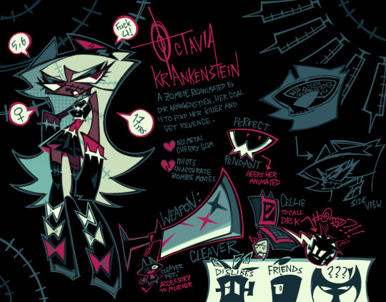
due to popular demand, here is my first DESIGN DEEPDIVE, where i explain all my little character designs! character design is really important to me, so i hope you guys appreciate this TwT
this deepdive goes over octavia krankenstein, the main character of my series reassassination. firstly, we'll go over shapes and color pallete, the first things you notice when looking at most character designs.
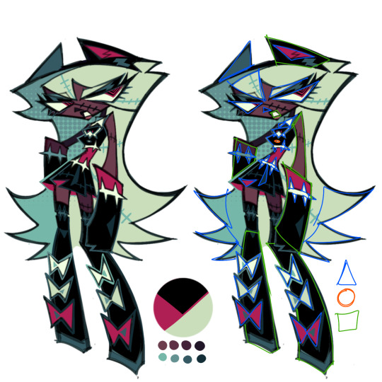
when it comes to octavia's shapes, we can see that she's primarily made of squares and triangles. this establishes two things about her right off the bat:
- she's sharp, and personality wise, probably dangerous and active.
- she's strong, and possibly stubborn.
however, a detail that i want to point out is octavia's singular circle, in the form of a button on her dress under perfect pendant. i've added this button to indicate that behind the sharp, tough exterior, octavia has some empathetic traits. the location of the button is also important, being at the heart. (this exerpt is from my own personal factfile for octavia):
"...Octavia is a particularly self-contradictory character - while she's apathetic to the idea of killing, she can't stand the idea of harming innocents - meaning she often feels the need to justify her homicidal tendencies."
the color pallete of octavia is also important. as you can see above, she's made up of two colors and a tone - black, scarlet, and seafoam green. i want to focus on black and scarlet here.
when it comes to black, i think it's an interesting color both technically and in terms of character. black was used to give octavia's design the vibe of an executioner or medieval assassin. it blends into the night, and hides bloodstains, so it makes sense for octavia to wear it as an assassin. however, this is juxtaposed by flashy red details, which indicate several things about octaiva -
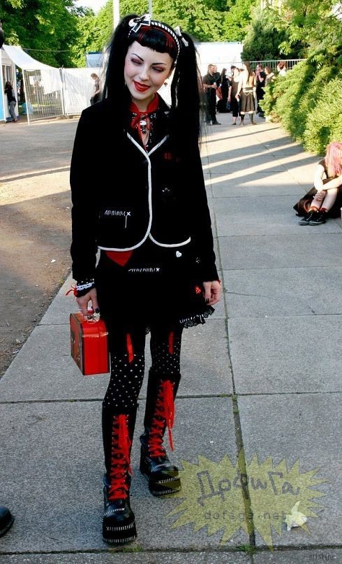
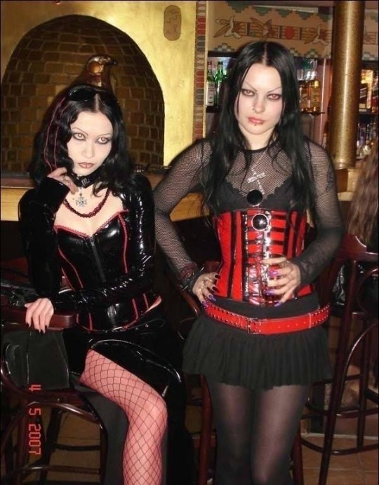
- she cares a lot about fashion and the way she looks, even if it isn't functional. the style of clothing that octavia wears is heavily inspired by 2000s "mallgoth" and the general nu-metal scene, which was often red and black clothing. (cybergoth was also a small inspiration!)
- octavia is a character with a lot of freedom. this might seem like a stretch, but in color language, red indicates action, confidence, danger, passion, and power, along many other things. in canon, octavia's dress was given to her by another character (dr. krankenstein) completely black, and then octavia edited the dress herself to include red details. this on its own might seem like nothing, but the thing about octavia is that her design is complimentary to another character's; vivica de la crux.
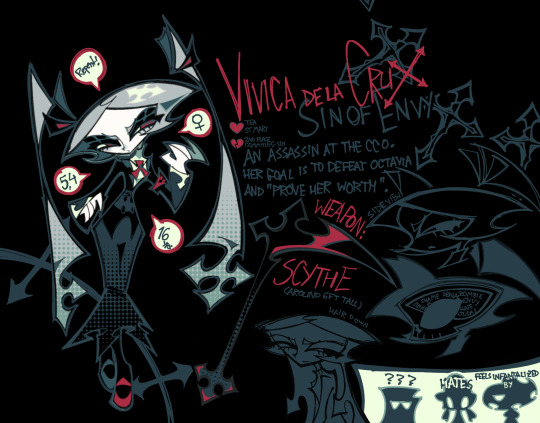
vivica is a character who wants freedom, but has next to none, to say the least. therefore, her "red" qualities (passion, freedom, etc), are stifled, so she has very little red in her design compared to octavia. side by side, you can see that their designs have a strong contrast in this regard.
- and lastly, octavia is vulnerable in that she wears so much of her personality literally on her sleeve. while octavia may seem stoic and mysterious in terms of character, and possesses strong physical strength, she lacks social awareness and struggles in that regard, being a social outcast within the story.
alright, now it's time to go over body type, hair and outfit! these are all pretty important in my opinion.
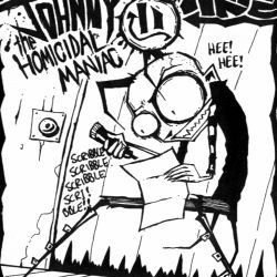
firstly, body type. octavia's heavily exaggerated thinness which is actually inspired by that "scene kid" artstyle that you've probably seen before, and 90s/2000s cartoons and comics in general (SPECIFICALLY the art of jhonen vasquez, who made invader zim and JTHM)!
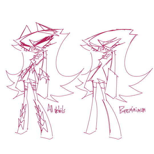
of course, octavia's hair gives her design more depth and volume, and a strong silhouette - one resembling a ghost or spiky monster. as you can see in her ref sheet, there are 3 spiked ends on either side of the hair. in fact, there are a lot of matching pairs of threes in octavia's design, aren't there?
- three bottom eyelashes on either eye - 6 in total
- three bows on either boot - 6 in total
- and of course, three hair spikes on either side - 6 in total.
that's right! octavia's design hides a secret 666, which relates to her alternative name - experiment-666 - and the fact that she's literally seen as a demon to the clear crucifix org, the antagonists of the story.
but let's look at octavia's outfit entirely. or maybe not? the thing about octavia's design is that i wanted it to be one where you could deform and modify it in various ways, and no matter how many details you remove, it's still clearly octavia. kind of like hatsune miku!
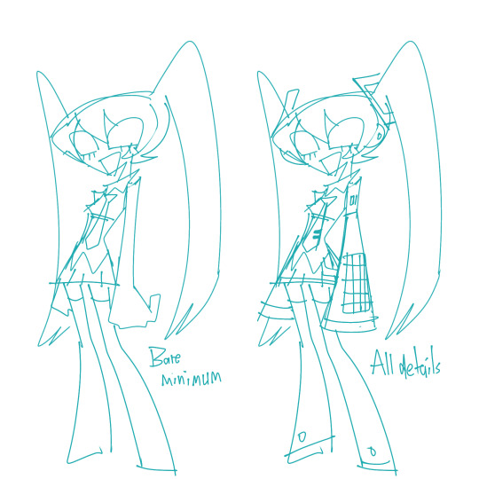
in the end, octavia is supposed to feel like a character from the 2000s, rather than just one based off of 2000s alternative culture. i don't know if i really succeeded with that, but i'm still proud of her design regardless. if you read all of this ramble to the end, thank you so much! i might do more design deepdives for other characters if people are interested. you can even request specific characters of mine if you'd like!
#zeno's art#ocs#reassassination#octavia krankenstein#design deepdive#long post#very long post#PHEW#had to leave some details out because they're related to spoilers or too obvious#eg pendant is at octavia's heart because it keeps her alive#and the stitch motif#but other than that this is basically everything about octavia's design#and a little bit of vivica too
161 notes
·
View notes
Text


Check it out, I found some ref sheets for one of my favorite Star Wars: The Clone Wars characters!! 😊🫶

It was so much fun to work on this! I've been meaning to update Brea's ref officially for a while now, and for some reason I thought it'd be fun to imitate the style of the clone wars character sheets. I think it turned out pretty good, and I'll probably draw some more show-accurate style stuff soon! (taglist + some detail ramblings under the cut)
So, one of the neat things I did in this ref sheet was sort of break up the segments for Brea's hair! Both to help future artists I may commission get a better understanding of it, and to have an idea of how it might be 'rigged' for animation, inspired by a note I saw on Anakin's season 7 ref sheets.
The progression of her outfits is something I've thought about a lot too, and I think it reflects the animation style over the years and in some cases her personality!
Seasons 1-2 had very limited animation, so her outfit isn't very complicated and doesn't have a ton of moving parts. Her iconic waist drapery is missing so they wouldn't have to animate it, and her outfit is...visibly kinda slutty as you can see 😂 given what outfit they put Aayla Secura in, and that Ahsoka's stupid little season 1 tube top was George Lucas's input, I wouldn't put it past them to give Brea the same treatment.
Seasons 3-6 see her iconic outfit I've drawn her in the most! Her waist fabric is more for show than anything else, though it comes in handy as a blanket or a towel in a pinch. Her affinity for gold accents is most apparent in this outfit, as well.
In season 7, I think they would wanna show off just how far the animation has improved by giving her an even more complex outfit! I thought the two-tone top looked nice, as well as the cutouts on the sides of her abdomen. She also has her midriff covered for the first time, which reflects her emotional growth and maturity over the years in my mind. Her gold accents are slightly more subdued, but they're still present, she keeps a boob window and lack of sleeves to show that it's still the same Brea at heart!
Taglist♡: @me-myself-and-my-fos @tiny-cloud-of-flowers @sunstar-of-the-north @dearly-beeloved @adoredbyalatus @changeling-selfship @crushes-georg @cherry-bomb-ships
@rosieaurora @rejaytionships @in-true-blue-love @tropicalgothships @little-miss-selfships @hotrodharts @cupiidzbow @frozenhi-chews
@limey-self-inserts @candyheartedchy @space-sweetheart @halsinkisser @clancyismylover
#artfarts#self insert#self ship#self insert community#self ship community#self insert art#self insert oc#reference sheet#character sheet#oc refrence sheet#oc ref sheet#star wars#star wars the clone wars#star wars tcw#tcw#the clone wars ref#jedi oc#star wars jedi#🌟 brea callisto 🌟#OUGH NOW TO DO KEPLER NEXT#im lowkey considering making this my pinned#unless i just ADD it to my pinned along w my self insert lore guide#which i am working on 👀#im going FULL HAM BANANAS on it too#my fwiend axel inspired me!
70 notes
·
View notes
Text
Hello! I'd like to say thank you so much for following me! It really means a lot. I never thought I'll get this far, to be honest. But you guy's support really motivated me! You guys are just so nice!
And this is VERY late but here's the DTIYS for my 100 followers goal!

YEAH I KNOW IM LIKE SUPER LATE AND IM REALLY SORRY BUT I GOT BUSY WITH IRL STUFF 😭😭
BUT THAT'S A LOT OF FOLLOWERS- I'M ALMOST AT 200 ALREADY—
TBH I DON'T KNOW WHAT TO DO WHEN I REACH 200 FOLLOWERS
Well anyway- enough of me ranting, I'll just show you!

Here it is! Yes I know it doesn't have shading and lighting. I'm planning to have my art style not having those (maybe? i might change my mind in the future)
By the way, this is important but there would be no art prizes because of two reasons!
First reason, I already do art requests, so it would be kinda pointless for this to have art prizes... /lh (and even though it's closed rn, I'm planning to reopen art requests soon ^^)
And my second reason, this DTIYS is just for fun! :D
Also here's my horrible ref sheet for Crust. And make sure to use the Underground version of him!
Now for the guidelines and rules:
• You can change the perspective, pose, and the background! Go crazy!
• If you don't want to draw the gaster blaster, you can draw flaming sharp bones or red sharp bones (or you could do all of them, but it's entirely up to you! ^^)
• You can also add more gaster blasters/bones!
• Traditional or digital, whichever you prefer! ^^
• Don't use AI or Gacha (sorry moots who like gacha 😭)
• And lastly, use the tag #spookz100dtiys and tag (@) me!
• Don't trace D:
86 notes
·
View notes
Text
My Elliott drawings process (and art styles) from past months...


[1st pic: my *very* first attempt on drawing him (Jan 30th) | 2nd pic: my first ship art of my farmer and elliott (Jan 31st) | 3rd pic: attempt on rendering him (Feb 3rd)]


[4th pic: my farmer x elliott animatic :3 (Feb 12th) | 5th pic: my attempt of him for my personal photocard lol (Mar 19th) | 6th pic: simple ref sheet of him (Apr 21st)]


[7th pic: more art style practice teehee (Apr 30th) | 8th pic: finally using actual references lol (May 3rd) | 9th pic: simple doodle(??? (Jul 8th)]
And finally my recent... (Aug 27th)🧎♂️

I have a lot more... go check the elliott tag in my acc lol
I'm not kidding when I say i STRUGGLED to draw him (I still am) I am not used to draw men,, I usually draw cartoony guys with my silly cartoony art style... but I learned to draw beyond that just for the sake of him 🧍♂️
I am getting the hang of it though! but still struggling at times... 😭 and seeing my progress on drawing him, this year alone makes me feel... proud-ish?
A little more fact about me: I got into Stardew on late January this year (I am still newbie :3). At first I was going for either Shane or Penny but then... I saw the sight of him on the beach. I never expect to get THIS obsessed over a character... he changed me 🙏
Hehe a random post but i feel like making it ehehehehe 👉👈
58 notes
·
View notes
Note
hi! i saw your post saying that you would draw anyone’s wof oc for free if they provided you with a ref sheet and i was wondering if maybe you could draw my wof sona? 🥺👉👈 she was my very first oc i ever made (when i was ten) so she’s kinda basic but i love her and would love to see her in your style! i have no artistic talent whatsoever and can’t draw a ref sheet, but i made her using one of the roblox wof games and here she is! the glasses and necklace are very important parts of her character, so if you could include them in the headshot, that would be great! of course, you don’t have to draw her if it’s an inconvenience, just do whatever you’re comfortable with and have a great day!


Aw its no big deal! Thank you for submitting her!
43 notes
·
View notes
Text

Luigi Ref 01
First page of the reference sheet of Luigi, drawn in my art style. It briefly shows Luigi is keeping himself warm under his cape :)
Luigi © Super Mario, Nintendo Artwork drawn in my art style
#fanart#video games fanart#nintendo#cartoon art#digital art#mario fanart#super mario fanart#super mario bros#super mario#luigi fanart#luigi#luigi nintendo#luigi mario
35 notes
·
View notes
Text


I started drawing proper reference sheets for my OC 4 months ago and only just finished them last week, so PLEASE check out my new set I made for Jayce my beloved motorcyclist robot assassin! He has multiple identities and I adore him :>
If you're curious about his story check out his tag on my blog, I've drawn him lots! I'm also putting extra details about his ref sheets under the read more.
ID in ALT text!
DETAILS:
-Jayce's body is a combination of solid metal and soft vinyl that's padded to feel like flesh over his internals. He can change this on a whim exchanging parts (in many ways 😉), but personally likes being able to be "cuddle-able" for reasons he won't explain. If he's "injured" he bleeds a blue glowing fluid, but he cannot "bleed out". He has a sort of false healing factor that repairs on the spot.
-while he can change up his clothes, he's very particular to his style and attached to wearing his usual. He's picky and doesn't like being told what to do, so getting him to change is... difficult. He has a preference for leather over others.
-Jayce's main identity is technically a wanted criminal assassin, so he has a hard time casually being out and about wherever he's recognized. thus he's always on the move. As for his "Daytime" persona he uses for LEGAL racing, "bluejayy" is completely opposite to Jayce in a lot of ways- openly friendly, follows the rules, and is a good sport.
-Bluejayy, his persona, is used to participate and enjoy celebrity status and stardom but with limits- he always makes sure to avoid winning first more than once in a while, opting to purposefully place within the top 5 instead. He also rarely ever makes off-track appearances, making himself an 'enigma' people can never find outside races usually. He avoids sponsors who aren't non-profit, and doesn't like being under contract under anyone if he can help it.
-wings in his world are common, however flight capable wings are rare and expensive- outside of how difficult they are to maintain, you need to be registered to have them for safety and legal purposes (even if avoiding the law it paints a target on you big time). Thusly, he NEVER uses them in his other persona (bluejayy). Flight capability while uncommon is useful for his assassination purposes; not for hiding.
-Jayce's main bike is a custom that while it looks heavy and slow was made for endurance and maneuvering. He often is working to constantly improve its capability and comfort. It looks like him because he's rather vain. It can seat two people, though nobody yet has been allowed to ride it with him outside dire circumstances.
-Bluejayy's bike is a typical speed based cycle for racing- light as possible with as much power as possible. He customizes this bike frequently too, finding it amusing to make it look like his persona.
54 notes
·
View notes