#Mostly use Krita now
Photo


Some phone doodles I’ve accumulated in exam waiting rooms
#I still have one more exam so maybe I'll add another one. who knows#Doodle Dilemma#Haven't drawn with my finger for a while so it was nice to do these#Also on autodesk sketchbook which. again. been a while#Mostly use Krita now
0 notes
Text

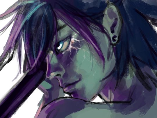
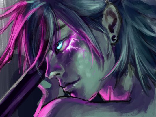
"I think we can help each other out!"
reference images


gosh the color palette in these is great
#wheucto#art#bfdi#tpot#bfdi fanny#tpot fanny#bfdi one#tpot one#xfohv one#FINALLY ITS BEEN COMPLETED AUGH. i'm going to explode now#it was so great it vaporized my computer/silly/hyperbole (krita was actually pretty slow though. mildly annoying)#it was too big of a file to be uploaded to tumblr. i had to compress it <///3#tpot 12 spoilers#i now realize the purple i used is closer to like... a brownish color thats kind of just the faded color in between dark blue / bright red#- orange but thats okay#colors weehooo#also i wanted to try something more painterly#its kinda funny how originally i was mostly just thinking of coloring one and like most of my time was spent doing things other than that.#and then when i colored (shaded? highlighted? i did the shadow as a base color) it was like. super quick lol
48 notes
·
View notes
Text
once again debating trying out another program
#the bin#hated krita. just doesnt work for me. firealpaca is genuinely great but i think i need something with a bit more to it#not even for the stuff i post. i havent posted any of the art im struggling to make in firealpaca bc im just unhappy with it#maybe i just need to lean the program better but i honestly dont wanna put in effort to learn a program that doesnt have a lot of features#thats what i like about firealpaca most is its a very simple easy to use program#well idk what one to try out. i think ill maybe give a free trial if some less expensive ones a go and see how i like it#firealpaca is dear to me weirdly. idk. i just remember making really shitty art and animations with it when i was 11 on my touch screen#laptop and it feels happy that im making so much better stuff with it now. i wanna learn to animate properly but im not good at it#i havent been drawing much lately bc my room is a mess but im gonna clean it today so hopefully that mostly fixes it#once my sister moves out i should be back to normal. i miss drawing all the time :/#sorry im rambling here again. nobody cares abt this lol. but ig nobody sees these usually anyway so it doesnt matter
0 notes
Note
Sorry to ask but what brushes do you use (or maybe I should start with art program?? idk) Sending good vibes your way and have a nice day :)
I mostly use Photoshop! there are better + cheaper ones out there, but for various academic/career/"well now I'm used to this one" reasons I've stuck with it. :') I have also used Clip Studio Paint, which is a much more artist-friendly program, and I hear Krita is a good free one!
I'm super picky about brushes, so a lot of my favorites come down to "they just...FEEL right"; in particular I like lines that have a little texture to 'em and a very specific sweet spot of responsiveness/pressure sensitivity. your mileage may vary!
free brush recs:
Matt's Painting Set (click through to the rest of the store for a Procreate version/more free Procreate brushes)
sketchupnfries' Storyboard Brushes
paid brush recs:
Alex Duval's Pencils Garden (Sharp-N-Thin my beloved...)
LP Inking Brushes (also available in CSP + Procreate versions)
happy drawing! 🌟
#how do art#i don't do rendered paintings and i don't like too much pressure sensitivity so that rules out 99% of ps brushes#i am VERY specific :')#someday i will find an sbp brush that feels Right to me and also doesn't inflate file size 80000% because of textures#and someday i might find a million dollars just laying on my doorstep#one of these is more likely
172 notes
·
View notes
Text
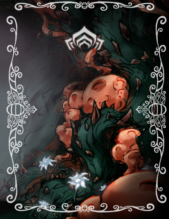
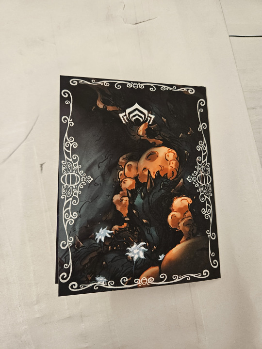
(edited to fix page 3, oops!)
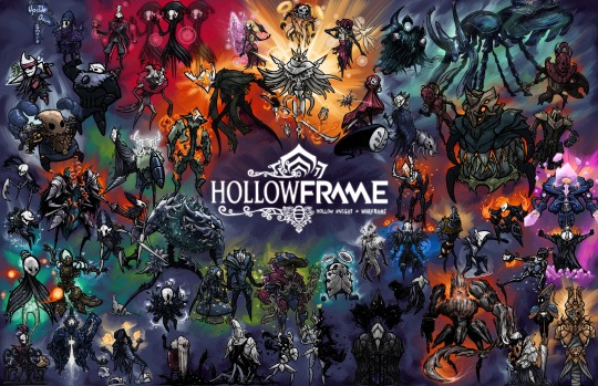
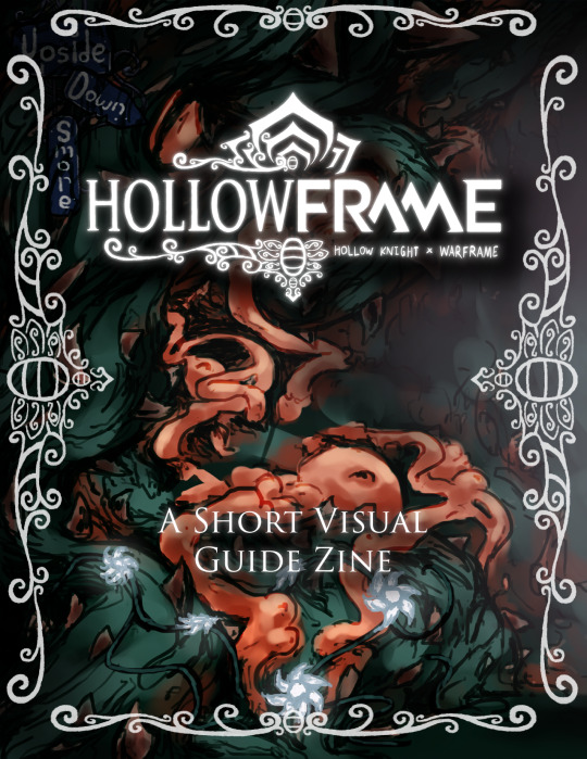
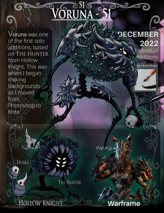
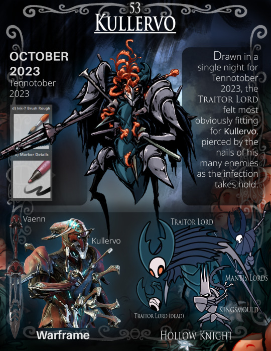
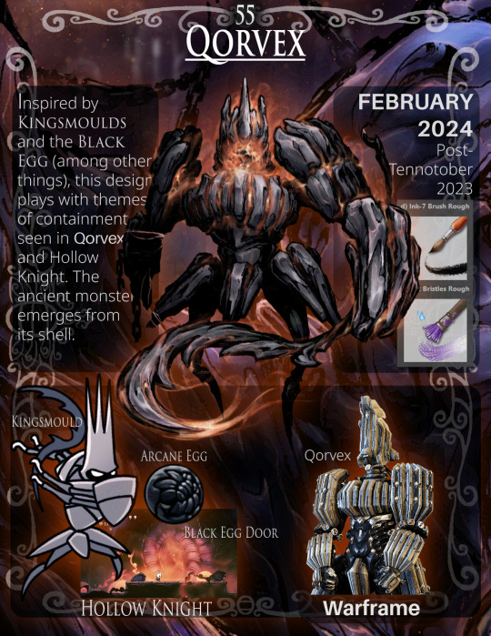
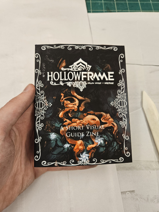
Hello! Here's a Hollowframe zine I made for my 2D design class final last week!
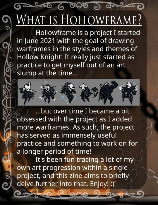
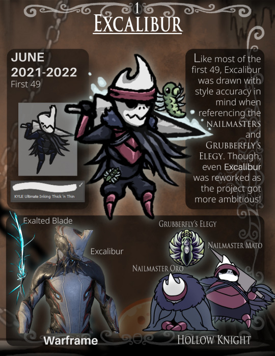
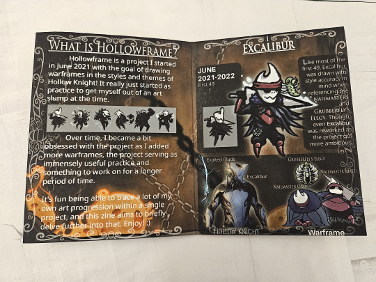
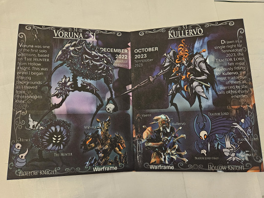
We basically got to make an 8-paged zine + poster designed for a double-sided 11x17" sheet of paper about anything we wanted, so I elected to just reuse stuff I already drew for my ongoing Hollowframe project since I was already buried under other assignments (though I still ended up putting way too much effort into it lol, I even remade the full group arrangement!)
The idea was to split the timeline of the Hollowframe project into four rough "phases", take a warframe from each, and then condense a bunch of info about the design I drew for them into a page each.
Hollowframe tag!
Google drive link with high quality pdfs, pngs, and more for printing and whatever! :) (and send me pics if you actually print it!!)
Pics of the irl folded zine and more under the cut!
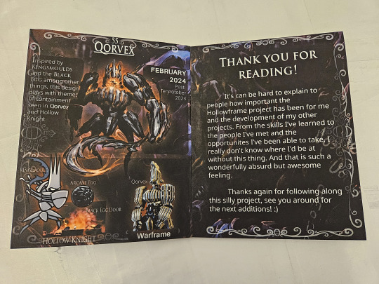
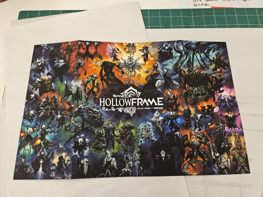
And here's an unfolded view of all of the pages:
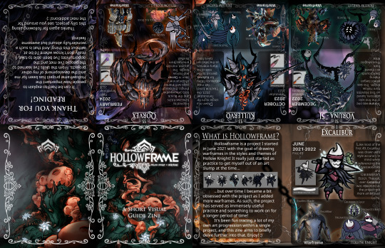
Feel free to try printing and folding it yourself! (here is a random zine folding tutorial I found: https://zineopolis.blogspot.com/p/h.html) (meant for 11x17" paper but idk maybe you can make a really small one lol)
I used Photoshop for the page backgrounds, Illustrator to arrange the pages themselves, and Krita to rearrange the full group image.
Pretty happy with how it turned out! I'm honestly mostly glad I finally got an excuse to remake that full group arrangement cause man that dull bluish gray background was not doing it for me anymore lol (though now it's 11x17" rather than 16:9 ratio so maybe not as good for desktop backgrounds but idk if that matters that much? idk i might adjust it back to a 16:9 ratio if people really want me to)
Anyways that's it for now bye bye :)
#warframe#warframe fanart#art#my art#UpsideDownSmore's art#hollowframe#krita#photoshop#illustrator#hollow knight#hollow knight fanart#wf tag#zine#art zine#i kinda dig the format and almost want to continue it somehow but i'm losing access to illustrator in a few days#so probably not lol#gonna be busy with other projects anyways now that the semester is over#like hollowframe dante :)
245 notes
·
View notes
Text
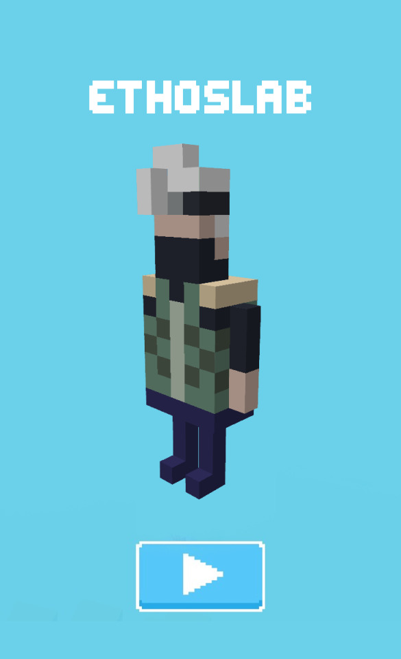
Hermit-a-Day May, day 17: EthosLab. Today's style/medium is the mobile game Crossy Road. I'm gonna be honest, this was my backup style and mostly a joke, but my first choice was not working out and I didn't have time to fiddle with it. Crossy Road is essentially just a modern Frogger, so it fits what Etho's been up to this season (at least, I think--I've never actually played the game). Details and references under the read more!
Materials/software: Blockbench for most of it; I exported the image to Krita to add a background and clean up the details.
References: I primarily based Etho's features on two of the developer insert characters from the Australian update, Ben Weatherall and Andy Sum. I borrowed the play button from a screenshot of the game and hand-wrote the font pixel by pixel, referencing several different screenshots.
This was my first time using Blockbench and I went in completely blind, but it was actually pretty intuitive! I was pleasantly surprised. I'm realizing now that I made Etho's legs a bit too short but it's fiiiine. I think that's... about all I have to say, actually. This piece was mostly a "do it for the meme" kind of thing, but I am proud of how much it looks like the source material.
#hermitaday#hermit a day may#hermitcraft#hermitcraft fanart#ethoslab#ethoslab fanart#...technically#my art
269 notes
·
View notes
Note
Hi uh,, kumzorg. I watched your 'you're too much' video on youtube, and I think it is really cool. I am really interested on how you did the filters for the backgrounds, as in; what program you used and what filters you applied.
Thanks for your time reading this, bye :D!
ok, first thing i have to admit is im really bad with colors so i rely on effects very often, be it level correction or posterisation or whatever, but i hope my explanation will still be of value to you ^^;
long post ahead
for that video every bg except the first one was taken from google maps, so their quality was always high and crisp, which i DONT like

for example first one I took from Shinsei Kamattechan MV "Michinaru hou e": (神聖かまってちゃん - 美ちなる方へ (youtube.com), and the compressed quality looked very nice when applied with tons of effects on it (My apologies to Noko for erasing them (m > <)m
So I'll go with example of another picture I already used, and scale it down

First I correct the levels and contrast so that details that I need pop out more

Then I use krita feature called "Gradient Map", which has a really nice feature that lets you do dithering with transparency

I copy the original picture and now for the second one I simply posterise it

I join the two new ones together, I usually use whatever effect I feel like but I personally really like the one called "Combine Normal Map"

now i copy the original picture AGAIN, and blur it with different constrast levels this time

I use Gradient Map on it again, this time with different dithering settings and color

I combine it with the previous one whily applying effects like Overlay or Burn

Now i'm mostly done, i scale up this new image slightly so that pixels are blurred, for a more washed out effect (plus some additional effects if your heart feels like it)

I posterise it once more so that colors bleed together nicely and now im done!

Just put whatever 2d freak you want over it and what the hell is this now (ಠ_ಠ)
(My first inspiration was from Shizuku VN, it had really cool backgrounds which had dark uneasy atmosphere, so i can kinda understand the comments that said they got a mysterious and liminal feeling from the video lol)
112 notes
·
View notes
Note
Hey, so I really love Lore Rekindled, and the art is one of my favorite parts! The style, the coloring, the background, all of it is just so… smooth! I don’t really know how to describe it. Recently, I’ve been trying to replicate it, and I was hoping you would give me a few pointers. What brushes do you use for line art? How do you decided what to line, and what to leave blank? What about coloring brushes? Do you use smudge brushes? Whats, like, the step by step process? You don’t have to answer if you don’t want to! But any tips or answers would be great!
Ah thanks so much!!!
Here are the brushes! They're .abr brushes, so they should work in Photoshop, Clip Studio and Procreate :) (they don't work in Krita or other software that utilizes PNG brushes though, sorry ; ; )
There's also a tutorial included with that file that breaks down my process layer by layer! That said, there are a couple things that have changed in my process since doing that tutorial:
I mostly use the Hard Square Pastel brush now for all of that 'crispy' lighting that often happens along the edges of characters' shoulders and heads, such as seen here:

I now do an extra step of applying a 'blur' layer, where I essentially merge all the layers into a new layer on top of everything, set it to Overlay, and then Gaussian Blur by about 60%. This is how I get that 'dreamy' look that's been present in a lot of the more recent episodes!
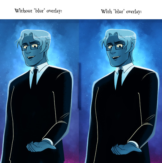
It's subtle, but really effective in making the glow effects and deeper colors really pop!
As for the more nuanced stuff like lineart, it's kinda just something I do by feel! Sometimes I'll shade something in and realize the lineart doesn't need to be there, so then I'll go in and erase, other times I have to be a bit more excessive with it esp if two similar colors are up against each other. I'm actually trying to use less lineart going forward to get more of that authentic LO look but it's hard, I'm very used to doing lineart-heavy drawings so it's forcing me to draw in a way that I'm not used to! 😆 I usually always start with flat colors first though, meaning I start by 'shaping' out the character poses and then lining them in afterwards!
You can see an example of this process in my END OF PERSEPHONE time lapse here:
youtube
I also usually stream work sessions of Rekindled over on my Twitch, but I'm currently on hiatus from streaming due to technical difficulties (OBS just... decided it was gonna stop working, sigh). Go give it a follow anyways tho so you can be notified when I start streaming again! I'm thinking in the meantime until I can get my Twitch going again I might start doing some screen sharing sessions in Discord. So keep your eyes peeled for that if you ever wanna catch me working! I'm always happy to talk about and demystify the process <3
93 notes
·
View notes
Note
i wish i could draw anything humanoid so i could draw your iterator designs
A /// I recently gave a handful of drawing tips in my stream! Though it's mostly animation I talked about a few things!
So for some general tips
Don't worry about what everyone is doing
Compare yourself to others (positively). What I mean is don't say "I can't do what they do" but "How do they do this" and try to learn from them, learn what you like from them, the more artist you reference from and compare to the more you'll be able to draw in and create a unique style!
Remember everyone improves at their own rate, we start at different time, have less or more time to practice, different resources- the main thing is that you improve yourself over time- linear improvement or not! You never stop improving, there is no end goal, so enjoy the journey!
Brushes do and don't matter. Try to collect as many, explore them, I've grabbed brushes from some really cool artist and tossed them because I don't understand how they work. The main thing is understanding what brush gives what effect and what brushes fell good to use. Your taste in brushes will always change (mine do always when I find something!)
These are my brushes as of now!
Don't worry about what everyone is doing
Program means nothing- the only reason why I have CSP is for animation and nothing more (bc adobe animate sucks and I came from Fire Alpaca so I was lazy to learn Krita) Legit only get CSP if you want to animate
Finally, don't waste time with anatomy. You learn it as you go and with reference you get better, like yes study it if you want to for fun but you don't need to study it to be able to produce art work, just your ability to observe and be critical of you work is a skill required to improve! Also 100% don't if your character has baggy ass clothes, you'll spend 30 minutes drawing out those boxes and making sure it's perfect only to erase a god 80% of it, just get the rough shape out! If they're nude then different story or skin tight clothes but majority of clothes are slightly loose. Practice it yes but, you will improve in all skill sets together as you continue your journey.
Don't worry about what everyone is doing
I hope any of these somewhat help, good luck on your artist journey man~! <3
#QNA#toxart#timelapse#support#the dont worry... I got from another artist myself XD#like dont stress too much man#have fun#draw for yourself#<3#good luck!
62 notes
·
View notes
Note
Do you have any tips for someone who is trying a more realistic aproach for their art style? your painting and lighting are so good that I had to ask 🤠
Thank you!
So this question is actually pretty hard to answer, mostly because I still consider myself a beginner/hobbyist, and I'm pretty sure a lot of my technique comes from the ~5 years of classical art training I received in middle school and high school, and that's so fuzzy I can't tell what's intuition or muscle memory! I can go over some of my workflow/thoughts though and hopefully some of it is useful!
The first thing is that for realism, You. Need. References. It is impossible to replicate the level of detail in a realistic painting without a reference. I usually pick a reference, try to draw that reference exactly, and once I have the proportions correct, I'll change it to match the character/scene I'm drawing (move an arm, tilt the head, add a hand, make the eyes bigger, add anime hair etc. haha). Over time you'll get more comfortable moving away from a specific reference and piecing together a bunch of references into something more unique.
Here is an example of a recent post that was fairly simple. I take the reference image (link to reference here) and try to match it, and then I change it to match the character details, in this case, Kashimo.

As for the lighting, when I first started, my colors were a mess! I already know basic color theory which helps, but it didn't help enough haha. What I think helped me learn the quickest was color picking - in krita you can select a color directly from an imported reference figure. So I'd find a reference that I really liked the lighting on, and color picked from it while paying attention to the actual color I was grabbing (how warm it was, gray it was, what the typical skin tones were, etc).
Later on as I started to learn what types of color palettes I really liked working with, I'd open the reference photo in Krita and tweak the image's contrast and sometimes completely change the lighting and colors. However, at some point I started using it as a crutch and my skills stagnated, so you need to be careful! However, now I've progressed to the point of doing a painting in black and white and adding the colors later (with no color picking!), sometimes even without a reference for the color. This was a slow and painful process, so don't expect things to make sense overnight!
Also, don't forget that you don't have to make the colors perfect in one shot. Usually I'll color things using a color layer with minimal detail and basic color tone (Itadori's hair is soft pink, his hoodie is bright red, etc), and then create shadows and lighting with multiply and overlay layers (blues and purples for night, etc.). Eventually I'll build up the color and merge all the layers together, and then add details in full color. I can color pick from other parts of the painting to maintain consistency. Then to finish things off, I almost always tweak the colors and contrast using filter layers.
Here is an example from that same Kashimo painting, going from black and white to full colors using color, multiply, and overlay layers, and then ending with full color details.

As a side note, starting out in black and white can make things so much easier. When you're only worried about values, you can really focus on shadow depth and the shapes of things. It's so much easier to explore rendering when you're not trying to do color on top of everything! Don't try to do everything at once.
The rendering style I use is based heavily on trying to replicate the feeling of actual oil painting. I use the (free!) art program Krita, and my favorite, most used brush is from a free pack I downloaded from deviant art (here). I use the brush called R T Masked4 (shown below) for basically 90% of any painting I do. I use about 4 brushes total on a typical painting (R T Masked4, that same brush but tweaked to be narrower for hair details, a smudge brush that I discovered maybe 10 days ago that I'm now obsessed with, and sometimes a scratchy brush for additional texture).

One last thing - don't be afraid to use tracing! Block in a reference photo to get the head and shoulders in the right place!! Trace a few hands to see how it feels!!! Obviously don't trace somebody's art and present it as your own, and it should only be rough approximations of shapes so you learn how to break down the body into parts. Otherwise, it won't be helpful at all. I only use photographs for tracing, including pictures I've taken of myself. One of the more helpful things I'll do is free hand my drawing and try to make it match the reference as closely as possible. Then, on a separate layer, I'll trace the reference photo (again, no details, just general positioning/shapes), and compare it to my original drawing. I can immediately see the issues, and I'll use the liquify tool to get things in the right place. I've learned that my horizontal spacing is usually pretty good, but I struggle with vertical spacing, especially on faces. So now I triple check my work for those specific things!
This kinda turned into a book, I'm sorry! I hope some of this is helpful and doesn't sound like the 10:30pm ramblings of someone who didn't get enough sleep haha.
78 notes
·
View notes
Note
What do you use to animate? Always wanted to get into it but fear
*nervous laugh* I guess I'll have to write my programms somewhere where everyone can see any moment...
Don't fear, just start, don't think when you do.
I started 10 years ago from multator (Ohhhh that's the best animation phaza of my life, now this site deleted) (My first animatic was made in Lama... I forgot how it's called... anyway, it was awful, but I was proud of myself aehfhgehegh)
Now I use Toon Boom Harmony Premium (mostly. Like it very much, it has a lot of stuff and it's comfortable for me...)
But Krita and Clip Studio Paint (animation mode) are also not bad, but for more painted looks?


139 notes
·
View notes
Note
What program do you use for your art??? I don’t have a tablet, well I do but it’s not Apple so I don’t have procreate unfortunately, but I use Krita on my desktop sometimes. Any tips on digital art for beginners? Especially with dealing with what to do with layers, what brushes to use, line art, sketching, sketching side profiles (cause I hate doing side profiles), coloring etc. I’m more traditional but I’m trying to get better at digital. Also I love your The Outsiders art—especially the musical Outsiders art you do. And especially your Curtis Brothers art. The Curtis Brothers make my autism go crazy.
Oh shoot that's a lot haha
I use Photoshop now but I've used Krita and IbisPaint before! Tbh I don't have many specific tips for drawing in digital, it's all about learning the possibilities of the program and what works the best for your style <3 Try to check all the brushes you have and if none work for you then download some more :D For layers I mostly make different ones for lineart, skin, hair, clothes and background :) It makes working on the drawing easier! Colouring for me is basically searching for references and using the colour palette from them :D
I struggle with side profiles too :'(( I mostly learned how the shape of the forehead, nose and lips look like and I drew it over and over again until I was able to draw it in one stroke :'))
Thank u sm! Oh yeah I get the hyperfixation on Curtis bros <3 I hope this helps somehow!!!
11 notes
·
View notes
Note
hi Habs! :D i love your art and have seen ppl say they want to eat it and i would also like to partake lol. have you ever explained your methods of doing digital art? i love traditional but i would like to branch out into digital. i've tried different applications like krita, sketchbook, and sketch.io but i don't really vibe with them (if that makes sense). any tips?
Hello ! Haha thank you ! Totally get what you mean about vibes, I’ve used a few different programs, and I like paint tool sai and clip studio paint the most, and mostly use csp now !
Took me a long time to get into digital art, and the biggest breakthrough I had was that I didn’t have to do line art lol, now I only do it when necessary and 99% of my stuff is cleaned up sketches. Changing my process completely changed how I felt about my art for the better. It keeps my work dynamic, and also lessens feeling of the sketch looking better than the linework!
Generally my process is sketch, duplicate the layer and clean it (sometimes put the old layer on a low opacity so I can make sure I’m staying true to the sketch, so it’s like lineart with extra steps lol) then I block in one colour under the lines, either make a new layer with a clipping mask, or lock the opacity and colour on that layer.
For colouring, I usually use a single layer, I put down messy flats and shadows then clean it up and render it, add highlights and funky details and then I’m done. I’ve explained my colouring process here before, and I have a time lapse that shows my sketching/colouring process here.
I have shaky hands, so a lot of my brushes have stabilization turned up, usually I set it at 15 on csp brushes idk how that translates to other programs though.
For my sketches/clean up, I like using brushes that have little to no variation in brush size, and have varying density or opacity. Not for everyone but I like how it makes my work look and I end up liking my stuff a lot more like that. Usually I keep my sketches at the start really light and build up pressure as I clean
In general, I think the best thing to do is try a whole bunch of methods and figure out what works and what doesn’t! Lots of people have very different processes, so looking at how other artists work and trying out how they do stuff for yourself can be great for learning! Good luck with digital art!
101 notes
·
View notes
Text
gay people go here
james/icarus/patroclus | he/it/they + she sometimes + neos! switch it up
19 | traumagenic system
blog is rated 16+ interact at own risk
follows and likes from @faggotcowboys | alter blog: @lowresolutionboyfriend
hi! wewcome to my bwog uwu i am a longtime tumblr user moving blogs
i mostly post hermitcraft/trafficlife but i dabble in some other stuff too <3
i am a fan of the dream smp but i dont post about it and i have most of the fanbase on here blocked from ye olden days. i dont like interacting with the fandom other than fanart so dont expect that from me if ur blocked nothing personal just how it is
i'm a writer. in theory. mostly i liveblog and shitpost and reblog art but occasionally i will upload my own art or writing
i do not tag for shipping mostly because i am absolute dogshit at remembering. i am an adult and i don't shy away from reblogging suggestive or the occasional nsfw post, but usually they're tagged under #suggestive or #nsft.
i am a beginner artist! please be nice to me :') i use krita
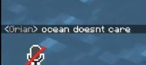
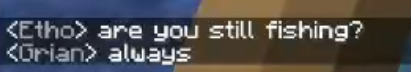
for hc s10 i'll be maining grian, joel, scar, and etho, but as of right now i am also caught up on mumbo, iskall, gem, zombiecleo, and i'm trying to slowly work my way through other people's povs
i main grian and joel! i go apeshit insane over scarian and smalletho, but i also enjoy gribeans/joelian and smallidarian/badboys content. treebark fan by osmosis. outside of trafficblr i watch a lot of content creators but ive been a fan of slimecicle and jschlatt for a while
used to be a wilburian. still like c!wilbur, disappointed and ignoring the actual guy. support shelby shubble and victims of abuse
i dont tag things as duo names i think its dumb as fuck i portmanteau their names or use "ship names" even if i dont care whether its romantic or platonic. if that bothers you block button
i dont believe in dnis but if you are a fan of dreamteam vivziepop jkr matpat or brendon urie i am probably going to block you. no terfs no swerfs no maps no zionists no racists or anti-semities and i am NOT pro-endo but i dont really care?? as long as you dont cause syscourse ur welcome idgaf
i <3 heart weird problematic labels like boygirl fagdyke mspec butch lesbians bi lesbians bi gays cisgender het aros furries neopronouns xenogenders objectum and if any of that bothers you. well. block button


#tags for navigation ->#jamies bad posts#jamies bad art#jamies bad writing#jamie liveblogs#jamies faves#jamies absolute faves#fanart fridge#other peoples art#core tags#jamie answers asks#jamies serious posts
43 notes
·
View notes
Text

OYAAA
small introduction! ◈
.
I'm Rama! 🦙
.
I like food that will rot my teeth and churn my stomach till I regret it like ice cream and pizza~
.
I've been drawing (as a hobby) for almost a decade now! crazy, but I still have so much to learn T.T I mostly draw weebshit hhshshsh and I'm terrible at backgrounds, but I enjoy drawing anatomy and complicated poses! I also like character designing
.
Current fandoms I'm in as of today (July 2023) are OM!, DR, TWST, BNHA, GI, CSM and more~
.
I use Krita (Desktop art program) most of the time, but I also use IbisPaintX ✨
.
WELCOME ! ! !
98 notes
·
View notes
Note
How are you so good at art??? Also what tablet/softwere do you use?
I've been drawing all my life and I started taking my art seriously (aka learning anatomy and putting atention to what I'm actually doing) when I was like 15... so it's a whole ass decade of improvement 👍
Currently I have a Huion Kamvas 22 (I've have it for 3 years now) and I use different sofwares depending on what I'm doing
Mostly I use photoshop to draw, some of my most simple animations I also do there.
If a comic animation is too complicated for photoshop I move to krita
I was using krita for full animations too but lately I've been using toon boom harmony just to get used to it
43 notes
·
View notes
Last Seen Blogs

likefollowme1
Untitled

doodles-trus
TRUS Doodles
btkook
BTS info
princess-massacre
Princess Massacre

bimicujoc
Untitled