#Minimalist wall deco
Explore tagged Tumblr posts
Text
Expert Painting and Decoration Services at Best Prices

Looking for expert painting and decoration services? Look no further than BrutDeco! Our team of specialists offers a range of services, including decorative lime-based plaster painting, wallpapering, wall lining, and smooth coat restoration. With our expertise in modern, Nordic, minimalist, and Brutalist wall decor, we can elevate your interiors with a touch of luxury and personality.
#Painting and decorating#painter#Worn minimalist painting#Lime-based paint techniques#Distressed wall finishes#Textured wall painting#Faux finish painting#Unique wall treatments#Lime plaster techniques#Artistic wall finishes#Art deco#Minimalist wall deco#Modern wall décor#Artisan wall decor#Wallpaper installation#Professional wallpaper services#Custom wallpaper designs#Smooth wall restoration#Wall covering experts#Expert wallpaper hanging#Wall surface refinishing#Smooth wall finishing
1 note
·
View note
Text
5 Wholesale Products to Fill Your Shelves with This Summer
Looking to fill your shelves with the latest wholesale products this summer? Check out these 5 unique wholesale business ideas, including glassware and barware, eco-friendly gift packaging, minimalist jewellery, nautical decor, and wall decor. Read on to learn more about how these products can help boost your sales and stand out in the market.

#art deco glassware#B2B e-commerce#decorative glassware#eco friendly products wholesale#entrepreneurs#minimalist jewellery#nautica home decor#restaurant glassware#sustainable products#wall party decor#wholesale#Wholesale Business Ideas#wholesale eco friendly products#wholesale wood products#kitchen and dining#kitchenware#buyers#art#E-commerce#Eco-conscious#Expobazaar#handmade#Home#home decor#Interior#Party#Style#merchandise#marketing#lifestyle brand
0 notes
Text


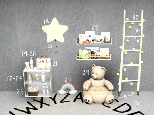
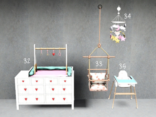

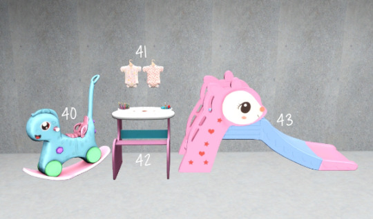

WanderingSims Fave CC - Kids/Nursery Pt. 2 List
1-3, 38-39 - johziii - Nursery Prints Set (Animalia Paintings V1, Animalia Paintings V2, Minimalist Animals Painting, Wildlife Painting)
4 - SimsDeoGloria - 4t3 Charly Pancakes SMOL Framed Animal Paintings
5-6, 15 - MainlyJustTheSims - 4t3 Syboulette Candy Nursery Set (Books, Cat Plushie, Diapers Box)
7-8 - MainlyJustTheSims - 4t3 Syboulette Charles Set (Nightstand & Potty Chair)
9, 13, 17 - MainlyJustTheSims - 4t3 Syboulette Helios Set (Crib, Folded Towels, Nursery Table)
10, 14 - SincerelyASimmer - Baby Wipes & Pack of Diapers
11 - Metisse - 4t3 Babyganics Cream Wash
12 - Metisse - 4t3 Johnson Baby Lotion
16 - Martassimsbook - 4t3 Soloriya Darina Deco Toy
18 - Martassimsbook - 4t3 Leosims Star Wall Lamp
19-20, 22-24 - MainlyJustTheSims - 4t3 Cowbuild Rattan Nursery Set (Protective Diaper Rash Cream, Hydrating Baby Lotion, Brush & Comb in Ceramic Glass, Soothing Baby Face Cream, Baby Shampoo & Body Wash)
21, 25 - studio-papillon - 4t3 Pinkbox Anye Diaper Bag & Diapers
26 - HydrangeaChainsaw - Cozy Nursery Extras Baby Bottle Deco
27, 29 - Martassimsbook - 4t3 Cowbuild My Home Set (Rainbow Plush & Soft Bear Mini Chairs)
28 - johziii - Critters Reading Nook
30 - helen-sims - Ladder with Garland
31 - WanderingSims - Rugs 3 Collection
32-35, 41, 44-45 - HydrangeaChainsaw - Cozy Nursery Set (Changing Table, Toddler Swing, Cute Fox Baby Mobile, Retro High Chair, Baby Clothing, Sweet Home Crib, Baby Bear Bath Seat Deco)
36-37 - MainlyJustTheSims - Kids Jungle Room (Bed Base & Shelf)
40, 42-43, 46 - HydrangeaChainsaw - Cozy Nursery II Set (Rocking Horse, Activity Table, Deer Slide, Cute Cow Potty)
311 notes
·
View notes
Text
CDK: Company Cafeteria

Published: 9-25-2024 | Updated: N/A SUMMARY Cubic Dynamics by John B. Cube and Marcel Dusims forged the future with furnishings that were minimalist in design and maximalist in erudite pretension. Generations later, the company continues to produce edge-of-cutting-edge designs. Use the Cubic Dynamics Kitbash (Simmons, 2023-2024) collection to set up corporate, exposition, and office environments. Envisioned as an add-on to the Cubic Dynamics set (EA/Maxis, archived at GOS), it features minimalist and retro-futuristic objects. Find more CC on this site under the #co2cdkseries tag. Read the Backstory and ‘Dev Notes’ HERE. The COMPANY CAFETERIA set includes edited versions of the Focus Kitchen (Tolli/Simgedoehns) which are now linked to the recolors/textures in the #co2cdkseries. Use it to set up a cafeteria, breakroom or food court in your businesses.


DETAILS All EPs/SPs. §See Catalog for Pricing | See Buy/Build Mode You need the Company Expo (Mesh Pack) set (Simmons, 2024) for TXTRs to show properly in game. ALL files with “MESH” in their name are REQUIRED. You may need “move objects” and “grid on/off” cheats to place some objects to your liking. When placing partitions/floating shelves and tables/desks/counters on the same tile, place the partition/shelves first. I recommend using this set with Object Freedom 1.02 (Fway, 2023), which includes Numenor’s fix for OFB shelves (2006), for easier use overall. ITEMS Counter 001 (747 poly) Counter 002 (963 poly) Cupboard 001 (90 poly) - bookcase Dining Chair (1703 poly, HIGH) Dishwasher (1014 poly) Fridge (315 poly) Microwave (280 poly) Microwave Cupboard (450 poly) Oven Hood (516 poly) Sink (1036 poly) Stove (1520 poly, HIGH) Table Element (14 poly) Table Legs (Right/left) (24 poly) Trash Compactor (1872 poly, HIGH) Wall Cabinet 001 (Deco) (132 poly) Wall Cabinet 002 (110 poly) Wall Shelf (Functional) (126 poly) DOWNLOAD (choose one) CAFETERIA MESHES from SFS | from MEGA CAFETERIA RECOLORS from SFS | from MEGA COMPATIBILITY AVOID DUPLICATES: The #co2cdkseries includes edited versions – replacements - for items in the following CC sets: 4ESF (office 3, other 1/artroom, other 2/build), All4Sims/MaleorderBride (miskatonic library, office, postmodern office), CycloneSue (never ending/privacy windows), derMarcel (inx office), Katy76/PC-Sims (bank/cash point, court/law school sets, sim cola machine), Marilu (immobilien office), Murano (ador office), Reflex Sims (giacondo office), Retail Sims/HChangeri (simEx, sps store), Simgedoehns/Tolli (focus kitchen, loft office, modus office), ShinySims (modern windows), Shoukeir via Sims2Play(reverie office, step boxes/shelving), Spaik (sintesi study), Stylist Sims (offices 1,2, & 3, Toronto set), Tiggy027 (wall window frames 1-10), Wall Sims (holly architecture, Ibiza). *The goal is link the objects to the recolors/new functions in the #co2cdkseries without re-inventing the wheel! Credit to the original creators.

CREDITS Thanks: EarlyPleasantview/EPV, Panda, Soloriya, ChocolateCitySim, HugeLunatic, Klaartje, Ocelotekatl, Whoward69, LoganSimmingWolf, Gayars, Ch4rmsing, Ranabluu, Gummilutt, Crisps&Kerosene, LordCrumps, PineappleForest. Sources: Any Color You Like (CuriousB, 2010), Beyno (Korn via BBFonts), EA/Maxis, Offuturistic Infographic (Freepik). SEE CREDITS (ALT)
43 notes
·
View notes
Note
So I’m an architecture student and I really enjoy building and decorating in the Sims 4, and I was building Cyril’s apartment, and I cannot decide if he would 1) not give a single fuck about aesthetics and interior design and live in a white walls, messy, books everywhere apartment or if he 2) would care and (at least try) to make the space nice.
So basically, what aesthetic would Cyril’s apartment fall under? Sorry if this is long I don’t know what acceptable message length is.
Honestly it could go either way so this by no means 100% canon lol, but I could imagine him being very meticulous/perfectionist/generally needing things to be exactly as he wants them when it comes to aesthetics, and the level of messiness (not dirty, just messy/disorganized/books everywhere, etc) would depend on how much time he's been spending at work and whether ha has company coming over
Because he absolutely inherited Faustin's habit of going into cleaning mode if someone's coming over like

As for the actual aesthetic (and again this is by no means canon so feel free to ignore if it doesn't fit what you imagine) I could see him having something between minimalist and mid century modern in his apartment! (His parents definitely have something more ornate like art deco or something so he probably kinda went in a simpler direction)
23 notes
·
View notes
Text
TS4 Neutral Family Home
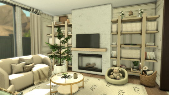
Watch The Stop Motion YouTube Video Here
♡ ɢᴀʟʟᴇʀʏ ɪᴅ: OpheliaBuilds
♡ ʙᴜɪʟᴅ ɪꜱ ꜱᴀᴠᴇᴅ ᴀꜱ: Neutral Family Home
♡ ʟᴏᴛ ꜱɪᴢᴇ: 20x15
♡ ᴡᴏʀᴛʜ: 81,487
♡ 3ʙᴇᴅ, 1ʙᴀᴛʜ
♡ ᴡɪᴛʜ ᴄᴄ
MOD USED (THIS ISN'T REQUIRED BUT IT WAS IN THE BUILD)
Flicbuster by Lot 51
DOWNLOAD THESE BEFORE YOU DOWNLOAD THE BUILD ↓↓↓
ALL CC USED
Welcome Home by @thecluttercat
Cosy Backyard Pack by @maxsus
STEFAN by @pierisim
Happy Stairways by @syboubou
Country Kitchen by @syboubou
The Giardino Pack by @heybrine
Liselotte Mini Bath by @simkoos
Luna Bedroom by @myshunosun
Influencer; A Collection Of 6 Deco Items by @simkoos
Ikea Collection; 50+ deco & functional items by @simkoos
Neighborly CC Sims 4 Part 1 & Part 2 by @syboubou
Sea-Adventure TS4 CC-Pack by @lemonbunny-ts4cc
Daria Bedroom by @myshunosun
2024/08 Combination Wardrobe Kit(Download) by @gua-cc
Myra Living by @peacemaker-ic
Bowed Living - Contemporary Rattan Set with 32 Items by @peacemaker-ic
Switch; Nine 2t4 Outlets And Light Switches by @simkoos
Besties Part 2: Me And My Cat by @imfromsixamsixamcc
Beach day by @plushpixelssims
Living Room for a Cozy Family (CC Pack for The Sims 4) by @imfromsixam x @oshinsimblr
Pinterest Finds; 12 Deco & Functional Items Inspired By My Home Deco Pinterest Board! by @simkoos
4# Simple Live Collection - Update 03/05/24 by @joyceisfox
Ulaa Petbed by @nostylesimsstudio
Simmify Music Nook by @myshunosun
Vanity Nook by @myshunosun
Freja Nursery by @myshunosun
Summer In The Hamptons Part 2 by @plushpixelssims
Chic - Bedroom by @bostyny
Build Buy Redux (Revamped): Part One by @simkoos
Life Bathroom Clutter CC Sims 4 Part 1 & Part 2 by @syboubou
East Oak Living CC Sims 4 by @syboubou
Generation Gap Clutter CC Sims 4 Part 1 & Part 2 & Part 3 by @syboubou
Minimalist Table Clock by @gua-cc
Enchanted Dreams Kid Bedroom CC Sims 4 by @syboubou
Shape Collection Dining Room by @plushpixelssims
Stefan Bedroom by @pierisim
Modern Classic Living Room (CC Pack for The Sims 4) by @imfromsixamsixam
Love Sims 4 CC Set by @syboubou
Parisian Apartment @plushpixelssims
Boho Mojo Bedroom CC Sims 4 by @syboubou
Life Livingroom Set - Part 2 by @syboubou
Closet Collection by @maxsus
Binge Inking Stacked Books by @ravasheencc
Parakeet Pop Cissouryne Pastel CC Sims 4 by @syboubou
Ellipse Seating - Curved Seating in 32 Colours by @peacemaker-ic
Combles by @pierisim
Clean Day; 8 Deco Cleaning Products by @simkoos
Cottage Bedroom CC Sims 4 by @syboubou
Kopenhagen living room by @plushpixelssims
Clutter Dump; 40 deco And Functional Clutter Items by @simkoos
Shape Collection Dining Room by @plushpixelssims
Naturali Living Room - Download by @valiasims
Stay Hydrated; 4 Deco Bottles & Tumblers by @simkoos
Noova Collection by @heybrine
Gamer Build by @simsinatra
Into Summer by @plushpixelssims
Wall Art - Movie Hangout by @brazenlotus
Candy Nursery CC Sims 4 by @syboubou
Modern Elegance - Mini Set 3 by @bostyny
Antique Stone Tile by @momo-cc
Cheap & Chipped Used Grunge CC Sims 4 by @syboubou
Splendid Panelling - Three New Painted Wall Styles by @peacemaker-ic
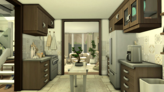
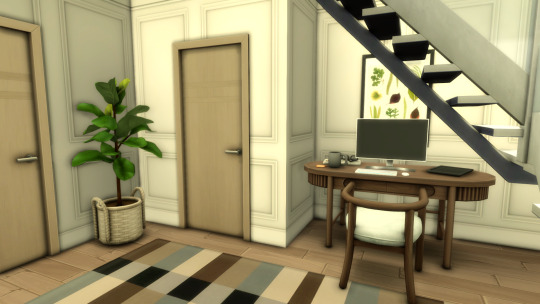


Welcome, Welcome! Our latest listing is a breathtaking 3 bedroom, 1 bathroom home, based in Oasis Springs! The current homeowners are a wondering little family that are looking to sell this to a dedicated homeowner who'll give this place the love and care that it deserves! Raked with natural sunlight, and adorned with a small pool, this home has everything one could possibly need! Take this wonderful home off of the market today! <3333
#simblr#sims 4#sims#sims 4 screenshots#sims 4 buy mode#sims builds#sims blog#sims cc#the sims#the sims community#sims 4 gameplay#maxis match#sims 4 maxis cc#ts4 maxis cc#simmer#aesthetic#gaming#ts4#my sims#interiors#interior design#interior decorating#ts4 interior#ts4 screenshots#ts4 cc#ts4 simblr#sims 4 aesthetic#ts4 legacy#ts4 gameplay#the sims4
33 notes
·
View notes
Text

I saw this tumblr post and decided the Sims should also be able to add Holiday Decoration to their homes. This is a new low poly wall deco- a paper header tag themed on 6 different holidays hastily pinned to the wall with a matching thumbtack. Happy holidays!


More info and download after the cut.

Doing the bare minimum to decorate for the holidays. For Sims with a good sense of humor.
base game compatible
new original mesh and textures
6 swatches (Christmas, Hanukkah, Kwanzaa, Halloween, Valentines, and New Year's Eve)
low poly - 116 polygons / 80 polygons
found under Deco > Clutter, Misc. Deco
Simlish text for maximum immersion
color tagged, style tagged for holidays, shabby
§3 simoleons
catalog search: itsonlythee minimalist meme holiday paper


Download (no ads)
➤ Simsfileshare | Mod the Sims | Cf
ToU
Fonts used: Simlish Lengiza, several Franzilla fonts
#mycc#itsonlythee-sims#maxis match cc#sims 4 custom content#maxis match#ts4mm#ts4 download#cc#s4cc#ts4 maxis match#s4mm#sims custom content#s4 maxis match#simlish cc#keep it simlish#buy mode decor#sims 4 wall deco#sims 4 clutter#sims 4 holiday cc#alwaysfreecc#holiday decoration#meme cc#custom content#the sims 4#deco cc#ts4 deco cc
85 notes
·
View notes
Note
I'm a big fan of building commie blocks to ameliorate the US housing crisis -- and putting them in the public parks that were stolen from other communities to give colonisers some trees to look at -- but what policies should be enacted to get suburbanites into beautiful and efficient bedspace apartments with kitchens and washrooms shared by a floor?
As a good social democrat, I'm contractually obligated to prefer Red Vienna to your proper commie block. Short of a complete class revolution that completely upends the social hierarchy, a significant part of ensuring that social housing pulls off being "a living tapestry of a mixed community" is building it to middle-class standards (including aesthetic standards) so that people with the money to find alternatives don't all leave. Art Deco is a hell of a lot chic-er than the boring minimalist crap that luxury developers are getting away with these days.
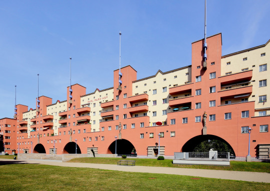
Also, don't build them in parks: green space is not only important for environmental sustainability but also the health and mental health of working-class and poor communities who can't afford houses in the suburbs, and we should be encouraging in-fill development instead. (Build them on golf courses instead, because they are classist, invasive, artificial monocultures that do nothing for the environment.)
In terms of how to make suburbia more in synch with dense, sustainable social housing, there are a number of necessary changes:

Commuter rail: suburbs predate the car by a fair few decades, and originally sprung up along the routes of commuter rail lines. Well, it turns out that transit-oriented development and dense transit corridors go hand-in-hand: if you can build higher-density units near transit lines, people will use mass transit to commute, and if there are well-planned areas of higher density around major urban areas, the increased number of commuters can support more regular transit services.
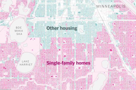
Planning/zoning/ligitation revolution: as I mentioned in my student housing post, one of the major reasons why it's so hard to build affordable housing projects is that local NIMBY groups use every legal tool in the book to bury them. So there needs to be pretty comprehensive reforms of zoning regulations (banning single-family zoning, reducing set-backs and eliminating mandatory parking, getting rid of "unrelated persons" limitations, getting rid of building heights limits, etc.), standardization of the permitting and development approval process, streamlining of the public comment/hearing process and environmental review process for model projects, and extreme limits on litigation for model projects.

Financing reform: as I sort of imply in my Red Vienna section above, a big part of making social housing/public housing successful and avoiding replicating or increasing class and racial segregation is adhering to middle-class minimum standards. This has important knock-on implications:
you need to eliminate requirements for absolute lowest possible land costs (which restrict social housing to economically and socially isolated areas).
you need to raise allowable construction costs, so that you can achieve those aesthetic standards and avoid corner-cutting like smaller rooms and lower ceilings, single-thickness walls/floors/ceilings, no doors on cabinets or closets, cheap cladding and wiring and pipes and other building materials, low-quality insulation and HVAC, etc. Not only do middle-class folks notice this stuff and go elsewhere, but it's all penny-wise and pound-foolish, because cheap construction runs down faster which increases maintenance costs, and sometimes it just straight-up kills people.
you need to adequately finance maintenance, services, and amenities. This is crucial to keeping tenants with deeper pockets, but it's also another one of those things where penny-pinching is counter-productive in the long-run. The more you save on maintenance costs, the faster the buildings run down and the more expensive repairs you have to make. The more you save on services like superintendants and doormen, the more your tenants end up having to spend on handymen and the more you have to spend on police and repair costs. And so forth.
And there is a real potential here for all kinds of positive feedback loops: spending money on achieving higher standards of construction and operation means that you can hang onto and attract higher-income tenants, which means you can have sliding scale rents that cross-subsidize tenants and pay for higher construction and operating costs, and the poor and working class tenants who couldn't have paid for those higher costs and amenities on their own enjoy a "positive externality" for once.
#public policy#public housing#social housing#social democracy#urban development#urbanism#urban planning#urban studies#housing#nimbyism#nimby#red vienna#commie blocks
112 notes
·
View notes
Text
How the Companions would decorate their homes
...and how I would lose my goddamn mind wrestling with Tumblr's formatting nightmare hellworld.
sorry to anon who requested this, I deleted your ask while fighting for my life :[
Cait; The punkest of punk design; whatever the hell makes her happy. Would take interest in things she previously never cared much for, like music, or tinkering, or model making. So, you'll have posters and vinyls of her favorite bands and artists everywhere, tools and materials strewn about flat surfaces. Lots of reds and plaid/flannel. Likes big couches you can sprawl out on and thickly-knit, chunky blankets. Think of pop art with darker colors, chaotic patterns. Loves warm, bright lighting, dim areas remind her of the Combat Zone. Her spaces are messy, but freeing and charismatic. Her style is best described as rocker college dorm room. Reminiscent of Chloe Price's room, but more mature and with less teen melodrama. Would have lots of candles. Has a statement shelf with feature lighting for unique alcohol bottles.
Codsworth; Post-modern. Modern is medium-toned, neutral colored, and somewhat minimalist. Post-modern likes colors, soft shapes, having art as part of the house itself. Bright wood paneling, one-line artwork wallpaper, multiple colors in one room. It's very birds of paradise in color pallet. Brown suede couches are a classic. Lots of plants. It's inspired by 1950s, but with bouncier aesthetics, where 1950s can feel stiff. Codsworth wouldn't want anything too out there, though. Dani Dazey is kinda close to what he'd enjoy, but tone down the amount of color, go less crazy with the decals. But otherwise, bright colors, patterns, textures—that's the vibe. Just a less plastic 1950s, and it doesn't have the Great Depression's fingerprints all over it. I would have said something Colonial, or classic British, but I didn't want to think exclusively about his accent. Codsworth is chipper, he's friendly, he invites people over. Something fun, welcoming, and optimistic is up his alley.
Danse; However he got the house/apartment, it would stay that way. Danse does not provide for himself like that. It wouldn't be until he made friends that his residence would have personality. Nick gets him an orange-patterned bedspread that's a lot more neon than it looked in the store. Cait gets him a retro CD player and wall-mounted CD case displays. Preston and Deacon team up to repaint everything minty green and install walnut wood paneling. The furniture is gone the next day, replaced with lodge-style log-and-leather. Everyone pitches in something different, something from their own tastes. As a result, Danse's space would be a constant visual reminder that he's loved, and gaudy as fuck. Nothing matches. The colors are everywhere. Textures? A nightmare. You could kill Ty Pennington with this house. There's a giant mural of cats having mimosas and he isn't sure how or when it got there. Loves it, but...who...why...
Curie; I really struggled with Curie. I first went with French Provincial, then French Farmhouse, French Country, Rustic Glam, Scandinavian, Flemish, bauhaus, pastel bauhaus...I felt like I was trying to convince myself of everything. Nothing fit her. Eventually I settled on girly vintage. The thing with vintage is that technically, 'vintage' has like 70 years of vastly different styles. So...you get a little bit of Victorian-esque, a little bit of art deco, Hollywood Regency...imagine a really nice Barbie dollhouse. That's the vibe, just make everything blues, greens, and purples instead of pink. Curie has a bit of an older grandma vibe. Floral quilts, Wedgwood china dishware and cabinets, antique paintings. I imagine she'd repaint or reupholster her furniture, if not get it new. Definitely has white or blue painted furniture, rather than open wood. Ornate vanity, seashell wallscone lighting, embroidered curtains, kidney desks, corner cupboards...Curie's style is elegant, a little outdated, cherubic, and somewhat saccharine. Would have naturalistic wallpaper with flora and fauna.
Deacon; Like Danse's, but intentional. He's extremely fond of furniture made to look like other things. Mushroom ottomans. Fried egg light switches. Wall-mounted shelving/hangers that are open, grabbing hands. Toucan table lamps. Surrealist thrifter in style. Goes to yard sales, estate sales, those sales put by storage unit owners when a tenant doesn't pay. Grabs the weirdest shit he finds. A McDonalds sign from Thailand. A taxidermied rabbit. A Bigfoot track mold. His walls are never the same color or wallpaper. The kitchen is mint green, the living room is pink and orange, his bedroom is black and blue. Maximalist. There's a story behind every item in his space and good luck figuring out which are true. The least chaotic room is the bedroom, decorated simply with space/star aesthetics. Most chaotic? The empty hallway filled with wall-phones. Only one of them is real. The others go off only when the real one does. He won't tell you this before housesitting.
Gage; You'd think it'd be a Male Living Space. No. Gage is a mean, old, materialistic [sexuality redacted] man. He has tastes. He has standards. Will act like it's a Male Living Space keep up appearances, but his place is probably one of the more expensive. It's fine, money isn't an issue for him. Favors greens, yellows, browns, lots of swampy colors. Steals streetsigns and hangs them up. Weaved and leather furniture, linens, animal pelts, mounts. Worn teak wood, cream walls, travertine floors. If this sounds luxurious, consider that Gage lives here. Unclean. Has no bed frame, only a mass of sheets and pillows. The most pristine places in his house are the coffee maker's counter, and the spaces for his pet lizard, who roams freely like a small dog. The lizard is the only thing keeping him from smoking indoors. So many fucking books everywhere, all dog-eared to death. Has stolen something from every party he's ever been to. Keeps them on display. Has a worrying amount of wedding cake toppers.
Hancock; Psychedelic culture-nerd hippie meets a grizzled ex-starlet who moonlights as a show girl. Think Whimsigoth, without the victorian influence and a lot more drippy shapes. All light sources are lava lamps. Conversation pit that you could meet God in. Many colors, most of them moody and 'sleepy'. Stereo system through the entire space. Paints on his walls whenever he's feeling creative/high, they're constantly changing. Has to scrape off the paint every so often. Collects movie memorabilia, particularly horror movies. Has masks, outfits, props. His kitchen/dining room is unintentionally Japanese-eqsue in style, in that the table is low, and you sit on beanbags. Really not into dealing with chairs in the morning. Hancock's ideal furniture is made of moldable jelly, him being a cat in spirit. His office is a complete divorce from the other rooms. It's entirely 1700s luxury Colonial in style. Dark mahogany woodwork, deep reds and blues, a (electric) chandelier. Big library.
MacCready; Eclectic. This style is defined by maximilism, mismatched everything, lots of tchotchkes. The core tenent of it is that it takes whatever looks good from other styles. It's magpie core. It's how the gremlin thief in your DnD campaign would style a home. So, lots of different kinds of fabrics, many shelves for trinkets, posters of all kinds on the wall. You ever make a wall with just the posters, signs, etc in your settlements? That's what he does. In canon, MacCready likes midnight blue and leopard print, but I can see olive greens as well. Very messy and busy. Raw wood furniture seems like it would be a good fit for him. Would have a big entertainment center, very nerdy space. I think Rodrick Heffley's and Eddie Munson's bedrooms are a good way of getting an idea. Kind of basementy, kind of glamrock. He's 22, what do you want from him? Very much "baby's first place." Duncan's room would be more child-friendly, lighter colors and softer furniture. His drawings always get hung up wherever there's space.
Nick; Also struggled with this one...I didn't want to just make him Victorian/Gothic, that felt too obvious. But...it's obvious because it's correct. It just is. His name is Valentine. He has a neon pink sign with hearts on it. This man is modern Victorian meets dingy alleyway in a Hollywood noir film. So, we're looking at victorian settees and woodwork (which is when the walls are carved all fancy, by the by), lots of dark colors, leathers, a fireplace to stare into broodily with a glass of whiskey. We'll also need a bit of industrial to blend the Modern Victorian and Urban Night vibes, so some dark brick/stone, perhaps? Or industrial light fixtures. In terms of materials, the aforementioned leather, but also velvet and dasask fabrics, marble, and rosewood, possibly treated to bring out the red, or be made darker. This space is mostly dark and black, with pops of pink, purple, and blues. Would definitely need an LED indirect lighting for mood setting. It's not as dark like X6-88's home, though, it's more intimate and warm. Heavier emphasis on coziness and inviting auras. Nick's home is an older queer man's home, so obviously it's a little extra, a little theatrical. Has a sweet cocktail bar setup, will make you a martini while you unveil your tragic backstory.
Piper; Also eclectic, but brighter and with some intellectualism. So, more vintage, but bolder and more assertive than Curie's vintage. The best thing I can do it point you towards Arianna Danielson's blog, and ask that you imagine most of those pinks to be darker, or just red. Similarly, Dani Klaric and Tay Beep Boop's viral design. That vibe of confidence, a little bit of feminine rebelliousness, and generally just spunky. A crucial item would be book paper lighting shades. It clashes but Piper would be into it. I imagine she'd want the place to be fun for Nat, satisfy that little girl urge for Maximum Colors. Piper would have a messy as hell writing room, papers everywhere, red-string corkboards, coffee cups. Collection of vintage newspapers, lots of plushy rugs and pillows, probably has weird little knickknacks hidden about. The type to have rubber ducks in her fridge and refuse to elaborate. Don't question the writing process.
Preston; Walnut, shiplap, rattan, navy blue. Reeves Connally put me on this combination and now I'm spreading the propaganda. People have feelings on rattan but it deserves more respect, just like Preston. His style is best described as hygge with a beachy edge. Hygge is all about neutrals, extremely soft and squishy fabrics and furniture, warm ambient lighting, and worn wood. Fairy lights everywhere. Cozycore, really. Blue and shiplap walls, walnut flooring, rattan furniture. Blues + white + sandy + rich brown. Best combo. Fucking fight me. Chunky wool blankets, velvet for more decorative cloths, like drapery or the fabric of the seat cushions. For decor, you're looking at handdrawn maps, paper light fixtures/shades, plants kept in colored glass vases, nature photography, a reading nook filled with historical fiction and textbooks. I can also see hanging greenery. Preston's space is refreshing, energizing, but not bombastic. I imagine he has a kitchen island with stools, but no dining table.
X6-88; Dark modernist, hands down. Crucial item is the Zaha Hadid moon sofa, in black. Steel, concrete, and sparingly, brass/brassy wood. Blacks, greys, and with the brass, an inoffensive pop of color. It's a minimalist style that, when darkened, takes inspiration from Gothic and industrial styles, but doesn't lean into them. Also has some futurism elements. X6-88's home is clean, elegant, sharp. It's designed to not be overstimulating, like the Institute's stark white plastic and fluorescent lighting is. LED indirect lighting + metal-caged hanging lights, velvet and taffeta fabrics, glass tables. There is no better kitchen for him then the Modern Kitchen 2020 from Burak LACFI on Behance. For the bathroom, Anna Kolos' work, also on Behance. His bedspread, the Ithaca Sateen set from Sleep by Sānti. I spent three years designing this man's home for a 40k word fanfic and I will hear no opposition.
#fo4#fallout 4#paladin danse#preston garvey#piper wright#nick valentine#companions react#x6-88#robert joseph maccready#porter gage#codsworth
99 notes
·
View notes
Text
My Ranking of Florence + The Machine Albums: A Physical CD Experience
This ranking is based on my personal experience with the songs, the album cover, the booklet, and the design of the CDs I own. While I may have preferences, I absolutely love every Florence + The Machine album. I’m beyond thrilled to own a physical copy of each one. In other posts, I’ve dived deeper into ranking the albums purely based on the songs or my favorite cover designs.
1. Lungs This album is pure experimentation at its finest. Many of the tracks have become my long-standing obsessions, and I can confidently say no single song here feels "just okay." The CD design is by far my favorite. The booklet is like holding a piece of art—every page features stunning photos of Florence that resemble ultra-realistic paintings, each paired with a line from a Lungs track. The CD case has a vintage feel, adorned with delicate floral designs. The CD itself is a beautiful masterpiece. There is a featured hand-drawn illustration of hands holding an orange on the disc with the title Lungs elegantly displayed. It's a feast for both the ears and the eyes!

2. Dance Fever In terms of songs, this is my favorite album. However, I’m not as in love with the CD packaging. The CD is housed in a paper case, which, while more environmentally friendly, doesn’t have the sturdy feel I’m used to from traditional CD cases. That said, the album art is lush, with gorgeous, fairy-tale-like photos of Florence Welch. Though it features my least favorite cover, I appreciate how the booklet is almost a mini-poster. I love that the booklet includes the lyrics to all the songs—something not all of the band’s albums provide. The booklet also enhances the fairytale atmosphere that runs through Dance Fever. The booklet makes it a thematic experience from start to finish.

3. High As Hope While this is my fourth favorite album for the songs, there are still three tracks I'm absolutely crazy about. The more pared-down instrumentals need to be more varied for my taste. I prefer Florence’s grand, sweeping sound. However, I'm ranking it third in this post because the booklet is a personal favorite. While the CD is pretty plain—just the band’s initials, FATM—the booklet feels like holding a piece of Florence’s diary. The cover, with Florence gazing deeply into the lens while holding a single flower in a simple pink dress, perfectly captures the album's introspective nature. Inside, each page pairs typed-out lyrics with Florence’s sketches and small, intimate photos of her. It’s a beautifully personal touch that mirrors the emotional vulnerability of the songs.

4. Ceremonials If I were only ranking based on the music and the cover art, Ceremonials would be my second favorite album. The songs feel like a powerful, otherworldly wall of sound. I have countless obsessions from this album. However, the physical CD is underwhelming, with a plain design and no actual decorations on the case. The booklet is similar to Lungs, but the lyrics are written in cursive, making them harder to read. The photos in the booklet have a historical fiction vibe, but they lack the artistic flair of Lungs. The Art Deco influence in Ceremonial's music videos and tour outfits shines through, but the style of the booklet photos span the 1940s to the 1970s. Though I adore the album, the physical design isn’t as captivating as others.

5. How Big, How Blue, How Beautiful I’m deeply obsessed with three of the songs on this album. Overall, I still love a lot of the music here, but I am crazier about the songs on other albums. Some days, I rank this album fourth. On other days, I place it last. The album cover’s minimalist black-and-white aesthetic is one I actually really enjoy. However, the booklet is lackluster. There are two beautiful photos, but nothing particularly striking. Each page is simply the lyrics typed out, making the booklet feel much more simplistic than the more decorated ones from the band’s other CDs.

#florence and the machine#florence welch#florence + the machine#fatm#CDs#lungs album#how big how blue how beautiful#ceremonials#dance fever album#dance fever#high as hope#high as hope album#ceremonials album#hbhbhb
5 notes
·
View notes
Text
RAAAHH my ankle is killing me how dare you betray me body
i am looking forward to some things:
I bought some cute decor, phone/airpod cases off of aliexpress and i’m excited to decorate! i plan on getting a new bedframe on amazon prime day bc this ones getting pretty dated and im trying to be more minimalistic. I hope to get a deal on this one i want to get, but, if there isn’t i’ll get it anyways and see what deals there are
my mom is finally talking about my eventual japan trip~ we plan to go to tokyo and then china to visit the great wall. My late grandmother and I as a child always talked about visiting the great wall. She passed in December of 2023, it’s been very hard dealing with her passing and it’s been very hard on my mother and I. I want to honor her by making it to the Great Wall and walking the whole thing.
Even if life right now is mainly sleeping, battling depression like Battle Royale and bitching about my job where it feels like I’m telling them what issues are going on but to them I’m speaking Hungarian or something. My workplace is uhh.. very backwards. Since childhood we were always told to work hard and we’ll succeed in life but at my job, it’s the complete opposite! I know I may have a lowly job as a warehouse worker, yet, hard work there just gets you even more work and being bad at your job gets you pampered. Today it was busy and after last week management sending 30 people to a building across the street due to low volume— being surprised that we, a team of less people and majority of our seasonals being quite incompetent — that things get behind and that the few core people that didn’t get to go; we’re expected to basically answer every beck and call no matter how tired we are. (supervisors and leads just get to sit all day yet they expect us to run all over the building, whilst working a very psychically demanding job of walking for 12 hours…)
Grr.. supervisors and leads, you guys get to be sedentary on your computer watching us work and yet not knowing anything about the psychical demand, favoritism and mistreatment, being very overly expecting of you yet others get a “get out of jail card” when they are just as capable.
I mainly only have stayed here because of the pay, hours and I’m good at what I do; no matter how much I hate the place. The benefits as well are extremely good as well as the PTO, I don’t know if I’d have the same luxuries at another occupation as of now.
I’ve been struggling with depression and battling it with regaining my ability to art and write.. do more tasks and make plans, do things. I don’t even have the motivation to scroll through indeed. Ahhh… it could be worse, I could be at the other building where it’s candles and mists… that’d be way too heavy for me..
ah tumblrland save meee.. i love coming to my beautiful gothic lolita art deco slash nouveau literature palace … i will stay up and sleep soon though, just had many thoughts and wanted to get them out— be it frustration or just my idyllic daydreams.
6 notes
·
View notes
Text
Sims Au: New Iacon, Historical District, The Brownstone, Unit 2| Prowl & Jazz

Welcome back to New Iacon apartment tours! Today we'll be touring Unit Two of The Brownstone building located in the beautiful Historical District. Home to our two hosts Jazz (left) and Prowl (right). Our hosts are currently engaged in conversation in their lovely communal space which serves as living room, dining area, and entry. We can see how Jazz's modern and eclectic style has been blended into Prowl's more minimalist and utilitarian design profile in the lovely black and white scheme with lovely hints of gold and blue to help add a pop of color.

Getting a better look at the living space while Prowl readies for a formal police function, and we can see how practical storage solutions and style have given the space a lovely, sophisticated feel that meshes well with the modern aesthetic of the space.

Looking to the right we have the kitchen which has been well outfitted with sleek, modern countertops and lovely under-lighting to ensure a well-lite workspace.

Continuing with the shared spaces we move into the apartment's bathroom. It's a bit of a squeeze through the small entry hallway but the small amount of space has been put to excellent use with a modern sense of zen with the sleek black tub.

Rounding the corner we can see how the laundry amenities have been given room beside the shower while still allowing plenty of space to get clean and relax without feeling cramped.

The bathroom's water-closet has plenty of modern style as well as counter space to ensure that both roommates have areas to store their own, personal self-care needs.

Leaving the bathroom we enter our first bedroom space with Jazz's eclectic and funky styled bedroom. This space has a fun and modern feel that really brings the party home. With sound-proof panels to ensure he isn't disturbing his neighbors Jazz can enjoy his jams and surround-sound speakers safe in the knowledge that he won't be the source of any noise complaints.

There's plenty of space both to relax in bed as well as to work and store clothes with a sectioned-out work corner and a selection of closet and drawer space so that storage and style are not an issue.

Out of Jazz's space and down the apartment space we come to Prowl's room which features a touch of art-deco contemporary class as well as stark practical use with his personal space that feels more like a work-space away from his office down at the precinct.

There's a real sense of sophistication in the space despite the rather stark evidence of a man who refuses to stop working once he's left the premises (I see that box of unsolved case files there beside your bed Prowl).

Prowl really has brought the precinct home with him with the harsh industrial office furniture but it blends well with the classic art deco lines and sleek modern style. Though that certainly isn't endorsement of this lack of work-life balance on display.

At last we come to the apartment's balcony space which feels both comfortable and stylish with tasteful additions of wall-art and space to garden vertically while still having plenty of space to entertain and relax and watch the city go by around you.

Speaking of entertaining. We end our tour with this excellent shot of the view from the balcony's wet bar, installed specifically to drag Prowl out of his solitary living and into Jazz's fun orbit filled with sound and real living. We hope you've enjoyed this tour and will join us on our next one!
6 notes
·
View notes
Text
Kept poking at yakuza!Jou and lawyer!Kaiba. I did get them into bed eventually, but that part's even messier than the one I'm posting here. Will take a break to consider if I have more to add besides a secondary smut scene.
Still no title unless I keep my placeholder, In bed with the mob.
Still rated T, more backstory and feels
Part 1 here
Read the whole thing in AO3
___
They didn't go to Mega. No, Seto preferred a quiet neutral ground to Jounouchi's club. The hole-in-the-wall bar was a block away from where Seto parked his car, but it was still within Jounouchi's usual stomping grounds. Mega was but a short walk away from the storefront. Yet when Seto slipped through the unobtrusive wooden door, Jounouchi followed his lead without question.
The interior was styled after European bars—wood paneling, deco light scones, a minimalist chandelier hanging from the center of the ceiling. Similar to many storefronts in the area, it was long but narrow. A polished oak bar and shelves after shelves of artfully presented liquor bottles backlit by warm yellow light lined the left wall. Along the opposite wall was a series of small tables and booths to sit parties of two to three. Soft piano music played from the surround speakers mounted along the ceiling. It reminded Seto of a miniature version of the venues he frequented through his law school years.
The bartender, an older gentleman donning a crisp white shirt, dapper waistcoat, and ironed slacks, greeted them. Besides him, there were two salarymen seated at the bar near the entrance. Both men glanced in their direction but very deliberately looked away and avoided eye contact after they spotted Jounouchi behind Seto.
The bartender's expression revealed nothing behind his customer service face. He was likely the owner too. "What can I get for you, sirs?"
Seto asked for a gin and tonic. Jounouchi surprised him by ordering a whisky highball.
The gangster flashed another face-splitting grin. "Told ya. I'm all class."
With their drinks in hand, they made their way to the back of the bar and took the booth near the back wall. It was a tight squeeze even for two people on account of their heights. Their knees knocked several times before they settled into a comfortable enough arrangement. Jounouchi slouched, braced by the booth's corner, and stretched his legs diagonally until his feet poked out. Seto took the opportunity to sit facing forward, with his spine straight and knees locked perpendicular to the ground.
Jounouchi brought his dewy highball glass to his lips and drank. Seto did the same, choosing to contemplate his drink's zesty flavor instead of his companion. To his surprise, Jounouchi didn't guzzle his, but he did wipe his mouth with the back of his hand when he set the glass back on the table.
Seto's phone chirped. He pulled it out to check his notification. It was a message from Mitsurugi.
Mitsurugi Don't do that again.
Seto merely rolled his eyes and stuffed the device back into his pocket without replying.
"Why are ya making that face? Was it your boss or your boyfriend?" joked Jounouchi. That or he was still fishing.
"Neither. Just Mitsurugi bitching."
Jounouchi whistled. "So you weren't bluffing back at the station."
"I don't bluff," Seto snapped. One should never have to bluff if one had the goods.
Jounouchi sat up only to plant his elbow on the tabletop. Still smiling, he pressed his non-bruised cheek to his raised fist. Under the table, the toe of Jounouchi's shoe brushed against Seto's ankle, slow and deliberate and lingering.
"Look at you, friends in high places."
Uncowed, Seto locked gazes with the other man. "I could say the same for you if Yoshimori contracted us for your benefit."
"Aww, yer jealous? Don't worry. He's a bit too old for my taste." Jounouchi winked. "But can't deny he's a swell guy looking out for the guys in the area."
"Yes, I suppose this has nothing to do with the seven-year stint you did for possession and distribution of a controlled stimulant."
Jounouchi's expression collapsed, as swiftly as a earthquake ripping through an out-of-code building. Silence descended over their booth. One so thick that it felt as if nothing, not the bar's piano music or the other patron's muted conversations, could penetrate. Ice clinked in Seto's glass as he lifted it. If he strained his ears, he wouldn't be surprised if he could somehow hear Jounouchi's heartbeat.
After a long, awkward silence that began to grate even on Seto's nerve, Jounouchi finally said, "You know about that?"
"I'm your lawyer"—for tonight anyway—"I would be a piss-poor one if I didn't know. I do my due diligence for my clients."
Jounouchi sucked in a sharp exhale. His hand trembled as he gripped his highball. This time, he chugged half of it at once. "Yeah, and you always had to be the best at anything you did."
Seto studied the other man, noting his sudden downturned gaze and the abrupt change in his mannerism. He couldn't help but remember that Jounouchi often relied on bluster. Brainless loyalty was more of his speed than mean drive.
"If you're ashamed, you should've thought of that before you took the fall for someone else," Seto scoffed.
"Wait. How could you possibly know that?"
"A few well-placed inquires and money to grease some palms will tell me whatever people are already talking about. It's not a stretch of the imagination. Not only were you able to find employment straight out of prison, you were promoted to manager within two months. One possibility is stellar work ethics, but it's more likely that someone owes you a favor. A big favor."
Jaw dropped, Jounouchi gawked at him. Seto filled the new lull with sips of his drink.
To his surprise, Jounouchi burst out into riotous laughter, drawing the attention of everyone in the bar. "Holy shit. That was some Sherlock Holmes shit!"
"Simple deductions," Seto muttered into his glass. He didn't know where the sudden wave of self-consciousness came from. Then again, people sometimes accused him of being too self-assured about the conclusions he drew about others and sticking to them.
It was unsettling how difficult it was to get a read on Jounouchi, though. The tension broke, and the gangster was smiling fondly at him again. "Okay, lemme take a stab at it. You studied abroad. Maybe as early as high school, but definitely university. Your taste in drinks' the same as a returnee's," Jounouchi's gaze flicked to Seto's glass. "The only question's was it England or America?"
Seto took a sip before responding. It didn't escape his notice how Jounouchi's gaze lingered on his lips afterwards. He licked them.
"Neither. Germany."
Jounouchi laughed. "Ya always did bulk conventions."
Seto didn't stop his mouth in time. "Buck conventions."
"Po-tay-toe, po-tot-toe." Jounouchi waved a hand dismissively. "And for the record, I'm not ashamed. Not really. I know who I am. That's not gonna change. It's just... It's you. I always felt kinda shabby standing next to you, and now..."
The man's expression took a turn for the wistful. Seto's heart clenched unexpectedly. From their youth, he only remembered chasing after Jounouchi, a shining beacon that clambered through the orphanage's and the surrounding woods' nooks and crannies.
"If your background was an issue, I would've left you outside police headquarters," said Seto. Not share a smoke or bodily drag Jounouchi into his car so he couldn't escape. They wouldn't be here at this bar if that was the case.
"True. Guess you still don't put up with anyone's bullshit." Jounouchi's eyes crinkled again. "Good to know that hasn't changed."
They lapsed into silence again and finished their drinks in the meanwhile. Seto rose to order another round. When he returned with with another gin and tonic for himself and another whisky highball for Jounouchi, the other man was frowning at his phone, but he quickly shoved it back into his pocket when Seto sat down.
That was when Seto remembered it was a Saturday night, which meant prime business hours for a club like Mega.
"Don't let me keep you if you have business to take care of," he said.
Jounouchi shook his head. "Nah, Toshihiro can hold down the fort. It's not every day I get a chance to catch up with an old friend."
As Jounouchi reached across the table for his glass, his palm covered the back of Seto's hand. His fingers caressed the patch of skin under Seto's wristwatch band. Despite his best efforts not to react, Seto's breath hitched. He didn't necessarily want Jounouchi to stop flirting with him, but each successive touch further muddled Seto's purpose of mind. He slipped his hand out from under Jounouchi's touch. Jounouchi let him retreat without comment, clasping his drink and drawing it across the table.
It was almost a relief when Jounouchi changed the topic. "How's Mokuba doing?"
"Well, he's living in London at the moment." A small smile crept across Seto's lips at the thought of his little brother. "He's happy. I think."
That's what made his departure from the orphanage and the ensuing years worth it. Ensuring his brother's happiness and keeping his father's dying wish.
"Awww, that's good to hear. He's so lucky to have you. You love him to bits."
Even back then, Jounouchi had supported his plan. Even though it ultimately led to their separation. That was one of Seto's few regrets.
"I'm sorry I never wrote," he mumbled.
He tried early on. Until he found several weeks of letters crumpled in the trash in his new adoptive father's study. He got the message then. His letters would never reach their intended destination.
A self-deprecating smile wormed across Jounouchi's face. "That's alright. You were moving onto bigger and better things. I wouldn't have gotten 'em anyway. I ran away several weeks after you and Mokuba left. That place was the pits. There was nothing worth staying for."
The vise tightened around Seto's heart again. His blood roared in his ears. He could blame it on the alcohol, but he wasn't a lightweight. Seto wasn't nearly as much of a stickler for rules as some people guessed. He was a defense attorney. He knew when to bend the rules or even turn a blind eye. But he couldn't turn away from Jounouchi even if he tried.
Not again.
It took effort, but he swallowed the lump in his throat. "We should continue this conversation somewhere private," he declared. It shamed him to recognize the slight warble in his voice.
Jounouchi froze, his highball glass suspended in mid-air with his hand. "Wait, really?"
"You're more familiar with this area. You must be able to recommend such a place."
The other man downed his drink like water and wiped his mouth with the back of his hand. "Okay, okay. Yeah. A few places come to mind. Yer sure about this?"
"Don't make me repeat myself," he snapped, unable to keep an ounce of contempt from bleeding through.
Jounouchi either didn't notice or didn't care. After slamming his glass down on the table, he shot forward and clasped Seto's wrist. It was strong enough that his bones creaked under the pressure, but it wasn't a threat. Nor was Jounouchi trying to hurt him. It seemed he was as reluctant to let go as Seto was.
Then as if no time has passed—untrue because so much did—Jounouchi dragged him out of the bar and out onto the neon-lit streets.
#yugioh#puppyshipping#violetshipping#joukai#ygo#my wips#fic: In bed with the mob#writing more artsy M-rated smut really strained my brain 😂#the metaphors and similes are probably very strained#thanks to everyone for giving your thoughts on the first part ;;_;;#absolutely did encourage me to write and share more of this#i'm kinda proud of the back-and-forth here which says a lot because i generally consider dialogue my weak spot as a writer
23 notes
·
View notes
Text
CDK: Company Props 001
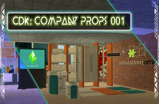
Published: 9-26-2024 | Updated: N/A SUMMARY Cubic Dynamics by John B. Cube and Marcel Dusims forged the future with furnishings that were minimalist in design and maximalist in erudite pretension. Generations later, the company continues to produce edge-of-cutting-edge designs. Use the Cubic Dynamics Kitbash (Simmons, 2023-2024) collection to set up corporate, exposition, and office environments. Envisioned as an add-on to the Cubic Dynamics set (EA/Maxis, archived at GOS), it features minimalist and retro-futuristic objects. Find more CC on this site under the #co2cdkseries tag. Read the Backstory and ‘Dev Notes’ HERE. Here are some essential COMPANY PROPS to help you decorate and organize your office – give it an authentic office look with shelves, signs, sculptures, trash cans, and “corporate-style” paintings. This compilation includes edited versions of the Modus/Loft sets from SG/Tolli (see compatibility note below).
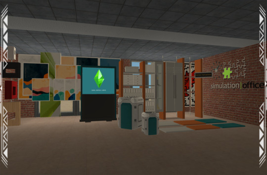
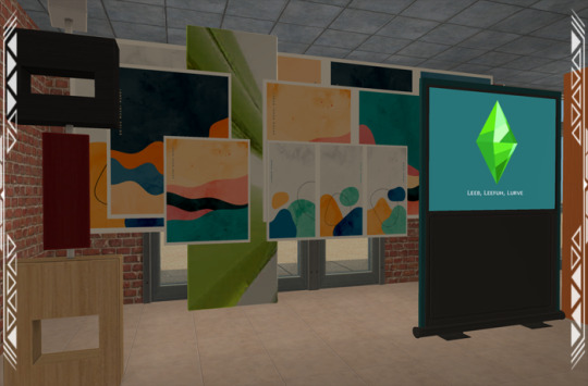
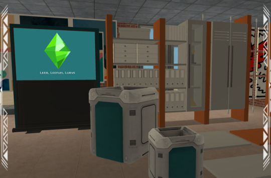
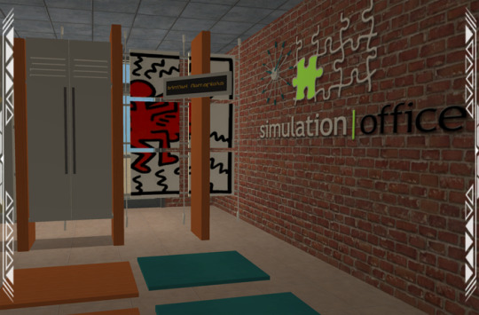
DETAILS All EPs/SPs. §See Catalog for Pricing | See Buy/Build Mode You need the Company Expo (Mesh Pack) set (Simmons, 2024) for TXTRs to show properly in game. ALL files with “MESH” in their name are REQUIRED. You may need “move objects” and “grid on/off” cheats to place some objects to your liking. When placing partitions/floating shelves and tables/desks/counters on the same tile, place the partition/shelves first. I recommend using this set with Object Freedom 1.02 (Fway, 2023), which includes Numenor’s fix for OFB shelves (2006), for easier use overall. ITEMS Bookshelves/Shelf Frame (146-455 poly) Clock-Fire Alarm (717 poly) *PULSING LIGHT Counter Shelves (x6)/Shelf Frame (12-48 poly) – shift shelves as needed Door Frame Sign (60 poly) Loft/Modus Paintings (46-342 poly) Paintings 001-006 (12 poly) Sci-Fi Trashcans Small/Large (783 poly) – place indoors/outdoors via “move objects on” cheat Smart Board (1380 poly) Sculpture/Other Deco (2-466 poly) DOWNLOAD (choose one) from SFS | from MEGA COMPATIBILITY AVOID DUPLICATES: The #co2cdkseries includes edited versions – replacements - for items in the following CC sets: 4ESF (office 3, other 1/artroom, other 2/build), All4Sims/MaleorderBride (miskatonic library, office, postmodern office), CycloneSue (never ending/privacy windows), derMarcel (inx office), Katy76/PC-Sims (bank/cash point, court/law school sets, sim cola machine), Marilu (immobilien office), Murano (ador office), Reflex Sims (giacondo office), Retail Sims/HChangeri (simEx, sps store), Simgedoehns/Tolli (focus kitchen, loft office, modus office), ShinySims (modern windows), Shoukeir via Sims2Play(reverie office, step boxes/shelving), Spaik (sintesi study), Stylist Sims (offices 1,2, & 3, Toronto set), Tiggy027 (wall window frames 1-10), Wall Sims (holly architecture, Ibiza). *The goal is link the objects to the recolors/new functions in the #co2cdkseries without re-inventing the wheel! Credit to the original creators. CREDITS Thanks: EarlyPleasantview/EPV, Panda, Soloriya, ChocolateCitySim, HugeLunatic, Klaartje, Ocelotekatl, Whoward69, LoganSimmingWolf, Gayars, Ch4rmsing, Ranabluu, Gummilutt, Crisps&Kerosene, LordCrumps, PineappleForest. Sources: Any Color You Like (CuriousB, 2010), Beyno (Korn via BBFonts), EA/Maxis, Offuturistic Infographic (Freepik). SEE CREDITS (ALT)
36 notes
·
View notes
Text


credits: Martin Brudnizki
The Vesper at the Dorchester hotel in London designed by Martin Brudnizki. The mirror walls, wooden decoration and lamps bringing some mystery into the glamorous space remind me of the art deco times when tiffany's lamps and geometric shapes were in their times of glory. Martin stands in opposition towards minimalistic and raw modernistic trends. The artist himself admits he was inspired by the 20s of XX century.
2 notes
·
View notes
Text
Abstract Geometric Wall Art Prints (Art Deco)

Varicolored shade abstract geometric art, curved lines, smudges, minimalist canvas prints, 3 piece wall art, split art prints, triptych wall art, wall décor hanging framed/stretched gallery wrapped panel artwork.
2 notes
·
View notes