#Messina Serif
Explore tagged Tumblr posts
Photo
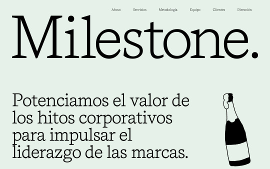
https://wearemilestone.com/
#Milestone#wine#agency#consultancy#Barcelona#Madrid#illustrations#one page#typography#type#typeface#font#Messina Serif#2023#Week 23#website#web design#inspire#inspiration#happywebdesign
5 notes
·
View notes
Photo

how to use notion enhancer to customize your notion pages!
i use notion enhancer to change the colors of text and callouts, remove extra bits to make my pages more streamlined and change other various aspects of notion. although, I understand that it can be a bit confusing to implement so here’s a guide on how to install and use notion enhancer!
thanks to dragon-wocky over on github for coding this software, and also this is completely legal! notion hq said that this was a great idea and a good temporary solution while they develop their own user-script for the app.
step 1: install
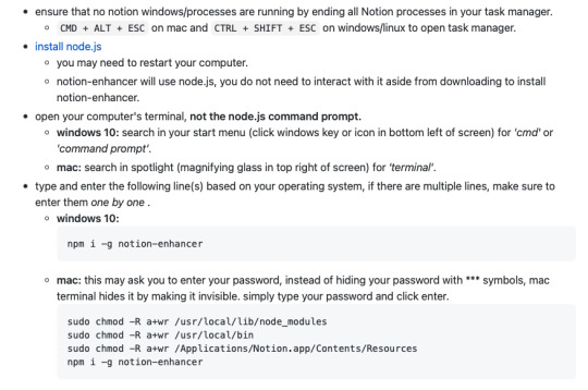
this step is pretty straightforward, as long as you follow the instructions on the notion enhancer github. all you have to do is make sure notion isn’t running, and install node.js (this is just a program that will allow notion enhancer to run). then, according to your operating system download your version of notion enhancer and copy + paste the commands into your terminal/cmd prompt (this is a bit scary but all you have to do is follow the instructions). from here the installation should be complete and you can quit your terminal app and move on to the next step! also, it would be useful to read through the info on the notion enhancer github for yourself.
step 2: customize
this is where the fun starts! you can go ahead and open notion, and press ALT / OPTION - E to open up the enhancer interface. now, there are a bunch of different tweaks and things to go through on here but for this guide I’ll share what I changed for an ~aesthetically pleasing~ notion interface:
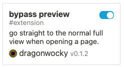
1. bypass preview this is a really useful addition in the menu (search for it in the top bar), and it basically makes it so whenever you open a page it directly opens it into full-view, rather than the preview
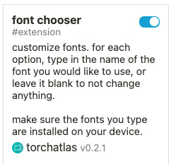
2. font chooser
this does what it says, it allows you to change the fonts of notion! you have to be careful to write the name of the fonts correctly and not to specify any weights (i.e. just the name of the font without ‘bold’ or ‘italic’). I use Messina Sans, Messina Serif and Inconsolata for my sans-serif, serif, and monospace fonts. you can also change the fonts for the code and quote blocks!
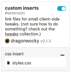
custom css
now here is where it gets a bit tricky and it might be beneficial to just copy and paste what I've done, or if you can it helps to look through the enhancer github for any specific tweaks that I haven't done and others may have. first, you want to open your text editor (in mac, this is called textedit and on windows it’s notepad) and save a file called style.css. from here you can pick, choose and edit the code that I made for my notion. MAKE SURE THAT EVERYTHING YOU COPY & PASTE IS BETWEEN : root { and }, for example:
: root {
--theme_light--text_brown: rgb(77, 39, 12);
}

1. text / callout colors
this is probably the most lengthy part but it makes such a big difference; so, to save this post from reaching unfathomable lengths I made a notion page with all the hex colors and respective code I use on my pages :)
2. gallery view/board view buttons and columns
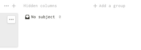
this is also a really important tweak for me as it really changes the way gallery view and board view is used in my setup! normally when you use galleries and boards there is a ‘+ add new button’ or a hidden column that takes up a lot of space and isn’t that visually appealing, so I found some code on github for it:
ALSO: these bits of code have to go OUTSIDE of :root { } - this is an edit, I noticed that it doesn’t work inside of root for some reason. sorry!
for gallery view:
.notion-gallery-view .notion-selectable.notion-collection_view-block > [role='button'], .notion-gallery-view .notion-selectable.notion-collection_view_page-block > [role='button'] { display: none !important; }
for the kanban board view:
.notion-board-view > [data-block-id] > div:nth-last-child(2), .notion-board-view > [data-block-id] > div:first-child > div:nth-last-child(2) { display: none !important; }
.notion-board-view > [data-block-id] > div:last-child, .notion-board-view > [data-block-id] > div:first-child > div:last-child { display: none !important; }
3. header image width
I prefer to have my header image a bit skinnier so that I can see my homepage all together; the 22vh is the size so you can increase / decrease that as you will:
/** banner height **/
--theme_light--page_banner-height: 22vh;
}
and there you go!
that’s everything I do in notion enhancer. I'm still learning new things for notion so if I end up using something worthwhile I'll post it on here. hope you guys enjoy your new ~fancy~ notion pages, and if you have any problems please feel free to ask - but try google first! this is pretty simple code in the grand scheme of things and most problems have answers in the github or online. happy coding! <3
#notion#notion enhancer#aesthetic#productivity#productive life#coding#apps#studyblr#studying#school#studyspo#inspiration#notionhq#study tips#notes#online#work from home#online school
73 notes
·
View notes
Photo

Two Front → Site of the Day for November 8, 2020
Fonts: Messina Sans, Messina Serif
1 note
·
View note
Text


Messina Sans, Messina Modern, and Messina Serif font by Luzi Type.
0 notes
Photo
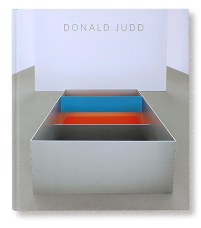
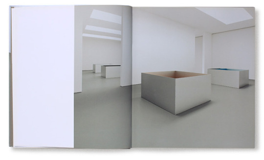
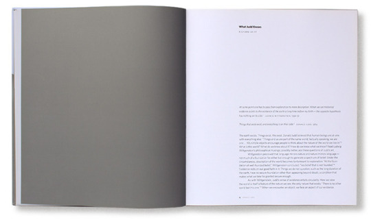
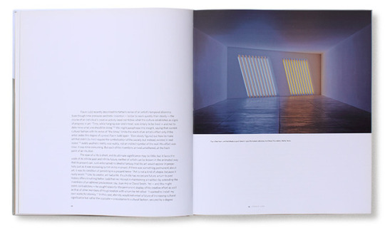
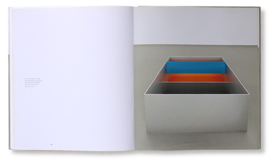
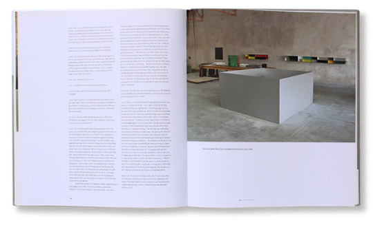
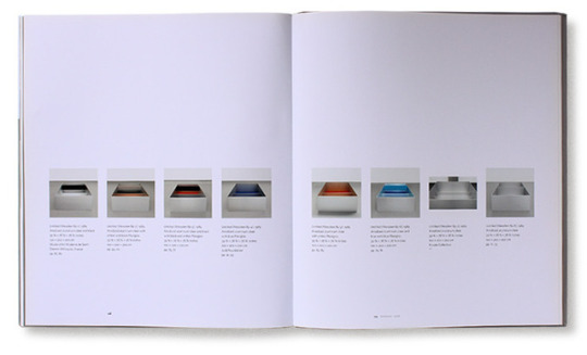
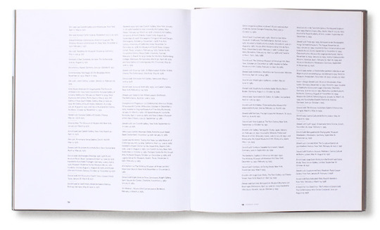
I enjoyed this exhibition by Donald Judd from Margaret Bauer. I can’t exactly see the type but it looks like a sans serif, and the image quality isn’t the best from the website, but what drew me to it was the layout of the exhibition photos and type.
The work seems to be installations that have to do with light or room setting. The type setting is modern/post modern it seems with 3 columns usually on pages with long descriptions, the column furthest to the left being smaller. It has larger margins and gutters so that’s why I wouldn’t call it completely modern.
I love the use of white space and captions for some of the photos so I’ll probably take that and use it in my designs.
-Charlie Messina
0 notes
Photo
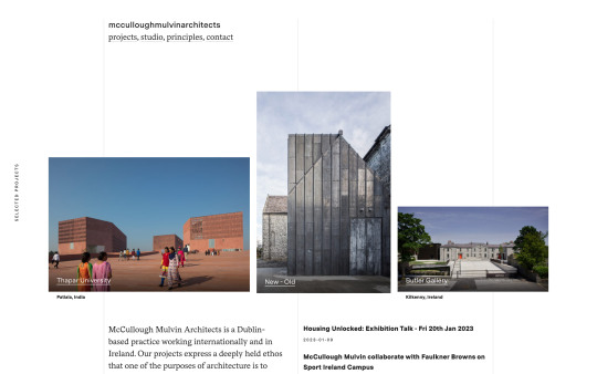
https://mcculloughmulvin.com/
#McCullough Mulvin#Architects#architecture#design#studio#Dublin#Ireland#portfolio#typography#type#typeface#font#Messina Sans#Messina Serif#2023#Week 06#website#web design#inspire#inspiration#happywebdesign
5 notes
·
View notes
Photo
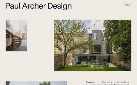
https://paularcherdesign.co.uk/
#Paul Archer Design#architect#architects#architecture#design#studio#London#portfolio#typography#type#typeface#font#Messina Sans#Messina Serif#2022#Week 39#website#web design#inspire#inspiration#happywebdesign
13 notes
·
View notes
Photo

studiojuly.co
#July#studio#design#portfolio#Montréal#typography#font#Messina Sans#Messina Sans Mono#Messina Serif#2020#Week 45#website#webdesign#inspire#inspiration#happywebdesign
10 notes
·
View notes
Photo

The Counter → Site of the Day for February 13, 2020
Fonts: Whyte, Messina Serif
3 notes
·
View notes