#Lemon demon edits
Explore tagged Tumblr posts
Text
“Oh, Mango,” my imaginary audience cries, “Where have you been this week?” And the answer, my friends, is simple: I couldn’t get these stupid gay men out of my head so I made my first ever animatic about it. No-Eyed Girl is SO Billford coded don’t fight me on this.
Also I drew a companion piece to this post, so go check it out if you want <3
#gravity falls#billford#stanford pines#bill cipher#fiddleford mcgucket#animatic#animation#sorry for the jank I edited this on imovie#also this is pretty tame billford tbh but LISTEN I just had to make something about it#might draw an art piece related to this if I have the energy#this is my first animatic so Be Nice#yeah it’s 2 fps. and I still had to split it into four (!!!) parts so I didn’t blow up my computer#lemon demon#no eyed girl#spirit phone#here’s hoping this exports properly
119 notes
·
View notes
Text
Screenshot Edits! || Lavenderade


Is this a safe space to spread my propaganda……..
OG screenshots ⬇️


#artists on tumblr#digital art#fanart#spooky month#lila#spooky month lila#lila spooky month#skid and pump#spooky month skid#spooky month fanart#screenshot edit#fnf lemon monster#fnf lemon demon#fnf fanart#fnf monster#lavender#lemon#lemon demon#lavenderade
264 notes
·
View notes
Text
BEEF BASTARD
#edit#capcut#transformers animated#tfa blurr#tfa#Blurr#transformers#bumblebee#shockwave tfa#shockwave#video#audio#lemon demon#robot
140 notes
·
View notes
Text
it's probably decently obvious that my main lemon demon design was created BEFORE seeing any fandom depictions (or even really that much official art past the logo) because of how violently he stands out in comparison to other designs. it's a little obvious that my inspiration was self-contained and it granted me a bit of creative freedom along with a completely different train of thought while designing him. his three eyes however is very much a relic of 2022 because I was designing a lot of demons with asymmetrical faces at the time and well, why not make another
anyway here's a comparison of him to my most recent lemon demon original design (where it's a bit more obvious I was influenced by somewhat of a fandom culture)


extra bonus rambling under the cut
my general design process has actually stayed relatively contained with a few exceptions like soft fuzzy man's color and weirdly neil himself. yeah sorry chat neil is the first guy that was highly influenced by someone else's design you can shoot me too if you'd like. but I legitimately believe he's the only real example because every other character that has a design remotely similar to someone else is likely due to us both following a similar source material (like my cabinet design being based off polybius) or there being only so many ways to interpret the design (gef the mongoose would've fallen into this category if it wasn't for the fact I made him Joker colors)
in general I tend to follow a mindset of how "weird" I can make a design or how much I can push a lyric/implement it into a design. I also like to twist around the convention and try new things. a good example of both of these apply to my doctor amnesia design.


really the main things going through my head were "well he didn't state HOW many eyes", chosing an eye color that often is overlooked in conventional beauty standards to elevate them and cause you to think, while leaning into the somewhat otherworldly nature she's depicted in by giving her blue skin, a color I associate with the song.
another fun thing I'll do is create a "design pipeline" where I'll take an attribute and run it through a list of connections before we end up in a place long past where we started or just combining a bunch of traits that could be interpreted that way, resulting in designs like this.


though wolfgang isn't my weirdest design, he definitely did not start where we ended off. I believe before the wizard of oz theming for clown circus was set in stone (a choice that has EVERYTHING to do with oz explodes and an element I'll explain later), he was some kinda mirror object head that had absolutely nothing to do with his current namesake. since I wasn't satisfied with that design, I kept a relative aspect of the personality and shapes and thus ended up creating a really interesting take on a character who is largely depicted as... well there's no really good way to say this, but Bad.
since I was working with a new fresh aspect I started by making him a wolf... and then connecting him to "there's a robot in my head". this kind of connected the dots to ultimately make him associated to the tin man, since no one was connected to that character for the wizard of oz element and it was up for grabs (this is also how he somehow got associated with toasters via connecting the previously mentioned song to "what's in the toaster", etc etc). these pipelines of connecting songs that aren't normally related, but making them Work in a believable way makes designs more interesting for me and gives them a bit more purpose and personality. I think this is what ultimately makes people get a bit lost on my interpretations considering they aren't super simple by just being about One Song, but by being about multiple that aren't originally related in the source material. just like how I connected dr amnesia to when he died, explaining a bit of her more mildly supernatural or off-putting elements by making the man in that song her father.
the final real design element that I focus on is the strange rule I follow in terms of how these characters are shaped. there's a massive sort of "alice in wonderland" theming going on in terms of how human/humanoid designs look in contrast to designs that look less and less human. their proportions become more cartoon and shaped, their sizes are affected etc etc all while the human/humanoid characters stay relatively normal next to each other with more believable design elements.
here's the horrid long strip of nearly 100 different character renders next to each other to get a general idea on what I'm talking about

the silhouettes of the human characters "pop" less because they're supposed to contrast to their nonhuman counterparts. which isn't something I normally do, but given the source idea of a sort of "wonderland", I think it works in this specific context.
in conclusion: I'm design autistic and like to use designing to try new things, which is why I fucked that lemon up. sorry about that chat
#guy on the right is completely unaffiliated with the ncu which is why I don't think about him that much sorry ld#also imagine him with half circle black eyes like the logo design because that's legitimately the only colored art of him#nobody has ever actually asked me about this before so I will no longer wait for permission#debating whether or not I should even main tag this I want this self contained to my followers#but it's late so I'm sure no one will see this anyway erm#edit: fuck it it took like ten morbillion years to write the bonus stuff I'm main tagging#lemon demon#mos text post
67 notes
·
View notes
Text
Eureka that's it! *edits your tawog clips*


#screenshot edit#Tawog#the amazing world of gumball#gumball#neil cicierega#lemon demon#strange hill high#becky butters#roblox#unemployed brendon#dhmis#dont hug me im scared
69 notes
·
View notes
Text

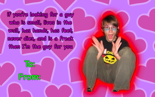

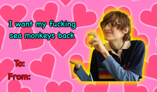
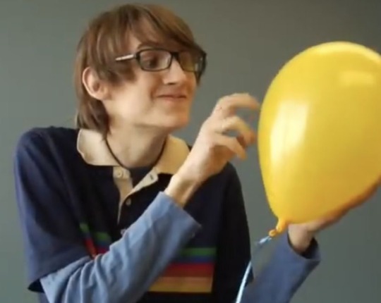
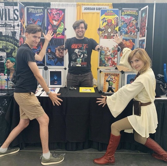
Happy valentines day lemon demon fans, enjoy some wonderful little cards to give to your loved ones <3
(original Neil photos used under the cut⬇️)


140 notes
·
View notes
Text
He’s so babygirl
(Reblogs appreciated <3)
#the spot#spot#spiderman across the verse#across the spiderverse#atsv#atsv spot#mine#edit#edits#lemon demon#neil cicierega#no eyed girl#spiderverse
155 notes
·
View notes
Text
geeks in love !!! :3 | 2nd animaticlock edit of the day !|
i love lemon demon,,,
btw thanks to my moot @aggressiivemenace for the song :33 (new song to listen to cause this is a banger and i havent heard this lemon demon song b4!!!)
i love these two
ANIMATICLOCK HOT MAKEOUT !!!!1!1!?÷÷?#??$(#(#?××? >? >?/imTWEAKING UGGGH
#animatic#animatic battle#itft clock#clock#it's time for the#animaticlock#clockmatic#animatic x clock#edit#lemon demon
23 notes
·
View notes
Text
I heard this song again for the first time since playing through Control and thought "hmmm this might work for a Darling edit"
#ALSO HOLY FUCK IT'S SO LONG. I didn't want to cut out the chorus..#song: Touch-Tone Telephone - Lemon Demon#control#control remedy#control game#control 2019#casper darling#doctor darling#dr darling#matthew porretta#my edit
25 notes
·
View notes
Text
16 notes
·
View notes
Note
Would it be possible to make a Neil Cicierega Lemon Demon sprite? Love your sprits btw

#dirksawesomesprites#ask#homestuck#request#homestuck sprites#homestuck sprite edit#sprite edit#neil cicierega#lemon demon
45 notes
·
View notes
Text

#asexual#aspec#ace#lemon demon#crappy edit#me when i’m in love with someone who gives me intense gender envy (please help)
22 notes
·
View notes
Text

had an epiphany just now lmao
#tmos has art#homestuck#eridan ampora#sollux captor#dave strider#this isnt shippy enough to tag but we all know which one id tag lmao#anyways. im an eridan oingo boingo enjoyer truther <3#also for the nerds looking for trivia; sollux's lemon demon and neil cicierega albums WERE picked for being red and blue#and dave's was picked because thats the one that has the song T.I.M.E#eridans oingo boingo album was picked for having private life and islands on the album lol#and now we just keep intermittently editing this thing until it shows up in the tags lmao 🛌
401 notes
·
View notes
Text
you want to cover up your eyes
but they’re already shut so tight
#isat#isat spoilers#IM GOING TO DIE. NEVER DRAEING A KNIFE AT AN ANGLE(tm) EVERY AGAIN#Lyrics are from You’re at the Party by lemon demon that song paired up with act five has been eating my brain lately#so uh. i played isat a bit ago and i physically cant think about anything else 👍#also. for SO long i thought those lyrics were something something ‘broken eyes’#i do like the actual version now that i understand em tho#anyways!!! scurries away under the sand like a startled beach dweller.#IF YOU SAW THAT EDIT NO YOU DIDNT INFORGOR SOMETHINGG
33 notes
·
View notes
Text
Pyro's fire motif
#tw flashing#team fortress 2#team fortress 2 edit#tf2#tf2 edit#pyro tf2#song: lemon demon fire motif
14 notes
·
View notes
Text
IF YA LIKE IT, REBLOG IT!
MODIFY - LEMON DEMON
BLUE BEETLE EDIT
by meeee
i only started making edits like yesterday so it may not be good i dunno im not the lord of the edits
and yes i just had to reuse caramelldansen blue beetle its my pride and joy
#dc#dc comics#blue beetle#jaime reyes#blue beetle 2023#batman the brave and the bold#btbatb#young justice#young justice animated#young justice invasion#modify#lemon demon#neil cicierega#edit#i love this song so much omg
26 notes
·
View notes