#Jacques herbin
Explore tagged Tumblr posts
Text


9 notes
·
View notes
Photo

Sometimes hitting a wall when writing can be weirdly and easily helped by picking up a pen and paper and closing up the laptop. Will I still have to type up what I've (illegibly) handwritten? Sure. But I guess at least I'm getting words down.
(Reminded to do this thanks to @wunderschon-lieblich‘s reblog of a post to maybe limit the screen time a little more...😅 *she says as she posts about it on the internet*)
#it also helps make you want to handwrite more when your pen is super pretty 👀#writing#am writing#fountain pen#ferris wheel press#ferris wheel press brush pen#jacques herbin#notebook
8 notes
·
View notes
Text


Calligra-kitty with my new Herbin ink, all colour matching except my kit bag.
(Also featuring: my attempts at Ronde script, in KWZ ink Miodowy, which I bought by mistake but kind of love.)
1 note
·
View note
Text


Typewriter font practice.

- Evelyn Waugh, from Brideshead Revisited (1945)
53K notes
·
View notes
Text
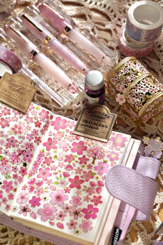

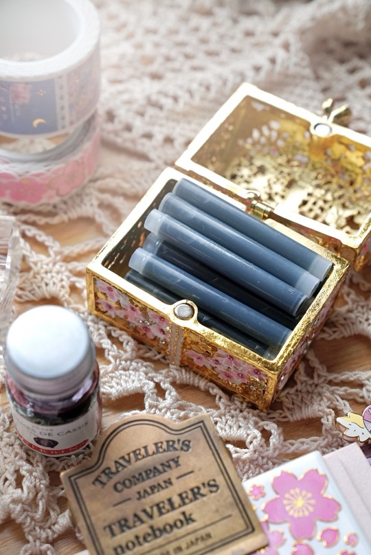
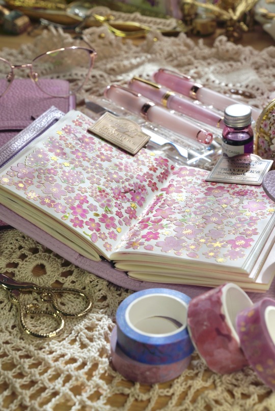
Views from my feminine, airy, and elegant desk.
Pictured here:
a crocheted doilie my mom made for me
an antique enameled trinket box my husband gifted me last Valentine’s Day (I use it to store my fountain pen ink cartridges)
sticker release paper TN Passport insert inside my lilac Moterm Companion cover
three limited edition pink Sailor fountain pens
bottle of Jacque Herbin fountain pen ink in Larmes de Cassis
my Libertaz Leather cover with a Sterling Ink N2V journal inside
brass clips from Traveler’s Company
gold scissors from The Onion Skin Journal
sakura themed washi tapes from Notebook Therapy 💕
My desk is my happy place. ☺️
#light academia#journals#notebooks#travelers notebook#Moterm companion passport#journal inspo#sticker book#stationery#fountain pens#fountain pen ink#journaling#pink aesthetic#desk goals#desk decor#vintage decor#cottage core#eggbunni#luxury stationery
38 notes
·
View notes
Text

AoA for Peaches of Rusted Woodlands, words by Lydia Webbe. Jacques Herbin "Shogun" ink and Coliro Arabic Gold watercolor on 6x8" Fluid watercolor paper. Irish Half-Uncial script.
#calligraphy#illuminated manuscript#sca#society for creative anachronism#insular majuscule#sca scribe
13 notes
·
View notes
Text
ink swatches up ahead, just using up my samples and having fun Wahoo!


First set: Inks with shimmer, though not all of the ones I have
Ferris Wheel Press Unfettered. It's cute, it's a very light grayish blue with pink shimmer.
Jacques Herbin Emerald of Chivor, a blue-teal ink with gold/green shimmer. The red sheen is my favorite to get on the Midori MD notebooks, I use it in my broad nibbed fountain pens for maximum red sheen.
Colorverse Ham Glistening. A blue ink with purple shimmer. Another favorite of mine. Purple glitter.
Diamine Shimmer Purple Pazzazz. Purple with gold shimmer. Another favorite of mine. Use it in a broad nib because it's prone to clogging my finer nibs. Very shiny. A lot of the shimmer just comes out in it.
7 notes
·
View notes
Text

I finished my journal today. And I start a new one. How bittersweet.
This pile of tree corpse felt like my own personal horcrux. But also, like a friend that was never busy. Also, like a shrink that was able to think logically when my brain was in fight or flight. Like a parent who could guide me when I felt lost. Like a teacher making sure I don't forget a lesson.
If things carry life in them, this thing absolutely does. I would know. I put most of it in there, myself.
This last page is brought to you by:
Kaweco Sport Bordeaux (B)
Jacques Herbin: Shogun (dilute)
Here's to horcruxes. They keep us alive.
#tumblr doesnt allow any type of coloring on images anymore? thats nice.#journaling#mindfulness#reflection#meditation#hobby#ink#on some real. i think I'm gonna think up a horcrux symbol for myself.#all the things i love combined into some line art.#and if you draw it on the sad and place an animal in the middle. it spawns me.
6 notes
·
View notes
Text
Jacques Herbin Turquoise de Perse

Well, I am obsessed with blue-greens and love the Jacques Herbin glitter inks, so this was a no brainer for me. Of all the shimmer inks I've tried, they are the least prone to clogging and have some of the most vibrant colours. The price tag is on the steep side, but you're definitely getting a good product (except for Rouge Hematite. That ink is awful.).
I was worried at first that this would be close to Kyanite du Népal, the other bright blue in this line, but I couldn't have been more wrong. Turquoise de Perse is lighter, and straddles the line between cyan and seafoam green. My phone is notoriously bad at capturing blue-greens accurately, so you'll have to take my word for it when I say that it's greener in person.

Gorgeous colour. This is Tomoe River paper, a blank page in the back of an old Hobonichi--the legendary pre-Sanzen TR, but hey, what is the point of nice things if you don't use them, right? Anyway, if you've used other inks from this line you know what to expect in terms of performance. The flow is very high, which presumably helps mitigate clogging. I personally like wet-writing inks, but YMMV. You'll want good paper for sure. It has gold shimmer like Emeraude de Chivor, but the two are extremely different colours, so having all three of these is filling all different niches to me.

I loaded it into my Platinum 3776 Sands of Komodo (B nib), which previously exclusively drank Kyanite du Népal. But I think this is a better match, and I enjoy a good pen-ink match.
So yeah! Cool ink! Glad I picked it up. I don't have anything quite like this in my collection so I'm thrilled to have it.
2 notes
·
View notes
Text


6 notes
·
View notes
Text
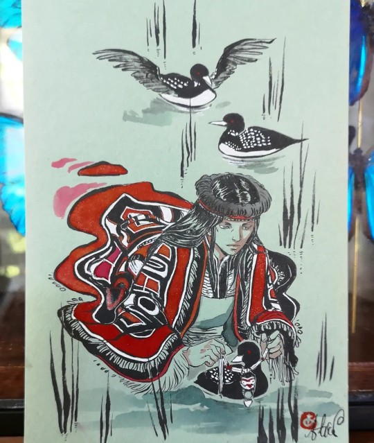
Undying Tales 2 : il s'agit du plongeon à bec blanc. Inspiré d'une légende d'Amérique du Nord
Pentel et encres Jacques Herbin sur papier coloré. , format A5.
Disponibilité de l'original : ✅
Légende du plongeon à bec blanc :
🇺🇲 "The mournful and beautifully poignant cry of the loon can be heard skimming across the waters at dawn and dusk. The Tsimshian people who live in Canada and Alaska have a story of how the loon got its white necklace of feathers. Loon assisted a blind man, restoring his vision by taking him under his wing and swimming swiftly under the mirror clear waters of a lake. After several circuits of the lake, when Loon and the man emerged, his sight was restored. He gifted Loon his traditional Tsimshian necklace, and it melted across Loon’s neck to create the white pattern of feathers around the bird’s ruff."
#plongeon �� bec blanc#yellow billed loon#undying tales project#the undying tale#inktober#artbober#inktober2023
17 notes
·
View notes
Text
Fountain Pens and Inks
gouletpens.com
Fountain Pen 101
LAMY Füllhalter
How it's made: Lamy Fountain Pens
Jacques HERBIN
mountain of ink.com
fountainfeder.de
stilo & stile.com
KAWECO Füllhalter
DIAMINE fountain pen inks
ROHRER & KLINGNER Schreibtinten
Akkerman ink
P. W. Akkerman Den Haag
appelboom.com
de-atramentis.com
Manufakturen: Der Herr der Tinte
TWSBI fountain pens
FERRIS WHEEL PRESS
RHODIA Kollektionen
CLAIREFONTAINE Kollektionen
TOMOE RIVER PAPER
Leuchtturm1917 Notizbücher
PILOT iroshizuku ink bottles
PILOT iroshizuku ink cartridges
Graf von FABER-CASTELL Tinten
PELIKAN Edelstein Tinten
SAILOR shikiori inks
SAILOR studio inks
SAILOR hocoro dip pen
PILOT iro-utsushi dip pen
KAKIMORI dip pen
PLATINUM Preppy
PLATINUM Plasir
PILOT Kakuno
PILOT Metropolitan (Europe) aka
PILOT Cocoon (Japan)
14 notes
·
View notes
Text

My piece from yesterday’s Sketchwalk at Geylang Serai, a popular Malay / Muslim enclave in the mid-eastern part of Singapore.
Ramadan is about over and Hari Raya (translated: Big Day; celebrating the end of Ramadan) is around the corner, and this part of town is usually teeming with atmosphere and festivities this time of the year.
While most of our sketchers were sketching up Malay-inspired architecture across the street, Ken and I decided to capture some favorite Malay eats – a big part of the Hari Raya festivities, and certainly Singapore Malay Culture.
This stall (operating since 1985) is a very popular Malay dessert place selling Putu Piring, a Kueh (steamed rice cake) with brown palm sugar (Gula Melaka) fillings, sprinkled with freshly grated coconut, usually served on a tiny piece of banana leaf. It reminds me a lot of the Chinese Kueh Tu-Tu.
One bite into the steamy, soft and slightly powdery and bland exterior, and you will be greeted with an explosion of nuanced, textured sweetness, and that combination is just heavenly… and I don’t even have a sweet tooth. 😂
The other sweet delights on the table I bought from the neighboring stalls; the Putu Piring was the star.
An urban sketcher at heart, I could not help but also capture the shopfront, with dedicated kak-kaks (older sisters) and makciks (older ladies / moms) hard at work churning out Kueh after Kueh.
Wonderful hangout with my bros Ken and Alvin sketching up these sweet delights.
*TWSBI 580RBT B nib FP, Jacques Herbin ECLATS “Chocolat” ink, Daniel Smith Artist Watercolors, Da Vinci Travel Brushes, Arches 300gsm Hot-pressed watercolor paper sketchbook.
#usksg #usk #urbansketchers #urbansketching #sketchwalks #harirayapuasa #ramadan #singapore #heritage #putupiring #malayfood
#urbansketchers#usksg#artistsoninstagram#sketchwalk#usk#artist#urbansketch#sketchwalks#memoirsofpapapat#sketch
6 notes
·
View notes
Text
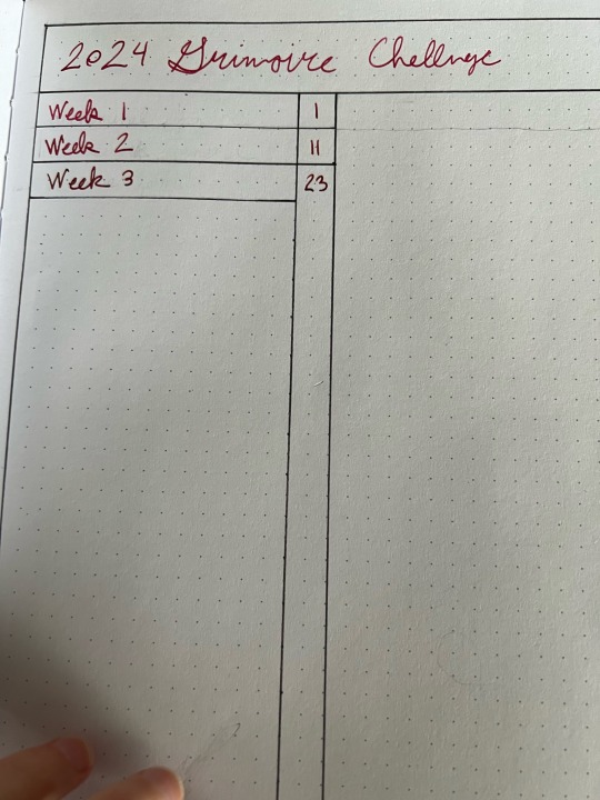


So I’m way behind on the @2024-grimoire-challenge, but I’m working on it! Kind of bullet journal style.
If you noticed I struggled with my pen and happen to be a fountain pen aficionado, I’m using a Kaweco Student and Jacques Herbin Garnet Rouge ink. I switched inks and refilled with a different red to see if that was the issue, but I would LOVE for someone to tell me why this nib dries up at the slightest provocation. None of the other pens I’ve tried do this, but I haven’t tried this ink in a different pen so I’m wondering if it’s just got a dry character or I need the nib tuned or SOMETHING.
4 notes
·
View notes
Text


So tumblr ate these before I posted them yesterday
1st row: Diamine Oxblood, Diamine Marine below Diamine Asa Blue and Sailor Manyo Yamabuki Ink
2nd row: Jacques Herbin Emerald of Chivor in the middle of drying to show off the red sheen when allowed more time to dry.
3rd row: Diamine Purple Pazzaz, in the middle of drying to show off the gold glimmer particles. Colorverse Ham Glistening version, in the middle of drying showing off the glimmer and purple sheen.
All these swatches were done on Strathmore Mixed Media paper 117lb, eyedropped and swatched with cotton swabs.
2 notes
·
View notes
Text
bought two pen inks today - one is light brown and smells like caramell macciato (surprisingly made by some local no name company) and one vert amazonite by jacques herbin. both flow really well and im literally in love with the deep almost emerald green.
0 notes