#insular majuscule
Explore tagged Tumblr posts
Visit Tumblr Blog
Explore Tumblr blogs with no restrictions, modern design and the best experience.
Last Seen Tumblr Blogs


Fun Fact
Tumblr was created by web developers David Karp and Marco Arment.
Text

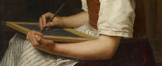
AoA for Peaches of Rusted Woodlands, words by Lydia Webbe. Jacques Herbin "Shogun" ink and Coliro Arabic Gold watercolor on 6x8" Fluid watercolor paper. Irish Half-Uncial script.
#calligraphy#illuminated manuscript#sca#society for creative anachronism#insular majuscule#sca scribe
14 notes
·
View notes
Text
Some Early Forms of Handwriting
MAJUSCULE
Relatively large letters generally contained within a single pair of imaginary horizontal lines; now usually called capital letters.
The Greek and Latin alphabets were both originally written in this way.
MINUSCULE
Relatively small letters whose parts often extend above and below a pair of imaginary horizontal lines; now usually called small letters or lower-case letters.
Minuscule writing was a gradual development, known in Greek from the 7th–8th centuries AD.
UNCIAL
A form of professional writing used in Greek and Latin manuscripts during the 4th–8th centuries AD.
The style consists of large (the name means ‘inch-high’), simple, rounded letters.
A later development, now known as half-uncial or semi-uncial, prepared the way for modern small letters.
Half-uncial is often found in early manuscripts from the British Isles, where the style of writing developed an ‘insular’ character of its own.
CURSIVE
Handwriting in which the characters are joined in a series of rounded, flowing strokes, which promotes ease and speed.
Often now known colloquially as ‘script’ (US) or ‘joined-up writing’ (UK), it was widely used from the 4th century BC, and eventually replaced uncial and half-uncial as the handwriting norm.
DUAL ALPHABET
The use of capital letters and small letters in a single system.
This development took place during the renaissance associated with the reign of Emperor Charlemagne (742–814), as part of the script which was later called Carolingian minuscule.
Carolingian writing, promoted throughout Europe, was an important influence on later handwriting styles.
For example, modern Roman printed letters derive from a classical style, based on the Carolingian, introduced in Italy by humanist printers in the early 15th century.
Source ⚜ Writing Notes & References ⚜ Worldbuilding ⚜ Typography
#writing reference#writeblr#dark academia#spilled ink#worldbuilding#handwriting#literature#writers on tumblr#writing prompt#studyblr#poetry#poets on tumblr#light academia#writing inspiration#creative writing#writing inspo#writing ideas#history#langblr#linguistics#albrecht anker#writing resources
289 notes
·
View notes
Note
can u write "nazi punks fuck off" in insular majuscule hand

Nazi punks fuck off
Alas, I currently have but the one hand at my disposal.
Ink: Sailor Jentle yama-dori
267 notes
·
View notes
Text
Goddamn calligraphy hurts. I try to write one tiny shopping list in insular majuscule and my arm starts cramping up.
2 notes
·
View notes
Text

Folio 27r from the Lindisfarne Gospels, incipit to the Gospel of Matthew.
The main text contains the first sentence of the Gospel: “Liber generationis Iesu Christi filii David filii Abraham” (“The book of the generation of Jesus Christ, the son of David, the son of Abraham”).
The first line contains the word “liber” (“the book”) with illuminated letters in insular majuscule; the first three letters (“lib��) are much more ornate than the last two (“er”) in white.
The next two lines are in runic capitals (i.e. Latin letters in a rune-inspired script, also seen in the Book of Nunnaminster for example): the first of these lines partially contains the word “generationis” as “-onis” appears in the next line, followed by the contracted form of “Iesu”, namely “Ihu” with a tilde on the “h”; this type of contraction is called a nomen sacrum.
The last line is in insular majuscule and begins with another nomen sacrum, the contraction “χρi” with a tilde, meaning “Christi”. This is followed by a more compressed series of words. The first is “filii” (“son”) with an “fi” ligature and a letter “l” with two stacked “i” letters on its leg. Then “David” is seen and is formed with a letter “d” with an “a�� stacked on a “v” in its counter followed by “id”. After that, “filii” is present again, however this time the “fi” ligature is replaced with the Greek letter phi (φ) due to its phonetic similarity. The last word is “Abraham”, which is split into two lines.
#lindisfarne#manuscript#illumination#illuminated manuscript#bible#gospel of matthew#calligraphy#latin#insular
7 notes
·
View notes
Text
Prior to the case we had "majuscule" (for capitals) and "miniscule" (for lowercase.) Hence you get hands called "Insular Majuscule." Often people wrote in either all majuscule or all miniscule and reserved the big fancy capitals (Versals) for the first letter of the paragraph, or page.
If uppercase letters are capital letters then what the FUCK are lowercase letters
10K notes
·
View notes
Text
Eomund
Eomund is an Anglo-Saxon masculine name composed of eoh (horse) and mund (protection).
Variants:
EOMVND [John Lindsay 1842 A View of the Coinage of the Heptarchy, page 11].
Eomund [Charles Keary 1887 A Catalogue of English Coins in the British Museum, Anglo-Saxon Series 1: 143].
Fomund [Keith Briggs 2021 An index to personal names in English place-names, 1st edition, page 129].
Prototheme:
Eoh = a horse [Joseph Bosworth 1838 A Dictionary of the Anglo-Saxon Language, 1st edition, page 684].
Deuterotheme:
Mund = protection [Robert Ferguson 1883 Surnames as a Science, page 41].
Usage:
“Terminal of the upper arm of a cross, with name EOMVND in Insular majuscule” [Sir Charles Peers & Ralegh Radford 1943 Archaeologia 89: 39].
0 notes
Text
字母的演進

耶穌受難圖大家都很熟悉,但上面寫的IESVS是什麼呢?
想必你已經推理出來了,IESVS就是JESUS,整段話翻譯過來就是:「耶穌,拿撒勒人,猶太人的君王」
會有這樣的拼法,是因為早期的字母表中是沒有JUW這三個字的!我們熟悉的英文字母書寫規則,其實是近三百年才慢慢統一的���
讓我們先回到古羅馬時代:

這是西元113年,由羅馬帝國皇帝圖拉真所建立的「圖拉真凱旋柱」的碑文,發現了嗎?這個時代還沒有小寫,JUW這三個字也還沒被發明出來,所以圖拉真的TRAJAN這時候拼寫為TRAIAN。
J
是最晚出現在字母表上的字母,在16世紀以前,它常常被當作是I的變體,特別是用在人名的時候,比如前面講到的耶穌,或是凱薩大帝的女兒茱莉雅、雅各、約瑟夫:
JULIA = IVLIA
JACOB = IACOB
JOSEPH = IOSEP

U
羅馬時代沒有U這個字,/uː/ /ʊ/ /w/這些發音是��V擔任的,所以神祇的名字如朱庇特和茱諾:
JUPITER = IVPITER
JUNO = IVNO
時至今日,我們仍然可以看到這種拼法,一些仿古的品牌或建築招牌,仍然會用V代替U,比如寶格麗:

W
FYUVW其實是同源字母,都是腓尼基字母𐤅派生而來。

所以在某些國家中W被稱為雙U,有些稱為雙V。
像這本書就以UUitches代替Witches。

上面講完大寫的字母表,現在來講小寫。

注意啊!有些人在查資料的時候,會誤以為上圖的安色爾體(uncial)或島嶼文字(Insular majuscule)是小寫,不對啊!Wrong! 別會錯意了,這兩種文字只是開始有了上下伸部的雛形,本質上都是大寫,沒有小寫的!
小寫要一直到西元八世紀查理曼大帝統一日耳曼,開啟加洛琳王朝之後,當時有大量翻譯的需要,因此統一了書寫的形制,發明了加洛琳小寫體(Carolingian Minuscule)

可以看到句子的開頭仍然保留了羅馬時代的大寫,而句子內文的部分是小寫。
圖片來源:
DROUOT.com
historyofinformation.com
Yahoo news
wikipedia:Julia_(daughter_of_Caesar)
wikipedia : Wonders of the Invisible World
wikipedia:uncial
wikipedia:Carolingian minuscule
0 notes
Text

Might be able to paint this one, but thought I'd see what you could do with a line drawing in the meantime.
This one is a simplification of the Norse Pagan Futhark rune Dag.
Text in Insular Majuscule.
1 note
·
View note
Photo

FUCKIN TITIVILLUS https://en.m.wikipedia.org/wiki/Titivillus
19 notes
·
View notes
Photo
now if only i could write in medieval polyphonic notation

“The power of her heart will save us. Her love enlightens us. She is the soldier who embraces all.”
https://soundcloud.com/ginadonahue/illa-miles-est
14 notes
·
View notes
Text

this evening's efforts~ noodler's american eel black ink, reeves gouache, and coliro/finetec arabic gold, opal, and sterling silver; capital A from the book of nunnaminster; words from a scout camp song. i also avoided W by using ou and ough 😅
6 notes
·
View notes
Photo


Callivember 6, 7, 8, 9 & 10 - Shiny, courage, keep writing, calligraphy masters, calligraphy.
#callivember#callivember 2018#brush lettering#uncial#insular minuscule#blackletter#fraktur#roman majuscule
10 notes
·
View notes
Text
i am so fucking scared that i won’t be able to tell carolingian minuscule apart from insular minuscule, much less insular majuscule from semi uncial script. and like. college is FUCKED because that is not a fear a normal person should have. not only did they give the monkey anxiety, they gave the monkey anxiety about LETTER FORMS
#my thoughts#and like. insular minuscule vs carolingian should be easy??? but ive been staring at it for so long#that it all looks the same now#and my prof even said that we should be on the look out for the differences between insular majuscule and semi uncial#but like... i can't tell ya the difference dfklgjdflh#every entry to insular majuscule just goes: they have a lot of uncial and semi uncial influences dflkgdfh#like cool. and what are their differences dflkgjdlfh#AAAAAAAAAAH#okay let me think. semi uncial is minuscule and curvy and round and pretty. and has a normal r and a two strike s#insular majuscule has a round s most of the time?? and either the uncial R or the long descender r?? i THINK#but the other website i got here also says like. naahhh the differences between those arent that big dfkjgdflh#so fuck that i guess? dfgkjdflh#i dont even know
0 notes
Photo
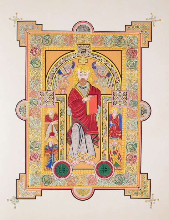
Saint Matthew from the Book of Kells, MS 58, folio 28v., Ireland, c 800 CE. Trinity College, Dublin, Ireland.
* * * * *
Matthew's face, with its vast, staring eyes and long, snaking yellow hair, has an ecstatic visionary aspect that transfixes. This Celtic evangelist is an enraptured, strange figure. His symmetrical features - the black arches of the eyebrows coiling into the outline of a pillar of a nose, the beard a perfectly balanced, mask-like shape - are not lacking individual features as a result of medieval clumsiness, but are emphatically cleansed of identity, transfigured into a divine, iconic generality. There is something unsettling and powerful about this face, as if transformed by knowledge into something inhuman. The hair, so wild, suggests intoxication rather than asceticism. The design of the page - the purple robe with its gold repeated device of three circles, the animal emblems of the other evangelists, the frame that literally squashes against him as it orgies in the compulsive repetition of organic yet balanced forms, the squares, circles, circles within squares and spiralling metallic forms - is suggestive of rhapsody, a sensuous delight in the scriptures, in copying, in visions experienced in silence in a remote community on a cold island. In his left hand, Matthew holds a book, an object of mystery and power. Its representation folds the act of reading back on itself; the Book of Kells is a monument to the idea of the book.
[Scott Horton]
* * * * *
“The writing, in huge insular majuscule script, is flawless in its regularity and utter control. One can only marvel at the penmanship. It is calligraphic and as exact as printing, and yet it flows and shapes itself into the space available. It sometimes swells and seems to take breath at the ends of lines. The decoration is more extensive and more overwhelming than one could possibly imagine. Virtually every line is embellished with color or ornament.”
― Christopher de Hamel, Meetings with Remarkable Manuscripts
#Book of Kells#Saint Matthew#religious art#Scott Horton#manuscripts#Christopher de Hamel#Meetings with Remarkable Manuscripts#quotes#decoration#Ireland#Irish
37 notes
·
View notes
Text


[The artist] wrote the small letters in Insular Majuscule, a striking script invented by Irish monks. It derives ultimately from the uncial script invented by Christian scribes in Egypt who used curving Greek penstrokes to write Latin letters. Uncial was the first peculiarly Christian handwriting; the faithful throughout the Latin-speaking world adopted it to distinguish holy manuscripts from pagan literature. The display capital letters of the Lindisfarne Gospels have an unmistakable resemblance to Germanic runes. Runes were known at Lindisfarne; they were even used to carve the nomina sacra on the reliquary casket of St. Cuthbert. Patterns of knots, spirals and keys; and interlaces of elongated beasts and birds decorate the manuscript. These are motifs from Celtic and Germanic art that predate the Christian missions.
The pages depicting the four Evangelists, however, resemble mosaics from Rome or Byzantium or Antioch. Eadfrith likely based their composition on pictures in an illustrated manuscript brought by missionaries from one of the Mediterranean urban centers of early Christianity. It was through small, portable objects such as books that iconography spread; a missionary, obviously, cannot carry a basilica decorated with mosaics with him into the wilderness. He can carry a great many books containing a great many pictures. In the monastic art of Northern Europe, fascinating combinations of Hellenistic, Syrian and Byzantine traditions are encountered. The influences can be distinguished as late as the twelfth century, and vary from monastery to monastery. This is because their libraries held books from all over the Christian world, which served as models for the resident artists. Cruciformally arranged ornament fills five pages of the Lindisfarne Gospels. Art historians call these carpet pages; one, Volkmar Gantzhorn, has proposed that they were inspired by actual carpets woven in Christian Armenia. Carpet pages appeared in Northumbro-Irish manuscripts about the time that Theodore of Tarsus arrived at Canterbury to become its archbishop in AD 669. Perhaps he carried, either in his memory or in his baggage, the tradition of the Oriental carpet as far as Lindisfarne. Other scholars see in the carpet pages an imitation of Coptic art; several intriguing early medieval documents mention Egyptian monks living in Ireland. A Psalter from this time, lined with Egyptian papyrus, was pulled intact from an Irish bog eleven years ago. The Lindisfarne Gospels is thus a work of sacred art to which Germanic, Celtic, Roman, Greek, Hebrew and possibly Armenian or Coptic Christians contributed. It pages illustrate the universality invoked by St. Wilfrid, whose words would have been fresh in the memory of the monks at Lindisfarne; here, at one and the same time, is the art of Africa, Asia, Egypt, Greece and all the world, wherever the Church of Christ is spread abroad, through the various nations and tongues. It was never more beautifully made than in a corner of the remotest island.
It annoys me to know that, upon seeing this page, most people would simply say: Oh, how Irish. A few would call it Celtic instead. And while that is not an inaccurate description, it is a meager one. This art is popular in the present day, not as an expression of universal Christianity, but of Irishness or (more commonly) pseudo-Irishness. You often see it on pub signs and knickknacks and other bits of paddywhackery; you rarely see it on sacred artwork. I cannot imagine a new church being decorated in this manner, unless it were intended for Irish immigrants. Certainly I am grateful to see this art linger at all, but I lament the loss of the idea that it belongs to everyone.
Icon painter Daniel Mitsui, commenting on the Lindisfarne Gospels
69 notes
·
View notes