#IVE BEEN WANTING TO DRAW THESE DESIGNS THEYRE SO GOOD
Explore tagged Tumblr posts
Text
I think the reason why I have a tendency to draw new things every few months is bc im Still relatively new to digital art and always wonder how much i improve in months
So mainly it's for my sake because im like Oh wait ive been drawing this character differently recently ?? And then Boom i take my eyes away for one second and theres redesigns


Plus instead of making clothing so complex i decided to go w my heart and base their clothes off of how id characterize them If That Makes Sense ,, i figure kallamars is the most obvious one for him being a tailor for example
Whereas shamura is the (main) undertaker , Leshy and Heket are the two missionary party leaders , and Narinders isnt very obvious but hes considered the gladiator :-3c
Lamb and Goat (Allure & Giuseppe) are the two leaders of the cult!! (Allure main leader, giuseppe co leader) As time went on and giuseppe settled in allure's cult , the name changed from just alluring lamb to the cult of death and wisdom ,,, Ram (aaliyah) isnt a very repetitive person that shows up at the cult since she has her own cult to run (within another universe , a war cult specifically) but she likes to show up every so often just to check in with her brother [giuseppe] :>c
And ofc how could i forget wilt lol- i forgot to add giuseppes cape here Woops ,, But its what giuseppes main clothes r in the other cult

And well i kinda wanted to incorporate the healed designs ,, another thing i wanted to add is that i constantly yap about them all being rlly strong (minus Narinder however- i believe he wouldn't be able to go on crusades or missionaries due to fibromyalgia) but its not too obvious either ,, id def say that leshy and allure are probably the strongest out of everyone else (leshy can summon roots from the ground and uses his body as an advantage, where as to allure their main weapon is withholding a heavy axe ,, but that shit is Not Easy so both leshy and allure are bottom heavy cuz of that- their back muscles and legs carry shit for the both of them HELPP)
Shamura isnt exactly a battlefield person though, they're probably the only bishop to not wanting to fight ?? Those days r Way behind them ,, Kallamar can make himself taller due to Allure reserving some strength left of the blue crown as apart of a compromise they were forced to make with kallamar to stay within the cult-
One thing in common Giuseppe and Narinder have is pacifism ,, narinder is a pacifist because of seeing allure so ill and he didnt actually like seeing people in pain- whereas Giuseppe is pacifist because hes a god of wisdom nd prefers to take things with a lighter approach. The complete opposites of those two are Allure and Aaliyah, theyre both aiming for any type of genocidal route because of what they went through for both the lamb and goat genocides occuring in different worlds of theirs ,, giuseppe doesnt rlly like crusading with allure for that reason 😭 even though aaliyah is Much worse since shes a god of war- its just the way that bloodthirst makes giuseppe incredibly uncomfortable,, to see such a shy lamb act the opposite on their crusades is Lowkey what terrifies him lmao-
Herrmm ,, heket and kallamar are pretty similiar in the stances of not rlly gaf-ing about fighting and crusades ,, heket is good at stealth and kallamar just aims right for the target because shi's just Impatient-
Okay thats all the yapping i have left in me fur now i also have these to share


The only decency here is giuseppe lmaooo 😭🙏
Oh one last thing is heights :-3

(Shamura is 4'7, Ram is 5'1, Lamb is 5'5, Narinder is 6'0, Goat is 6'1, Kallamar is 6'3, Heket is 6'6, and Leshy is 7'2 ,, Idk why i put sozo there but maybe bc its fur my own reference)
#sydneys doodles#cotl#cult of the lamb#mystic pursuit#regretful war & regretful wisdom#Teehee lyndwyrm leshy is Real#Ive had this in drafts fur like two days so idk if what i wrote down below the cut made any sense . Or even above 🗿#I also have alternative outfits but maybe ill put them all in a separate post one day-#if it wasnt obvious the color black is a consistent color in their clothes !! However kallamar is built different and#shi refuses 2 wear anything dark 😔 in spite of allure anyways-#narinder#lamb#the lamb#goat#the goat#the ram#ram#shamura#kallamar#heket#leshy
36 notes
·
View notes
Text

a summer (college) laika kids piece i was chipping away at all week :') inspired by all the love yall gave that last kubo drawing i did and also @kittarts coraline and wybie designs. i love them ur honor
also for no reason coraline's drink is ube boba, kubo's is thai tea with cream foam, and wybie's is hojicha black sesame
i have had all these drinks and theyre all fire
#IVE BEEN WANTING TO DRAW THESE DESIGNS THEYRE SO GOOD#AAAAAA#WE'RE SO BACK LAIKA NATION#WE'RE SO FUCKING BACK#ALSO @ EVERYONE THAT FOLLOWED ME FROM KITT'S SHOUTOUT#HI THANK U#I LIKE WARHAMMER TOO#SORRY#UNFORTUNATELY#YOU WILL PROBABLY SEE THAT MORE#but i have....ideas....for koober#hhuehehuhueuihehiuehiuehuieuhieuhe#also ive been riding the high of all the nice comments ever since it started gaining notes#one person said that kubo looked like kenji sato#cursed#i didnt even realize but damn#he really does look like kenji sato#kills self#laika studios#coraline#wybie#kubo#laika kids#kubo and the two strings#fanart#older au#college au#modern au#rip cory that tanline will be heinous#ramsei's art
127 notes
·
View notes
Text
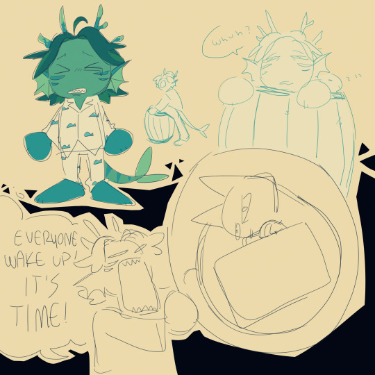
sleepy gill and gill with the bubbled evil cat
#hi remember when i thought i was in for a really bad bout of hsr fixation. lets see how thats going.. lets just check in and#oh . oh no. oh this was. this wasnt the plan. oh no#just roll with it#jrwi riptide#gillion tidestrider#gill in pjs got to me ok. gill fighting in pjs got to me. the thought of gill sleeping in a barrel of water with pjs on got to me.#wheni tell you this fkn podcast is the only thing ive been thinking abt for the past few days dude what thef uck#theyre all so stupid they get up to so much bs its fkn great i lvoe the three of them so mcuh WHEHhghh >:'O#my art#i keep nearly forgetting that tag help???#ive slowly been getting used to drawing them jsut you wait til i feel good abt the designs n shit ok its gonna be epic or smth#oop s its 1am soon whoopsies ehehee but like ..... the dumbasses... theyre in my head..#there are so many stupid scenes i want to draw 😭😭😭😭😭#im sorry to. my friends. for jsut . yknow. and everyone really#i wasnt ready for this 😭 idk what happened i just started going through eps so quickly all of a sudden and ive gone through like 12 eps in#2-3 days and i feel absolutely insane and i think abt them so much. theyve taken up all my time help
318 notes
·
View notes
Text
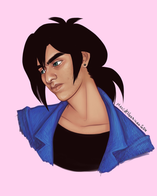
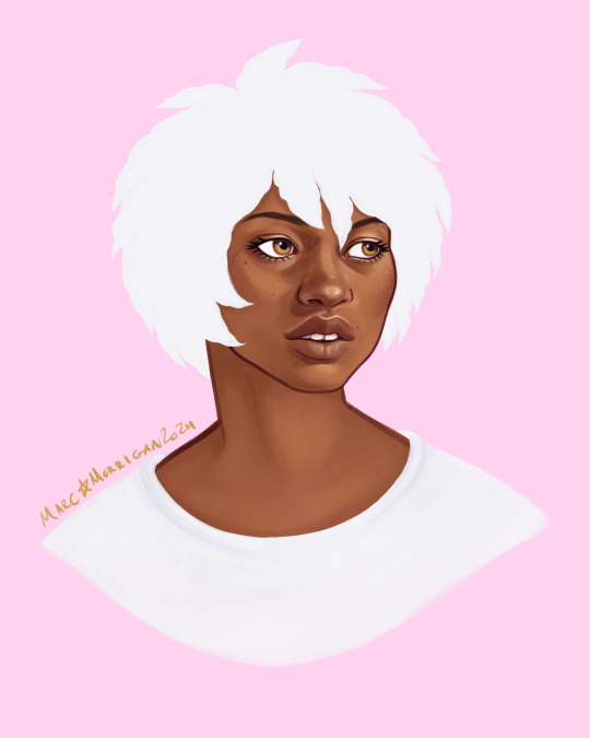
finally delivering on the princess tutu headshots i promised... love these dysfunctional teens 🩰💖💕
LOTS of notes about headcanons/design choices under the cut! like. a lot. dont say i didnt warn you
starting with my specialest guy fakir:
i had a suuuper clear vision for fakir, and i couldnt be happier with how he turned out, he looks exactly how i imagine him! trying to translate his Bird-Shaped Hair into my style gave me SERIOUS homestuck flashbacks. my affinity for knights with Problems knows no bounds...
adding the hyperpigmentation around his eyes and his acne scars is what really solidified this for me-- i put those in and was like oh!!! there you are!!! my boy!!! and you can tell because i gave him acne scars + thick eyebrows that he IS my boy... there are very clear trends among my headcanons for my faves lol. big noses, thick eyebrows, skin imperfections, heavy eyebags, long dark hair... and fakir truly has it all 😤 he is so Ideal Character Design to me
i think fakir is actually pretty self-conscious about his appearance tho! we see characters like pike and lilie say hes handsome to ahiru, but i dont know how often he actually hears that? and im sure its hard not to compare himself to mytho, who is straight out of a fairy tale; being a regular teenager dealing with regular teen body stuff is hard enough without your roommate being a magically beautiful eternally youthful storybook hero. i think he probably internalises more that people see him as scary and angry, and that the girls who do have crushes on him always frame it in contrast to mytho, who is Good and Kind and Handsome, implying (or sometimes outright stating!) that fakir is Bad and Mean and... Well...
fakir is very sensitive but quiet about it, so i think its a very private point of self-consciousness. i think he puts a lot of semi-secret effort into his appearance; canonically he has a lot of very funny and clearly customised clothing, and he chooses to keep his hair long and in a very particular style (i have a whole breakdown in my mind of how he achieves that style and it involves a surprising amount of pins and an unsurprising fuckton of teasing. i think his hair is a little fried from heat damage!), and i think that probably extends to other things, too, like manicuring his eyebrows and doing a lot of very Teenage Skincare that doesnt actually help his acne much lol. i think he probably has a lot of self-injurious habits and BFRBs like skin picking and chewing, mostly at his acne and around his nails (both of which he hates, because he knows he shouldnt but does it anyway). i think if he does it enough that theres noticeable evidence it feels, like, world-ending for him, ESPECIALLY if anyone asks what happened lol. do not perceive him except in the very specific ways and contexts he approves of THANKS
on to the narratives favorite princess, mytho:
again, i had a pretty clear idea of the vibe i wanted mytho to have going into this-- i want him to have, like, extreme prince charming vibes, very Classically Handsome without necessarily being 'conventional.' i thought a lot about 'the happy prince' story while i was working on this, and really wanted him to look like a cross between how the prince statue looks in my head and a porcelain doll. and also a cross between jonny brown and brigitte bardot? lots of very direct influences for him lol. so! lots of gold tones, gemmy eye color, cute little tooth gap, quivering wide-eyed thousand-yard-stare doe eyes and big ol dolly anime lashes, which were the very last thing i added because i was NERVOUS about pulling those off lol. they turned out cute tho! ive only done a handful of pieces for this series and i can already tell princess tutu is gonna make me up my lash drawing game considerably, these kids all look like they blink and cause a hurricane from the gale force wind of their falsies
also wait i lied the very last thing i did was add his freckles/beauty marks because he needed that little extra oomph and those were It. i think he probably has some on his hands/wrists too 💕
i was a little unsure if my idea for his hair would translate with this flat-color approach but im pretty happy with it! its supposed to be afrotextured hair (somewhere between 3b and 4c i think? wide range of potential i knowww but im still kind of hammering out my headcanons okay, this is exploratory lol) thats been rolled and finger-styled into his little feather shapes. i think loose, chunky twists would be another fun way to interpret his hair and twists are one of my fave styles to draw do i might draw him like that at some point too...
i guess fakir is the one who styles his hair for him before mytho gets his heart back? i imagine fakir is pretty meticulous about maintaining mythos health and appearance, even at the worst stages of their relationship. i think itd be hard for fakir to frame the way he treats mytho as For Mythos Sake if he wasnt doing some level of actually beneficial care for him, so being really fastidious about things like mythos diet and sleep hygiene and hair care and such gives fakir an outlet for his 'you just have to do what i tell you' thing that helps him convince himself it really is helping, no really, hes doing this for mythos benefit and he just has to be strict with him because mytho doesnt UNDERSTAND he needs PROTECTING and fakir is the ONLY ONE who can do it so mytho HAS to let him because if he doesnt then why does fakir even EXIST, if he cant manage this then what is he good for, and--
yknow. the usual complexes. and their relationship is so complex!!! but also so simple, but like. in a good way. fakirs behavior is complicated but his motivation regarding mytho is SO straightforward which makes that downward spiral into harm really easy to map out... i wont go much into that in this post since this is about visual/appearance-related headcanons but just. augh. i love this show and i love these characters!!! and i hope its apparent in my work that i do love them so <3
im hoping to do a set of these for the girls next!!! i have some other stuff to finish first but hopefully... Soon... Some Birds...
#princess tutu#fakir#mytho#prince siegfried#my art#i had sooo much fun playing around with style in these... the super strong white highlights + underpainting combo looks SO lovely#i should take this approach more often i almost never do!!! it rules and is fun to do#i was listening to my fakir playlist nonstop for DAYS while working on this and still intermittently since...#it feels like ive been sitting on these for a month but its only been 5 days omg. crazy... good to know tho#anyway i love themmm theyre everything. SO fun to draw i really hope i can do more art of them. i Want To... i have Ideas >:o)#btw is putting notes on my thoughts under a cut like this interesting for yall? its fun for me but idk if yall wanna read all that#i will probably continue regardless bc i love to hear myself talk esp abt my design choices but#im curious if my notes on my thought process are interesting to anyone else#if not oh well! thats what the cut is for 😤 nobodys gotta read it if they dont wanna im doing this for Me#full color
64 notes
·
View notes
Photo
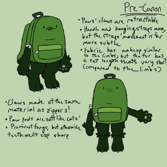


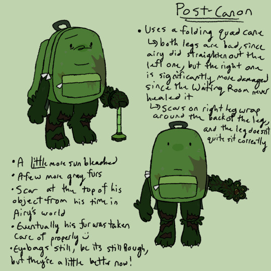


HELLO here is............ reference art for my liam design/interpretation!!!!!! a lot of these r ideas ive already had and/or included in my liam art already BUT !!! now its all in ONE PLACE!!!! :)
#hfjone#liam plecak#hfjone liam#hfjone backpack#my art#i feel like there was more i couldve added but i sifted thru my liam ref art and couldnt find any#but!!!! im very happy w how i draw him so this was fun to put all in smth :)#esp bc i was able to explain my thought processes on him a bit more!!!! bc i put. SO much thought into how i draw him#its why my design for him changed like every week for a few months a good while back. was adding n adjusting stuff SM#this is not even counting the bone diagrams i made. i am not including the bone diagrams#(theyre just for limbs but ive spent a long time on this already and im TIRED its been over 5 hrs and it is now 2 am)#BUT!! this will be queued for a good time !!!so i may not be awake when this is posted lol!!!#(also i am VERY much willing to discuss my designs if thats smth anyone wants to ask abt.... i have so many ideas)#additional fun fact that i specifically dont draw his shoulder ANY higher than his pocket bc thats as high as it goes on my design#ANYWAY im tired so im gonna queue this now
261 notes
·
View notes
Text
btw u guys have to promise to not be mad at me for becoming ur turtle mutual. please
#shut up dave#IM LIKE. NOT NORMAL ABOUT THEM. AND THIS MEANS A LOT TO ME#i nEED a special interest to consume my every waking thought in order to thrive#and after i grew out of homestuck its like i lost my spark its EXCRUCIATING.#what do you MEAN i cant draw 3 comics and 2 full piecesn write 50 page essay in one day every day if im not insane abt some piece of fictio#outrageous!!!!!#and as much as i wish i could. i cant Choose or induce this thats not how it weorks we all know this#i TRIED to make miraculous my next big thing after hs it did not work!!! im still insane abt it! but its the#watching trrailers frame by frame making longass analyses and tracking down the exact car in one scene type of insane.#sure ive made art n comics its still one of the things i was and am more invested in than about 60-something of my other media interests#but GOD then rottmnt hit me full speed. i am FEELING this one. i made art AND the characters i was scared would be impossible to draw#turned out to be. so easy? like i did a great splinter first try and thats HUGE for me usually my first attempts suck#until i develop a personal touch for their design#the style of the show is just sososo good for me. theyre my best friends now. and i INTEND to make that clear to EVERYONE#bc im still feelin lonely!!! despite everything!! and i dont want to!!!!!!!!! and im making it everyone elses problem!!!!#anyways like as i said. ur not allowed to be mad at me. please please. ive always been annoying this is just a new arc#and u have to put up wirh it. or ill cry. thanks.
18 notes
·
View notes
Text
I need to make a new pmd story right now or I'll explode
#rat rambles#someone I follow made some pmd ocs based on one of their pokerogue runs and Im just sitting here like why didnt I do that first fuck#I have three guys Ive been using in literally every run (because theyre my only tier 3 shinies lol) and I wanna make them ocs sooo bad#I might end up doing it but I mostly am just unsure because Id have to make some tough decisions when it comes to their designs#mainly if I stick closer to the actual colors used for the shinies or make my own pallets for them#on the one hand I Do like the colors used for them but on the other hand I wouldn't actually want this story to be too pokerogue inspired#so like Id feel bad using the pokerogue shinies for a story that ultimately has little to nothing to do with it#second biggest issue is that one of them is a golurk and god I dont wanna draw that#also one of them is a pyukumuku and thats fine by me but it does necessitate some creativity#the other two are an eevee and leavanny#although Id definitely have the eevee evolve into flareon since my best runs with him were when he was one#now tbf those also happened to be the runs I got multilense on him (one of them I got two on him) and he was able to stunlock anything#slower than him to death with bites and steal all their items with covet#Im so glad they switched eevee's passive to pick up it makes my life so much easier#simple wasnt Terrible but it was hard to use well since most of its evolutions arent strong or defensive enough to utilize it well#tbf I didnt try very hard since leavanny is my default sweeper and he learns sword dance#but eevee does make for good support early on at least even if it takes good rng for it to hold up well late game#tbf leavanny should also be in that camp but its simply built different (gets sharpness as a passive)#golurk is the real one that falls off hard tho unfortunately#which sucks because it's terrible early game and good for like five seconds mid game and then mostly terrible late game#I say mostly because god does my boy hard carry me through the final boss every time#generally a decently built leavanny with stone axe can cleave through 90% of the game but bestie gets hard countered by the final boss#I will say tho that Ive enjoyed using pyukymuku Way more than I thought I would its lowkey highkey saved my ass more time than I can count#its soooo important in pokerogue to have a stalling pokemon because youre inevitably going to need one#oh yeah I forgot to mention that eevee isnt one of the tier three shinies but my boy is the lesser of two evils amongs my tier two shinies#the other is goldeen. which I have also used in a huge chunk of my runs. it was the second shiny I got.#that guy tormented me so bad I was sitting here having to convince myself that the seaking carry was real#every now and then I get to use a better water type and I feel a surge of emotion as I remember what it feels like to use a good water type#and then I sigh and go back to seaking since I need my luck score maxxed out and I dont have space for my other tier two shines because#theyre both 5 costs
0 notes
Text
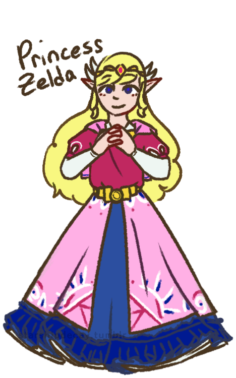

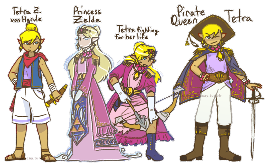
Toon Zelda redesigns! I've never been fond of the Toon Zelda design, and these girls deserve some individuality. Design notes and rambles below the cut :D
(time to turn the proper grammar off i aint capitalizing all this. warning: i am verbose)
first up, tmc zelda!
shes the one most like toon zelda, since i felt like the vibes fit the *most* (though not a lot). also, with her place on the timeline, i could justify a lot of bits, like the wings and the cape
the cape! obvs it comes from the toon zelda base design, but also it involves skyloftian fashion! i take the timeline as a challenge, and i once saw a take somewhere that the skyloftians all wear their family crests (most often birds lol) on their person. zelda here (and link too) do just that, wearing their family crests on little caplets. on the back is, of course the royal crest
i went very cutesy princess for her. tmc has such a *whimsical* vibe that i feel is very. muted? by the fact its stuck with the toon style. so i wanted to put in that vibe here. also her sprites make it look like her skirt is super poofy, so how could i not?
curly hair: i wanted something interesting, and most zeldas have straight hair. so! adds to the cuteness
i didnt draw it so well but she (and link) both have very sleepy expressions. zelda especially just has a sleepy expression in her sprite, its quite adorable.
shes not as decked out as other princesses, cuz i see tmc taking place before the royal family really starts to get *royal* as we see it. shes still of course got a tiara and some embroidery tho.
Tetra! her base design isnt all that changed from the original. her name is a fun hc of mine tho. i think "von Hyrule" sounds better as a surname than just "hyrule". shes not zelda, but shes still a descendant.
(WW) princess z (as i call her)
I went more oot zelda vibes for her, since she would be closer, temporally, to oot. i also went very warm, since ive never seen the flood as a *warm* endeavor.
shes got the shoulder danglies, as most zeldas have shoulder armor of some kind. the danglies instead of actual armor are supposed to kind of evoke a royal sea captain kind of vibe.
shes ghostly, with a fish-eyed stare. shes been dead and gone for a long time. shes also a bit taller and a few years older than tetra (as of ww). shes just some spectre the king saw in tetra, not at all a close match
tetra, being smaller than princess z, doesnt fit into the clothes. the dress is too big for her (as is in canon gd that skirt is WAY too long for her), the coat is baggy. the role of a princess *literally* does not fit her.
the ribbons! theyre my replacement for the wings, and they represent the wind in the game! since its represented by white lines, the ribbons are a perfect symbolic match. (also, a note, tetras hair is shorter and coarser than princess z's)
i mostly bullshitted the blue panel but the vague idea i gave it was 'a hope for the triforce to give good fortunes to the people' (pictured as dots, mostly behind her arms)
Pirate Queen Tetra
ph! about a year has passed, and tetra has really grown into her own! as well as literally grown!
shes still tetra, pirate and captain, but shes incorporated that royal heritage into her identity: quite literally! she made piecemeal of the original outfit (what was left of it anyway after the fight), and added bits and pieces to her new life.
she also takes full advantage of said heritage to call herself pirate queen. its great for branding. whos gonna say she CANT go by pirate queen?
the seagull feather is from Aryll. only crew member tetra wears a trinket from (who can say no to that ball of sunshine! certainly not tetra)
not many notes. yall can see whats there. (also she still wears her hair in a bun, its just in a low bun (you can almost see it) when she wears her hat)
st zelda!
first note is: shes not a princess! shes an heiress of the company tetra had made and left behind. hence her title of Lady zelda. ("new hyrule" rly just like-- the ending of ww was *literally* that hyrule is dead and thats okay. how did they miss that :sob emoji:) also calling her Lady Zelda fits with the train vibes
shes in a 1880s style bustle dress because 1) i am OBSESSED with bustle dresses. i love them. so much. 2) the more historical vibe works really well with trains! also a lot of the other outfits in the game have late victorian vibes, so shes certainly not out of place.
her hat (and gloves): any proper lady has a hat on when going about town, however, when she gets body snatched, she pulled out her hatpin to use (ineffectively) as a weapon (she IS tetras great-great-granddaughter), causing her to lose her hat *and* hairdo.
shes still got the hatpin in her ghost form, too. she uses it to threaten people for funsies
Ribbons! on the topic of hairdo, her ribbons! visually tying her to tetras design, the ribbons here instead take on the image of train tracks, with her pin (on the left side) evoking a train engine. the pin also makes her look rich and girly. when her hair comes undone, this makes the ribbons all loose, like how the train tracks disappear in game. (the hat also kinda connects her to tetra)
thanks for reading :D i hope you liked reading this as much as i liked typing it
#loz#legend of zelda#princess zelda#tetra#wind waker#minish cap#spirit tracks#phantom hourglass#zelda#zelda fanart#the legend of zelda#ww tetra#ww zelda#st zelda#minish cap zelda#the wind waker#loz ww#starship art#ive got more designs down the mental pipeline#these ones just came first cuz i dislike toon zeldas design
445 notes
·
View notes
Text

charr body types for practice, rambling nonsense under the cut
ive been trying to get better at drawing more varied body types for a while now and i think ive still got a long way to go but im getting there. fat and muscle definition werent something i bothered to learn for a long time because all i wanted to draw was twinks and dragons ... but in the last year or so ive really been pushing myself to do better. i think learning to draw different body shapes is really important and improves your overall anatomy skill by a mile, its also just really fun for me to think about how fat is distributed across the body and affected by gravity and all that stuff. bodies in general are my favorite thing to draw and what i spend the most time sketching
ok enough word vomit lets talk about my ocs
iovitus is supposed to be built more like an athlete, but im not sure i got that across very well. they're still skinny and comparatively twinky next to their fellow cats, but still strong and in good shape. after they left the legions they didnt really bother that much with the upkeep of their figure, but since theyre focusing more on mercenary work again they've been better about it
most of iovitus' muscle is in their shoulder & back, as their weapons of choice -- longbow and throwing axes -- require a lot of strength in that area. theyre very triangular shaped & top-heavy, with a broad chest & shoulders, thin waist and narrow hips. skipped leg day :/
nero is supposed to have sort of a dad-bod type of build. i changed a bit about his design as ive been tinkering around with his lore recently. she was always supposed to have some tummy to her, but i dont think i drew it very well in the past. i think a dad bod is very fitting because she is one after all
i also wanted to make her blind eye more obvious because i kept forgetting about it whenever i drew her so umm sorry babe. still need to come up with an explanation as to why it happened! was considering having him just born with it for a while, but i love scars and scary traumatic events so... sorry nero
in spite of the good layer of fat he's got on his body though, nero is very strong and muscular underneath it all. his warband doesnt do a lot of combat stuff anymore but he's still working most of the time and takes good care of himself. juicy thighs btw
ruckus... i dont have much to say about. i love you babygirl
she's so much taller than everyone else.... its difficult to notice in the line-up as they are, but i wanted to see so i lined them up in front of one another and. well. ->

look at her. and iovitus. why are you so small??
finally, lia! she's still small in comparison to most other blood legion charr, but she makes up for it in her strength. or, well, she might've in her younger years; at her current age she's definitely lost a lot of that muscle definition just by the nature of aging
thats not to say she's weak, though. she can and will definitely fuck you up if you try her
her burned arm is her main weak point. it was burned severely enough where the muscle and nerves were permanently damaged, resulting in a lot of stiffness, uncomfortability, and chronic pain. the movement in that arm is limited and she has to guard it closely if she's ever in a scuffle
i think in general a lot of muscle definition for charr is lost just cause they have fur to cover it up, evident by the fact you cant really see a lot of it on the in-game models. or at least thats my excuse for not knowing how to define muscle with lineart
#iovitus rainbreak#nero wolfcaller#ruckus gutsaw#lia windwalker#my art#charr#guild wars charr#gw2 charr#gw2#gw2 art#gw2 ocs#gw2 oc#guildwars2#guild wars#guild wars 2#guild wars art#guild wars oc#cw nudity#i guess??? not really but whateva#i got really lazy with the scars in this one so ignore how butt ugly they are ok#theyre not the main focus here
115 notes
·
View notes
Text
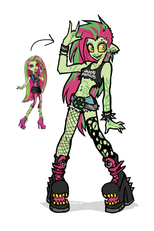
venus if she was awesome
speedpaint and more thoughts under the cut
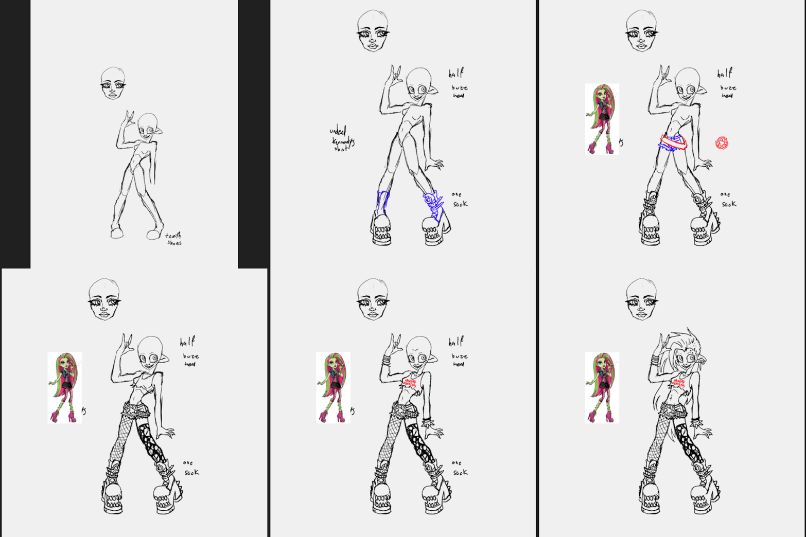
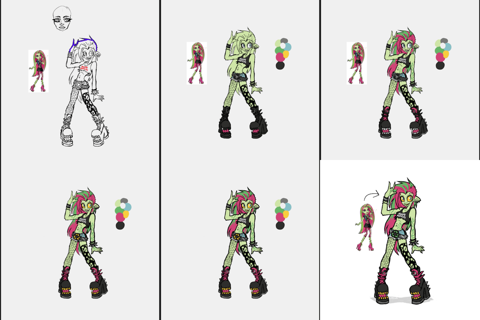
venus has always been one of my favorite characters, though i feel her design is pretty underwhelming with a lot of wasted potential. this is kind of a redesign, kind of my own personal headcannon, and kind of how i imagined venus in my head as a kid.
this is supposed to be my version of g1 venus, more similar in facial features and keeping the straight hair. i absolutely love her new hair and face in g3 but im hesitant to call the new outfit an improvement. both g1s outfit and g3s outfit are bad in their own ways. i dont want it to seem like im shitting on the new design. again i think the face sculpts, hair, and body types of g3 are so awesome. its great to see more diversity being included in the designs. i just decided to go with g1 venuses look because thats the venus i grew up with
i definitely took some inspiration from g3s outfit for this design. i like the idea of it but the execution is just not great, not to say her original outfit is any better. i feel like out of all of tge original monsters she was the one with the most waisted potential. i love her personality and the abilities she has but the way she was styled has always bothered me.
in the movies shes described as “eco-punk” which is SUCH a cool style to go with a plant monster character. i just feel like the “punk” in “eco-punk” was never really represented in her outfits. i personally love punk music and clothing; ive been an active member in my local diy scene for many years and i love seeing all the outfits people put together.
i thought i would give her an outfit that shows off a couple of my personal favorite staples of punk style. big chunky leather boots with lots of straps and buckles. kept the shoe mouths from the original because they cool as hell. lots of leather, studs, spikes. i gave her denim cutoff shorts inspired by her gen 3 outfit, same with the torn black top. punk style has a big focus on comfort, practicality, and making things yourself. i imagine she cut a pair of old pants into shorts, roughly cut her “undead kennedys”band shirt tank into a crop top, and probably repurposed the remaining fabric. i also totally didnt draw this whole thing as an excuse to use that pun. i included asymmetrical leg accessories, with one fishnet stocking and one torn up sock. i also feel like she repurposed these, continuing to wear her old torn up socks instead of just throwing them out. i gave her a big chunky studded belt matching one of her cuffs with a recycling symbol belt buckle. i feel like it communicates an important aspect of her personality just at a glance, plus i just love big belt buckles. lastly i added piercings because 1. theyre cool and 2. i for some reason remembered her having an eyebrow piercing but i guess she never had one.
i mostly kept her body and hair the same. changed her ears and hair color slightly but thats just personal preference. i decided to make the vines on her body look more like tattoos instead of being 3d. i imagine she can make them grow into real vines, but when shes not using her powers theyre just flat against her skin. gave her a facial expression that made her look a little more unhinged. she might only do things for the good of the earth but she can still mind control people at will.
i wish i leaned a little bit more into the plant theming but im overall still super happy with how this came out. maybe ill made more monster high redesigns in the future
198 notes
·
View notes
Text
have you been doomscrolling? feeling awful about it? do you feel out of control? does it seem your autonomy has been swallowed by the ever present beast that is the internet?
we live in the most overwhelmingly stimulating age of humanity ever seen, and it's only getting worse. our brains are sponges, soaking up whatever we smear them across, and it seems more and more difficult to find a clean surface to rest on. i'm no expert or professional, but ive been born and raised into the internet, and i'd like to hand out some wisdom regarding this.
the main issue: brain poison
since the brain absorbs whatever it's exposed to, media consumption is unsurprisingly going to effect it. the type of media, the amount of media, and the frequency of the media all play a factor.
it's not the internet itself that's bad here. it's the media on the internet, and the platforms designed to suck in our attention and keep it there until we're rotting inside our skulls.
we're never going to escape the internet. it's just a fact of life now, and a tool that can be used for wonderful things. so how do we learn to live with the internet and take advantage of its potential?
treat it like a dietary balance
staying aware of what goes in your brain is just as important as being aware of what you're eating. if you eat carelessly, don't listen to how your body feels after you eat certain things, and ignore any sickness that might result from rotten food, you're going to have a bad time and wreck your guts. the same goes for the brain.
you want to have a good mix of various types of media in the right amounts, or approximately so. if things are feeling bland, maybe diversify. if things are feeling stupid, try something more intellectual. if it's feeling too much, cut back on all of it
the following are three things you can do to maintain a sense of control and awareness over your media diet. this isnt a step by step and is in no particular order, theyre just ideas to carry forward in general any time it could be helpful.
1. digest
this is the process of thinking about and remembering what youve done throughout your time on the internet. it could apply to any period of time. so you might think, 'man, i've done nothing but watch tiktok all day.' or 'i've been scrolling twitter a lot more this past week.'
i feel like most people already do this to some extent, but it manifests as a fleeting sense of anxiety or shame that doesn't lead anywhere. analyze that feeling, and ask if it's really true or helpful.
ask if your media consumption is making you feel less focused, distracted, putting you into a brain fog, making you fall asleep when you don't want to, making you irritable and angry, drawing you into arguments, keeping you awake at night, or upsetting/disrupting you in any way.
digestion also means appreciating the good stuff and recognizing the good feelings you get too. so also ask if it's enriching you, helping you learn something new, giving you a new perspective, exposing you to something beautiful, passing the time, relaxing you, honing your focus, or generally lifting your mood.
2. cut
cut certain types of content from your life once you've decided they're not good for your media diet. block people. move on. tell youtube to stop reccomending that channel. block them. unfollow people. unfollow tags. block the tags. blacklist things. do it. forget the awful things that make your brain hurty. click the block button. uninstall the app. you know you want to
consider removing yourself entirely from websites that are designed to be attention predators. if you consistently feel like youre 'stuck' on a site and cant leave, it's probably best to just delete your account and get out of there. tiktok is NOTORIOUS for this.
i also tend to keep my following or subscribed count low. keeping the stream of content short forces me to find other things to do with my time. this goes hand in hand with things like turning off infinite scroll. it provides an 'end point' where the repetitive action of scrolling down stops bearing fruit, breaking the doomscrolling cycle. the internet is almost an infinite place, and its up to you to build walls around yourself so you arent lost in it forever.
its also important to get off the internet in general sometimes. i know this is obvious, but literally touch grass on occasion. doing anything with your physical body away from the screen will be more enriching than sitting there scrolling for hours. whether it's just a 5 minute walk around your house to stretch your legs or a 6 hour hike every weekend, part of cutting media will mean replacing it with real life. looking at some plants, doing a pushup, or working on a knitting project can be like rinsing your brain sponge under some cold, clean water.
3. curate
the flip side of cutting is curating. you'll want to be looking for media that makes you happy and feels productive or meaningful in some way. anything that not only doesnt make you feel like you wasted your time, but specifically makes you feel like you spent your time well, is a green flag.
keep in mind entertainment just for entertainment's sake is good for you too. you don't have to be watching university lectures and tutorials and stuff all day. finding high quality entertainment, such as personalities you enjoy, good production values, and inventive ideas can be really difficult. find the people who dont make you feel like a cocomelon baby and stick with them. from there you should be able to find similar content.
what's good for your soul is going to depend very much on you as an individual. this is also going to be an ongoing process as not only you but the internet both change and evolve. the important thing about this step is that you Make Decisions about what to consume. even bad decisions! it's all part of the process, and it's all about reclaiming your autonomy.
4. eat your junk food
this isn't a military drill or an exact science. i'm just a guy on tumblr with an intimate connection to his own brain and a LOT of time on the internet. that's my only credential. sometimes i want to turn that brain off and just mindlessly consume without putting any thought into what dirty dishwater is soaking into my sponge. sometimes adhd brain wants me to watch a shitty B movie in recap form so i dont have to commit to a full movie. sometimes i get stuck in the youtube shorts for like 3 hours.
that's fine. the most important part of any kind of self care is that a little bit is better than nothing. even just being aware that youre consuming something bad for you and knowing you arent ready to stop just yet is better than nothing.
thats it!!
now you should be prepared to take back some control over your media consumption. be gentle with yourself and take your time. eventually this stuff will become second nature, and you'll be effortlessly digesting, curating, and cutting media like it's just part of your personality. remember YOU have control over what the internet thinks you want to see. dont let it force feed you nasty slop anymore. let it be a reflection of your mind, not the other way around.
and good luck!
121 notes
·
View notes
Text
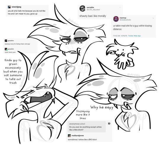
Surprise! I am going to rant about my own redesign and art! I think this is me mentally preparing for the helluva boss episode next week and praying to god it’s actually good. I’ve also been nursing a bit of a hangover today so forgive me if my wording is a bit more jumbled than usual
Im a big fan of my Angel Dust redesign, but in the general aspect of my art, a lot of my poses are a bit flat. That can be from either posing issues on my end, trouble with facial features, or just some secret third thing, but I think so far Ive been enjoying drawing much more cartoonishly as of recent. That vox canon & headcanon drawing was super super fun to do even though it was supposed to be vivzies style, but I used to have a style with more sharp angles and pointy curves that I honestly kind of miss, I also miss playing with cartoonish proportions!!
My art style may end up changing eventually, but my main pieces will stay in my usual style and my more doodle-y ones will probably be in a more cartoony style like the ones above. While theyre definitely closer to canon and meant to be inspired as such, the difference is that I can draw diverse body types in said artstyle! I also cant lie, Angel’s chest fluff is one of my absolute favourite things to draw and it’s so easy in this style…
About my redesigns though! This is mostly about Angel, but I’m gonna slap this here from DMs with a friend: “Im so pleased with this genuinely im so happy he has his little pedipalps, theyre technically also still his fangs but now he can move them and stuff and :33 typically for male spiders the pedipalps are a reproductive organ but that isnt the case for angel or many other arachnid or insect sinners id say so I think personally most of them have developed pedipalps for primarily other reasons like fangs in Angels case or maybe something similar to cat whiskers for other people”
In my original angel dust redesigns I just couldn’t find a way to draw his fangs in a way that made me happy because I want to keeo the same energy in his face as the original. Big clunky fangs that stick out just didn’t work for him and while they made him look like a spider, he lost that sort of angel-ness that I need when drawing him so I instead looks to the pedipalp aspect of spiders to move them off of his mouth and more onto his cheeks. It’s a very small change but it improved the design in my eyes significantly and just really made me a lot happier. I wont be updating his redesign post as of right now and maybe never will, but if I do yknow why now!
I just really really like drawing this guy a bit rubbery, hes supposed to be fluffy so like he should move kinda soft in a way? I dunno how to explain it rn, its 2 AM at the time of writing this so im gonna lay the hell down now!
#hazbin hotel#hazbin critical#hazbin hotel criticism#hazbin hotel critical#angel dust#hazbin angel dust#hazbin angel#anti vivziepop#angel dust hazbin#angel dust hazbin hotel#angel dust redesign#hazbin redesign#hazbin hotel redesign#my art#will add alt text later
130 notes
·
View notes
Text
I dont want to text post too much on this blog because the whole point of this blog is for me to make drawings even if theyre crappy, so that I dont ramble, because rambling is one of my compulsions. But I dont have time to draw today and Ive been thinking:
I'm really happy that I am finally open/semi open about what I like sexually. My friends all know and joke with me. I tell people about my fat preference if it comes up, and I don't worry that I'll "look creepy" when I bring up characters that I have crushes on in group conversations anymore.
I really used to think that if anyone realized I had a preference, that I would be feared and exiled. LMAO. (Especially as someone who is a serious sfw artist trying to become a professional). After that fear went away, I was still obsessed with proving I was "good" (only liking the finest art and characters, checking myself 24/7, never admitting I enjoy kinks/kink art). I get OCD still, but I'm realizing all my fears made no sense.
I feel guilty and embarrassed, because this fear and OCD is a product of fatphobia I absorbed -- meanwhile I'm relieved yet saddened because it doesnt seem like I'm the only one who has had these feelings.
I'm glad that when I'm not paralyzed by OCD, I get to be myself now. It sounds dramatic if you can't relate but being sexually repressed and secretive for 20 years has been MESSED UP. (and it gave me OCD).
I'm glad that I get to design/write cool fat characters and not just say "oh yeah representation is important to me...thats all..." like some saint, but now say "representation is important to me and Im HORNY" like a real human person.
Hopefully draw something more about this later.
25 notes
·
View notes
Note
That'd be helpful, I wanna draw fanart


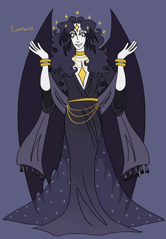


after many grueling hours they are finally done! ofc their outfits change but these ones give a good idea of how they dress. some design notes and inspiration underneath. im gonna redo their bio sheets at some point soon too so look out for that
in order of the height chart:
dumois: i wanted to make her look kind of like a little kids nursery and also incorporate her astrology interest into her design more so i gave her more charms in her hair and a cute quilt-inspired victorian nightgown. oughh shes so cute i love her sm <3 i think her colors turned out a lot more comprehensive compared to her old design where i threw a bunch of different purples at the wall and they kind of looked bad. now shes so prettyyy and i think the naptime sleepy cowsheepgirl aesthetic has definitely been captured
zubi: their fashion is usually the hardest for me to conceptualize because its like a weird mix of beachy clothes and emo rave... i think this outfit turned out good though, and i really like that the pops of coral/salmon evoke the beach while the dark fishnets evoke deeper dark water. i also almost gave them longer ponytails (think like miku has) bc i thought it would look pretty in water but i decided not to bc everyone else besides gaglug has long hair and i think the weird hair they have now has a good unique silhouette. i also turned their fins the other way so that they would actually be helpful in water
paezel: hes finally buff!!!! the crowd goes wiiiiiiild. he also has his pact tattoo on his arm (its supposed to look like a plant bc thats maeves thing) i feel like the tail kind of went from bovine to almost dragonlike but i actually really like that. i dress him like in the second spongebob movie when theyre in the apocalypse and i love it. not much else to say but i think he definitely looks a lot better
aureus: ok so her design turned out so elaborate that i had to go back and redo the designs i did before hers (dumois, lumiloriol + zubi) so that they wouldnt look lame asf which overally definitely helped their concepts. aureus is supposed to be way more over the top than everyone else but still i mean i cant let the others be flops. shes soooo pretty though i used a reference for her rococo style and it definitely helped a lot. my princess my darling i love youuu
lumiloriol: i usually try to keep their clothes kind of simplistic to highlight their own natural beauty, but i did give them the scarf kind of thing and the train for some layers. for lumiloriol i usually take a lot of inspiration from gothic art especially john martins paradise lost art (because of course) and i definitely feel like i was able to incorporate it. i also think they look super androgynous which i loveee bc angels usually are... they really do look like a fallen angel even if they technically are a step removed
concupiscence: connie i luv uuuuuuuu <3 concupiscence has gone through a lot of different inspirations over the years but ive settled into a britney spears/paris hilton smashup for him and so i based his outfit on various outfits both wore in the early 2000s. shes also got the striped tongue now which i decided to give her a while back bc i think its a fun addition to her design, reminds you that shes a creature. my girly <33333
gaglug: yeah um i got rid of four of its arms... they were making the design wayyy too busy and hard to draw. now it has funny little weird grubby arm thingies though so its okay its still buggy. umm not too much to say here since it doesnt wear clothes but i do love its bug hooves so much :)
anyways i love you my silly 400 year old 20 year olds
21 notes
·
View notes
Text
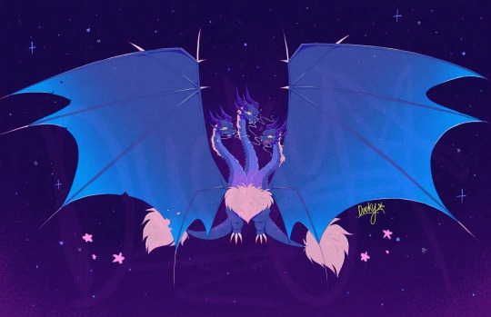
NEW KAIJU OC?!?!
Well, yea technically. Basically i was interested in figuring out how id go with making my own kaiju. At first i wasnt sure where to go for designing one. So i chose to base it off another existing kaiju for inspiration. I kinda wanted to go for a dragon type kaiju (i like dragons) and the only thing i could think of was Ghidorah so i went with that (now that i think about it more, I could’ve maybe used Manda too prob but oh well, Ghidorah was still a good option). I added some different details to mine that make it unique to the og Ghidorah
My idea was that it could potentially be a relative to Ghidorah (being of the same species) but still far apart from one another to the point they arent all that aware of the other existing (theyre in for a shock when & if they do encounter each other lol). This version actually relies on cosmic energy derived from such sources like stars & generally anything that produce some form of energy within the vast universe (basing it off how Ghidorah themselves originally came from space & this variant being much more dependent on that factor). It stores that energy & relatively stays in a dormant stage for an extended period of time until when faced with the challenge to defend itself or fight off those it deems as a danger. Then it would release all that ginormous amount of space energy that manifests itself as a rapidly expanding glow of extremely bright light. Enough to cause extreme damage & bring down the opposition. It can gather energy by using special crystals it can grow (took that also as inspiration but from Space Godzilla) & become as some form of attracting & absorbing the energy. In a way, the energy is like its main source of food & energy to maintain itself (right after releasing a lot of it during its final attack of using that glow, it would be put in a highly vulnerable state if not recovered by regaining some energy back soon enough). For the most part, they mostly sleep (being lazy 24/7 just like me fr lmao) to keep all that energy but can be potentially dangerous if disturbed or provoked in some manner
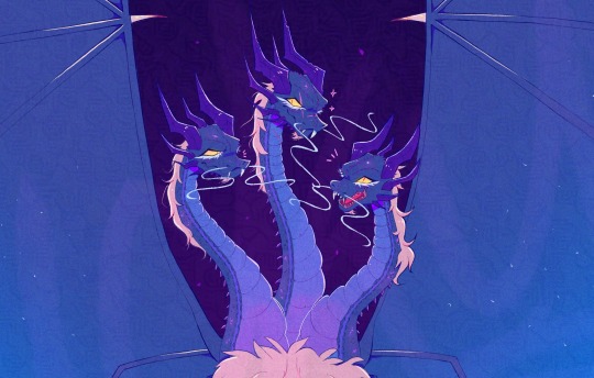
(Here’s a better closer look at their faces. Realized the canvas’ too big to properly see each of them-)
The name of this kaiju you may be wondering???
It’s Ryudorah
(Yea i know im the most creative person out there. I combined another nickname i use for myself and just added the end part of Ghidorah’s name to make it clear it’s related to the other kaiju. I couldn’t think of anything else im sorry😭)
And also each head has its own individual name:
Do, Re & Mi
(Named after intervals in the musical scale (ex: Do, Re, Mi, Fa, So, La, Ti, Do)
Did i mention this kaiju can also technically sing too :)
I did have a lot of fun with coming up with the concept for them (tho it honestly took longer in designing them due to a busy schedule ive been put in as of late & finding the time to finish it) but im glad to finally be able to share this with you all. Hopefully I can share more about them soon (i have a whole google doc’s worth of lore lmao) & probably draw them again (tho maybe a lot more simplified by then). Didn’t wanna overwhelm ppl with the huge amount of info so I’ll prob slowly reveal more over time.
[Another thing too is that i still am new to the fandom (tho with more knowledge from getting to learn more from the source material) & most of this i gathered from already know stuff i knew. Tho im also open to feedback & maybe some ideas to add onto my own kaiju. So id very much appreciate it if there’s any suggestions from you guys ^^⭐️]
(I’ll only be taking constructive criticism btw. Anything hateful will obv be ignored)
#godzilla#kaiju#kaiju oc#my very first kaiju oc!!!#oc artwork#oc#I feel like both this guy & Ghidorah would have a rough first encounter#i love how i also made them the lazy ass who sleeps all day & only wakes up to tell others to shut up when they’re being annoying#i really tried with making this#i think theyre really cool so far#appreciate any feedback on this#i should probably draw a Ryudorah & Ghidorah interaction just for fun some time#youre also free to do fanart of this guy if ya want#i love them very much
38 notes
·
View notes
Text

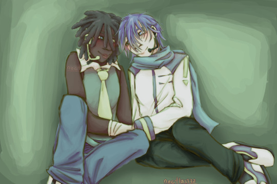
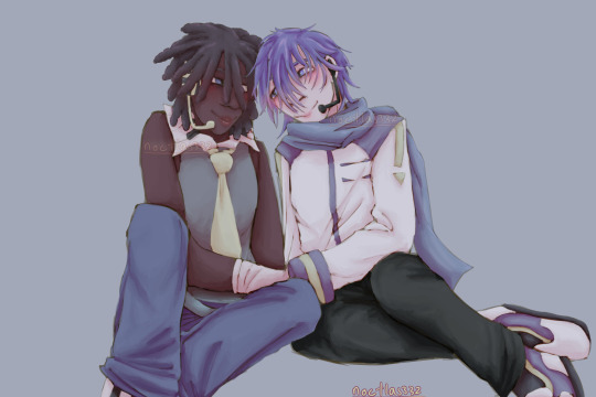
here is that rumoured leon x kaito art,,,
why leon x kaito ?? well for one (and i hate to say this) i never really liked gakukai, like i can see the appeal and i wont bash it but its just not for me,, i could say kaimei is kind of cute and that whole "being literally made for eachother" thing is also quite nice but i break out in a rash when i try to draw straight couples (slahs jay i have nothing against the heteors), BUT ALSO, leon x kaito is good, not just because i dont like other popular kaito ships, but also because its just good,, theyre the first 2 male vocaloids, part of the original 4 daisy project vocals, a couple of the only 5 v1loids, so they have like old married couple vibes to me, like theyve been together for so long that it would be weird for them to be apart, theyve just always been together yk,, also i like how they were NOT "made" for eachother, like how leon and lola were a pair, and kaito and meiko were one, so kaito x leon goes against that,, its like those queer fantasy stories/ oc universes i somtimes come across like "this PRINCE was in an ARRANGED MARRAGE with this PRINCESS, but hes GAY and shes GAY IN THE OTHER WAY", like they werent supposed ot be gasp, but they are anyway gasp. like theres no forces opposing leon x kaito but it just kind of like wasnt intended when they were created, and i just like the comfort in their queerness that they have
you might now be thinking htough, "dont the exact same things apply to lola x meiko ??" and the answer is yes i will be drawing them too. i might have drawn meiluka in the past but that was peer pressure and that ship also just kind of never was it for me, so lola x meiko it shall be.
i love the idea of the 4 daisy project vocaloids just all hanging out, like theyre all good friends, maybe they all live together slendermans creppypasta mansion style, and theyre just very mlm wlw solidarity,, or hostility either would work. they are basically all parents to the younger loids an di grergerhhhhhhhhh,,,
in otherwords leon x kaito real, as well as lola x meiko
oh also this is my own leon design, i dont have a ref drawn up but feel free to draw it this design yourself if you want to,, i think that that whitewashed leon character mascot probably has a place within the fandom, seeing as its the most commonly accepted mascot for the first ever vocaloid, but it just does not work as a protrayl of leons voice. he can be a fanloid or smthing, but actual leon is voiced by slahs modeled on a black person, same with lola, so they are both black too. my design is a bit plain and heavily based on cfm character vocal series, so ill probably work on it more in the future
sorry for all this writing but i need to make leon x kaito propaganda, as i dont think ive ever seen anyone ship them outside of "kaito x fucking everyone as long as it passes as yaoi", and i need them to be real they have been on my mind a lot recently
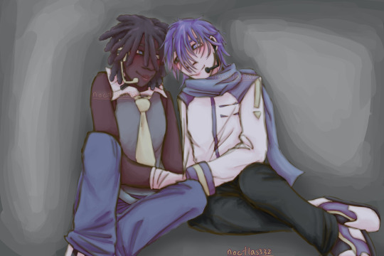
ALTS (NOT GREEN) (NOT CLICKBAIT) VV


#art#digital art#vocaloid#fanart#my art#mine#vocal synth#vocaloid fanart#vocaloid art#leon#leon vocaloid#vocaloid leon#kaito#kaito vocaloid#kaito shion#vocaloid kaito#leon x kaito#kaito x leon#do they even have a fucking ship name#ok the shipping wiki calls them leokai#so that it shall be#leokai#writing
40 notes
·
View notes