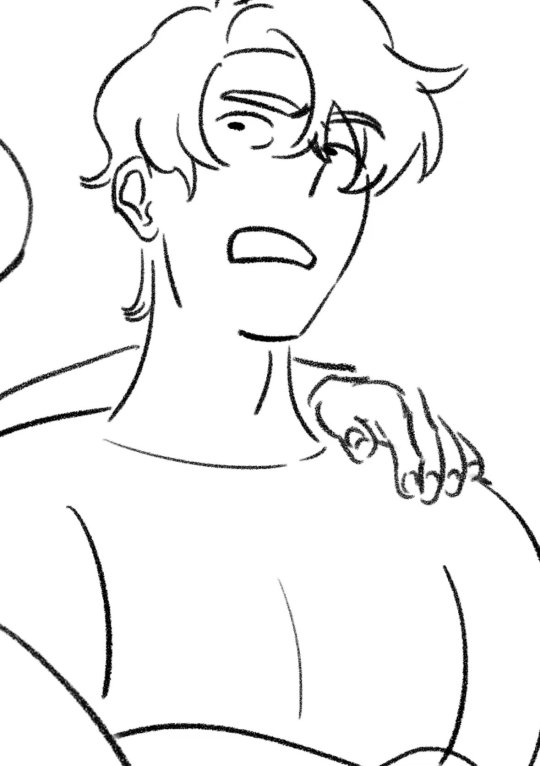
#ITS NOT GREAT BUT I DONT HAVE TIME I HAVE BACKGROUNDS TO DRAW
Explore tagged Tumblr posts
Note
so if this beauty is BADLYdrawnronpa, what goes BETTERdrawnronpa look like???
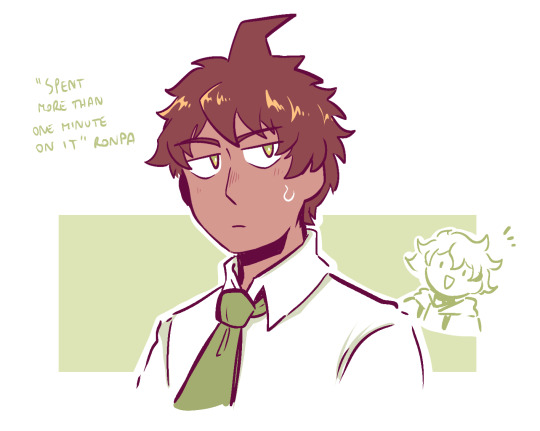
#admin post#used this as warm up before doing my actual assignments#ITS NOT GREAT BUT I DONT HAVE TIME I HAVE BACKGROUNDS TO DRAW
1K notes
·
View notes
Text
award for most neurotic 13 year old goes to...!!!!
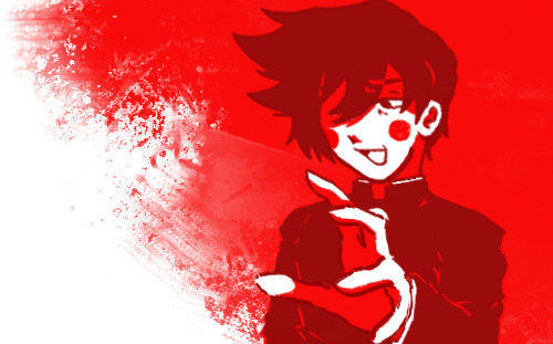
(LOW-EFFORT FUNNIES UNDER CUT)

#mp100#mob psycho 100#kageyama ritsu#ritsu kageyama#Okay. fandom tags out of the way now I get to be annoying#so. um. several things first i havent properly drawn anything digitally since August?#and this is also my first time in several years to do something on a computer. and not my phone#I have yet to invest in any sort of shitty tablet so this is a bit stiffer than i would like but its fine!#I've been for lack of a better word '2018-maxxing' because i managed to get back into mob at the same im back on bandori.#its great. probably#But yeah i dont know how mp100 re-entered my brain it just happens like that sometimes.#This has all reminded me awfully of how formative ritsu was for middle school me .#funny thing i remembered is spending several history classes drawing ritshou. fun times#also caption is completely a lie the average hobbyani protagonist is significantly worse than ritsu but shhhhhh#also how the hell do people come up with backgrounds. i just put colors there because i think theyre cool. if it works it works.#someday I'm going to make myself learn actual composition techniques and anatomy and literally every other art basic
106 notes
·
View notes
Text
SORRY. JUST REALIZED I ORIGINALLY SKETCHED THE STUFF FROM THAT LAST WIP POST IN. MARCH.
GODDDD...
#I GUESS MY WRIST FUCKING UP PUT ME FURTHER BACK THAN I THOUGHT#but also like. i was JUST talking about it in chat. i have a comic about the Three Of Them that i wrote in a frenzy in FEBUARY.#by the time i rewrote the dialogue and figured out the ending it was SEVEN FUCKING PAGES. SOLID.#OF JUST SCRIPT.#I STILL HAVENT EVEN FINISHED SKETCHING IT. YOU GUYS ARE NOT SEEING THAT SHIT UNTIL 2024#sometimes an idea of them will grasp me and i will just write the script out in the middle of the night#I realistically. dont even know if you guys are gonna like my scripted stuff.#the first scripted thing i wrote was a yellow&duck comic that im STILL SKETCHING BACKGROUNDS ON#i could be really bad at writing for them. i could totally not get them at all.#but hey!#we'll see when we see I guess#BUT YEAH UH. SORRY FOR LITERALLY ALL I POST BEING WIPS NOWADAYS I AM JUST WORKING ON LIKE 5 DIFFERENT DRAWINGS AT ONCE#STILL TRYING TO GET MY SPRING STUFF DONE. AND ITS ALMOST FALL. SO :]#I JUST CARE SO MUCH ABT THOSE PUPPETS DAWG I HAVE SO MANY IDEAS FOR THEM#I HAVE!!! EVEN MORE DRAWINGS THAT I JUST HAVENT SHARED!!! bc i either made them for something real specific in the discord#or bc theyre phone doodles and i dont think theyre that great. or bc i made them just for a friend and thats like. theirs now kjdhkjdfhs#a lotta times once i finish drawing smth for a friend ill just never post it bft. so its just like. for that one thing and nothing else#ANYWAYS HAPPY 3 AM IM FORCING MYSELF TO GO TO BED#AND I STILL HAVE THE ANIMATIONS#AND THE FANART FOR LIKE 5 FICS I WANNA DO#OHHH GOD CMONNN BRO IM NEVER FINISHING ANYTHING#my postings
26 notes
·
View notes
Text
i have. 35 attacks left. to revenge. ive gotten like. 15 out of 45 or smth i dont remembor the number
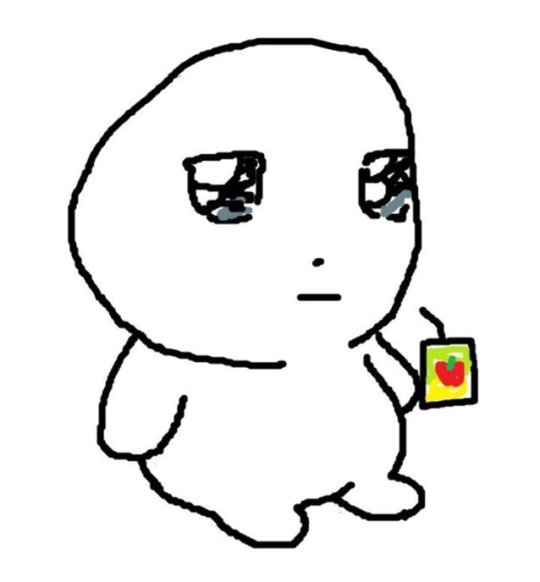
i naur realistically i dont have to revenge them all but also. i really really do love and appreciate the arts wahhhh. i want to hang all of them on my wall to look at forever. and i def want everyone to know i appreciate and that every art is rlly meaningful to me 🥺
#me looking at friends whoeve warned me ahead of time 🫣#dont get me wrong its so fun but also im trying not to burn myself out so im taking it slow WAHHH#my goal rn is focus on mutuals and friends. then the rest#im motivated fr though. i just dont want get art block and get tired halfway thru by trying to rush thru everything#i shall do what i. can. i am excited though#bee buzzes#also i cant even explain the overwhelming inspiration seeing my characters in dif styles and takes has on me ???#i licherally want to draw all of them immediately. like this is the biggest motivator ever its insane#like me taking breaks from artfight by doing some enako stuff. and tbh i think its really great. ive been messing more with backgrounds#and environments and etc etc#i think its perhaps been the best ive been in a long time? experimentally too. and im having fun! i feel less... stuck and so s unmotivated#and the best part is that its all been really fun. geniunely. if anything im proud of myself thinyear#this year i mean
9 notes
·
View notes
Note
Thank you for getting me to finally try pixel art! I‘ve always wanted to get into pixel art but I never knew what to start with and always ended up procrastinating. Your blog and the post you made on learning pixel art were what finally pushed me to give it a go. It was really helpful and I managed this little animation in Libresprite.

I definitely want to improve and your art is like the ultimate goal lol. Do you have any tips or instructions for how to get better or on what to focus on in the future? I‘d appreciate any kind of criticism/input you are willing to give! How do you manage to make such gigantic and beautiful landscapes?
thank you!! and i'm so happy you decided to give it a real go, you're doing great already!! the rendering on the body and the pink shading is really nice.
i can help a little with animation stuff but i'm not an expert, ill write something out about backgrounds at the end
i hope you don't mind but i edited the sprite a little, just to illustrate some stuff
🤺Animation stuff

i added an extra frame near the top of the arc so it slows down. this is called ease or slow in/out and usually happens at the beginning and end of movements. u can do even more slow but this is just a quick version
i also removed the middle frame (where the tail is straight down) to make the swing appear a bit more powerful. this could be the principle of timing in the same video. you can exaggerate smears if you do this, its up to you!! lately i tend to exaggerate stuff a lot, things arent super noticable in motion
i also got a good bit of advice from nickwoz that helped me, basically when you begin to animate, it really puts the rest of the sprite being still into focus. try to think of how you could animate other parts of the body, even subtly. and sometimes if individual pixels stay still they can catch the eye in an unintended way as well, just keep it in mind!!
if you want to learn animation more, you could take a look at duelyst sprites, they have incredible idle and ability animations, i study them a lot

heres one i downloaded a long time ago. i recommend just downloading stuff you like and looking at it!! i have a huge collection of pixel inspo. slowing animations down can really help you understand whats going on. its just a bunch of simple elements put together that makes it look so good.
IF U WANT MORE RESOURCES/ARTISTS I REOCMMEND TO GO AND STUDY LMK!!! IM LIKE A WIKIPEDIA, I AM A BIG FAN of pixel art and love to share
🌿 OK lets talk about landscape stuff
it looks like you have art experience already, but im gonna talk as if youre a complete noob cos it might help some other people who read this!! ur doing great 👍
❓ how to learn: study (and practise a lot)
what i mean by study: draw it, copy it, try to understand it. you can try to change characteristics about it. changing the angle or lighting can help u understand how something works in 3 dimensions.
sometimes it takes time, dont worry, you will figure out your own style through doing studies, its all a process
❓ how to draw landscape details?
study pixel artists and how they do it recommendations: fool, slym, jubilee, deceiver
also please look at real world references!! you got to build that visual library
❓ how to learn composition?
study traditional artists or animation. i did a ton of studies of ghibli backgrounds which i think helped my growth a lot recommendations: arcane, studio ghibli, traditional painters
im gonna break down a piece as well and maybe that will help. this is one from 2022 but its still one of my most popular and its pretty simple too!!


if we remove all the fancy stuff what we have is actually really simple. just a few large, overlapping shapes that all point towards our focal point. it's the brightest area with the most contrast and many edges point into it.
go to pinterest or google and just search "pretty landscape" or "mountains" or something and you can see what i'm doing is nothing special or unique!! break it down into bigger shapes to begin with, its just different areas of material mostly.

and heres how you can make any landscape from any colours. purple sky or mountain? orange grass? ok !! it all works, it doesnt matter. i just blend the colours.
when parts of the landscape are in the distance they become closer to the sky colour as there is more "sky" in between you and it. its called atmospheric perspective. so if the sky was red, the clouds would fade towards red.
OKKK i dont know what else to say so i hope that helps!! honestly 90% of what i do is intuitive and hard for me to really explain, so you dont have to know The Rules, you just kind of pick up stuff as you go.
GL and thanks so much for showing me your art!! please keep going!! 💕💕💕💕
185 notes
·
View notes
Note
hihi not a creature au ask sorry but do u have any tips to improving art skills? /gen, second question how did u get into digital art?
dont be sorry the asks are for anything really
my biggest tip is pretty boring and has been said a billion times probably but you u fortunately need to do the boring basics. you can go anywhere you want from there and its gonna be much easier. ex. - drawing alot of boring 3d shapes in dofferent types of perspective. boom now you can draw backgrounds. drawing from models in realism (live ones are better but photos are great too). boom now you have the skill and knowledge on how the human body works and can play around with it to develop ur own art style. greyscale form practice (like shading cubes or drapery or still life). boom u understand how light and shadow works. the hardest thing really (imo) is learning colour. me personally, traditional painting (acrylic, oil, guache, tempera) helped the most (again ALOT of still life). but learning colour theory, or just fucking around with whatever colour medium you like until it looks good is also very helpful. so again basics are really important.
next thing is, use resources. theres so many free art resources out there and theyre very helpful. my personal fav lately are quickposes and david finch on youtube. use refs, if needed take ur own.
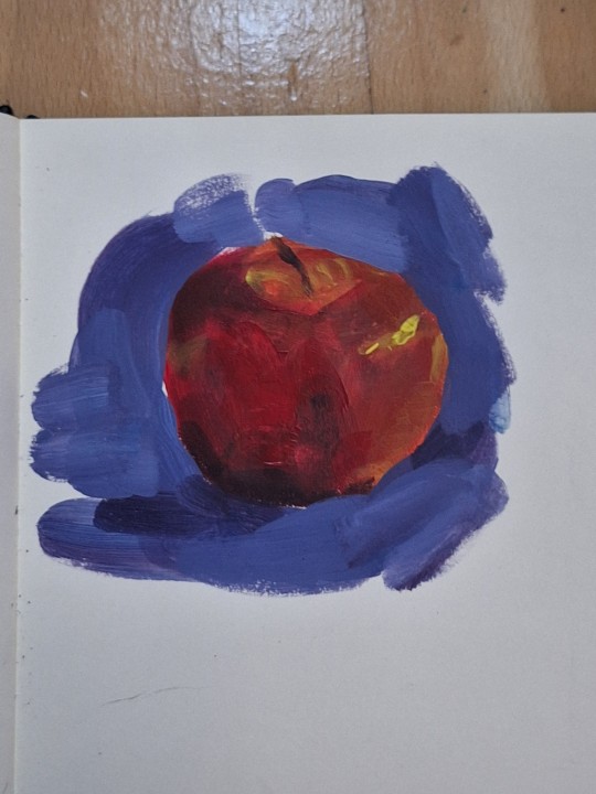
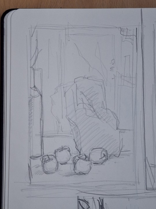
also mindset stuff like being okay with making "bad" drawings. shitty sketches, wierd colour xombinations, wonky perspective. making art is not abt not making mistakes, but abt making them and learning from them cuz if u dont try ull never get it right, even if its bad at first. also always go from overall to detail. make 5 minute sketches, that forces u to focus on form and translatinf the overall idea more than hyperfocusing on detail. and ofc alot of consistent practice. draw every day, whether its a 5 min aketch or something more polished. (im gonna attach some of my oractice sketches so u get the idea of what im talking abt cuz i feel like im not the best at explainin)
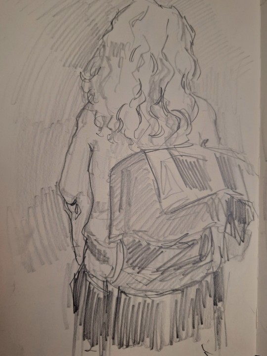
as for digital art, i was first drawing on a regular ass samsung tablet with a pen wrapped in tin foil (it makes it work like a stylus fun fact) on ibis paint which is free and honestly it was great. on thing is if ur starting digital get some free simple program cuz if u try to start with something thats "industry standard" its just making ur life harder cuz on top of learning how to draw oj a tablet, you have to learn the software, and u dont need that when u start. i got my actual drawing tablwt after like two years and i was working in krita (also free and really good). now i work in csp and its amazing but theres alot going on and it is pricey (but well worth it imo) digital is easier in alot of ways but i still recommand learning traditionally
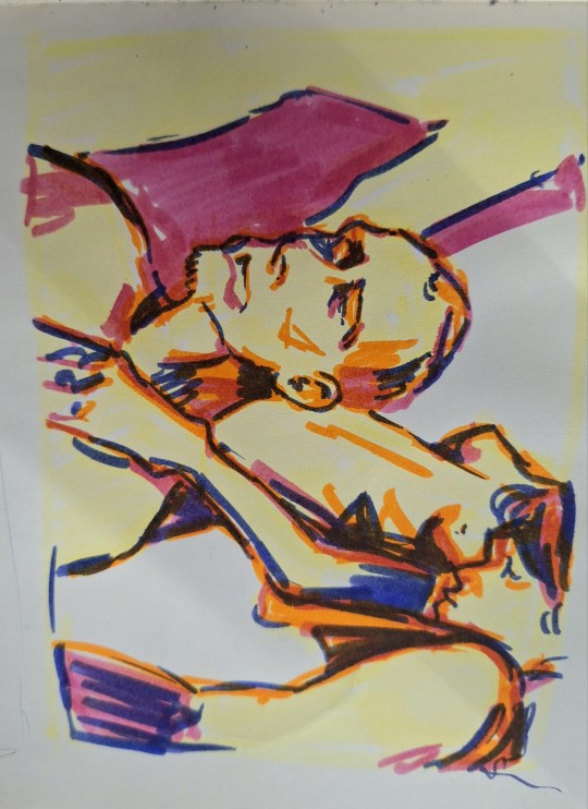
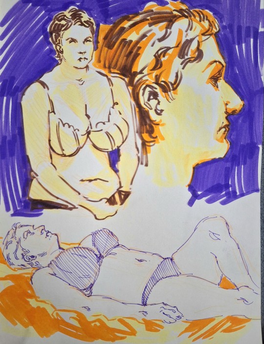
sorry for the shitty photo quality im bad at posting traditional art. but thats what im talking abt these are like 10-15 min each, focusing on form and the overall and not going into much detail
41 notes
·
View notes
Note
Are there any tips on drawing stomachs? Or drawing in general?
So I'm gonna go over the basic steps I take when drawing a stomach.
HOW I DRAW A TUM (INTERNAL)
I sketch out the basic shape of it, which is normally a circle with 2 curves. This, of course can be altered based on your character, but again, this is just the most average tum shape.

2. I then sketch out the basic shaped of the person/being in the stomach. Normally I do this on a separate layer, just in case I need to erase something, that way I dont erase my base sketch of the stomach.

If your person/being in the tum is big enough, they will probably make the stomach bulge a bit. If that's the case, then follow step 3, if not then feel free to skip that step.
3. Shape the stomach around the person/being, make sure to leave much of the original shape in tact, but in places that the person/being is making contact and is pushing against the stomach you will want the tum to curve around it.

4. This is now when I outline and refine the character.

5. After that, I add some depth to the outside walls of the stomach, adding additional thickness to the parts where the person/being is pushing into it. In this specific example, it is in places like the head and the hand.

6. Now its time for my favorite part, the goop. Whether its saliva or whatever else you may want, this is one of the best parts about drawing a stomach. If you want a more detailed tutorial for these let me know, but essentially the biggest thing to remember is that they will be thin, and if there is a point where its too thick, you can disconnect it. That is shown a lot in this drawing, where the base of the saliva strands have a hole in it.

7. After that, all that's left to do is shade in the background portion of the stomach, and your done! Normally you will see me shade using the hatching technique on the right, but the left works better for many others art styles.


Remember, this is just how I draw this, not how it has to be drawn. Ive also gathered a lot of inspiration from the way @pineappleparfaitie draws their stomachs, who is another great artist you should 100% check out. Dont be afraid to mix and match techniques seen from other artist :)
55 notes
·
View notes
Text


example donation link
if you are an artist or something and want to offer the same commissions, please feel free to take any of these images and use them yourself (edit however you want, remove my art, obviously), the text is free to use.
*in the unlikely event i receive a ton of these, i might have to close them. will let you know. reblogs will be turned off if i close commissions
extra information below v


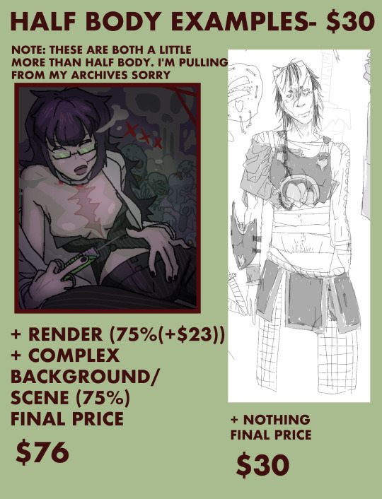

thank you so much for reading! i used all caps for ease of read, it comes across super agro lol sorry <3 i will be nice in person
also, small note, i dont consider mobility aids (including wheelchairs) to be props, those are free to add.
any further questions DM away!
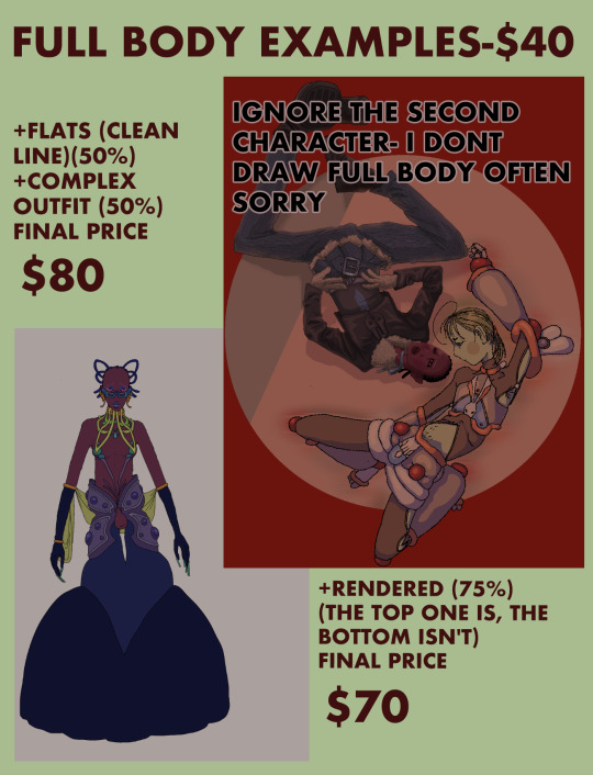
TEXT IN FIRST MAJOR IMAGES BELOW
------------------------------------
HOW DOES THIS WORK?
FIRST: AGREE UPON AMOUNT IN APPROPRIATE CURRENCY (SEE "QUESTIONS")
SECOND: WE AGREE UPON ONE OR (IF THE COMMISSION IS OVER $40) MORE GOFUNDME'S TO SEND IT TO TO SEND THE AMOUNT TO
OPTION 1: PAYPAL
SEND ME THE AMOUNT AGREED UPON VIA PAYPAL
I WILL IMMEDIATELY SEND THIS AMOUNT TO THE GOFUNDME OR GOFUNDME'S WE AGREED UPON
I WILL SEND YOU PROOF OF DONATION (SCREENSHOTS, FORWARDED EMAILS, WHATEVER YOU NEED).
(THIS IS MY PREFERRED BECAUSE I CAN BE 100% SURE THE MONEY IS SENT)
OPTION 2: STRAIGHT TO THEM
CREATE AN ACCOUNT WITH 'GOFUNDME' AND ALLOW THEM TO SEND YOU AN EMAIL TO SEND YOU A DONATION RECEIPT
SEND THE MONEY STRAIGHT TO THE AGREED UPON GOFUNDME/S
SHOW ME PROOF (SCREENSHOTS AND FORWARD THE EMAIL CONTAINING THE RECEIPT TO ME)
IF YOU CANNOT FORWARD THE ACTUAL EMAIL TO ME, I WILL NOT ACCEPT YOUR COMMISSION.
THIS HAS TO BE A NEW DONATION THAT WE MAKE TOGETHER (PEOPLE NEED MORE MONEY RIGHT NOW, I WILL NOT BE ACCEPTING COMMISSIONS BASED ON OLD DONATIONS.)
additions:
+75% extra character, complex background/ scene*, full render, complex outfit design by meee ;)
+50% medium background/ scene*, flats (will include nice lineart), complex outfit/ design, simple outfit design by me
*scene means a complex pose or it looks like they're actually in the background. interpretation of this is up to me
addition prices are calculated based off of the base price and do not compound
example calculation: half body ($30) + extra character (+75% of $30 = $23) + medium background/scene (+50% of $30 = $15) = 30+23+15= $68
for stuff not covered here (like a complex prop) just shoot me a DM
will draw: furry (not great but i can try), gore (incl extreme), horror, artistic/ casual nudity, fanart, your roc's, my doc's, romantic/ ship art, anything LGBT+ (people might not know me i felt i should add that)
wont draw: porn, fetish (up to me to interpret what i consider that), ship/ romantic/ nude art involving persons who are or appear to be under the age of 18 (even if they are 'aged up'.) even if its like kids kissing, i'm not comfortable with that cheers, anything i consider 'hateful' (i dunno man i felt i had to add it)
if i am uncomfortable i reserve the right t refuse aspects or the entire request
ownership of the art is yours, if you dont want me to post it to my account i wont
QUESTIONS
USD? AUD? CAD? EUROS?
I TRUST YOU TO BE HONEST, IF YOU ARE AUSTRALIAN, AUD, IF YOU ARE AMERICAN, USD. IF YOU DON'T USE THOSE, PICK ONE. (EUROS AND USD ARE WORTH MORE SO I WILL PUT MORE EFFORT IN NGL)
DO I (THE ARTIST) KEEP ANY OF THE MONEY?
NO!! 100% GOES TO A GOFUNDME (OR MULTIPLE) WE AGREE UPON MUTUALLY
WHEN DO YOU (THE COMMISSIONER) PAY?
ASAP! (BEFORE I START PREFERABLY) THESE PEOPLE NEED MONEY NOW. IF YOU CAN ONLY PAY HALF NOW, HALF LATER, THAT'S FINE. I WILL NOT SHOW YOU THE FINISHED PRODUCT UNTIL ALL THE MONEY IS DONATED. (I WILL SHOW YOU PROOF OF WORKING ON IT (A SKETCH))
WHEN WILL YOU (THE COMMISSIONER) RECIVE THE ART?
I AM CURRENTLY A FULL TIME UNI STUDENT, AND IF I RECEIVE A LOT OF REQUESTS IT MAY TAKE SOME TIME. I DON'T KNOW HOW STRESSFUL THIS WILL BECOME
HOW MUCH WOULD ONE LIKEDRAWING FROM MY (THE ARTIST'S) ACCOUNT COST?
DM IT TO ME I'LL TELL YA
HOW IS 'RENDERING' DIFFERENT FROM A 'FULL PAINTING'
RENDERING INCLUDES CONSIDERED LIGHTING AND SHADING AS WELL AS ATTENTION TO DETAIL. A 'FULL PAINTING' INCLUDES THAT PLUS INTERESTING COMPOSITION, BETTER LIGHTING AND DETAIL, A BETTER 'VIBE' TO IT. ITS HARD TO EXPLAIN, BUT YOU CAN SEE IT FOR SURE. IF YOU DISAGREE
REFUNDS?
NO FULL REFUNDS
IF I AM UNABLE TO PRODUCE A DRAWING IN A MAXIMUM OF 3 MONTHS I CAN REFUND YOU 50% OUT OF MY OWN POCKET. IF THIS HAPPENS, YOU WILL NOT RECIVE ANY ART FROM ME FOR THIS COMMISSION
IF THERE IS AN ISSUE WITH YOU DECIDING YOU NO LONGER WANT THIS, OR YOU ARE UNABLE TO PROVIDE SUFFICIENT PROOF (OUTLINED ABOVE) FROM THE ACTUAL GOFUNDME THAT IS NOT MY PROBLEM. YOU HAVE JUST DONATED MONEY TO PERSON/S IN DIRE NEED SO THATS AWESOME ACTUALLY
TO BE CLEAR: IF YOU CHANGE YOUR MIND AND THE MONEY IS SENT, I WILL NOT REFUND YOU. I WILL ONLY REFUND 50% IF I FAIL TO PRODUCE A DRAWING IN 3 MONTHS FROM TIME OF COMMISSION
53 notes
·
View notes
Text
Some blorbo about cedric and godrick meeting each other for the first time 🤧
Id like to imagine when he APPEARS in stormveil, godricks men are like "wtf is THAT" and gostoc at the gate comes runnin to godrick scared out of his wits like "milord, you have company" and godrick is like "why so pale? You look like youve seen a ghost or something!" And gostoc is like "more like something, milord...... theres a, uh.. someone here to see you that says hes a brother of yours" and godrick twists a lock of his hair with this unimpressed expression like "meh, distant relatives.." and then gostoc is like "no, lord godrick. They're a direct descendant of the golden lineage" and hes like "oh??" And hes like "and they are also grafted.....i think" and godrick gets all excited like "ooh! A brother after my own interests! I must see them at once!" Ced comes crawlin in, the soldiers are like that meme of dafoe staring at the sky in fucking horror.
You know, this one? 😂
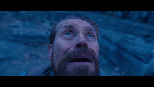
And the energy in the whole castle changes as his shadow literally OVERTAKES godrick like the fucking solar eclipse, and cedric is like "hello, brother! :]" and godrick has a "oh no, chat" moment as he realizes the extent of the homunculus in front of him. Hes like "my, my..! You are more than i expected..!" But you know godrick, hes prideful so he doesnt outright say what hes thinking which is him geeking out like "i-incredible..! The extent of those grafts..! And they're near seamless..! And he can move so easily with it all..!" And cedric is like "i have something for you, brother!" And proceeds to pull a rykard and take an axe out from the depths of his insides talkin bout some damn "apologies if its a little wet, nyehe." and the mf is forged from living flesh (just like rykards sword hey hey!) And godrick is just like "FOR ME?!?!" because i seriously doubt atp anyone has ever given that man something nice, and he just starts ugly crying as his pride is shattered by genuine kindness, and ceds like "i heard you like axes, so i had one made for you as a gift" and godrick is just "NO ONES EVER DONE ME A KINDNESS LIKE THIS!! I CANT THANK YOU ENOUGH!!" and gostoc is just 😬 in the background, lmfao, still trying to process wtaf hes looking at. Cedric def takes Pendra everywhere, as well, he took her with him on this trip to stormveil. Shes like "his majesty, cedric, formerly the grafted centipede, has come a great distance to meet you. ^^" and ceds like "youre all arms, godrick" 😏 and godrick is like "youre one to talk.. cedric" 😏 BLORBO ESTABLISHED. And ced is the life of the party man, lemme tell you! Hes like "lets get a picture to remember this moment in history forever, dearest brother!" And its a whole album of them making goofy faces. Godrick has no time to question the legitimacy of it cause hes just so happy to know he has a trueblood brother other than morgott. Not that he needs to question it. I cant draw it worth a damn but they do look very much alike in the face, despite cedric's obvious bug mouth horror. Gostoc is like "pardon my boldness on the matter but how do we even know hes your brother? He looks nothing like you, milord!" And they're just standing next to each other, lookin like a fucking mirror. And godrick is like "I dont know what you mean! He looks exactly like me!" And pendra agrees like "i concur. They are one and the same" pspspsps, gostoc is just jealous hes not the center of attention anymore... 😏
And they just trade stories all day, as honored guests! Godrick is dying to know how he did it all. Hes like "how have you achieved such a respectively monstrous form??" And hes just like "creative freedom, nyehe. Tell me brother, do you eat tarnished here?" And godrick just pauses like
"You do not eat whats left?" And godrick is like "...............afraid not. 😀" and cedric is like "how interesting! 🤔 ill admit, they dont taste as good as demigods do!" And godriick just grows more distressed like 😃‼️ and ced catches himself like "no worries, brother. I wouldn't ever eat you! :]"
Yeah, blorbo over, for now, LOL
13 notes
·
View notes
Text
Recalled updated! Okay okay okay im very excited about this lets gooooo!
HI!
How are yall doing? I've been freed, (then I got sick haha.) We are back with the final part of Directionless and we find the main group inside Hyrule castle trying to figure out what to do next.
With some shenanigans along the way.
Okay, time for the important things! Recalled and all panels belong to @recalled11 and its wonderful artist @l3ominor. Go check it out!
You can find the comic page here!
Now, it is time for snacks and drinks, Let's do this! :D
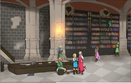
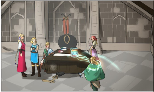
Backgrounds my beloved, you get so much story telling from just this one shot it's great.
MAlon and Time and helping Wild gather information, Sky is resting his leg while flower and Sun discuss something.
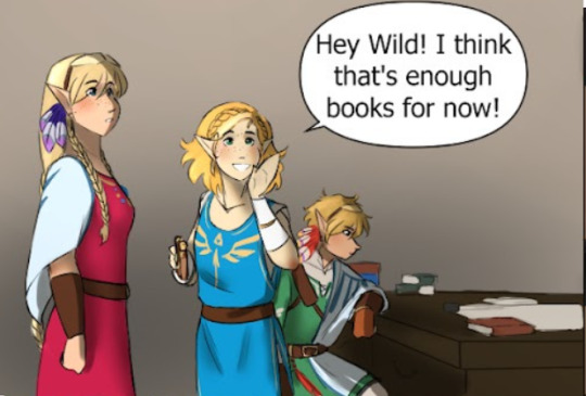
Hmm, Sky's looking very serious right now. What's on your mind blorbo?
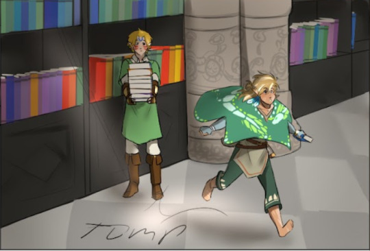
Look at him run. I love him.
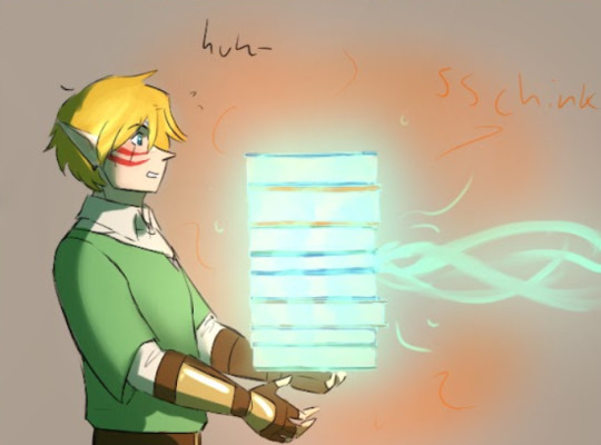
Yoink.
This makes me chuckle. I love when we get Wild shenanigans.
I love how casual he is about this. But I'm gonna note something here.
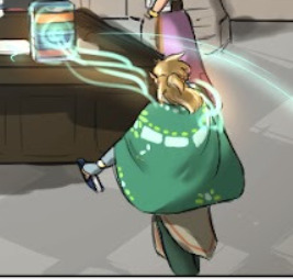
The orange glow of what I assume is ultrahand. Which would be it, If this next panel didn't exist.
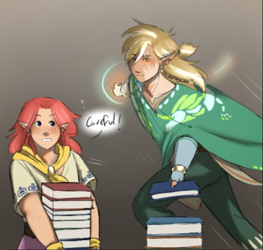
Wild's eye is glowing orange. The eye which changes colour when he's looking at the orb.
So Wild's eye changes colour based on what ability he is using.
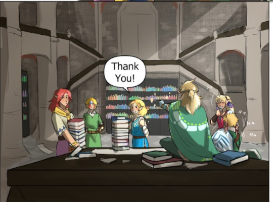
Confusion and joy.
Like ust look at these guys
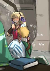
These two are just cackling at Time's expense. And Wild's shenanigans and I totally agree.
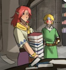
The man is still holding his hands out like he's still holding the books.
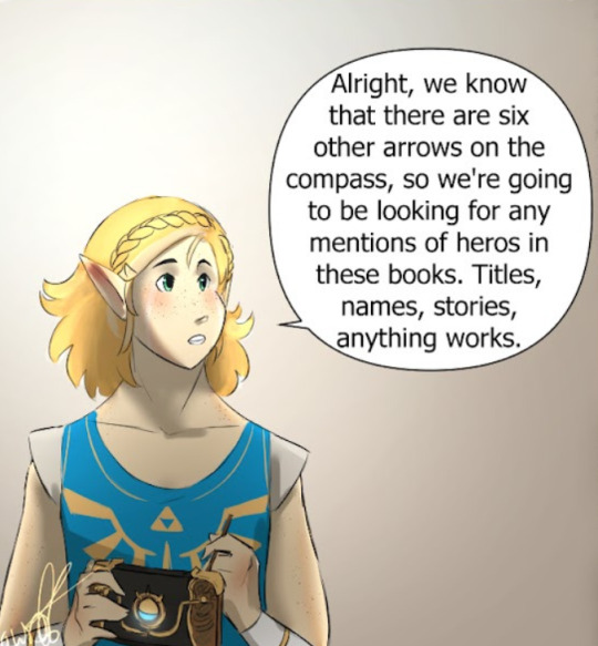
Flower's little pen for her pura pad. I love it. I can only assume She's got a little diagram on her screen which is just chaos
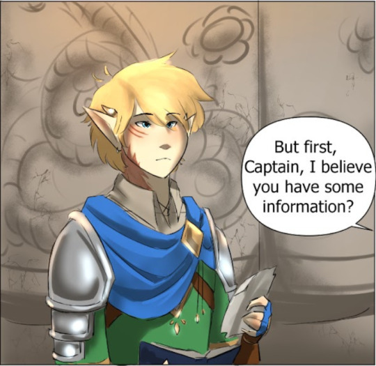
What's on the paper captain? I hope you didn't tear it out of your book.
I wonder if it's a group drawing of the war heroes looking at a reference picture while trying to find information would make sense. Depending on the length of time it's been since he was fighting that war.
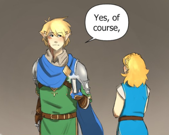
Hiding something are we captain?
I reckon he's trying to figure out just who Time is. And has dug out a picture from the war. (Im unsure, do we get Big Brother Captain? Because I live for Big Brother Captain)
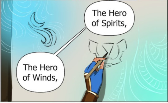
interesting we get symbols for these heroes.
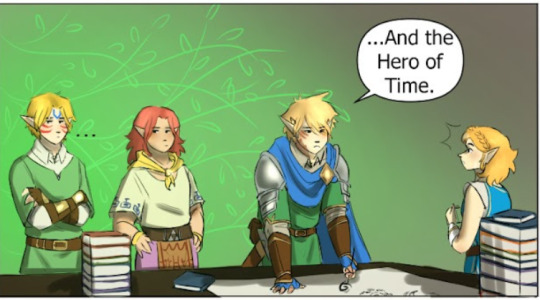
What's the problem Time? Are you looking at someone who you recognise and now he's mentioned your hero title you dont want to talk about it?
Look at Malon, She's like 'You have gotta tell him.'
And Captain looks sad about it. Which tells me that he knows and that he's waiting for Time to approach him.

Thats interesting. We know we get Midna as a companion in Hyrule Warriors. And I assume that Fi mentioned Sky at one point.
I sense some Angst in our future.
Sun putting her hand on Sky's shoulder like that gives me life. i love these two a healthy amount okay.
Also these backgrounds are pretty, I love the triangle behind Sun and Sky here. Thats' Wisdom On the triforce (If observed on the left hand). And considering that sun is in the centre of the frame. I find this interesting. Maybe because they are learning a lot of information right now?
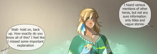
Okay, so you may be wondering who says this line on the left here. I was too. I reckon it's Sky. As a shock response to being mentioned by Captain.
Mainly because From the angle of the speech bubble and the location of the heroes in relation to Wild, it only gives a few heroes. Mainly Sky and Sun.
Sky asking this makes sense as he and sun are the newest to the group at this point.
Okay now its the time for the big one'
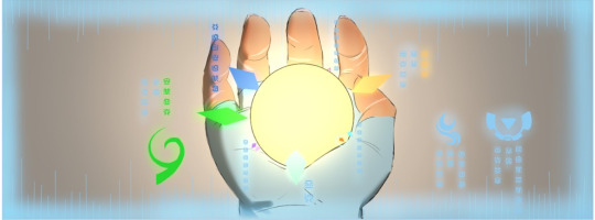
The orb. (Or compass,)
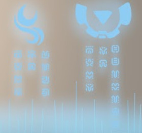
I've taken the time to translate the words I can identify and have extrapolated the rest of them from there. The language is Sheika, and most of these words are what (From what I understand) Is what Wild himself identifies each hero as.
So we have, (Rapid fire style)
Hero of Wind
Hero of Spriits
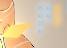
Hero of Sky
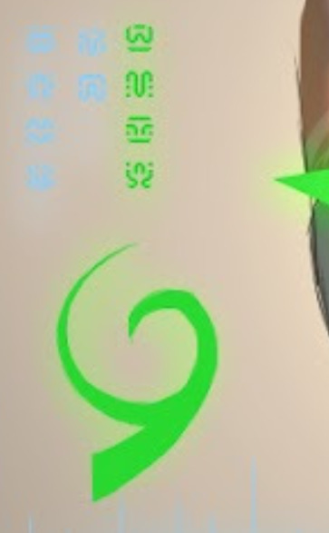
Hero of Time
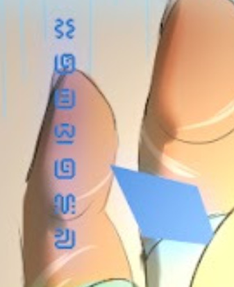
Captain
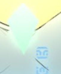
Me
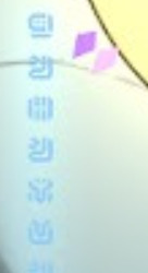
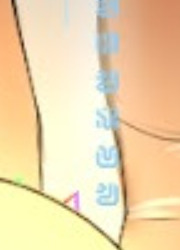
These all say, Unknown.
A little more on this as well.

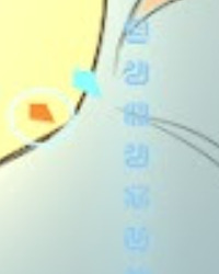
This circle around this orange arrow. I believe this is the arrow that Wild has chosen for them to approach. Orange if I had to give you a guess is Twilight's colour. Mainly from this bit before.
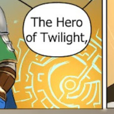
Backgrounds give a lot of information by themselves. This looks like a Twili portal.
The reason Wild chose that is unknown to me. During one of his adventures, he encountered Wolfie. So it makes sense. Maybe he was able to identify his name as Twilight. Or called the wolf that himself.
I suppose the next arc will give us more information!
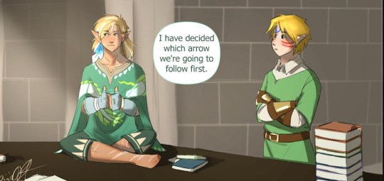
Woo! Adventure time! :D
Okay, thats enough of me rambling.
Thanks for hanging out with me today! I love this comic so it's always a pleasure to write these!
:D
Now I hope you all have a wonderful day!
#recalled#recalled update#recalled Directionless#recalled Wild#recalled Flower#recalled Time#recalled Malon#recalled Captain#recalled Sky#recalled Sun#ramble corner with major#:DDDD#recalled spoilers#comic analysis corner with major#so many characters i love them all#i love making these sm#i wont stop#(unless asked)#Wild's shenanigains give me life and bring me joy#this one was fun#yes i did the translation by hand and then realised it was sheika#i regret nothing
27 notes
·
View notes
Text
ok slow day on the blog so im about to get all soppy and artsy. Because a) this man drives me insane and i continously try to figure out why slash justify it to myself and b) i am so obsessed right now with that one leg muscle that kinda goes flat when you sit but also is a key part of how to structure the leg when drawing. Blah blah blah hockey butts yeah great but what if... hockey inner thigh....
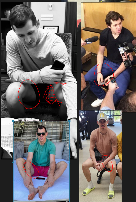
Ughhhhhhh kill me now.
Anyway im gonna adress a trend i have noticed in the pens fandom mostly displayed through passive aggression towards me or other creators...and that's the use of references. There seems to be this idea that using references is lazy or cheating or means that this person isn't making 'real' art. And im gonna call some bullshit. Every single artist since someone decided to paint their hand and try to recreate a cow on a cave wall with their thumb has used references. Talk to real commercial artists and they use WAY more references than you can imagine. My current job is super stylized and unique. But back when i worked in hyper realism on C*ll of Dooty and superheroes and stuff? Never not once did the illustrators not utilize references. Often us 3D artists were given a photo with a posed actor, which we used to pose the 3D model, which then was illustrated on top of directly by the illustrator. Those artists had to churn out hundreds of illustrations a month. They did not have time to get precious about it.
And lets talk about 'sourcing'. Yes, if you copy a photo directly almost pixel for pixel an artist should probably reveal their source. But so rarely is this the case. If you put any kind of spin on it - your own style, change the colors, add or subtract the background - that is YOUR art and there is no need to link to or include the damn 'source'. It's not a 'source' at that point. That would be like asking the amazing folks who photoshop artistic 'edits' together using photos and brushes to link to the original photos at the bottom of all their posts. This is just silly.
You want to know what commercial artists did before the internet? My old friend here has a studio from the 70s-2000s that has an entire wall full of neatly organized stacked drawers of printed references, a lot of it clipped from magazines and books. Each of them labeled by subject matter. And this artist worked in some of the most famous advertizing studios during that era.
So, coming back around to hockey thighs, because I know there are certain folks in the pe*ns fandom that get annoyed and angry at my daily drawings (which is so sad by the way, get a life). I have to admit this is the first time this has ever happened in a fandom so it threw me for a loop. But I also know there are younger artists out there who follow me so I want to explain my process a little. Most of my daily doodles are studies - its one of the reasons its been easier to do them during my illness than any more serious creative work. When i doodle i am looking at references and trying to recreate that as i see it. The key point being 'as i see it'. I am usually trying to learn things like: in this photo what about the lighting is compelling, and how can i make it more so? Or what is the focus of the drawing and how can i let the rest of it fade? Or whats the main gesture and how do i exaggerate that? And always, always im trying to study anatomy from new angles. For me its not enough to learn what a 'knee' looks like because the shape of the knee and the muscles around it change depending on how it's posed. And it is often those changes that make it so beautiful. Or in this case that beautiful sexy stretch of thigh between geno's knee and groin.
Often times if i imagine a 'pose' in my head, i will then go pull as many references as i can where the body's limbs are roughly arranged how i want it and then draw those over and over until i feel like i have enough of a grasp on that anatomy to recreate it for myself. So please, dont listen to the haters, use those references or dont use them freely. the haters are idiots who are projecting their own fear of inadequacy and learning to be creative onto you. <3
In my next essay i will discuss how baffled and humbled i am by the way my love for geno's face has utterly transformed my artistic eye...
#Wip#I never actually enjoyed *realism* until i started looking at photos of geno#Hes...just...so...perfect...???????.....#Also if your putting this post together with the santa wearing shorts reference post yes youre connecting the dots
11 notes
·
View notes
Note
if you could give one tip to an amateur artist (aka not complete newbie but not great either), what would it be?
I could talk about using references, drawing from life, breaking down what you see into shapes, having someone critique your work etc etc, but i think the biggest tip regardless of level is
Just keep drawing
Its stupid simple, but there are so many factors that prohibit people from doing this.
Theres perfectionism, fear of failure, discouragement from not being at the level you want to be, being overwhelmed by life, the list goes on.
But the simple action of consistently doing something is the foundation for improvement. Even if you dont notice at the time. The hard part is developing a mindset that allows consistency. And this is where a lot of the "just draw" advice people give falls apart. I am not telling anyone to draw once per day (unless thats something that works for you). My tip is to find the thing thats stopping you from drawing and solve that in order to find the motivation to keep drawing. Because once you do that, then everything else will fall into place.
There is no one size fits all, but i think an important mentality to have is to treat your art journey as an endless game of levelling up. You can only ever gain more experience. So for every bad drawing you make, you still walk away learning something. This is especially helpful for people that suffer from perfectionism or are dissatisfied with their art. Trust the process and trust yourself. Even if your art doesnt look the way you want it to now, by continuing to learn and practice the thing you want to get good at, you eventually will reach the level you want.
And perhaps, anon, you are someone who already is drawing consistently. Then all i have to say to you, is that youre on the right track and all you need is to have faith that you will continue to improve if you chose to keep drawing consistently.
Ive actually had the pleasure of witnessing two of my friends start their artistic journey from almost ground 0 and watched their art improve significantly in months. Both come from a non art school background and had no formal training. The one common thing they have is that they started to draw more.
#its actually really stupid that doing something often means youll get better#my default mentality is that i have to be good at it now#but srsly i watched myself improve significantly the second i drew more#who wouldve thought#not me giving the just believe in yourself advice#but i feel this is more beneficial then telling someone to master the basics#cuz if you havent then this advice will hopefully help you to actually do that#hope this helps anon!#pixel replies#art advice#answering at 2am
13 notes
·
View notes
Text
um. an analysis of martha & ten in s3e1 of doctor who or whatever
now when it comes to the tenth doctor's companions you only really hear about rose and donna. and that's great, that makes a lot of sense, i get it. but that meant i really had nothing to go off of with the introduction of martha jones in series 3 & setting aside the fact that i immediately loved her, it really struck me just how calculated the doctor was in that first episode in regard to letting her on
i think its fascinating actually, because in "The Runaway Bride" (the christmas special between series 2 & 3) the doctor had just lost rose. like it went: "Rose Tyler, i love you" *30 seconds later, Donna has entered the chat* "Who the hell are you?" so it makes sense that he's super out of it that whole special
a new end of world crisis is thrown on him, a new person is thrown in his life, & its all happening before he's had time to process the end of "Doomsday". by the end of the special i didnt get why donna didnt go with him, but i get it now
it was all just so much so fast. unfortunately, i dont think we know how much time has passed between The Runaway Bride & Smith and Jones, but he's apparently had enough time to settle two things:
despite his protests, there's no avoiding what donna made him promise. "find someone", "i dont need anyone", "yes you do. because sometimes i think you need someone to stop you.", "yeah"
the fashion in which he wants to go about finding said someone
ok
in that first scene martha and the doctor have together, where the doctor is pretending to be a patient, right off the bat he's got this cheery neutrality to all the doctors-in-training crowding his bed. martha just happens to be the one called up to diagnose him, and he seems to like the way she reacts to finding out he's got two hearts
its interesting, she just takes it calmly, no freaking out or even mentioning it. this is a pattern with martha, she just accepts whatever situation shes in and rolls with it. and the doctor's got this look on his face when he looks at her in that first scene, neutral smile, raised eyebrows, he's curious he's probing the waters he's trying to figure her out
right off the bat, the doctor is curious as to what sort of person martha is. & i dont have the background of how he met rose (because im not watching doctor who in order) but im assuming, based on how it ended, that everything about her sort of happened to him. like she just burst into his life, blinding, and they crashed into each other
so it makes sense, indeed its incredibly human of him, to take the exact opposite approach with a new companion. he doesnt want to fall apart like he did for rose, so he's going in all experimental and curious neutrality and its fascinating because he's not even emotionally distant!
right, ten's emotions are something that gets talked about a lot, about how buried they are. its funny, ten is telling martha who he is instead of showing. (because if you're upfront with the things that hurt you then its all out in the open and you can put distance between yourself and the significance of your own experiences)
im getting ahead of myself. second scene they have together
ten comments on how smart martha is with the whole "if the air was gonna get sucked out it would have happened straight away, but it didnt!" thing. this objective observational approach to bizarre situations seems to be the first thing that draws martha and ten together. shes smart, and clear-headed, and curious. like he is
and then! and then and then!! "fancy going out [-side, on the moon, where there's no oxygen]?" "okay." "we might die." "we might not." "...good, come on."
good. good. like a teacher asking a question and getting the answer they want. the line is delivered slowly (which is saying something because jesus christ david tennant talks fast) and deliberately. if the question is "will you risk your life in the name of figuring out what's going on?" then the answer is "yes, not only will i risk my life but i choose to put my faith in the chance that i live."
curiously, i think it's this gift for hope martha has that ten is drawn to. i think he's been flying by the skin of his teeth, running on hope and running out of it, and martha is an optimist. a curious, smart, observant, optimist. god i love her already
(at the end of that interaction ten specifically points to the other woman with martha and says "not her, she'll hold us up". he's chosen his subject, and disregarded the other potential opportunities. its so calculated)
scene three, that balcony scene.
turns out they can breathe on that balcony, wahoo. martha remembers that party with her family and starts getting choked up. "you okay?" "yeah" "you sure?" "yeah" "you wanna go back in?" "no way, we could die any minute but all the same its beautiful"
ten sees her getting emotional and, briskly, asks if shes okay. she insists she is twice in a row and shoves down her emotions in favor of admiring the view. and who is this reminding me of?
okay so thats the fourth thing of note then. she's calm, smart, hopeful, and ignores her own emotions in crisis. and she finds joy in that view too! its beautiful! standing in the earth light.
she finally asks him whats happened, and he turns the question back on her. here we go, fifth thing. "extraterrestrial. idk a few years ago that would have sounded mad, but these days?" she pays attention. complete opposite of donna, she's caught up on the alien events going on and she believes them
moving right along: ten makes the decision to open up to martha, and tell her his real name. "what, people call you The Doctor?" "yeah" "well im not, as far as im concerned you've got to earn that title" "well i better make a start then"
i love this interaction. he's telling her his name and instead of ogling at the weirdness she says "earn it." like its a challenge. my current hypotheses, having not seen the rest of season 3, is that this is a unique quirk of their dynamic. martha wont just take his bullshit, or ogle at his space-alien-ness, or let him take charge just to follow after going "what the hell??". she'll catch right up with him and help figure out the mystery as well
ok scene 4
"if they're [jabloon, monster of the week] police are we under arrest? are we trespassing on the moon or something?" "no, but i like that! good thinking."
again, she's sharp. creative. and then the reveal that the doctor's non-human! oh youre kidding me, dont be ridiculous, stop looking at me like that. 13 seconds. "oh you're kidding me, you're not non-human" to "well shit, guess he is" in 13 seconds! she's marvelous! she just takes it!
fifth scene, the whole The Doctor is trying to figure out the situation and the companion is hanging back asking questions and trying to get their head around the whole space alien thing while he spits information a mile a minute. its crazy, she keeps up! like not just with how freaking fast ten talks, with what he's saying!
im a broken record, she just believes it all its wild. she recognizes the situation as a problem, accepting each piece of information as valuable and true, and works to solve it i love you martha jones
ok i cant sit here going scene by scene lets jump to the end shall we
scene i lost count. the tardis is parked in some back alley after a fiasco of that family party for marthas brother
the initial test is over, and martha's passed. the doctor wants to take a chance on her
"i just thought, since you saved my life and ive got a brand-new sonic screwdriver which needs road testing, you might fancy a trip?"
evidently martha cant say no to that so we, lovely viewers, are treated to a classic "its bigger on the inside!" scene. and ten's got that look on his face again! carefully cataloging her reaction, sizing her up.
coming full circle, martha asks about the doctors previous companions (again), and its fascinating comparing this scene with the opening of "The Runaway Bride"
where donna stumbled across rose's jacket, assumed ten had kidnapped her, and confronted him about it, thus throwing the hurt of loosing rose right back in his face, ten puts it all out in the open for martha right off the bat
im the doctor, ive got a brand new sonic screwdriver, the tardis is bigger on the inside, and the last one was rose. welcome aboard
even while throwing it all out in the open, ten quickly says "anyway" like he doesnt want to talk about it. when martha asks where she is (like donna did) ten assures her that rose is safe and fine. directly doing the opposite of how donna approached the subject
and still ten insists that martha isnt going to be "the new companion". that shes here for one trip, then back home. he knows donna was right, he needs someone, he promised her. he knows but he doesnt want it, yet. hes telling martha the situation while still walling off his actual feelings about it
which explains why ten reacts so badly to martha teasing him about that kiss from earlier. when she opens up the situation like he's flirting he shuts her down fast. but when she turns it into a joke, and says she's not interested we get "good." again
its a really clear pattern, the way ten assesses her this episode. he notices her cool headedness and observation and pokes a bit more. he shuts her off when she approaches territory he doesnt want her to. he responds with "good" when she responds with what he wants
he's drawn to her because they share a lot of key traits (accepting bizarre situations, intellect, high emotional regulation) & because she shows a few key traits that distinctly compliment his own (her hope, curiosity, and stubbornness). she doesnt marvel at him like other companions did (and will), and doesnt put up with his bullshit either. she makes fun of him for being "pompous" in a way other humans just worshipped him. she relates, accepts, understands, and humbles him in very distinct, important ways
anyway "Smith and Jones" was a solid episode & you guys dont talk about martha enough, shes amazing
#doctor who#tenth doctor#martha jones#david tennant#freema agyeman#the way ten approaches martha is just so human of him#like ik the whole point of doctor who is the humanity at the center of all this space alien nonsense but man#i really like reading into things#someone please put a word count on tumblr posts its for my own good
25 notes
·
View notes
Text
Hello everyone!
☆Noodle post of the day consists of a series of more research for that Lackadaisy fan animatic I am working on (mentioned in previous posts w/my Sable and Rocky human designs!).
I've been working very hard!!! My storyboard is almost done ^^
☆The project is inspired by a song (i'll keep it as a surprise until I post hehe) and a short synopsis would be this: Sable has a rendez-vous with Mitzy at the Little Daisy Cafe, and Mitzy is running late. Rocky encounters him at the cafe and decides to try and spook him, telling him how dangerous Mitzy apparently is, so he could leave. In doing so, Rocky will break into his usual theatrics and do a whole performance, leaving Sable confused and very disturbed.
Its heavily inspired by some scenes seen in the comic and I thought the song was perfect for this scenario!!!! (Oh and I'll draw them as human)
☆Yesterday and today I've been working on choosing colour palettes for the backgrounds and characters. My goals are to make them reminiscent of the iconic colouring of Tracy Butler's comic panels, use 2 to 3 colours and really keep it simple (so I can stick w/them during the whole animatic).
I did a lot of samples;
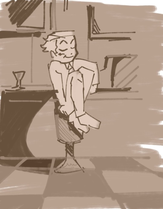
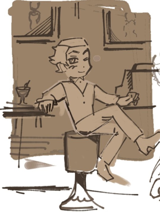
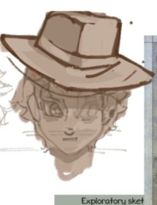
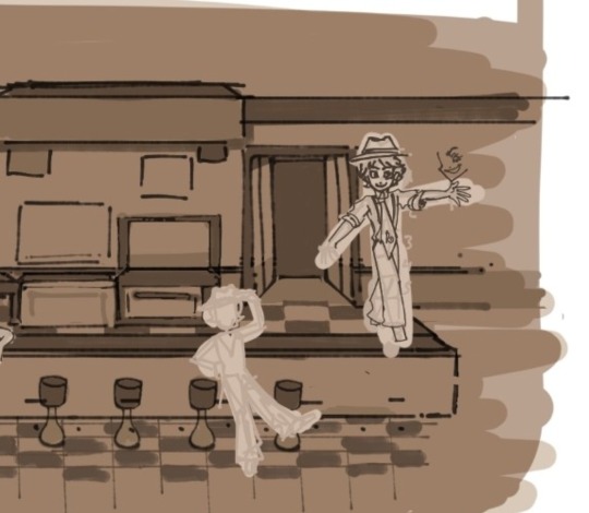
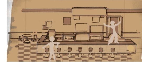


And some more Rocky studies! As I was doing some sort of character sheet!!!

Dont ask why but I've been STRUGGLING to draw his "human hair" for days haha- I spent a lot of time on it☠️ but I decided i'll keep something simple for the animatic (not the crazy perfect geometrical versions I have down there, those only serve as inspiration haha).
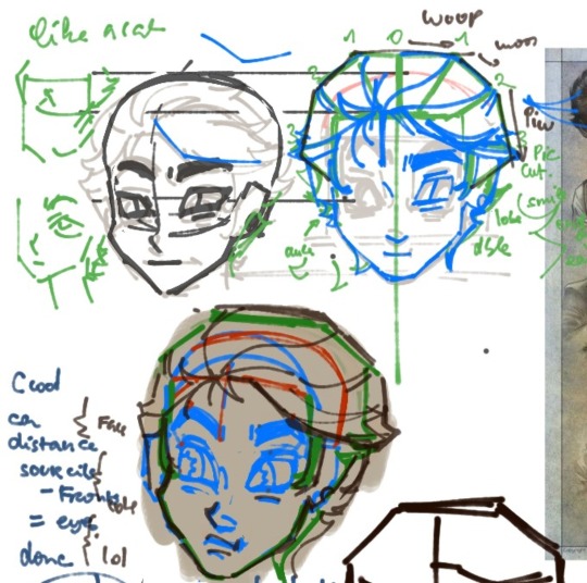
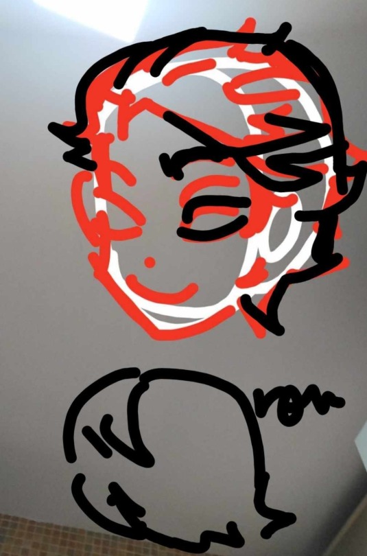
So- yes. Working very hard!! I'll keep posting my advancements here ♡ I won't lie, a bit of support and motivation would be greately appreciated😭it IS my first time doing a whole animatic.
I wanna do something nice and fun!!☆
Thank you SO much for reading all of this♡
Have a great day.
#lackadaisy cats#lackadaisy fanart#lackadaisy rocky#rocky rickaby#rocky rickaby fanart#youngartist#artist of tumblr#ibispaint#ibispaint art#wip#animatic#younganimator#artists supporting artists#art support#lackadaisy animation#lackadaisy fananimation#charactersheets#character design#background layouts#colour palette#1920s#littledaisycafe
18 notes
·
View notes
Note
i like ur art. its great and interesting!! i really like your artstyle and i really like the way u draw hsy, yjh, and kdj. you captured them so well in terms of vibes/character. also i was wondering do u have any advice to improve on drawing anatomy/poses/faces?
wahh thank you so much...!! i feel like im still trying to figure them out in a lot of ways but i do really like ironing out my visual interpretations of them so im really happy to hear if people like what im coming up with
also anon you super activated the part of my brain that cant help but yap about art theory... i spent some time writing as many tips as i could think of. unfortunately i dont think i have the time currently to do a fully illustrated guide, but ill still try to include some visual examples:
[incoming wall of text lol]
ANATOMY:
to preface i think that like 100% of the time you should reference a real life photo for anatomy rather than other artwork or drawn references. the best way to learn the body is by… well, actually looking at the body! but also artwork is informed by a person's own artistic ability/stylization choices/sense of idealism, so while looking at art can help give you an idea on how to break down forms, i think you would be best served observing real life references. i labor on this point because i do think that having over relied on drawn reference material and avoiding photographic references on the basis of not being interested on realism hindered me as a largely self-taught artist as a kid, so i want to encourage live or photographic reference since anatomy is one of the foundations from which everything else is built on. that being the case, all of my doodles i'm doing for this are going to be for the sake of example rather than to strictly say how you should or should not be drawing something
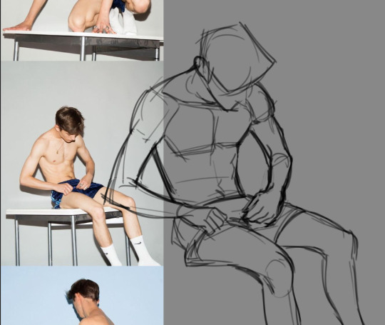
-> when you are doing a study of a photo, just try copying it as best as you can. pay close attention to the natural lines and shapes of the body -- the S-curve shape of the leg, the triangular shape of the forearm, the trapezoid shape of hips/thighs when they sit, and so on. note where the body folds or squishes or pulls; how mass will shift to accommodate a certain position. if a form is hard to visualize, focus on the negative space and carve that out, rather than strictly drawing the positive space.
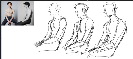
don't expect to get it perfect the first time. in fact, iterate on it multiple times to build understanding. try doing it to a timer of 15, then 10, then 5 minutes. doing this will force you to have to prioritize the most important shapes. you can help reinforce this by using a thicker brush or a brush with no pen pressure (no joke ms paint works great for this) to force you to be loose and not become preoccupied with details.
-> pinterest is a great resource for finding and compiling photo reference material
-> organic shapes are curved, so embracing/emphasizing that (particularly for the extremities) can help make your drawings look more natural or fluid
POSES: -> it all begins & ends with contrapposto… you've probably heard of the line of action, which is related. if you're offsetting the shoulders & hips, it: makes poses more natural, more dynamic, and helps the pose sort of "draw itself" -- the legs will follow the direction of the hips, and you can use the arms to reinforce the angles
-> context is key. don't ask: what pose should i draw? instead ask: what do i want this character to convey? what does happiness, anger, sadness, and so forth look on this particular character? how do they express that? consider these drawings: these are both ostensibly the same pose, but look at how changing just the shape of the spine recontextualizes it.
for more on pose design i recommend watching Tracer & Pose Design 101 - The Animation of Overwatch by New Frame Plus (i promise this is a genuinely super informative video).
to expand on this, in general, all of the components of a piece (background, composition, pose, etc.) are best considered in conjunction rather than separately. it is difficult to choose a pose and then choose a background because they are missing the context that would make a piece cohesive. when you are planning a drawing, try to begin with your general concept/idea/prompt and then do several thumbnails -- small and quick doodles that should take no longer than 5 minutes each -- developing it: you may find that the pose and bg will naturally fall into place.
-> silhouette: the degree to which you need to push this varies by style but generally speaking the pose needs to be readable; i.e. instantly recognizable. try to keep important elements of the gesture outside of the silhouette. for example, if the character is pointing, keep that arm out of the interior of the body. the same pose can be more or less readable or dynamic depending on where the character is pointed in relation to the viewer
-> exaggeration!! goes along with the previous point. push the pose as much as you can (and what makes sense for your style) to communicate your pose as clearly and as intensely as possible.
FACES: -> i highly recommend the app Handy Art Reference Tool by Belief Engine for all things related to drawing hands/heads/feet. its on both android and ios. it isn't free -- it costs around $3 -- but that is seriously such a small price to pay for the amount of utility you get out of it: the hands models are fully poseable (there's also pose presets), you can rotate the head models however you want, and there is 3-point customizable lighting. it is really helpful for getting those super tricky and hyperspecific head angles that you just can't find a real life reference for. that being said given that there's only a few different head model variants, bear in mind how differences in features can affect what exactly a face will look like in those angles.
-> i still recommend doing studies of real people. as with anything else, learning generalized proportions is important, even if you are going to later on bend or break this depending on style
-> as for my own approach... it kind of depends on the style i'm doing at that particular time. for my paintings (what id consider my main style) i approach a character with a few real-world features in mind and then apply them to the best of my ability. it usually will take a few iterations to land on an interpretation i really like as i try out different things. a lot of the face also gets developed during rendering rather than through my initial sketch too, as i adjust for lighting and correct proportions on the fly
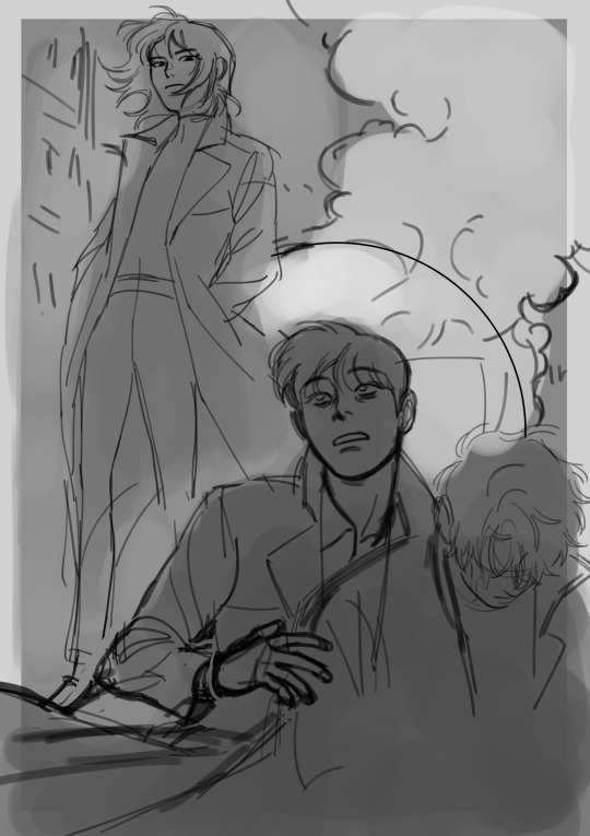
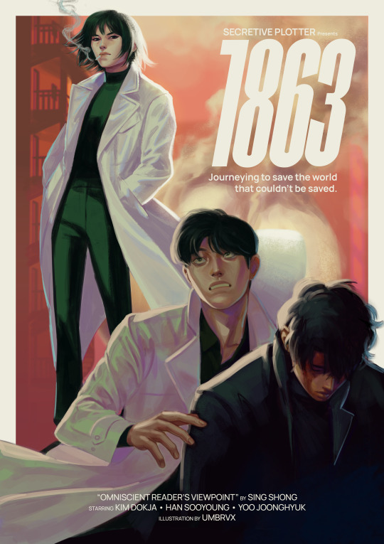
(look how much this image changes between sketch and render lol)
if i were to recommend anything, i think it would be to nail down your most distinct features first -- the ones that will make your character's face recognizable, and could apply regardless of art style. in my case with kim dokja, i knew when i first started drawing him that i wanted to give him a longer face and down-turned eyes. when i decided to do the disco elysium inspired set, in which i was breaking out of my comfort zone by letting go of any idealizations focusing on conveying characterization/making them feel "real", i landed on some more specific traits (defined lower lids/perpetually tired eyes/eyebags(?) the crease there idk how to describe it) which i continue to try to evoke even if im drawing something much more cartoony
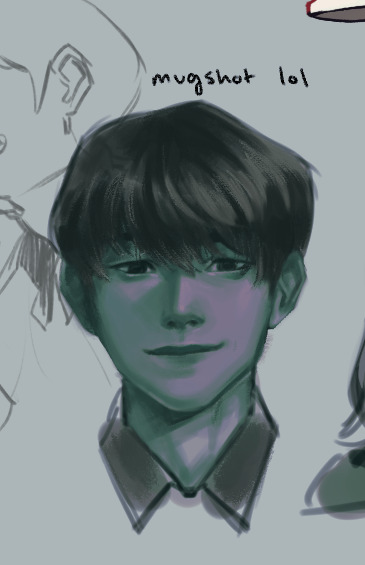
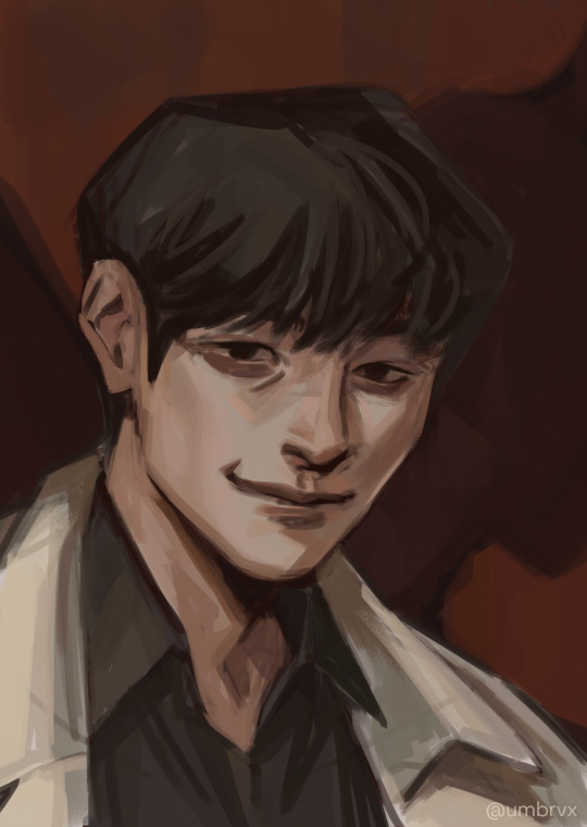

(pictured are my first kdj -> disco elysium style -> my post de-style kdj)
as a side note, this very same process changed yjh much more dramatically

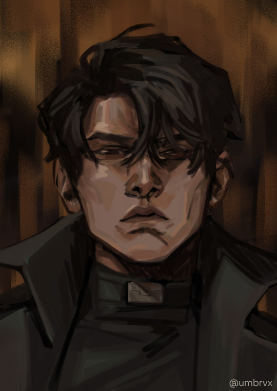
(^ that first guy is mad someone else)
those handful of key features will be the thing that you can then take into a simpler style and simplify or exaggerate to whatever degree suits you. you can also play with shape theory (square = sturdy/solid, circle = natural/smooth/welcoming, triangle = energetic/dangerous). shape theory doesn't necessarily need to be so rigid -- you can combine shapes as you please to convey whatever vibe you're going for -- so please think of it as a tool that may help rather than a rigid law you must abide by.
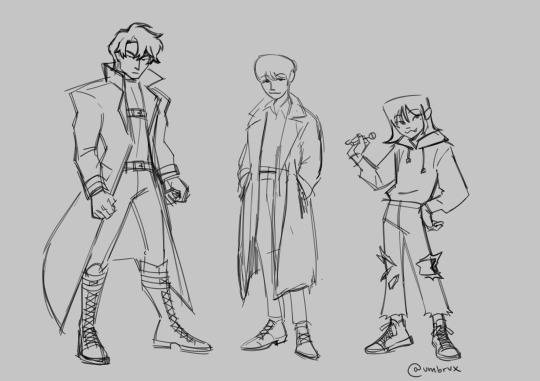
-> expressions: exaggerate them. thats kind of it!! make it big!!! you wanna be able to really feel those emotions. the principles of squash & stretch help here: think of how the muscles move when you, say, open the eyes or mouth really big. as one side of the face stretches open, the other side squashes to accommodate it

even without changing the position of the jaw here, moving the nose and scrunching the eyes will sell the expression
you can also play with squash/stretch to break proportions to sell a feeling more
since expressions are just, well, poses for the face, everything else for poses applies here (and facial expressions & pose should also be considered in tandem). while the term contrapposto itself just refers to the offset of the shoulders & hips, the similar principle of asymmetry also carries here as that will help make the expression a bit more dynamic.
and i think... that's it!! all i can think of at least. i hope it helps anon!!!
#umbrvx.ask#sorry the reply took a minute i have been writing this post since i got the ask im so serious#i tried to determine what advice i could give that would be the most immediately actionable#also sorry its a huge wall of text im a little crazy about learning and discussing art theory . oops (the yapper)
44 notes
·
View notes
Text
2024 retrospective and 2025 goals
this is the censored version of this post. for full images, check out the full free post on subscribestar!
hi :)

i'm really happy with everything i achieved in 2024. it was my first year illustrating full time, meaning no school and no salaried job on the side (believe me i tried to get one) and i'm happy to report i did not die! fuck yes. i even illustrated for 7 (i think) art books, designed merch for 2 and organised my first collab fanbook.
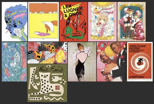
from top left clockwise: michael deforge, anna haifisch, Michel Esselbrügge, CLAMP, saul bass, jon whitcomb, rene gruau, paul rand, molly fairhurst
at the beginning of 2024 i made this moodboard for influences i wanted to incorporate into my work more, they are pretty much the same faves ive had for years but i just wanted to have them in front of me and start deliberately choosing elements to ape.
i'd say i basically want to incorporate more 2D cartoon graphic elements combined with detailed, realistic, delicately rendered characters, more theatric background design and props... features like borders etc. the thing about a moodboard is unless you print it out and put it up by your desk it will sort of slide to the back of your mind which is what i think happened w mine LOL. cuz looking at this now im like well i didnt really hit all these ideas but i did inch closer.

the first pic here is sth i drew immediately after making the board and i like it but it does feel like a slightly clumsy attempt at mashing stuff together... i wouldn't say that it shows i dont understand whats appealing about the work i was referencing (even though thats how it looks), its more like the picture goes in an unexpected direction while making it LOL. but that's part of the fun. whereas in my mind the 2nd pic spiritually embodies the ideas of the ppl i'm trying to copy. even tho visually it's still a ways off. its probably my favourite thing i drew all year? :) though that's hard to say bcus i'm so pleased w so many other pieces especially those u can see on my summary pic!!!
i have a few more artists i wanna add to my board and then i will definitely print it this time so i can look at it every day instead of just twice a year LOL.
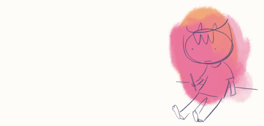
another thing im really pleased about is the number of comics i drew in 2024. i have this odd relationship with comics where i do draw them and have for years and im more or less decent at them but i act like drawing them mortally wounds me. like im so dramatic... i do partially believe the only way ill ever be able to complete a longform comic is through abusing stimulants but you know ill also never find out if i keep crawling off to die after inking a page. i see a lot of illustrators suffering when approaching comics from the illustration mindset of making beautiful pictures instead of the comics mindset of making finished pictures, but u know, im extremely slapdash as an illustrator and im also proud enough to believe im a guy that can do both, so its really time i act like it... basically just shut up and draw. i want to apply this especially to perspective drawing/panel backgrounds, which im, like, fine at. honestly fine at. i do think i trip myself up because i want to be the next dostoevsky or beyonce or whatever, i want to be great, but have to remember the most anyone can do is aspire to express something from your inner world. everything else is secondary.

one thing i learned the hard way is how hard it is to have work life balance when you work from your bedroom and 'monestise your hobby'... you know, the thing everyone has been warning each other about for years. turns out its real. its super confusing when so many elements of your work bleed into your social life, physical health, leisure time etc -- like i go online for fun, and also to promote myself. so wheres the distinction? i watch movies for entertainment but also for research... ive definitely felt like ive been working around the clock or my job has consumed my life at points. but i think being stricter with my work hours is the way forward. it truly is shaytan at the wheel when u answer an email at 3AM... no more of this!
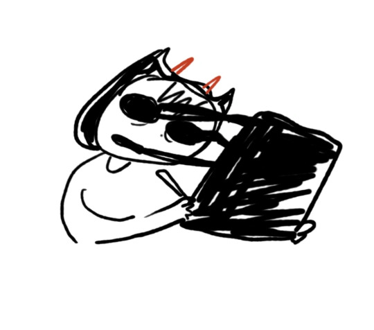
and tied into this is being realistic about what i can achieve in a day and not feeling ashamed or that i need to do more... i get stuck in this silly loop that's like... 'i believe everyone should work 4 hours a day, but because other people are stuck working 40 hours a week i should also be making myself do that' and then i work myself into a flare up and wreck my work ethic and enjoyment. u can laugh... i know it doesnt make sense. well i wont do it any more. because i CANT... because i will DIE... some days i work 4 hours. some days i work 6. some days i work half an hour... it doesnt matter as long as stuff gets done.. and it does.
also want to talk about my chronic pain and hypermobility... after a year of lifting weights i am stunned to let u know ive actually improved. unfortunately i dont look anything like the rock and i still cant do a real push up but im stronger and have more stamina and suffer from way less zaps and aches and numbness, which was unthinkable before. i only really noticed after taking a trip and doing different activities (painting walls) that i can physically do a lot more than i usually do at home. but also my house is fucking cold so its hard to do anything for anyone. hoping for warmer days and big muscles to come.
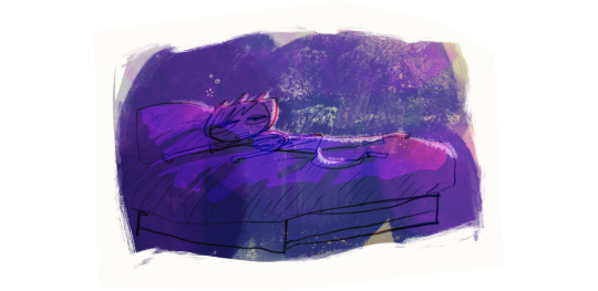
some of my other art goals are to work more on paper whenever i can. i used to have a huge stack of newsprint on my drawing board underneath my ipad and id doodle and test ideas on that paper before drawing it digitally. i wanna do that again. many people find its easier to 'think' on paper and im the same. whenever i have an idea i wanna go 'what would this look like on paper?' and then find out.
i want to be thinking about composition and storytelling more in my illustrations, as in, think cinematic, movie posters, communicating big ideas. even if that idea is only as big as 'this blue looks great with this orange'... i want to make more stuff that looks like promotional material for my stories. of course behind every movie poster is 100,000 thumbnails and sketches and half-finished ideas. i want to remember that and not be hard on myself for drawing girl in profile #997.
i want to draw more autobio comics, just to be drawing more comics and also to look back on and know what i was doing that day. nothing fancy. a lot of people are doing that gentle comics habit this year and i fear my competitive nature may get me into it too.
i have more books i wanna create which ive talked about at length in my last diary entry and for now i think that's enough goals thank you very much. thank you for reading this far and for all your support. happy new year! love you x
11 notes
·
View notes