#IDK HOW TO CHANGE THE FONT SIZE OR WHATEVER
Explore tagged Tumblr posts
Visit Tumblr Blog
Explore Tumblr blogs with no restrictions, modern design and the best experience.
Last Seen Tumblr Blogs


Fun Fact
Tumblr Inc. is using 66 technologies for its website.
Note
hii, do you have any templates for a multimuse pinned post??
idk if it’s a template, but idk how to make my pinned post pretty yk?
hello there! i don't have any templates for that per se ( because there's no one universal answer for this and i think it's up to each individual how they wanna style it ) but i can give you some markers. also, here's an example of my potential multimuse blog, just to give you an idea of what you can do without overcomplicating it.
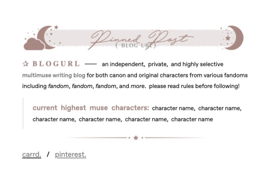
first off, the easiest thing to make it pretty is if you already have a certain color scheme or aesthetic you can use. ( so in the example above, the theme is mostly stars and the color scheme consists of a muted red / brown and grey. ) it basically gives you a basis on what things to use and how to make it fit your theme nicely.
secondly, just play around with various fonts ― personally, i use this site a lot, but there are a lot of similar ones out there, just use whatever you like best ― styles like different sizes, colors, spaces, bold, italic, and links to emphasize certain things ( just note here, that the more excessive you get with all of that, the more difficult it may become to read; so always keep that in mind if you care about readability ) and use symbols / emojis to give it more, for lack of a better word, character.
put some graphics if you have them, use quotes that seem fitting, include a little info on whatever you deem important, list the characters you currently have the most muse for ― the possibilities here are pretty much endless.
honestly, overall i'd just say play around a bit, maybe look at the way other people style their pinned posts ( without downright copying everything they do ) and try until you find something you are happy with. after all, you can always change the look of it at a later time again. i do hope this little guide helped you a little, though! :)
142 notes
·
View notes
Text
HTML BASICS

hey goobers, let's learn some basics for rp.me HTML coding.
under the cut, we have:
-getting image URL -what are hex codes? -how to post a gif/image -how to add a background -how to bold, italic, underline, or highlight text -coloring text -centering text or right aligning text -line breaks -creating a link
*ignore my typos, i'm stupid **if you need any extra help w/ these, lmk on discord @feralgnat

getting image url:
i'm only adding this because it's important for other steps and i don't wanna assume y'all know how to get this.
to get a image url, typically you can right-click on any interwebz photo and click "copy image link/url."
you can also upload onto imgur or similar places and still copy the image url. some sites have specific copy zones for those urls, but i always just right click and copy. up to you.
make sure your url ends in .jpeg, .png, .gif and similar. i don't think .svg works for html coding but i am probably wrong and stupid.
hex codes:
we're gonna be using a lot of hex codes too so here's what they are!!!!
hex codes will have # and 6 characters after that represent any color you can think of. for a full list of hex code colors, go here and look around. copy and paste that number/letter code, including #, and use that in any codes that require hex codes.
black: #000000 white: #ffffff
posting gif/image:
whenever you're posting a gif or an image, you'll use the same code, which is:
<img src='IMAGE URL HERE'>
with this code, it will post the original size of the photo you're using. sometimes that's OK!!!!!! but a lot of the time, we are lazy and don't want to personally resize pictures. there is a solution!!!
back to our original code but with a new addition: <img src='IMAGE URL HERE' width=100> or <img src='IMAGE URL HERE' height=100>
this code will keep the aspect ratio the same, but will now make the picture 100 pixels in width (or height in the second code). you can TECHNICALLY add both width and height to your code, but you might fuck up the aspect ratio (you do you, tho). you can obviously edit the width/height number to whatever space you need to fit it in. you'll probably have to play with it and adjust it a lot, but that's life, baybee.
adding a background:
idk this code off of the top of my head, but here u go.
background image:
<style> body {background-image:url("URL HERE") background-attachment:fixed; background-repeat:repeat; background-position:top; }</style>
the url used should end in .jpeg, .png, .gif, or similar.
background color only:
<style> body {background-color:HEX CODE HERE; background-attachment:fixed; background-repeat:repeat; background-position:top; }</style>
(this code could prob be shorter but i'm not touching it. what if i fuck it up? we will DIE!!!!!!! more code is better than less code, imo)
bold, italic, underline, or highlight text:
bold: <b>text herehehehehrehherehhe </b> italic: <i> text heehrhehrhehhehehheh </i> underline: <u> text herehehrhehrheh </u> highlight: <mark> text herehehrhehr </mark>
there's a way to change the highlight color, too!!! add this code: <style> mark {background-color:ADD HEX CODE; color: black; } </style>
background color is the actual highlight color and the second color is your text color. typically we're gonna use black but you can also adjust that with another hex code if ur feeling fancy.
with all of these codes, do not forget to add the second code when you are done with transforming whatever text you're working with. those </> codes are your friends.
coloring text:
you're gonna need ur handy, dandy hex codes for this too.
before text you wanna color, use: <font color=HEX CODE HERE>TEXT WHEEE</font>
once again, don't forget that </font> or else everything after the code will be the color you chose. unless you want that.... it's your life.
centering text or right aligning text:
centering: <center> TEXT OR PIC CODE??? WHATEVER </center>
right align: <p align=right> TEXT OR PIC OR WHATEVER </p>
left align (default but here u go): <p align=left>TEXT WHEEEE</p>
line breaks:
many of you prob know this but JUST IN CASEEEEE
new line: <br> skip a line: <p>
creating a link:
<a href='LINK URL'>link name</a>
#rp.me#roleplayer.me#get crazy get stupid#html#resources#this post likes to not show up in the resources tag#why
29 notes
·
View notes
Text


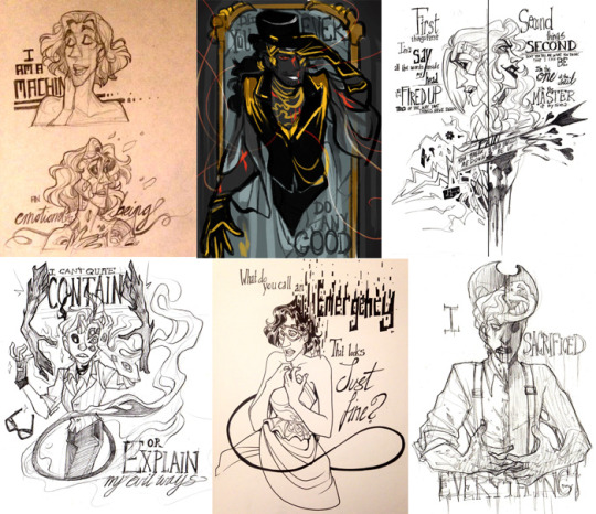
[ID: a series of nine images/panels of nothing but handwritten text. They read:
I can't read the titles of my own works
But even a single layer lags badly enough to switch to a tool I'm not using
Are these the “bug fixes” that made updating the app a necessity?
I can't use a basic accessibility feature / But I can pay for ✨ premium ✨
To change the color of my background (this line of text is on a red background.)
But we have vector layers now / so it's fine, right?
it's not like you have a choice anyway
(this section of text is not handwritten and is in Monospace font, a font reminiscent of old computer text.) but if it bothers you so much, you could always fill your time with other things instead / like getting one of those jobs telling AI how it fucked up / one of the only jobs in your field that you can find
or maybe I'll just stop doing anything at all.
I'd call this a digital zine but idk if it counts. Anyway. My art app updated recently and the update sucks (the new text size is too small for me to read without straining my eyes, for instance, and there's no way to change it), so now I'm having thoughts about enshittification and making art in the current state of things.
Ah, yes, Ibis Paint X. Making sure I know what layer I'm selecting a color from via a pop-up I can't get rid of and may accidentally touch which brings me to that layer for whatever fucking reason is more important than making sure I can read the titles of my own works. Truly, this is innovation
1 note
·
View note
Text
ok heres jaunes epic cliffnotes on How Tf Do You Use Ibis Paint
oki first hit the littol plus sign to make a new drawing. set the scale to ur standards (if you make the canvas size too big it says it'll make the app lag. i always ignore this)
you can also import a picture to draw over
okay this is where it gets Complicated
toolbar
transform: tap this and it automatically selects everything on the layer youre currently on. make it bigger, make it smaller, rotate it. you can also change its perspective and mesh forms. warps it et cetera
filter: put a filter over ur drawing!! i save this til last but its very fun to look around the different filters. can also add a grid if ur getting technical with it
brush: literally just the brushes. if you watch one ad you can get all of the premium brushes for like 18 hours or smth so its very worth it. you can also save and import qr codes (i usually find them on pinterest) by hitting the three dots in the corner of the brush menu and tapping "import brush qr code." you can also make ur OWN brush and export it as a qr code for others to use. change thickness, opacity, and various other brush settings until ur happy with what you get. i think theres a setting to turn on pen pressure in a different menu but that might depend on ur hardware idk
eraser: same thing as the brushes
smudge + blur + eyedropper are self explanatory
bucket: fills in w paint/erase. if you have a circle on one layer and use the bucket on another, itll still fill in the circle unless you turn the layer off. its weird
text: ADD FUN TEXT. change style and spacing among other self explanatory things. add ur own font
frame divider: DIVIDES FRAMES 4 COMIC MAKING PURPOSES. i always do this by hand but hey it can be useful if ur in a rush/want it to look a certain way
canvas: resize, flip, trim, whatevs
other stuff
reference window: shows ur whole canvas in a little corner while ur zoomed in. i never used this either
stabilizer, drawing tools, rulers aaaand materials u can import. play around with the different tools thats how i figured it out
THE OFFICIAL WEBSITE CAN PROLLY EXPLAIN IT BETTER THAN I CAN:
I have only ever use procreate as a drawing app
(and notes app, whiteboard, magma, sketchbook, and sketch tree if those count for anything)
anyways how tf do you use ibis. I just got it
3 notes
·
View notes
Text
a lot of skam questions thank u for tagging me @isaksqueaks!!
favourite squad: um the boy squad i think. especially now when we know how sana feels around the girls most of the time ://
favourite character: isak sana eva!!
least favourite character: billy boy
most good-looking person: ??? i dont know? maybe sana and eva
character you’d like to kiss: e v a
character you’d like to cuddle with: eva. and even maybe? or yousef? he looks like a good cuddler
character you’d like to have as a best friend: SANA and jonas
character you’d like to live with: i have no idea. linn ? shes quiet
character you’d take with you on a deserted island: billy so hed die there
character you’d have tickling contests with: ??????????no one
character you resemble the most: idk pal
favourite friendship: sana and isak, and isak and jonas
favourite romantic pairing: isak and even, and eva and vilde
notp: EVA AND PCHIRS
favourite haircut/hairstyle: um ok i loved nooras in s2 ep5 at billys party thing, AND isaks in s3 ep7 when he came out to mahdi and magnus, AND evas in s1, evens in s3 ep2 when they were at his place AND when he wore the bandana in s3 ep3 um i love jonas’ too. thats all? no wait, mikaels hair as well
favourite outfit: sanas in the fy faen clip. also isaks when he ordered that nasty ass sandwich in the cafeteria. ...and evens when he slowmo walked in s3 ep2
favourite location: i loove sanas place
favourite season: 3. but 1 and 4 are pretty close
least favourite season: 2 lmao
favourite episode: dont have one
favourite scene/clip: mekke öl (cant do the norwegian ö atm soz) and when isak comes out to jonas. and listen i rly loved det beste fra islam too
moment(s) that made you cry: skam hasnt made me cry yet but the pride clip makes me v emotional and when vilde made noora tortillas. tortilla? o helga natt ......
moment(s) that made you laugh: i MADE THE UGLIEST LAUGH when magnus hugged even
i tag: @sanameskini and @valtersns
3 notes
·
View notes
Text
how i make scripts aesthetic on google docs (on pc) <33
Part One - Images
! Due to Tumblr's 30 image limit, I'll have to make this in parts. This one revolves around how I sort pictures to make them look aesthetic or just more organised in my script. + I'm not the best at organising tutorials sometimes but I'm trying to not make this confusing <//3
Ignore any typos and errors, thankyou. If you need me to re-explain anything, please feel free to ask. I feel like I haven't explained properly but, idk what else to do, lol :,)
Page isn't broken, to avoid messing up the way images are organised.


— ◦◦◦
What do I use?
Other than Google Docs (obviously), — Fontspace | A background remover [my mains: 1, 2] | Pinterest/WeHeartIt/Google search, and other sources for pretty pictures, pngs, etc. 🤍🌙

bundling images
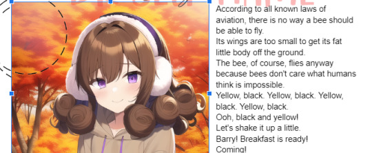
Using the different text wrapping options, I found that it helped a lot more to "bundle" images together, so that things look prettier + more organised.
! example

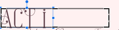
This is pretty simple, honestly; Fontspace provides font text as pictures, transparent bg and not, — so organising the text from it will fall under the tut for this bit.
^ These are the text wrapping options. The first one is the default and limits text placement/movement, the other four allow you to move text where-ever on the document (especially if print view is off) but each do different things.
In order of settings, examples (press images to see properly):


! tip : If you're bundling images that "overlap" too much, make sure to crop at least one (or however many needed) past its actual size so that it won't be a pain in the ass moving them later on.
- You may also use "behind text" for one of them, if it helps, so that it's easier to select the images, this also applies to using image over text (examples in each image).
what I mean:

Using these features, I'll—as per the aesthetic of my script—sort things accordingly. Get creative with the way you're doing this, and keep experimenting 'till you're able to make stuff look the way you want, lol.
"BuT DaRLIng wHaT Do I dO wItH ThIS iNFo??!?!?" bitch idk find an aesthetic 💀💀
like those 2016 fashion sticker books or smthn, idk- whatever u like-
Going into the aesthetics more ;; I usually pick diff aesthetics for each script and refuse to script until I find a pretty one LMFOAOAO- But I especially go for inspiration from (Korean?) bullet journal aesthetics which include lots of image bundling and customised tables.
Why korean ones specifically? Idk the difference, but using "Korean" as a keyword gets the stuff I'm looking for. 💀 But I also search for little pngs I want to add to my script; and if it's a false transparent png or has any background, I use my background removers to make it an actual transparent png.
And, sometimes, I like to search for colours then use my snip tool to screenshot them really thin, like those brown-beige borders you see in all my posts, then use them in my script like highlighter lines, like-
That's pretty much it, really.
! examples from two of my scripts


Fontspace fonts apply as well. One thing about Fontspace is that, you can change the colour of the text ;; as well as the background.

The brown colour is the text's colour, the blue one is the background's colour. You can of course choose to have no background, but it's there as an option.

I don't know of any features where you can save a colour but that's maybe me being dumb ;; but what I do is set a certain colour (i.e. blue) then use the colour adjustment in google docs to change it to black, red, or whatever over colours r in the script.
i.e.:


Anyways I'm p close to the image limit, so that's it for this post.
I hope this makes sense bc explaining this was harder than I thought. 💀💀 Once again I can clear anything up if needed

! tips
Keywords you can use for tiny decorations, are "clipart", "[aethetic name] clipart transparent png", "[aesthetic name] sticker png transparent", etc.
You can have a look at the aesthetics wiki for ideas for your script
Fotor is what I use to crop images into different shapes, and it is how I got the circle/heart shaped pictures in my documents ^-^*
...I'll add more when I remember them.
next up ··· customising tables ✿
#—DARLINQ'S DOMAIN🤍🌙#reality shifting#reality shifting script#shifting script#shifting realities#shiftblr#respawning#idk what else to put#im just using tags bc itll probably help ppl#i feel so shy posting bear w me 😔❗❗❗
116 notes
·
View notes
Note
How did you go about publishing your own story through Amazon? I'd like pointers for future reference. If you don't mind!
Amazon offers a self-publishing option! I used it back in 2014 to make a few ebooks and, since then, they expanded to print. Which I wasn't aware of, until I started poking about in self-publishing print books.
However, to self-publish a print book, you have to wear a lot of hats. And that means...
A lot of research.

There's a lot to know to format your own books. And remember, traditional publishers have editors, cover artists, typesetters, and so much more at their disposal.
Also, you'll have to do separate formatting for a print book vs an ebook.
If you're ready for the long answer, there is a lot:
First: Plan out your sections.
There's "front matter" and "back matter" sandwiching the "text body" or the story.
Front Matter is stuff like: Title, Copyright, Dedication, Introduction, etc. (This is also where you'd add things like a Table of Contents or maybe a fantasy map.)
You can find a copyright template for self-published books easily!
Back matter is stuff like: Author's Note, Acknowledgement, Other Books by the Author. (You could also add appendices of Characters here [or in the front] or excerpts to another book.)
The text body itself will have formatting for chapter headings and scene breaks (like if you use images or * * * to break up scenes in one chapter.)
Second: Learn about paragraph styles and page styles.
A paragraph style setting makes it easier to change all of your font with one click. Especially if you get fancy with your chapters.
A page style setting will help with things like tweaking margin sizes for multiple pages.
Either find or make yourself a template in whatever processing program you use. (I used LibreOffice and I'm working on making my own template.)
idk if it's just me or what, but these things are still finicky for me. So, I'll have to do more research on how to make them behave. lol
Three: Don't be afraid to google something!
BUT double-check that the information is relatively recent. I did keep finding stuff from 2011 or 2012. The self-publishing market has changed a lot since then. (You can bypass this, usually, but adding 2022 or a similarly recent year into what you search.)
Reddit was a great source for me during this process. They literally have sub-reddits for self-publishing. So, when you put in your question in google, add "reddit" at the end. You'll often find threads filled with answers for you, whether that's one agreed-upon one or various takes.
There's a ton of stuff that's up to personal preference, but it's nice to see what your audience might take notice of.
Miscellaneous Things:
Bye bye "by:" For your covers or title pages, ditch "by" in front of the author's name. Seen as a beginner mistake.
Research widows and orphans in typesetting. This is something I still need to decide on, but for now I left them in my book unless it was a line by itself on a mostly blank page.
Larger books need larger gutter margins! (ie the part of the book, closest to the binding.)
Some people think if a self-published author's name is comparatively small on the cover or binding - compared to the title - the author doesn't have confidence. I, personally, hate when the author's name is the same size or bigger than the title, especially if the title is literally another name. Which is the author and which is the character? 😖 But that's me.
Decide if you're going to buy your own ISBN! An ISBN is an International Standard Book Number. Most countries give them away for cheap or free, but the US has 1 purveyor of "legit" ISBNs and they charge $125 for one or $395 for ten. Amazon (and other self-publishing companies) can provide you with one of their free ISBNs. This just means those ISBNs can't be used outside of their services, but you can still publish elsewhere.
Don't forget your page numbers! There is an "add page number" function for the headers or footers, but if you want it on the outer sides on opposite pages, you'll have to do some finagling. (This gave me a ton of guff.) And consider if you want your name and book title in the headers. That's an easy-to-overlook detail.
Covers. Canva is what I used to piece together mine. I also used elements from Pixabay, if I couldn't find something I needed on Canva.
There's still so much I could say. I did so much googling and waffling between what I wanted to do. And, honestly, I've probably rushed the process quite a lot and have more googling and learning yet to do.
But, yeah. I hope this helps some people out there!
18 notes
·
View notes
Note
for the writing meme 1, 3, 22, 40 :)
Hi!! thank you for asking :-)
1. What font do you write in? Do you actually care or is that just the default setting?
OK i do care abt font tbh, i usually write in baskerville in google docs lol, size 9 or 10 maybe, i change it to 8 when i read through it all; occasionally i will change the doc into a completely different font like comic sans or something lol just so that it like. looks different + therefore hopefully gonna make me spot mistakes or things to change idk? but yeah baskerville my friend baskerville, it looks like this on my phone:

3. What is your writing ritual and why is it cursed?
I already answered this one but actually i guess i can say a bit more abt sort of how id go about sitting down to write, whether i 'warm up' or not or whatever. sometimes i might start off with typing up some handwritten stuff if ive got some left to do, before i actually write anything new, and that's like my warm up i guess. and i will keep reading through my work frequently of course, although sometimes you also have to take a little break or pause from it, because you end up having read it over so many times that it loses its impact; but if you leave it and come back to it in a few days or whatever your time scale is and read it all through from the start, then it hopefully feels fresh again and you start to really enjoy the bits you wrote again.
22. How organized are you with your writing? Describe to me your organization method, if it exists. What tools do you use? Notebooks? Binders? Apps? The Cloud?
hmm, i wouldn't say i'm like...disorganised exactly, but idk how organised i am either......when i write by hand i use like a5 size notebooks and black biro, and when i type it up i use google docs... hghgffj in my google drive i do have a lot of Untitled Documents lol, mostly notes/planning for fics. (and lately for shorter fics sometimes i don't actually think of a title until it’s finished and i'm uploading it to ao3, so it just stays as untitled document in my drive... oops..)
my document full of notes for a possible ocelhira fic is almost at 3k words or something (plus some scribbles in my real notebook) and it’s extremely messy.. i live in hope of someday writing it,but here's a snippet from my notes for now:

i also have another short bosselot fic in mind.. :
my notes like this on my phone tend to be just. lower case free from punctuation no speech marks just vibes. tends to be a mixture of more polished sentences that i will probably end up using in the final thing, as well as looser bits and actual like. notes to myself of outlines / plans / settings etc. i can't seem to find my notes for 'awakening', i guess i deleted them, but it would have been good to show my notes for a fic i posted recently so you can see what made it into the final thing and what didn't, ah well.
40. Please share a poem with me. I need it.
I already answered this but I'll go for another poem by the same author, Wilfred Owen, since there are several I really like by him. (His most well-known, and for good reason, is Dulce et decorum est, but i feel like that's the obvious choice with him, so I'm avoiding choosing that one lol. But it is very good..)
thanks 4 asking!!! :)
4 notes
·
View notes
Note
Hello how did u edit and add subtitles to ur gifs
hi friend! thank you for coming to me with this question.
idk if you’re asking about the whole editing process or just adding subtitles, so before i go in depth about caption text, i wanna direct you towards my gif resources masterpost, where i compiled and organized a bunch of tutorials for different gif making processes. if your question isn’t answered here, its probably answered somewhere on there.
adding captions/subtitles to gifs: a detailed tutorial
(if this tutorial helps you in any way, please REBLOG it)
okay so when it comes to adding text to a gif it varies slightly whether you’re using frames or the timeline. i heavily recommend using the timeline function over frames just in general bc it allows for a lot more flexibility, ease, and precision with each effect that you add.
how to convert your gif from frames to timeline
when you add caption text to a gif, you wanna make sure you’ve resized the gif first. here’s a quick guide to gif dimensions. additionally, always make sure that your text layer is above all of your editing/coloring layers.
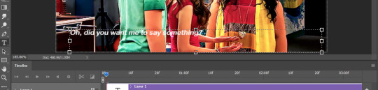
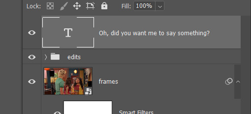
after resizing and editing, go ahead and click the lil text icon in the tools panel on the left.
your cursor will change shape, and and then you can draw a text box on your gif. it will fill with placeholder text at first:

press ctrl+a to select all the text in the box and backspace to delete it. type in your caption text:
select all the text again and press the center icon (1) at the top of the screen to center it within the box. once you’ve done that, click the check mark (2) to tell photoshop you’re done editing the text:

now that your text is centered within the box, it’s time to center it horizontally on the gif. switch to the move tool:
and make sure your text layer is selected in the layers panel:
press ctrl+a. your entire gif should have a dashed line around it. press the center icon at the top:
(pro tip: this will work for any type of layer you want to center, not just text.)

from there, use the arrow keys to scoot your text up or down to whatever distance from the bottom you prefer:
now, let’s get into specifics like fonts, sizes, and shadows that will help make your text more clear and readable.
click the text tool icon again, click your text box, and press ctrl+a to select all your text. these are my preferred caption text settings:
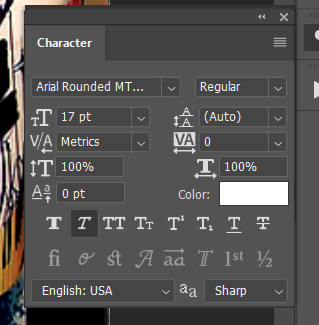
i use arial rounded MT bold font, 17pt for full size (540px width) gifs and 14pt for smaller gifs. i use the “faux italic” setting to add a slight slant.
next, let’s talk about blending. drop shadows and strokes are essential for helping your caption text show up clearly on any gif. right click on your text layer in the layers panel and click “blending options...” OR just double click your text layer.

these are my preferred blending settings for caption text:
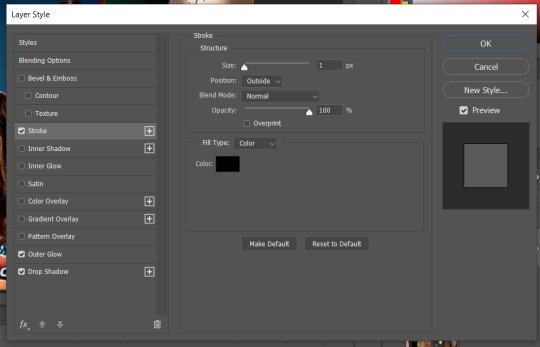
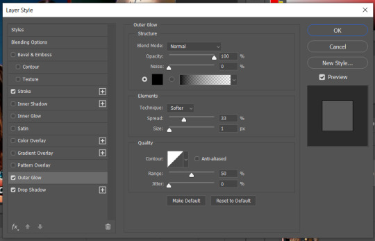
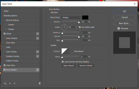
click “ok” in the top right of the panel to save the settings onto your text layer.
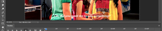
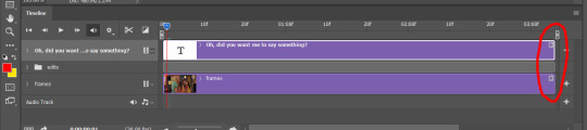
all right! you’re almost there! the last thing to do (if you’re editing in timeline) is to make sure that the length of your text layer matches the length of your gif layer.
if your timeline looks like this:

or this:
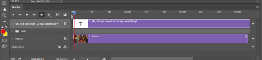
then you’ll need to adjust the length of the text layer. to do this, click and hold the right end of the purple bar representing the text, and drag it horizontally until it matches the length of your gif layer.
and you’re done! the finished product:
hope this helped!
#gif tutorial#how to make a gif#allresources#completeresources#caption text#gif caption tutorial#subtitle tutorial#gif subtitles#photoshop tutorial#gif help#gif tips#smilecapsules#quirkyresources#sibylresources#answered asks#anons#mytutorials#chaoticresources#finesources
81 notes
·
View notes
Note
I need some kind of a photoshop lesson for this aesthetic of yours
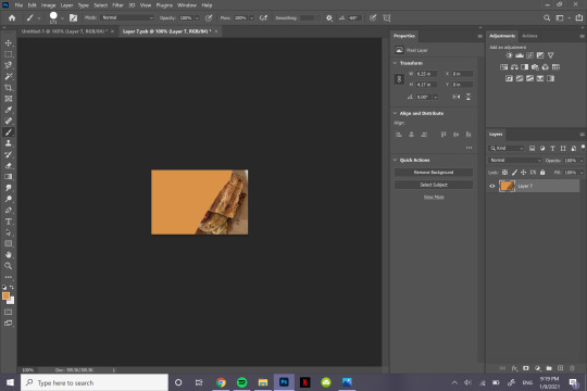
okay i’m gonna do a tutorial real time for a picspam type aesthetic that will look like this ⇣ a photo i will put here once i make it.
step one. open ps : )

welcome : )
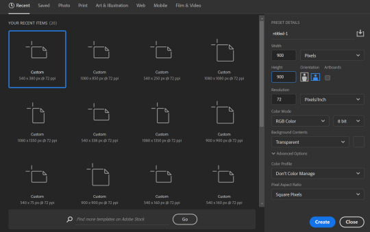
okay so dimensions r a thing tumblr compresses photos like hella so i do all my still img aesthetics 900x900 is you’re trying to do this for say insta i would actually recommend jumping up to 1080x1080. pixels, obviously. idk if i have to clarify that.
so click ctrl+n or create new i’ll be doing 900x900
these r the rest of my settings i personally do not think they matter my resolution stays at 72 the only thing i’ve detected this affecting is font size. (side note notice how this pic looks all fuzzy? that’s bc it’s a ss with a boatload of pixels. and if there’s one thing tumblr hates. it’s pixels. and then it’s users. but who’s counting? tumblr is. i recommend keeping ur still images 900x900♥)
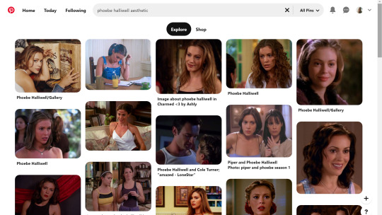
step two is collecting ur images i personally use pinterest for these bc quite frankly it’s really nice & easy to find these types of photos esp if you’re looking for a canon character bc if you type in [character name] aesthetic you’ll get stuff if you don’t quite frankly even just type in aesthetic you can scroll until you find an image you like click on that and go through like images underneath it and keep burning thru. like u probably know how to work pinterest. but i am being thorough and covering my bases. searching [color] aesthetic is also nice or even searching a character that isn’t the character you’re doing this for but who’s kind of similar that also works. i recommend esp for charmed bc their pinterest gets bogged down with screencaps and then like. charms like jewelry searching “charmed aesthetic” or “phoebe halliwell aesthetic” really just doesn’t cut it so what i’d recommend is instead of going through pins, go through boards.
bc like. big difference. other pro tips if you see a board you like, go to the person’s profile and check out their other boards bc odds are you’ll find more you like. another protip if you’re specifically doing ocs typing in oc aesthetic will get you a lot even going to the boards on that as well. yields.
so. you’ve gathered ur images. u need five. open em. i’m making an aesthetic 4 myself which you’ve probably already guessed from the fact i’m putting the finished piece at the top, but it’s not ready yet so it’s still a surprise for me.
cropping. if ur doing a 900x900, use these setting exactly. 1080x1080 use 1080/2 x 1080/3. i’m not doing the math 4 u ♥

most important part? Delete Cropped Pixels. otherwise ur not really doing anything. crop all five images.

but them in ur document. document? psd? ur thing ♥ place them places. u do not have to commit now. leave one middle one blank. it does not matter which one. i personally like to alternate my text pieces if i’m doing a long post like what i did on my ncwotng set. some people keep them all on the same side. this lowkey bugs me i feel like it throws off the Balance but i imagine some people like The Consistency. i don’t. but w/e. it’s up to u as this is gonna be ur set. also like. as you’ve cropped these to x/2,x/3 settings they should fit nice like puzzle pieces : )

the next step i personally like doing is creating by text box with The Color™ do this bc simply duplicating one of ur images, shoving it in the empty slot, and converting into a sharp object. edit contents.


now. obvi i selected these images w a color scheme in mid. i recommend u do the same. even if it’s just vague. they don’t all have 2 fit. this is my example of my sheridan piece b4 or after. tweaking is possible. layers w masks r ur friend. i can talk about them more if need be.
But. back 2 the smart object. brush tool. paint it.
♥
the text i used was times new roman all caps 40pt font 0 spacing for the title and times new roman 14pt font 0 spacing italics for the subheading. here’s my dency b4 and after for comparison

next step is after you have your text in alright, shove everything into groups. mode on “normal”
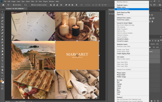


then you can start editing. the groups let you edit things like lighting and color without touching any of the layers below it 👍
i’m not gonna do a Major coloring tutorial, for lighting i’ll usually tinker with exposure, levels, sometimes brightness/contrast. for colors, color balance + hue/saturation. i rarely touch anything else.
i’ll bring u along 4 the coloring of this one bc i’m gonna add a layer mask.
so the first thing i’m going to do bc the paper itself is already close to the vibe is i’m going to color it normal and just ignore the background

something like that. then i’m going to add a layer mask (square button w the plus sign)
and then i’m going to eye dropper a color off from somewhere else
now i was talking about the “normal” blend mode stops ur color settings from bleeding over onto other images? does not apply to painting on layers but you’re already masking this bad boy, so it doesn’t matter. just don’t say i didn’t warn u
i’d recommend using a really ridiculous blend mode to clean up ur thing at first, i’m using darken which isn’t that wild but like whatevs.
add a layer mask using this button.

select and mask
use this thing to clean up ur mask
okay so i did a lot since we last spoke

but if i impart any lesson to u. it’s: fuck around. find out. that’s literally how i’ve basically done everything. nothing’s ever really gone horribly wrong. click things. see what happens.
okay so now that you’ve kinda gotten everything figured out. change ur text box color again. i’m introducing u to ye ol trick that is not the paint brush. but. hue/saturation on colorize more yeah babyyyyy
ahaha yes. love this bad boy.
Now. Trick To Make Everything Super Cohesive™. put things above All of your groups.

yeah boy.
reorganize ur thing bc u don’t like how it looks.
fuck around w a lot of stuff.
it’s still cluttered.
fuck it. grab a new image.
something like that. never let the fear of striking out keep u from playing the game : )
fuck around a bit more.

vibes♥
save ur image bc u literally Have Not Done That Yet

& then remember the other thing u forgot to do
eyedropper what ur text box looks like move the whole thing to the tippity top and recolor

this is just bc u’ve fuck around a lot w a lot f different settings. this ensures that the text stays the same color u set it as.
okay final step.
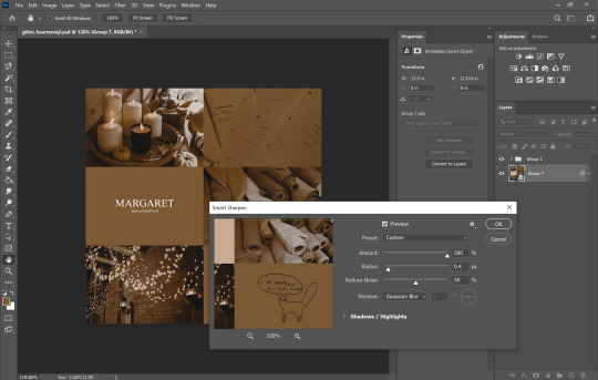
turn The Whole Thing into a smart object, smart sharpen
leave out the text box tho. the sharpened text can look weird. it’s ur choice, but with these settings,, cronch.
and wallah. ctrl+shift+s save as png and bada bing bada boom baby. aesthetic
#like i cannot stress how much of this simply is. fuck around. find out.#like just have fun click on things#go ape#like there's no right or wrong way to do this#anyways i used to make these for harry potter on canva ♥ remember ur roots#tutorials#ps tutorial#aesthetic tutorial#ogwork
39 notes
·
View notes
Text
Hug-o-gram Preview | Yoongi
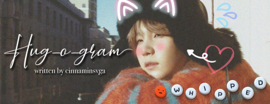
→ summary:
“This is probably the dumbest idea you’ve ever had,” Yoongi hisses, but it’s kind of hard for Seokjin to take him seriously when he’s wearing a cardboard sign around his neck that says ‘Huggie Wuggie Machine!’ in bubble font.
“Like, even worse than when we DIY’d your car into a convertible by sawing the top off?” Seokjin asks, genuinely curious.
“Worse,” Yoongi admits, trying his best to stay out of your line of sight. His cheeks redden, matching the gaudy pink kitten ears he was forced into wearing.
{or alternatively: Seokjin is a terrible wingman. He also runs a profitable business by sending “hugs” to people’s crushes for a fee. Mix them together and you have a recipe for Min Yoongi’s worst nightmare.}
→ genre: college!au, hugging booth!au, fluff, humor → warnings: yoongi is so smitten that he’s a walking disaster, so much shy!yoongi to the point where you’ll want to *o*e him, seokjin just tryna get his homie some y/n love coochie bro ;o; → words: anticipated 10-12K → a/n: who the fuck am i... why am i writing so much??? let’s all thank miss kwaranteen for that, my friends. but what’s with the fluff, you ask? thank miss @jincherie for that because her weak heart can’t handle angst so i have to use my limited fluff muscles to write this for her... anyway idk when this is coming out but its probs soon,, enjoy this lil snippet i guess LMAO

“Yoongi, it’s time for me to head to work. You want to come with me today?” Seokjin asks, though he knows what answer he’s going to get. You see, Seokjin’s new booming business is another one of his fantastic ideas, but it is a little... inventive. Sure, Yoongi had scoffed when he had originally suggested the idea, but Seokjin knew that it was going to be a money-maker. Sure, it had taken a few years for the business to really take off, but once it finally did…
Enter Kim Seokjin’s Hug-o-gram Service! Students from his university are able to send anonymous payments directly to him, with little notes attached for their crushes. Each love letter delivery comes with a hug from Seokjin himself, delivered straight to the person without them ever knowing who the hug came from. It was ingenious! It was lucrative! But most of all…
It allowed Seokjin to cause drama and have an excuse for it! Nothing could have been more perfect for a man like him.
“No thanks,” Yoongi snorts, rolling over to face him. He watches from the floor as Seokjin changes into a butter-less shirt, which also happens to have his own face printed on the front and back. His trusty cardboard sign that reads “I’m Gonna Glomp Ya!” also joins his attire for the afternoon, a long piece of string tied to its edges so that he can wear it around his neck. Throwing on a pair of white sneakers with the tags still attached, Seokjin is ready to tackle today’s list of would-be hug-ees.
“How do I look?” Seokjin asks, combing his hair with his fingers. It leaves an oily sheen, which he somehow makes it work.
“Ugly,” Yoongi says, like a liar.
“It’s okay, I understand. I can speak tsundere, so you don’t need to explain,” Seokjin snickers, nearly getting hit with a TV remote by Yoongi. He opens his phone again, swiping to his e-mail to see his list of hug deliveries for the day.
Seokjin gets around 10 requests a day, with around half of them coming from regular clients. He’s especially fond of this boy who has been sending hugs to his TA named Namjoon for almost a month now. He has no idea why this kid has so much disposable income, though seeing the blush on Namjoon’s face everyday makes Seokjin think that he would spend every last penny for him too. Namjoon had begged Seokjin for his secret admirer’s identity, but snitchin’ isn’t a part of his service, unfortunately.
As much as Seokjin wants to know who is crushing on who, his little business wouldn’t work as well as it did if anonymity wasn’t included in his package deal. It allows people to thirst in public without facing the repercussions, like getting a knee to the groin or a slap to the face. Not that Seokjin has ever been at the receiving end of that; everyone loves him! Like, have you seen him? He must have saved a civilization in the past with how devastatingly beautiful his forehead is.
“Why am I suddenly filled with the relentless urge to deck you right now?” Yoongi says, getting up to change into clean clothes as well. His black t-shirt unfortunately does not have Seokjin’s face on it, but that can quickly be amended if the elder of the two decides to follow his every intrusive whim.
Seokjin laughs, completely unaware of the murderous capabilities of his friend. Due to his smaller body size, his percentage of evil is unusually concentrated. “Maybe it’s because you know that I’m into pain pla–” but Seokjin’s retort suddenly grinds to a halt. He chokes mid-sentence, coughing wildly as he pounds his chest with a balled-up fist. When Yoongi looks up at him, he finds his hyung staring slack-jawed at his phone, seemingly flabbergasted by what he finds on his screen.
“What’s the matter? Accidentally sent a dick pic to your prof again?” Yoongi snorts.
“That was one time! And no, it’s…” Seokjin trails off, uncharacteristically hesitant. He shifts his gaze from his phone to Yoongi, a drop of sweat quickly forming on the back of his neck. Yoongi raises a brow, silently urging him to continue.
Instead of replying, Seokjin hands him his phone. Yoongi finds a copy of one of Seokjin’s newest hug requests, only having just received it five minutes ago. As he scrolls down, he finds that this secret admirer is a new client, but that isn’t what made Seokjin stop in his tracks. Instead, it’s the recipient of the hug that catches his attention–
“Y/N has a secret admirer?” Yoongi says, voice cracking at the end. He clears his throat, trying his best to school his face into something less… jealous. He swivels away from Seokjin, forcing himself to breathe slowly through his nose. He convinces himself that he is the very epitome of calmness.
“You okay there, Yoongi? You look like you’re about to vomit,” Seokjin says, immediately breaking his inner peace. Yoongi groans loudly, shucking the phone over his shoulder, uncaring of where it lands. Seokjin, with his superhuman and God-given reflexes… doesn’t catch it. But he did dive to the floor like a seasoned Olympian, and his ass cushioned his phone so he supposes that’s a win.
Back to the matter at hand––
“I am fine,” Yoongi says, as he continues to not be fine.
From the floor, Seokjin shoots him a disbelieving look. He lies down more comfortably, propping his head on his elbow. Screw his hug-o-gram appointments for now; nothing brings him more joy than seeing Yoongi absolutely losing it. “Really? So you wouldn’t mind if I marched up to Y/N right now and give her the warmest, coziest, most tender hug of her fucking life?”
“Y… Yes,” Yoongi squeaks, neck glowing a furious red. He has his fists clenched (adorably) by his sides, head bowed as he faces the wall of their apartment. Seokjin’s brain makes the unhelpful comparison of Yoongi with that cat meme who says “no talk me angy” in Impact font.
Seokjin grins, his wickedness from within coiling and yearning to burst from his seams. This is it! Maybe if he pushes a little more, then maybe Yoongi will stop pining like a pathetic loser! Also, it didn’t hurt that he got to push Yoongi’s buttons while he’s at it, but hey! Not all heroes go to heaven or whatever.
He grabs his phone from his ass, scrolling back to the e-mail. “So… You wouldn’t mind if I walk up to Y/N right now and tell her ‘Hey! I’ve had an embarrassingly long crush on you and when I heard about this hugging service… I couldn’t miss the chance to shoot my shot! If you’re single and ready to #mingle, then please meet me at the Corner Cafe at 2 PM tomorrow.’” Seokjin sing-songs, snickering loudly when he sees the absolute pain etched onto Yoongi’s face.
There is a pause, and Seokjin waits as Yoongi uses his tiny kitty brain to think of what to do. He can only imagine what’s going inside his head, but he has a guess. Yoongi could either: 1) finally admit his feelings for you and come clean before Seokjin has to deliver your hug, or 2) do something stupid and counterproductive.
It comes as no surprise when Yoongi goes with option number––
#btsghostie#my wips#bts scenarios#bts fanfiction#bts imagines#bts reader insert#yoongi scenarios#yoongi fanfiction#yoongi imagines#IM SO SICK @ MYSELF THIS IS GONNA BE SO FUCKING SOFT#ITS LIKE I HAVE SPLIT PERSONALITY DISORDER#FLUFF THIS! SMUT THAT! WHERE IS MY ANGST#[dialtone noises] the number u have dialed is no longer in service... zee machine broke
214 notes
·
View notes
Note
hi! can i ask how u made ur carrd like what are the settings? ty!
omg YES i love carrd making hi anon. if there’s anything specific u want just lmk!! under the cut bc its long... i make most of my carrds on desktop so this is very desktop based.... to all of u who do ur carrds on mobile honestly kudos i cld never
uhm also when i say long like this is v long bc i added a lot of reasoning to my settings n tips that i’ve picked up on making carrds (plus the screenshots) i hope it helps tho ^_^ apologies if u knew most of this stuff tho bc i explained... everything...
some notes before we get in: for colors i usually just base everything off the sidebar image and use a color picking website (i use this one) to get the the html codes for colors. the site i use also generates a palette which i also use! ur free to use anything tho obv. the font i used is “inter”
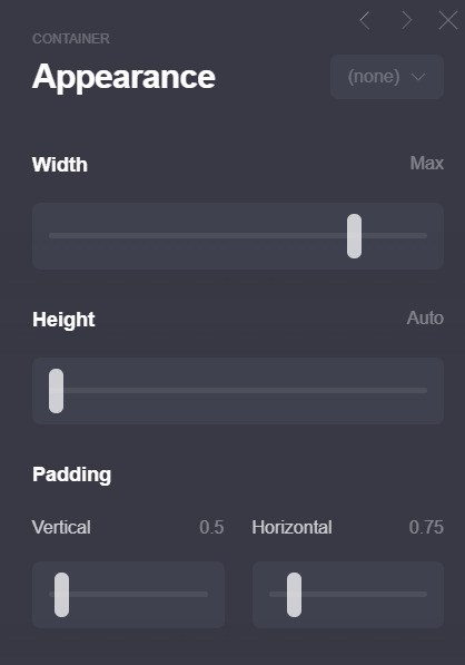
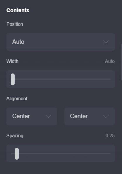
1. ok first here are my page settings! i wont include my animation settings now ill leave that to the end.. these r rlly the only settings that i’ve changed so i’ll just post these.
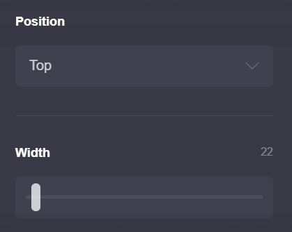
ok i dont rlly change much except for these two, the position is set to top not center (which is the default) b/c esp w carrds like the one i have now i dont like the header portion moving depending on the height of the container underneath... does that make sense? that’s just super nitpicky of me LOL but if u do end up making the carrd n playing around w the settings u’ll see what i mean
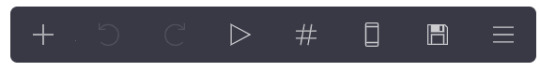
the width is set to 22 bc i like small carrds! play around w this as u see fit, i also change it depending on how it looks like in mobile (im very thorough lol) if ur wondering how u can do that on desktop, its this phone looking icon on this bar on the top right of the screen: (the 6th icon!)
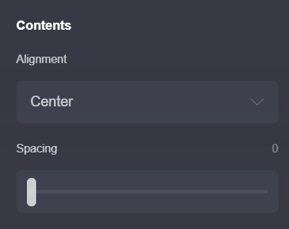
the next pic is also default settings except my spacing is set to 0. i’ll explain why later! the alignment also doesnt really matter w/ this carrd. u can play around with it tho!
2. this is for the home page!
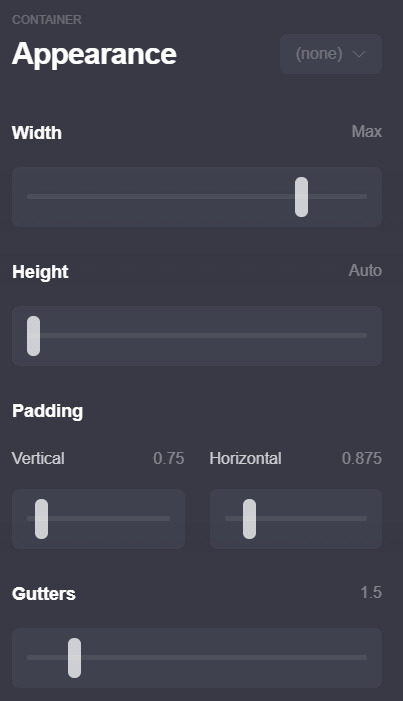
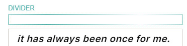
first i’ll explain how this is set up: the title box and the box under it (i’ll call it info box) are both containers! here is why i put set the spacing to 0 earlier: if u put 2 containers theres going to be space btwn them and to achieve this kind of look (ig) i just set the page spacing (in the page settings) to 0. however this means that everything is going to be pressed up against each other so i usually just add dividers (which are transparent [color code is #96969600]) i wont post a screenshot bc the settings r default, except for the margins which u can play around with to see what works for u (it’s set to 0.375 for me rn)
here are my settings for the title box

most of these r pretty standard except for the padding and border. the reason why i didnt tick the bottom part is bc of the container w all my info underneath. both containers have borders so the bottom & top border of those containers wld just merge n create a thicker border which isnt what i was looking for... anyway.
then i just add a text element & just write my title! idt my settings for that r relevant so i wont add it (the text size is 0.875)
next is the info box! here are my settings:
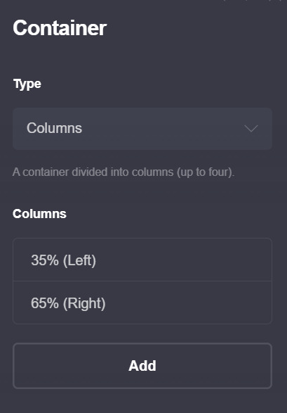

btw this is a container with columns!! those can look p wonky on mobile so make sure to have these settings on so that they wont look awful on mobile!!

oh also i wont post a screenshot of my text settings (text size is 0.75 + line spacing is 1.25) if ur wondering how i changed colors for some of the text the format is basically just [text]{#color}
for the image size i set the width size to full (or full column) that depends on u (and how much text u put in the info part) i just prefer how it looks like when the image width is set to full bc that way no part of the image is cut off... really depends on u and what image ur using though so just play around w/ it!!
and in terms of spacing, i have a divider on top of the title box b/c otherwise the whole thing is just too high up for my taste
ok now to explain the header part and how i got my title/info box to stay “fixed”

so... im ngl. i dont understand how the header function works (help) so uhh i wont go as into detail here. but what worked for me is adding a header marker (the plus thing on the bar > control > change section break to header marker) right after the info container, then adding a section break (this one is called #wala bc wala here means ‘nothing’ in bisaya lol) and a transparent divider right after it. i hope its visible in the pic... anyway this is the only method i found that makes the carrd work lmao. it rlly doesnt matter what u name the #wala section break bc its not gonna show up so u might as well just use a keysmash
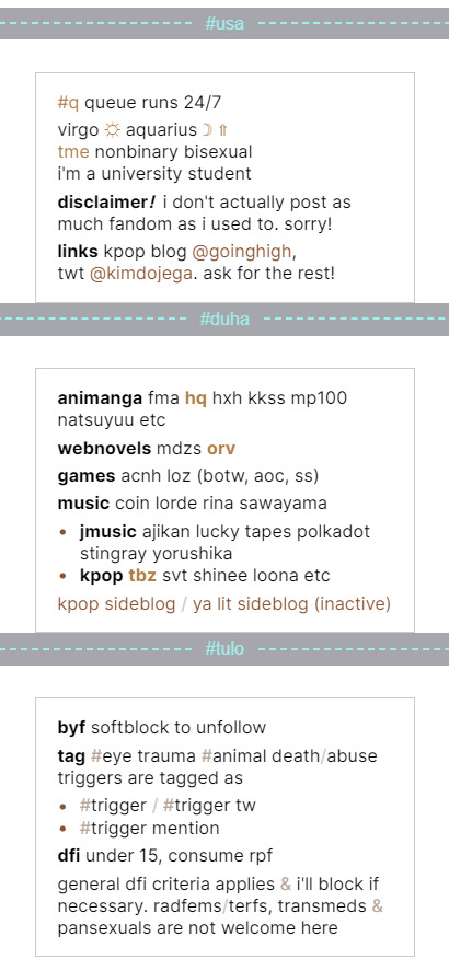
3. the extra info!! (extra, interests, byf)
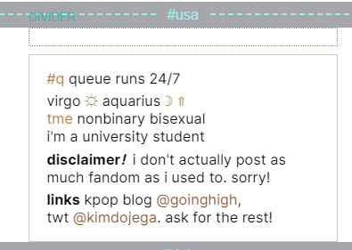
this section will b shorter compared to the first two LOL anyway. first i started off w a section break (#usa which means 1 in bisaya hehe), then a transparent divider for spacing, and then a container! theres nothing fancy abt this container it has the exact same settings as the info box above so u can just duplicate that container and change the container type from columns to default.
then just add ur info and ur done!! repeat w whatever extra info u want to add (i only had 3 to add so it looks like this for me)
4. oh before i forget, these are my animation settings!! (page > the triangle thing)

u can preview the on load animation by clicking the triangle button on the top right bar, but for the on section change animations u have to save then preview it on ur carrd itself :/ kinda annoying but yeah... i usually never set anything above 0.5 seconds for on section change animations bc im impatient LOL
these r completely optional tho... i just think animations make the carrd look smoother & more fun!
thats it i think! here are some tips i have
1. this tip is abt how carrds can differ when on mobile! i sometimes fiddle around with the mobile settings to make sure my carrd looks the way i want it to on mobile! bc mobile sometimes fucks up the spacing and it annoys me LOL... example here:
u can find these settings if u scroll down a bit on the page settings and switch mobile from auto to manual (like in the screenshot) most of the settings i dont touch except the size setting, i just fiddle around w it and see how my carrd looks in the mobile view until im satisfied
2. this isnt rlly necessary but its smthn neat i picked up! if u check ur section break settings and check hide footer u can get rid off the “( made with carrd )” text on the bottom! i think it just makes the carrd look a bit neater, esp since the page spacing is set to 0 so it might look a little squished under the container...
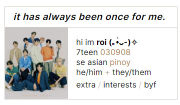
3. i like to use all elements of my carrd efficiently (ig? heres the engineering major jumping out) and idk if u noticed, but if u click on the title (”it has always been once for me”) or the image (which is... of tbz..) it actually takes u back to the home page ^^ idk i just think small things like that r neat
thats it for real!! i hope this wasnt too much of a hassle to read or follow through, and if u have any questions dont hesitate to dm me or send me an ask, even if we arent mutuals!! i hope u have fun making this carrd <3
#anon#ask#carrd#also rip this is one of the simpler carrds im using rn#i bolded some stuff so it doesnt get lost in the midst of my rambling... oops
22 notes
·
View notes
Note
Hi, I have been working on your Kikyo theme for the last couple of days, and there is a couple of things I still can't quite get right. Is there a way to add more links on the sidebar, without it ending under See More? I noticed on the preview that it had more before the see more, but I can't figure out how to get that done. I was also wondering the four buttons, Dashboard, message, customize and follow is there a way to change them? I love the theme, so I hope you can help :)
Hey! Thanks for reaching out and using my theme! I rarely help with any major customization questions since it requires lengthy customization + explanation but I'll give this an exception :)
To answer your questions:
Changing the Links' Style
As you know by now, the links can be added by using Tumblr's built-in links. I have added it, as a default setting, to make all the links appear beneath the [See More] section except for ask and submit. Technically, it is possible for you to do that (depending on if we have the same concept in mind). So, to do it, you need to do it as follow -
Go to your Customization page. And click [Edit HTML].
Click ctrl/cmd + F, and find {block:HasPages} .
Once your find it, remove <details>, <summary>{lang:See more}</summary>, and </details>. Click [Update Preview] and [Save]. Supposedly, you'll be seeing that none of the links are hidden beneath the [See More] section. This is because we have omitted the code which allows the link to stay hidden inside [See More]. Here's the supposed outcome:
However, do take note of the following -
The font size will be the same as the other sidebar headings like Ask/Submit.
Once a user clicks the About, Ask, or Submit button, every link will be going down (idk how to explain this but here's a photo):
This may or may not look pleasing in your eyes, depending on how you see it.
If you have so many links and it needs to scroll down, unfortunately, your search bar would be like this:
Solution
Here are the solutions to the above issues:
Decrease the size of the font
There are two relevant selectors that are crucial for this solution which are details and .sidebar a. details cover over the ask, submit, and about section while .sidebar a covers over the links like Index and other links added inside using Tumblr's built-in.
Search for the above selectors at the CSS area/ <style>.
Once you found it, search for font-size and edit it to 1rem (recommended) or whatever suits you/your blog.
Not getting the search bar in an awkward position.
Search for .sbp at the CSS area.
Omit the position, bottom, and left and replace it with margin:2rem 0.5rem;
Done.
Tumblr controls
As to your second question, I think you need to explain further, what do you mean by "a way to change them"? This is just general customization:
At the code itself, search for /*TUMBLR CONTROL*/.
You can edit the .tc > a and .tc > a:hover. However, do it at your own risk. I'll not assist you in this matter. If you don't understand any of the properties, you can simply Google it to find the answer.
Hope this helps you out! If you still have any trouble, just reach out again. Don't forget to share with me the name of the blog that you're using (just write @yourusername, no need for a full link). Another thing, can you answer this survey of mine about theme selection?. I would really appreciate it :D
All the best!
5 notes
·
View notes
Text
elotito tagged me on this so i’m gonna do it for her <33333
1. describe how you first started writing and when you first posted
i began to write in general since i was around 14 like any other emo kid kdjdjsks and o began to write fics when a friend asked me for one as a birthday present. it was written in a hurry and it’s not my favorite but i really enjoyed doing it. i posted that exact same fic on their birthday
2. which of your characters do you typically resonate most closely with? do you base any characters off of yourself?
it depends the fic i guess. and not really, i think the closest i’ve been to do that is in the rockstar au (coming to the @bottomlouisficfest very soon), i put one or two of my old insecurities in h so he could connect better and wouldn’t be persieved as just an asshole-y dude cause i don’t like that and louis don’t deserve that uwu🌸
3. where do you often find inspiration?
music, movies, tiktoks (DONT JUDGE KDKDKS)
4. has quarantine helped or hindered your writing process?
before the quarantine i had around 3 wips, now i have 8
5. do you listen to music/noise while you write or do you prefer silence?
i listen lofi youtube playlists shjdkld
6. what is your biggest writing pet peeve in your writing or in general?
me repeating “Oh...” over and over again through tall my fics, it shouldn’t be legal
7. describe your ideal writing setup
rainy day, good coffee, comfy sweater, my cat besides me, arely sending texts about teeth/imessage games, snacks
8. favorite time of day to write?
nights (it’s usually when i have time)
9. favorite genre to write + one you’d like to try writing in the future?
i’d LOVE to write a thriller
10. do you struggle with writer’s block? how do you typically overcome it?
i just leave the fic for a bit, i don’t really like to push myself about this cause i’m just doing it for fun
11. what is the easiest part of your writing process and the most difficult?
the easiest is the dialogues, i could write pages and pages of just dialogues in hours and the hardest is the smut dhjdd
12. how do you come up with original characters? (if applicable)
it depends, is the antagonist? i ask myself how’d i feel if i were them, like a third party just trying (and usually failing) to get in between
13. what is your favorite and least favorite word?
i like “wet” i just... yeah.... and least favorite i don’t really know tbh
14. what is one thing about your writing that you’re really proud of and one thing you hope to continue working at?
i like that people conect with the characters because i always put a lot of effort in making them realistic (as much as i can), i make them flawled and sometimes even messy but with good hearts and intentions, all of them are (even the antagonists). and my grammar OH MY GOD MY GRAMMAR
15. what work of yours has your favorite ‘verse/world building? how did you come up with it?
hands down the ice prince fic. and funny thing is, i already had my prompt for the fic fest but i just couldn’t stop thinking about one particular prompt about a bratty prince and an alpha who hated omegas and the amount of POSSIBILITIES that had. two days later or so, the mods of the fest gave us the opportunity to pick another prompt if we wanted and the rest is HISTORY
16. what font and size do you write in? single spaced or double?
11 and single
17. what is a typo(s) you find yourself making consistently?
baby do we have TIME FOR THIS ONE?
18. (if applicable) do you separate fic writing from fandom?
yes, always 100000000%
19. what emotion is your favorite to write? which is the most difficult?
angst, sadness, anguish, sorrow, jealousy, i love to hurt hearts. and it’s not an emotion but after they get together it’s really difficult to me to actually keep going (oh god dkdkdkkdd)
20. what is one thing you hope readers always take away from your works?
that that’s okay to fuck up, that no matter the circumstances you have to respect your partner and TALK WITH THEM and that a person can be successful, independent and a badass while being soft and a c*mslut
21. what is the best and worst writing advice you’ve ever received?
i think “write whatever you like, you’re not being paid for it anyways” is the best and only advise i’ve actually listened to
22. which one of your works would you most want to see turned into a film/television show?
it’s complicated cause my two favorites are abos and idk how that would work dkskkss but the ice prince and the alpha/alpha fic
23. do you write scenes chronologically or out of order?
chronologically but i have a document apart where i write everything that comes to my mind at the moment, that one is A MESS
24. how do you handle criticism?
i think good, if it’s respectful
25. what is the advice you would give to someone who is looking to start writing?
trust yourself, have fun
26. what kind of feedback on your work always makes your day?
ANY type of positive feedback makes my day tbh
27. which fic ‘verse of your own would you most like to exist in? which fic’s characters would you most like to befriend?
none tbh dkdkks and louis, obviously
28. what do you always enjoy getting asks about/wish people would ask about more?
about my stories, i love when people just come to rant to me about certain things the characters did and ask me why they did it
29. what has writing added to your life? how has it changed you?
it relaxes me a lot. i just can write for hours and hours and it just feels nice and in some way exciting
30. why do you write?
refer to question 29 kdkdkxk
boost yourself + tags!
1a. share the last sentence you wrote
from the exes to lovers au:
The second hiccup of the night came in the form of his ex smiling to a boy sitting next to him on a couch. The boy had gorgeous, dark and wild hair, clear hazel eyes and a pretty pouty mouth. Their body language screamed attraction and that they both were ready to devour each other. Louis was familiar to the smile Harry was giving to him, bright and seductive, ready to give anything you asked for.
2a. describe the wip you’re most excited about
right now i’m very excited for the happiest season au, my “cliche story” au and for my exes to lovers au dksks i’m excited about a lot of my wips i’m so sorryjdjd
3a. share the piece of dialogue from one of your works you’re most proud of
from the alpha/alpha au:
“I’m not giving up on love,” He softly touched the hand that was still grabbing his thigh. “To me, love is like flowers. Each one needs a special treatment, if you give an orchid the same treatment you give to an iris, the orchid will die. Same thing with love. I’m not giving up on love, I’m just changing the treatment. We might not be an orchid, but we could make such a pretty iris.”
4a. share the best first and last lines from your work(s)
favorite first line from the sugar baby au:
Powerful people only end up with powerful people. The rest are just playthings in their lives. Louis Tomlinson was many things, but he wasn’t anybody’s plaything.
favorite last line from the ice prince fic:
“Who would have guessed…” Harry whispered after a while, smiling against Louis’ lips. “the dragon finally got to keep the princess.”
5a. link the last fic you read
HAYLEY’S MASTERPIECE
6a. link the last work you published
that’d be the ice prince fic
7a. link to your ao3 (if applicable)
hereee
8a. someone that inspires you
louis teheeee
9a. a comfort fic/work that you’ve been grateful for this year
god, again, there’s so so many of them, like the amount of authors i’m so grateful for, the list is infinite but these are a few that comes to my mind
all elote’s (@defencelesst) fics makes me really really happy and never fails to give me a cozy/wintery feeling, her louis IS THE MOST PRECIOUS THING ON EARTH AND HER HARRY IS JUST PERFECTION, i’m in love with her descriptions and how she just takes you THERE. hanis @loulicate-recs always makes me smile so fucking hard. ris @falsegoodnight fics NOW.... well.... ris fics they make me smile but also make me want to throw my phone to the other side of the room BEST OF BOTH WORLD IG. MAR’S FICS (loubellies on twitter, idk their @ here i’m sORRY) ARE LITERALLY ONE OF MY FAVORITE AUTHORS AT THE MOMENT, such a pretty louis IM SO IN LOVE WITH MAR’S LOUIS ITS UNFAIR
10a. other writers that you’d like to tag!
omg i’m probably so late to this and idk how many of you have actually done this so here goes nothing @allwaswell16, @runaway-train-works, @greenfeelings, @kingsofeverything, @thepolourryexpress, @larents
20 notes
·
View notes
Text
The things you need to start the self publishing thing
This is a day late, doesn’t even follow the how to do the thing format, and my dyslexia is running rampant today so ther’s probably six billion typos and mispellings but fuck it let’s goooooooo
Shit you’ll need before you can even get to the shit you need:
A complete manuscript
I’m talking multiple drafts here people. Beta readers, self edits, tears, blood sacrifice, the works. Unfortunately, this isn’t 1920, we cannot publish our first drafts.
I mean, you can but its not gonna go well.
Money
Like. Lots of money. This shit is Expensive.
A Plan
Don’t be like me. Don’t just suddenly go “alright let’s publish” one day
Actually lay out a timeline for yourself
Expect delays
So Many Delays
Plan for publishing at least like six months in advance you will thank yourself later I promise
Ingramspark vs. Createspace or whatever they call it now. They changed the name the other day I think
I went for ingramspark
Because
Fuck amazon
Ingramspark is More Professional
Everyone else also thinks “fuck amazon”
You’ll be able to sell your book more places this way.
This one is a p personal decison so look this shit up yourself.
One you’ve got that shit, you can get this other shit
First things first, hire an editor. There are a shit ton of different editors out there, I’m not listing them all, mostly because I don’t remember them all and a lot of them overlap anyway. The majority of places will let you pick an editing ‘package’ that’ll combine several types. Go with that.
Alright I’ll list a couple kinds of editor. Just the ones I can remember tho, I’m not looking them up again.
Content Editor-looks over the big picture, the story itself. Fuck that grammar bullshit, this is about lookign for plot holes and character inconsistencies and shit. Basically a beta on steroids, I love these dudes.
Line Editor-this is what everyone thinks of when they say editor. They do the grammar shit.
Sensitivity reader-make sure you’re not making a dick of yourself, good thing to have.
Learn how to Format the book
This one you actually can do yourself, its not like...unattainably difficult, especially if you can get ahold of Microsoft Word.
The basics are:
Book Size
8.5x5.5 is pretty much the most common
And that’s the interior pages, the cover itself tends to add a lil bit onto that and so if you go measure a bunch of books you’re gonna get 9x6 or something
Font
12 pt. Times New Roman is the standard
Margins.
I think 1 inch is standard?
Listen, this shit gets complicated and its been like nine months since I did it, I’ll link you some things at the end so you can get a better idea.
Header and Footer
Pro tip: Center all of this shit, that way you don’t have to fuck around with aligning it right on the corners of the page.
Author name on one page, book name on the other
You can do evens or odds, I don’t think there’s a standard
Page number on every page
EXCEPT: the first page of a new chapter
Just to make things more difficult, nothing goes on those pages. Because fuck you.
Widows and Orphans
Yeah I know “what the fuck does that mean???”
You know how sometimes you’ll have this one sentence that’s just hogging a whole page? Yeah those
Or those times that a sentence goes onto the next page all on its own
I’m not sure which of those are widows and which ones are orphans tbh. I mean... I could probably guess but nothing is simple you know?
There’s some places that’ll tell you to do this manually by changing the line spacing and/or text size of each page?
Don’t fuckign do that
That’s ludicrous.
There’s literally a button for it on microsoft word
This is one of those things where the easy solution is actually the one you’re supposed to use.
Oh yeah, indents
No you can’t just press tab
That would be too easy.
And nothing can be easy, remember?
0.3/0.5 is the standard I think.
Also make sure everything is left aligned.
And the line spacing is usually double spaced? I think?
I want to say there was a certain number of lines per page that was standard and you’re supposed to fiddle around until you get that. So enjoy.
https://www.youtube.com/watch?v=0IGkyMhsr28
https://firstmanuscript.com/proper-manuscript-format/
A Cover
Unless you’re like A Professional don’t do this yourself its way more complicated than you’d think
Have a Solid Idea of what you want your cover to look like. Just shrugging and going “idk man” isn’t going to help anyone.
This isn’t just the fun artsy shit either
Figure out where you’re putting the blurb and your author picture and your author bio, which, btw, you gotta write too. I’ll get there.
Author Bio
Jenna Morecci did a whole video on this so def look that up cause that’s pretty much the best info I’ve got for you.
But:
3-5 sentences
Written in third person
Yes its weird to write about yourself this way, just go with it.
Embrace your inner “whatever fictional character talks in third person” and go with it
One sentence on your experience with writing whatever this is
One sentence about yourself/shit you like
And one on something else, I’m not watching the whole video over for this. Just go watch Jenna, you’ll love her.
I don’t think I’ve ever read an author bio and I don’t know anyone else who does either but I guess somebody must so we all have to suffer.
A Copyright thing
Like. Register your book with the copy right office so that if someone tries to steal it you can tell them to stop.
Yes this costs money too. Becasue fuck you I guess.
This sounds really intimidating but honestly you just fill out paperwork and while that stresses me personally out beyond rationality its not really that bad.
Don’t forget to add the copyright page in your book too, there’s a thing on the format for it, lemme look
Here ya go:
https://blog.reedsy.com/copyright-page/
An ISBN
Most people upon reading this immeditaely went “what the fuck is an ISBN?”
If you didn’t then good job you’re more prepared than I was. Good on you.
An ISBN is like an identifying number for your book.
Actually, its an identifying number for specifically this format of your book. If you’re planning on doing a paperback and an ebook or a hardcover or an audiobook or whatever, you need to get an ISBN for Every Format of it
You can buy ISBNs ((in the US at least, I don’t know about other countries sorry)) on Bowker.com
Why did they name it that?
I don’t know
You would think that they’d maybe pick a more...I don’t know, relevant name for their site?
Listen, a fact of publishing a book is that everyone involved has conspired to make is as frustrating as humanly possible. You’re just going to have to accept that.
Why is their whole site mascot a bird?
Also don’t know. They’re having a good time with it I guess.
Maybe something to do with Bowker sounding like bough?
Also a barcode!
Yeah, didn’t think you’d have to buy that did you?
Neither did I but here we are
Actually you don’t have to buy one if you use ingramspark, they’ll give you one when you use their cover template thing apparently.
Know what price you want to sell the book for
Even in self publishing, the place you’re going through is gonna want a piece of the pie. Enjoy that.
Ingramspark has a calculator for that actually, its p cool
You can stick the price in the barcode
Idk if that relevant but that’s a thing you can do?
uhh…..I’m pretty sure I’m forgetting something….
You might want to get an author website set up?
You should probably have that before now but if youre doing this Chaos Style (™) like I did then you probably want it up before you publish so you can put it on the book somewhere.
People you need to hire:
Editor
Cover Designer
Possibly a formatting person if you decide fuck that shit
Which. Understandable
Shit you need to get a handle on
Formatting
If you decide fuck yourself
Which. Understandable
Copyright
Price
ISBN
OH yeah.
Marketing Junk
You honeslty need to have a handle on this shit Waaaaaaayyyy the fuck in the future. If you’re only thinking about it like...now its probably not great.
The Chaos Method is not generally a good approach
See: Ascendant’s release was essentially a flop and even tho people who read the book love the book I’m still struggling to get people to read the book
Psst read the book its great I promise
Your book release is like. The Biggest Chance for marketing shit
Get on top of that junk
Giveaways
Posts about it
Just
Everything all the time everywhere
You definitely need a schedule for this
Like seriously
Make a plan.
That’s pretty much it I think. I mean...look in other places too because like I said earlier, its been months since I did this and when I did do it it was the Chaos Method of me just going “I’m gonna publish now” and Doing That.
Get a plan, believe in yourself. Get a publishing mentor
Someone who’s done this shit before and can give you some encouragement and direction.
It probably shouldn’t be me but I guess if you need help I’m game to do what I can.
Also be prepared to like. Crash, mentally, So Hard. Its terrible. See my older post for all the shitty shit about publishing this way.
226 notes
·
View notes
Note
Hi Shazz, hope you're doing well and keeping safe! I've been following you for years now, I love how expressive and detailed your art is! I was wondering if you had any advice on incorporating text into art. I see a lot of your stuff with lyrics or quotes in the piece, and it always looks so natural and complementary, when I think words in art can have a tendency to look very stuck-on and superfluous. Is there anything you keep in mind when you're doing this?
Oh gosh!! Thank you so much!! Putting text into images is oNE OF MY FAVOURITE THINGS so I'm always really delighted when people like them, I just.... like words a lot and have A LOT OF FEELINGS,
General Disclaimer that IDK WHAT IM DOING REALLY.... I'm not familiar with the like, relevant Graphic Design Standards for these sorts of things; like, I'm sure there's some helpful rules about how many fonts is too many fonts and what ratio the different sizes of text should be to each other -- I don't know any of those things off the top of my head and am generally just fussing around until things look nice to me.
But, hmm, I guess the main things I do think about are:
>> The Text is Part of the Art
Usually when I'm sketching something that I'm planning to be a lyrics picture or have a quote in it or whatever, I’ll sketch out the words as if they're a piece of the image!
I wanted to scribble up something real quick to show how this looks when I'm first pondering an idea but uhhhhhhhh y'all all know where my brain is right now and the song stuck in my head today was a BATIM song so,,,

(lyrics from Recording Gold by CK9C, hilighted the bits that are text since it’s not super readable at this stage. Just an example; I would probably shift these around a bunch as I cleaned up the sketch if I were to finish this)
I use those boxy shapes a lot while fussing with where I want the text to go and the space I want it to take up -- I usually start scribbling the words I want and then making a rough box shape around them that’s closer to the shape I want. I can rework the spacing and such of letters inside the box afterwards, but I'll often just shift that shape around at first to see how itll look.
>> Placing Words
The main things I'm thinking about when I do art-with-words is rhythm and like, how the text makes you look at certain parts of the drawing. The size and the spacing of the text is mostly me thinking of rhythm; bits that are the same size or in the same "block" will be read as one piece, words that are larger will break that and have a heavier beat to them, sometimes changing the font will also get this effect of making one word more intense than the others, words being mushed close together or stretched out will affect the rhythm of how they're read, and obviously literal space on the page can put space between words.
A lot of my word placement is simultaneously thinking about framing the image in a way that looks interesting but also making your eye run into the image (and words) at a good time -- I find that people's eyes will often look for and follow text first, so writing within an image is a really easy way to take control of the viewer's eye. And also thinking about just.... generally making sure people read things in the right order, whiCH LIKE, SOUNDS OBVIOUS, but once you start trying to artistically balance words around in the image it can be easy to forget or accidentally fling people's eyes off in a weird direction.
---------
I’m not sure if this answers your question, since a lot of making this kind of drawing is just me making pretty-looking patterns out of words, or having a whole bunch of emotions and just needing the words to be there in the picture, but this is at least kinda how I approach it?? I HOPE THIS IS SLIGHTLY HELPFUL, pls feel free to ask if there’s something i can explain better!!
68 notes
·
View notes